

Retro color palettes are back for a reason: they’re expressive, readable, and instantly recognizable across UI, posters, and packaging.
Below you’ll find 20+ modern retro tones with HEX codes, plus practical pairing tips and AI prompts you can use to generate matching visuals in minutes.
In this article
- Why Retro Palettes Work So Well
-
- sun faded diner
- vinyl sunset
- soda shop pastels
- desert postcard
- arcade neon
- pumpkin spice print
- palm motel
- surf wax blue
- tangerine type
- olive corduroy
- cherry formica
- dusty stationery
- teal radio
- mustard and plum
- creamy polaroid
- cosmic lavender
- cocoa and mint
- seaside stripe
- brick and butter
- midnight cassette
- garden disco
- What Colors Go Well with Retro?
- How to Use a Retro Color Palette in Real Designs
- Create Retro Palette Visuals with AI
Why Retro Palettes Work So Well
Retro color combinations balance familiarity with contrast. They often pair warm neutrals (cream, tan, cocoa) with bold accents (coral, teal, mustard), making layouts feel lively without sacrificing legibility.
They also carry built-in storytelling. A single palette can signal “diner,” “arcade,” “postcard,” or “cassette-era tech,” which helps branding land faster and feel more intentional.
Finally, retro tones are flexible in modern design systems. You can keep the vibe with muted bases and just one saturated highlight, so components still look clean and contemporary.
20+ Retro Color Palette Ideas (with HEX Codes)
1) Sun Faded Diner
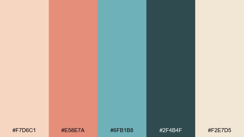
HEX: #f7d6c1 #e58e7a #6fb1b8 #2f4b4f #f2e7d5
Mood: sun-washed, friendly, nostalgic
Best for: cafe branding and menu design
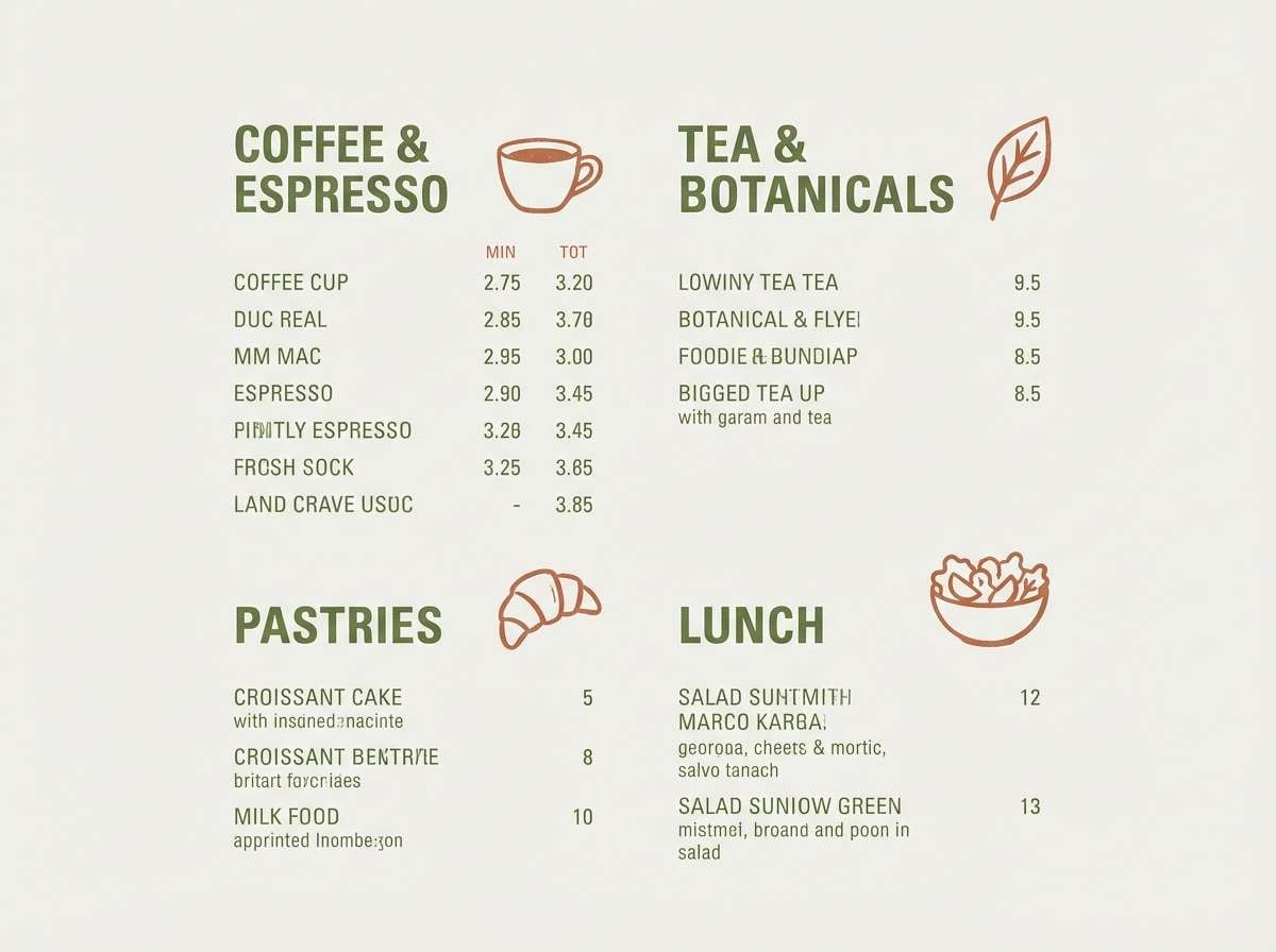
Sun-washed peach and seafoam tones evoke booth seats, laminated menus, and late-afternoon light. It works beautifully for cafe branding, menus, and friendly packaging that should feel approachable. Pair it with a warm off-white background and let the deep teal act as your text and icon color. Usage tip: keep the coral as a highlight color for prices and callouts to avoid overpowering the layout.
Image example of sun faded diner generated using media.io
Media.io is an online AI studio for creating and editing video, image, and audio in your browser.

2) Vinyl Sunset
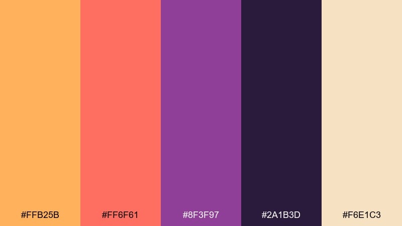
HEX: #ffb25b #ff6f61 #8f3f97 #2a1b3d #f6e1c3
Mood: bold, warm, night-drive
Best for: album art and social banners
Glowing orange and hot coral feel like a sunset reflected on a record sleeve. The plum and midnight tones add that late-night depth that makes headlines pop. Use it for album art, event teasers, and social banners where you want instant energy. Usage tip: set typography in cream for readability, then reserve the orange as a spotlight gradient.
Image example of vinyl sunset generated using media.io
3) Soda Shop Pastels
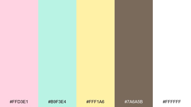
HEX: #ffd3e1 #b9f3e4 #fff1a6 #7a6a5b #ffffff
Mood: sweet, airy, playful
Best for: baby shower invitations and sticker sets
Cotton-candy pink, mint foam, and lemon sherbet create a cheerful counter-top vibe. These tones shine on invitations, sticker packs, and lighthearted packaging where softness matters. Ground the pastels with cocoa-brown typography to keep everything legible. Usage tip: use white as breathing room so the pastels feel clean rather than crowded.
Image example of soda shop pastels generated using media.io
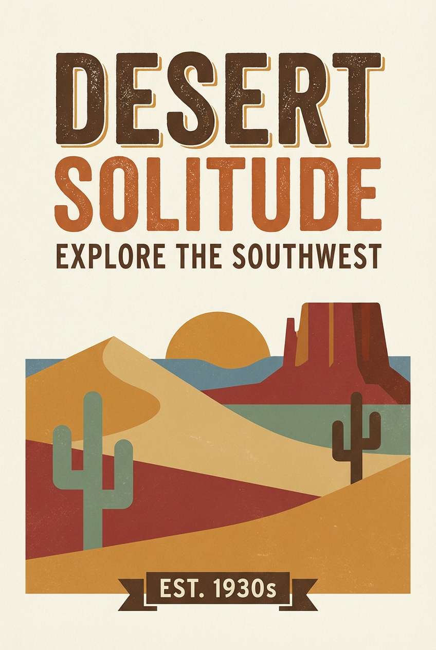
4) Desert Postcard
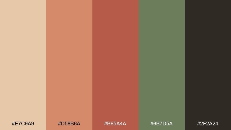
HEX: #e7c9a9 #d58b6a #b65a4a #6b7d5a #2f2a24
Mood: earthy, sunbaked, travel-ready
Best for: travel posters and stationery
Sunbaked sand, terracotta, and cactus green bring to mind roadside motels and stamped postcards. As a retro color palette, it feels authentic on travel posters, stationery, and souvenir-style merch. Pair it with textured paper backgrounds and simple line icons for a printed look. Usage tip: keep the near-black for small text and outlines so the warm hues stay dominant.
Image example of desert postcard generated using media.io
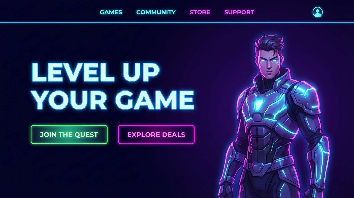
5) Arcade Neon
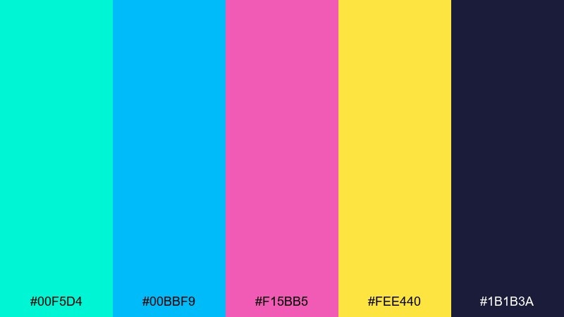
HEX: #00f5d4 #00bbf9 #f15bb5 #fee440 #1b1b3a
Mood: electric, playful, high-contrast
Best for: gaming landing pages and promo banners
Neon cyan and magenta spark like arcade lights bouncing off glossy cabinets. The bright yellow adds a coin-op punch, while deep indigo keeps it grounded. Use it for gaming promos, streamer overlays, and punchy landing pages that need strong contrast. Usage tip: limit neon fills to buttons and key icons, then rely on indigo for most backgrounds to reduce glare.
Image example of arcade neon generated using media.io
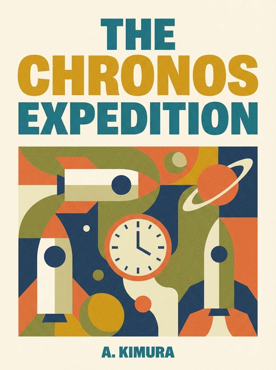
6) Pumpkin Spice Print
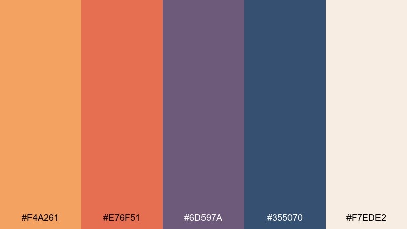
HEX: #f4a261 #e76f51 #6d597a #355070 #f7ede2
Mood: cozy, printed, autumnal
Best for: book covers and blog headers
Toasty orange and clay red feel like ink on textured paper, warmed up by creamy beige. The indigo and muted purple add a vintage editorial vibe without feeling heavy. It fits book covers, blog headers, and seasonal campaigns that want warmth with structure. Usage tip: let the beige dominate large areas, then use orange for section labels and badges.
Image example of pumpkin spice print generated using media.io
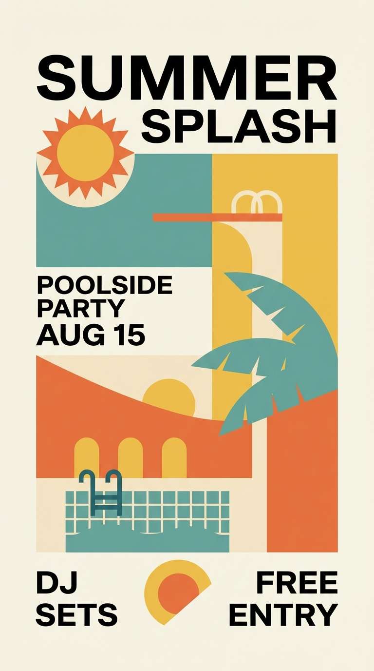
7) Palm Motel
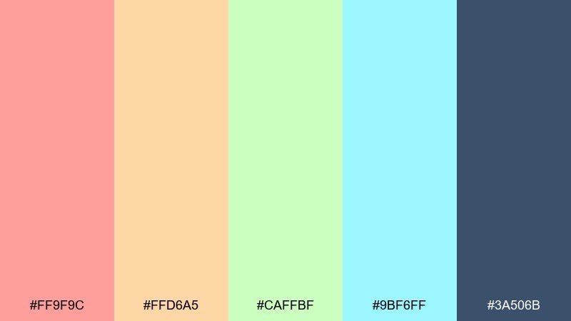
HEX: #ff9f9c #ffd6a5 #caffbf #9bf6ff #3a506b
Mood: breezy, sunny, carefree
Best for: summer event flyers and lifestyle branding
Breezy pastels suggest pool tiles, palm shadows, and painted motel doors. These retro color combinations are ideal for summer flyers, lifestyle brands, and cheerful merch that needs an easygoing feel. Pair the pastels with crisp navy for type and logo marks to avoid looking washed out. Usage tip: use the aqua as a large background block and keep pink for small accents and stamps.
Image example of palm motel generated using media.io
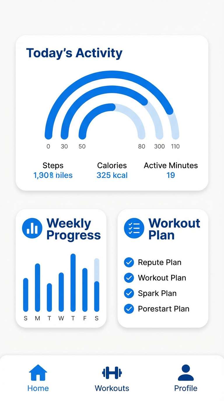
8) Surf Wax Blue
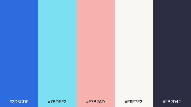
HEX: #2d6cdf #7bdff2 #f7b2ad #f9f7f3 #2b2d42
Mood: fresh, coastal, sporty
Best for: activewear branding and app headers
Bright ocean blue and icy aqua feel crisp like surf wax and salt air. The soft pink keeps it playful, while charcoal anchors it for modern UI. Use it on activewear branding, app headers, or outdoor campaigns where clarity matters. Usage tip: keep the charcoal for navigation and icons, and use the brighter blues for progress states and highlights.
Image example of surf wax blue generated using media.io
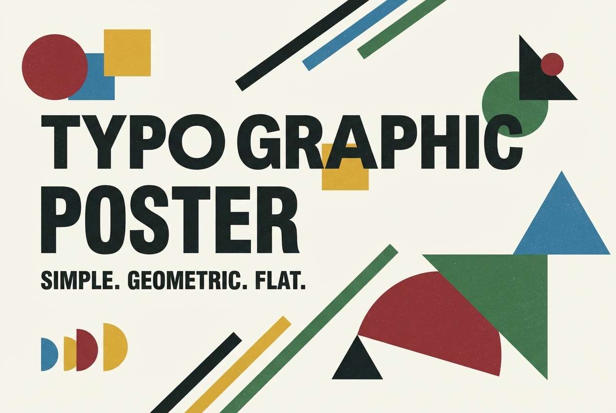
9) Tangerine Type
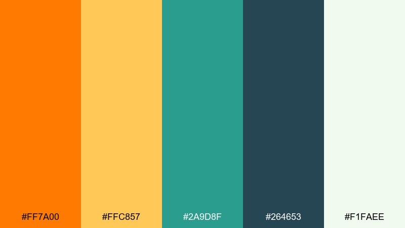
HEX: #ff7a00 #ffc857 #2a9d8f #264653 #f1faee
Mood: punchy, typographic, confident
Best for: headline posters and ad creative
Tangerine and golden yellow feel like bold letterpress ink and cut-paper shapes. Teal and deep blue-green give the palette authority, especially for large type. It excels in posters, ad creative, and social tiles that rely on strong hierarchy. Usage tip: set large headlines in deep green, then use orange sparingly as a directional cue.
Image example of tangerine type generated using media.io
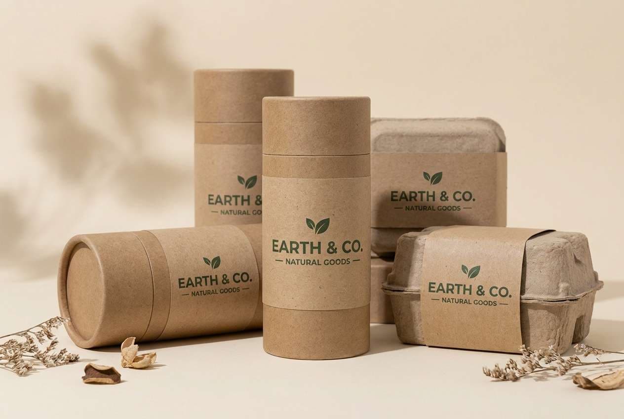
10) Olive Corduroy
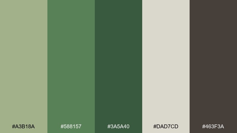
HEX: #a3b18a #588157 #3a5a40 #dad7cd #463f3a
Mood: grounded, natural, tactile
Best for: eco packaging and outdoor brands
Olive greens and warm neutrals evoke corduroy texture, hiking gear, and old field guides. The mix feels calm and dependable for eco packaging, outdoor labels, and sustainable branding. Pair it with recycled paper textures and simple sans-serif type to keep it modern. Usage tip: use the darkest green for small elements like stamps and batch codes.
Image example of olive corduroy generated using media.io
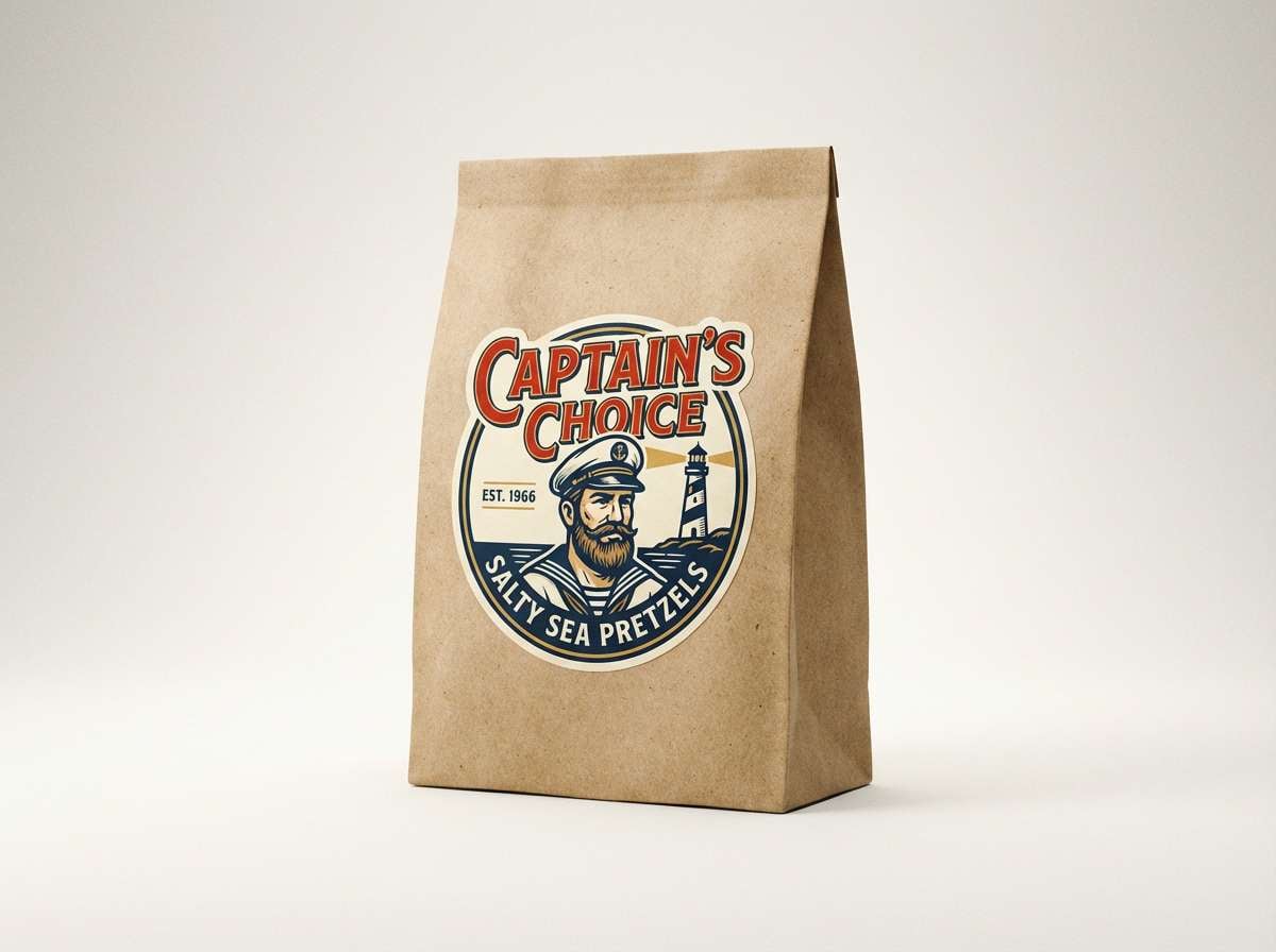
11) Cherry Formica
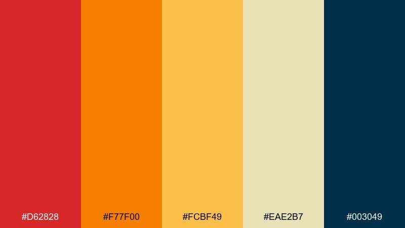
HEX: #d62828 #f77f00 #fcbf49 #eae2b7 #003049
Mood: classic, appetizing, high-contrast
Best for: restaurant promos and retro-inspired packaging
Cherry red and bright orange recall glossy countertops and bold signage. The buttery cream keeps it friendly, while navy adds a crisp finishing edge. As a retro color palette, it works well for restaurant promos, snack packaging, and branding that needs instant appetite appeal. Usage tip: let navy frame the design as borders or panels, then keep red for the hero item only.
Image example of cherry formica generated using media.io
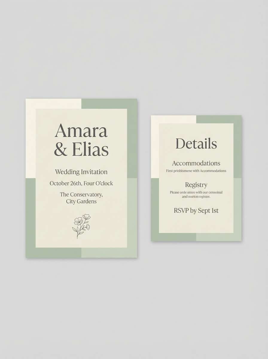
12) Dusty Stationery
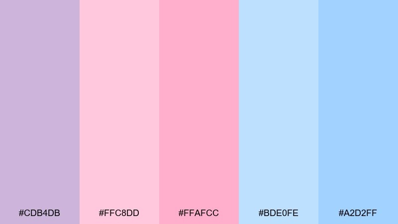
HEX: #cdb4db #ffc8dd #ffafcc #bde0fe #a2d2ff
Mood: soft, dreamy, gentle
Best for: wedding details and personal brand kits
Dusty lavender and blush tones feel like vintage envelopes and lightly faded ink. The sky blues keep it airy, making it great for wedding stationery, creator brand kits, and delicate packaging. Pair it with thin serif typography and lots of whitespace for a refined look. Usage tip: choose one pink as the primary and keep the other as a subtle highlight to avoid a sugary overload.
Image example of dusty stationery generated using media.io
13) Teal Radio
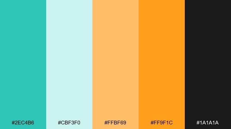
HEX: #2ec4b6 #cbf3f0 #ffbf69 #ff9f1c #1a1a1a
Mood: bright, optimistic, slightly quirky
Best for: podcast covers and creator thumbnails
Teal and pale aqua feel like plastic radio casings and glowing dials. The orange range adds punch for calls to action and playful icons. Use it for podcast covers, creator thumbnails, and newsletter headers that need instant pop. Usage tip: keep the near-black for text, then use the lighter aqua as a soft canvas behind illustrations.
Image example of teal radio generated using media.io
14) Mustard and Plum
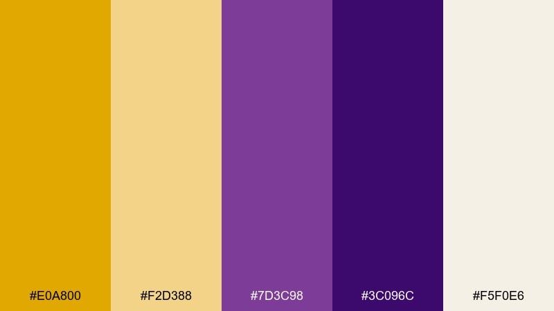
HEX: #e0a800 #f2d388 #7d3c98 #3c096c #f5f0e6
Mood: rich, artsy, vintage-luxe
Best for: boutique branding and editorial headers
Mustard gold against plum feels like velvet curtains and gallery lighting. The creamy neutral keeps it upscale and readable for premium layouts. It fits boutique branding, editorial headers, and product drops that need warmth with sophistication. Usage tip: use plum for backgrounds and reserve mustard for small, high-impact details like buttons and price tags.
Image example of mustard and plum generated using media.io
15) Creamy Polaroid
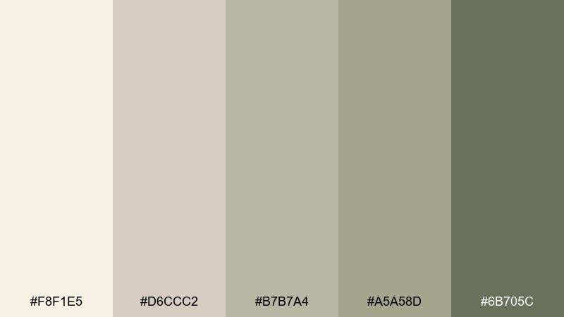
HEX: #f8f1e5 #d6ccc2 #b7b7a4 #a5a58d #6b705c
Mood: soft, muted, nostalgic
Best for: portfolio sites and minimal UI themes
Creamy neutrals and mossy gray-greens evoke instant film borders and softly aged prints. The tones are gentle enough for portfolios, minimal UI themes, and calm blog layouts. Pair it with subtle shadows and a single accent color from your imagery to keep it from feeling flat. Usage tip: use the darkest olive for key labels only, so the interface stays light and airy.
Image example of creamy polaroid generated using media.io
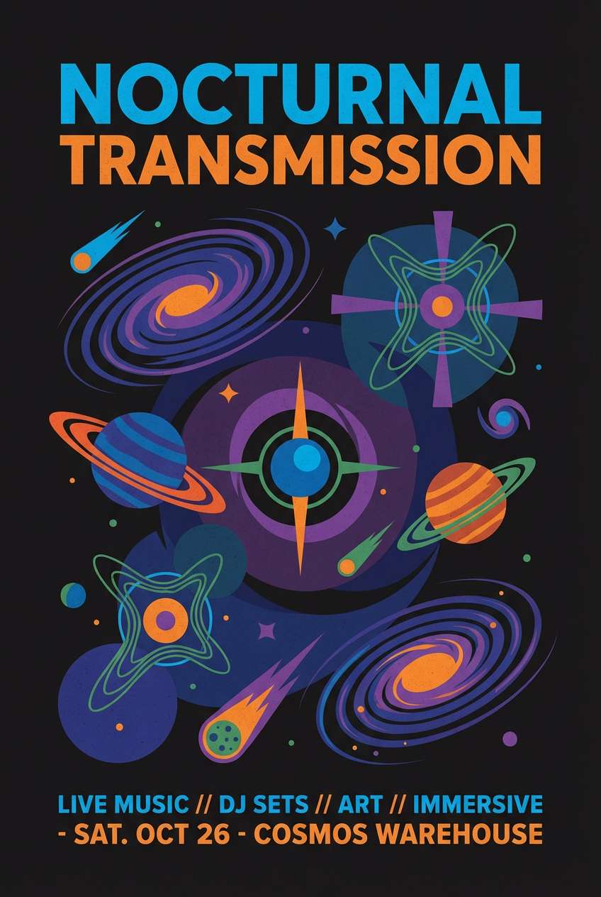
16) Cosmic Lavender
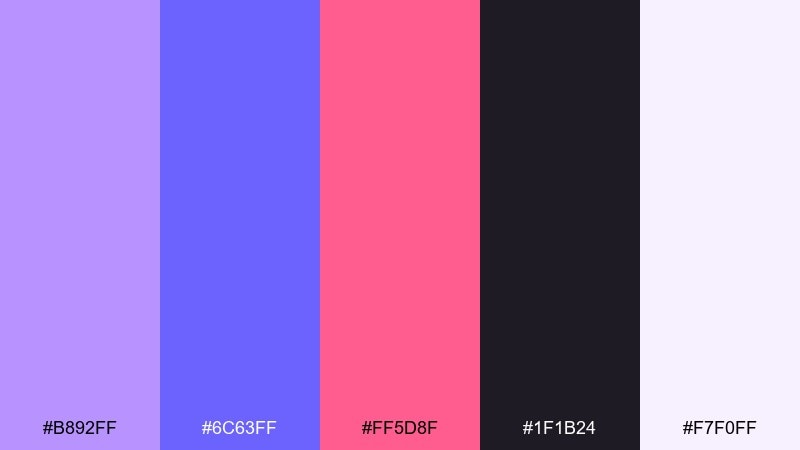
HEX: #b892ff #6c63ff #ff5d8f #1f1b24 #f7f0ff
Mood: spacey, creative, modern-vintage
Best for: music merch and nightlife posters
Lavender and electric violet feel like neon haze over a midnight sky. Pink adds a lively glow, while near-black brings the drama needed for standout layouts. It is a strong fit for merch graphics, nightlife posters, and bold social ads. Usage tip: keep large areas dark and use violet gradients for depth, then drop in pink sparingly for emphasis.
Image example of cosmic lavender generated using media.io
17) Cocoa and Mint
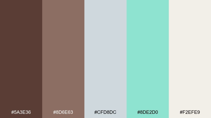
HEX: #5a3e36 #8d6e63 #cfd8dc #8de2d0 #f2efe9
Mood: calm, cozy, fresh
Best for: skincare packaging and calm landing pages
Cocoa browns and soft mint feel like a warm drink beside a clean, fresh towel. The pale neutrals keep it soothing for skincare packaging, wellness landing pages, and gentle email templates. Pair it with rounded typography and simple product photography for a friendly premium feel. Usage tip: use mint as a secondary accent only, letting cocoa carry the brand weight.
Image example of cocoa and mint generated using media.io
18) Seaside Stripe
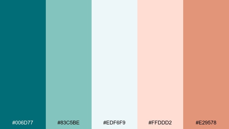
HEX: #006d77 #83c5be #edf6f9 #ffddd2 #e29578
Mood: clean, coastal, refreshing
Best for: beach shop branding and lookbooks
Cool teal and sea-glass aqua feel like striped umbrellas and salty breeze. The blush and warm sand add a relaxed, sunlit counterpoint to the cooler tones. Use it for lookbooks, beach shop branding, and seasonal campaigns with a clean editorial finish. Usage tip: keep the off-white as the main background and use coral for small badges and links.
Image example of seaside stripe generated using media.io
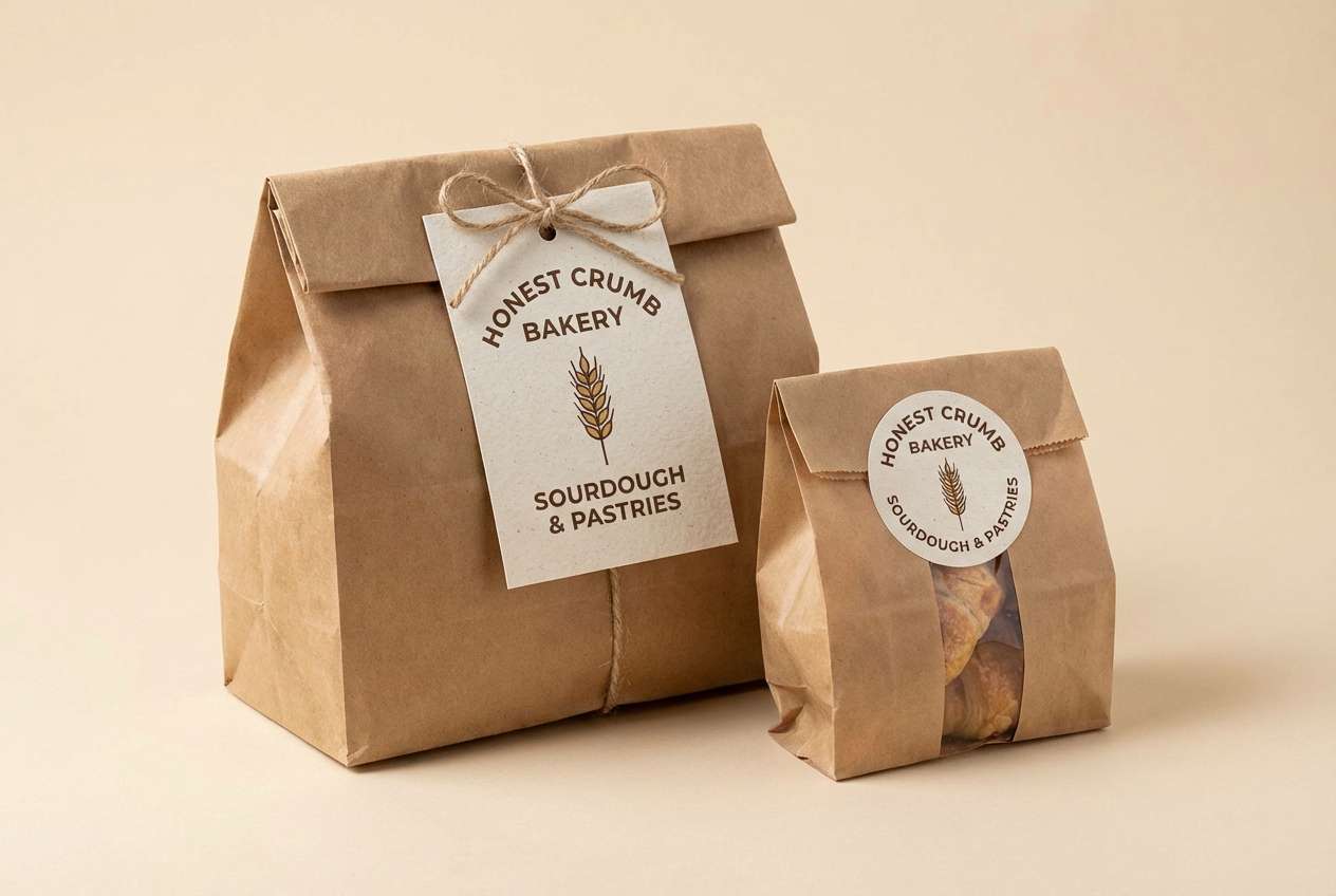
19) Brick and Butter
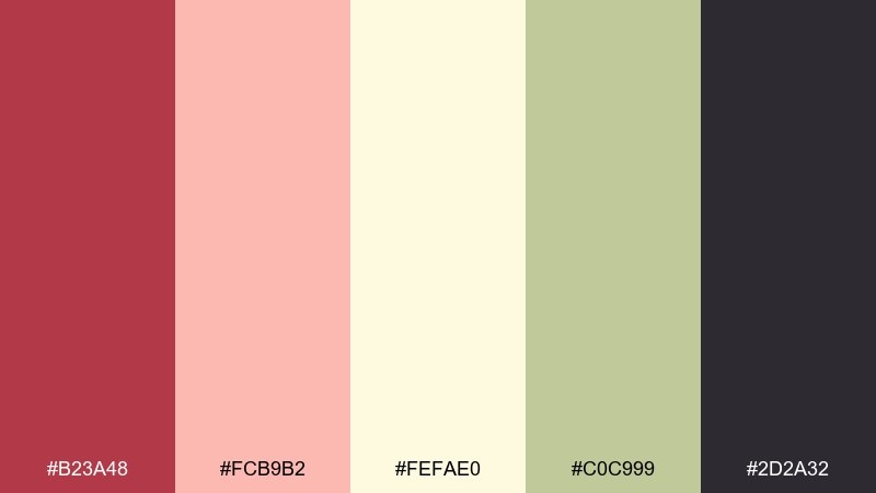
HEX: #b23a48 #fcb9b2 #fefae0 #c0c999 #2d2a32
Mood: warm, grounded, handmade
Best for: artisan labels and bakery packaging
Brick red and butter cream evoke storefront awnings and hand-stamped paper bags. The muted green keeps it earthy, while charcoal gives you crisp readability. It is well-suited for artisan labels, bakery packaging, and farmers market signage. Usage tip: use the cream for large fields and keep brick red for a single strong brand mark.
Image example of brick and butter generated using media.io
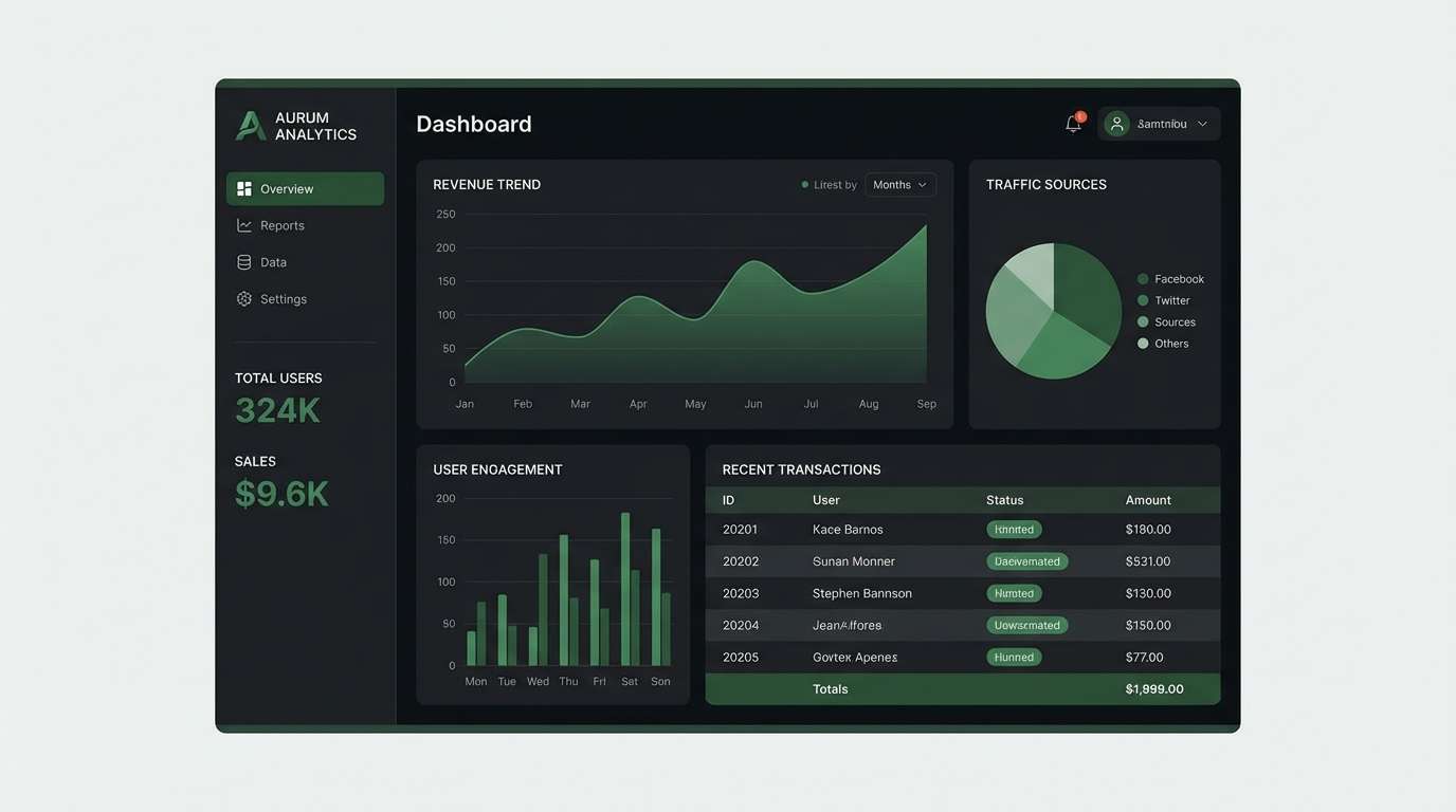
20) Midnight Cassette
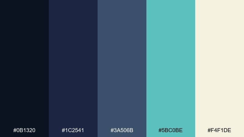
HEX: #0b1320 #1c2541 #3a506b #5bc0be #f4f1de
Mood: moody, cool, techy
Best for: dashboard UI and tech branding
Deep navy layers feel like cassette tape shells and dim studio LEDs. Aqua brings just enough glow to guide the eye through data-heavy screens. Use it for dashboards, SaaS branding, and presentations where contrast is non-negotiable. Usage tip: reserve aqua for active states and charts, and keep the warm cream for key numbers and labels.
Image example of midnight cassette generated using media.io
21) Garden Disco
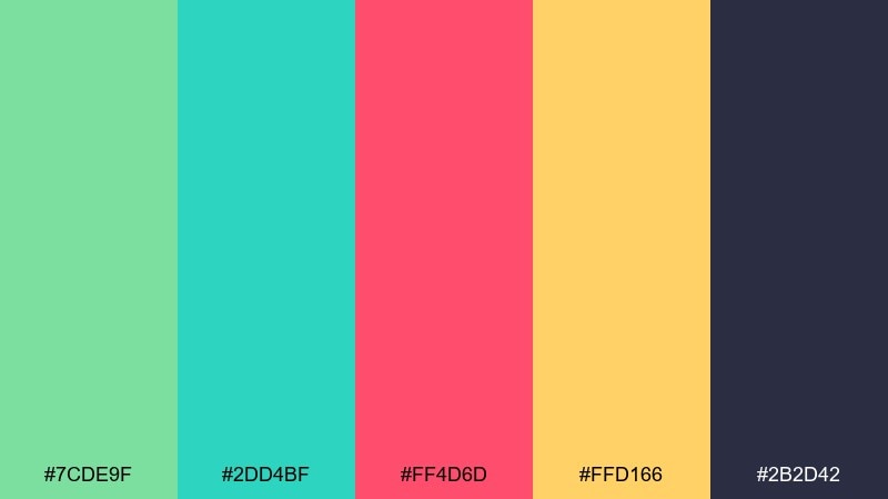
HEX: #7cde9f #2dd4bf #ff4d6d #ffd166 #2b2d42
Mood: lively, quirky, upbeat
Best for: festival posters and merch graphics
Minty greens and hot pink feel like dancing lights over a backyard garden party. The golden yellow adds cheer, while deep slate keeps everything readable. It is ideal for festival posters, merch graphics, and punchy announcements. Usage tip: pick one bright as the hero and let the others support it in smaller shapes and stickers.
Image example of garden disco generated using media.io
What Colors Go Well with Retro?
Retro palettes pair best with warm neutrals and inky darks. Cream, off-white, sand, and warm gray give your bright accents room to breathe, while deep teal, navy, or charcoal keep typography crisp.
For a true vintage palette feel, combine one “sun-faded” hue (dusty pink, muted teal, sage) with one saturated pop (tangerine, cherry red, neon cyan). This keeps the design energetic but not chaotic.
If you want an 80s neon edge, use a dark base (indigo/near-black) and limit neon to UI states like buttons, links, and chart highlights so the screen stays readable.
How to Use a Retro Color Palette in Real Designs
Start with roles, not colors: assign a background, surface, text, and accent color first. Retro color combinations work best when the boldest hue is reserved for CTAs, prices, badges, or one hero element.
Use contrast intentionally. Many vintage palette picks are mid-tone, so add a reliable dark (navy/charcoal) for type and a light neutral (cream/white) for spacing to avoid a muddy look.
To modernize retro tones, keep layouts minimal and let color do the storytelling—simple grids, big headings, and a few geometric shapes are often enough.
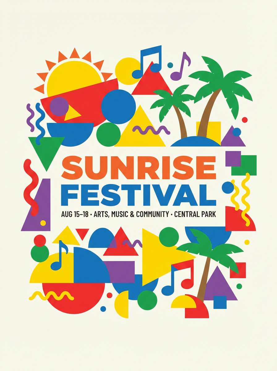
Create Retro Palette Visuals with AI
If you’re building a UI theme, poster, or packaging mockup, AI can help you generate on-style visuals quickly—especially when you include the medium (poster/UI/studio shot), the composition (flat 2D, clean grid), and your desired aspect ratio.
Reuse the prompts above and swap the subject (menu, album cover, dashboard) while keeping the style keywords consistent. You’ll get a cohesive retro look across multiple assets without starting from scratch each time.
When you find a palette you like, keep the HEX codes nearby and match your generated imagery to those tones for a polished brand system.
Retro Color Palette FAQs
-
What is a retro color palette?
A retro color palette is a set of colors inspired by past design eras (commonly the 50s–80s), often mixing warm neutrals with bold accents like teal, coral, mustard, and cherry red. -
What are popular retro colors for branding?
Popular retro branding colors include cream/off-white, warm beige, terracotta, mustard, teal, seafoam, coral, cherry red, and deep navy or charcoal for contrast. -
How do I make retro color combinations look modern?
Use retro tones with modern layout rules: plenty of whitespace, a clear type hierarchy, and one strong accent color. Anchor everything with a readable dark text color (navy/charcoal). -
Are retro palettes good for UI design?
Yes—especially when you pick one bright accent for buttons and states, keep backgrounds neutral, and ensure accessible contrast for text and interactive elements. -
What’s the easiest way to choose a retro accent color?
Choose one “hero” accent (tangerine, coral, neon cyan, or mustard) and use it consistently for CTAs and highlights. Keep all other saturated colors secondary to prevent visual noise. -
Which retro palette style fits posters best: muted or neon?
Muted pastels work well for editorial and lifestyle posters, while neon palettes (cyan/magenta/yellow on dark bases) are better for nightlife, gaming, and high-energy events. -
Can I generate retro-style visuals with specific HEX colors?
You can guide results by using prompts that describe the era, medium, and lighting (flat 2D, vintage print, studio shot) and then color-correct or iterate until the visuals match your HEX palette closely.
Next: Mauve Pink Color Palette


