

Mint blue sits right between pastel freshness and modern calm, making it an easy win for branding, UI, and soothing interior moods.
Below are 20 curated mint blue color palette ideas with HEX codes, plus practical tips for pairing and applying them in real designs.
In this article
- Why Mint Blue Palettes Work So Well
-
- sea glass breeze
- arctic lagoon
- mint denim pop
- spa day neutrals
- coastal candy
- frosted coral accent
- cloudy harbor
- modern clinic ui
- retro sorbet
- botanical mint mist
- minimal gallery
- aqua lavender dream
- night swim neon
- warm sand & mint
- icy grapefruit
- blueprint mint
- nordic kitchen
- playroom pastels
- ocean fog editorial
- fresh tech gradient
- What Colors Go Well with Mint Blue?
- How to Use a Mint Blue Color Palette in Real Designs
- Create Mint Blue Palette Visuals with AI
Why Mint Blue Palettes Work So Well
Mint blue combines the clarity of blue with the softness of mint, so it reads clean and contemporary without feeling cold. That balance makes it especially effective for calm, “breathable” layouts and modern brand identities.
It also plays nicely with both warm and cool accents. You can push it toward coastal and airy with whites and teals, or toward playful and energetic with coral, pink, and sunshine yellow.
Most importantly, mint blue supports strong hierarchy: keep it for backgrounds and soft surfaces, then use deep navy/charcoal for text and one bold accent for CTAs to maintain contrast and focus.
20+ Mint Blue Color Palette Ideas (with HEX Codes)
1) Sea Glass Breeze
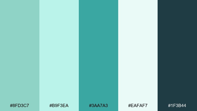
HEX: #8fd3c7 #b9f3ea #3aa7a3 #eafaf7 #1f3b44
Mood: airy, coastal, clean
Best for: beach resort branding and landing pages
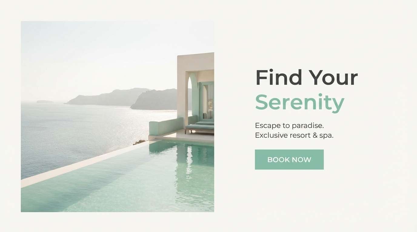
Airy sea-glass tones evoke shoreline light and polished pebbles. Use the deep blue-charcoal as your type color and let the pale mint sit as the main background. The teal works beautifully for buttons, icons, and small brand marks. Tip: keep contrast high by pairing #1f3b44 text over #eafaf7 for effortless readability.
Image example of sea glass breeze generated using media.io
Media.io is an online AI studio for creating and editing video, image, and audio in your browser.

2) Arctic Lagoon
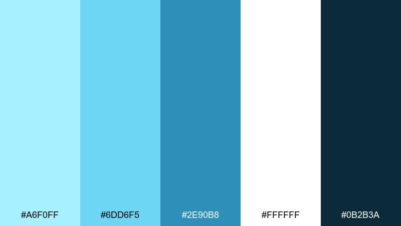
HEX: #a6f0ff #6dd6f5 #2e90b8 #ffffff #0b2b3a
Mood: crisp, icy, modern
Best for: tech startup websites and product pages
Crisp lagoon blues feel like fresh air and clean water under winter sun. White gives the layout breathing room while #0b2b3a anchors navigation and headings. Use #2e90b8 for primary CTAs and reserve #a6f0ff for subtle highlights. Tip: add thin dividers in #6dd6f5 to keep sections structured without heaviness.
Image example of arctic lagoon generated using media.io
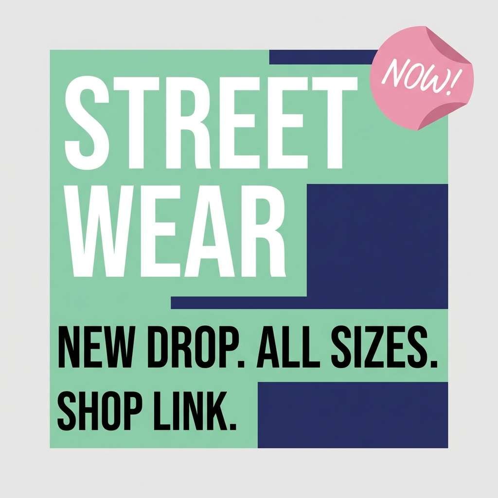
3) Mint Denim Pop
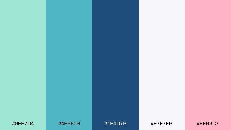
HEX: #9fe7d4 #4fb6c6 #1e4d7b #f7f7fb #ffb3c7
Mood: fresh, youthful, confident
Best for: streetwear branding and social ads
Fresh mint against denim navy feels sporty, upbeat, and a little playful. These mint blue color combinations shine in bold typography and punchy promo blocks, with pink used sparingly for price tags or badges. Keep #f7f7fb as the neutral base so the navy never looks too heavy. Tip: use the navy for logos and outlines to make the lighter tones pop on mobile screens.
Image example of mint denim pop generated using media.io
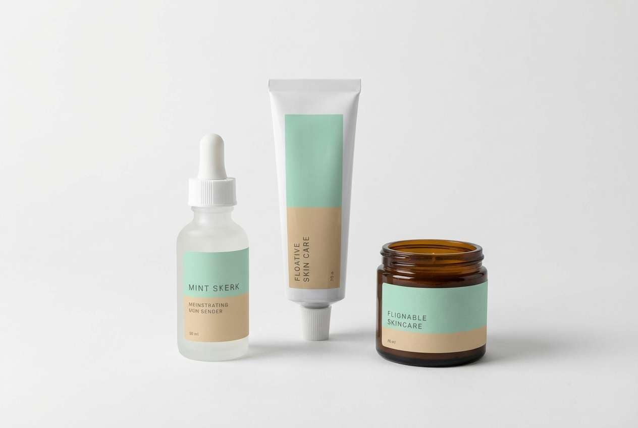
4) Spa Day Neutrals
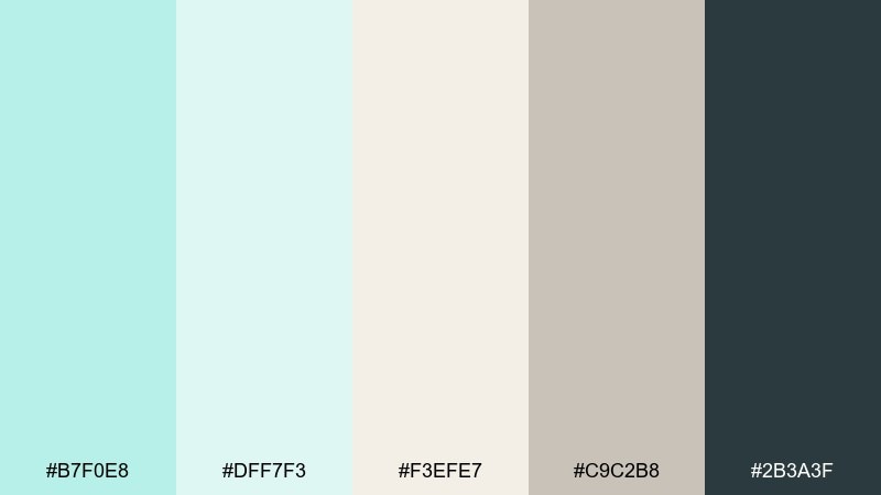
HEX: #b7f0e8 #dff7f3 #f3efe7 #c9c2b8 #2b3a3f
Mood: soothing, natural, premium
Best for: skincare packaging and wellness menus
Soothing steam and clean linen come to mind with these soft mints and warm neutrals. This mint blue color palette feels premium when you pair the gentle background shades with charcoal typography. Use #c9c2b8 for secondary labels and borders to keep the look calm and cohesive. Tip: try matte finishes and minimal iconography so the colors do the talking.
Image example of spa day neutrals generated using media.io
5) Coastal Candy
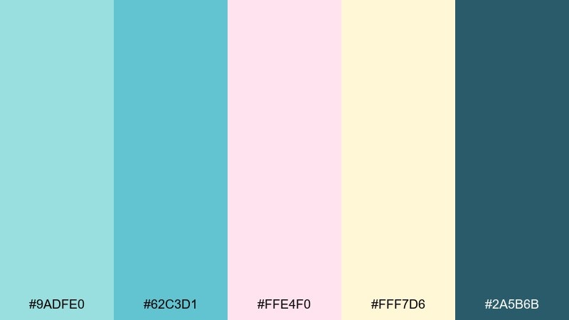
HEX: #9adfe0 #62c3d1 #ffe4f0 #fff7d6 #2a5b6b
Mood: cheerful, bright, inviting
Best for: ice cream shops and playful cafe branding
Cheerful seaside candy vibes make this mix feel friendly and approachable. The pink and butter-yellow act as sweet accents while the deeper teal keeps everything grounded. Use the lightest tones for backgrounds and menu panels, then highlight specials with #ffe4f0. Tip: keep your logo simple in #2a5b6b so it stays legible across cups, signs, and stickers.
Image example of coastal candy generated using media.io
6) Frosted Coral Accent
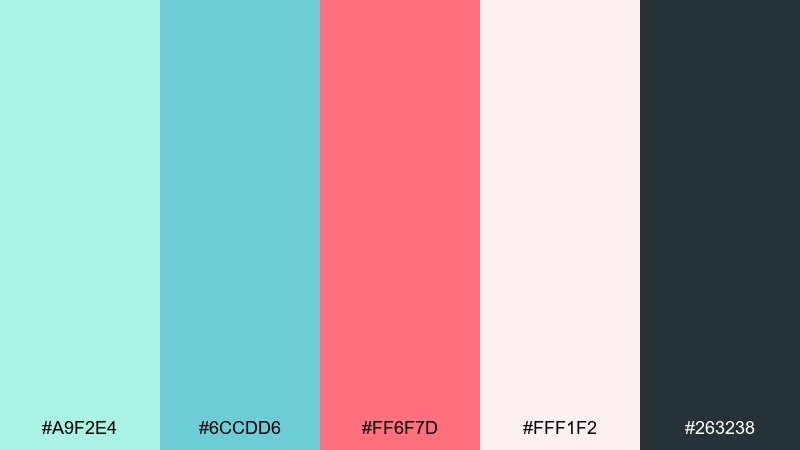
HEX: #a9f2e4 #6ccdd6 #ff6f7d #fff1f2 #263238
Mood: modern, lively, polished
Best for: beauty product ads and ecommerce banners
Modern mint with a coral punch feels like a fresh drink with a bright garnish. Coral is best as the spotlight color for limited-time offers, while the dark slate carries headers and pricing. Keep #fff1f2 as the base to soften the contrast and make the coral look intentional, not loud. Tip: limit coral to one element per section to maintain a premium feel.
Image example of frosted coral accent generated using media.io
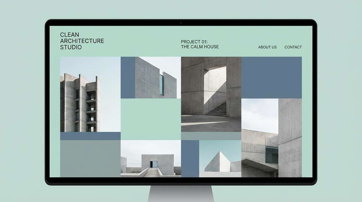
7) Cloudy Harbor
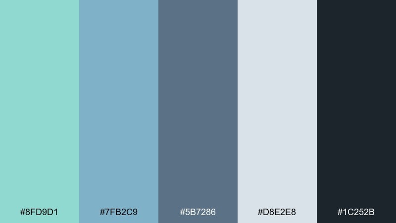
HEX: #8fd9d1 #7fb2c9 #5b7286 #d8e2e8 #1c252b
Mood: calm, overcast, editorial
Best for: architecture portfolios and case studies
Calm harbor tones feel understated, like fog rolling in over steel-blue water. The muted midtones create a professional frame for photography and project diagrams. Use #1c252b for body text and #d8e2e8 for generous margins and whitespace. Tip: pair with thin-line icons and grayscale imagery to keep the palette quietly confident.
Image example of cloudy harbor generated using media.io
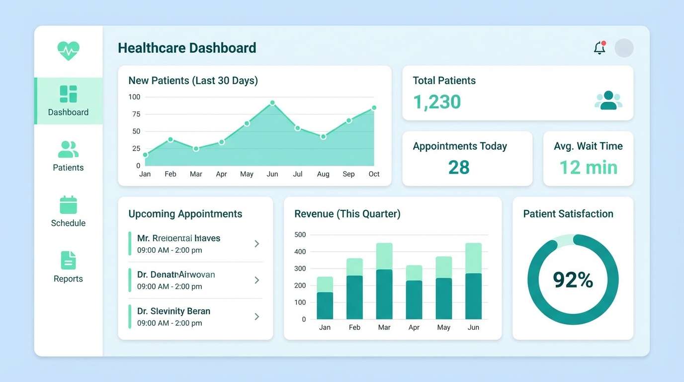
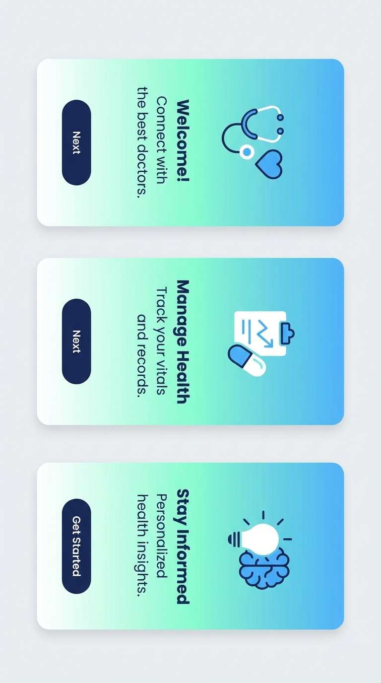
8) Modern Clinic UI
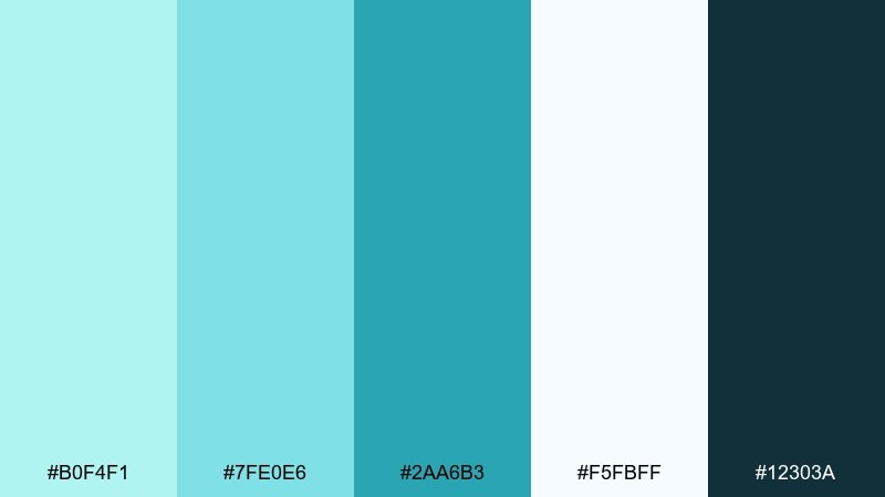
HEX: #b0f4f1 #7fe0e6 #2aa6b3 #f5fbff #12303a
Mood: trustworthy, clean, reassuring
Best for: healthcare dashboards and appointment apps
Trustworthy clinic vibes come through in bright, hygienic mints and deep slate. The teal reads clearly for active states like selected tabs and primary buttons. Use #f5fbff as the background to keep forms and charts easy on the eyes. Tip: reserve #7fe0e6 for highlights so the interface stays calm under heavy data density.
Image example of modern clinic ui generated using media.io
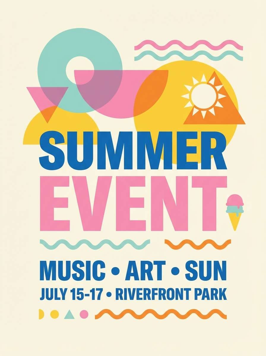
9) Retro Sorbet
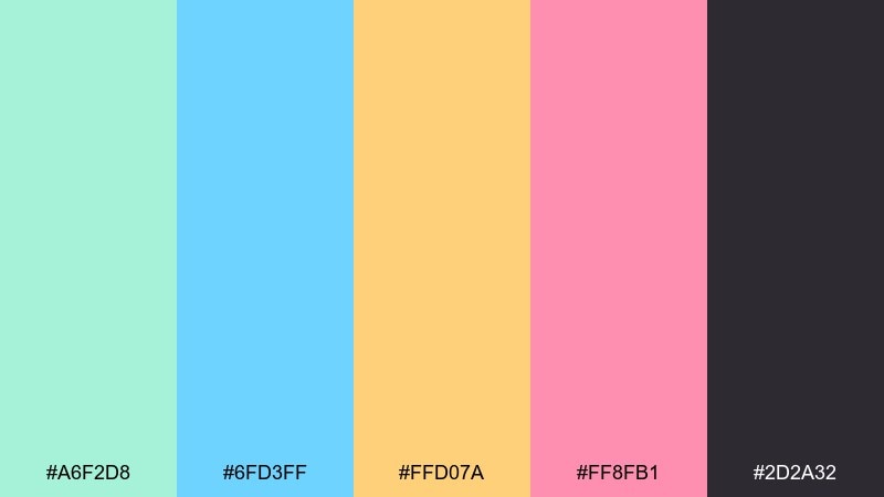
HEX: #a6f2d8 #6fd3ff #ffd07a #ff8fb1 #2d2a32
Mood: playful, nostalgic, energetic
Best for: event posters and summer pop-up flyers
Playful sorbet tones feel like a retro summer playlist in color form. Use the dark charcoal to keep large type readable, then layer the warm yellow and pink as punchy shapes behind headlines. The mint and sky blue balance the warmth so the design stays fresh rather than sugary. Tip: try halftone textures or simple geometric patterns to lean into the nostalgia.
Image example of retro sorbet generated using media.io
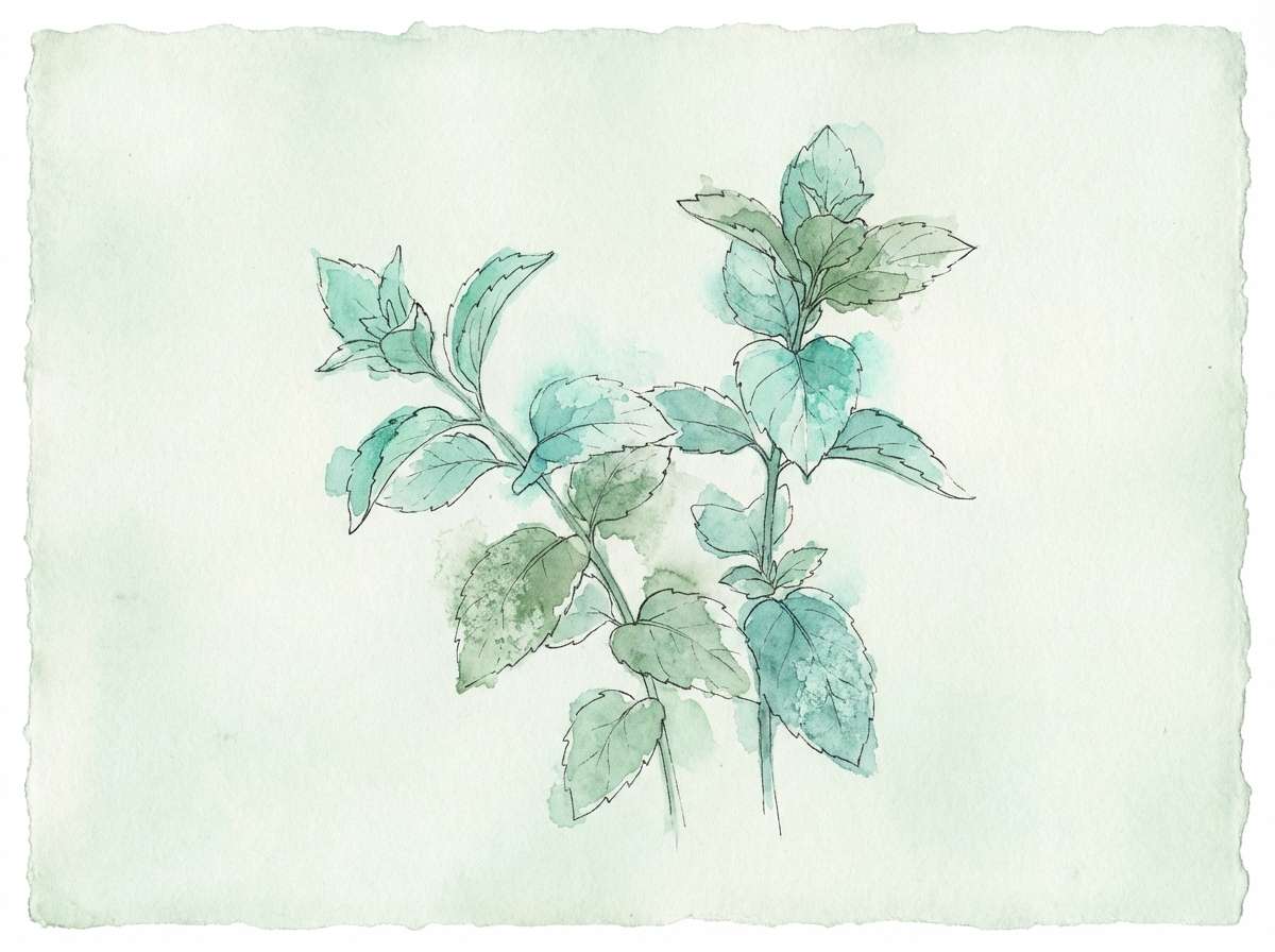
10) Botanical Mint Mist
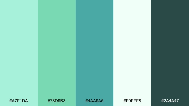
HEX: #a7f1da #78d9b3 #4aa9a5 #f0fff8 #2a4a47
Mood: fresh, botanical, restorative
Best for: spring illustrations and eco labels
Fresh garden mist and leafy shadows give this set an organic, restorative mood. The darker green-teal is ideal for outlines, stamps, and eco certifications, while the pale mint keeps negative space soft. Pair with recycled paper textures or natural fibers to reinforce the earthy feel. Tip: use #78d9b3 for small leaf highlights so illustrations stay dimensional.
Image example of botanical mint mist generated using media.io
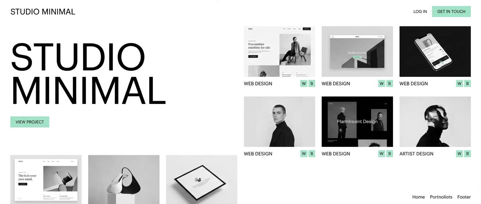
11) Minimal Gallery
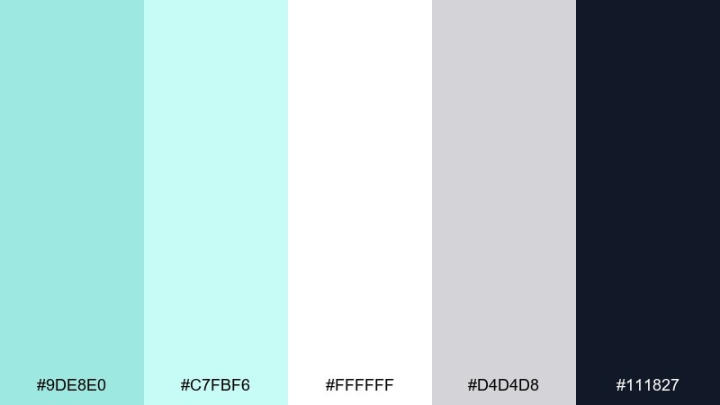
HEX: #9de8e0 #c7fbf6 #ffffff #d4d4d8 #111827
Mood: minimal, airy, high-end
Best for: portfolio sites and product photography layouts
Minimal gallery tones feel like a bright studio with clean walls and soft daylight. Use #111827 for crisp typography and let white do most of the work for spacious layouts. The mints are best as micro-accents in hover states, tags, and subtle gradients. Tip: keep imagery neutral or monochrome so the mint reads intentional and modern.
Image example of minimal gallery generated using media.io
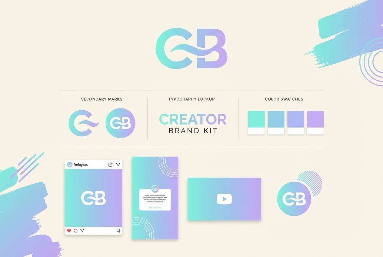
12) Aqua Lavender Dream
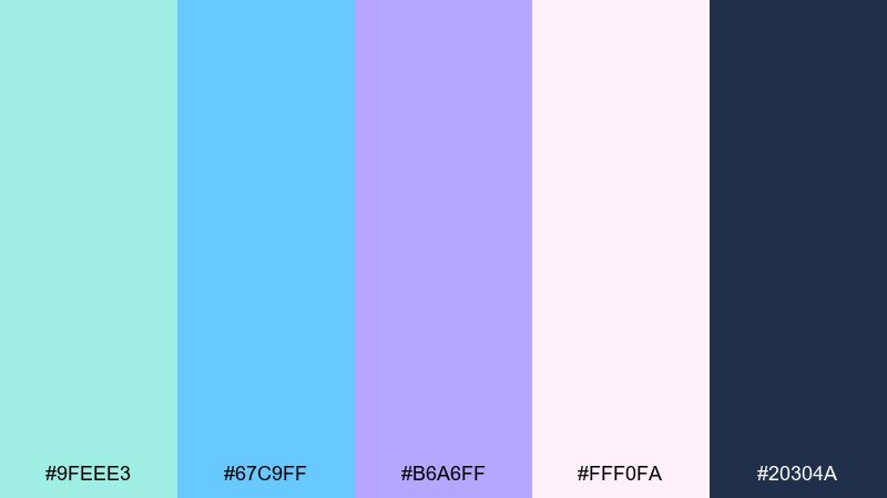
HEX: #9feee3 #67c9ff #b6a6ff #fff0fa #20304a
Mood: dreamy, soft, creative
Best for: music playlists and creator branding
Dreamy aqua and lavender feel like twilight reflections with a soft glow. The navy adds structure for logos and headings, while the blush tint keeps backgrounds gentle. Use the lavender for secondary highlights like link states or sticker-style badges. Tip: a subtle gradient from #67c9ff to #b6a6ff works beautifully for hero banners.
Image example of aqua lavender dream generated using media.io
13) Night Swim Neon
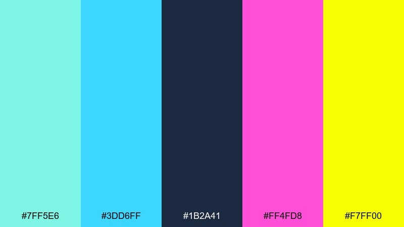
HEX: #7ff5e6 #3dd6ff #1b2a41 #ff4fd8 #f7ff00
Mood: electric, bold, nightlife
Best for: gaming promos and neon-style banners
Electric pool-at-night energy comes through with neon accents and a deep inky base. The bright yellow and magenta are perfect for callouts, while the mint and cyan carry gradients and UI glows. Keep #1b2a41 as the main canvas so the neon stays controlled and readable. Tip: add soft outer glows around buttons for a high-impact look without clutter.
Image example of night swim neon generated using media.io

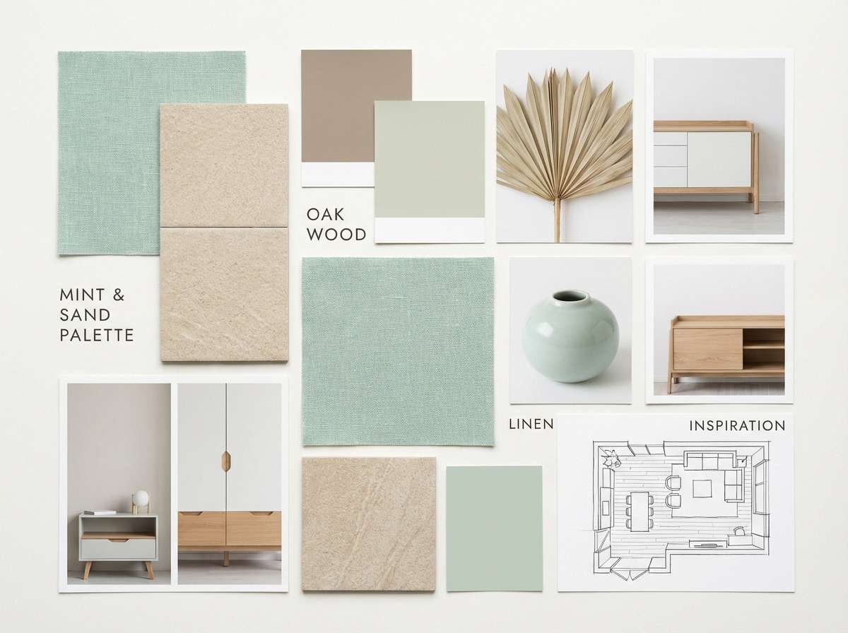
14) Warm Sand & Mint
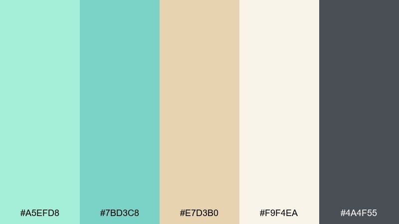
HEX: #a5efd8 #7bd3c8 #e7d3b0 #f9f4ea #4a4f55
Mood: cozy, natural, balanced
Best for: interior mood boards and lifestyle blogs
Warm sand and cool mint create a balanced, lived-in calm. The beige tones soften the palette so it feels inviting rather than clinical, especially in home content. Use #4a4f55 for headers and body text, then add mint in accents like buttons and section dividers. Tip: pair with light wood textures and linen photography to make the colors feel tactile.
Image example of warm sand & mint generated using media.io
15) Icy Grapefruit
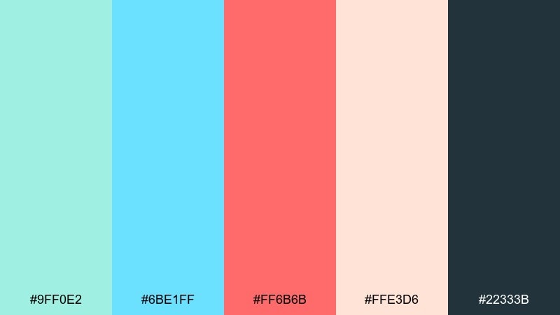
HEX: #9ff0e2 #6be1ff #ff6b6b #ffe3d6 #22333b
Mood: fresh, zesty, modern
Best for: food delivery apps and restaurant promos
Fresh citrus energy shows up in the grapefruit coral paired with icy mint and blue. These mint blue color combinations work well when coral is limited to key actions like order buttons or discount badges. Use #22333b for text to keep menus and pricing easy to scan. Tip: test coral on both light peach and mint backgrounds to find the cleanest contrast for mobile UI.
Image example of icy grapefruit generated using media.io
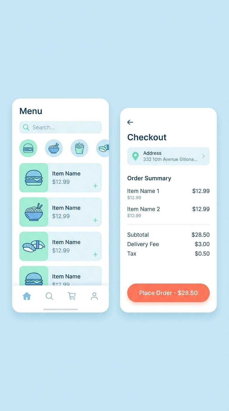
16) Blueprint Mint
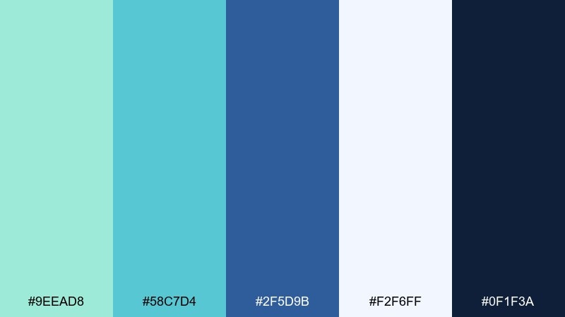
HEX: #9eead8 #58c7d4 #2f5d9b #f2f6ff #0f1f3a
Mood: smart, structured, confident
Best for: SaaS dashboards and analytics reports
Structured blueprint blues with mint highlights feel focused and dependable. This mint blue color palette is especially strong for data-heavy screens because the deep navy keeps charts and labels readable. Use #58c7d4 for interactive states and #f2f6ff for soft section backgrounds. Tip: apply mint only to key metrics so your dashboard communicates hierarchy at a glance.
Image example of blueprint mint generated using media.io
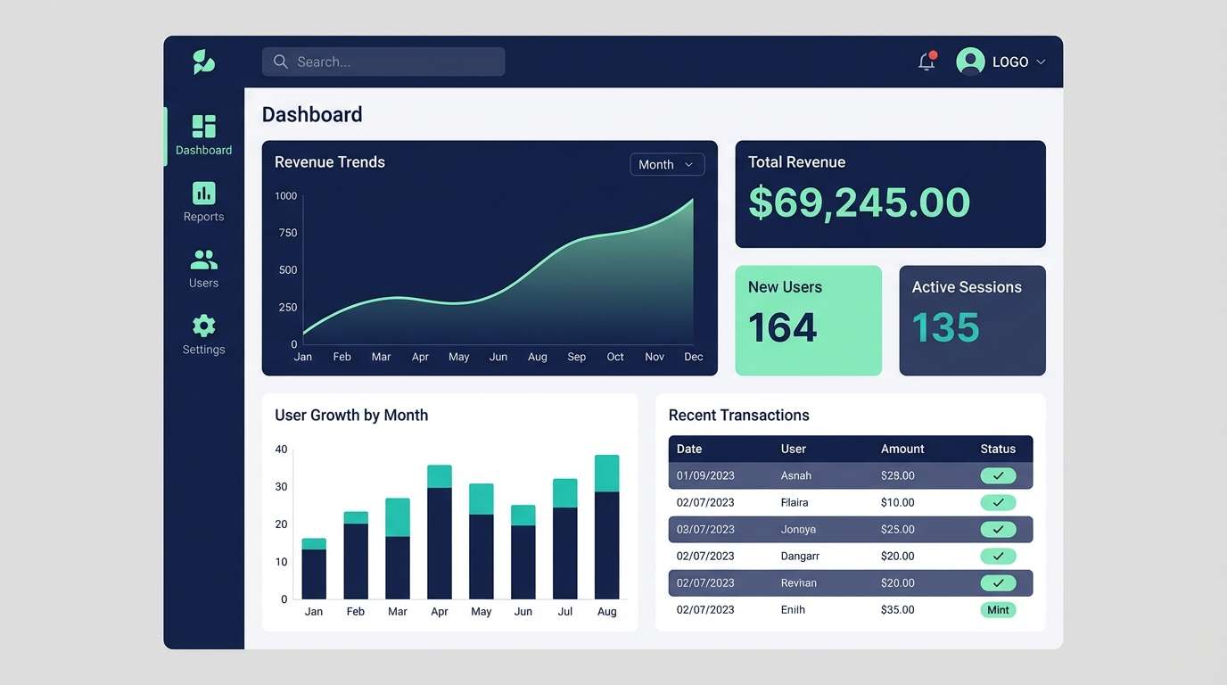
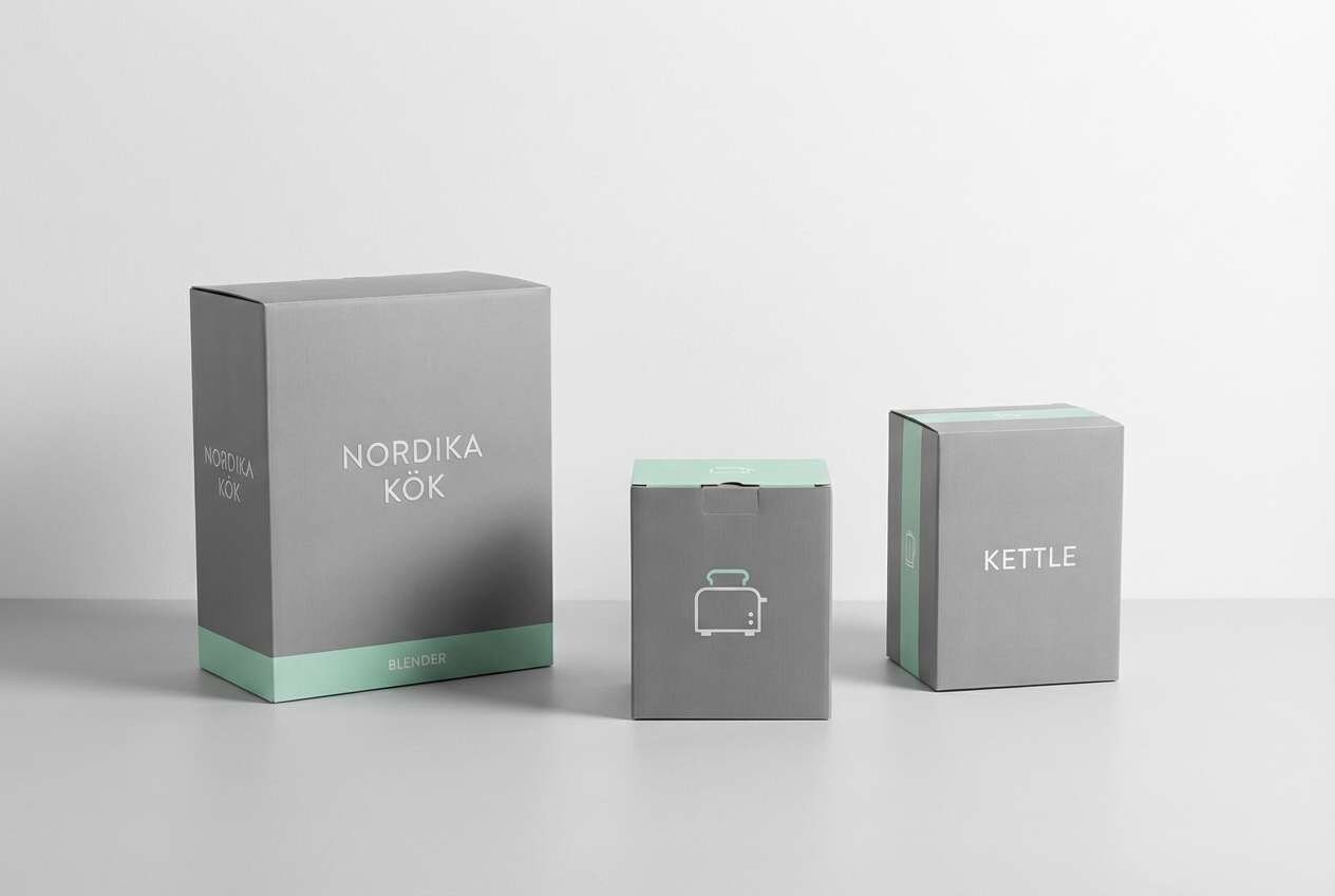
17) Nordic Kitchen
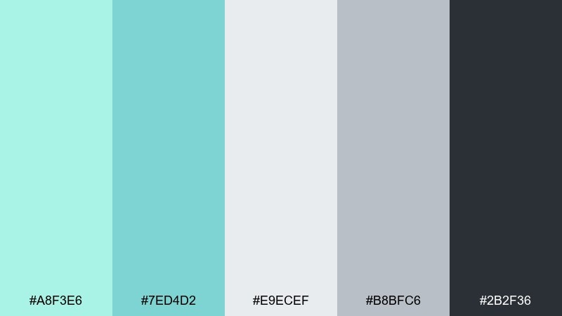
HEX: #a8f3e6 #7ed4d2 #e9ecef #b8bfc6 #2b2f36
Mood: calm, practical, Scandinavian
Best for: kitchen brands and home appliance catalogs
Calm Nordic tones feel practical and tidy, like a well-lit kitchen with matte finishes. The cool grays keep the palette grounded while the mint adds a clean, refreshing edge. Use #2b2f36 for product specs and headings, then bring mint in for feature highlights and icons. Tip: keep backgrounds in #e9ecef to avoid harsh white in long-read catalogs.
Image example of nordic kitchen generated using media.io
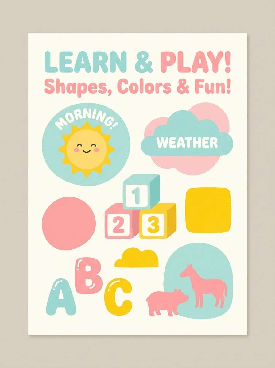
18) Playroom Pastels
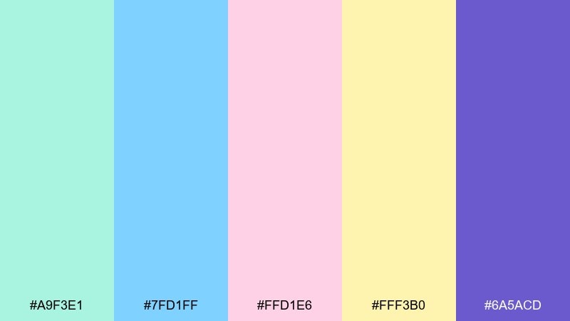
HEX: #a9f3e1 #7fd1ff #ffd1e6 #fff3b0 #6a5acd
Mood: sweet, friendly, imaginative
Best for: kids learning apps and preschool posters
Sweet playroom pastels feel imaginative and safe, with just enough color to stay engaging. The purple gives you a strong accent for headings and key icons without overpowering the softer tones. Use the yellow for rewards, stars, or progress highlights that need quick attention. Tip: pair rounded shapes with generous spacing to keep the palette gentle and readable for kids.
Image example of playroom pastels generated using media.io
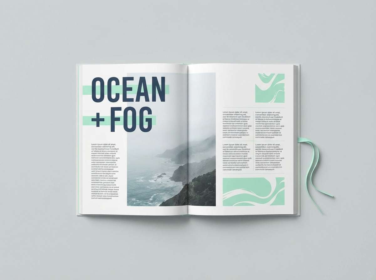
19) Ocean Fog Editorial
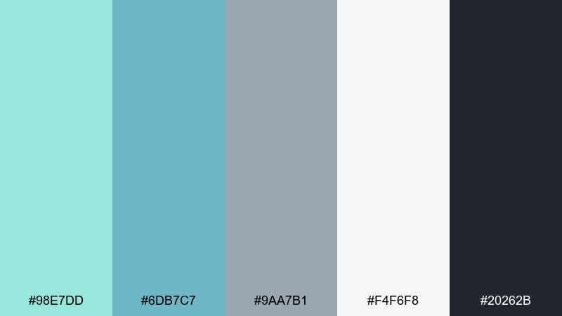
HEX: #98e7dd #6db7c7 #9aa7b1 #f4f6f8 #20262b
Mood: editorial, refined, contemporary
Best for: magazine layouts and long-form articles
Refined ocean fog tones feel contemporary and quietly stylish. The gray-blue midtone is perfect for pull quotes, section headers, and subtle sidebars in editorial design. Keep body text in #20262b and use #f4f6f8 for margins to reduce eye strain. Tip: limit the mint to small highlights like link hovers to preserve a premium magazine look.
Image example of ocean fog editorial generated using media.io
20) Fresh Tech Gradient
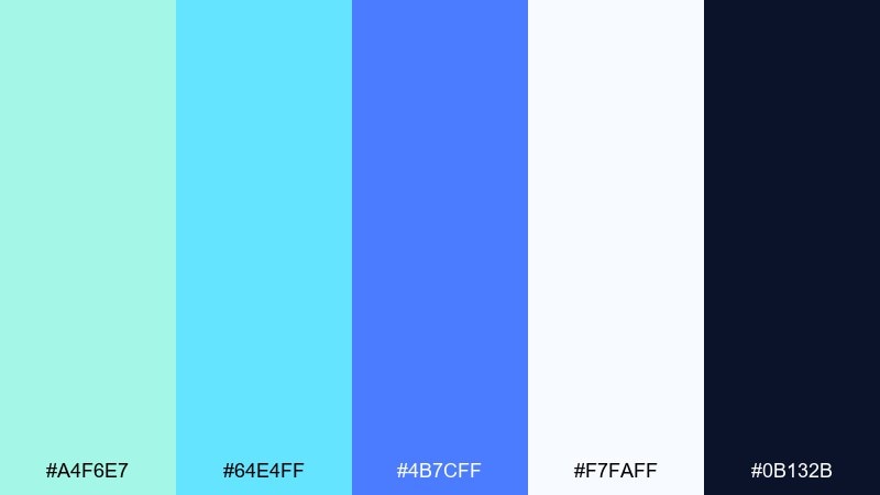
HEX: #a4f6e7 #64e4ff #4b7cff #f7faff #0b132b
Mood: futuristic, clean, energetic
Best for: app onboarding screens and hero gradients
Futuristic freshness comes through in a mint-to-blue flow that feels fast and optimistic. Use the deep navy for navigation and headings, then apply gradients for hero sections and onboarding illustrations. White-blue #f7faff keeps cards and input fields feeling light and modern. Tip: keep gradients subtle and consistent so the interface stays cohesive across screens.
Image example of fresh tech gradient generated using media.io
What Colors Go Well with Mint Blue?
Mint blue pairs naturally with crisp neutrals like white, off-white, and soft cool grays for a clean, modern look. For typography and structure, deep navy or charcoal is the most reliable companion because it preserves readability without killing the airy vibe.
For accents, try warm contrasts like coral, blush pink, peach, or butter yellow to add friendliness and energy. If you want a more nature-forward direction, combine mint blue with sage, eucalyptus greens, and muted teal for an organic palette.
For a creative or “dreamy” feel, mint blue also works well with lavender and periwinkle. The key is to keep one dominant neutral/background, then use mint as a soft surface color and reserve bold accents for focal points.
How to Use a Mint Blue Color Palette in Real Designs
Start with roles, not just colors: pick a light mint or near-white for backgrounds, a deeper teal/blue for UI actions, and a dark navy/charcoal for all text. This keeps your mint blue color scheme usable across screens, print, and different lighting conditions.
In branding, mint blue is strong as a “trust + freshness” signal—great for wellness, tech, and lifestyle. Use mint for large areas (packaging base, website sections) and keep saturation under control so your brand still looks premium.
In UI, rely on mint for subtle states (hover, selected, tags) and keep your primary CTA color consistent (teal, navy, or coral). Always test contrast for accessibility—mint backgrounds typically need dark text to pass readability checks.
Create Mint Blue Palette Visuals with AI
If you already have HEX codes, the fastest way to validate a mint blue palette is to generate a few realistic mockups—landing headers, packaging, posters, or UI cards. Seeing the colors in context helps you confirm contrast, hierarchy, and “vibe” in minutes.
With Media.io, you can turn prompts into clean concept visuals for social graphics, brand kits, and interface ideas—then iterate quickly by swapping just one accent color or background tint.
Use the palette prompts above as a starting point, then add details like “minimal,” “studio lighting,” “flat design,” or a specific aspect ratio to match your platform.
Mint Blue Color Palette FAQs
-
What is a mint blue color palette?
A mint blue color palette is a set of coordinated colors built around mint-leaning light blues/blue-greens, usually paired with neutrals (white, gray, charcoal) and one or two accent colors (like coral or lavender) for contrast and hierarchy. -
Is mint blue a warm or cool color?
Mint blue is typically cool because it sits in the blue/green family, but it can feel warmer or friendlier when paired with beige, peach, coral, or soft pink accents. -
What text color looks best on mint blue backgrounds?
Deep navy or charcoal usually works best for readability on mint blue backgrounds. For very pale mint tints, dark text like #111827, #1f3b44, or similar near-black shades keeps the design crisp. -
What accent colors go well with mint blue?
Coral, blush pink, peach, butter yellow, lavender, and deep teal are popular accents. Choose one accent as the “attention color” for CTAs or highlights and keep the rest supportive. -
Can mint blue work for professional branding?
Yes. Mint blue can look very professional when balanced with structured neutrals (white, cool gray) and a strong dark anchor (navy/charcoal). It’s widely used in tech, healthcare, skincare, and modern lifestyle brands. -
How do I keep a mint blue palette from looking too pastel?
Add a darker anchor color (navy/charcoal), reduce the number of light tints on one screen, and use mint as a background/support color rather than the only dominant hue. A single bold accent (coral or deep teal) also helps add maturity. -
How can I preview mint blue color combinations before designing?
Generate quick mockups (web headers, posters, packaging, UI screens) using AI, then compare how the palette behaves in different lighting and layouts. This is an efficient way to test contrast and brand mood before committing.
Next: White Pink Color Palette


