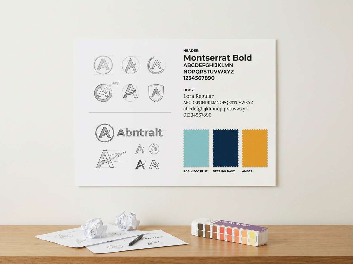
Robins egg blue is a crisp blue-green that reads clean, optimistic, and coastal. It’s a favorite for brands and interfaces that want to feel fresh without looking icy.
Below are robins egg blue color palette ideas with HEX codes, plus practical tips for pairing, contrast, and real-world use in branding, UI, and decor.
In this article
- Why Robins Egg Blue Palettes Work So Well
-
- seaside glass
- minted linen
- crystal pop
- powdered sky
- vintage bathhouse
- citrus tonic
- pearl harbor mist
- blush lagoon
- workshop fresh
- botanical breeze
- arctic lemonade
- ceramic studio
- neon calm
- cloud kitchen
- quiet nursery
- modern apothecary
- retro diner pop
- boardwalk neutral
- tropical postcard
- oceanic branding
- ice cream parlor
- blueprint coast
- What Colors Go Well with Robins Egg Blue?
- How to Use a Robins Egg Blue Color Palette in Real Designs
- Create Robins Egg Blue Palette Visuals with AI
Why Robins Egg Blue Palettes Work So Well
Robins egg blue sits between teal and cyan, so it feels both calming and energetic. That balance makes it versatile: it can look airy and spa-like with soft neutrals, or bold and modern when paired with dark charcoal and bright accents.
It also performs well in digital design because it’s naturally “highlight-ready.” Used for buttons, active states, chart lines, or icons, it draws attention without the harshness of fully saturated neon colors.
Finally, robins egg blue is easy to theme across seasons and industries. Swap in warm corals, ambers, and peaches for a sunny vibe, or lean into steel blues and deep navies for a professional, corporate-friendly palette.
20+ Robins Egg Blue Color Palette Ideas (with HEX Codes)
1) Seaside Glass
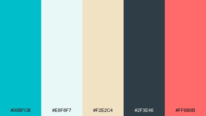
HEX: #00BFCB #E8F8F7 #F2E2C4 #2F3E46 #FF6B6B
Mood: breezy and coastal
Best for: travel branding and hero banners
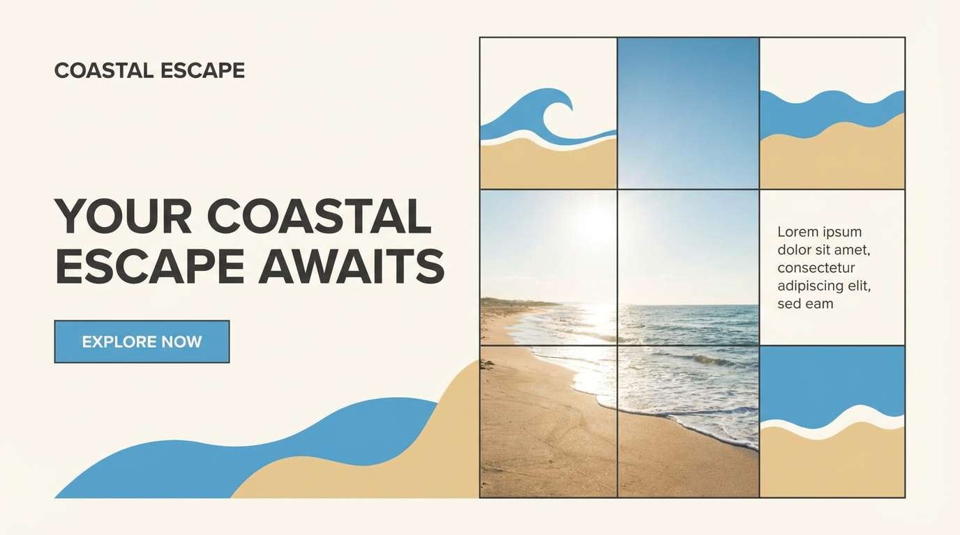
Breezy and coastal, like sunlit sea glass on warm sand. Use the robin-egg tone as the main backdrop, then anchor layouts with deep slate for readability. Coral works best as a small call-to-action accent so it feels fresh, not loud. For a polished look, keep plenty of white space and let the beige act as a soft buffer between cool and warm.
Image example of seaside glass generated using media.io
Media.io is an online AI studio for creating and editing video, image, and audio in your browser.

2) Minted Linen
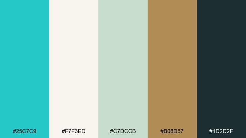
HEX: #25C7C9 #F7F3ED #C7DCCB #B08D57 #1D2D2F
Mood: clean and organic
Best for: skincare packaging and labels
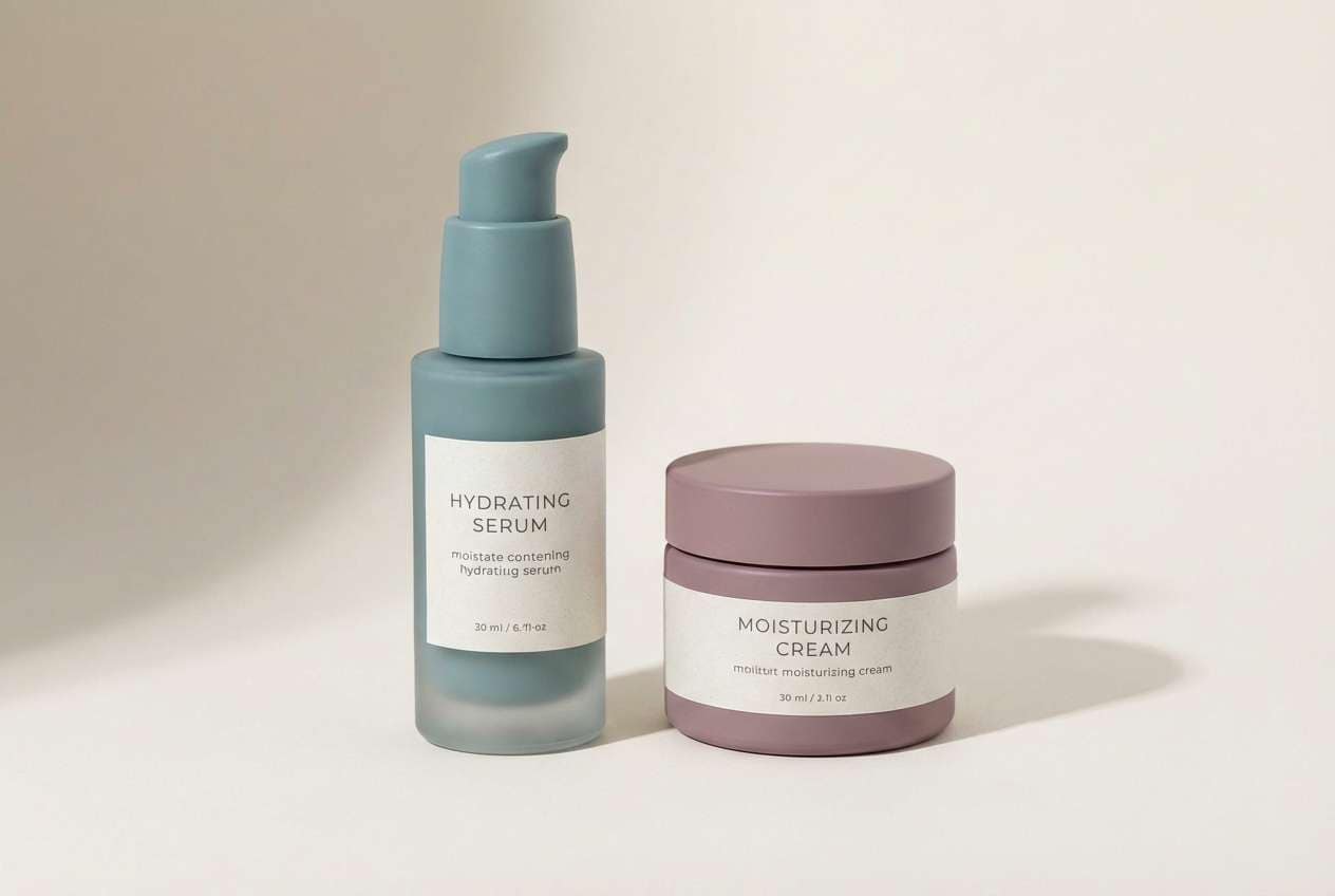
Clean and organic, like folded linen beside fresh herbs. Pair the cool blue-green with off-white and sage to keep the palette calm and trustworthy. Brass-brown adds a premium touch for caps, borders, or ingredient callouts. Tip: print the darkest tone for body text and reserve the robin hue for brand marks and highlight bands.
Image example of minted linen generated using media.io
3) Crystal Pop
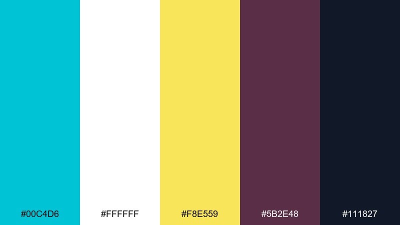
HEX: #00C4D6 #FFFFFF #F8E559 #5B2E48 #111827
Mood: playful and high-contrast
Best for: app landing pages and CTA sections
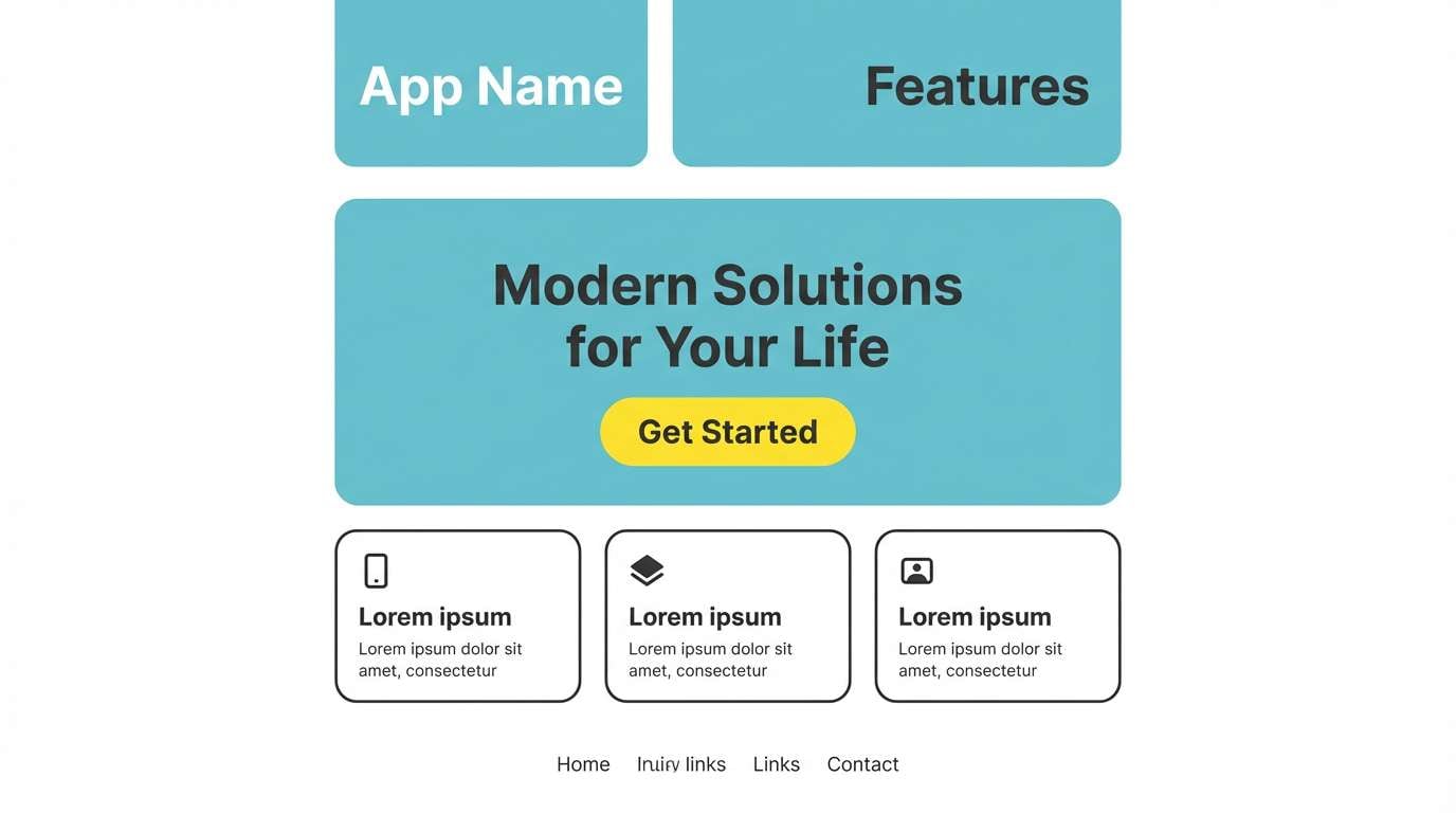
Playful and high-contrast, like a splash of soda against bright sunshine. The crisp cyan reads best on white with charcoal for type and structure. Lemon yellow is ideal for buttons, badges, and micro-interactions where you want instant attention. Keep the plum tone for secondary elements so the page stays energetic but organized.
Image example of crystal pop generated using media.io
4) Powdered Sky
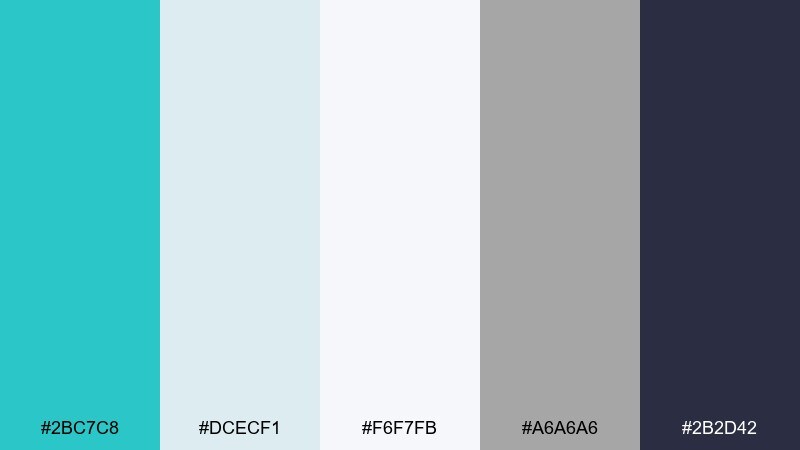
HEX: #2BC7C8 #DCECF1 #F6F7FB #A6A6A6 #2B2D42
Mood: soft and airy
Best for: SaaS dashboards and data UI
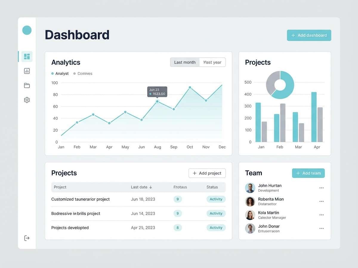
Soft and airy, like thin clouds over a pale horizon. Use the cool blue as a highlight color for active states, charts, and toggles. Light grays keep panels and tables calm while still separating content. Tip: set the darkest tone for headings and numbers to maintain contrast on large white surfaces.
Image example of powdered sky generated using media.io
5) Vintage Bathhouse
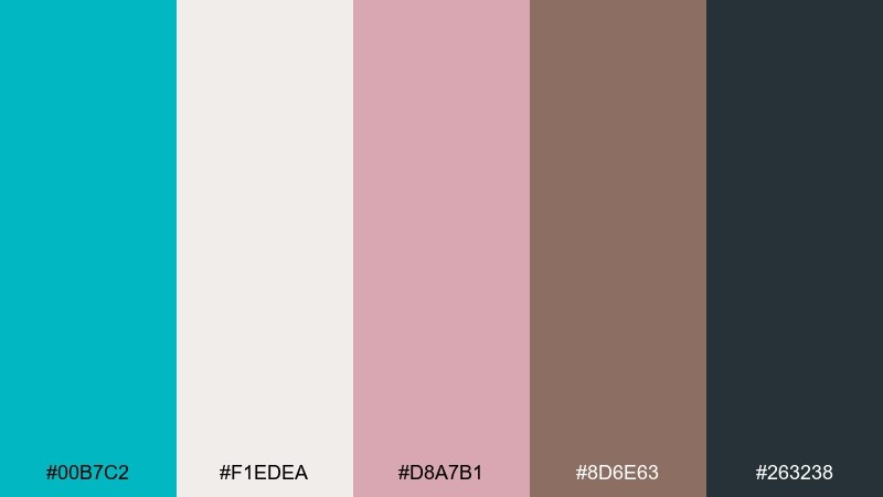
HEX: #00B7C2 #F1EDEA #D8A7B1 #8D6E63 #263238
Mood: nostalgic and comforting
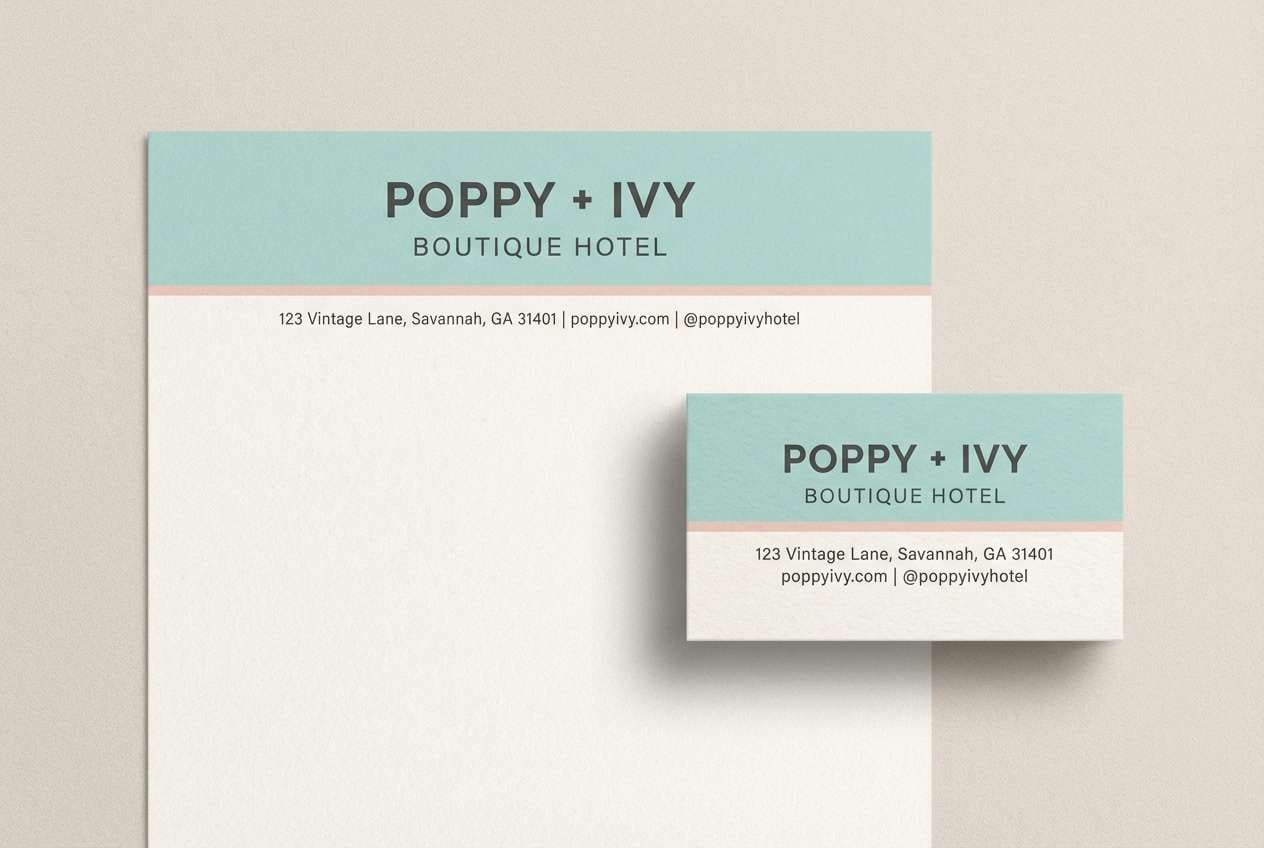
Best for: boutique hotel identity and stationery
Nostalgic and comforting, like tiled bathhouses and soft cotton robes. The cool aqua feels inviting when balanced with blush and warm taupe. Use charcoal for typography and monograms so prints stay crisp. A good trick is to keep blush as a small accent on seals or sidebars to avoid a too-sweet look.
Image example of vintage bathhouse generated using media.io
6) Citrus Tonic
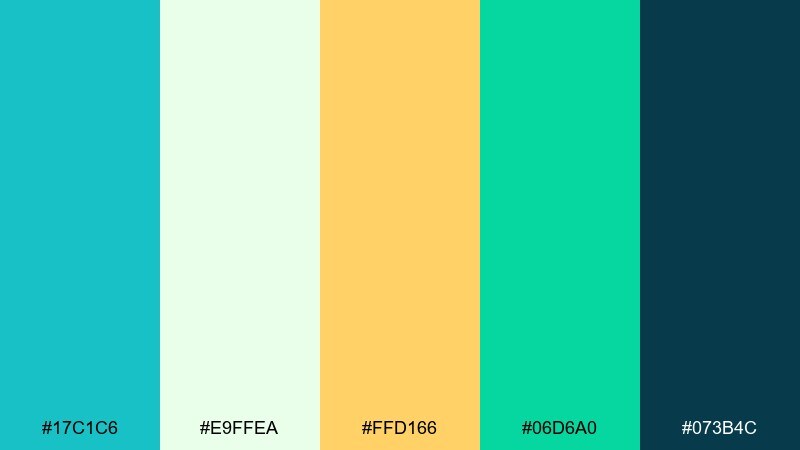
HEX: #17C1C6 #E9FFEA #FFD166 #06D6A0 #073B4C
Mood: zesty and upbeat
Best for: fitness social ads and promos
Zesty and upbeat, like a sparkling drink with a lime twist. These tones make a robins egg blue color palette that feels energetic without going neon. Use navy for bold headlines, then let citrus and mint carry icons, badges, and price points. Tip: keep the warm yellow to one focal element per layout for clean, punchy hierarchy.
Image example of citrus tonic generated using media.io

7) Pearl Harbor Mist
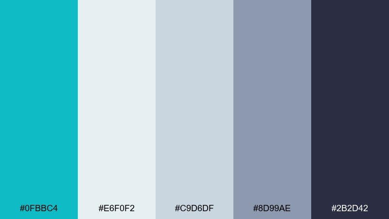
HEX: #0FBBC4 #E6F0F2 #C9D6DF #8D99AE #2B2D42
Mood: calm and professional
Best for: corporate presentations and reports
Calm and professional, like morning fog over a quiet waterfront. The cool aqua brings clarity to charts and section dividers, while steel blues keep the tone serious. Use the lightest shades for spacious slides and the darkest navy for titles and key figures. Tip: reserve the aqua for data highlights so audiences instantly read what matters.
Image example of pearl harbor mist generated using media.io
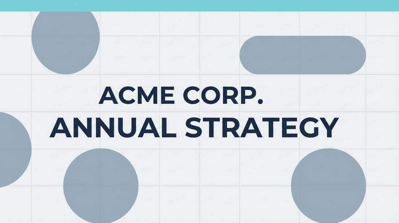
8) Blush Lagoon
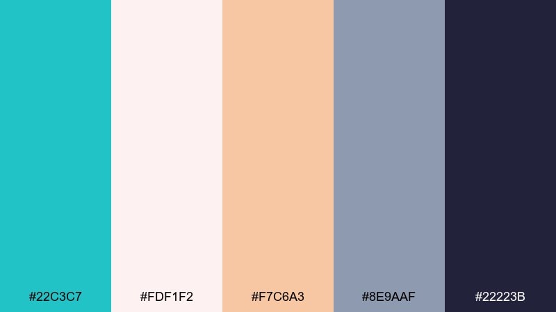
HEX: #22C3C7 #FDF1F2 #F7C6A3 #8E9AAF #22223B
Mood: romantic and modern
Best for: wedding invitations and save the dates
Romantic and modern, like a pastel sunset reflecting on still water. The soft pink and peach warm up the cool lagoon tone without feeling overly sweet. Use the deep indigo for names and details to keep printing sharp and legible. Tip: set the robin hue as a thin border or envelope liner for an elegant reveal.
Image example of blush lagoon generated using media.io
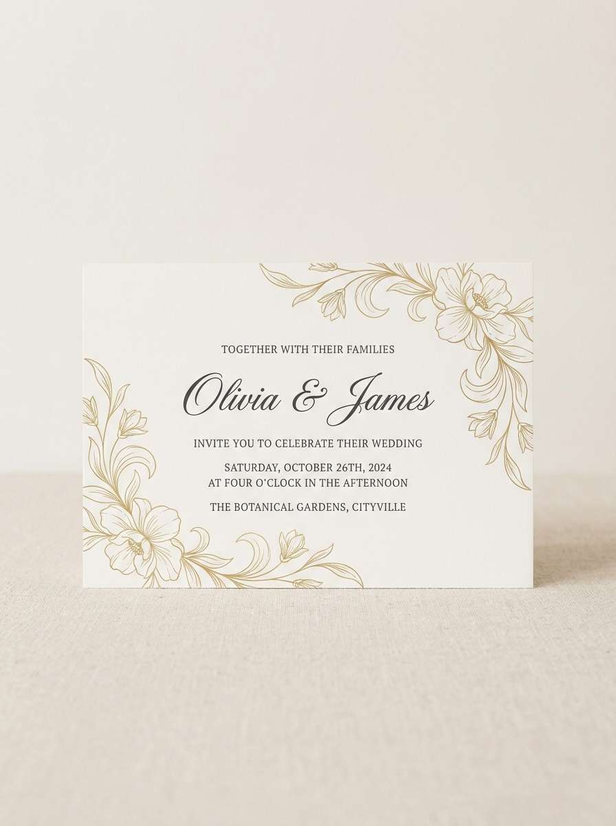
9) Workshop Fresh
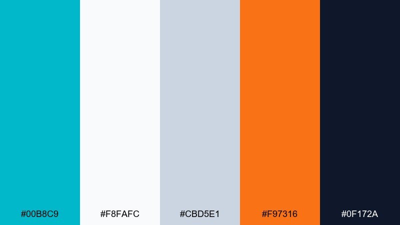
HEX: #00B8C9 #F8FAFC #CBD5E1 #F97316 #0F172A
Mood: practical and upbeat
Best for: startup pitch decks and diagrams
Practical and upbeat, like a tidy studio with bright tools on the wall. The cool blue-green keeps slides modern, while orange adds an action-ready accent for milestones and highlights. Use slate neutrals for grids, icons, and supporting labels. For strong visual flow, repeat the orange only on key moments so the story reads in seconds.
Image example of workshop fresh generated using media.io
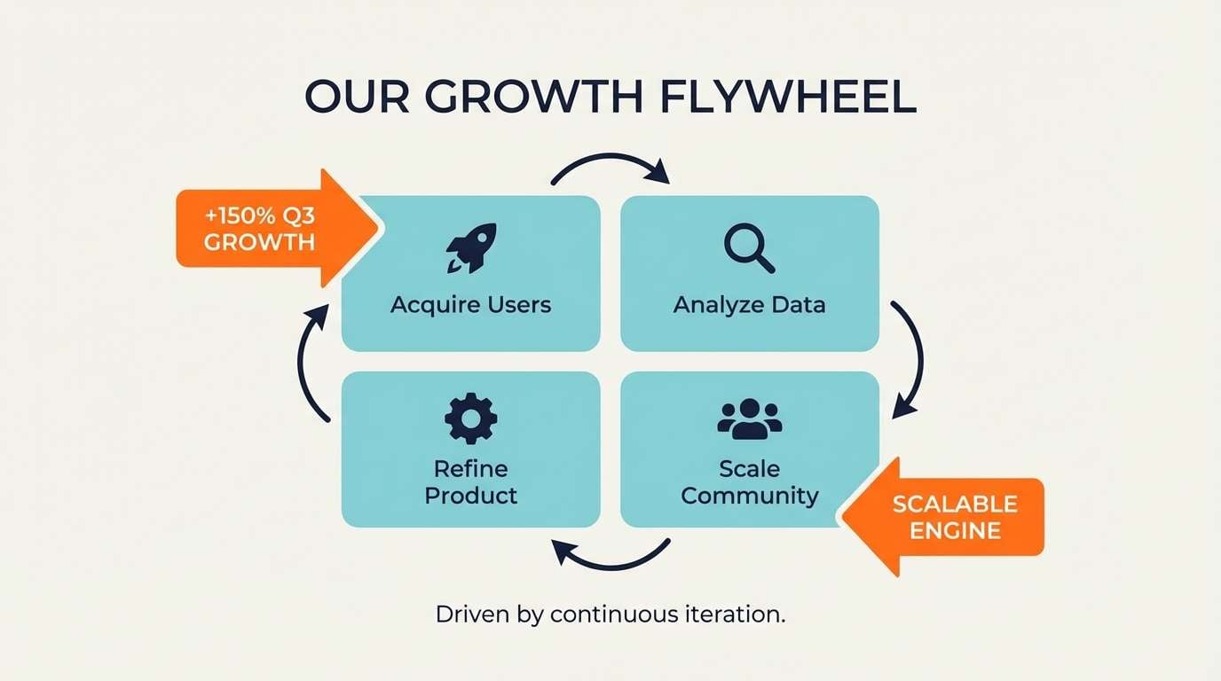
10) Botanical Breeze
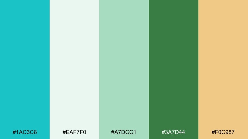
HEX: #1AC3C6 #EAF7F0 #A7DCC1 #3A7D44 #F0C987
Mood: fresh and garden-like
Best for: spring illustrations and event flyers
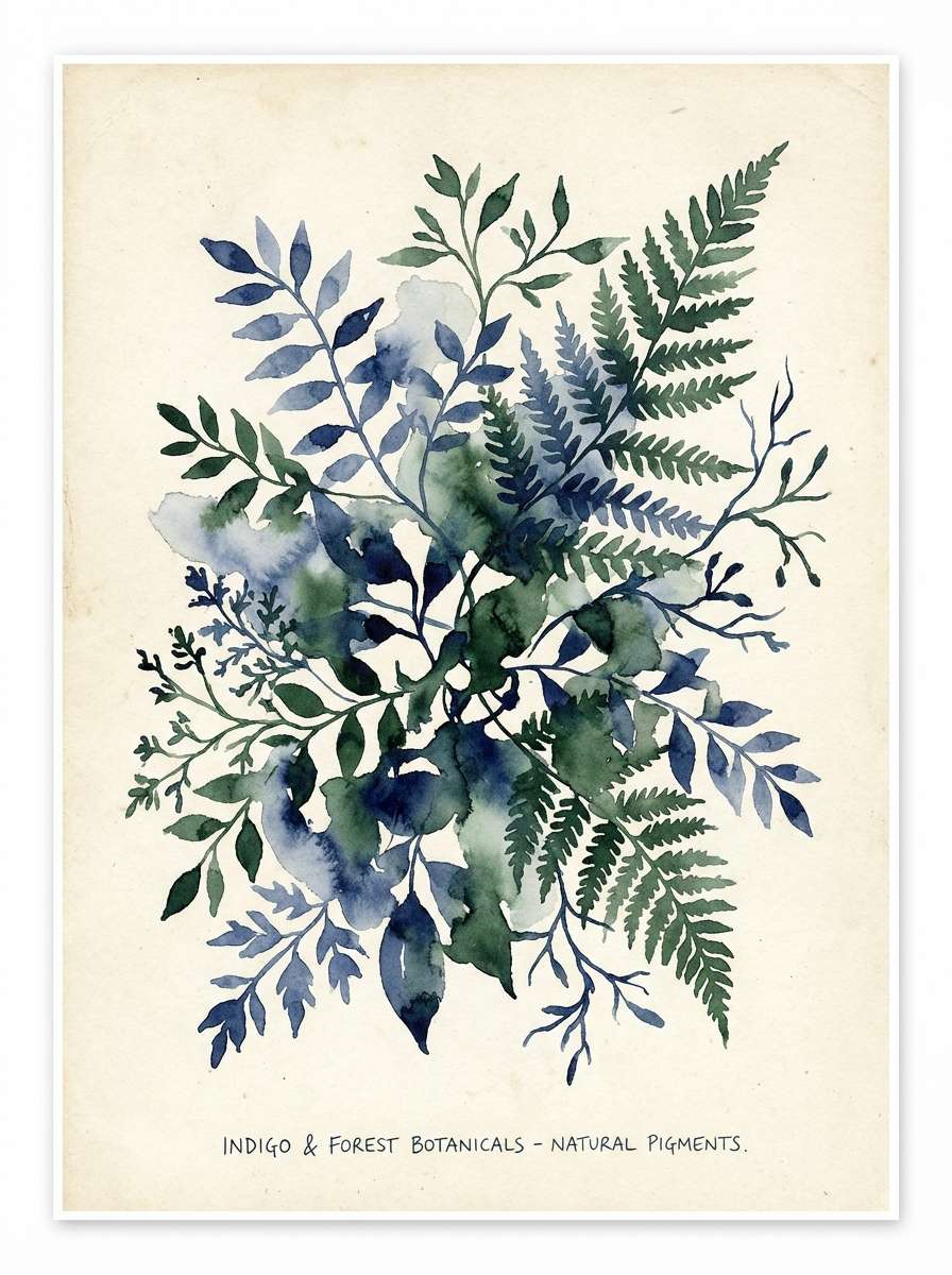
Fresh and garden-like, like new leaves after a light rain. These robins egg blue color combinations shine when you blend them with leafy greens and soft cream tints. Use the darker green for titles or borders to ground the airy teal. Tip: keep gradients subtle so watercolor textures stay natural rather than glossy.
Image example of botanical breeze generated using media.io
11) Arctic Lemonade
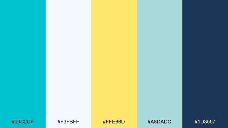
HEX: #00C2CF #F3FBFF #FFE66D #A8DADC #1D3557
Mood: bright and refreshing
Best for: email headers and promo banners
Bright and refreshing, like icy lemonade in a tall glass. The pale tints give plenty of breathing room, while the yellow is perfect for limited-time badges. Deep blue keeps text readable and adds a trustworthy edge. Tip: use the yellow sparingly and repeat the robin tone across buttons for consistent clicks.
Image example of arctic lemonade generated using media.io

12) Ceramic Studio
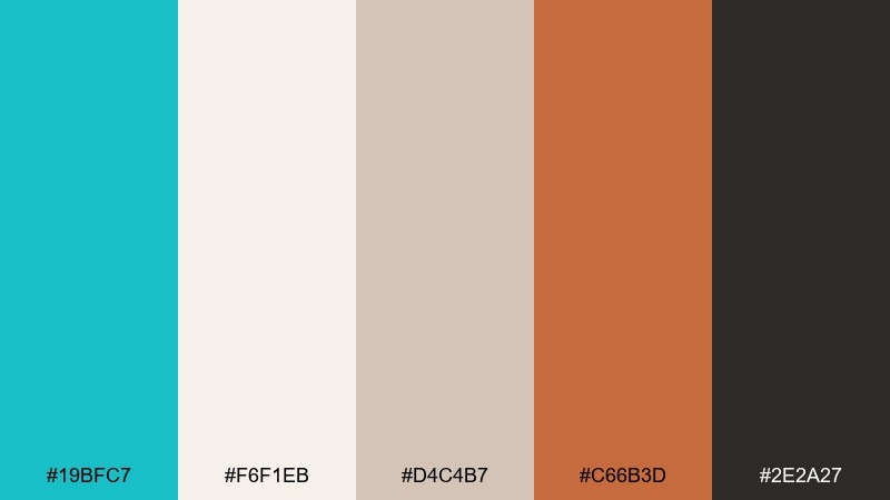
HEX: #19BFC7 #F6F1EB #D4C4B7 #C66B3D #2E2A27
Mood: earthy and crafted
Best for: artisan product branding and tags
Earthy and crafted, like glazed ceramics on a wooden workbench. The robin tone keeps the look contemporary, while clay and sand shades add handmade warmth. Use the deep brown-black for logos and small type so labels stay legible. Tip: pair the palette with textured paper stocks to reinforce the artisanal feel.
Image example of ceramic studio generated using media.io

13) Neon Calm
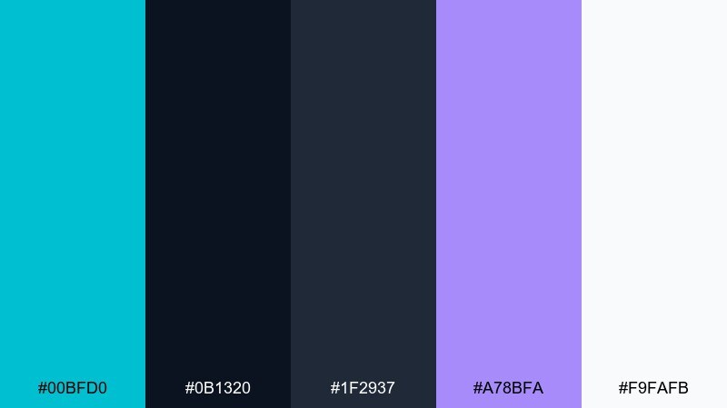
HEX: #00BFD0 #0B1320 #1F2937 #A78BFA #F9FAFB
Mood: sleek and techy
Best for: dark mode UI themes
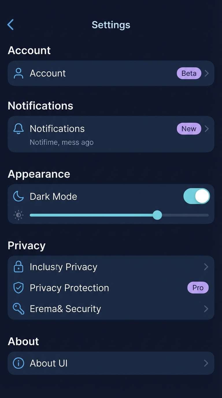
Sleek and techy, like city lights reflected on wet pavement. The robin hue pops beautifully on near-black surfaces for active states, links, and key icons. Lavender adds a softer secondary accent that still feels modern. Tip: keep most panels in deep gray so the teal highlight stays special and easy to scan.
Image example of neon calm generated using media.io
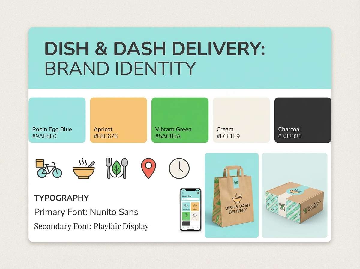
14) Cloud Kitchen
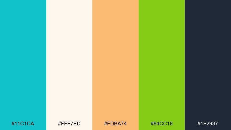
HEX: #11C1CA #FFF7ED #FDBA74 #84CC16 #1F2937
Mood: friendly and appetizing
Best for: food delivery brand kits
Friendly and appetizing, like a bright café menu with fresh garnish. Warm apricot and lively green keep the cool blue from feeling too sterile. Use charcoal for text and navigation so the brand system stays readable across screens and print. Tip: let apricot own the primary button and keep the robin tone for headers and icons.
Image example of cloud kitchen generated using media.io
15) Quiet Nursery
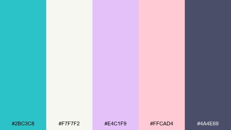
HEX: #2BC3C8 #F7F7F2 #E4C1F9 #FFCAD4 #4A4E69
Mood: gentle and soothing
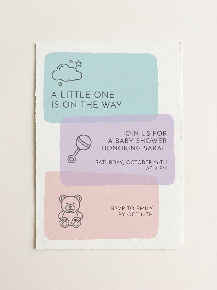
Best for: baby shower invites and nursery decor
Gentle and soothing, like soft blankets in a sunlit room. The cool robin tone pairs beautifully with powdery lavender and blush for a calm, comforting vibe. Use the muted navy for names, dates, and small details so everything stays clear. Tip: keep the pastels in large blocks and avoid heavy outlines for the softest finish.
Image example of quiet nursery generated using media.io
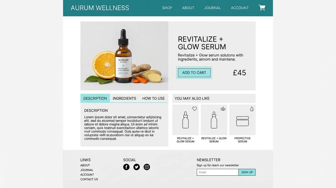
16) Modern Apothecary
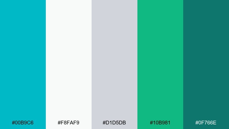
HEX: #00B9C6 #F8FAF9 #D1D5DB #10B981 #0F766E
Mood: fresh and clinical
Best for: wellness websites and product pages
Fresh and clinical, like a clean counter with labeled bottles and herbs. The teal family stays cohesive while the cool grays keep the interface crisp. Use the deeper green-teal for navigation and footers to add stability without going heavy. Tip: stick to simple line icons so the color hierarchy carries the visual interest.
Image example of modern apothecary generated using media.io
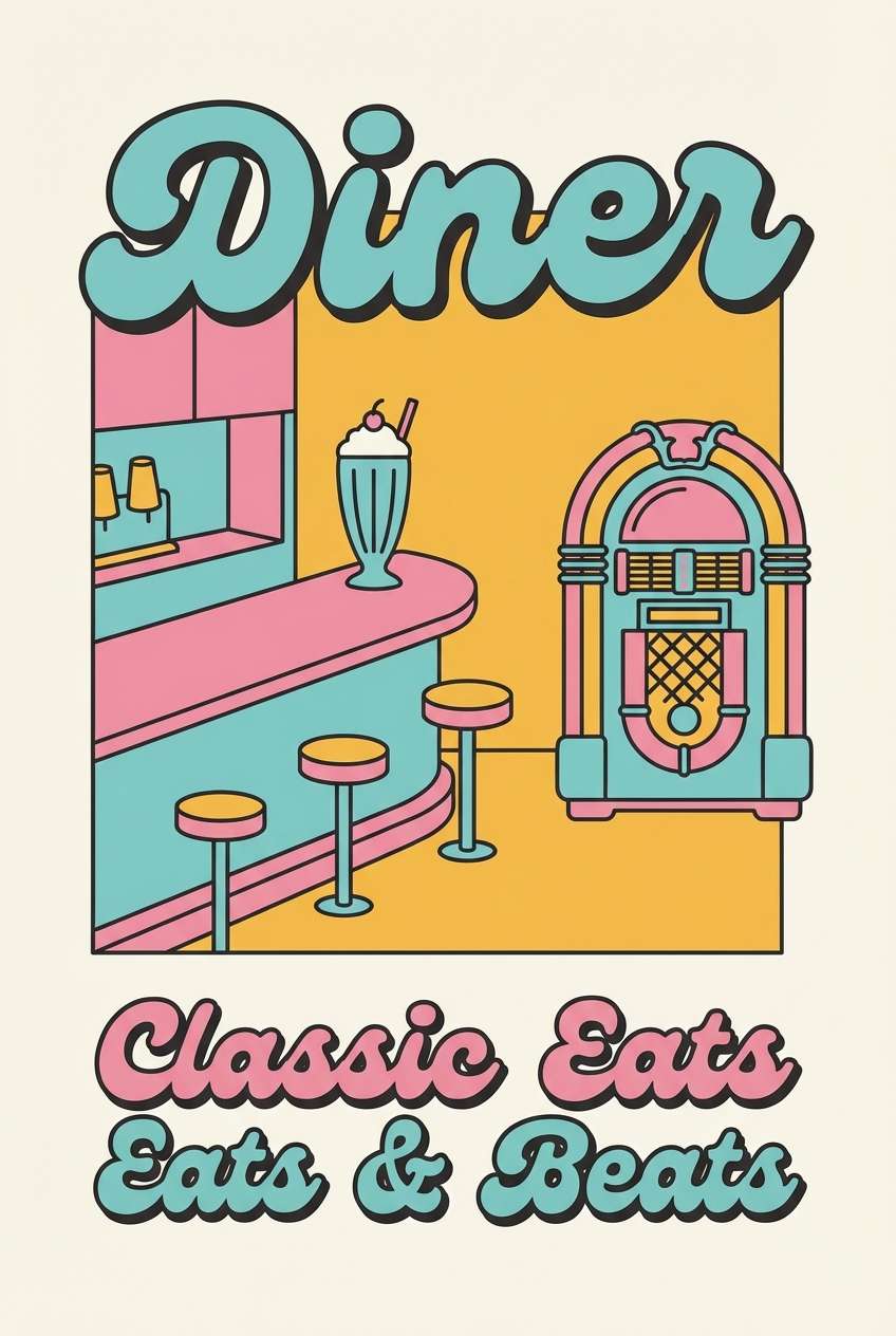
17) Retro Diner Pop
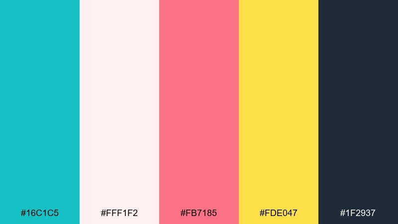
HEX: #16C1C5 #FFF1F2 #FB7185 #FDE047 #1F2937
Mood: cheerful and nostalgic
Best for: poster designs and merch graphics
Cheerful and nostalgic, like a classic diner sign glowing at dusk. Pink and yellow bring playful energy, while the cool robin tone keeps the mix modern. Use charcoal for outlines and lettering so shapes stay bold and readable from a distance. Tip: limit the palette to flat fills and simple shadows for that screen-printed feel.
Image example of retro diner pop generated using media.io
18) Boardwalk Neutral
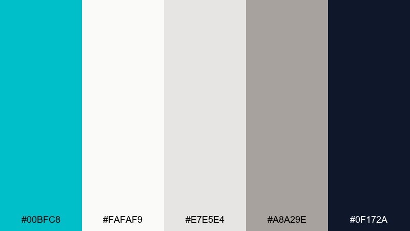
HEX: #00BFC8 #FAFAF9 #E7E5E4 #A8A29E #0F172A
Mood: minimal and timeless
Best for: editorial layouts and portfolios
Minimal and timeless, like sun-bleached boardwalk planks and clean white sails. The neutrals let the robin accent feel intentional rather than decorative. Use the darkest navy for headlines and captions to keep long reads comfortable. Tip: add small robin details like rules, bullets, or pull-quote marks to guide the eye.
Image example of boardwalk neutral generated using media.io
19) Tropical Postcard
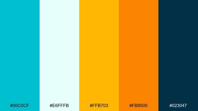
HEX: #00C0CF #E6FFFB #FFB703 #FB8500 #023047
Mood: sunny and travel-ready
Best for: tour posters and destination ads
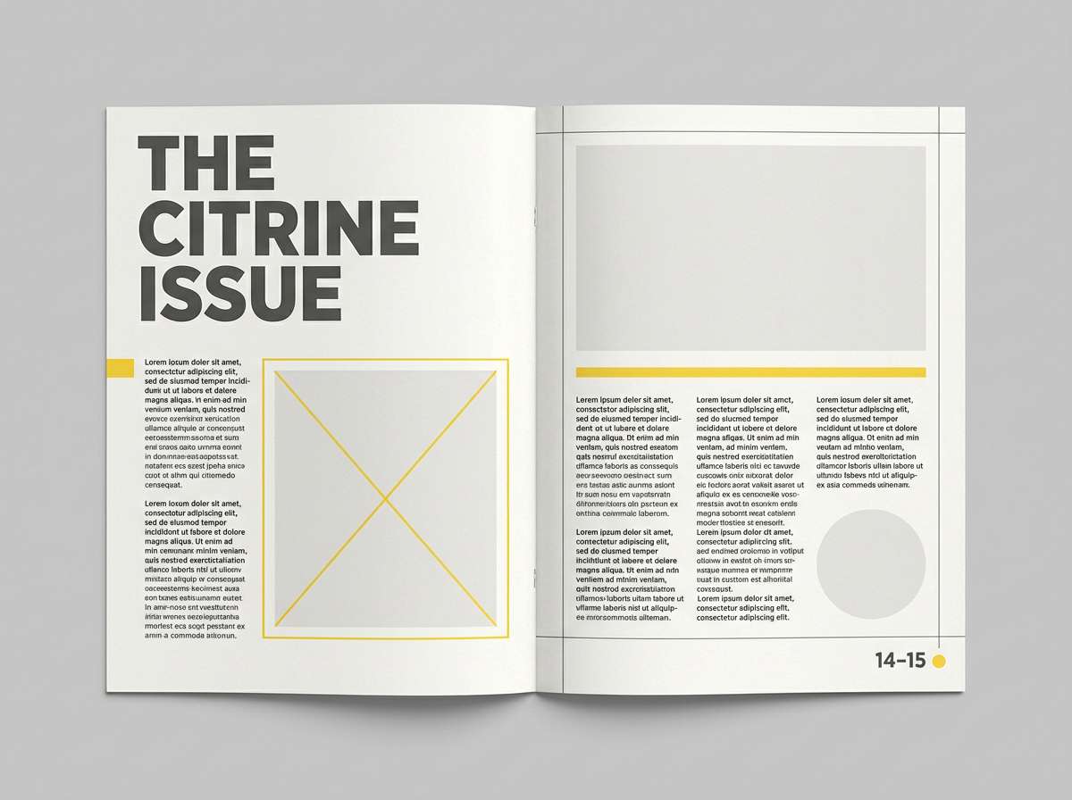
Sunny and travel-ready, like a postcard stamped with sea spray and citrus. Make the teal the base tone, then layer warm oranges for energy and appetite appeal. Deep blue works as a strong text color that still feels coastal. Tip: keep the warm accents in gradients or small shapes so the design stays airy.
Image example of tropical postcard generated using media.io
20) Oceanic Branding
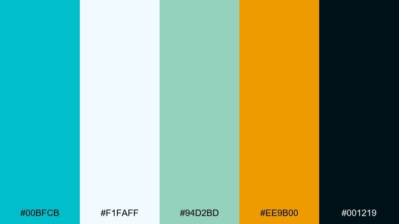
HEX: #00BFCB #F1FAFF #94D2BD #EE9B00 #001219
Mood: confident and refined
Best for: brand identity systems and logos
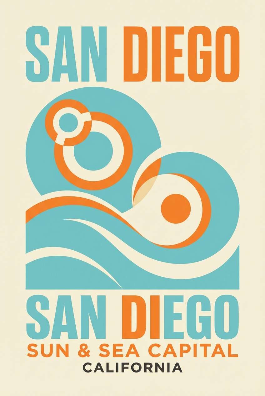
Confident and refined, like deep water framed by a bright horizon line. The dark inky tone gives the palette authority, while the robin hue adds approachability. These robins egg blue color combinations work especially well for tech, marine, and sustainability brands. Tip: use the warm amber for a single signature element such as a logo mark dot or icon highlight.
Image example of oceanic branding generated using media.io
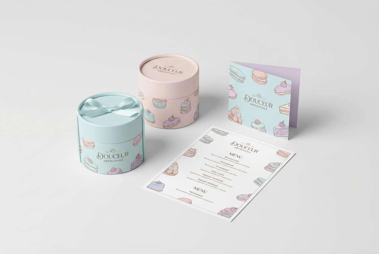
21) Ice Cream Parlor
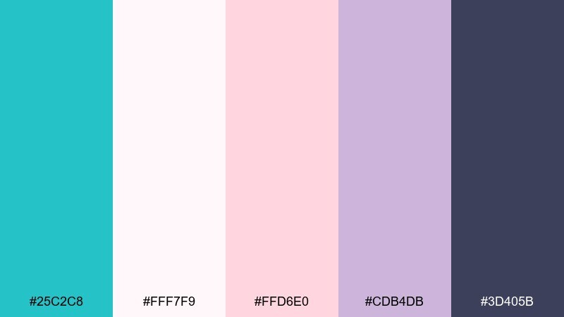
HEX: #25C2C8 #FFF7F9 #FFD6E0 #CDB4DB #3D405B
Mood: sweet and light
Best for: bakery menus and dessert packaging
Sweet and light, like scoops in a pastel parlor display. The robin accent keeps the pinks from feeling too sugary and helps the layout stay modern. Use the deep slate for prices and item names to maintain legibility. Tip: put the softest pink as a background wash and keep the teal for badges or flavor highlights.
Image example of ice cream parlor generated using media.io
22) Blueprint Coast
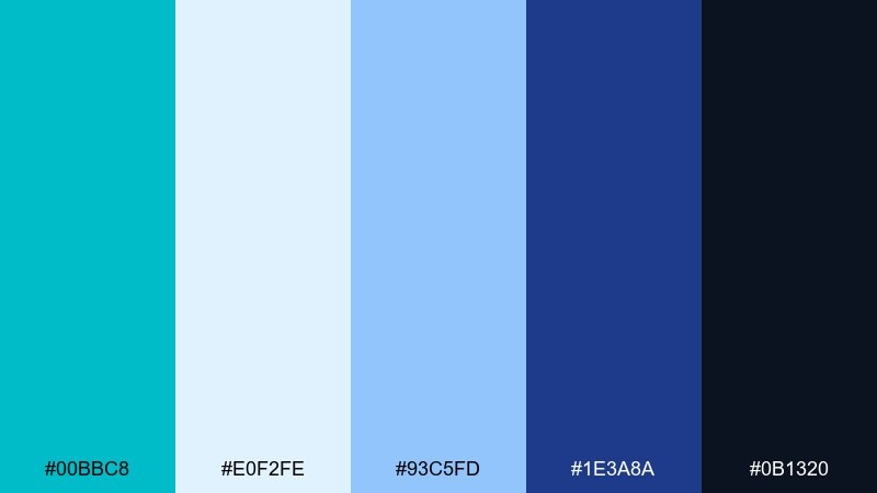
HEX: #00BBC8 #E0F2FE #93C5FD #1E3A8A #0B1320
Mood: structured and modern
Best for: infographics and product explainers
Structured and modern, like crisp blueprint lines drawn over ocean tones. Use the robin shade for callouts and key steps, then layer blues for depth and hierarchy. Dark navy keeps labels sharp and professional on light backgrounds. Tip: stick to consistent line weights so the color contrast does the heavy lifting.
Image example of blueprint coast generated using media.io

What Colors Go Well with Robins Egg Blue?
Robins egg blue pairs naturally with crisp whites, off-whites, and cool light grays, which keep layouts open and contemporary. For contrast that still feels clean, use deep navy or charcoal for typography and key UI structure.
To warm it up, add peach, coral, amber, or apricot in small doses (buttons, badges, highlights). If you want a more organic look, combine it with sage, mint, and forest greens, plus sand or linen neutrals to prevent the palette from feeling too “aqua-only.”
For a playful, modern edge, try pairing it with lemon yellow or soft lavender as secondary accents. The key is hierarchy: keep robins egg blue as the main identity color, then choose one warm or one vivid accent to avoid visual noise.
How to Use a Robins Egg Blue Color Palette in Real Designs
In branding, robins egg blue works best when it has a strong supporting neutral. Use dark navy/charcoal for logos, headlines, and long text, while reserving the robin tone for brand marks, section headers, and signature shapes.
In UI design, treat it as a “state color”: links, toggles, progress indicators, focus rings, and chart highlights. If you’re using it for large surfaces (headers or backgrounds), soften the rest of the interface with off-white panels and light dividers so the screen stays readable.
In decor, balance its coolness with warm natural materials (beige textiles, wood tones, brass hardware). For a polished room, repeat the color in small touches—vases, art, cushions—rather than painting every surface the same teal-blue.
Create Robins Egg Blue Palette Visuals with AI
If you want to preview how a robins egg blue color scheme looks in a real layout, generate quick mockups before committing to design work. This is especially useful for testing contrast, accent strength, and how the palette feels in different styles (minimal, playful, vintage, or corporate).
With Media.io’s text-to-image tool, you can turn a palette concept into hero banners, UI screens, posters, packaging scenes, or brand boards in minutes. Start from one of the prompts above, then swap keywords like “minimal,” “watercolor,” or “dark mode” to match your project.
Once you like the direction, keep the robins egg blue as your consistent brand anchor and standardize how you use the accent colors (CTA, highlights, or supporting backgrounds) for a cohesive system.
Robins Egg Blue Color Palette FAQs
-
What is the HEX code for robins egg blue?
There isn’t one single official HEX for “robins egg blue,” but common digital picks sit around #00BFCB to #2BC7C8. In this article, each palette lists five specific HEX codes so you can choose the exact tone that fits your project. -
Is robins egg blue more blue or green?
Robins egg blue is a blue-green (often described as a light teal). It leans bluer than many mints, but greener than sky cyan, which is why it reads both fresh and calming. -
What colors complement robins egg blue best?
For a classic complement, pair it with warm accents like coral, peach, or amber. For a modern, clean look, use white/off-white with charcoal or deep navy for contrast and legibility. -
What’s a good text color on a robins egg blue background?
Deep navy or charcoal usually provides the best readability (for example #0F172A, #111827, or #2B2D42). For accessibility, test contrast—robins egg blue can be bright, so pure white text isn’t always the most readable choice. -
Can I use robins egg blue in a corporate brand?
Yes. Use it as a highlight color for charts, dividers, or key callouts, and anchor the system with steel blues, cool grays, and a dark navy. This keeps the tone professional while still feeling modern and approachable. -
How do I keep a robins egg blue palette from feeling too “beachy”?
Reduce the warm sand/coral accents and lean into structured neutrals: cool grays, layered blues, and deep navy. Use robins egg blue sparingly for interactive states or key highlights rather than large decorative blocks. -
How can I visualize a robins egg blue color scheme quickly?
Use an AI mockup generator to create a banner, UI screen, poster, or packaging scene from a short prompt. It’s a fast way to test whether the palette feels airy, premium, playful, or professional before you design final assets.


