

A green yellow blue color palette is a go-to mix when you want your design to feel fresh, optimistic, and instantly noticeable. Green signals nature and balance, yellow adds warmth and energy, and blue brings trust and structure.
Below you’ll find 20+ green yellow blue palette ideas with HEX codes—each one includes a practical use case and an AI image prompt you can reuse for branding, UI, posters, packaging, and more.
In this article
Why Green Yellow Blue Palettes Work So Well
Green, yellow, and blue naturally cover a wide emotional range: grounded (green), joyful (yellow), and dependable (blue). That balance makes the palette flexible across industries—from wellness and education to tech and sports.
These hues also create clear hierarchy in layouts. Blue typically reads as stable and “primary,” yellow pulls attention for highlights, and green supports secondary actions or supportive messaging without feeling aggressive.
Most green yellow blue combinations stay readable when you assign roles thoughtfully: use deep blues/charcoals for text, reserve bright yellows for accents, and let greens carry backgrounds, sections, or success states.
20+ Green Yellow Blue Color Palette Ideas (with HEX Codes)
1) Lime Lagoon
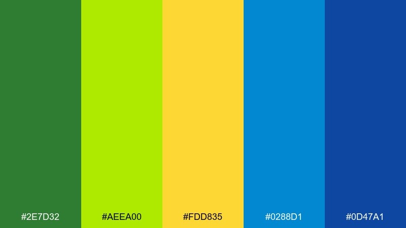
HEX: #2e7d32 #aeea00 #fdd835 #0288d1 #0d47a1
Mood: fresh, coastal, energetic
Best for: travel branding and hero banners
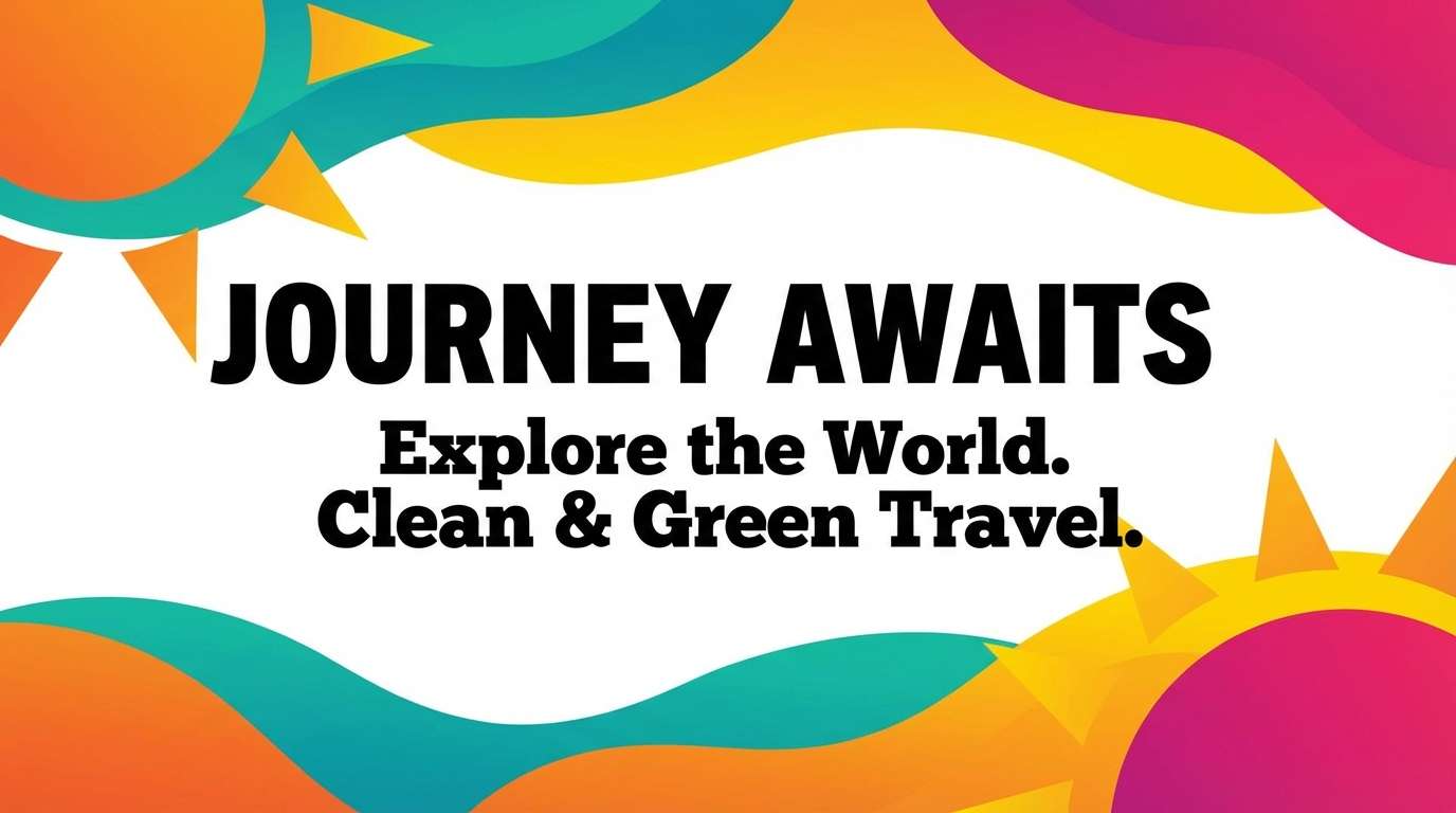
Fresh, coastal energy with a lime pop and lagoon blues that feel like sun on water. It shines in travel branding, summer promos, and landing page heroes where you want instant momentum. Pair it with clean white space and light gray type to keep the yellows crisp. Usage tip: reserve the deepest blue for headings and CTAs so the bright accents never overpower readability.
Image example of lime lagoon generated using media.io
Media.io is an online AI studio for creating and editing video, image, and audio in your browser.

2) Citrus Surf
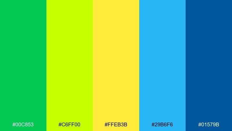
HEX: #00c853 #c6ff00 #ffeb3b #29b6f6 #01579b
Mood: playful, sunny, sporty
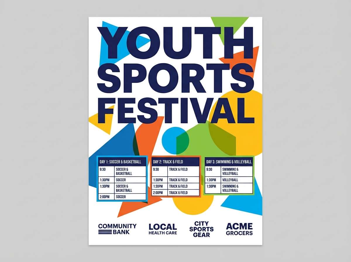
Best for: sports event posters
Playful sunshine and surfy blues give this mix a fast, sporty vibe. It works great for race posters, outdoor events, and energetic social graphics where bold color blocks lead the eye. Balance it with a dark navy footer or border so the neon notes feel intentional. Usage tip: keep type mostly in deep blue or near-black, and use yellow only for highlights and icons.
Image example of citrus surf generated using media.io
3) Meadow Sky
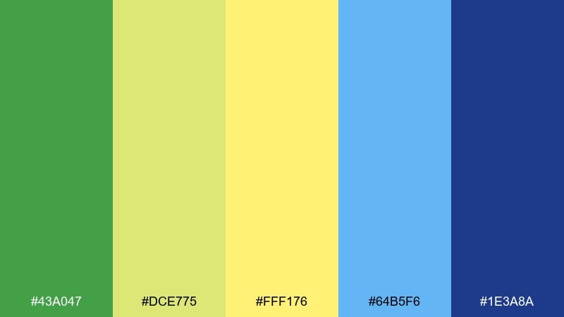
HEX: #43a047 #dce775 #fff176 #64b5f6 #1e3a8a
Mood: calm, airy, optimistic
Best for: wellness blog headers
Calm meadow greens and airy sky blues feel light, optimistic, and easy to read. Use it for wellness articles, mindful newsletters, and friendly brand headers that need warmth without shouting. Pair with soft cream backgrounds and rounded typography to keep the mood gentle. Usage tip: let the pale yellow act as a subtle highlight behind key phrases rather than a full fill color.
Image example of meadow sky generated using media.io
4) Tropical Trail
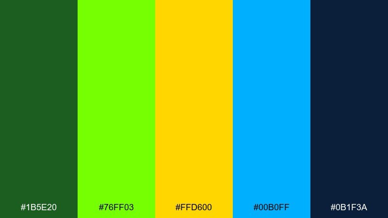
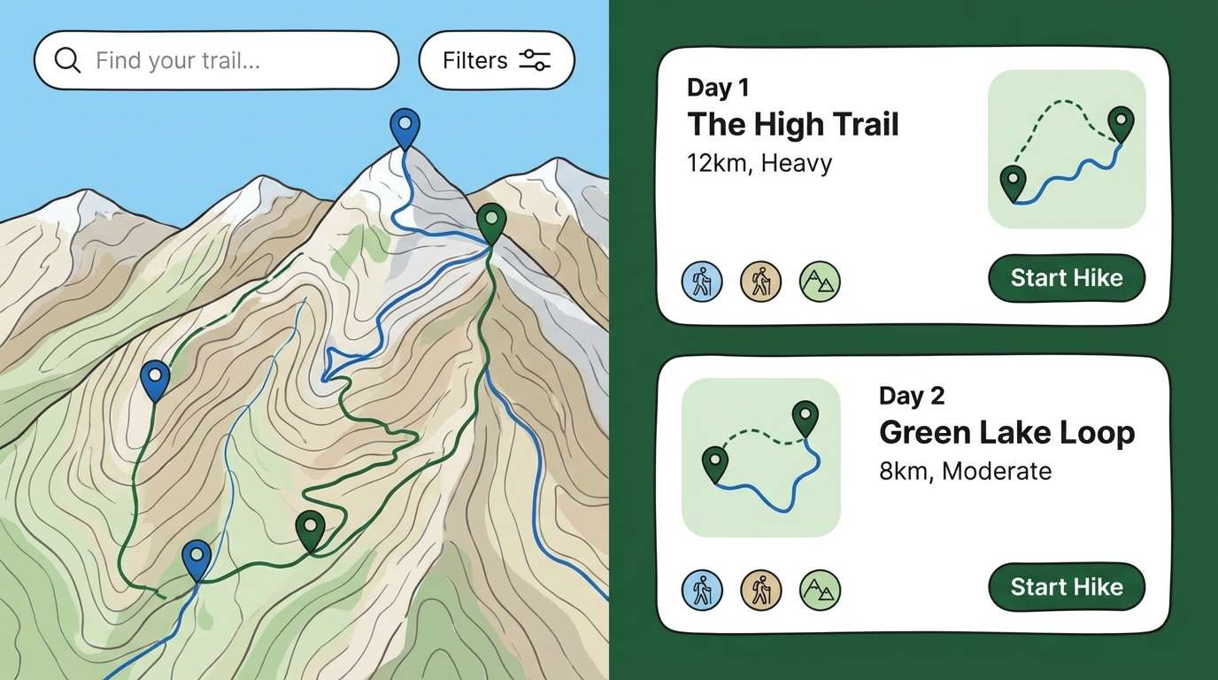
HEX: #1b5e20 #76ff03 #ffd600 #00b0ff #0b1f3a
Mood: adventurous, vibrant, outdoorsy
Best for: hiking app UI
Adventurous and vibrant, it evokes jungle trails, trail markers, and bright open skies. For an active product feel, this green yellow blue color palette fits hiking apps, map screens, and gear promos where clarity matters. Pair it with charcoal UI surfaces and plenty of spacing to keep neon accents under control. Usage tip: use yellow sparingly for alerts and progress states, and lean on blue for primary navigation.
Image example of tropical trail generated using media.io
5) Solar Marina
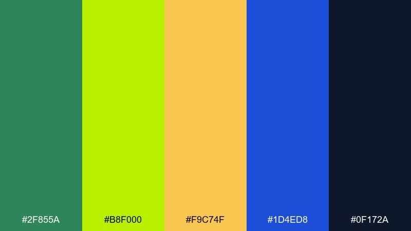
HEX: #2f855a #b8f000 #f9c74f #1d4ed8 #0f172a
Mood: bright, modern, confident
Best for: tech startup branding
Bright solar accents against marina blues make the whole set feel modern and confident. It suits tech startups that want to look friendly yet capable, especially in pitch decks and brand kits. Pair with off-white and a restrained sans serif for a clean, contemporary finish. Usage tip: anchor layouts with the dark slate and let lime appear in small, repeatable UI tokens.
Image example of solar marina generated using media.io
6) Chartreuse Coast
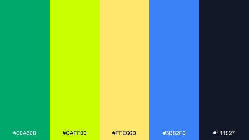
HEX: #00a86b #caff00 #ffe66d #3b82f6 #111827
Mood: trendy, crisp, high-contrast
Best for: streetwear product ads
Trendy chartreuse and crisp blue bring high-contrast energy that feels current and bold. Use it for streetwear drops, limited editions, and punchy product ads where the palette needs to stop the scroll. Pair with black typography and tight spacing for a sharp, editorial edge. Usage tip: keep backgrounds mostly neutral and let chartreuse carry the callouts and price tags.
Image example of chartreuse coast generated using media.io

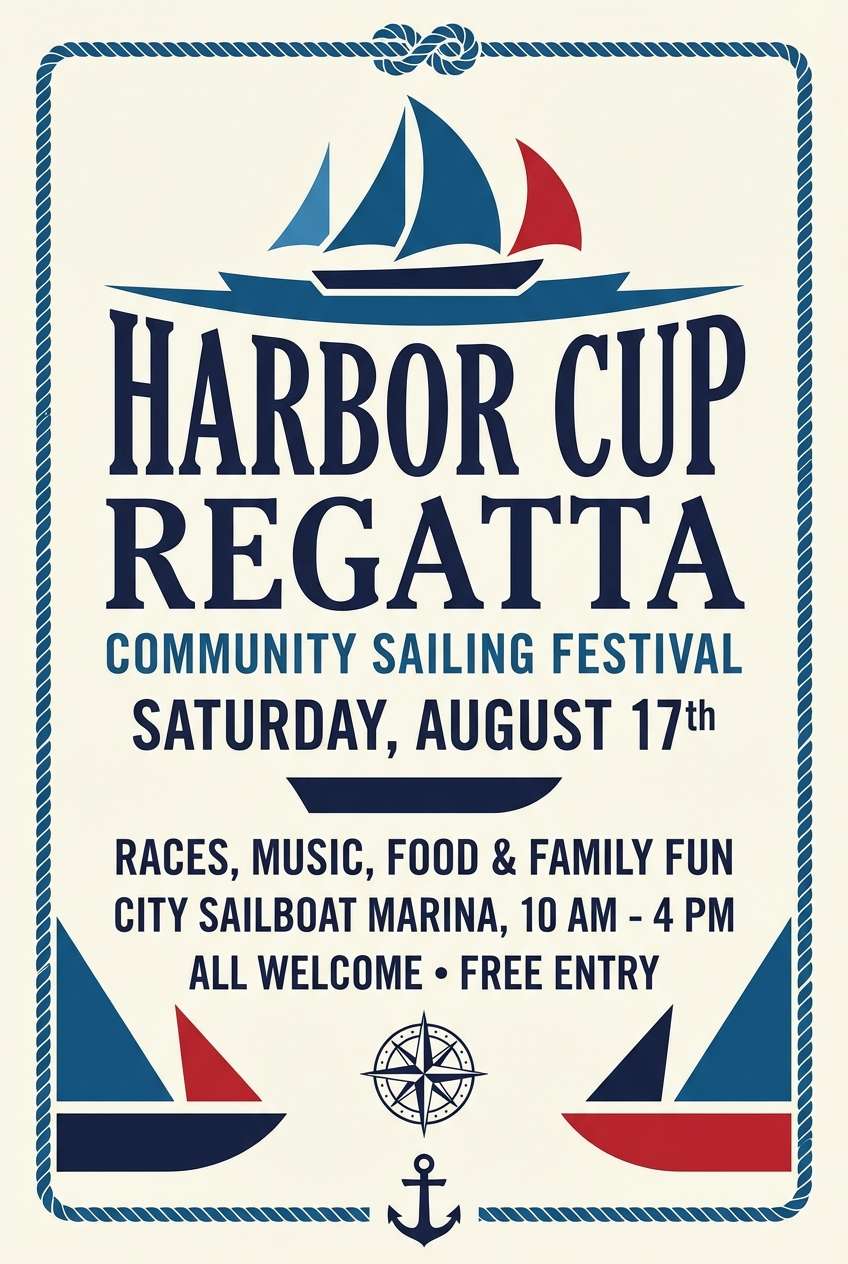
7) Spring Regatta
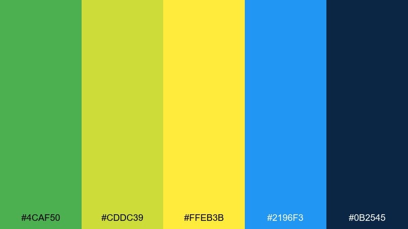
HEX: #4caf50 #cddc39 #ffeb3b #2196f3 #0b2545
Mood: sporty, breezy, upbeat
Best for: community event flyers
Sporty and breezy, it feels like sail flags, fresh grass, and a bright spring morning. As a green yellow blue color scheme, it helps community flyers and school events look inviting while staying structured. Pair it with simple icons and plenty of margin so the yellows read as cheerful, not harsh. Usage tip: use blue for the main background panel and place yellow only behind key dates and locations.
Image example of spring regatta generated using media.io
8) Verdant Lemonade
HEX: #2d6a4f #95d5b2 #f1fa8c #118ab2 #073b4c
Mood: refreshing, friendly, natural
Best for: cafe packaging
Refreshing and friendly, it evokes leafy shade, chilled lemonade, and a bright storefront window. Perfect for cafe packaging, menu inserts, and takeout labels that need a natural lift. Pair with kraft textures or warm whites to keep the set grounded. Usage tip: use the pale mint as the main label field and keep the darker teal for ingredient text.
Image example of verdant lemonade generated using media.io
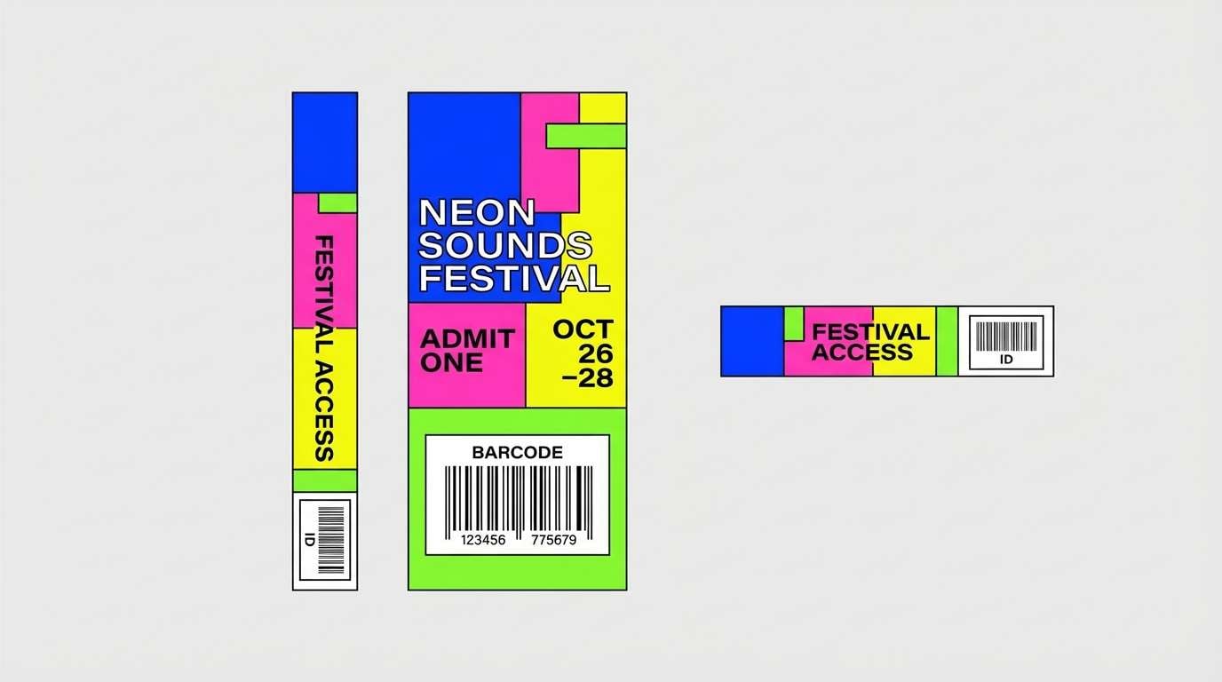
9) Neon Picnic
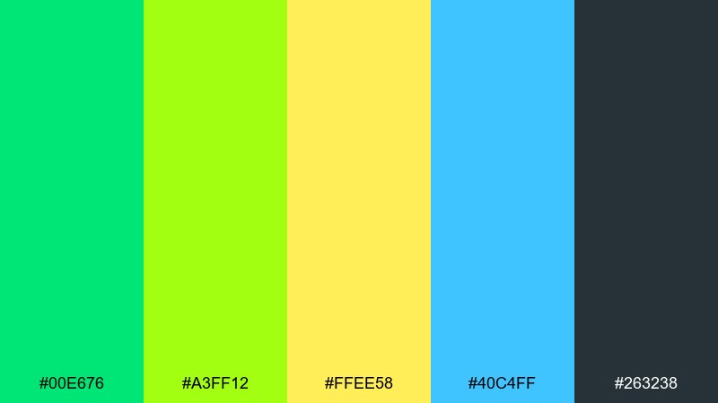
HEX: #00e676 #a3ff12 #ffee58 #40c4ff #263238
Mood: loud, youthful, festival-ready
Best for: music festival wristbands
Loud, youthful tones feel like glow sticks, summer nights, and festival confetti. Use it for wristbands, tickets, and bold merch where color needs to be instantly recognizable. Pair with charcoal or pure black to stop the neon from vibrating on-screen. Usage tip: place neon accents in thick shapes rather than thin lines to avoid flicker and aliasing.
Image example of neon picnic generated using media.io
10) Freshwater Citrus
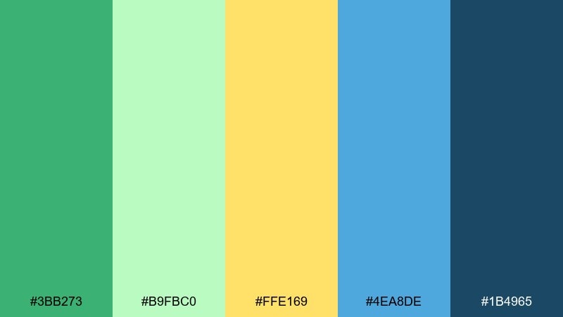
HEX: #3bb273 #b9fbc0 #ffe169 #4ea8de #1b4965
Mood: clean, approachable, bright
Best for: health clinic landing pages
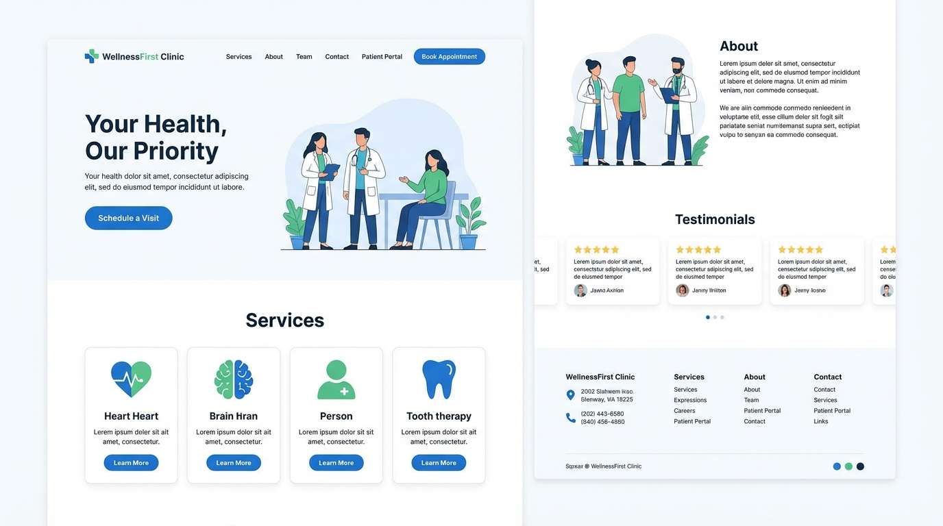
Clean and approachable, it suggests freshwater clarity with a cheerful citrus lift. These green yellow blue color combinations work well on health and service landing pages where trust and friendliness must coexist. Pair it with lots of white space, subtle dividers, and calm photography overlays. Usage tip: use the mid-blue for buttons and keep yellow limited to supportive badges like new or updated.
Image example of freshwater citrus generated using media.io
11) Garden Kites
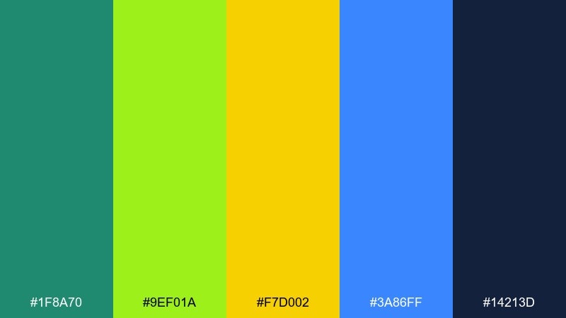
HEX: #1f8a70 #9ef01a #f7d002 #3a86ff #14213d
Mood: cheerful, breezy, family-friendly
Best for: kids education worksheets
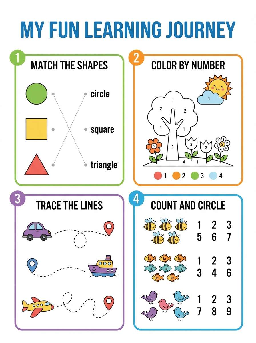
Cheerful and breezy, it feels like kites over a garden and bright crayons on paper. Great for kids education worksheets, classroom slides, and friendly icons that need clear color separation. Pair it with warm off-white paper tones and playful illustrations. Usage tip: keep the darkest navy for body text to maintain legibility against bright fills.
Image example of garden kites generated using media.io
12) Athletic Pop
HEX: #00c853 #c6ff00 #ffdd00 #1e88e5 #0a0f1a
Mood: bold, competitive, high-impact
Best for: fitness app onboarding screens
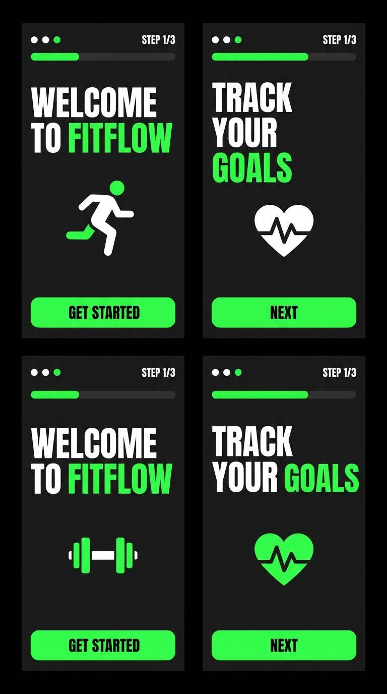
Bold, competitive energy comes through like stadium lights and high-impact training gear. It is ideal for onboarding flows, fitness stats screens, and motivational badges. Pair with dark mode surfaces so the lime and yellow feel electric rather than loud. Usage tip: use blue for primary actions, and reserve lime for success states and streak indicators.
Image example of athletic pop generated using media.io
13) Eco Tech
HEX: #2e7d32 #7cb342 #f9a825 #1565c0 #0f172a
Mood: responsible, modern, dependable
Best for: sustainability reports
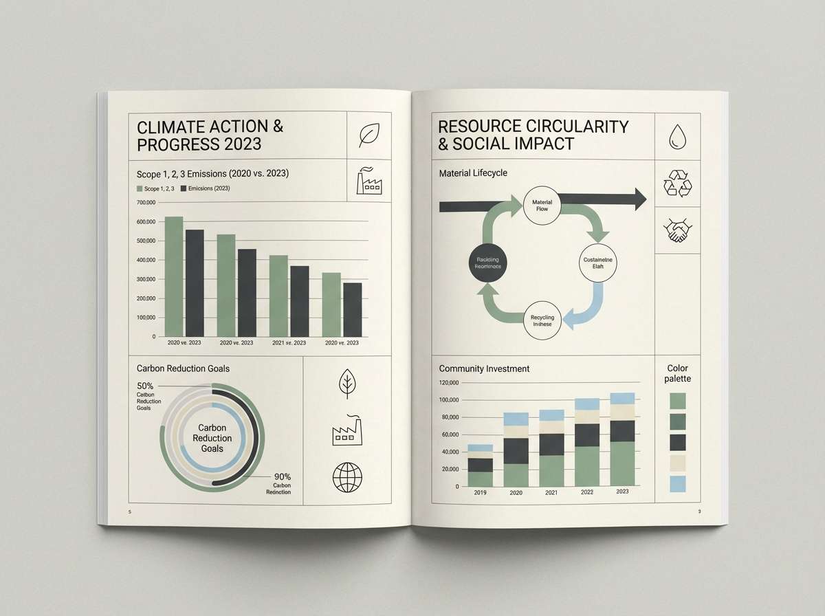
Responsible greens with a smart blue base feel modern and dependable, like clean energy dashboards. Use it for sustainability reports, impact pages, and presentations that need credibility with a touch of optimism. Pair with subtle grid lines and thin icon strokes for a data-forward look. Usage tip: keep yellow as a chart highlight only, so graphs stay calm and readable.
Image example of eco tech generated using media.io
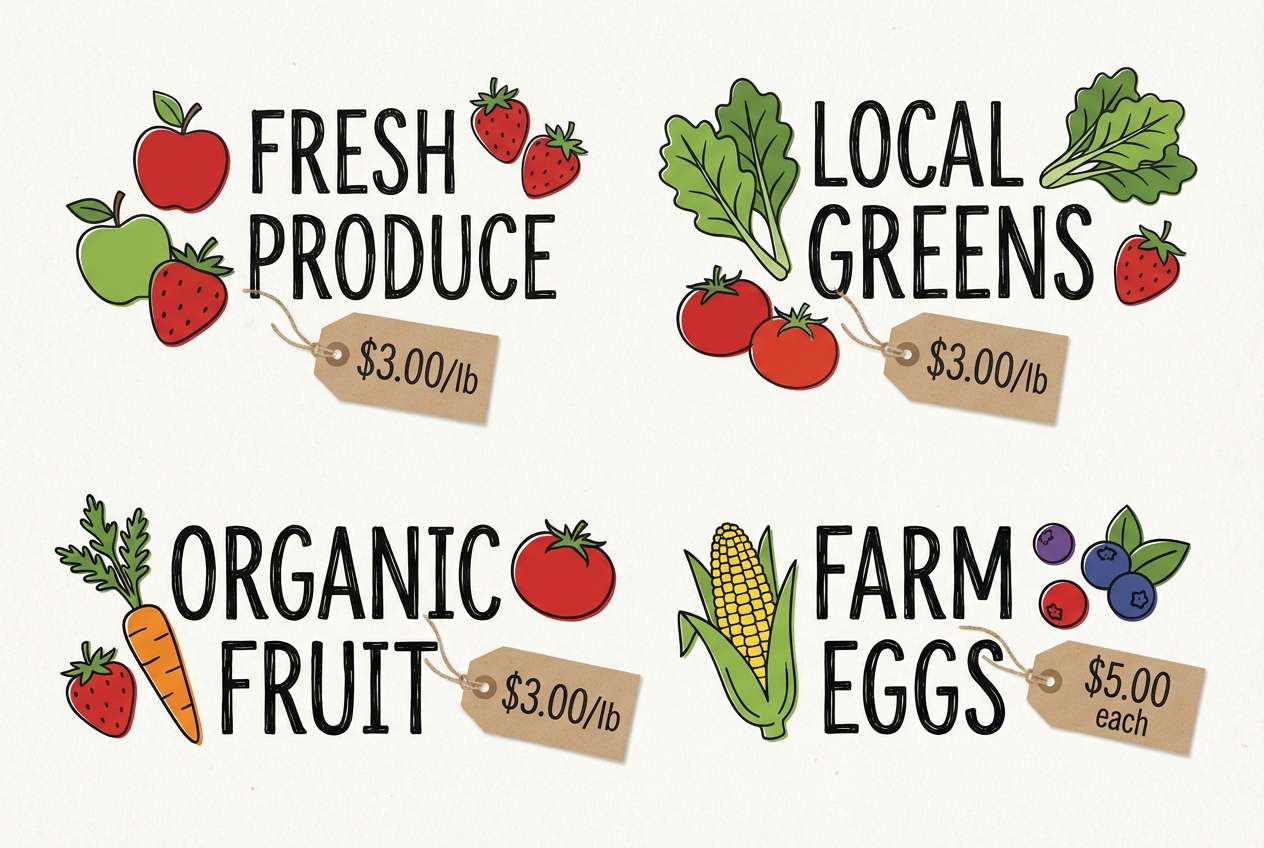
14) Seaside Orchard
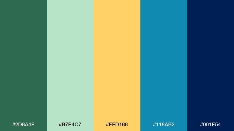
HEX: #2d6a4f #b7e4c7 #ffd166 #118ab2 #001f54
Mood: wholesome, relaxed, summery
Best for: farmers market signage
Wholesome and relaxed, it mixes orchard warmth with seaside coolness. It works beautifully on farmers market signage, fruit labels, and seasonal promotions with a handcrafted feel. Pair with natural textures like paper grain and simple line illustrations. Usage tip: use the soft mint for large background areas and let the deeper blue frame prices and headings.
Image example of seaside orchard generated using media.io
15) Sunlit Denim
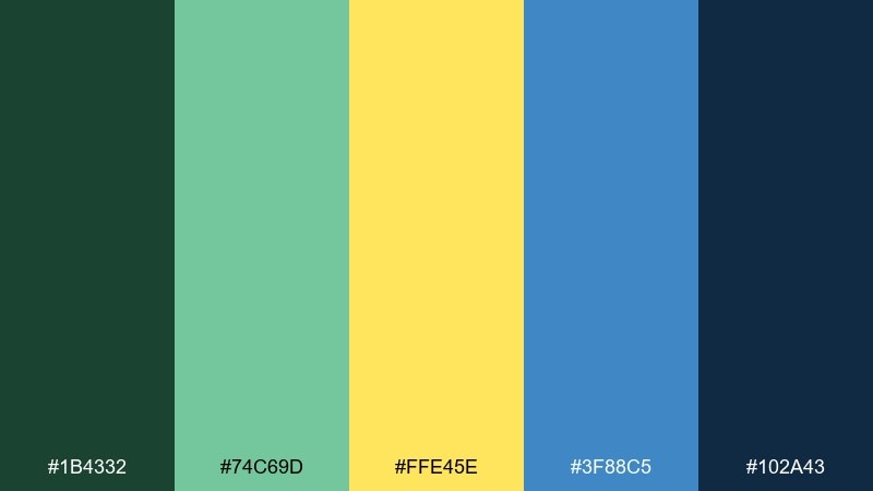
HEX: #1b4332 #74c69d #ffe45e #3f88c5 #102a43
Mood: casual, warm, grounded
Best for: ecommerce category pages
Casual and grounded, it feels like sunlit denim with a soft golden highlight. Use it for ecommerce category pages and lifestyle collections that should read friendly and easygoing. Pair with warm neutrals and product photography on light backgrounds to keep it approachable. Usage tip: apply yellow as a hover state or filter highlight, and keep the main UI in blue and deep slate.
Image example of sunlit denim generated using media.io
16) Mint Zest
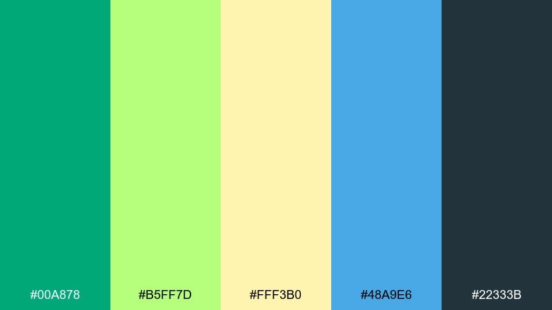
HEX: #00a878 #b5ff7d #fff3b0 #48a9e6 #22333b
Mood: light, upbeat, clean
Best for: skincare packaging
Light mint and a gentle zest of yellow create a clean, upbeat skincare mood. Great for minimalist packaging, ingredient callouts, and product pages that aim for fresh simplicity. Pair with matte white containers and thin typography to keep it premium. Usage tip: use the pale yellow as a subtle background tint and let the blue handle brand marks and seals.
Image example of mint zest generated using media.io
17) Rainforest Taxi
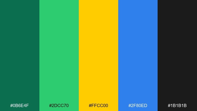
HEX: #0b6e4f #2dcc70 #ffcc00 #2f80ed #1b1b1b
Mood: urban, punchy, high-contrast
Best for: delivery app UI
Urban and punchy, it blends rainforest greens with taxi-yellow urgency and crisp blue trust. Use it in delivery app UI, tracking screens, and promo banners where speed and clarity matter. Pair with black or near-black text for strong contrast and a modern edge. Usage tip: keep yellow for status highlights like arriving soon, while blue stays the primary action color.
Image example of rainforest taxi generated using media.io
18) Alpine Glow
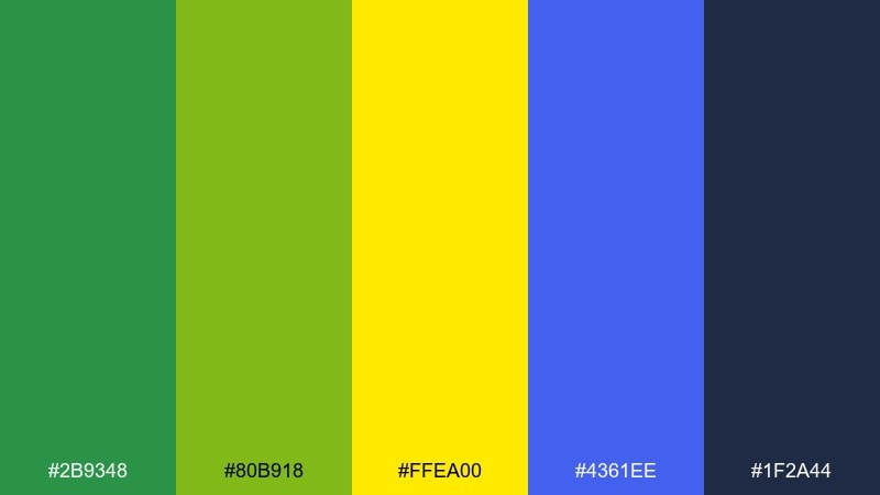
HEX: #2b9348 #80b918 #ffea00 #4361ee #1f2a44
Mood: crisp, outdoorsy, uplifting
Best for: adventure blog editorial layouts
Crisp alpine greens and glowing yellow feel uplifting, like sunrise over a mountain ridge. These green yellow blue color combinations fit adventure editorial layouts, photo essays, and guide pages with clear sectioning. Pair with generous margins and serif headlines for a premium, journal-like tone. Usage tip: let blue anchor navigation and captions, and use yellow as a small badge for difficulty or season.
Image example of alpine glow generated using media.io
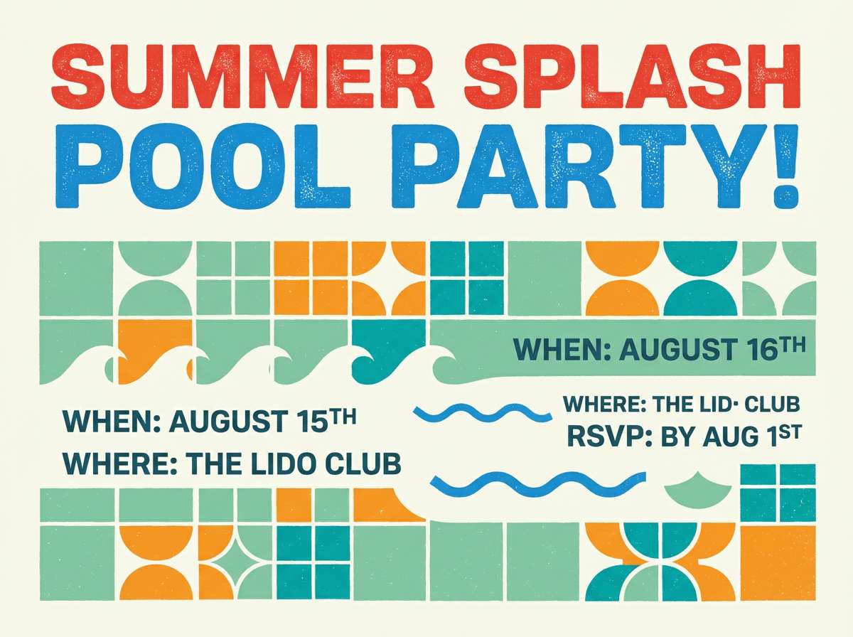
19) Retro Swim
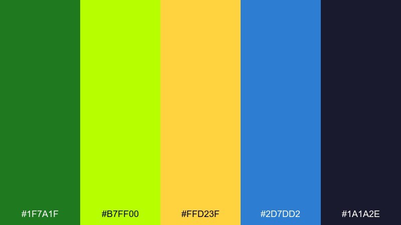
HEX: #1f7a1f #b7ff00 #ffd23f #2d7dd2 #1a1a2e
Mood: retro, fun, summery
Best for: pool party invitations
Retro fun comes through like vintage swimwear and bright pool tiles. Use it for pool party invitations, social posts, and playful merch where graphic shapes carry the message. Pair with cream backgrounds and chunky type to lean into the nostalgic vibe. Usage tip: limit the lime to small shapes and outlines, and let blue handle larger color fields for comfort.
Image example of retro swim generated using media.io
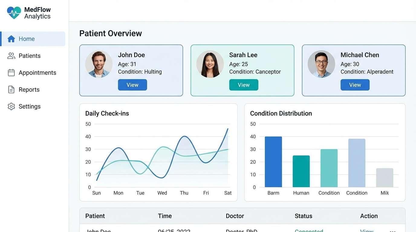
20) Clean Clinic
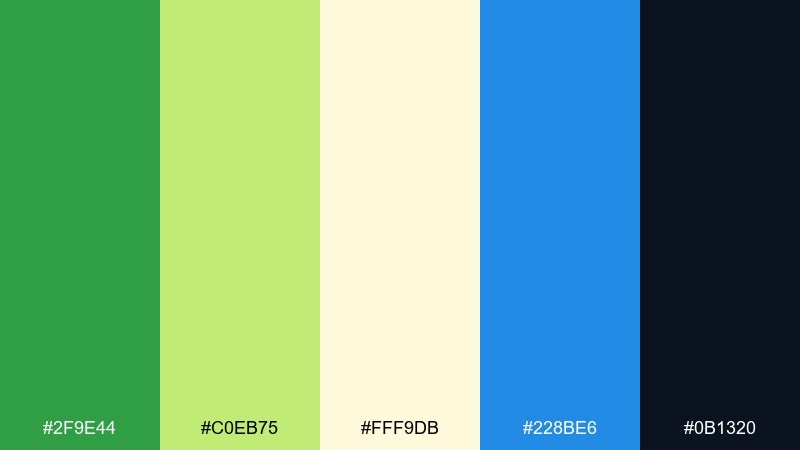
HEX: #2f9e44 #c0eb75 #fff9db #228be6 #0b1320
Mood: reassuring, tidy, professional
Best for: medical dashboard UI
Reassuring and tidy, it reads like a clean clinic interior with gentle optimism. It suits medical dashboard UI, appointment systems, and patient portals that need calm structure. Pair with light gray surfaces, clear spacing, and simple icons for quick scanning. Usage tip: use green for success confirmations, blue for primary actions, and keep yellow as a soft background highlight only.
Image example of clean clinic generated using media.io
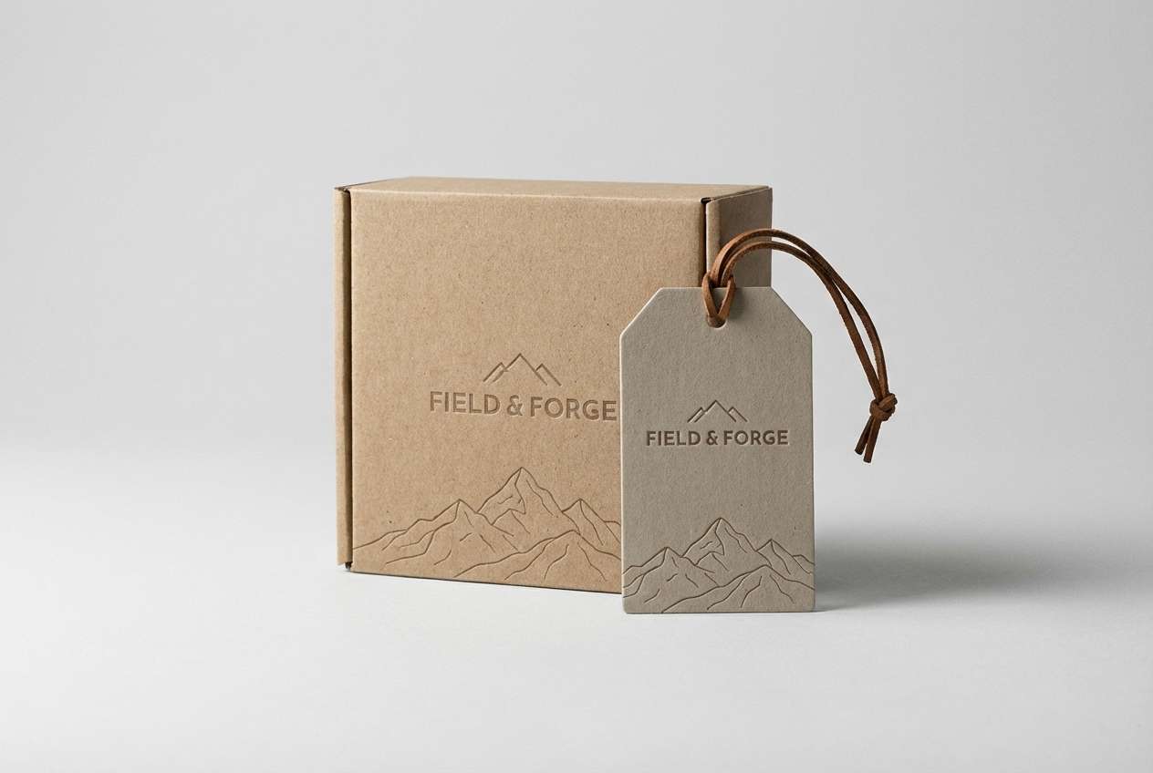
21) Canyon Field
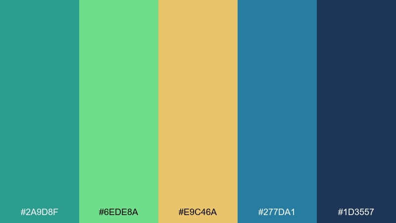
HEX: #2a9d8f #6ede8a #e9c46a #277da1 #1d3557
Mood: earthy, balanced, adventurous
Best for: outdoor gear packaging
Earthy balance with a sunlit yellow feels like fields meeting cool canyon water. It works for outdoor gear packaging, hang tags, and product spec sheets that should feel rugged but friendly. Pair with kraft paper tones and minimal line icons to maintain authenticity. Usage tip: keep the darker navy for technical text and use teal for brand accents and trims.
Image example of canyon field generated using media.io
22) Blueberry Grove
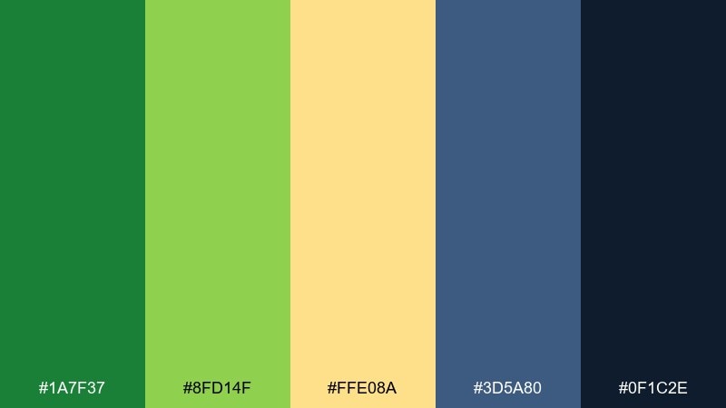
HEX: #1a7f37 #8fd14f #ffe08a #3d5a80 #0f1c2e
Mood: cozy, natural, slightly muted
Best for: recipe cards and food blogs
Cozy, natural tones bring to mind berry bushes, leafy shade, and a soft morning sky. Use it on recipe cards, food blogs, and newsletter sections that need a calm, homey touch. Pair with creamy backgrounds and warm photography to keep it inviting. Usage tip: use the muted blue for headings and frames, and let yellow act as a small highlight for cook time or servings.
Image example of blueberry grove generated using media.io
What Colors Go Well with Green Yellow Blue?
Neutrals are the easiest match: white, off-white, and light gray keep yellow from feeling harsh and give blue room to anchor the layout. For text, deep charcoal or near-black typically reads cleaner than pure black on bright palettes.
For more depth, add navy, slate, or deep teal to create structure in headers, footers, and UI bars. If you want a warmer, lifestyle feel, pair the palette with sand, cream, or kraft-paper beige for a natural finish.
As an accent beyond the trio, a small touch of coral or soft orange can add friendly contrast—just keep it minimal so it doesn’t compete with yellow’s attention-grabbing role.
How to Use a Green Yellow Blue Color Palette in Real Designs
Assign clear roles: use blue for primary actions (buttons, links, navigation), green for supportive states (success, confirmations, secondary panels), and yellow for highlights (badges, key dates, prices, and icons). This keeps the design readable and predictable.
Control saturation and area size. Bright yellow and chartreuse work best in small, repeatable elements—large yellow backgrounds can cause eye fatigue, especially on screens. If you need a big warm area, use a pale yellow tint instead.
Check contrast early, especially for UI and posters. Dark blues and slates usually solve legibility; if the palette is neon-heavy, consider a dark-mode surface to make accents feel intentional rather than noisy.
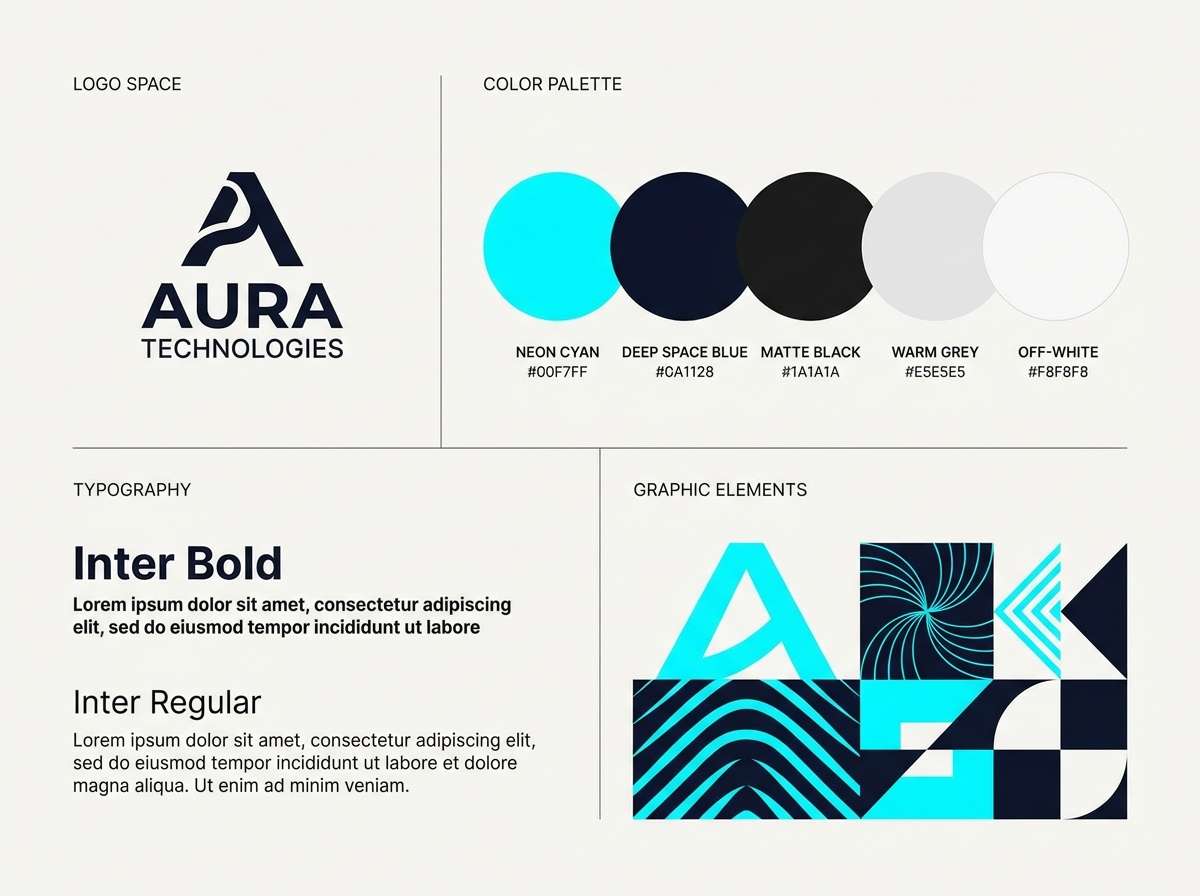
Create Green Yellow Blue Palette Visuals with AI
If you already have HEX codes, you can turn them into consistent visuals fast with AI—mock up posters, landing pages, packaging shots, and UI screens that match your palette without starting from scratch.
Reuse the prompts above, then refine with details like “flat vector,” “editorial grid,” “dark mode UI,” or “studio product shot” to match your brand style. Keeping your palette roles consistent (blue as primary, yellow as accent) helps outputs look cohesive.
When you find a look you like, generate a set of variations for different placements (hero, square post, story, banner) so your campaign stays consistent across formats.
Green Yellow Blue Color Palette FAQs
-
What does a green yellow blue color palette communicate?
It typically communicates freshness and growth (green), optimism and attention (yellow), and trust and stability (blue). Together, the mix feels energetic but still structured, which is why it’s common in wellness, education, sports, and tech. -
How do I keep yellow from overpowering the design?
Use yellow as an accent rather than a main background. Make blue or a dark neutral your primary surface/text color, then apply yellow to small UI tokens (badges, highlights, icons) or as a pale tint behind important content. -
What are safe text colors for green yellow blue palettes?
Deep navy, slate, charcoal, and near-black are the safest for readability. For light backgrounds, use dark blue/charcoal text; for dark-mode layouts, use off-white text and keep yellow for highlights only. -
Are green yellow blue palettes good for branding?
Yes—blue supports credibility, green suggests responsibility or health, and yellow adds friendliness. Many brands use blue as the core identity color, then introduce green and yellow as secondary/accent colors in UI and marketing. -
How can I use this palette in UI design without looking too “neon”?
Limit high-saturation lime/yellow to a few components (success, progress, notifications) and use neutral surfaces (white, light gray, or dark slate). Keep most typography in navy/charcoal, and avoid thin neon lines that can flicker on screens. -
What print design tips work best for green yellow blue combinations?
Use larger color blocks and clear margins so the palette feels intentional. Choose a dominant color (often blue), keep yellow in smaller areas to avoid glare, and proof with CMYK conversions since bright yellows and limes can shift in print. -
Can I generate matching visuals from these HEX codes with Media.io?
Yes. Use Media.io Text-to-Image prompts (like the examples above), then iterate by specifying layout type (poster, UI mockup, packaging), style (vector, minimal, editorial), and contrast (light or dark background) to keep results aligned with your palette.


