

Mauve pink sits in that sweet spot between blush and berry, so it can feel soft and romantic or deep and dramatic depending on the shades you pair it with.
Below are 20 mauve pink color palette ideas with HEX codes, plus practical tips for using them in branding, weddings, interiors, UI, and social graphics.
In this article
Why Mauve Pink Palettes Work So Well
Mauve pink is naturally versatile because it carries both warm (rose) and cool (purple) undertones. That balance makes it easy to match with neutrals, metals, woods, and even bold accents without looking accidental.
It also photographs beautifully: soft mauves create flattering skin-adjacent backgrounds, while deeper mauves add instant contrast for typography and product focus. This is why mauve pink shows up so often in weddings, beauty packaging, and modern UI.
Most importantly, it communicates emotion without being loud. You can get “romantic,” “professional,” “cozy,” or “luxury” by simply shifting the palette toward cream, grey, plum, or near-black.
20+ Mauve Pink Color Palette Ideas (with HEX Codes)
1) Rosy Vellum
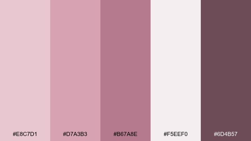
HEX: #E8C7D1 #D7A3B3 #B67A8E #F5EEF0 #6D4B57
Mood: airy, romantic, polished
Best for: wedding invitations and stationery
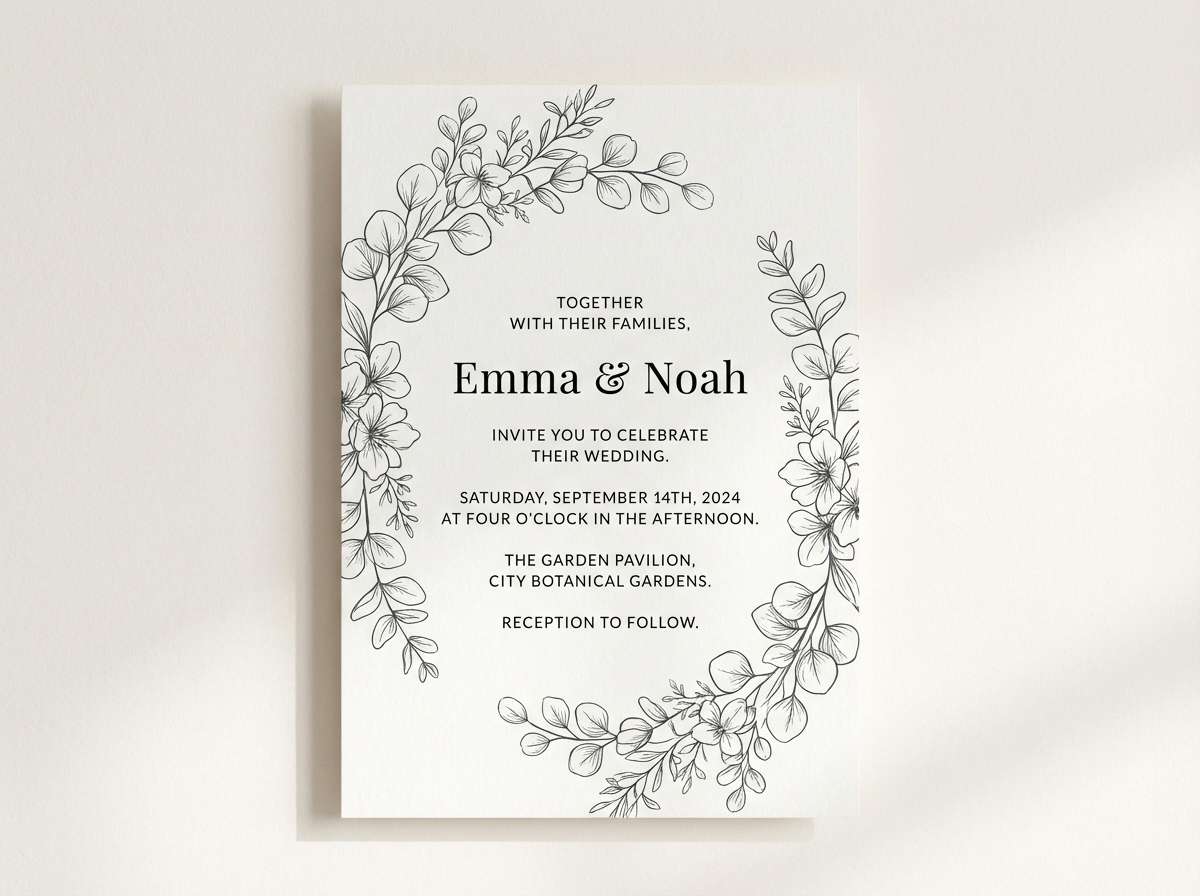
Airy and romantic, this mix feels like rose petals pressed into vellum paper. Use the pale blush as your background, then lean on the mid mauves for type and borders so everything stays readable. The deep wine tone is perfect for monograms, wax seal illustrations, or RSVP headers. Tip: keep metallics subtle and choose matte paper to preserve the soft look.
Image example of rosy vellum generated using media.io
Media.io is an online AI studio for creating and editing video, image, and audio in your browser.

2) Lilac Dust
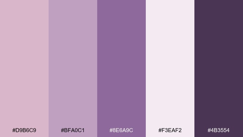
HEX: #D9B6C9 #BFA0C1 #8E6A9C #F3EAF2 #4B3554
Mood: calm, dreamy, creative
Best for: beauty branding and packaging
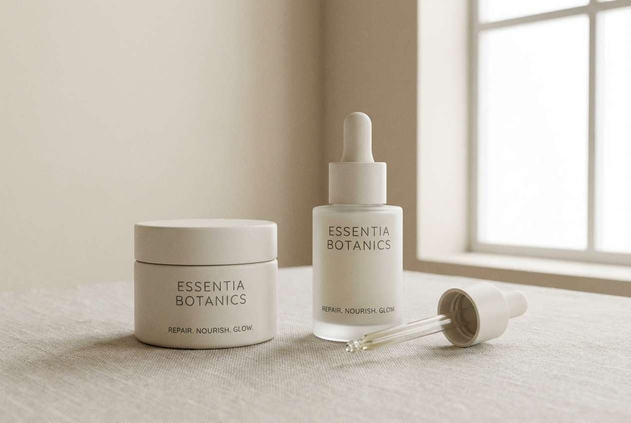
Calm and dreamy, these tones suggest lilac powder and soft-focus studio lighting. Pair the light lilac with high-contrast plum for logos and ingredient lists to keep packaging crisp on shelves. The mid tones work well for patterns like subtle gradients or watercolor washes. Tip: add a small area of pure white around the logo to make the darker purple pop.
Image example of lilac dust generated using media.io
3) Quiet Romance
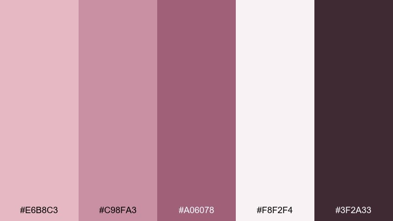
HEX: #E6B8C3 #C98FA3 #A06078 #F8F2F4 #3F2A33
Mood: soft, intimate, timeless
Best for: editorial layouts and magazine spreads
Soft and intimate, it reads like a love letter tucked into a vintage book. For a mauve pink color palette that still feels editorial, let the near-white carry large margins and keep body text in the deep cocoa. Use the mid rose tones for pull quotes, section dividers, and small icons. Tip: limit the darkest shade to 10 to 15 percent of the page to avoid a heavy finish.
Image example of quiet romance generated using media.io
4) Modern Ballet

HEX: #F0C8D8 #D59AB7 #9D6A86 #FFF8FB #2F2430
Mood: clean, graceful, modern
Best for: UI onboarding screens
Clean and graceful, like ballet slippers against a black stage curtain. Use the off-white as the main canvas and reserve the darkest shade for primary text and key labels. The mid mauve is strong enough for buttons without feeling loud, especially when paired with generous spacing. Tip: keep shadows minimal and use a single accent color per screen to avoid visual clutter.
Image example of modern ballet generated using media.io
5) Mauve Mocha
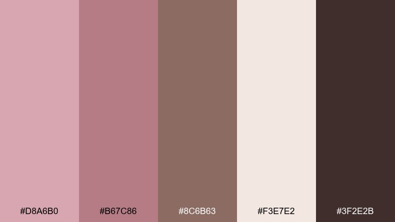
HEX: #D8A6B0 #B67C86 #8C6B63 #F3E7E2 #3F2E2B
Mood: cozy, grounded, sophisticated
Best for: cafe menus and lifestyle branding
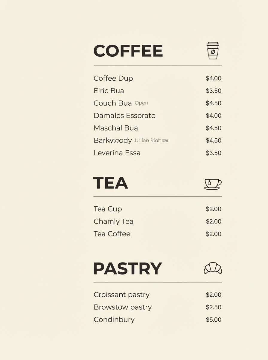
Cozy and grounded, it feels like steamed milk swirled with berry syrup. Use the warm cream as the base, then pull in the mocha browns for typography and menu structure. The dusty rose tones add warmth to photos and highlight boxes without turning saccharine. Tip: choose one brown for all text styles and use rose only for callouts and prices.
Image example of mauve mocha generated using media.io
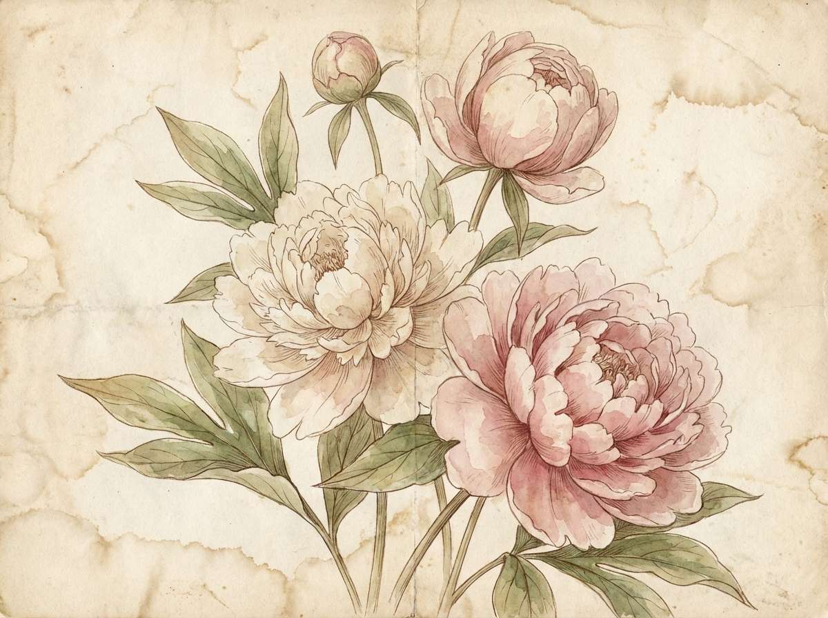
6) Antique Peony
HEX: #EAC2C8 #D79AA5 #B46C7A #F7ECEE #6A4A52
Mood: vintage, floral, warm
Best for: botanical illustrations and spring prints
Vintage and floral, it evokes peonies in a faded garden journal. The light blush works beautifully as paper tone, while the deeper rose creates definition for petals and stems. Pair it with natural textures like watercolor grain or light ink bleed for authenticity. Tip: keep outlines in the muted burgundy instead of black to maintain the antique softness.
Image example of antique peony generated using media.io
7) Berry Smoke
HEX: #D3A0B3 #B26A86 #7B4A5C #EFE5EA #2B1F24
Mood: moody, velvety, dramatic
Best for: music posters and event promos
Moody and velvety, it suggests berry velvet under smoky stage lights. Use the near-black for bold titles and let the dusty mauves carry background gradients or grainy textures. The pale grey-pink is great for secondary info like dates and venue details. Tip: add subtle noise to large color blocks so the poster feels more tactile and less flat.
Image example of berry smoke generated using media.io
8) Studio Petal
HEX: #E9B4C6 #D783A2 #AD4F76 #F9EFF3 #3A2A33
Mood: confident, playful, glossy
Best for: social ads and creator content
Confident and playful, it feels like fresh petals lit by a ring light. These mauve pink color combinations shine when you keep the background pale and push contrast with the berry accent for buttons and prices. The deep plum anchors headlines and prevents the look from drifting too sweet. Tip: use the brightest shade sparingly, ideally on one focal element per post.
Image example of studio petal generated using media.io

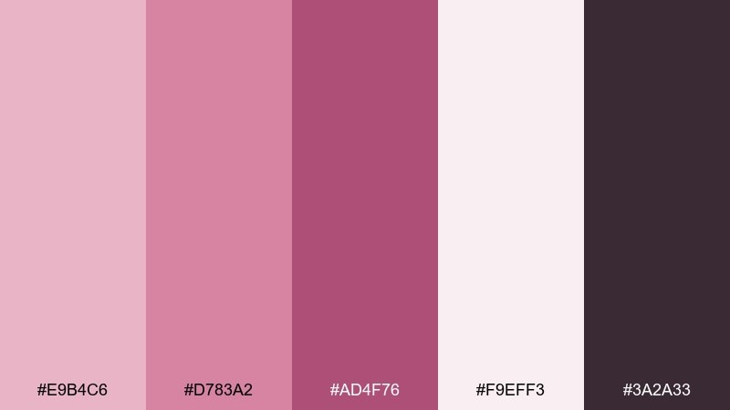
9) Clay Rose
HEX: #D7A4A1 #B7797D #8A5A5D #F4E8E6 #3C2B2B
Mood: earthy, comforting, organic
Best for: home decor and interior mood boards
Earthy and comforting, it recalls sun-warmed terracotta with a rosy blush. Use the light neutral as wall color or large background areas, then bring in the clay tones through textiles and ceramics. The dark espresso shade works well for frames, hardware, and small contrast moments. Tip: repeat the medium rose twice in a room, once in fabric and once in decor, to make it feel intentional.
Image example of clay rose generated using media.io
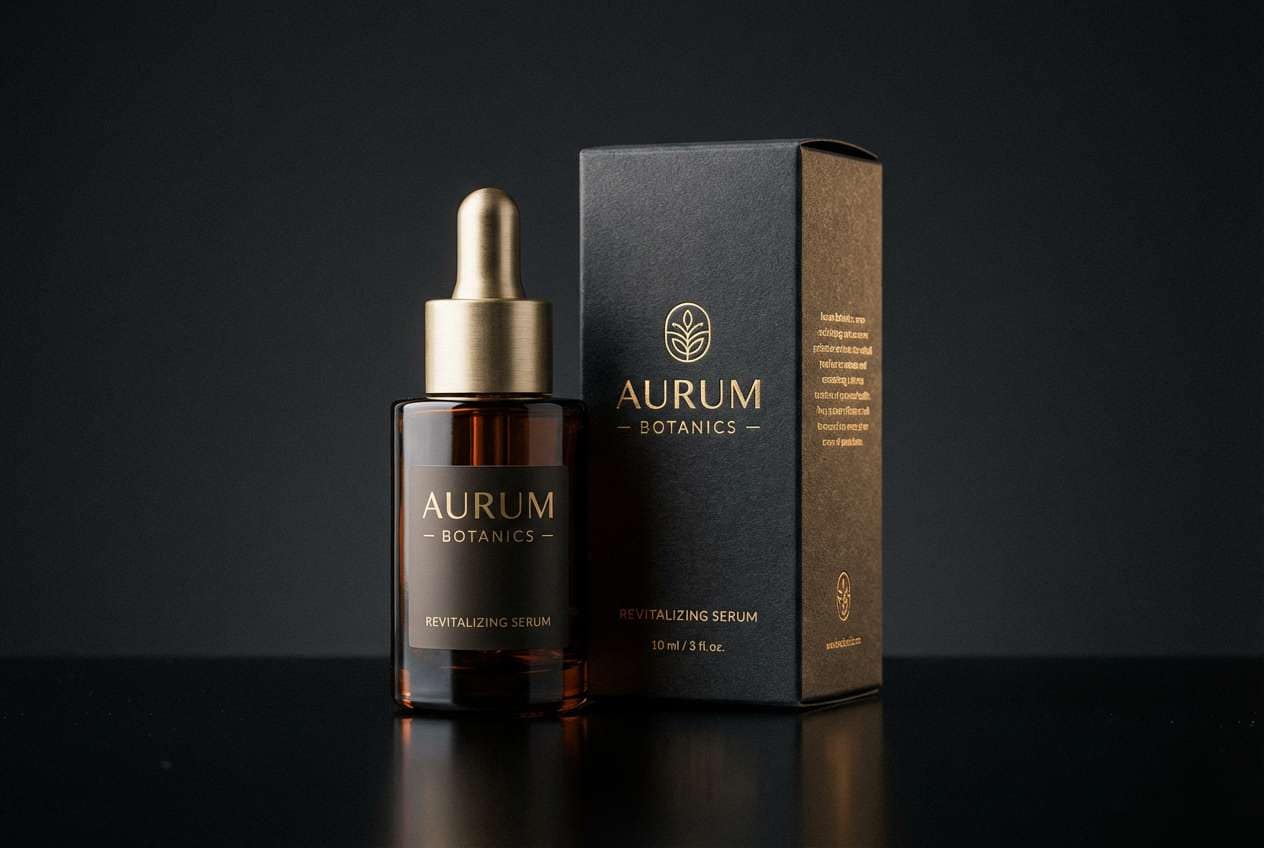
10) Midnight Mauve
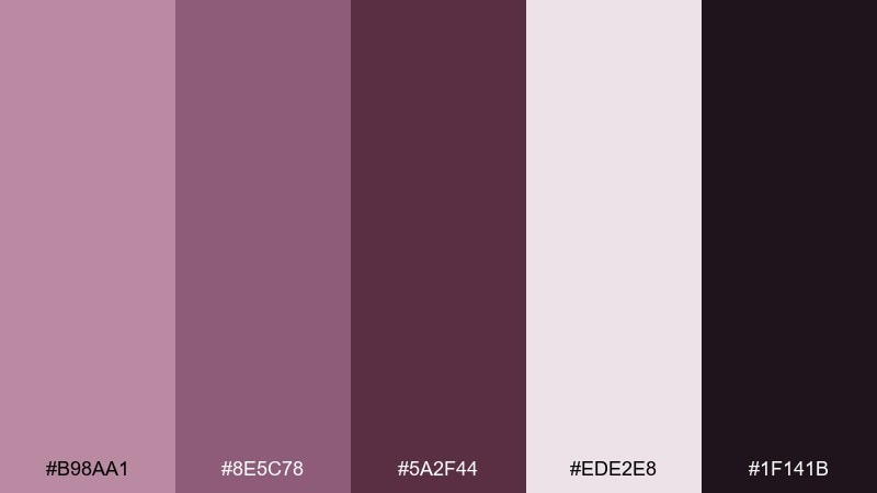
HEX: #B98AA1 #8E5C78 #5A2F44 #EDE2E8 #1F141B
Mood: luxurious, nighttime, bold
Best for: premium skincare product ads
Luxurious and nocturnal, it reads like satin at midnight with a hint of blush. The near-black makes an elegant backdrop for product shots and gives the lighter mauves a glowing effect. Use the pale tint for small highlights, badges, and fine print to keep the ad clean. Tip: keep reflections controlled and use soft edge lighting so the colors look rich, not harsh.
Image example of midnight mauve generated using media.io
11) Soft Plum Linen
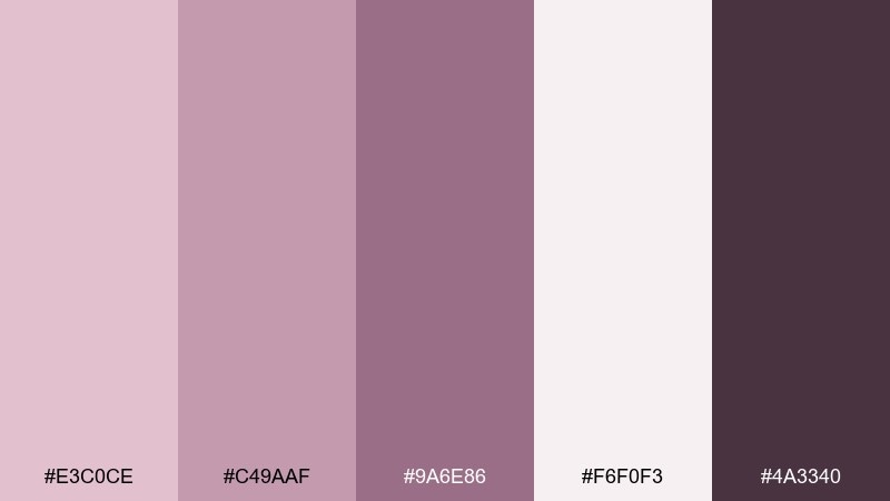
HEX: #E3C0CE #C49AAF #9A6E86 #F6F0F3 #4A3340
Mood: gentle, airy, minimal
Best for: wellness blog headers and web banners
Gentle and airy, it feels like linen curtains filtering morning light. Use the palest shade for spacious backgrounds, then set headings in the deep plum for clean contrast. The mid mauves are ideal for subtle dividers, icons, and hover states. Tip: pair with soft photography and keep saturation low so the banner stays calm.
Image example of soft plum linen generated using media.io
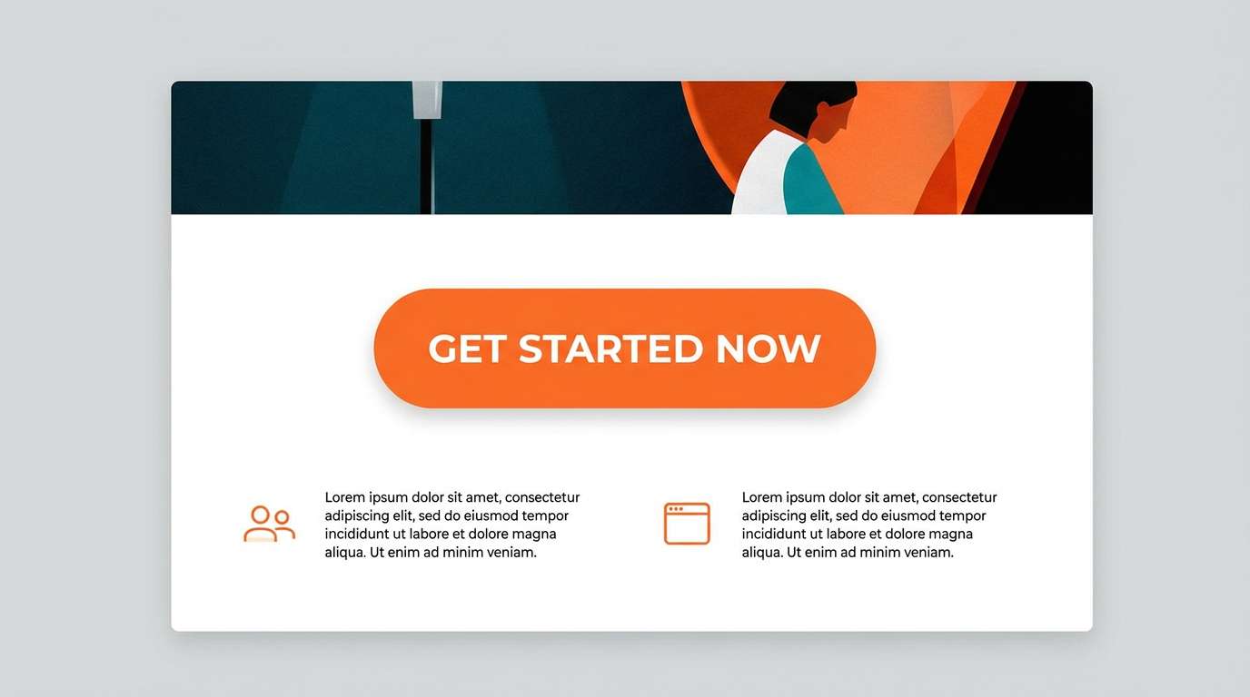
12) Neon Rose Accent
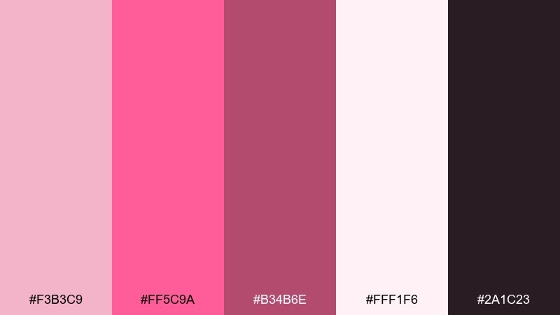
HEX: #F3B3C9 #FF5C9A #B34B6E #FFF1F6 #2A1C23
Mood: energetic, trendy, punchy
Best for: app promo landing pages
Energetic and trendy, it looks like neon signage softened by rosy haze. Use the bright pink as a sharp accent for primary CTAs and key stats, while the pale tint keeps the layout breathable. The deeper mauve adds structure for sections and navigation elements. Tip: reserve the neon shade for one action per screen so the design stays premium, not chaotic.
Image example of neon rose accent generated using media.io
13) Cottage Blush
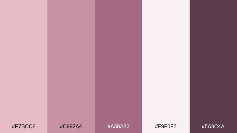
HEX: #E7BCC6 #C992A4 #A56A82 #F9F0F3 #5A3C4A
Mood: sweet, handmade, nostalgic
Best for: small business logos and brand kits
Sweet and handmade, it brings to mind cottage kitchens and handwritten labels. This mauve pink color palette works best when the blush background stays clean and the darker berry tone carries the logo mark. The medium shades are great for secondary patterns like dots, gingham, or small florals. Tip: export one logo version in a single dark color for stamps and shipping labels.
Image example of cottage blush generated using media.io
14) Rose Quartz Office
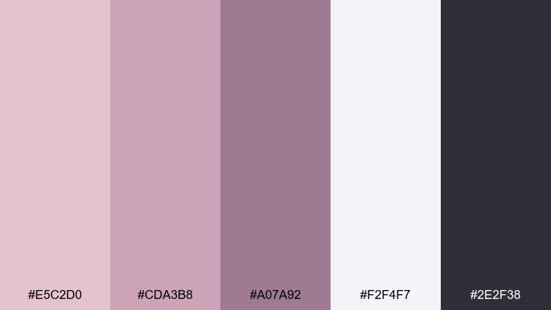
HEX: #E5C2D0 #CDA3B8 #A07A92 #F2F4F7 #2E2F38
Mood: professional, soft, contemporary
Best for: presentation templates and decks
Professional but soft, it feels like rose quartz paired with modern graphite. Use the cool off-white for slide backgrounds to keep content crisp, then apply the mauves to charts and section headers. The near-black is ideal for body text and data labels. Tip: keep one accent shade consistent across the deck to make charts easier to scan.
Image example of rose quartz office generated using media.io
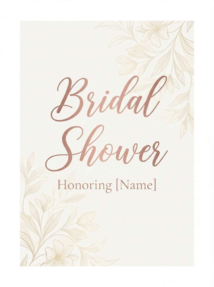
15) Vintage Bouquet
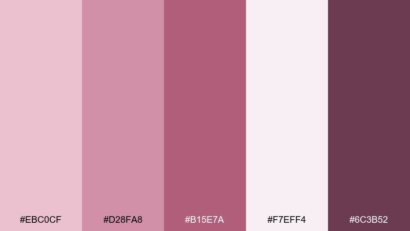
HEX: #EBC0CF #D28FA8 #B15E7A #F7EFF4 #6C3B52
Mood: romantic, classic, celebratory
Best for: bridal shower flyers
Romantic and classic, it resembles a bouquet wrapped in satin ribbon. The pale blush is perfect for backgrounds, while the richer rose creates headings that still feel friendly. Add the deep berry for small details like dates, borders, and icons to keep everything legible. Tip: use a subtle floral pattern at 5 percent opacity so the text stays the star.
Image example of vintage bouquet generated using media.io
16) Minimal Mauve Grey
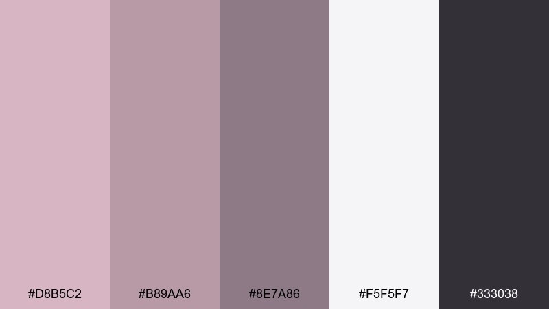
HEX: #D8B5C2 #B89AA6 #8E7A86 #F5F5F7 #333038
Mood: neutral, modern, understated
Best for: SaaS dashboard UI
Neutral and modern, it looks like warm grey concrete softened with blush. Use the light grey as the dashboard base, then apply mauve-tinted greys to cards, tables, and subtle states. The charcoal gives strong readability for data-heavy screens without feeling stark. Tip: use the pinkest shade only for highlights like active tabs or key metrics.
Image example of minimal mauve grey generated using media.io

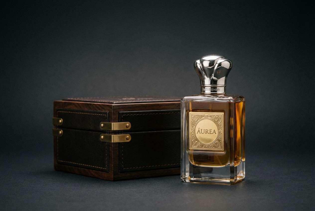
17) Velvet Wine
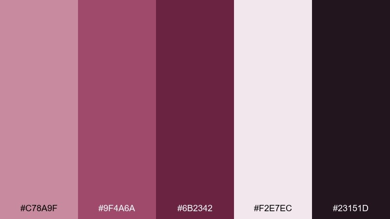
HEX: #C78A9F #9F4A6A #6B2342 #F2E7EC #23151D
Mood: dramatic, intimate, luxe
Best for: perfume packaging and ads
Dramatic and intimate, it feels like velvet drapes and a glass of red wine. These mauve pink color combinations are strongest when you let the darkest tones dominate and use the pale blush as a glow around the product. The mid magenta makes a striking foil stamp color or label accent. Tip: choose one high-gloss element, like the cap or logo, and keep everything else matte.
Image example of velvet wine generated using media.io
18) Pastel Sorbet
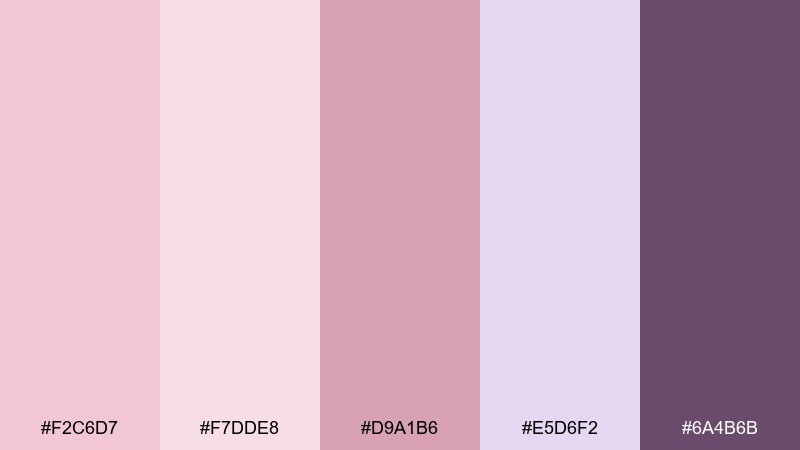
HEX: #F2C6D7 #F7DDE8 #D9A1B6 #E5D6F2 #6A4B6B
Mood: light, playful, sweet
Best for: birthday invitations for adults
Light and playful, it reads like berry sorbet with a lavender swirl. Use the softest pink as the main background and keep text in the plum shade for clarity. The lavender tint is great for confetti shapes or secondary panels to add variety without breaking the mood. Tip: stick to rounded type and simple icons to keep it modern, not childish.
Image example of pastel sorbet generated using media.io
19) Desert Orchid
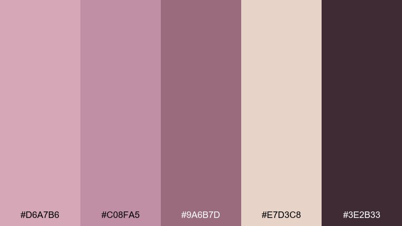
HEX: #D6A7B6 #C08FA5 #9A6B7D #E7D3C8 #3E2B33
Mood: sunbaked, earthy, refined
Best for: fashion lookbooks
Sunbaked and refined, it suggests desert orchids against sand and stone. Use the sandy neutral for page backgrounds and let the mauves carry section titles and captions. The deepest shade is ideal for fine rules, page numbers, and small type. Tip: pair with warm, grainy photography and avoid cool whites so the set stays cohesive.
Image example of desert orchid generated using media.io
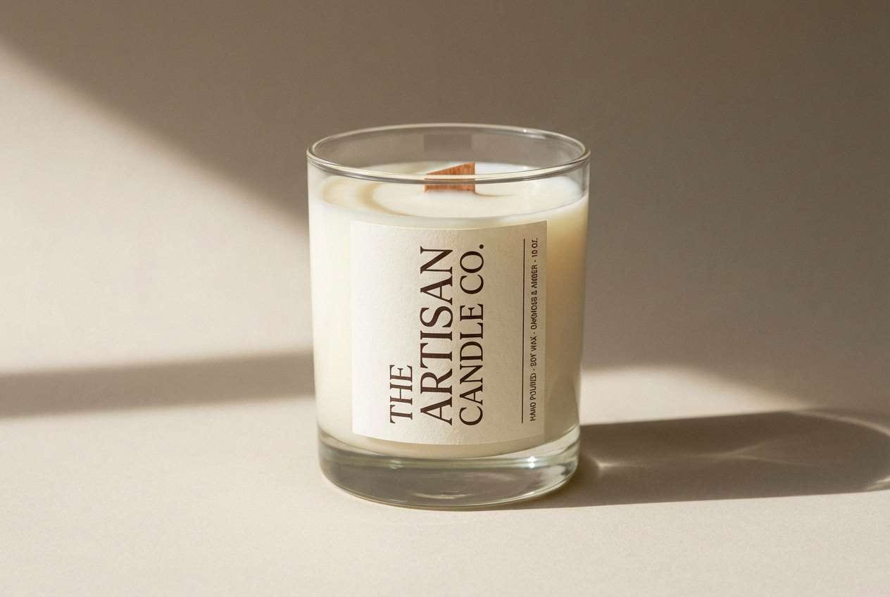
20) Orchid Cocoa
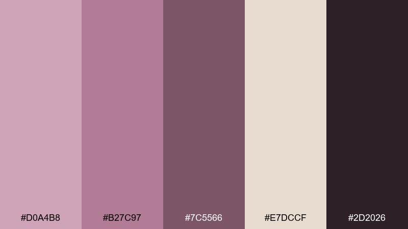
HEX: #D0A4B8 #B27C97 #7C5566 #E7DCCF #2D2026
Mood: warm, elegant, grounded
Best for: handmade candle labels
Warm and elegant, it feels like orchid petals beside cocoa powder. Use the creamy neutral as your label base, then set type in the near-black for clean contrast. The mid mauves work well for scent families, icons, or subtle border frames. Tip: print a small color band around the bottom of the label to distinguish scents at a glance.
Image example of orchid cocoa generated using media.io
What Colors Go Well with Mauve Pink?
Neutrals are the easiest win: warm whites, creams, taupes, and mauve-tinted greys keep the palette mature and readable. For typography, espresso brown and charcoal often look softer than pure black while still providing strong contrast.
For a richer feel, pair mauve pink with deep plum, wine, or near-black to create a luxe nighttime mood. For a brighter, modern edge, add a single high-energy accent (like hot pink) and keep everything else muted.
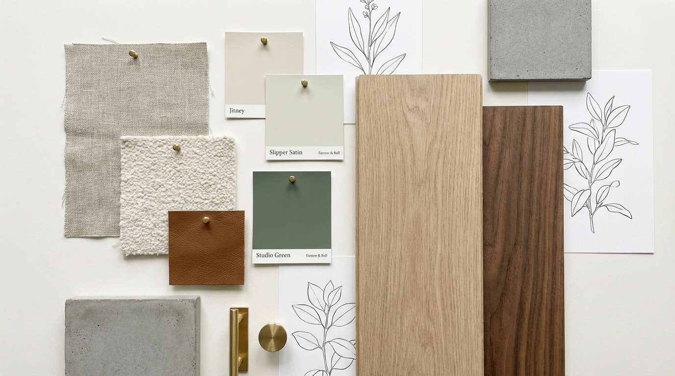
Natural materials also pair beautifully with mauve pink: light oak, walnut, linen textures, and soft stone tones help mauve read grounded rather than overly sweet.
How to Use a Mauve Pink Color Palette in Real Designs
Start with role assignment: pick one light shade for backgrounds, one dark shade for text, and one mid shade for UI components or headings. This keeps your design system consistent across pages, posts, or printed pieces.
Use mauve pink strategically for hierarchy—badges, dividers, highlights, and secondary panels—then let neutrals carry the bulk of the layout. You’ll get the emotional tone without sacrificing clarity.
If you’re working with photos, match the palette to the image temperature. Warm, grainy, sunlit photography tends to suit mauve + cream; glossy studio shots often look best with mauve + near-black.
Create Mauve Pink Palette Visuals with AI
When you need quick mockups—invite concepts, landing pages, packaging scenes, or mood boards—AI visuals help you test how a mauve pink color scheme looks in context before final production.
Reuse the prompts above and swap subjects (like “skincare bottle” to “lip balm tube”) while keeping the same lighting and layout cues. That way, your visuals stay consistent across a campaign.
With Media.io, you can generate multiple variations fast, then pick the one that best matches your brand tone (airy, editorial, cozy, or luxe).
Mauve Pink Color Palette FAQs
-
What is mauve pink, exactly?
Mauve pink is a pink with noticeable purple/grey undertones. It feels softer and more muted than hot pink, and less peachy than blush, making it easy to pair with both warm and cool colors. -
Is mauve pink warm or cool?
It can be either. Mauve pink often leans cool because of its purple base, but many palettes include warmer rose or brown notes (like mocha or cocoa) to make it feel cozier and more neutral. -
What color text works best on mauve pink backgrounds?
Deep plum, charcoal, espresso brown, or near-black typically read best. For very light mauves, you can also use dark grey; for deep mauves, use off-white or a pale blush for contrast. -
What are the best accent colors for a mauve pink palette?
Great accents include wine/plum for luxury, cream/taupe for minimal styles, and a single bright pop (like neon rose) for modern CTAs. Keep the accent limited to avoid overwhelming the softness of mauve. -
Is mauve pink good for branding?
Yes—especially for beauty, wellness, boutique retail, events, and lifestyle brands. It communicates warmth and refinement, and it scales well from minimal identity systems to bold, high-contrast campaigns. -
How do I keep mauve pink from looking too “sweet”?
Add structure with darker anchors (plum, cocoa, charcoal) and increase negative space. Also avoid using multiple saturated pinks at once; one strong pink plus muted mauves feels more premium. -
Which mauve pink palette is best for a wedding?
For classic invitations, try Rosy Vellum or Vintage Bouquet. For a moodier evening wedding, Midnight Mauve or Velvet Wine creates elegant contrast while still feeling romantic.


