

A retro 90s color palette is all about confident contrast: neon accents, pastel backdrops, and inky anchors that make everything feel bold, playful, and instantly recognizable.
Below are 20+ ready-to-use retro 90s color scheme ideas with HEX codes, plus practical tips for pairing brights and pastels in posters, UI, and branding.
In this article
- Why Retro 90s Palettes Work So Well
-
- neon arcade
- memphis pop
- roller rink glow
- snack pack pastels
- cyber teal punch
- bubblegum denim
- vhs sunset
- laser lime
- purple haze
- aqua sorbet
- grunge flannel
- stereo metallic
- cartoon citrus
- techno night
- sticker book brights
- mall food court
- radioactive tropic
- soft peachy neon
- alt rock poster
- pixel party
- pastel track suit
- What Colors Go Well with Retro 90s?
- How to Use a Retro 90s Color Palette in Real Designs
- Create Retro 90s Palette Visuals with AI
Why Retro 90s Palettes Work So Well
Retro 90s palettes are built for attention: high-chroma neons and candy pastels naturally pull the eye, which is why they work so well for posters, thumbnails, UI highlights, and merch.
They also rely on strong “anchors” (near-black, deep navy, charcoal) that keep loud colors readable. That balance makes designs feel energetic without becoming messy or hard to scan.
Most importantly, the 90s look is flexible: you can go arcade-neon, Memphis pastel, grunge-muted, or techno-night—while still keeping that instantly nostalgic vibe.
20+ Retro 90s Color Palette Ideas (with HEX Codes)
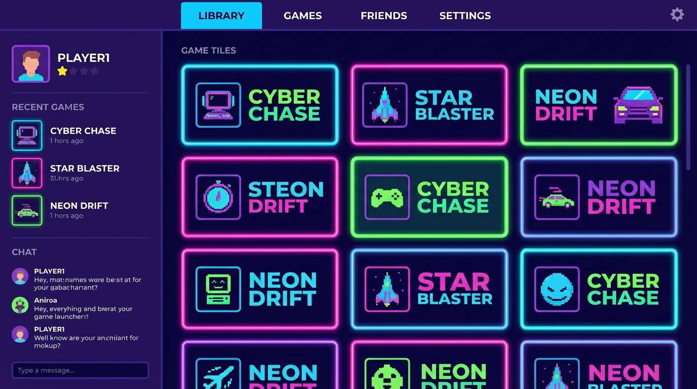
1) Neon Arcade
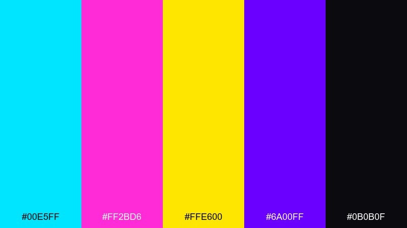
HEX: #00e5ff #ff2bd6 #ffe600 #6a00ff #0b0b0f
Mood: electric, playful, high-contrast
Best for: 2D UI for a game launcher or streaming overlay
Electric and playful, it feels like blinking cabinet lights and late-night high scores. Use the black as your base to keep the neon readable, then reserve cyan and magenta for key actions and badges. Yellow works best as a small spotlight accent for alerts and rewards. Tip: add a subtle glow or 1px outline so bright buttons stay crisp on dark panels.
Image example of neon arcade generated using media.io
Media.io is an online AI studio for creating and editing video, image, and audio in your browser.

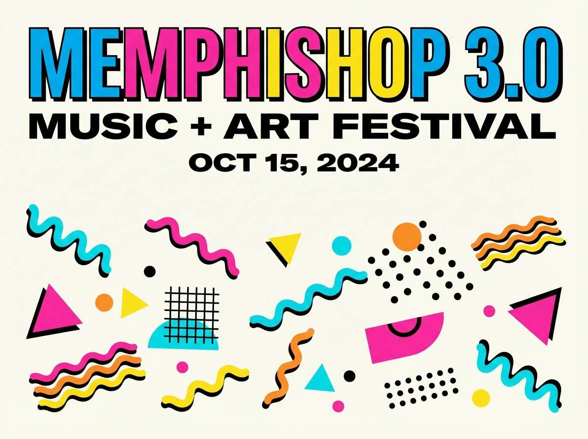
2) Memphis Pop
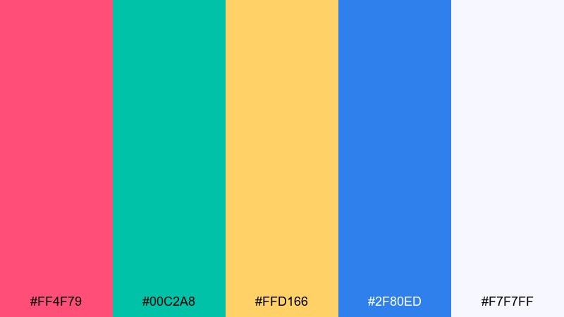
HEX: #ff4f79 #00c2a8 #ffd166 #2f80ed #f7f7ff
Mood: bouncy, graphic, upbeat
Best for: Event poster or flyer design
Bouncy and graphic, it brings back squiggles, confetti shapes, and upbeat radio hits. These are the kind of retro 90s color combinations that shine with big geometric blocks and playful type. Keep the off-white as breathing room so the pink and teal do not fight for attention. Tip: limit yourself to two hero colors per layout and let the yellow act as a punchy highlight.
Image example of memphis pop generated using media.io
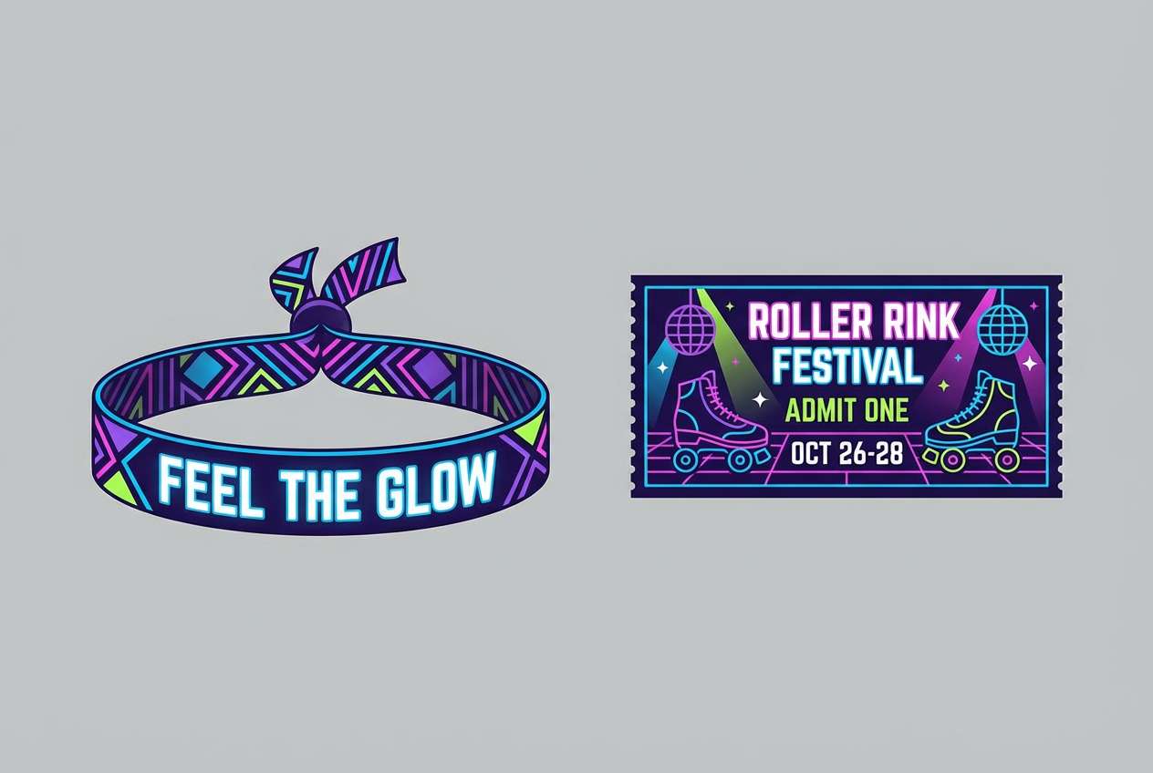
3) Roller Rink Glow
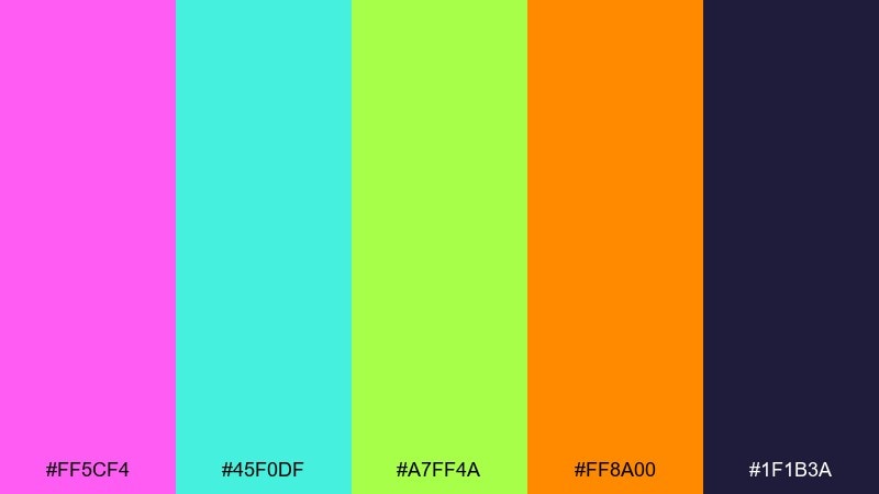
HEX: #ff5cf4 #45f0df #a7ff4a #ff8a00 #1f1b3a
Mood: sparkly, kinetic, nightlife
Best for: Festival wristband and ticket graphics
Sparkly and kinetic, it evokes disco balls, skate wheels, and colorful floor lights. The deep indigo grounds the brights, so use it for text and outlines while the neon tones do the heavy lifting. Orange works well for secondary highlights when pink and lime are already competing. Tip: set a single dominant neon and keep the others to small icons, stripes, or border details.
Image example of roller rink glow generated using media.io
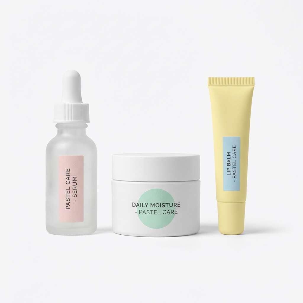
4) Snack Pack Pastels
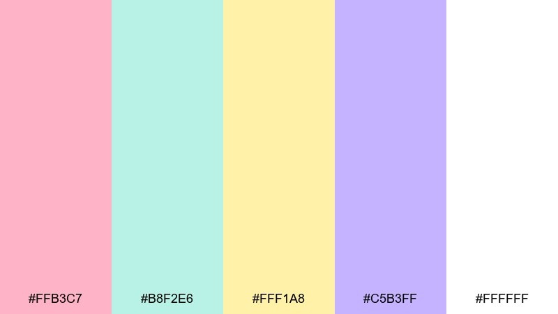
HEX: #ffb3c7 #b8f2e6 #fff1a8 #c5b3ff #ffffff
Mood: soft, sweet, nostalgic
Best for: Beauty packaging or sticker labels
Soft and sweet, it feels like lunchbox treats and pastel wrappers. These tones work best with simple shapes and generous white space so the design stays airy. Pair with a rounded sans font and minimal line icons for a friendly, modern finish. Tip: print tests matter here, so bump contrast slightly if you need small text to stay legible on the pale yellow.
Image example of snack pack pastels generated using media.io
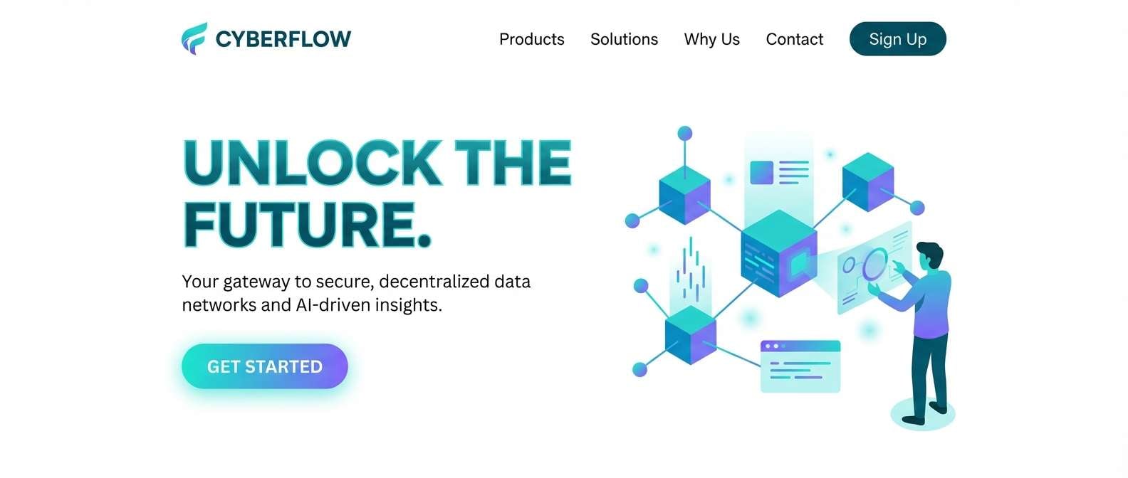
5) Cyber Teal Punch
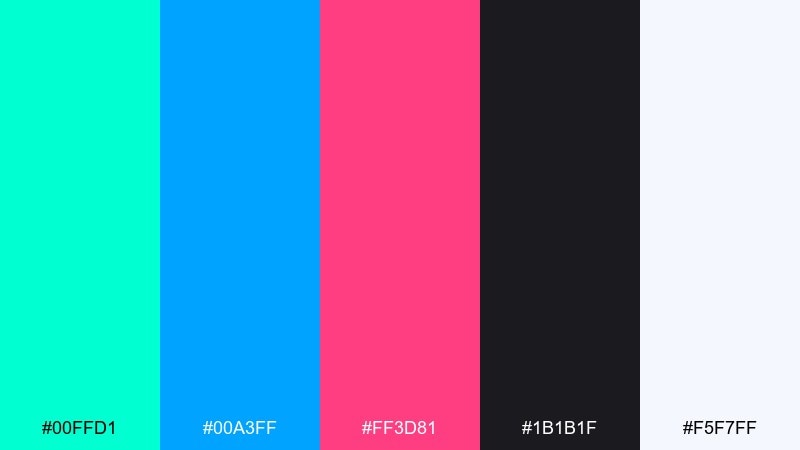
HEX: #00ffd1 #00a3ff #ff3d81 #1b1b1f #f5f7ff
Mood: techy, sharp, energetic
Best for: Landing page hero section and call-to-action buttons
Techy and sharp, it suggests dial-up futurism and glowing cursor trails. Use the near-black for headers and nav, then let teal and blue define structure with links and sections. Magenta is strongest as a conversion accent for primary buttons and promo tags. Tip: keep gradients subtle, and choose one neon highlight per component to avoid visual noise.
Image example of cyber teal punch generated using media.io
6) Bubblegum Denim
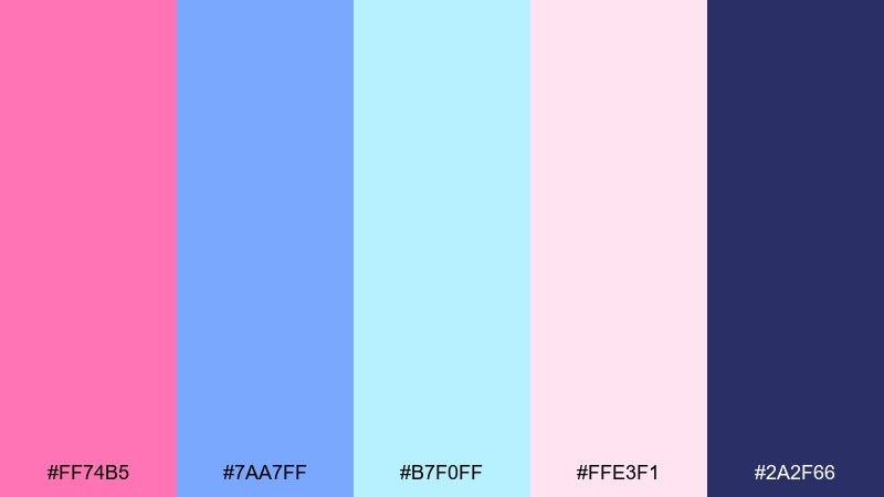
HEX: #ff74b5 #7aa7ff #b7f0ff #ffe3f1 #2a2f66
Mood: cute, breezy, pop-fashion
Best for: Social media carousel templates
Cute and breezy, it feels like denim jackets with bubblegum gloss. The navy makes a great anchor for headlines and small type, while the pink and blue carry the personality. Use the pale blush as a background so photos and cutout stickers stand out. Tip: add a thin navy border around pastel blocks to keep edges clean on mobile screens.
Image example of bubblegum denim generated using media.io
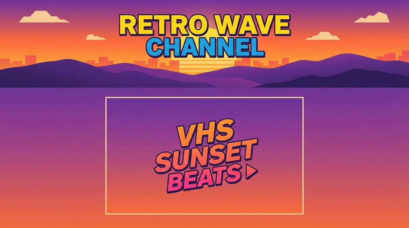
7) VHS Sunset
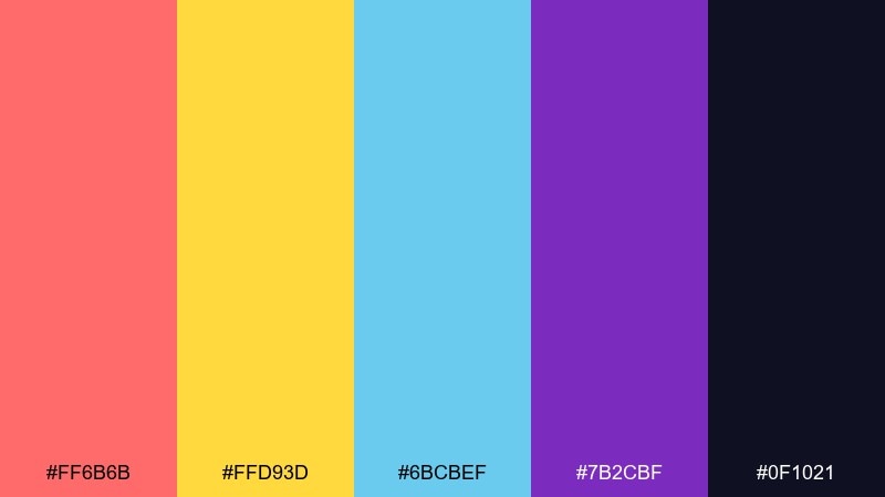
HEX: #ff6b6b #ffd93d #6bcbef #7b2cbf #0f1021
Mood: warm, cinematic, nostalgic
Best for: YouTube thumbnail and channel branding
Warm and cinematic, it looks like sun-faded tapes and a late-evening sky. These retro 90s color combinations pop when you layer coral and yellow over the deep midnight base. Keep cyan for small contrast cues like badges, arrows, or highlights around faces and titles. Tip: use a bold shadow on text so it stays readable against bright gradients.
Image example of vhs sunset generated using media.io
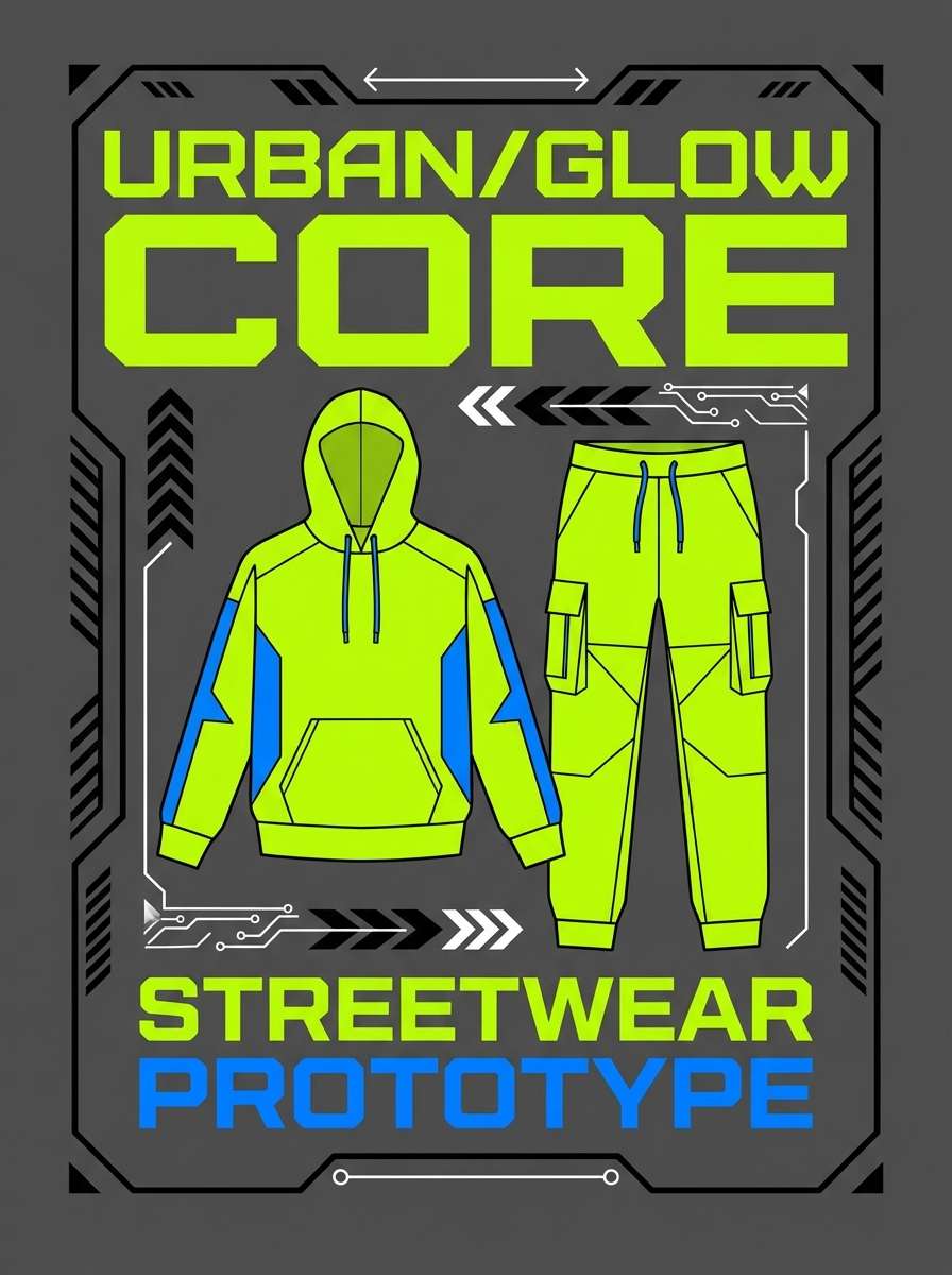
8) Laser Lime
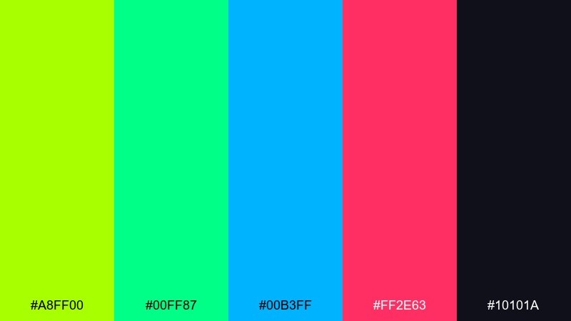
HEX: #a8ff00 #00ff87 #00b3ff #ff2e63 #10101a
Mood: loud, sporty, rave-ready
Best for: Streetwear product ad graphics
Loud and sporty, it recalls glow sticks, reflective windbreakers, and club flyers. The dark base gives you instant contrast, so let lime take the lead and use teal and blue as supporting accents. Pink works best in tiny bursts for price tags, stickers, or key product details. Tip: keep backgrounds simple and use chunky shapes so the lime does not overwhelm the layout.
Image example of laser lime generated using media.io
9) Purple Haze
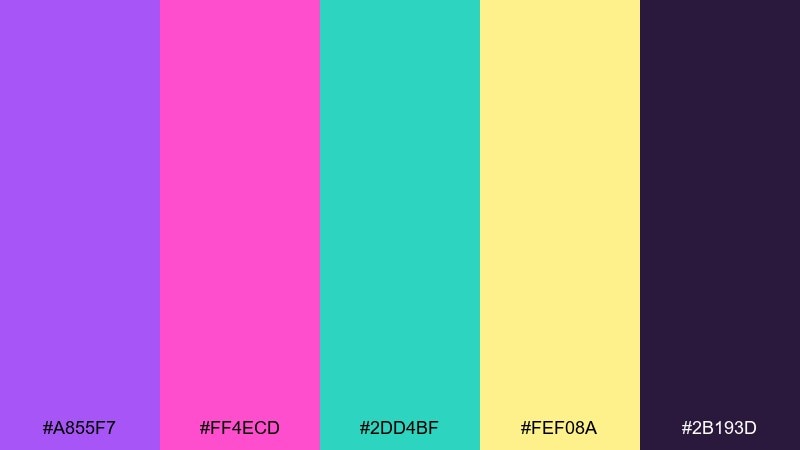
HEX: #a855f7 #ff4ecd #2dd4bf #fef08a #2b193d
Mood: dreamy, cosmic, artsy
Best for: Album cover art or playlist cover
Dreamy and cosmic, it suggests stage lights in a smoky room and glittery gel pens. Use the deep violet for backgrounds and let teal cut through for icons and focal elements. The pale yellow is ideal for small type and star-like details, especially when you need a softer contrast than white. Tip: try a grain texture overlay to make the gradients feel more analog.
Image example of purple haze generated using media.io
10) Aqua Sorbet
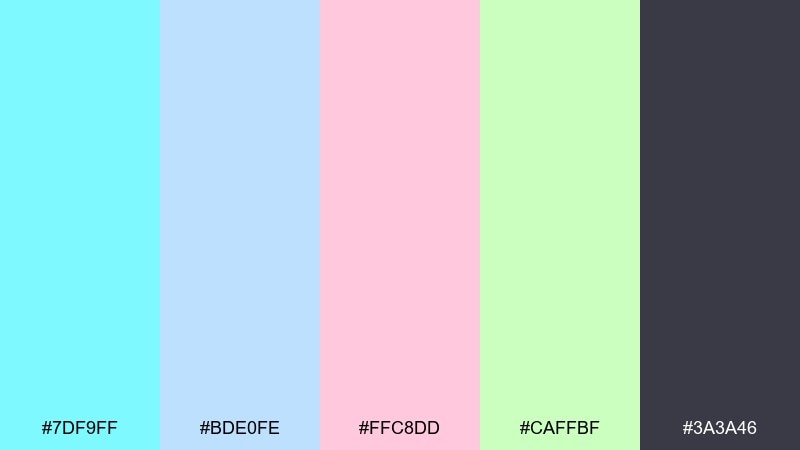
HEX: #7df9ff #bde0fe #ffc8dd #caffbf #3a3a46
Mood: fresh, sunny, friendly
Best for: Blog header illustrations and icons
Fresh and sunny, it feels like pool water, sherbet, and glossy magazine inserts. As a retro 90s color palette, it works nicely for light backgrounds with a single dark text color to keep reading comfortable. Balance the soft pastels with simple iconography and consistent spacing rather than heavy shadows. Tip: pick one pastel for each content category so navigation feels intuitive.
Image example of aqua sorbet generated using media.io
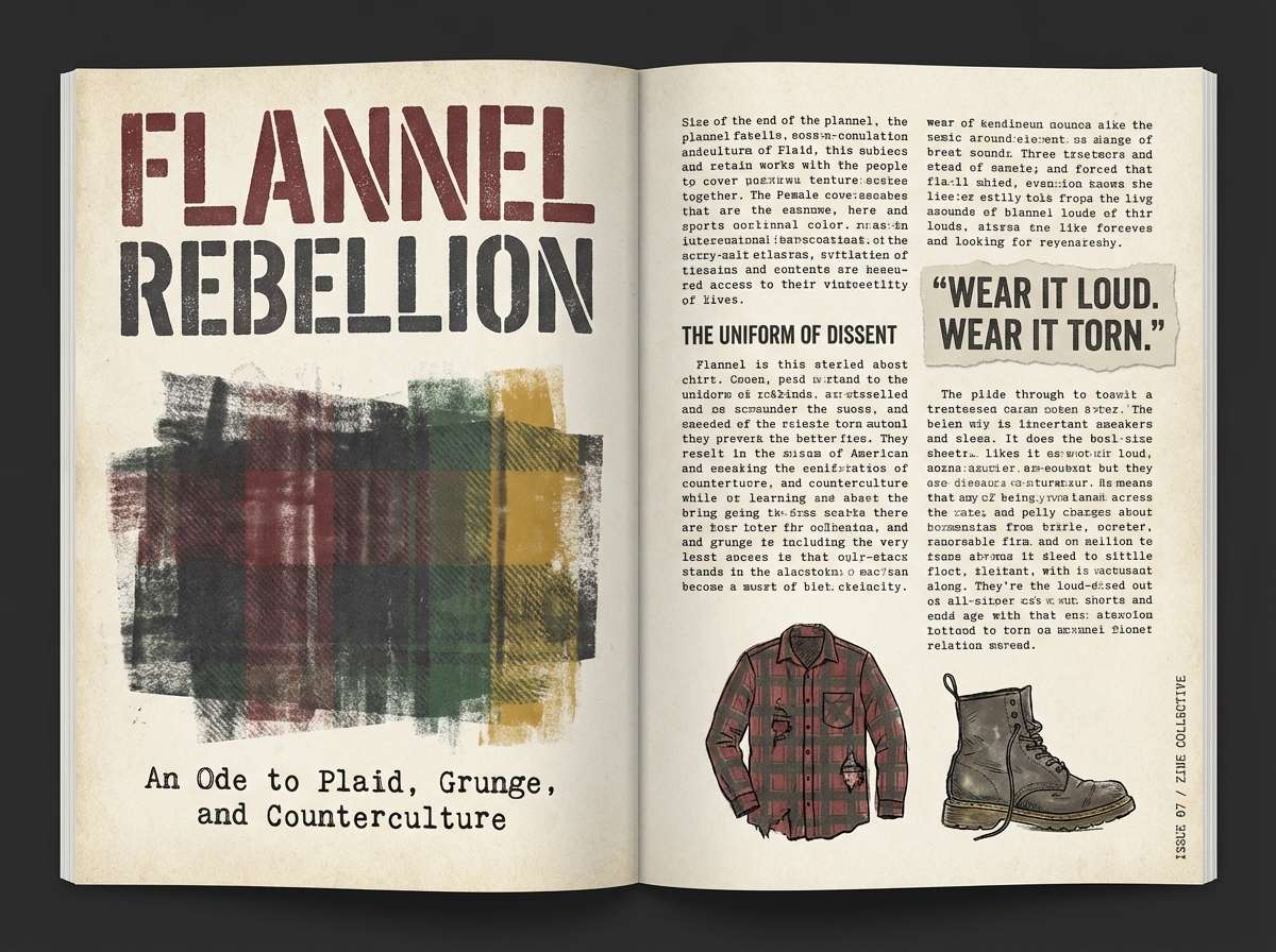
11) Grunge Flannel
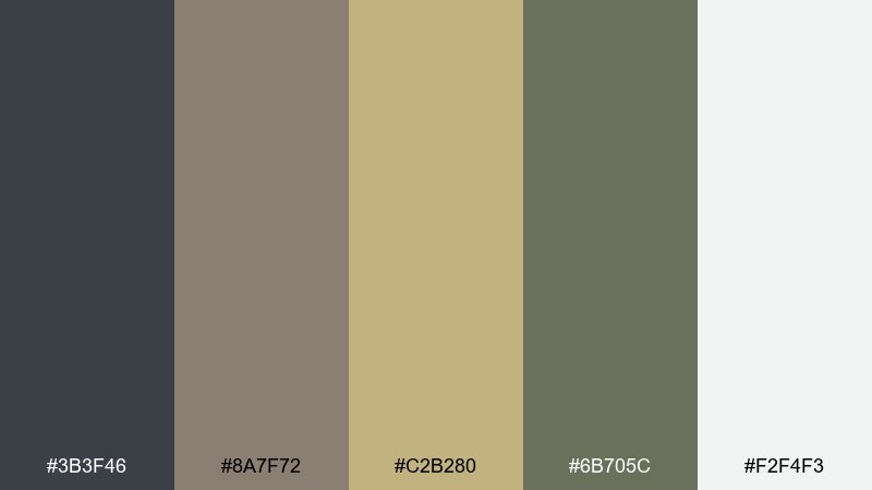
HEX: #3b3f46 #8a7f72 #c2b280 #6b705c #f2f4f3
Mood: earthy, moody, worn-in
Best for: Editorial zine layout and typography
Earthy and worn-in, it brings to mind thrifted flannel and photocopied zines. Use the charcoal for type, rules, and margins, then layer the muted tan and olive as paper-like blocks. The off-white keeps spreads from feeling too heavy, especially with dense text. Tip: lean into imperfect textures, but keep one consistent grid so the design still reads clean.
Image example of grunge flannel generated using media.io
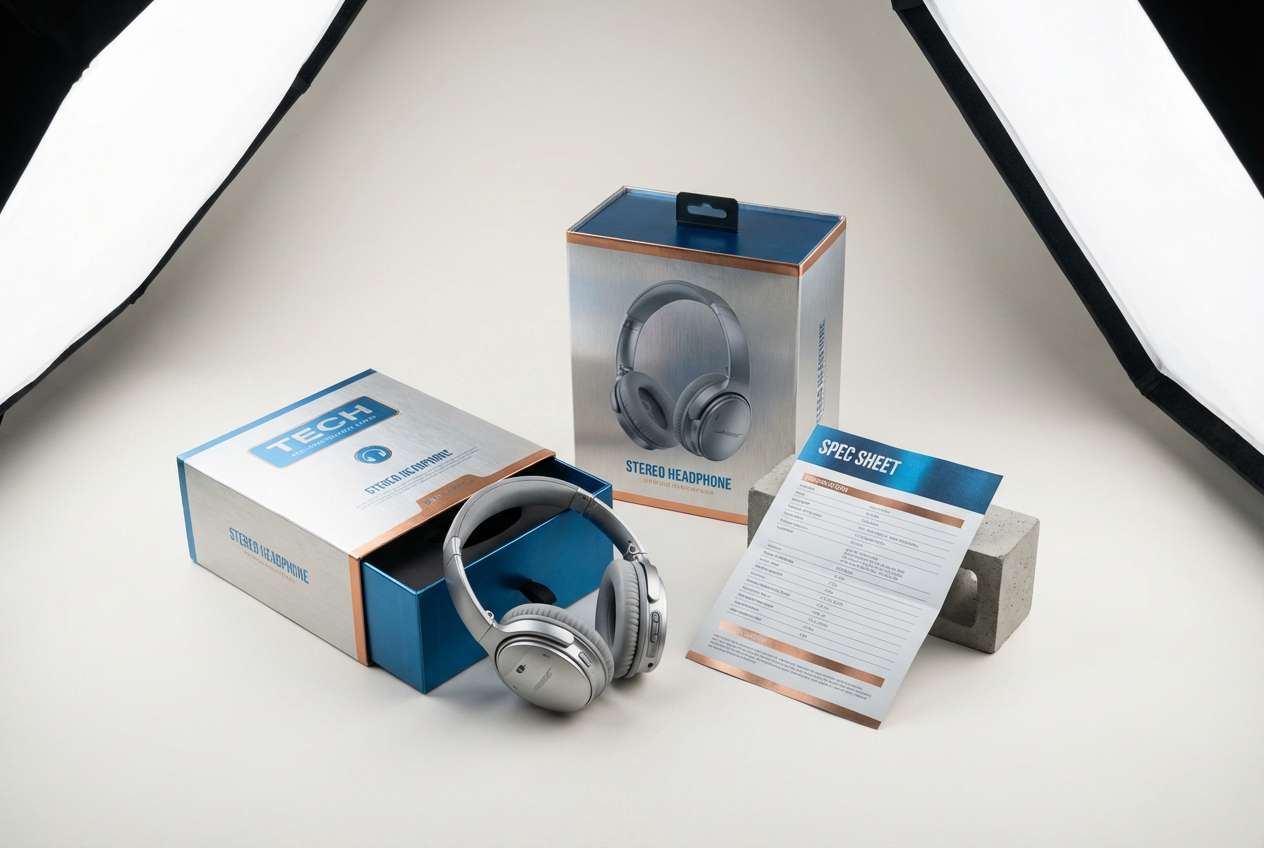
12) Stereo Metallic
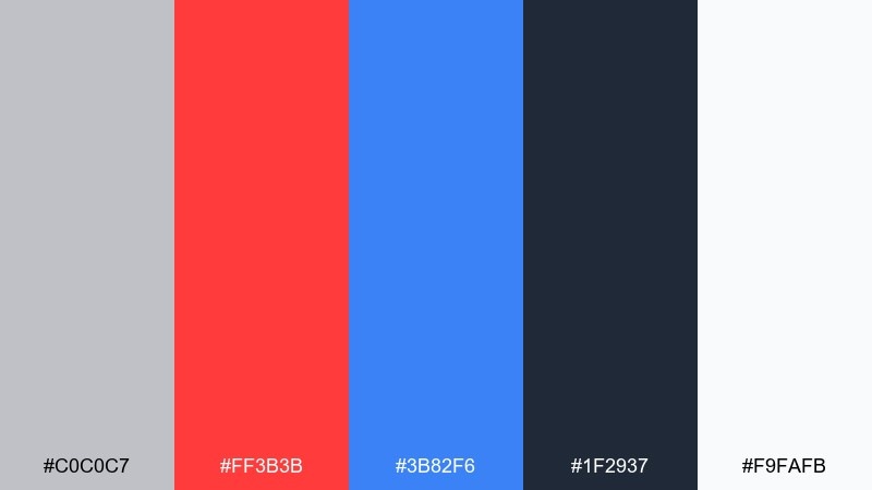
HEX: #c0c0c7 #ff3b3b #3b82f6 #1f2937 #f9fafb
Mood: sleek, bold, industrial-pop
Best for: Tech product packaging and spec sheet
Sleek and bold, it channels brushed metal, plastic buttons, and red status LEDs. Silver and off-white make clean surfaces, while navy brings the technical credibility for text and diagrams. Red should be reserved for key callouts like new, limited, or warning labels, with blue as the calmer secondary accent. Tip: use metallic gradients sparingly and keep most areas flat for a more authentic print look.
Image example of stereo metallic generated using media.io
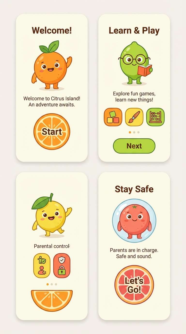
13) Cartoon Citrus
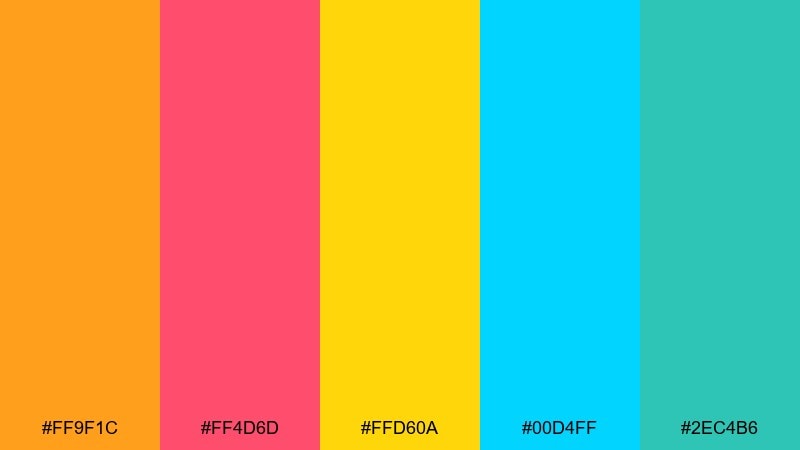
HEX: #ff9f1c #ff4d6d #ffd60a #00d4ff #2ec4b6
Mood: cheerful, kidcore, punchy
Best for: Kids app onboarding screens
Cheerful and punchy, it feels like Saturday morning cartoons and sticker sheets. Let the yellow and orange handle big friendly shapes, then use teal and cyan for navigation cues and progress states. Pink is perfect for celebratory moments like success screens and badges. Tip: keep icons thick and rounded so the palette stays playful, not chaotic.
Image example of cartoon citrus generated using media.io
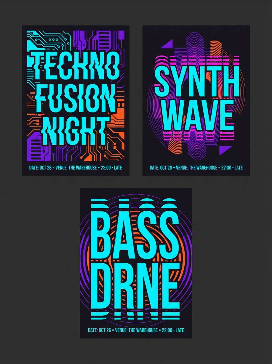
14) Techno Night
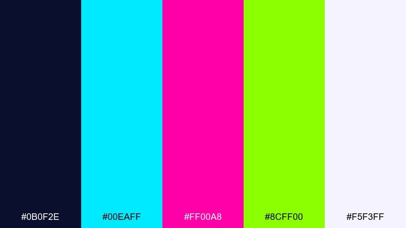
HEX: #0b0f2e #00eaff #ff00a8 #8cff00 #f5f3ff
Mood: clubby, futuristic, intense
Best for: Nightlife event poster series
Clubby and intense, it evokes strobe lights cutting through a dark room. Use the deep navy as the backdrop and keep white-lilac for legible details like dates and venue info. Magenta and cyan can carry the headline, while acid green makes a perfect highlight for the lineup. Tip: limit neon overlaps and use clean separations so colors do not vibrate on print.
Image example of techno night generated using media.io
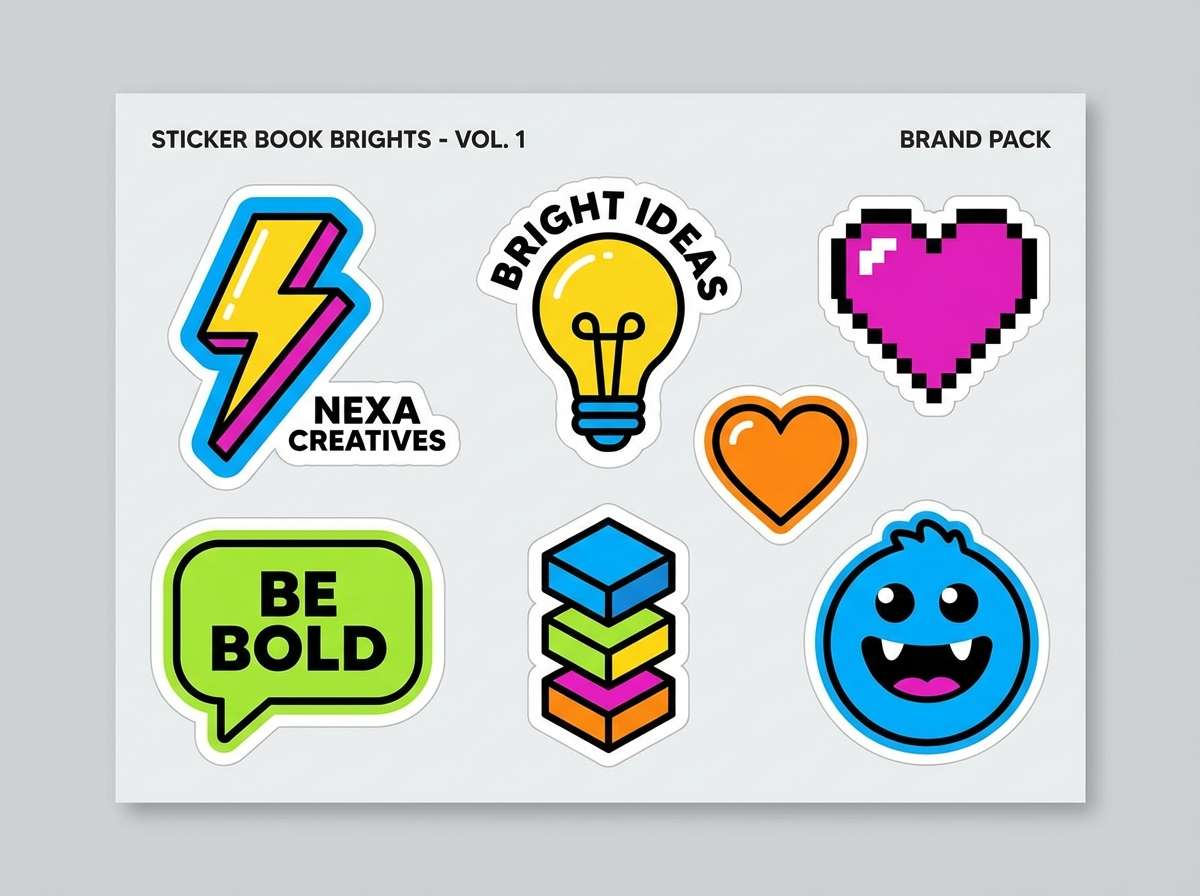
15) Sticker Book Brights
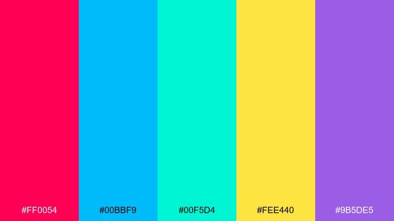
HEX: #ff0054 #00bbf9 #00f5d4 #fee440 #9b5de5
Mood: fun, punchy, maximalist
Best for: Brand sticker pack and merch graphics
Fun and maximalist, it looks like a fresh sticker pack peeled onto a notebook. A retro 90s color combination like this works best with chunky outlines and simple silhouettes. Keep the yellow for small pops so it stays bright instead of washing out surrounding colors. Tip: add a consistent 2 to 4px dark stroke around each sticker to unify the set.
Image example of sticker book brights generated using media.io
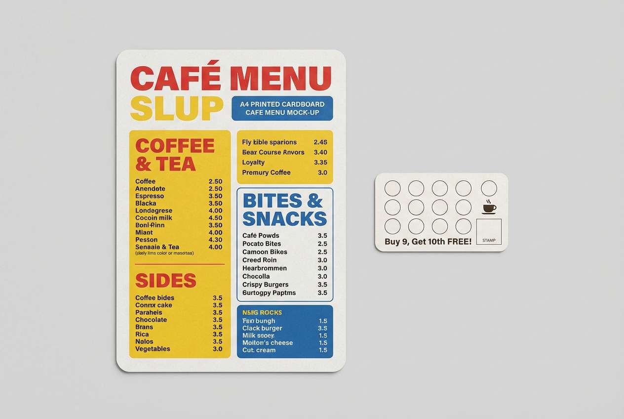
16) Mall Food Court
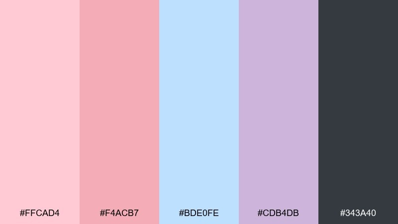
HEX: #ffcad4 #f4acb7 #bde0fe #cdb4db #343a40
Mood: cozy, pastel, everyday-nostalgia
Best for: Cafe menu and loyalty card design
Cozy and familiar, it feels like window shopping and a shared table under fluorescent lights. The charcoal keeps menus readable while the pinks and lilac add warmth without screaming neon. Use the powder blue for section dividers and small icons to guide the eye. Tip: choose matte paper and keep backgrounds light so the pastels stay clean, not muddy.
Image example of mall food court generated using media.io
17) Radioactive Tropic
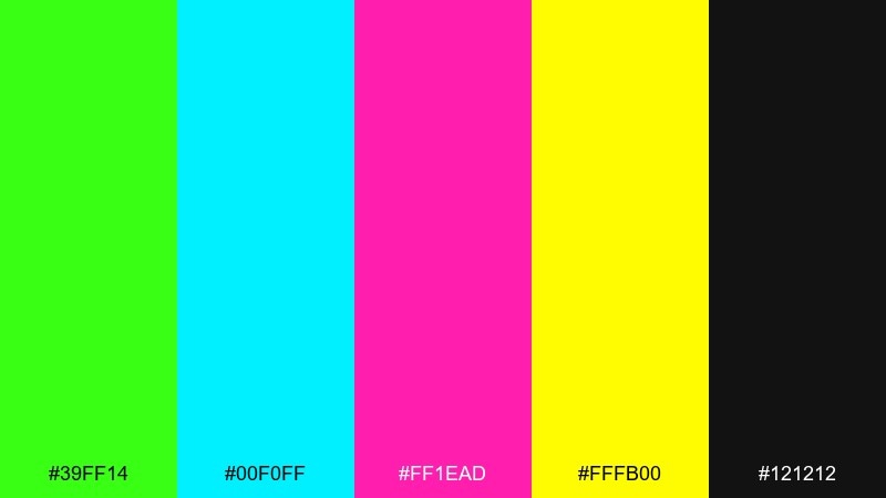
HEX: #39ff14 #00f0ff #ff1ead #fffb00 #121212
Mood: wild, high-energy, summer-rave
Best for: Summer sale banner and web ads
Wild and high-energy, it screams tropical nights with neon signage and loud music. Keep the black background dominant so lime and yellow read as true accents rather than full-page glare. Cyan helps structure the layout, while magenta draws attention to prices and limited-time tags. Tip: use big, simple typography and avoid thin lines that can flicker against the neon.
Image example of radioactive tropic generated using media.io
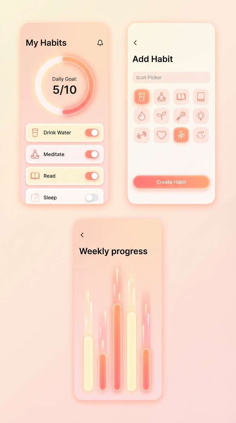
18) Soft Peachy Neon
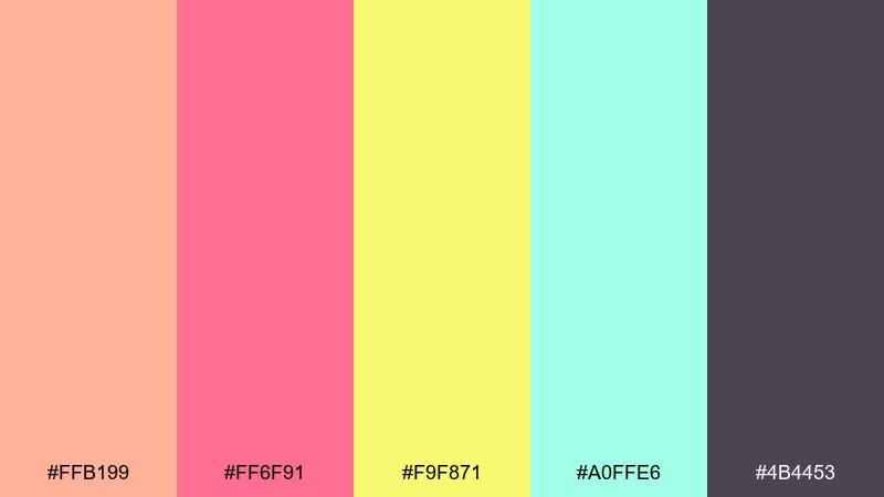
HEX: #ffb199 #ff6f91 #f9f871 #a0ffe6 #4b4453
Mood: optimistic, warm, playful-soft
Best for: Wellness app UI and habit tracker screens
Optimistic and warm, it blends peachy sunlight with a gentle neon kick. Use the muted purple-gray for text and outlines to keep the interface calm and readable. Pink is great for active states, while mint and yellow work as supportive highlights for progress and streaks. Tip: keep backgrounds mostly peach and reserve neon yellow for rewards, not navigation.
Image example of soft peachy neon generated using media.io
19) Alt Rock Poster
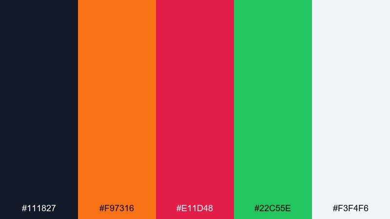
HEX: #111827 #f97316 #e11d48 #22c55e #f3f4f6
Mood: edgy, gritty, bold
Best for: Gig poster and merch tee graphic
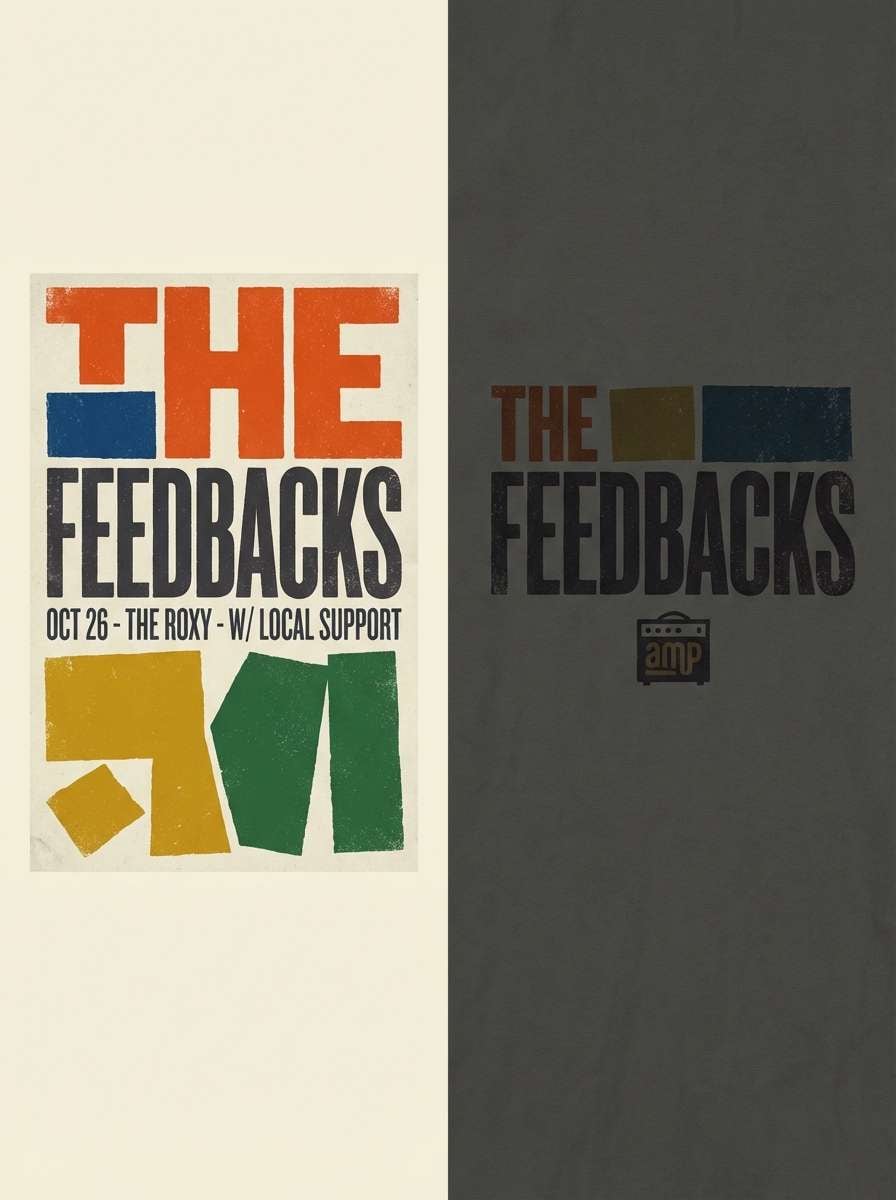
Edgy and gritty, it recalls stapled posters on brick walls and loud guitar riffs. Use the dark base for the main field, then let orange carry the headline and green act as a punchy secondary accent. The light gray keeps small details and venue info clean without going full white. Tip: add a halftone or rough texture behind the type to amplify the DIY vibe.
Image example of alt rock poster generated using media.io
20) Pixel Party
HEX: #00ffcc #ff00ff #ffff00 #ff6a00 #2d2a32
Mood: arcade-fun, energetic, digital
Best for: 8-bit style illustrations and icons
Arcade-fun and digital, it feels like pixel sprites and bonus levels. The dark gray makes a great screen-like base, while cyan and magenta create instant retro contrast. Yellow and orange are best used as highlight pixels, coins, or power-up flashes. Tip: restrict yourself to a small pixel grid and consistent dithering so the bright accents look intentional.
Image example of pixel party generated using media.io
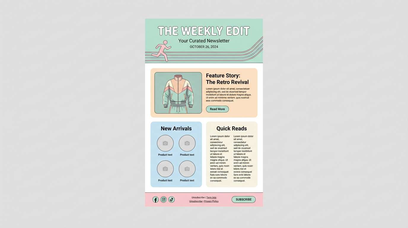
21) Pastel Track Suit
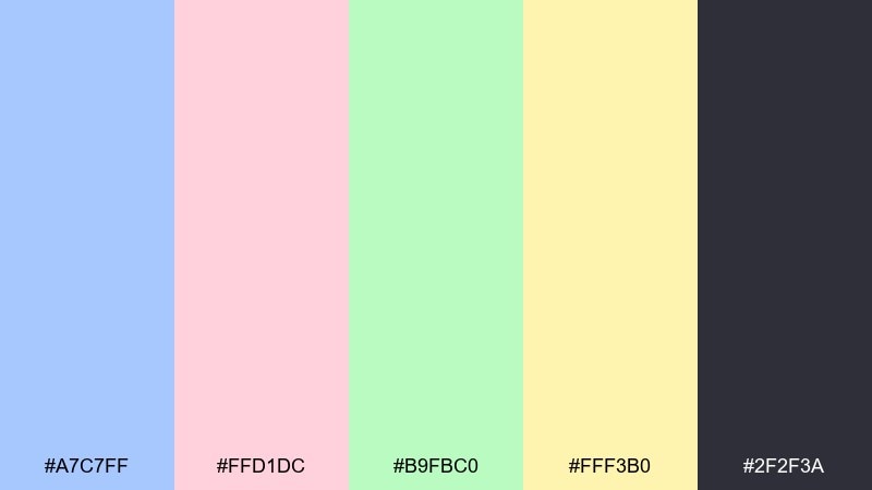
HEX: #a7c7ff #ffd1dc #b9fbc0 #fff3b0 #2f2f3a
Mood: sporty-soft, casual, sunny
Best for: Spring newsletter template and headers
Sporty-soft and sunny, it evokes track suits, tennis courts, and glossy catalog pages. Use the charcoal for text and dividers to keep the pastel blocks from feeling washed out. The mint and baby blue work well for sections, while pink can spotlight key links or feature cards. Tip: avoid pure white text on pastels and choose the dark anchor for accessibility.
Image example of pastel track suit generated using media.io
What Colors Go Well with Retro 90s?
Retro 90s colors pair best when you mix one “loud” neon with one calmer pastel, then ground everything with a dark anchor like near-black, deep navy, or charcoal.
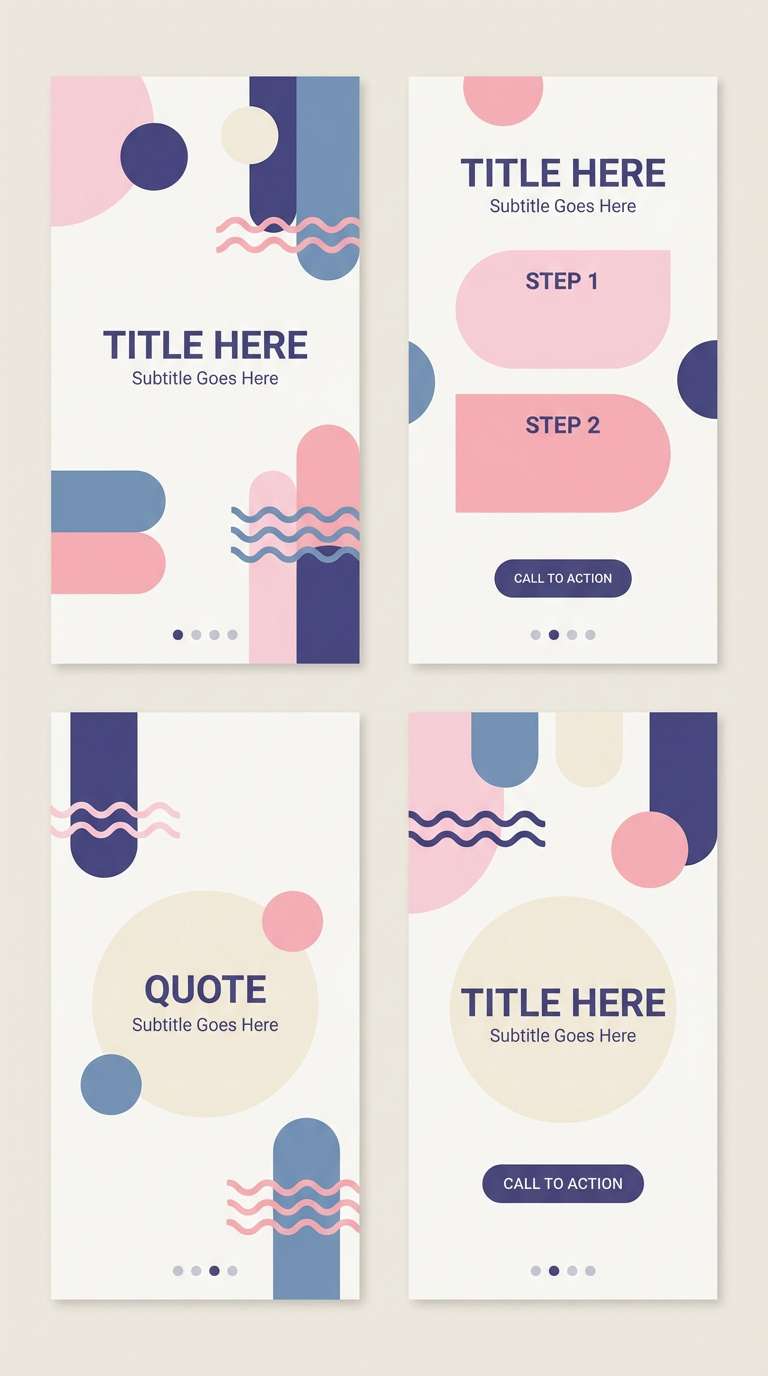
For classic 90s contrast, try cyan + magenta, teal + hot pink, or purple + neon yellow. If you prefer a softer Memphis vibe, use off-white backgrounds and choose two hero colors per layout.
To keep the look modern, use neutrals as layout structure (type, dividers, containers) and let your neon shades appear as UI states, badges, and headline accents.
How to Use a Retro 90s Color Palette in Real Designs
Start with hierarchy: pick one dominant color (brand field or background), one secondary color (sections or cards), and one accent color (CTA, highlights, price tags). Retro 90s works best when the contrast feels intentional.
For UI, reserve neons for interactive elements (active tabs, toggles, key buttons) and keep long reading areas on light neutrals. For posters and merch, use chunky shapes, bold typography, and clean separations so the colors don’t “vibrate.”
If you’re printing, test proofs: bright neons can shift on paper. Using slightly deeper anchors and thicker strokes helps maintain clarity across screens and print.
Create Retro 90s Palette Visuals with AI
If you already have HEX codes, the fastest way to validate a retro 90s color scheme is to generate a few mockups: poster layouts, UI screens, sticker sheets, or packaging shots.
With Media.io text-to-image, you can iterate on the same palette across different design formats, then keep the best composition and reuse it as a reference for real projects.
Try generating multiple variants with the same prompt and swap only the palette name (or the HEX codes) to quickly compare which retro 90s combination feels most on-brand.
Retro 90s Color Palette FAQs
-
What defines a retro 90s color palette?
Most retro 90s palettes combine high-saturation neons (cyan, magenta, lime, yellow) with softer pastels and a dark anchor (black or deep navy) to keep contrast sharp and readable. -
Which retro 90s colors are best for UI design?
Use a near-black or charcoal for text and surfaces, then choose one neon for primary CTAs (often magenta or teal) and one supporting bright for states and badges. Keeping neons as accents prevents eye fatigue. -
How do I avoid neon colors looking messy together?
Limit each screen or layout to one dominant neon and one secondary neon, then separate them with neutrals (white/off-white or deep navy). Clean spacing and thicker outlines also reduce “vibrating” edges. -
Are pastel retro 90s palettes still “90s” enough?
Yes. Pastel-forward schemes (like Memphis-inspired sets) are a core 90s look—especially when paired with graphic shapes, playful typography, and one darker anchor for contrast. -
What’s the best background color for retro 90s posters?
For high-energy neon posters, use near-black or deep navy backgrounds. For Memphis-style posters, use off-white so bright blocks and shapes stay crisp and readable. -
Do retro 90s palettes print well?
They can, but neons often shift in print. Run a quick test print, increase contrast for small text, and avoid very thin lines placed on top of high-chroma colors. -
Can I generate retro 90s palette mockups with AI?
Yes. You can use Media.io text-to-image to generate posters, UI mockups, stickers, and packaging concepts, then refine your prompt and reuse the same palette to keep the series consistent.


