

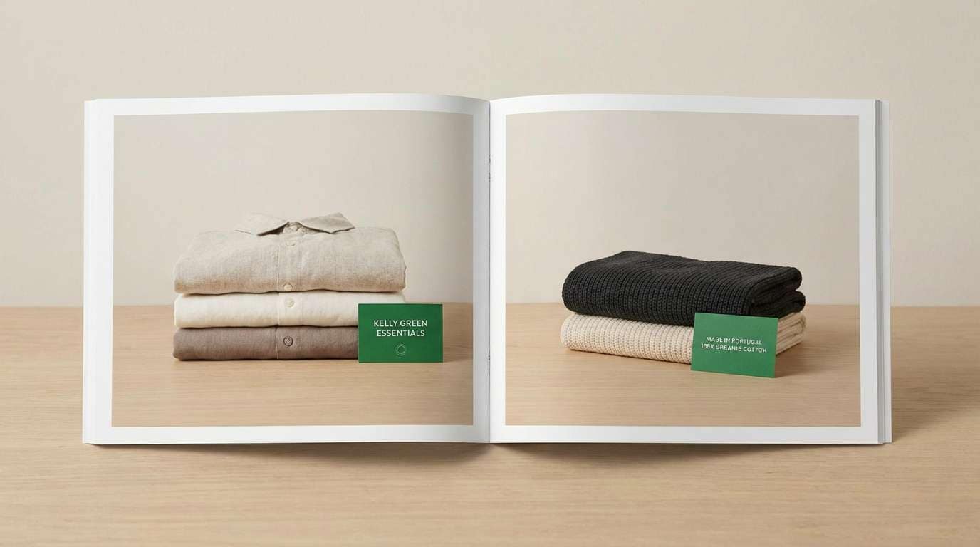
Kelly green is bright, confident, and instantly recognizable—perfect when you want a design to feel energetic without relying on neon tones.
Below are kelly green color palette ideas for branding, UI, print, packaging, and social content, each with ready-to-use HEX codes.
In this article
- Why Kelly Green Palettes Work So Well
-
- emerald campus
- clover and cream ui
- garden party stationery
- forest blush beauty
- retro diner pop
- botanical watercolor set
- city park minimal
- irish coast editorial
- neon market social
- olive ink banner
- minty data story
- kelly terracotta home
- lime zest fitness ui
- jade noir luxury
- meadow pastels baby
- evergreen tech landing
- green lilac studio
- citrus pop snacks
- classic green navy report
- rainy day neutrals
- What Colors Go Well with Kelly Green?
- How to Use a Kelly Green Color Palette in Real Designs
- Create Kelly Green Palette Visuals with AI
Why Kelly Green Palettes Work So Well
Kelly green sits in a sweet spot: it’s saturated enough to feel bold and “alive,” but still natural enough to pair with neutrals, woods, and soft tints. That balance makes it adaptable across modern UI, print, and product packaging.
Because the hue is strongly associated with growth, freshness, and success, it works well for calls-to-action, positive states, eco cues, and sporty brand energy. With the right supporting colors, it can also look premium, editorial, or cozy.
Most importantly, kelly green holds its own. It stays recognizable when used in small doses—badges, icons, borders, highlights—so you can build clear hierarchy without overloading a layout.
20+ Kelly Green Color Palette Ideas (with HEX Codes)
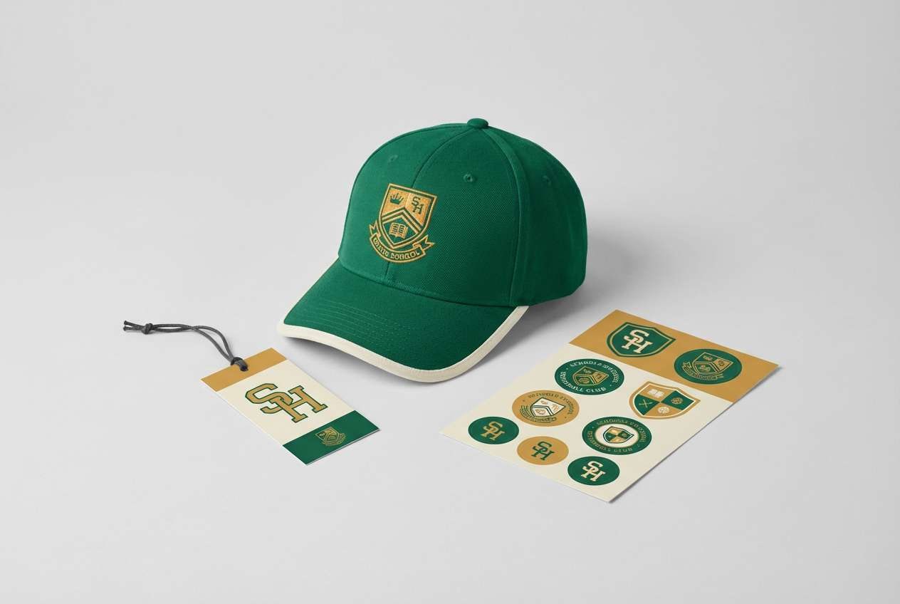
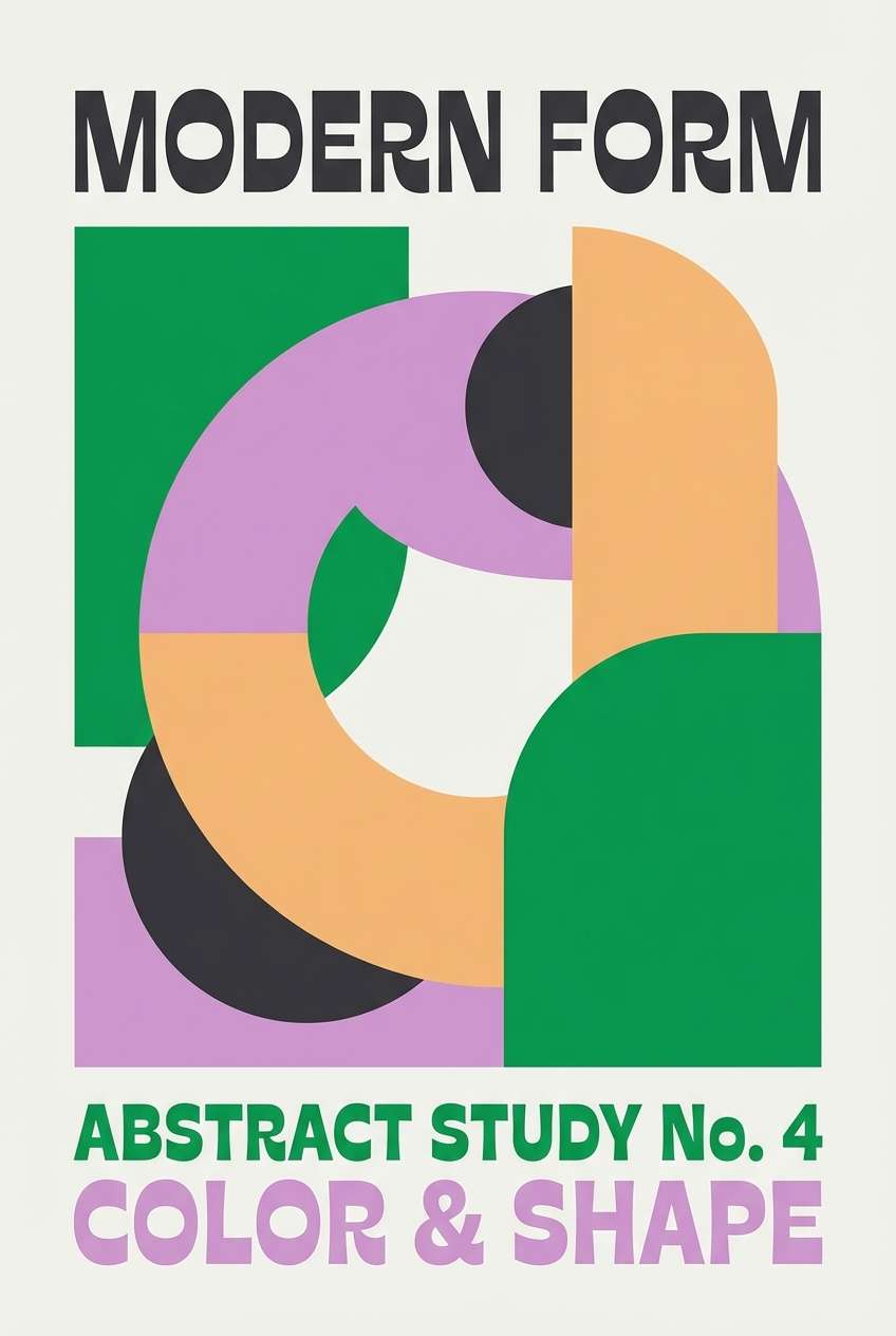
1) Emerald Campus
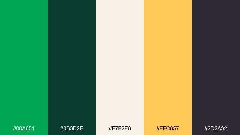
HEX: #00A651 #0B3D2E #F7F2E8 #FFC857 #2D2A32
Mood: spirited, classic, upbeat
Best for: sports branding and school merch
Spirited and classic, this mix feels like fresh turf, varsity jackets, and bright stadium lights. The green stays punchy while charcoal and deep forest keep it grounded. Pair it with warm gold for highlights on logos, patches, and typography. Tip: use the ivory as the main background so the green reads cleanly in print and embroidery.
Image example of emerald campus generated using media.io
Media.io is an online AI studio for creating and editing video, image, and audio in your browser.

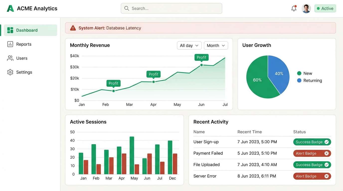
2) Clover and Cream UI
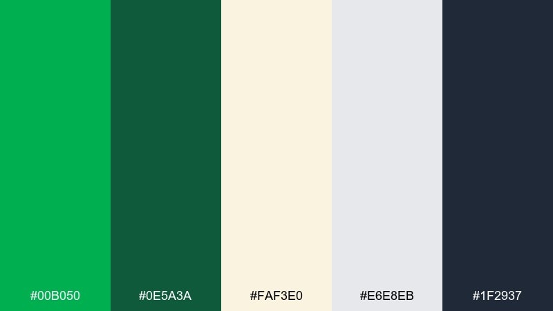
HEX: #00B050 #0E5A3A #FAF3E0 #E6E8EB #1F2937
Mood: clean, friendly, modern
Best for: saas dashboard UI
Clean and friendly, it evokes polished dashboards, tidy tables, and calm productivity. Cream softens the green so success states feel confident without shouting. Use charcoal for text and the cool gray for dividers, then reserve the darker green for primary buttons. Tip: keep green saturation consistent across charts so alerts and success badges do not compete.
Image example of clover and cream ui generated using media.io
3) Garden Party Stationery
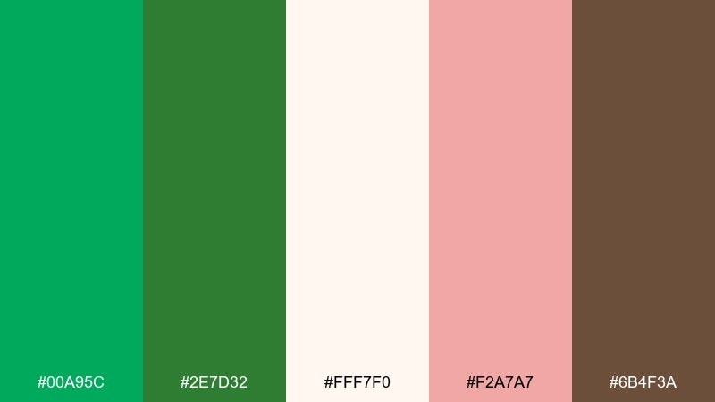
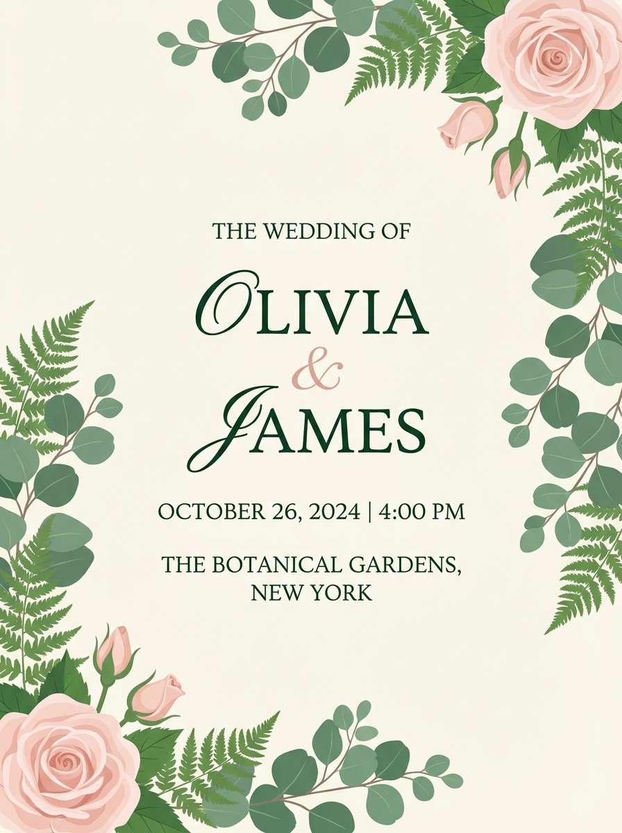
HEX: #00A95C #2E7D32 #FFF7F0 #F2A7A7 #6B4F3A
Mood: romantic, fresh, inviting
Best for: spring wedding invitation design
Romantic and fresh, it feels like florals on linen and sunlight through leaves. The blush brings softness while brown adds a grounded, paper-like warmth. Use green for monograms and borders, then let the cream carry the main text for readability. Tip: choose a single accent (blush or brown) for foil or embossing to keep the suite cohesive.
Image example of garden party stationery generated using media.io
4) Forest Blush Beauty
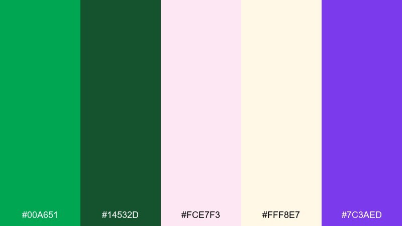
HEX: #00A651 #14532D #FCE7F3 #FFF8E7 #7C3AED
Mood: playful, chic, energetic
Best for: beauty packaging and labels
Playful and chic, it reads like a glossy boutique shelf with a surprising pop of violet. The blush and warm cream make the green feel fashion-forward instead of sporty. For a kelly green color palette that still looks premium, keep the green on caps and badges and use blush for the main label field. Tip: print-test the violet as a small accent only, so it stays crisp and does not muddy the greens.
Image example of forest blush beauty generated using media.io
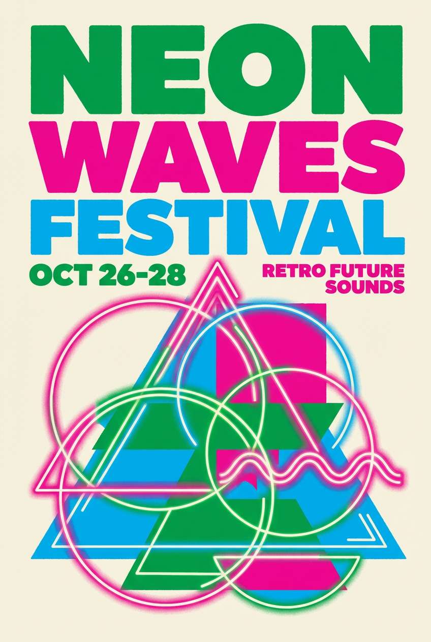
5) Retro Diner Pop
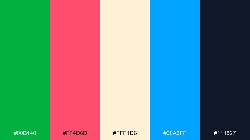
HEX: #00B140 #FF4D6D #FFF1D6 #00A3FF #111827
Mood: bold, nostalgic, high-contrast
Best for: poster and event promo graphics
Bold and nostalgic, it feels like neon signs, jukebox glow, and striped awnings. The hot pink and bright blue push the green into a lively, retro direction. Use the dark navy-black for headlines and outlines to keep the colors from vibrating. Tip: limit full-saturation fills to one or two shapes and rely on cream for breathing room.
Image example of retro diner pop generated using media.io
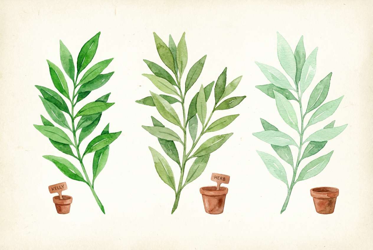
6) Botanical Watercolor Set
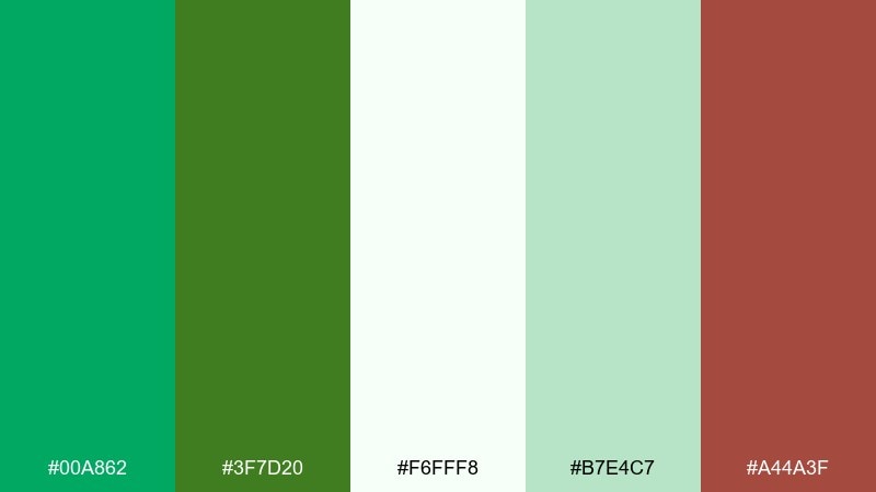
HEX: #00A862 #3F7D20 #F6FFF8 #B7E4C7 #A44A3F
Mood: airy, natural, hand-painted
Best for: botanical illustration and prints
Airy and natural, it brings to mind watercolor leaves, pressed herbs, and quiet garden notes. Soft minty green supports the brighter green without stealing focus. Add the warm clay tone for stems, seeds, or small captions to keep the artwork from feeling too cool. Tip: keep edges slightly transparent so the palette retains a hand-painted look.
Image example of botanical watercolor set generated using media.io
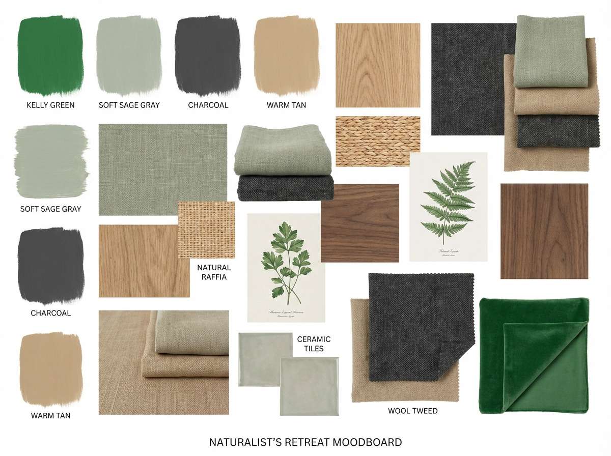
7) City Park Minimal
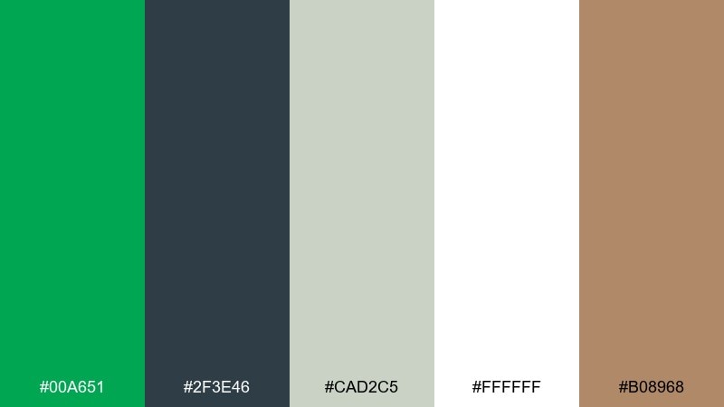
HEX: #00A651 #2F3E46 #CAD2C5 #FFFFFF #B08968
Mood: minimal, calm, urban-natural
Best for: interior moodboards and decor planning
Minimal and calm, it feels like a city park bench under clean modern architecture. The green acts as a single confident accent against soft grays and white. Use tan as a wood note for shelving, frames, or textiles to keep the look welcoming. Tip: repeat the green in small doses across the room rather than one large painted wall.
Image example of city park minimal generated using media.io
8) Irish Coast Editorial
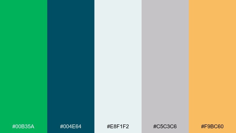
HEX: #00B35A #004E64 #E8F1F2 #C5C3C6 #F9BC60
Mood: crisp, coastal, editorial
Best for: magazine layouts and lookbooks
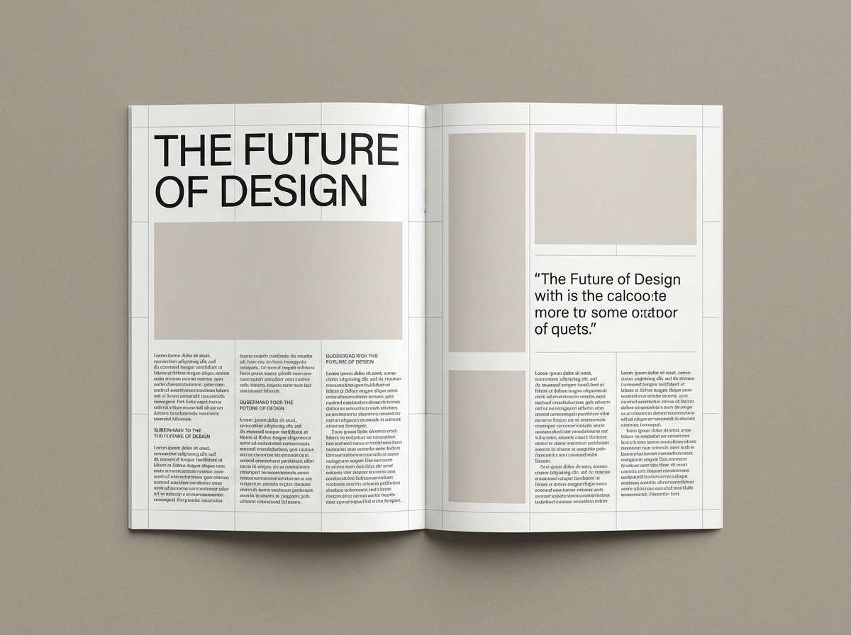
Crisp and coastal, it evokes sea air, bright grass, and clean printed pages. Blue-green depth adds sophistication while the warm amber keeps it lively. Use the pale ice tone for margins and negative space so imagery and headlines feel premium. Tip: reserve amber for pull quotes or page markers to guide the reader subtly.
Image example of irish coast editorial generated using media.io
9) Neon Market Social
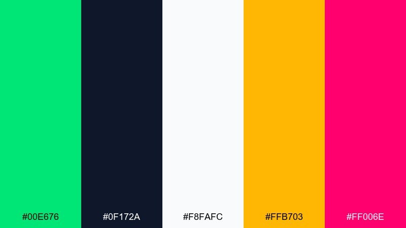
HEX: #00E676 #0F172A #F8FAFC #FFB703 #FF006E
Mood: flashy, fun, youthful
Best for: social media ad creatives
Flashy and fun, it feels like night markets, bold stickers, and bright callouts. The nearly-black base makes the green and pink glow for attention-grabbing promos. Keep body copy in off-white and use yellow only for price tags or limited-time badges. Tip: add subtle outlines around neon elements so they stay readable on small screens.
Image example of neon market social generated using media.io

10) Olive Ink Banner
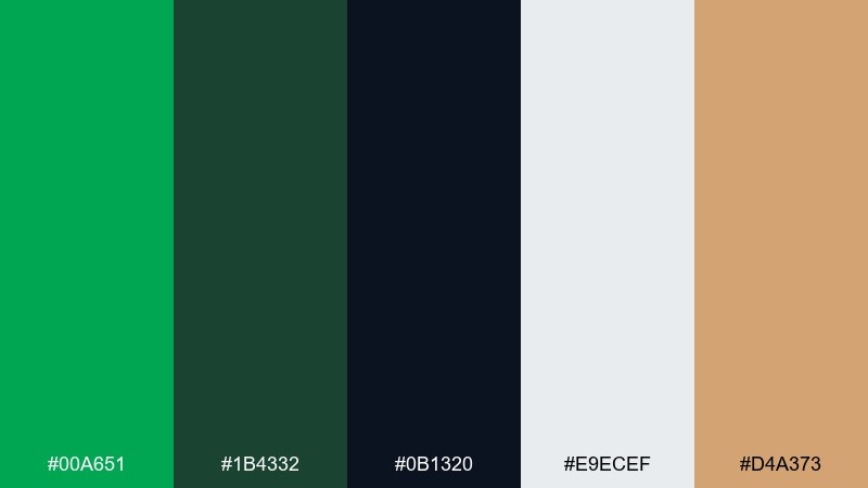
HEX: #00A651 #1B4332 #0B1320 #E9ECEF #D4A373
Mood: confident, refined, business-ready
Best for: website hero banners and headers
Confident and refined, it suggests trustworthy products with a modern edge. Deep ink and olive tones make the bright green feel controlled rather than loud. Use the light gray as the main field for clean typography and let tan act as a subtle warmth for icons. Tip: keep gradients out of the greens to avoid banding on wide banners.
Image example of olive ink banner generated using media.io
11) Minty Data Story
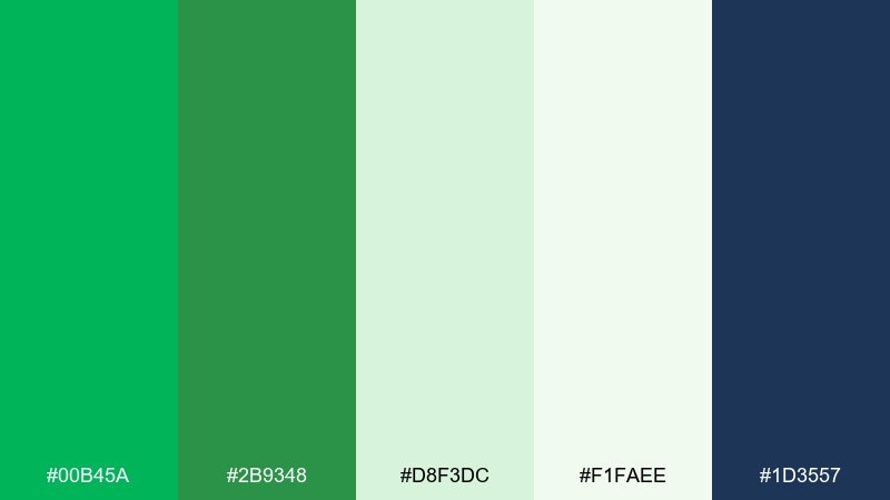
HEX: #00B45A #2B9348 #D8F3DC #F1FAEE #1D3557
Mood: clear, optimistic, informative
Best for: infographics and report charts
Clear and optimistic, it reads like tidy charts and well-organized insights. The mint and near-white give plenty of contrast for labels, while navy anchors axes and captions. Use the two greens for series comparisons and keep grid lines very light for a cleaner finish. Tip: test accessibility by ensuring the navy text meets contrast standards on mint fills.
Image example of minty data story generated using media.io
12) Kelly Terracotta Home
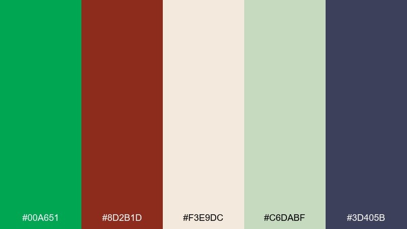
HEX: #00A651 #8D2B1D #F3E9DC #C6DABF #3D405B
Mood: earthy, cozy, modern-rustic
Best for: kitchen decor and home branding
Earthy and cozy, it feels like terracotta planters next to glossy green herbs on a windowsill. The warm red-brown adds comfort while the muted sage keeps the palette from getting too bright. Use the deep indigo as a grounding color for typography, hardware, or trim. Tip: choose matte finishes for terracotta accents so the green stays the hero.
Image example of kelly terracotta home generated using media.io
13) Lime Zest Fitness UI
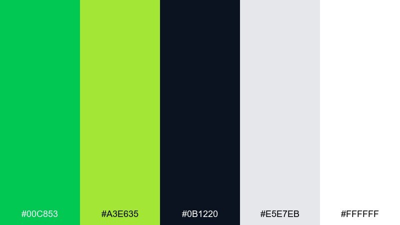
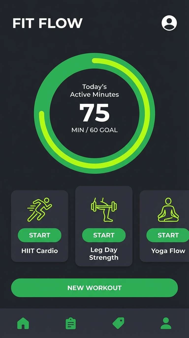
HEX: #00C853 #A3E635 #0B1220 #E5E7EB #FFFFFF
Mood: energizing, sporty, sharp
Best for: fitness app UI screens
Energizing and sharp, it evokes interval timers, progress rings, and clean athletic gear. The lime adds a quick jolt that works well for highlights and streaks. For kelly green color combinations that still feel sleek, keep the background dark and let white carry the text and key stats. Tip: use lime only for active states so the main green remains the primary brand signal.
Image example of lime zest fitness ui generated using media.io
14) Jade Noir Luxury
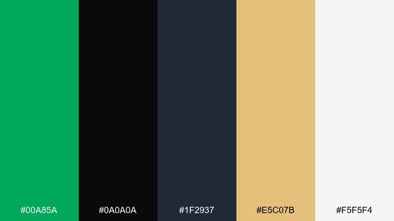
HEX: #00A85A #0A0A0A #1F2937 #E5C07B #F5F5F4
Mood: luxurious, dramatic, confident
Best for: premium spirits packaging
Luxurious and dramatic, it feels like a dark bar with a single jewel-toned label catching the light. Black and graphite sharpen the green, while gold brings a heritage finish. Use off-white for legal copy so it stays readable on dark labels and cartons. Tip: keep gold as foil only on small details to avoid overpowering the green.
Image example of jade noir luxury generated using media.io
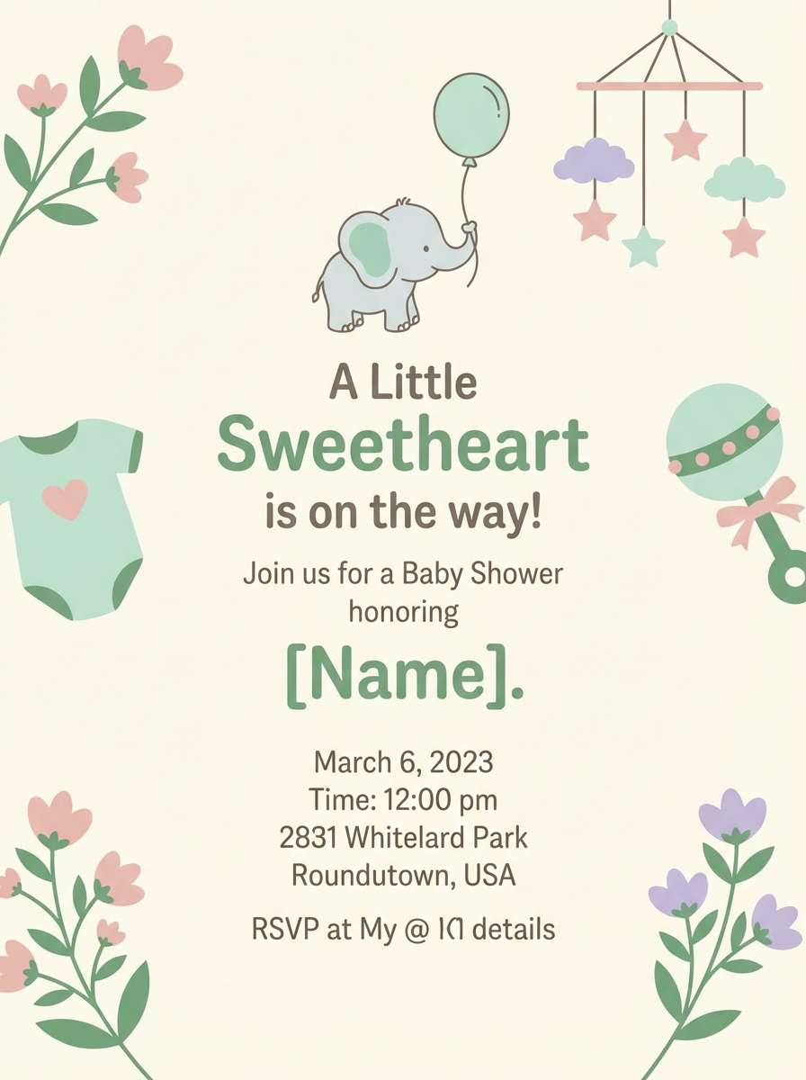
15) Meadow Pastels Baby
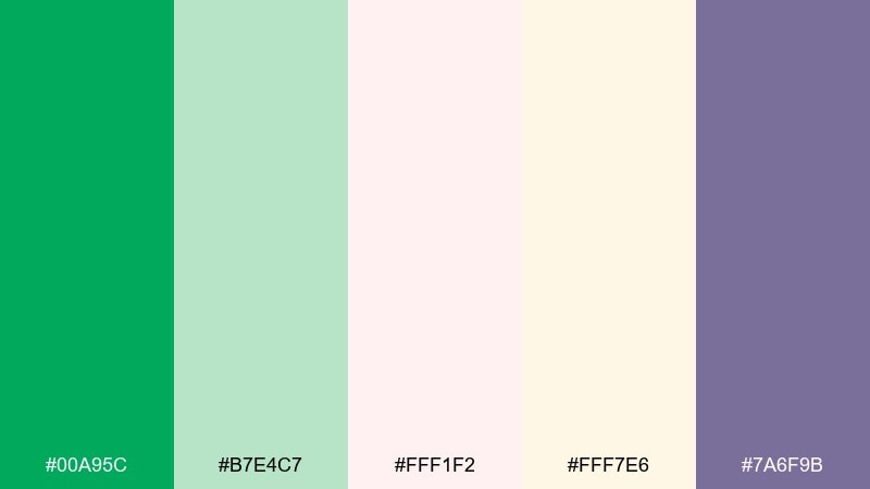
HEX: #00A95C #B7E4C7 #FFF1F2 #FFF7E6 #7A6F9B
Mood: gentle, cheerful, soft
Best for: baby shower invitations
Gentle and cheerful, it brings to mind soft blankets, spring blooms, and light-filled mornings. Pastel pink and buttery cream keep the green friendly and approachable. Use lavender for small icons or headers to add personality without making the design busy. Tip: print on uncoated paper to keep the pastels airy and true.
Image example of meadow pastels baby generated using media.io
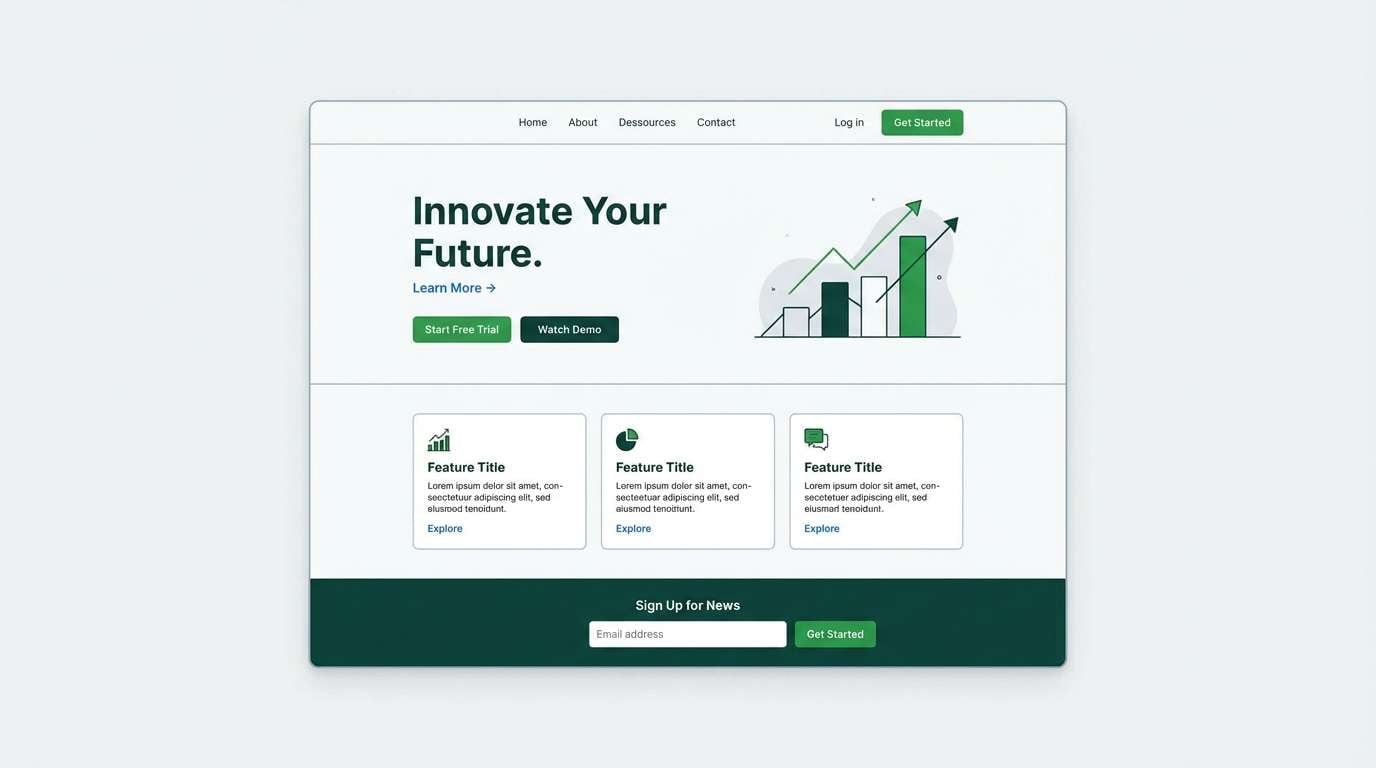
16) Evergreen Tech Landing
HEX: #00B050 #0F5132 #F8FAFC #CBD5E1 #2563EB
Mood: trustworthy, modern, crisp
Best for: startup landing pages
Trustworthy and crisp, it suggests secure systems with a modern, approachable feel. The blue adds clarity for links and secondary actions without competing with the main green. Use the light slate for section breaks and keep the darkest green for primary buttons and key metrics. Tip: keep shadows subtle so the palette stays clean and product-focused.
Image example of evergreen tech landing generated using media.io
17) Green Lilac Studio
HEX: #00A651 #7C3AED #F4F1FF #FFE8D6 #2D2A32
Mood: creative, punchy, artsy
Best for: art print posters
Creative and punchy, it feels like a studio wall covered in bold prints and paint swatches. Lilac brings a modern twist that makes the green look intentional and design-led. If you want a kelly green color palette that avoids the sporty vibe, lean on lilac for large blocks and keep green for shapes and titles. Tip: use charcoal for thin outlines and type to keep the colors from blurring together at a distance.
Image example of green lilac studio generated using media.io
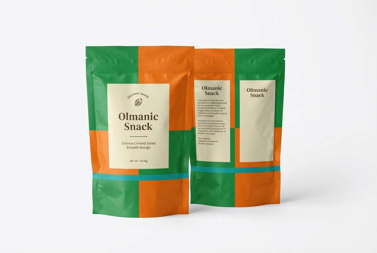
18) Citrus Pop Snacks
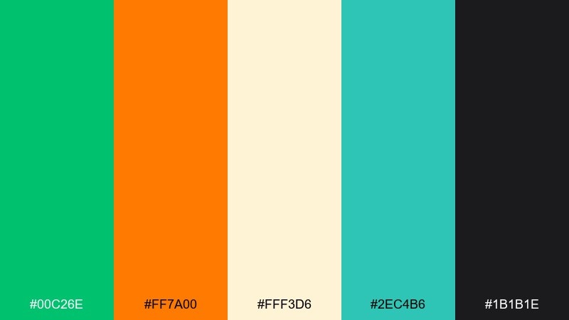
HEX: #00C26E #FF7A00 #FFF3D6 #2EC4B6 #1B1B1E
Mood: zesty, playful, high-energy
Best for: snack packaging design
Zesty and playful, it evokes fizzy citrus, bold flavor labels, and quick grab-and-go energy. Orange makes the green feel even fresher, while teal adds a modern twist. For kelly green color combinations on packaging, keep the darkest shade for nutrition text and barcode areas so the front stays bright. Tip: use the cream as a buffer behind small type to maintain legibility on curved bags or tubes.
Image example of citrus pop snacks generated using media.io
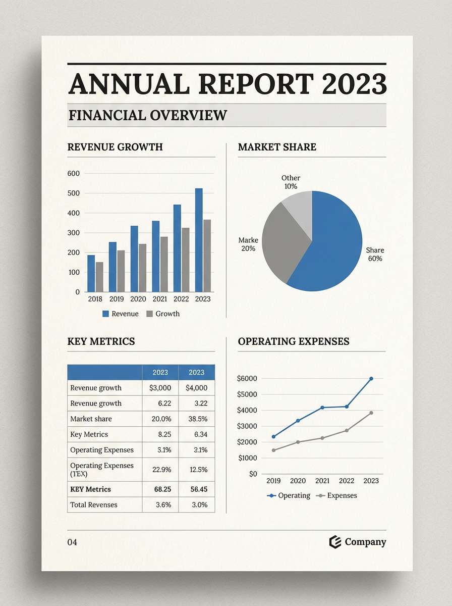
19) Classic Green Navy Report
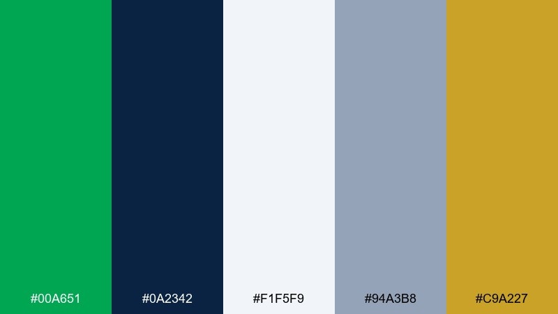
HEX: #00A651 #0A2342 #F1F5F9 #94A3B8 #C9A227
Mood: professional, composed, reliable
Best for: annual reports and presentations
Professional and composed, it feels like a well-edited report with clear hierarchy and calm confidence. Navy does the heavy lifting for body text while green signals wins, growth, and key callouts. Use slate for charts and dividers, then add muted gold sparingly for milestones or section titles. Tip: keep green highlights consistent across pages so charts and tables stay easy to scan.
Image example of classic green navy report generated using media.io
20) Rainy Day Neutrals
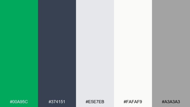
HEX: #00A95C #374151 #E5E7EB #FAFAF9 #A3A3A3
Mood: muted, modern, versatile
Best for: apparel lookbooks and ecommerce
Muted and modern, it feels like an overcast day where one bright green umbrella stands out. The neutrals are practical for photography-heavy layouts and let product images breathe. Use the green for tags like new, in stock, or eco notes, and keep the rest of the interface quietly gray. Tip: stick to one neutral background (off-white or light gray) across the lookbook for a consistent rhythm.
Image example of rainy day neutrals generated using media.io
What Colors Go Well with Kelly Green?
Kelly green pairs easily with crisp neutrals like white, ivory, and light gray when you want a clean, modern look. Add charcoal or near-black to make the green feel more controlled and professional, especially in UI and presentation design.
For warmer, friendlier combinations, try kelly green with tan, terracotta, or muted gold—these tones reduce the “sporty” feel and introduce a grounded, premium warmth. Peach and blush also work well when you want a softer, more lifestyle-forward mood.
If you want maximum pop, combine kelly green with bright accents like orange, hot pink, or electric blue. In those cases, keep one saturated color dominant and use the others as small highlights to avoid visual vibration.
How to Use a Kelly Green Color Palette in Real Designs
Start by deciding the role of kelly green: primary brand color (logos and core UI actions) or accent color (badges, links, highlights). Most layouts look best when green is used intentionally in repeated, small moments rather than large full-screen fills.
For accessibility and readability, pair kelly green with a dark text color (charcoal/navy) and reserve light neutrals for backgrounds. In print or packaging, test swatches—bright greens can shift on different papers, coatings, and lighting.
To keep hierarchy clear, limit the palette to one main green, one dark anchor, one light background, and one warm accent. This structure works across dashboards, posters, labels, and brand systems without feeling chaotic.
Create Kelly Green Palette Visuals with AI
If you have HEX codes but need real mockups—posters, packaging, dashboards, or moodboards—AI image generation can help you explore concepts quickly. The fastest workflow is to describe the scene, name your colors, and specify lighting, style, and aspect ratio.
With Media.io’s text-to-image tool, you can generate consistent palette visuals for presentations, client reviews, and A/B testing. Reuse prompts and swap accents (gold, peach, lilac) to iterate without rebuilding layouts from scratch.
Kelly Green Color Palette FAQs
-
What is kelly green (and how is it different from emerald or lime)?
Kelly green is a vivid, “true” mid-green with strong saturation. Emerald usually leans darker and bluer, while lime shifts more yellow and often feels more neon. -
Is kelly green a good color for branding?
Yes—kelly green signals energy, growth, and positivity, which works well for sports, wellness, eco-forward products, and modern consumer brands. Pair it with charcoal, navy, or warm neutrals if you want a more premium or business-ready tone. -
What neutrals pair best with kelly green?
White, ivory/cream, light gray, and charcoal are the easiest pairings. They help the green stay crisp and readable across UI, print, and packaging. -
What accent colors look good with kelly green?
Warm accents like gold, tan, terracotta, peach, and orange add balance and reduce the sporty vibe. For bolder looks, try hot pink or bright blue in small doses. -
How do I keep kelly green from overpowering a design?
Use it as an accent (buttons, icons, badges, borders) and let a light neutral be the main background. Keep one dark anchor color for typography so the layout has structure. -
Does kelly green print accurately?
It can shift depending on paper and ink (especially on uncoated stock). Print a small proof first, and consider slightly reducing saturation if the green looks too loud or bleeds into nearby colors. -
Can I generate palette mockups using the HEX codes?
Yes—turn each palette into posters, labels, UI screens, or moodboards by describing the scene and specifying your colors in the prompt. Media.io makes it easy to iterate and keep a consistent art direction.


