

A retro 80s color palette is all about bold contrast: neon brights, candy pastels, and deep “night mode” bases that make everything feel energetic and instantly recognizable.
Whether you’re designing posters, UI, packaging, or branding, these retro 80s color combinations help you create that synthwave, Miami Vice, and VHS-era vibe while still looking clean and modern.
In this article
- Why Retro 80s Palettes Work So Well
-
- neon arcade
- miami sunset
- vhs pastel
- laser grid
- pop cassette
- roller rink
- synthwave night
- bubblegum chrome
- electric citrus
- city pop daylight
- denim and neon
- crt glow
- aqua punch
- peachy polaroid
- magenta motorway
- soft scanlines
- techno teal
- sunset boulevard
- rubber duck
- midnight karaoke
- mall food court
- palm springs pool
- pixel prom
- record store rain
- What Colors Go Well with Retro 80s?
- How to Use a Retro 80s Color Palette in Real Designs
- Create Retro 80s Palette Visuals with AI
Why Retro 80s Palettes Work So Well
Retro 80s palettes are built on contrast: bright neon accents against dark bases, plus soft pastels that add a dreamy “VHS glow.” That push-pull makes headlines feel louder, buttons feel more clickable, and layouts feel more dynamic.
They also tap into instant visual nostalgia—arcades, cassette tapes, night drives, and early digital interfaces—so a viewer “gets the vibe” in seconds. That’s useful for branding, posters, and campaigns that need quick emotional impact.
Finally, synthwave colors and Miami Vice colors translate well to modern design systems. With careful spacing and readable neutrals, the palette can feel playful without becoming chaotic.
20+ Retro 80s Color Palette Ideas (with HEX Codes)
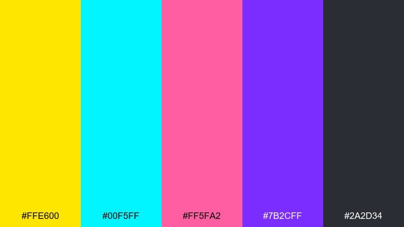
1) Neon Arcade
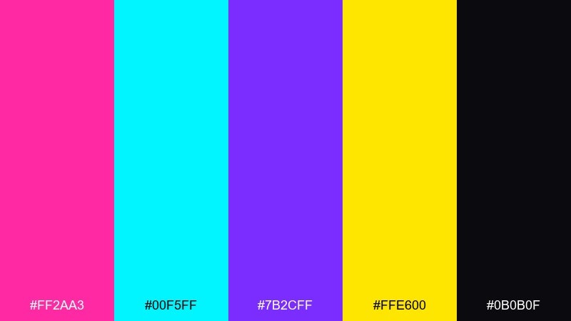
HEX: #ff2aa3 #00f5ff #7b2cff #ffe600 #0b0b0f
Mood: electric, loud, high-contrast
Best for: arcade night event poster
Electric neon on deep black evokes arcade cabinets, pixel glow, and late-night high scores. Use it when you want instant impact on posters, merch, and splash screens. Pair the cyan and magenta as primary blocks, then reserve yellow for calls to action. Tip: keep body text white or very light gray so the brightest accents stay readable.
Image example of neon arcade generated using media.io
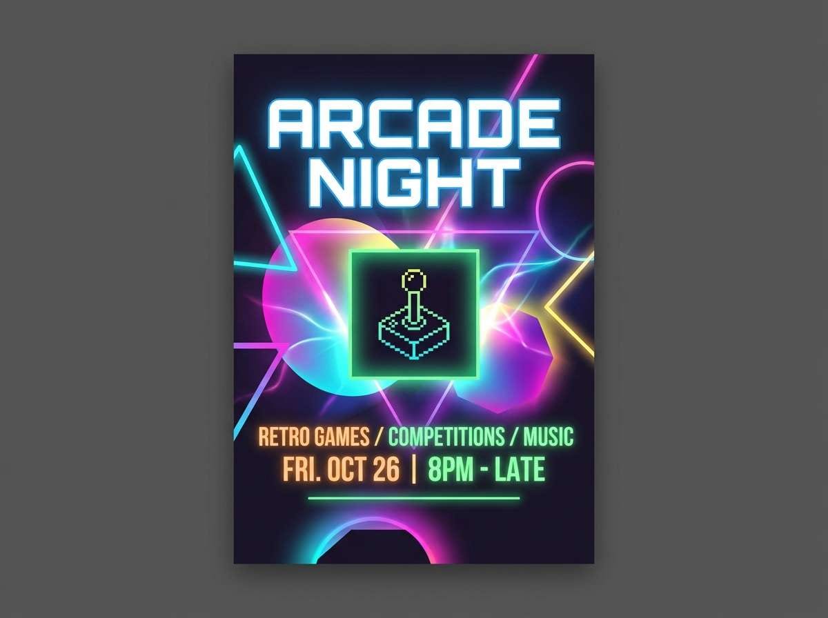
Media.io is an online AI studio for creating and editing video, image, and audio in your browser.

2) Miami Sunset
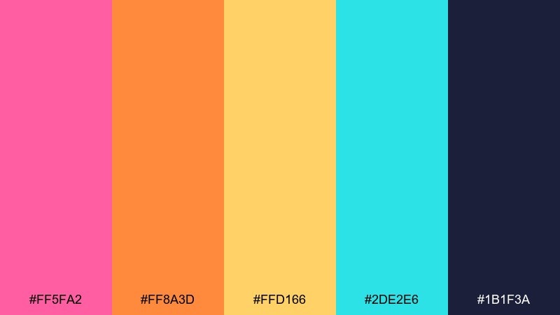
HEX: #ff5fa2 #ff8a3d #ffd166 #2de2e6 #1b1f3a
Mood: warm, breezy, tropical
Best for: summer sale social ad
Warm sunset pinks and tangerine tones feel like ocean air, palm silhouettes, and glowing neon signs. It works beautifully for social ads, lifestyle promos, and upbeat landing pages. Balance the heat with deep navy for type and use aqua as a fresh highlight. Tip: try a soft gradient from pink to orange behind a crisp navy headline.
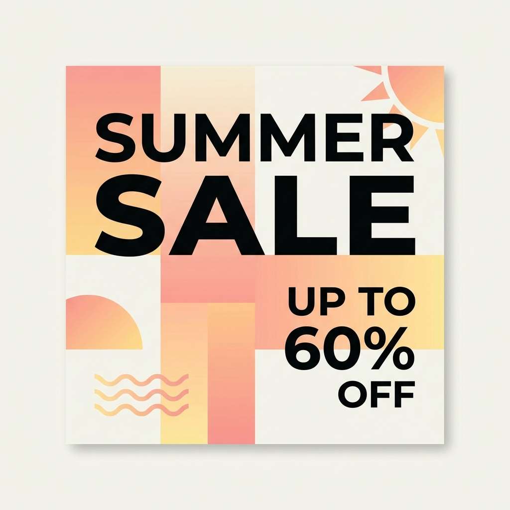
Image example of miami sunset generated using media.io
3) VHS Pastel
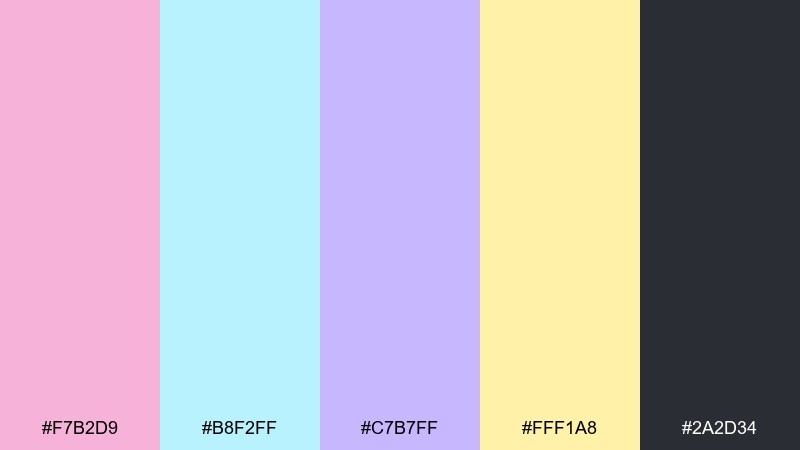
HEX: #f7b2d9 #b8f2ff #c7b7ff #fff1a8 #2a2d34
Mood: soft, nostalgic, dreamy
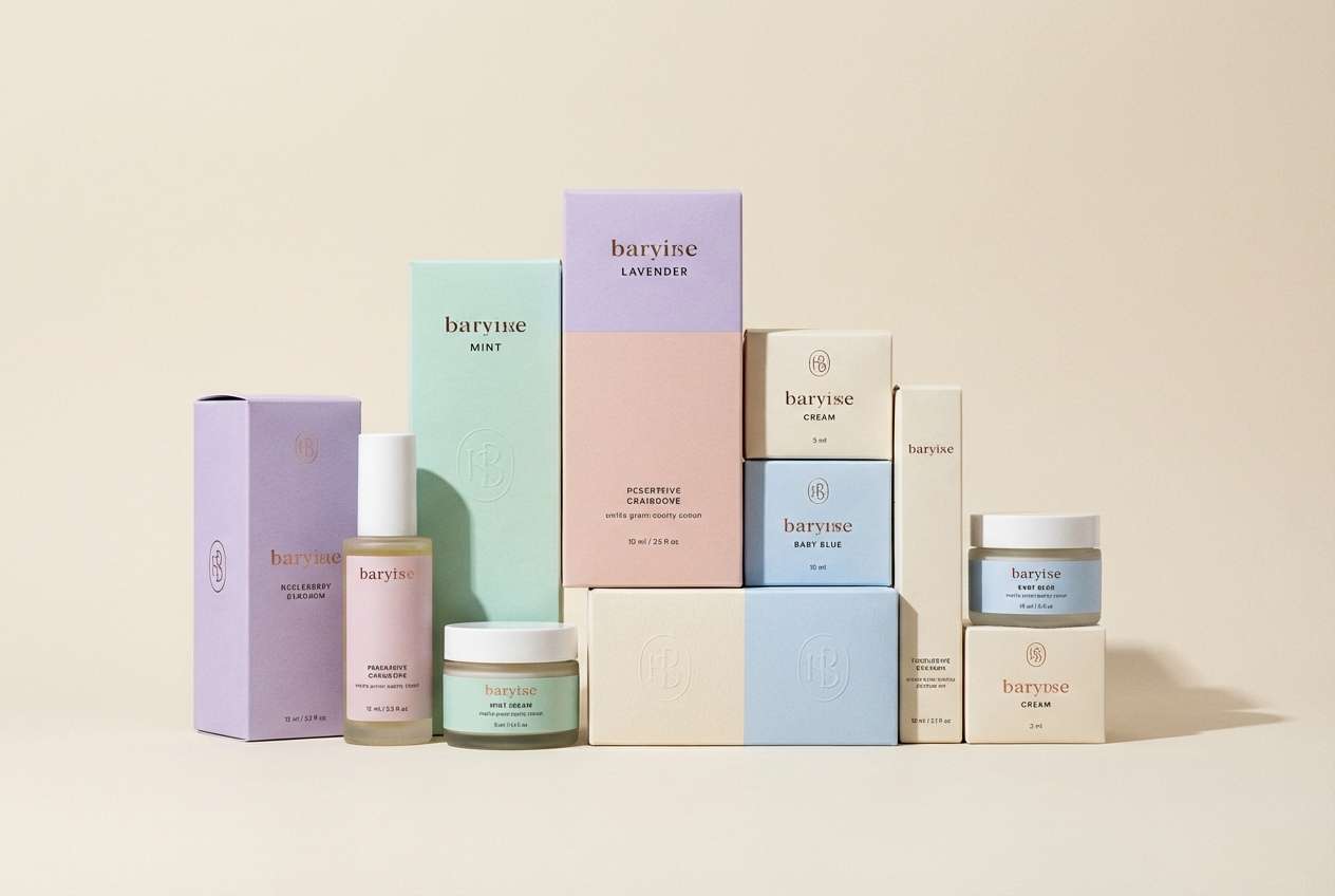
Best for: beauty brand packaging
Powdery pastels and a dark ink neutral bring back soft-focus camcorder memories and worn tape sleeves. Use these tones for packaging, labels, and gentle brand systems that still want a retro wink. The charcoal keeps it grounded, while yellow works as a friendly spotlight. Tip: print with a matte finish and let one pastel dominate per panel to avoid muddiness.
Image example of vhs pastel generated using media.io
4) Laser Grid
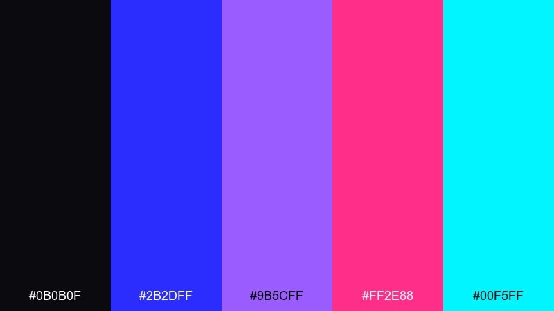
HEX: #0b0b0f #2b2dff #9b5cff #ff2e88 #00f5ff
Mood: futuristic, glossy, nighttime
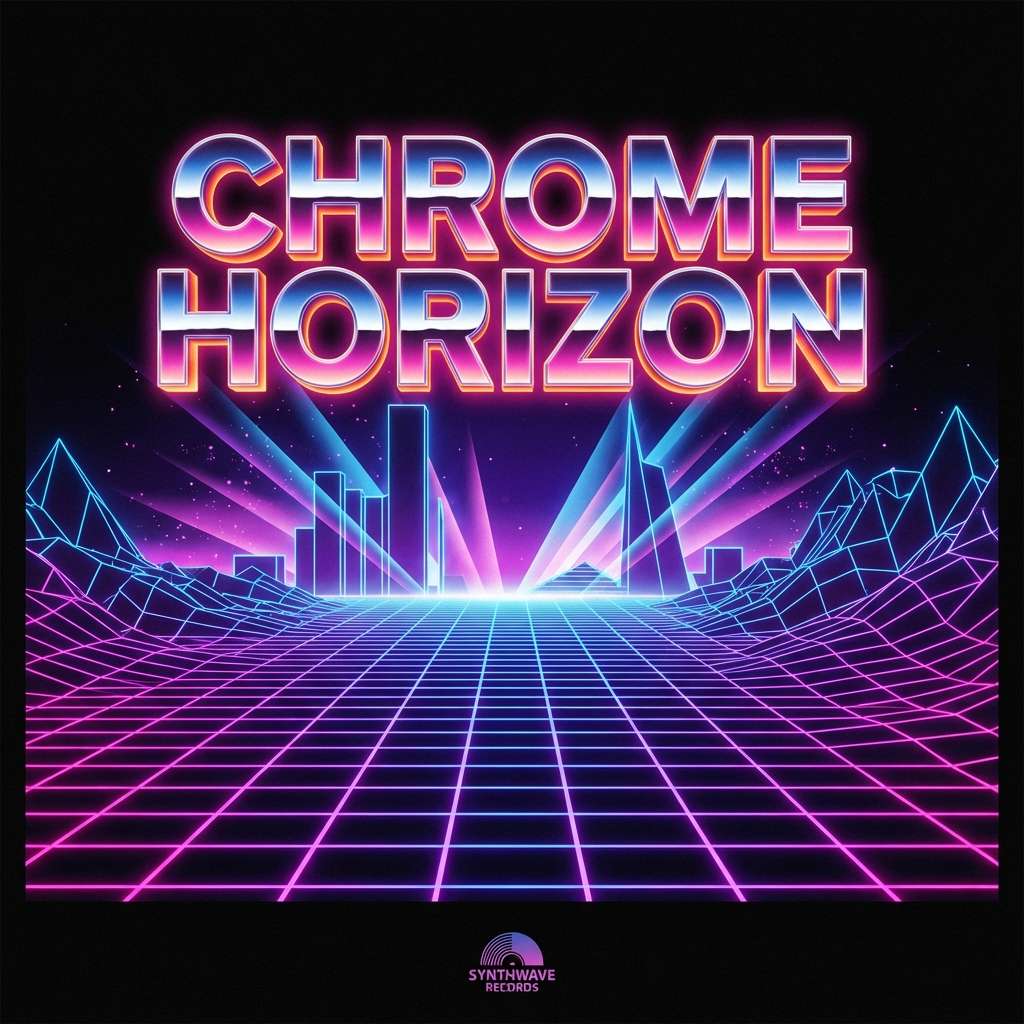
Best for: album cover artwork
Dark midnight tones with laser purple and hot pink feel like a chrome horizon and a glowing grid. It is a strong fit for album covers, DJ flyers, and hero headers with a sci-fi vibe. Keep cyan as a thin accent line to sell the light effect, and let blue carry larger areas. Tip: add subtle grain so the gradients look intentional rather than overly digital.
Image example of laser grid generated using media.io
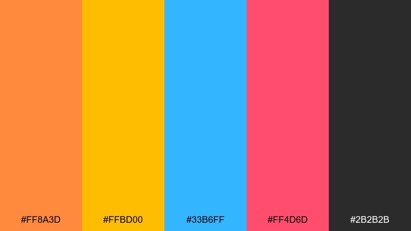
5) Pop Cassette
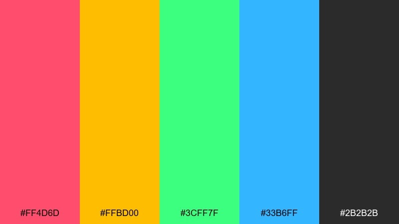
HEX: #ff4d6d #ffbd00 #3cff7f #33b6ff #2b2b2b
Mood: playful, pop, energetic
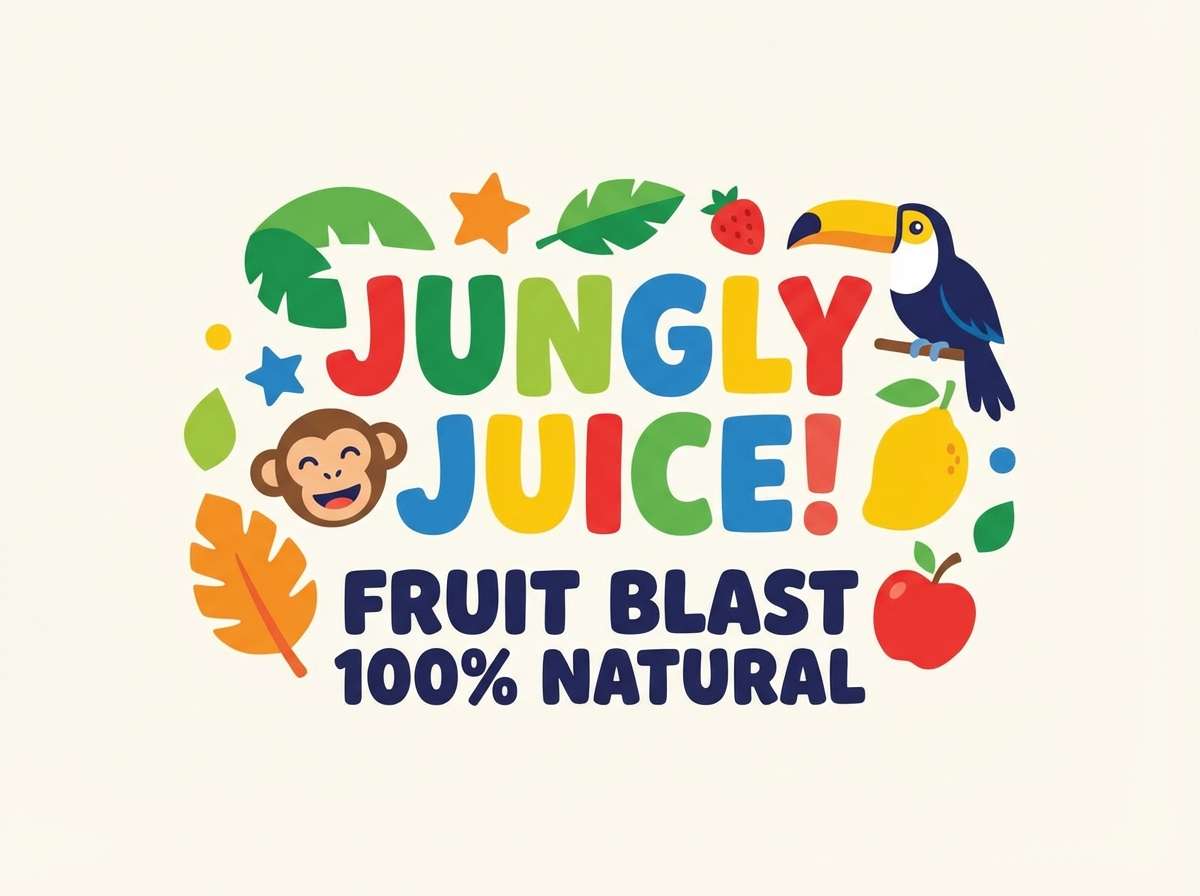
Best for: kids product label design
Punchy pop colors bring to mind cassette spines, sticker packs, and Saturday-morning energy. Use it for labels, playful packaging, and bold category navigation in web layouts. Anchor the set with dark gray, then rotate the bright colors as featured accents. Tip: outline small icons in dark gray to keep them crisp against the loud fills.
Image example of pop cassette generated using media.io
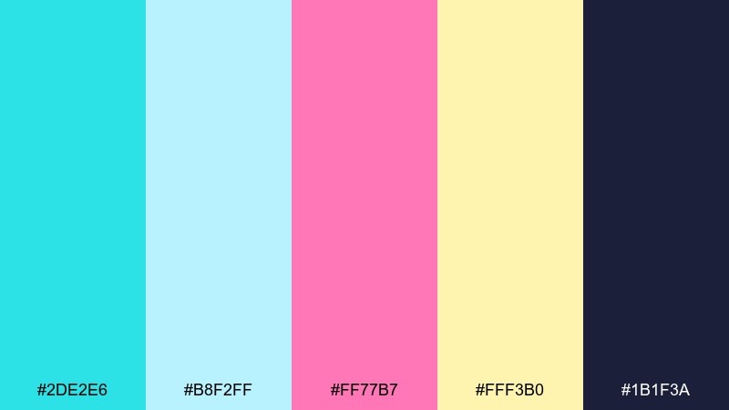
6) Roller Rink
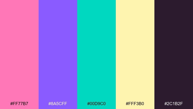
HEX: #ff77b7 #8a5cff #00d9c0 #fff3b0 #2c1b2f
Mood: sweet, upbeat, glossy
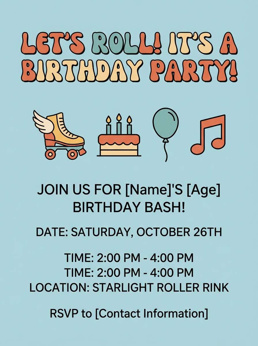
Best for: birthday invitation flyer
Candy pink and minty teal recall roller skates, disco lights, and shiny vinyl seats. It works well for invitations, party flyers, and anything that needs cheerful movement. Use the cream as breathing space and keep the deep plum for all small type. Tip: add a thin teal border to frame the layout and prevent the pink from overpowering.
Image example of roller rink generated using media.io
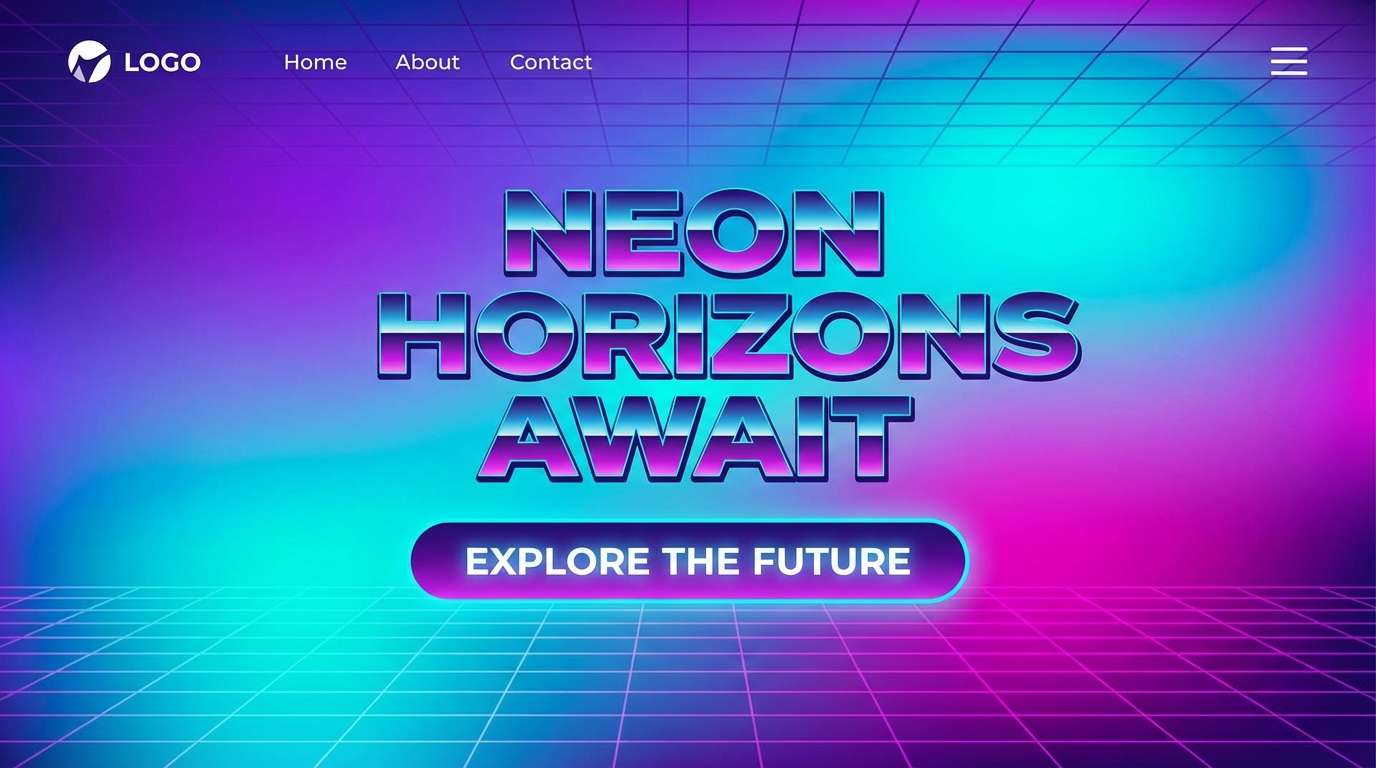
7) Synthwave Night
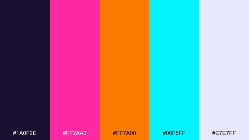
HEX: #1a0f2e #ff2aa3 #ff7a00 #00f5ff #e7e7ff
Mood: cinematic, neon-lit, moody
Best for: landing page hero section
Moody violet with neon highlights feels like night drives and glowing street reflections. Use it for landing page heroes, product launches, and striking banner graphics. Let the off-white carry body copy while pink and cyan become micro-accents for buttons and icons. Tip: keep your gradient direction consistent across the page to maintain a polished look.
Image example of synthwave night generated using media.io
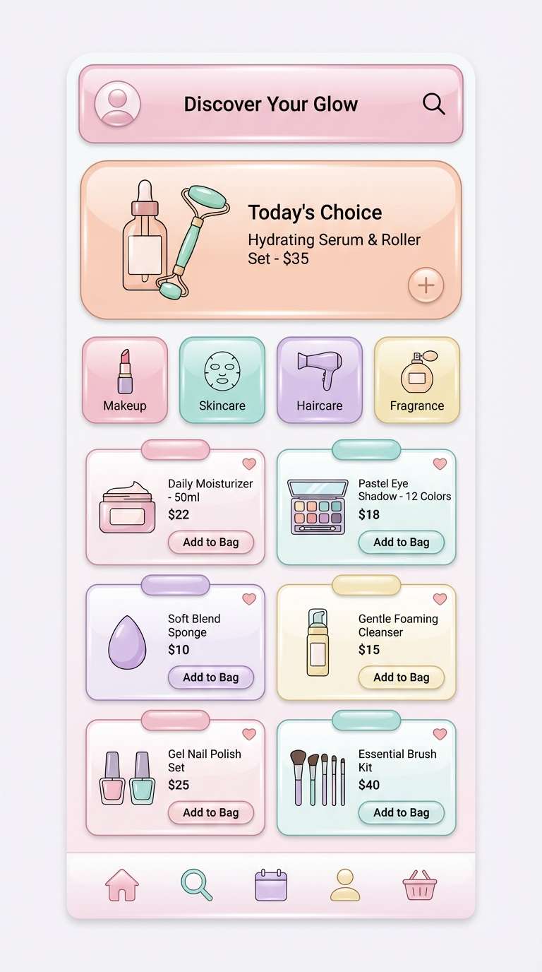
8) Bubblegum Chrome
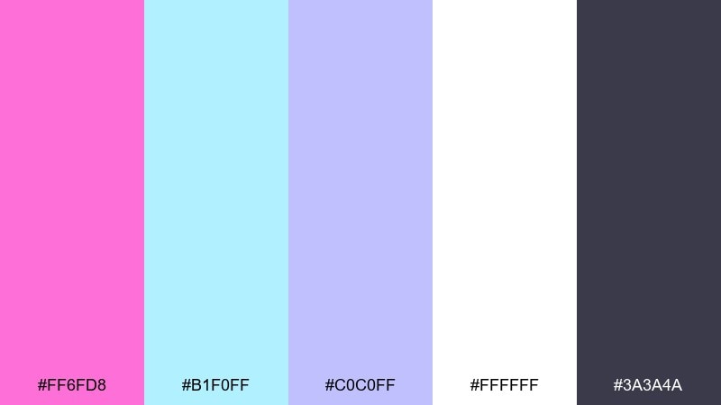
HEX: #ff6fd8 #b1f0ff #c0c0ff #ffffff #3a3a4a
Mood: glossy, cute, polished
Best for: beauty app UI mockup
Glossy bubblegum tones and icy highlights suggest chrome reflections and candy-coated plastics. These retro 80s color combinations shine in beauty or lifestyle UI where you want softness without losing clarity. Use white as the main canvas, then place pink for primary actions and aqua for secondary highlights. Tip: keep shadows cool and subtle so the chrome feel stays light, not muddy.
Image example of bubblegum chrome generated using media.io
9) Electric Citrus
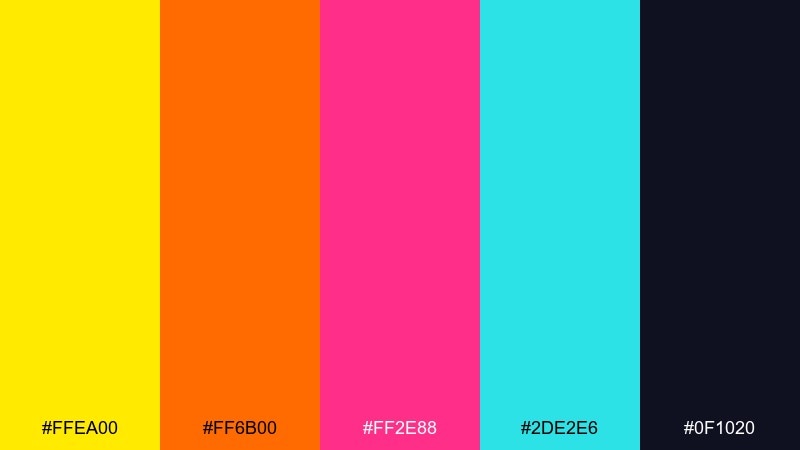
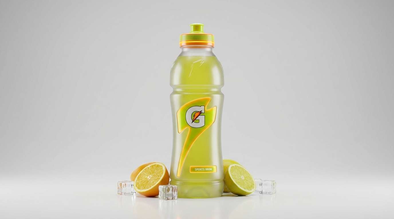
HEX: #ffea00 #ff6b00 #ff2e88 #2de2e6 #0f1020
Mood: zesty, bold, high energy
Best for: sports drink product ad
Zesty yellow and orange with neon pink feels like a fizzy kick and a flashing sign at midnight. It is ideal for product ads, energetic campaigns, and bold callouts in ecommerce. Keep the dark base for copy and use cyan sparingly to cool the heat. Tip: place yellow behind short words only, then switch to orange for larger panels to prevent glare.
Image example of electric citrus generated using media.io
10) City Pop Daylight
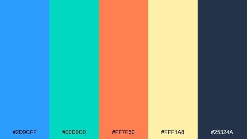
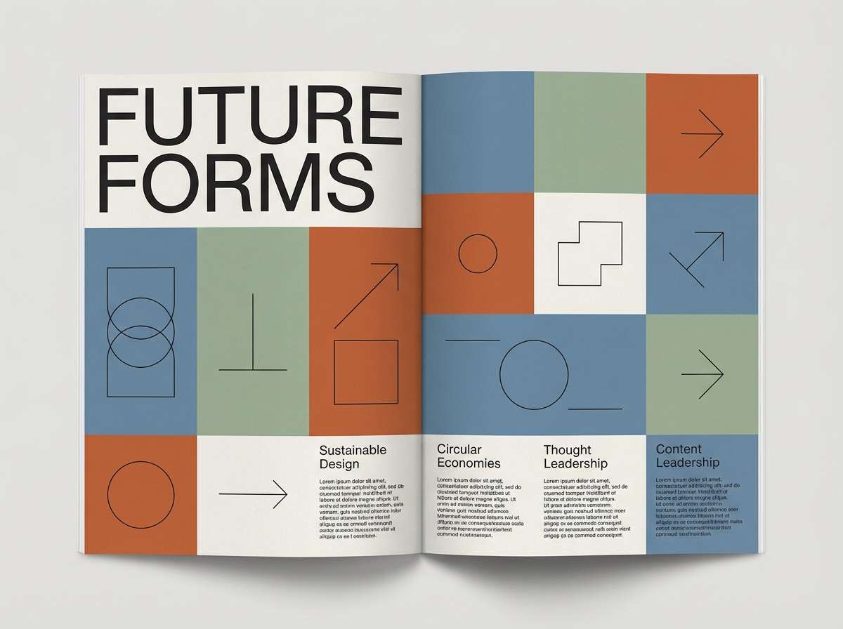
HEX: #2d9cff #00d9c0 #ff7f50 #fff1a8 #25324a
Mood: sunny, clean, upbeat
Best for: editorial magazine spread
Bright seaside blues and coral feel like city pop album art under clean daylight. Use it for editorial layouts, blog headers, and illustrated spot graphics. Keep navy for typography, then use coral as a warm counterpoint to the cool blues. Tip: limit the yellow to small highlights like pull quotes or section markers.
Image example of city pop daylight generated using media.io
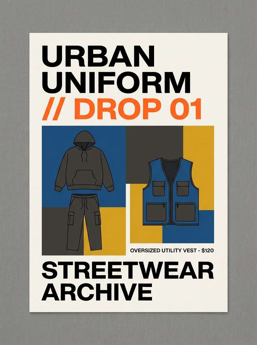
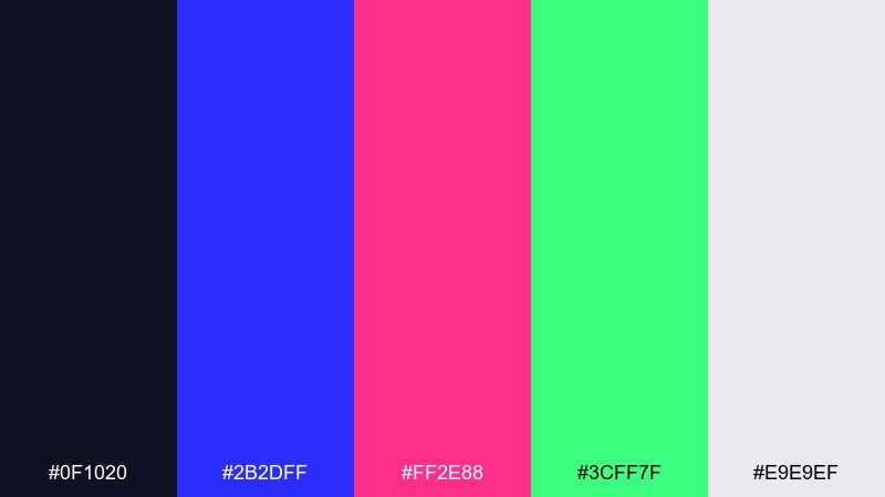
11) Denim and Neon
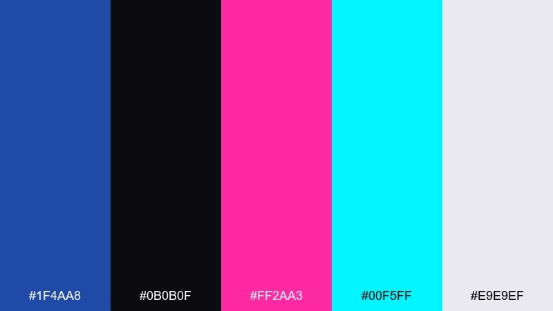
HEX: #1f4aa8 #0b0b0f #ff2aa3 #00f5ff #e9e9ef
Mood: street, cool, confident
Best for: streetwear lookbook page
Deep denim blue with neon pops looks like streetlights hitting a jacket at night. It suits streetwear lookbooks, bold brand decks, and gritty-yet-clean social graphics. Use the off-white for negative space and let magenta be the hero accent. Tip: keep cyan for thin rules and small badges so it reads as glow, not noise.
Image example of denim and neon generated using media.io
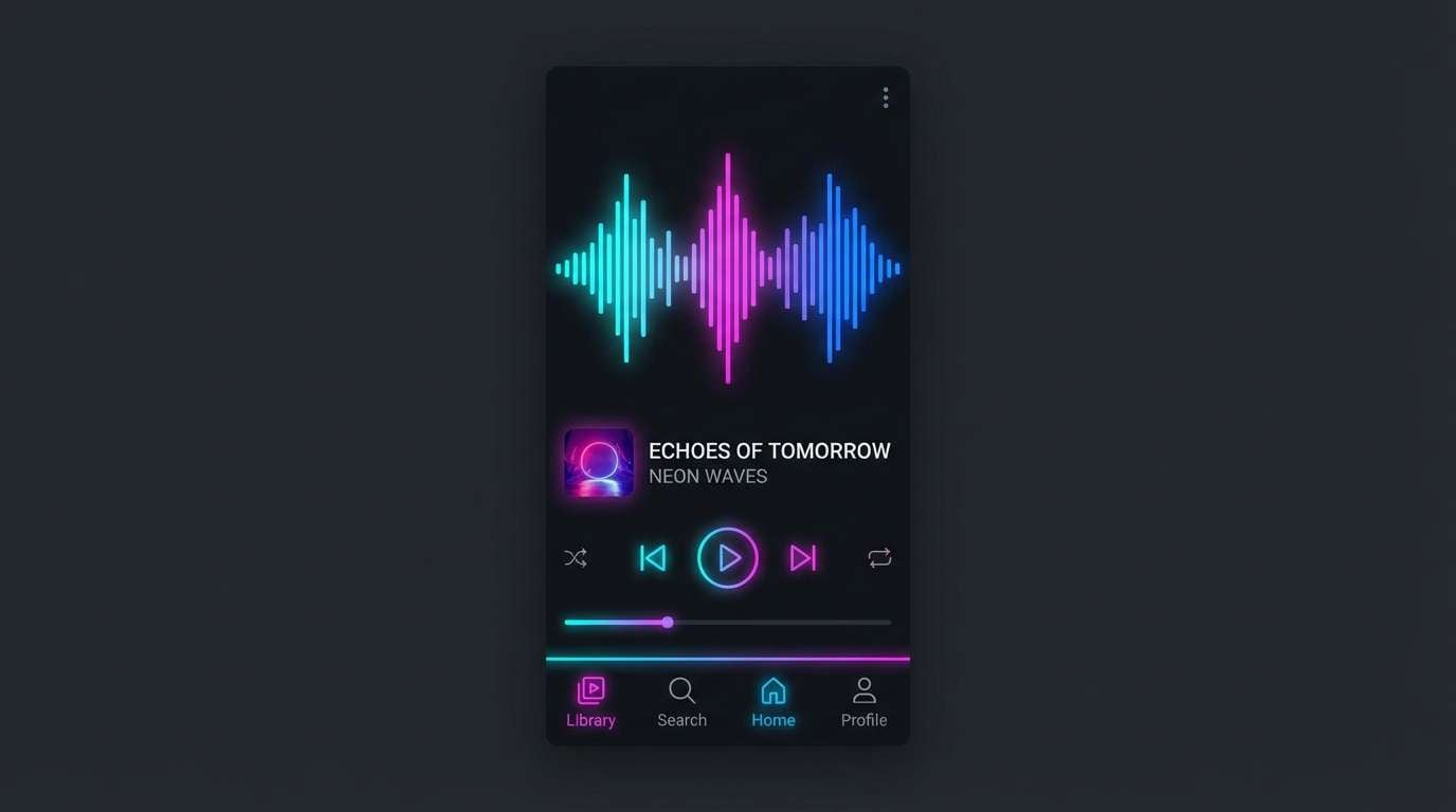
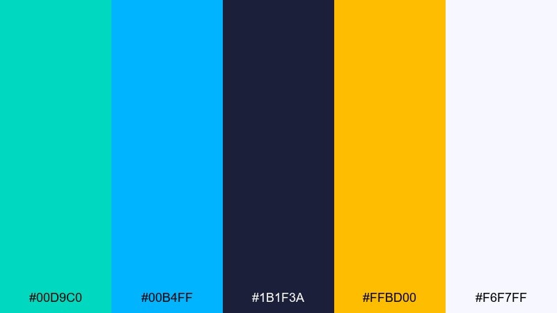
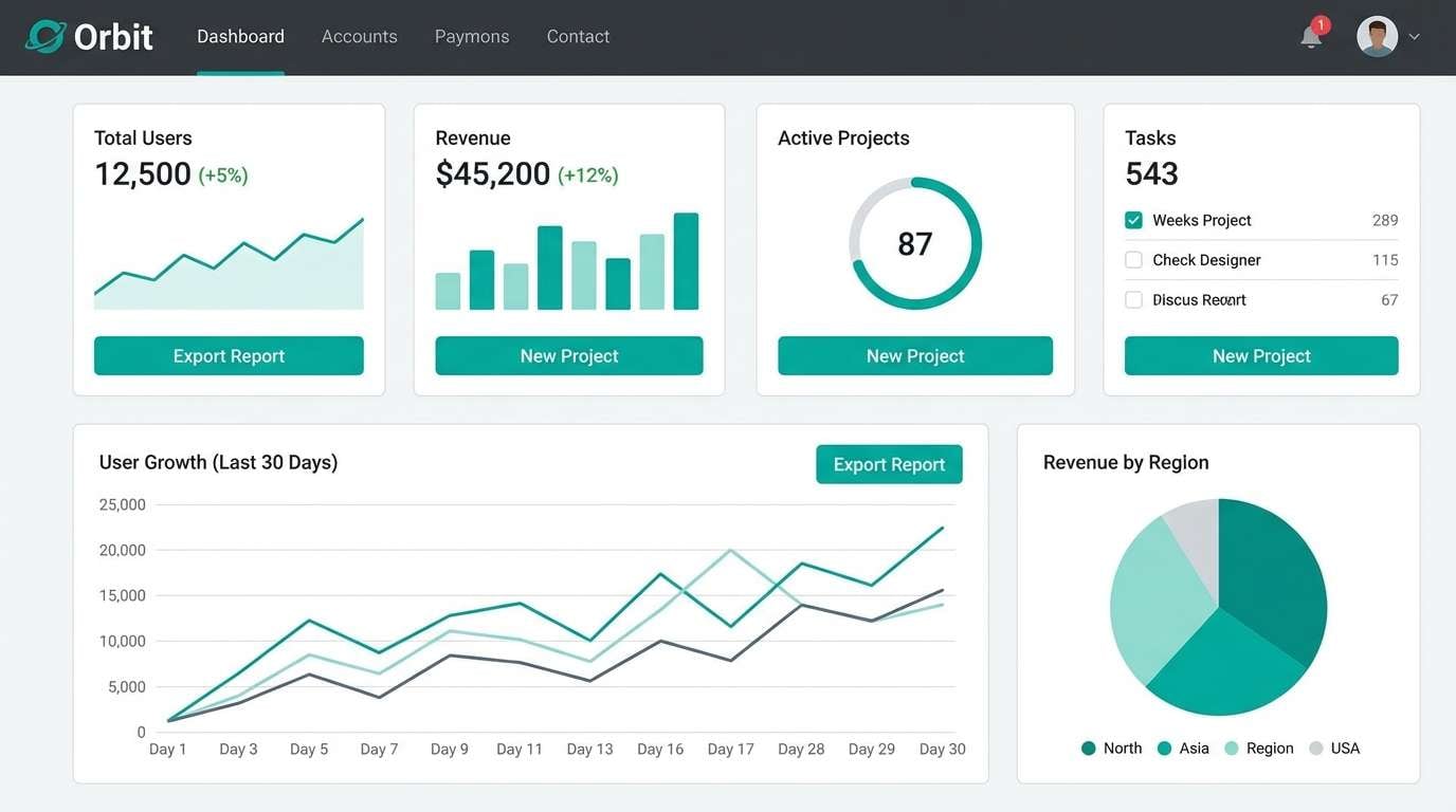
12) CRT Glow
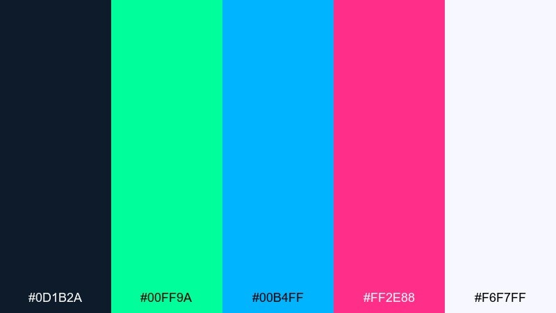
HEX: #0d1b2a #00ff9a #00b4ff #ff2e88 #f6f7ff
Mood: techy, luminous, nostalgic
Best for: music player UI mockup
Bright phosphor greens and blues echo CRT scanlines and the soft glow of old screens. Use it for music players, dashboards, and data widgets that need a nostalgic tech vibe. Keep the navy as your base and use pink only for key states like active or recording. Tip: choose one glow color per component so the interface stays readable.
Image example of crt glow generated using media.io
13) Aqua Punch
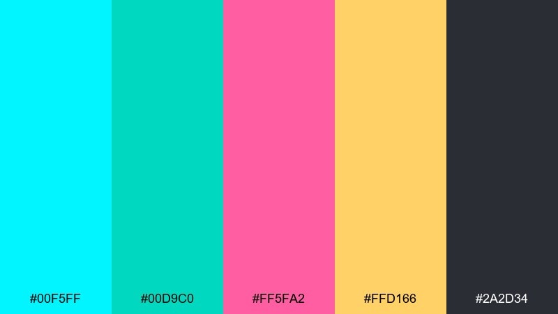
HEX: #00f5ff #00d9c0 #ff5fa2 #ffd166 #2a2d34
Mood: fresh, bubbly, fun
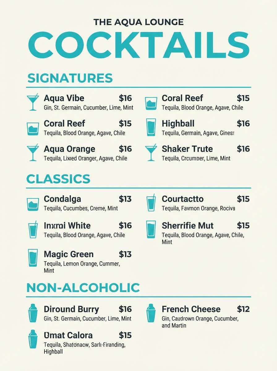
Best for: cocktail menu design
Aqua tones with pink and citrus yellow feel like pool water, fruit garnishes, and fizzy drinks. Perfect for menus, hospitality branding, and playful signage. Use charcoal for text, then highlight prices or section headers in pink. Tip: keep the aqua as the dominant field color and use yellow only for small icons to avoid overpowering the page.
Image example of aqua punch generated using media.io
14) Peachy Polaroid
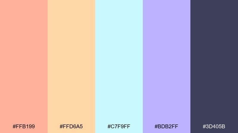
HEX: #ffb199 #ffd6a5 #c7f9ff #bdb2ff #3d405b
Mood: soft, airy, sentimental
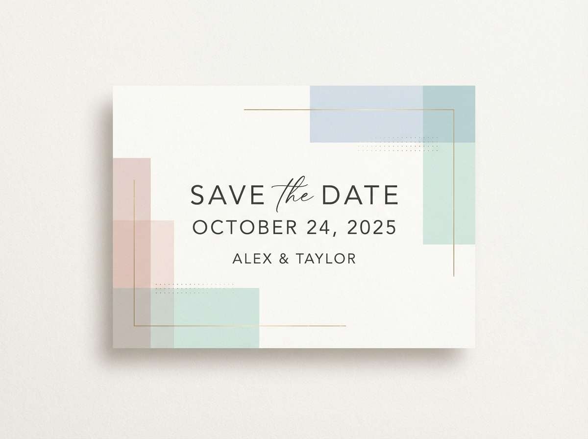
Best for: wedding save the date card
Peach and cream with airy pastels feel like sun-faded Polaroids and handwritten notes. Use it for save the dates, stationery, and gentle lifestyle brands. Keep the indigo for type to maintain contrast and use the blue as a cool counterbalance to the warmth. Tip: try a subtle paper texture so the pastels look tactile and premium.
Image example of peachy polaroid generated using media.io
15) Magenta Motorway
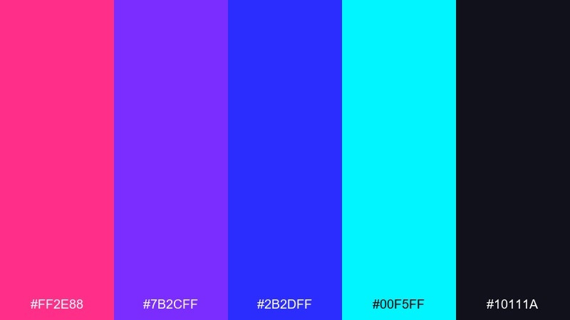
HEX: #ff2e88 #7b2cff #2b2dff #00f5ff #10111a
Mood: fast, electric, dramatic
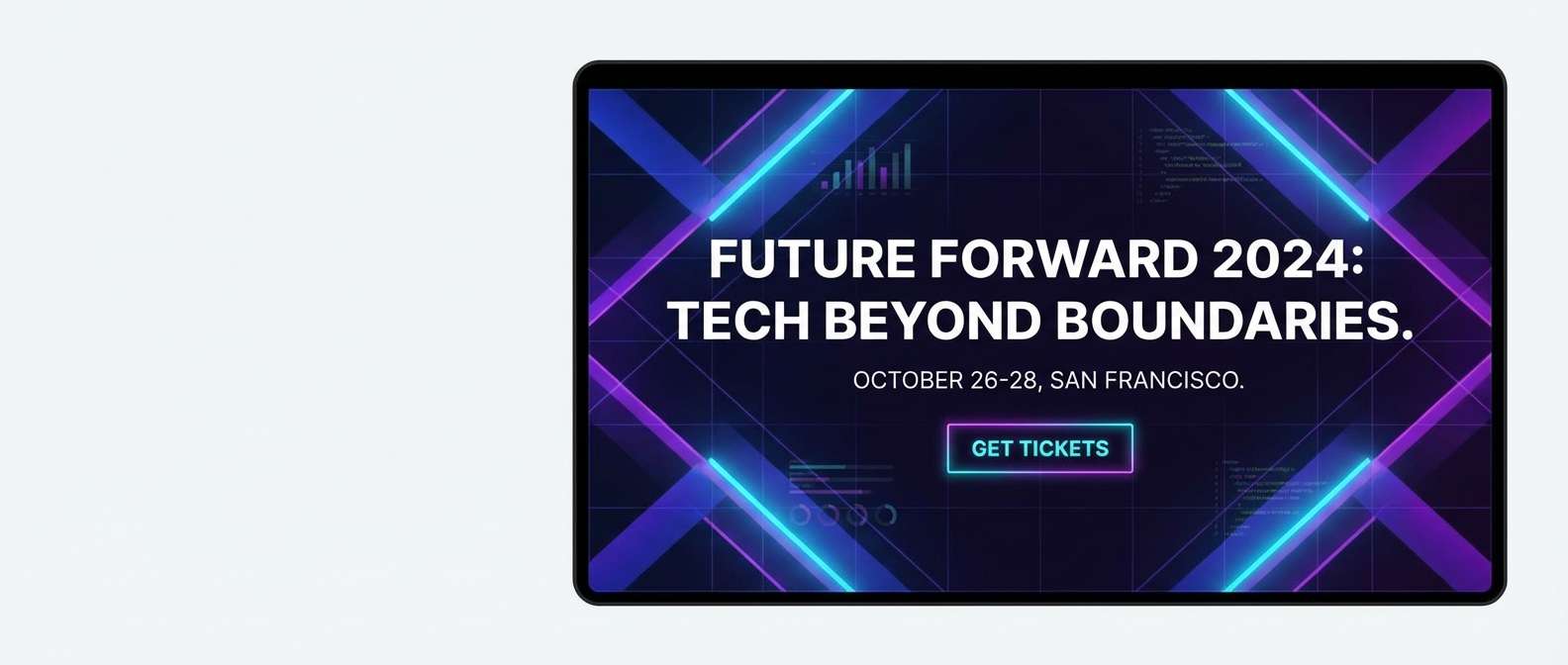
Best for: tech conference hero banner
Hot magenta and electric violet feel like taillights on a wet motorway and neon reflections in motion. Use it for conference banners, tech announcements, and dramatic hero sections. Keep black-blue for typography and let cyan act as a sharp edge highlight. Tip: use diagonal shapes or speed lines to echo the motion without overcrowding.
Image example of magenta motorway generated using media.io
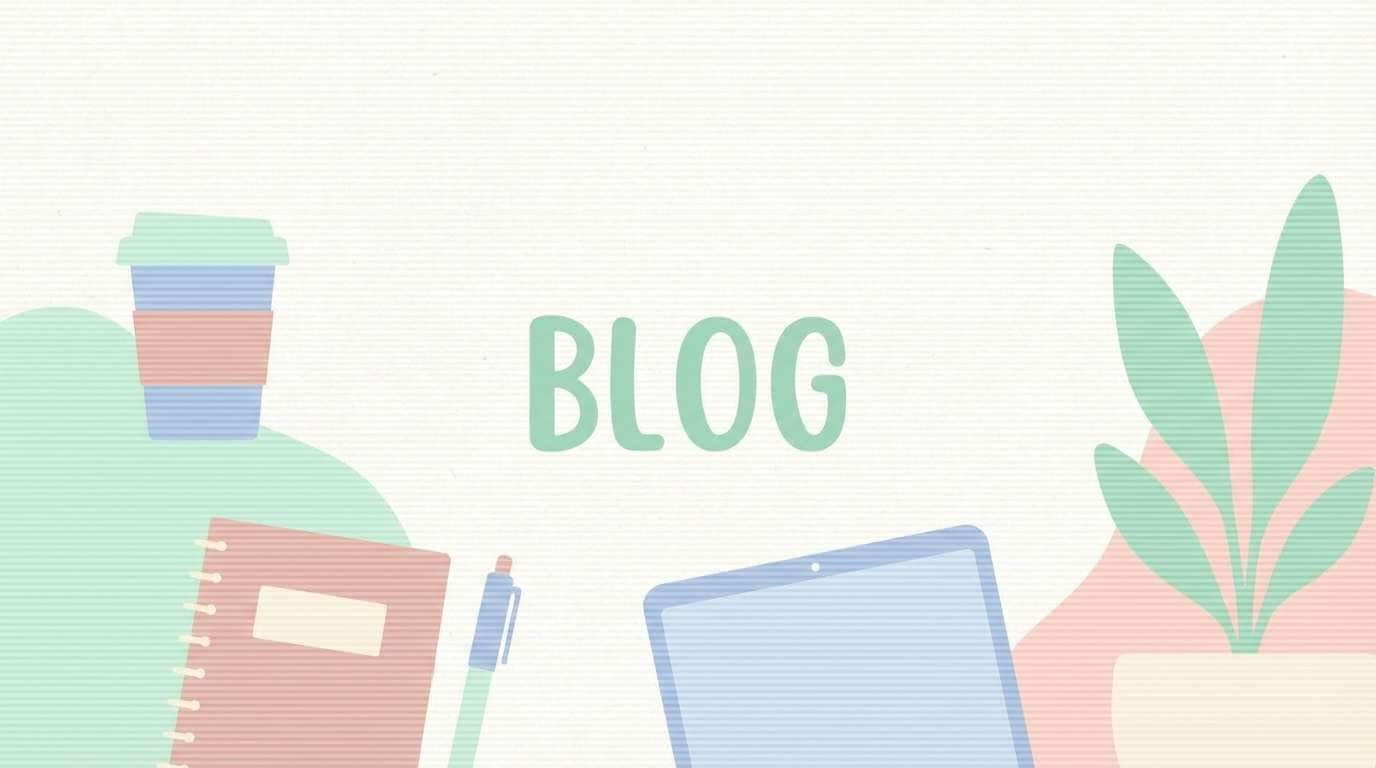
16) Soft Scanlines
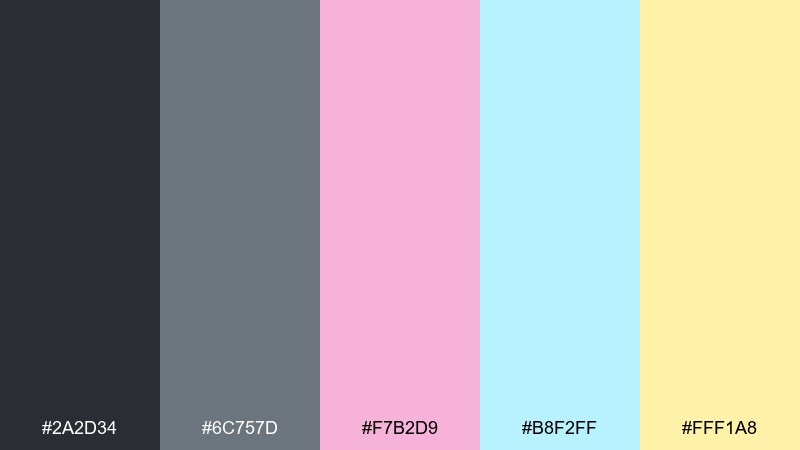
HEX: #2a2d34 #6c757d #f7b2d9 #b8f2ff #fff1a8
Mood: muted, cozy, nostalgic
Best for: blog header illustration
Muted grays with gentle pastels suggest soft scanlines and a favorite show playing in the background. These tones work well for blog headers, onboarding art, and calm branding systems. Use gray as your main structure and let the pastels pop only in illustrations or small UI states. Tip: reduce saturation slightly on large fills to keep the nostalgic softness.
Image example of soft scanlines generated using media.io
17) Techno Teal
HEX: #00d9c0 #00b4ff #1b1f3a #ffbd00 #f6f7ff
Mood: clean, modern, upbeat
Best for: SaaS dashboard UI
Crisp teal and blue against deep navy feels like a clean club light show with modern polish. Use it for SaaS dashboards, fintech interfaces, and data-heavy screens that still want personality. Keep off-white for panels and highlight key metrics with yellow. Tip: apply teal consistently to interactive elements so users learn the pattern quickly.
Image example of techno teal generated using media.io
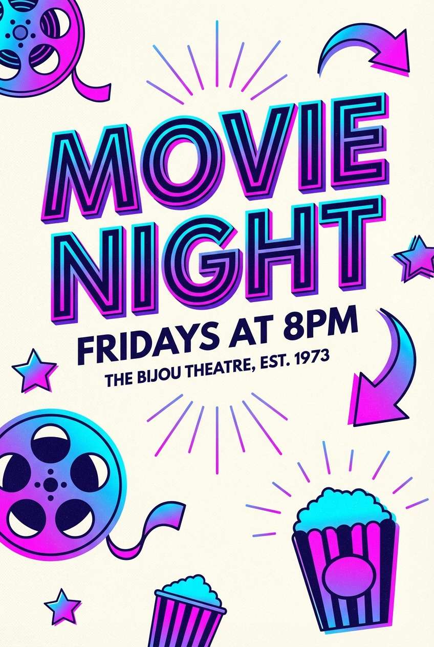
18) Sunset Boulevard
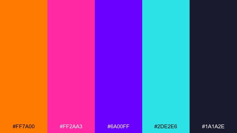
HEX: #ff7a00 #ff2aa3 #6a00ff #2de2e6 #1a1a2e
Mood: glam, neon-lit, cinematic
Best for: movie night poster
Neon orange and pink with rich purple feels like marquee lights and a late-night boulevard. Use it for movie night posters, entertainment promos, and bold thumbnails. Ground the layout with the deep navy and let cyan act as a small sparkle highlight. Tip: keep the headline in a single bright color to avoid competing neon layers.
Image example of sunset boulevard generated using media.io
19) Rubber Duck
HEX: #ffe600 #00f5ff #ff5fa2 #7b2cff #2a2d34
Mood: quirky, playful, pop
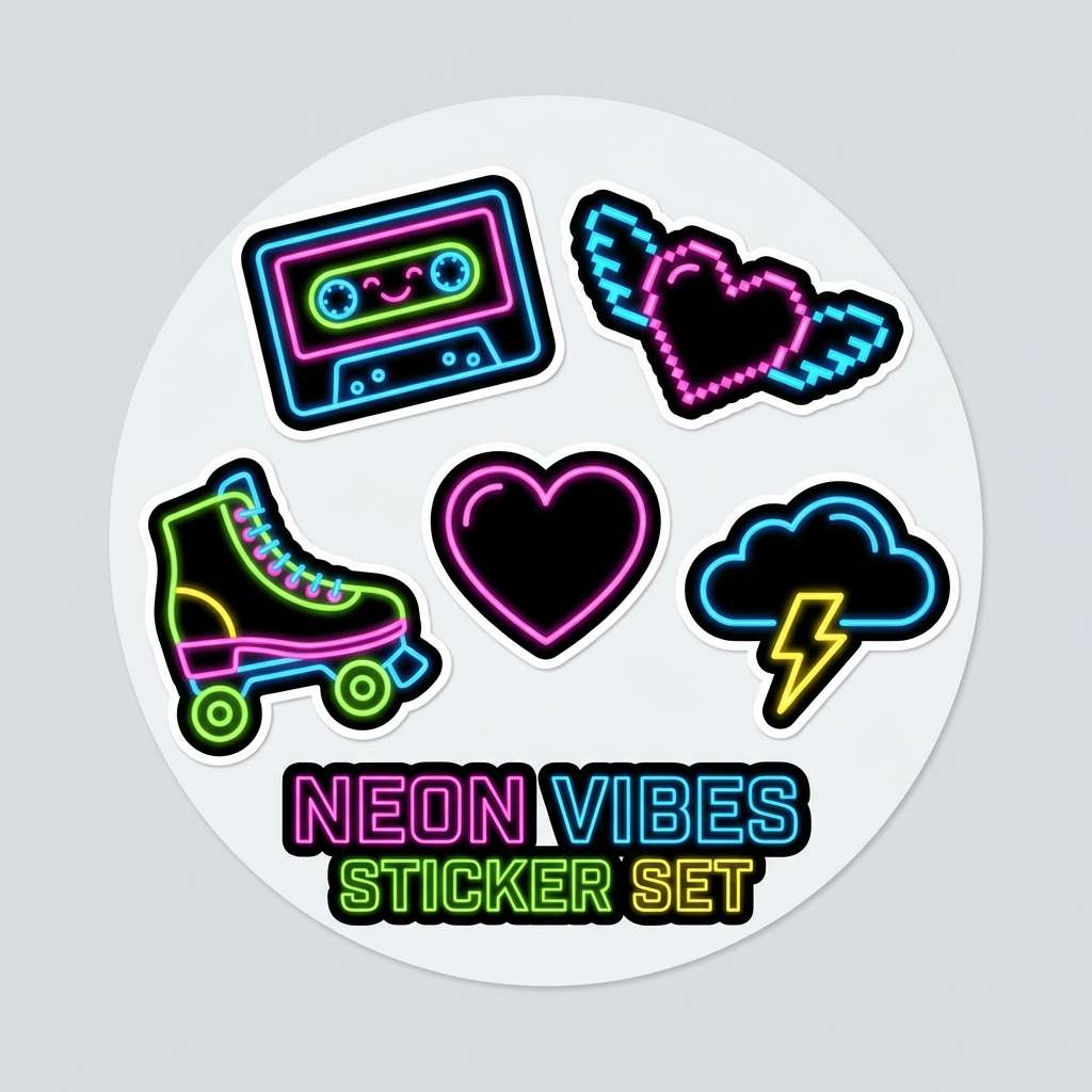
Best for: sticker pack design
Bright yellow with neon companions feels like toy-store fun and glossy sticker sheets. It is great for sticker packs, playful icons, and youth-focused merch. Use charcoal outlines to keep shapes sharp, then let pink and purple alternate for variety. Tip: keep large yellow areas broken up with small pattern dots to reduce visual fatigue.
Image example of rubber duck generated using media.io
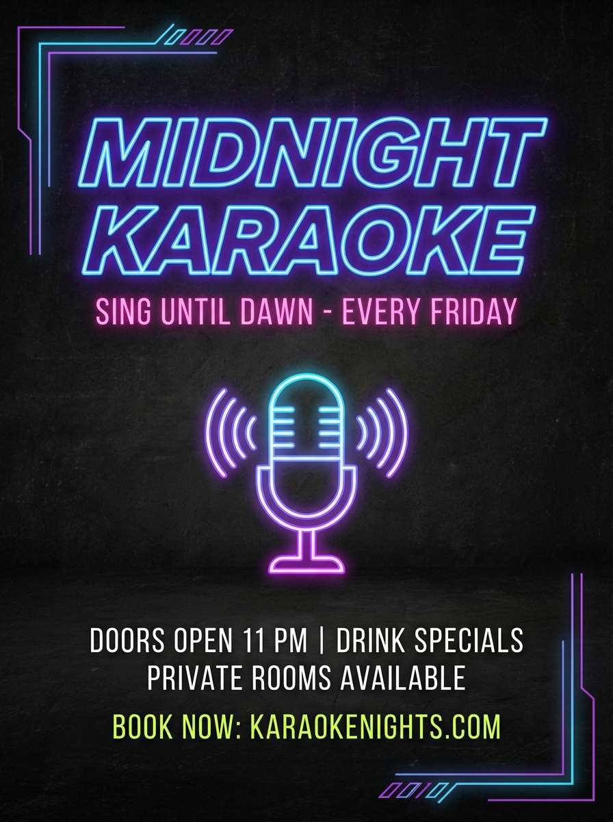
20) Midnight Karaoke
HEX: #0f1020 #2b2dff #ff2e88 #3cff7f #e9e9ef
Mood: nightlife, bold, punchy
Best for: karaoke bar flyer
Deep midnight tones with neon pink and green bring to mind karaoke lights and glowing mic buttons. Use it for nightlife flyers, ticket promos, and punchy story graphics. Keep off-white for details like date and location, and use blue as the stabilizing background. Tip: set the main headline in pink, then reserve green for one key highlight like free entry.
Image example of midnight karaoke generated using media.io
21) Mall Food Court
HEX: #ff8a3d #ffbd00 #33b6ff #ff4d6d #2b2b2b
Mood: cheerful, casual, nostalgic
Best for: fast casual menu board
Bright orange and golden yellow feel like food court signage, plastic trays, and weekend errands. It works best for menu boards, quick promos, and casual restaurant branding. Use dark gray for text, then pick one bright color per category to keep the layout organized. Tip: make prices a single consistent color so scanning is effortless.
Image example of mall food court generated using media.io

22) Palm Springs Pool
HEX: #2de2e6 #b8f2ff #ff77b7 #fff3b0 #1b1f3a
Mood: relaxed, sunny, resort-like
Best for: travel brochure cover
Cool aqua and soft pink feel like pool tiles, sun umbrellas, and a calm resort afternoon. Use it for travel brochures, hotel promos, and airy brand collateral. Pair the navy with the light aqua for readable headings, then bring in pink for highlights and badges. Tip: keep large areas light and add navy only as framing to maintain the breezy feel.
Image example of palm springs pool generated using media.io
23) Pixel Prom
HEX: #7b2cff #ff2aa3 #ffd166 #00ff9a #1a1a2e
Mood: romantic, fun, glittery
Best for: prom night poster
Violet, pink, and mint feel like glitter confetti, dance floors, and pixel sparkles. For prom posters and school event graphics, this mix reads bold without looking harsh. Use the deep navy for body copy and let yellow handle small stars or highlights. Tip: keep the background dark so the bright accents feel like lights rather than flat paint.
Image example of pixel prom generated using media.io
24) Record Store Rain
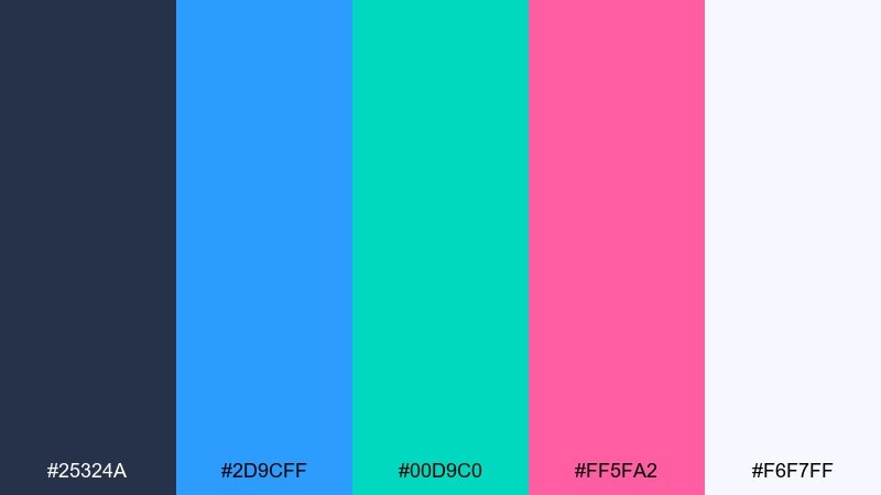
HEX: #25324a #2d9cff #00d9c0 #ff5fa2 #f6f7ff
Mood: cool, melodic, rainy-night
Best for: music blog homepage UI
Cool blues with a pink highlight feel like rainy sidewalks outside a record store and the glow of a neon window. Use it for music blogs, playlists, and editorial UI that needs a calm base with one bold accent. Keep off-white for reading comfort, then drop pink in for active states and tags. Tip: limit pink to one component type so it stays special and navigational.
Image example of record store rain generated using media.io
What Colors Go Well with Retro 80s?
Retro 80s palettes pair best with deep darks (near-black navy, ink purple, charcoal) because they make neon accents look like they’re glowing. Add an off-white for body text to keep the design readable on screens and in print.
For that classic synthwave look, mix hot magenta with electric cyan and a vivid purple, then add a small dose of bright yellow for highlights. For a softer VHS aesthetic palette, use powder pink, baby blue, and lavender anchored by a dark neutral.
If you want a modern twist, keep most surfaces neutral (white or deep navy) and use only one or two “loud” colors for key UI states like buttons, tags, or active indicators.
How to Use a Retro 80s Color Palette in Real Designs
Start with a clear hierarchy: pick one dominant background color, one primary accent (for CTAs), and one secondary accent (for small highlights). Retro branding colors work best when the neon is controlled, not everywhere at once.
Use gradients intentionally—80s UI colors often feel “airbrushed” or “chrome-like.” Keep gradient direction consistent across a layout and add subtle grain or texture so transitions look designed rather than banded.
Finally, test contrast early. Neon pastel palettes can look amazing but fail accessibility if you place bright text on bright fills. Reserve high-chroma colors for shapes, borders, and buttons, and keep typography on dark or off-white foundations.
Create Retro 80s Palette Visuals with AI
If you have HEX codes but need real visuals (posters, social ads, UI mockups, packaging shots), generate quick concept images with AI and refine the look before you move to final production.
With Media.io’s Text to Image, you can describe the style (synthwave, VHS, chrome, Miami nightlife), set the aspect ratio, and create multiple variations fast—perfect for exploring retro 80s color combinations.
Retro 80s Color Palette FAQs
-
What is a retro 80s color palette?
A retro 80s color palette is a set of colors inspired by 1980s design—usually neon magenta, electric cyan, vivid purple, bright yellow, and deep dark bases like navy or black—often paired with gradients for a synthwave or VHS feel. -
What are popular synthwave colors?
Common synthwave colors include hot pink/magenta, electric blue, neon cyan, saturated purple, and a near-black midnight background. Small accents of yellow or orange are often used for highlights. -
How do I keep neon colors readable in UI?
Use dark neutrals (ink navy/charcoal) for backgrounds and off-white for body text, then reserve neon for buttons, icons, and active states. Avoid placing neon text directly on bright neon fills unless contrast is tested. -
Which retro 80s palette works best for branding?
For brand systems, pick a palette with a strong neutral (navy/charcoal/white) plus 1–2 signature neon accents—like Denim and Neon or Record Store Rain—so the look stays consistent across web, print, and social. -
What’s the difference between Miami Vice colors and VHS pastel palettes?
Miami Vice colors lean warmer and tropical (sunset pink, orange, aqua, deep navy), while VHS pastel palettes use softer, powdery tones (pink, baby blue, lavender) anchored by a dark neutral for a dreamy nostalgic mood. -
How can I use an 80s palette in posters without making it look messy?
Limit the number of loud colors per area, add plenty of negative space, and keep typography on a stable neutral (dark or off-white). Use one bright color for the headline and another for a single CTA or key detail. -
Can I generate retro 80s visuals from these HEX codes?
Yes—use the HEX palette as a guide, then generate matching posters, ads, or UI mockups with an AI tool by describing the style (neon, chrome, grid, VHS grain) and iterating until the colors and lighting match your brand.
Next: Khaki Color Palette


