Khaki is one of the most useful neutrals in design: it feels natural, stable, and easy to live with, while still looking intentional and modern. It can read desert-warm, olive-green, or slightly golden depending on what you pair it with.
Below are 20+ khaki color palette ideas with HEX codes, plus quick tips for using them in branding, UI, interiors, packaging, and more.
In this article
- Why Khaki Palettes Work So Well
-
- desert canvas
- safari linen
- olive drift
- vintage field notes
- coastal khaki
- minimal studio
- autumn trail
- urban utility
- soft nursery neutral
- botanical herbarium
- warm café
- modern workwear
- heritage lodge
- sunlit stucco
- clay and sage
- luxe gold accent
- clean ecommerce ui
- eco packaging
- travel poster sand
- evening olive noir
- quiet monochrome khaki
- stone garden contrast
- What Colors Go Well with Khaki?
- How to Use a Khaki Color Palette in Real Designs
- Create Khaki Palette Visuals with AI
Why Khaki Palettes Work So Well
Khaki sits in the sweet spot between warm and cool, so it can support both earthy palettes (tan, clay, olive) and cleaner ones (white, gray, slate). That flexibility makes it a reliable base for systems like brand guidelines, UI components, and room schemes.
It also has a “trusted” personality: khaki feels practical and grounded, which is why it shows up in workwear, outdoor gear, and heritage aesthetics. In digital design, that translates to calm pages, strong readability, and fewer color clashes.
Finally, khaki pairs well with texture. It looks premium on matte paper, uncoated packaging, linen fabrics, wood surfaces, and subtle grain overlays—helping simple designs feel rich without loud colors.
20+ Khaki Color Palette Ideas (with HEX Codes)
1) Desert Canvas
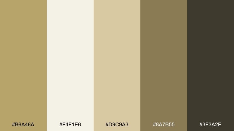
HEX: #B6A46A #F4F1E6 #D9C9A3 #8A7B55 #3F3A2E
Mood: warm, grounded, organic
Best for: interior mood boards and lifestyle branding
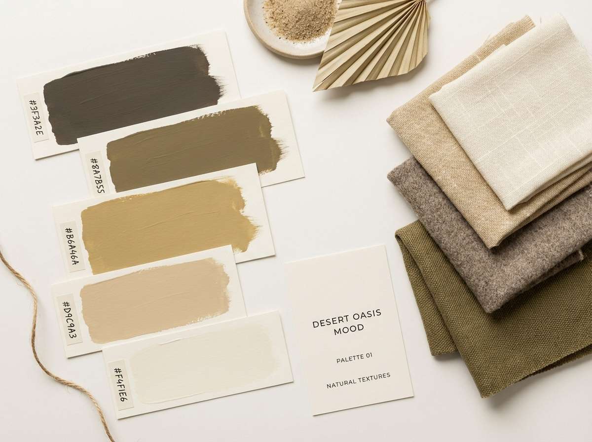
Warm and grounded like sun-washed sand and linen, this mix feels calm but confident. Use the light cream as your base, then layer khaki and oat tones for depth. The deep espresso shade adds contrast for typography or trim. Pair it with natural textures like wood, canvas, and matte ceramics, and keep accents minimal for a modern look.
Image example of desert canvas generated using media.io
Media.io is an online AI studio for creating and editing video, image, and audio in your browser.

2) Safari Linen
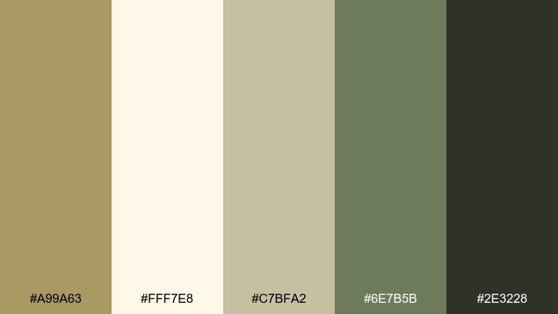
HEX: #A99A63 #FFF7E8 #C7BFA2 #6E7B5B #2E3228
Mood: adventurous, natural, relaxed
Best for: outdoor brands and travel blog headers
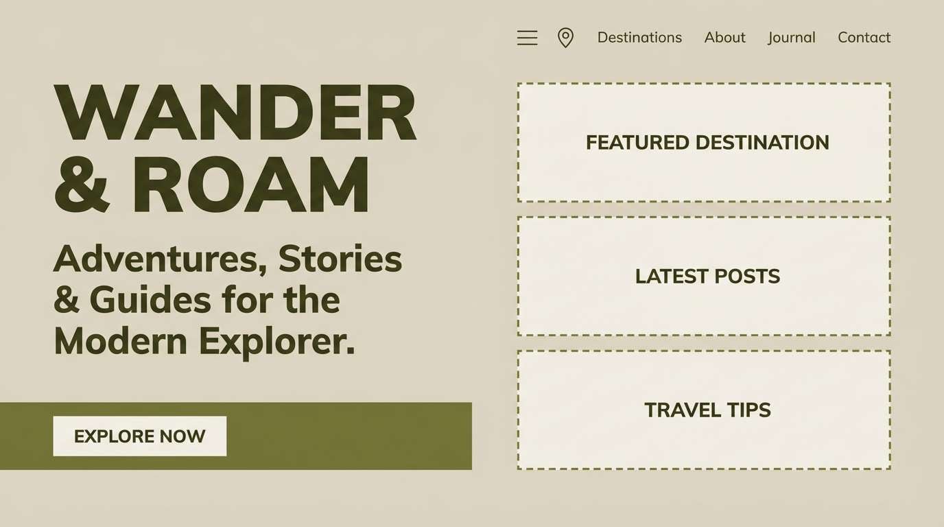
Adventurous and airy, it evokes linen shirts, dusty trails, and shaded leaves. Let the creamy highlight carry large backgrounds while the olive green supports navigation and secondary elements. Use the near-black for text to keep readability crisp. A small pop of muted green in icons or buttons keeps the layout lively without losing the earthy vibe.
Image example of safari linen generated using media.io
3) Olive Drift
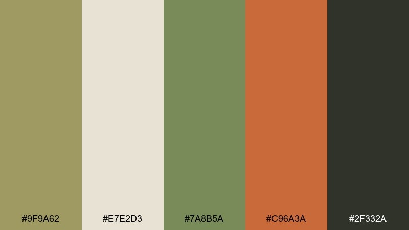
HEX: #9F9A62 #E7E2D3 #7A8B5A #C96A3A #2F332A
Mood: earthy, energetic, contemporary
Best for: sportswear labels and campaign graphics
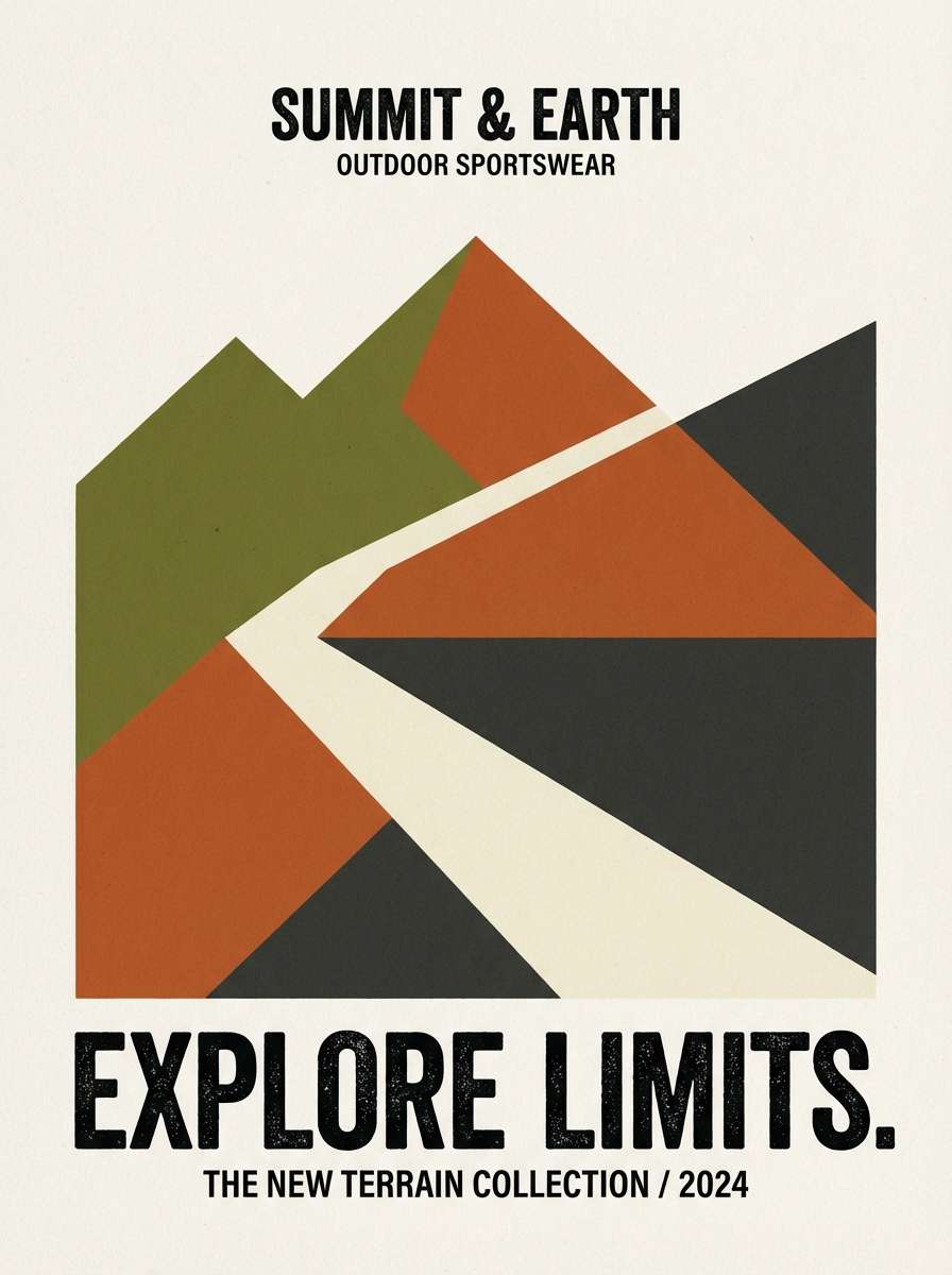
Earthy with a spark, it feels like olive groves warmed by late-afternoon light. The rust orange works best as a controlled accent for calls to action, patches, or small graphic shapes. Keep the soft neutral as the main field to avoid visual heaviness. For a modern edge, use sharp geometric blocks and repeat the dark green in type and outlines.
Image example of olive drift generated using media.io
4) Vintage Field Notes
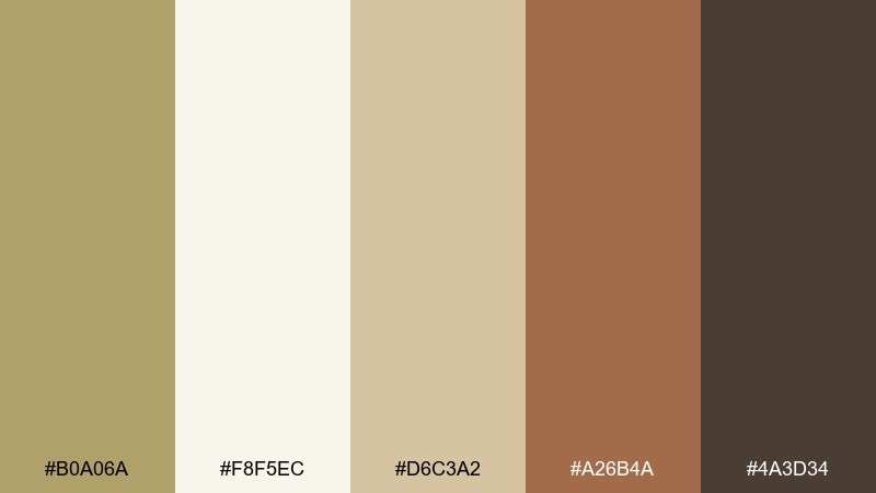
HEX: #B0A06A #F8F5EC #D6C3A2 #A26B4A #4A3D34
Mood: nostalgic, cozy, handcrafted
Best for: book covers and journal stationery
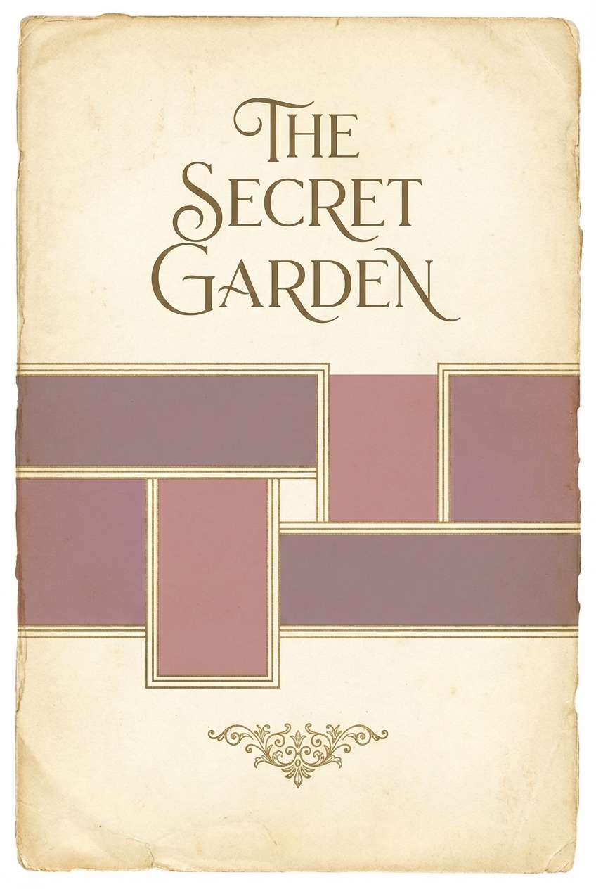
Nostalgic and cozy, it brings to mind aged paper, leather bindings, and pencil sketches. Use the warm cream for negative space and let the brown tones carry titles and borders. The softer tan works well for paper textures or subtle patterns. A good tip is to add grain and slightly imperfect edges to keep the handmade feel consistent.
Image example of vintage field notes generated using media.io
5) Coastal Khaki
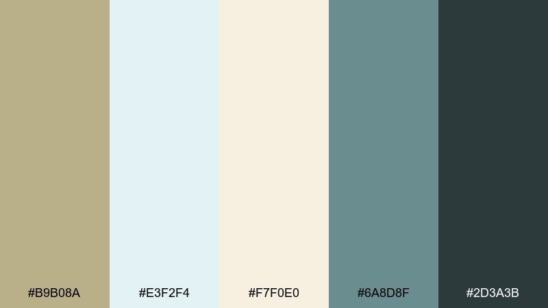
HEX: #B9B08A #E3F2F4 #F7F0E0 #6A8D8F #2D3A3B
Mood: fresh, breezy, balanced
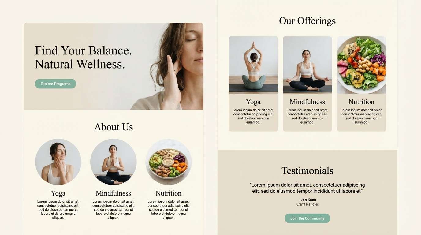
Best for: resort branding and wellness landing pages
Fresh and breezy, it feels like dune grass against pale seafoam water. Let the airy blue-green lighten your layout while the khaki keeps it grounded and premium. Use the deep slate for crisp headlines and small UI details. Pair with soft gradients and plenty of whitespace to maintain that coastal calm.
Image example of coastal khaki generated using media.io
6) Minimal Studio
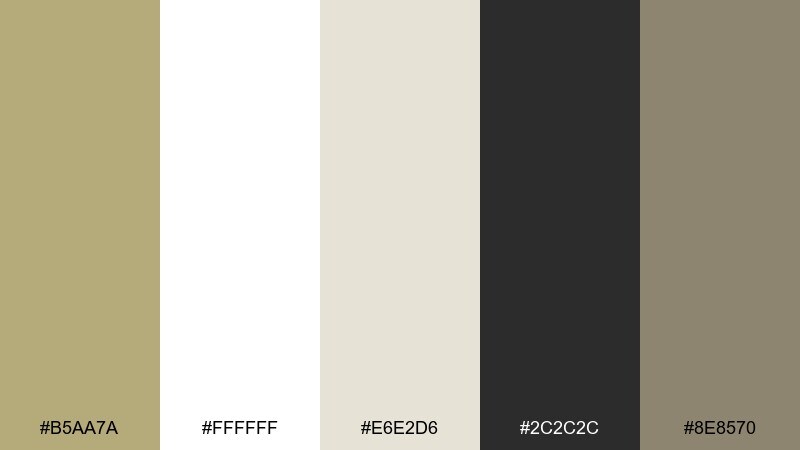
HEX: #B5AA7A #FFFFFF #E6E2D6 #2C2C2C #8E8570
Mood: minimal, clean, modern
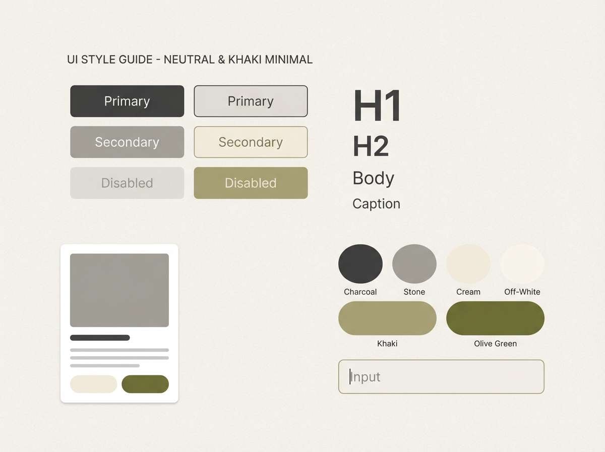
Best for: brand guidelines and minimalist web UI
Minimal and clean, it evokes a bright studio with smooth plaster walls and soft shadows. Use the white and warm gray for spacious layouts, then bring in khaki for highlights like tabs, badges, or section dividers. The charcoal anchors text and gives the whole khaki color palette a sharp, modern finish. Keep saturation low and rely on typography weight changes as your main emphasis.
Image example of minimal studio generated using media.io
7) Autumn Trail
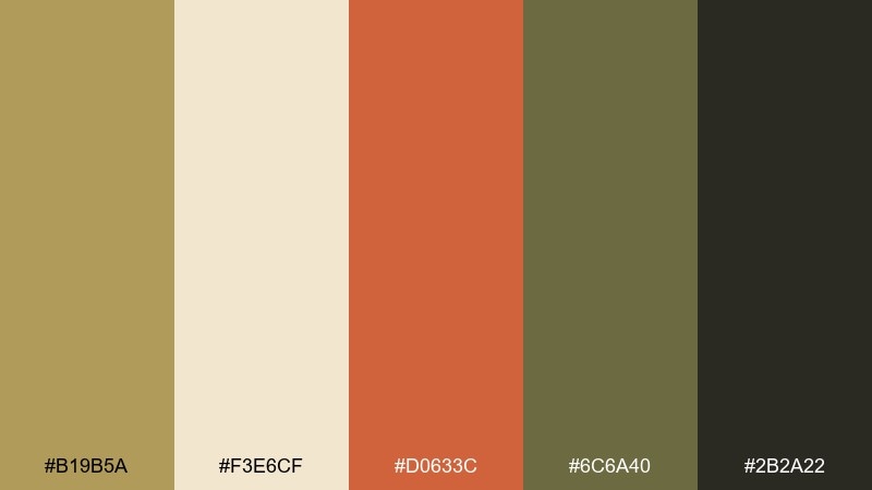
HEX: #B19B5A #F3E6CF #D0633C #6C6A40 #2B2A22
Mood: rustic, bold, outdoorsy
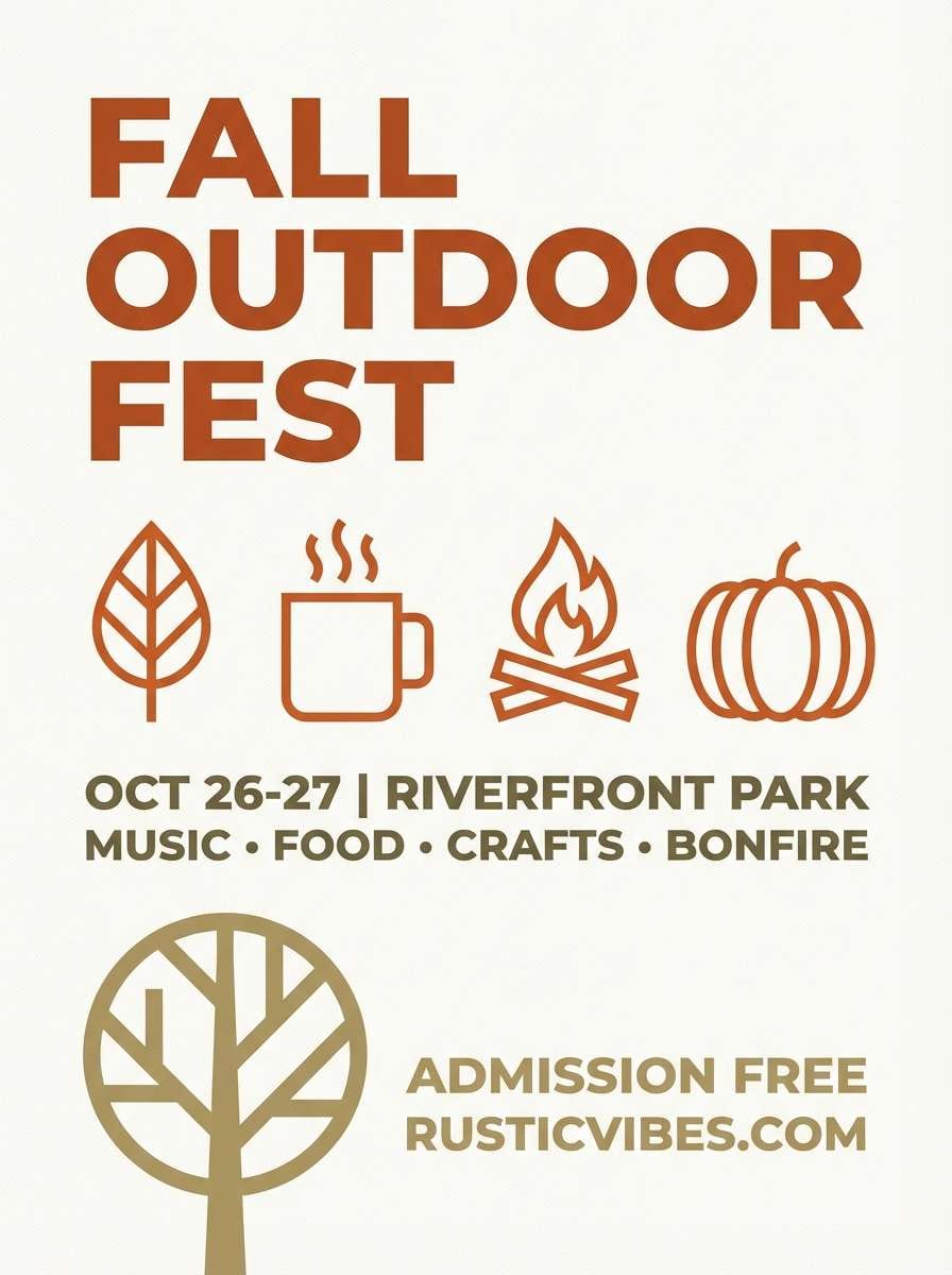
Best for: fall promotions and event posters
Rustic and bold, it reads like fallen leaves, trail dust, and a campfire glow. These khaki color combinations shine when the warm rust is used sparingly as a headline or callout color. Keep the light tan for background blocks so the dark tones stay readable. A practical move is to pair it with textured paper or subtle noise for seasonal depth.
Image example of autumn trail generated using media.io
8) Urban Utility
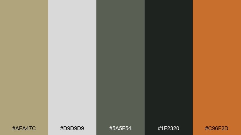
HEX: #AFA47C #D9D9D9 #5A5F54 #1F2320 #C96F2D
Mood: industrial, confident, streetwise
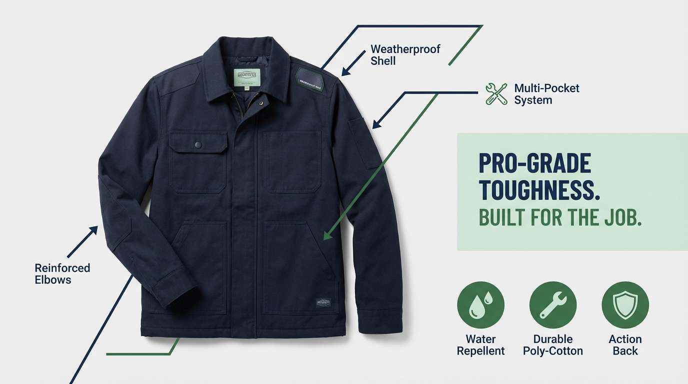
Best for: workwear branding and social ads
Industrial and confident, it feels like concrete, canvas, and brushed metal. The orange works best in short bursts, like price tags, stickers, or a single button, while the grays handle the heavy lifting. Use the near-black for logos and small print to keep contrast strong. Try a simple two-tone layout and reserve the accent for the one action you want users to take.
Image example of urban utility generated using media.io
9) Soft Nursery Neutral
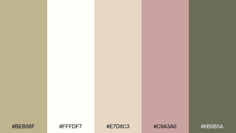
HEX: #BEB58F #FFFDF7 #E7D8C3 #C9A3A0 #6B6B5A
Mood: gentle, cozy, comforting
Best for: baby brands and nursery room styling
Gentle and cozy, it suggests soft blankets, warm milk, and quiet afternoon light. The blush tint adds sweetness without turning overly pink, especially when balanced with the creamy white. Use the muted olive-gray for text and small details like borders or icons. For interiors, keep walls light and bring khaki through textiles and storage baskets for a calm, lived-in look.
Image example of soft nursery neutral generated using media.io

10) Botanical Herbarium
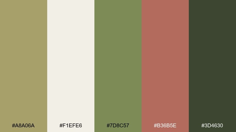
HEX: #A8A06A #F1EFE6 #7D8C57 #B36B5E #3D4630
Mood: botanical, artisanal, serene
Best for: watercolor prints and eco blog illustrations
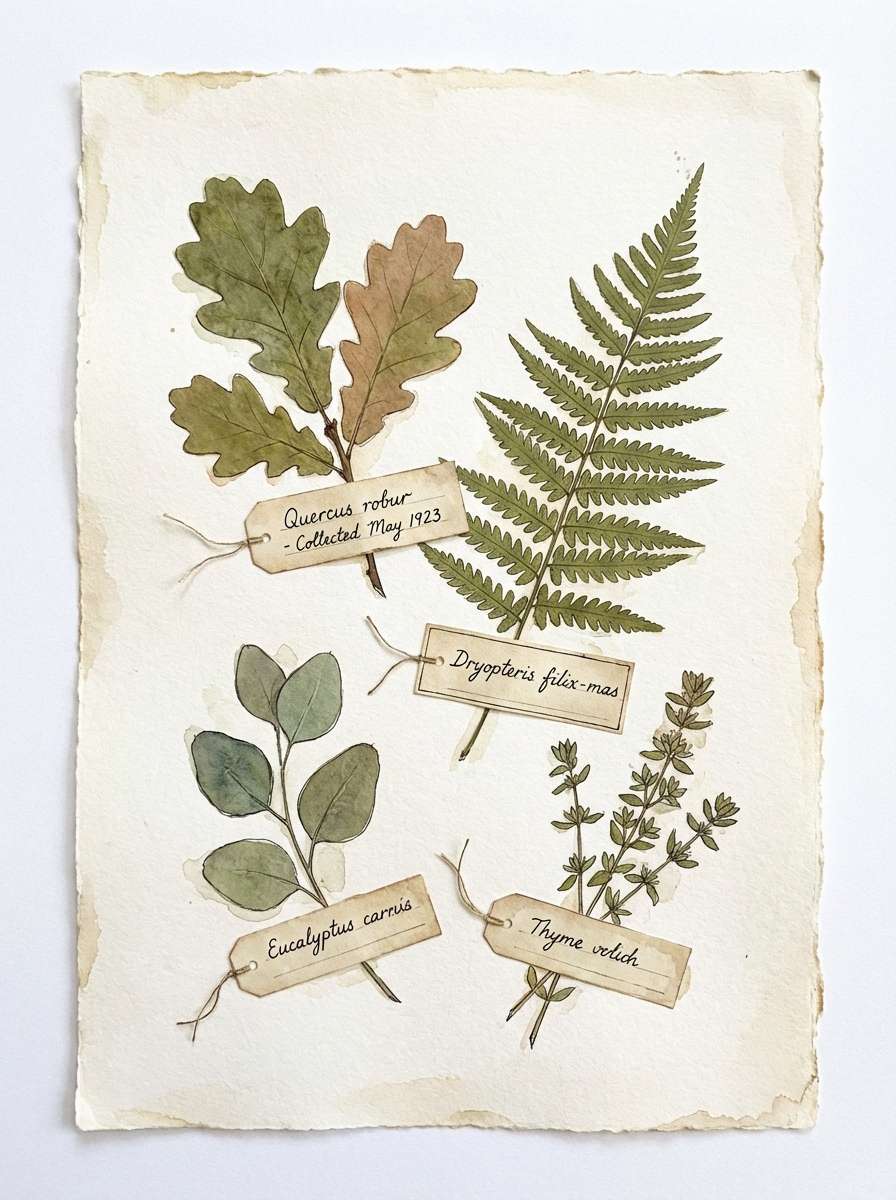
Botanical and serene, it recalls pressed leaves, seed pods, and handmade paper. The sage greens build the structure, while the muted clay adds a warm, human touch for highlights. Keep the pale neutral as the paper tone so the palette stays airy. A helpful tip is to use watercolor edges and light texture rather than hard shapes to match the herbarium feel.
Image example of botanical herbarium generated using media.io
11) Warm Café
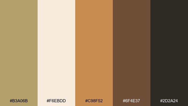
HEX: #B3A06B #F6EBDD #C98F52 #6F4E37 #2D2A24
Mood: inviting, rich, comfort
Best for: coffee packaging and menu design
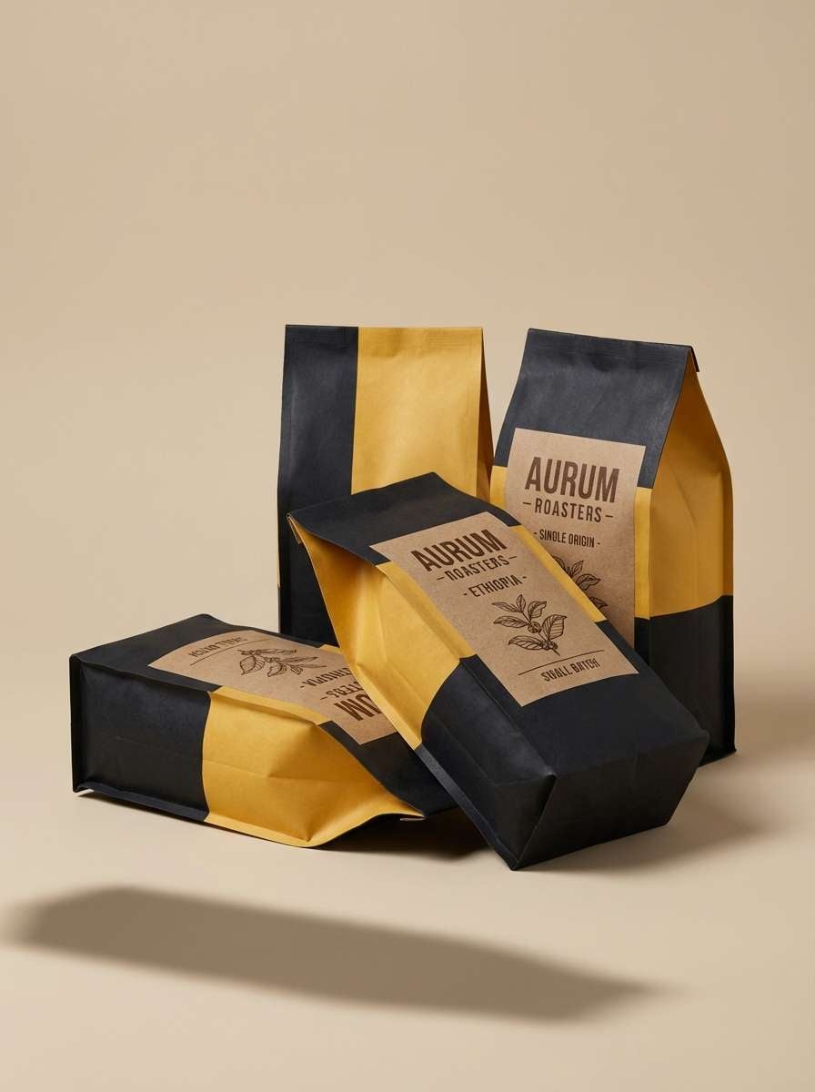
Inviting and rich, it brings espresso crema, toasted sugar, and cozy wooden counters to mind. Use the caramel tone for highlights like price markers or featured items, and let the cream keep the layout readable. The deep coffee brown is ideal for type and logo work. For packaging, a matte finish with subtle embossing makes these tones feel premium and tactile.
Image example of warm café generated using media.io
12) Modern Workwear
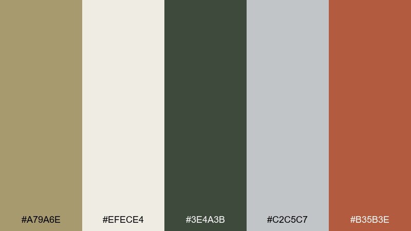
HEX: #A79A6E #EFECE4 #3E4A3B #C2C5C7 #B35B3E
Mood: practical, modern, durable
Best for: tool brands and ecommerce category pages
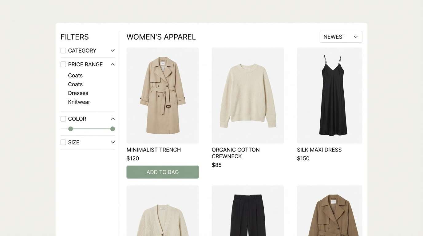
Practical and modern, it feels like canvas aprons, steel tools, and well-used workshop surfaces. Let the light neutral carry product grids, then use the forest green for navigation and trust-building elements. The warm terracotta adds energy for sale tags or key CTAs. Keep product photos consistent and avoid overly glossy finishes so the rugged tone stays believable.
Image example of modern workwear generated using media.io
13) Heritage Lodge
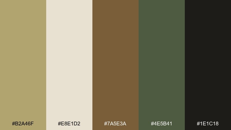
HEX: #B2A46F #E8E1D2 #7A5E3A #4E5B41 #1E1C18
Mood: heritage, moody, outdoors
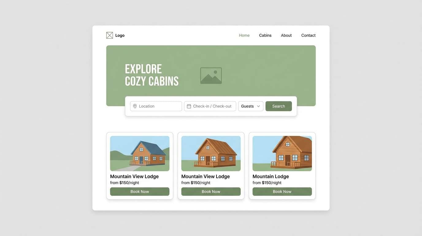
Best for: cabin rentals and rustic hospitality branding
Heritage and moody, it evokes cabin beams, worn leather, and pine needles after rain. Use the near-black for strong typography and the warm cream for breathable spacing. The olive green reads as natural and trustworthy, especially for booking buttons and section headers. Add a subtle woodgrain texture in backgrounds, but keep it faint so the text stays clear.
Image example of heritage lodge generated using media.io
14) Sunlit Stucco
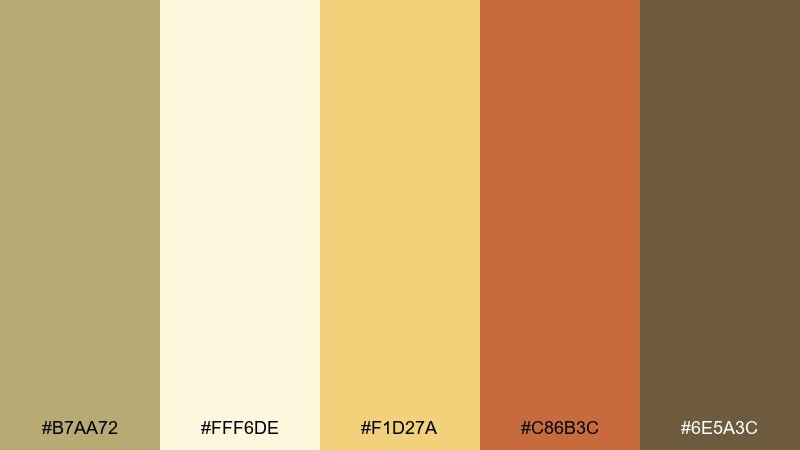
HEX: #B7AA72 #FFF6DE #F1D27A #C86B3C #6E5A3C
Mood: sunny, mediterranean, uplifting
Best for: restaurant identity and summer promos
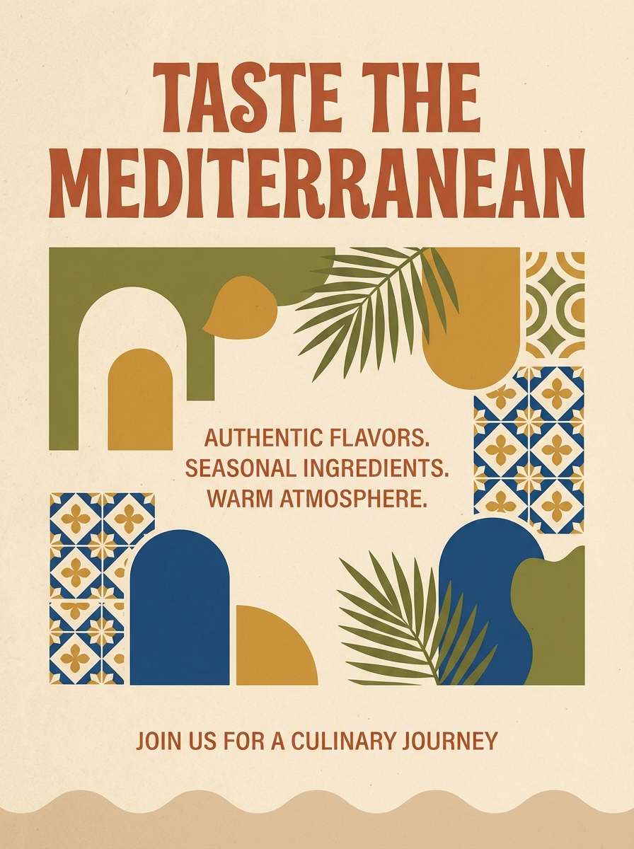
Sunny and uplifting, it feels like stucco walls, lemon light, and terracotta pots. Use the buttery yellow as a highlight for icons or small patterns, not as a full background. The terracotta adds appetite-friendly warmth for headlines and promo stickers. Pair with clean serif type and plenty of cream space to keep the look fresh, not busy.
Image example of sunlit stucco generated using media.io
15) Clay and Sage
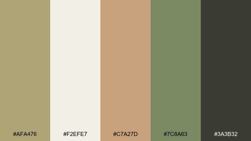
HEX: #AFA476 #F2EFE7 #C7A27D #7C8A63 #3A3B32
Mood: natural, balanced, calming
Best for: skincare labels and spa brochures
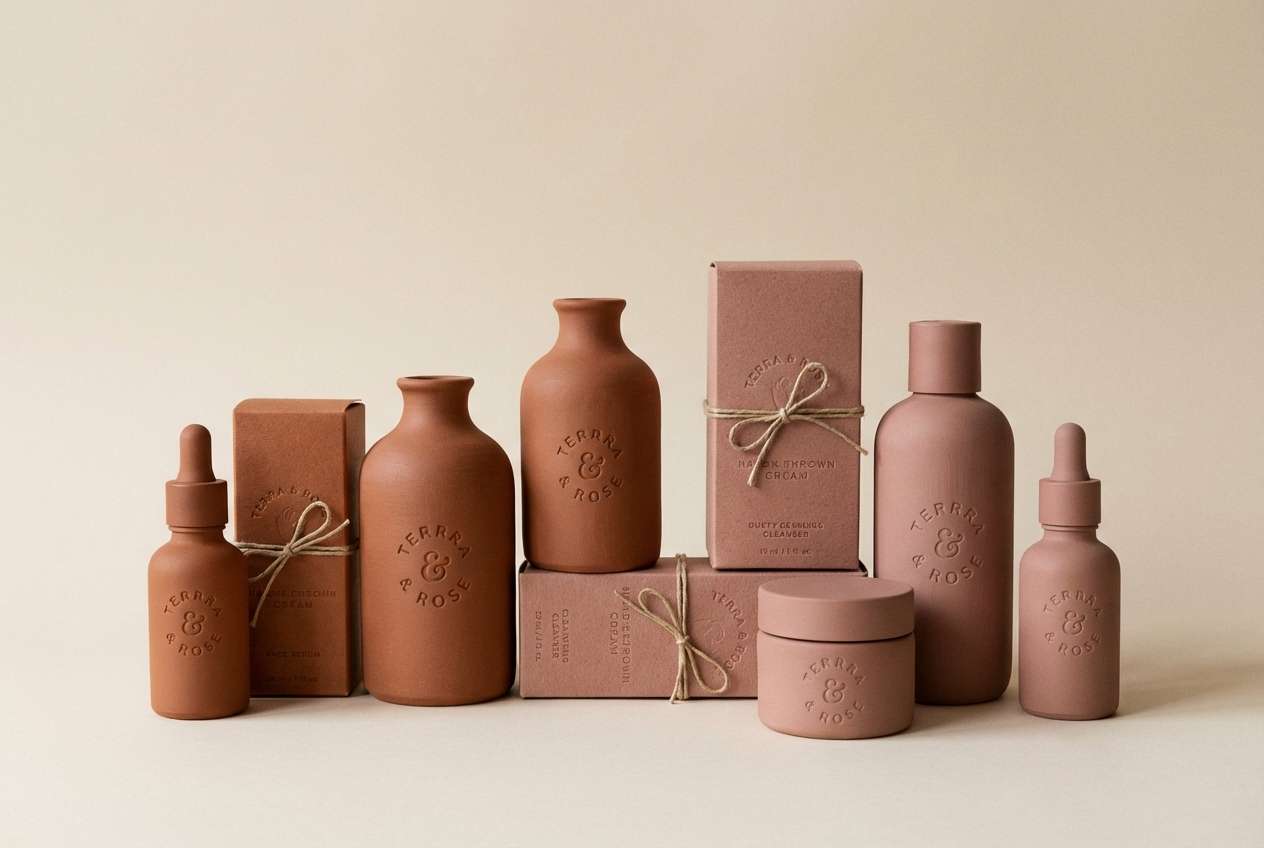
Natural and calming, it suggests clay masks, dried herbs, and warm stone. Use the light neutral for clean breathing room, then add sage for trust and calm. The clay tone works well on packaging as a soft focal point without shouting. A simple tip is to keep gradients minimal and rely on matte textures to make the colors feel clean and premium.
Image example of clay and sage generated using media.io
16) Luxe Gold Accent
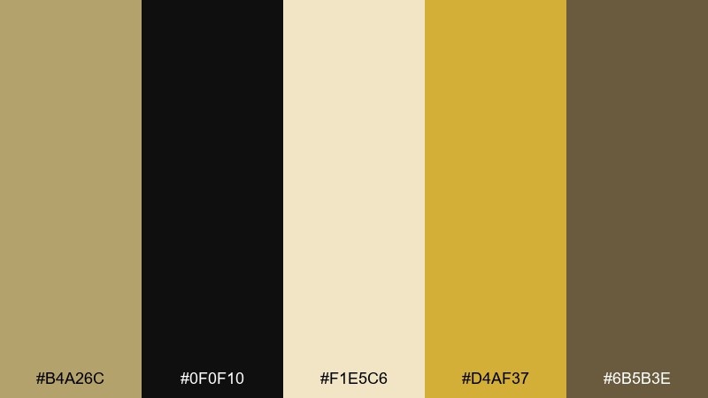
HEX: #B4A26C #0F0F10 #F1E5C6 #D4AF37 #6B5B3E
Mood: luxury, dramatic, elegant
Best for: premium branding and product launch ads
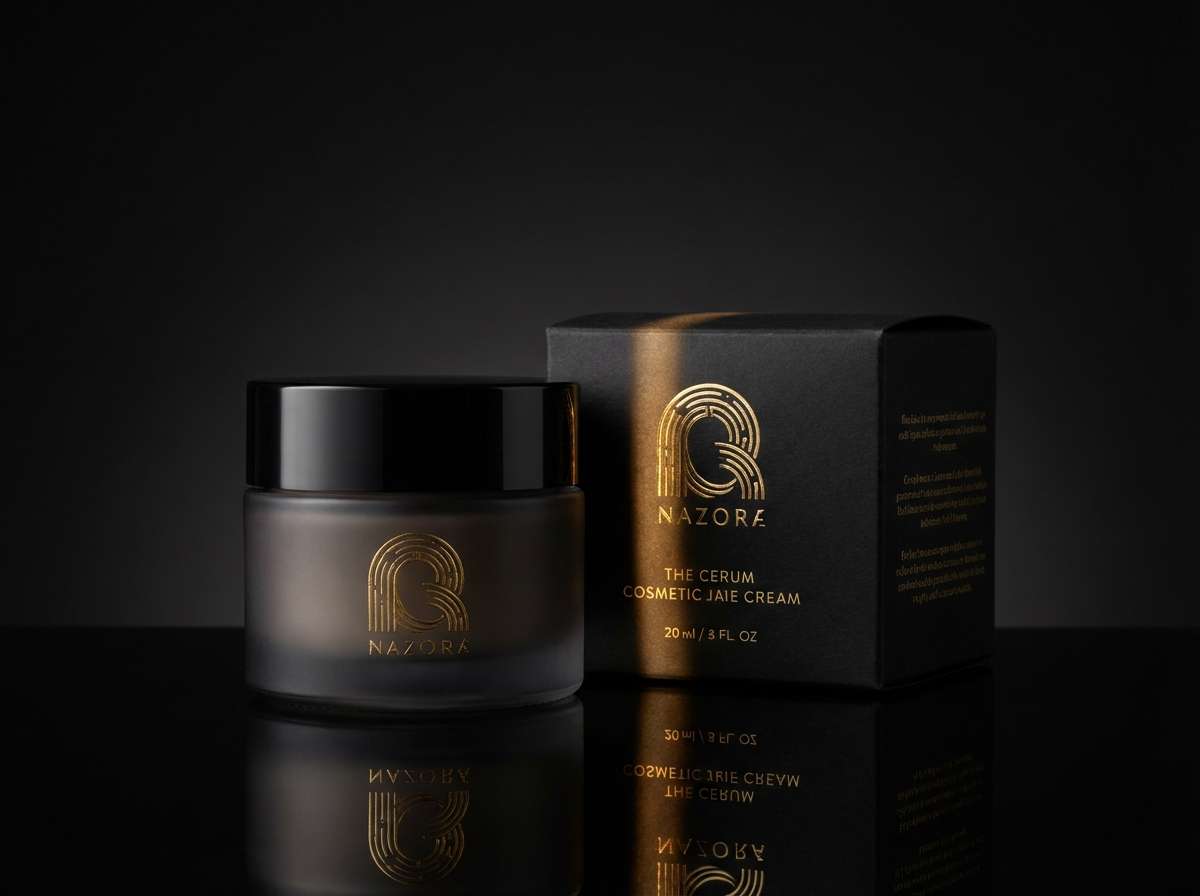
Luxury and dramatic, it feels like gold foil on dark velvet. Keep the black dominant for a high-end look, then use the metallic gold sparingly on key marks like logos, dividers, or price badges. The soft ivory prevents the design from becoming too heavy. For best results, limit gold to one finish style and give it plenty of negative space to shine.
Image example of luxe gold accent generated using media.io
17) Clean Ecommerce UI
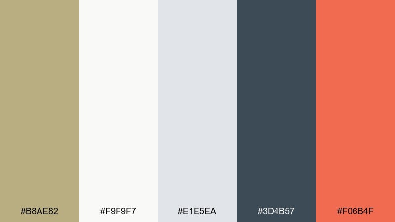
HEX: #B8AE82 #F9F9F7 #E1E5EA #3D4B57 #F06B4F
Mood: clean, friendly, conversion-focused
Best for: storefront UI and checkout flows
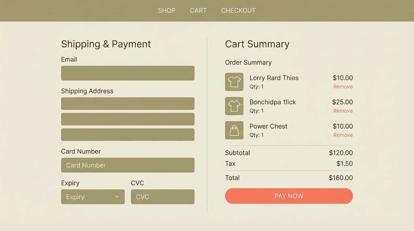
Clean and friendly, it reads like bright daylight with a warm, earthy undertone. These khaki color combinations work well for navigation and subtle UI emphasis, while the coral accent draws attention to primary actions. Use the blue-gray for text and icons to keep everything crisp against the soft background. A practical tip is to reserve coral for one button style only, so CTAs stay instantly recognizable.
Image example of clean ecommerce ui generated using media.io
18) Eco Packaging
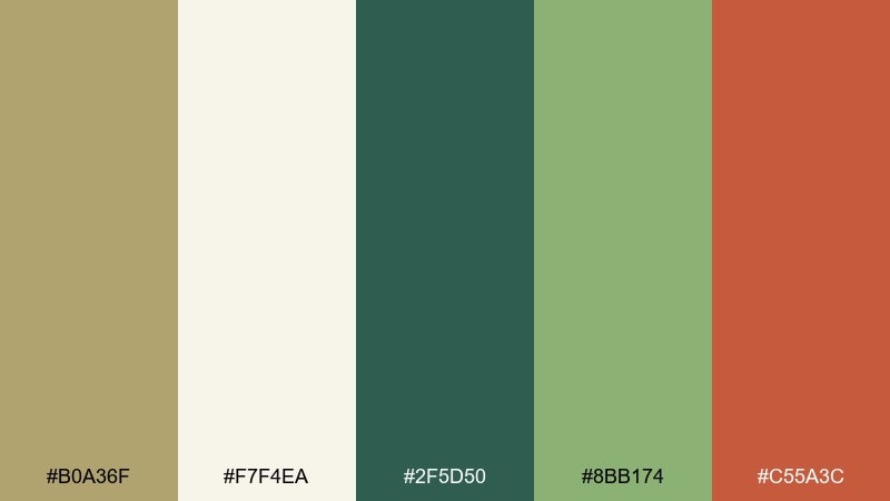
HEX: #B0A36F #F7F4EA #2F5D50 #8BB174 #C55A3C
Mood: eco, fresh, trustworthy
Best for: sustainable packaging and hang tags
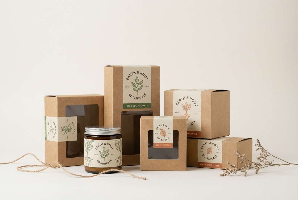
Eco and trustworthy, it suggests recycled paper, fresh herbs, and natural dyes. Let the paper-like off-white dominate labels, then use the deep green for brand marks and ingredient headers. The warm red-brown is strong as a small seal or stamp detail. Choose uncoated stock and avoid overly bright prints so the palette keeps its sustainable character.
Image example of eco packaging generated using media.io
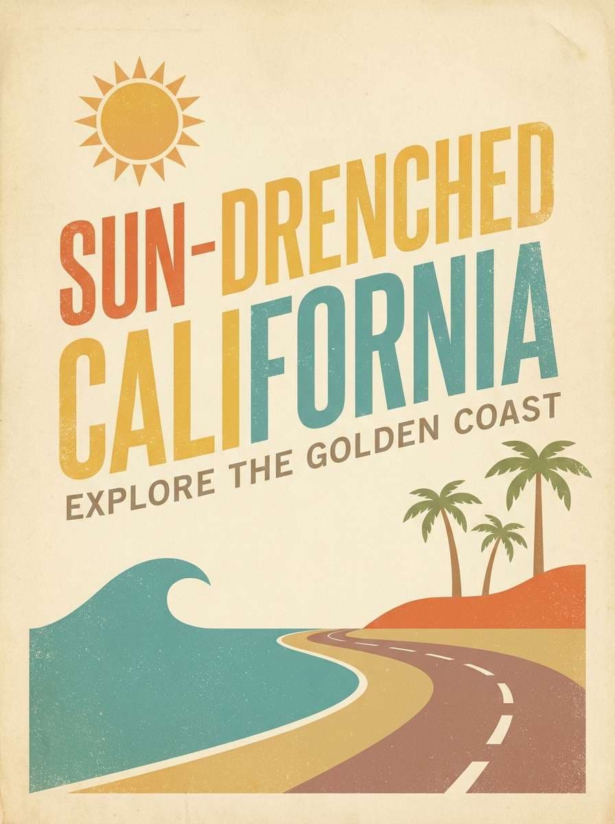
19) Travel Poster Sand
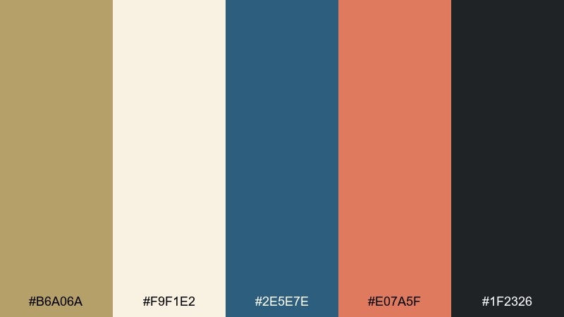
HEX: #B6A06A #F9F1E2 #2E5E7E #E07A5F #1F2326
Mood: retro, adventurous, graphic
Best for: travel posters and postcard designs
Retro and adventurous, it feels like a vintage postcard with sun-faded ink. The deep blue creates strong silhouettes and type, while the coral adds upbeat highlights for landmarks or badges. Keep the warm sand tones as the main background to preserve that nostalgic print feel. Use simple shapes and limited gradients to mimic classic screen-printed poster styling.
Image example of travel poster sand generated using media.io
20) Evening Olive Noir
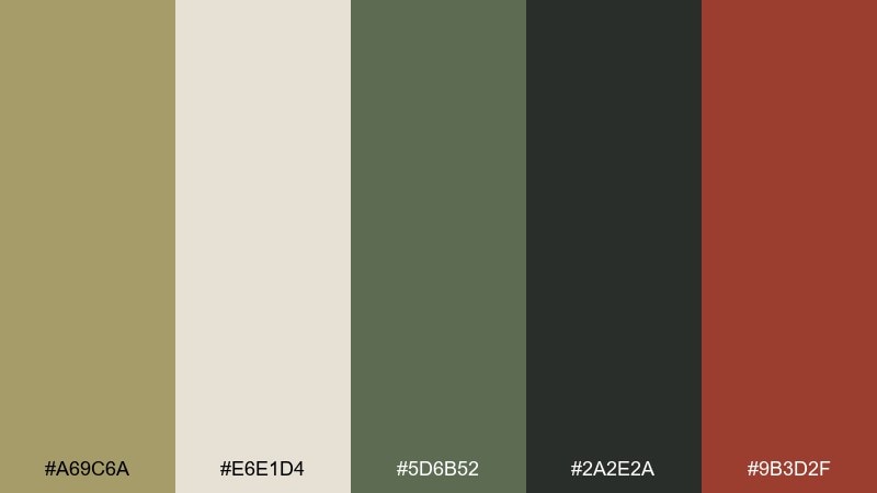
HEX: #A69C6A #E6E1D4 #5D6B52 #2A2E2A #9B3D2F
Mood: moody, refined, cinematic
Best for: editorial layouts and fashion lookbooks
Moody and refined, it evokes twilight shadows, olive branches, and deep wine tones. The off-white works best as a calm page base, letting the dark charcoal carry body text and grids. Add the burgundy as a controlled accent for pull quotes, section headers, or small rules. For a sleek finish, keep imagery desaturated and use generous margins so the palette feels cinematic, not cluttered.
Image example of evening olive noir generated using media.io
21) Quiet Monochrome Khaki
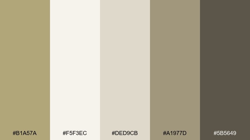
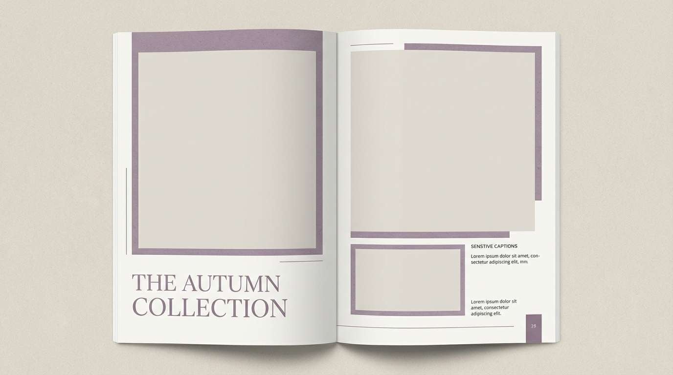
HEX: #B1A57A #F5F3EC #DED9CB #A1977D #5B5649
Mood: quiet, understated, airy
Best for: portfolio sites and case study pages
Quiet and understated, it feels like soft daylight on textured paper. Rely on the pale neutrals for large sections, then use the mid khaki shades for cards and dividers. The deeper taupe gives you enough contrast for headings without going harsh. A strong tip is to separate sections with spacing first, then add color second, so the design stays airy and premium.
Image example of quiet monochrome khaki generated using media.io
22) Stone Garden Contrast
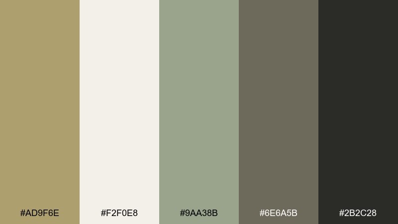
HEX: #AD9F6E #F2F0E8 #9AA38B #6E6A5B #2B2C28
Mood: zen, structured, balanced
Best for: architecture decks and minimalist presentations
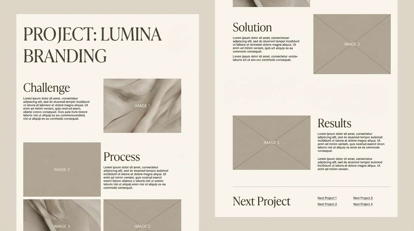
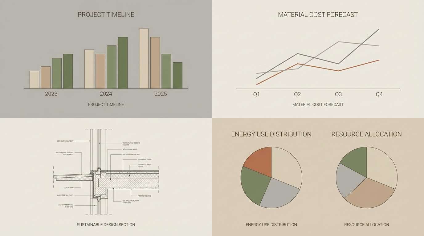
Zen and structured, it brings to mind raked gravel, moss, and smooth river stones. Use the light neutral for slides and whitespace, then build hierarchy with the two cool grays. The mossy green is ideal for diagrams and subtle emphasis. This khaki color scheme looks best with thin lines, restrained icons, and consistent spacing across every page.
Image example of stone garden contrast generated using media.io
What Colors Go Well with Khaki?
Khaki pairs naturally with other grounded neutrals like cream, warm white, sand, taupe, and espresso brown. These combinations feel cohesive because they share similar undertones and keep contrast comfortable.
For a fresher or more modern direction, combine khaki with cool supports like slate blue, blue-gray, seafoam, or light gray. This pushes khaki toward “clean minimal” while keeping warmth in the base.
If you want an accent that pops, use controlled hits of rust, terracotta, coral, burgundy, or metallic gold. Keep those accents limited to CTAs, badges, or key headlines so the palette stays premium rather than loud.
How to Use a Khaki Color Palette in Real Designs
In branding, treat khaki as your base color for backgrounds, packaging substrates, and supporting shapes, then choose one dark anchor (charcoal/espresso) for typography and logos. Add a single accent color for emphasis so your system stays consistent across assets.
In UI design, khaki works best as a warm neutral that replaces pure gray: use it for navigation highlights, tabs, dividers, and card backgrounds. For accessibility, keep body text in a dark neutral and verify contrast on buttons and links.
In interiors and product styling, bring khaki in through textiles, paint, or natural materials (linen, leather, wood). Mix it with cream for lightness, then add depth with darker browns or olive greens to avoid a flat, beige look.
Create Khaki Palette Visuals with AI
If you’re building a mood board, poster, UI mockup, or packaging concept, generating fast visuals can help you test how khaki behaves under different lighting, textures, and layouts. That’s especially useful when you’re deciding between olive-leaning khaki vs. golden khaki.
Start with one palette above, then describe the format you need (flat lay mood board, ecommerce UI, poster, label design) and add constraints like “plain background,” “no hands,” or a specific aspect ratio. Iterate by adjusting one variable at a time—texture, contrast, or accent color.
Use Media.io to turn your palette into consistent design examples you can share with teammates or clients.
Khaki Color Palette FAQs
-
What is the HEX code for khaki?
“Khaki” can vary by context, but common khaki HEX values sit around muted yellow-browns (for example #B6A46A or #B5AA7A). The best choice depends on whether you want it to lean sandy-gold or olive-green. -
Is khaki warm or cool?
Khaki is usually warm, but it can shift cooler when it has more green/olive in the mix. Pair it with creams and browns to emphasize warmth, or with slate/gray to make it feel cooler and more modern. -
What colors go best with khaki for a modern brand?
Clean combinations include khaki + white + warm gray + charcoal, with one accent like coral or terracotta for CTAs. This keeps the system minimal while still feeling distinctive and approachable. -
Does khaki work for websites and app UI?
Yes—khaki is a strong alternative to plain gray for UI neutrals. Use it for backgrounds, cards, and subtle highlights, while keeping text in charcoal/near-black and verifying contrast for accessibility. -
How do I choose an accent color for a khaki palette?
Pick one accent that matches the mood: rust/terracotta for outdoorsy energy, coral for friendly conversion-focused UI, burgundy for editorial sophistication, or gold for luxury. Use the accent sparingly so khaki remains the dominant neutral. -
How can I make khaki look more premium?
Use deep neutrals (charcoal/espresso) for typography, increase whitespace, and choose matte textures (paper grain, linen, uncoated stock). Limit saturated accents and keep the palette restrained for a high-end feel. -
What’s the difference between khaki and tan?
Tan is typically warmer and more orange-brown, while khaki often has a yellow-green or olive undertone. In design, tan reads more “desert/caramel,” and khaki reads more “utility/natural/heritage.”
Next: Light Gray Color Palette


