

Red and green is a high-energy pairing that can feel festive, earthy, modern, or luxe depending on the shades and the neutrals you add.
Below are 20+ red green color palette ideas with HEX codes, plus quick tips for using contrast, accents, and supporting colors in branding, UI, and print.
In this article
Why Red Green Palettes Work So Well
Red and green sit opposite each other on the color wheel, so they naturally create strong contrast. That contrast makes layouts feel punchy and easy to scan, especially when one color leads and the other supports.
This pairing also carries familiar cues: red reads as energy, warmth, and urgency, while green suggests growth, freshness, and stability. Together, they can communicate “exciting but grounded” in branding and UI.
The key is control. When you add calm neutrals (off-white, cream, charcoal) and reserve the brightest shades for accents, a red green color scheme stays polished instead of loud.
20+ Red Green Color Palette Ideas (with HEX Codes)
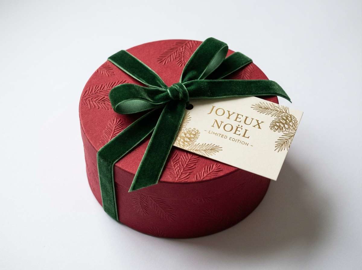
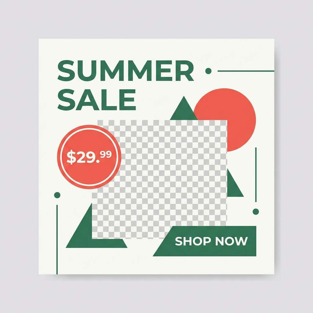
1) Winter Holly
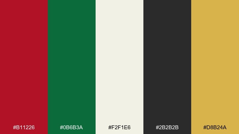
HEX: #B11226 #0B6B3A #F2F1E6 #2B2B2B #D8B24A
Mood: festive, classic, cozy
Best for: holiday gift packaging
Festive and familiar, it evokes holly leaves, warm lights, and classic winter décor. The off-white and charcoal keep the reds and greens from feeling loud, while the gold adds a premium finish. It works beautifully for seasonal packaging, greeting cards, and storefront banners. Usage tip: reserve the gold for small highlights like seals, borders, or foil accents to avoid visual clutter.
Image example of winter holly generated using media.io
Media.io is an online AI studio for creating and editing video, image, and audio in your browser.

2) Forest Berry
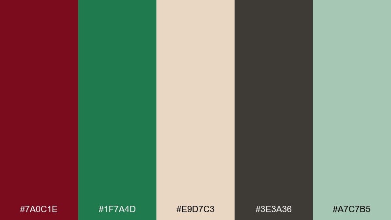
HEX: #7A0C1E #1F7A4D #E9D7C3 #3E3A36 #A7C7B5
Mood: earthy, outdoorsy, grounded
Best for: outdoor brand identity and labels
Earthy and calm, it feels like a hike through pines with ripe berries tucked under leaves. The beige and brown create a natural base, while the soft mint keeps the greens feeling fresh. Use it for sustainable products, trail goods, and craft food labeling. Pair with recycled-paper textures and choose the darkest tone for type to keep readability strong.
Image example of forest berry generated using media.io
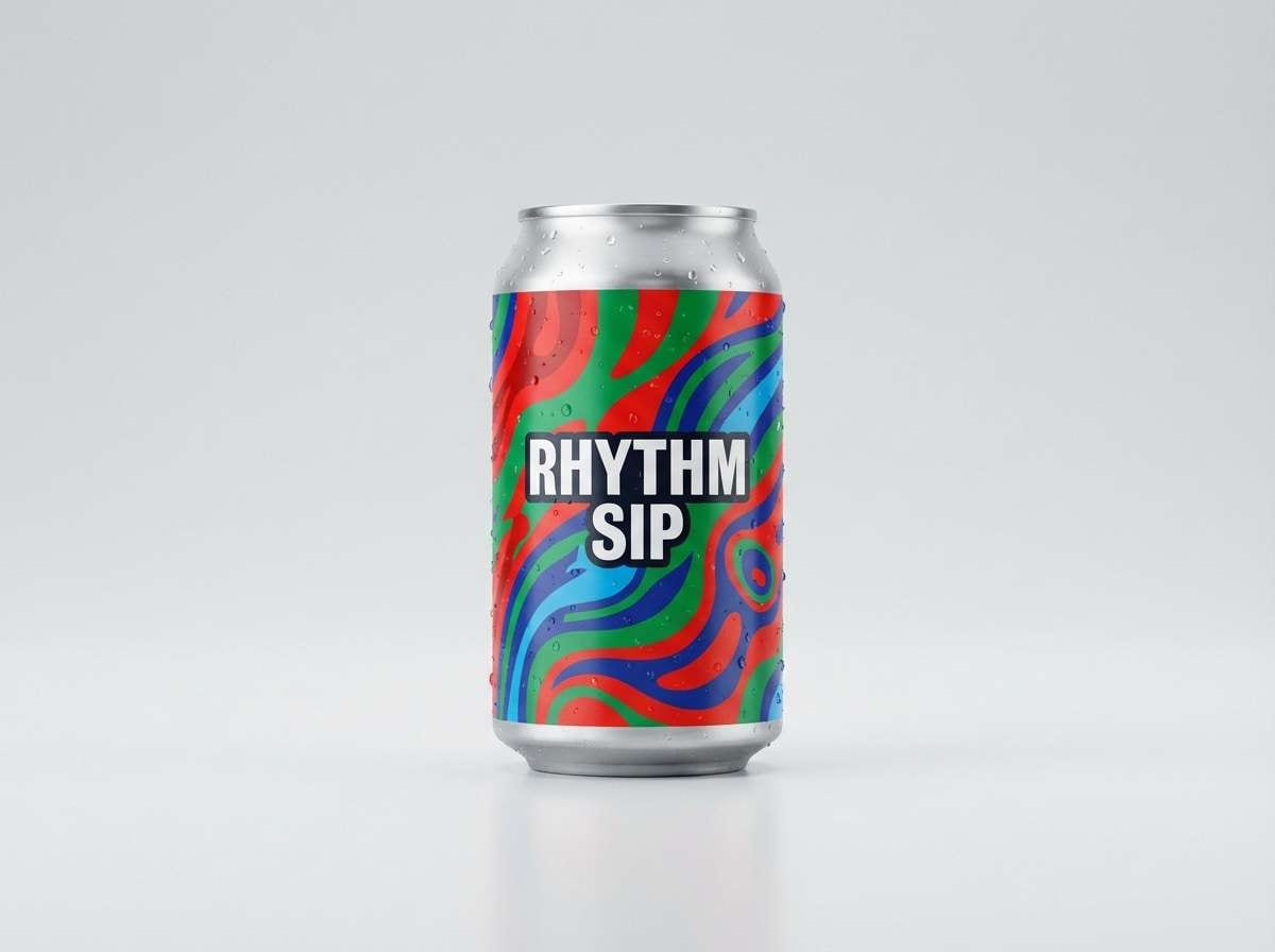
3) Candy Cane Pop
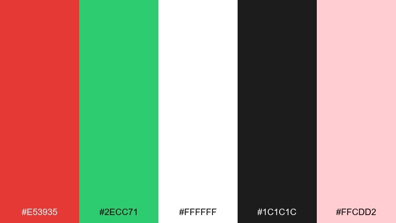
HEX: #E53935 #2ECC71 #FFFFFF #1C1C1C #FFCDD2
Mood: playful, bright, cheerful
Best for: kids event poster design
Playful and punchy, it brings to mind candy canes, balloons, and bold party graphics. The crisp white and inky black give the bright tones a clean stage, while the light blush softens large areas of color. For a lively red green color combination, use green for supporting shapes and keep red for calls to action. Tip: add thick outlines or black typography so small text never gets lost in the saturation.
Image example of candy cane pop generated using media.io

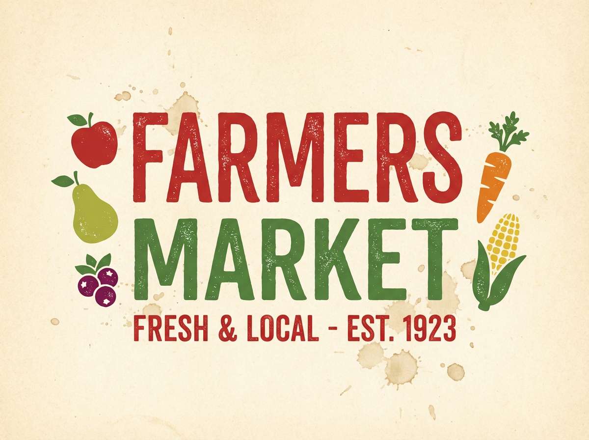
4) Rustic Orchard
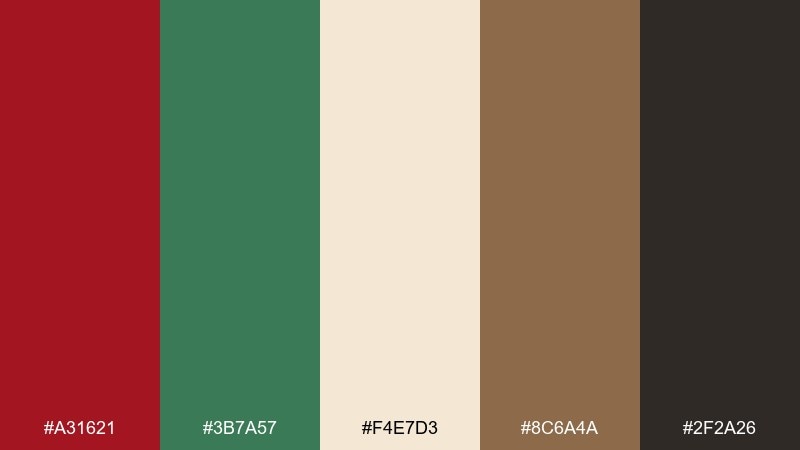
HEX: #A31621 #3B7A57 #F4E7D3 #8C6A4A #2F2A26
Mood: warm, rustic, nostalgic
Best for: farmers market signage
Warm and nostalgic, it feels like orchard apples, wooden crates, and hand-painted signs. Cream and brown keep the tones grounded, while the deep red adds appetite appeal. It shines on chalkboard menus, market signage, and artisanal jam labels. Usage tip: print the green slightly muted on textured stock so it looks natural rather than neon.
Image example of rustic orchard generated using media.io
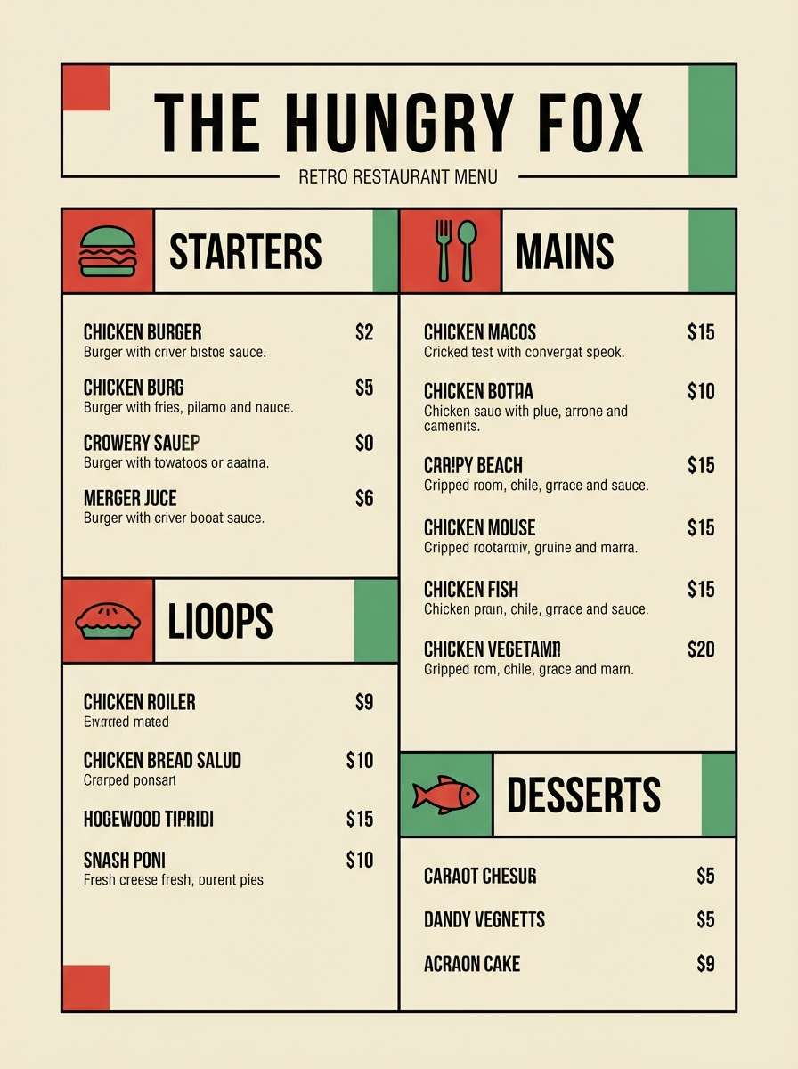
5) Retro Diner
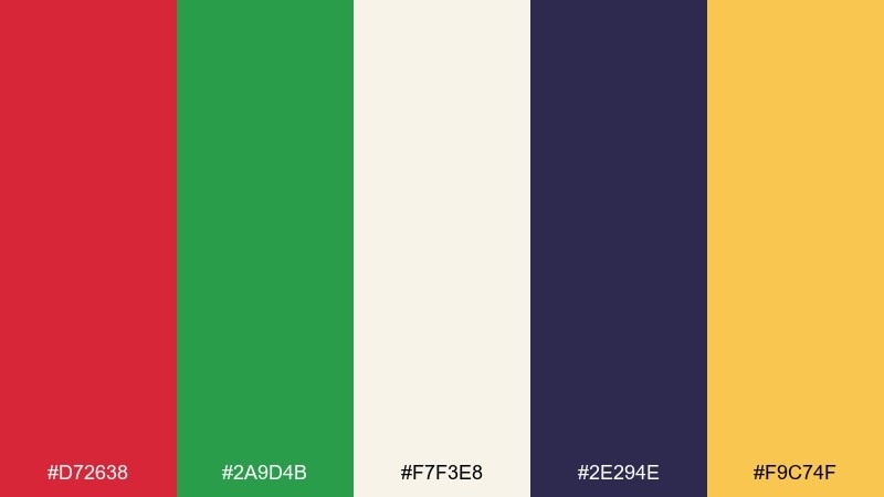
HEX: #D72638 #2A9D4B #F7F3E8 #2E294E #F9C74F
Mood: retro, bold, upbeat
Best for: restaurant menu layout
Bold and upbeat, it channels retro diner booths, neon signage, and late-night comfort food. The creamy base keeps the palette friendly, while navy adds contrast for headings and pricing. Use it for menus, café loyalty cards, and playful social graphics. Tip: let the yellow act as a divider color for section rules and badges instead of filling large blocks.
Image example of retro diner generated using media.io
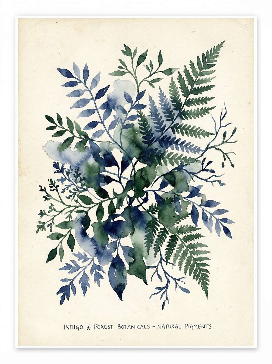
6) Botanical Study
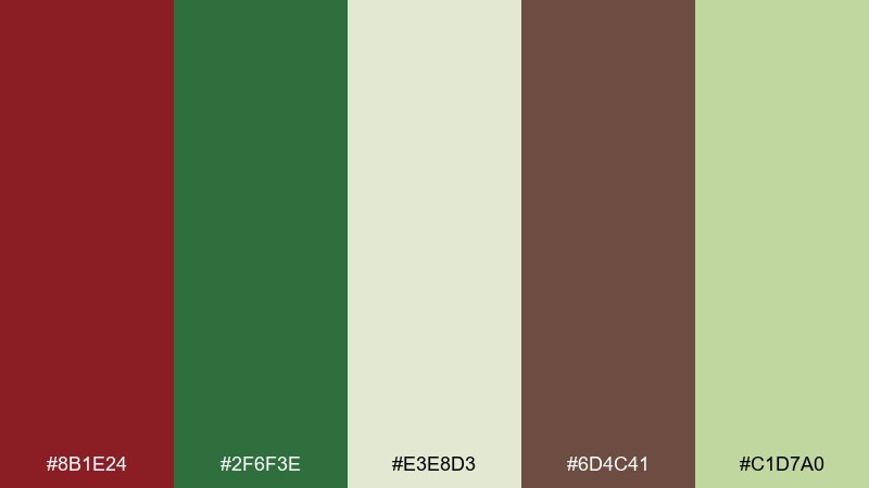
HEX: #8B1E24 #2F6F3E #E3E8D3 #6D4C41 #C1D7A0
Mood: natural, academic, calm
Best for: botanical poster illustration
Calm and natural, it looks like pressed leaves, ink notes, and a vintage field journal. The pale greens feel airy, while the deep red works well for titles and small stamps. Ideal for botanical prints, eco workshops, and packaging that needs a gentle, trustworthy tone. Usage tip: keep backgrounds in the light sage and save the darker green for outlines and detail work.
Image example of botanical study generated using media.io
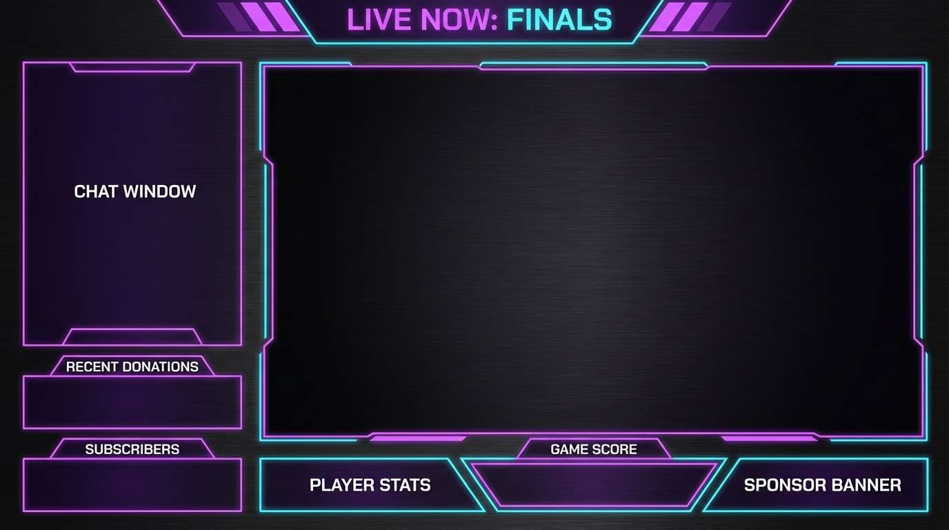
7) Neon Arcade
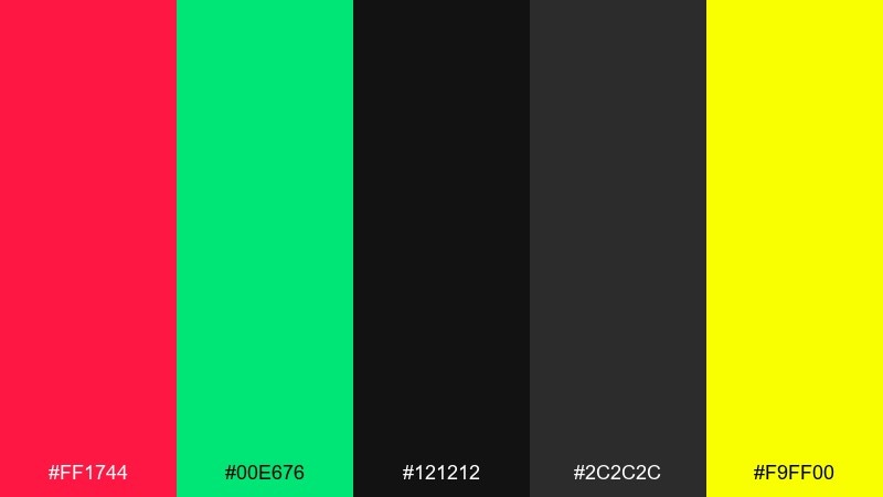
HEX: #FF1744 #00E676 #121212 #2C2C2C #F9FF00
Mood: electric, edgy, high-contrast
Best for: gaming stream overlay graphics
Electric and edgy, it evokes arcade cabinets, glow sticks, and late-night energy. The near-black background makes the neon tones pop without looking messy. Use it for gaming overlays, esports promos, and high-impact thumbnails. Tip: keep large areas dark and use neon only for icons, progress bars, and key buttons to reduce eye strain.
Image example of neon arcade generated using media.io
8) Muted Clay
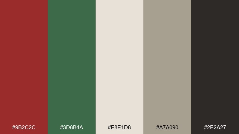
HEX: #9B2C2C #3D6B4A #E8E1D8 #A7A090 #2E2A27
Mood: muted, modern, earthy
Best for: interior design mood board
Muted and modern, it feels like clay pottery, linen curtains, and soft afternoon light. The warm neutrals balance the red and green so the overall look stays sophisticated. Great for interior mood boards, lifestyle branding, and calm website themes. Usage tip: use the dark charcoal for text and keep the colored tones for accents like buttons, bullets, and small illustrations.
Image example of muted clay generated using media.io
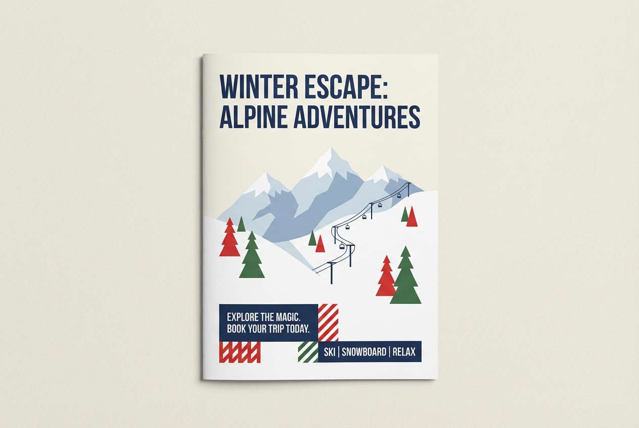
9) Alpine Chalet
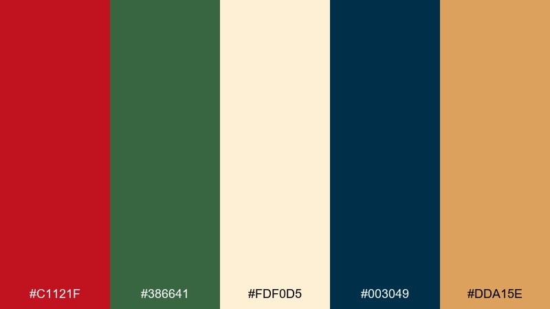
HEX: #C1121F #386641 #FDF0D5 #003049 #DDA15E
Mood: adventurous, cozy, premium
Best for: winter travel brochure
Adventurous yet cozy, it suggests alpine cabins, wool blankets, and crisp mountain air. The navy brings a refined depth that keeps the warm tones from skewing too seasonal. It works well for travel brochures, boutique hotel branding, and outdoor event collateral. For a balanced red green color scheme, let navy handle body text and use red only for highlights and badges.
Image example of alpine chalet generated using media.io
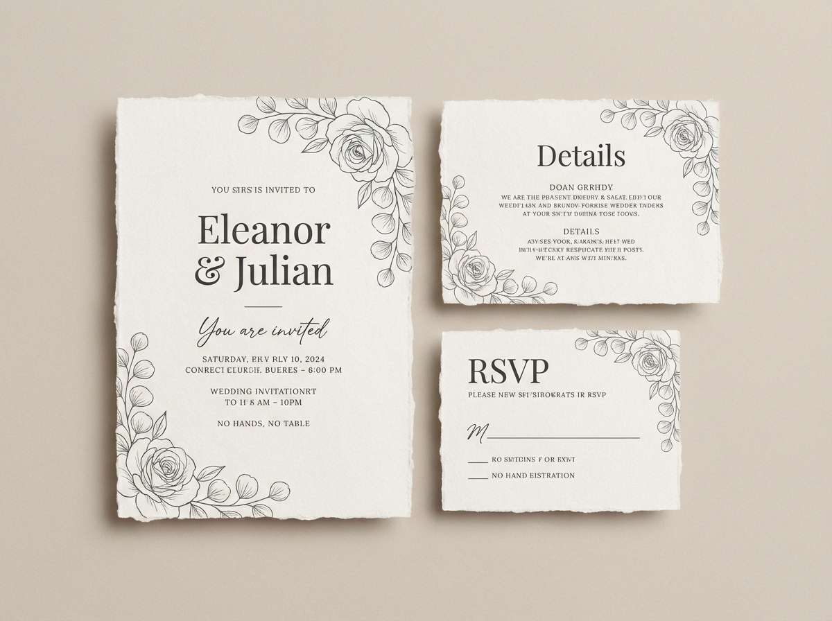
10) Sakura Pines
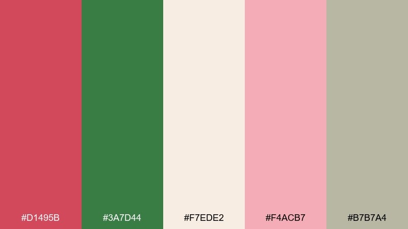
HEX: #D1495B #3A7D44 #F7EDE2 #F4ACB7 #B7B7A4
Mood: soft, romantic, serene
Best for: wedding invitation suite
Soft and romantic, it blends blush petals with pine greens for a gentle, modern contrast. The creamy background keeps everything airy, while the gray-green adds a calm, contemporary note. Perfect for wedding suites, spring announcements, and elegant stationery. Tip: print the red as a dusty rose for large areas and save the deeper green for monograms and borders.
Image example of sakura pines generated using media.io
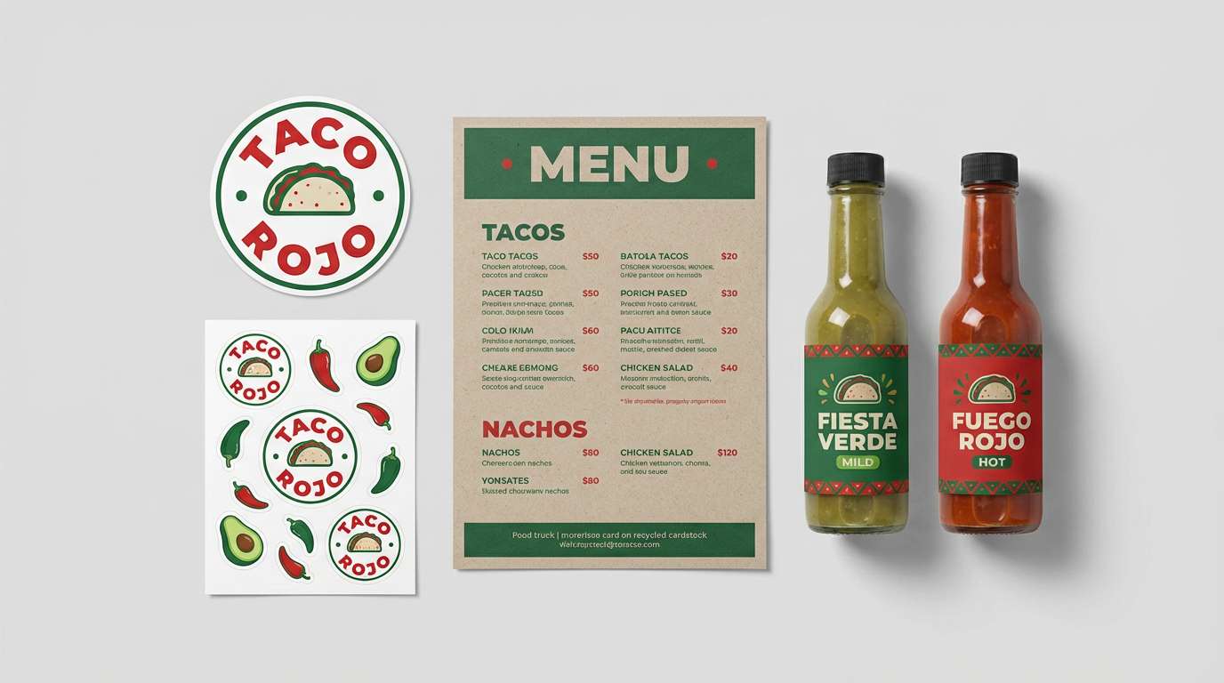
11) Spicy Salsa
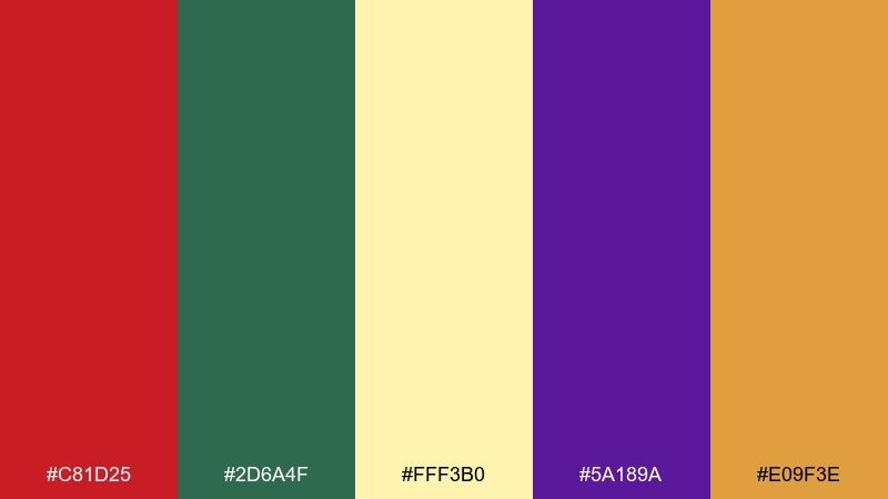
HEX: #C81D25 #2D6A4F #FFF3B0 #5A189A #E09F3E
Mood: spicy, festive, energetic
Best for: food truck brand kit
Spicy and festive, it feels like street-food lights, salsa heat, and vibrant market stalls. The sunny yellow keeps the deep tones from becoming heavy, while the purple adds a fun twist for secondary graphics. Use it for food truck branding, festival menus, and bold promo stickers. Usage tip: keep purple to small patterns or icons so the main message stays on red and green.
Image example of spicy salsa generated using media.io
12) Garnet and Sage
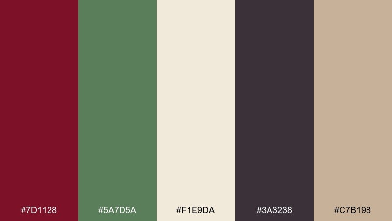
HEX: #7D1128 #5A7D5A #F1E9DA #3A3238 #C7B198
Mood: moody, refined, mature
Best for: law firm or consultancy website
Moody and refined, it brings to mind garnet velvet, sage ink, and quiet confidence. The cream and sand soften the dark tones so pages feel premium rather than severe. Ideal for professional websites, proposal decks, and upscale print collateral. Tip: use the sage for links and subtle UI states, and keep the garnet for primary calls to action.
Image example of garnet and sage generated using media.io
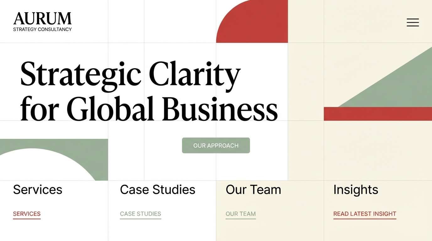
13) Coral Spruce
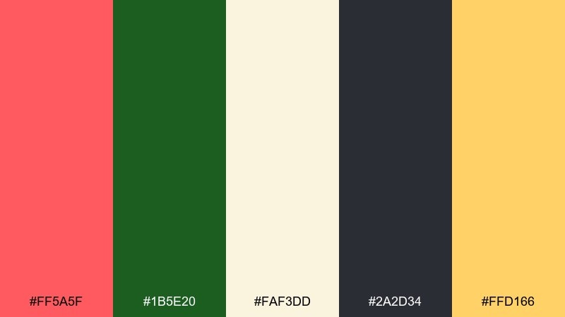
HEX: #FF5A5F #1B5E20 #FAF3DD #2A2D34 #FFD166
Mood: fresh, friendly, sunny
Best for: social media ad creatives
Fresh and friendly, it feels like coral fruit, spruce needles, and bright sunshine. The warm cream background keeps layouts light, while the dark slate anchors typography. It is a strong choice for upbeat social ads, creator templates, and quick promo banners. When exploring red green color combinations, use coral for headlines and keep green to supporting shapes for an easy hierarchy.
Image example of coral spruce generated using media.io
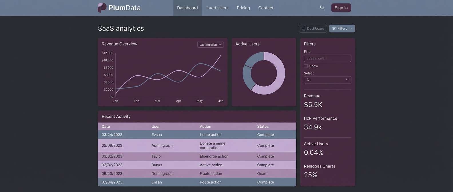
14) Emerald Brick
HEX: #B00020 #007F5F #F6F7F2 #343A40 #B7E4C7
Mood: clean, contemporary, confident
Best for: SaaS dashboard UI
Clean and contemporary, it suggests crisp surfaces with a confident, urban edge. The off-white and slate create clarity, while mint keeps the green feeling modern and approachable. Great for SaaS dashboards, admin panels, and analytics interfaces where status colors matter. Tip: use the emerald for success states and keep the brick red strictly for errors to maintain meaning.
Image example of emerald brick generated using media.io
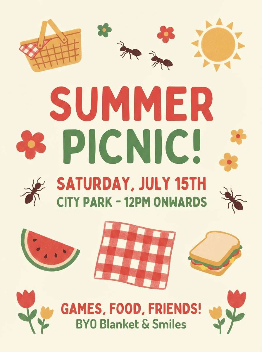
15) Picnic Blanket
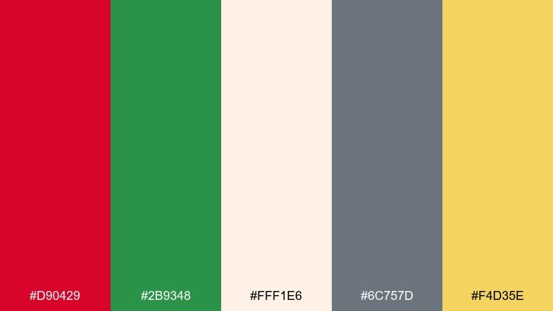
HEX: #D90429 #2B9348 #FFF1E6 #6C757D #F4D35E
Mood: happy, casual, family-friendly
Best for: summer picnic event flyer
Happy and casual, it feels like a checkered blanket, lemonade, and sunny park afternoons. The soft cream keeps the palette inviting, and the gray supports legible body text. Use it for community flyers, family events, and seasonal promos that need warmth without looking overly formal. Tip: set large blocks in cream and use red or green only for headers and key dates.
Image example of picnic blanket generated using media.io
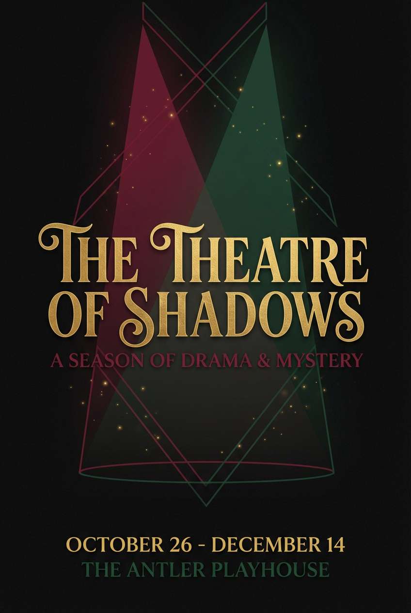
16) Velvet Theater
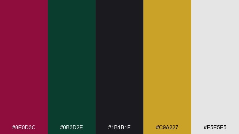
HEX: #8E0D3C #0B3D2E #1B1B1F #C9A227 #E5E5E5
Mood: dramatic, luxe, cinematic
Best for: theater poster and tickets
Dramatic and luxe, it evokes velvet curtains, dim aisles, and a golden spotlight. The near-black base creates instant contrast, while the pale gray keeps text areas breathable. Ideal for theater posters, gala tickets, and premium event branding. Usage tip: treat the gold as a spotlight color for titles and icons, and keep backgrounds deep for a cinematic feel.
Image example of velvet theater generated using media.io
17) Tropical Punch
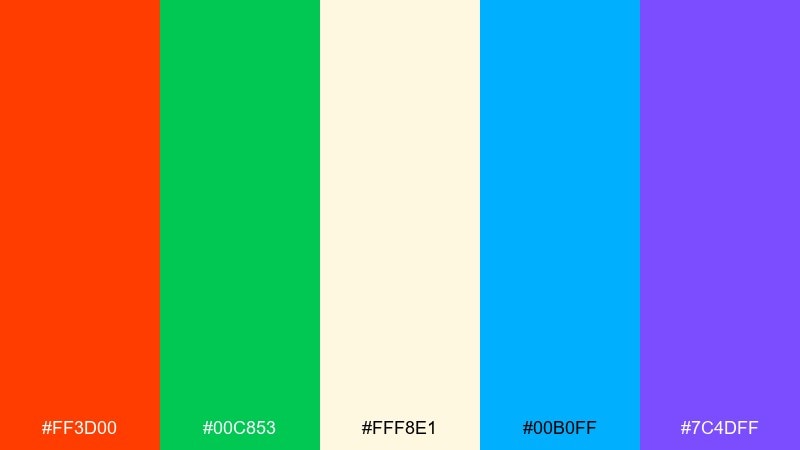
HEX: #FF3D00 #00C853 #FFF8E1 #00B0FF #7C4DFF
Mood: tropical, playful, energetic
Best for: beverage product ad
Tropical and energetic, it feels like citrus punch, palm leaves, and poolside color. The creamy light tone prevents the brights from turning harsh, while blue and violet add a lively modern edge. It is excellent for beverage ads, festival promos, and youthful branding that wants extra pop. Tip: keep green for freshness cues and use the blue as a cooling counterbalance in backgrounds or gradients.
Image example of tropical punch generated using media.io
18) Cozy Cabin
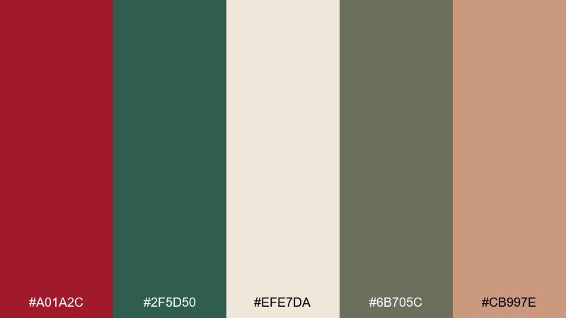
HEX: #A01A2C #2F5D50 #EFE7DA #6B705C #CB997E
Mood: cozy, calm, rustic
Best for: cabin rental landing page
Cozy and calm, it suggests woodsmoke, wool throws, and warm cabin interiors. The soft neutrals keep the palette relaxed, while the red reads like a subtle hearth glow. Great for hospitality pages, rental listings, and travel blogs that want warmth without going full holiday. Usage tip: use the muted green for navigation and the red only for one primary button per screen.
Image example of cozy cabin generated using media.io
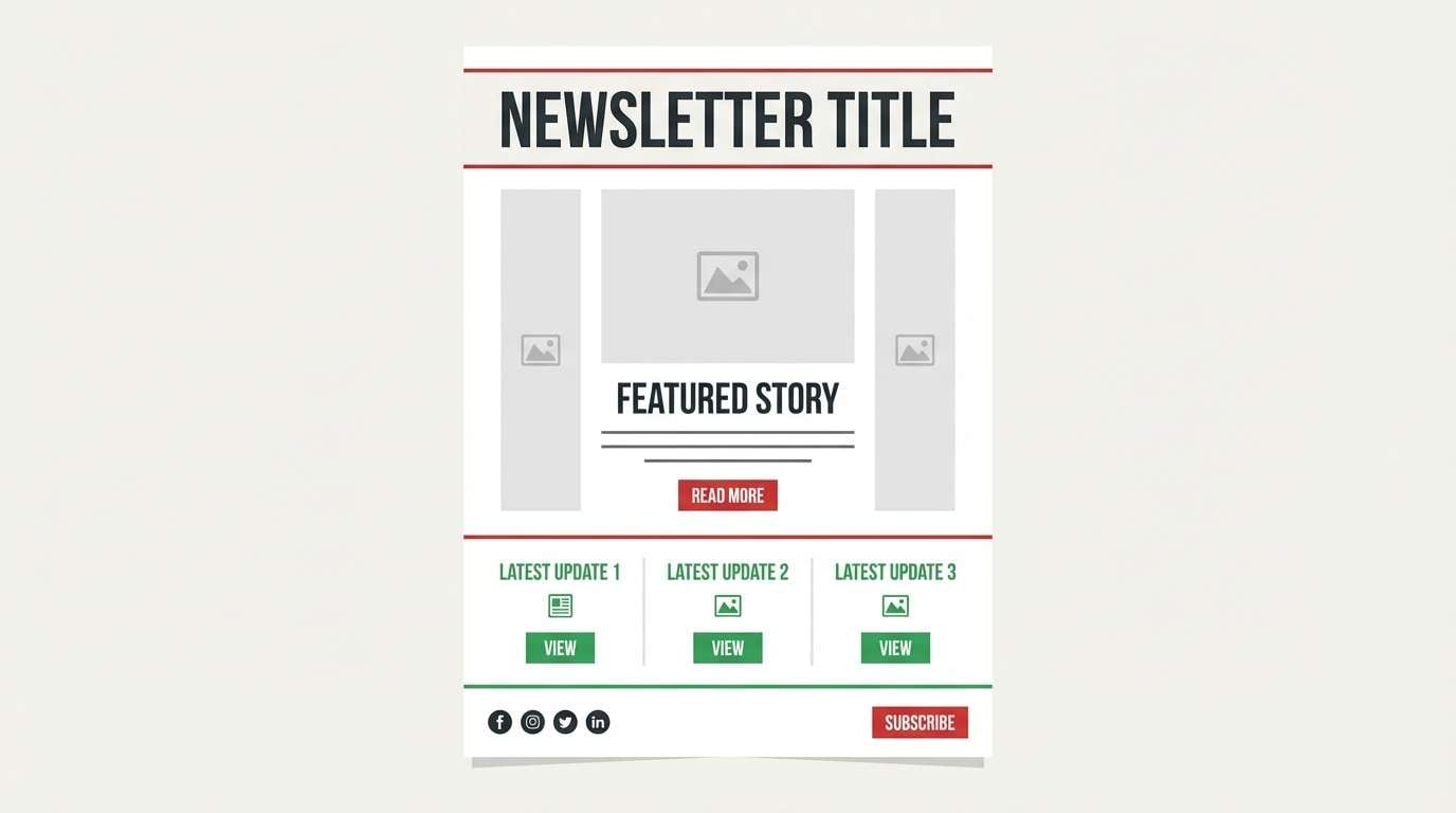
19) Minimal Festive
HEX: #C81F2D #1F8A45 #F8F9FA #212529 #ADB5BD
Mood: minimal, modern, crisp
Best for: email newsletter design
Minimal and crisp, it feels like clean typography with just a hint of celebration. The whites and grays do the heavy lifting, leaving red and green to work as neat, purposeful accents. A red green color palette like this is ideal for newsletters, announcements, and brand updates that need restraint. Tip: limit the accent colors to buttons, small icons, and section headers for a polished, modern rhythm.
Image example of minimal festive generated using media.io
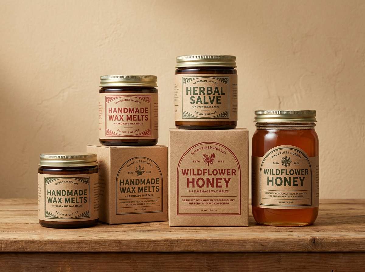
20) Artisan Market
HEX: #B23A48 #2E7D32 #F3E9DC #7F5539 #E6B8A2
Mood: handmade, warm, inviting
Best for: craft product packaging labels
Handmade and inviting, it brings up craft stalls, paper tags, and small-batch goods. The warm neutrals and cocoa brown make the reds and greens feel organic rather than loud. Use it for candles, soaps, ceramics, and any packaging that leans artisanal. Tip: print the label background in the cream tone and use brown for text to keep everything legible and cozy.
Image example of artisan market generated using media.io
21) Evergreen Editorial
HEX: #B31B34 #1E5B3A #FBF7EF #2D2A2E #DCC7A1
Mood: editorial, elegant, timeless
Best for: magazine feature spread
Elegant and timeless, it feels like a print magazine with rich inks and warm paper stock. The soft cream background keeps layouts airy, while the deep tones add authority for headlines and pull quotes. It works well for fashion features, food editorials, and premium brochures. Usage tip: keep body text in charcoal and use the warm beige for sidebars and captions to avoid harsh contrast.
Image example of evergreen editorial generated using media.io
What Colors Go Well with Red Green?
Neutrals are the easiest “glue” for red and green: white, off-white, cream, and warm beige soften the contrast, while charcoal and near-black add structure and readability. If your red and green are bright, increase the amount of neutral space to keep the design calm.
Metallics and warm accents (gold, brass, mustard) add a premium highlight without competing. For cooler balance, consider navy or slate blue as a stabilizer—especially for text-heavy layouts and UI.
Soft supporting tints like blush, mint, or sage help widen the palette while staying harmonious. These are especially useful for backgrounds, cards, and secondary sections where full saturation would feel too intense.
How to Use a Red Green Color Palette in Real Designs
Start with a clear role for each color: pick one as the primary (often green for stability, or red for urgency) and use the other as an accent. This keeps hierarchy obvious in logos, posters, and interfaces.
Control contrast with neutrals and value shifts. Dark charcoal or deep navy works well for typography, while off-white/cream backgrounds reduce visual fatigue and make buttons or badges stand out.
In UI and data-heavy design, reserve meaning: use green for success/positive states and red for errors/warnings. Keeping those conventions consistent improves usability and reduces confusion.
Create Red Green Palette Visuals with AI
If you want to see how a red green color scheme looks in context—packaging, posters, dashboards, or social ads—generate quick mockups before committing to print or production.
With Media.io, you can turn a simple prompt into on-brand visuals, then iterate fast by adjusting lighting, style, layout, or the exact shade of red/green.
Try generating multiple variations of the same concept (minimal, retro, luxe) and compare which palette feels best for your audience and platform.
Red Green Color Palette FAQs
-
Are red and green complementary colors?
Yes. In traditional color theory, red and green sit opposite each other on the color wheel, which is why they create strong contrast and high visual impact. -
How do I keep a red green color palette from looking “too Christmas”?
Shift the hues (coral + spruce, garnet + sage), add modern neutrals (off-white, slate, charcoal), and introduce a third accent like navy or warm beige. Avoid using fully saturated red and green in equal amounts. -
What are good neutral colors to pair with red and green?
Cream, off-white, warm beige, and light gray soften the pairing; charcoal, deep brown, and near-black add structure and improve readability for text-heavy layouts. -
Which color should be primary: red or green?
It depends on the message. Use green as the primary for calm, eco, and trustworthy branding; use red as the primary for urgency, appetite appeal, and strong calls to action. Keep the other color as an accent for clearer hierarchy. -
Can I use red and green in UI design without confusing status colors?
Yes—just define rules. Many products use green for success and red for error; keep those meanings consistent, and rely on neutrals plus icons/labels so color isn’t the only signal. -
What’s a good accent color to add to a red green palette?
Gold/mustard adds warmth and a premium feel; navy/slate adds stability and improves contrast; blush/mint can soften the look for invitations, lifestyle branding, and editorial layouts. -
How can I preview a red green color scheme on real designs quickly?
Generate mockups with AI (like posters, packaging, or dashboard screens) using your HEX codes as guidance. This helps you validate contrast and mood before final design work.
Next: White Blue Color Palette


