Purple red sits right between passion and mystery, blending the intensity of red with the depth of purple. That makes it a standout choice for brands, UI themes, and print pieces that need emotion without looking loud.
Below are 20 curated purple red color palette ideas with HEX codes, plus practical guidance on accents, contrast, and how to generate on-theme visuals with AI.
In this article
Why Purple Red Palettes Work So Well
Purple red palettes feel emotional and intentional: red brings urgency and warmth, while purple adds artistry, premium cues, and depth. Together, they read as modern, romantic, and slightly dramatic without relying on harsh primaries.
They also scale beautifully across mediums. In print, wine and plum tones look rich and tactile; in digital, berry accents pop against dark mode backgrounds and create clear focal points for CTAs.
Most importantly, purple red is flexible. You can push it toward luxe (aubergine + blush), energetic (electric violet + fuchsia), or editorial (near-black + crimson) depending on the neutrals and accent strategy.
20+ Purple Red Color Palette Ideas (with HEX Codes)
1) Velvet Orchid
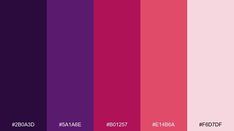
HEX: #2B0A3D #5A1A6E #B01257 #E14B6A #F6D7DF
Mood: luxurious and romantic
Best for: beauty branding, cosmetics packaging, premium labels
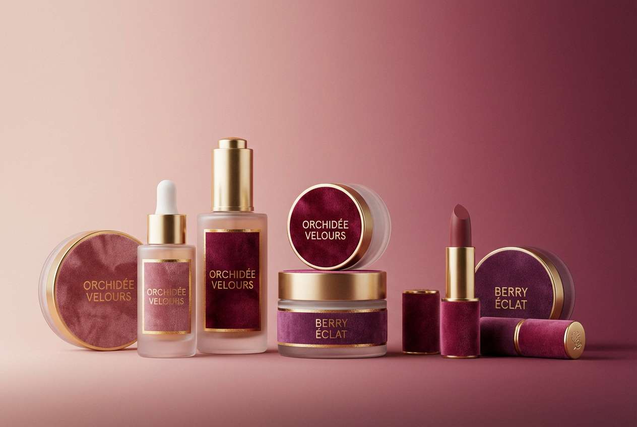
Luxurious and romantic, it feels like velvet curtains, orchid petals, and a hint of candlelight. Use the deep violet as your base, then let the berry and cherry tones handle headlines and key calls to action. Pair it with warm ivory or blush backgrounds to keep the look premium instead of heavy. Tip: reserve the brightest pink-red for small accents like seals, buttons, or price tags.
Image example of velvet orchid generated using media.io
Media.io is an online AI studio for creating and editing video, image, and audio in your browser.

2) Crimson Plum
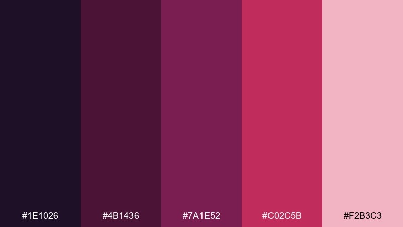
HEX: #1E1026 #4B1436 #7A1E52 #C02C5B #F2B3C3
Mood: dramatic and editorial
Best for: fashion posters, album covers, bold landing pages
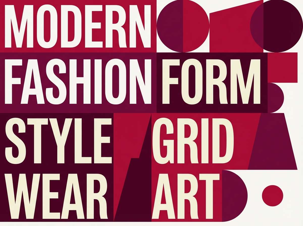
Dramatic and editorial, it reads like late-night city lights and rich plum lipstick. These purple red color combinations shine when you anchor layouts with the near-black and let crimson handle focal typography. Add a soft pink for breathing room, especially in negative space and secondary panels. Tip: keep gradients subtle so the palette stays sharp and print-friendly.
Image example of crimson plum generated using media.io
3) Berry Noir

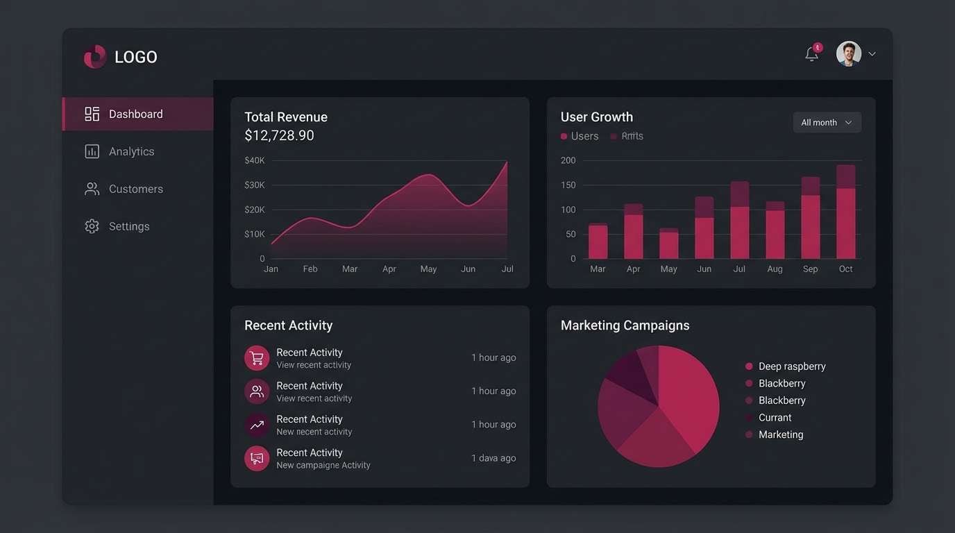
HEX: #0F0B14 #2A0F2F #5E1B56 #A71D4E #E66A8C
Mood: moody and sleek
Best for: dark mode app UI, streaming interfaces, gaming dashboards
Moody and sleek, it evokes midnight berries and neon reflections on wet pavement. Use the inky tones for backgrounds and containers, then apply the raspberry accent for active states and highlights. A restrained pink works well for charts, tags, and micro-interactions without breaking dark mode harmony. Tip: test contrast on small text and bump the lightest accent for accessibility.
Image example of berry noir generated using media.io
4) Rosy Mulberry
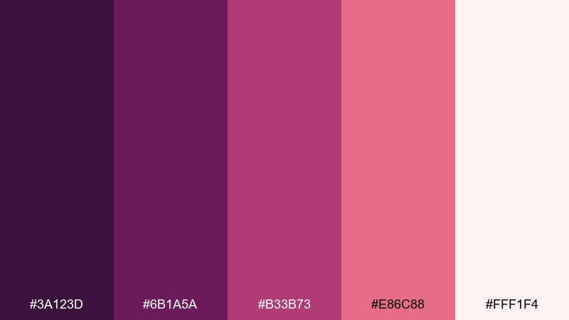
HEX: #3A123D #6B1A5A #B33B73 #E86C88 #FFF1F4
Mood: soft and celebratory
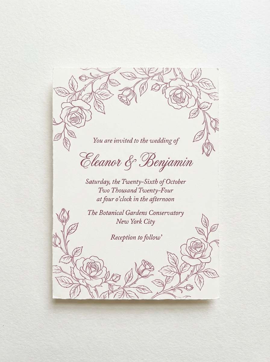
Best for: wedding invitations, RSVP cards, romantic stationery
Soft and celebratory, it feels like fresh peonies, mulberry jam, and a satin ribbon. This purple red color palette works beautifully for invitations where warmth matters more than high contrast. Pair it with creamy whites and delicate line art, and keep the darkest shade for names or headings. Tip: print on textured stock to make the blush and berry tones look richer.
Image example of rosy mulberry generated using media.io
5) Garnet Bloom
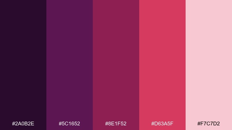
HEX: #2A0B2E #5C1652 #8E1F52 #D63A5F #F7C7D2
Mood: lush and botanical
Best for: botanical illustrations, spring branding, floral packaging accents
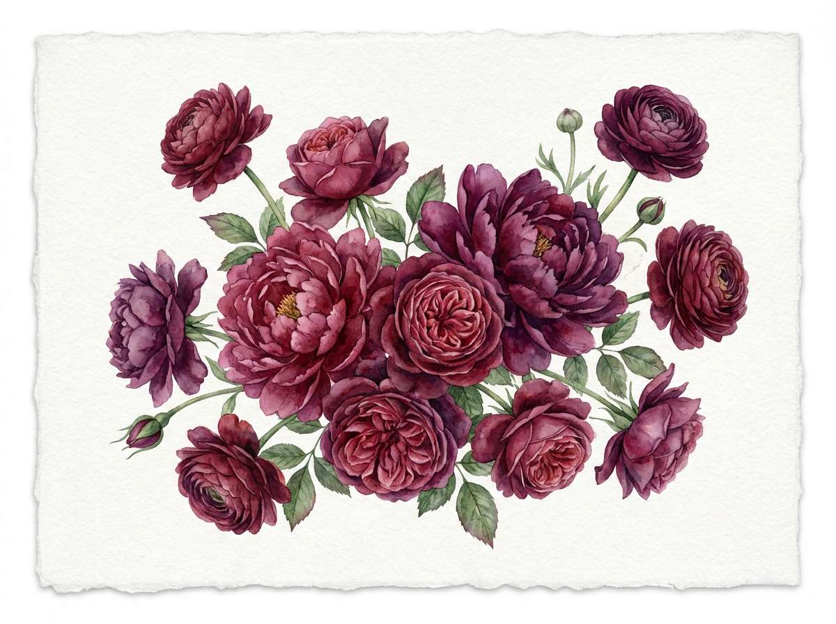
Lush and botanical, it suggests garnet petals, deep stems, and a rosy spring glow. Use the darkest purple for outlines and shadows, then layer the red-pink tones for petals and focal blooms. Pair with off-white paper textures or muted sage greens to make the florals feel natural. Tip: keep one accent color dominant and let the others act as watercolor washes.
Image example of garnet bloom generated using media.io
6) Wineberry Cream
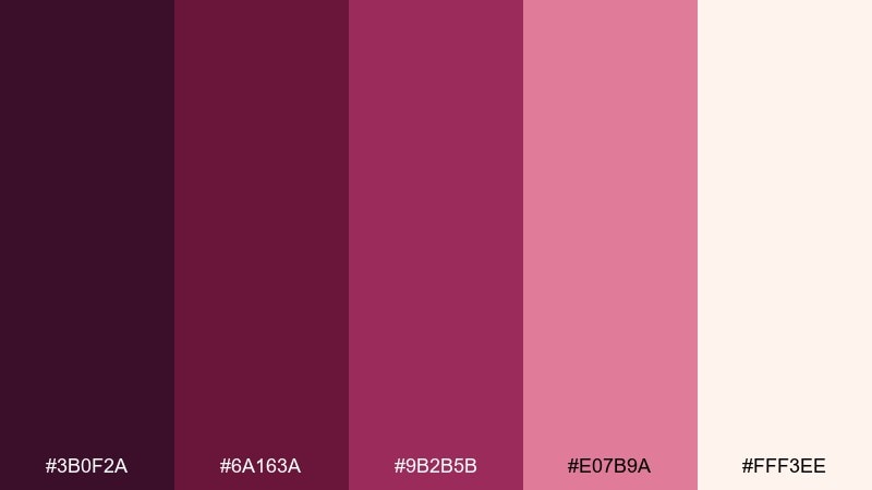
HEX: #3B0F2A #6A163A #9B2B5B #E07B9A #FFF3EE
Mood: cozy and inviting
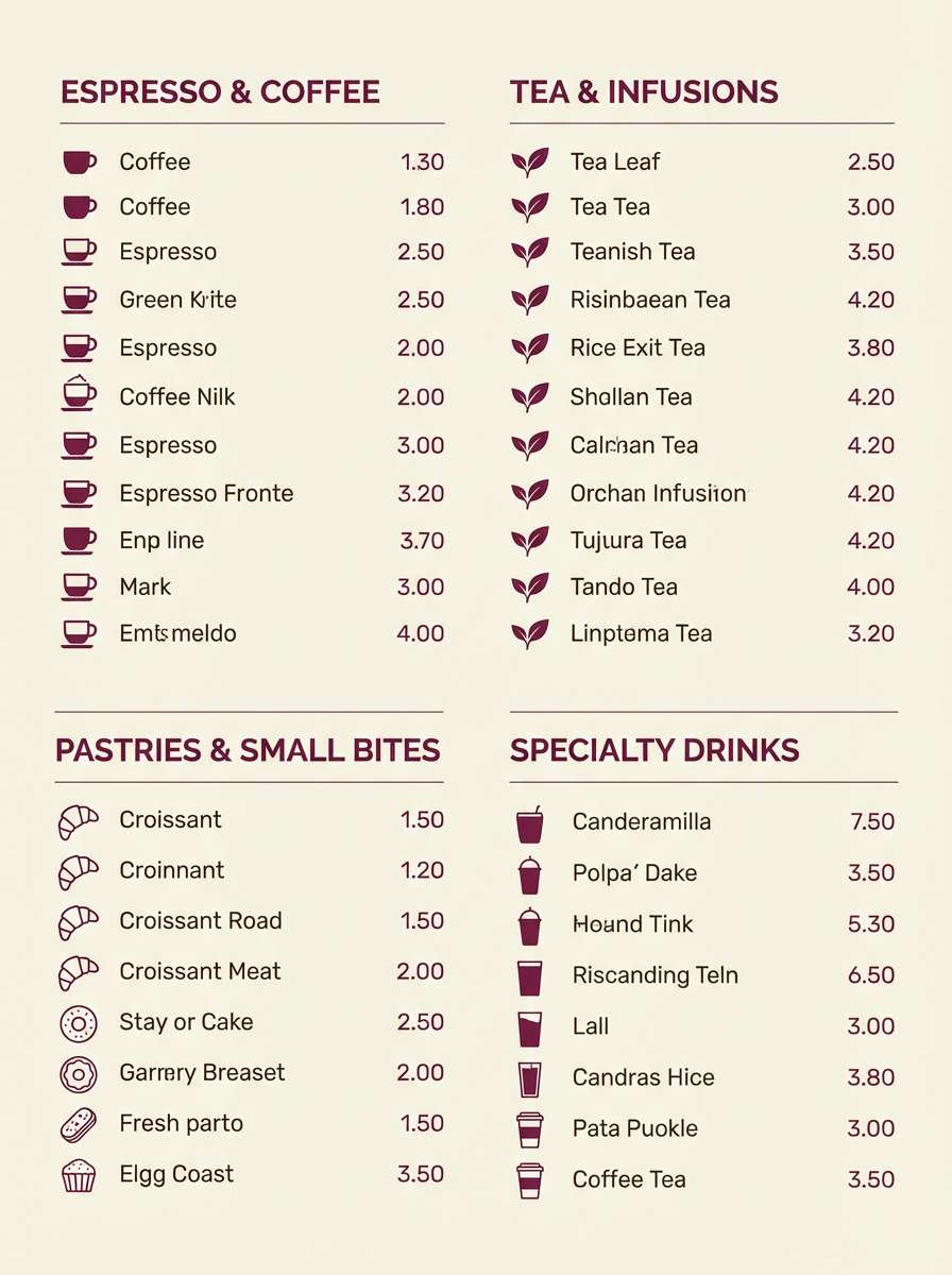
Best for: cafe menus, bakery branding, seasonal promos
Cozy and inviting, it brings to mind mulled wine, berry tarts, and warm cream. Use the wine tones for section headers and icons, then let the pale cream carry most of the background. Pair it with subtle grain or paper texture for a handcrafted feel that still looks polished. Tip: keep body text in the deepest shade to avoid muddiness in print.
Image example of wineberry cream generated using media.io
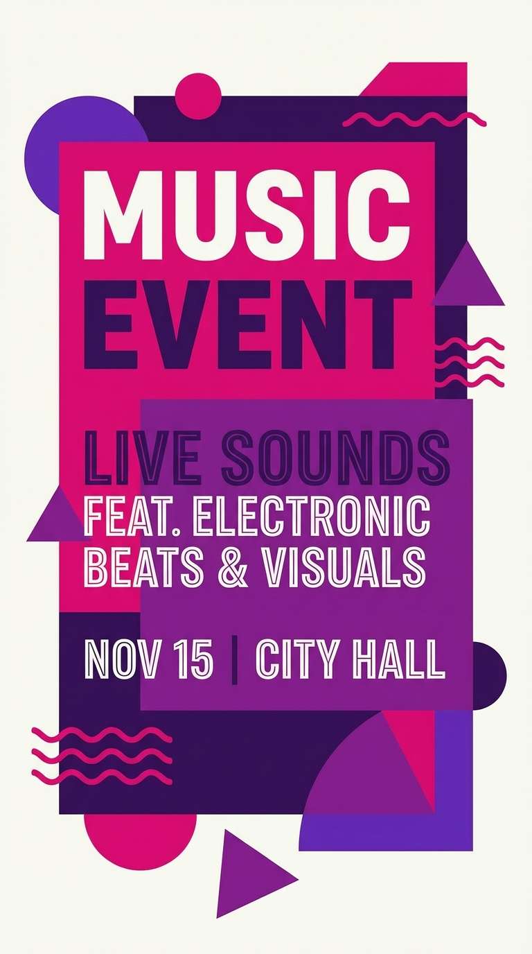
7) Royal Fuchsia
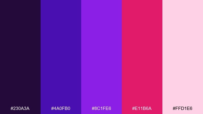
HEX: #230A3A #4A0FB0 #8C1FE6 #E11B6A #FFD1E6
Mood: energetic and playful
Best for: music event flyers, nightlife promos, bold social posts
Energetic and playful, it feels like stage lights, synth beats, and bright lipstick against a dark club wall. Use the electric violet and fuchsia for big type and geometric shapes, while the near-black keeps everything grounded. Pair with lots of negative space so the saturated colors do not compete. Tip: limit gradients and rely on sharp blocks for maximum impact.
Image example of royal fuchsia generated using media.io
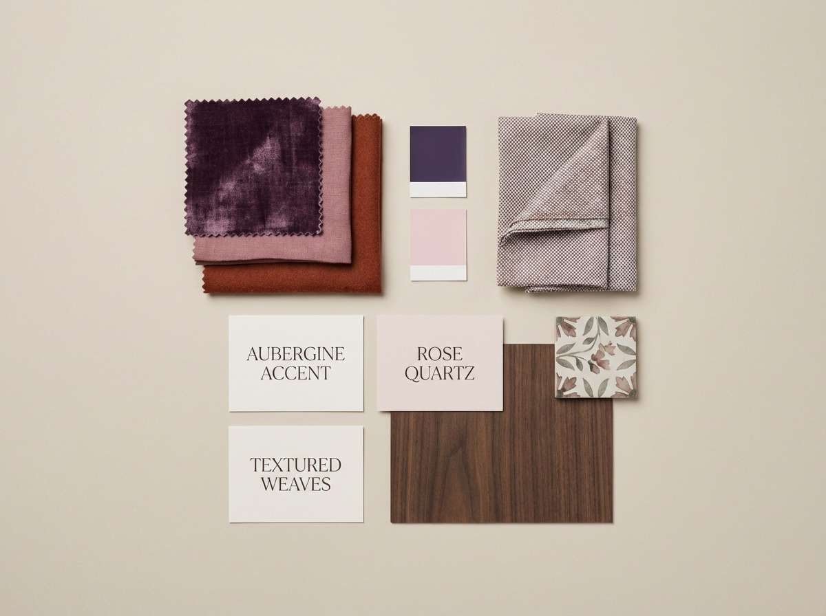
8) Aubergine Rose
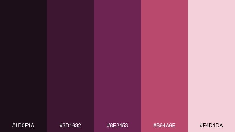
HEX: #1D0F1A #3D1632 #6E2453 #B94A6E #F4D1DA
Mood: refined and intimate
Best for: interior design mood boards, boutique lookbooks, lifestyle decks
Refined and intimate, it evokes aubergine shadows, dried roses, and soft velvet upholstery. Use the darker tones for frames, headings, and swatches, while the dusty rose keeps the layout airy. Pair with warm neutrals like sand or oatmeal to make the reds feel grown-up. Tip: keep imagery slightly desaturated so the palette remains the hero.
Image example of aubergine rose generated using media.io
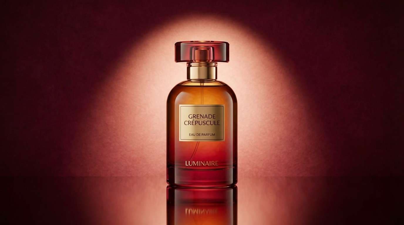
9) Pomegranate Dusk
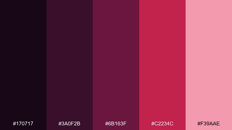
HEX: #170717 #3A0F2B #6B163F #C2234C #F39AAE
Mood: mysterious and premium
Best for: perfume ads, premium product banners, boutique campaigns
Mysterious and premium, it suggests pomegranate arils at twilight and glossy glass bottles. Let the blackened purple set the mood, then use the red as a single, confident focal point. Pair with metallic gold or soft pearlescent whites for a high-end finish. Tip: add a gentle spotlight gradient behind the product to increase depth without clutter.
Image example of pomegranate dusk generated using media.io
10) Lilac Cabernet
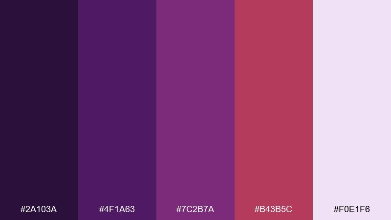
HEX: #2A103A #4F1A63 #7C2B7A #B43B5C #F0E1F6
Mood: creative and sophisticated
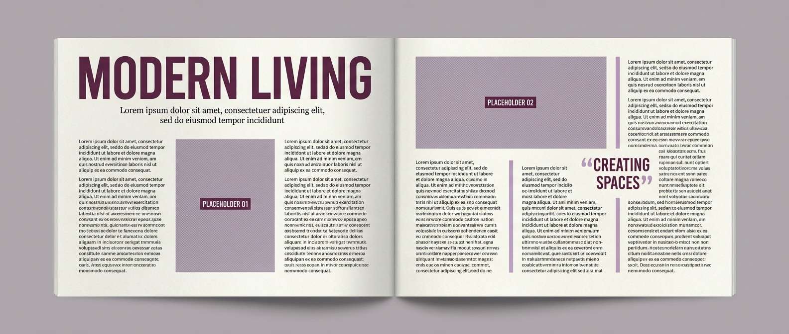
Best for: editorial layouts, magazine spreads, portfolio presentations
Creative and sophisticated, it feels like lilac ink with a cabernet stain on textured paper. Use the pale lilac as a calm canvas, then layer deeper purples for headings and pull quotes. The cabernet red works best as a spotlight color for page numbers, dividers, and small badges. Tip: keep margins generous so the darker shades never overwhelm the layout.
Image example of lilac cabernet generated using media.io
11) Magenta Ember
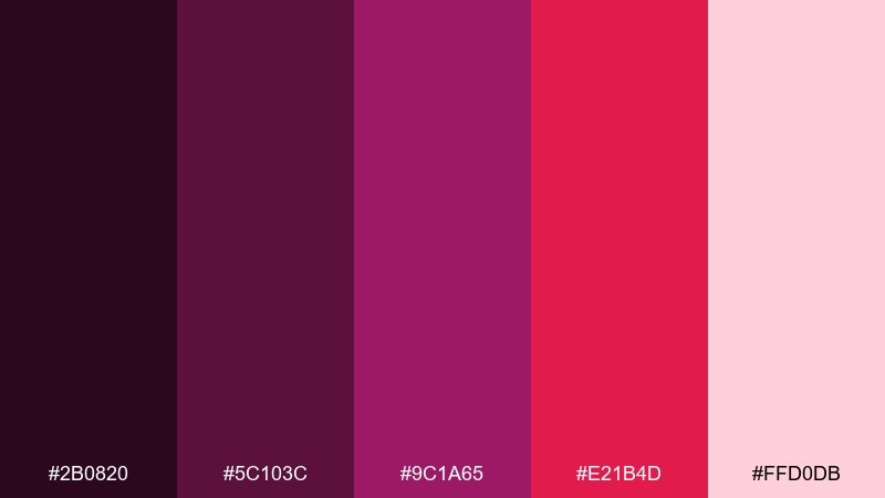
HEX: #2B0820 #5C103C #9C1A65 #E21B4D #FFD0DB
Mood: bold and modern
Best for: social media promos, creator branding, campaign tiles
Bold and modern, it looks like glowing embers under a magenta haze. These purple red color combinations are ideal for punchy tiles where you need instant contrast and a clear focal color. Pair the hot red with plenty of pale blush space, and keep the deep plum for text and shadows. Tip: stick to one display font weight so the colors do the heavy lifting.
Image example of magenta ember generated using media.io

12) Plum Punch
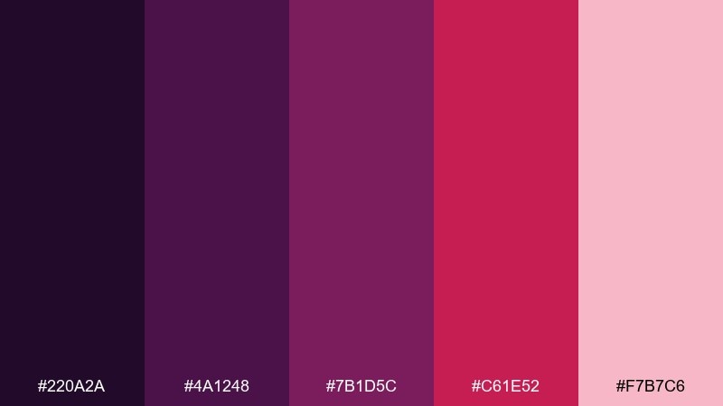
HEX: #220A2A #4A1248 #7B1D5C #C61E52 #F7B7C6
Mood: confident and sporty
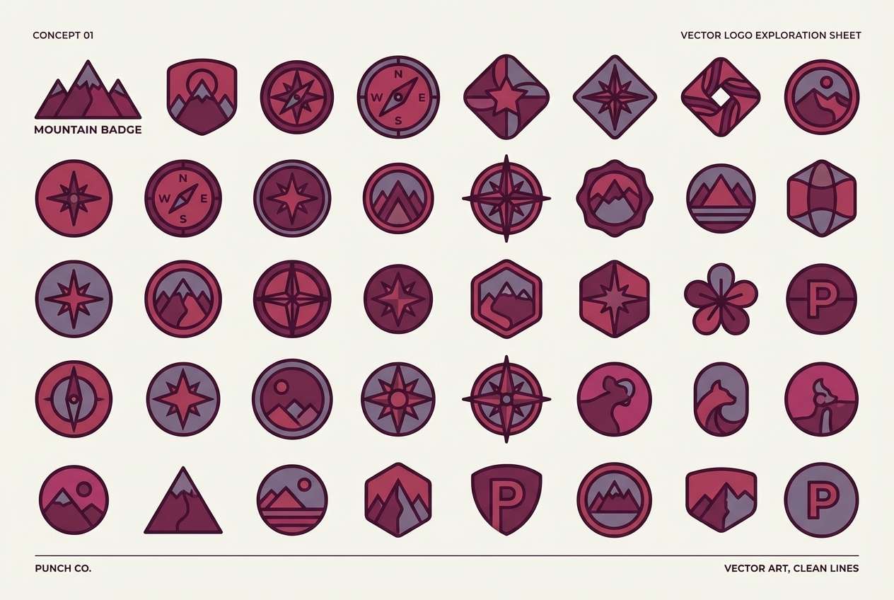
Best for: team branding, esports identity, logo explorations
Confident and sporty, it hits like a fruit punch with a dark plum finish. Use the strongest red for emblems and highlights, while the deep purples keep the identity grounded and tough. Pair with white or very light pink for clear contrast on jerseys, banners, and avatars. Tip: convert the palette to a two-color mark first, then add the lighter accent for depth.
Image example of plum punch generated using media.io
13) Raspberry Merlot
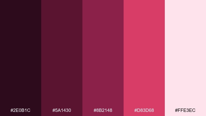
HEX: #2E0B1C #5A1430 #8B2148 #D83D68 #FFE3EC
Mood: sweet and upscale
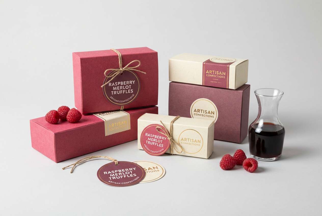
Best for: dessert packaging, gourmet labels, cafe product stickers
Sweet and upscale, it feels like raspberry glaze over a merlot reduction. Let the merlot shades define structure on labels, with the bright raspberry used sparingly for flavor cues and callouts. Pair with creamy whites and minimal typography for a boutique, giftable look. Tip: add a matte finish to the dark tones and a spot gloss on the bright accent.
Image example of raspberry merlot generated using media.io
14) Amaranth Mist
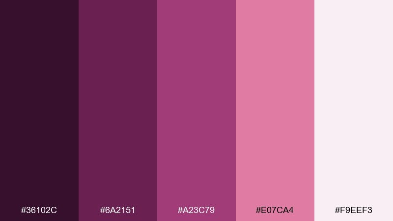
HEX: #36102C #6A2151 #A23C79 #E07CA4 #F9EEF3
Mood: gentle and airy
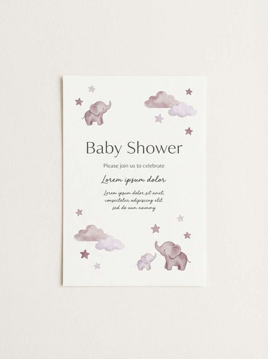
Best for: baby shower invites, wellness flyers, soft announcements
Gentle and airy, it brings up amaranth blooms softened by a morning mist. Use the palest tint for the page, then layer mauve and berry for headings and decorative shapes. Pair with light gray line icons and plenty of whitespace to keep it calm and readable. Tip: choose one medium tone for all secondary text so the design stays cohesive.
Image example of amaranth mist generated using media.io
15) Sangria Silk
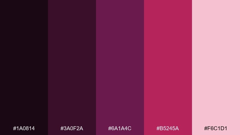
HEX: #1A0814 #3A0F2A #6A1A4C #B5245A #F6C1D1
Mood: polished and authoritative
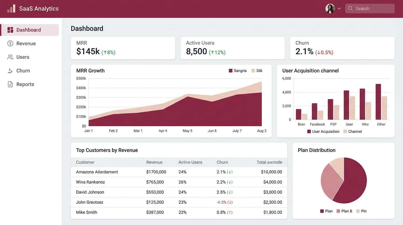
Best for: finance dashboards, SaaS UI, analytics products
Polished and authoritative, it reads like sangria in a cut-glass tumbler with a silky finish. A purple red color palette like this suits dashboards when you need depth without harsh neon. Use the near-black for navigation, the mid tones for charts, and the soft pink for hover states and highlights. Tip: avoid using the brightest red for error states so alerts stay distinct.
Image example of sangria silk generated using media.io
16) Violet Brick
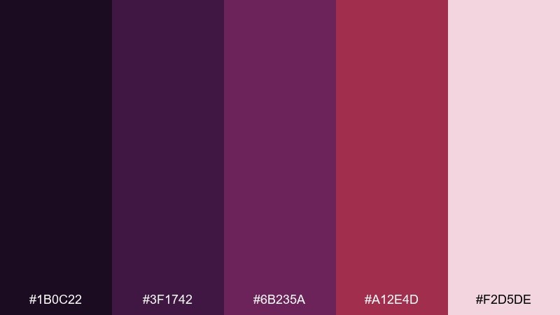
HEX: #1B0C22 #3F1742 #6B235A #A12E4D #F2D5DE
Mood: structured and urban
Best for: architecture slides, pitch decks, presentation templates
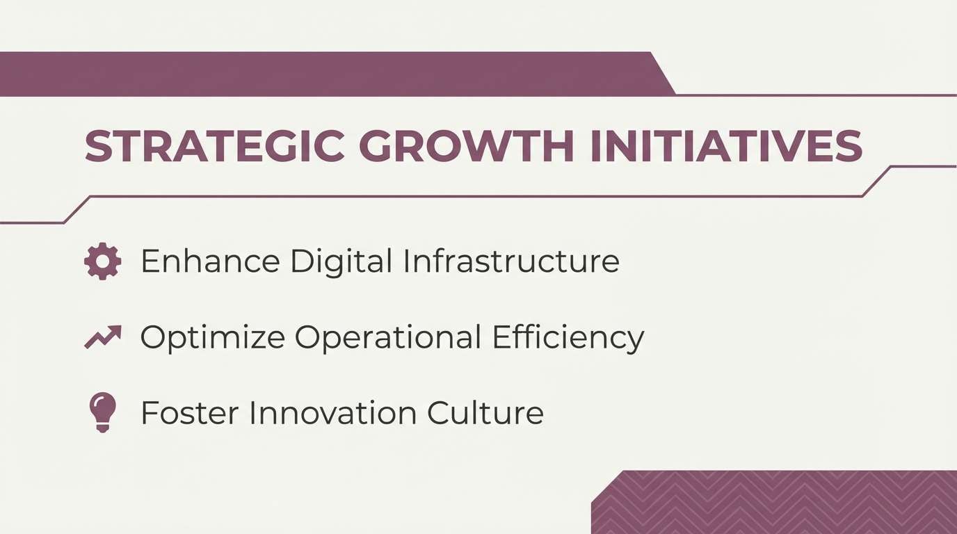
Structured and urban, it feels like violet shadows cast over warm brick at dusk. Use the darkest shades for headers and section bars, then bring in the brick-red for key numbers and highlights. Pair with off-white backgrounds and thin grid lines for a crisp, architectural rhythm. Tip: keep photos in cool tones so the warm accents stay intentional.
Image example of violet brick generated using media.io
17) Cranberry Orchid
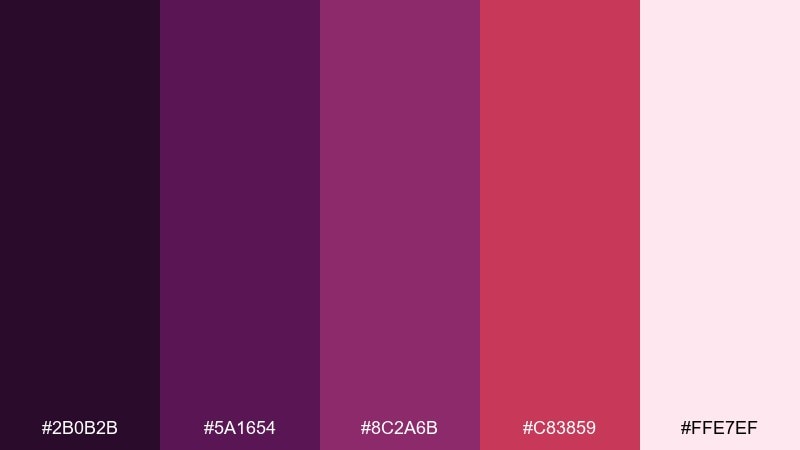
HEX: #2B0B2B #5A1654 #8C2A6B #C83859 #FFE7EF
Mood: fresh and floral
Best for: spring stationery, botanical cards, journal covers
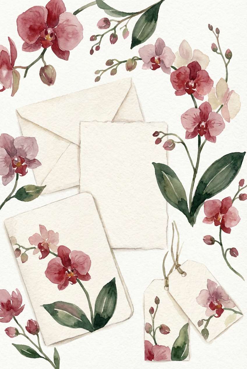
Fresh and floral, it suggests cranberry sprigs mixed with soft orchid blooms. Use the lavender-tinted light for backgrounds, then paint details with deeper purples and a restrained red accent. Pair with leafy greens or muted teal if you want a more botanical contrast. Tip: add a subtle paper grain to keep the palette feeling handmade.
Image example of cranberry orchid generated using media.io
18) Mauve Maroon
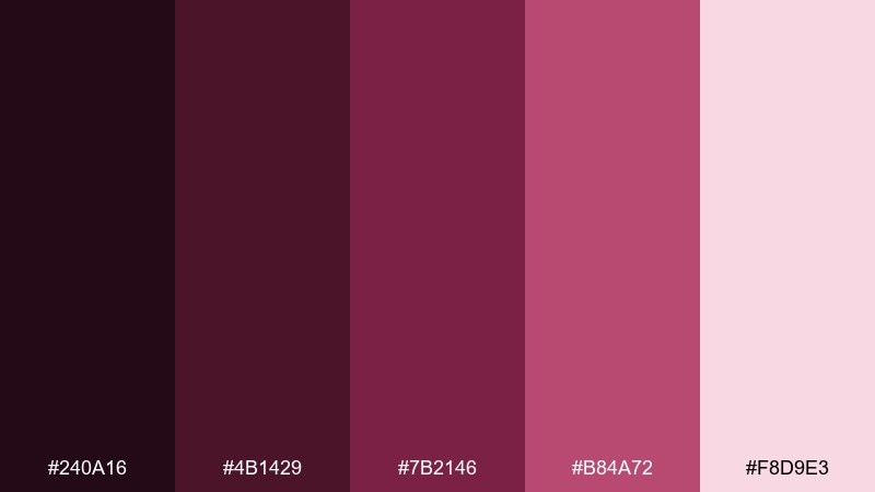
HEX: #240A16 #4B1429 #7B2146 #B84A72 #F8D9E3
Mood: elegant and trend-forward
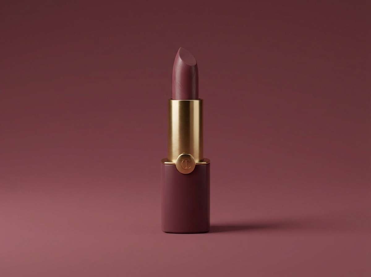
Best for: beauty product ads, lipstick launches, skincare promos
Elegant and trend-forward, it feels like mauve suede with a maroon lipstick stamp. Purple red color combinations like these work best when the light blush carries most of the space and the maroon is saved for emphasis. Pair with soft shadows and minimal props to keep the ad looking clean and premium. Tip: use the medium mauve for secondary headlines to avoid an overly dark layout.
Image example of mauve maroon generated using media.io
19) Cherry Velvet
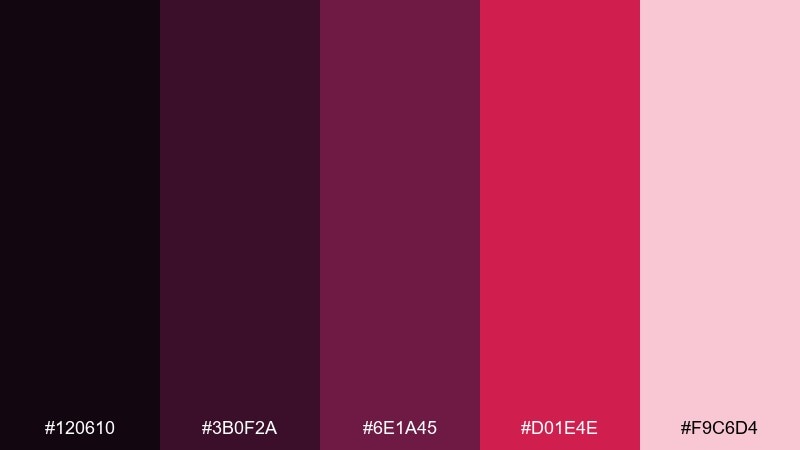
HEX: #120610 #3B0F2A #6E1A45 #D01E4E #F9C6D4
Mood: cinematic and bold
Best for: book covers, film posters, dramatic headlines
Cinematic and bold, it brings to mind cherry velvet seats in a dark theater. Use the blackened base for the cover field, then let the cherry red carry the title for instant focus. Pair with soft blush for subtitles and small details so the hierarchy stays clear. Tip: keep imagery monochrome so the accent red feels intentional, not noisy.
Image example of cherry velvet generated using media.io

20) Mulberry Sunset
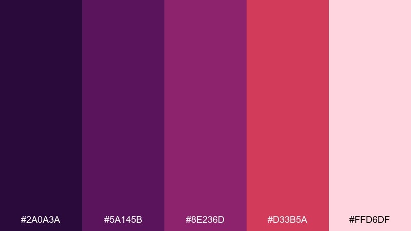
HEX: #2A0A3A #5A145B #8E236D #D33B5A #FFD6DF
Mood: warm and artistic
Best for: restaurant branding, stationery sets, brand guidelines
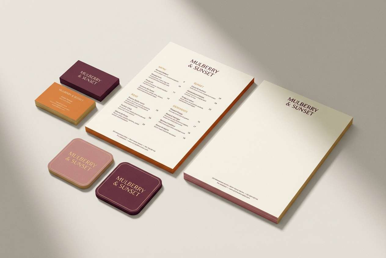
Warm and artistic, it feels like a mulberry sky at sunset with a rosy horizon line. This purple red color palette is great for restaurant brands that want romance without looking vintage. Pair it with cream paper, simple monoline icons, and a deep purple for text-heavy areas. Tip: keep the sunset red for stamps, patterns, or small badges to avoid overpowering menus.
Image example of mulberry sunset generated using media.io
What Colors Go Well with Purple Red?
Neutrals are the easiest win: warm ivory, soft cream, oatmeal, and light blush keep purple red feeling premium, while charcoal and near-black make it sleek and high-contrast for dark UI.
For tasteful contrast, try muted greens (sage, eucalyptus, olive) or cool blue-greens (dusty teal). These sit opposite the red family and help berry tones look fresher and more modern.
If you want a luxury finish, add metallic cues in gold or champagne (or their digital equivalents). Use them sparingly—think dividers, icons, small badges—so the purple red stays the hero.
How to Use a Purple Red Color Palette in Real Designs
Start with roles, not swatches: pick one darkest shade for text/nav, one mid tone for supporting UI/blocks, one bright accent for CTAs, and one light tint for backgrounds. This keeps the palette consistent across pages and components.
In print, avoid over-saturating large areas with the brightest red-pink; use it for emphasis and let creams/blushes carry the space. In digital, check contrast for body text and small labels—deep purples often outperform reds for legibility.
Keep imagery aligned: slightly desaturated photos or monochrome treatments pair especially well with purple red accents, preventing the overall design from feeling busy.
Create Purple Red Palette Visuals with AI
If you’re building a brand board, UI mockup, or packaging concept, AI images can help you validate the palette fast. Generate a few scenes (studio product shots, posters, dashboards) and compare how your accent color behaves at different sizes.
With Media.io’s text-to-image tool, you can paste a prompt, specify a layout ratio, and iterate until your purple red tones look right for your use case—then reuse the same style for a cohesive set.
Purple Red Color Palette FAQs
-
What is a purple red color palette used for?
Purple red palettes are commonly used for beauty and lifestyle branding, editorial design, premium product ads, and dark mode UI—anywhere you want emotion, depth, and a sophisticated “berry/wine” feel. -
How do I choose a primary and accent color in a purple red scheme?
Use a deep aubergine/plum as the primary (backgrounds, text, navigation) and reserve the brightest cherry/raspberry tone as the accent (CTAs, badges, highlights). This keeps the design readable and intentional. -
Do purple red colors work well in dark mode?
Yes. Inky purples make strong dark mode surfaces, and raspberry or pink-red accents are highly visible for active states. Just verify contrast for small text and thin icons. -
What neutrals pair best with purple red?
Warm ivory, cream, blush, and soft grays are the safest matches. For a bolder look, pair purple red with charcoal or near-black to increase drama and clarity. -
What complementary accent colors go with purple red?
Muted greens (sage/olive) and dusty teal create balanced contrast because they sit opposite the red family. Use them as secondary accents (icons, small patterns, data series) rather than the main CTA. -
How can I keep purple red from looking too heavy in print?
Give the lightest tint more surface area (backgrounds and margins) and keep the darkest shades for typography. Use the brightest red-pink only in small doses to avoid muddy, over-inked layouts. -
How do I generate purple red themed images consistently with AI?
Reuse one base prompt style (e.g., “realistic studio shot” or “flat UI mockup”), include your palette keywords (plum, berry, wine, blush), and keep the same aspect ratio and lighting notes across generations for consistent results.
Next: Black Gray Color Palette


