

A black gray color palette is one of the easiest ways to make a design look modern, confident, and clean. From UI layouts to print, these neutral tones create instant structure without stealing attention from content.
Below you’ll find 20+ black and gray palette ideas with HEX codes, plus practical tips for contrast, typography, and choosing accent colors.
In this article
- Why Black Gray Palettes Work So Well
-
- midnight slate
- concrete studio
- graphite whisper
- silver lining
- storm signal
- ink and fog
- museum charcoal
- steel monochrome
- shadowed pearl
- quiet type
- asphalt minimal
- smoke and chrome
- linen shadow
- noir notebook
- winter graphite
- carbon and sand
- monochrome bloom
- prism neutral
- obsidian interface
- urban mist
- mono workshop
- What Colors Go Well with Black Gray?
- How to Use a Black Gray Color Palette in Real Designs
- Create Black Gray Palette Visuals with AI
Why Black Gray Palettes Work So Well
Black and gray palettes are naturally organized: the value range creates hierarchy, spacing, and emphasis without relying on many hues. That makes them ideal for layouts where clarity matters—dashboards, editorial pages, product detail screens, and brand systems.
They also feel timeless. Because neutrals don’t trend as quickly as bright color schemes, a monochrome or charcoal/slate-based palette can stay relevant longer and adapt easily across web, print, and packaging.
Finally, black gray combinations make accent colors more powerful. A single teal, cobalt, coral, or lime can become instantly “clickable” in UI or instantly “special” in print, because the base is so calm.
20+ Black Gray Color Palette Ideas (with HEX Codes)
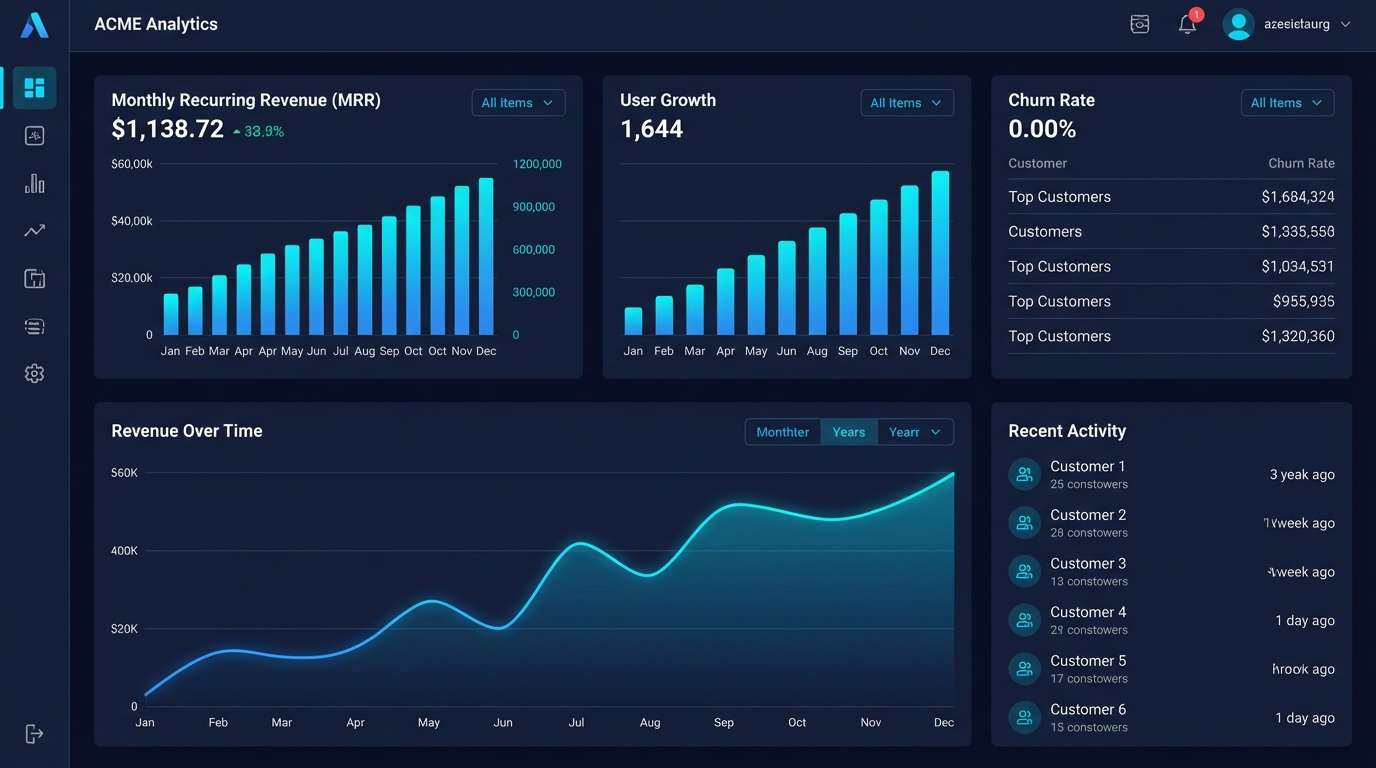
1) Midnight Slate
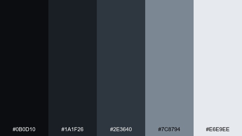
HEX: #0B0D10 #1A1F26 #2E3640 #7C8794 #E6E9EE
Mood: sleek, nocturnal, minimal
Best for: saas dashboard ui
Sleek midnight tones evoke a high-contrast city skyline and clean glass surfaces. This black gray color palette shines in dashboards, analytics, and admin screens where hierarchy matters. Pair it with crisp off-white for spacing and a single bright accent for primary actions. Usage tip: keep body text on the lightest gray and reserve near-black for headers and nav.
Image example of midnight slate generated using media.io
Media.io is an online AI studio for creating and editing video, image, and audio in your browser.

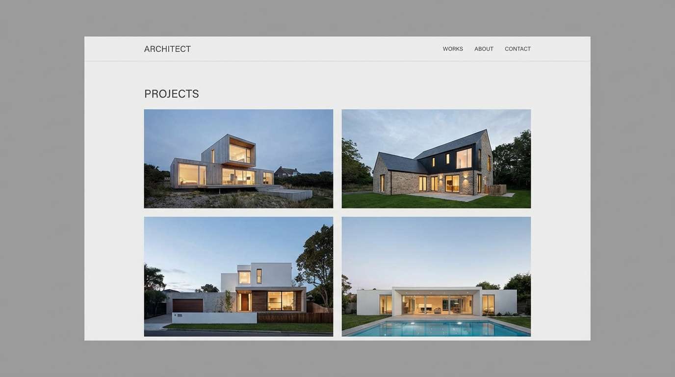
2) Concrete Studio
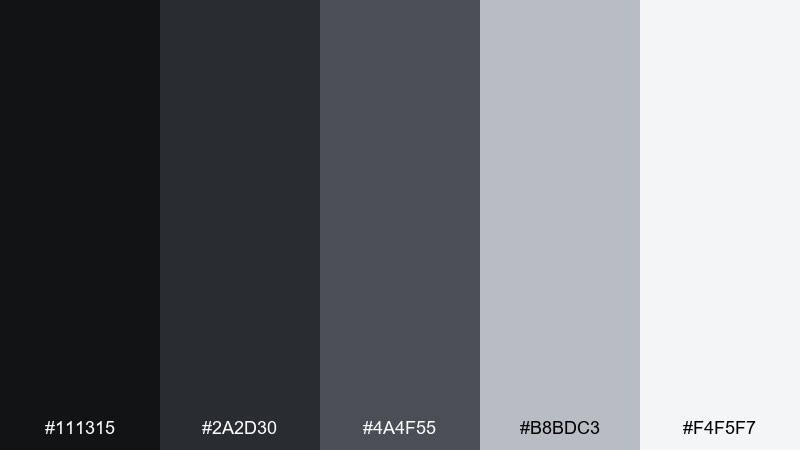
HEX: #111315 #2A2D30 #4A4F55 #B8BDC3 #F4F5F7
Mood: industrial, quiet, refined
Best for: architectural portfolio website
Industrial concrete vibes feel calm, structured, and quietly premium. The mid-grays make photography and renders look intentional instead of harsh. Pair with a warm white background and thin black lines for an editorial grid. Usage tip: use the lightest gray for section bands so layouts breathe without losing the minimal mood.
Image example of concrete studio generated using media.io
3) Graphite Whisper
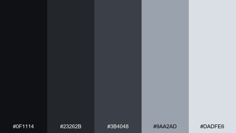
HEX: #0F1114 #23262B #3B4048 #9AA2AD #DADFE6
Mood: soft, modern, understated
Best for: brand guidelines deck
Soft graphite tones suggest restraint, clarity, and modern craft. They work beautifully for a brand book where type, spacing, and logo rules need to feel confident. Pair with one muted color chip (dusty blue or sage) for secondary highlights. Usage tip: keep charts and swatches on light gray to avoid pure-white glare in presentations.
Image example of graphite whisper generated using media.io
4) Silver Lining
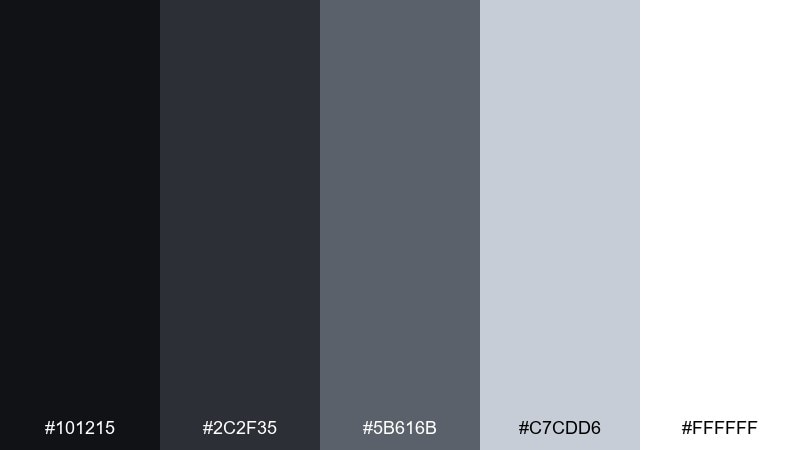
HEX: #101215 #2C2F35 #5B616B #C7CDD6 #FFFFFF
Mood: bright, clean, polished
Best for: ecommerce product page
Polished neutrals feel airy, crisp, and product-forward, like chrome details under studio lights. The bright end keeps pages feeling trustworthy and easy to scan. Pair with a single saturated CTA color (cobalt or coral) for conversion-focused layouts. Usage tip: use the medium gray for dividers and microcopy so important info stays primary.
Image example of silver lining generated using media.io
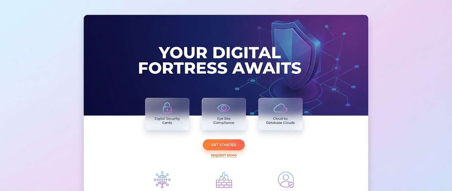
5) Storm Signal
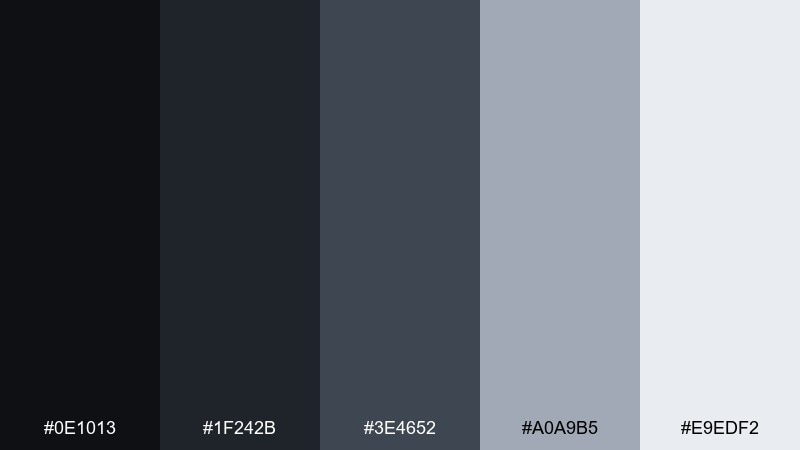
HEX: #0E1013 #1F242B #3E4652 #A0A9B5 #E9EDF2
Mood: moody, techy, focused
Best for: cybersecurity landing page
Moody storm tones evoke encrypted screens, server rooms, and a sense of controlled urgency. These black gray color combinations are ideal for security, compliance, and IT services that need authority without feeling flashy. Pair with electric teal or lime for status states and trust badges. Usage tip: keep gradients subtle and let sharp iconography carry the tech vibe.
Image example of storm signal generated using media.io
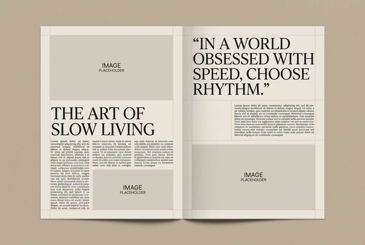
6) Ink and Fog
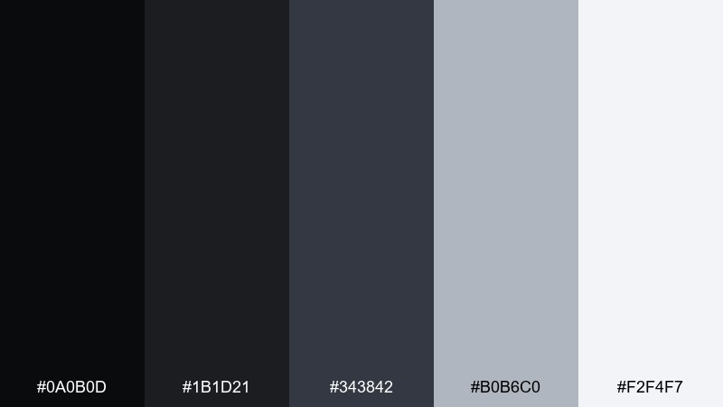
HEX: #0A0B0D #1B1D21 #343842 #B0B6C0 #F2F4F7
Mood: cinematic, soft, elegant
Best for: editorial magazine spread
Cinematic ink against foggy grays feels elegant and slightly mysterious. It suits long-form layouts where typography should look intentional and high-end. Pair with warm paper white and subtle linework for a classic editorial grid. Usage tip: use the fog gray as a caption box background to separate notes without heavy borders.
Image example of ink and fog generated using media.io
7) Museum Charcoal
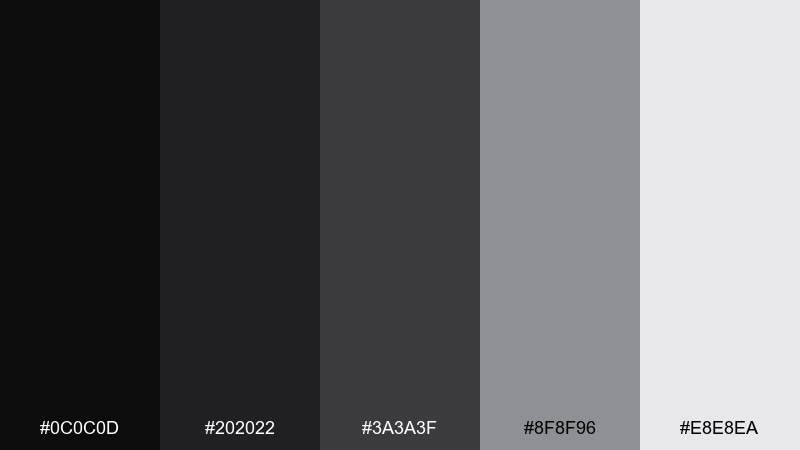
HEX: #0C0C0D #202022 #3A3A3F #8F8F96 #E8E8EA
Mood: curated, quiet, gallery-like
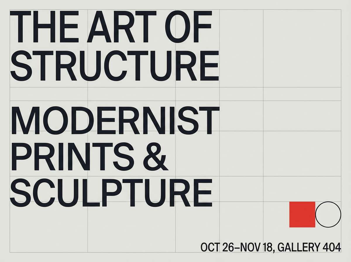
Best for: art exhibition poster
Curated charcoal tones feel like a quiet gallery wall under soft track lights. They let artwork titles and dates stand out without competing with imagery. Pair with a single spot color for the featured artist name to guide the eye. Usage tip: keep ample margin and align text to a strict grid for a museum-level finish.
Image example of museum charcoal generated using media.io
8) Steel Monochrome
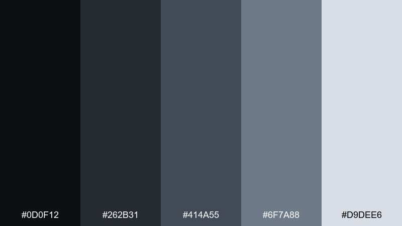
HEX: #0D0F12 #262B31 #414A55 #6F7A88 #D9DEE6
Mood: professional, structured, corporate
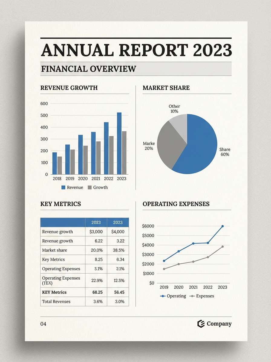
Best for: annual report layout
Steel grays suggest structure, trust, and well-organized information. They are a strong fit for reports packed with charts, tables, and data callouts. Pair with a restrained accent like navy to separate sections without breaking the neutral story. Usage tip: reserve the darkest shade for headings only, so dense pages stay readable.
Image example of steel monochrome generated using media.io
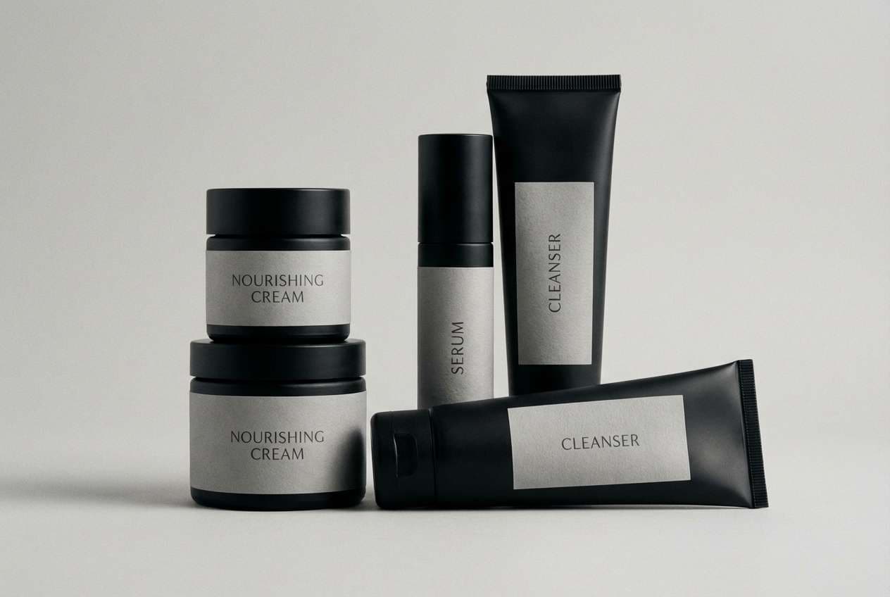
9) Shadowed Pearl
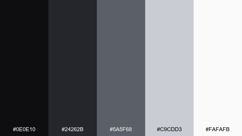
HEX: #0E0E10 #24262B #5A5F68 #C9CDD3 #FAFAFB
Mood: luxury, soft, high-contrast
Best for: beauty product packaging
Shadowy blacks paired with pearly grays feel luxurious, like satin fabric under a spotlight. This black gray color combination works well for beauty, skincare, and fragrance where minimal typography sells the premium story. Pair with foil silver or a single blush accent for a refined twist. Usage tip: keep finishes matte on the dark tones so highlights look intentional, not glossy.
Image example of shadowed pearl generated using media.io
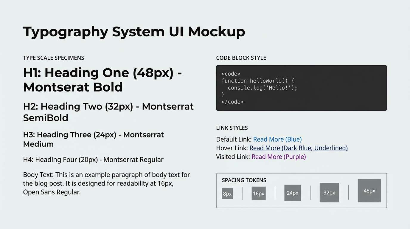
10) Quiet Type
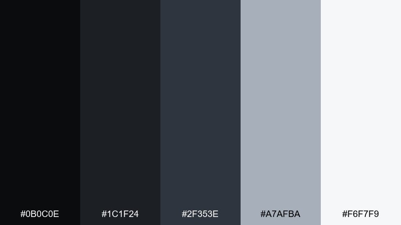
HEX: #0B0C0E #1C1F24 #2F353E #A7AFBA #F6F7F9
Mood: calm, typographic, minimal
Best for: blog typography system
Calm neutrals set a quiet stage for words, like ink on smooth paper. The range of grays makes it easy to build a typography ladder without visual noise. Pair with a gentle accent (dusty blue or terracotta) for links and highlights. Usage tip: use the soft gray for code blocks and pull quotes to keep reading flow uninterrupted.
Image example of quiet type generated using media.io
11) Asphalt Minimal
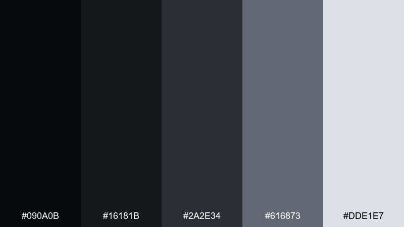
HEX: #090A0B #16181B #2A2E34 #616873 #DDE1E7
Mood: urban, bold, modern
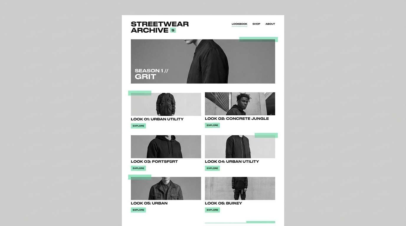
Best for: streetwear lookbook
Urban asphalt shades feel bold and modern, like fresh pavement and neon reflections. They give apparel photos strong contrast while keeping layouts minimal. Pair with a single loud accent for drop dates and price tags. Usage tip: use the mid-gray for labels and size info so the product shots stay dominant.
Image example of asphalt minimal generated using media.io
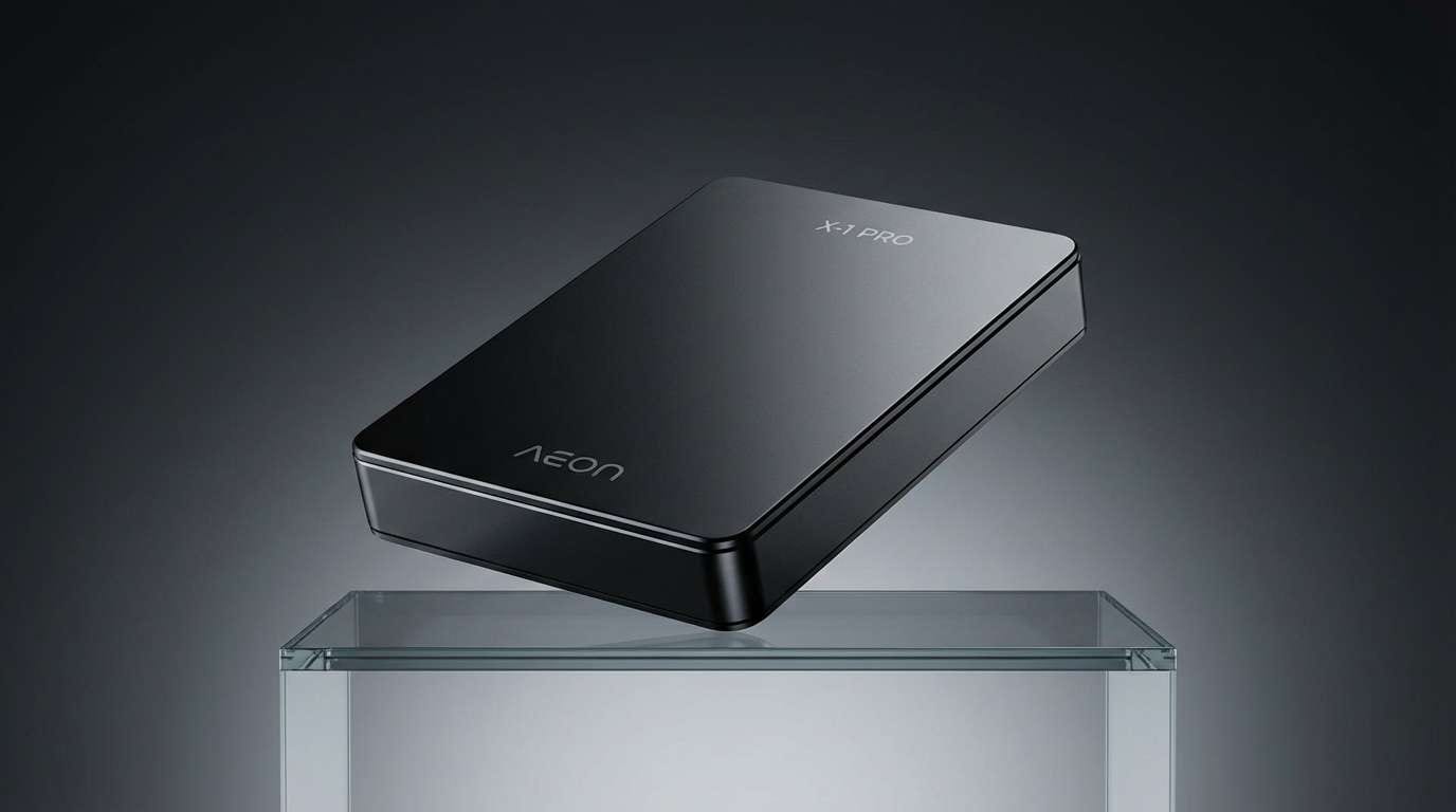
12) Smoke and Chrome
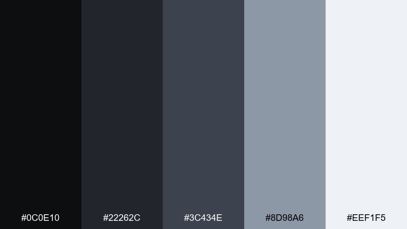
HEX: #0C0E10 #22262C #3C434E #8D98A6 #EEF1F5
Mood: futuristic, crisp, tech-forward
Best for: hardware product ad
Crisp smoke and chrome tones evoke precision engineering and clean metal surfaces. This black gray color palette is strong for hardware launches where the product needs to feel sharp and premium. Pair with cool blue highlights for specs and feature callouts. Usage tip: place spec text on the lightest gray panels to keep the ad readable at a glance.
Image example of smoke and chrome generated using media.io
13) Linen Shadow
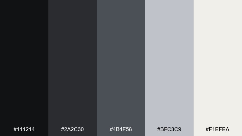
HEX: #111214 #2A2C30 #4B4F56 #BFC3C9 #F1EFEA
Mood: warm neutral, cozy, balanced
Best for: modern interior mood board
Warm shadowed neutrals feel like linen upholstery and soft afternoon light. The slightly creamy off-white keeps the palette from turning cold. Pair with natural wood textures and brushed brass for a lived-in modern look. Usage tip: use the dark tones for frames and fixtures, then let textiles carry the softer grays.
Image example of linen shadow generated using media.io
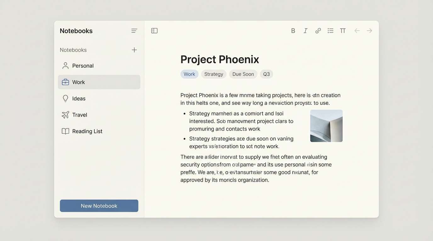
14) Noir Notebook
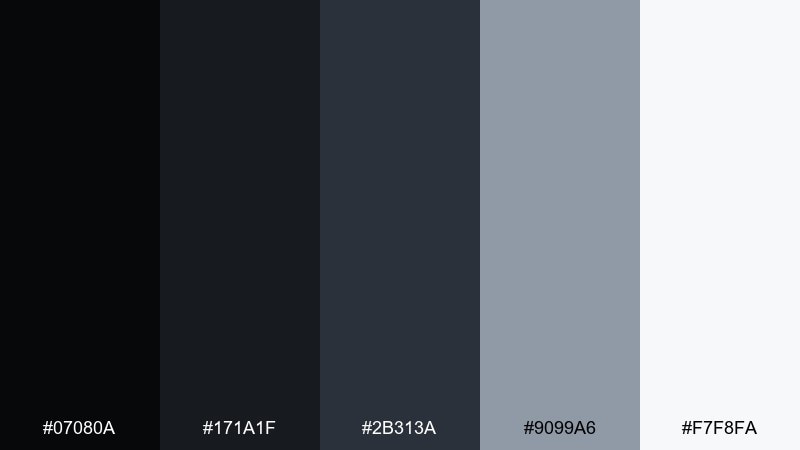
HEX: #07080A #171A1F #2B313A #9099A6 #F7F8FA
Mood: smart, academic, focused
Best for: note-taking app ui
Noir notebook tones feel focused and studious, like graphite on crisp paper. They help content stand out while keeping UI elements understated. Pair with a calm accent color for tags and selected states. Usage tip: keep input fields one shade lighter than the background so focus rings are obvious without being loud.
Image example of noir notebook generated using media.io
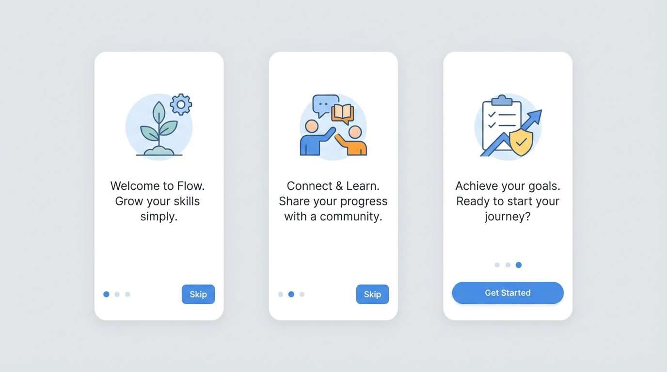
15) Winter Graphite
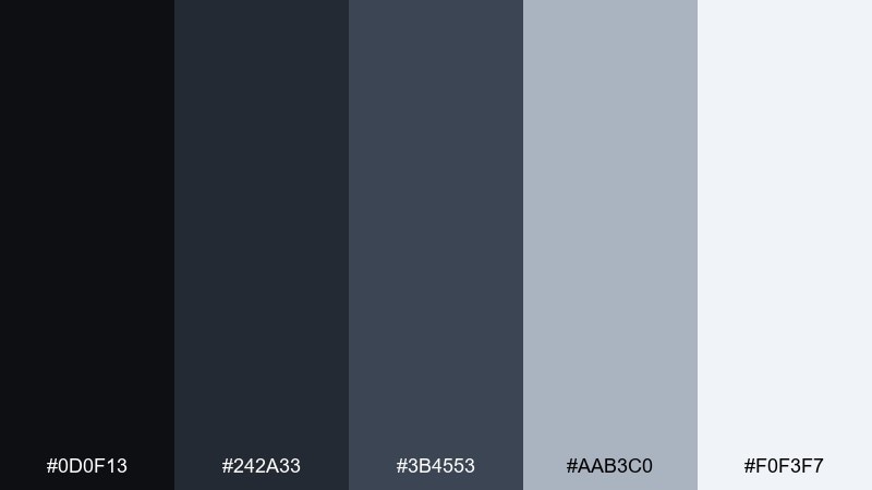
HEX: #0D0F13 #242A33 #3B4553 #AAB3C0 #F0F3F7
Mood: cool, airy, modern
Best for: mobile app onboarding screens
Cool winter grays feel airy and modern, like frost on glass with crisp edges. They give onboarding screens a clean baseline for illustrations and short copy. Pair with one bright accent for progress dots and primary buttons. Usage tip: keep backgrounds near-white and use the darker grays only for titles to avoid a heavy first impression.
Image example of winter graphite generated using media.io
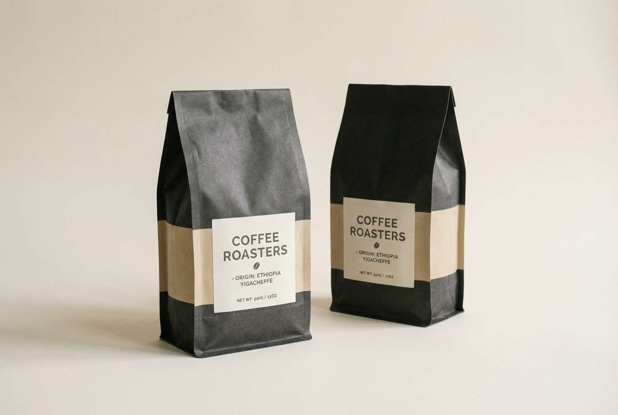
16) Carbon and Sand
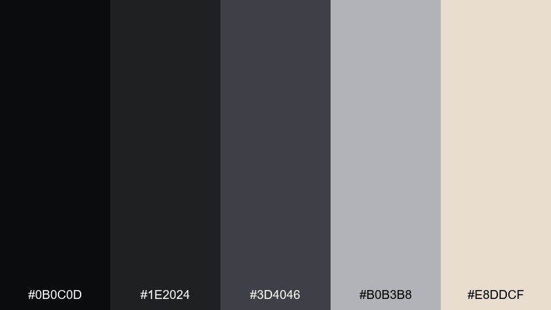
HEX: #0B0C0D #1E2024 #3D4046 #B0B3B8 #E8DDCF
Mood: earthy, premium, grounded
Best for: coffee brand label
Grounded carbon tones with a sandy highlight feel earthy and premium, like roasted beans and kraft paper. They work well for labels that need strong contrast without looking sterile. Pair with simple illustration lines and a tactile paper texture. Usage tip: print the darkest tone slightly softened (rich black) to avoid muddy edges on uncoated stock.
Image example of carbon and sand generated using media.io
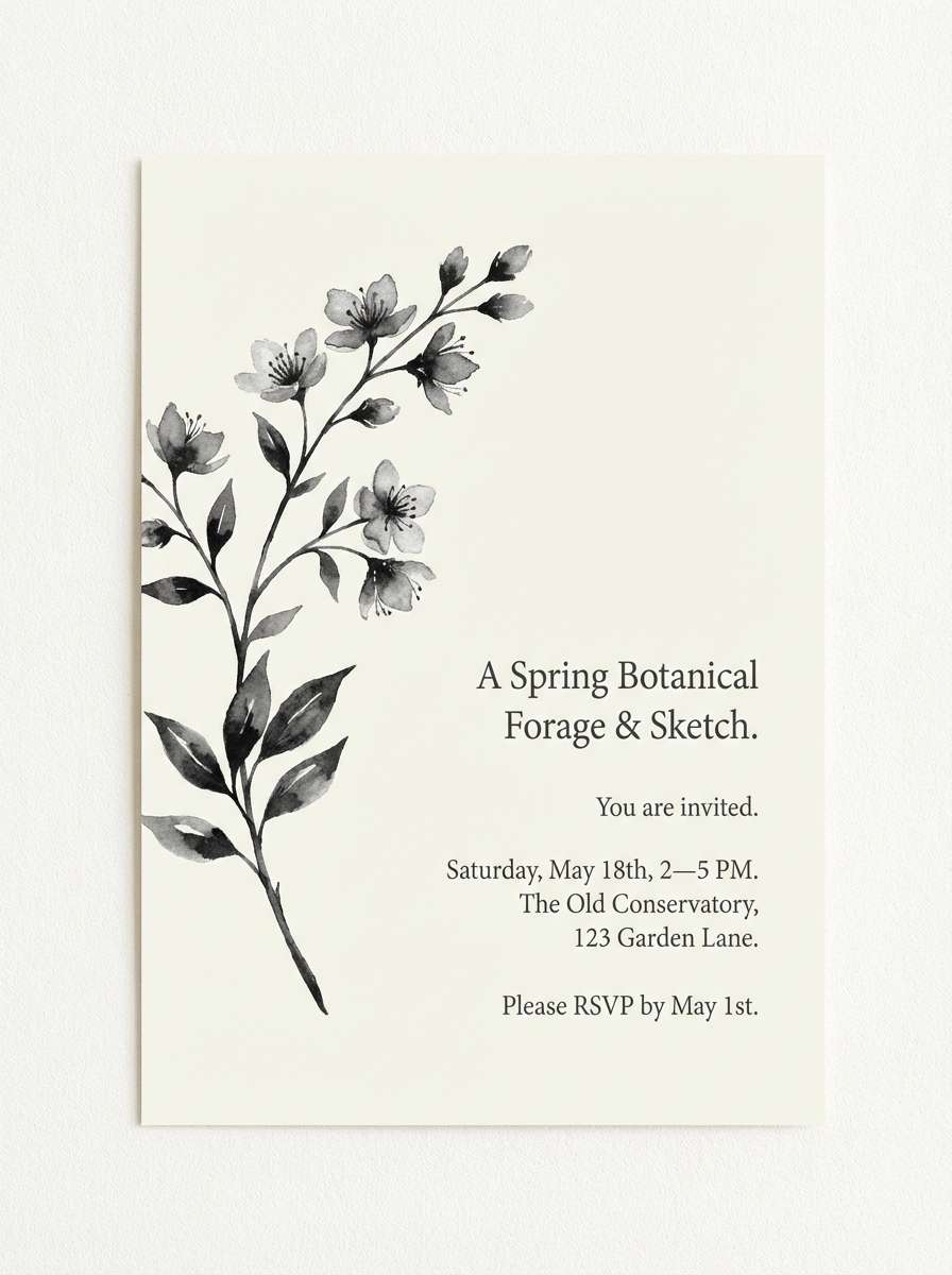
17) Monochrome Bloom
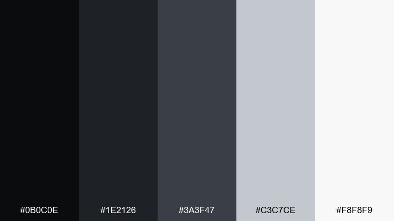
HEX: #0B0C0E #1E2126 #3A3F47 #C3C7CE #F8F8F9
Mood: soft, botanical, airy
Best for: watercolor botanical invitation
Soft monochrome tones feel like misty petals and delicate ink washes. The gentle range supports botanical artwork while keeping type readable. Pair with silver-gray linework and plenty of white space for an elegant stationery look. Usage tip: keep the invitation text in deep charcoal, not pure black, to match the watercolor softness.
Image example of monochrome bloom generated using media.io
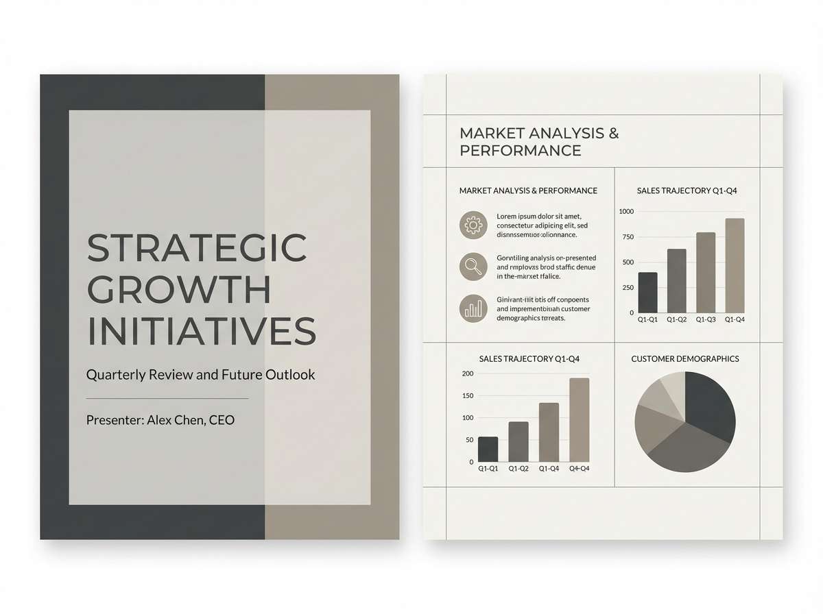
18) Prism Neutral
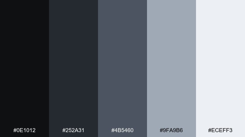
HEX: #0E1012 #252A31 #4B5460 #9FA9B6 #ECEFF3
Mood: clean, flexible, modern
Best for: presentation template
Clean neutrals feel flexible and modern, like a polished deck in a bright conference room. They keep charts, icons, and photography consistent across many slide types. Pair with one brand accent color for section headers and key metrics. Usage tip: use the lightest tone for backgrounds and alternate with pale gray panels to break up dense slides.
Image example of prism neutral generated using media.io
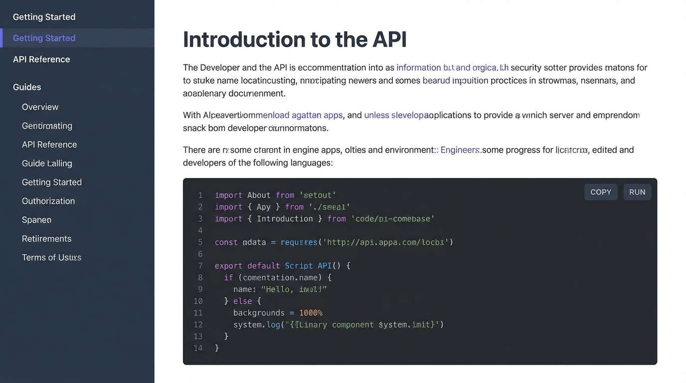
19) Obsidian Interface
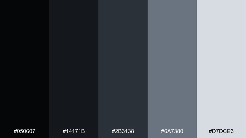
HEX: #050607 #14171B #2B3138 #6A7380 #D7DCE3
Mood: dark, precise, high-contrast
Best for: developer documentation site
Obsidian tones feel precise and technical, like a code editor in a dark room. These black gray color combinations make navigation, sidebars, and code blocks easy to separate without loud borders. Pair with a restrained accent (cyan or amber) for links and syntax highlights. Usage tip: keep code text on a slightly lighter panel than the page background to reduce eye strain.
Image example of obsidian interface generated using media.io
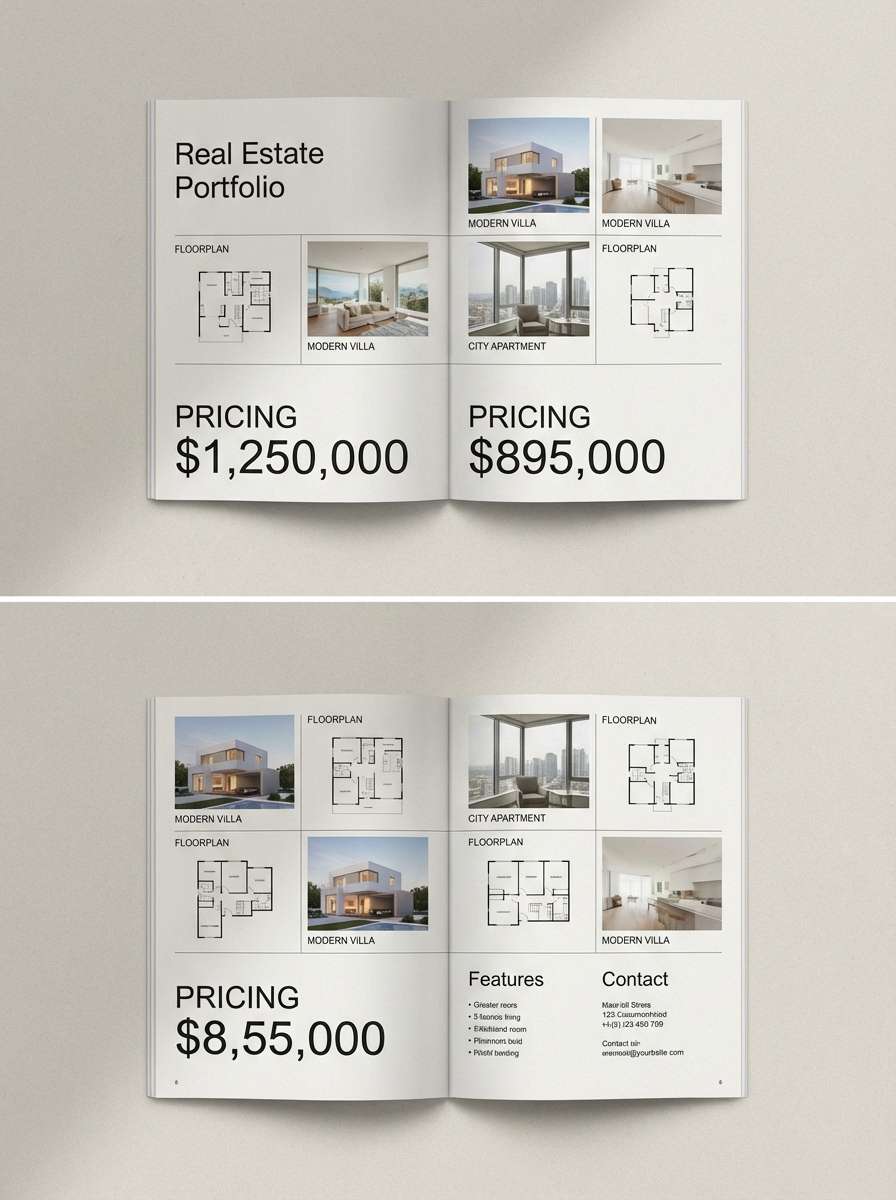
20) Urban Mist
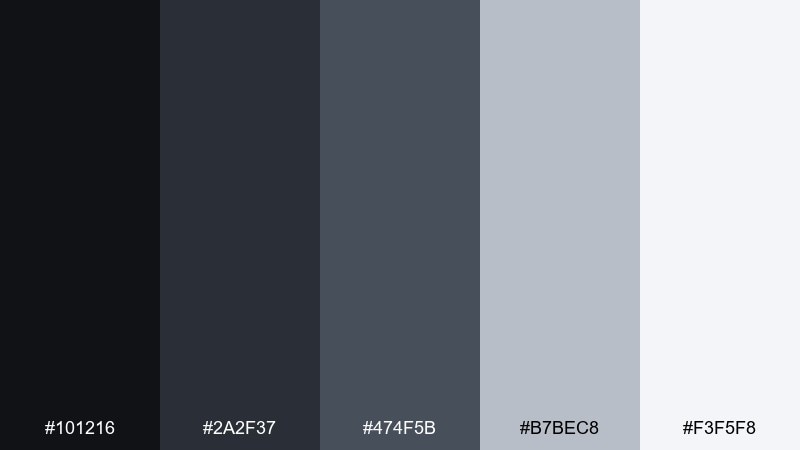
HEX: #101216 #2A2F37 #474F5B #B7BEC8 #F3F5F8
Mood: fresh, balanced, city-modern
Best for: real estate brochure
Urban mist grays feel fresh and balanced, like morning haze over glass towers. They suit real estate brochures where floorplans and photos need clarity and calm. Pair with a muted metallic accent for pricing and key amenities. Usage tip: set body copy in dark gray and keep headings slightly lighter than black to avoid harsh contrast on print.
Image example of urban mist generated using media.io
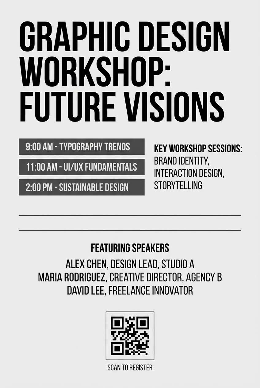
21) Mono Workshop
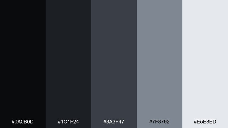
HEX: #0A0B0D #1C1F24 #3A3F47 #7F8792 #E5E8ED
Mood: practical, maker, organized
Best for: workshop event flyer
Practical workshop tones evoke tools, clean benches, and a no-nonsense maker vibe. The tight grayscale range keeps schedules, speakers, and venue info easy to scan. Pair with one bold accent for the date and registration link. Usage tip: use the light gray for section blocks so the flyer stays structured without heavy boxes.
Image example of mono workshop generated using media.io
What Colors Go Well with Black Gray?
Black gray pairs easily with high-energy accents like teal, lime, cobalt, coral, or magenta—perfect when you want CTAs, highlights, or key labels to pop. On a neutral base, even a small accent area reads clearly.
For softer, more premium combinations, try muted accents such as sage green, dusty blue, blush, or warm sand. These keep the monochrome mood while adding warmth and personality.
If you’re designing for print, consider metallics (silver, pewter, champagne gold) as accent “colors” through foil, ink, or material finishes. They complement charcoal tones without turning the layout noisy.
How to Use a Black Gray Color Palette in Real Designs
Build hierarchy with value, not extra colors: use near-black for headings/navigation, mid-grays for secondary UI and dividers, and very light grays or off-whites for surfaces. This makes pages feel structured and reduces visual clutter.
Watch contrast and readability. Instead of pure black on pure white everywhere, try dark charcoal text on off-white backgrounds for long reading, and reserve the deepest blacks for emphasis and key anchors.
To avoid a “flat” look, add depth with spacing, subtle shadows, and gentle gradients—especially in dark themes. Keep those effects minimal so the palette stays clean and professional.
Create Black Gray Palette Visuals with AI
If you want to preview how a black gray palette looks in a dashboard, poster, packaging shot, or slide template, generate quick mock visuals with AI. It’s a fast way to test mood, contrast, and accent color ideas before you commit to a full design.
Use your palette HEX codes as constraints, then describe the layout and lighting style (studio, editorial, cinematic, minimal UI). You can iterate with small prompt changes to find the right vibe in minutes.
When you like a result, export and reuse it as a mood board reference for web, print, or brand guidelines.
Black Gray Color Palette FAQs
-
What is a black gray color palette?
A black gray palette is a neutral color scheme built from near-black through multiple gray values up to off-white. It’s used to create clear hierarchy, a modern look, and strong contrast without relying on many hues. -
Is black and gray considered monochrome?
Usually, yes. Monochrome refers to variations in lightness/darkness within a limited hue family; black-to-gray-to-white is a common monochrome approach based on value rather than colorful hues. -
What accent color works best with black and gray?
Bright accents like teal, lime, cobalt, or coral pop strongly against grayscale. For a softer look, choose muted accents like sage, dusty blue, blush, or sand. -
How do I keep black gray designs from feeling boring?
Add interest with typography hierarchy, spacing, textures (paper, grain, fabric), and subtle elevation/shadows. Then introduce one consistent accent color for interactive states or key highlights. -
What’s the best text color on a dark gray background?
Use an off-white or very light gray instead of pure white to reduce glare. For UI, keep body text lighter and reserve pure-white highlights for small emphasis areas. -
Are black gray palettes good for branding?
Yes—especially for tech, luxury, editorial, architecture, and corporate identities. They feel timeless and premium, and they make a single brand accent color more recognizable. -
How many grays should I use in a UI palette?
A practical set is 5–9 steps: near-black, dark gray, mid gray, light gray, and near-white (plus optional extra steps). This gives enough flexibility for backgrounds, borders, text, and disabled states.
Next: Pink Green Color Palette


