

Purple magenta is the sweet spot between regal purple and energetic pink—bold enough to feel modern, but rich enough to feel premium. That range makes it a favorite for branding, UI accents, and attention-grabbing posters.
Below are 20+ purple magenta color palette ideas with HEX codes, plus practical tips and AI image prompts you can reuse to visualize each scheme fast.
In this article
- Why Purple Magenta Palettes Work So Well
-
- orchid neon
- berry velvet
- amethyst dusk
- fuchsia noir
- lilac bloom
- grape soda pop
- plum rose gold
- magenta mirage
- violet berry cream
- raspberry studio
- orchid lavender mist
- mulberry muse
- electric bougainvillea
- cosmic magenta
- vintage mauve paper
- deep plum orchard
- neon petal ui
- romantic magenta wedding
- magenta streetwear
- soft heather gradient
- plum arcade
- royal magenta script
- What Colors Go Well with Purple Magenta?
- How to Use a Purple Magenta Color Palette in Real Designs
- Create Purple Magenta Palette Visuals with AI
Why Purple Magenta Palettes Work So Well
Purple magenta palettes combine two strong emotional cues: purple’s depth and authority, plus magenta’s creativity and energy. The result feels expressive, stylish, and instantly “designed,” even with simple layouts.
They also scale well across contexts. Dark plums and violets handle backgrounds and typography, while bright fuchsia accents naturally pull attention to CTAs, badges, and key UI states.
Finally, purple magenta plays nicely with both cool and warm companions—think lavender tints for softness, charcoal for contrast, and creamy whites for a premium, print-friendly finish.
20+ Purple Magenta Color Palette Ideas (with HEX Codes)
1) Orchid Neon
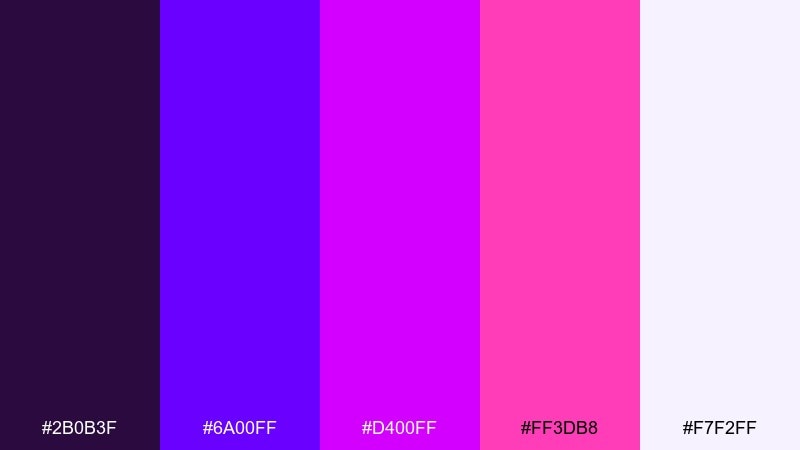
HEX: #2B0B3F #6A00FF #D400FF #FF3DB8 #F7F2FF
Mood: electric, playful, futuristic
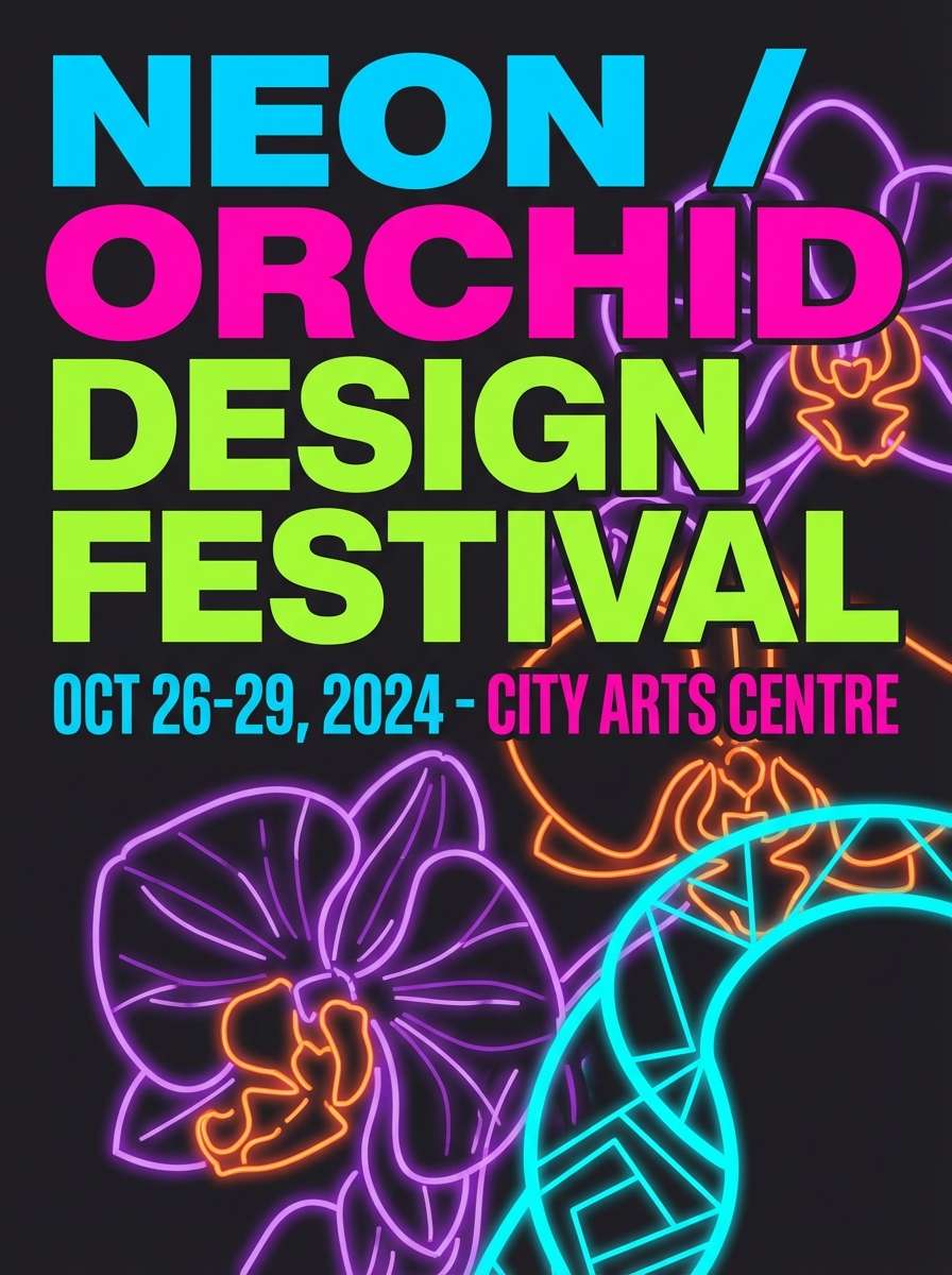
Best for: music festival poster design
Electric and playful, it feels like neon orchids glowing after dark. Use it on bold posters, event covers, and punchy social tiles where high contrast matters. Pair with clean whites or near-black backgrounds to keep the glow controlled. Tip: reserve the hottest magenta for headlines and CTA blocks so the hierarchy stays sharp.
Image example of orchid neon generated using media.io
Media.io is an online AI studio for creating and editing video, image, and audio in your browser.

2) Berry Velvet
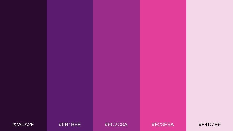
HEX: #2A0A2F #5B1B6E #9C2C8A #E23E9A #F4D7E9
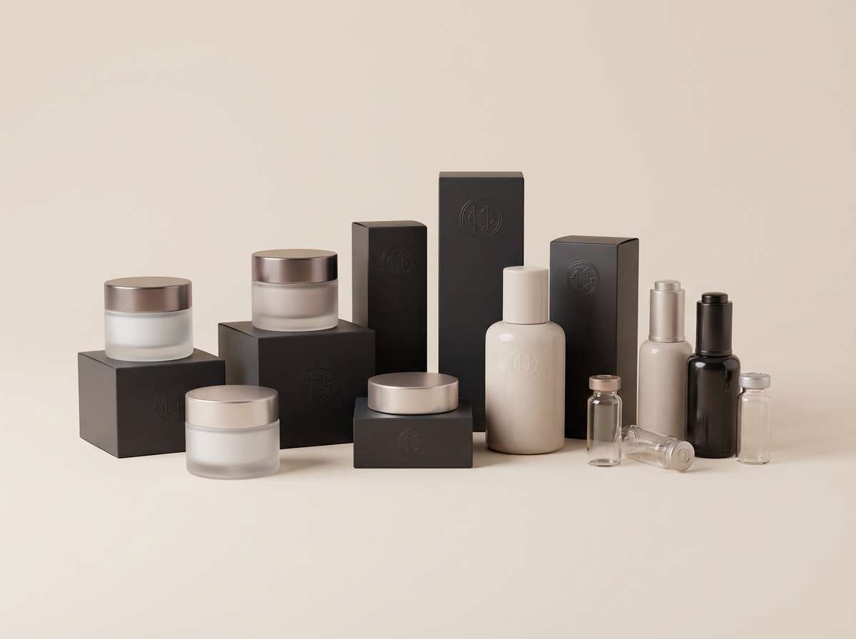
Mood: luxurious, warm, romantic
Best for: cosmetics packaging and product ads
Luxurious and warm, it reads like crushed berries on velvet fabric. It shines on beauty packaging, fragrance labels, and premium product ads with soft lighting. Pair with matte black, cream, or muted gold foils for a high-end finish. Tip: keep background tones dusty and let the bright berry pink hit only the logo or seal.
Image example of berry velvet generated using media.io
3) Amethyst Dusk
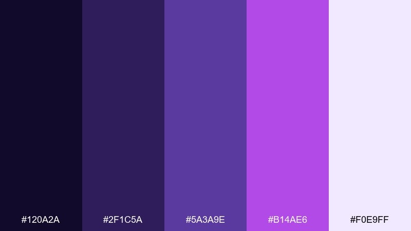
HEX: #120A2A #2F1C5A #5A3A9E #B14AE6 #F0E9FF
Mood: calm, cinematic, moody
Best for: streaming thumbnail and cover art
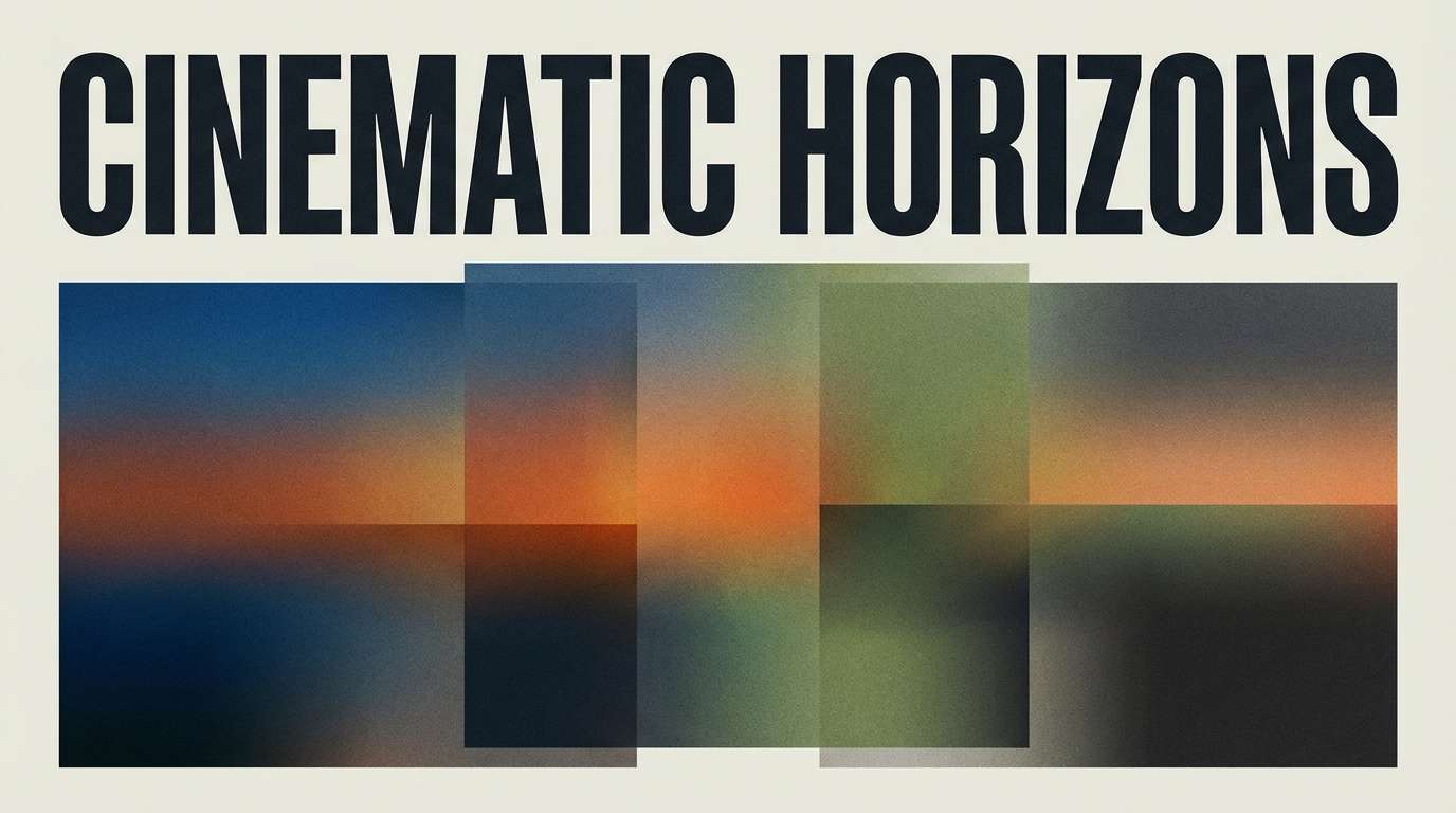
Calm and cinematic, it suggests a twilight sky with amethyst haze. It works well for thumbnails, cover art, and hero banners where you want depth without harsh contrast. Pair with cool grays and a soft lavender highlight to keep faces or titles readable. Tip: add a subtle grain overlay to make the darker purples feel richer.
Image example of amethyst dusk generated using media.io
4) Fuchsia Noir
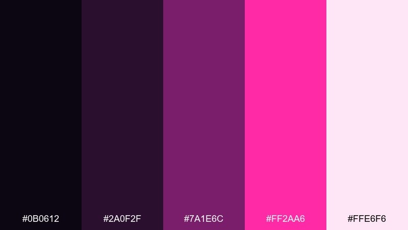
HEX: #0B0612 #2A0F2F #7A1E6C #FF2AA6 #FFE6F6
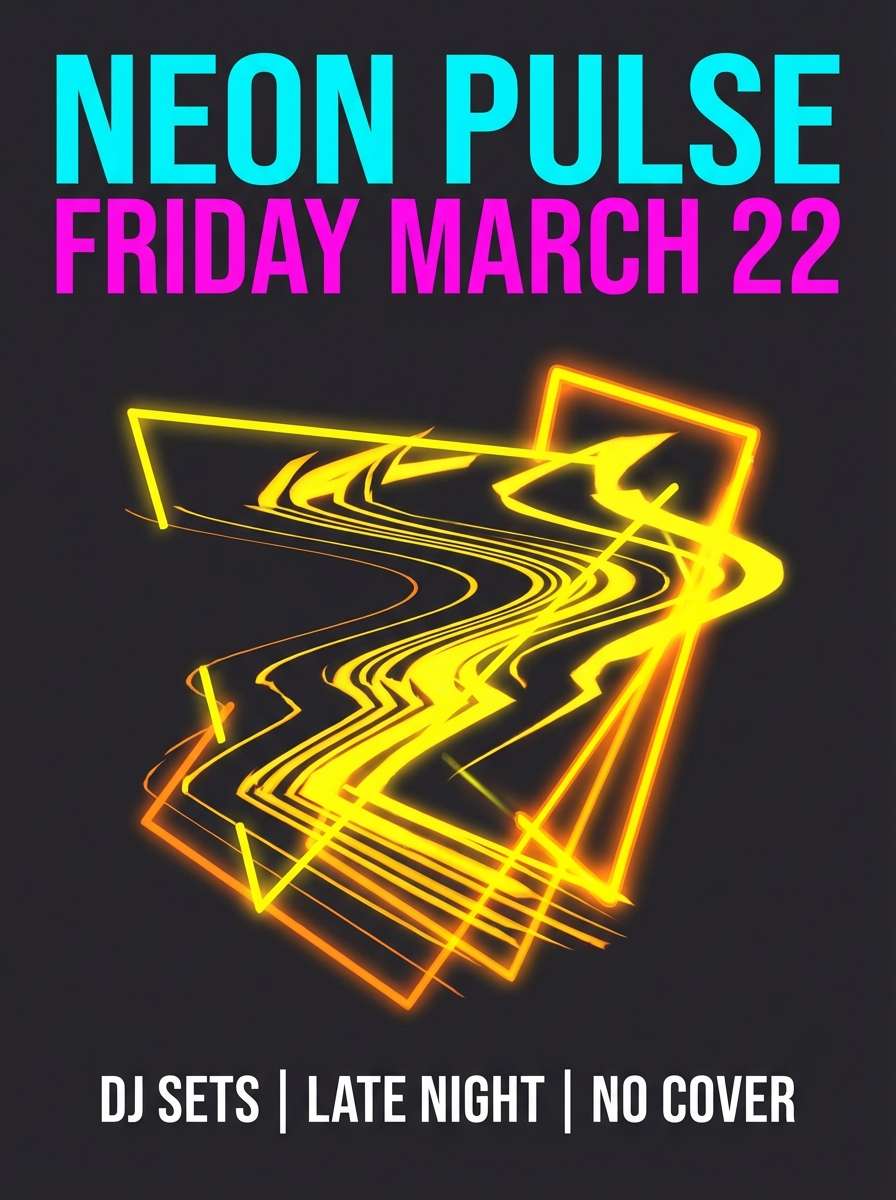
Mood: dramatic, edgy, nightlife
Best for: nightclub flyer and social promo
Dramatic and edgy, it feels like a nightclub spotlight cutting through smoke. These purple magenta color combinations are ideal for flyers, DJ promos, and high-energy social graphics. Pair with stark black and a hint of pale blush to keep type crisp and legible. Tip: use the hot fuchsia as a single accent stripe or badge so it hits like a strobe.
Image example of fuchsia noir generated using media.io
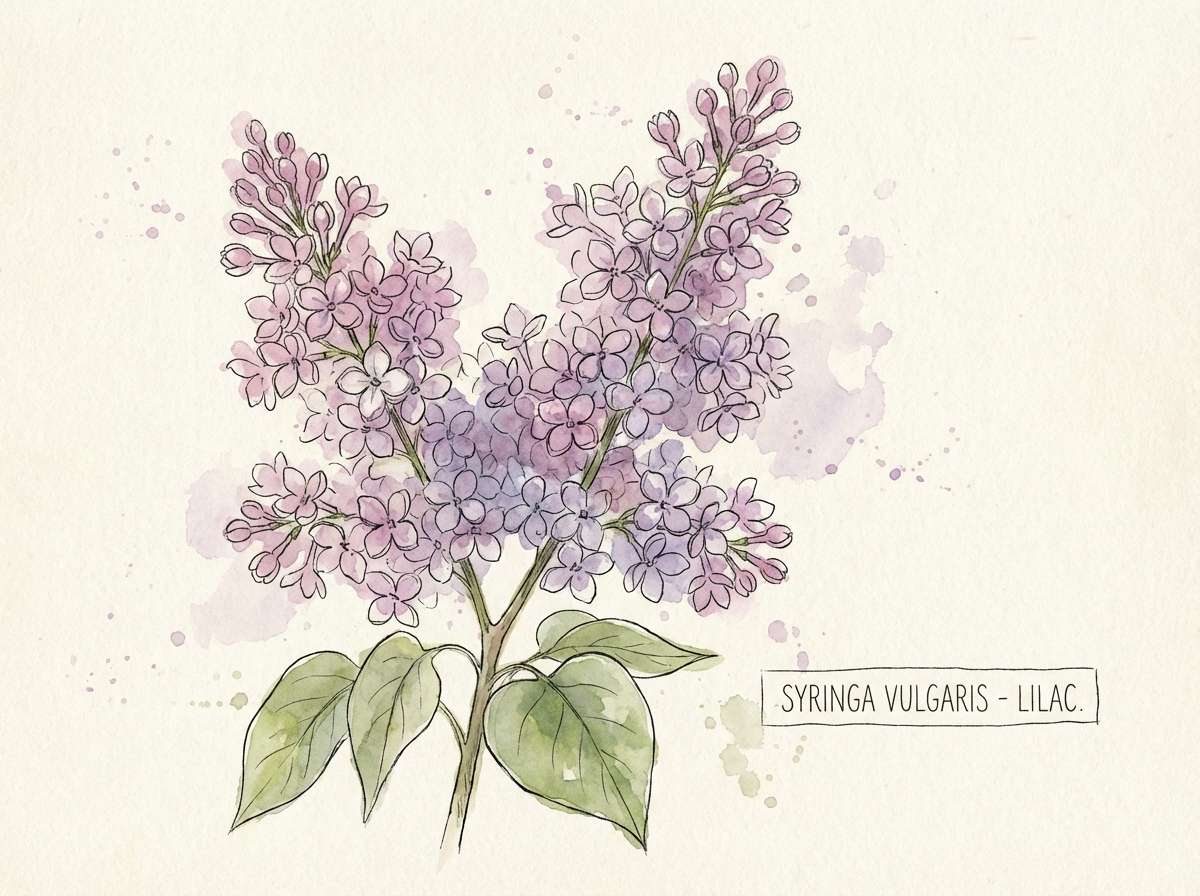
5) Lilac Bloom
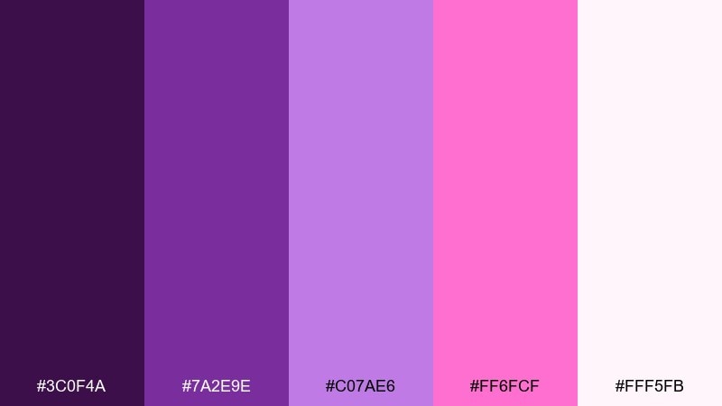
HEX: #3C0F4A #7A2E9E #C07AE6 #FF6FCF #FFF5FB
Mood: soft, optimistic, springlike
Best for: botanical illustration and stationery
Soft and optimistic, it looks like lilacs opening in warm morning light. It fits watercolor botanicals, stationery, and gentle lifestyle branding where you want color without shouting. Pair with off-white paper textures and a muted plum for outlines. Tip: keep the brightest pink for small petals or highlights so the composition stays airy.
Image example of lilac bloom generated using media.io
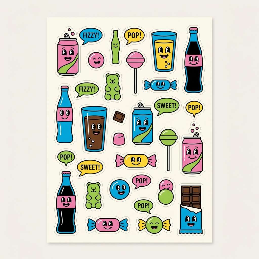
6) Grape Soda Pop
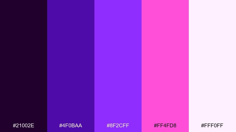
HEX: #21002E #4F0BAA #8F2CFF #FF4FD8 #FFF0FF
Mood: fun, bubbly, youthful
Best for: snack brand campaign and stickers
Fun and bubbly, it evokes fizzy grape soda and glossy candy wrappers. Use it for youth-focused snack campaigns, sticker packs, and playful merch graphics. Pair with lots of white space and simple shapes to avoid visual overload. Tip: add thin dark outlines around bright elements so they pop on both light and dark backgrounds.
Image example of grape soda pop generated using media.io
7) Plum Rose Gold
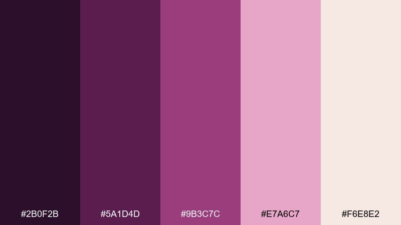
HEX: #2B0F2B #5A1D4D #9B3C7C #E7A6C7 #F6E8E2
Mood: elegant, feminine, editorial
Best for: fashion lookbook and editorial layouts
Elegant and editorial, it feels like plum lipstick paired with warm rose-metal highlights. It works beautifully for fashion lookbooks, magazine spreads, and premium blog headers. Pair with creamy neutrals and soft blush tones to keep photos flattering. Tip: use the deepest plum for body text and the rosy tint for section dividers and pull quotes.
Image example of plum rose gold generated using media.io
8) Magenta Mirage
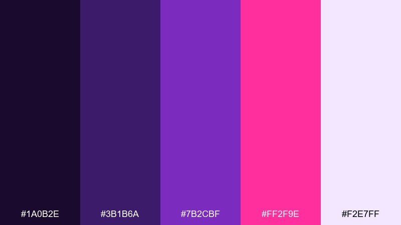
HEX: #1A0B2E #3B1B6A #7B2CBF #FF2F9E #F2E7FF
Mood: dreamy, surreal, modern
Best for: creative studio landing page
Dreamy and slightly surreal, it resembles heat haze with a magenta shimmer. As a purple magenta color palette, it suits creative studio landing pages, portfolio hero sections, and animated gradients. Pair with cool lavender tints and plenty of negative space so the saturated accents feel intentional. Tip: apply the brightest color only to interactive states like hover and focus for a polished UI feel.
Image example of magenta mirage generated using media.io
9) Violet Berry Cream
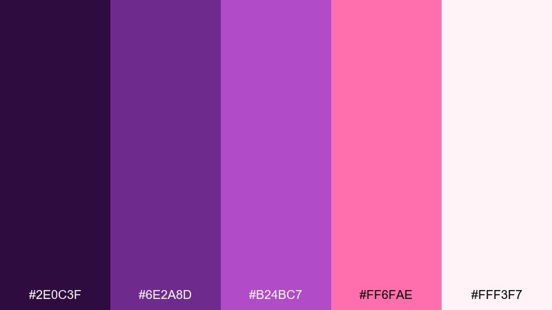
HEX: #2E0C3F #6E2A8D #B24BC7 #FF6FAE #FFF3F7
Mood: sweet, soft, approachable
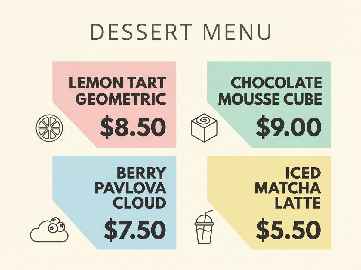
Best for: bakery menu and dessert promos
Sweet and soft, it brings to mind berry swirls folded into whipped cream. It is great for bakery menus, dessert promos, and pastel-forward Instagram carousels. Pair with creamy whites and a single deep violet for headings to keep the design grounded. Tip: use pink as a highlight color for prices or limited-time badges, not the entire background.
Image example of violet berry cream generated using media.io
10) Raspberry Studio
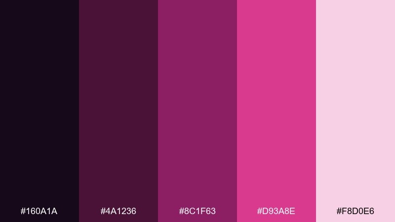
HEX: #160A1A #4A1236 #8C1F63 #D93A8E #F8D0E6
Mood: confident, creative, intimate
Best for: podcast cover and creator branding
Confident and intimate, it feels like a recording studio lit by raspberry gels. It fits podcast covers, creator branding, and profile assets where strong color helps recognition. Pair with warm off-white and a near-black base to keep type readable at small sizes. Tip: keep the mid-raspberry as the primary background and save the brightest pink for icons and accents.
Image example of raspberry studio generated using media.io

11) Orchid Lavender Mist
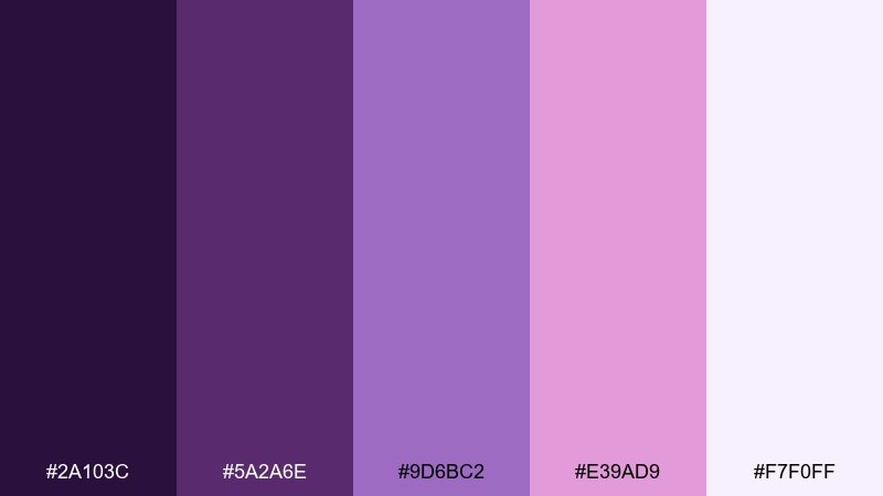
HEX: #2A103C #5A2A6E #9D6BC2 #E39AD9 #F7F0FF
Mood: gentle, airy, soothing
Best for: wellness app onboarding screens
Gentle and airy, it suggests lavender mist drifting through orchids. It is a strong fit for wellness onboarding, meditation content, and calm lifestyle UI. Pair with soft whites and muted plum text for comfortable reading. Tip: use the lightest tint as the main canvas and keep pink for progress indicators and micro-interactions.
Image example of orchid lavender mist generated using media.io
12) Mulberry Muse
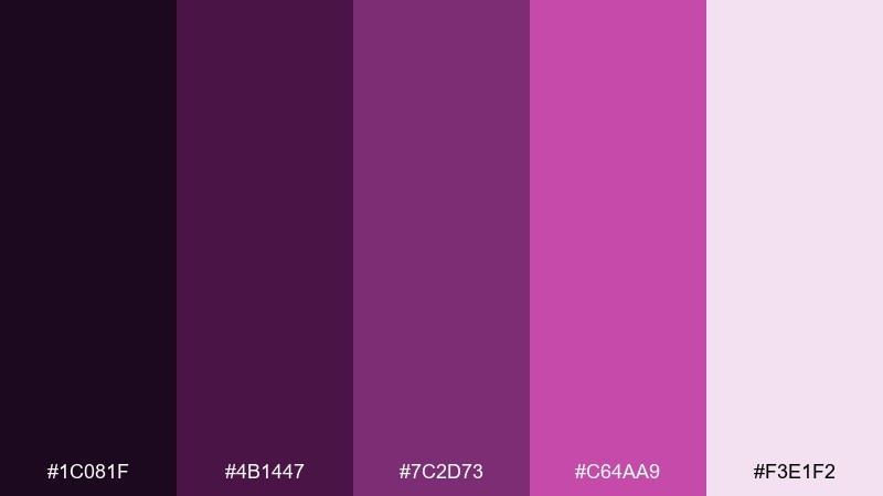
HEX: #1C081F #4B1447 #7C2D73 #C64AA9 #F3E1F2
Mood: artsy, poetic, sophisticated
Best for: book cover and literary posters
Artsy and poetic, it reads like mulberry ink on textured paper. These purple magenta color combinations suit book covers, literary posters, and author websites that need a refined edge. Pair with warm ivory and restrained line art to keep it timeless. Tip: use the lightest tint for margins and negative space so the typography feels curated.
Image example of mulberry muse generated using media.io
13) Electric Bougainvillea
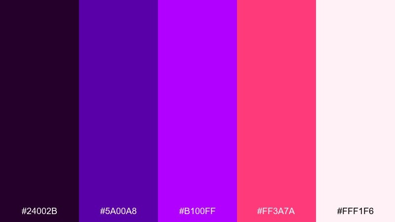
HEX: #24002B #5A00A8 #B100FF #FF3A7A #FFF1F6
Mood: bold, tropical, energetic
Best for: summer sale banner ads
Bold and energetic, it evokes bougainvillea climbing sunlit walls. It is made for summer sale banners, punchy hero ads, and scroll-stopping promo tiles. Pair with crisp white and a dark purple base to keep the tropical vibe modern, not messy. Tip: keep gradients subtle and let solid blocks carry the message for better readability.
Image example of electric bougainvillea generated using media.io

14) Cosmic Magenta
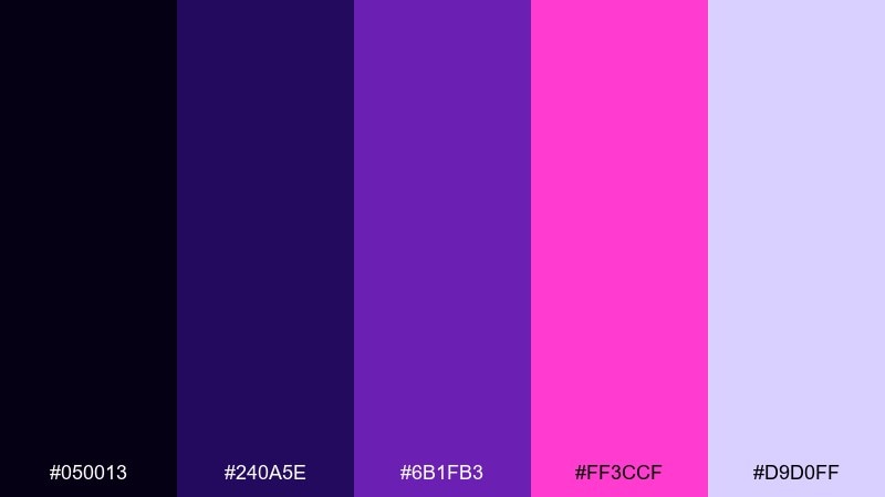
HEX: #050013 #240A5E #6B1FB3 #FF3CCF #D9D0FF
Mood: mysterious, sci-fi, expansive
Best for: gaming livestream overlay graphics
Mysterious and expansive, it feels like cosmic dust lit by a magenta nebula. It works for gaming overlays, stream alerts, and bold channel graphics that need contrast on dark backgrounds. Pair with icy lavender highlights and keep text in near-white for clarity. Tip: use the brightest magenta only for notification states so it reads as action, not decoration.
Image example of cosmic magenta generated using media.io
15) Vintage Mauve Paper
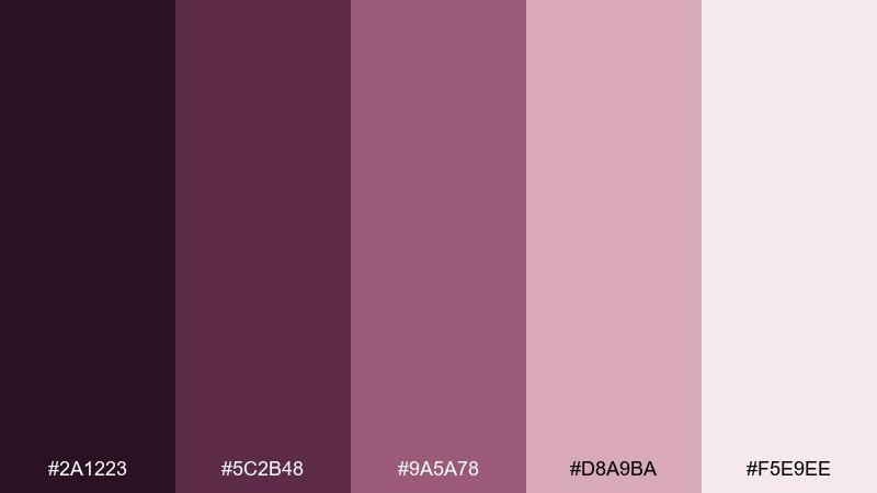
HEX: #2A1223 #5C2B48 #9A5A78 #D8A9BA #F5E9EE
Mood: nostalgic, muted, cozy
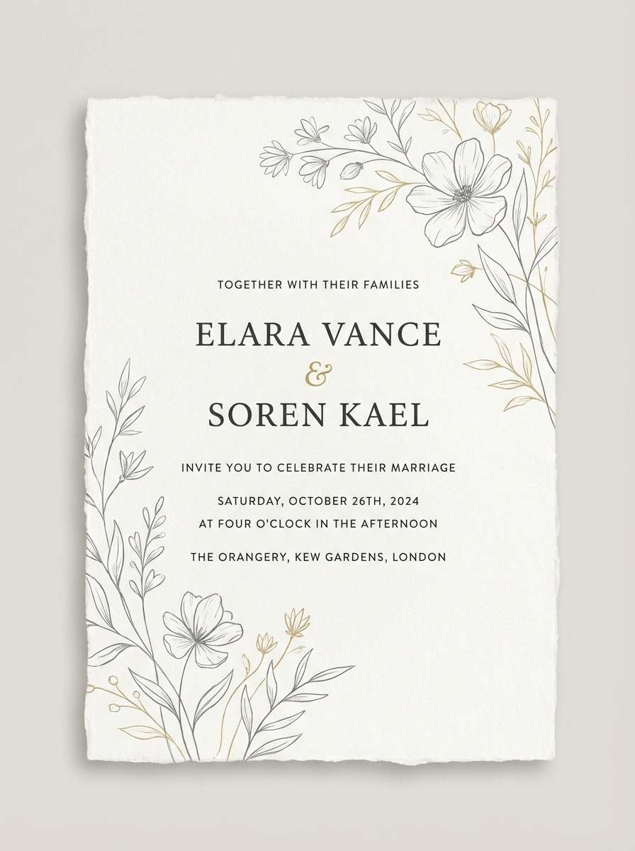
Best for: wedding invitation suite
Nostalgic and cozy, it recalls mauve paper, dried florals, and soft candlelight. It is ideal for wedding invitations, RSVP cards, and romantic save-the-dates with a vintage touch. Pair with warm cream stock and delicate charcoal typography for a classic finish. Tip: keep the darkest plum for names and dates to preserve legibility on textured paper.
Image example of vintage mauve paper generated using media.io
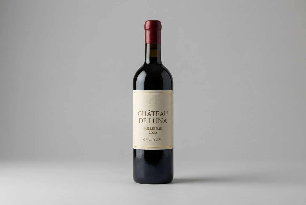
16) Deep Plum Orchard
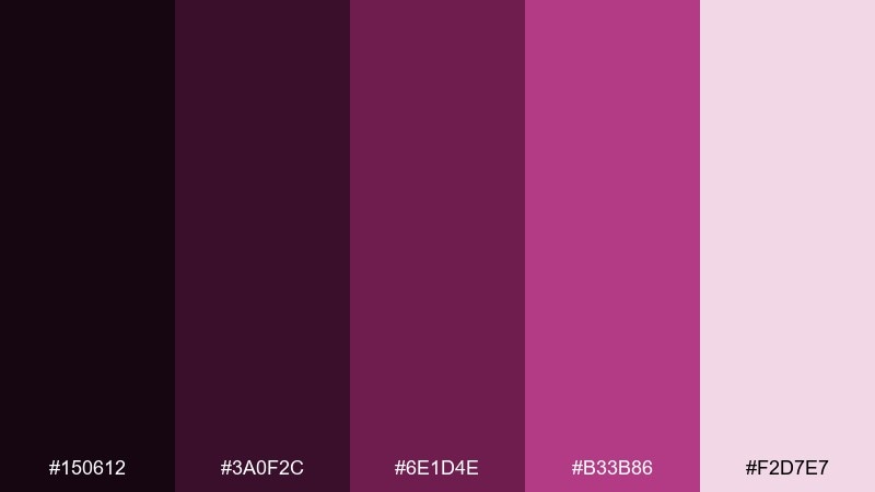
HEX: #150612 #3A0F2C #6E1D4E #B33B86 #F2D7E7
Mood: rich, grounded, artisanal
Best for: wine label and bottle packaging
Rich and grounded, it suggests ripe plums gathered in an autumn orchard. It is a strong choice for wine labels, artisan food packaging, and premium tags where depth matters. Pair with kraft paper, off-white, or subtle metallic inks to elevate the look. Tip: use the mid-plum as a solid label field and keep accents minimal for a refined shelf presence.
Image example of deep plum orchard generated using media.io
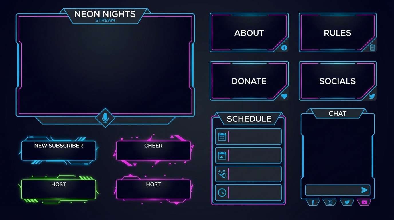
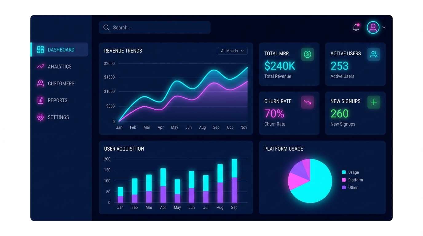
17) Neon Petal UI
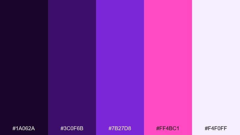
HEX: #1A062A #3C0F6B #7B27D8 #FF4BC1 #F4F0FF
Mood: clean, techy, energetic
Best for: saas dashboard UI kit
Clean and techy, it feels like neon petals floating over a dark canvas. It performs well in dashboards, analytics widgets, and data-heavy interfaces where accents guide attention. Pair with cool grays and keep charts mostly neutral for quick scanning. Tip: limit the hot pink to active states and key metrics so the UI stays calm under pressure.
Image example of neon petal ui generated using media.io
18) Romantic Magenta Wedding
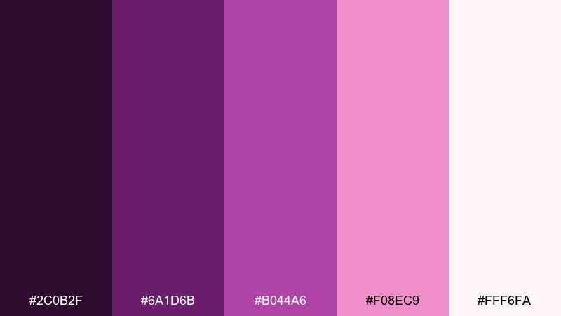
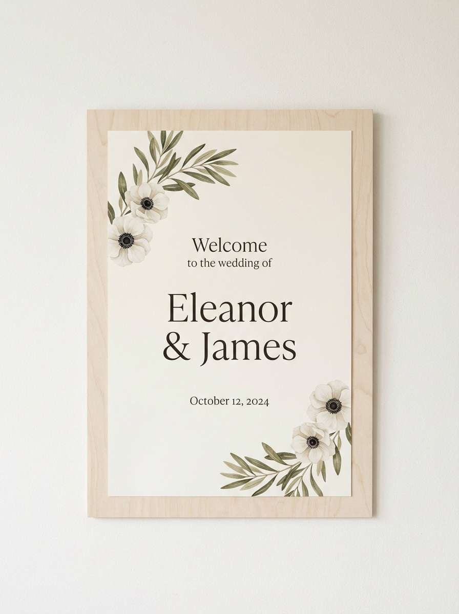
HEX: #2C0B2F #6A1D6B #B044A6 #F08EC9 #FFF6FA
Mood: romantic, celebratory, soft-glam
Best for: wedding welcome sign and day-of stationery
Romantic and celebratory, it feels like peonies and satin ribbons in soft-glam lighting. Use it for welcome signs, seating charts, and day-of stationery that needs a little drama without going dark. Pair with warm whites and a single deep violet for typography. Tip: keep the blush tint as your main background and use magenta sparingly for monograms and icons.
Image example of romantic magenta wedding generated using media.io
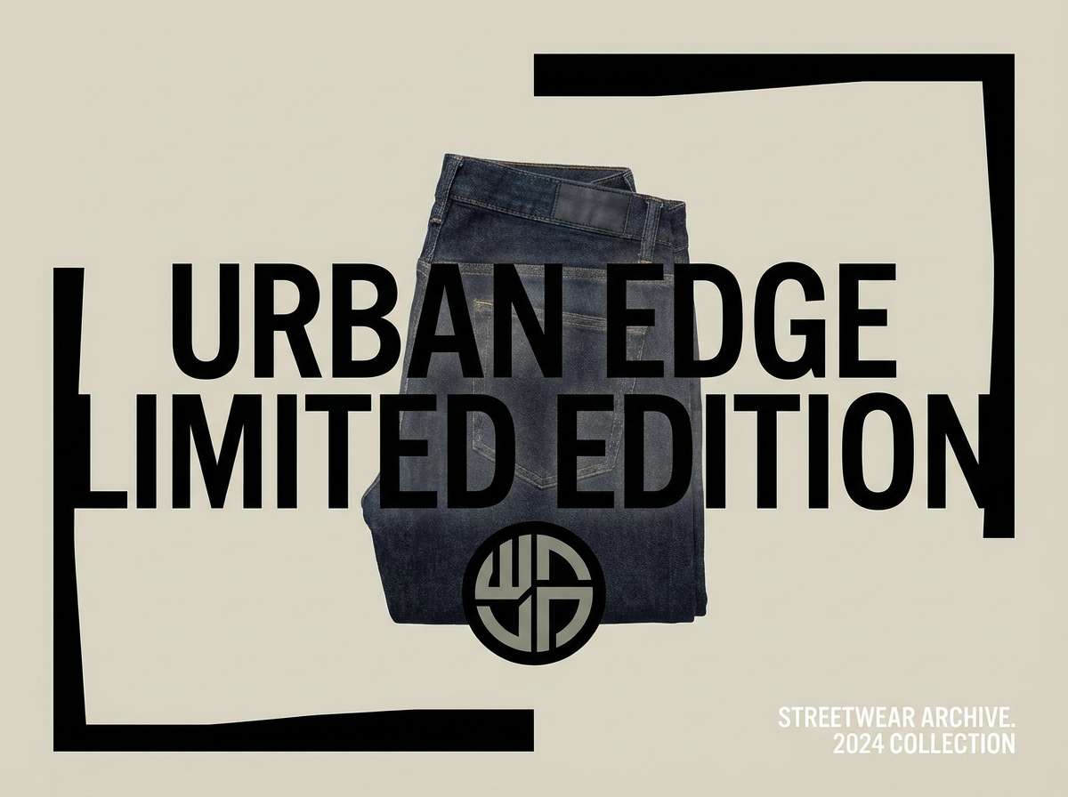
19) Magenta Streetwear
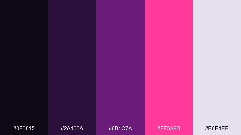
HEX: #0F0815 #2A103A #6B1C7A #FF3A9B #E6E1EE
Mood: urban, bold, high-contrast
Best for: streetwear product ad and lookbook tiles
Urban and high-contrast, it channels street lights reflecting on wet pavement. It is perfect for streetwear ads, lookbook tiles, and bold typographic drops. Pair with grayscale photography and keep layouts simple so the color reads as attitude, not clutter. Tip: use the pale gray-lilac for negative space to make the hot accent feel intentional.
Image example of magenta streetwear generated using media.io
20) Soft Heather Gradient
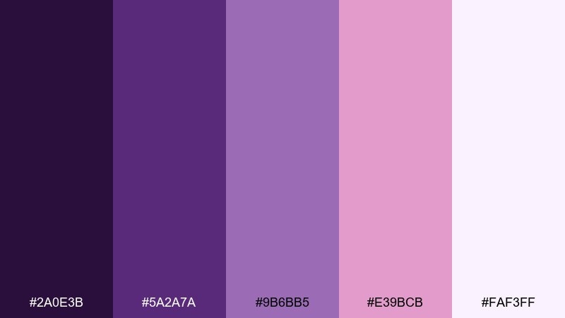
HEX: #2A0E3B #5A2A7A #9B6BB5 #E39BCB #FAF3FF
Mood: relaxed, modern, friendly
Best for: presentation templates and pitch decks
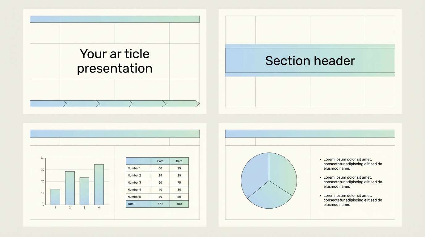
Relaxed and friendly, it looks like heather fabric fading into a soft gradient. It is great for pitch decks, presentation templates, and brand guidelines that need color without distraction. Pair with charcoal text and minimal line icons for a clean, modern finish. Tip: use the lightest tint for most slides and keep the deeper purple only for section breaks and key charts.
Image example of soft heather gradient generated using media.io
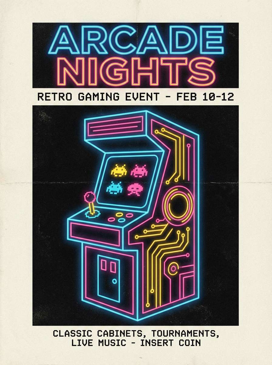
21) Plum Arcade
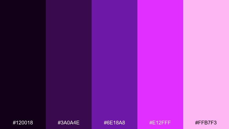
HEX: #120018 #3A0A4E #6E18A8 #E12FFF #FFB7F3
Mood: retro, loud, playful
Best for: arcade event poster and tickets
Retro and loud, it feels like arcade cabinets and synthwave lights. Use it for event posters, tickets, and playful promos that lean into nostalgia. Pair with dark backgrounds and a single pale pink highlight to keep the layout readable. Tip: apply the brightest violet only to icons and small bursts so the design does not vibrate.
Image example of plum arcade generated using media.io
22) Royal Magenta Script
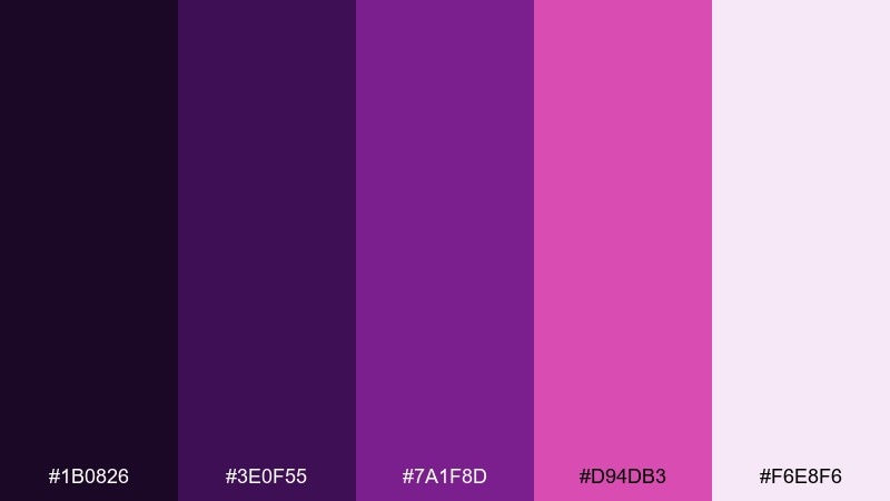
HEX: #1B0826 #3E0F55 #7A1F8D #D94DB3 #F6E8F6
Mood: regal, artistic, refined
Best for: luxury brand logo and identity system
Regal and refined, it calls up inked calligraphy with a magenta flourish. This purple magenta color scheme works for luxury identities, boutique logos, and packaging systems that need confidence and restraint. Pair with ivory, deep charcoal, and small metallic accents for a premium look. Tip: keep magenta as a signature detail in marks and patterns, while the deep purple carries most surfaces.
Image example of royal magenta script generated using media.io
What Colors Go Well with Purple Magenta?
Neutrals are the easiest win: crisp white, warm ivory, and charcoal help saturated magenta feel intentional instead of overwhelming. For darker palettes, near-black and deep eggplant keep contrast high and type readable.
For soft pairings, reach for lavender, blush, and pale lilac to create gentle gradients that still feel modern. If you want a sharper edge, add cool gray-blue or icy periwinkle highlights to make magenta look even brighter.
For print or premium branding, subtle metallics (muted gold or rose gold) and kraft-paper browns add warmth and sophistication without fighting magenta’s intensity.
How to Use a Purple Magenta Color Palette in Real Designs
Start with roles, not swatches. Use deep purples for backgrounds and text, mid-tones for large UI surfaces, and reserve the hottest magenta for actions (CTA buttons, selected tabs, notifications) so hierarchy stays clear.
Balance saturation with spacing. Purple magenta palettes look best with generous negative space and simple shapes—especially in posters, landing pages, and product ads where color is doing the heavy lifting.
Test accessibility early. For UI, verify contrast for small text on purple backgrounds, and consider using pale lavender or off-white text instead of pure white when glare becomes an issue.
Create Purple Magenta Palette Visuals with AI
If you already have HEX codes, you can turn them into realistic mockups (posters, packaging, UI screens) by describing the layout and lighting—and keeping the palette consistent across prompts. This helps you preview mood and contrast before committing to production files.
Media.io makes it simple to generate image examples, iterate on styles, and explore variations (dark mode, pastel tints, editorial layouts) in minutes—right in your browser.
Purple Magenta Color Palette FAQs
-
What is the difference between magenta and purple?
Magenta is a vivid pink-purple hue that sits closer to red on the color wheel, while purple is typically closer to blue. In design, magenta reads more energetic and playful; purple often feels deeper and more regal. -
Which neutral colors pair best with purple magenta?
Off-white/ivory, charcoal, cool grays, and near-black are the most reliable neutrals. They stabilize saturated magenta and help you keep strong contrast for typography and UI elements. -
Is purple magenta a good choice for branding?
Yes—especially for beauty, entertainment, fashion, and creator brands where you want a distinctive, expressive identity. Use deep purples as the foundation and treat bright magenta as a signature accent for logos, badges, or CTAs. -
How do I keep a purple magenta palette from looking too loud?
Limit the brightest fuchsia to small areas (buttons, highlights, icons) and give the design plenty of negative space. Pair it with darker plums and soft tints to create a smoother value range. -
What colors create strong contrast with purple magenta for UI?
Near-white, pale lavender, and very dark purple/black provide the clearest contrast. For data-heavy dashboards, keep charts mostly neutral and use magenta only to call attention to key metrics or active states. -
Do purple magenta palettes work for print materials?
They can look excellent in print, especially with creamy papers and restrained accents. For accurate output, request a proof and consider CMYK conversion, since very bright magentas may shift depending on inks and paper. -
How can I quickly visualize a purple magenta color scheme?
Use an AI text-to-image tool to generate mockups like posters, packaging, or UI screens from a prompt, then iterate by adjusting lighting, background darkness, and how much bright magenta you use in accents.
Next: Sunrise Color Palette


