

Light taupe (#d8cbbf) sits in that sweet spot between beige and gray, making it one of the most flexible neutrals for modern design. It brings warmth without turning yellow, and softness without feeling washed out.
Below are 20 light taupe color palette ideas with HEX codes—built for real-world use in interiors, branding, and UI—plus prompts you can use to generate matching visuals.
In this article
Why Light Taupe Palettes Work So Well
Light taupe is a “quiet” neutral that supports almost any style—minimal, rustic, modern, or romantic—because it balances warm and cool undertones. That balance helps it pair naturally with both earthy colors (terracotta, olive, cocoa) and cooler accents (slate, ink, lavender).
In digital design, light taupe reads softer than pure white and less clinical than cool gray, which makes it ideal for backgrounds, cards, and subtle UI surfaces. It also reduces glare while keeping contrast controllable for accessibility.
For interiors and print, light taupe creates a calm base that doesn’t fight with texture—linen, plaster, wood, paper, and metal finishes all look more natural next to it.
20+ Light Taupe Color Palette Ideas (with HEX Codes)
1) Linen Latte
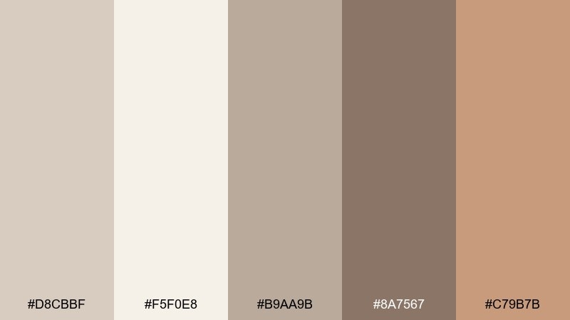
HEX: #d8cbbf #f5f0e8 #b9aa9b #8a7567 #c79b7b
Mood: cozy, airy, approachable
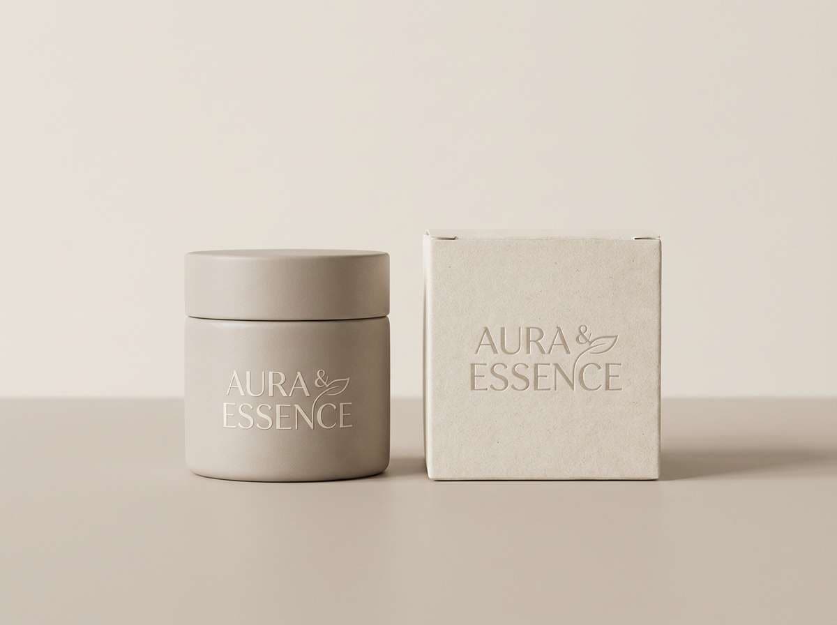
Best for: skincare packaging and wellness product labels
Cozy linen and milky coffee tones create a calm, welcoming feel that reads clean but not sterile. Use it for wellness packaging where you want softness, trust, and a premium-neutral vibe. Pair the taupe base with creamy white for breathing room, then use warm coppery tan for small highlights like seals or callouts. Tip: keep text in deep cocoa for legibility while letting the light tones do most of the work.
Image example of linen latte generated using media.io
Media.io is an online AI studio for creating and editing video, image, and audio in your browser.

2) Desert Clay
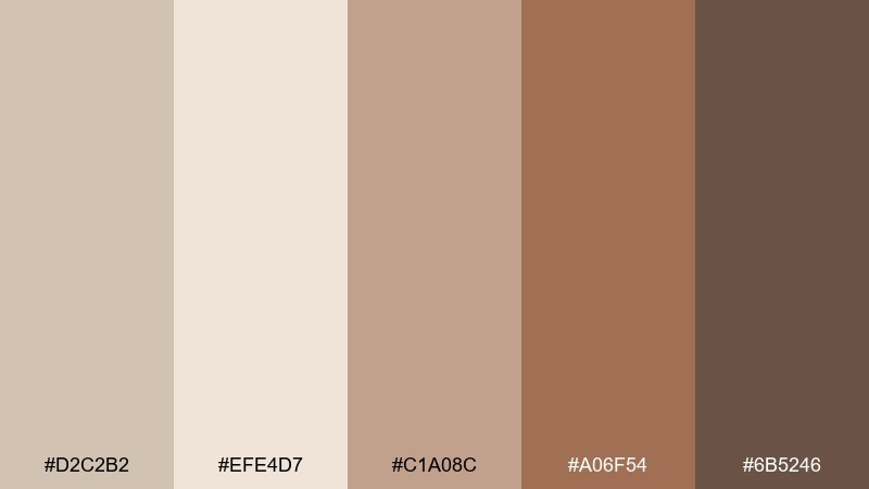
HEX: #d2c2b2 #efe4d7 #c1a08c #a06f54 #6b5246
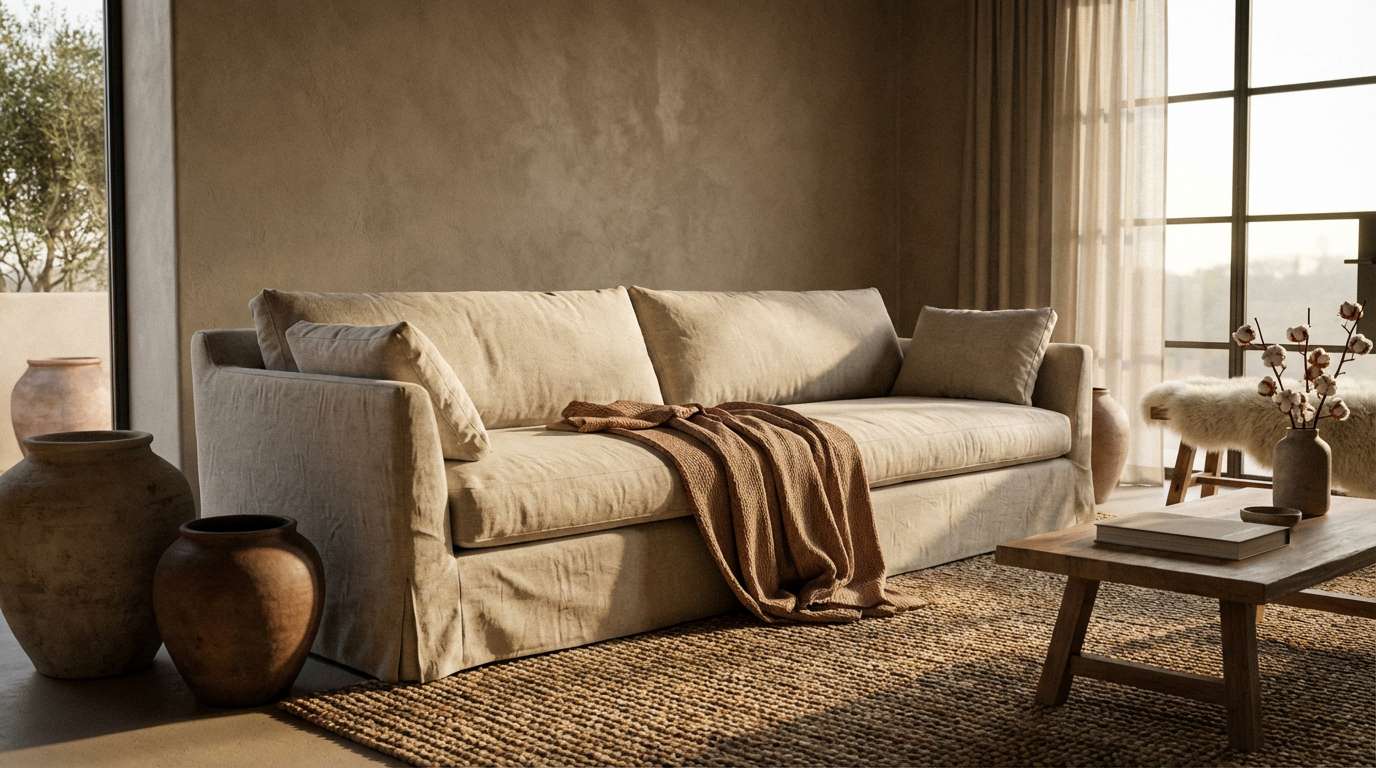
Mood: sunbaked, grounded, natural
Best for: southwest-inspired living room interiors
Sunbaked clay and sand hues evoke warm afternoons and textured plaster walls. These tones work beautifully on large surfaces like paint, rugs, and linen upholstery without feeling heavy. Pair the mid taupe with terracotta accents and bring in deep brown for contrast on hardware or frames. Tip: repeat the darkest shade in two small spots to keep the room cohesive.
Image example of desert clay generated using media.io
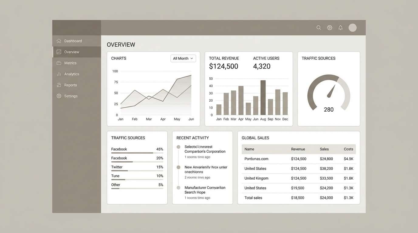
3) Modern Greige
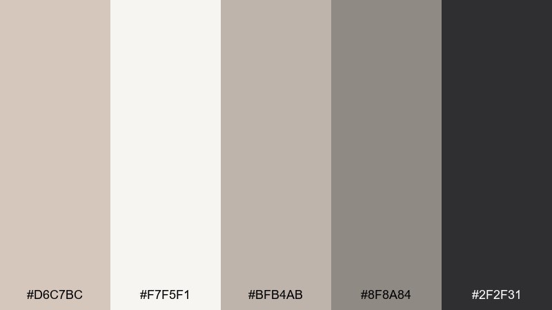
HEX: #d6c7bc #f7f5f1 #bfb4ab #8f8a84 #2f2f31
Mood: sleek, modern, balanced
Best for: SaaS dashboard UI and data-heavy layouts
Sleek greige neutrals give a composed, modern feel that stays out of the way of content. As a light taupe color palette, it supports dense dashboards by keeping backgrounds soft and type crisp. Pair the near-black with the palest off-white for strong hierarchy, and use mid greige for dividers, chips, and secondary cards. Tip: reserve the darkest tone for primary actions and key metrics only.
Image example of modern greige generated using media.io
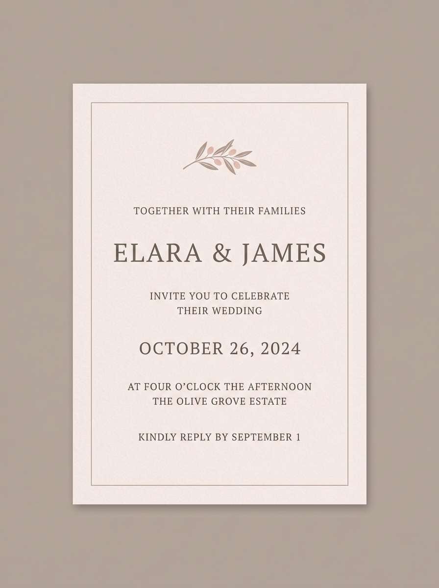
4) Blush Stone
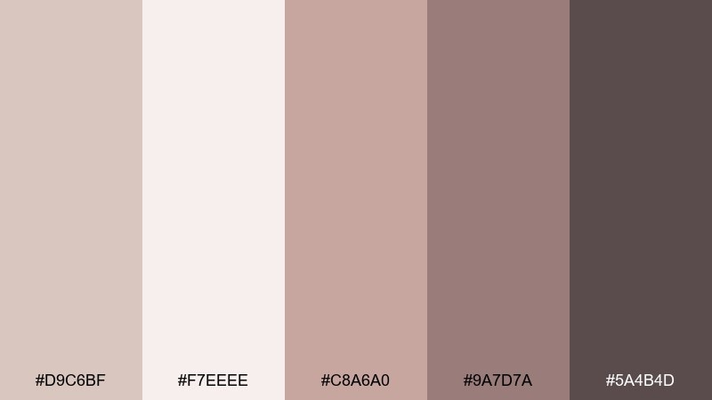
HEX: #d9c6bf #f7eeee #c8a6a0 #9a7d7a #5a4b4d
Mood: romantic, soft, refined
Best for: wedding invitations and day-of stationery
Soft blush washed over stone neutrals feels romantic without turning sugary. It shines on invitations where you want warmth, elegance, and a touch of vintage charm. Pair the pale blush with taupe as the main background and use the deeper mauve-brown for names and headings. Tip: print the darkest shade in letterpress or foil to add tactile contrast.
Image example of blush stone generated using media.io
5) Sage Taupe
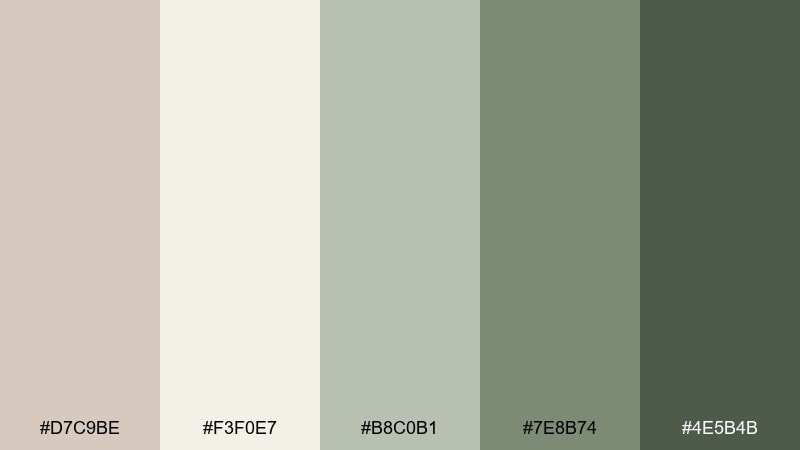
HEX: #d7c9be #f3f0e7 #b8c0b1 #7e8b74 #4e5b4b
Mood: fresh, calming, botanical
Best for: eco-friendly brand illustrations and labels
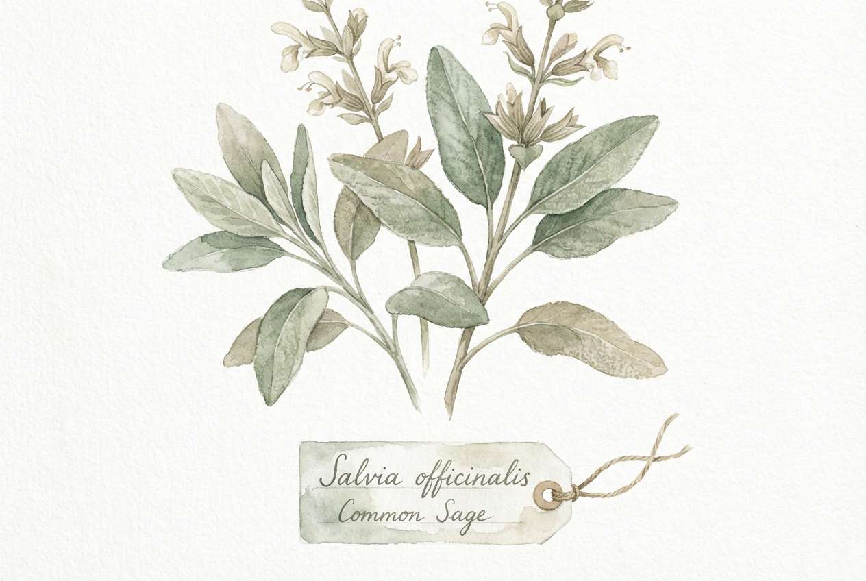
Gentle sage greens layered with warm taupe read like dried herbs and linen aprons. The mix feels calm and organic, perfect for sustainable brands that want to look modern yet earthy. Pair the muted green as a secondary accent with creamy neutrals for plenty of negative space. Tip: use the deep forest tone sparingly for stamps, icons, or ingredient highlights.
Image example of sage taupe generated using media.io
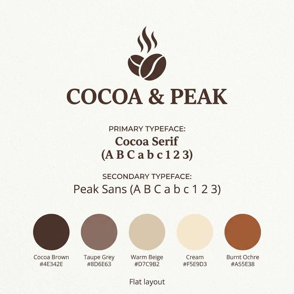
6) Cocoa Drift
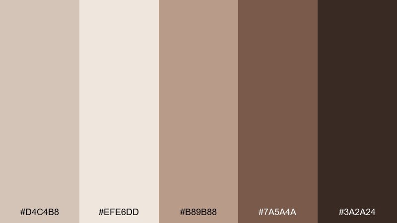
HEX: #d4c4b8 #efe6dd #b89b88 #7a5a4a #3a2a24
Mood: rich, comforting, artisan
Best for: coffee shop branding and menu accents
Rich cocoa and toasted latte tones feel comforting, like a warm mug in your hands. These light taupe color combinations are great for cafes that want craft energy without loud color. Pair the creamy beige with deep espresso for logos and headers, then let the mid taupe carry backgrounds and packaging. Tip: add the darkest shade only to the most important price or CTA so it stays premium, not busy.
Image example of cocoa drift generated using media.io
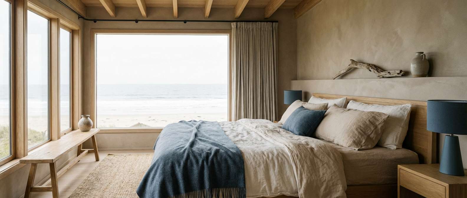
7) Coastal Dune
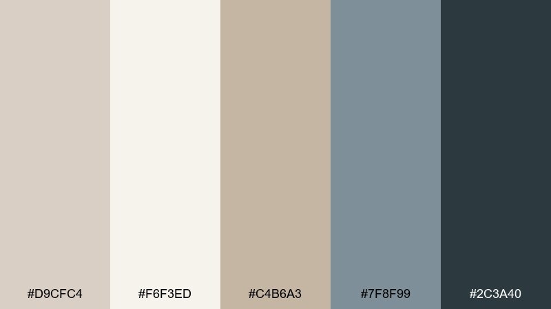
HEX: #d9cfc4 #f6f3ed #c4b6a3 #7f8f99 #2c3a40
Mood: breezy, coastal, relaxed
Best for: beach house bedroom styling
Breezy dune neutrals with cool sea-slate accents evoke driftwood, salt air, and calm mornings. Use the lightest shades for walls and bedding to keep the space bright, then anchor with slate blue-gray in throws or art. Pair the darkest tone with natural wood to add depth without losing the airy vibe. Tip: stick to matte finishes so the palette feels soft and lived-in.
Image example of coastal dune generated using media.io
8) Vintage Parchment
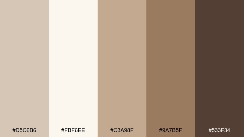
HEX: #d5c6b6 #fbf6ee #c3a98f #9a7b5f #533f34
Mood: nostalgic, bookish, warm
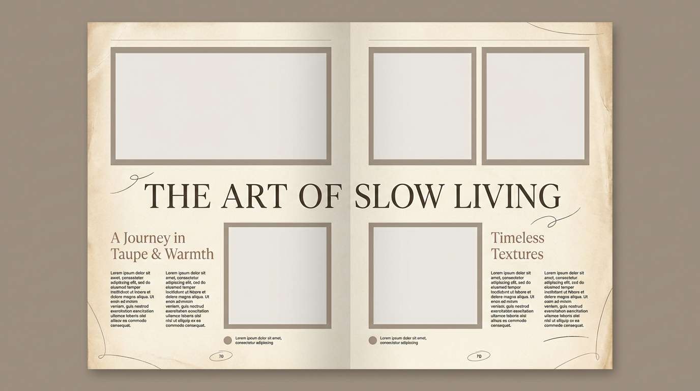
Best for: editorial spreads and lifestyle magazines
Aged parchment and antique tan tones bring a bookish, nostalgic atmosphere. They work well in editorial layouts where you want photography to feel warmer and typography to stay readable. Pair the cream background with chestnut headlines, and use the mid tan for pull quotes or section dividers. Tip: keep body text in the darkest brown and increase line spacing for an airy, premium look.
Image example of vintage parchment generated using media.io
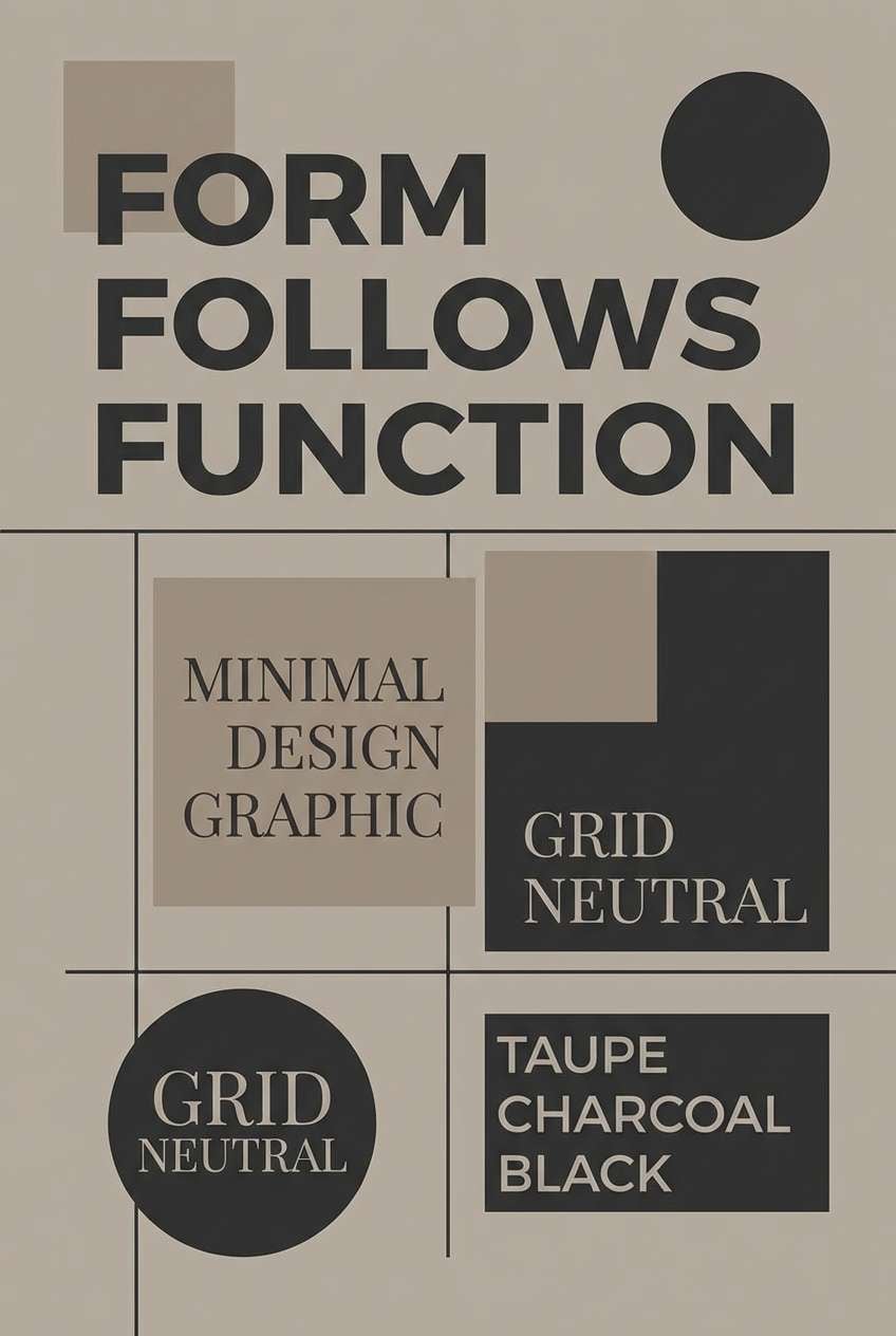
9) Charcoal Contrast
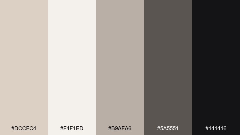
HEX: #dccfc4 #f4f1ed #b9afa6 #5a5551 #141416
Mood: bold, crisp, high-contrast
Best for: minimal posters and typography-led prints
Crisp taupe neutrals against inky charcoal feel bold and gallery-ready. A light taupe color combination like this is ideal when you want minimal design with strong readability. Pair the near-black for type and geometric shapes, and let the pale taupe hold the negative space. Tip: limit yourself to two type weights so the contrast comes from color, not clutter.
Image example of charcoal contrast generated using media.io
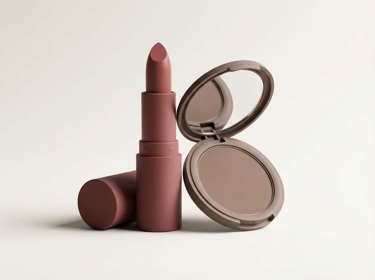
10) Dusty Rosewood
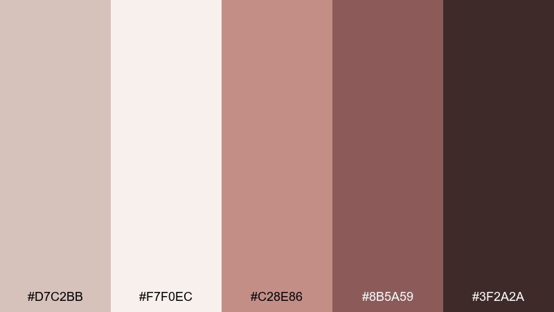
HEX: #d7c2bb #f7f0ec #c28e86 #8b5a59 #3f2a2a
Mood: sensual, warm, elevated
Best for: cosmetics product ads and hero images
Dusty rosewood and warm taupe create a sensual, elevated mood that feels modern and wearable. Use the soft blush-taupe for backgrounds and gradients, then bring in the deeper rose-brown for product names and key claims. Pair the near-black brown for fine print and ingredient lists to keep everything crisp. Tip: add subtle shadowing and keep highlights creamy, not pure white, for a luxe finish.
Image example of dusty rosewood generated using media.io
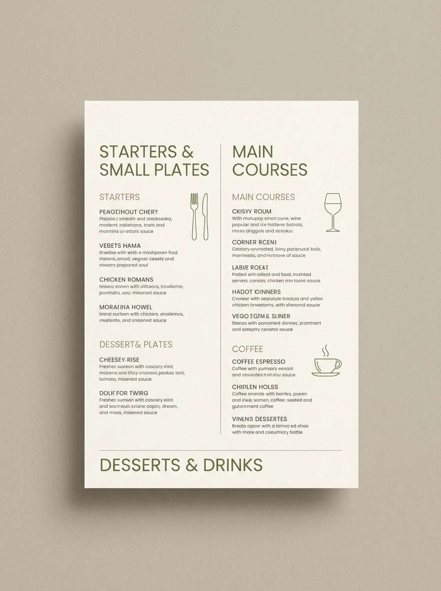
11) Olive Atelier
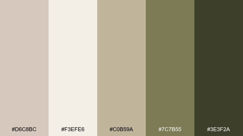
HEX: #d6c8bc #f3efe6 #c0b59a #7c7b55 #3e3f2a
Mood: rustic, curated, artisanal
Best for: restaurant menus and seasonal specials
Earthy olive and taupe tones feel like a small atelier kitchen with handwritten recipes. They suit menus where you want warmth, restraint, and a hint of farm-to-table character. Pair the creamy neutral as the main paper color with olive for section headers and icons. Tip: use the darkest shade for prices only so scanning stays effortless.
Image example of olive atelier generated using media.io
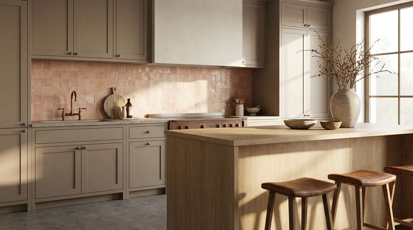
12) Soft Terracotta
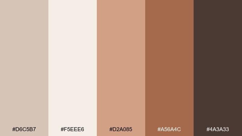
HEX: #d6c5b7 #f5eee6 #d2a085 #a56a4c #4a3a33
Mood: warm, inviting, handcrafted
Best for: kitchen cabinetry and backsplash concepts
Soft terracotta with creamy taupe feels inviting, like handmade tile and sunlit counters. These light taupe color combinations add warmth to kitchens without overpowering the space. Pair the pale neutrals for cabinets or walls, then use terracotta for backsplash details, bar stools, or ceramics. Tip: echo the darkest brown in hardware or lighting to tie the whole room together.
Image example of soft terracotta generated using media.io
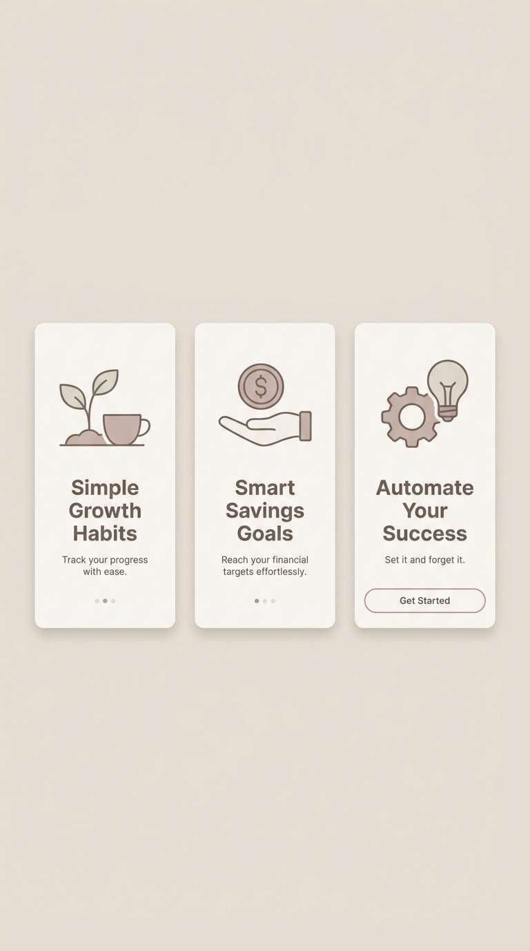
13) Misty Almond
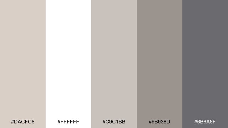
HEX: #dacfc6 #ffffff #c9c1bb #9b938d #6b6a6f
Mood: clean, gentle, understated
Best for: app onboarding and lightweight mobile UI
Misty almond neutrals feel clean and gentle, like fog over stone. They are ideal for onboarding screens where illustrations and microcopy need a quiet stage. Pair pure white for primary surfaces and use the mid taupe-gray for secondary buttons and form outlines. Tip: add one high-contrast text color and keep the rest of the UI in soft steps for a calm flow.
Image example of misty almond generated using media.io
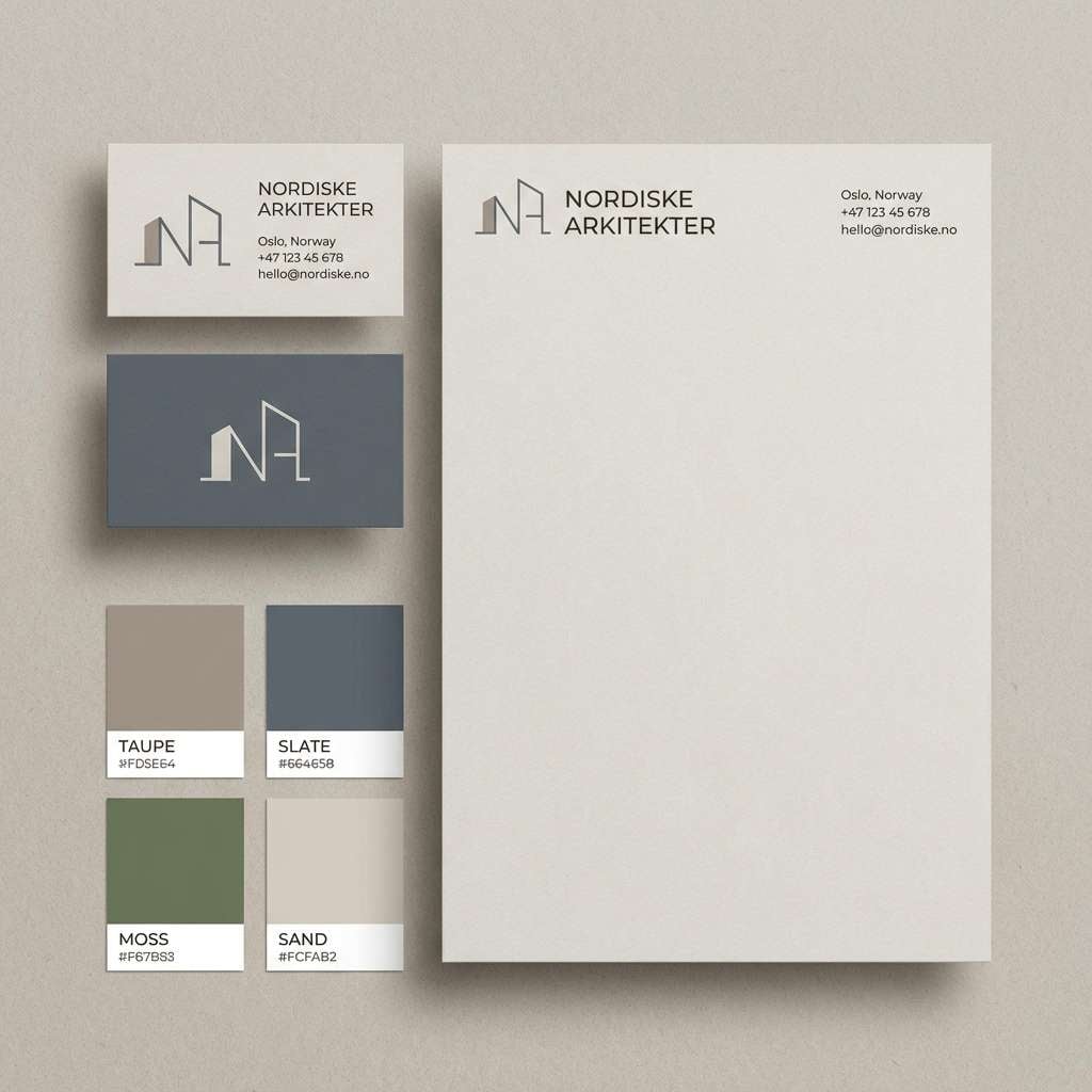
14) Nordic Minimal
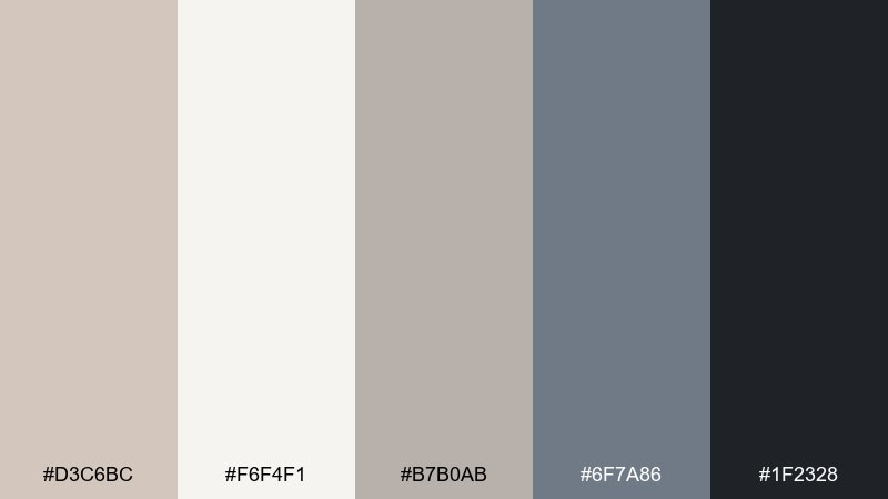
HEX: #d3c6bc #f6f4f1 #b7b0ab #6f7a86 #1f2328
Mood: cool, minimal, architectural
Best for: architecture studio branding systems
Cool neutrals with slate accents evoke concrete, glass, and clean lines. Use this light taupe color scheme for identity work that needs restraint while still feeling warm and human. Pair the pale taupe for stationery backgrounds with deep ink for logos and technical linework, and let slate sit in between for diagrams or subheads. Tip: keep color usage consistent across templates so every touchpoint feels designed, not decorated.
Image example of nordic minimal generated using media.io
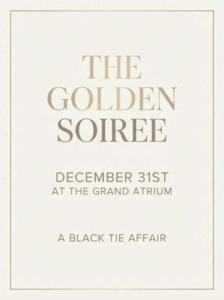
15) Champagne Dusk
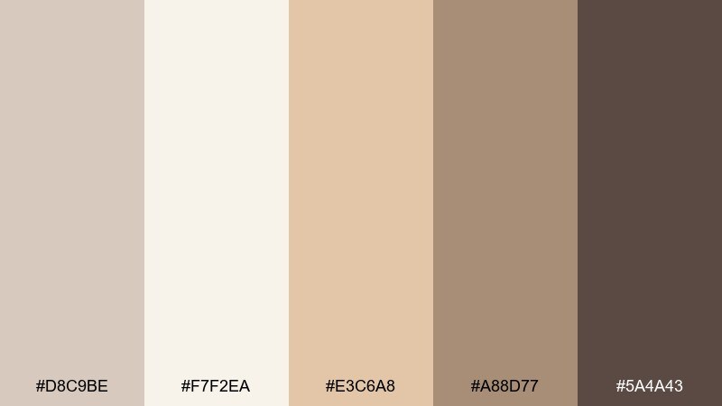
HEX: #d8c9be #f7f2ea #e3c6a8 #a88d77 #5a4a43
Mood: glowy, elegant, celebratory
Best for: event flyers and upscale announcements
Champagne warmth at dusk feels glowy and elegant, like candlelight on satin. As a light taupe color palette, it delivers softness while still looking polished for formal events. Pair creamy beige as the background with champagne-gold accents for lines, icons, or subtle gradients, then use the deeper taupe for the main headline. Tip: keep decorative elements thin and minimal so the colors read expensive, not busy.
Image example of champagne dusk generated using media.io
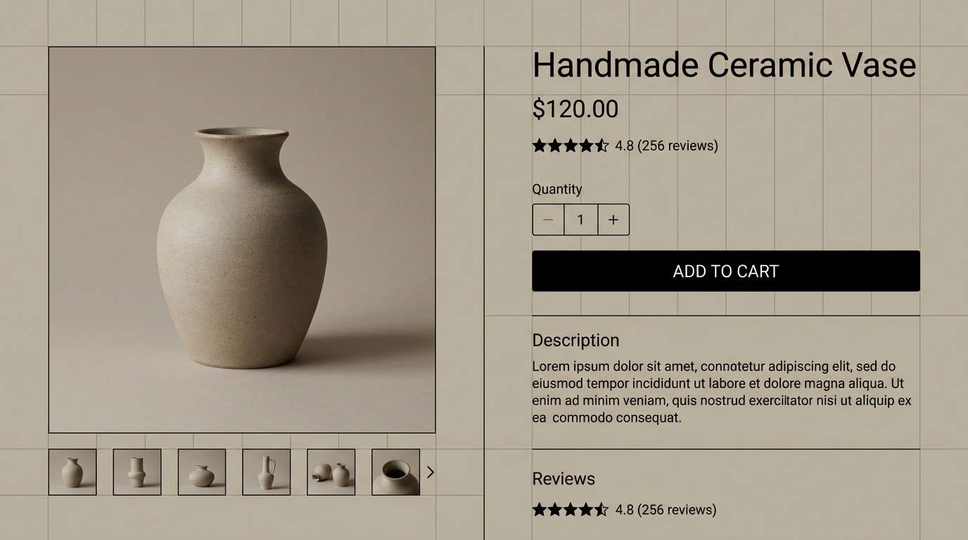
16) Ink and Sand
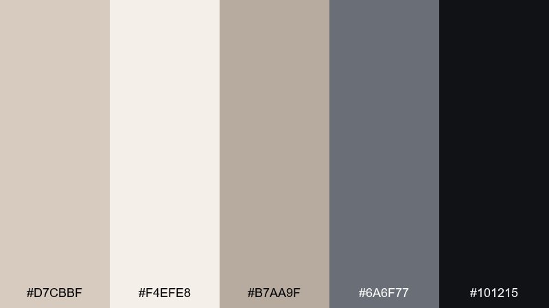
HEX: #d7cbbf #f4efe8 #b7aa9f #6a6f77 #101215
Mood: sharp, confident, editorial
Best for: ecommerce product page UI
Inky blacks over sand-taupe neutrals feel sharp, confident, and editorial. Use the light tones for page scaffolding and cards, then let the deep ink handle primary CTAs and pricing. Pair the cool gray-blue for secondary states like tabs, filters, and subtle badges. Tip: keep product photography consistent and allow generous whitespace so the interface feels premium.
Image example of ink and sand generated using media.io
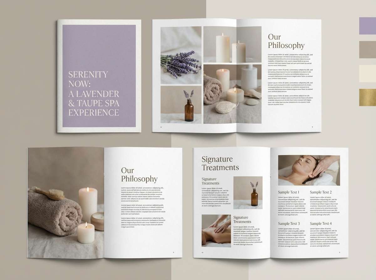
17) Lavender Taupe
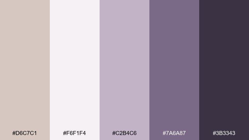
HEX: #d6c7c1 #f6f1f4 #c2b4c6 #7a6a87 #3b3343
Mood: soothing, spa-like, dreamy
Best for: spa brochures and service lookbooks
Muted lavender folded into taupe feels soothing and spa-like, like a quiet evening ritual. It works well for brochures where you want calm elegance without leaning too feminine or too stark. Pair the pale blush-lilac as the page base, then use the deeper violet-gray for headings and section tabs. Tip: add soft gradients only in large blocks to avoid visual noise in small text areas.
Image example of lavender taupe generated using media.io
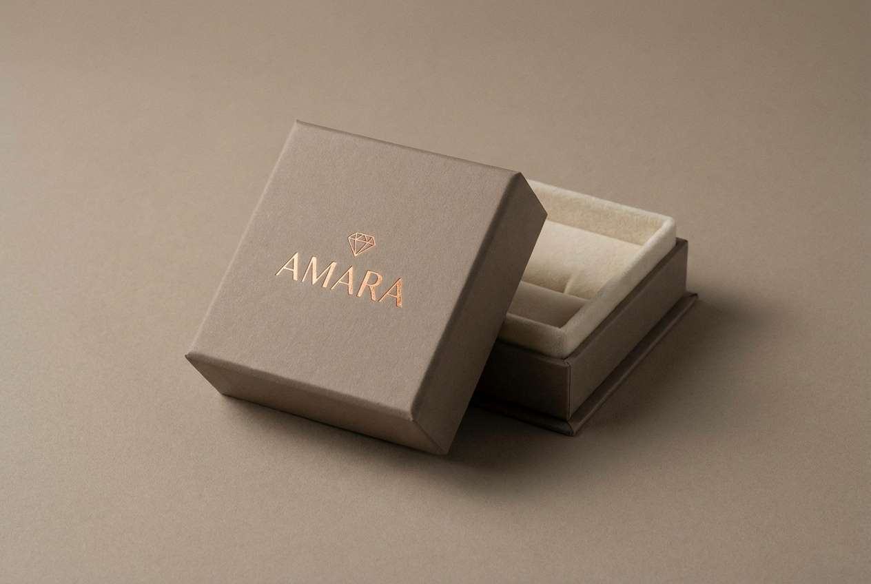
18) Copper Glow
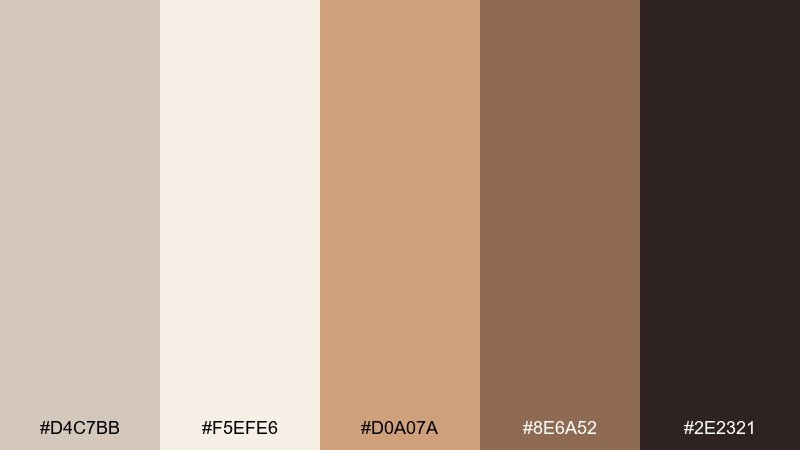
HEX: #d4c7bb #f5efe6 #d0a07a #8e6a52 #2e2321
Mood: luxurious, warm, radiant
Best for: jewelry packaging and gift boxes
Copper glow against soft taupe feels luxurious and radiant, like metal catching warm light. Use it for jewelry packaging where you want a premium look that still feels approachable. Pair cream for the box exterior, taupe for inner lining, and copper tones for foil logos or seals. Tip: keep the darkest shade for tiny details so the copper remains the star.
Image example of copper glow generated using media.io
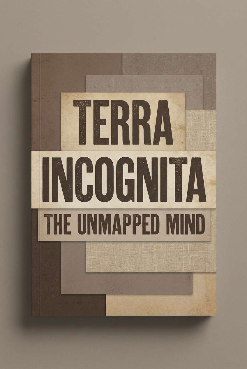
19) Midnight Mocha
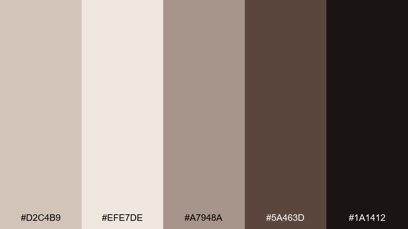
HEX: #d2c4b9 #efe7de #a7948a #5a463d #1a1412
Mood: moody, classic, intimate
Best for: book covers and literary posters
Moody mocha and warm taupe create an intimate, classic atmosphere that feels timeless. Use the lighter shades for negative space and title blocks, then bring in deep espresso for dramatic type and focal elements. Pair the mid browns for subtle texture bands or small ornaments. Tip: test the title at thumbnail size to make sure the darkest tone carries readability.
Image example of midnight mocha generated using media.io
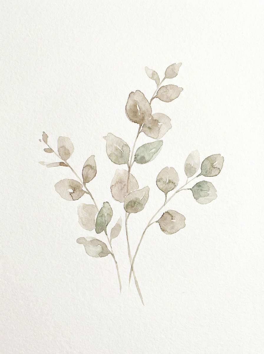
20) Airy Eucalyptus
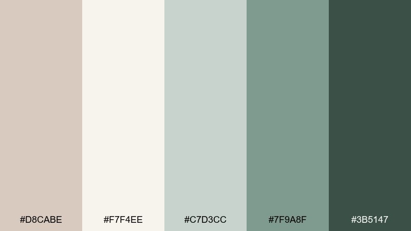
HEX: #d8cabe #f7f4ee #c7d3cc #7f9a8f #3b5147
Mood: fresh, light, restorative
Best for: nursery wall art and calming prints
Airy eucalyptus greens with warm taupe feel restorative, like fresh leaves in morning light. The soft contrast keeps wall art gentle and suitable for nurseries, bedrooms, or quiet corners. Pair the pale neutral for the background and use muted green for stems and simple shapes, finishing with the deep green for a small signature detail. Tip: keep brush textures visible to preserve the handmade calm.
Image example of airy eucalyptus generated using media.io
What Colors Go Well with Light Taupe?
Light taupe pairs beautifully with creamy whites, warm beiges, and cocoa browns for an easy monochrome neutral story. This is a reliable route for interiors and packaging where texture and materials should lead.
For modern contrast, add ink/charcoal, slate blue-gray, or deep forest green. These cooler, darker tones sharpen hierarchy in UI and keep print typography highly readable.
If you want a softer accent, try blush, dusty rose, lavender-gray, champagne gold, or muted terracotta. They keep the palette warm and inviting while adding personality.
How to Use a Light Taupe Color Palette in Real Designs
Start with light taupe as the base surface (backgrounds, walls, paper, large UI panels), then layer two mid-tones for structure (cards, dividers, upholstery, secondary blocks). Reserve one deep shade for type, icons, frames, and key actions.
To keep neutrals from feeling flat, mix finishes and textures: matte + gloss, linen + metal, or paper grain + flat color. Light taupe is especially good at making those material differences feel intentional.
For brand systems, keep your accent color usage consistent (e.g., copper only for seals and CTAs; olive only for headers and icons). Consistency is what makes a neutral palette feel premium instead of bland.
Create Light Taupe Palette Visuals with AI
If you’re building a moodboard, a brand pitch, or UI mockups, generating consistent palette visuals can speed up decisions. Use a prompt that describes subject, lighting, style, and your taupe/neutral color direction.
With Media.io’s text-to-image tool, you can create matching lifestyle scenes, product mockups, and graphic layouts that fit your chosen light taupe palette—then iterate quickly by adjusting one detail at a time.
Light Taupe Color Palette FAQs
-
What is the HEX code for light taupe in this article?
A commonly used light taupe base here is #d8cbbf. It’s a warm-leaning neutral that works well as a background, base paint, or UI surface. -
Is light taupe warm or cool?
Light taupe is typically balanced (a mix of beige warmth and gray coolness). The exact feel depends on surrounding colors—pair it with cream/terracotta to warm it up, or slate/charcoal to cool it down. -
What color text looks best on light taupe backgrounds?
Deep cocoa, charcoal, or near-black usually provides the cleanest readability. For accessible UI, test contrast with your exact taupe shade and avoid mid-grays that can look low-contrast. -
What are the best accent colors for a light taupe palette?
Great accents include sage/olive greens, slate blue-gray, dusty rose, lavender-gray, terracotta, and metallics like champagne or copper. Choose one accent and repeat it consistently. -
Does light taupe work for modern UI design?
Yes. Light taupe can replace stark white to reduce glare while still feeling clean. Use it for page scaffolding and cards, then rely on darker neutrals for hierarchy and CTAs. -
How do I keep a taupe palette from looking flat?
Build in tonal steps (at least one very light and one very dark shade) and add texture/finish contrast—linen, paper grain, matte paint, brushed metal, or subtle shadows in UI. -
Can I generate palette-based mockups automatically?
Yes. You can use Media.io text-to-image prompts that specify the scene, materials, and lighting, then iterate until the visuals match your light taupe color scheme.


