

A purple dark blue color palette is one of the most versatile “mood-first” combinations you can use in modern design. It can feel cinematic and luxurious, but also clean and technical depending on your accents.
Below are 20 curated purple-and-deep-blue pairings with HEX codes, plus practical guidance for contrast, branding, UI, and poster layouts.
In this article
- Why Purple Dark Blue Palettes Work So Well
-
- midnight orchid
- nebula velvet
- indigo dusk
- royal amethyst
- cosmic iris
- nightfall lavender
- deep sea plum
- galaxy grape
- cathedral violet
- sapphire mulberry
- twilight bloom
- neon violet pulse
- inkberry luxe
- moonlit periwinkle
- aubergine storm
- lavender noir
- electric hyacinth
- frosted iris
- plum observatory
- violet harbor
- What Colors Go Well with Purple Dark Blue?
- How to Use a Purple Dark Blue Color Palette in Real Designs
- Create Purple Dark Blue Palette Visuals with AI
Why Purple Dark Blue Palettes Work So Well
Purple brings creativity and personality, while dark blue adds trust and structure. Together, they create a balanced color story that can swing from “premium” to “playful” without losing cohesion.
These palettes also excel in dark-mode interfaces and night-themed posters because the deep bases provide natural contrast. You can keep layouts calm with muted tints or push energy with neon accents (cyan, mint, pink, or gold).
Most importantly, purple + navy/indigo tends to photograph and render beautifully across screens, which makes it reliable for branding systems, UI components, and marketing creatives.
20+ Purple Dark Blue Color Palette Ideas (with HEX Codes)
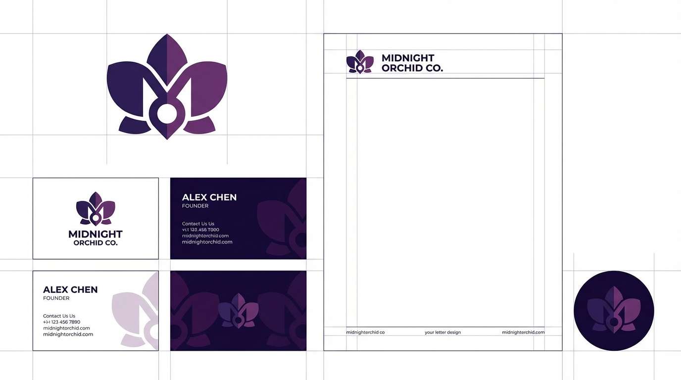
1) Midnight Orchid
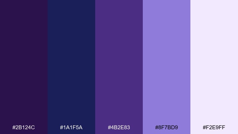
HEX: #2B124C #1A1F5A #4B2E83 #8F7BD9 #F2E9FF
Mood: mysterious, elegant, modern
Best for: branding and logo system
Mysterious and polished, it feels like velvet petals under a midnight sky. The deep bases keep layouts grounded while the lilac highlight adds a clean, premium glow. Use this purple dark blue color palette for logos, stationery, or landing pages that need confidence without feeling harsh. Pair with matte black or warm ivory, and reserve the lightest tint for whitespace and small highlights.
Image example of midnight orchid generated using media.io
Media.io is an online AI studio for creating and editing video, image, and audio in your browser.

2) Nebula Velvet
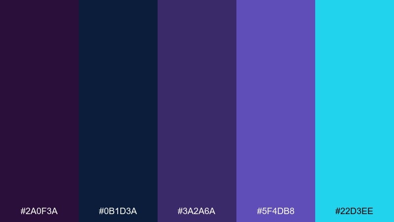
HEX: #2A0F3A #0B1D3A #3A2A6A #5F4DB8 #22D3EE
Mood: cosmic, energetic, futuristic
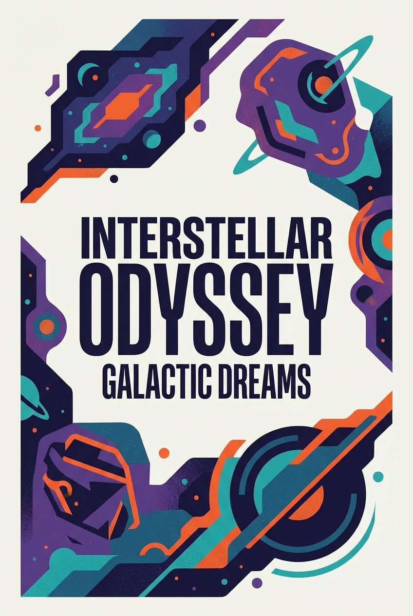
Best for: sci fi poster design
Cosmic and electric, it reads like a nebula streak cutting through deep space. The cyan accent pops against the darker tones, making headlines and focal elements feel alive. Use it on posters with large type, bold shapes, and plenty of negative space for contrast. Keep the bright accent to one or two elements so the composition stays sleek instead of noisy.
Image example of nebula velvet generated using media.io
3) Indigo Dusk
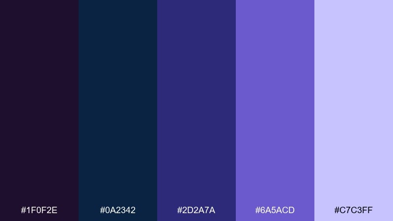
HEX: #1F0F2E #0A2342 #2D2A7A #6A5ACD #C7C3FF
Mood: calm, thoughtful, understated
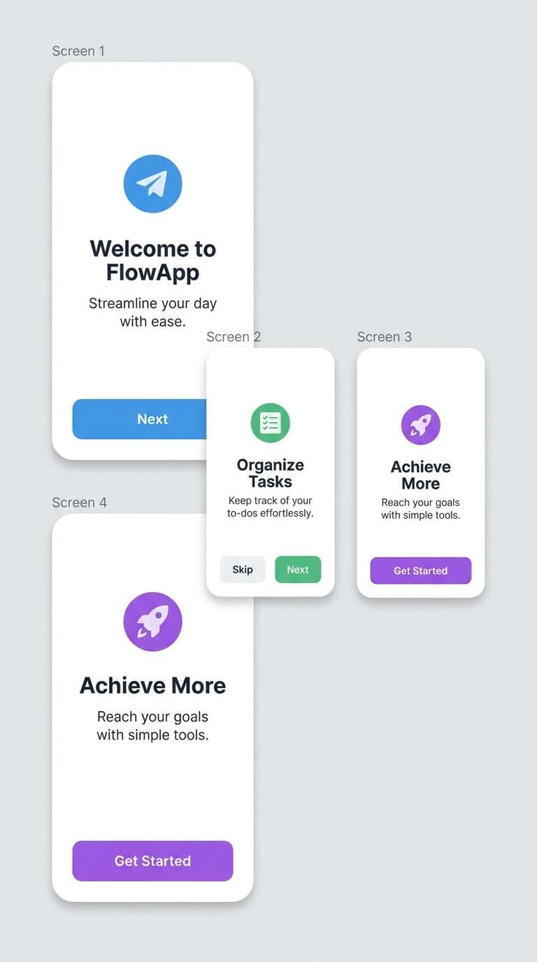
Best for: mobile app onboarding ui
Calm and introspective, it feels like the last light fading over a quiet city. The step-up from near-black to soft periwinkle makes it easy to build readable onboarding screens. Use the pale tint for cards and the deeper blues for navigation and headers. Add subtle gradients sparingly to guide the eye through each step without overwhelming the copy.
Image example of indigo dusk generated using media.io
4) Royal Amethyst
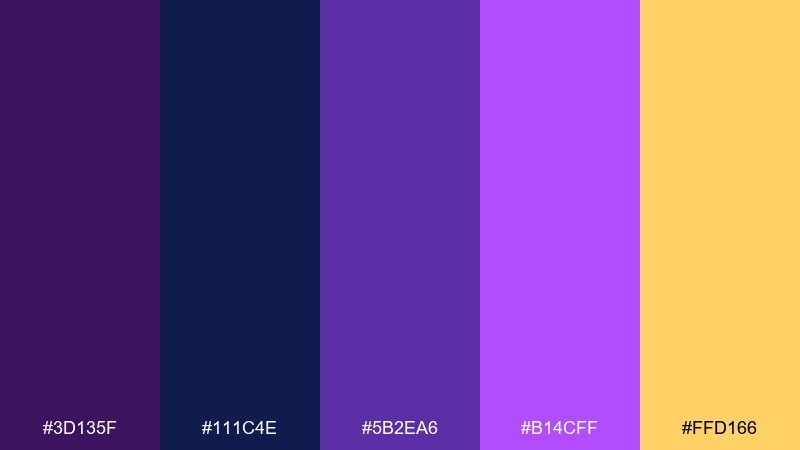
HEX: #3D135F #111C4E #5B2EA6 #B14CFF #FFD166
Mood: regal, celebratory, bold
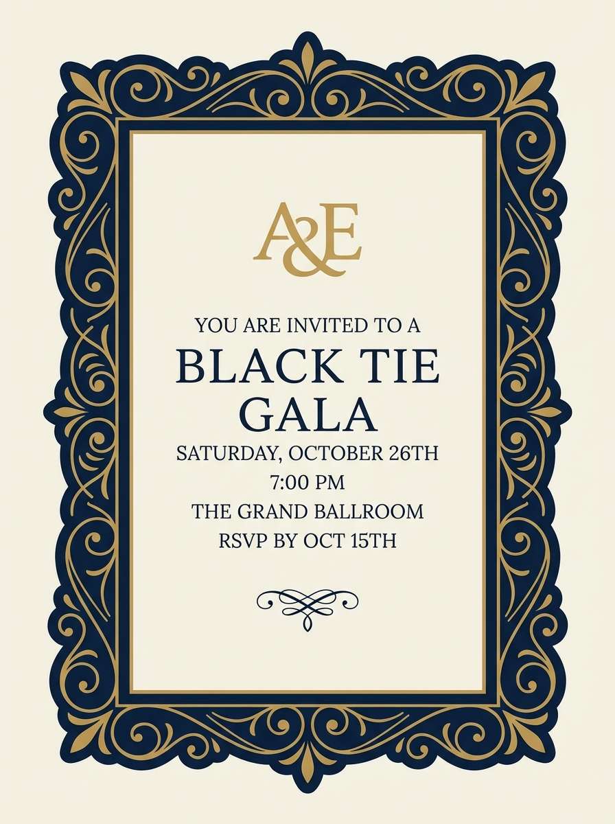
Best for: luxury event invitation
Regal and celebratory, it suggests gemstones lit by candlelight. The gold note turns the deeper hues into one of those purple dark blue color combinations that instantly feels upscale. Use it for invitations with foil-like accents, monograms, and elegant serif type. Keep gold for borders and small ornaments, and let the dark blue handle the background for maximum drama.
Image example of royal amethyst generated using media.io
5) Cosmic Iris
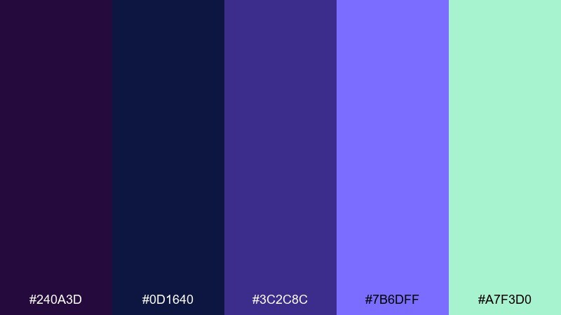
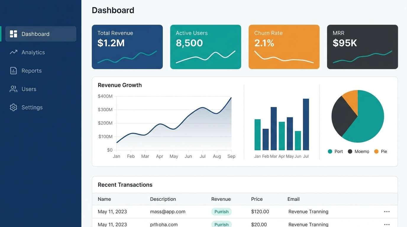
HEX: #240A3D #0D1640 #3C2C8C #7B6DFF #A7F3D0
Mood: techy, crisp, optimistic
Best for: saas dashboard ui
Techy and crisp, it brings a space-lab clarity to dark surfaces. The mint accent adds freshness, turning the set into a purple dark blue color scheme that still feels friendly. Use it for dashboards with clear hierarchy: deep tones for frames, indigo for charts, and mint for success states. Tip: test contrast on data labels early so small text stays legible on dark panels.
Image example of cosmic iris generated using media.io
6) Nightfall Lavender
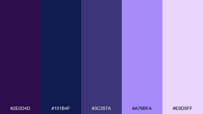
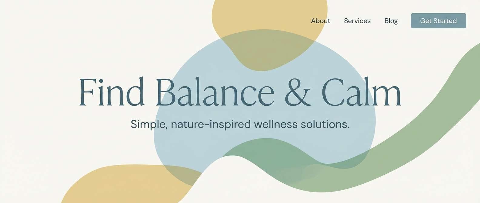
HEX: #2E0D4D #101B4F #3C357A #A78BFA #E9D5FF
Mood: soothing, gentle, dreamy
Best for: wellness blog hero
Soothing and dreamy, it looks like lavender fields under a twilight haze. The soft tints make headlines feel airy while the deeper tones keep buttons and nav stable. Use it for wellness, journaling, or meditation content where calm readability matters. Pair with warm off-white and minimal line icons, and keep shadows subtle for a serene finish.
Image example of nightfall lavender generated using media.io
7) Deep Sea Plum
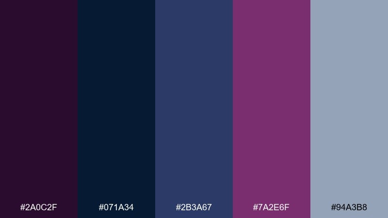
HEX: #2A0C2F #071A34 #2B3A67 #7A2E6F #94A3B8
Mood: serious, grounded, professional
Best for: corporate report slides
Serious and grounded, it evokes deep water and polished stone. The slate note is perfect for charts, gridlines, and secondary text without turning muddy. Use it for decks where clarity and credibility are non-negotiable. Tip: reserve the plum for key callouts and section dividers so the narrative stays easy to scan.
Image example of deep sea plum generated using media.io
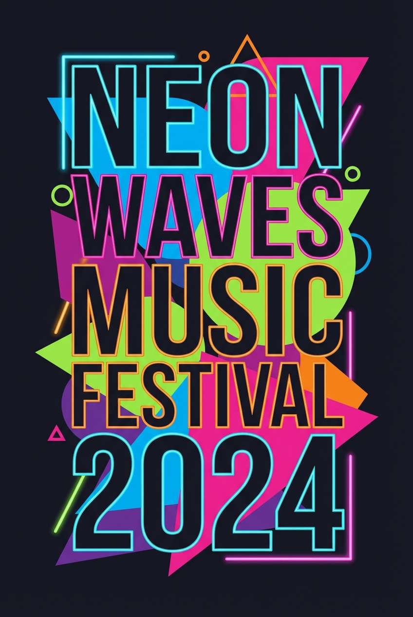
8) Galaxy Grape
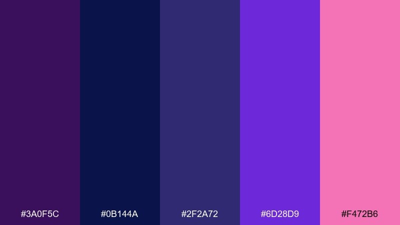
HEX: #3A0F5C #0B144A #2F2A72 #6D28D9 #F472B6
Mood: playful, bold, nightlife
Best for: music festival poster
Playful and bold, it feels like neon lights spilling across a night street. The pink accent gives the purples a modern edge that works especially well with big typography. Use it for festival posters, playlists, or album promos that need energy without going full rainbow. Pair with crisp white type and keep the darkest blue as your background anchor.
Image example of galaxy grape generated using media.io
9) Cathedral Violet
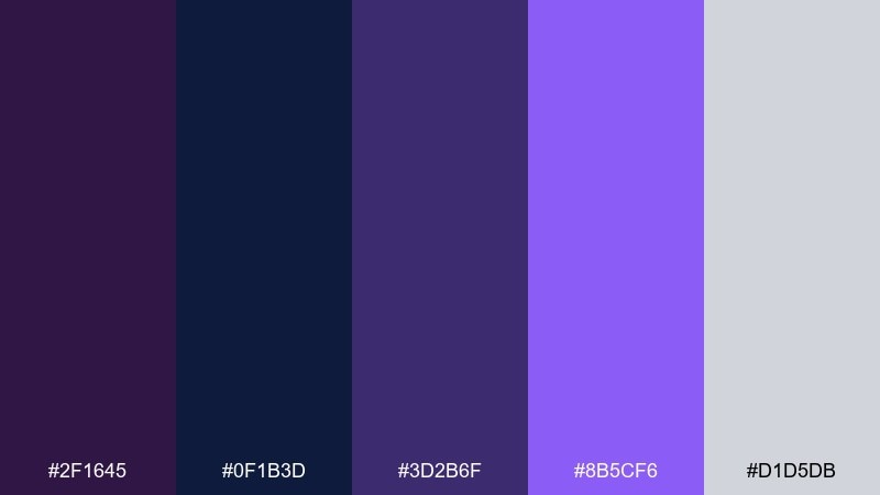
HEX: #2F1645 #0F1B3D #3D2B6F #8B5CF6 #D1D5DB
Mood: classic, refined, literary
Best for: book cover design
Classic and refined, it brings to mind stained glass and quiet libraries. The silver-gray works like a modern neutral for subtitle text and author names. Use it for fiction covers, essays, or poetry collections with a sophisticated tone. Tip: choose one strong violet for the title and keep supporting text in the gray to avoid visual clutter.
Image example of cathedral violet generated using media.io
10) Sapphire Mulberry
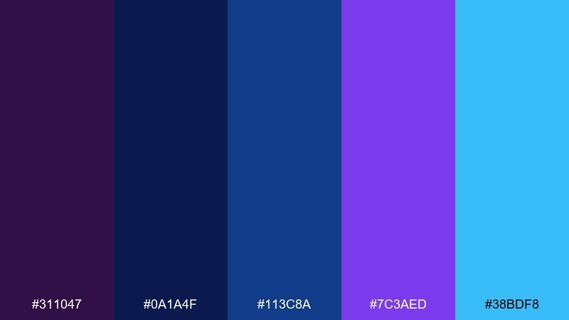
HEX: #311047 #0A1A4F #113C8A #7C3AED #38BDF8
Mood: confident, clean, high-contrast
Best for: e commerce product ad
Confident and clean, it reads like a sharp spotlight on satin fabric. The bright cyan-blue makes calls to action feel immediate, one of the most practical purple dark blue color combinations for digital ads. Use it for ecommerce banners, feature callouts, and product launches with a modern tech vibe. Keep product shots on white or very dark navy, then use the violet for price tags and badges.
Image example of sapphire mulberry generated using media.io
11) Twilight Bloom
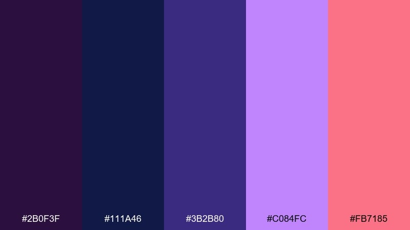
HEX: #2B0F3F #111A46 #3B2B80 #C084FC #FB7185
Mood: romantic, vibrant, youthful
Best for: social media carousel
Romantic and vibrant, it feels like twilight flowers catching the last pink light. The warm accent makes the palette friendly for lifestyle content and quote cards. Use it in carousels with clear slides: one dominant dark background, one bright headline color, and one accent for highlights. Tip: keep body text in a very light lavender so readability stays high on dark frames.
Image example of twilight bloom generated using media.io
12) Neon Violet Pulse
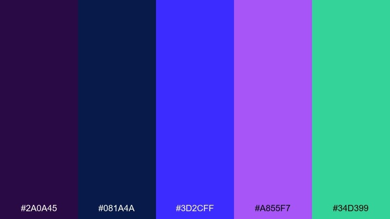
HEX: #2A0A45 #081A4A #3D2CFF #A855F7 #34D399
Mood: electric, sporty, streaming-ready
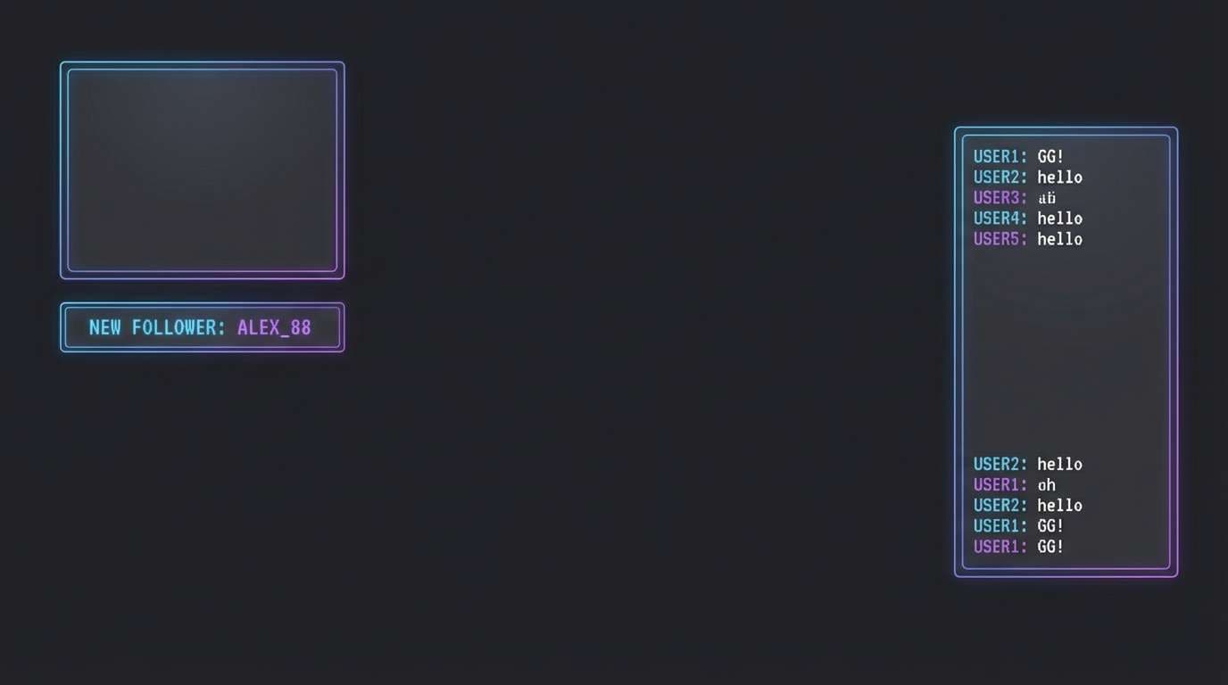
Best for: gaming stream overlay
Electric and punchy, it looks like a power-up glow on a dark arena floor. Neon accents play nicely with gradients, giving panels and alerts instant focus. Use this purple dark blue color palette for stream overlays, esports banners, or energetic creator branding. Tip: keep the brightest colors for status elements only, so the main content area stays readable.
Image example of neon violet pulse generated using media.io
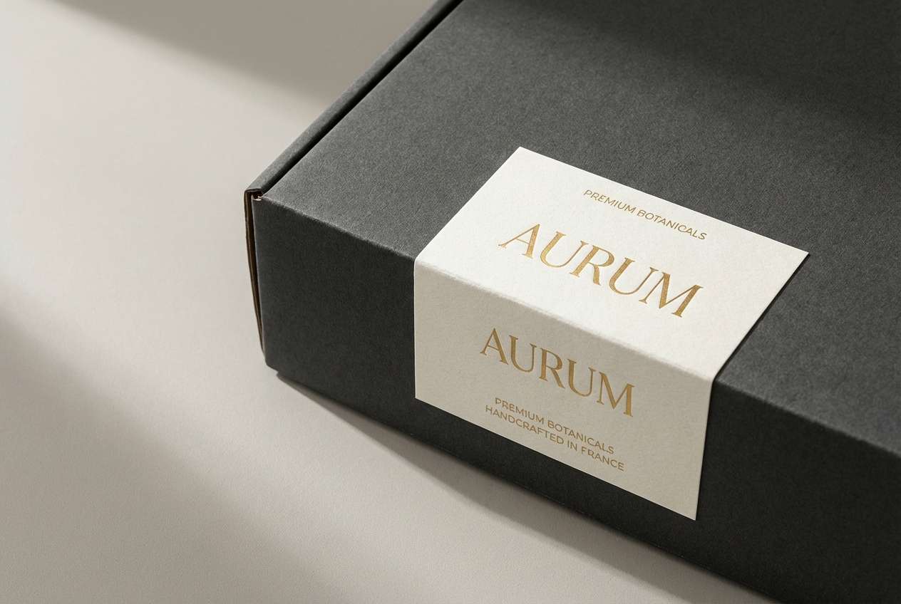
13) Inkberry Luxe
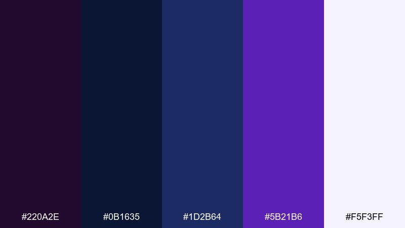
HEX: #220A2E #0B1635 #1D2B64 #5B21B6 #F5F3FF
Mood: premium, minimal, editorial
Best for: premium packaging
Premium and minimal, it has an ink-on-paper elegance that feels expensive. The near-white tint gives space for labels while the dark tones create a strong shelf silhouette. Use it for cosmetics, candles, or boutique food where you want a quiet luxury vibe. Tip: combine the deepest tone with a soft-touch finish, then use the violet for a single mark or seal.
Image example of inkberry luxe generated using media.io
14) Moonlit Periwinkle
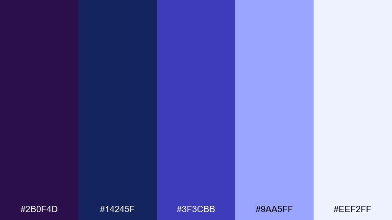
HEX: #2B0F4D #14245F #3F3CBB #9AA5FF #EEF2FF
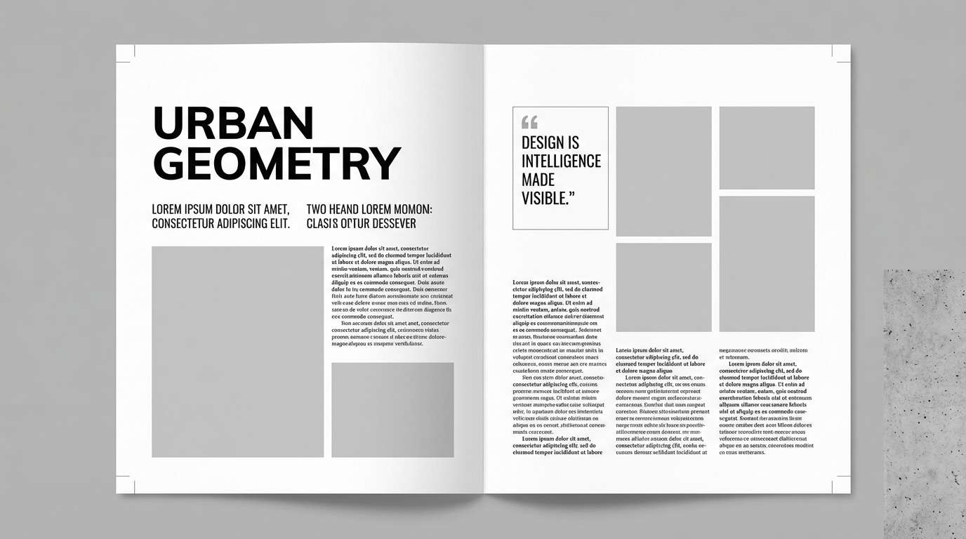
Mood: airy, luminous, modern
Best for: editorial magazine spread
Airy and luminous, it suggests moonlight reflecting off clouds. The light periwinkle supports clean columns and pull quotes without washing out photos. Use it for fashion or culture features where you want a cool, contemporary tone. Tip: keep image captions in the darkest blue and reserve the palest tint for margins and negative space.
Image example of moonlit periwinkle generated using media.io
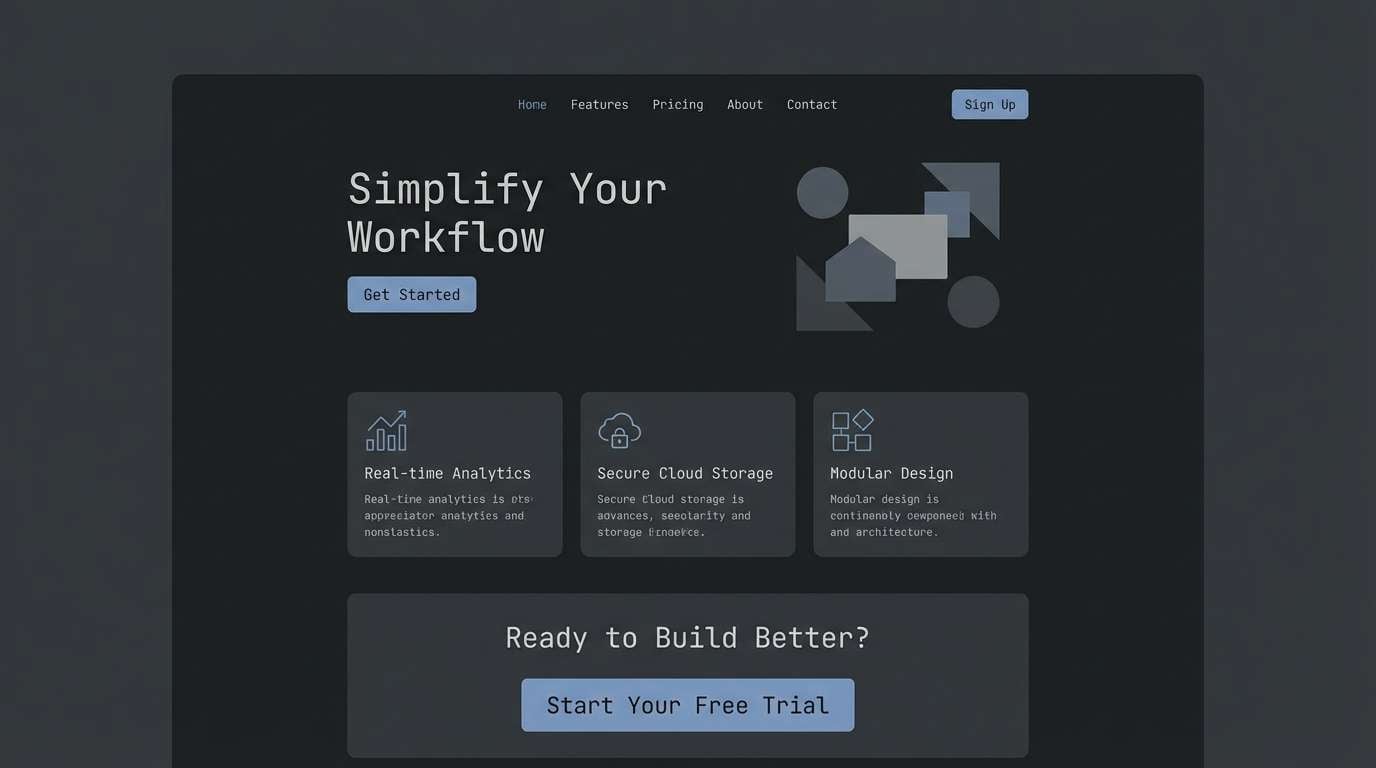
15) Aubergine Storm
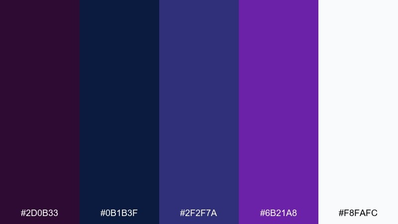
HEX: #2D0B33 #0B1B3F #2F2F7A #6B21A8 #F8FAFC
Mood: dramatic, sleek, confident
Best for: minimalist website theme
Dramatic and sleek, it feels like thunderclouds with a violet flash. The clean near-white makes type and UI spacing look intentional and sharp. Use it as a dark-mode foundation where headers, cards, and buttons need clear separation. Among purple dark blue color combinations, this one shines when you keep accents limited and let typography do the heavy lifting.
Image example of aubergine storm generated using media.io
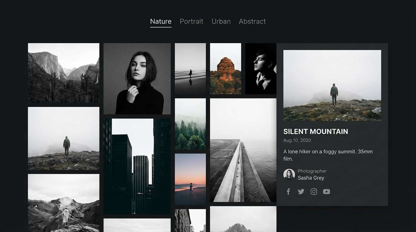
16) Lavender Noir
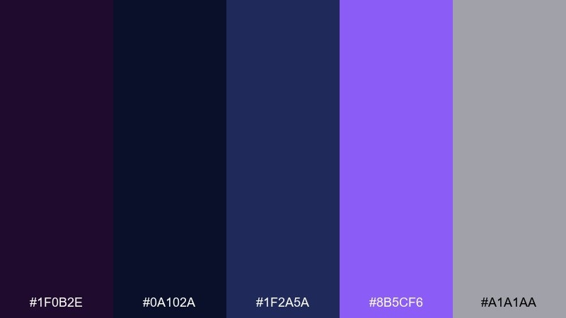
HEX: #1F0B2E #0A102A #1F2A5A #8B5CF6 #A1A1AA
Mood: moody, artistic, gallery-like
Best for: photography portfolio ui
Moody and gallery-like, it frames images the way a dark wall elevates prints. The gray helps with subtle UI elements like dividers and metadata. Use it for portfolios where the work needs to lead and navigation should stay quiet. Tip: keep thumbnail borders minimal and use the violet only for hover states and selected filters.
Image example of lavender noir generated using media.io
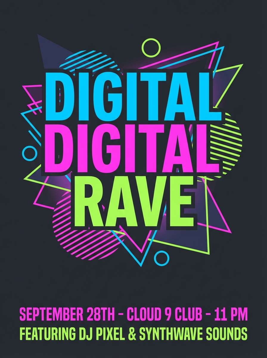
17) Electric Hyacinth
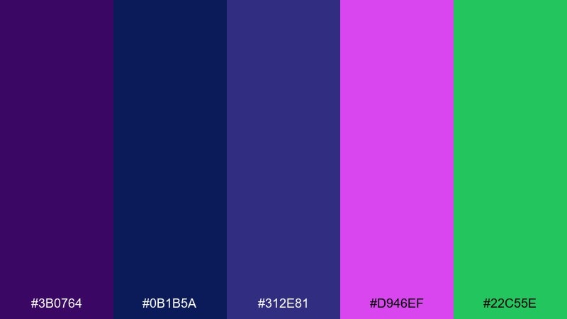
HEX: #3B0764 #0B1B5A #312E81 #D946EF #22C55E
Mood: loud, edgy, nightlife
Best for: nightclub flyer
Loud and edgy, it feels like laser beams and bass drops. The green accent adds a sharp twist that keeps the purples from feeling too sweet. Use it for flyers with big type, high contrast, and geometric patterning. Tip: stick to two font weights and let the color contrast do the work for readability at a glance.
Image example of electric hyacinth generated using media.io
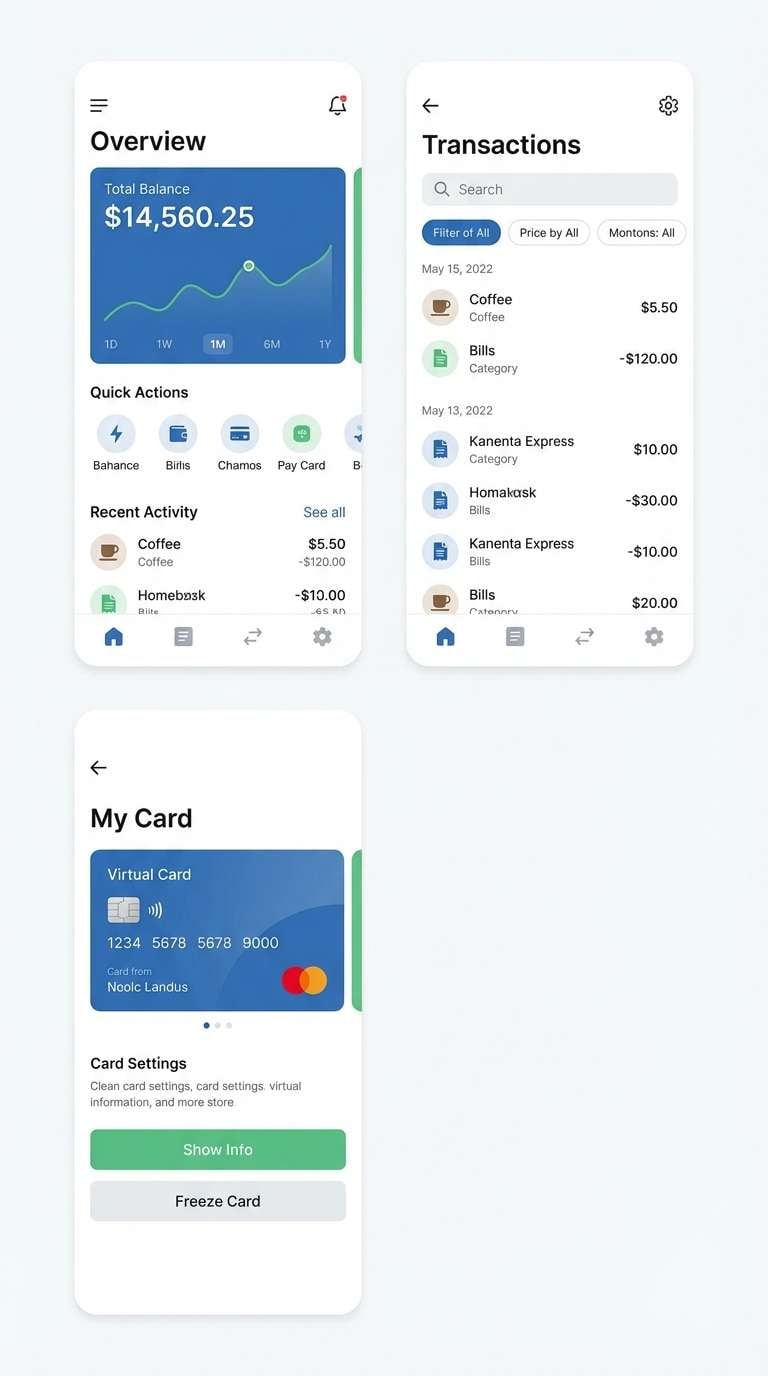
18) Frosted Iris
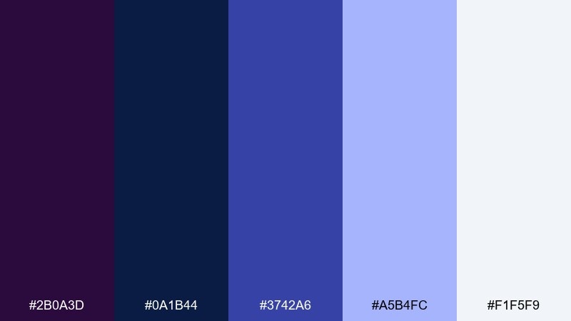
HEX: #2B0A3D #0A1B44 #3742A6 #A5B4FC #F1F5F9
Mood: cool, crisp, trustworthy
Best for: fintech app ui
Cool and crisp, it evokes frosted glass over deep water. The light tints help build trustworthy screens while still feeling modern and slightly futuristic. Use this purple dark blue color scheme for fintech UI where states, charts, and buttons need consistent contrast. Tip: map the lightest shades to surfaces and keep the saturated blue for primary actions to avoid visual fatigue.
Image example of frosted iris generated using media.io
19) Plum Observatory
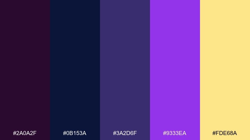
HEX: #2A0A2F #0B153A #3A2D6F #9333EA #FDE68A
Mood: curious, scholarly, warm-accented
Best for: classroom presentation template
Curious and scholarly, it feels like a night observatory with warm lamplight. The buttery accent keeps the deep tones approachable for long-form reading. Use it for lesson slides, webinars, or research summaries with diagrams and callouts. Tip: place the warm yellow on key definitions or quiz answers and keep everything else in the cooler tones for focus.
Image example of plum observatory generated using media.io
20) Violet Harbor
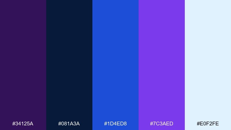
HEX: #34125A #081A3A #1D4ED8 #7C3AED #E0F2FE
Mood: fresh, coastal-night, adventurous
Best for: travel brochure cover
Fresh and adventurous, it suggests harbor lights against a night coastline. The bright blue adds clarity and movement, while the pale sky tint keeps layouts breathable. Use it on brochure covers where you want bold headlines and a modern travel vibe. Tip: set the title in the lightest tint over the darkest base, and use the bright blue for route lines or small icons.
Image example of violet harbor generated using media.io
What Colors Go Well with Purple Dark Blue?
Neutrals are the easiest wins: warm ivory, cool white, and soft grays keep purple-and-navy layouts readable and premium. If you want a darker, more editorial finish, add charcoal or matte black sparingly for depth.
For bolder contrast, choose bright accents like cyan, mint, hot pink, or electric blue. These pop cleanly against deep bases and are ideal for CTAs, badges, and chart highlights.
To make the palette feel luxe or ceremonial, introduce a warm metallic-like accent such as gold or buttery yellow. Keep it minimal (borders, icons, small ornaments) so it reads as intentional rather than distracting.
How to Use a Purple Dark Blue Color Palette in Real Designs
Start with role assignment: use the darkest blue/purple as the background anchor, mid-tones for surfaces (cards, sections), and the lightest tint for whitespace, dividers, and readable text areas. This keeps hierarchy clear in both print and digital layouts.
In UI, keep your accent color count low. A single bright accent (cyan/mint/pink/gold) reserved for primary actions and key states will improve scanning and reduce visual fatigue—especially in dashboards and onboarding flows.
For posters and social graphics, lean into contrast: big typography on dark bases, then use one neon or warm accent to direct attention. If you use gradients, keep them subtle and consistent (e.g., deep navy to indigo) so the design still feels cohesive.
Create Purple Dark Blue Palette Visuals with AI
If you want to preview how these HEX combinations look in real designs—like posters, brand kits, packaging mockups, or UI screens—generate quick examples with AI. It’s a fast way to validate mood, contrast, and readability before production.
On Media.io, you can paste a prompt, specify an aspect ratio, and iterate variations until the palette balance feels right. Use your darkest tone as the base, then call out the accent color as “small highlights” to avoid overpowering the composition.
Purple Dark Blue Color Palette FAQs
-
What does a purple dark blue color palette communicate in branding?
It typically signals creativity (purple) plus reliability and professionalism (dark blue). Together they often feel premium, modern, and confident—great for tech, lifestyle, and luxury-adjacent brands. -
Is purple and navy a good combination for dark mode UI?
Yes. Deep navy and purple create smooth, low-glare backgrounds, while pale lavender or near-white tints keep text readable. Add one bright accent (cyan/mint/pink) for primary buttons and key states. -
Which accent color works best with purple dark blue?
Cyan and mint deliver the cleanest “pop” for digital interfaces, while gold or buttery yellow adds a more upscale, invitation-like feel. Hot pink is best when you want nightlife energy or a youthful tone. -
How do I keep text readable on purple dark blue backgrounds?
Use very light tints (off-white, pale lavender) for body text, and avoid mid-gray text on dark purple/blue because it can look muted. Test small sizes early, especially for UI labels and chart annotations. -
How many colors should I use from a 5-color palette?
A practical rule is 60/30/10: one main dark base, one supporting surface tone, and one accent for emphasis. Keep the remaining two as tints for spacing, borders, and subtle highlights. -
What’s the best purple dark blue palette for posters?
High-contrast sets with a neon accent (like cyan or pink) work best because they make headlines and focal elements stand out. Use the darkest blue as the background anchor and keep the accent limited to key elements. -
Can I generate mockups that match these HEX codes with AI?
Yes. Describe the design (e.g., “dashboard UI” or “event invitation”) and specify the palette as the dominant colors, then instruct the accent to appear only in small highlights. Media.io’s text-to-image tool is a quick way to iterate visuals before final design work.
Next: Gold Blue Color Palette


