Gold and blue is a modern classic: metallic warmth adds prestige, while blues bring calm clarity and structure. Together, they create contrast that feels confident rather than loud.
Below are gold blue color palette ideas you can use for branding, UI, weddings, packaging, and editorial layouts—each with HEX codes and an AI prompt you can reuse.
In this article
- Why Gold Blue Palettes Work So Well
-
- gilded harbor
- royal regatta
- midnight crown
- desert sapphire
- art deco bay
- celestial medal
- coastal treasure
- winter aurum
- museum velvet
- sunlit delft
- aurora trophy
- blueprint brass
- opal compass
- jazz age yacht
- lanternlit lagoon
- alpine crest
- noble atlas
- golden nebula
- heritage porcelain
- skyline bullion
- crownline editorial
- mariner emblem
- What Colors Go Well with Gold Blue?
- How to Use a Gold Blue Color Palette in Real Designs
- Create Gold Blue Palette Visuals with AI
Why Gold Blue Palettes Work So Well
Gold and blue naturally balance each other: gold feels premium and human, while blue signals reliability and calm. This contrast makes designs feel both aspirational and trustworthy.
Blue also provides strong structure for layouts—navigation, headings, and background blocks—while gold works best as a highlight. That division of labor helps you build clear hierarchy without adding extra colors.
Because gold can read “metallic” even when it’s a flat HEX value, gold-blue schemes are especially effective in branding, packaging, and UI where you want a luxury cue without heavy visuals.
20+ Gold Blue Color Palette Ideas (with HEX Codes)
1) Gilded Harbor
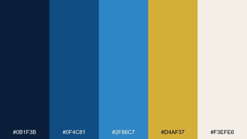
HEX: #0b1f3b #0f4c81 #2f86c7 #d4af37 #f3efe6
Mood: nautical, refined, confident
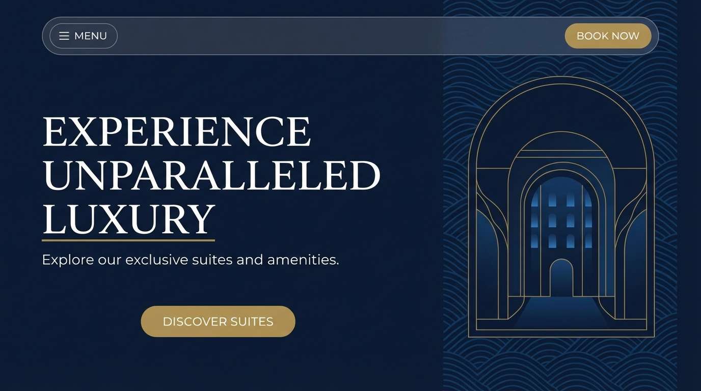
Best for: luxury hotel branding and website hero sections
Refined and nautical, it feels like polished brass on a deep harbor at dusk. Use it for premium hospitality, travel, and maritime brands where trust matters. Pair the gold with warm off-white typography and let the blues carry large backgrounds. Usage tip: keep gold to buttons, icons, and thin rules for a crisp upscale finish.
Image example of gilded harbor generated using media.io
Media.io is an online AI studio for creating and editing video, image, and audio in your browser.

2) Royal Regatta
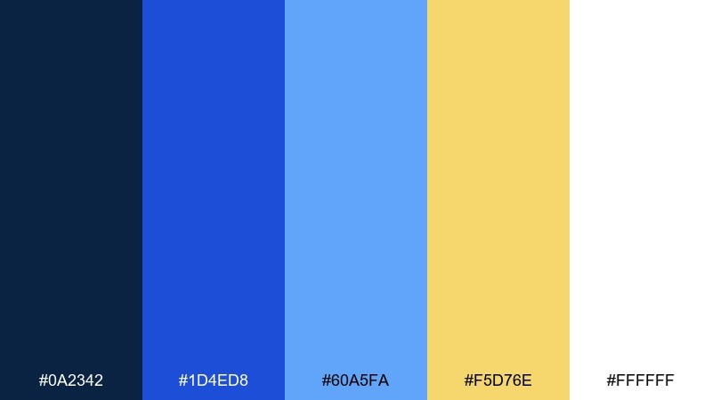
HEX: #0a2342 #1d4ed8 #60a5fa #f5d76e #ffffff
Mood: sporty, bright, celebratory
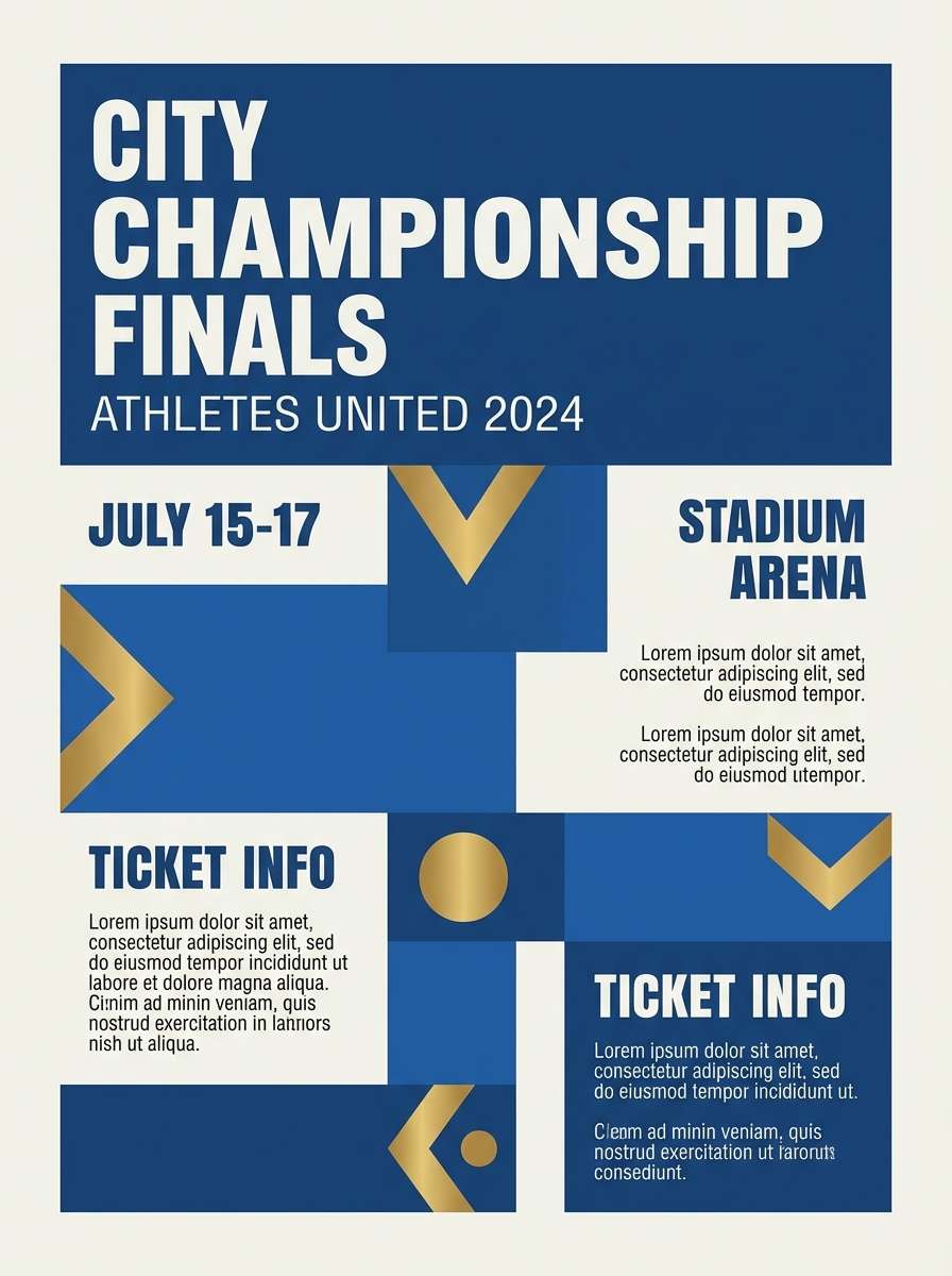
Best for: team posters and sports event promos
Sporty and celebratory, it reads like bright flags over open water. The vivid royal blue keeps energy high while soft gold adds trophy-level shine. Pair with clean sans-serif type and plenty of white space to avoid visual noise. Usage tip: reserve the light blue for secondary callouts and keep headlines in the deepest navy.
Image example of royal regatta generated using media.io
3) Midnight Crown
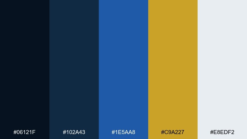
HEX: #06121f #102a43 #1e5aa8 #c9a227 #e8edf2
Mood: dramatic, regal, high-contrast
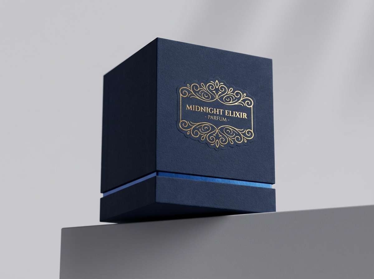
Best for: premium packaging and fragrance labels
Dramatic and regal, it evokes velvet night with a crown of metal. The near-black navy makes gold feel richer and more intentional. Pair with embossed textures, thin serif lettering, and minimal secondary colors. Usage tip: place gold only on the front label mark to keep the packaging from looking busy.
Image example of midnight crown generated using media.io
4) Desert Sapphire
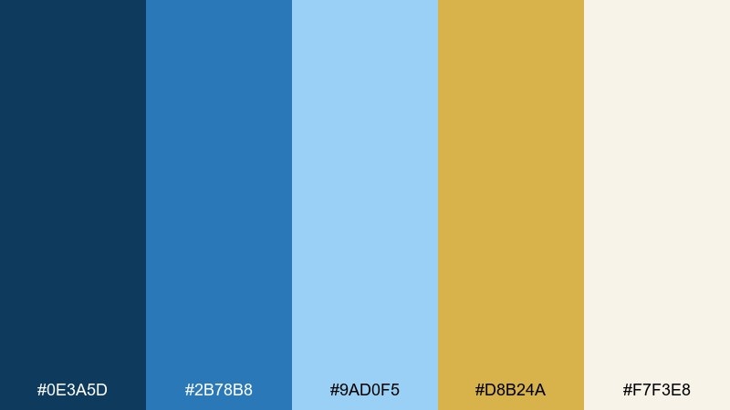
HEX: #0e3a5d #2b78b8 #9ad0f5 #d8b24a #f7f3e8
Mood: sunlit, airy, welcoming
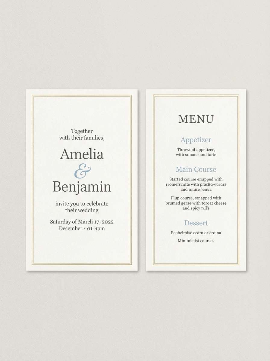
Best for: summer wedding invitations and menus
Sunlit and airy, it feels like sand-gold shimmer beside clear blue sky. The soft cream keeps the palette gentle and print-friendly. Pair with deckled paper textures or light watercolor washes for a romantic touch. Usage tip: use the gold as a thin border or monogram for elegant restraint.
Image example of desert sapphire generated using media.io
5) Art Deco Bay
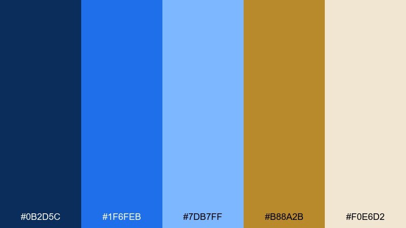
HEX: #0b2d5c #1f6feb #7db7ff #b88a2b #f0e6d2
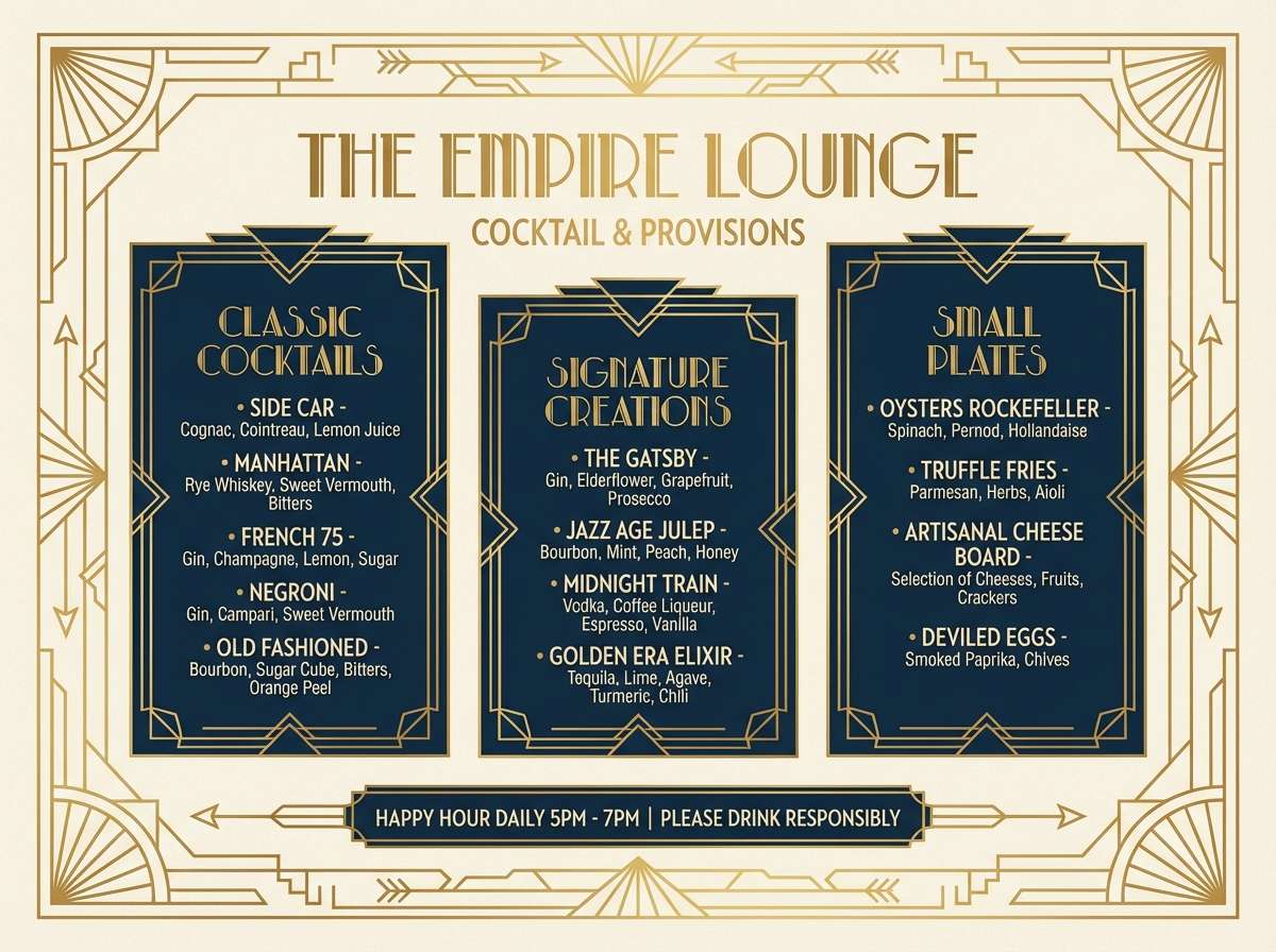
Mood: glamorous, geometric, vintage-modern
Best for: cocktail bar menus and nightlife branding
Glamorous and geometric, it nods to art deco gold lines against bold blue tiles. The warm metallic tone plays well with sharp angles and repeating patterns. Pair with black accents, thin dividers, and condensed display fonts. Usage tip: keep backgrounds in navy and use gold only for section headers and icons.
Image example of art deco bay generated using media.io
6) Celestial Medal
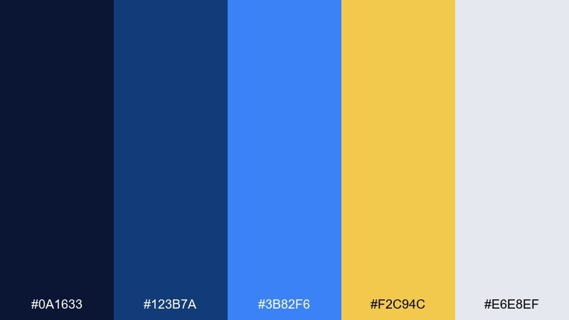
HEX: #0a1633 #123b7a #3b82f6 #f2c94c #e6e8ef
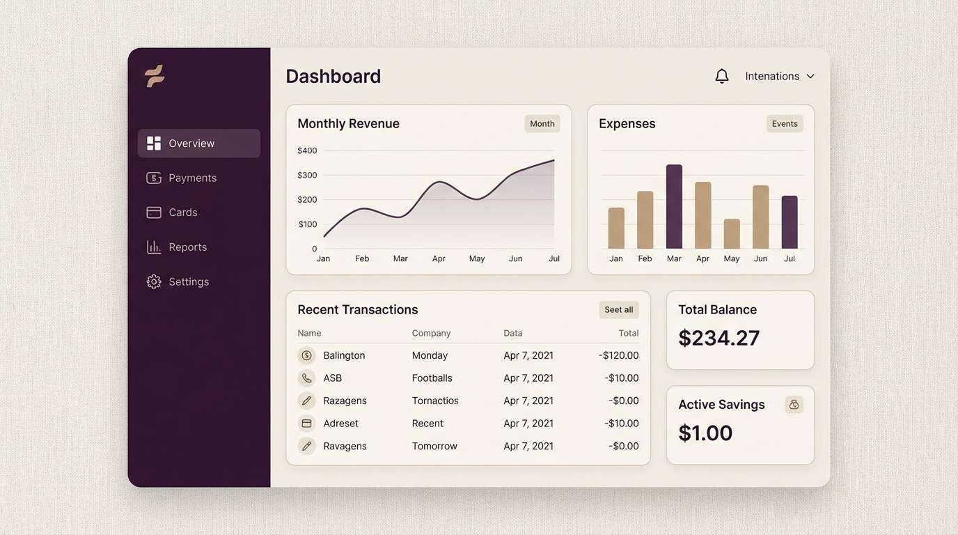
Mood: clean, tech-forward, optimistic
Best for: SaaS dashboards and fintech UI
Clean and tech-forward, it suggests starlight gold against a crisp midnight sky. The bright blue brings clarity for charts and interactive states. Pair with cool grays and plenty of spacing to keep complex screens readable. Usage tip: map gold to success highlights only, so it stays meaningful.
Image example of celestial medal generated using media.io
7) Coastal Treasure
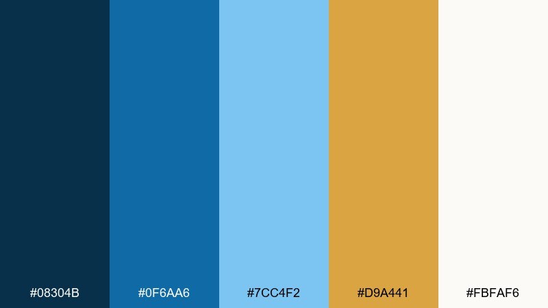
HEX: #08304b #0f6aa6 #7cc4f2 #d9a441 #fbfaf6
Mood: fresh, coastal, friendly
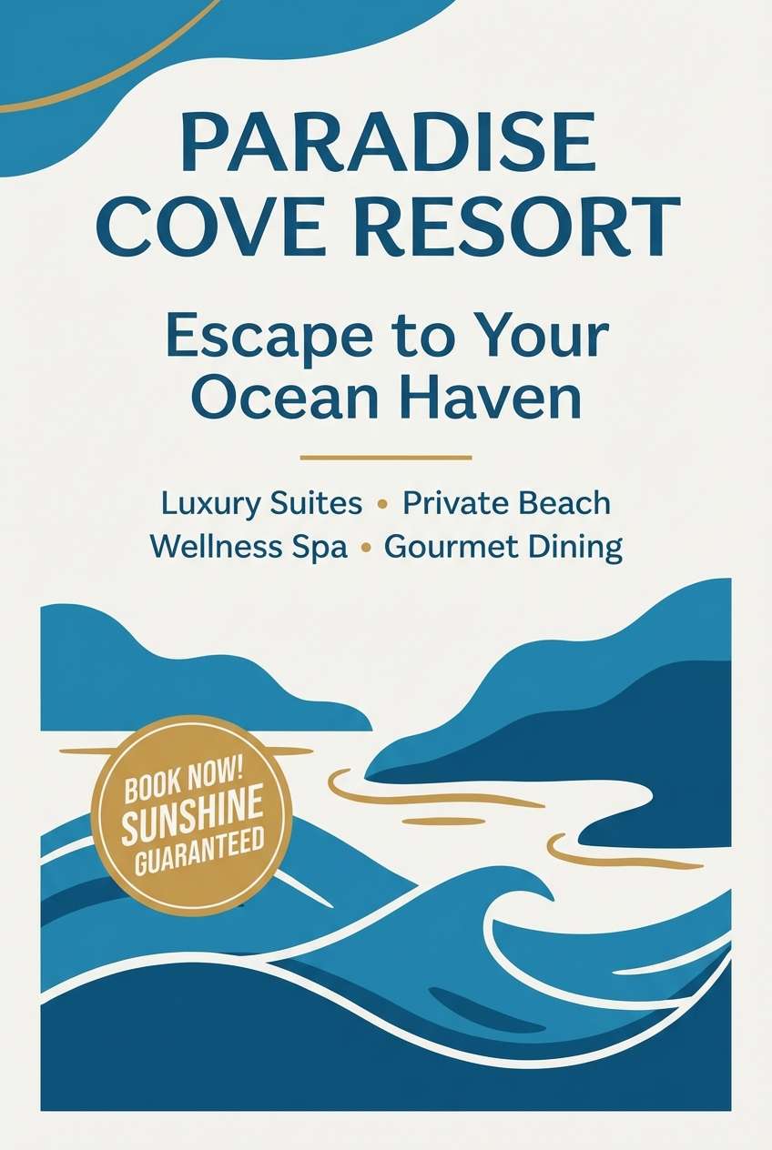
Best for: travel ads and beach resort social graphics
Fresh and coastal, it feels like sun on coins tucked into sea-blue water. The lighter blues keep it approachable for social posts and banners. Pair with sandy neutrals and playful rounded type for an inviting vibe. Usage tip: use the mid blue for buttons and the pale blue for backgrounds to maintain contrast.
Image example of coastal treasure generated using media.io
8) Winter Aurum
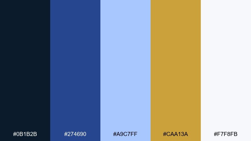
HEX: #0b1b2b #274690 #a9c7ff #caa13a #f7f8fb
Mood: cool, polished, minimal
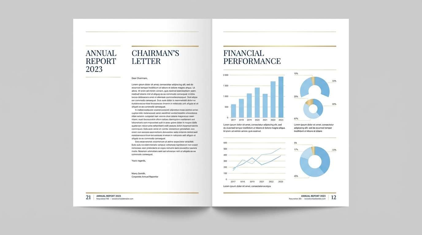
Best for: corporate annual reports and slide decks
Cool and polished, it resembles winter sky blues with a restrained aurum sheen. The icy tint helps data-heavy pages feel lighter and more modern. Pair with crisp grids, fine rules, and a neutral sans-serif for readability. Usage tip: use gold for section dividers and key takeaways, not full blocks.
Image example of winter aurum generated using media.io
9) Museum Velvet
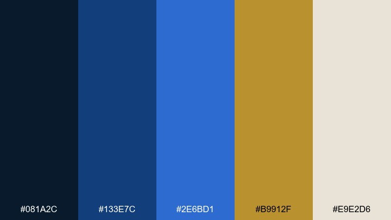
HEX: #081a2c #133e7c #2e6bd1 #b9912f #e9e2d6
Mood: classic, cultured, luxurious
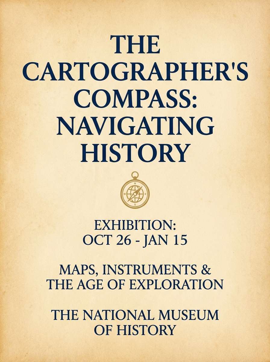
Best for: exhibition posters and museum branding
Classic and cultured, it recalls velvet ropes, spotlighted frames, and gilded plaques. The deep navy anchors long-form copy while the brighter blue modernizes the look. Pair with warm paper textures and elegant serif headlines for an archival feel. Usage tip: keep the gold as a small seal or logo stamp to signal prestige.
Image example of museum velvet generated using media.io
10) Sunlit Delft
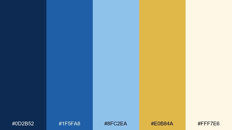
HEX: #0d2b52 #1f5fa8 #8fc2ea #e0b84a #fff7e6
Mood: cheerful, artisanal, warm
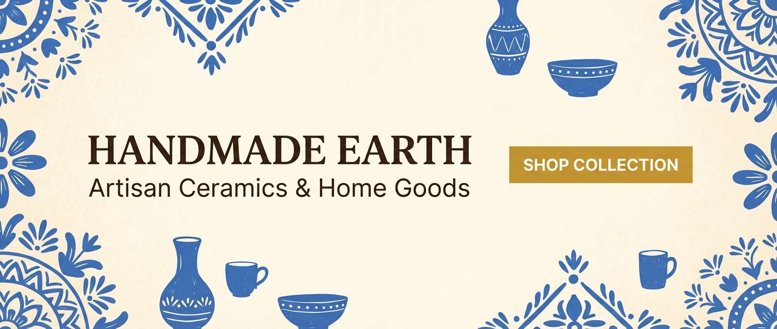
Best for: ceramic shop branding and ecommerce banners
Cheerful and artisanal, it brings to mind delft blues with a warm sunlit glaze. The creamy background keeps product pages bright and welcoming. Pair with hand-drawn patterns or subtle grain to enhance craft credibility. Usage tip: set calls to action in gold on navy for maximum legibility.
Image example of sunlit delft generated using media.io
11) Aurora Trophy
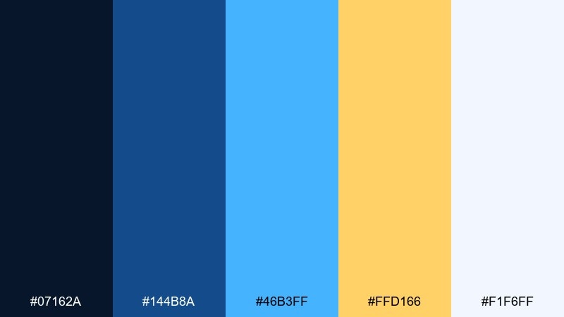
HEX: #07162a #144b8a #46b3ff #ffd166 #f1f6ff
Mood: bold, energetic, modern
Best for: gaming tournament landing pages
Bold and energetic, it feels like neon blue streaks around a warm trophy glow. The contrast works well for hero sections, countdowns, and competitive ranking tables. Pair with dark gradients and sharp display type for a high-impact look. Usage tip: use gold only for winners and primary actions to preserve hierarchy.
Image example of aurora trophy generated using media.io

12) Blueprint Brass
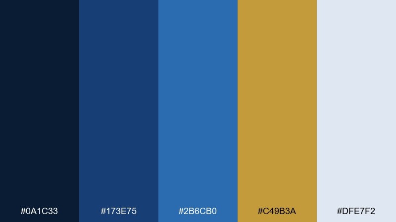
HEX: #0a1c33 #173e75 #2b6cb0 #c49b3a #dfe7f2
Mood: practical, engineered, trustworthy
Best for: architecture portfolios and proposal decks
Practical and engineered, it resembles blueprint ink with a brass ruler edge. The mid blues keep diagrams readable while the gold adds a premium highlight. Pair with thin line icons, plenty of margins, and cool grays for structure. Usage tip: reserve gold for callout numbers and key measurements so it guides the eye.
Image example of blueprint brass generated using media.io
13) Opal Compass
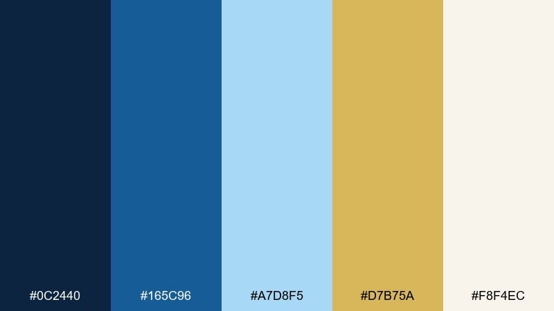
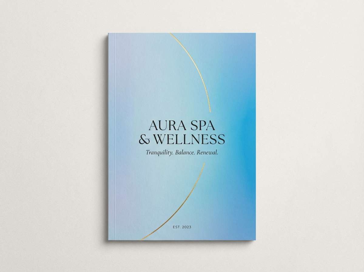
HEX: #0c2440 #165c96 #a7d8f5 #d7b75a #f8f4ec
Mood: calm, airy, refined
Best for: wellness brands and spa brochures
Calm and airy, it evokes a pale ocean horizon with soft opal light. The gentle blues feel restorative while the warm gold prevents it from turning too cold. Pair with minimal photography, lots of whitespace, and light serif headings. Usage tip: choose the palest blue for large areas and keep the navy for body text.
Image example of opal compass generated using media.io
14) Jazz Age Yacht
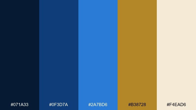
HEX: #071a33 #0f3d7a #2a7bd6 #b38728 #f4ead6
Mood: vintage, luxurious, lively
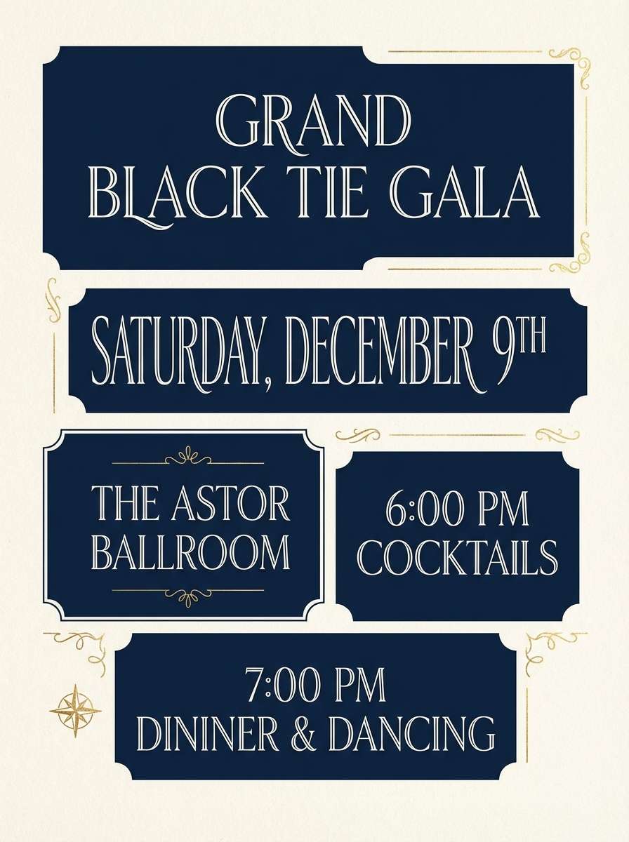
Best for: gala invitations and fundraiser collateral
Vintage and lively, it feels like jazz on a yacht with brass notes over midnight water. The gold reads formal without being flashy when used sparingly. Pair with cream stock, monoline icons, and a classic serif for names and dates. Usage tip: print gold as foil on navy for the most dramatic impact.
Image example of jazz age yacht generated using media.io
15) Lanternlit Lagoon
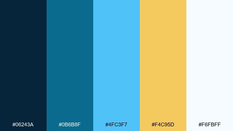
HEX: #06243a #0b6b8f #4fc3f7 #f4c95d #f6fbff
Mood: tropical, playful, bright
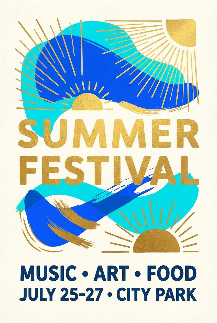
Best for: summer festival posters and social tiles
Tropical and playful, it suggests lanterns glowing over a bright lagoon. The teal-leaning blue adds freshness while gold brings evening warmth. Pair with energetic shapes and bold headlines, then soften with plenty of white. Usage tip: keep the brightest cyan for small pops so it does not overpower the gold.
Image example of lanternlit lagoon generated using media.io
16) Alpine Crest
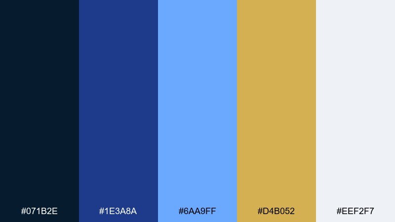
HEX: #071b2e #1e3a8a #6aa9ff #d4b052 #eef2f7
Mood: crisp, confident, outdoorsy
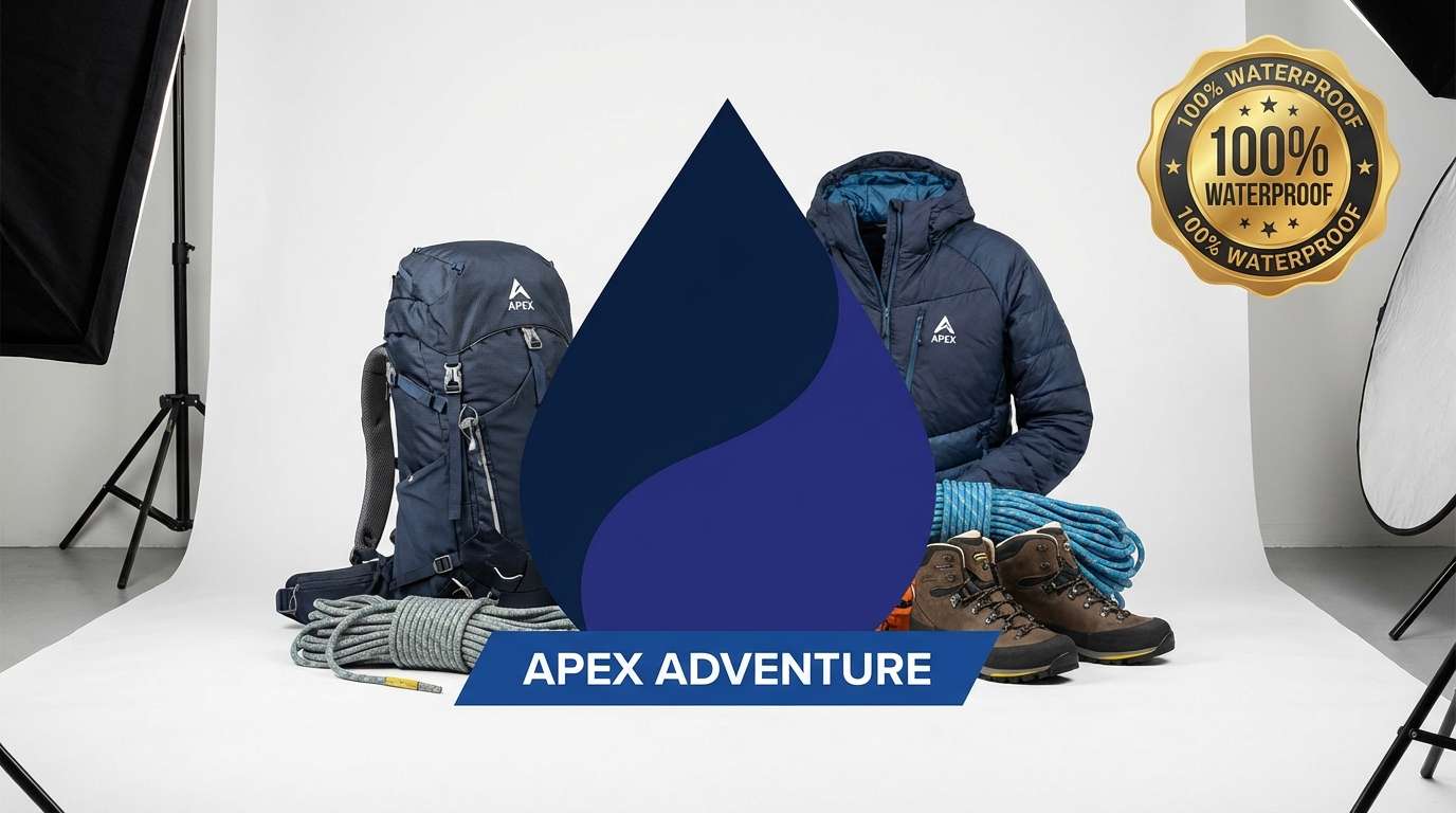
Best for: outdoor gear product ads
Crisp and confident, it feels like a clear alpine morning with a sunlit summit. The blues support performance messaging while the gold adds warmth and premium cues. Pair with sharp product photography, minimal copy, and a strong grid. Usage tip: use navy for headlines and let gold highlight specs like weight or durability.
Image example of alpine crest generated using media.io
17) Noble Atlas
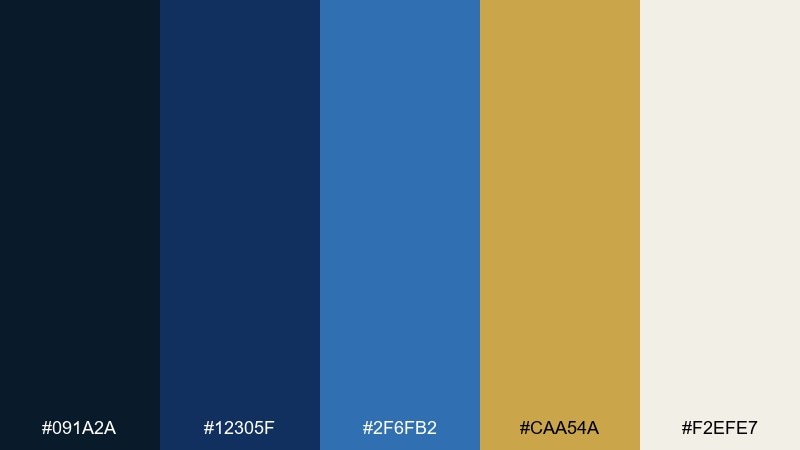
HEX: #091a2a #12305f #2f6fb2 #caa54a #f2efe7
Mood: scholarly, steady, heritage
Best for: book covers and academic conference materials
Scholarly and steady, it brings to mind atlas covers with worn gold stamping. The structured blues help long titles and schedules stay legible. Pair with textured paper backgrounds and classic serif typography for authority. Usage tip: keep the lightest neutral for margins and use gold only for the title stamp or crest.
Image example of noble atlas generated using media.io
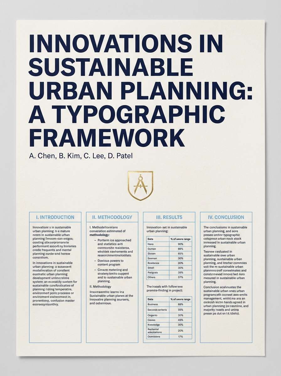
18) Golden Nebula
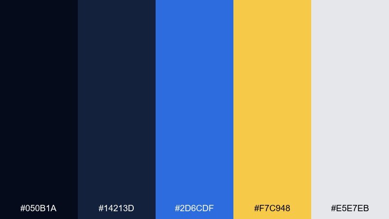
HEX: #050b1a #14213d #2d6cdf #f7c948 #e5e7eb
Mood: cosmic, dramatic, futuristic
Best for: music album artwork and streaming covers
Cosmic and dramatic, it looks like a gold flare cutting through electric blue space. The deep base makes saturated accents feel cinematic and modern. Pair with high-contrast type and abstract gradients for a futuristic vibe. Usage tip: put gold behind the artist name as a small glow, not a full backdrop.
Image example of golden nebula generated using media.io

19) Heritage Porcelain
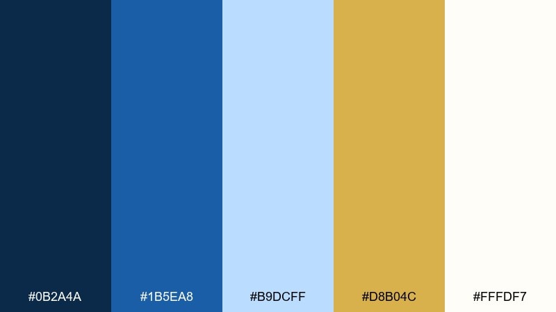
HEX: #0b2a4a #1b5ea8 #b9dcff #d8b04c #fffdf7
Mood: timeless, clean, boutique
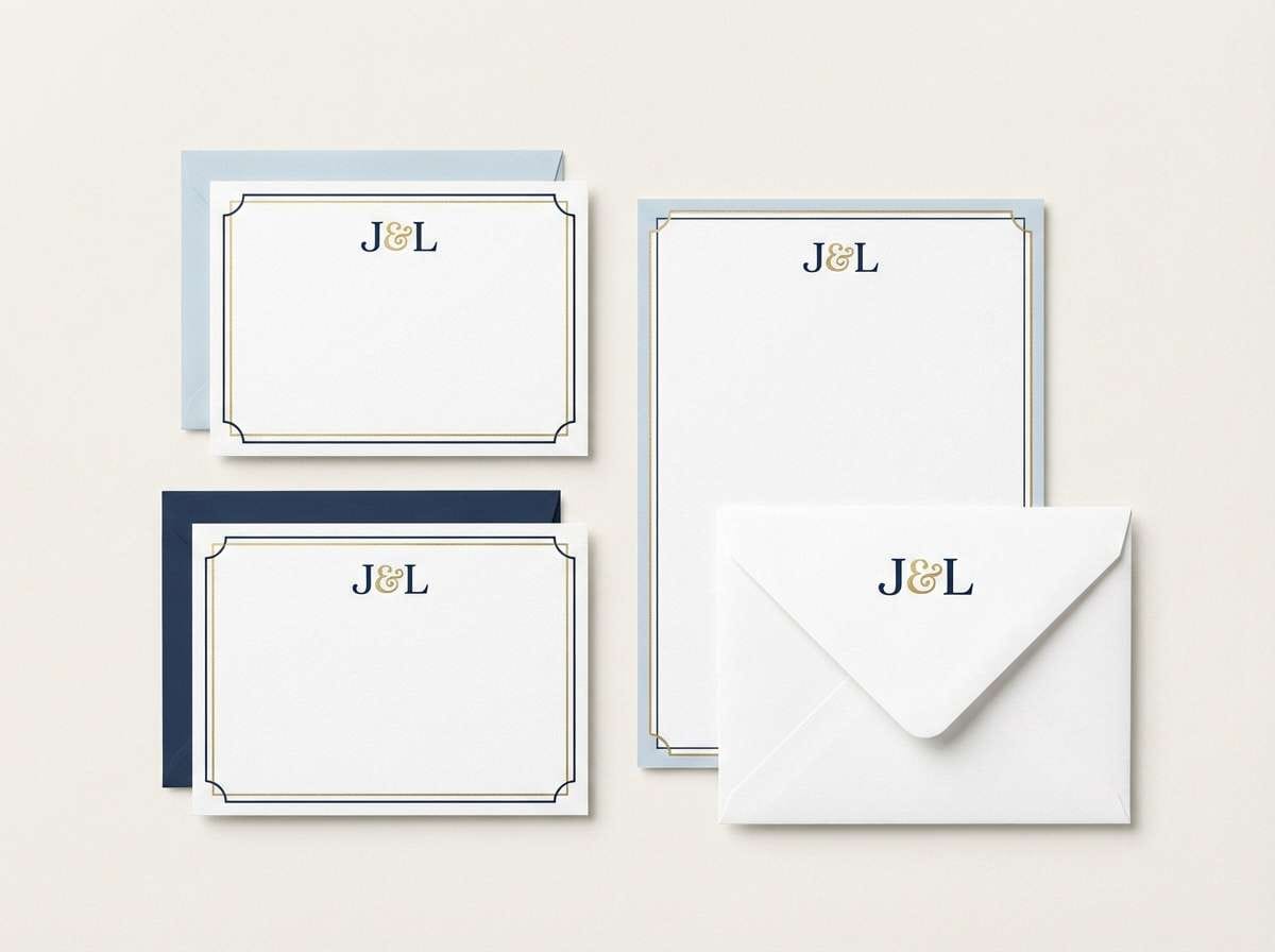
Best for: stationery sets and personal monograms
Timeless and clean, it feels like blue porcelain with a fine gold rim. The gentle contrast keeps monograms and borders looking crisp in print. Pair with subtle patterns, cotton paper, and simple serif initials. Usage tip: use the pale blue for envelope liners and keep gold for the monogram mark.
Image example of heritage porcelain generated using media.io
20) Skyline Bullion
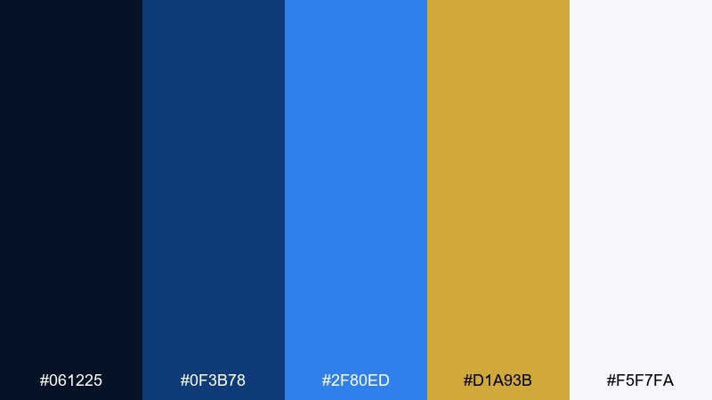
HEX: #061225 #0f3b78 #2f80ed #d1a93b #f5f7fa
Mood: urban, sharp, premium
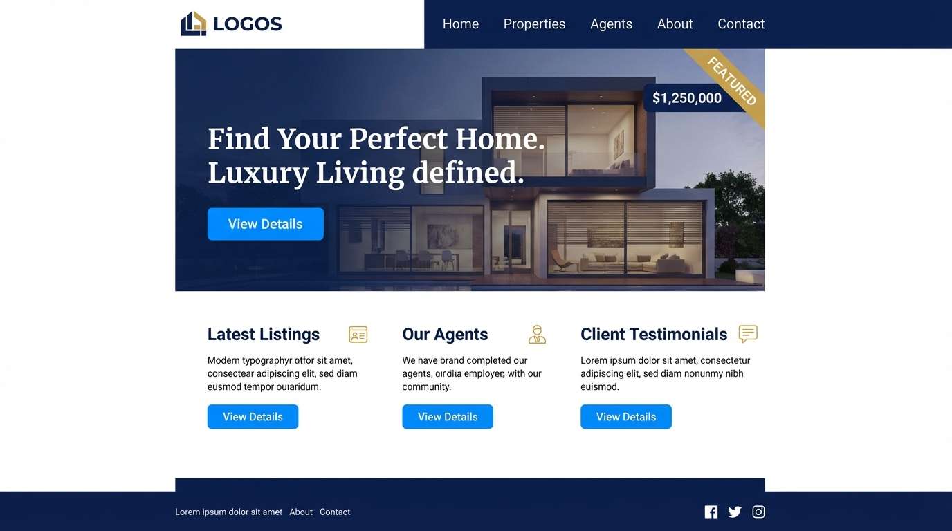
Best for: real estate landing pages and listing brochures
Urban and sharp, it suggests glassy blue skylines with bullion highlights. For a gold blue color combination that feels premium, keep layouts clean and structured. Pair with modern sans-serif headlines and muted grays for supporting details. Usage tip: use gold for price tags and key stats, while blues handle navigation and section headers.
Image example of skyline bullion generated using media.io
21) Crownline Editorial
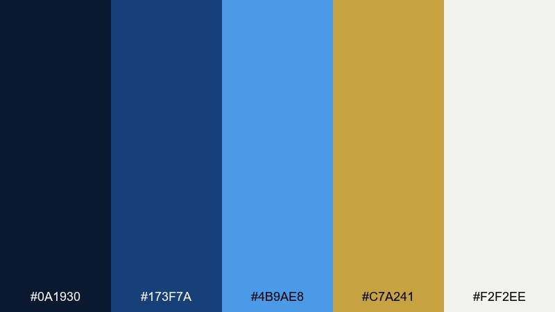
HEX: #0a1930 #173f7a #4b9ae8 #c7a241 #f2f2ee
Mood: editorial, elegant, composed
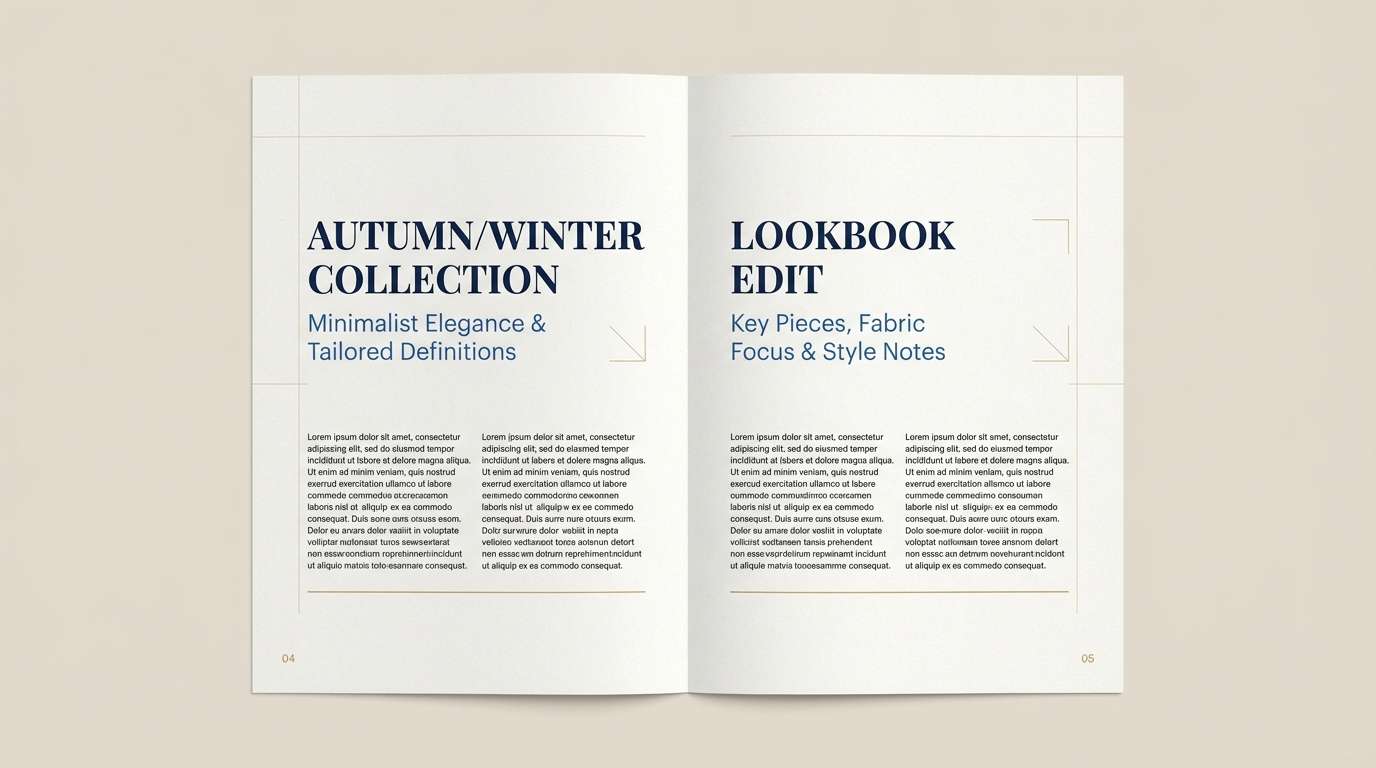
Best for: magazine spreads and lookbooks
Editorial and composed, it reads like tailored navy ink with a subtle gold signature. The balance is ideal for headlines, pull quotes, and product callouts without overwhelming photography. Pair with warm neutrals and restrained accent shapes for a premium layout. Usage tip: keep gold to small markers and folios so the page stays airy.
Image example of crownline editorial generated using media.io
22) Mariner Emblem
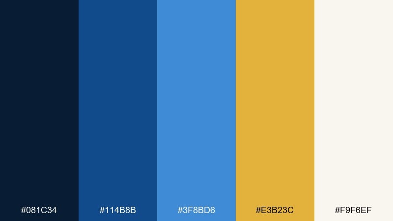
HEX: #081c34 #114b8b #3f8bd6 #e3b23c #f9f6ef
Mood: bold, classic, emblematic
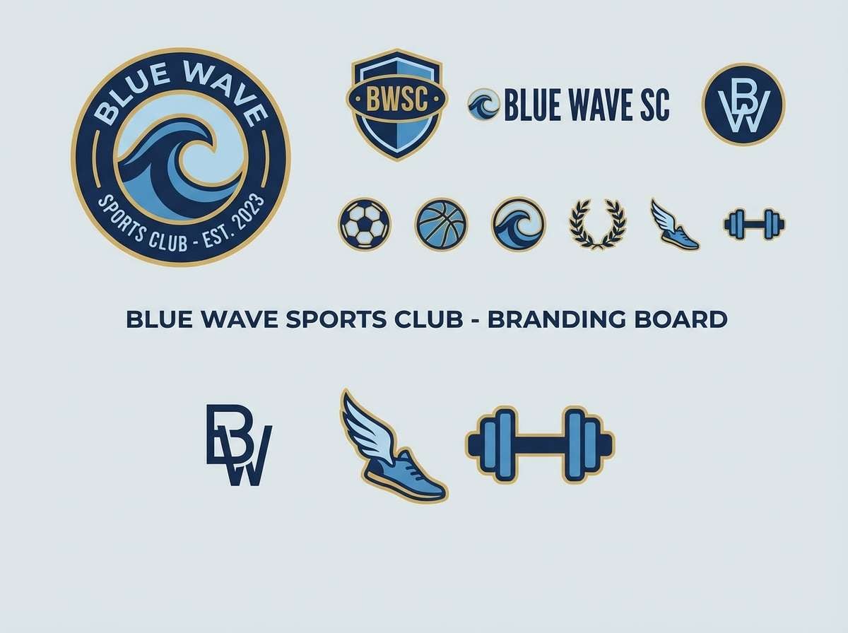
Best for: sports club logos and badge systems
Bold and classic, it feels like stitched patches, brass buttons, and clean uniform blues. This gold blue color palette is especially strong for crests, shields, and identity marks that need authority. Pair with white for clarity and add a touch of black for extra punch. Usage tip: build the badge in navy first, then layer gold as the outline and highlights.
Image example of mariner emblem generated using media.io
What Colors Go Well with Gold Blue?
Warm neutrals like ivory, cream, and sand soften the contrast between gold and blue, making the palette feel more premium and print-friendly. They also help gold accents look intentional instead of flashy.
Cool supporting tones—slate gray, silver, and soft blue-grays—keep layouts clean and tech-forward, especially in dashboards and editorial grids. These work well when blue is your primary background.
For extra depth, add near-black (charcoal) for type or outlines, or a teal-leaning accent when you want a fresher, coastal twist without breaking the gold-blue harmony.
How to Use a Gold Blue Color Palette in Real Designs
Start by assigning roles: use navy/deep blue for primary backgrounds and typography, mid/bright blue for interactive states and highlights, and gold for “attention moments” like buttons, badges, or key numbers.
Keep gold coverage low (often 5–10% of the layout) to preserve its premium feel. If you need more emphasis, increase contrast with lighter neutrals rather than adding more gold blocks.
In print, gold can be flat (HEX) or simulated with gradients; for the most luxurious finish, consider foil or spot color. In UI, avoid using gold for long text—reserve it for icons and small labels.
Create Gold Blue Palette Visuals with AI
If you want to preview a gold blue color scheme in a real layout, generate quick mockups using AI prompts like the ones above. It’s a fast way to test mood, contrast, and hierarchy before committing to a design direction.
Try variations by swapping the background (navy vs. off-white) and changing where gold appears (CTA only vs. section headers). Small shifts can dramatically change how “luxury” or “sporty” the same palette feels.
When you find a direction you like, reuse the prompt structure across banners, posters, packaging, and UI screens to keep the visual language consistent.
Gold Blue Color Palette FAQs
-
What does a gold and blue color palette communicate?
Gold suggests quality, achievement, and warmth, while blue signals trust, calm, and professionalism. Together they read as premium and reliable—great for brands that want authority without looking cold. -
How do I keep gold from overpowering my blue design?
Treat gold as an accent, not a base. Use it on small elements like buttons, icons, dividers, seals, or key stats, and let navy/mid-blue carry backgrounds and large shapes. -
Which blue works best with metallic gold?
Deep navy and midnight blues typically pair best because they increase perceived “metallic” richness. Royal blue is more energetic and sporty, while lighter sky blues feel airy and wedding-friendly. -
What background colors pair well with a gold blue color scheme?
Off-white, cream, warm gray, and very light blue-gray are the easiest backgrounds for readability. For a dramatic look, use near-black navy and keep gold accents minimal. -
Is gold blue a good UI color palette?
Yes—blue is excellent for interaction states and information hierarchy, while gold can mark achievements, premium tiers, or key metrics. Use gold sparingly to avoid confusing it with warning or error states. -
What font colors should I use with gold and blue?
Use white or warm off-white on navy for headings, and charcoal/near-black on light backgrounds for body text. Avoid setting long paragraphs in gold; it’s best for short labels and accents. -
Can I use a gold and blue palette for weddings?
Absolutely—pair soft blues with cream and a restrained gold for borders, monograms, and small decorative details. This keeps the stationery elegant and print-friendly.
Next: Teal Gray Color Palette


