

Purple is a flexible design color: it can feel luxurious, playful, calm, or futuristic depending on saturation and contrast. That range makes purple palettes a smart choice for branding, UI, print, and social content.
Below are 20+ curated purple color palette ideas with HEX codes, plus quick pairing notes and AI image prompts you can reuse to generate matching visuals.
In this article
- Why Purple Palettes Work So Well
-
- amethyst dusk
- lavender milk
- orchid pop
- plum velvet
- grape soda
- lilac linen
- violet neon
- mauve clay
- berry jam
- iris breeze
- royal purple gold
- eggplant sage
- twilight gradient
- dusty minimal
- galaxy violet
- purple peach sunrise
- deep aubergine
- monochrome violet
- wildflower purple
- smoky violet gray
- purple charcoal contrast
- What Colors Go Well with Purple?
- How to Use a Purple Color Palette in Real Designs
- Create Purple Palette Visuals with AI
Why Purple Palettes Work So Well
Purple sits between warm reds and cool blues, so it can lean energetic or calming with small tweaks in hue and saturation. That “in-between” quality makes purple palettes easy to adapt across different brand personalities.
It also carries strong cultural associations—creativity, premium quality, mystery, and imagination—so a purple color scheme can instantly set a mood without heavy illustration or texture.
From a practical standpoint, purple pairs well with both light neutrals and deep charcoals, giving you a wide contrast range for accessible typography, UI states, and print readability.
20+ Purple Color Palette Ideas (with HEX Codes)
1) Amethyst Dusk
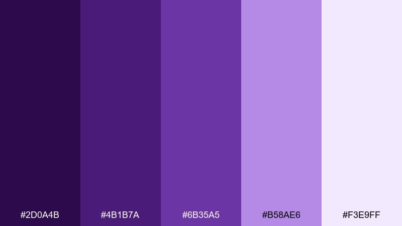
HEX: #2D0A4B #4B1B7A #6B35A5 #B58AE6 #F3E9FF
Mood: moody, elegant, cinematic
Best for: luxury brand landing page
Moody twilight tones and jewel-like highlights create a cinematic, high-end feel. Use the deepest shade for headers and navigation, then let lavender tints carry backgrounds and card surfaces. Pair with crisp white space and a single metallic accent (gold or champagne) for polish. Tip: keep contrast strong by reserving the lightest tint for text areas and form fields.
Image example of amethyst dusk generated using media.io
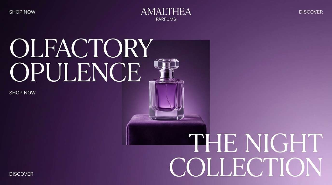
Media.io is an online AI studio for creating and editing video, image, and audio in your browser.

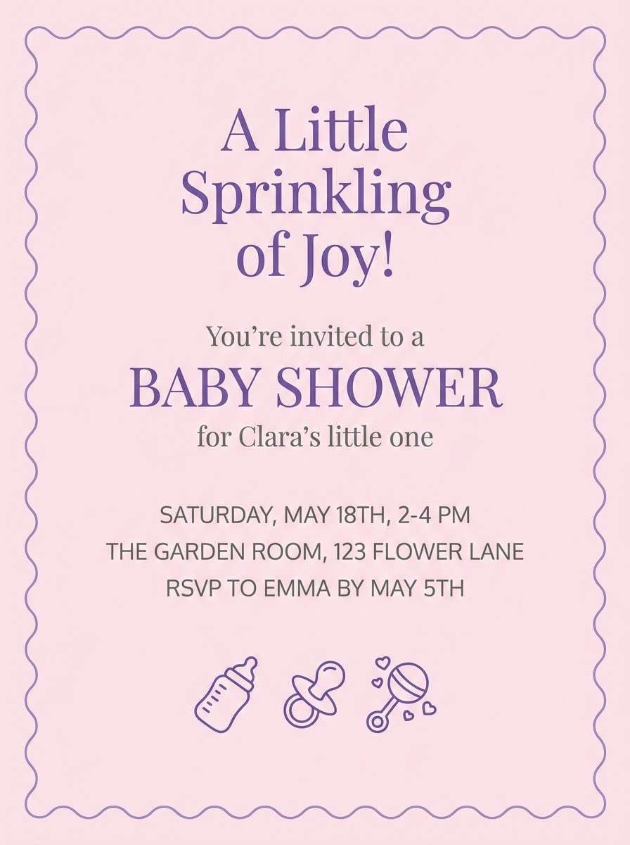
2) Lavender Milk
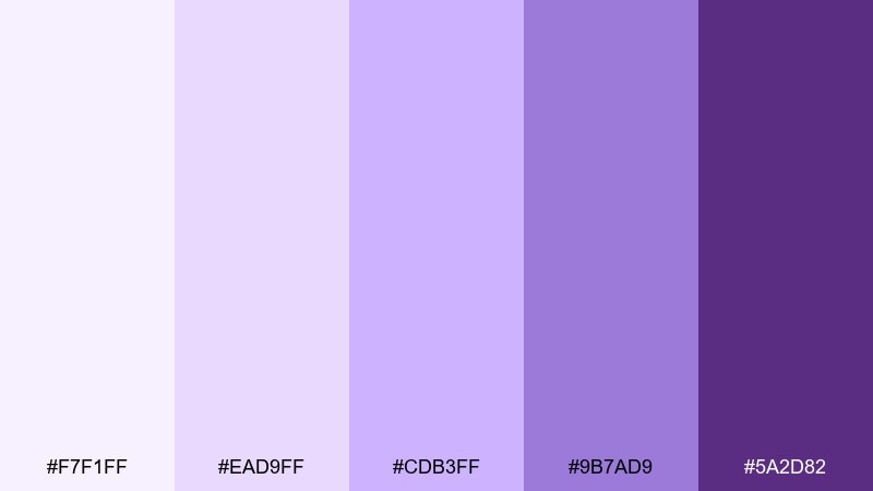
HEX: #F7F1FF #EAD9FF #CDB3FF #9B7AD9 #5A2D82
Mood: soft, cozy, gentle
Best for: baby shower invitation
Creamy pastels and sweet lavender notes feel comforting, like satin ribbons and soft candlelight. Keep typography delicate and airy, and let the mid-tone lilac anchor key details like date and location. Pair with warm neutrals (ivory, oatmeal) to avoid a cold look. Tip: use the darkest shade sparingly for legibility—think names, not full paragraphs.
Image example of lavender milk generated using media.io
3) Orchid Pop
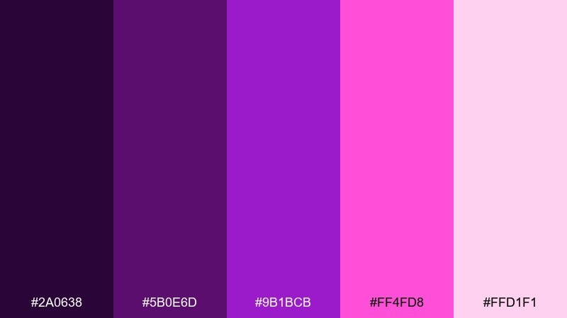
HEX: #2A0638 #5B0E6D #9B1BCB #FF4FD8 #FFD1F1
Mood: bold, playful, energetic
Best for: social media promo post
Electric orchid and hot-magenta accents bring instant energy, like neon signage after dark. Use the bright pink as a call-to-action color, while the deeper purples handle backgrounds and shadows. Pair with clean sans-serif type and plenty of breathing room so it stays modern, not chaotic. Tip: apply the neon shade to one focal element per layout to keep scrollers focused.
Image example of orchid pop generated using media.io

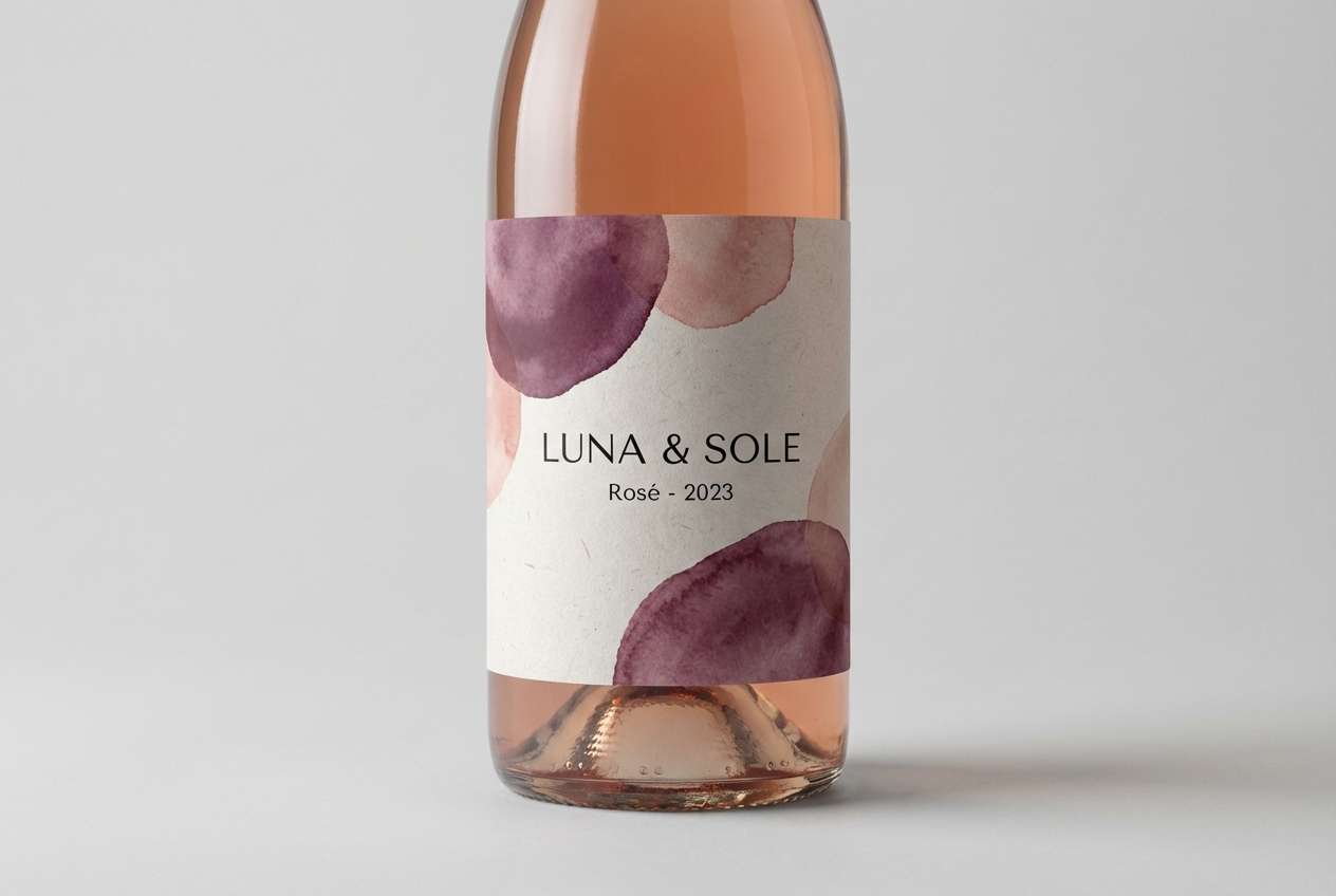
4) Plum Velvet
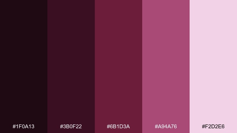
HEX: #1F0A13 #3B0F22 #6B1D3A #A94A76 #F2D2E6
Mood: rich, romantic, premium
Best for: wine bottle label packaging
Velvety plum shades feel decadent and intimate, like candlelit dinners and aged merlot. This purple color palette works best when the darkest tones frame a light label area for readability. Pair with matte black, cream paper textures, and subtle foil details for a boutique finish. Tip: use the rosy mid-tone for small badges (reserve, vintage) to add hierarchy without clutter.
Image example of plum velvet generated using media.io
5) Grape Soda
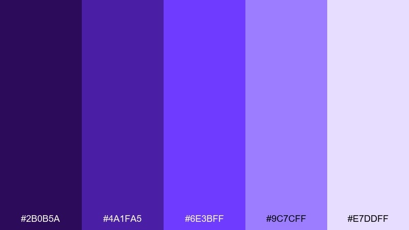
HEX: #2B0B5A #4A1FA5 #6E3BFF #9C7CFF #E7DDFF
Mood: fun, youthful, bright
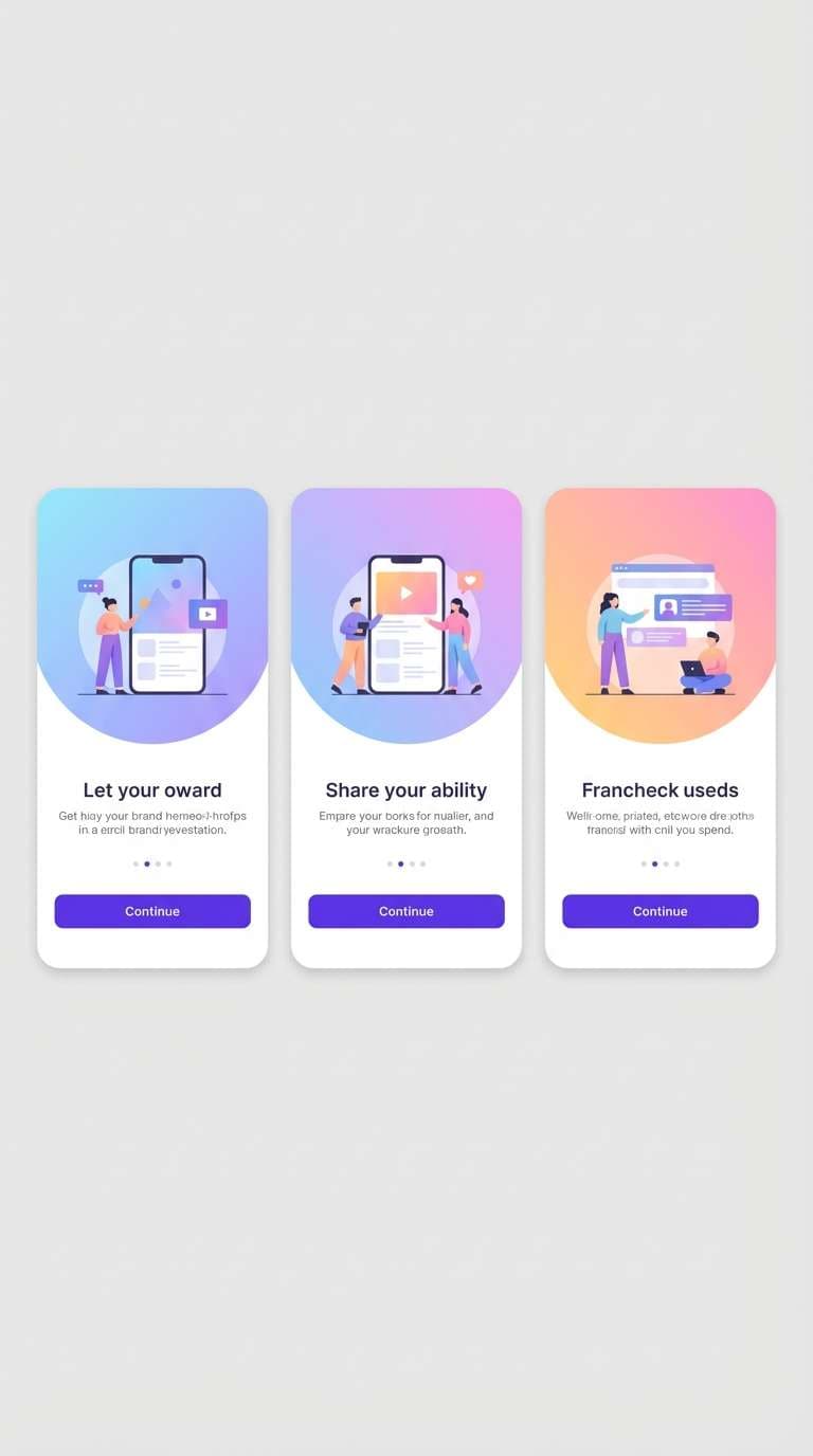
Best for: mobile app onboarding screens
Bubbly brights and candy gradients feel cheerful, like fizzy drinks and arcade lights. Use the vivid violet as the primary button color and let the lighter tints handle background sections and illustrations. Pair with clean whites and rounded UI elements for a friendly tone. Tip: reserve the most saturated shade for interactive states to keep the flow intuitive.
Image example of grape soda generated using media.io
6) Lilac Linen
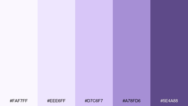
HEX: #FAF7FF #EEE6FF #D7C6F7 #A78FD6 #5E4A88
Mood: calm, airy, understated
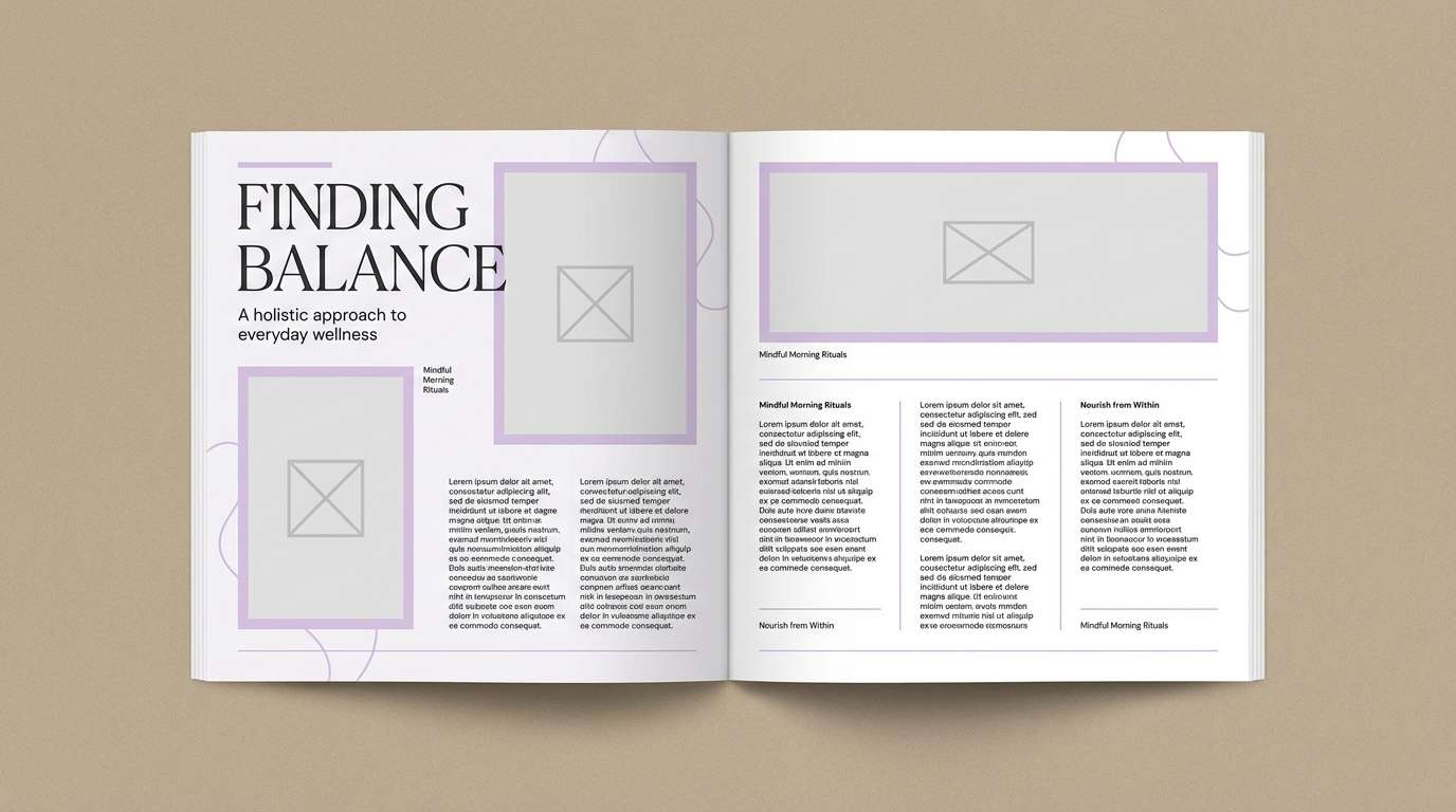
Best for: wellness blog editorial layout
Light lilac layers feel like fresh linens and quiet mornings, giving content room to breathe. These purple color combinations shine in long-form reading layouts where subtle section breaks matter. Pair with warm gray body text and soft beige photography tones for a grounded, wellness-forward look. Tip: use the mid-tone for pull quotes and dividers to guide scanning without shouting.
Image example of lilac linen generated using media.io
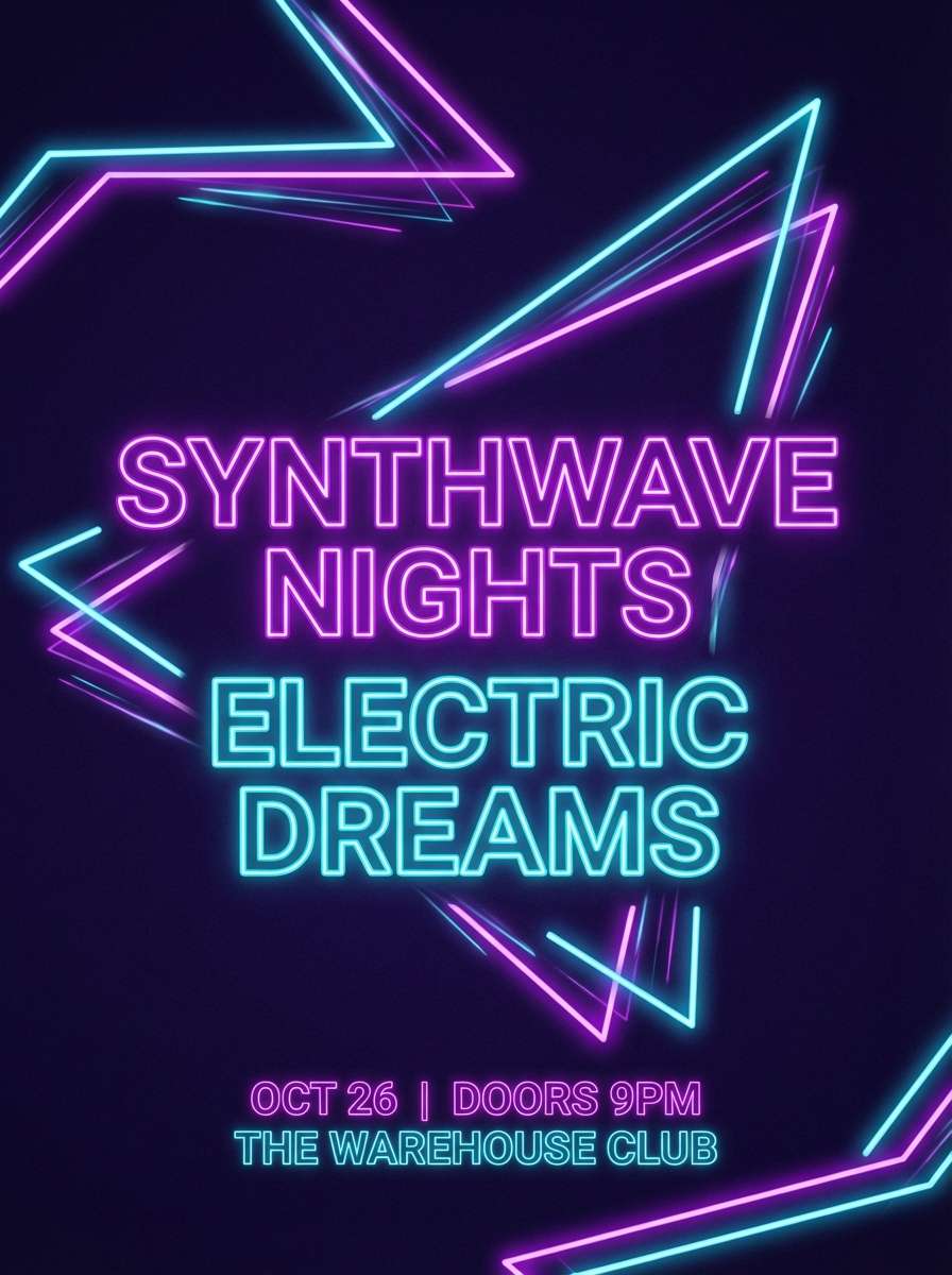
7) Violet Neon
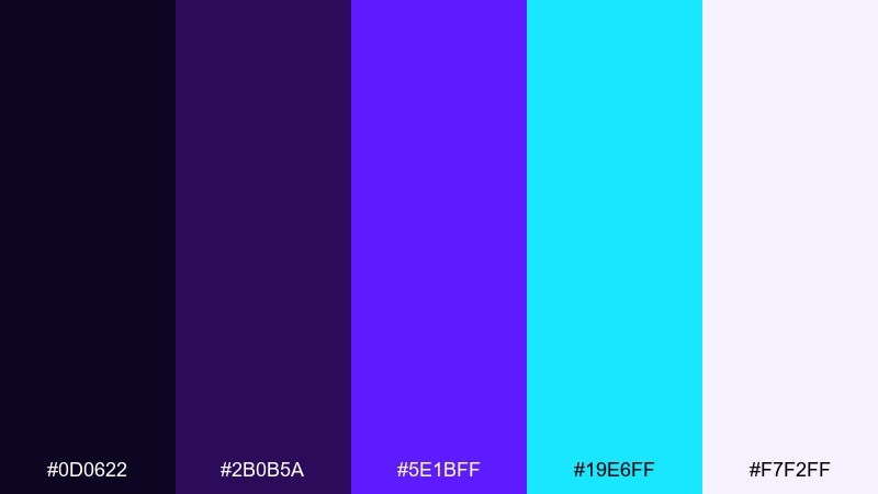
HEX: #0D0622 #2B0B5A #5E1BFF #19E6FF #F7F2FF
Mood: futuristic, electric, high-contrast
Best for: music event flyer
Glowing violet against near-black feels futuristic, like laser beams cutting through a club haze. Use cyan as a highlight for dates and ticket info, while violet handles the main visual rhythm. Pair with condensed type and geometric shapes to push the nightlife vibe. Tip: keep backgrounds mostly dark so the neon accents stay punchy when printed.
Image example of violet neon generated using media.io
8) Mauve Clay
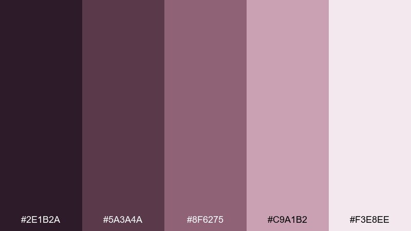
HEX: #2E1B2A #5A3A4A #8F6275 #C9A1B2 #F3E8EE
Mood: earthy, warm, artisanal
Best for: interior design mood board
Dusty mauves and clay-like neutrals evoke handmade ceramics and sunlit studios. Use the deeper tones for room labels and swatch captions, then let the pale blush carry the background. Pair with natural textures—linen, walnut, brushed brass—to keep it grounded. Tip: add one charcoal accent to prevent the look from drifting too sweet.
Image example of mauve clay generated using media.io
9) Berry Jam
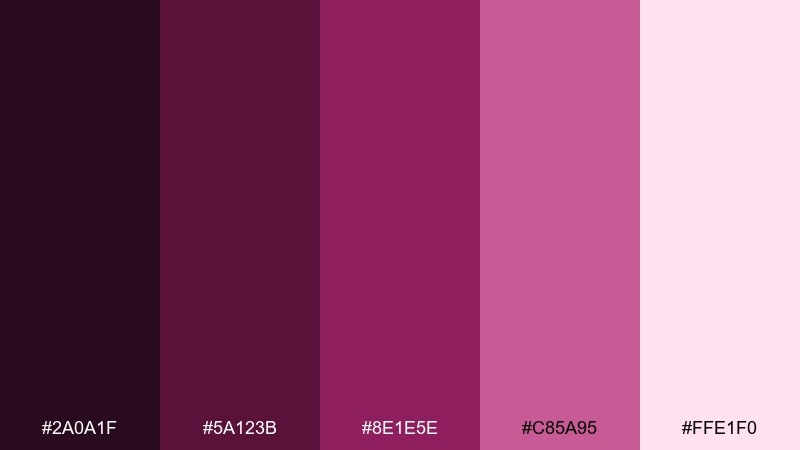
HEX: #2A0A1F #5A123B #8E1E5E #C85A95 #FFE1F0
Mood: cozy, sweet, inviting
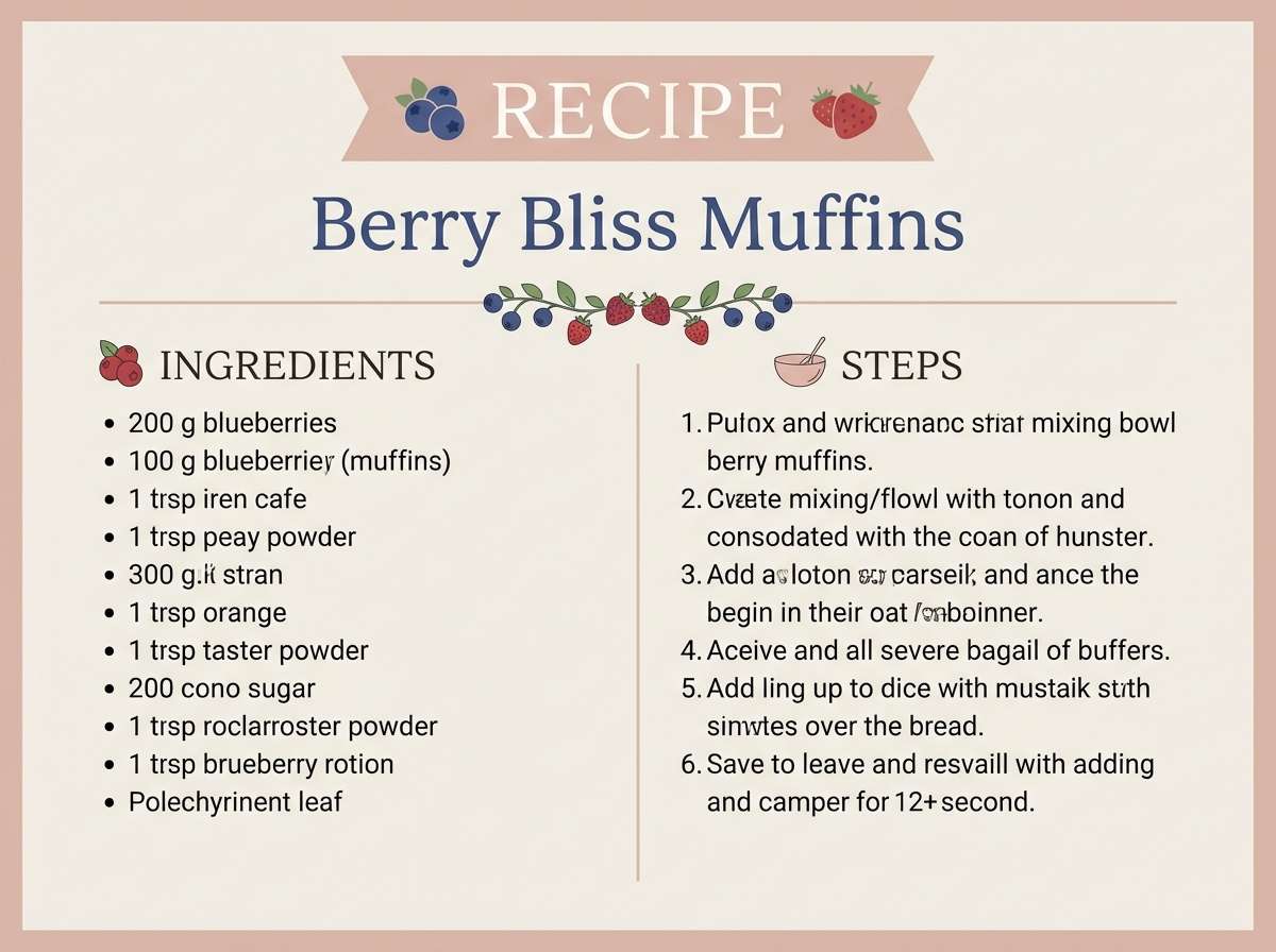
Best for: recipe card template
Jammy berry tones feel cozy and homemade, like fresh pastries and handwritten notes. Use the rosy mid-tone for headings and icons, and keep the darkest shade for ingredient lists to maintain readability. Pair with cream backgrounds and a subtle paper-grain effect for warmth. Tip: limit decorative flourishes to the corners so the recipe stays scannable.
Image example of berry jam generated using media.io
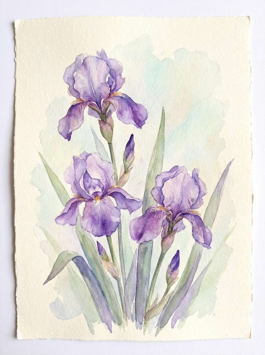
10) Iris Breeze
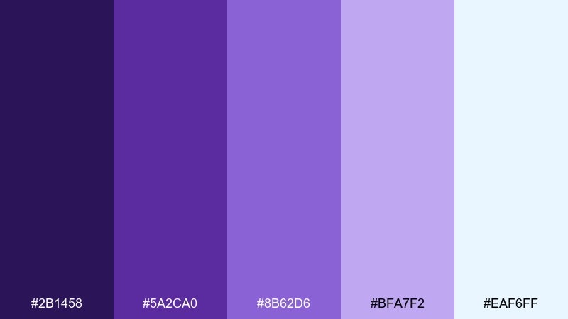
HEX: #2B1458 #5A2CA0 #8B62D6 #BFA7F2 #EAF6FF
Mood: fresh, light, springy
Best for: spring botanical illustration
Cool iris tones with airy blue-white highlights evoke a breezy garden just after rain. Let the mid violets define petals and shadows, and use the palest tint as negative space for a watercolor feel. Pair with soft greens if you need foliage accents without stealing focus. Tip: keep edges slightly imperfect to preserve the hand-painted charm.
Image example of iris breeze generated using media.io
11) Royal Purple Gold
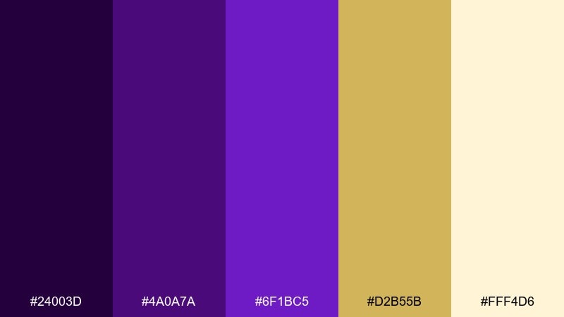
HEX: #24003D #4A0A7A #6F1BC5 #D2B55B #FFF4D6
Mood: regal, celebratory, formal
Best for: award ceremony invitation
Regal violet paired with warm gold feels ceremonial, like spotlights and velvet drapes. Use gold for borders, seals, or foil-like highlights, while the deep tones support the typography. Pair with classic serif type and generous margins for a formal look. Tip: keep gold as an accent only—too much can reduce contrast and readability.
Image example of royal purple gold generated using media.io

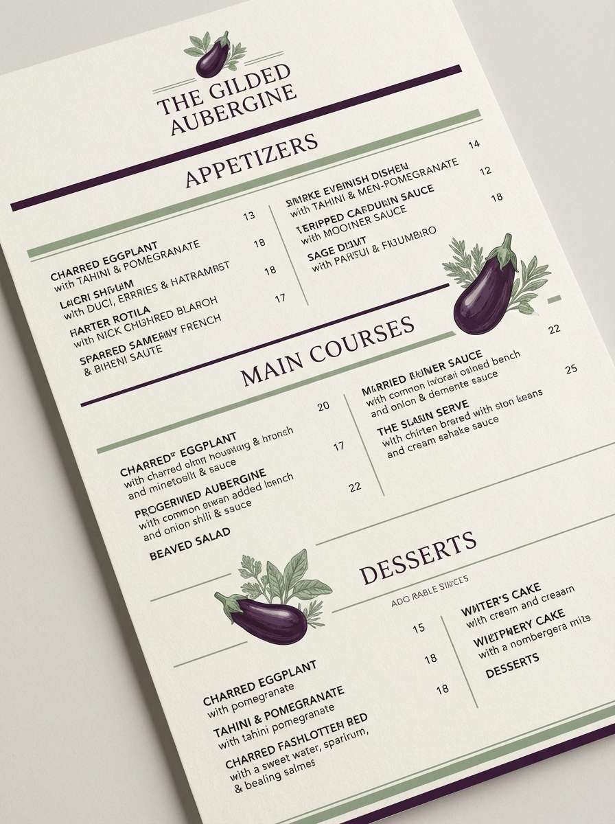
12) Eggplant Sage
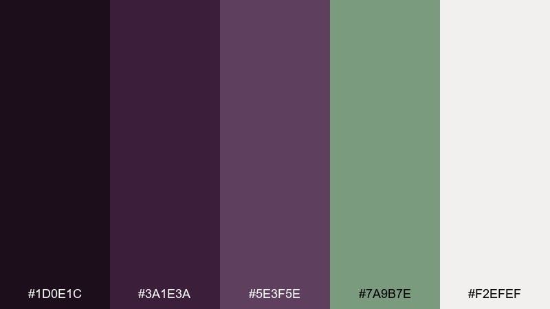
HEX: #1D0E1C #3A1E3A #5E3F5E #7A9B7E #F2EFEF
Mood: modern, grounded, sophisticated
Best for: restaurant menu layout
Dark eggplant with muted sage feels refined and grounded, like a cozy bistro with modern plating. Use the deepest tone for section headers and the off-white for generous negative space around dishes. Pair with sage for subtle highlights like vegetarian markers or pricing rules. Tip: keep body text near-black or deep eggplant to avoid low-contrast reading.
Image example of eggplant sage generated using media.io
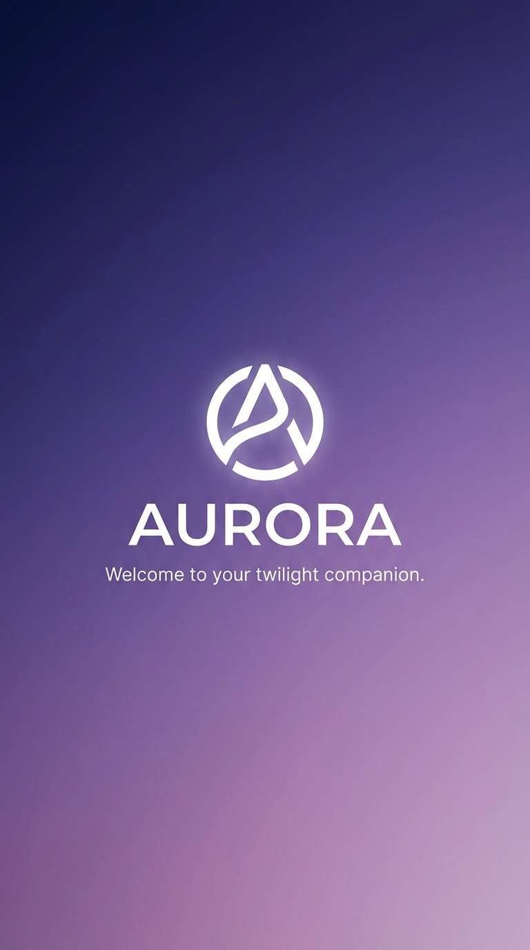
13) Twilight Gradient
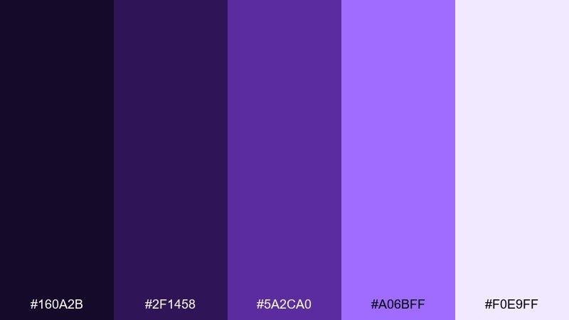
HEX: #160A2B #2F1458 #5A2CA0 #A06BFF #F0E9FF
Mood: dreamy, smooth, immersive
Best for: app splash screen
A smooth twilight fade feels immersive, like dusk turning into starlight. Use the gradient as the hero background and keep the logo in the palest tint for crisp contrast. Pair with minimal iconography so the color does the storytelling. Tip: test the gradient on OLED screens to ensure the darkest stops don’t crush detail.
Image example of twilight gradient generated using media.io
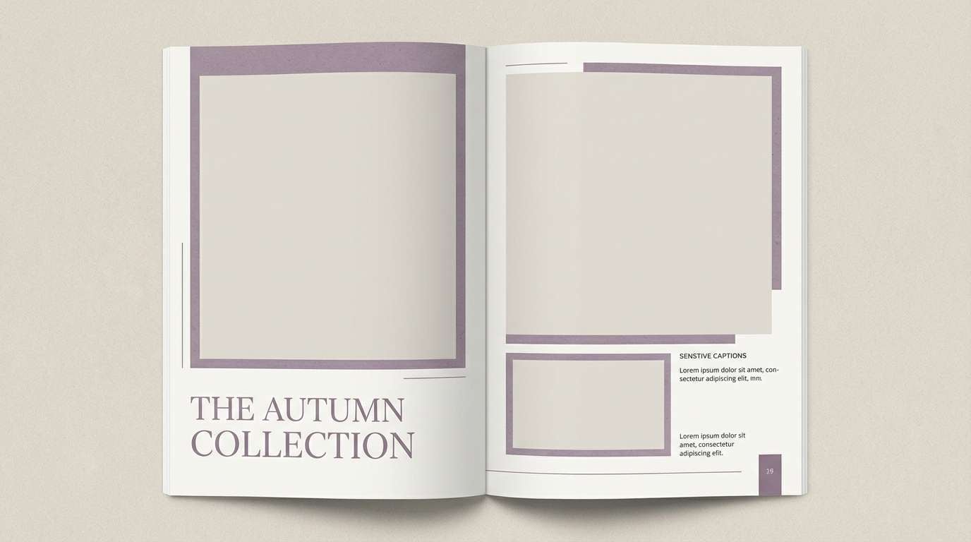
14) Dusty Minimal
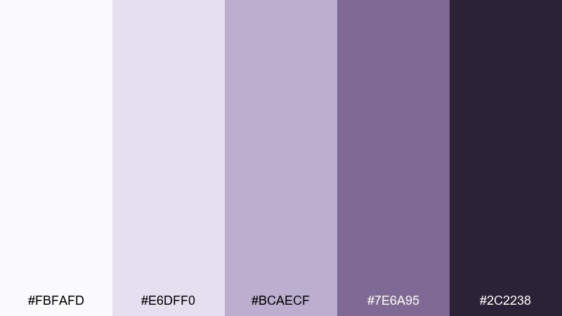
HEX: #FBFAFD #E6DFF0 #BCAECF #7E6A95 #2C2238
Mood: minimal, editorial, calm
Best for: fashion lookbook spread
Dusty neutrals with a quiet violet undertone feel editorial and composed, like matte paper and soft studio light. Use the lightest shades as generous margins and the charcoal-violet for captions and page numbers. Pair with monochrome photography to keep the spread refined. Tip: maintain consistent spacing and let the muted tones unify the whole lookbook.
Image example of dusty minimal generated using media.io
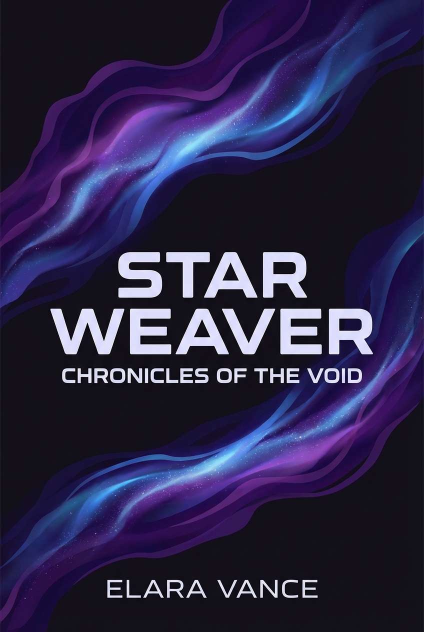
15) Galaxy Violet
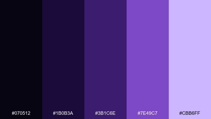
HEX: #070512 #1B0B3A #3B1C6E #7E49C7 #CBB6FF
Mood: mysterious, cosmic, dramatic
Best for: sci-fi book cover design
Inky space purples and luminous violet highlights feel cosmic, like distant nebulae and starlit dust. Use the darkest tones for the background and the bright violet to frame the title for instant shelf impact. Pair with sleek sans-serif type and subtle grain for a cinematic finish. Tip: keep the brightest accent away from the author name so the hierarchy stays clear.
Image example of galaxy violet generated using media.io
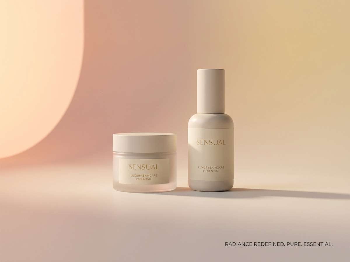
16) Purple Peach Sunrise
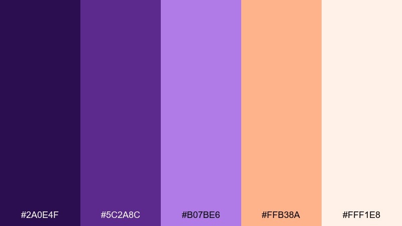
HEX: #2A0E4F #5C2A8C #B07BE6 #FFB38A #FFF1E8
Mood: warm, optimistic, modern
Best for: skincare product ad
Warm sunrise tones blend softness and energy, like early light spilling across a vanity. Use peach as the highlight for product benefits, while violet handles shadows and brand accents. Pair with creamy whites and minimal typography to keep the ad clean and premium. Tip: keep the gradient subtle so the packaging and product name stay the hero.
Image example of purple peach sunrise generated using media.io
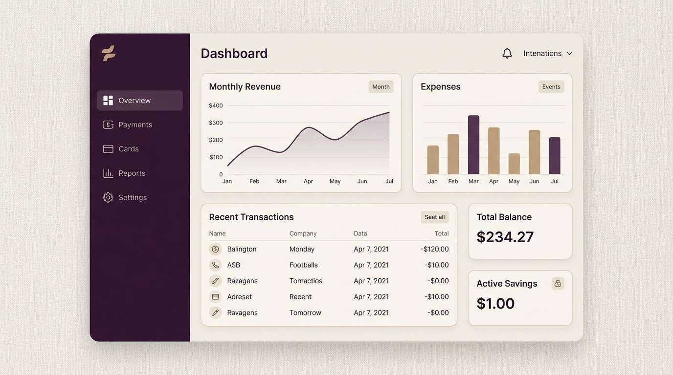
17) Deep Aubergine
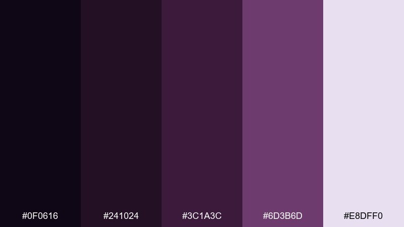
HEX: #0F0616 #241024 #3C1A3C #6D3B6D #E8DFF0
Mood: serious, sleek, confident
Best for: fintech dashboard UI
Deep aubergine tones feel sleek and focused, like a dimly lit control room. This purple color scheme works well for dashboards when paired with light surfaces and clear typography. Use the pale tint for cards and tables, then reserve the mid-tone for highlights like active tabs and charts. Tip: add a single contrasting accent (teal or lime) for alerts so status changes are instantly visible.
Image example of deep aubergine generated using media.io
18) Monochrome Violet
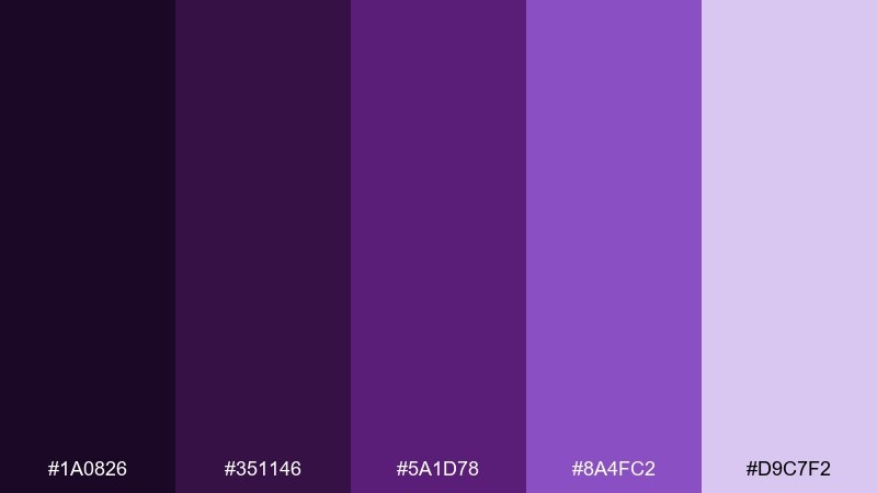
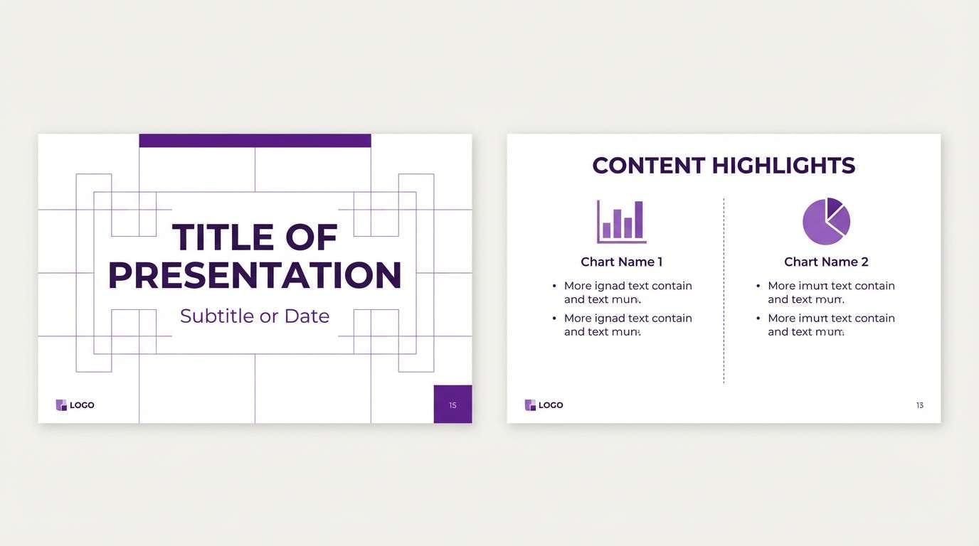
HEX: #1A0826 #351146 #5A1D78 #8A4FC2 #D9C7F2
Mood: cohesive, modern, polished
Best for: presentation slide template
A tonal violet range feels cohesive and polished, perfect for clean storytelling. Use the darkest shade for title slides, then step down to mid-tones for section headers and charts. Pair with plenty of white space and simple icons to keep it business-ready. Tip: choose one consistent tint for data highlights so charts stay readable across decks.
Image example of monochrome violet generated using media.io
19) Wildflower Purple
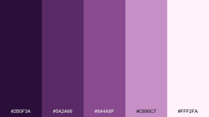
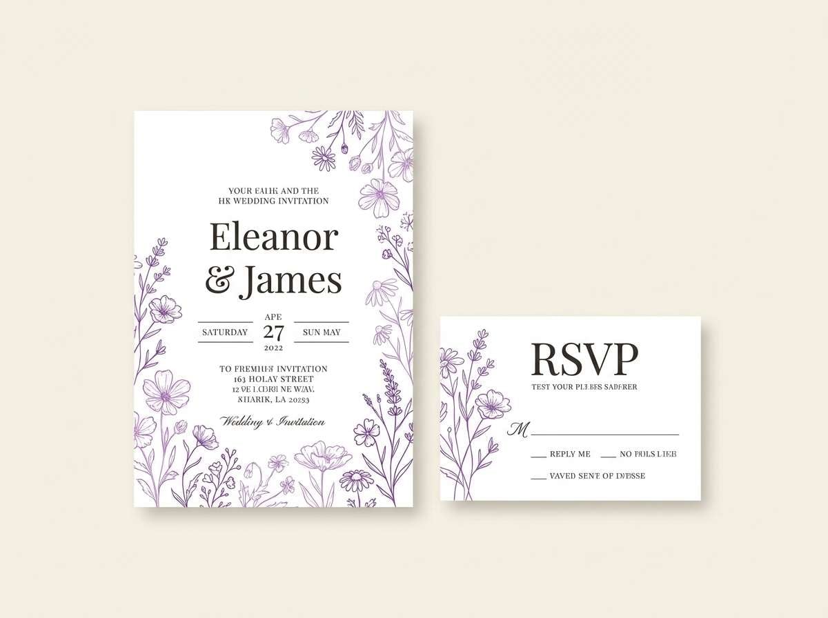
HEX: #2B0F3A #5A2A66 #8A4A8F #C690C7 #FFF2FA
Mood: romantic, floral, whimsical
Best for: wedding stationery suite
Wildflower purples feel romantic and whimsical, like pressed petals tucked into a book. Use the pale blush as the paper base and bring in the mid purples for monograms, borders, and RSVP details. Pair with soft sage or eucalyptus greens for botanical balance. Tip: keep ink coverage light on envelopes to preserve a delicate, handcrafted look.
Image example of wildflower purple generated using media.io
20) Smoky Violet Gray
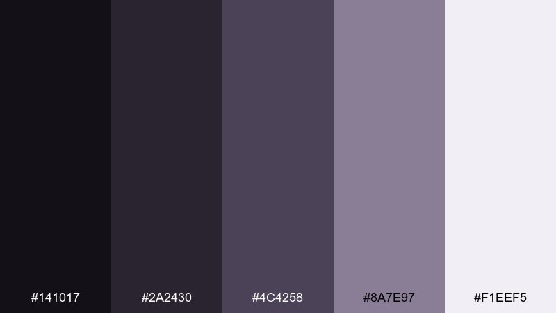
HEX: #141017 #2A2430 #4C4258 #8A7E97 #F1EEF5
Mood: quiet, mature, minimalist
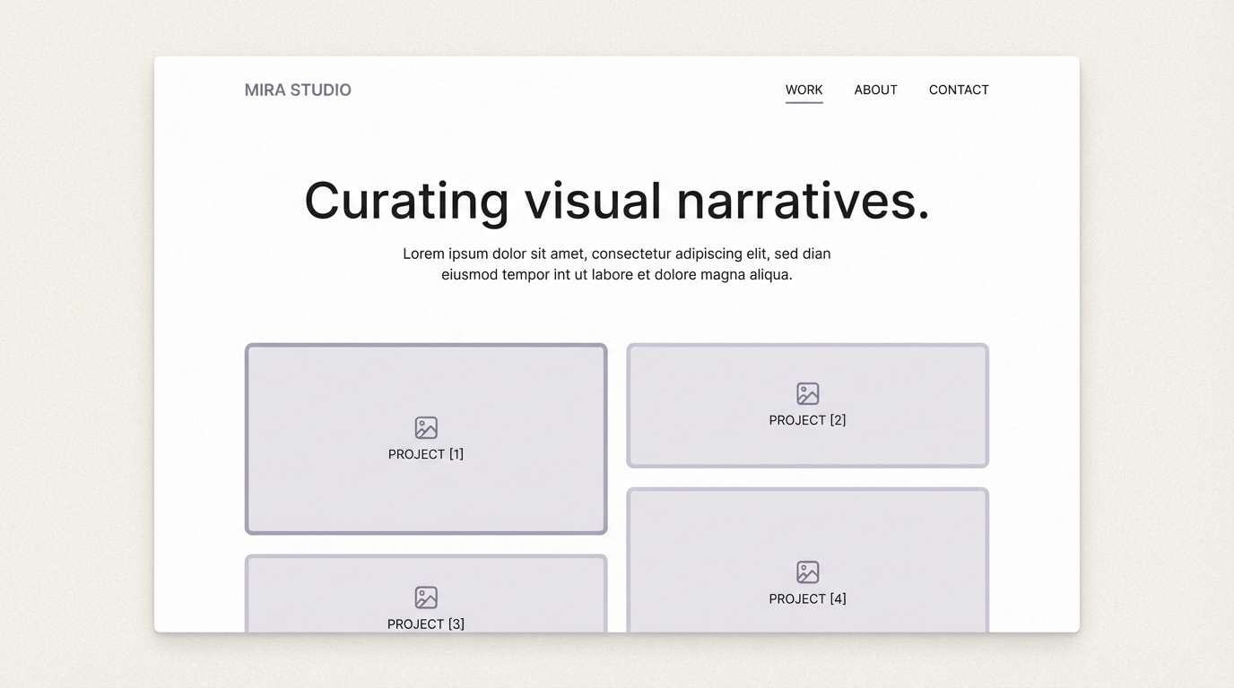
Best for: portfolio website UI
Smoky violets mixed with gray feel quiet and mature, like a gallery wall in soft light. Use the near-black for navigation and body text, while the pale tint keeps sections open and calm. Pair with neutral photography and subtle hover states to avoid visual noise. Tip: lean on spacing and typography scale rather than heavy color blocks for structure.
Image example of smoky violet gray generated using media.io
21) Purple Charcoal Contrast
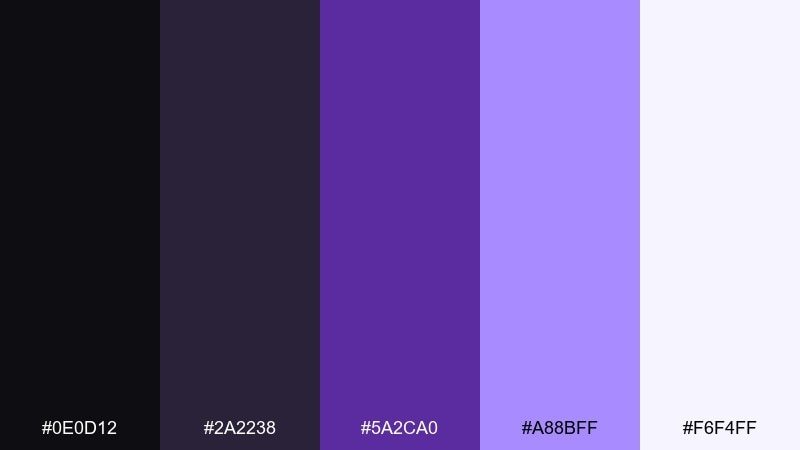
HEX: #0E0D12 #2A2238 #5A2CA0 #A88BFF #F6F4FF
Mood: bold, modern, high-contrast
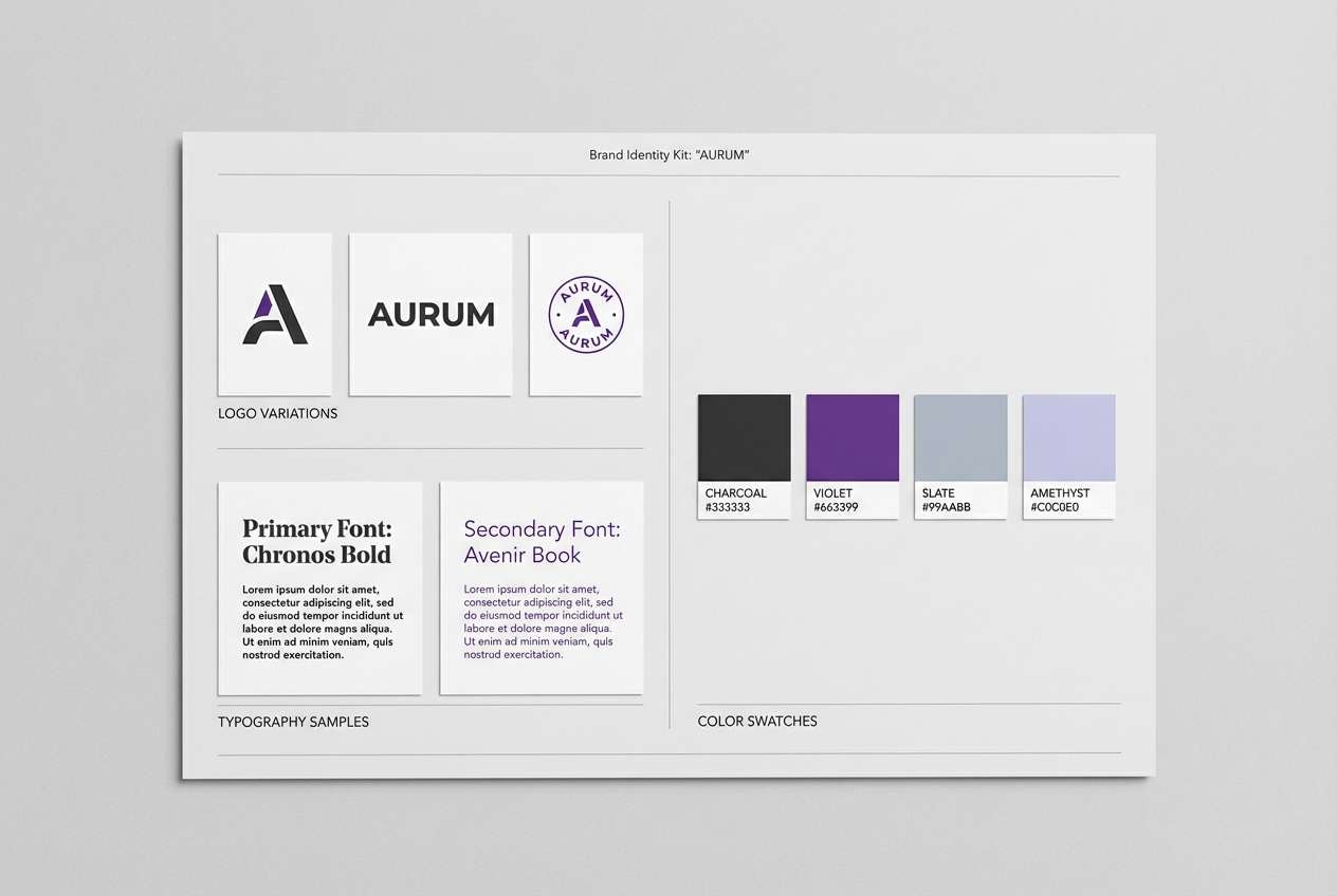
Best for: logo and brand kit board
Charcoal with bright violet accents feels modern and assertive, like tech branding with a creative edge. Use the dark neutrals as the foundation for logos and typography, then bring in the brighter tones for highlights and secondary marks. Pair with crisp white and a restrained icon set to keep it versatile across channels. Tip: test the accent color on small elements (favicon, app icon) to ensure it stays distinct.
Image example of purple charcoal contrast generated using media.io
What Colors Go Well with Purple?
Neutrals are the easiest match: white, ivory, light gray, and charcoal help purple feel clean and intentional. For UI, pairing purple with off-white surfaces often improves readability while keeping the design soft.
Warm complements like gold, champagne, peach, and blush add a premium or welcoming tone, especially for packaging and ads. Cooler accents like cyan or teal create a crisp, modern contrast that feels tech-forward and energetic.
For nature-inspired looks, try muted greens (sage, eucalyptus) with eggplant or dusty mauve. Keep the green desaturated so purple remains the hero rather than competing for attention.
How to Use a Purple Color Palette in Real Designs
Start by assigning roles: choose one primary purple for brand emphasis, a dark shade for text/navigation, and a light tint for backgrounds and cards. This prevents “all-purple” layouts from feeling heavy or unstructured.
Prioritize contrast when using vibrant violets: reserve the most saturated color for CTAs, active states, or key highlights. For long-form reading or dashboards, keep large surfaces lighter and let deeper purples anchor hierarchy.
In print, test purple swatches under your expected lighting and on the intended paper stock. Deep purples can shift toward black on uncoated paper, so you may need a slightly brighter mid-tone to preserve detail.
Create Purple Palette Visuals with AI
If you have HEX codes but need matching visuals (mockups, flyers, UI screens, or mood boards), generating consistent imagery can save hours. The prompts above are designed to align composition and mood with each palette.
In Media.io, you can paste a prompt, adjust style and aspect ratio, and iterate quickly until the lighting and contrast match your brand. This is especially helpful when you need a full set of assets that feel cohesive across channels.
Once you have an image you like, reuse the same prompt structure and swap only the subject (for example, “menu” to “poster”) to keep a consistent purple color scheme across your campaign.
Purple Color Palette FAQs
-
What does purple communicate in design and branding?
Purple often signals creativity, imagination, premium quality, and a touch of mystery. Lighter lavenders feel gentle and calming, while deep aubergine or royal purple can feel luxurious and authoritative. -
How do I choose the right purple palette for a website UI?
Pick a light tint for surfaces, a dark shade for text/navigation, and one saturated accent for interactive elements. Test contrast (especially on buttons and links) so the purple stays accessible on both desktop and mobile screens. -
Which neutral colors pair best with purple?
Crisp white, warm ivory, soft grays, and charcoal are the most reliable pairings. Neutrals help purple stand out without making the layout feel overly colorful. -
What accent colors work well with purple besides neutrals?
Gold/champagne adds a formal, premium feel; peach/blush makes purple warmer and more friendly; cyan/teal creates a high-contrast, futuristic look; sage green adds an earthy, modern balance. -
Can purple be used for minimalist designs?
Yes—use dusty violets and violet-grays, keep saturation low, and rely on spacing and typography for structure. Reserve a brighter violet for one small highlight (like a link or tag) to maintain a minimalist aesthetic. -
How can I avoid purple looking too dark or too neon?
Control saturation and surface area: use bright purples only on focal elements, and give them breathing room with light backgrounds. For dark purples, introduce lighter tints for cards/sections so details don’t get lost. -
How do I generate consistent purple-themed visuals for campaigns?
Use a repeatable prompt format (subject + layout + lighting + mood) and keep the same aspect ratio across outputs. With Media.io’s text-to-image tool, you can iterate quickly and maintain a cohesive purple color scheme across ads, posts, and landing pages.


