

Dark blue navy blue palettes are a go-to when you need instant trust, structure, and a premium feel. They can read modern in UI, timeless in branding, and cozy in interiors—depending on the accents you pair with them.
Below are 20 curated dark blue navy blue color palette ideas with HEX codes, plus practical tips and Media.io prompts so you can generate matching visuals fast.
In this article
- Why Dark Blue Navy Blue Palettes Work So Well
-
- midnight harbor
- cobalt nightfall
- ink & copper
- stormy linen
- sapphire citrus
- museum velvet
- arctic beacon
- rose after dark
- graphite tide
- seafarer gold
- denim & oat
- neon marina
- winter observatory
- pine & deep sea
- coral compass
- royal ink & lavender
- saltwater minimal
- night garden
- pilot uniform
- twilight plum accent
- What Colors Go Well with Dark Blue Navy Blue?
- How to Use a Dark Blue Navy Blue Color Palette in Real Designs
- Create Dark Blue Navy Blue Palette Visuals with AI
Why Dark Blue Navy Blue Palettes Work So Well
Dark blue navy blue sits in a sweet spot between black’s authority and blue’s clarity, so it feels confident without turning harsh. That’s why it’s common in finance, SaaS, and corporate design systems where credibility matters.
It also creates instant depth. A navy base makes brighter accents (teal, gold, coral, mint, or even neon) look more intentional because the background naturally “frames” interactive elements and key information.
Finally, navy is versatile across mediums. It holds up in print, reads well on screens, and pairs nicely with both warm neutrals (ivory, oat, greige) and cool tints (periwinkle, ice blue), making it easy to scale into a full brand palette.
20+ Dark Blue Navy Blue Color Palette Ideas (with HEX Codes)
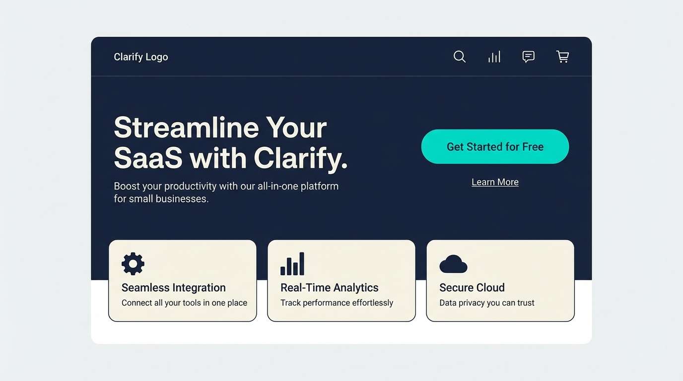
1) Midnight Harbor
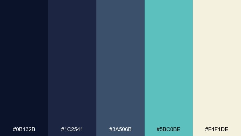
HEX: #0B132B #1C2541 #3A506B #5BC0BE #F4F1DE
Mood: calm, maritime, sophisticated
Best for: saas landing page hero
Calm and maritime, this mix feels like moonlight on deep water with a crisp sea-breeze accent. Use the darkest navy for headers and navigation, then lean on the teal for CTAs that pop without looking neon. Warm ivory keeps sections readable and prevents the layout from getting too heavy. Tip: reserve the teal for one primary action per view to keep hierarchy clean.
Image example of midnight harbor generated using media.io
Media.io is an online AI studio for creating and editing video, image, and audio in your browser.

2) Cobalt Nightfall
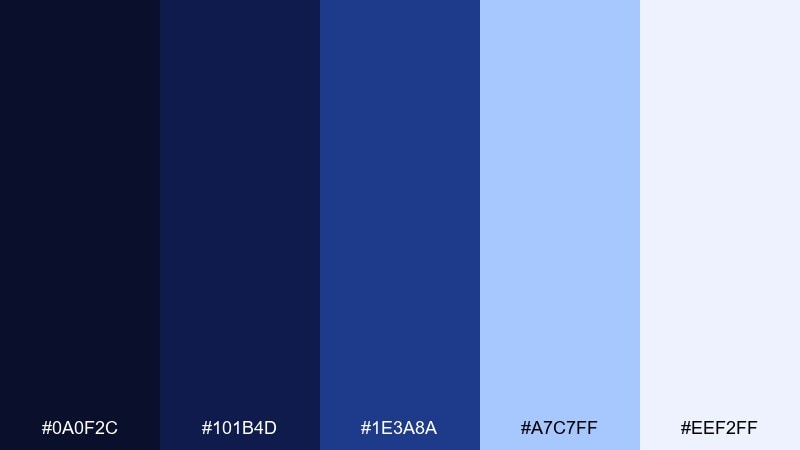
HEX: #0A0F2C #101B4D #1E3A8A #A7C7FF #EEF2FF
Mood: sleek, tech-forward, focused
Best for: dashboard UI mockup
Sleek and focused, these tones read like a city skyline lit by cobalt highlights. Build depth by using near-black navy for sidebars and the brighter blue for active states and charts. Pale periwinkle and off-white keep data grids legible and reduce eye fatigue. Tip: pair the cobalt with subtle 10–15% tints for hover and selection states.
Image example of cobalt nightfall generated using media.io

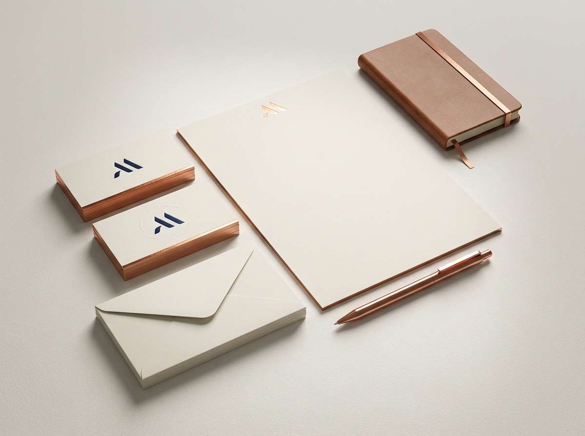
3) Ink & Copper
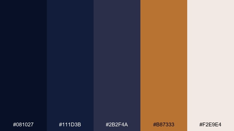
HEX: #081027 #111D3B #2B2F4A #B87333 #F2E9E4
Mood: luxurious, editorial, warm
Best for: premium brand identity
Luxurious and editorial, it evokes dark ink on textured paper with a copper foil glint. These dark blue navy blue color combinations shine in logos, monograms, and packaging where you want restrained drama. Keep copper as a highlight (rules, icons, small type) and let the warm off-white do the heavy lifting for readability. Tip: test copper on both matte and glossy finishes to pick the right warmth.
Image example of ink & copper generated using media.io
4) Stormy Linen
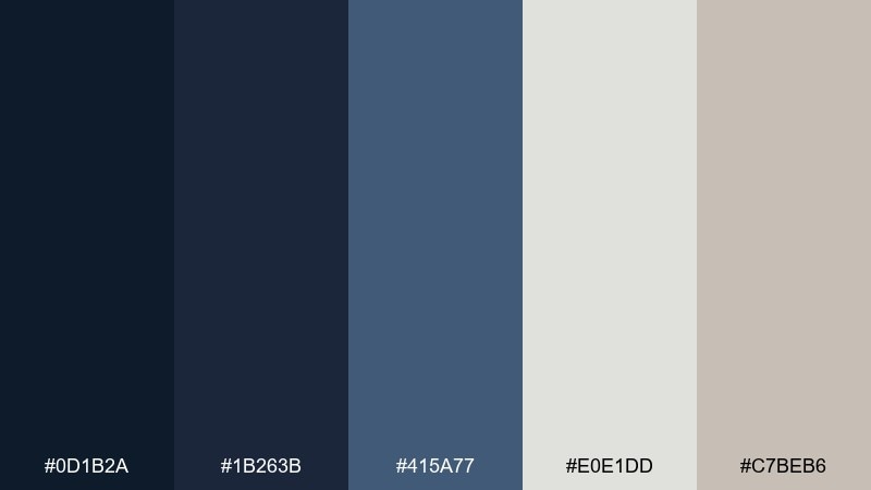
HEX: #0D1B2A #1B263B #415A77 #E0E1DD #C7BEB6
Mood: quiet, natural, understated
Best for: modern living room interior
Quiet and natural, it feels like storm clouds over soft linen and stone. Use the deep blues for built-ins, accent walls, or cabinetry, and balance with the light neutrals on larger surfaces. The greige tone bridges warm woods and cool paints, making the whole room feel intentional. Tip: add texture—bouclé, linen, matte plaster—to keep the palette from feeling flat.
Image example of stormy linen generated using media.io
5) Sapphire Citrus
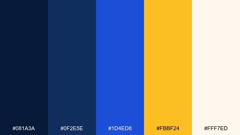
HEX: #081A3A #0F2E5E #1D4ED8 #FBBF24 #FFF7ED
Mood: energetic, bold, playful
Best for: social media promo graphic
Energetic and punchy, it’s like sapphire light cutting through a bright citrus burst. Use the golden yellow sparingly for price tags, badges, or key stats so it reads as intentional emphasis. The creamy off-white prevents the blues from overwhelming small mobile canvases. Tip: keep text either near-white on navy or near-navy on cream—avoid mid-blue body copy.
Image example of sapphire citrus generated using media.io

6) Museum Velvet
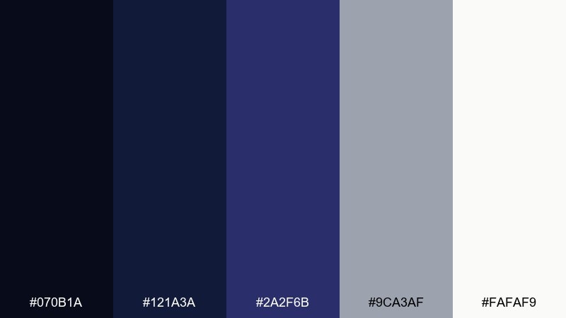
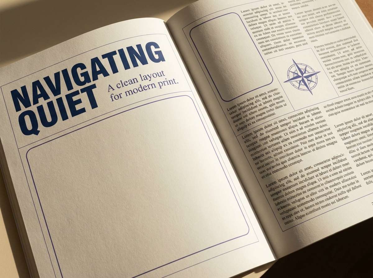
HEX: #070B1A #121A3A #2A2F6B #9CA3AF #FAFAF9
Mood: dramatic, cultured, refined
Best for: editorial magazine spread
Dramatic and cultured, these tones recall velvet gallery walls and polished frames. Use the nearly-black navy for headlines and borders, then soften long reads with the warm off-white background. The cool gray works as captions, rules, and secondary typography without competing for attention. Tip: add a single saturated indigo element per spread to guide the eye.
Image example of museum velvet generated using media.io
7) Arctic Beacon
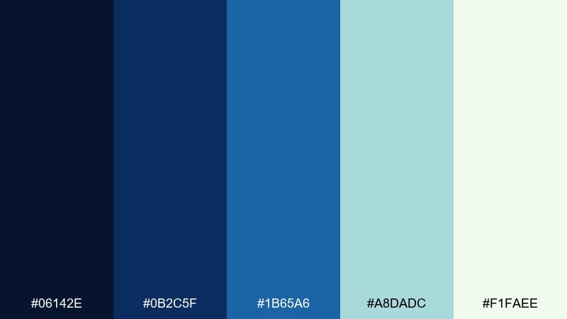
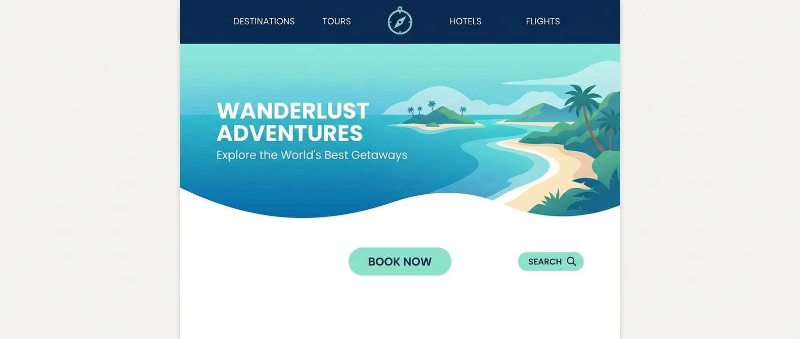
HEX: #06142E #0B2C5F #1B65A6 #A8DADC #F1FAEE
Mood: fresh, crisp, outdoorsy
Best for: travel website header
Fresh and crisp, it feels like polar air and bright water under a clear sky. This dark blue navy blue color palette is ideal for travel and outdoor brands that want trust plus a hint of adventure. Use the icy mint as an accent for buttons and tags, while the soft white keeps imagery and copy clean. Tip: let photos carry the warmth; keep UI elements cool and minimal.
Image example of arctic beacon generated using media.io
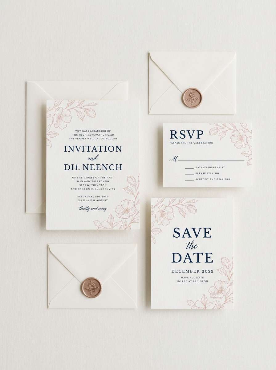
8) Rose After Dark
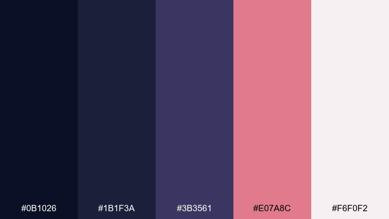
HEX: #0B1026 #1B1F3A #3B3561 #E07A8C #F6F0F2
Mood: romantic, modern, slightly moody
Best for: wedding invitation suite
Romantic and modern, it evokes twilight blooms against a dark sky. Pair the blush rose with generous white space for names and dates, and use the deepest navy for formal typography. The muted violet-blue helps bridge the two so the contrast feels elegant, not harsh. Tip: print rose accents as spot color or foil to keep them crisp on textured stock.
Image example of rose after dark generated using media.io
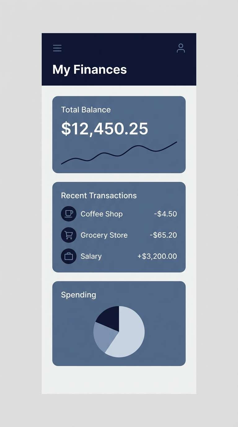
9) Graphite Tide
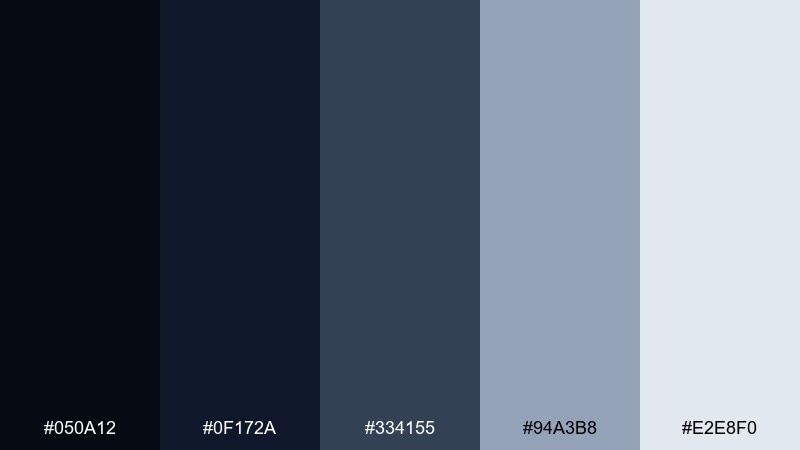
HEX: #050A12 #0F172A #334155 #94A3B8 #E2E8F0
Mood: minimal, professional, balanced
Best for: finance app UI
Minimal and professional, it reads like graphite, steel, and deep water. Use the darkest tones for navigation and security cues, then let the slate and light grays carry tables and forms. This mix works especially well when you want a serious look without going full black-and-white. Tip: keep error and success colors muted so they don’t clash with the cool base.
Image example of graphite tide generated using media.io
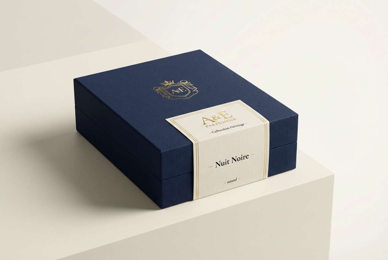
10) Seafarer Gold
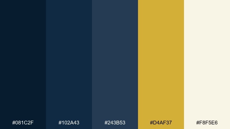
HEX: #081C2F #102A43 #243B53 #D4AF37 #F8F5E6
Mood: classic, confident, upscale
Best for: luxury product packaging
Classic and confident, it brings to mind captain’s uniforms and a warm gilded detail. Use gold as a premium highlight on logos, seals, and small borders, while the navies provide a sturdy backdrop. The creamy neutral keeps the set from feeling cold and helps product info stay readable. Tip: choose a slightly darker gold for small text so it holds up in print.
Image example of seafarer gold generated using media.io
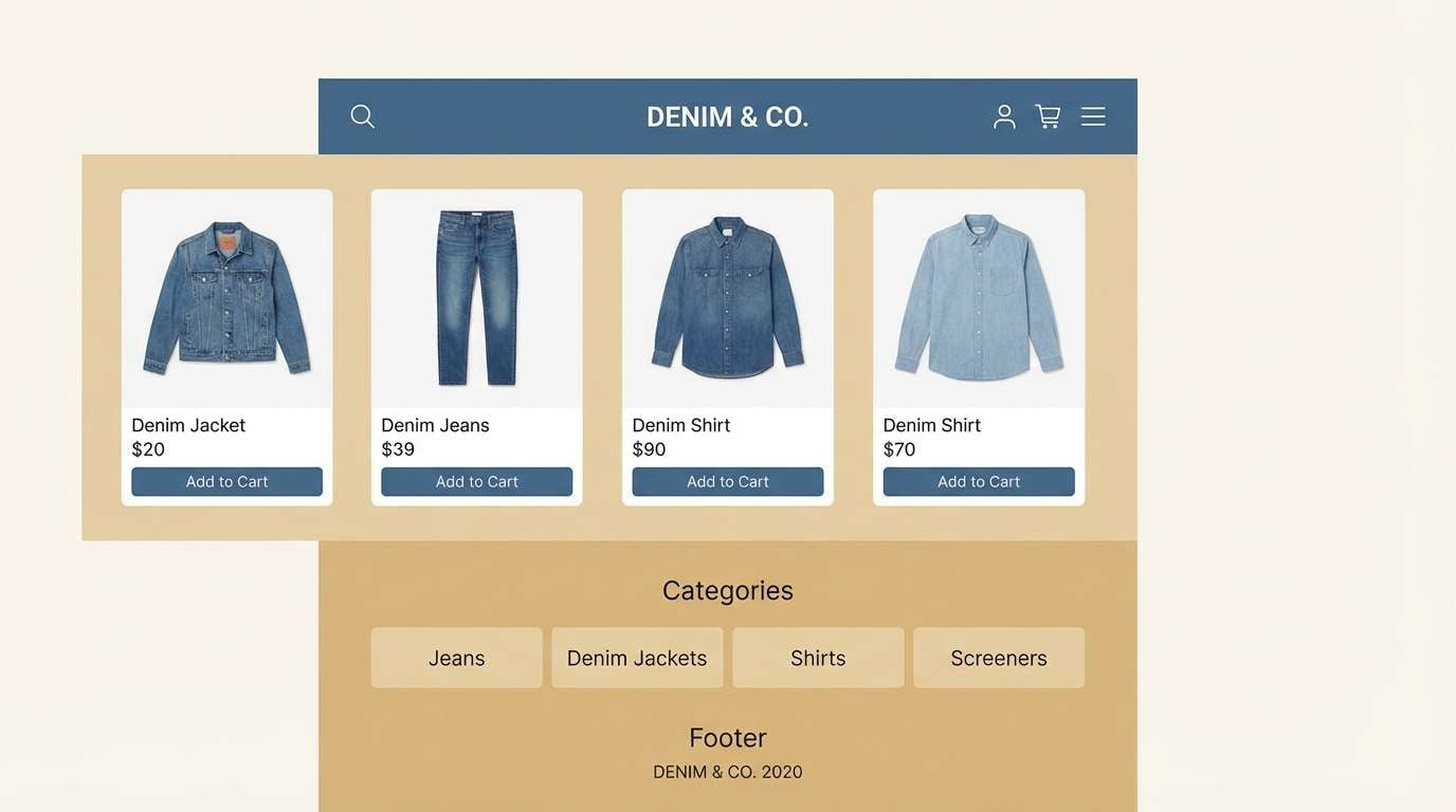
11) Denim & Oat
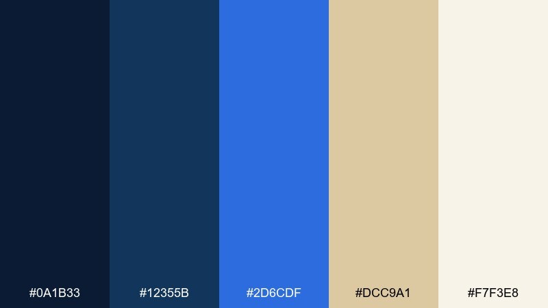
HEX: #0A1B33 #12355B #2D6CDF #DCC9A1 #F7F3E8
Mood: friendly, casual, approachable
Best for: ecommerce storefront
Friendly and casual, it feels like well-worn denim with warm oat tones. Use the mid-blue for links and highlights, and lean on the light neutrals for product grids and long pages. The warm beige is great for subtle badges, category chips, or background bands. Tip: keep CTAs consistent—one blue, one neutral—to avoid a busy storefront.
Image example of denim & oat generated using media.io
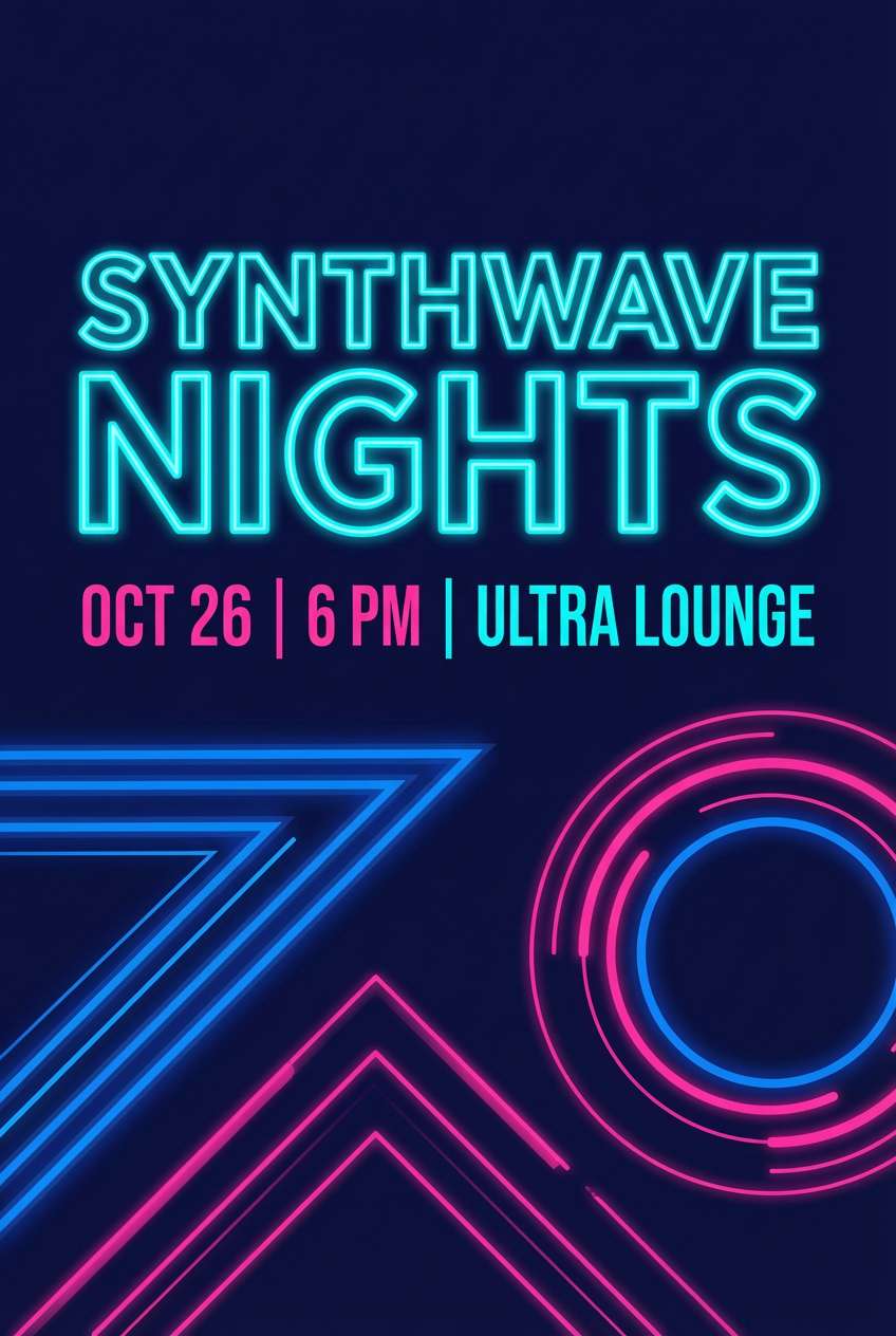
12) Neon Marina
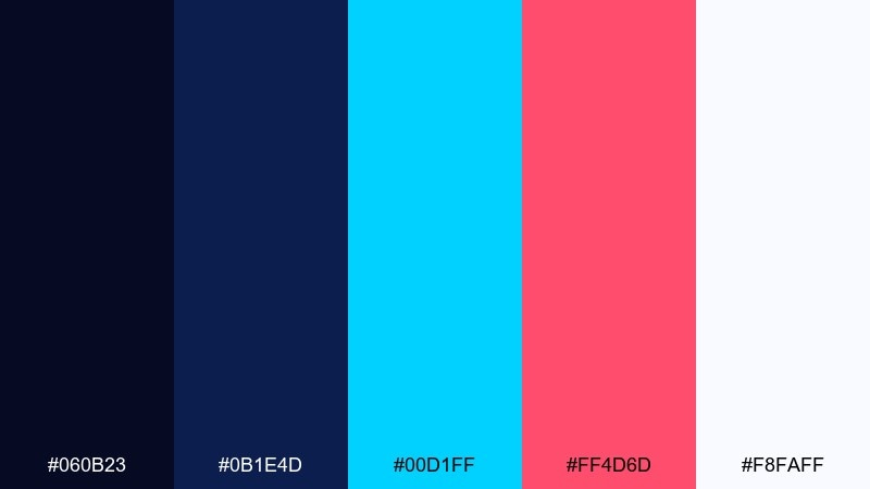
HEX: #060B23 #0B1E4D #00D1FF #FF4D6D #F8FAFF
Mood: electric, youthful, nightlife
Best for: event poster design
Electric and nightlife-ready, it suggests neon reflections on dark water. Use the cyan and hot pink as opposing accents to create high-energy contrast without relying on pure black. Keep the background navy-heavy so typography stays readable and the brights feel intentional. Tip: limit gradients to one area (like a headline) so the layout doesn’t turn chaotic.
Image example of neon marina generated using media.io
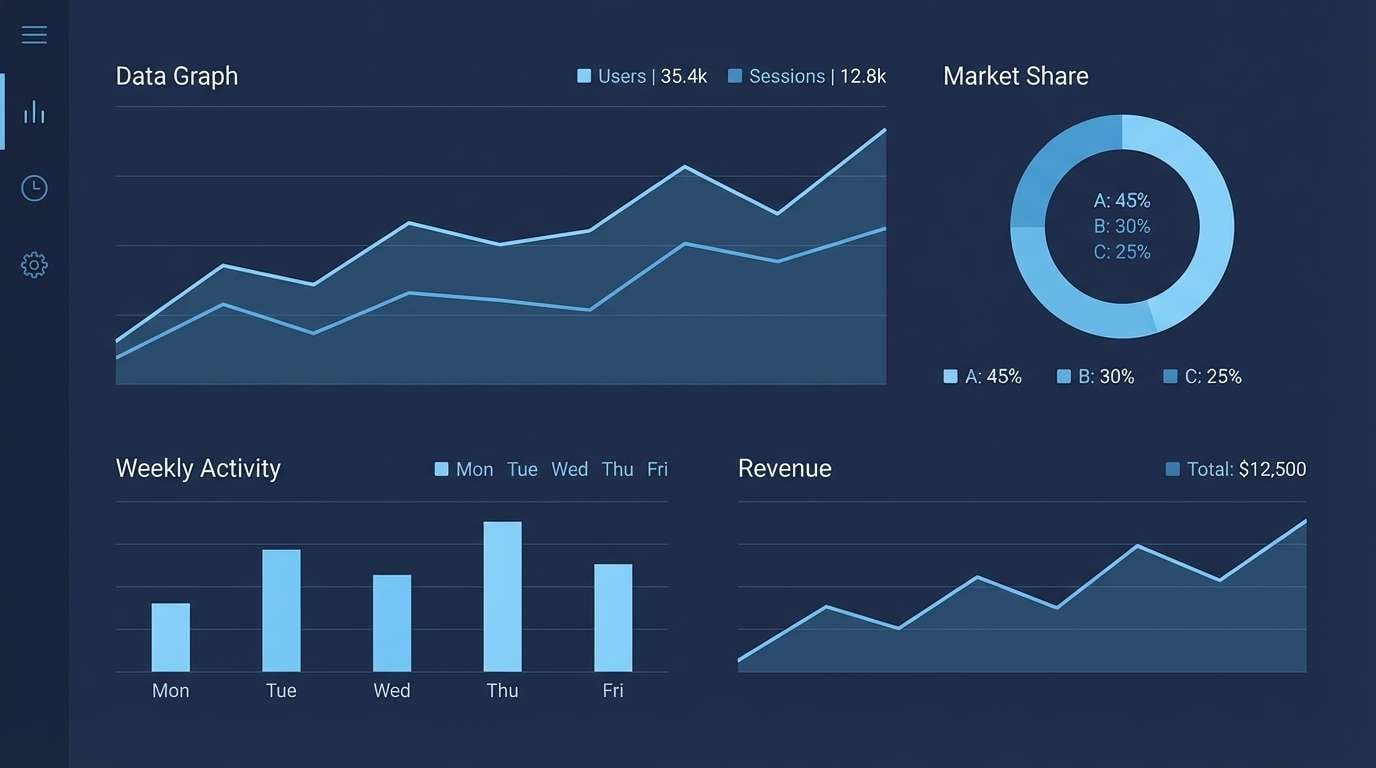
13) Winter Observatory
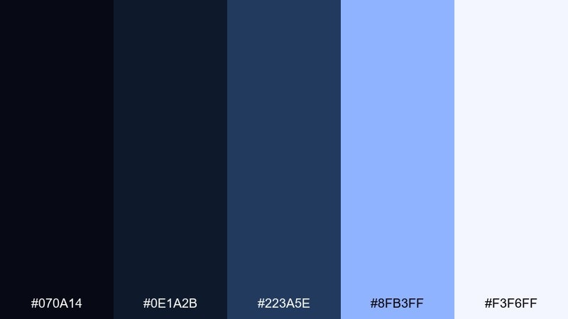
HEX: #070A14 #0E1A2B #223A5E #8FB3FF #F3F6FF
Mood: quiet, cosmic, intelligent
Best for: data visualization theme
Quiet and cosmic, it feels like a winter observatory with cool starlight. Use the pale blue for line graphs and highlights, while the deeper navies set a consistent background for dashboards and reports. The near-white makes legends and labels easy to scan at small sizes. Tip: increase gridline transparency so charts don’t fight the dark base.
Image example of winter observatory generated using media.io
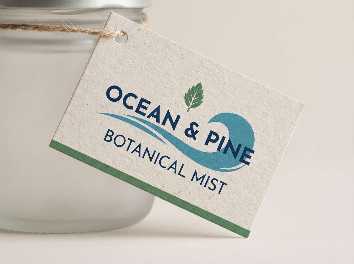
14) Pine & Deep Sea
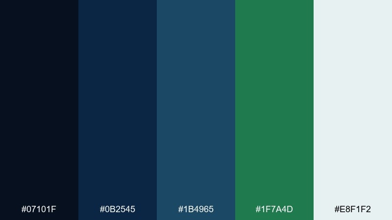
HEX: #07101F #0B2545 #1B4965 #1F7A4D #E8F1F2
Mood: grounded, outdoors, refreshing
Best for: eco brand packaging label
Grounded and outdoorsy, it brings together deep sea blues with a pine-green breath of freshness. Use the green as a trust cue for sustainability claims, and keep the blues for structure and credibility. The pale icy neutral works well for ingredient lists and small-print details. Tip: choose uncoated paper so the dark tones feel natural rather than glossy.
Image example of pine & deep sea generated using media.io
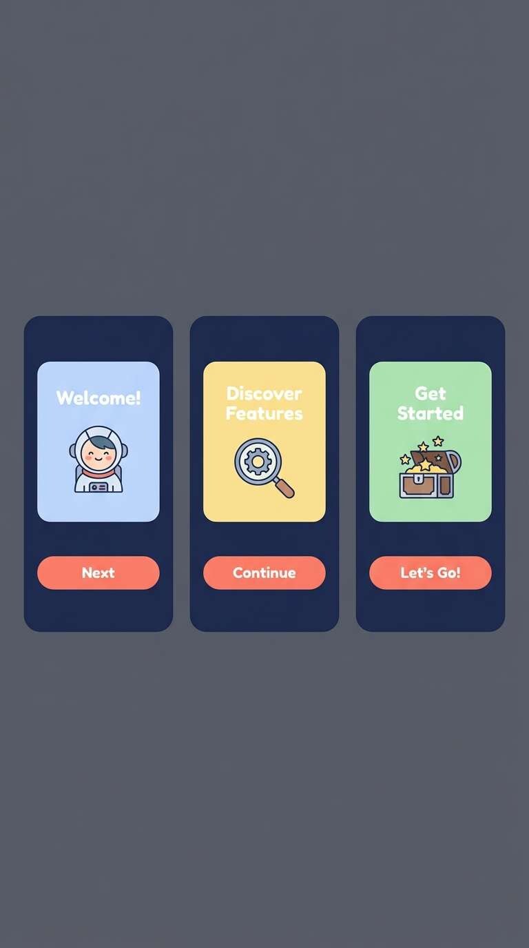
15) Coral Compass
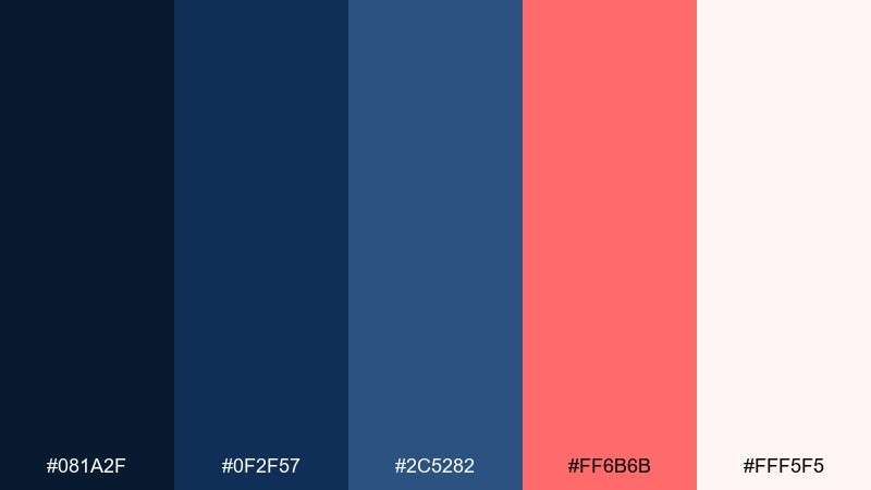
HEX: #081A2F #0F2F57 #2C5282 #FF6B6B #FFF5F5
Mood: adventurous, warm, inviting
Best for: mobile app onboarding screens
Adventurous and inviting, it feels like a coral marker on a nautical map. These dark blue navy blue color combinations are great when you want trust plus a friendly, human accent for onboarding. Use coral for progress dots and primary buttons, and keep the softer white-pink for gentle screen backgrounds. Tip: ensure coral passes contrast on navy by slightly deepening it for small text.
Image example of coral compass generated using media.io
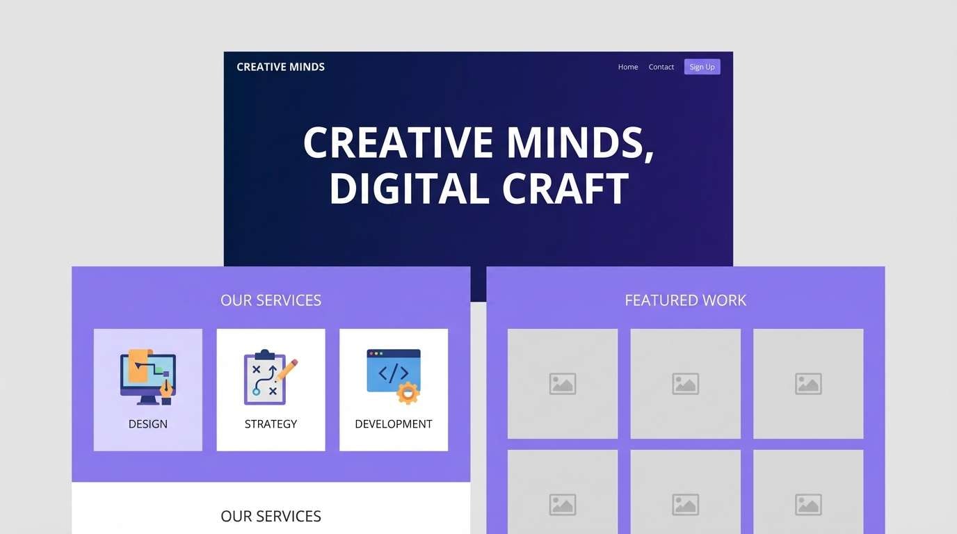
16) Royal Ink & Lavender
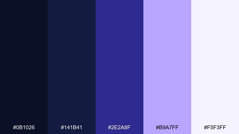
HEX: #0B1026 #141B41 #2E2A8F #B9A7FF #F5F3FF
Mood: creative, elegant, slightly dreamy
Best for: creative agency website
Creative and slightly dreamy, it reads like royal ink softened by lavender haze. Use the indigo as a bold brand color for headings and interactive states, then keep lavender as the supporting tint in backgrounds and cards. The near-white lilac keeps long-form content calm and readable. Tip: add subtle grain or gradients to lavender sections to avoid a “flat pastel” feel.
Image example of royal ink & lavender generated using media.io
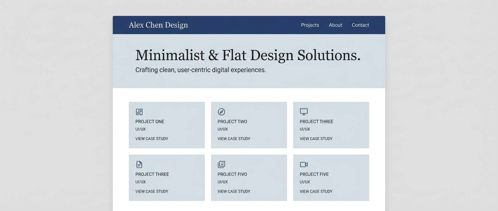
17) Saltwater Minimal
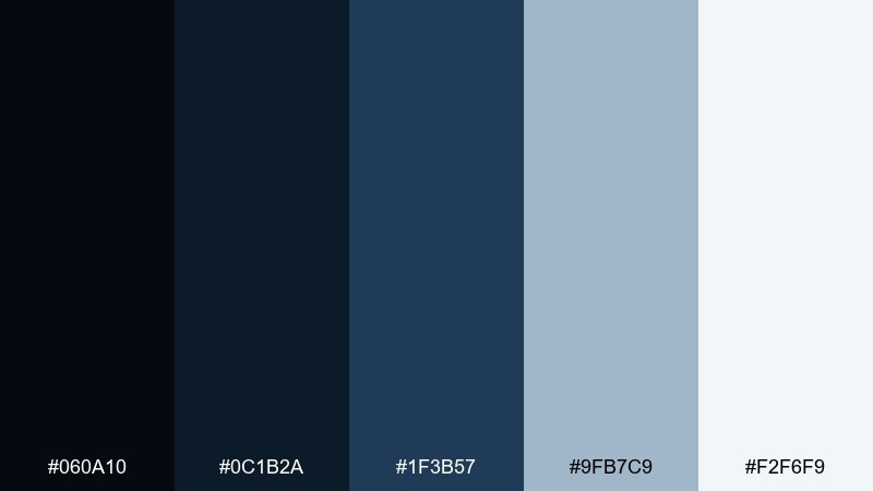
HEX: #060A10 #0C1B2A #1F3B57 #9FB7C9 #F2F6F9
Mood: clean, airy, modern
Best for: portfolio website
Clean and airy, it feels like saltwater mist over smooth slate. Use the darkest shades for navigation and project titles, then let the pale blue-gray handle backgrounds and dividers. This set works well for portfolios because it frames imagery without stealing attention. Tip: keep shadows subtle and rely on spacing to create depth.
Image example of saltwater minimal generated using media.io
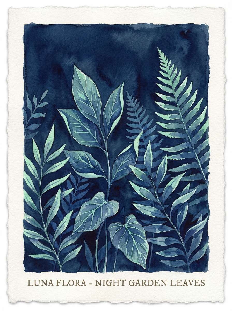
18) Night Garden
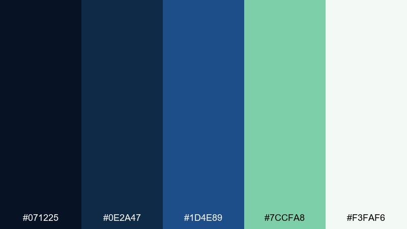
HEX: #071225 #0E2A47 #1D4E89 #7CCFA8 #F3FAF6
Mood: fresh, botanical, serene
Best for: botanical illustration poster
Serene and botanical, it suggests leaves lit softly at night with a cool blue atmosphere. Use the minty green for foliage details and the blues for background washes and shadows. The gentle off-white keeps the composition breathable and print-friendly. Tip: layer watercolor textures so the deep tones stay luminous rather than muddy.
Image example of night garden generated using media.io
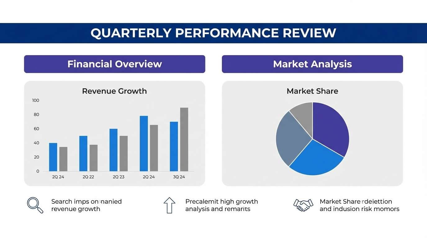
19) Pilot Uniform
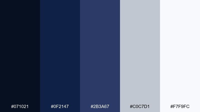
HEX: #071021 #0F2147 #2B3A67 #C0C7D1 #F7F9FC
Mood: structured, trustworthy, corporate
Best for: B2B presentation template
Structured and trustworthy, it feels like a crisp uniform with polished metal details. Use the darkest navy for title slides and section headers, then rely on soft grays for body content and charts. This palette reads well on projectors and keeps long decks from looking harsh. Tip: emphasize key numbers with the mid-indigo rather than introducing new accent colors.
Image example of pilot uniform generated using media.io
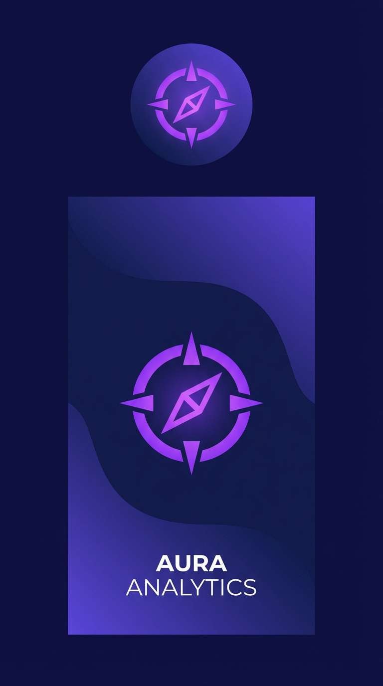
20) Twilight Plum Accent
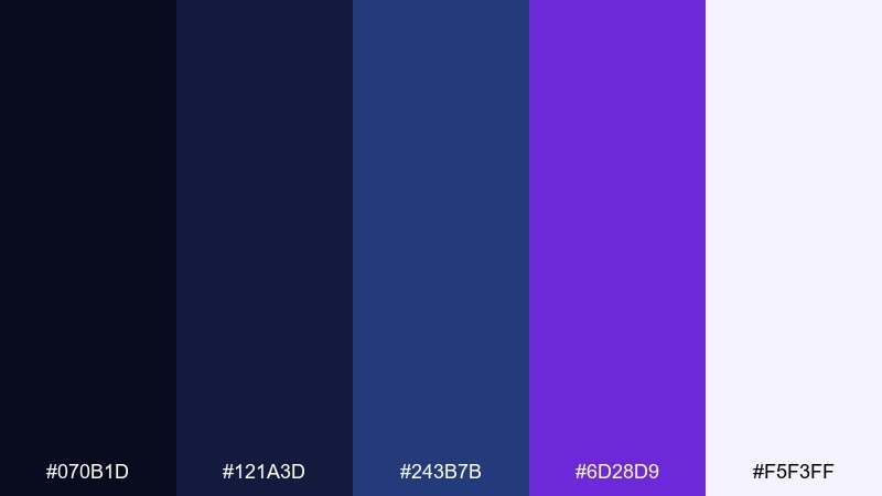
HEX: #070B1D #121A3D #243B7B #6D28D9 #F5F3FF
Mood: bold, modern, creative
Best for: app icon and splash screen
Bold and modern, it feels like twilight blues punctuated by a punchy plum glow. Use the purple as a controlled accent for the icon mark or splash headline while keeping most UI elements in navy. The soft lavender-white helps gradients and glow effects look refined instead of loud. Tip: keep purple accents consistent across states so the brand feels cohesive.
Image example of twilight plum accent generated using media.io
What Colors Go Well with Dark Blue Navy Blue?
Warm accents are the fastest way to make navy feel inviting: ivory, cream, oat, greige, copper, and gold add softness and “premium” warmth without losing the palette’s structure. These pairings are especially strong for packaging, editorial layouts, and interiors.
For a modern digital look, pair navy with cool tints like periwinkle, ice blue, and pale blue-gray. They keep interfaces readable, reduce eye strain, and create clean separation for cards, tables, and backgrounds.
If you want energy, reach for high-chroma pops like coral, citrus yellow, cyan, or plum—but keep them limited to primary actions, key stats, and highlight components so the overall hierarchy stays calm.
How to Use a Dark Blue Navy Blue Color Palette in Real Designs
Start by assigning roles: use the darkest navy for headers/nav, a mid-navy for surfaces or sections, and a lighter blue/gray for cards and dividers. This keeps depth consistent and prevents the design from becoming a single dark block.
Then choose one accent color for interaction (buttons, links, active states) and one neutral for readability (off-white or light gray). In most layouts, that simple split delivers strong contrast while staying cohesive across pages and components.
Finally, test your palette in context: dark backgrounds can make small text and thin icons disappear. Use slightly heavier font weights, increase line-height, and confirm contrast for all states (default, hover, disabled) before you scale the system.
Create Dark Blue Navy Blue Palette Visuals with AI
Need mockups that match your palette (dashboards, posters, invitations, packaging, or interiors)? With Media.io, you can turn a prompt into on-brand visuals in minutes—then iterate quickly by swapping accents, ratios, or styles.
For best results, reference your palette in the prompt using the color names (navy, cobalt, ivory, gold, coral) and describe where each color should appear (background, CTA button, typography, cards). Keep layouts simple so the colors stay the focus.
Once you generate a look you like, reuse the same prompt structure across different formats (social, web hero, slide template) to maintain a consistent navy-based design language.
Dark Blue Navy Blue Color Palette FAQs
-
What does dark blue navy blue communicate in design?
Dark blue navy blue typically communicates trust, stability, professionalism, and calm authority. It’s common in finance, tech, and corporate branding because it feels reliable without being as severe as pure black. -
Is navy blue better than black for UI backgrounds?
Often, yes—navy can feel softer and more modern than black while still providing strong contrast. It also pairs more naturally with blues, mints, and lavenders for charts, cards, and states in dashboards. -
What accent colors pair best with a navy palette?
Gold/copper for a premium look, teal/mint for a crisp modern feel, coral/rose for friendly warmth, and plum/purple for creative energy. The best choice depends on whether you want the palette to read classic, fresh, or bold. -
How do I keep navy designs from looking too dark?
Use a light neutral (ivory, off-white, light gray) for large reading surfaces, and reserve the deepest navy for navigation, headers, and framing. Adding a mid-tone blue-gray for cards and dividers also helps create breathing room. -
What’s a safe way to use bright accents like neon cyan or hot pink with navy?
Keep navy as the dominant background and use brights only for one or two emphasis roles (headline, badge, primary CTA). Limiting gradients and repeating the same accent in predictable spots will prevent the layout from feeling chaotic. -
Do dark blue navy blue palettes print well?
Yes, but you should proof carefully because deep navies can shift darker on certain stocks and finishes. Pairing navy with warm neutrals and using metallic accents (gold/copper) sparingly helps details remain clear. -
How can I generate palette-matching mockups quickly?
Use Media.io’s text-to-image tool and describe the layout plus where each palette color should appear (e.g., “navy header,” “teal CTA,” “ivory content blocks”). Then iterate by adjusting ratio, typography style, and accent usage while keeping the same color roles.
Next: Sunset Color Palette


