

Purple blue palettes combine the imagination of purple with the clarity of blue, making them a go-to choice for modern branding and digital design.
Below are 20 refined purple blue color palette ideas with HEX codes, plus practical pairing tips and AI-ready prompts you can use to generate matching visuals.
In this article
- Why Purple Blue Palettes Work So Well
-
- midnight iris
- violet nebula
- periwinkle dusk
- royal amethyst
- lavender storm
- indigo orchid
- blueberry velvet
- cosmic grape
- sapphire lilac
- plum glacier
- iris neon
- misty periwinkle
- twilight hydrangea
- arctic violet
- deep space bloom
- soft heliotrope
- electric ultraviolet
- denim lavender
- mauve marina
- orchid nightfall
- What Colors Go Well with Purple Blue?
- How to Use a Purple Blue Color Palette in Real Designs
- Create Purple Blue Palette Visuals with AI
Why Purple Blue Palettes Work So Well
Purple blue sits in a sweet spot between expressive and dependable. Purple brings creativity, mystery, and a premium tone, while blue adds structure, trust, and clarity—so the mix feels both imaginative and usable.
These palettes also handle contrast gracefully. Deep indigos can anchor backgrounds and headers, while periwinkle and lilac tints create clean highlights that feel softer than pure white on screens.
From UI to posters, purple and blue tones scale well across sizes: they look rich in large gradients, and they stay readable when reduced to small icons, badges, and button states.
20+ Purple Blue Color Palette Ideas (with HEX Codes)
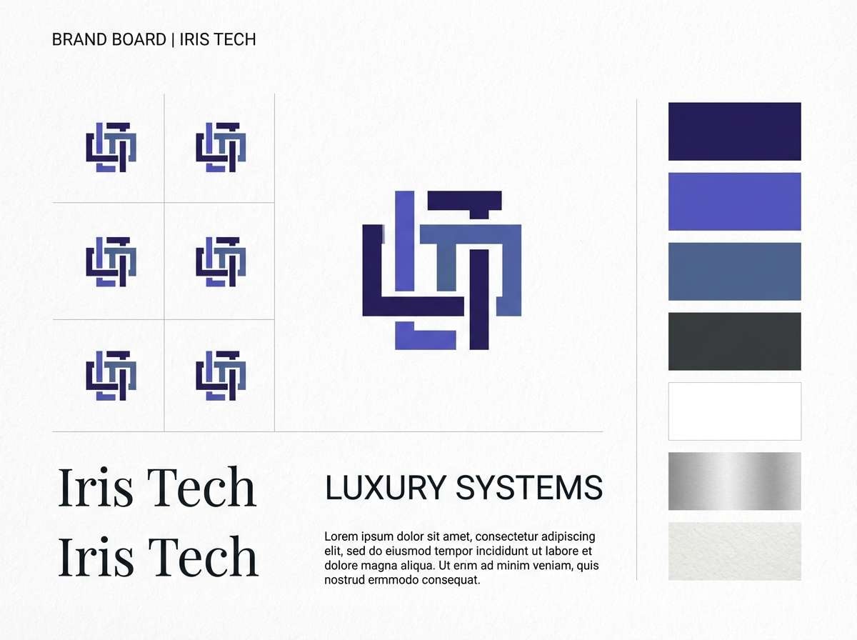
1) Midnight Iris
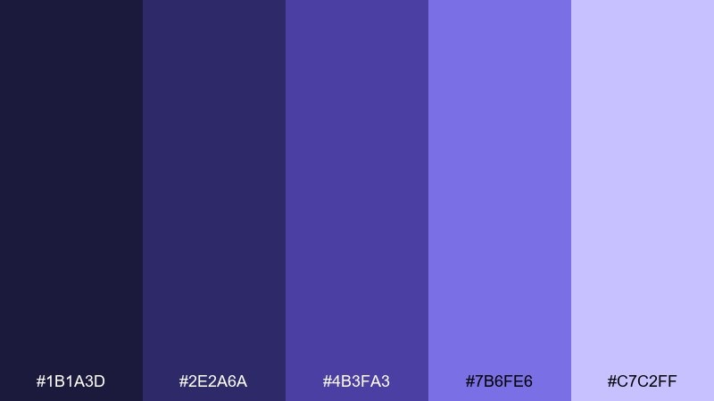
HEX: #1B1A3D #2E2A6A #4B3FA3 #7B6FE6 #C7C2FF
Mood: moody, premium, futuristic
Best for: luxury tech branding
Moody midnight violets and inky blues evoke city lights after dark and a polished, high-end feel. Use the deeper shades for logos and headers, then bring in the soft lilac as a glow-like highlight. It pairs especially well with black, graphite, and a hint of silver foil for a premium finish. Tip: keep gradients subtle—one smooth transition from indigo to lilac is enough to feel modern without looking noisy.
Image example of midnight iris generated using media.io
Media.io is an online AI studio for creating and editing video, image, and audio in your browser.

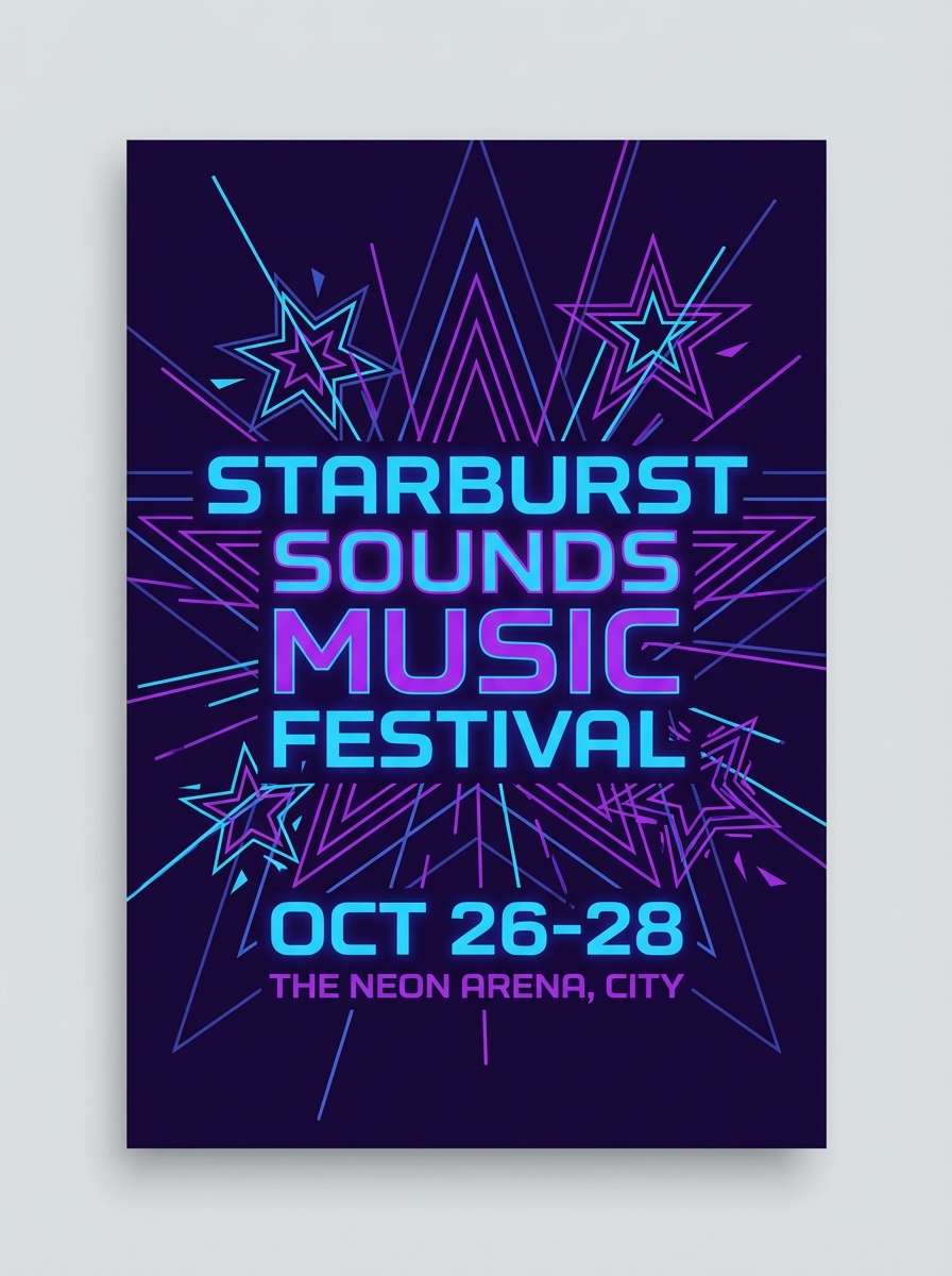
2) Violet Nebula

HEX: #2A124F #3B1C7A #4D2DB7 #2F6BFF #A7D1FF
Mood: cosmic, energetic, vivid
Best for: music festival poster
Vivid nebula purples with electric blue highlights feel like lasers cutting through a night sky. Use the bright blue for the main act and the pale sky blue for secondary details and dates. For contrast, pair with a near-black background and a single neon accent rather than stacking multiple brights. Tip: set body text in the lightest tint to keep readability high on dark layouts.
Image example of violet nebula generated using media.io
3) Periwinkle Dusk
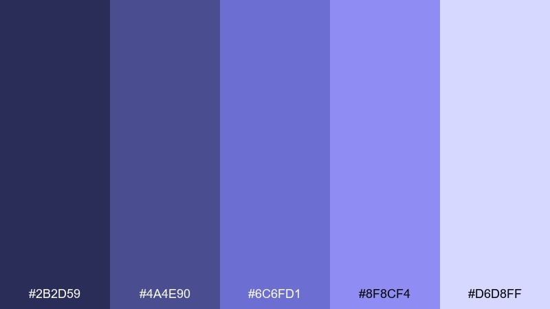
HEX: #2B2D59 #4A4E90 #6C6FD1 #8F8CF4 #D6D8FF
Mood: calm, airy, approachable
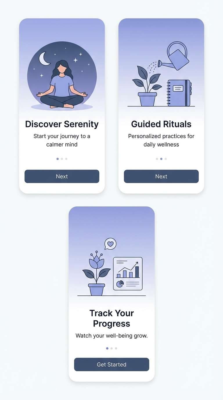
Best for: mobile app onboarding UI
Soft dusk blues and periwinkle tones feel like evening clouds—quiet, friendly, and easy on the eyes. This purple blue color palette works beautifully for onboarding screens where you want reassurance and clarity. Pair it with plenty of white space and rounded UI components, then reserve the brighter periwinkle for primary buttons. Tip: use the palest tint for cards and surfaces to keep depth without harsh borders.
Image example of periwinkle dusk generated using media.io
4) Royal Amethyst
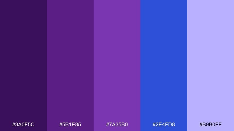
HEX: #3A0F5C #5B1E85 #7A35B0 #2E4FD8 #B9B0FF
Mood: regal, bold, elegant
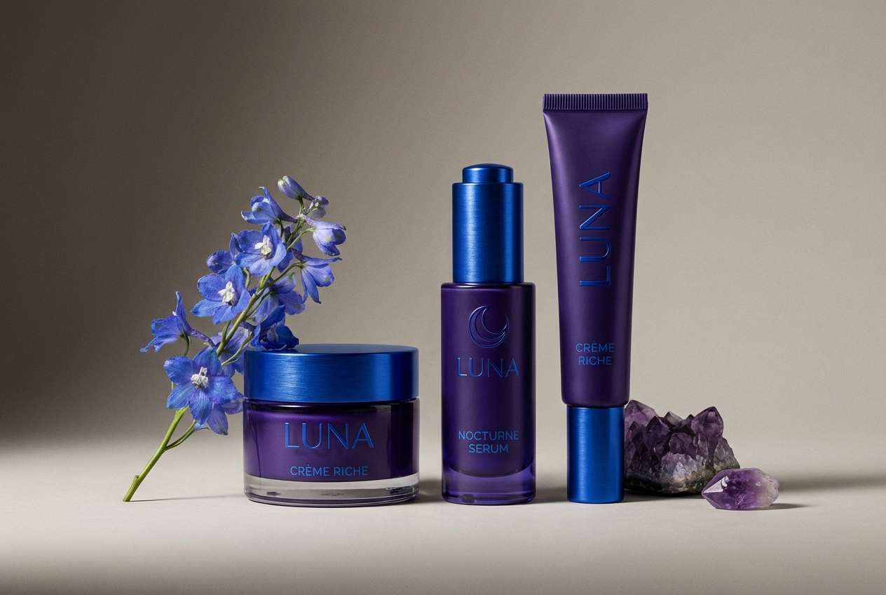
Best for: cosmetic packaging
Regal amethyst and saturated blue create a confident, jewel-box impression. Use the darkest purple for the pack base and the vivid blue as a crisp accent for seals, caps, or callouts. Pair with warm neutrals like ivory to keep it luxe instead of harsh. Tip: add a small metallic detail (gold or chrome) to elevate the contrast without adding another color.
Image example of royal amethyst generated using media.io
5) Lavender Storm
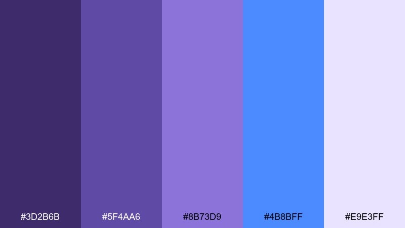
HEX: #3D2B6B #5F4AA6 #8B73D9 #4B8BFF #E9E3FF
Mood: romantic, dynamic, modern
Best for: wedding invitation suite
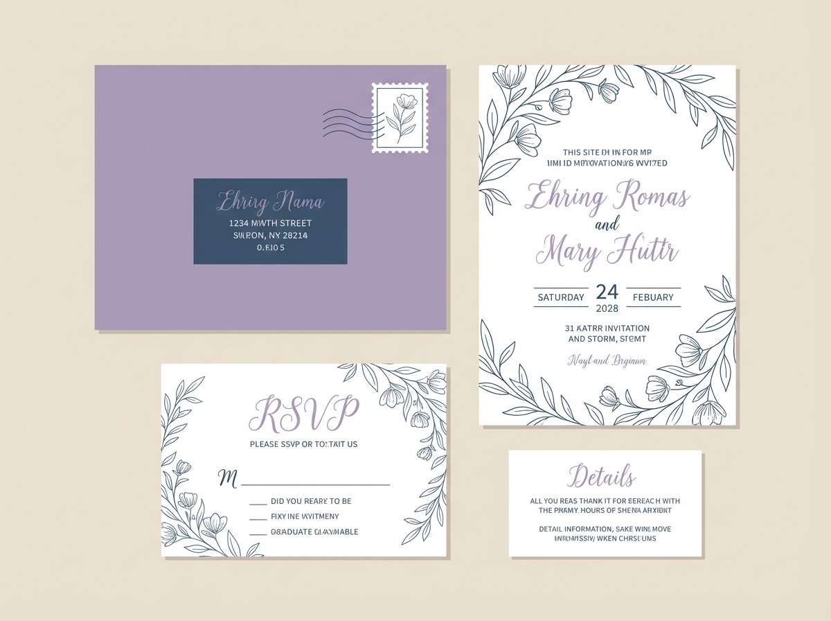
Romantic lavender with a flash of stormy blue feels like rain-kissed petals and candlelight. Use the softest tint for the paper background and the deeper violet for names and headings. Pair with a warm gray or champagne to keep the look timeless and printable. Tip: keep the blue as a thin rule line or monogram accent so it reads refined, not sporty.
Image example of lavender storm generated using media.io
6) Indigo Orchid
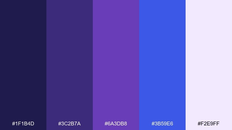
HEX: #1F1B4D #3C2B7A #6A3DB8 #3B59E6 #F2E9FF
Mood: sleek, dramatic, creative
Best for: gaming stream overlay UI
Dramatic indigo and orchid purple set a high-contrast, streamer-ready mood with a clean neon edge. Use the darkest shade for panels and the saturated blue for alerts and highlights. Pair with white text and a small cyan glow if you want extra energy without adding clutter. Tip: apply the bright purple only to key states (live, new follower, goal hit) to keep hierarchy clear.
Image example of indigo orchid generated using media.io
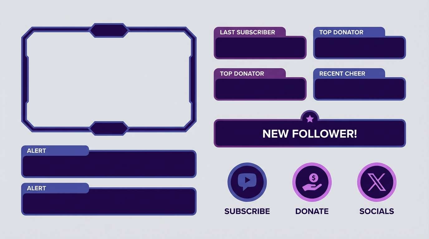
7) Blueberry Velvet
HEX: #24174C #3F2A7A #5C3EB2 #2746A6 #A9B8FF
Mood: rich, cozy, editorial
Best for: editorial magazine spread
Rich blueberry and velvet violet tones feel plush, intimate, and slightly vintage. Use the mid violet for section headers and the soft periwinkle for pull quotes to create rhythm across the spread. Pair with off-white paper tones and a classic serif to lean into an editorial vibe. Tip: keep photos slightly cool-toned so the palette reads intentional, not accidental.
Image example of blueberry velvet generated using media.io
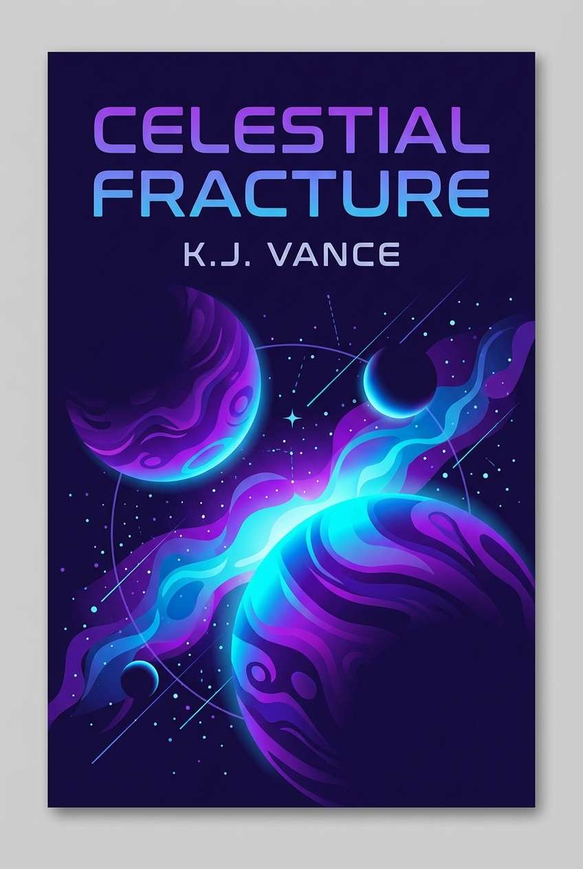
8) Cosmic Grape
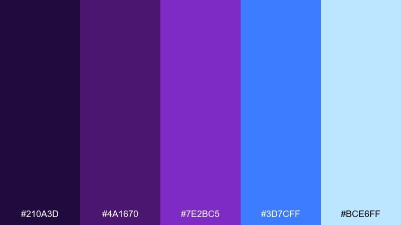
HEX: #210A3D #4A1670 #7E2BC5 #3D7CFF #BCE6FF
Mood: bold, playful, futuristic
Best for: sci-fi book cover
Bold grape purples with a sharp electric blue feel like hyperspace trails and glowing constellations. These purple blue color combinations shine on cover designs where you want instant shelf impact. Pair with black or deep navy and keep typography simple so the colors carry the drama. Tip: use the light sky blue as a rim light around planets or shapes to add depth without extra gradients.
Image example of cosmic grape generated using media.io
9) Sapphire Lilac
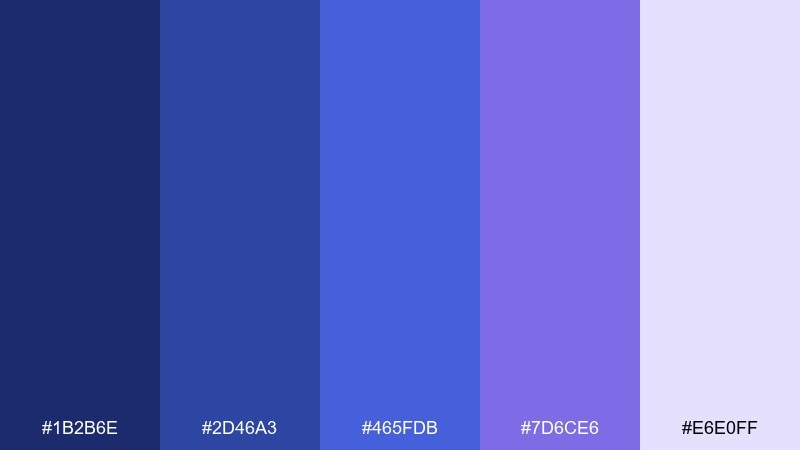
HEX: #1B2B6E #2D46A3 #465FDB #7D6CE6 #E6E0FF
Mood: confident, clean, professional
Best for: corporate pitch deck
Confident sapphire blues with a lilac lift feel polished, trustworthy, and easy to present. Use the darker blues for charts and titles, then reserve lilac for callouts or key numbers. Pair with white backgrounds and subtle gray dividers to keep slides crisp. Tip: keep one dominant blue and use the lilac sparingly for emphasis so the deck stays executive-friendly.
Image example of sapphire lilac generated using media.io
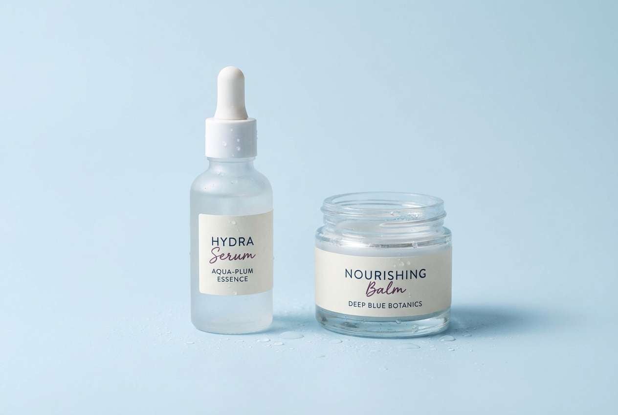
10) Plum Glacier
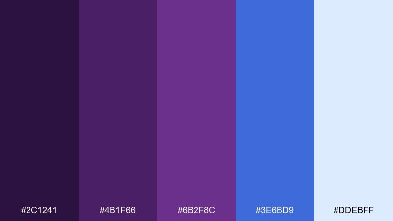
HEX: #2C1241 #4B1F66 #6B2F8C #3E6BD9 #DDEBFF
Mood: fresh, cool, premium
Best for: skincare product ad
Cool glacier blue against plum tones feels clean, hydrated, and quietly premium. Use the pale blue for the backdrop and let plum handle product names and benefits for strong readability. Pair with minimal props—glass, water droplets, and soft shadows—to keep it modern. Tip: use the mid blue as a thin underline or badge to guide the eye through key claims.
Image example of plum glacier generated using media.io
11) Iris Neon
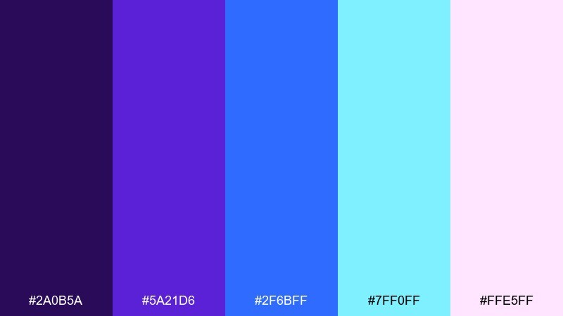
HEX: #2A0B5A #5A21D6 #2F6BFF #7FF0FF #FFE5FF
Mood: neon, upbeat, nightlife
Best for: nightclub event flyer
Neon iris and electric blue feel like LED signage, bass drops, and late-night energy. Use the cyan as a glow effect around headings and the dark purple as the base for contrast. Pair with a condensed sans font and simple geometric shapes for a club-ready look. Tip: limit gradients to small highlights so the flyer prints cleanly and stays legible.
Image example of iris neon generated using media.io
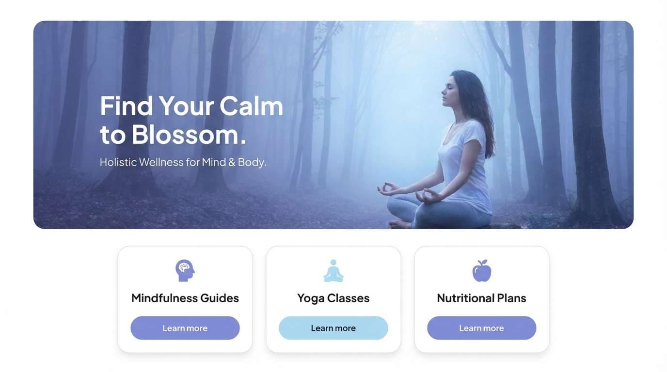
12) Misty Periwinkle
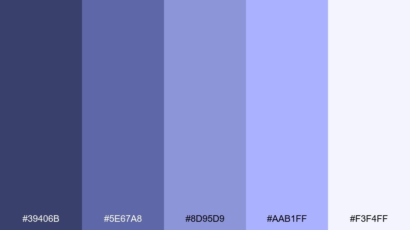
HEX: #39406B #5E67A8 #8D95D9 #AAB1FF #F3F4FF
Mood: soft, mindful, reassuring
Best for: calm wellness website UI
Misty periwinkle tones evoke quiet mornings, slow breathing, and a gentle sense of order. A purple blue color scheme like this works well for wellness UI, where contrast should feel supportive rather than loud. Pair it with warm whites, subtle grain, and natural photography to keep the experience human. Tip: use the mid periwinkle for primary buttons and reserve the darkest tone for navigation and key accessibility states.
Image example of misty periwinkle generated using media.io
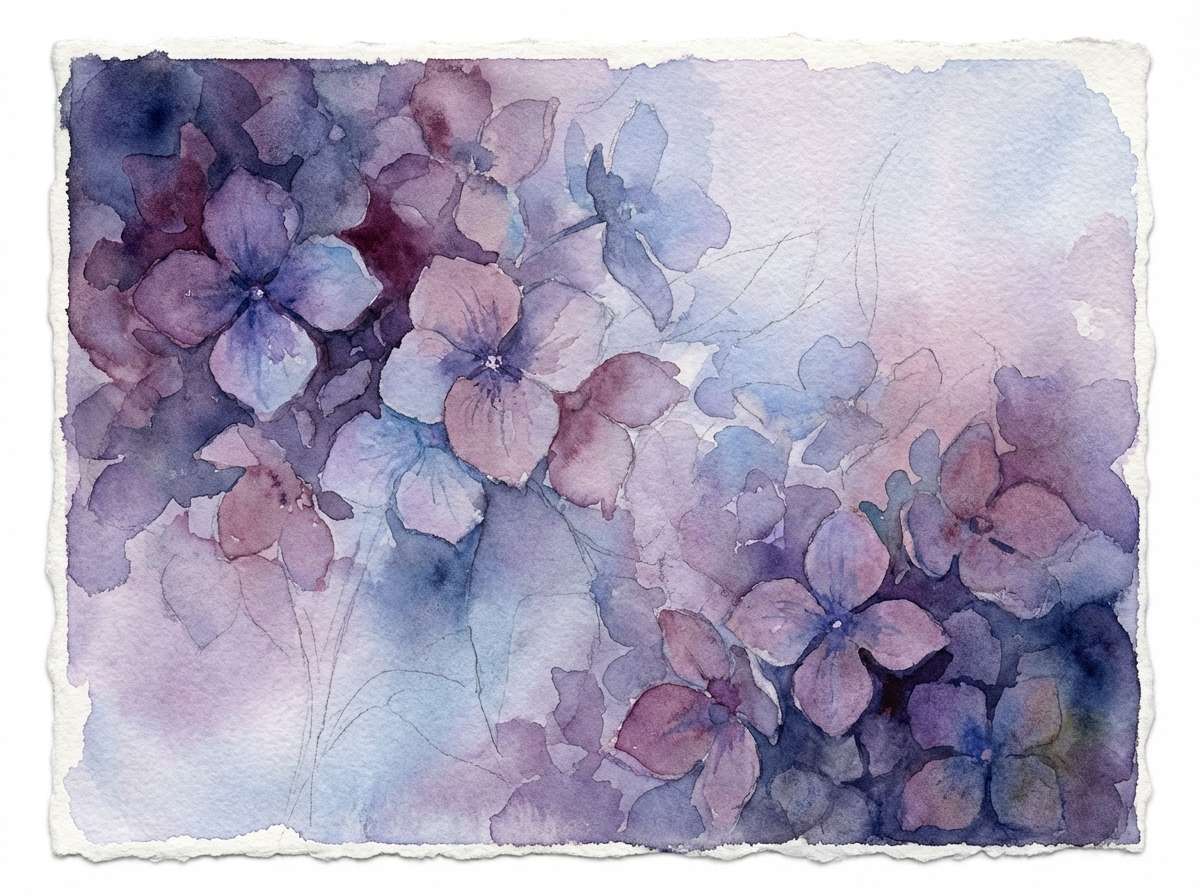
13) Twilight Hydrangea
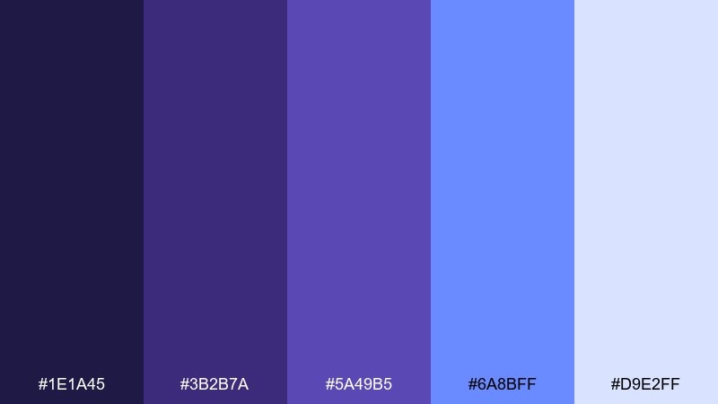
HEX: #1E1A45 #3B2B7A #5A49B5 #6A8BFF #D9E2FF
Mood: dreamy, botanical, romantic
Best for: watercolor floral illustration
Dreamy twilight purples and hydrangea blues feel like garden blooms fading into evening light. Use the deeper indigo to define petals and leaves, then wash in the pale blue for soft highlights. Pair with creamy paper textures and minimal linework for an airy, handcrafted look. Tip: keep edges slightly imperfect so the illustration reads watercolor, not digital fill.
Image example of twilight hydrangea generated using media.io
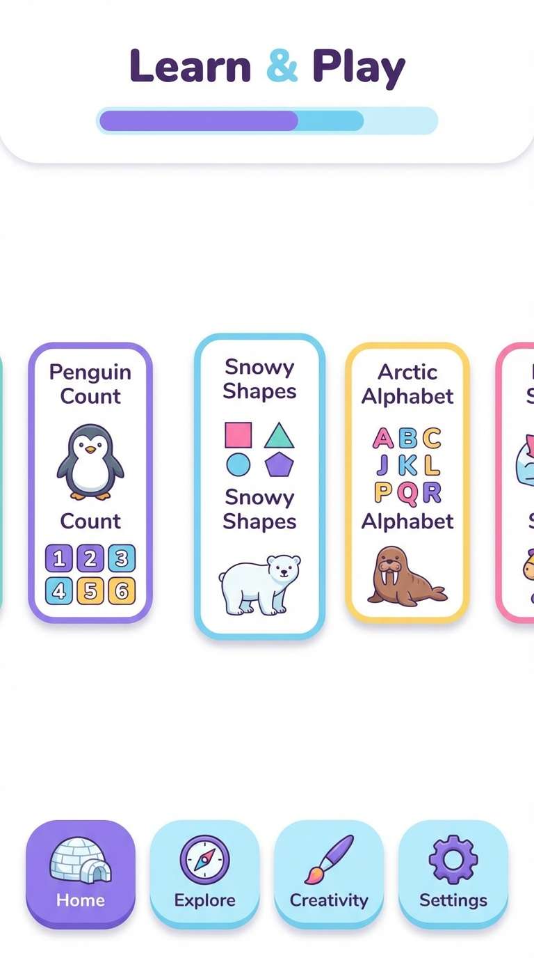
14) Arctic Violet
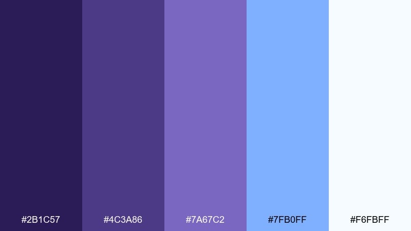
HEX: #2B1C57 #4C3A86 #7A67C2 #7FB0FF #F6FBFF
Mood: fresh, light, optimistic
Best for: kids learning app UI
Arctic violets and icy blues feel bright, friendly, and easy to navigate. Use the lightest tint for backgrounds and the mid violet for playful icons and progress states. Pair with rounded shapes and warm accent colors (like peach) in tiny doses to keep it kid-safe and inviting. Tip: test contrast on small labels—use the darker purple for text to maintain readability.
Image example of arctic violet generated using media.io
15) Deep Space Bloom
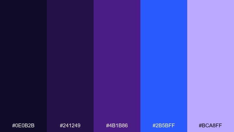
HEX: #0E0B2B #241249 #4B1B86 #2B5BFF #BCA8FF
Mood: intense, cinematic, mysterious
Best for: album cover art
Cinematic deep-space purples with a blue flare feel mysterious, emotional, and bold. This purple blue color palette is ideal when you want an album cover to look modern but still dramatic. Pair it with high-contrast monochrome photography or abstract shapes, and keep the title in one clean line. Tip: add grain and a subtle vignette so the darkest tones don’t crush on streaming thumbnails.
Image example of deep space bloom generated using media.io
16) Soft Heliotrope
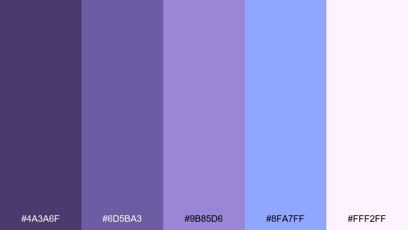
HEX: #4A3A6F #6D5BA3 #9B85D6 #8FA7FF #FFF2FF
Mood: gentle, cozy, elegant
Best for: home interior mood board
Gentle heliotrope and softened blue feel like plush textiles, lavender candles, and calm evenings at home. Use the muted violets for upholstery and the pale blue for airy walls or curtains. Pair with warm oak, brushed brass, and creamy whites to keep it inviting instead of cold. Tip: repeat one accent (like the mid lavender) in two places—pillows and art—so the room feels intentional.
Image example of soft heliotrope generated using media.io
17) Electric Ultraviolet
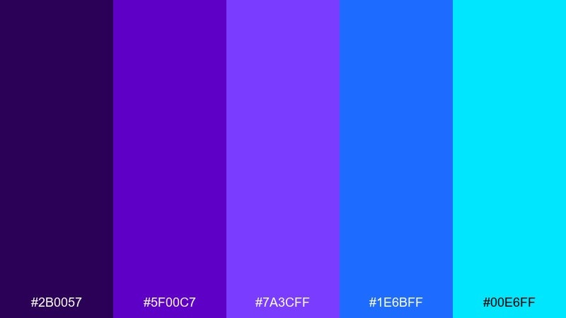
HEX: #2B0057 #5F00C7 #7A3CFF #1E6BFF #00E6FF
Mood: high-energy, competitive, modern
Best for: sports team branding
Electric ultraviolet with punchy blues feels fast, competitive, and built for spotlight moments. Use the darkest purple as the base color, then bring in cyan for small highlights on jerseys or social graphics. Pair with white and charcoal for a strong, readable system across merch and digital assets. Tip: keep the cyan ratio low—think 5–10%—so it stays a signature accent, not visual noise.
Image example of electric ultraviolet generated using media.io
18) Denim Lavender
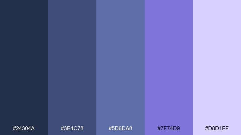
HEX: #24304A #3E4C78 #5D6DA8 #7F74D9 #D8D1FF
Mood: casual, stylish, contemporary
Best for: denim fashion lookbook
Denim blues with a lavender twist feel casual, wearable, and effortlessly cool. These purple blue color combinations fit lookbooks where you want modern color without overpowering the photography. Pair with lots of white margins, minimalist captions, and a single bold headline style. Tip: use the lighter lavender as a background block behind text so it reads clearly on busy outfit shots.
Image example of denim lavender generated using media.io
19) Mauve Marina
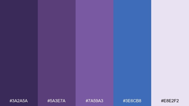
HEX: #3A2A5A #5A3E7A #7A59A3 #3E6CB8 #E8E2F2
Mood: artsy, relaxed, coastal-night
Best for: coffee shop menu board
Mauve and marina blue feel like seaside evenings—relaxed, a little artsy, and welcoming. Use the pale mauve as the base and the marina blue for category headers and prices. Pair with a warm cream and simple icons to keep the menu approachable. Tip: keep your darkest tone for the smallest text so it stays readable from a distance.
Image example of mauve marina generated using media.io
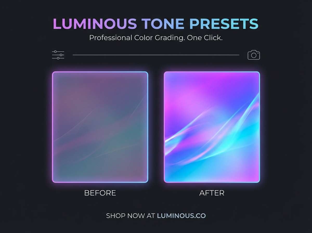
20) Orchid Nightfall
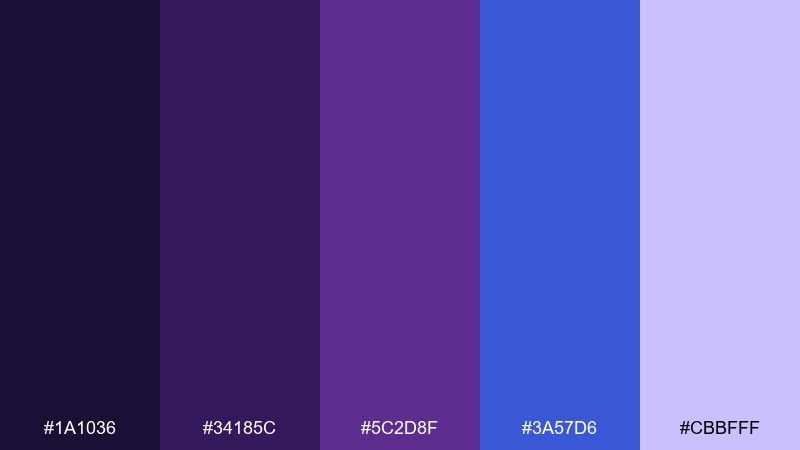
HEX: #1A1036 #34185C #5C2D8F #3A57D6 #CBBFFF
Mood: sleek, nocturnal, artistic
Best for: photography preset promo poster
Nocturnal orchid purples with bright night-blue highlights feel like city bokeh and twilight skies. Use the darkest tone for a premium backdrop and the lilac tint for before/after labels and small badges. Pair with minimalist typography and a single hero image to keep the promo clean. Tip: add a thin blue frame line to guide the eye without competing with the photo.
Image example of orchid nightfall generated using media.io
What Colors Go Well with Purple Blue?
Neutrals are the easiest match: white, ivory, cool gray, graphite, and near-black keep purple blue looking modern and intentional. They also help preserve readability when you use saturated indigos or electric blues.
For a warmer balance, try small doses of champagne, sand, or warm beige—these soften the coolness and make the palette feel more premium and print-friendly. Metallic accents like silver, chrome, or gold can work too, as long as they stay secondary.
If you want extra pop, use one bright accent (like cyan, mint, or soft pink) rather than multiple neon colors. A single accent keeps hierarchy clear and prevents the design from turning noisy.
How to Use a Purple Blue Color Palette in Real Designs
Start by choosing a “base” color for large areas (often the darkest indigo) and a “surface” tint for cards or sections (a pale periwinkle or lilac). Then reserve your brightest blue for calls-to-action, links, or key data points.
For branding systems, keep the ratio disciplined: 60–80% neutrals, 15–30% purple/blue mids, and 5–10% highlight color. This approach makes your palette scalable across logos, slides, social graphics, and UI states.
In gradients, aim for one smooth transition (e.g., indigo → violet → lilac) instead of stacking multiple high-saturation stops. Subtle gradients feel more premium and compress better for web and mobile.
Create Purple Blue Palette Visuals with AI
If you already have HEX codes, you can turn them into cohesive visuals by describing the layout (poster, UI, packaging) and calling out your purple/blue mood (calm, premium, neon, etc.).
Use short prompts that specify style, background, typography vibe, and composition. Then iterate by adjusting only one variable at a time—like lighting, contrast, or “minimal vs. bold”—to keep results consistent.
With Media.io’s AI image generator, you can quickly create brand boards, mock UI screens, or poster concepts that match your purple blue palette.
Purple Blue Color Palette FAQs
-
What does a purple blue color palette communicate in branding?
Purple blue usually signals creativity plus trust—premium, modern, and slightly futuristic. It’s common in tech, apps, entertainment, and beauty because it feels distinctive without losing professionalism. -
Which purple blue palette is best for UI design?
Softer sets like Periwinkle Dusk or Misty Periwinkle work well for UI because their tints create comfortable backgrounds and clear component states. Use the darkest shade for navigation and text, and the brighter periwinkle/blue for primary buttons. -
How do I keep purple and blue from looking too “neon”?
Control saturation and limit the brightest color to accents only (around 5–10%). Pair with warm whites or light grays, and avoid using multiple vivid blues/purples at the same time in large blocks. -
What neutral colors pair best with purple blue tones?
White, ivory, cool gray, charcoal, and near-black are the most reliable. They keep contrast clean and help purple blue gradients look smoother and more modern. -
Is purple blue good for print projects like posters or invitations?
Yes—just favor slightly muted midtones and keep gradients subtle for predictable printing. Palettes like Lavender Storm and Twilight Hydrangea are especially print-friendly when paired with warm neutrals. -
How many colors should I use from a 5-color palette?
In most designs, 3 is enough: one dark base, one mid for structure, and one light or bright accent for emphasis. You can keep the remaining two as optional tints for depth (cards, borders, hover states). -
Can I generate images that match my HEX palette with AI?
Yes. Use prompts that describe the style and purpose (brand board, UI, packaging, cover art) and mention your purple/blue mood. Generate a few variations, then refine by adjusting composition or lighting while keeping the palette consistent.
Next: Pink Blue Color Palette


