

Pink and blue is a timeless duo: it can feel soft and friendly, bold and electric, or clean and editorial—depending on the shades you choose.
Below are 20 ready-to-use pink blue color palette ideas with HEX codes, plus practical tips for UI, branding, and print (and prompts you can reuse to generate matching visuals fast).
In this article
- Why Pink Blue Palettes Work So Well
-
- cotton candy surf
- blush navy studio
- rosewater sky
- neon bubblegum night
- powder pink denim
- sakura harbor
- flamingo ice
- peony poolside
- ballet blueprints
- raspberry arctic
- mauve marina
- orchid capri
- pink lemonade blueberry
- electric fuchsia glacier
- dusty rose seaside
- coral pink cobalt
- cherry blossom blueprint
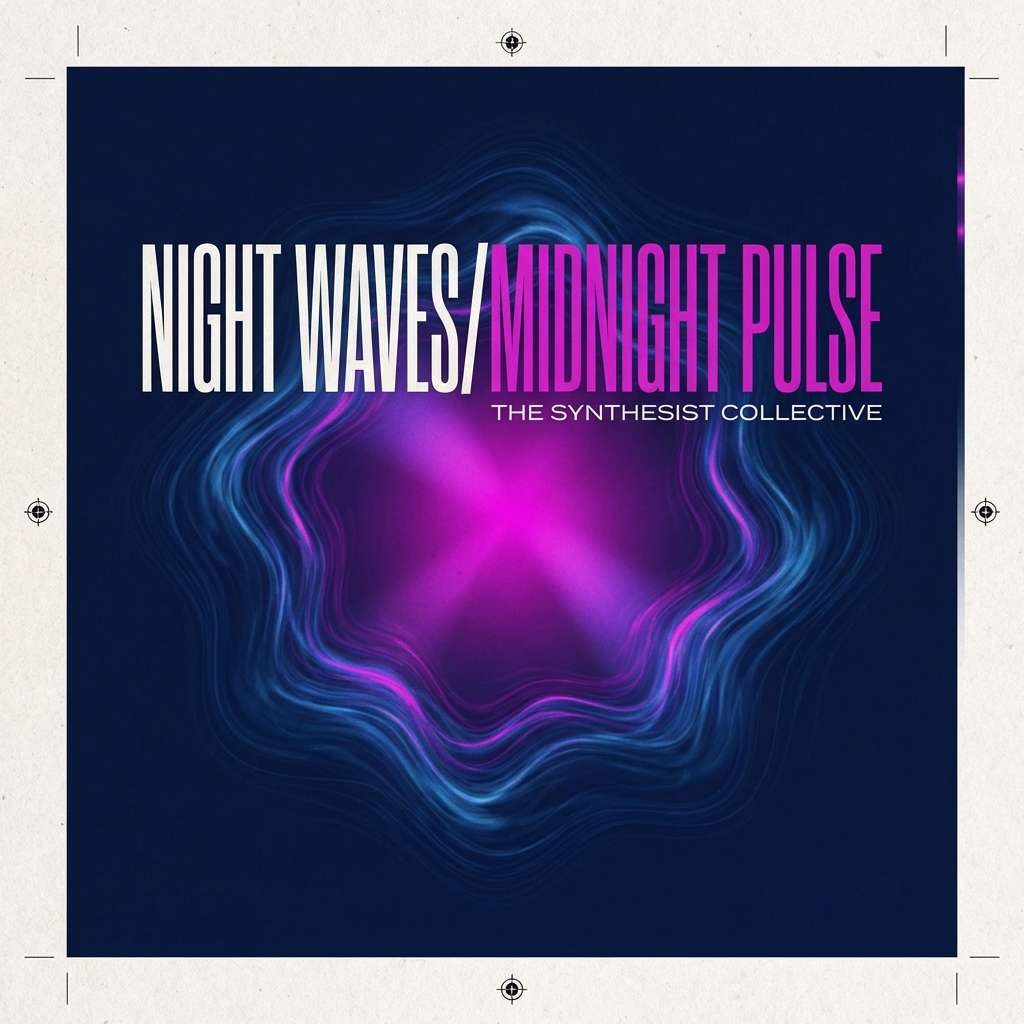
- magenta midnight wave
- pastel pop arcade
- vintage rose indigo
- What Colors Go Well with Pink Blue?
- How to Use a Pink Blue Color Palette in Real Designs
- Create Pink Blue Palette Visuals with AI
Why Pink Blue Palettes Work So Well
Pink brings warmth, approachability, and personality, while blue adds trust, clarity, and structure. Together, they balance emotion and usability—ideal for modern interfaces and brand systems.
This pairing also gives you easy hierarchy: deeper blues naturally carry navigation, headlines, and CTAs, while lighter pinks work beautifully for backgrounds, highlights, and supportive UI states.
From pastel “cotton candy” looks to neon nightlife contrast, pink and blue scales across moods without losing harmony—especially when you add a clean neutral (white, off-white, or near-black) for breathing room.
20+ Pink Blue Color Palette Ideas (with HEX Codes)
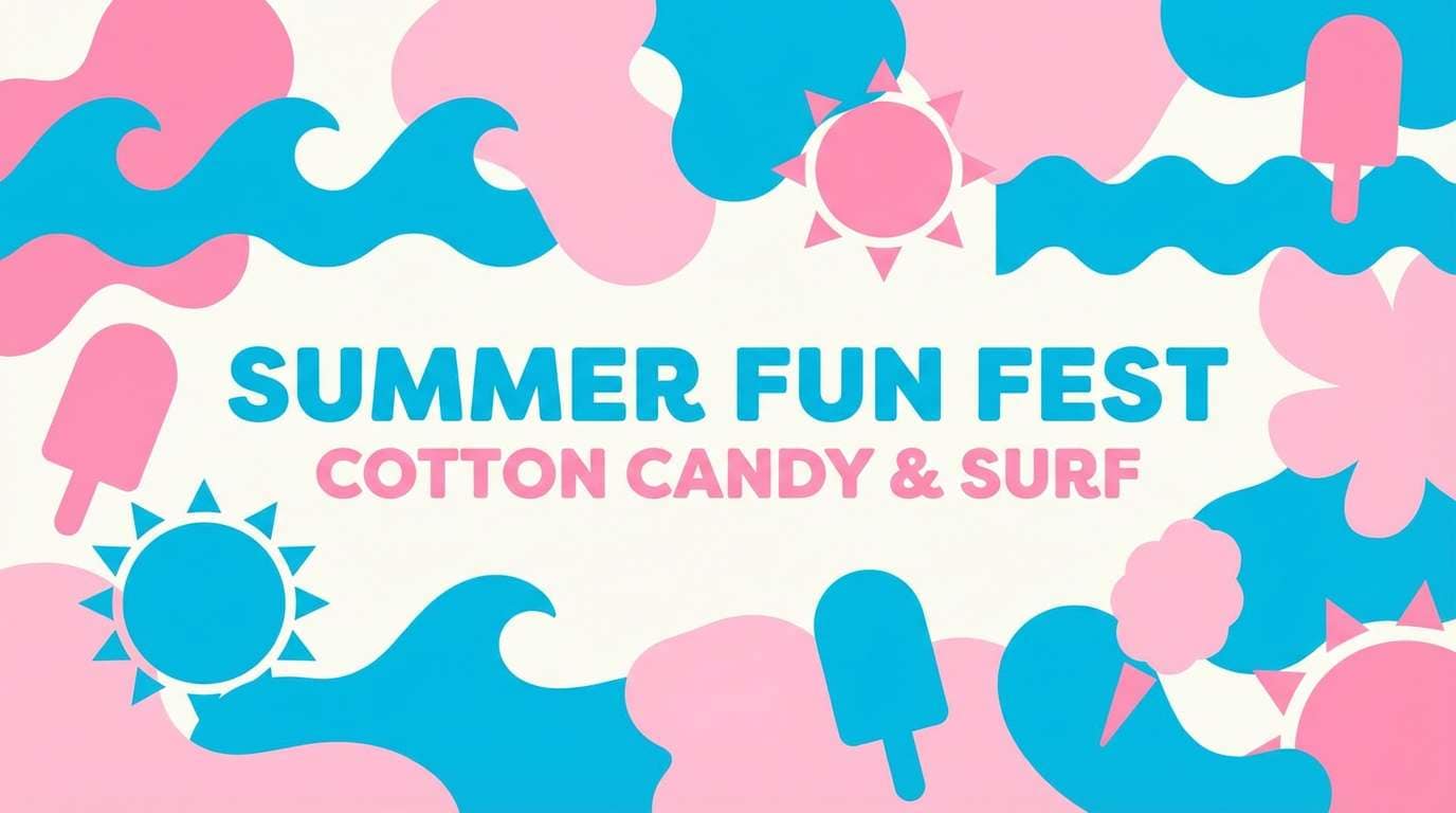
1) Cotton Candy Surf

HEX: #FFB3C7 #FFD6E5 #6EC9FF #2B7DBF #FFF7FB
Mood: playful, airy
Best for: summer social posts, playful branding
Playful and airy, it feels like boardwalk candy and bright ocean spray. This pink blue color palette works best with rounded type and simple icons so the sweetness stays modern. Pair it with lots of white space and a tiny hit of charcoal for readability. Usage tip: keep the deeper blue for headlines and buttons to anchor the lighter pinks.
Image example of cotton candy surf generated using media.io
Media.io is an online AI studio for creating and editing video, image, and audio in your browser.

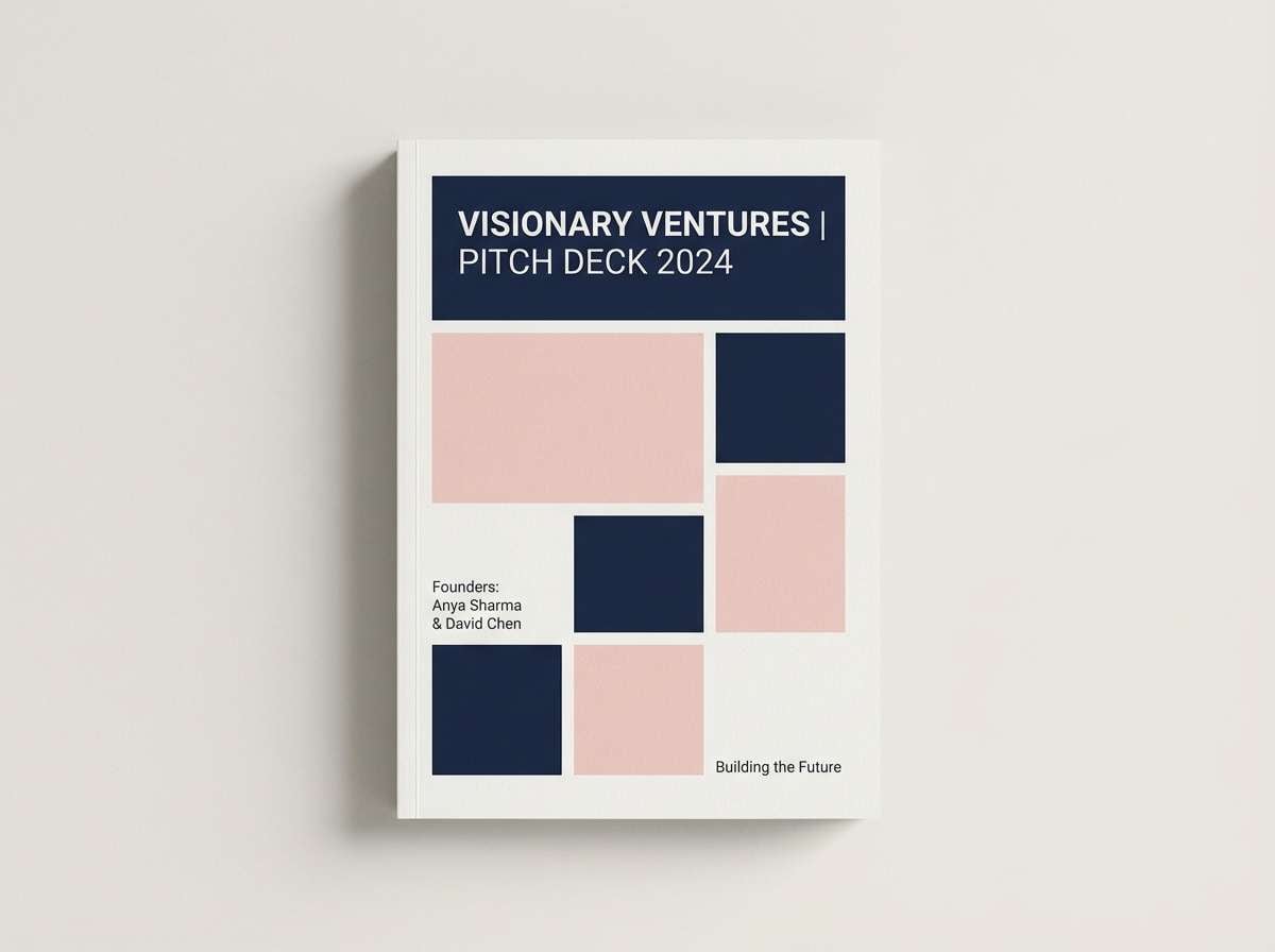
2) Blush Navy Studio
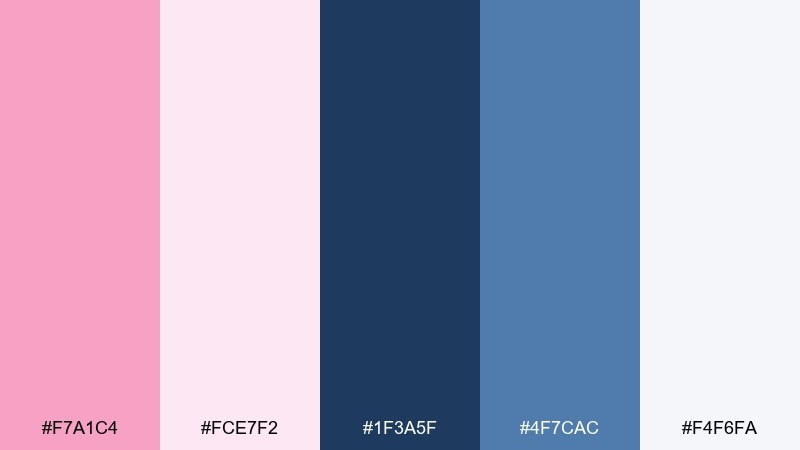
HEX: #F7A1C4 #FCE7F2 #1F3A5F #4F7CAC #F4F6FA
Mood: polished, confident
Best for: agency sites, premium pitch decks
Polished and confident, it evokes blush silk against a tailored navy blazer. The dark blue creates instant hierarchy for titles while the soft pink keeps the tone approachable. Pair with warm grays or off-white paper textures for a studio-finished look. Usage tip: reserve blush for callouts and charts, and let navy carry navigation and body text.
Image example of blush navy studio generated using media.io
3) Rosewater Sky
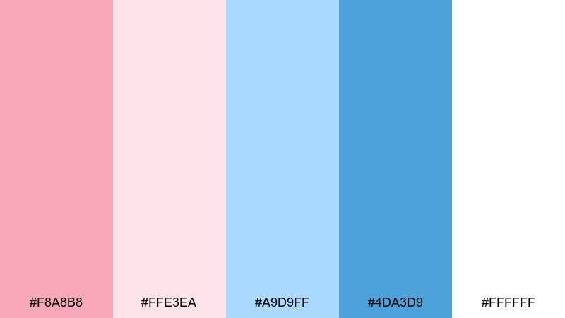
HEX: #F8A8B8 #FFE3EA #A9D9FF #4DA3D9 #FFFFFF
Mood: soft, optimistic
Best for: wellness landing pages, skincare blogs
Soft and optimistic, it reads like rosewater mist under a clear morning sky. The pale tints make content feel calm, while the mid-blue adds just enough structure for UI elements. Pair with light sand neutrals and thin line icons for a spa-clean vibe. Usage tip: boost contrast by placing blue text on the lightest pink rather than white.
Image example of rosewater sky generated using media.io
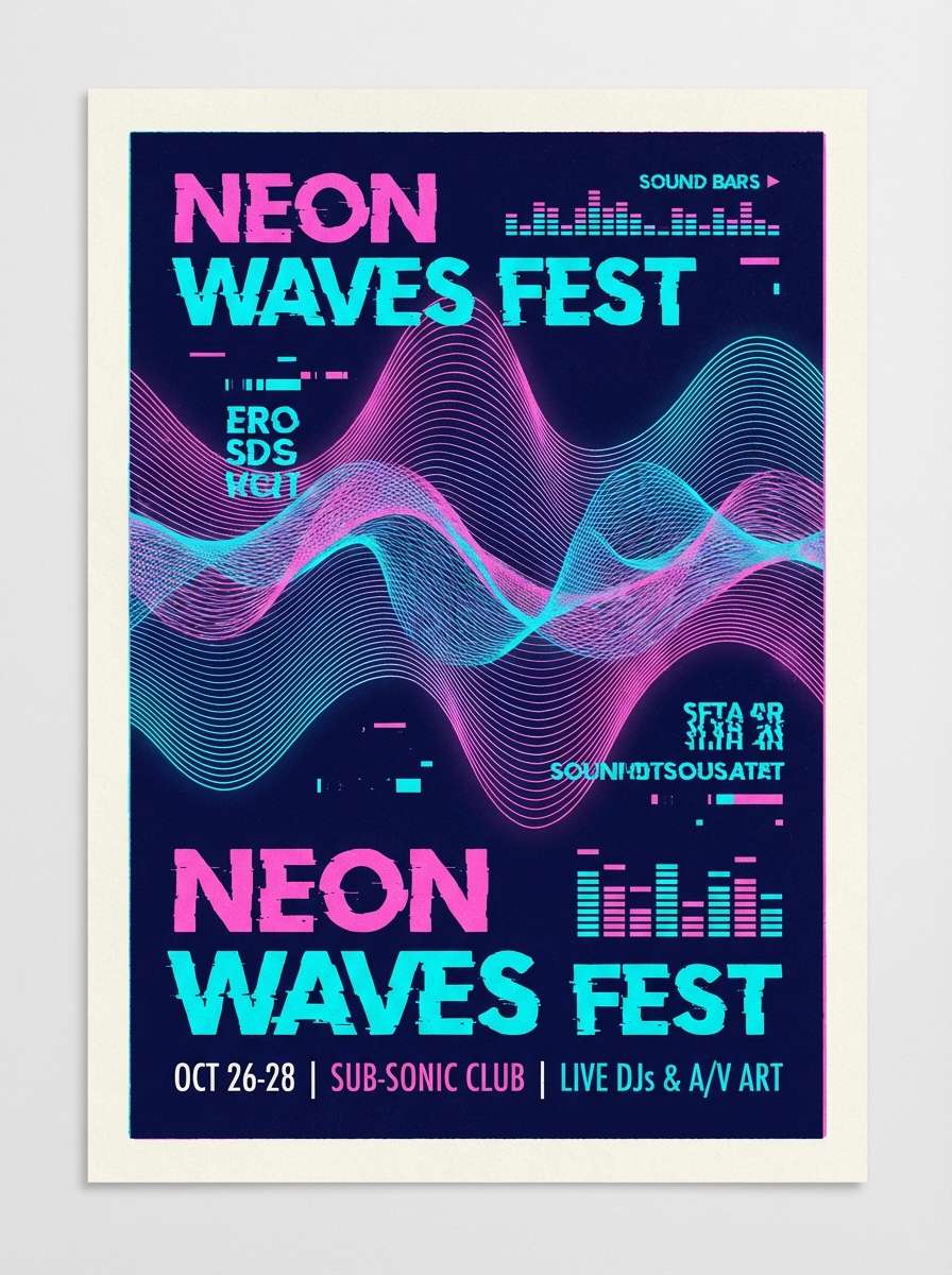
4) Neon Bubblegum Night
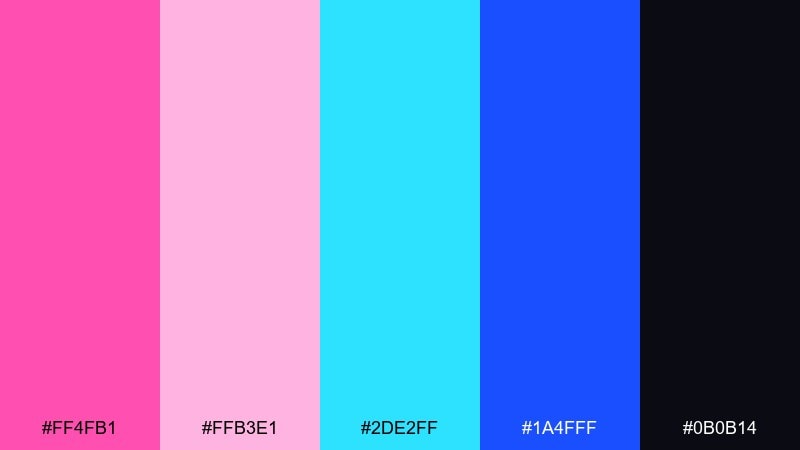
HEX: #FF4FB1 #FFB3E1 #2DE2FF #1A4FFF #0B0B14
Mood: electric, nightlife
Best for: music posters, gaming promos
Electric and nightlife-ready, it feels like neon signs reflected on wet pavement. These pink blue color combinations pop hardest when you let the near-black background do the heavy lifting. Pair with condensed type, glow effects used sparingly, and simple geometric shapes. Usage tip: keep gradients subtle—use solid neon accents so small text stays legible.
Image example of neon bubblegum night generated using media.io
5) Powder Pink Denim
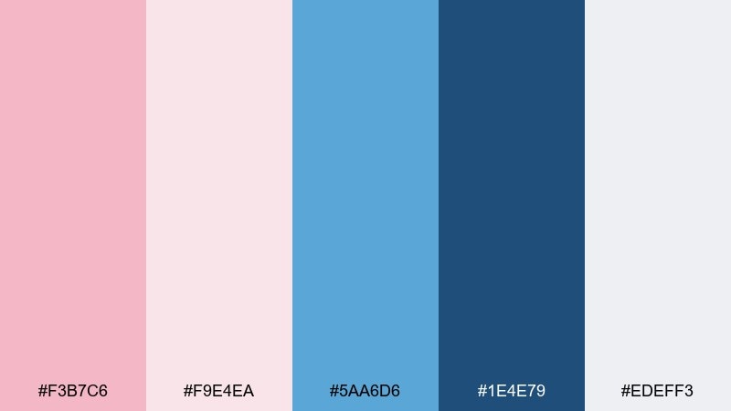
HEX: #F3B7C6 #F9E4EA #5AA6D6 #1E4E79 #EDEFF3
Mood: casual, modern
Best for: app onboarding, lifestyle brands
Casual and modern, it brings to mind a powder-pink tee with worn-in denim. The lighter pinks keep screens friendly, while the deeper blue gives dependable contrast for CTAs. Pair with cool grays and simple photography for an effortless everyday look. Usage tip: use the denim navy for icons and microcopy to maintain accessibility.
Image example of powder pink denim generated using media.io
6) Sakura Harbor
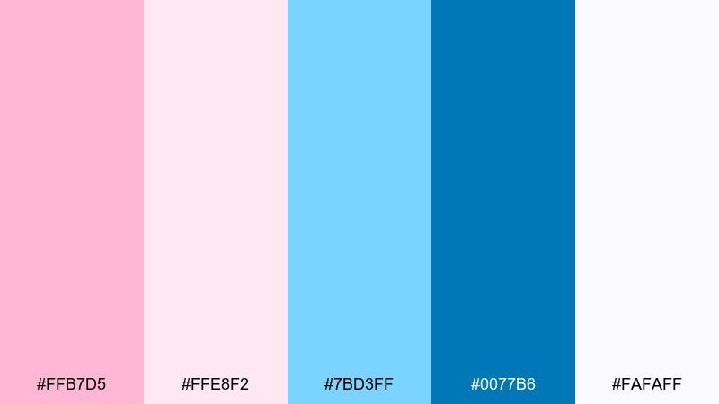
HEX: #FFB7D5 #FFE8F2 #7BD3FF #0077B6 #FAFAFF
Mood: fresh, coastal
Best for: travel newsletters, resort branding
Fresh and coastal, it suggests sakura petals drifting over a bright harbor. The saturated ocean blue gives you strong anchors for headings, while the petal pinks soften the overall tone. Pair with airy serif headlines and warm beige accents to echo sand and sun. Usage tip: limit the saturated blue to 10–15% of the layout for a relaxed feel.
Image example of sakura harbor generated using media.io
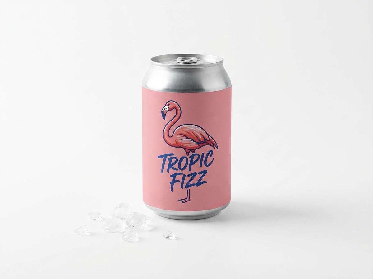
7) Flamingo Ice
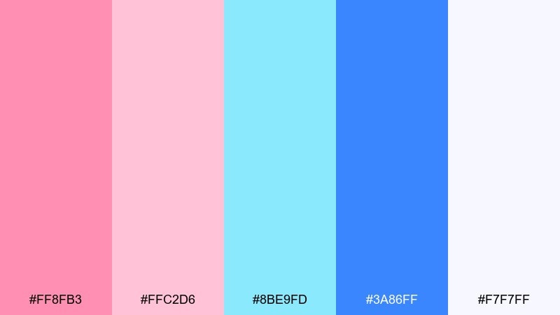
HEX: #FF8FB3 #FFC2D6 #8BE9FD #3A86FF #F7F7FF
Mood: bright, refreshing
Best for: beverage ads, summer campaigns
Bright and refreshing, it looks like a flamingo float on crushed ice. The icy cyan and electric blue make the pink feel extra juicy, perfect for energetic visuals. Pair with clean white, bold sans type, and high-contrast product photography. Usage tip: use the electric blue for price tags and key claims so they read instantly.
Image example of flamingo ice generated using media.io
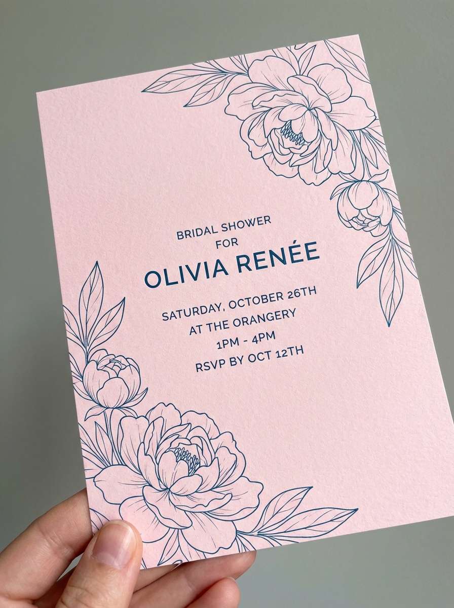
8) Peony Poolside
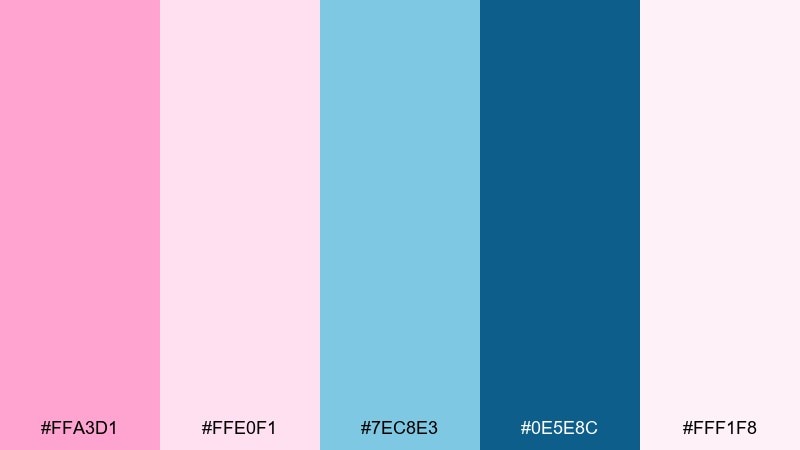
HEX: #FFA3D1 #FFE0F1 #7EC8E3 #0E5E8C #FFF1F8
Mood: romantic, breezy
Best for: wedding details, bridal shower invites
Romantic and breezy, it feels like peonies by a sunlit pool. The deep teal-blue is elegant for names and dates, while the pale pinks keep the stationery soft. Pair with delicate line florals and creamy paper textures for a premium finish. Usage tip: print a swatch test—pale pinks can fade on uncoated stock.
Image example of peony poolside generated using media.io
9) Ballet Blueprints
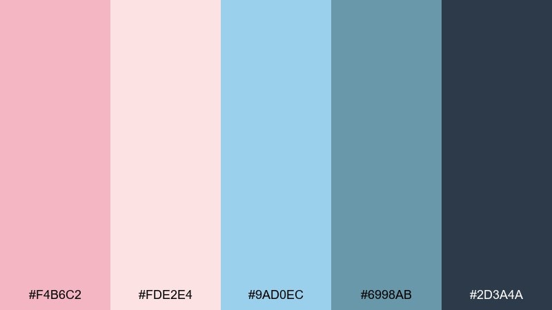
HEX: #F4B6C2 #FDE2E4 #9AD0EC #6998AB #2D3A4A
Mood: calm, structured
Best for: product dashboards, data visuals
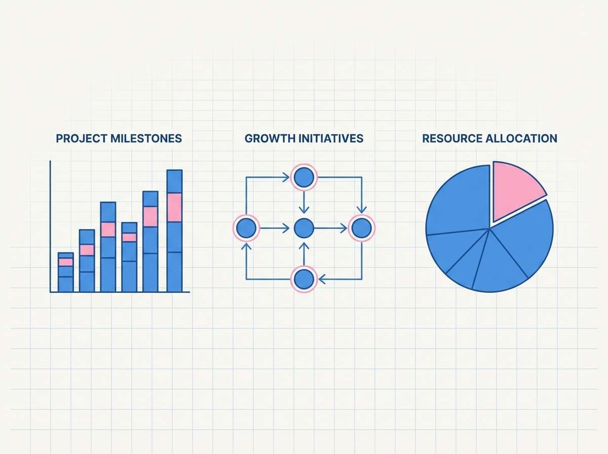
Calm and structured, it brings ballet softness to a blueprint-like grid. The slate and steel blues give charts and tables clarity without feeling harsh. As a pink blue color scheme, it pairs well with thin strokes, subtle shadows, and lots of spacing. Usage tip: use the darkest slate for axis labels and the muted blues for series colors to avoid visual noise.
Image example of ballet blueprints generated using media.io
10) Raspberry Arctic
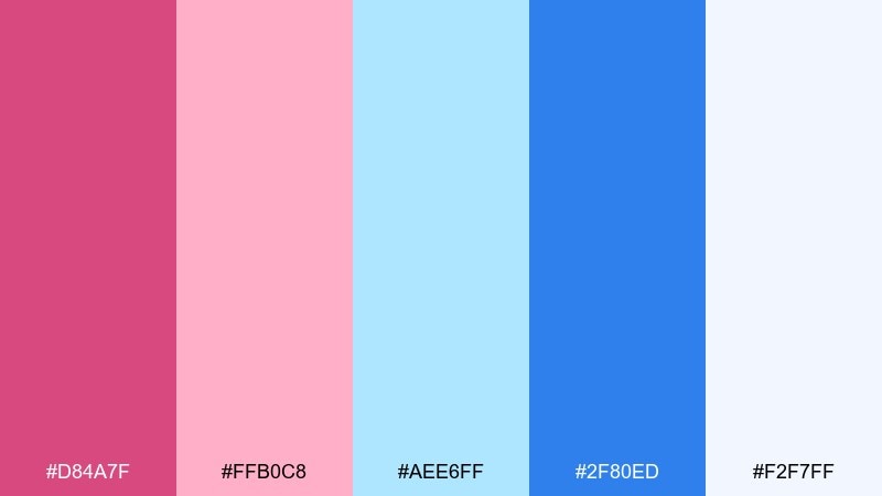
HEX: #D84A7F #FFB0C8 #AEE6FF #2F80ED #F2F7FF
Mood: crisp, high-energy
Best for: sportswear promos, bold social ads
Crisp and high-energy, it feels like raspberry syrup over arctic snow. The strong blue reads sporty and fast, while the pinks add punch without turning sugary. Pair with black type, dynamic diagonals, and sharp product cutouts. Usage tip: keep backgrounds icy-light and let raspberry be the accent, not the base.
Image example of raspberry arctic generated using media.io
11) Mauve Marina
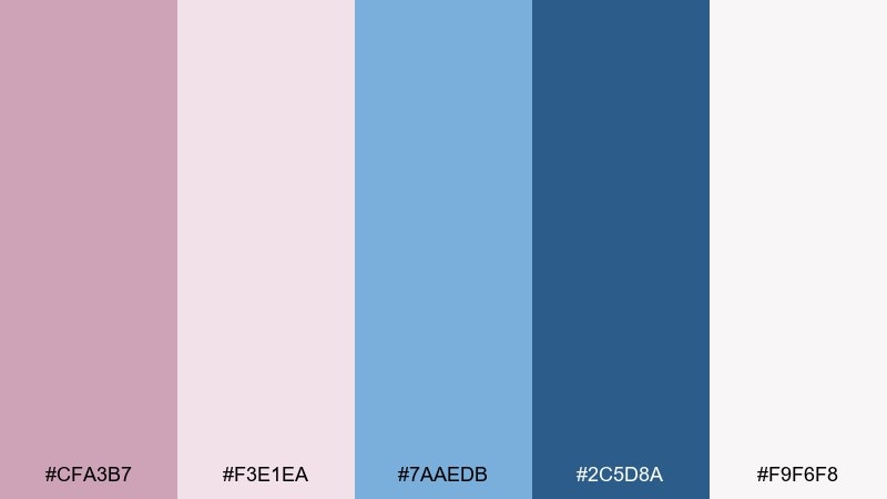
HEX: #CFA3B7 #F3E1EA #7AAEDB #2C5D8A #F9F6F8
Mood: quiet, refined
Best for: book covers, boutique packaging
Quiet and refined, it evokes mauve evening light on a marina. The dusty tones feel mature, making it a smart fit for premium labels and understated typography. Pair with soft gold foil accents or warm gray to deepen the elegance. Usage tip: use the darker blue for small print so ingredients and details stay readable.
Image example of mauve marina generated using media.io
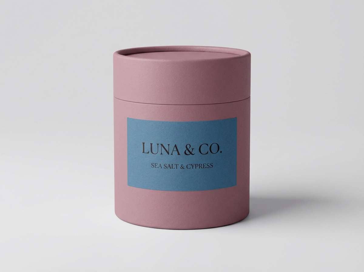
12) Orchid Capri
HEX: #E58AB7 #FAD5E5 #74C0FC #3B5BDB #FBFCFF
Mood: sunny, Mediterranean
Best for: beauty launches, influencer kits
Sunny and Mediterranean, it feels like orchids against Capri-blue water. The vivid blue is perfect for punchy headlines, while the orchid pink supports softer sections and backgrounds. Pair with bright white, simple shapes, and glossy product photos for a launch-ready feel. Usage tip: keep body text dark and let color live in buttons, stickers, and highlights.
Image example of orchid capri generated using media.io
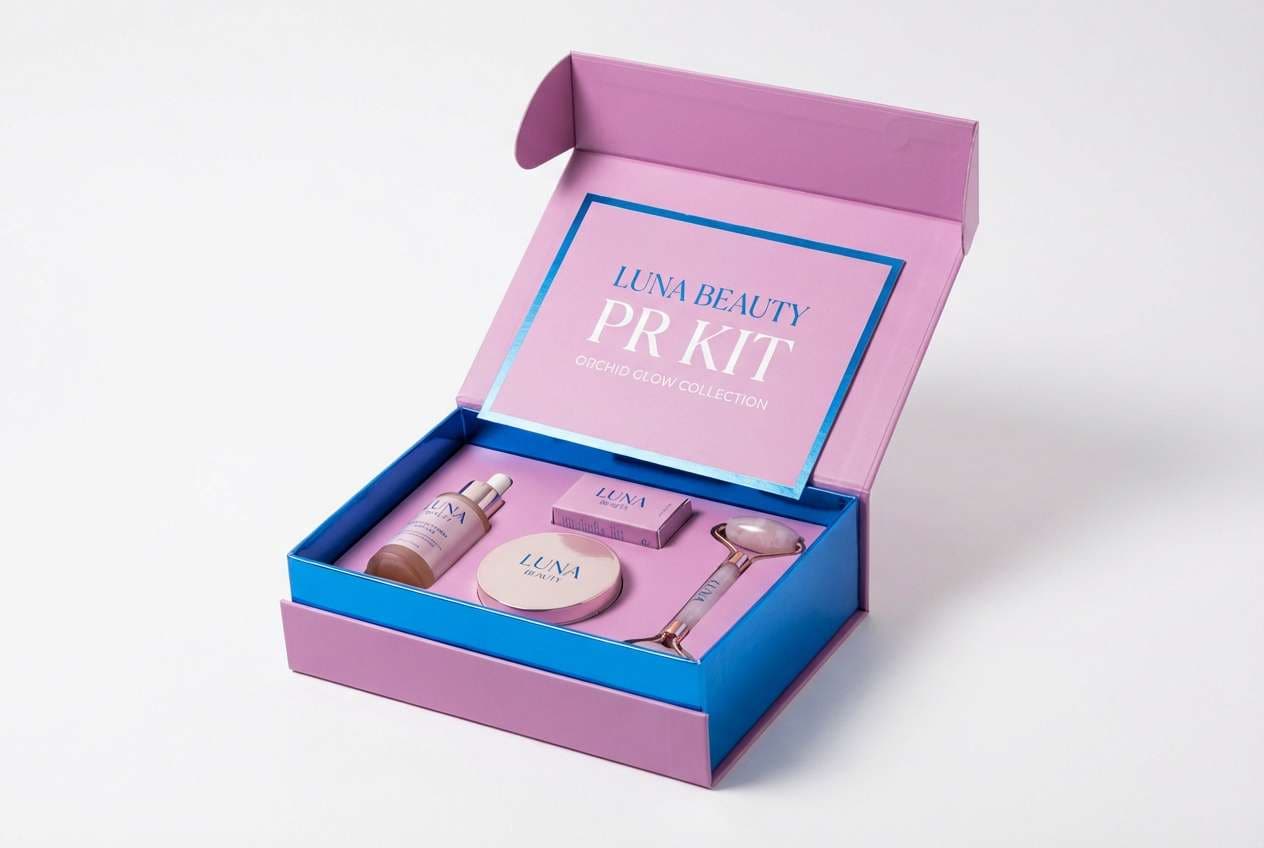
13) Pink Lemonade Blueberry
HEX: #FF9BB0 #FFE6E0 #7BDFF2 #4EA8DE #FFFCEB
Mood: cheerful, youthful
Best for: cafes, dessert menus
Cheerful and youthful, it tastes like pink lemonade with a blueberry fizz. The buttery light neutral keeps designs warm, while the blues add a refreshing counterpoint. Pair with hand-drawn doodles or playful illustration styles for menus and signage. Usage tip: use the brighter blue for category headers to keep busy layouts organized.
Image example of pink lemonade blueberry generated using media.io
14) Electric Fuchsia Glacier
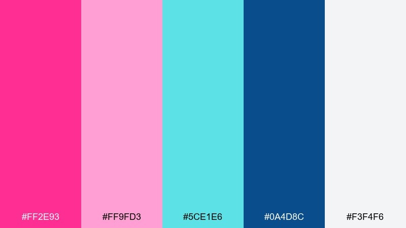
HEX: #FF2E93 #FF9FD3 #5CE1E6 #0A4D8C #F3F4F6
Mood: bold, futuristic
Best for: tech event visuals, startup rebrands
Bold and futuristic, it reads like fuchsia LEDs over glacial ice. These pink blue color combinations feel most modern with sharp geometry, oversized type, and lots of negative space. Pair with cool grays and subtle gradients to keep it sleek instead of loud. Usage tip: pick one “hero” neon (usually fuchsia) and let the deep blue handle structure and contrast.
Image example of electric fuchsia glacier generated using media.io

15) Dusty Rose Seaside
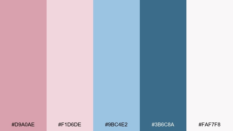
HEX: #D9A0AE #F1D6DE #9BC4E2 #3B6C8A #FAF7F8
Mood: gentle, nostalgic
Best for: home decor lookbooks, lifestyle blogs
Gentle and nostalgic, it evokes a dusty rose cardigan on a breezy seaside walk. The muted blues keep it grounded, making it easy to use across long-form pages without fatigue. Pair with warm beige, linen textures, and soft photography for an editorial feel. Usage tip: let the darker blue handle links and captions so the palette stays calm but usable.
Image example of dusty rose seaside generated using media.io
16) Coral Pink Cobalt
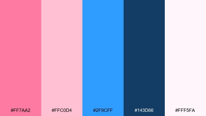
HEX: #FF7AA2 #FFC0D4 #2F9CFF #143D66 #FFF5FA
Mood: confident, punchy
Best for: ecommerce promos, CTA-heavy pages
Confident and punchy, it feels like coral lipstick paired with a cobalt jacket. The cobalt instantly boosts contrast for buttons and promo tags, while the pinks keep the vibe friendly. Pair with crisp white, subtle drop shadows, and simple product grids. Usage tip: use cobalt sparingly as a true accent so your CTAs don’t compete with each other.
Image example of coral pink cobalt generated using media.io

17) Cherry Blossom Blueprint
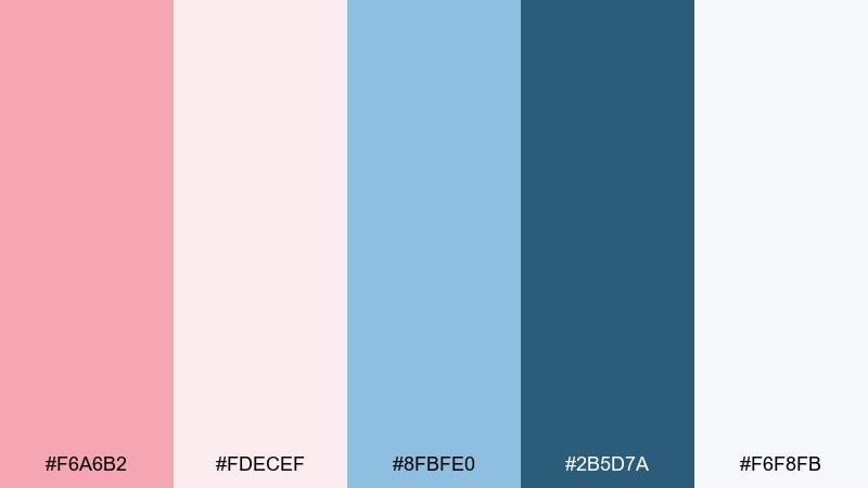
HEX: #F6A6B2 #FDECEF #8FBFE0 #2B5D7A #F6F8FB
Mood: clean, academic
Best for: course slides, infographics
Clean and academic, it suggests cherry blossoms pressed into a neat notebook. The cool blue range makes diagrams and charts feel precise, while the pink adds warmth for highlights. Pair with plenty of white, thin rules, and monospaced labels for a “technical but friendly” tone. Usage tip: map one blue to data series and keep pink for annotations only.
Image example of cherry blossom blueprint generated using media.io
18) Magenta Midnight Wave
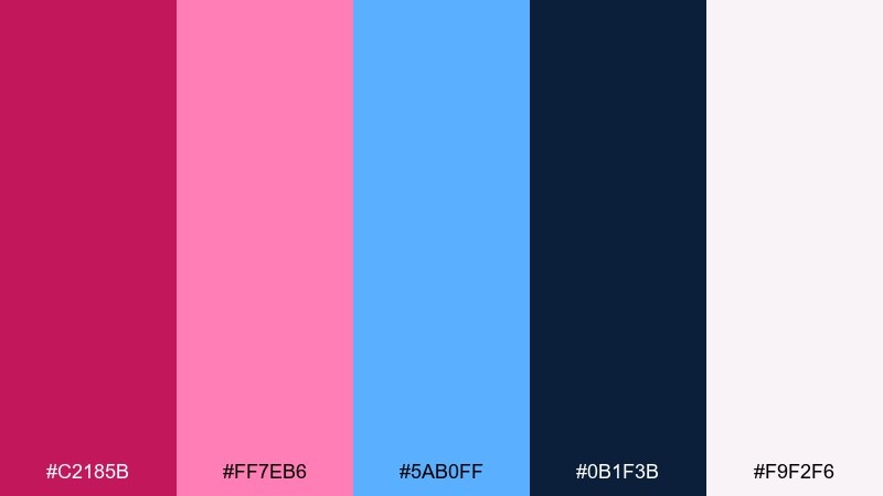
HEX: #C2185B #FF7EB6 #5AB0FF #0B1F3B #F9F2F6
Mood: dramatic, luxe
Best for: nightlife branding, album art
Dramatic and luxe, it feels like a magenta spotlight cutting through midnight waves. The dark navy gives instant depth, making the brighter accents look expensive rather than loud. Pair with glossy gradients, large photography, and minimal copy for maximum impact. Usage tip: keep small text off the darkest navy unless you bump it to near-white for contrast.
Image example of magenta midnight wave generated using media.io
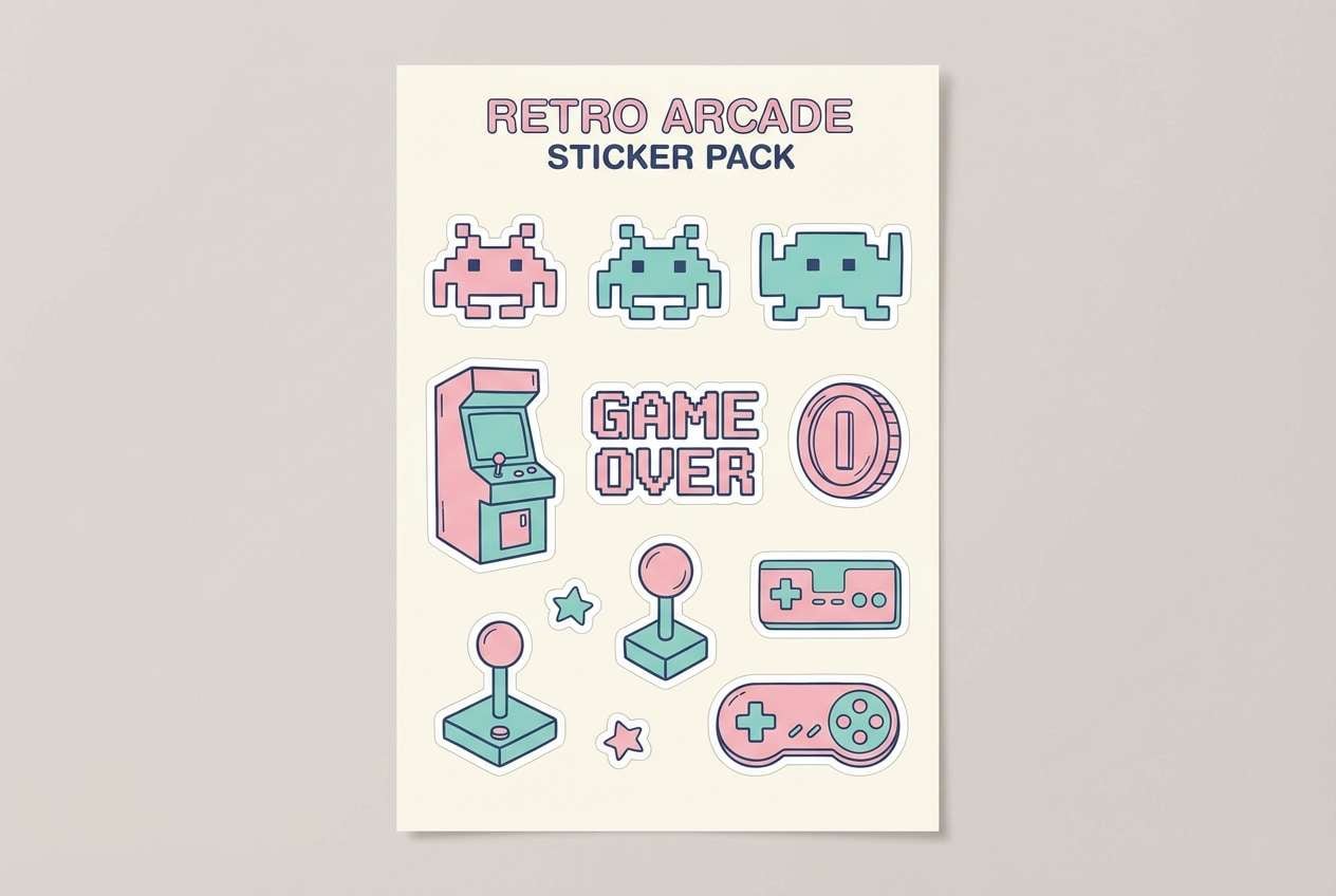
19) Pastel Pop Arcade

HEX: #FFB6D9 #FFD9EE #73D2DE #3D5A80 #FAF3FF
Mood: fun, retro
Best for: kids brands, sticker packs
Fun and retro, it feels like an arcade prize wall in pastel lights. The soft tints are easy on the eyes, while the darker blue gives you a dependable outline color. Pair with chunky icons, rounded corners, and playful patterns like dots or checkerboards. Usage tip: use the darkest blue for strokes so pastel elements don’t blur together.
Image example of pastel pop arcade generated using media.io
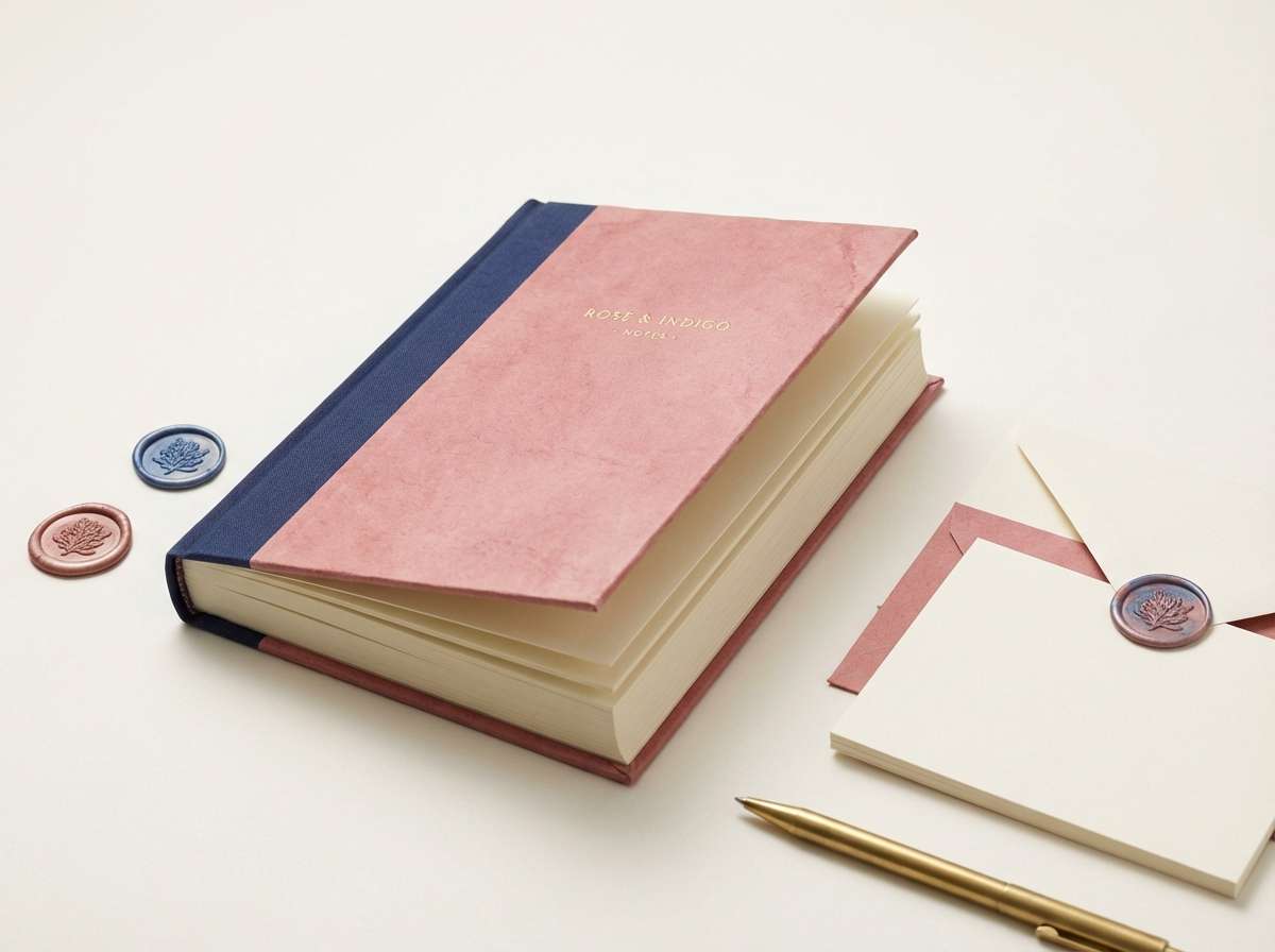
20) Vintage Rose Indigo
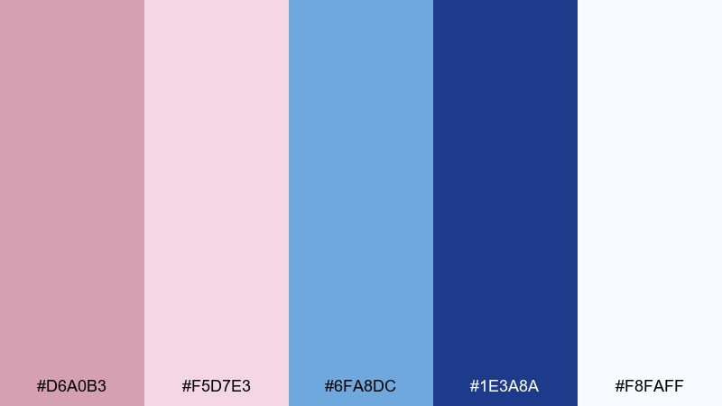
HEX: #D6A0B3 #F5D7E3 #6FA8DC #1E3A8A #F8FAFF
Mood: classic, romantic
Best for: journals, boutique stationery
Classic and romantic, it evokes a vintage rose pressed inside an indigo-bound journal. The indigo adds heritage and seriousness, while the rosy tints keep the look soft and giftable. Pair with textured paper, serif fonts, and subtle embossing for a timeless stationery direction. Usage tip: use indigo for borders and titles, and let the pinks fill larger areas to avoid heaviness.
Image example of vintage rose indigo generated using media.io
What Colors Go Well with Pink Blue?
Clean neutrals are the easiest win: bright white for a fresh UI feel, off-white for print warmth, and near-black/charcoal for readability and premium contrast. These neutrals keep pinks from feeling too sweet and help blues stay crisp.
To expand the palette, try cool grays and silver for modern dashboards, sandy beige for coastal or lifestyle brands, and subtle gold accents for packaging or event design. If you need extra energy, add a tiny pop of lime or yellow as a micro-accent—just keep it minimal so it doesn’t compete with the blue.
When in doubt, let blue handle structure (text, nav, buttons) and let pink handle emotion (backgrounds, badges, highlights). That division keeps your designs consistent across pages and formats.
How to Use a Pink Blue Color Palette in Real Designs
Start with contrast roles: pick one deep blue for text and primary CTAs, then choose a light pink or off-white for large backgrounds. This creates instant hierarchy and keeps accessibility easier to manage.
For branding, keep one “signature” shade (like a blush or neon fuchsia) and repeat it across touchpoints—social templates, packaging labels, or presentation callouts—while the supporting blues provide trust and consistency.
For print, test your light pinks on the actual stock (uncoated papers can mute them). In digital UI, avoid placing thin pink text on white; instead, use blue/charcoal text on light pink panels for a soft look that still reads clearly.
Create Pink Blue Palette Visuals with AI
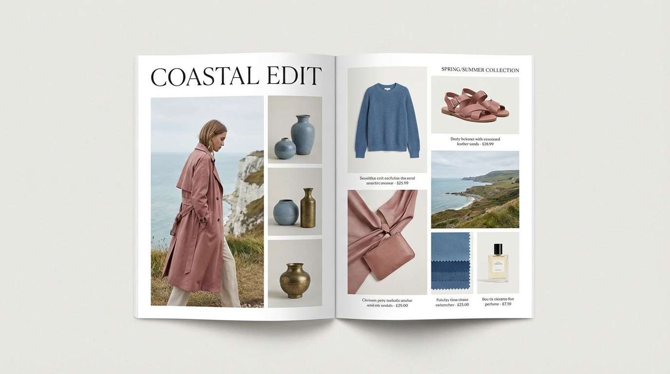
If you already have HEX codes, the fastest way to validate a palette is to generate a few realistic mockups—posters, landing pages, packaging shots, or UI screens—and see how the colors behave in context.
With Media.io’s Text to Image, you can paste a prompt (like the ones above), specify a layout ratio, and quickly iterate on lighting, typography style, and mood while keeping your pink-blue direction consistent.
Generate a small set (3–5) of visuals per palette: one hero image, one close-up detail, and one text-heavy layout. That mix helps you spot contrast issues early.
Pink Blue Color Palette FAQs
-
What does a pink and blue color palette communicate?
Most pink-blue palettes communicate a balance of warmth (pink) and trust/clarity (blue). Pastels feel soft and friendly, while saturated neon pink with deep blue feels energetic and futuristic. -
Which blue works best with blush pink: navy or sky blue?
Navy gives stronger contrast and a more premium, editorial feel (great for navigation and headlines). Sky blue keeps the look airy and gentle (great for wellness, lifestyle, and light UI backgrounds). -
How do I keep pink and blue from looking childish?
Use a grounding neutral (off-white, warm gray, or near-black), reduce saturation, and choose a deeper “anchor” blue for typography. Minimal layouts, clean type, and restrained accents make the duo feel modern. -
Are pink-blue palettes good for UI and accessibility?
Yes, if you assign roles carefully: use dark blue/charcoal for text, keep pink as backgrounds or highlights, and verify contrast ratios for buttons and small labels. Avoid light pink text on white. -
What neutral colors pair best with pink and blue?
White and off-white are the most versatile, charcoal/near-black adds premium contrast, and cool grays create a modern product feel. For warmer branding, add sand/beige sparingly. -
How many colors should a pink-blue palette include?
Five is a practical sweet spot: a light background, a secondary light tint, one mid tone, one deep anchor (often blue), and a clean neutral. This is enough for UI states, charts, and marketing layouts without clutter. -
Can I use pink-blue palettes for print materials?
Absolutely—especially invitations, packaging, and editorial pieces. Just print a quick swatch test because pale pinks can shift or fade depending on paper stock and finishing.


