

Mauve sits in the sweet spot between muted pink and dusty purple, so it can feel romantic without being loud and modern without turning cold. That flexibility is why mauve tones show up everywhere from wedding suites to SaaS UI accents.
Below are 20 curated mauve color palette ideas with HEX codes, plus practical tips for balancing light neutrals, deep anchors, and accent highlights in real design work.
In this article
- Why Mauve Palettes Work So Well
-
- rosewood mist
- velvet dusk
- blush taupe studio
- sage meadow
- plum espresso contrast
- champagne glow
- coastal heather
- modern lilac office
- terracotta hearth
- icy mauve minimal
- muted berry library
- pearl nursery calm
- graphite rose tech
- antique lace
- cinnamon market
- orchid noir evening
- dusty mauve denim
- golden hour mauve
- rainy concrete rose
- spring mauve bloom
- What Colors Go Well with Mauve?
- How to Use a Mauve Color Palette in Real Designs
- Create Mauve Palette Visuals with AI
Why Mauve Palettes Work So Well
Mauve is naturally “quiet,” which makes it easy to pair with both warm and cool neutrals. It can read as soft and romantic in light tints, or sleek and premium when you push it toward deeper plum and charcoal.
Because mauve has both red and blue influences, it bridges palettes that would otherwise clash (for example, sage greens and warm champagne golds). That makes it especially useful for branding systems where you need flexible accents across many layouts.
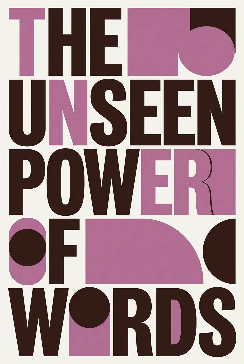
In digital design, mauve also performs well as an accent color: it attracts attention without the harshness of saturated magenta or purple. With the right dark anchor, it stays readable in UI, editorial layouts, and marketing banners.
20+ Mauve Color Palette Ideas (with HEX Codes)
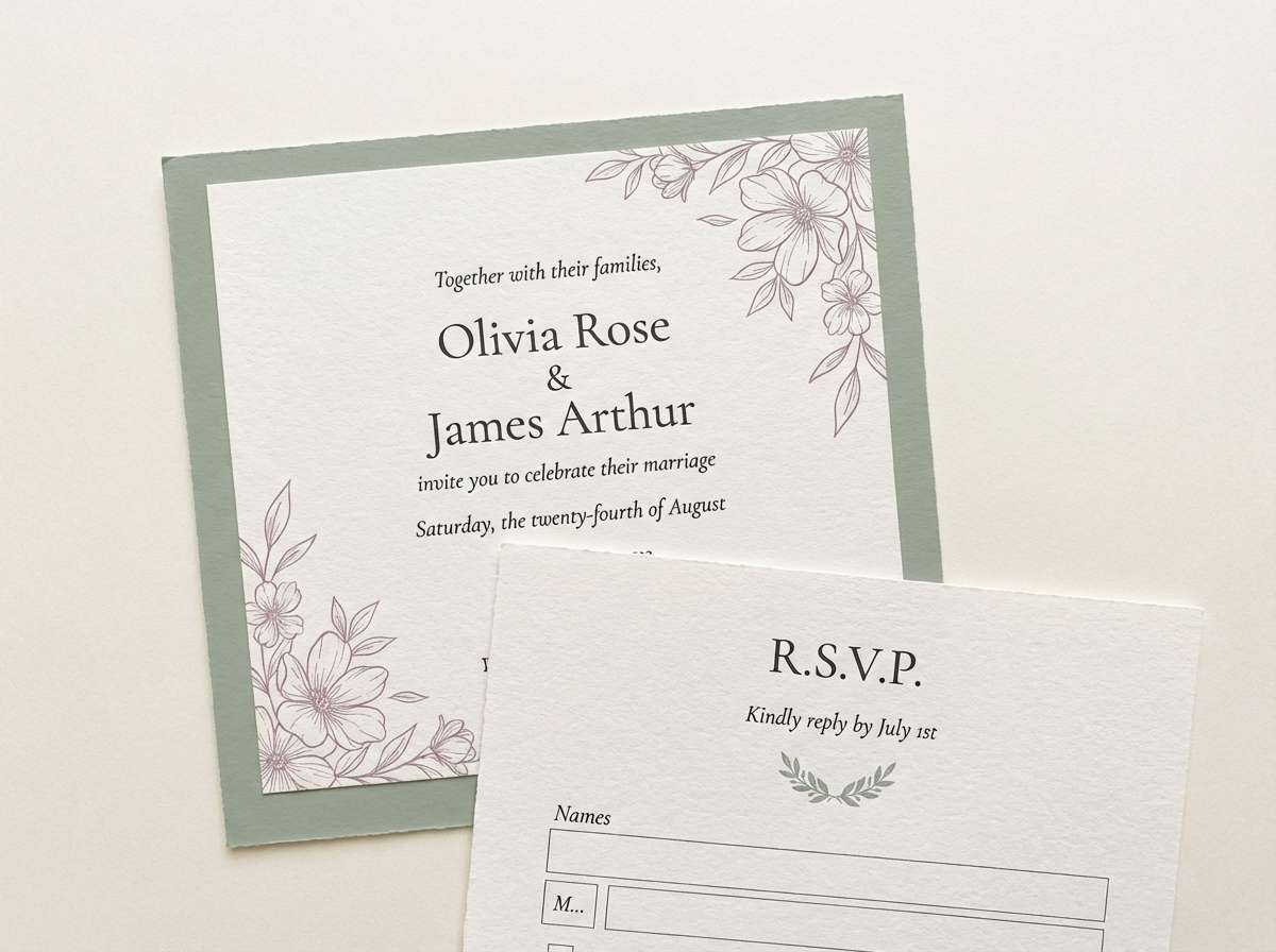
1) Rosewood Mist
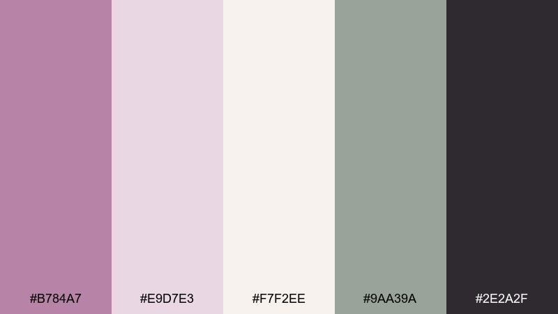
HEX: #B784A7 #E9D7E3 #F7F2EE #9AA39A #2E2A2F
Mood: romantic, airy, refined
Best for: wedding invitations and RSVP suites
Romantic and weightless, it feels like rose petals in morning fog with a quiet herbal breeze. Use it for stationery, bridal branding, or soft lifestyle layouts where type needs to look elegant. Pair the mauve with creamy off-white for breathing room and add the muted sage as a calm counterpoint. Tip: keep the darkest charcoal only for headings and tiny rules so the paper-like lightness stays intact.
Image example of rosewood mist generated using media.io
Media.io is an online AI studio for creating and editing video, image, and audio in your browser.

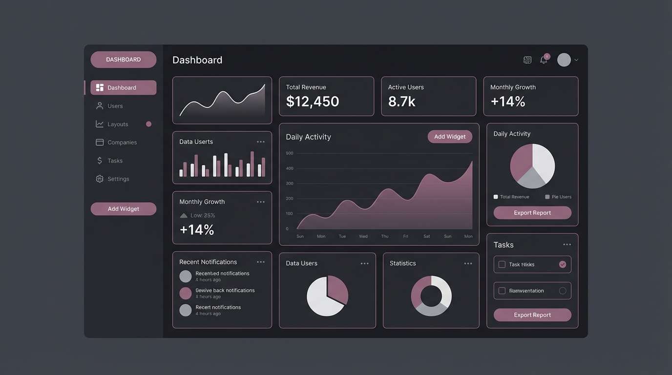
2) Velvet Dusk
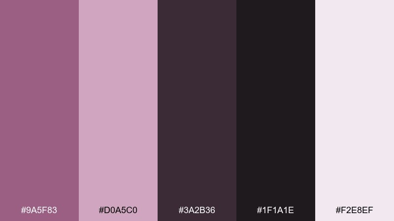
HEX: #9A5F83 #D0A5C0 #3A2B36 #1F1A1E #F2E8EF
Mood: moody, luxe, modern
Best for: dark-mode app UI and dashboards
Moody and plush, it reads like velvet curtains and city lights after rain. The deep near-black base keeps screens grounded while the mauve highlight feels premium instead of loud. Pair the pale blush as a surface color for cards, then reserve the brighter tint for active states and badges. Tip: aim for high contrast on body text and use the mauve only as an accent to avoid a washed interface.
Image example of velvet dusk generated using media.io
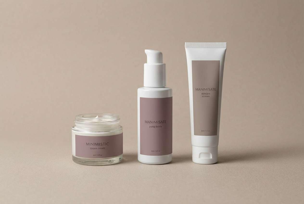
3) Blush Taupe Studio
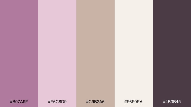
HEX: #B07A9F #E6C8D9 #C9B2A6 #F6F0EA #4B3B45
Mood: soft, polished, editorial
Best for: beauty product packaging and labels
Soft and polished, it evokes satin makeup bags and warm studio lighting. This mauve color palette works beautifully on skincare boxes, perfume labels, and minimal cosmetics branding. Let the taupe support long-form copy while the creamy tone keeps the layout bright and clean. Tip: print the darkest shade as a spot color for logotypes to avoid muddy results on textured paper.
Image example of blush taupe studio generated using media.io
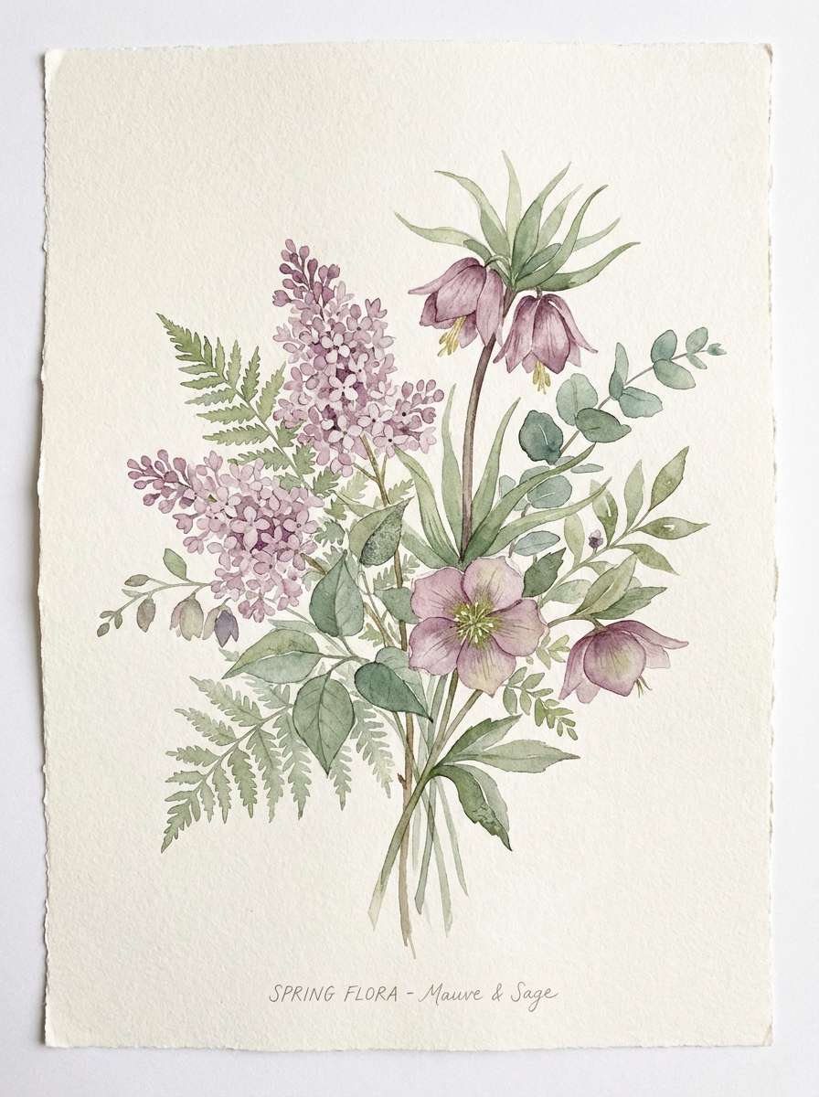
4) Sage Meadow
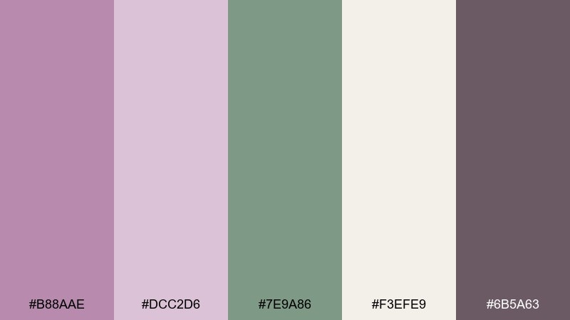
HEX: #B88AAE #DCC2D6 #7E9A86 #F3EFE9 #6B5A63
Mood: fresh, botanical, calming
Best for: spring botanical illustrations and cards
Fresh and botanical, it feels like wildflowers tucked into a linen journal. The green keeps the mauve from leaning too sweet, making it ideal for garden-themed prints and seasonal announcements. Pair the light neutral as the paper base and use the deeper plum-gray for outlines and captions. Tip: in watercolor work, wash the mauve first, then glaze the sage on top for natural depth.
Image example of sage meadow generated using media.io
5) Plum Espresso Contrast
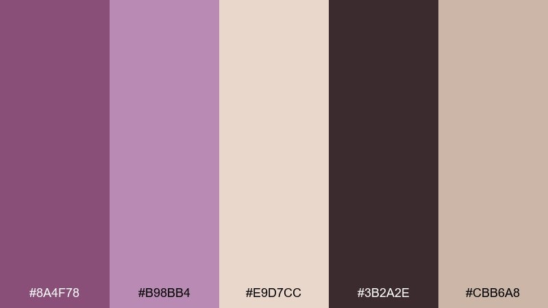
HEX: #8A4F78 #B98BB4 #E9D7CC #3B2A2E #CBB6A8
Mood: dramatic, cozy, high-contrast
Best for: concert posters and bold typography
Dramatic and cozy, it brings to mind espresso foam and dark plum velvet. Strong contrast makes it perfect for posters, book covers, and statement headlines. Pair the warm creams for negative space, then push the deepest brown-plum for type and key shapes. Tip: use the mauve midtone as a gradient bridge so the jump from dark to light feels intentional.
Image example of plum espresso contrast generated using media.io
6) Champagne Glow
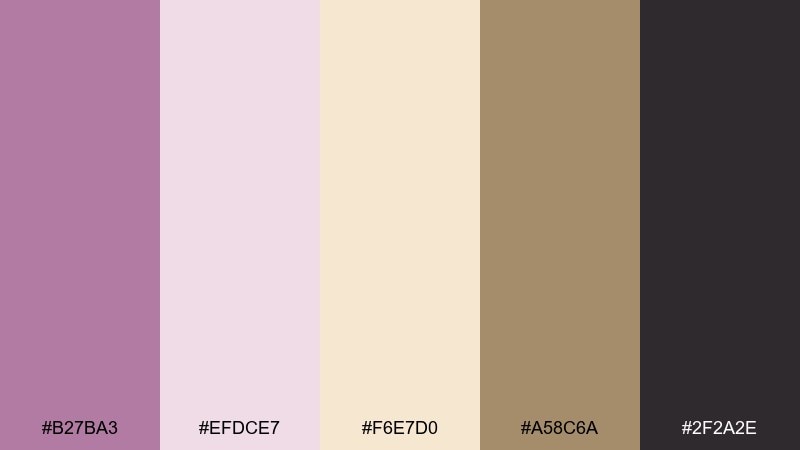
HEX: #B27BA3 #EFDCE7 #F6E7D0 #A58C6A #2F2A2E
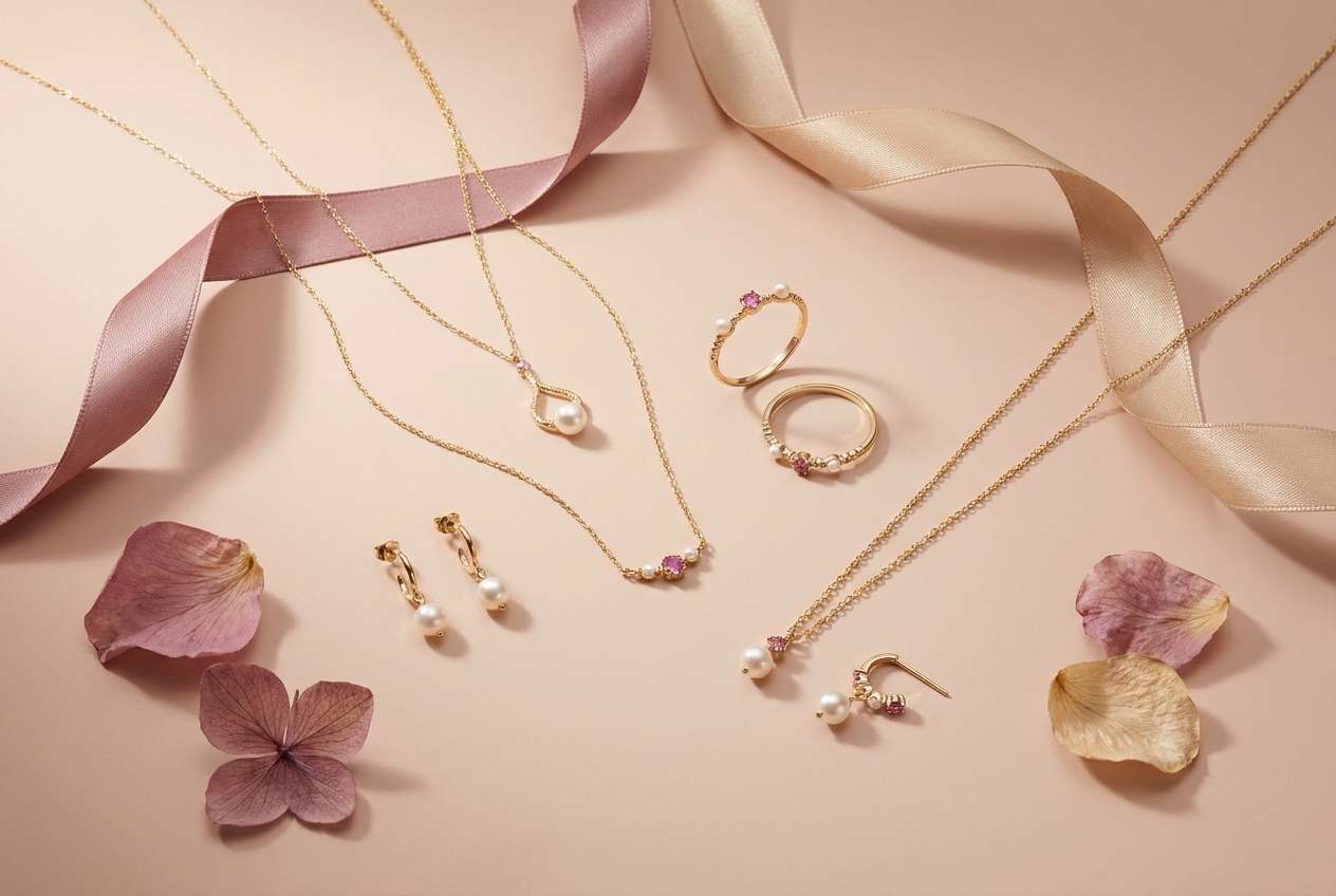
Mood: festive, luminous, upscale
Best for: jewelry ads and holiday promos
Festive and luminous, it looks like champagne highlights on brushed silk. These mauve color combinations shine in jewelry creatives, gift guides, and premium promo banners. Pair the pale pink with warm champagne to flatter gold-toned products, then use the dark neutral to anchor pricing and CTAs. Tip: keep metallic accents minimal and let the contrast do the luxury work.
Image example of champagne glow generated using media.io
7) Coastal Heather
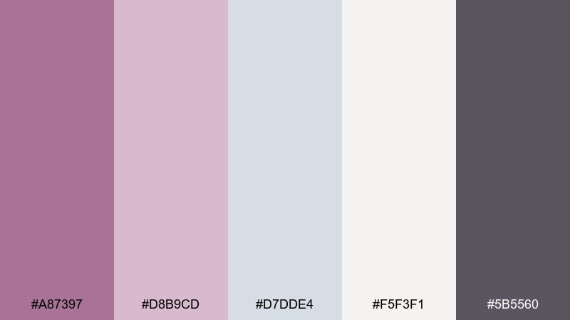
HEX: #A87397 #D8B9CD #D7DDE4 #F5F3F1 #5B5560
Mood: breezy, coastal, understated
Best for: interior mood boards and lifestyle blogs
Breezy and understated, it recalls heather blooms near a cloudy shoreline. The cool gray-blue keeps the pink-purple tones feeling modern for home styling, blog headers, and calm brand photography overlays. Pair the soft white as the main canvas, then use the slate tone for captions and navigation. Tip: for interiors, echo the palette with matte ceramics and brushed nickel instead of shiny chrome.
Image example of coastal heather generated using media.io
8) Modern Lilac Office
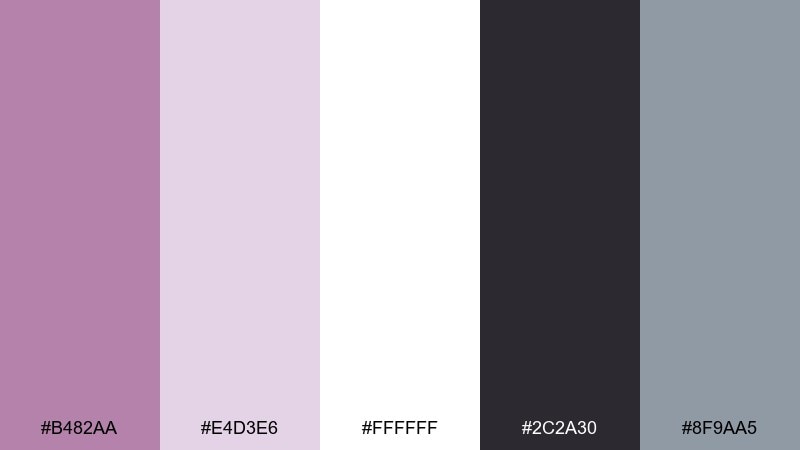
HEX: #B482AA #E4D3E6 #FFFFFF #2C2A30 #8F9AA5
Mood: clean, professional, friendly
Best for: presentation templates and pitch decks
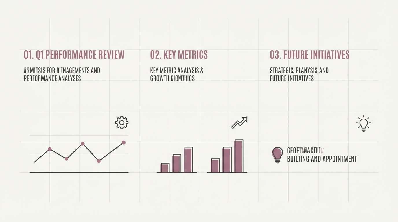
Clean and professional, it suggests crisp stationery with a friendly blush tint. As a mauve color scheme, it keeps decks approachable while still looking sharp on projectors. Pair white slides with charcoal text, then use the mauve for section headers and callouts with the blue-gray as a supporting UI-like neutral. Tip: avoid gradients in charts and instead assign each data series a single flat tone for clarity.
Image example of modern lilac office generated using media.io
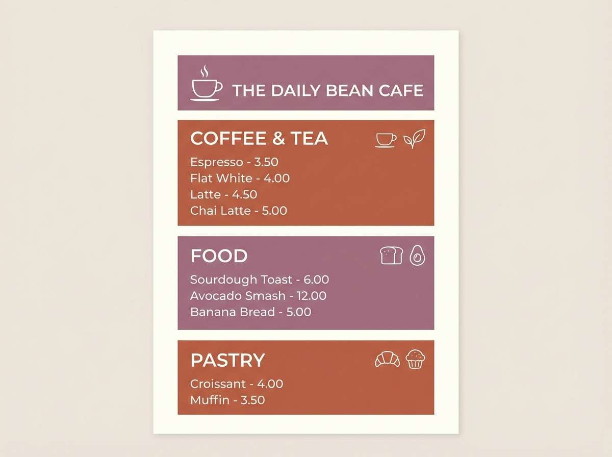
9) Terracotta Hearth
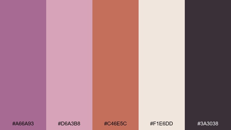
HEX: #A66A93 #D6A3B8 #C46E5C #F1E6DD #3A3038
Mood: earthy, welcoming, artisanal
Best for: cafe branding and menu design
Earthy and welcoming, it feels like clay mugs and dried florals on a wooden counter. The terracotta adds appetite appeal while the mauve keeps the look gentle and contemporary. Pair the cream base for menus and labels, then use the deep plum-brown for readable type and stamp-like marks. Tip: print menus on uncoated stock so the warm tones stay natural, not glossy.
Image example of terracotta hearth generated using media.io
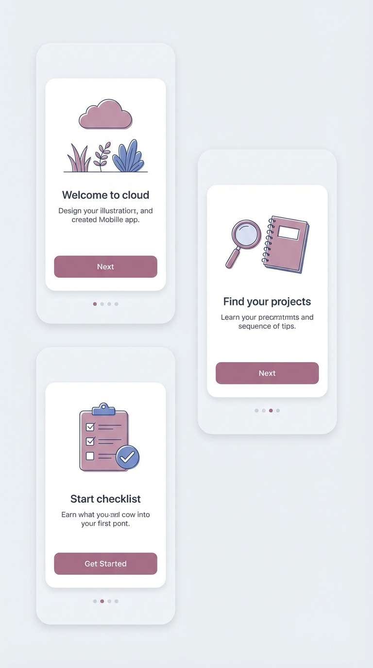
10) Icy Mauve Minimal
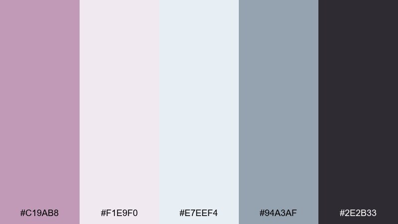
HEX: #C19AB8 #F1E9F0 #E7EEF4 #94A3AF #2E2B33
Mood: cool, minimal, airy
Best for: mobile onboarding screens and UI kits
Cool and airy, it reads like frosted glass with a blush undertone. The near-white tints are great for onboarding flows where you want softness without sacrificing legibility. Pair the icy blue-gray for dividers and secondary buttons, and keep the dark ink shade for core text and icons. Tip: use the mauve midtone only on primary CTAs so the user always knows where to tap next.
Image example of icy mauve minimal generated using media.io
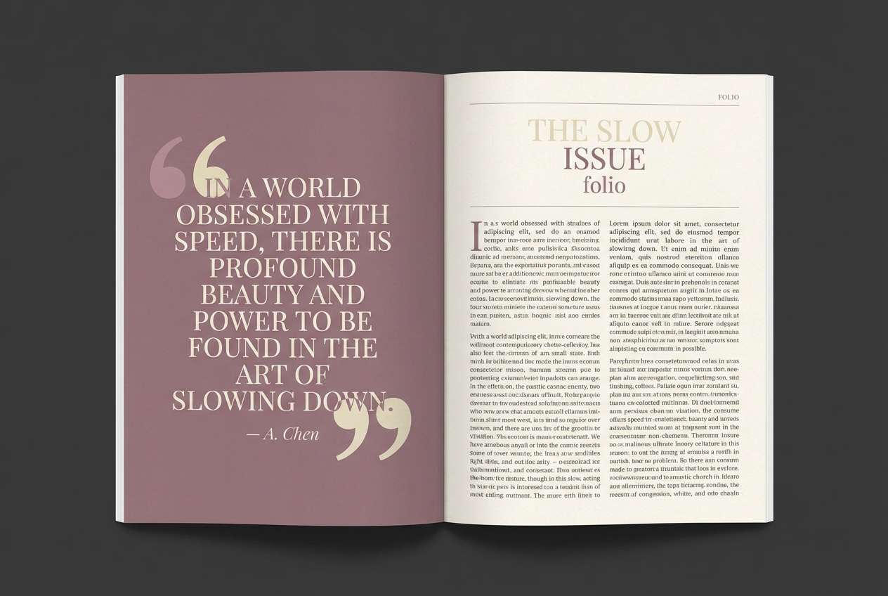
11) Muted Berry Library
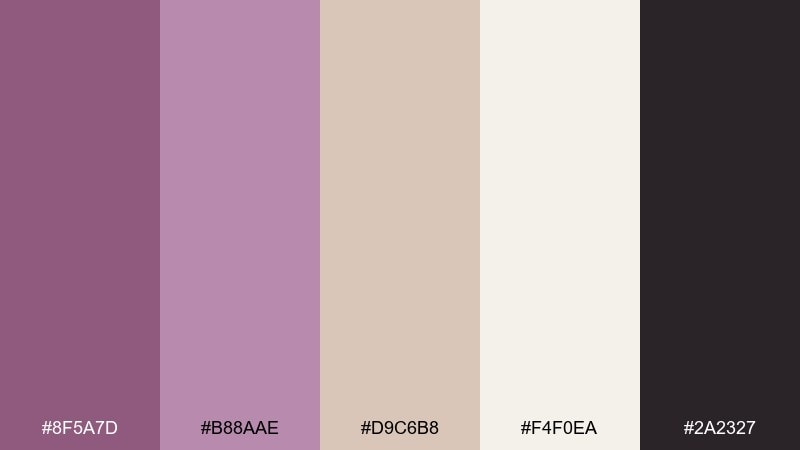
HEX: #8F5A7D #B88AAE #D9C6B8 #F4F0EA #2A2327
Mood: classic, literary, warm
Best for: magazine editorials and book layouts
Classic and literary, it evokes worn book cloth and berry tea. The dusty neutrals are friendly to long reading sessions in editorials, catalogs, and multi-page PDFs. Pair the light cream for generous margins, then use the dark ink tone for body copy and the berry for pull quotes. Tip: keep accent usage consistent by assigning one highlight color per page spread.
Image example of muted berry library generated using media.io
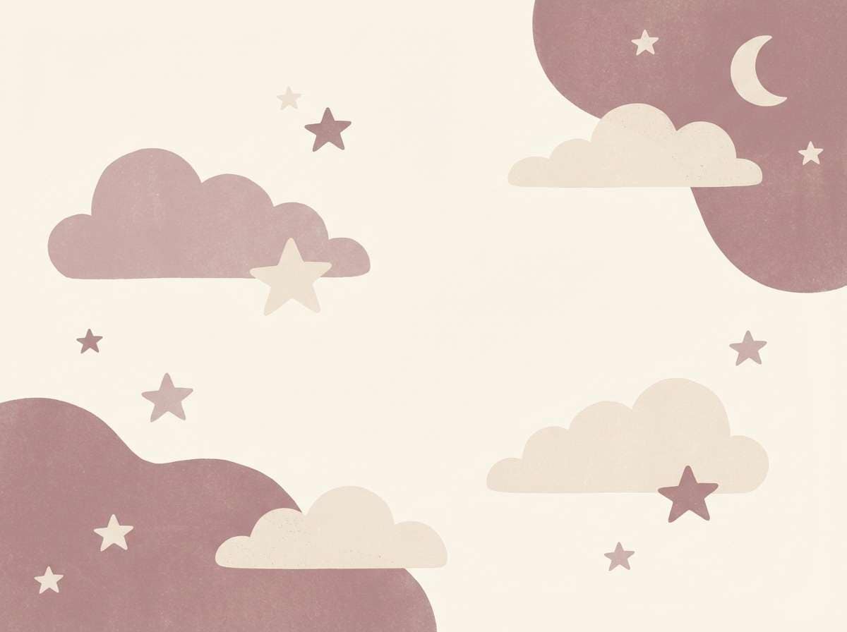
12) Pearl Nursery Calm
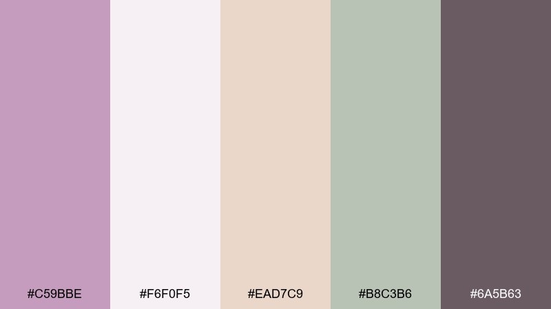
HEX: #C59BBE #F6F0F5 #EAD7C9 #B8C3B6 #6A5B63
Mood: gentle, comforting, dreamy
Best for: nursery wall art and baby shower decor
Gentle and dreamy, it feels like pearl buttons and soft knit blankets. The warm beige keeps the pink-lilac notes cozy rather than icy, making it ideal for nurseries and baby shower pieces. Pair the pale base for large backgrounds, then use the sage-gray for tiny details like stars, leaves, or borders. Tip: for prints, choose slightly thicker linework so the soft colors do not disappear at a distance.
Image example of pearl nursery calm generated using media.io
13) Graphite Rose Tech
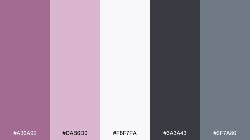
HEX: #A36A92 #DAB6D0 #F8F7FA #3A3A43 #6F7A86
Mood: sleek, confident, contemporary
Best for: SaaS landing pages and hero sections
Sleek and confident, it looks like graphite sketches softened by a rosy haze. The palette balances trust and warmth for tech brands, subscription products, and conversion-focused landing pages. Pair the near-white background with graphite headings, then use the mauve for key links and the steel gray for secondary navigation. Tip: limit the accent to one primary button style so your hero stays clean and scannable.
Image example of graphite rose tech generated using media.io

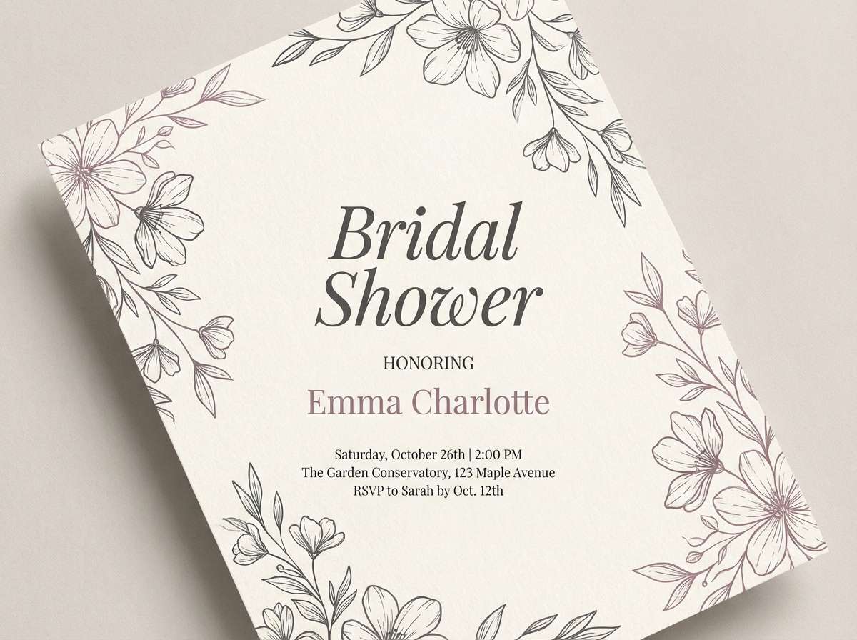
14) Antique Lace
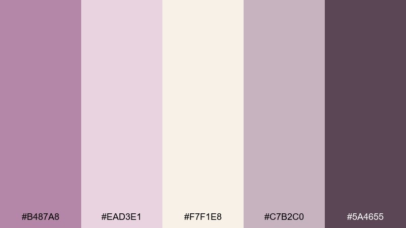
HEX: #B487A8 #EAD3E1 #F7F1E8 #C7B2C0 #5A4655
Mood: vintage, delicate, romantic
Best for: bridal shower flyers and tea party invites
Vintage and delicate, it brings up antique lace, pressed violets, and porcelain teacups. The soft midtones keep floral motifs gentle while the deeper plum adds definition to type. Pair the creamy shade as your main field, then use the dusty lavender-gray for borders and subtle patterning. Tip: choose thin line illustrations and keep gradients minimal to preserve the heirloom feel.
Image example of antique lace generated using media.io
15) Cinnamon Market
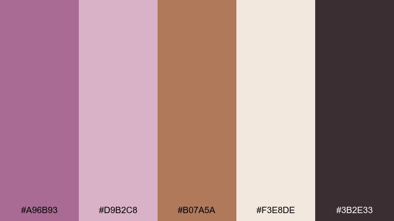
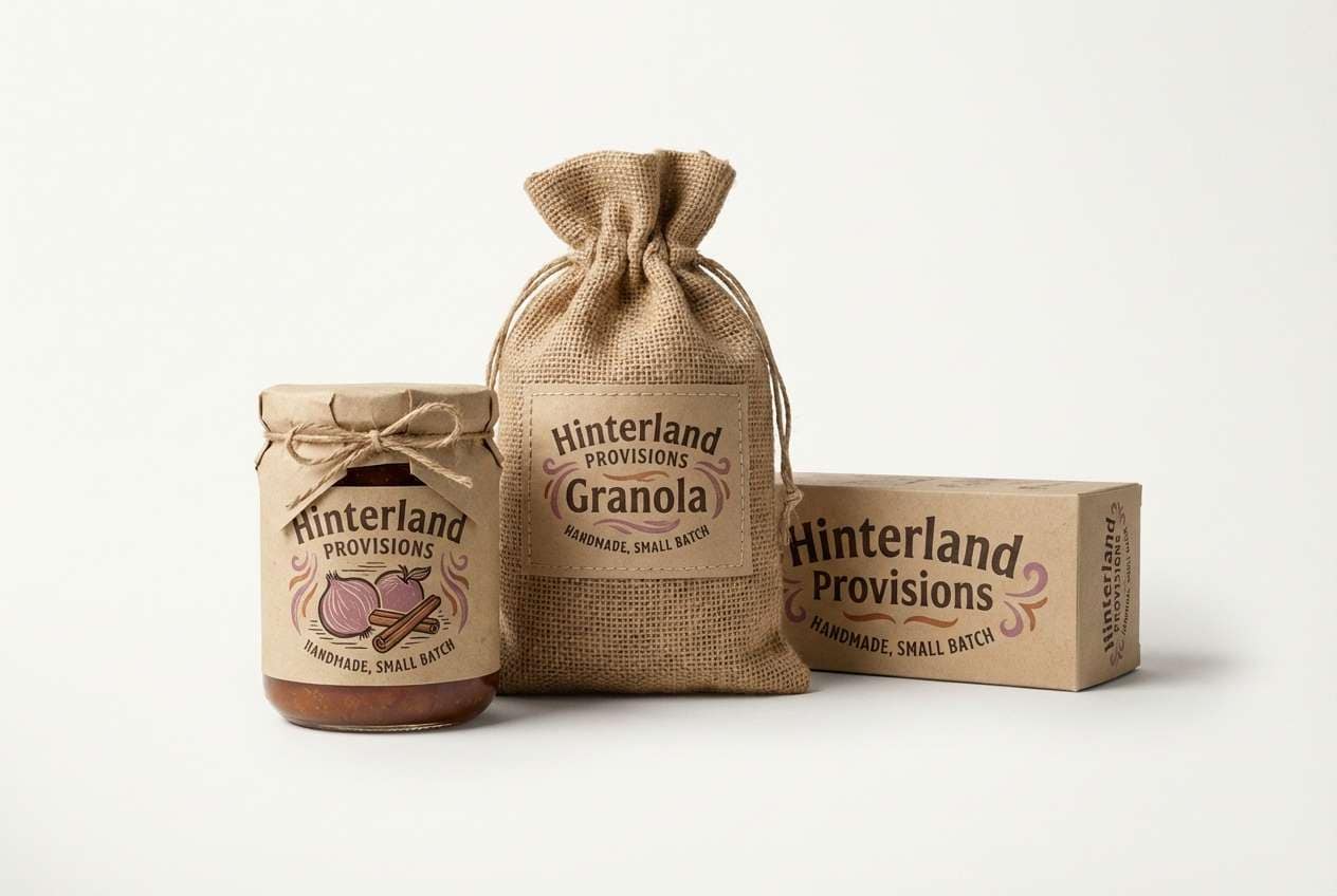
HEX: #A96B93 #D9B2C8 #B07A5A #F3E8DE #3B2E33
Mood: warm, rustic, modern
Best for: food packaging and craft labels
Warm and rustic, it feels like cinnamon sticks, paper tags, and a small weekend market. This mauve color palette pairs beautifully with earthy browns for sauces, tea tins, and artisanal bakery branding. Keep the cream for label backgrounds and use the dark cocoa tone for ingredient text and barcodes. Tip: add a simple one-color stamp mark in the mid-mauve to make the package look handcrafted without clutter.
Image example of cinnamon market generated using media.io
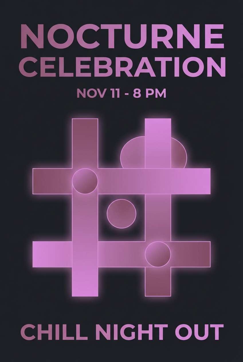
16) Orchid Noir Evening
HEX: #7D3F6A #B77FA8 #1A161B #5E5964 #F1E7EE
Mood: bold, cinematic, elegant
Best for: night event posters and invitations
Bold and cinematic, it suggests orchid petals against a dark theater curtain. The inky base makes the mauve pop for night events, cocktail parties, and gallery openings. Pair the pale blush for negative space in small areas like date blocks, then let the purple-plum lead your headline. Tip: set body copy in the lightest shade and reserve saturated tones for only the highest hierarchy.
Image example of orchid noir evening generated using media.io
17) Dusty Mauve Denim
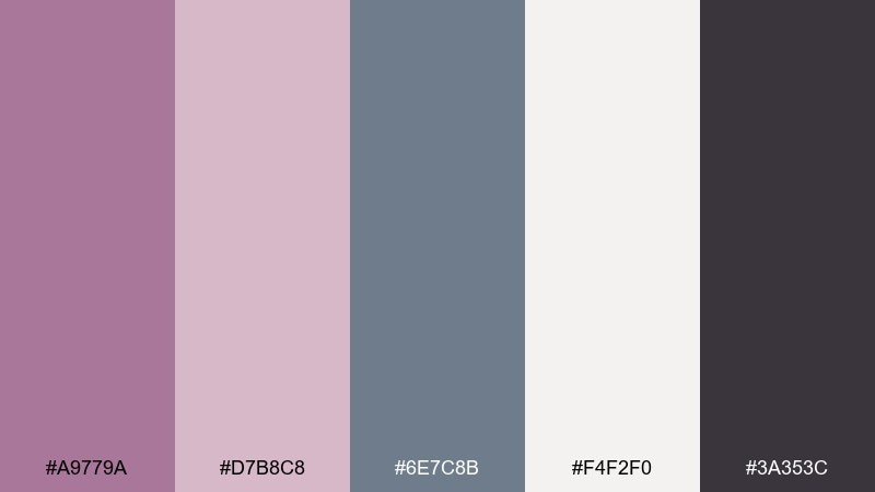
HEX: #A9779A #D7B8C8 #6E7C8B #F4F2F0 #3A353C
Mood: casual, stylish, contemporary
Best for: fashion lookbooks and seasonal campaigns
Casual and stylish, it feels like faded denim with a blush-toned lip stain. The steel-blue neutral adds structure, making it great for fashion lookbooks, product grids, and campaign headers. Pair the off-white for breathable pages, then use the charcoal for pricing and sizing details. Tip: keep photography slightly desaturated so the palette reads as intentional rather than competing with images.
Image example of dusty mauve denim generated using media.io
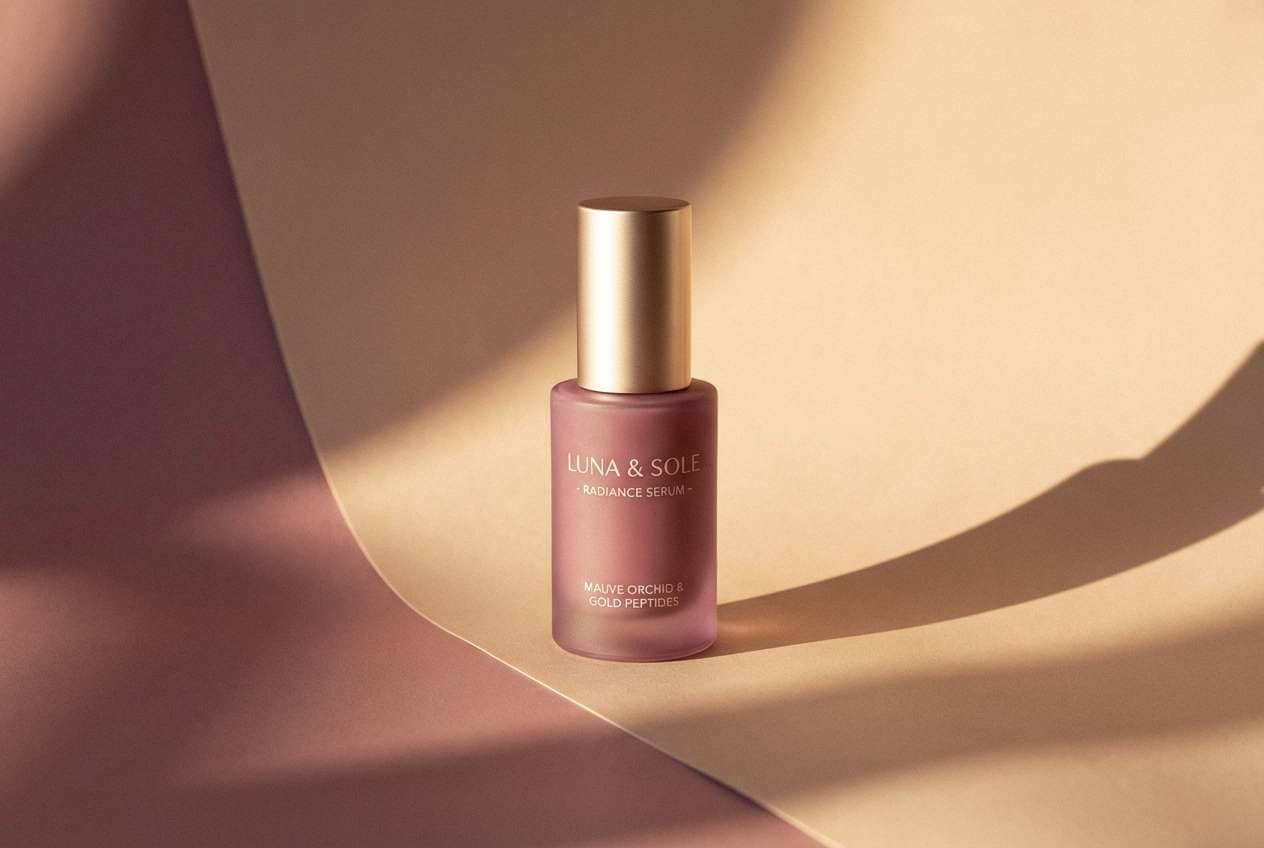
18) Golden Hour Mauve
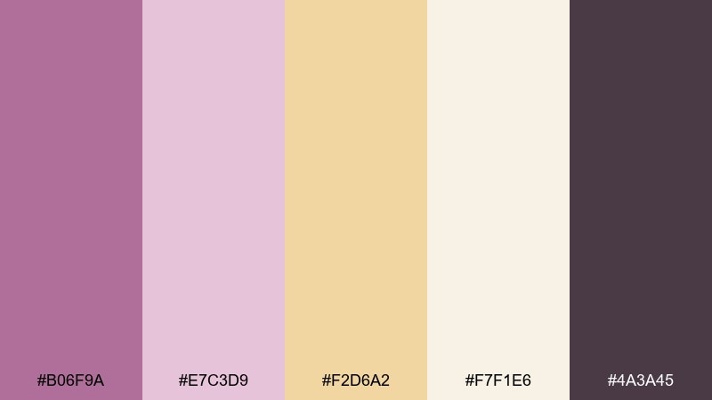
HEX: #B06F9A #E7C3D9 #F2D6A2 #F7F1E6 #4A3A45
Mood: sunlit, optimistic, luxe
Best for: skincare ads and premium product visuals
Sunlit and optimistic, it brings to mind warm skin tones at golden hour and a soft glow on glass. These mauve color combinations are especially flattering for skincare, wellness, and premium self-care campaigns. Pair the warm gold as a highlight and keep the deepest plum for fine print so the ad still feels airy. Tip: use a gentle diagonal light gradient in the background to mimic studio glow without adding clutter.
Image example of golden hour mauve generated using media.io
19) Rainy Concrete Rose
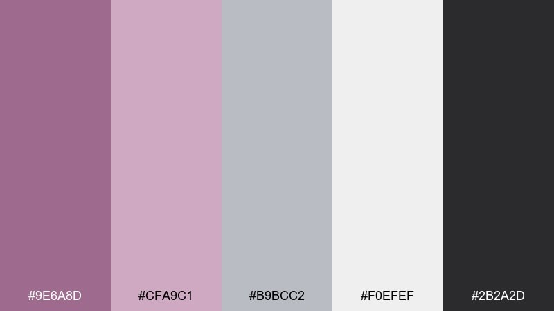
HEX: #9E6A8D #CFA9C1 #B9BCC2 #F0EFEF #2B2A2D
Mood: urban, calm, sophisticated
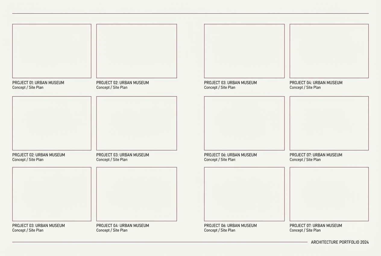
Best for: architecture portfolios and case studies
Urban and calm, it resembles wet concrete softened by a muted rose reflection. The grays make the mauve feel grown-up, perfect for architecture portfolios, case-study PDFs, and minimalist studio sites. Pair the light gray-white as your page base, then use the charcoal for captions and technical notes. Tip: keep section dividers thin and consistent so layouts stay crisp and gallery-like.
Image example of rainy concrete rose generated using media.io
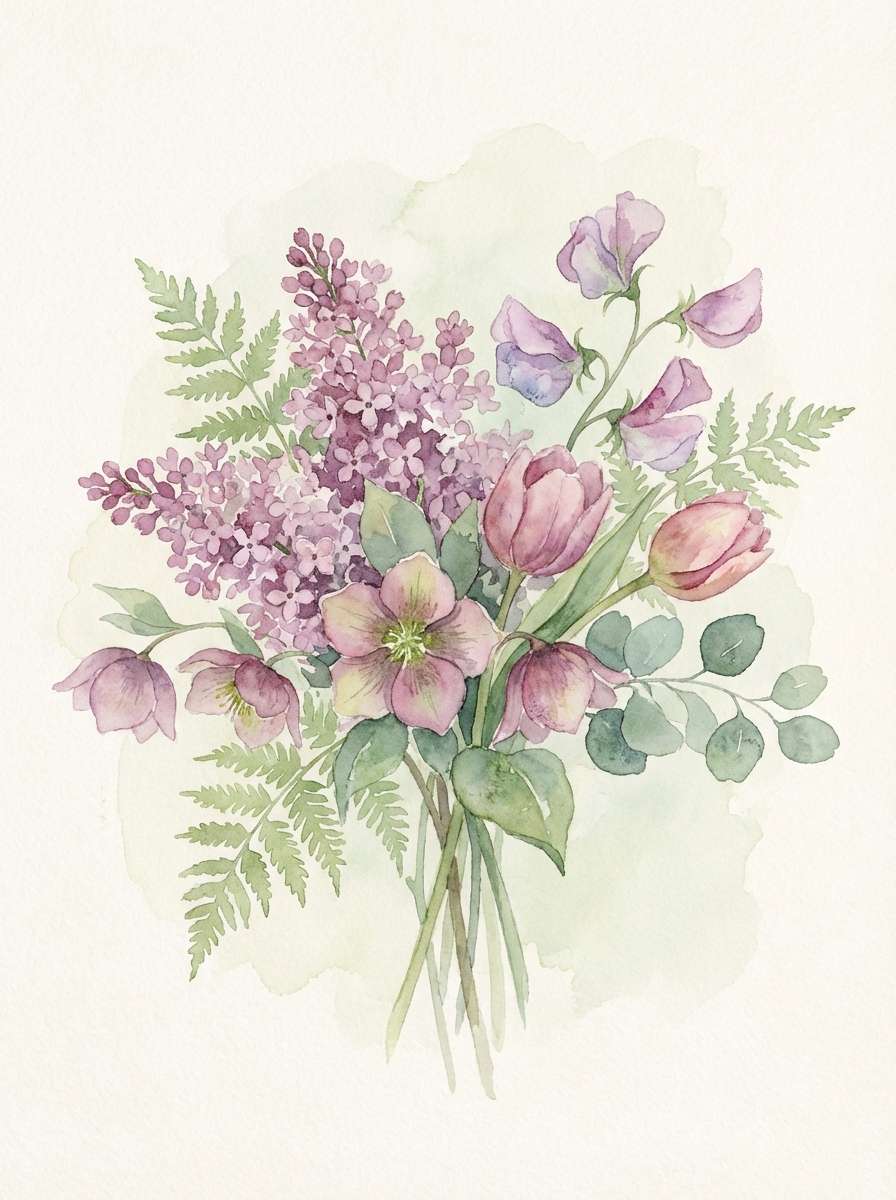
20) Spring Mauve Bloom
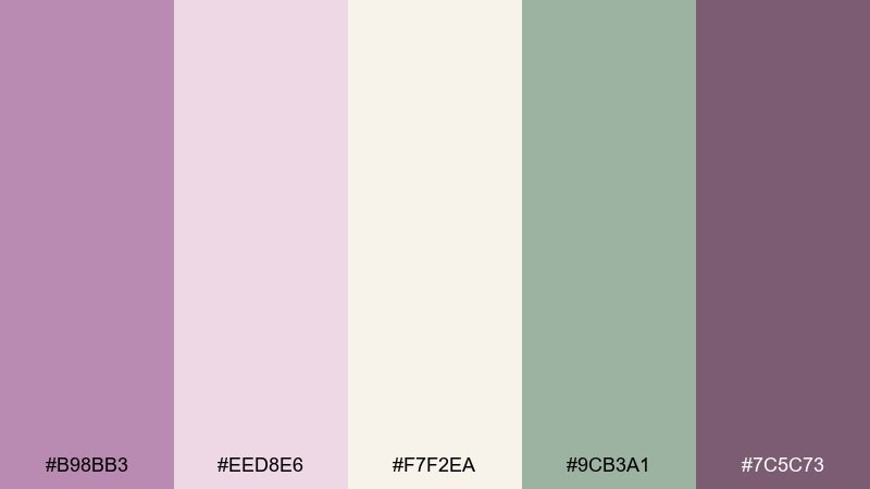
HEX: #B98BB3 #EED8E6 #F7F2EA #9CB3A1 #7C5C73
Mood: light, joyful, floral
Best for: watercolor prints and seasonal social graphics
Light and joyful, it feels like fresh blooms and soft ribbon tied around a bouquet. The greens keep the pink-purple tones lively, which works well for spring announcements, social posts, and gentle brand illustrations. Pair the pale neutral as your paper tone and use the deeper plum for stems, outlines, or small text overlays. Tip: let one color dominate the composition and use the others as small accents so the artwork stays airy.
Image example of spring mauve bloom generated using media.io
What Colors Go Well with Mauve?
Soft neutrals are the easiest match: ivory, cream, greige, and warm taupe keep mauve airy and editorial. If you need sharper structure, add charcoal or near-black to define hierarchy and improve legibility.
For modern contrast, pair mauve with cool blue-grays or concrete tones; this pulls it away from “sweet” and into a more professional, architectural feel. For a natural look, sage and muted olive are especially flattering because they counterbalance mauve’s rosy undertone.
If you want a luxe finish, champagne, antique gold, and caramel accents work well in small doses. Keep metallics minimal and let your darkest neutral do the heavy lifting for contrast.
How to Use a Mauve Color Palette in Real Designs
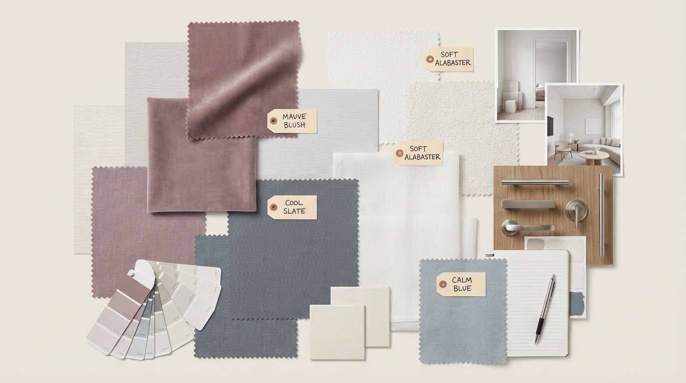
Start by choosing your “role” colors: one light background (off-white/cream), one dark anchor (charcoal/plum), and one mauve accent. This simple structure keeps brand systems consistent across web pages, packaging, and print.
In UI, reserve mauve for primary actions (buttons, active states, highlights) and keep surfaces mostly neutral. In print, be mindful that mauve can shift on uncoated stock, so test proofs and consider using deeper plum for small text.
For photography overlays, pick a translucent mauve tint and pair it with high-contrast type in charcoal or white. This keeps the mood cohesive without making images look “pink-washed.”
Create Mauve Palette Visuals with AI
If you already have HEX codes, you can generate matching visuals (posters, UI mockups, mood boards, packaging scenes) by describing the layout and lighting, then reinforcing the palette in your prompt. Mauve looks especially good with “soft studio light,” “matte paper texture,” and “minimal editorial layout” phrasing.
To keep results consistent, reuse one prompt template and only swap the subject (invite, landing page, label, etc.). Then iterate by adjusting one detail at a time, like background tone or contrast level.
When your design needs to feel premium, add one dark anchor and one warm highlight (champagne or gold) so the mauve doesn’t drift too pastel.
Mauve Color Palette FAQs
-
What is mauve, and is it closer to pink or purple?
Mauve is a muted pink-purple. Depending on the mix (more red vs. more blue) and how much gray is added, it can read as dusty pink, lilac-leaning, or soft plum. -
What colors pair best with mauve for a modern brand?
Charcoal, graphite, cool blue-gray, and near-white are reliable modern pairings. Add mauve as an accent for buttons, links, badges, or headline highlights to keep the system clean. -
Does mauve work for dark mode UI?
Yes. Use an inky neutral base (near-black/charcoal), keep text contrast high, and apply mauve sparingly for active states or primary CTAs so the interface doesn’t look washed out. -
What’s a good complementary accent for mauve besides neutrals?
Muted sage/olive gives a botanical, calming balance, while champagne or antique gold adds a luxe, festive highlight. Choose one accent direction so the palette doesn’t feel busy. -
How do I keep mauve from looking too “sweet” or bridal?
Anchor it with grays (concrete, slate, blue-gray) and deeper plums/charcoals, and reduce the amount of pale blush. Clean typography and minimal layouts also push it toward contemporary. -
What’s the best way to use mauve in print designs?
Pair mauve with cream or warm white for the paper field, and use a darker plum/charcoal for small text. Always proof on your chosen stock because mauve can shift warmer or cooler depending on paper and ink. -
Can I generate mauve palette mockups quickly without design software?
Yes. Use an AI text-to-image tool to generate mood boards, posters, and packaging concepts by specifying the subject, style (minimal/editorial), and lighting, then iterate with your HEX palette in mind.
Next: Lavender Color Palette


