

Pink and turquoise is one of those rare pairings that feels both playful and polished. Blush brings warmth and personality, while turquoise adds clarity and freshness.
Below are 20+ pink turquoise color palette ideas with HEX codes you can use for branding, UI, and print—plus AI-ready prompts to generate matching visuals in minutes.
In this article
- Why Pink Turquoise Palettes Work So Well
-
- cotton candy lagoon
- retro poolside pop
- blush seafoam minimal
- flamingo reef
- ballet aqua glass
- sorbet sunset
- candy quartz luxe
- coraline marina
- pastel arcade
- rosewater spa
- neon taffy splash
- desert shell tide
- peony mint tea
- mermaid bazaar
- pink sand tile
- frosted hibiscus
- cherry blossom surf
- opal horizon
- berry gelato lagoon
- vintage postcard cove
- seashell confetti
- prism flamingo tech
- What Colors Go Well with Pink Turquoise?
- How to Use a Pink Turquoise Color Palette in Real Designs
- Create Pink Turquoise Palette Visuals with AI
Why Pink Turquoise Palettes Work So Well
Pink turquoise palettes succeed because they balance temperature: pink adds a warm, human tone while turquoise brings cool, clean contrast. That push-pull makes layouts feel energetic without becoming chaotic.
They also offer strong hierarchy options—turquoise can lead with “trust” and clarity (great for UI and calls-to-action), while pink adds personality for highlights, badges, and brand moments.
With the right dark neutral (navy, charcoal, slate), a pink turquoise color scheme stays readable and accessible across screens and print, even when you use lighter blush and mint tints.
20+ Pink Turquoise Color Palette Ideas (with HEX Codes)
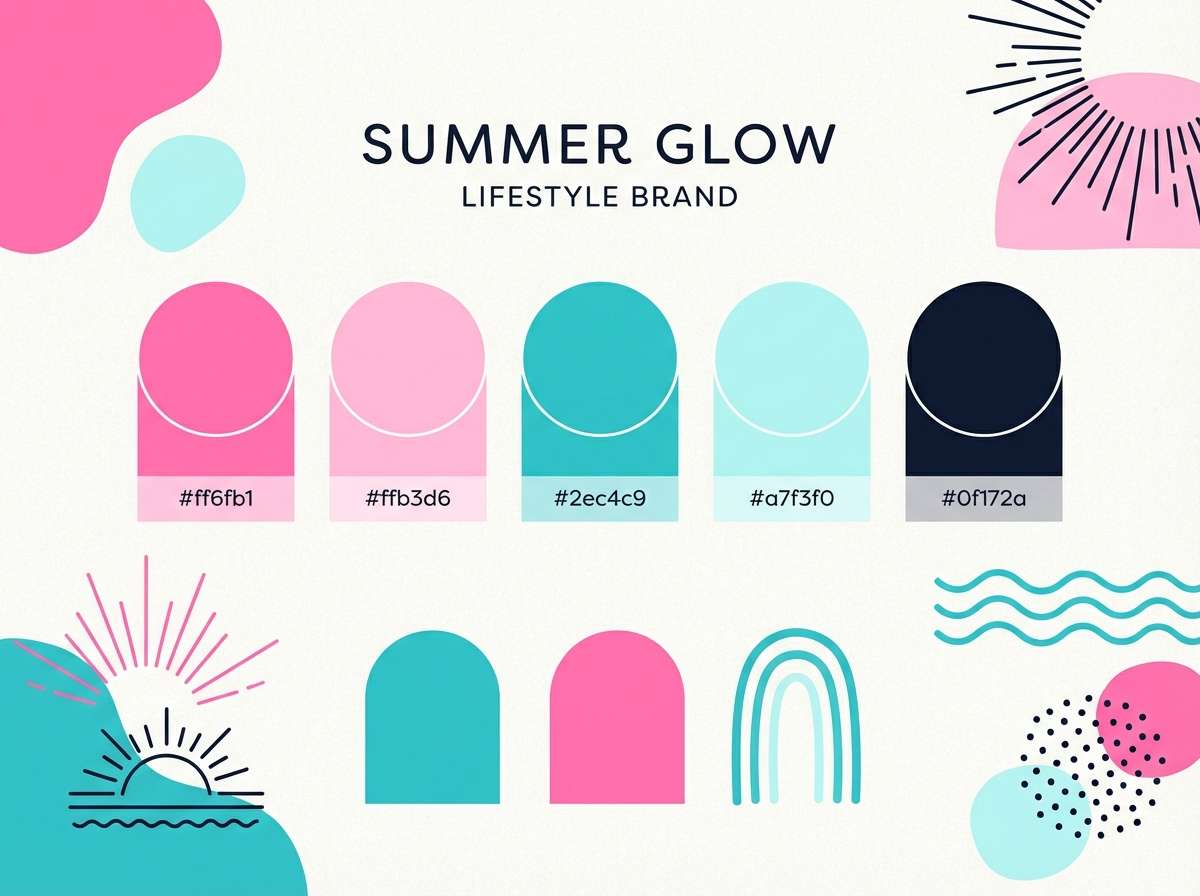
1) Cotton Candy Lagoon
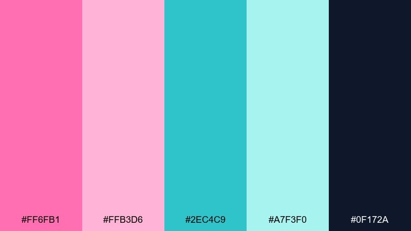
HEX: #ff6fb1 #ffb3d6 #2ec4c9 #a7f3f0 #0f172a
Mood: playful, airy, beachy
Best for: summer brand kits, social posts, creator merch
Playful and airy like cotton candy over a bright lagoon, these tones feel instantly sunny and light. Use the deep navy as your anchor for type so the pinks and aquas stay readable. Pair with rounded sans serif typography and lots of white space for a modern, friendly look. Tip: keep turquoise in larger blocks and use the hot pink as a punchy accent for buttons or badges.
Image example of cotton candy lagoon generated using media.io
Media.io is an online AI studio for creating and editing video, image, and audio in your browser.

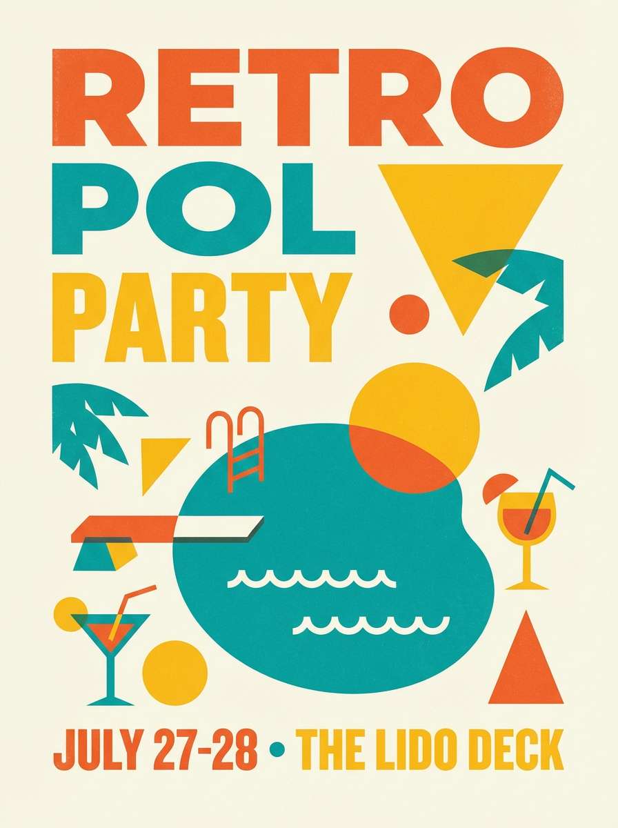
2) Retro Poolside Pop
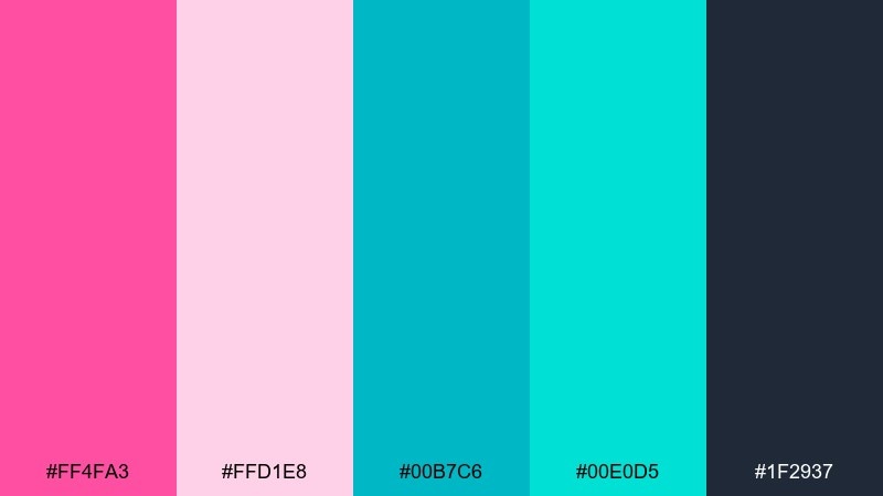
HEX: #ff4fa3 #ffd1e8 #00b7c6 #00e0d5 #1f2937
Mood: bold, nostalgic, upbeat
Best for: event posters, sticker packs, punchy ads
Bold and nostalgic like a retro pool sign, this mix brings instant energy. Let the bright turquoise carry the main shapes, then use the vivid pink for headlines and callouts. A charcoal base keeps the look grown up and prevents the pastels from feeling too sweet. Tip: add subtle grain or halftone textures to lean into the vintage vibe without hurting legibility.
Image example of retro poolside pop generated using media.io
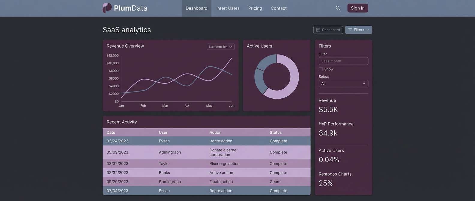
3) Blush Seafoam Minimal
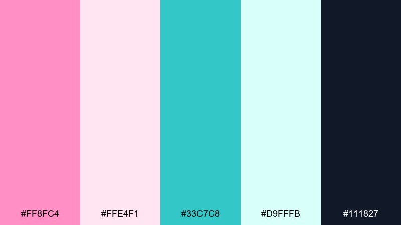
HEX: #ff8fc4 #ffe4f1 #33c7c8 #d9fffb #111827
Mood: clean, calm, modern
Best for: dashboard UI, SaaS landing pages, fintech widgets
Clean and calm like seafoam glass next to a soft blush tint, these hues feel modern without being cold. For a pink turquoise color combination that stays professional, keep the darkest shade for navigation and body text. Use the pale pink for surfaces and the seafoam for highlights, success states, and data markers. Tip: reserve the brightest turquoise for one primary action per screen to avoid visual noise.
Image example of blush seafoam minimal generated using media.io
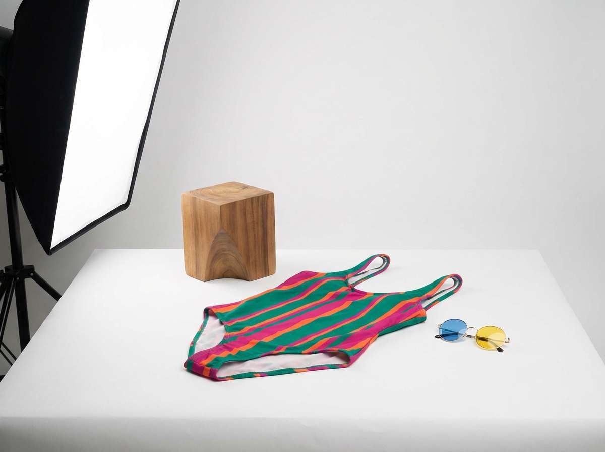
4) Flamingo Reef
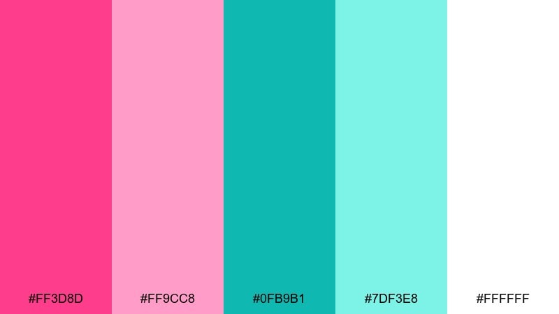
HEX: #ff3d8d #ff9cc8 #0fb9b1 #7df3e8 #ffffff
Mood: tropical, lively, confident
Best for: swimwear ads, travel promos, influencer campaigns
Tropical and lively like flamingos near a sunlit reef, these colors feel confident and camera-ready. The hot pink pops best on clean white, while the teal family adds freshness and contrast. Pair with high-impact photography and minimal copy so the palette does the talking. Tip: keep skin tones natural by pushing the pink into graphic accents rather than heavy overlays.
Image example of flamingo reef generated using media.io
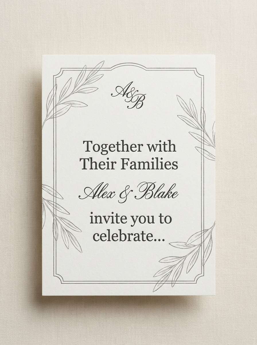
5) Ballet Aqua Glass
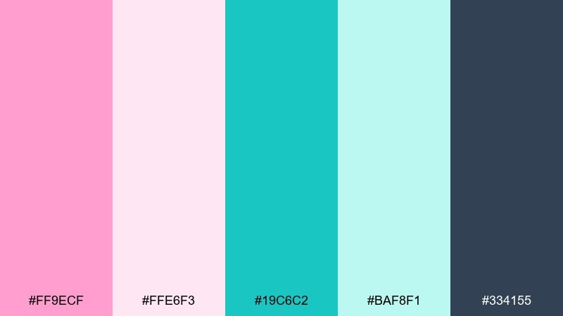
HEX: #ff9ecf #ffe6f3 #19c6c2 #baf8f1 #334155
Mood: romantic, delicate, polished
Best for: wedding invitations, bridal showers, elegant announcements
Romantic and delicate like satin slippers beside aqua glass, the tones feel polished and sweet. This pink turquoise color palette works beautifully with thin serif type and airy spacing for a refined invitation look. Add warm gray for text and small details, then let turquoise appear in borders or monograms. Tip: foil effects look best when you keep the background nearly white and avoid overusing the mid pink.
Image example of ballet aqua glass generated using media.io
6) Sorbet Sunset
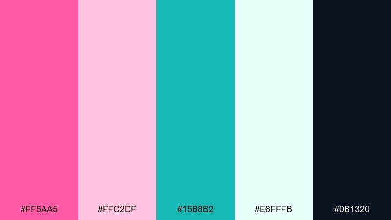
HEX: #ff5aa5 #ffc2df #15b8b2 #e6fffb #0b1320
Mood: warm, cheerful, welcoming
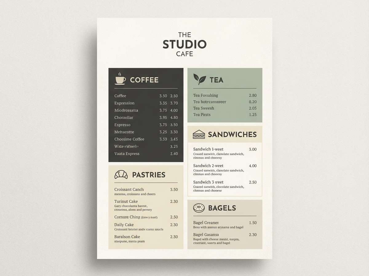
Best for: cafe menus, seasonal promos, Instagram story templates
Warm and cheerful like sorbet at sunset, this mix feels friendly and welcoming. Use the pale tint as a menu background and the deep navy for crisp readability under indoor lighting. Turquoise makes a great highlight for prices, icons, or section dividers. Tip: pick one hero pink for headings and keep supporting elements in lighter blush to reduce clutter.
Image example of sorbet sunset generated using media.io
7) Candy Quartz Luxe
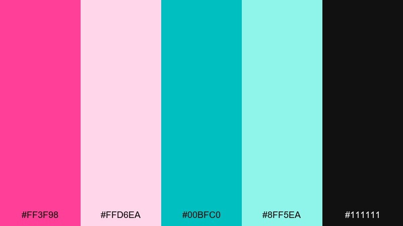
HEX: #ff3f98 #ffd6ea #00bfc0 #8ff5ea #111111
Mood: glossy, luxe, high-contrast
Best for: cosmetics packaging, beauty ads, premium labels
Glossy and luxe like polished quartz, these shades create high contrast with a premium edge. Black grounds the look and makes both the pink and turquoise feel more saturated and expensive. Pair with simple geometric patterns and a clean logotype for a modern beauty aesthetic. Tip: use spot gloss on the turquoise elements to add depth without adding extra colors.
Image example of candy quartz luxe generated using media.io
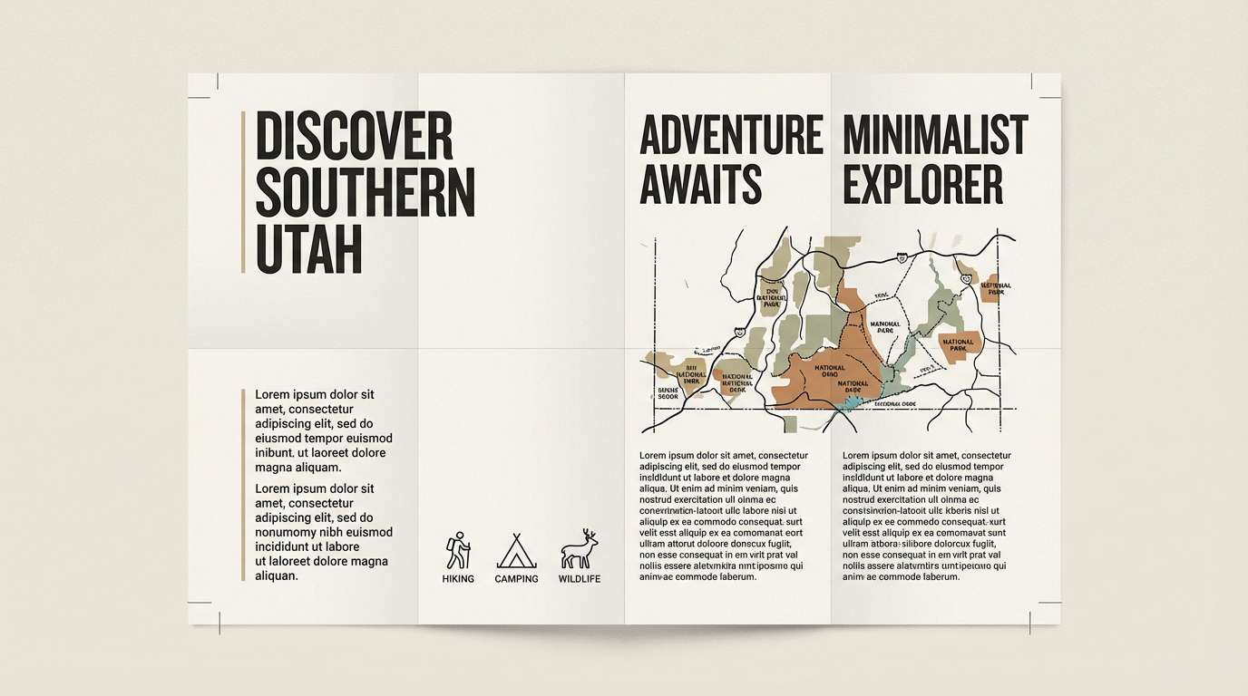
8) Coraline Marina
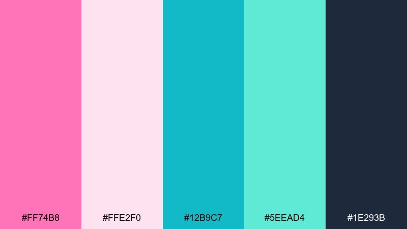
HEX: #ff74b8 #ffe2f0 #12b9c7 #5eead4 #1e293b
Mood: nautical, fresh, upbeat
Best for: travel brochures, tour banners, hotel collateral
Fresh and upbeat like a marina at midday, these hues balance playful warmth with ocean clarity. Use the darker slate for body copy and map labels, then let turquoise handle icons and routes. Blush pink works best as a supporting color for section headers or callouts. Tip: keep photos cool-toned so the turquoise feels integrated rather than competing.
Image example of coraline marina generated using media.io
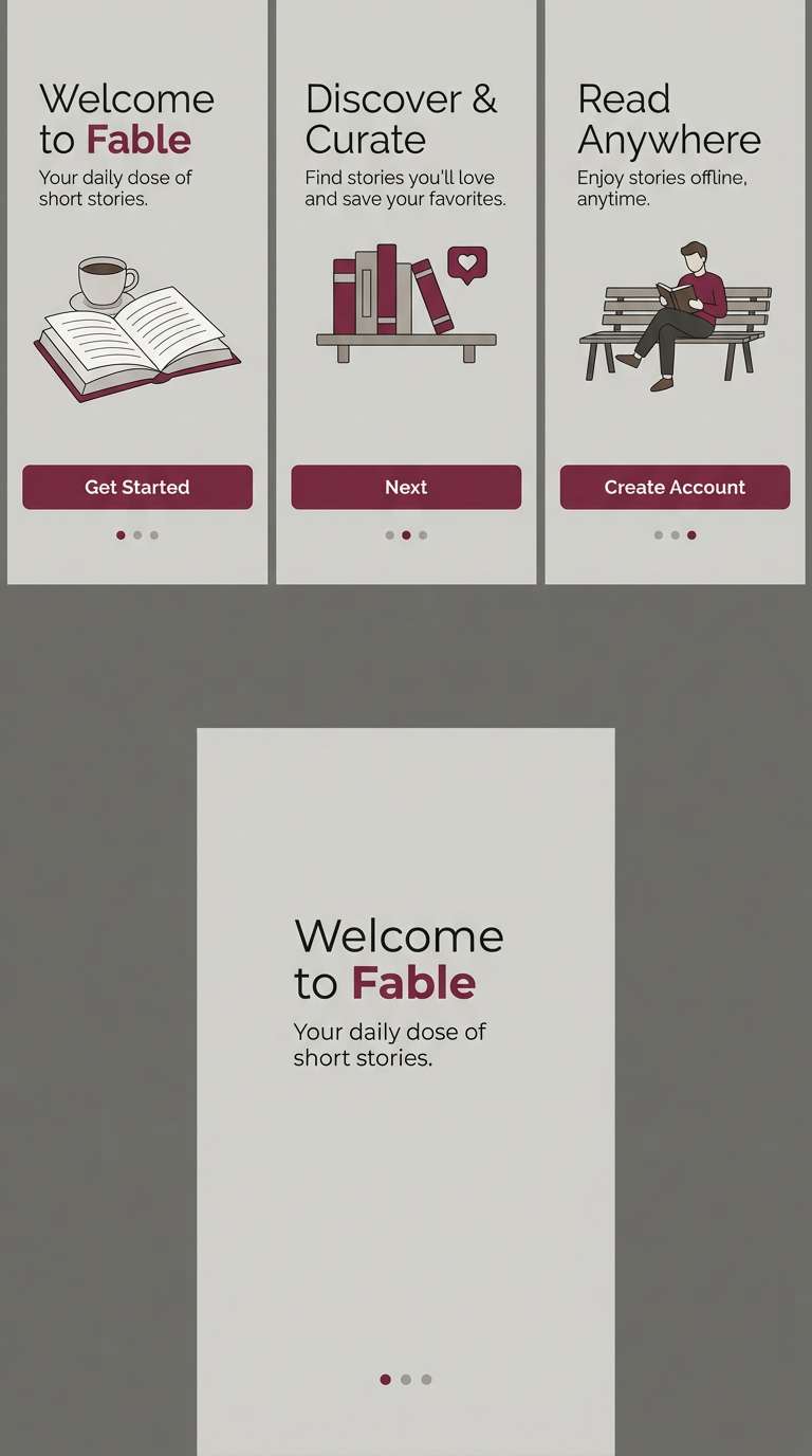
9) Pastel Arcade
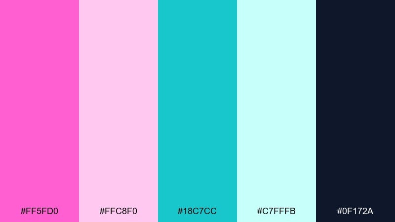
HEX: #ff5fd0 #ffc8f0 #18c7cc #c7fffb #0f172a
Mood: fun, youthful, techy
Best for: app onboarding, gaming UI, playful web banners
Fun and youthful like a pastel arcade glow, this set feels techy without going neon. Use the darkest shade for navigation and microcopy, then layer the lighter tints for cards and modals. Bright pink works best for progress states and key moments, while turquoise can guide attention with links and toggles. Tip: add subtle gradients between the two light tints to make flat UI feel more dimensional.
Image example of pastel arcade generated using media.io
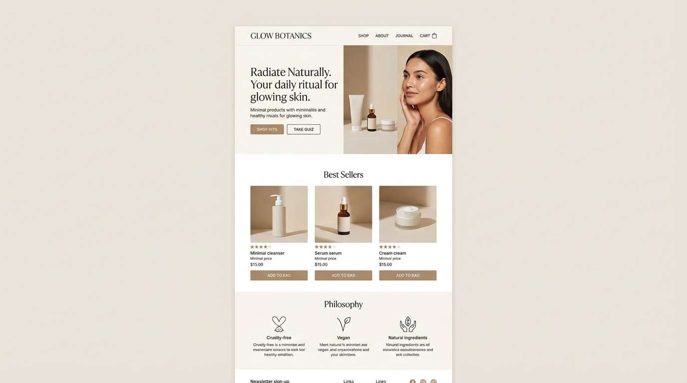
10) Rosewater Spa
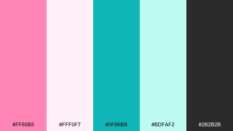
HEX: #ff85b5 #fff0f7 #0fb6b8 #bdfaf2 #2b2b2b
Mood: serene, clean, refreshing
Best for: skincare landing pages, wellness branding, spa signage
Serene and refreshing like rosewater mist in a bright spa, these hues read clean and calming. Keep the background almost white and let turquoise carry trust signals like badges, links, and icons. A muted pink adds softness in hero sections and gentle gradients. Tip: avoid heavy shadows and instead use thin dividers for a light, airy finish.
Image example of rosewater spa generated using media.io
11) Neon Taffy Splash
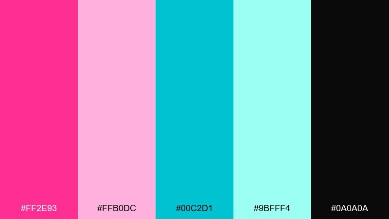
HEX: #ff2e93 #ffb0dc #00c2d1 #9bfff4 #0a0a0a
Mood: electric, loud, nightlife
Best for: music flyers, club posters, bold social ads
Electric and loud like neon taffy under blacklight, these colors are built for nightlife. Pink turquoise color combinations like this shine when you lean into high contrast with near-black backgrounds. Keep typography bold and simple, and let turquoise handle secondary info like dates and venue details. Tip: limit effects to one glow style so the layout stays sharp at a distance.
Image example of neon taffy splash generated using media.io
12) Desert Shell Tide
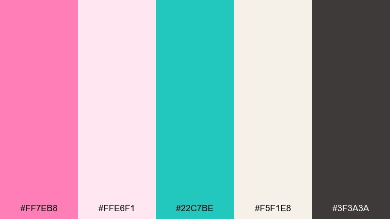
HEX: #ff7eb8 #ffe6f1 #22c7be #f5f1e8 #3f3a3a
Mood: earthy, relaxed, coastal
Best for: interior mood boards, home blogs, lifestyle branding
Earthy and relaxed like shells on warm sand near the tide line, this mix feels grounded and coastal. The off-white sand tone is perfect for backgrounds, while the charcoal-brown reads softer than pure black for text. Use turquoise in decor accents and pink in small styling notes or labels. Tip: pair with natural textures like linen and light wood to keep the palette feeling organic.
Image example of desert shell tide generated using media.io
13) Peony Mint Tea
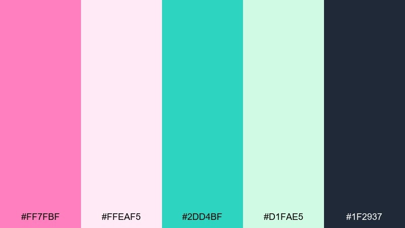
HEX: #ff7fbf #ffeaf5 #2dd4bf #d1fae5 #1f2937
Mood: gentle, cozy, comforting
Best for: stationery, journals, gift tags, small-batch crafts
Gentle and cozy like peonies beside mint tea, these shades feel soft and comforting. Use the pale pink as paper stock color, then keep charcoal for readable notes and headlines. Turquoise works well for icons, stamps, or a subtle edge pattern. Tip: print tests help a lot here, since very light tints can wash out on uncoated paper.
Image example of peony mint tea generated using media.io
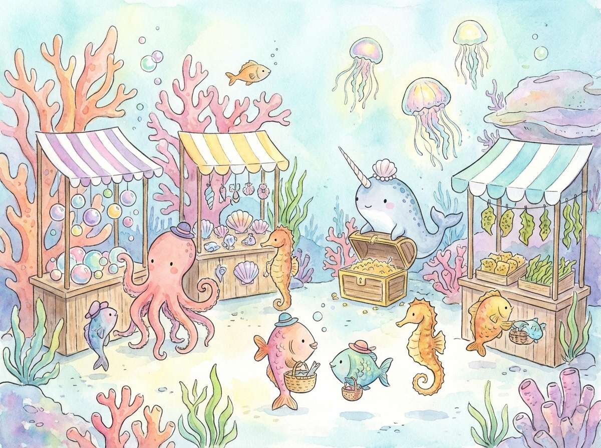
14) Mermaid Bazaar
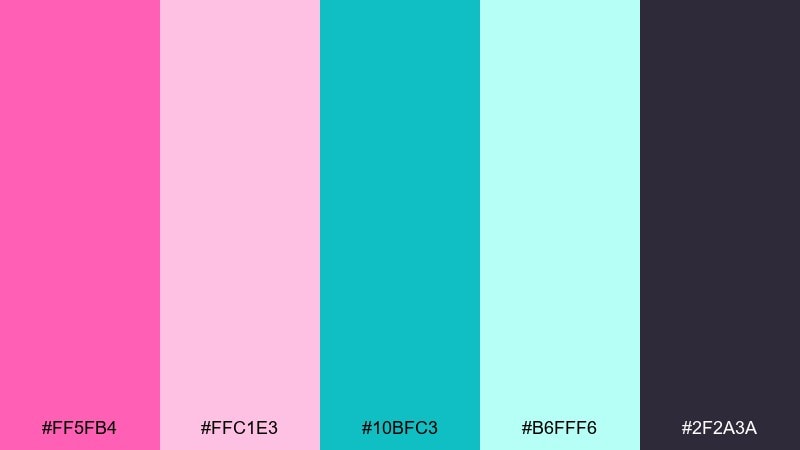
HEX: #ff5fb4 #ffc1e3 #10bfc3 #b6fff6 #2f2a3a
Mood: whimsical, magical, storybook
Best for: kids illustrations, fantasy covers, playful packaging
Whimsical and magical like a mermaid market, these colors feel like a storybook come to life. The darker purple-charcoal adds depth and helps the brights stand out without looking flat. Use pink for characters or focal elements and turquoise for water, sparkle details, and signage. Tip: keep outlines consistent and slightly darker than the fill colors for cleaner print results.
Image example of mermaid bazaar generated using media.io
15) Pink Sand Tile
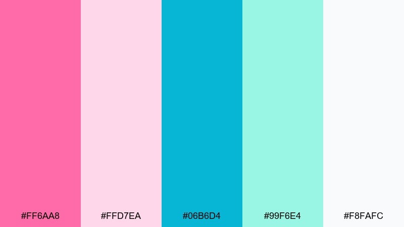
HEX: #ff6aa8 #ffd7ea #06b6d4 #99f6e4 #f8fafc
Mood: Mediterranean, sunny, stylish
Best for: home decor shops, tile brands, ecommerce banners
Sunny and stylish like Mediterranean tile against pink sand, these tones feel fresh but still timeless. Use the near-white as your main canvas, then place turquoise in strong geometric blocks for that tiled look. Keep pink for smaller accents like sale tags, icons, or hover states. Tip: repeat turquoise shapes at consistent intervals to create an intentional pattern rather than scattered pops.
Image example of pink sand tile generated using media.io
16) Frosted Hibiscus
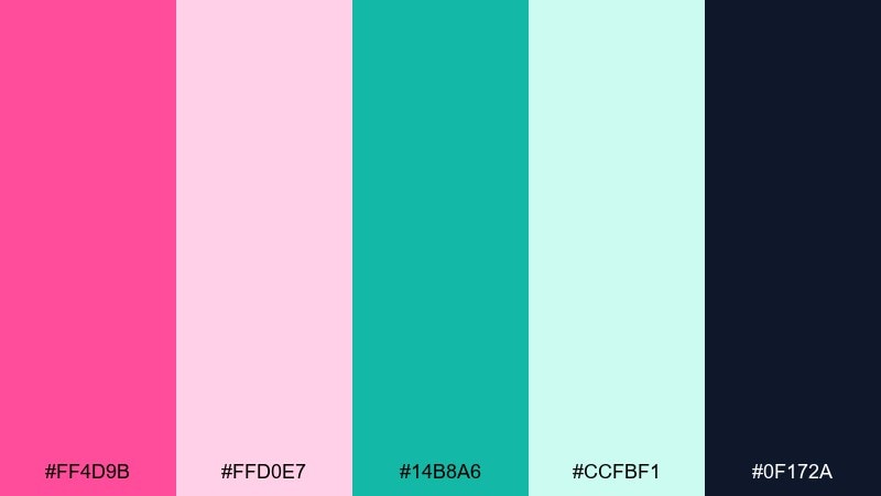
HEX: #ff4d9b #ffd0e7 #14b8a6 #ccfbf1 #0f172a
Mood: crisp, modern, high-clarity
Best for: tech branding, startup pitch decks, product UI
Crisp and modern like a frosted hibiscus drink, this set looks sharp on screens. The deep navy supports accessibility, while the pale minty tint keeps layouts breathable. Use pink for key moments like errors or highlights, and turquoise for primary actions and active states. Tip: choose one accent per component so buttons, tags, and charts do not compete for attention.
Image example of frosted hibiscus generated using media.io
17) Cherry Blossom Surf
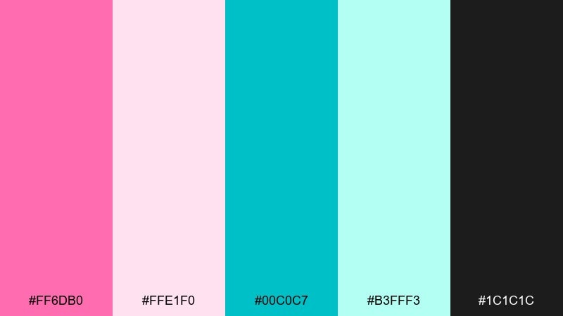
HEX: #ff6db0 #ffe1f0 #00c0c7 #b3fff3 #1c1c1c
Mood: breezy, youthful, sporty
Best for: surf shop logos, streetwear drops, sticker branding
Breezy and youthful like blossoms drifting over a bright shoreline, this mix feels sporty and fun. Black brings edge for logos and wordmarks, while the light tints keep the overall look friendly. Use turquoise for wave motifs and pink for signature marks or limited edition badges. Tip: test the logo in one color first, then add the second accent only where it adds meaning.
Image example of cherry blossom surf generated using media.io
18) Opal Horizon
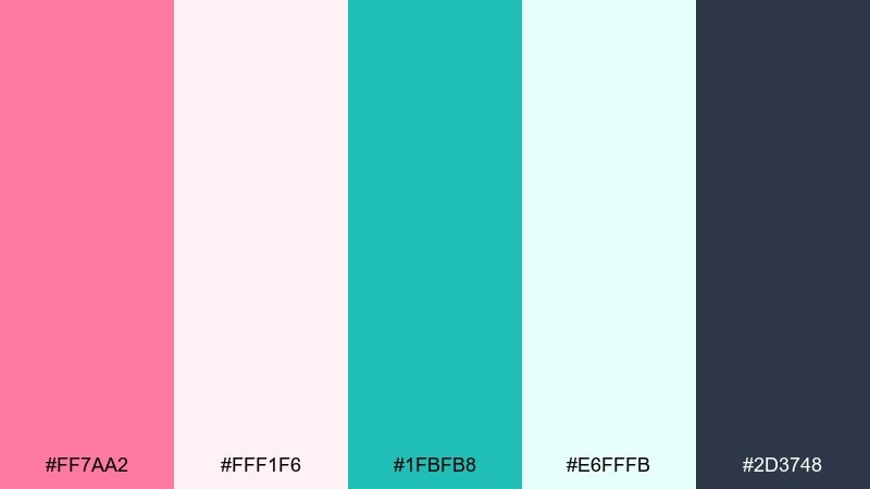
HEX: #ff7aa2 #fff1f6 #1fbfb8 #e6fffb #2d3748
Mood: soft, editorial, refined
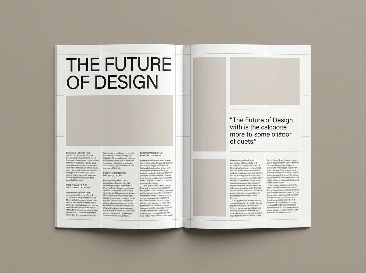
Best for: magazine layouts, lookbooks, brand guidelines
Soft and refined like opal light at the horizon, these tones feel editorial and premium. Use the cool gray for long-form text and captions to keep pages calm and readable. Pink works well for pull quotes, while turquoise can mark section headers and small rules. Tip: keep margins generous and avoid heavy blocks of color for a more luxury, print-like rhythm.
Image example of opal horizon generated using media.io
19) Berry Gelato Lagoon
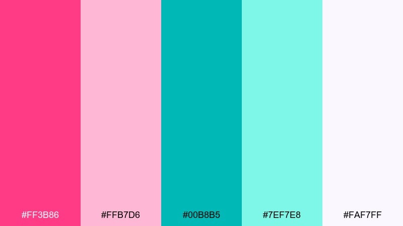
HEX: #ff3b86 #ffb7d6 #00b8b5 #7ef7e8 #faf7ff
Mood: sweet, bold, appetizing
Best for: dessert packaging, cafe promos, food labels
Sweet and bold like berry gelato beside a bright lagoon, these tones feel instantly appetizing. Use the creamy near-white for packaging base so the colors print clean and vibrant. Turquoise makes a great flavor system color, while pink can signal best sellers or limited runs. Tip: keep ingredient text in a darker neutral and avoid placing it directly on saturated pink.
Image example of berry gelato lagoon generated using media.io
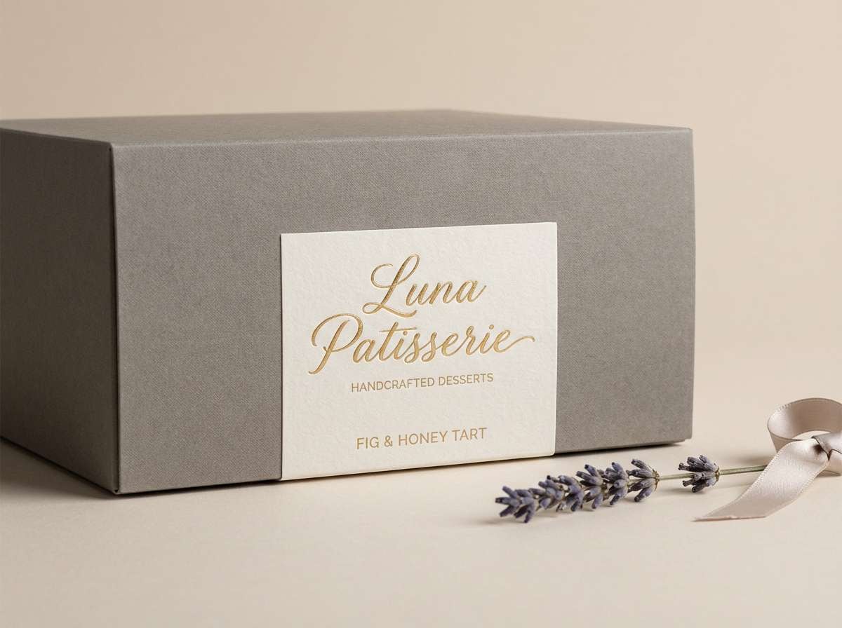
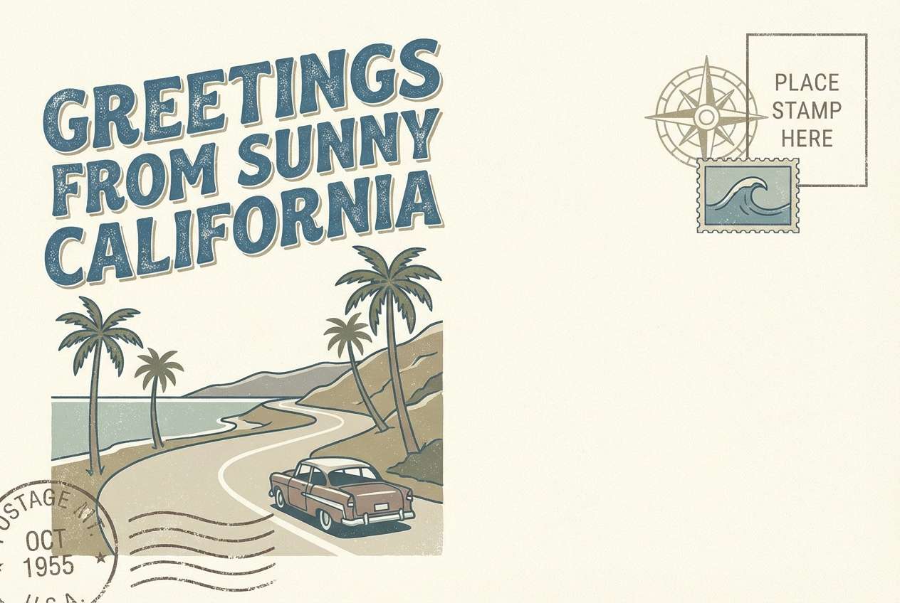
20) Vintage Postcard Cove
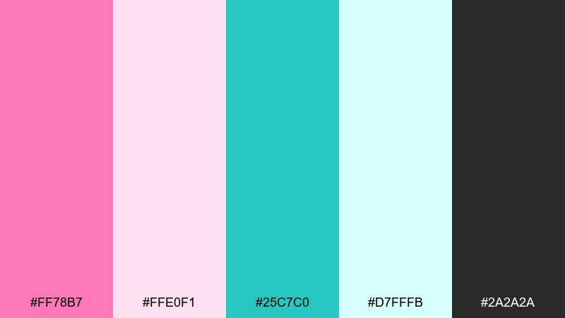
HEX: #ff78b7 #ffe0f1 #25c7c0 #d7fffb #2a2a2a
Mood: nostalgic, sunny, travel-inspired
Best for: postcards, souvenirs, retro branding
Nostalgic and sunny like a faded postcard from a seaside cove, these tones feel charming and approachable. Let the off-white tint mimic aged paper, then use the darker neutral for type and stamp details. Pink adds warmth to headlines, while turquoise fits borders, waves, and small icons. Tip: add a subtle paper texture and keep contrast high enough for print readability.
Image example of vintage postcard cove generated using media.io
21) Seashell Confetti
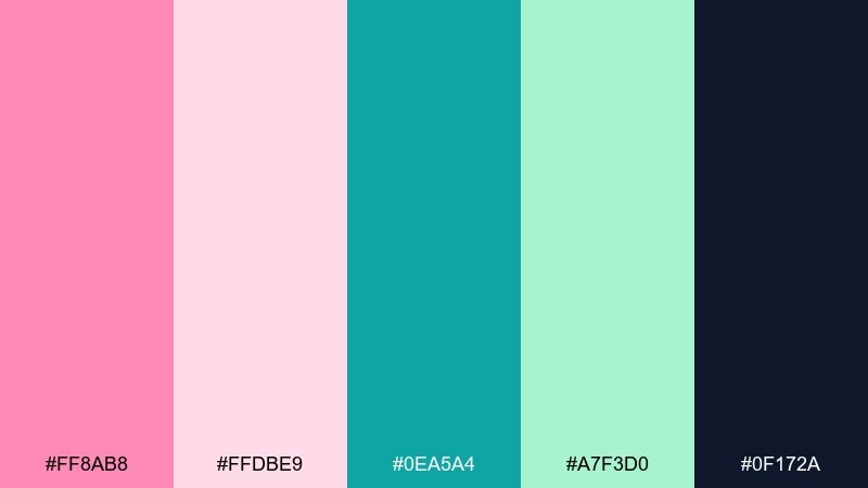
HEX: #ff8ab8 #ffdbe9 #0ea5a4 #a7f3d0 #0f172a
Mood: festive, light, celebratory
Best for: party invites, baby showers, celebratory banners
Festive and light like confetti over seashells, these hues feel sweet but still modern. Use the dark navy for names and details so the softer tints stay readable. Turquoise is ideal for borders and small icons, while pink works best in larger shapes or headers. Tip: keep your background light and use one bold accent element per section to avoid a cluttered look.
Image example of seashell confetti generated using media.io
22) Prism Flamingo Tech
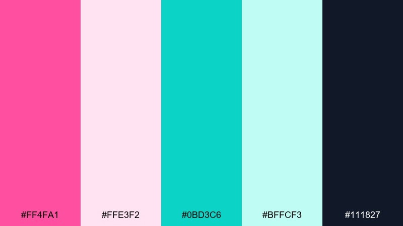
HEX: #ff4fa1 #ffe3f2 #0bd3c6 #bffcf3 #111827
Mood: bright, sleek, forward-looking
Best for: startup hero sections, conference slides, UI highlights
Bright and sleek like light through a prism, these colors feel forward-looking and sharp. The near-white blush keeps pages airy, while the deeper neutral supports crisp typography. Use turquoise for key interactive elements and pink for emphasis moments like badges or featured stats. Tip: set strict rules for accent usage across components to keep the system consistent at scale.
Image example of prism flamingo tech generated using media.io
What Colors Go Well with Pink Turquoise?
Neutrals are your best stabilizers: deep navy, charcoal, slate gray, and clean white keep pink and turquoise from feeling overly sweet. For a softer look, try warm off-white or light greige instead of pure white.
Metallics and warm accents also pair well—think champagne gold, brushed brass, or a muted coral. If you need a “third color” that’s still modern, try a gentle lavender-gray or a sandy beige to bridge the warm/cool split.
For UI, prioritize one dark neutral for text and accessibility, then let turquoise own primary actions while pink highlights secondary emphasis (badges, alerts, featured cards).
How to Use a Pink Turquoise Color Palette in Real Designs
Start by assigning roles: pick one main background (usually a near-white blush or mint tint), one dark text color, and then decide which accent leads (turquoise for actions, pink for emphasis, or vice versa). This keeps the system consistent across pages and components.
Use proportion to avoid overload—try 60/30/10 (background/support/accent). In print, run a quick proof: light blush and mint tints can fade on uncoated stock, so you may need slightly darker values or a stronger neutral for type.
When combining photography with the palette, keep edits subtle. Let pink and turquoise live in UI elements, shapes, borders, and labels so skin tones and product colors stay natural.
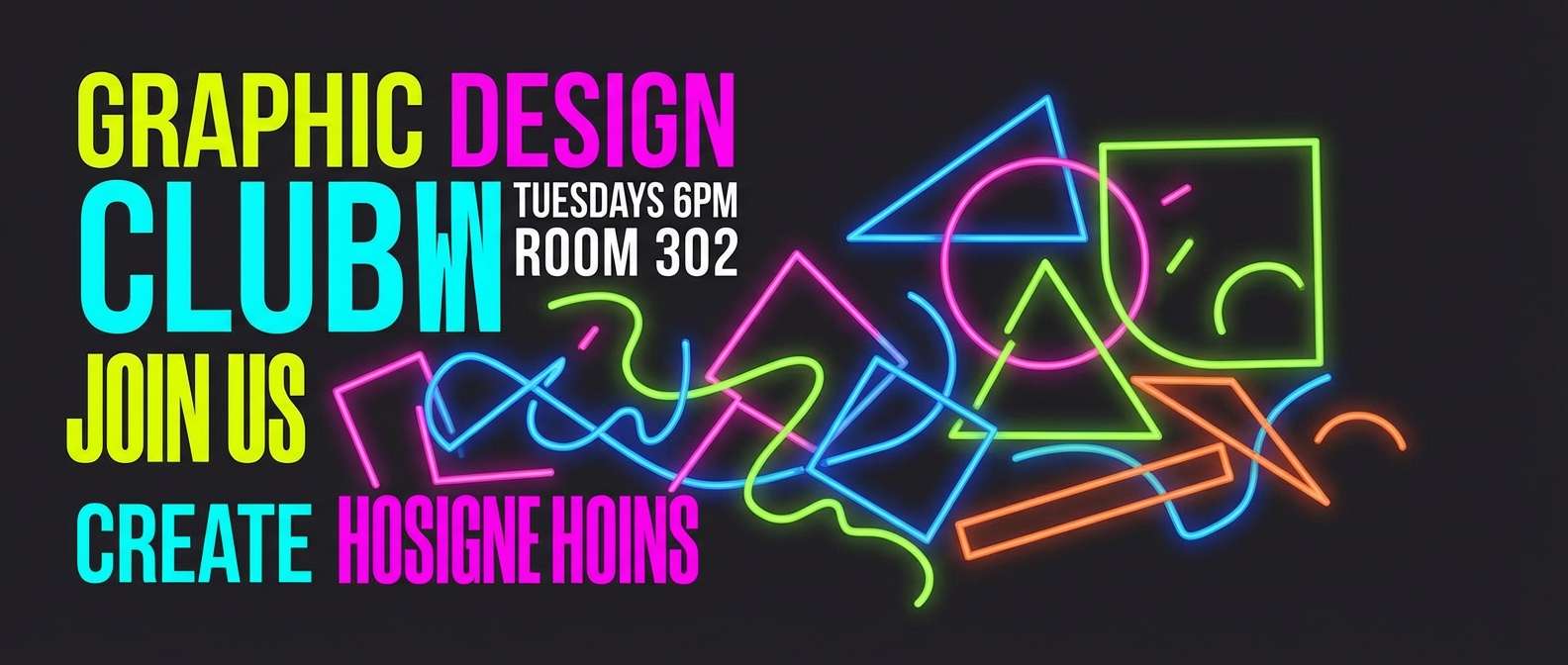
Create Pink Turquoise Palette Visuals with AI
If you already have HEX codes but need matching visuals (brand boards, poster mockups, UI screens, packaging concepts), generate them with text prompts in Media.io. You can keep the composition minimal and let color blocks do the heavy lifting.
For best results, describe the format (poster, landing page, invitation), the style (flat, editorial, watercolor, premium studio), and include constraints like “plain background” and “no photography” when you want clean palette-first images.
Once you like a direction, iterate by adjusting only one variable at a time (layout, texture, or lighting) so the pink turquoise color scheme stays consistent across variants.
Pink Turquoise Color Palette FAQs
-
What does a pink turquoise color palette communicate?
It usually communicates playful confidence plus clean freshness. Pink adds warmth and personality, while turquoise signals clarity, energy, and a modern “coastal” feel—making the combo great for lifestyle brands, beauty, and upbeat tech. -
Is pink and turquoise a good combination for UI design?
Yes—if you anchor it with a dark neutral for text (navy/charcoal) and limit saturated accents. A common approach is turquoise for primary buttons/active states and pink for emphasis (badges, highlights, select alerts). -
How do I keep pink turquoise designs from looking too childish?
Use less saturated pinks (blush/rose), add a mature neutral (slate, deep navy, black), and keep layouts minimal. Thin typography, generous whitespace, and consistent component rules instantly make the palette feel more premium. -
What background color works best with pink and turquoise?
Near-white backgrounds (soft blush whites, mint whites, or clean white) are the easiest for readability and a modern look. For high-impact campaigns, near-black backgrounds can make both pink and turquoise glow with strong contrast. -
What are good “third colors” to add to a pink turquoise palette?
Great third colors include navy/charcoal (for structure), sand/beige (for warmth), or champagne gold (for a luxe accent). Keep the third color muted so it supports, rather than competes with, the main duo. -
Do pink and turquoise print well?
They can print beautifully, but very light tints may wash out on uncoated paper. Test prints are recommended, and consider slightly deepening the light blush/mint tones or using a darker neutral for small text. -
How can I generate pink turquoise images that match my HEX codes?
Use Media.io’s text-to-image tool and describe the design type (poster, UI, packaging) plus the vibe (minimal, retro, luxe). Then iterate prompts while keeping the palette consistent, using your HEX set as a reference for color direction.


