

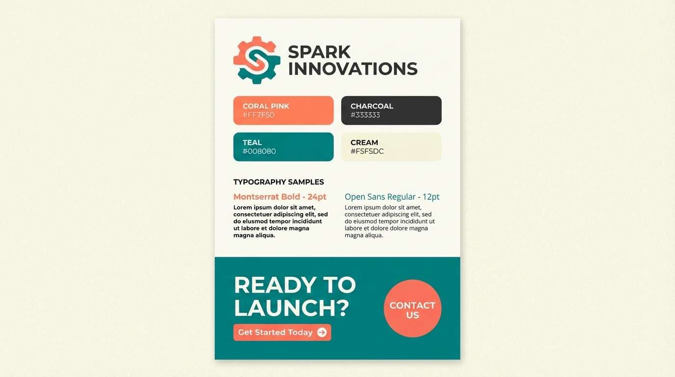
Pink and teal is a modern classic: warm, lively pink meets cool, refreshing teal for a look that feels both energetic and clean.
Below are curated pink teal color palette ideas with HEX codes, plus practical tips for using them in UI, branding, and print without losing balance.
In this article
- Why Pink Teal Palettes Work So Well
-
- cotton candy reef
- neon harbor pop
- blush lagoon calm
- retro diner glow
- spa day pastels
- sunset boardwalk
- rosewater mint cream
- festival confetti
- minimal pink teal ui
- art deco coral teal
- coastal boutique
- candy wrapper brights
- dusty rose seafoam
- nordic pink teal neutrals
- botanical bloom
- velvet night teal
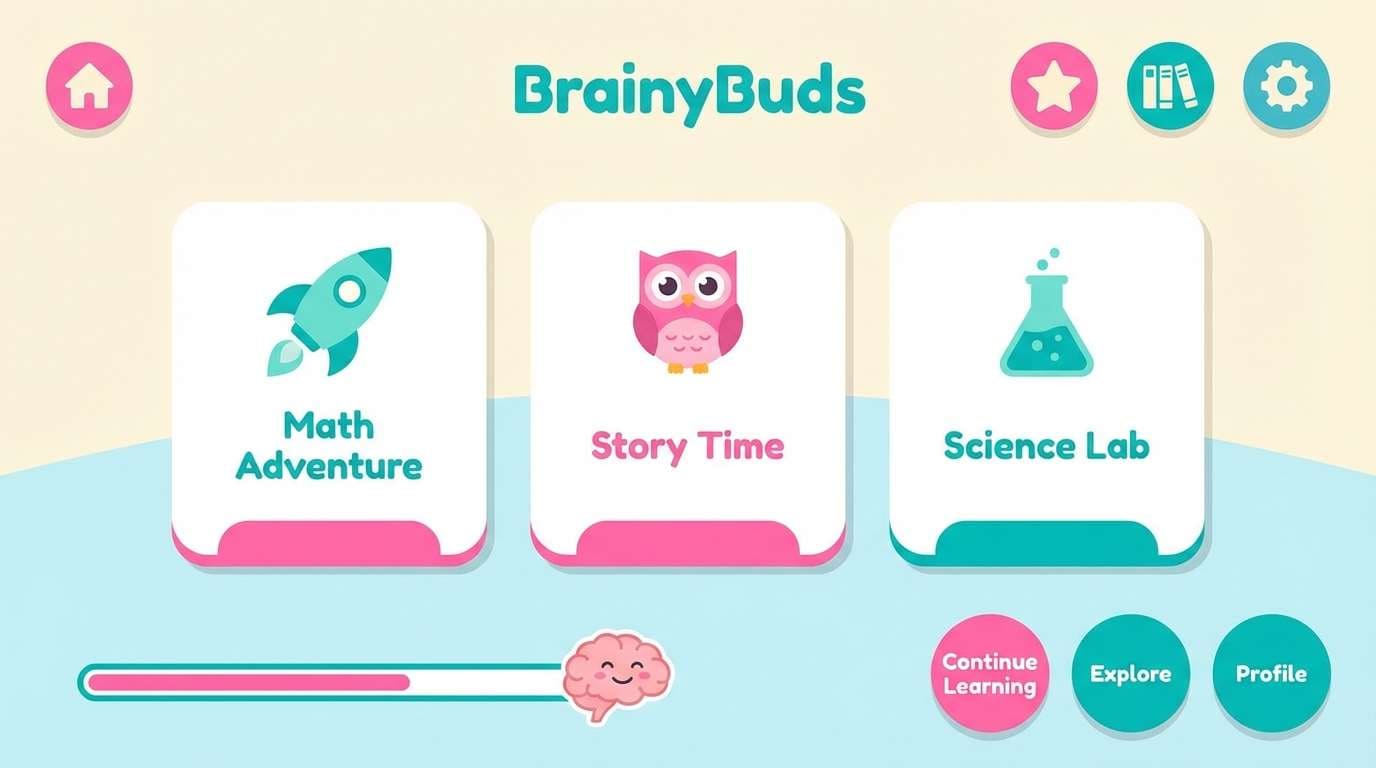
- playroom joy
- wedding florals
- streetwear accent
- soft gradient studio
- coral teal punch
- What Colors Go Well with Pink Teal?
- How to Use a Pink Teal Color Palette in Real Designs
- Create Pink Teal Palette Visuals with AI
Why Pink Teal Palettes Work So Well
Pink and teal sit on opposite sides of “temperature,” so they naturally create visual contrast: pink reads warm and expressive, while teal feels cool and stabilizing. That contrast makes layouts feel dynamic without requiring lots of extra colors.
These palettes also scale well from bold to pastel. You can push neon pink and bright aqua for high-energy campaigns, or soften both into blush and seafoam for wellness, weddings, and minimal UI.
Most importantly, pink teal schemes tend to provide clear hierarchy. Teal is often strong for navigation and actions, while pink is excellent for highlights, featured states, and attention-grabbing accents.
20+ Pink Teal Color Palette Ideas (with HEX Codes)
1) Cotton Candy Reef
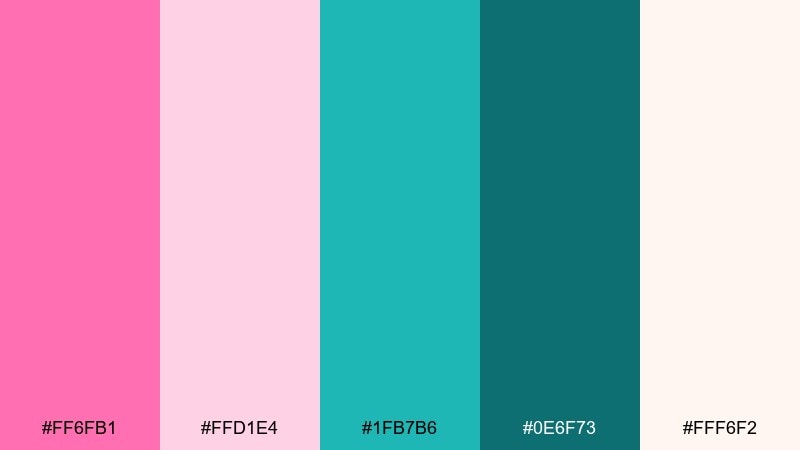
HEX: #ff6fb1 #ffd1e4 #1fb7b6 #0e6f73 #fff6f2
Mood: airy, playful, beachy
Best for: summer branding and social posts
Airy and candy-sweet, this mix feels like saltwater taffy beside a bright reef. Use the hot pink as the hero and let teal handle buttons, links, and highlights. Pair it with creamy off-white for breathing room and a deeper teal for readable type. Tip: keep the pink to 10 to 20 percent on layouts so it pops without overpowering.
Image example of cotton candy reef generated using media.io
Media.io is an online AI studio for creating and editing video, image, and audio in your browser.

2) Neon Harbor Pop
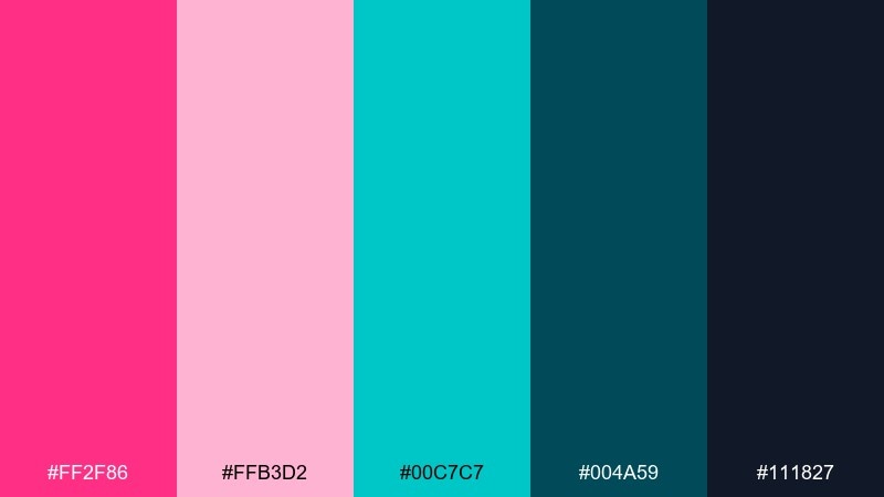
HEX: #ff2f86 #ffb3d2 #00c7c7 #004a59 #111827
Mood: electric, urban, high-contrast
Best for: music posters and nightlife ads
Electric and nightlife-ready, it reads like neon signs reflected on dark water. Let the deep teal and near-black anchor backgrounds while the bright pink sells the headline. Add soft pink for gradients and teal for secondary callouts. Tip: use the neon pink only for one focal element per poster to keep the hierarchy sharp.
Image example of neon harbor pop generated using media.io
3) Blush Lagoon Calm
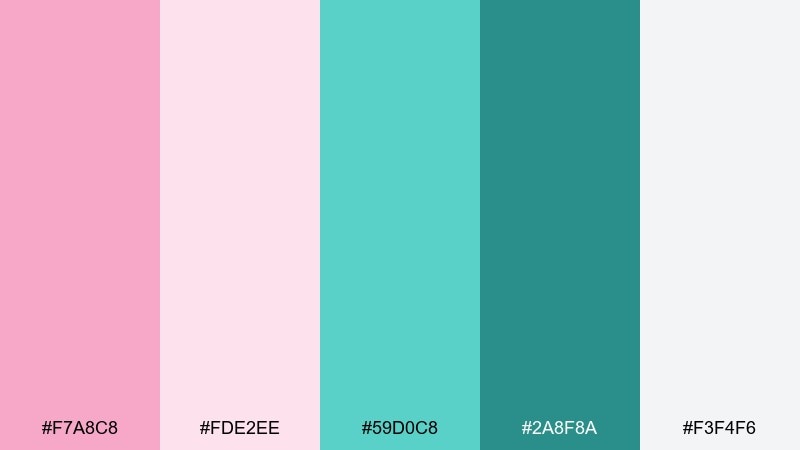
HEX: #f7a8c8 #fde2ee #59d0c8 #2a8f8a #f3f4f6
Mood: calm, clean, restorative
Best for: wellness websites and spa menus
Calm and restorative, these tones feel like a quiet lagoon at sunrise. Use the pale blush for backgrounds, then add teal for navigation and gentle emphasis. Pair with cool light gray to keep everything modern and uncluttered. Tip: choose the darker teal for body text to maintain contrast on blush panels.
Image example of blush lagoon calm generated using media.io
4) Retro Diner Glow
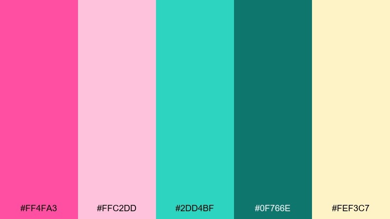
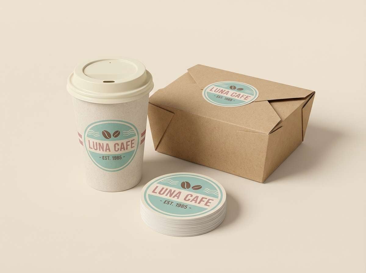
HEX: #ff4fa3 #ffc2dd #2dd4bf #0f766e #fef3c7
Mood: nostalgic, upbeat, kitschy
Best for: retro logos and café packaging
Nostalgic and upbeat, it brings to mind chrome counters, milkshakes, and glowing signage. This pink teal color palette shines when you use the warm cream as the base and reserve saturated pink for badges and price bursts. The teal reads great on labels and menu sections, especially with simple line icons. Tip: add a thin teal outline around pink shapes to keep edges crisp in print.
Image example of retro diner glow generated using media.io
5) Spa Day Pastels
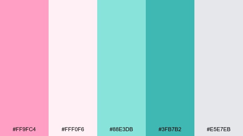
HEX: #ff9fc4 #fff0f6 #88e3db #3fb7b2 #e5e7eb
Mood: gentle, soothing, minimalist
Best for: skincare labels and calm editorial
Gentle and soothing, it feels like steamed towels and clean ceramics. Keep the near-white blush as your main canvas, then layer in sea-glass teal for headings and dividers. A touch of stronger teal works well for ingredient lists and small icons. Tip: print tests matter here, so slightly darken teal if it looks washed out on matte paper.
Image example of spa day pastels generated using media.io
6) Sunset Boardwalk
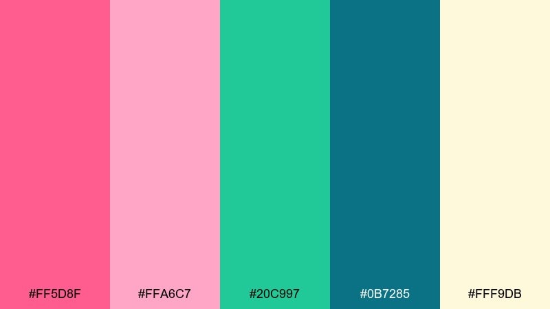
HEX: #ff5d8f #ffa6c7 #20c997 #0b7285 #fff9db
Mood: warm, breezy, optimistic
Best for: travel ads and event flyers
Warm and breezy, it suggests sunset skies over a teal shoreline. Use coral-pink for headline energy, then balance with the cooler teal for subheads and separators. The buttery pale yellow gives a friendly base that still feels premium. Tip: add subtle grain or a soft gradient between pink and teal for a more cinematic flyer.
Image example of sunset boardwalk generated using media.io

7) Rosewater Mint Cream
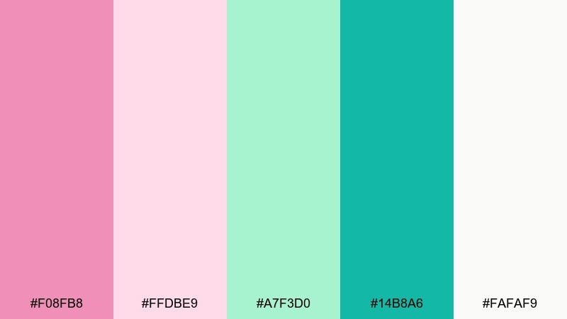
HEX: #f08fb8 #ffdbe9 #a7f3d0 #14b8a6 #fafaf9
Mood: fresh, sweet, modern
Best for: beauty ecommerce and gift sets
Fresh and sweet, it feels like rosewater spritz over cool mint cream. Let the soft pink set a welcoming tone while mint and teal create a clean, hygienic vibe for product pages. Pair with warm white to keep photos true-to-color and reduce visual noise. Tip: reserve the deeper teal for primary CTAs so they stand out on pastel sections.
Image example of rosewater mint cream generated using media.io
8) Festival Confetti
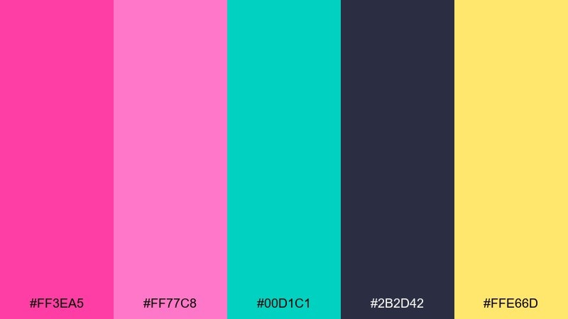
HEX: #ff3ea5 #ff77c8 #00d1c1 #2b2d42 #ffe66d
Mood: loud, fun, celebratory
Best for: campaign graphics and merch
Loud and celebratory, it looks like confetti bursting under stage lights. These pink teal color combinations work best when the dark ink tone holds the layout together and the brights stay as accents. Add the sunny yellow for small sparks like stickers, icons, or limited-time tags. Tip: keep typography mostly dark to avoid vibrating edges between saturated pink and teal.
Image example of festival confetti generated using media.io
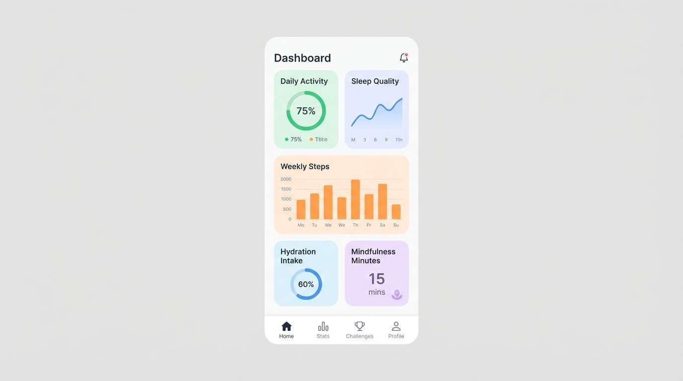
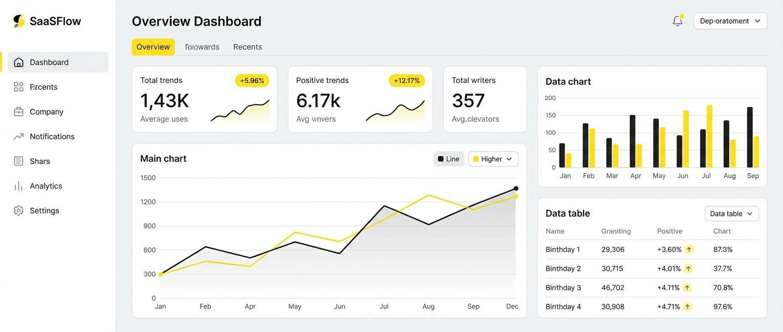
9) Minimal Pink Teal UI
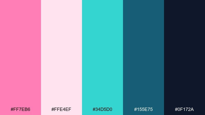
HEX: #ff7eb6 #ffe4ef #34d5d0 #155e75 #0f172a
Mood: sleek, techy, confident
Best for: saas dashboards and fintech apps
Sleek and tech-forward, it evokes glassy panels with a soft blush glow. Use the near-black and deep teal for structure, then add pink for states like selected, new, or featured. The pale blush keeps cards approachable without feeling childish. Tip: define one consistent rule, such as teal for actions and pink for status, to avoid mixed signals.
Image example of minimal pink teal ui generated using media.io
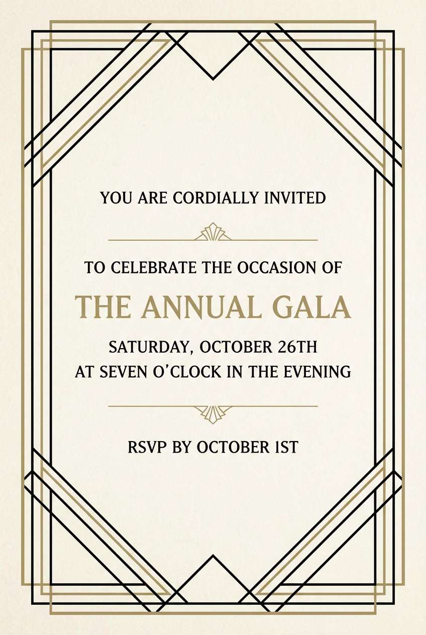
10) Art Deco Coral Teal
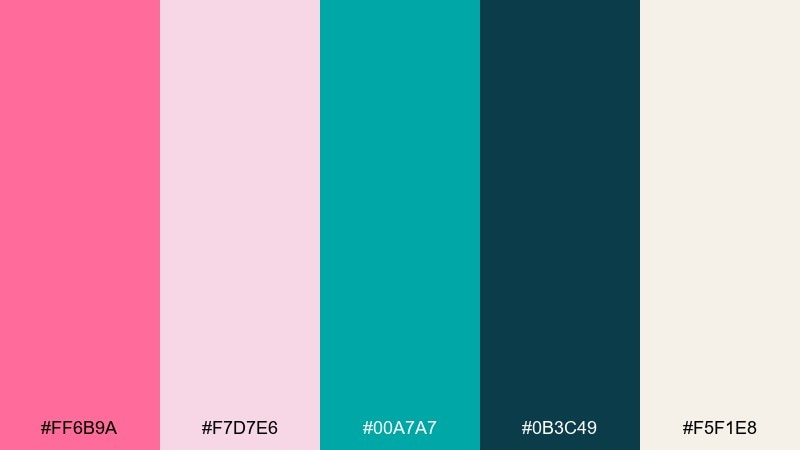
HEX: #ff6b9a #f7d7e6 #00a7a7 #0b3c49 #f5f1e8
Mood: glam, structured, vintage-luxe
Best for: invites and boutique branding
Glam and structured, it recalls art deco posters with coral lipstick and deep teal shadows. Pair the dark teal with cream for typography and borders, then use coral-pink in geometric accents. The pale rose is perfect for subtle panels behind copy. Tip: add thin linework in dark teal to bring that deco precision to your layouts.
Image example of art deco coral teal generated using media.io
11) Coastal Boutique
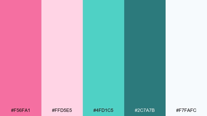
HEX: #f56fa1 #ffd5e5 #4fd1c5 #2c7a7b #f7fafc
Mood: fresh, airy, boutique-chic
Best for: shopify themes and lifestyle blogs
Fresh and boutique-chic, it feels like sunlit linen with a hint of sea breeze. Use soft blush for section backgrounds, then bring in teal for links, filters, and micro-interactions. Keep product photography framed by cool whites so colors do not compete. Tip: apply teal to hover states and icons to guide shoppers without shouting.
Image example of coastal boutique generated using media.io
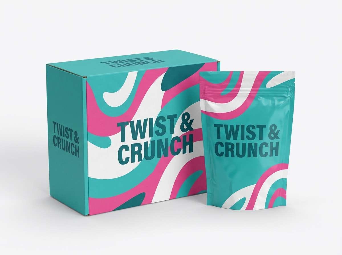
12) Candy Wrapper Brights
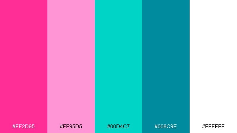
HEX: #ff2d95 #ff95d5 #00d4c7 #008c9e #ffffff
Mood: sweet, shiny, youthful
Best for: kids products and snack ads
Sweet and shiny, it channels glossy candy wrappers and bubblegum energy. Keep white dominant so the brights look intentional rather than chaotic. Use teal for shapes and supporting text, and save the hottest pink for the main offer or product name. Tip: add rounded corners and big spacing to match the friendly vibe.
Image example of candy wrapper brights generated using media.io
13) Dusty Rose Seafoam
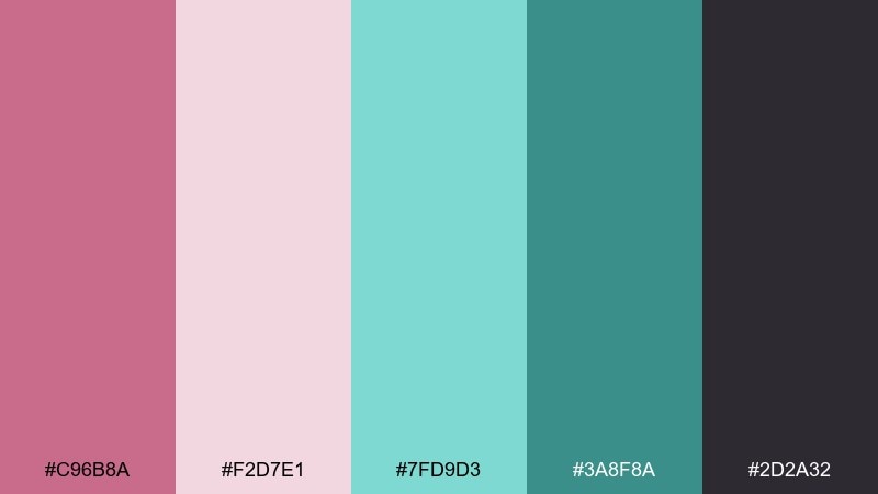
HEX: #c96b8a #f2d7e1 #7fd9d3 #3a8f8a #2d2a32
Mood: muted, grown-up, moody
Best for: interior moodboards and photography brands
Muted and grown-up, it feels like dusty roses beside weathered sea glass. Let the charcoal-purple tone handle text and framing so the softer colors stay elegant. Seafoam works beautifully on large blocks, while dusty rose becomes a refined accent in logos. Tip: introduce texture, like paper grain, to make the muted tones feel richer.
Image example of dusty rose seafoam generated using media.io
14) Nordic Pink Teal Neutrals
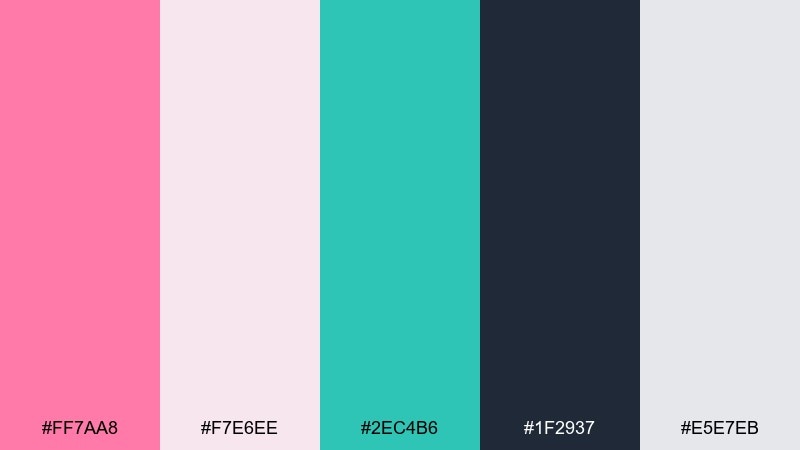
HEX: #ff7aa8 #f7e6ee #2ec4b6 #1f2937 #e5e7eb
Mood: modern, balanced, minimalist
Best for: brand systems and presentation decks
Modern and balanced, it suggests Nordic minimalism with a playful blush twist. This pink teal color palette is easiest to manage when neutrals do most of the work and color is reserved for callouts. Use deep gray for body copy, teal for charts, and pink for key highlights. Tip: in slides, keep charts to one color family at a time to avoid visual clutter.
Image example of nordic pink teal neutrals generated using media.io
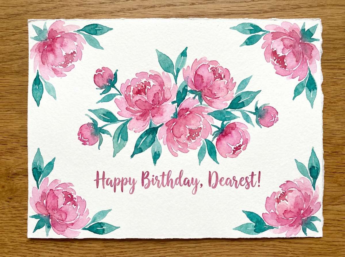
15) Botanical Bloom
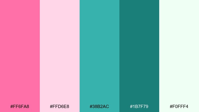
HEX: #ff6fa8 #ffd6e8 #38b2ac #1b7f79 #f0fff4
Mood: fresh, floral, springlike
Best for: greeting cards and stationery
Fresh and springlike, it feels like peonies against glossy teal leaves. Use the pale pink as paper tone, then add teal for stems, borders, and type accents. The minty off-white keeps illustrations light and airy. Tip: limit saturated pink to petals and focal blooms so the artwork stays readable at small sizes.
Image example of botanical bloom generated using media.io
16) Velvet Night Teal
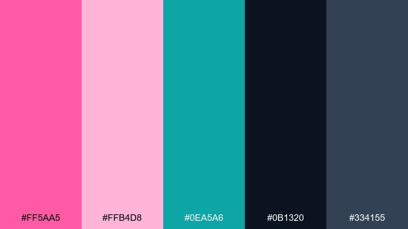
HEX: #ff5aa5 #ffb4d8 #0ea5a6 #0b1320 #334155
Mood: dramatic, luxe, cinematic
Best for: beauty campaigns and premium ads
Dramatic and luxe, it evokes velvet curtains with a neon blush highlight. Use the near-black for full-bleed backgrounds and let teal add sleek, glossy accents. Soft pink can sit behind copy blocks to keep text comfortable without losing the night feel. Tip: add a subtle spotlight gradient around the product to make the pink accent feel intentional.
Image example of velvet night teal generated using media.io
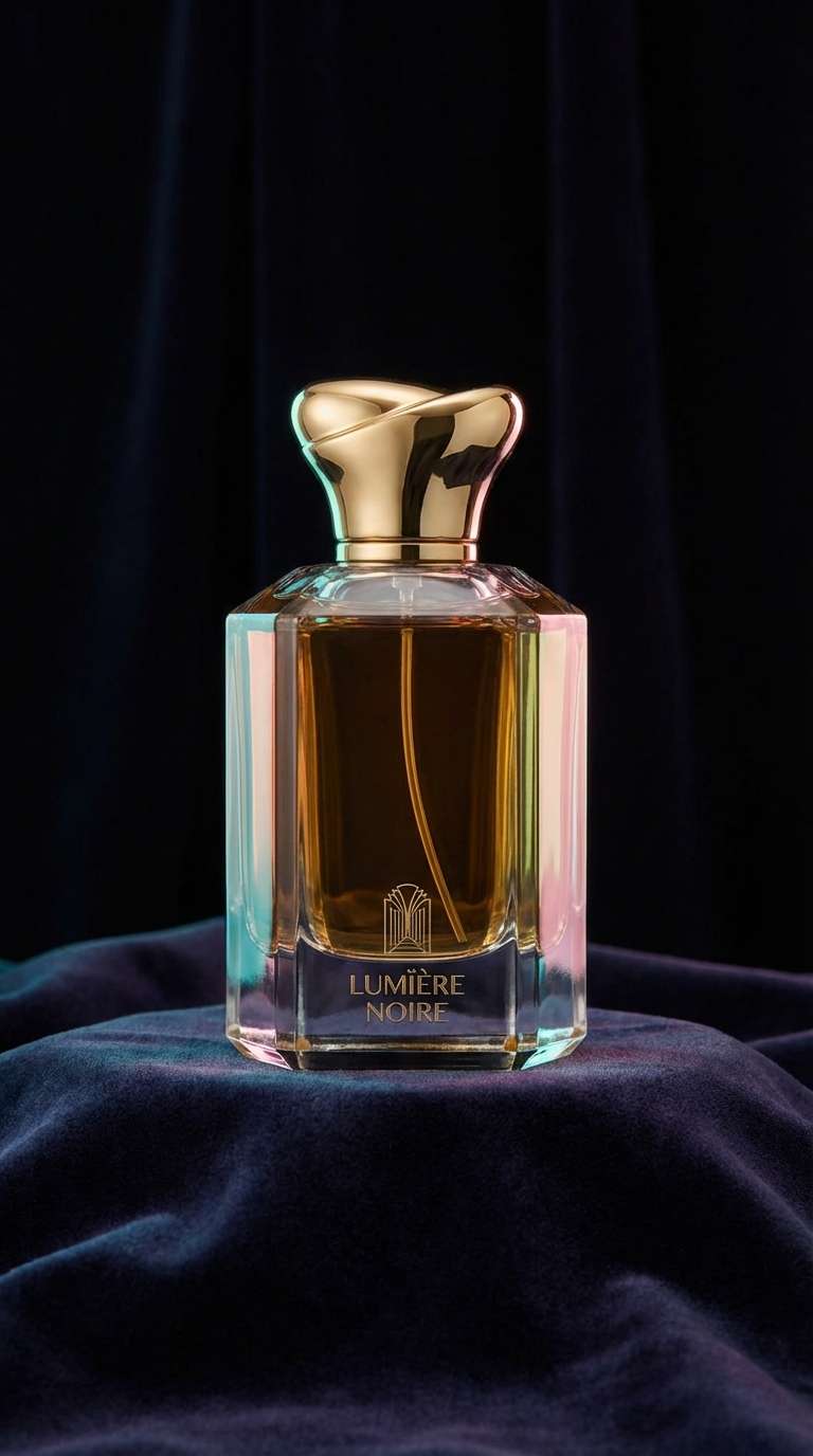
17) Playroom Joy
HEX: #ff4d9d #ff9fd0 #30e3ca #0c8599 #fff1f2
Mood: cheerful, friendly, energetic
Best for: education apps and kids ui
Cheerful and friendly, it feels like building blocks scattered on a soft mat. Use the light blush as your background so icons and illustrations stay bright. Teal works well for success states and interactive elements, while the deeper blue-teal supports readable labels. Tip: keep shadows subtle and rely on color plus spacing for hierarchy.
Image example of playroom joy generated using media.io
18) Wedding Florals
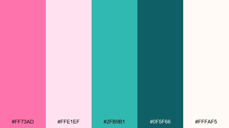
HEX: #ff73ad #ffe1ef #2fb9b1 #0f5f66 #fffaf5
Mood: romantic, elegant, fresh
Best for: wedding invitations and signage
Romantic and elegant, it suggests pink petals with cool teal ribbons. Use the warm ivory as the base, then place teal in typography and borders for a crisp, modern twist. Blush works best for floral illustrations and soft background washes. Tip: keep teal to thin rules and headings so the overall look stays airy.
Image example of wedding florals generated using media.io
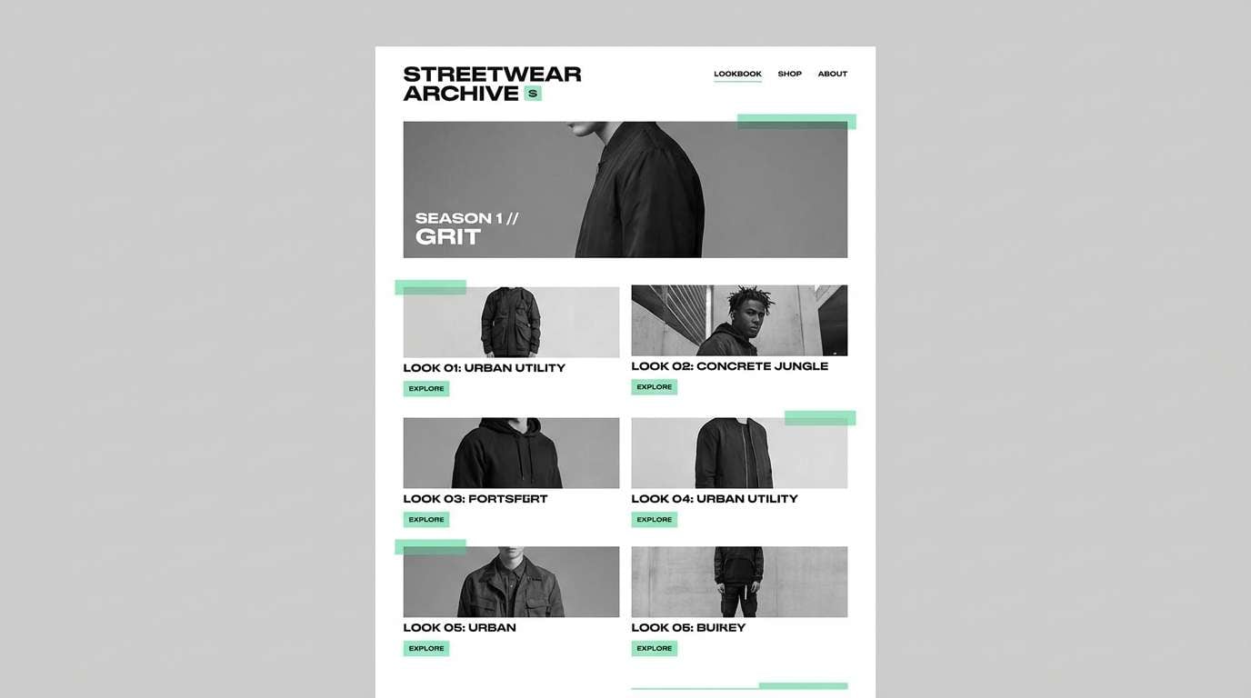
19) Streetwear Accent
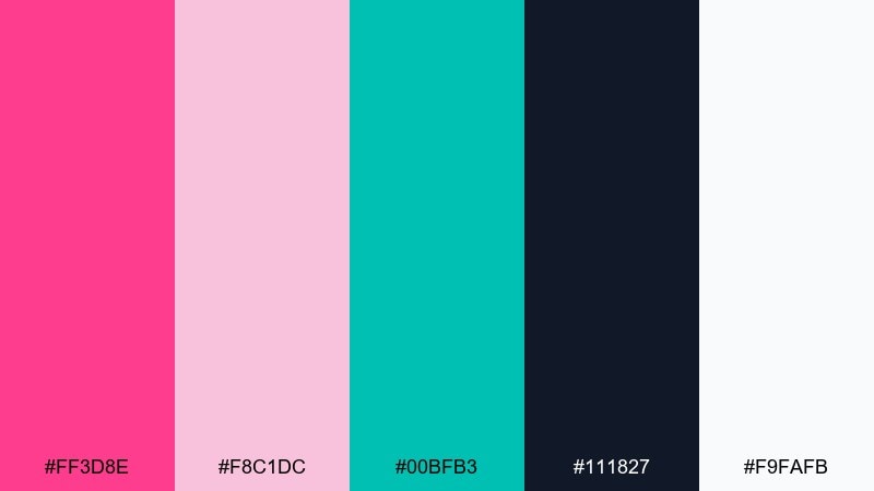
HEX: #ff3d8e #f8c1dc #00bfb3 #111827 #f9fafb
Mood: bold, edgy, graphic
Best for: streetwear lookbooks and drops
Bold and edgy, it feels like a clean monochrome base hit with loud accent ink. These pink teal color combinations are strongest when you keep most space white or near-black and let color appear in small stamps. Use teal for secondary badges and pink for the drop name or price tag. Tip: try oversized type with tight tracking to match the streetwear energy.
Image example of streetwear accent generated using media.io
20) Soft Gradient Studio
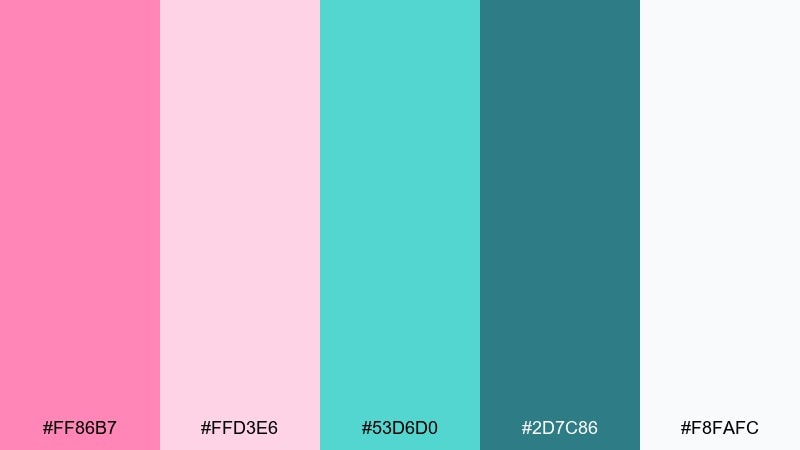
HEX: #ff86b7 #ffd3e6 #53d6d0 #2d7c86 #f8fafc
Mood: soft, polished, modern
Best for: landing pages and hero gradients
Soft and polished, it looks like a studio light gradient fading from blush into cool water tones. Use the pale pink and aqua as gradient endpoints, then pick the deeper teal for navigation and footer text. Keep the nearly-white background for content sections so the hero does not overwhelm. Tip: test the gradient behind text and add a semi-opaque white overlay if readability drops.
Image example of soft gradient studio generated using media.io
21) Coral Teal Punch
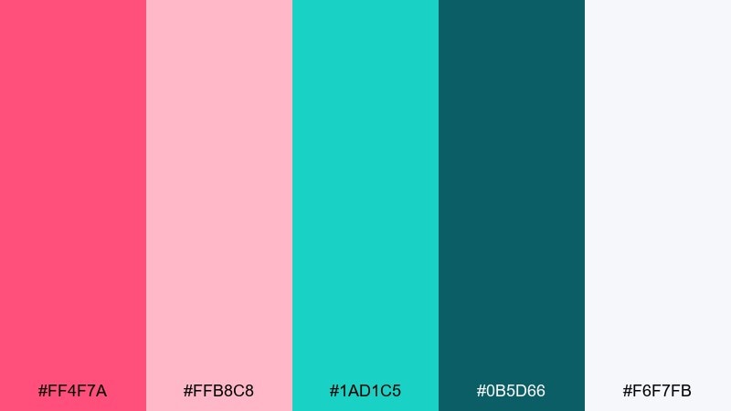
HEX: #ff4f7a #ffb8c8 #1ad1c5 #0b5d66 #f6f7fb
Mood: confident, punchy, modern
Best for: startup branding and pitch pages
Confident and punchy, it reads like coral paint splashes over cool teal glass. Use coral for key messaging, teal for interactive elements, and light pink for friendly backgrounds. Pair with a clean near-white to keep the brand modern and credible. Tip: set one strong accent per section so users always know where to look next.
Image example of coral teal punch generated using media.io
What Colors Go Well with Pink Teal?
Neutrals are the easiest match: warm white, cream, and soft gray keep pink and teal from feeling too loud, while charcoal or near-black adds instant readability for typography and UI components.
For extra depth, try navy, deep teal-green, or slate as grounding tones. If you want more sparkle, small doses of buttery yellow or gold can add a “sunlit” highlight without competing with the main pair.
When you need a softer, more mature direction, swap neon pink for dusty rose and bright teal for seafoam or muted teal. This keeps the contrast but reduces visual intensity.
How to Use a Pink Teal Color Palette in Real Designs
Start with a rule for roles: for example, teal for actions (buttons, links, active nav) and pink for emphasis (badges, featured cards, “new” states). Clear assignments prevent mixed signals across screens.
Control saturation and area. Let a neutral background carry most of the space, then use one saturated color as the focal point per section; the second color can support with smaller accents, icons, or dividers.
For print and branding, test contrast and ink coverage. Highly saturated pink next to saturated teal can “vibrate,” so use outlines, spacing, or a darker text color to keep edges crisp and legible.
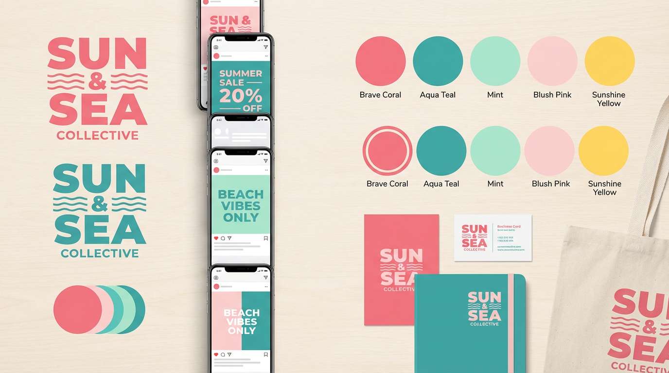
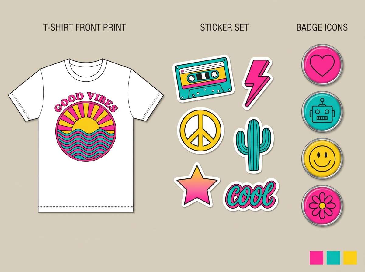
Create Pink Teal Palette Visuals with AI
If you want to see these pink and teal combinations in context, generate quick mockups like landing pages, posters, packaging, or invitation suites. Visual tests make it easier to pick the right saturation and contrast before you commit.
With Media.io, you can turn a short prompt into on-brand visuals, then iterate fast by changing mood words (soft, neon, luxe) or adding use-cases (UI kit, café packaging, wedding suite).
Pink Teal Color Palette FAQs
-
What does a pink teal color palette communicate?
It typically signals playful energy plus modern clarity: pink brings warmth and personality, while teal adds calm, trust, and a clean “fresh” feel. -
How do I keep pink and teal from looking too loud?
Use a neutral base (white, cream, light gray) and limit saturated pink to small accents (around 10–20%). Choose a deeper teal for structure and typography to maintain balance. -
Which pink works best with teal: blush, coral, or hot pink?
Blush pairs best for calm, minimal designs; coral feels friendly and premium for lifestyle and travel; hot pink is strongest for campaigns, nightlife, and bold hero moments. -
What’s a good text color on blush pink backgrounds?
Use deep teal, charcoal, or near-black for body text. Avoid mid-tone teals on light blush, since contrast can drop and readability suffers. -
Can I use pink teal palettes for professional brands?
Yes—choose muted pink (dusty rose) and a darker teal, then let neutrals dominate. This keeps the palette polished while still feeling distinctive. -
What accent colors pair well with pink and teal?
Great accents include buttery yellow/gold for highlights, navy or slate for depth, and warm ivory for a softer, more editorial finish. -
How can I preview a pink teal palette in a UI or poster quickly?
Generate a few mockups with an AI image tool using prompts like “landing page UI,” “event poster,” or “packaging,” then tweak saturation and background neutrals until the hierarchy feels clear.


