

Copper is warm, grounded, and instantly tactile—like aged metal, fired clay, and late-afternoon light. In palettes, it can read as premium and editorial or casual and earthy depending on what you pair it with.
Below are 20 copper color palette ideas (with HEX codes) you can use for branding, interiors, UI, packaging, and social graphics—plus AI prompts to generate matching visuals in minutes.
In this article
- Why Copper Palettes Work So Well
-
- burnished copper & ink
- autumn copper glow
- copper desert sand
- copper & sage loft
- modern copper neon
- copper blue hour
- copper & olive heritage
- copper blush wedding
- copper citrus pop
- copper monochrome minimal
- copper & plum velvet
- copper coastal calm
- copper rainy street
- copper mint studio
- copper forest cabin
- copper sunrise pastels
- copper gallery neutral
- copper tech dashboard
- copper & teal mosaic
- copper night market
- What Colors Go Well with Copper?
- How to Use a Copper Color Palette in Real Designs
- Create Copper Palette Visuals with AI
Why Copper Palettes Work So Well
Copper sits in the sweet spot between orange and brown, so it brings warmth without feeling loud. That makes it a reliable “human” accent for modern layouts that might otherwise feel too cold or digital.
It also reads as material—metal, leather, clay—so it adds depth even in flat graphics. A small copper highlight can imply craftsmanship, heat, and texture with minimal effort.
Best of all, copper bridges warm and cool worlds. Pair it with navy, charcoal, teal, sage, or ivory and it still looks intentional, balanced, and brand-ready.
20+ Copper Color Palette Ideas (with HEX Codes)
1) Burnished Copper & Ink
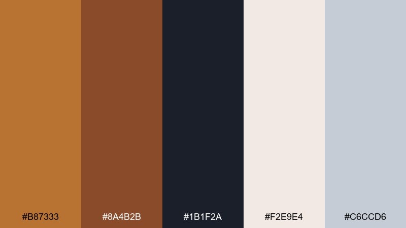
HEX: #B87333 #8A4B2B #1B1F2A #F2E9E4 #C6CCD6
Mood: moody, refined, editorial
Best for: luxury branding and editorial layouts
Moody and refined, these tones feel like polished metal against fresh ink on textured paper. Use the deep navy-black as your anchor and let copper act as the premium accent for headlines, rules, and icons. Warm off-white keeps layouts readable while the soft gray-blue smooths transitions between dark and light. Tip: keep copper to 10 to 15 percent for a high-end finish that does not overwhelm.
Image example of burnished copper & ink generated using media.io
Media.io is an online AI studio for creating and editing video, image, and audio in your browser.

2) Autumn Copper Glow
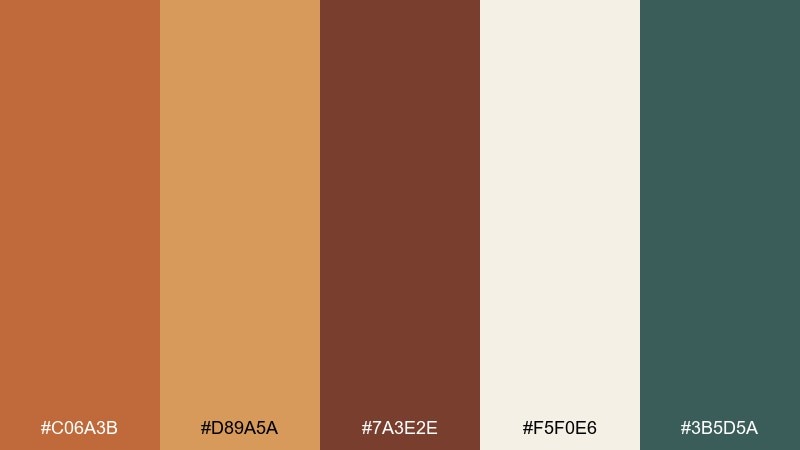
HEX: #C06A3B #D89A5A #7A3E2E #F5F0E6 #3B5D5A
Mood: cozy, inviting, seasonal
Best for: coffee shops, fall campaigns, and packaging
Cozy and inviting, it reads like late-afternoon light on brick, leather, and toasted caramel. These copper color combinations work especially well when the cream is your base and the teal-green is reserved for small contrast moments. Use the darker rust for type on light backgrounds and the golden tan for secondary panels or patterns. Tip: add a matte paper stock to make the warm hues feel even richer.
Image example of autumn copper glow generated using media.io
3) Copper Desert Sand
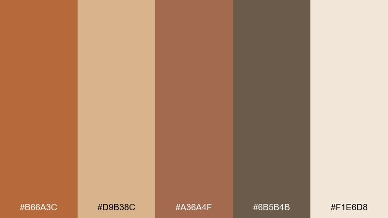
HEX: #B66A3C #D9B38C #A36A4F #6B5B4B #F1E6D8
Mood: earthy, grounded, natural
Best for: interior styling, wellness brands, and lifestyle blogs
Earthy and grounded, it evokes sunbaked clay, dunes, and worn timber. Build your base with the sand and soft cream, then layer copper and terracotta for depth in textiles and accents. The muted brown works well for typography, frames, or furniture silhouettes. Tip: pair with natural materials like linen, rattan, and walnut to keep the palette feeling honest and calm.
Image example of copper desert sand generated using media.io
4) Copper & Sage Loft
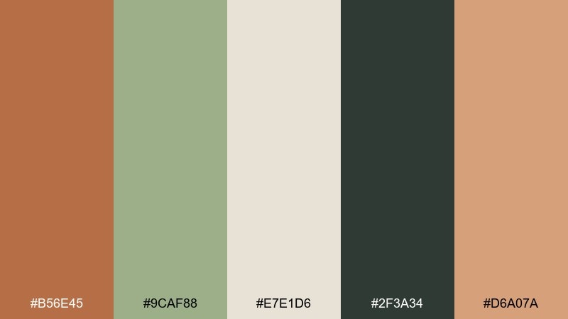
HEX: #B56E45 #9CAF88 #E7E1D6 #2F3A34 #D6A07A
Mood: fresh, modern, balanced
Best for: home decor brands and boutique hotel visuals
Fresh and modern, it feels like a sunlit loft with plants, warm wood, and brushed metal details. Let sage carry larger surfaces while copper and tan highlight trim, fixtures, or callouts. The near-black green keeps text crisp and adds a sophisticated edge. Tip: use the cream as negative space so the warm accents look intentional, not busy.
Image example of copper & sage loft generated using media.io
5) Modern Copper Neon
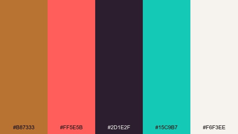
HEX: #B87333 #FF5E5B #2D1E2F #15C9B7 #F6F3EE
Mood: bold, energetic, nightlife
Best for: music promos, streetwear drops, and social ads
Bold and energetic, it brings neon signage glow to warm metal and dark velvet backdrops. Use the deep purple as the main field, then pop coral and aqua for high-contrast buttons, stickers, or sale bursts. Copper works best as a grounding highlight that ties the brights together. Tip: keep type mostly off-white to avoid readability issues against saturated accents.
Image example of modern copper neon generated using media.io
6) Copper Blue Hour
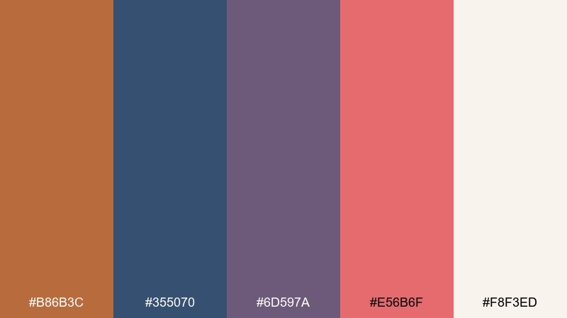
HEX: #B86B3C #355070 #6D597A #E56B6F #F8F3ED
Mood: romantic, cinematic, soft contrast
Best for: beauty branding and lifestyle photography overlays
Romantic and cinematic, it looks like twilight skies meeting warm city light. Use the slate blue and dusty violet as the main blocks, then bring in copper for warmth in icons, dividers, and emphasis text. The rose tone adds a friendly highlight without turning overly sweet. Tip: apply a subtle grain texture to unify the cool and warm tones in one cohesive look.
Image example of copper blue hour generated using media.io
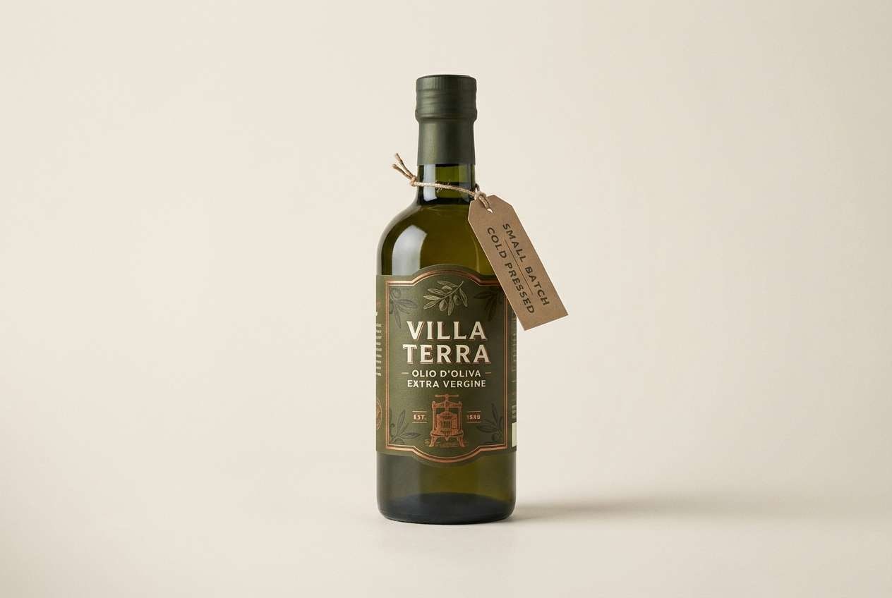
7) Copper & Olive Heritage
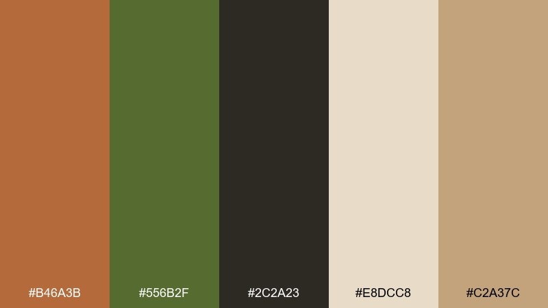
HEX: #B46A3B #556B2F #2C2A23 #E8DCC8 #C2A37C
Mood: heritage, rustic, confident
Best for: artisan food labels and heritage brand identities
Heritage and rustic, it suggests old-world craft, olive groves, and hand-stamped packaging. This copper color scheme shines when olive leads and copper becomes the signature stamp or seal color. Cream keeps the look approachable while the near-black adds authority for logos and ingredient text. Tip: try letterpress or embossing to make the warm accent feel tactile and premium.
Image example of copper & olive heritage generated using media.io
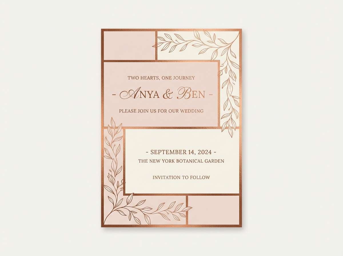
8) Copper Blush Wedding
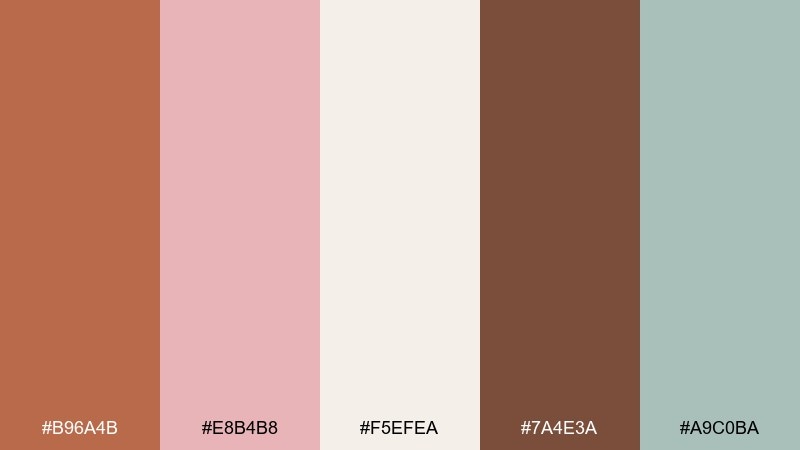
HEX: #B96A4B #E8B4B8 #F5EFEA #7A4E3A #A9C0BA
Mood: romantic, soft, airy
Best for: wedding invitations and event stationery
Romantic and airy, it feels like blush florals, satin ribbons, and warm metallic foil. Use cream as the paper base, blush for soft panels, and copper for foil-like headings or monograms. The muted teal keeps the look modern and prevents the pink from dominating. Tip: reserve the darkest brown for small text so details stay legible on light backgrounds.
Image example of copper blush wedding generated using media.io
9) Copper Citrus Pop
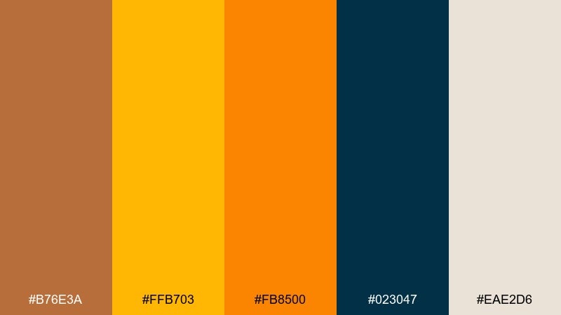
HEX: #B76E3A #FFB703 #FB8500 #023047 #EAE2D6
Mood: sunny, playful, high-contrast
Best for: summer promos and sports branding
Sunny and playful, it reads like oranges and marigolds against a deep ocean-blue horizon. Let navy handle backgrounds and text for maximum contrast, then stack the citrus tones for energetic highlights. Copper bridges the warm shades so the bright yellows feel more grounded. Tip: use the cream as breathing room between loud blocks to keep the design crisp.
Image example of copper citrus pop generated using media.io

10) Copper Monochrome Minimal
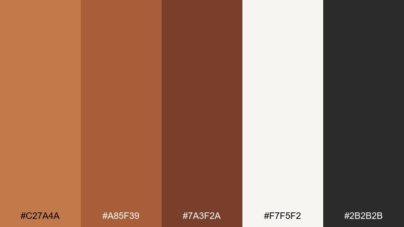
HEX: #C27A4A #A85F39 #7A3F2A #F7F5F2 #2B2B2B
Mood: minimal, elegant, product-first
Best for: premium skincare packaging and landing pages
Minimal and elegant, it feels like clean ceramic, warm metal, and modern type on bright paper. This copper color palette works best when off-white dominates and the copper shades step in for hierarchy across headings and badges. Charcoal is ideal for body copy and outlines, keeping everything sharp and readable. Tip: limit gradients and use flat blocks to preserve the minimal, product-first vibe.
Image example of copper monochrome minimal generated using media.io
11) Copper & Plum Velvet
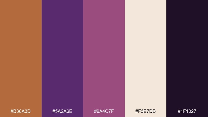
HEX: #B36A3D #5A2A6E #9A4C7F #F3E7DB #1F1027
Mood: luxurious, dramatic, artistic
Best for: boutique cosmetics and night-out event branding
Luxurious and dramatic, it evokes velvet curtains, plum wine, and a warm metallic glow. Use the deep eggplant as your main background and bring copper in for logos, icons, or foil-style borders. The lighter plum is great for secondary panels that still feel rich without going fully dark. Tip: keep photography or illustrations high contrast so they do not get lost in the saturated base.
Image example of copper & plum velvet generated using media.io
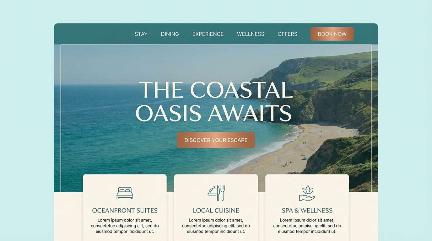
12) Copper Coastal Calm
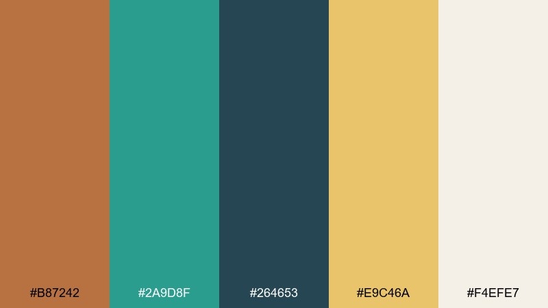
HEX: #B87242 #2A9D8F #264653 #E9C46A #F4EFE7
Mood: fresh, coastal, relaxed
Best for: travel sites and resort branding
Fresh and relaxed, it feels like sea glass and driftwood warmed by late sun. Use teal as the main brand color and copper as the warm accent to keep the look friendly rather than cold. The golden sand shade works well for highlights, badges, and small background fills. Tip: pair with airy photography and plenty of white space to maintain that coastal ease.
Image example of copper coastal calm generated using media.io
13) Copper Rainy Street
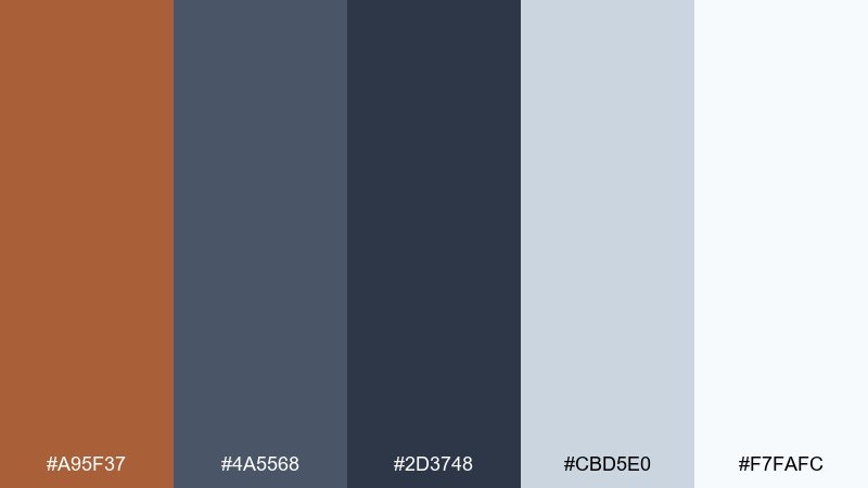
HEX: #A95F37 #4A5568 #2D3748 #CBD5E0 #F7FAFC
Mood: urban, muted, professional
Best for: B2B websites and fintech reports
Urban and muted, it looks like wet pavement and steel with a hint of warm streetlight. Use the slate range for structure and information-heavy sections, then add copper sparingly for key metrics, links, or icons. The pale tints keep charts and tables readable without harsh contrast. Tip: choose a single warm accent per page to avoid visual noise in dense layouts.
Image example of copper rainy street generated using media.io
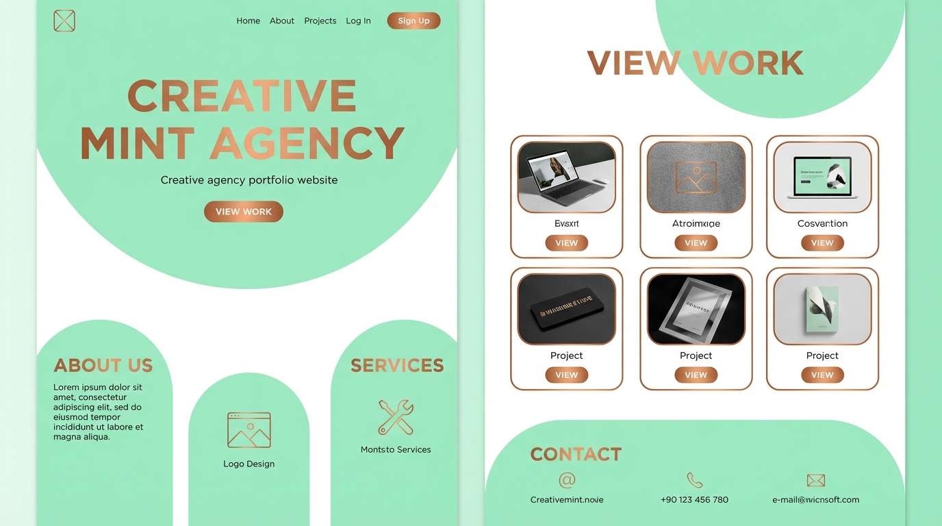
14) Copper Mint Studio
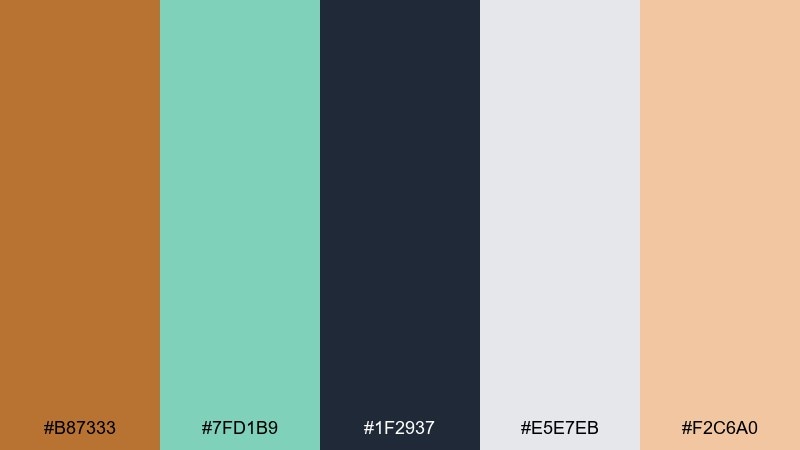
HEX: #B87333 #7FD1B9 #1F2937 #E5E7EB #F2C6A0
Mood: clean, creative, contemporary
Best for: design agencies and portfolio sites
Clean and contemporary, it pairs warm metal with refreshing mint like a bright studio with copper desk lamps. Let mint carry large backgrounds or section headers, then use the copper and peach for playful highlights and hover states. Charcoal and light gray support accessibility for long-form text and UI components. Tip: keep icons simple and geometric so the warm accents feel intentional and modern.
Image example of copper mint studio generated using media.io
15) Copper Forest Cabin
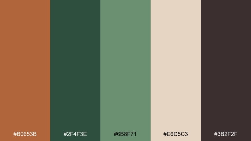
HEX: #B0653B #2F4F3E #6B8F71 #E6D5C3 #3B2F2F
Mood: outdoorsy, warm, grounded
Best for: outdoor gear branding and cabin rental listings
Outdoorsy and warm, it suggests pine needles, aged leather, and a copper mug by the fire. Use the forest greens for backgrounds and navigation, then bring copper in for badges, price highlights, or key actions. Cream keeps the palette breathable and balances the heavy darks. Tip: pair with wood textures and simple iconography to reinforce the cabin feel without going kitschy.
Image example of copper forest cabin generated using media.io
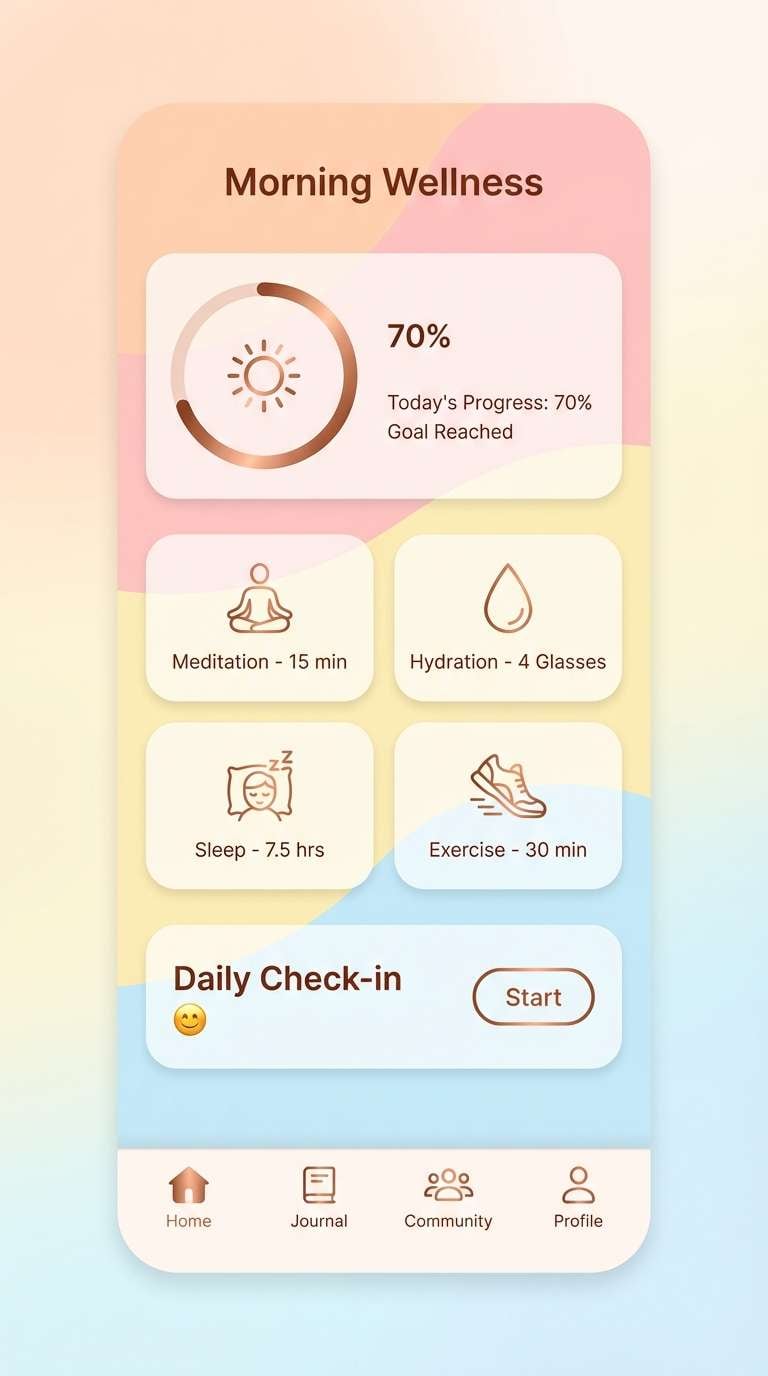
16) Copper Sunrise Pastels
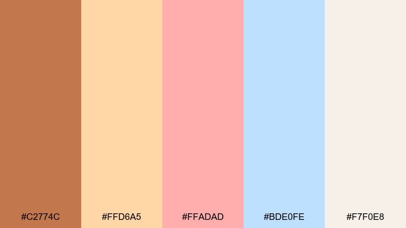
HEX: #C2774C #FFD6A5 #FFADAD #BDE0FE #F7F0E8
Mood: optimistic, soft, airy
Best for: wellness apps and morning routine content
Optimistic and airy, it feels like a sunrise gradient spreading across cotton clouds. Use the cream and pale peach as the base, then layer pink and baby blue for gentle category coding. Copper is the perfect micro-accent for icons, toggles, and progress highlights without breaking the softness. Tip: keep shadows subtle and favor rounded shapes for a calm, friendly interface.
Image example of copper sunrise pastels generated using media.io
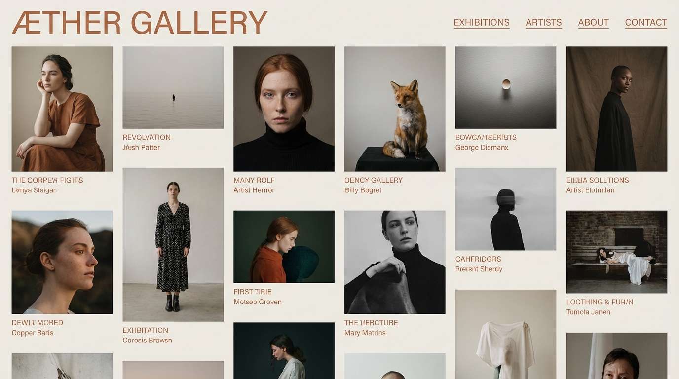
17) Copper Gallery Neutral
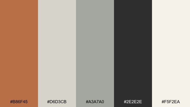
HEX: #B86F45 #D6D3CB #A3A7A0 #2E2E2E #F5F2EA
Mood: quiet, curated, sophisticated
Best for: art galleries and minimalist portfolios
Quiet and curated, it resembles gallery walls, concrete floors, and a single warm spotlight on sculpture. Use the off-white and warm gray as your canvas, then introduce copper as the signature highlight on buttons, nav states, or captions. Charcoal keeps typography crisp and contemporary, especially for artist names and headings. Tip: let imagery breathe with wide margins so the palette supports the work instead of competing.
Image example of copper gallery neutral generated using media.io
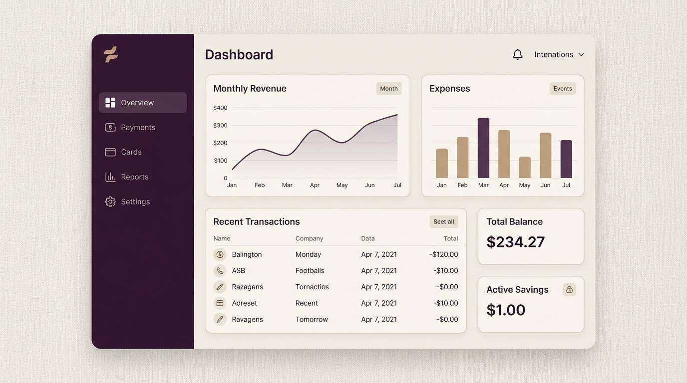
18) Copper Tech Dashboard
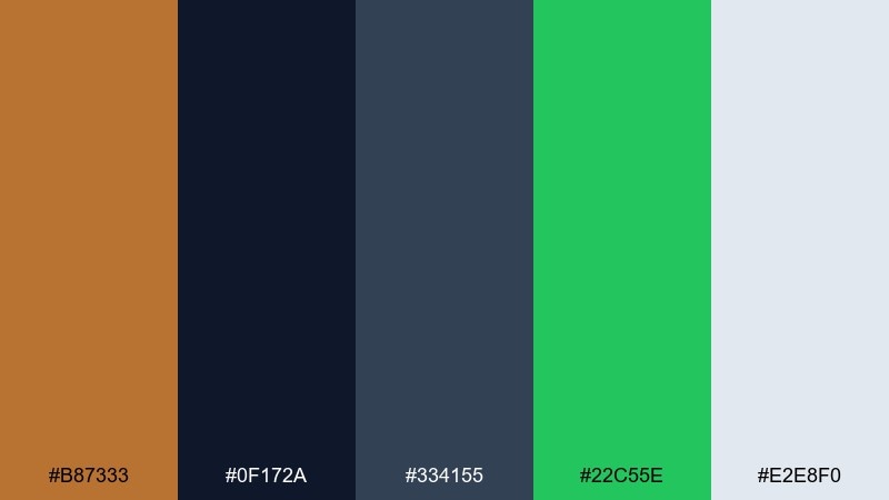
HEX: #B87333 #0F172A #334155 #22C55E #E2E8F0
Mood: sleek, technical, confident
Best for: SaaS dashboards and admin panels
Sleek and technical, it feels like a dark control room with a warm metallic indicator light. Use navy and slate for the foundation, then let green signal success states while copper highlights key actions or selected tabs. The pale gray-blue keeps charts readable and reduces eye strain on dark backgrounds. Tip: treat copper as your brand accent and keep status colors consistent for clarity.
Image example of copper tech dashboard generated using media.io
19) Copper & Teal Mosaic
HEX: #B86B3A #0B7285 #2EC4B6 #F0E5D8 #3D2B1F
Mood: artisanal, vibrant, textural
Best for: restaurant branding and menu design
Artisanal and vibrant, it brings to mind glazed tiles, sea-toned ceramics, and warm cookware. Copper and deep brown create a hearty base, while teal and aqua add freshness for section headers and callouts. Cream keeps the menu readable and gives the colors room to shine. Tip: use teal for category labels and copper for prices to create a clear scanning rhythm.
Image example of copper & teal mosaic generated using media.io
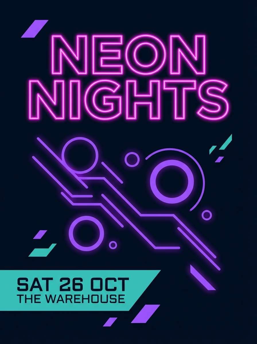
20) Copper Night Market
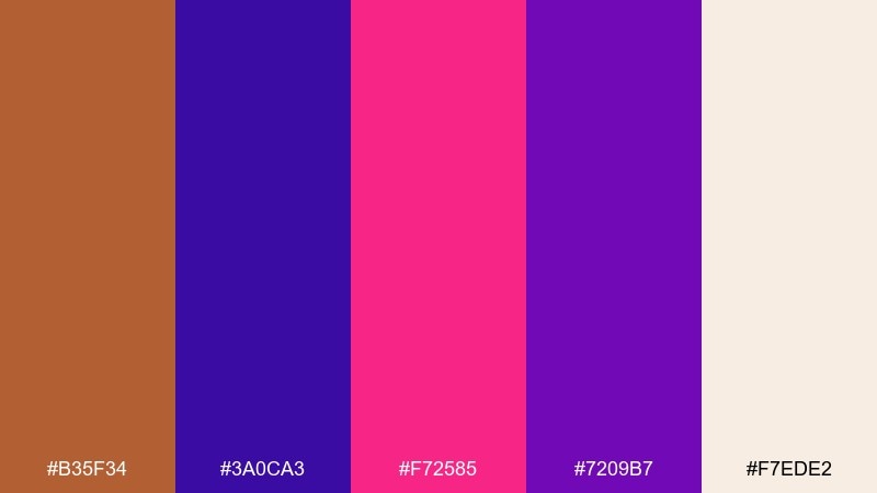
HEX: #B35F34 #3A0CA3 #F72585 #7209B7 #F7EDE2
Mood: electric, playful, modern
Best for: festival posters and nightlife ads
Electric and playful, it feels like bright signage and neon stalls against a warm evening haze. Copper keeps the intense purples and pinks from feeling too candy-like, especially when you pair it with the soft cream. Use the bold magenta for hero elements and the violets for layered depth behind type. Tip: keep your gradients smooth and your shapes simple to avoid visual clutter at a distance.
Image example of copper night market generated using media.io

What Colors Go Well with Copper?
Copper pairs beautifully with deep cool anchors like navy, charcoal, slate, and eggplant. These darker bases make copper feel more luminous and premium, especially for headlines, icons, and UI highlights.
For a softer look, combine copper with warm neutrals—ivory, cream, sand, greige, and warm gray. This keeps contrast gentle and works well in interiors, wellness, and minimalist branding.
If you want modern contrast, try copper with teal, sage, or mint. Greens and blue-greens are copper’s natural counterpoint, creating a balanced warm/cool palette that still feels approachable.
How to Use a Copper Color Palette in Real Designs
Use copper as an accent first, not a background. In most layouts, copper performs best at 10–20% coverage: buttons, separators, badges, price highlights, and small decorative rules.
Choose one “anchor” neutral (off-white or deep navy) to control readability, then build hierarchy with 1–2 supporting shades. This keeps your copper color scheme from turning muddy or overly saturated.
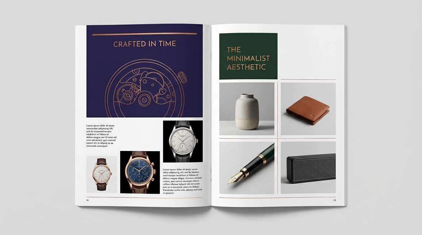
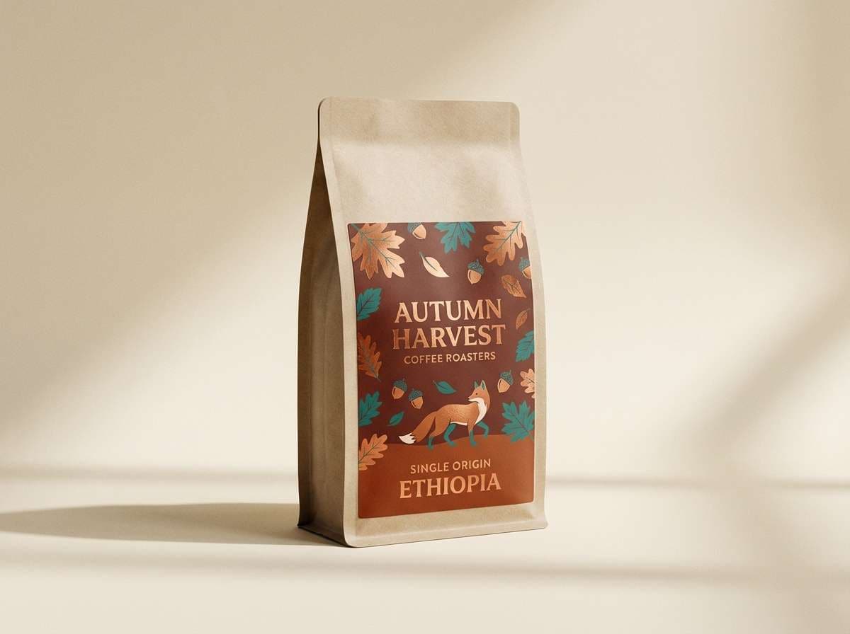
In print and packaging, copper looks especially strong with tactile finishes—matte paper, embossing, spot UV, or metallic foil. In digital UI, mimic that premium feel with subtle gradients and restrained glow.
Create Copper Palette Visuals with AI
If you already have HEX codes but need matching visuals, AI can generate on-brand mockups fast—posters, packaging, UI screens, invitations, and social templates—using your palette as the style guide.
Start with a clear subject (e.g., “skincare packaging” or “fintech dashboard”), then add your design cues (grid, typography style, lighting) and mention copper accents for the finishing touch.
Use Media.io Text-to-Image to turn the prompts above into consistent copper-themed designs you can iterate in minutes.
Copper Color Palette FAQs
-
What is the HEX code for copper?
A commonly used copper HEX is #B87333. Depending on the style, “copper” can shift warmer (more orange) or deeper (more brown), so it’s normal to see several copper variants in one palette. -
Is copper a warm or cool color?
Copper is primarily a warm color because it sits between orange and brown. It can feel slightly cooler when paired with slate, navy, or teal, but the copper itself still reads warm. -
What colors complement copper best?
Cool anchors like navy, charcoal, slate, teal, and sage complement copper well because they increase contrast and make copper look more metallic. Soft neutrals like ivory and warm gray create a calmer, more editorial feel. -
Can I use copper in a modern UI color palette?
Yes. Use copper as a brand accent for primary buttons, active states, icons, and key metrics, while keeping backgrounds neutral (off-white) or deep (navy/slate) for accessibility and clarity. -
What’s the difference between copper and bronze in design?
Copper tends to look more orange-red and vivid, while bronze usually appears darker and browner with a more muted, antique feel. In branding, copper often reads “warm premium,” while bronze leans “heritage” or “classic.” -
How do I keep a copper palette from looking too orange?
Balance copper with cool counterweights (teal, navy, slate) and include at least one neutral base (cream/ivory/gray). Also limit copper coverage and reserve it for emphasis instead of large fills. -
Does copper work for wedding or event stationery?
It works especially well for weddings when paired with cream/ivory and soft tones like blush or sage. Use copper for monograms, headings, and borders to mimic a foil accent without overpowering the page.
Next: Ivory Color Palette


