

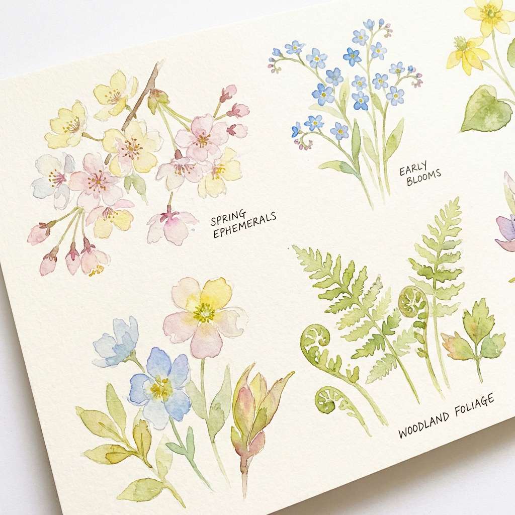
Pink and green is one of those rare color pairings that can feel sweet or sophisticated depending on the shades you choose. From blush + mint to rose + sage, it brings instant freshness to branding, web UI, and print.
Below are 20+ pink green color palette ideas with HEX codes, plus practical tips for contrast, neutrals, and accents so your designs stay readable and intentional.
In this article
- Why Pink Green Palettes Work So Well
-
- cotton candy garden
- rose sage studio
- watermelon pop
- peony eucalyptus
- retro sorbet
- blush olive linen
- neon orchid lime
- sakura matcha
- flamingo fern
- dusty rose moss
- ballet mint cream
- tropical hibiscus
- antique mauve thyme
- candy stripe kiosk
- modern blush jade
- strawberry pistachio
- sunset cactus
- rosewater celery
- blossom pine
- minimal petal sprig
- eden blush botanical
- What Colors Go Well with Pink Green?
- How to Use a Pink Green Color Palette in Real Designs
- Create Pink Green Palette Visuals with AI
Why Pink Green Palettes Work So Well
Pink and green sit across from each other in feeling: pink reads warm, human, and expressive, while green reads balanced, natural, and steady. Put together, they create a built-in push-pull that keeps layouts lively without needing lots of extra colors.
This pairing is also extremely flexible. Swap neon lime for muted sage and you move from nightlife to wellness; shift bubblegum pink to dusty rose and you instantly get a calmer, more editorial tone.
Most importantly, pink green palettes can be made accessible. With a darker green (or charcoal) for text and a light blush/cream background, you can maintain strong contrast while still keeping the aesthetic soft.
20+ Pink Green Color Palette Ideas (with HEX Codes)
1) Cotton Candy Garden
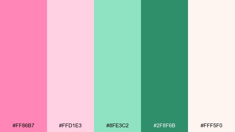
HEX: #FF86B7 #FFD1E3 #8FE3C2 #2F8F6B #FFF5F0
Mood: playful, airy, sweet
Best for: kids brand identity and cheerful social posts
Playful and airy like cotton candy at a spring fair, these tones feel instantly upbeat. Use the deeper green for logos or headings, then let the pale blush and cream carry the background. Pair with rounded typography and simple icons to keep it modern, not childish. Usage tip: reserve the hot pink for small highlights like buttons or price tags to avoid visual fatigue.
Image example of cotton candy garden generated using media.io
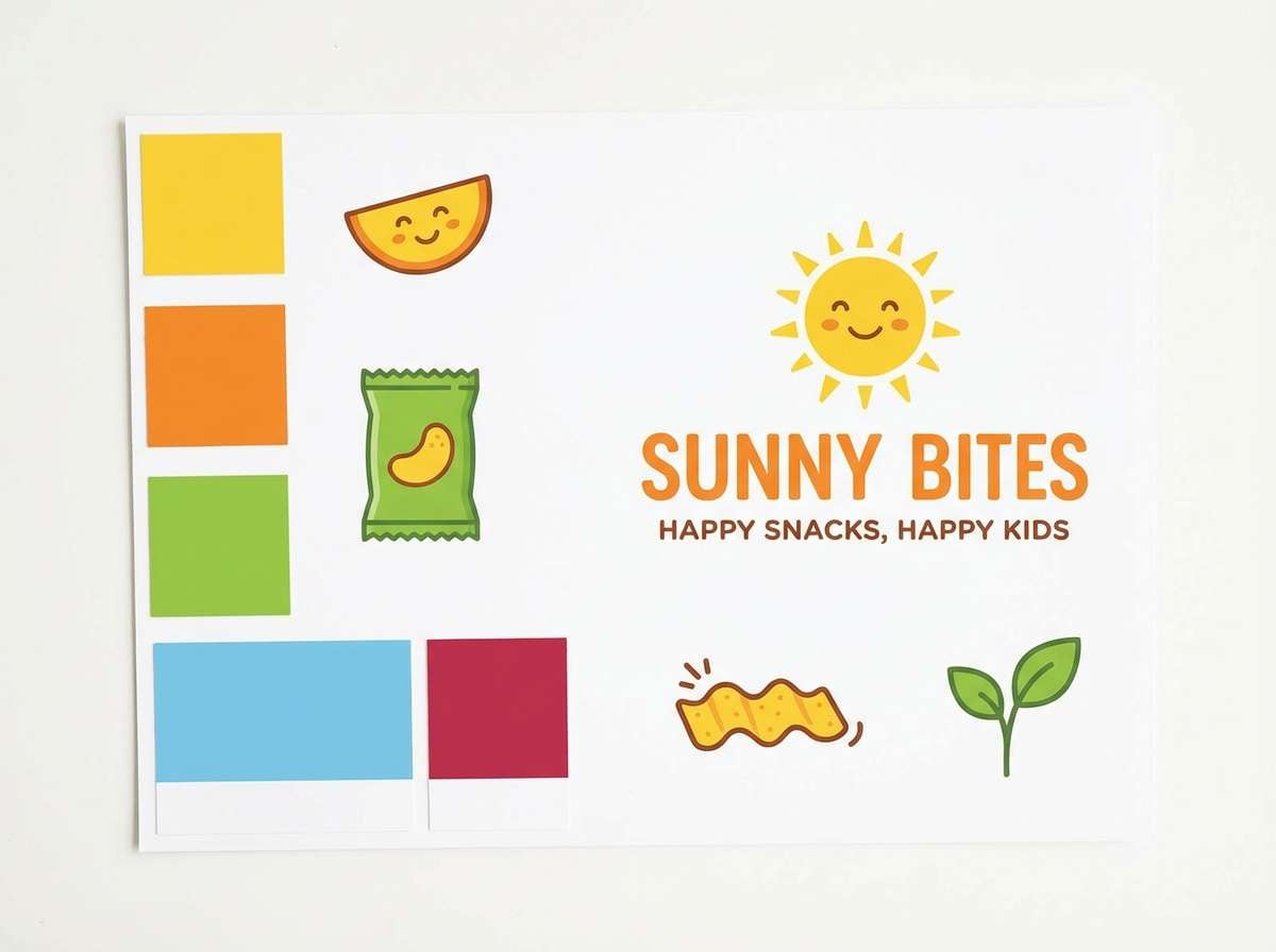
Media.io is an online AI studio for creating and editing video, image, and audio in your browser.

2) Rose Sage Studio
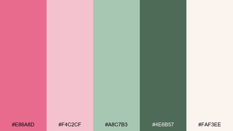
HEX: #E86A8D #F4C2CF #A8C7B3 #4E6B57 #FAF3EE
Mood: calm, refined, modern
Best for: wellness branding and boutique packaging
Calm and refined like a spa studio with soft daylight, this mix reads premium without feeling cold. It works beautifully as a pink green color palette when you need gentle contrast for labels and web headers. Ground the look with the deep sage for type, and keep the light blush for negative space. Usage tip: print a matte finish so the muted tones stay sophisticated instead of glossy.
Image example of rose sage studio generated using media.io
3) Watermelon Pop
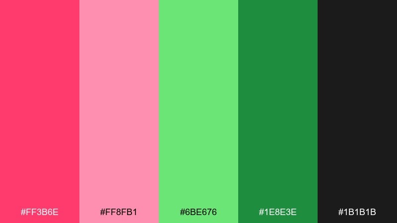
HEX: #FF3B6E #FF8FB1 #6BE676 #1E8E3E #1B1B1B
Mood: bold, punchy, high-energy
Best for: summer event posters and promo banners
Bold and punchy like a fresh watermelon slice, these colors are made for attention. Use the near-black for text and outlines so the neon-leaning hues stay readable at a distance. The lighter pink is perfect for gradients or big background blocks, while the greens act as strong CTAs. Usage tip: keep layouts simple with large type to avoid a busy, candy-store feel.
Image example of watermelon pop generated using media.io

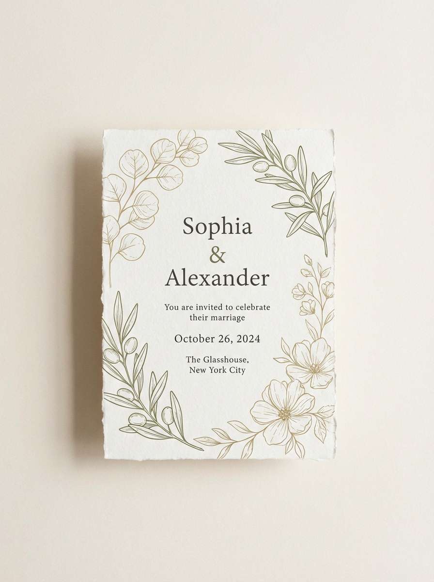
4) Peony Eucalyptus
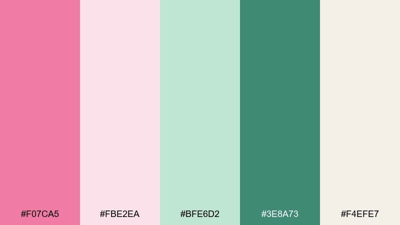
HEX: #F07CA5 #FBE2EA #BFE6D2 #3E8A73 #F4EFE7
Mood: romantic, fresh, botanical
Best for: wedding invitations and floral stationery
Romantic and fresh like peonies tucked into eucalyptus, this set feels effortless and airy. These pink green color combinations shine on textured paper, with blush for florals and teal-green for names and details. Add the warm off-white to keep the whole layout soft and readable. Usage tip: foil only the dark green text, and let the pink stay uncoated for a modern finish.
Image example of peony eucalyptus generated using media.io
5) Retro Sorbet
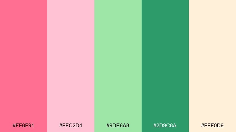
HEX: #FF6F91 #FFC2D4 #9DE6A8 #2D9C6A #FFF0D9
Mood: nostalgic, sunny, friendly
Best for: ice cream shop branding and menu boards
Nostalgic and sunny like a vintage sorbet sign, these hues feel welcoming and fun. Let the creamy peach act as your base and use the saturated green for prices and key menu items. The softer pink keeps large areas from feeling loud, especially on print. Usage tip: set body text in the dark green or a near-black for clarity under bright store lighting.
Image example of retro sorbet generated using media.io
6) Blush Olive Linen
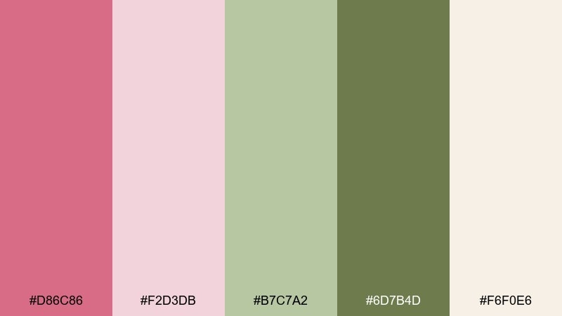
HEX: #D86C86 #F2D3DB #B7C7A2 #6D7B4D #F6F0E6
Mood: earthy, soft, understated
Best for: slow living blogs and lifestyle newsletters
Earthy and soft like linen and dried petals, this palette feels grounded and editorial. Use olive as the anchor for navigation, dividers, and headers, while blush stays in supporting roles. The warm off-white keeps pages breathable and pairs well with serif type. Usage tip: add subtle texture in backgrounds, but keep contrast high for accessibility.
Image example of blush olive linen generated using media.io
7) Neon Orchid Lime
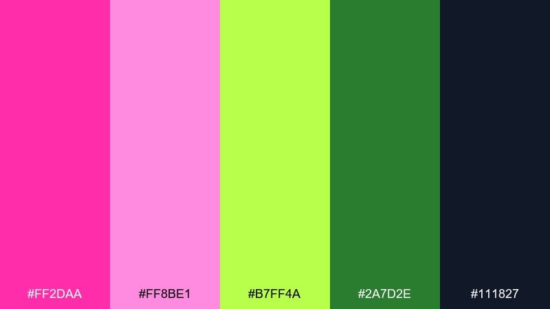
HEX: #FF2DAA #FF8BE1 #B7FF4A #2A7D2E #111827
Mood: electric, edgy, futuristic
Best for: music promo graphics and nightlife ads
Electric and edgy like club lights against a dark wall, these colors bring instant energy. Keep the deep navy-black as the dominant background to make the neon tones glow. Use lime for calls to action and orchid pink for headlines or artist names. Usage tip: avoid thin fonts; bold weights keep the neon readable on screens.
Image example of neon orchid lime generated using media.io

8) Sakura Matcha
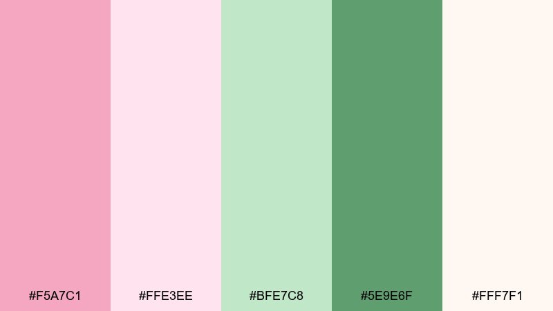
HEX: #F5A7C1 #FFE3EE #BFE7C8 #5E9E6F #FFF7F1
Mood: gentle, cozy, clean
Best for: cafe packaging and seasonal promos
Gentle and cozy like sakura tea with a matcha side, this mix feels clean and inviting. Use the deeper green for stamp marks, labels, and small type to maintain contrast. The pale pinks work nicely for wrapping paper and social templates without overwhelming product photos. Usage tip: add a thin green border to keep light backgrounds from washing out in print.
Image example of sakura matcha generated using media.io
9) Flamingo Fern
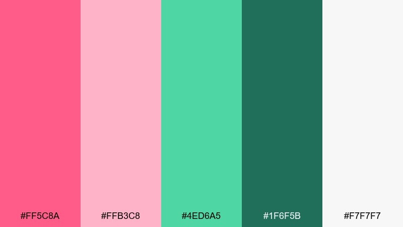
HEX: #FF5C8A #FFB3C8 #4ED6A5 #1F6F5B #F7F7F7
Mood: fresh, lively, tropical
Best for: travel blog headers and hero banners
Fresh and lively like a flamingo in lush fronds, these colors feel bright but balanced. Let the light gray-white act as breathing room, then layer pink for highlights and green for structure. It performs well in big hero areas where you want a cheerful first impression. Usage tip: keep photography slightly desaturated so the UI accents remain the star.
Image example of flamingo fern generated using media.io
10) Dusty Rose Moss
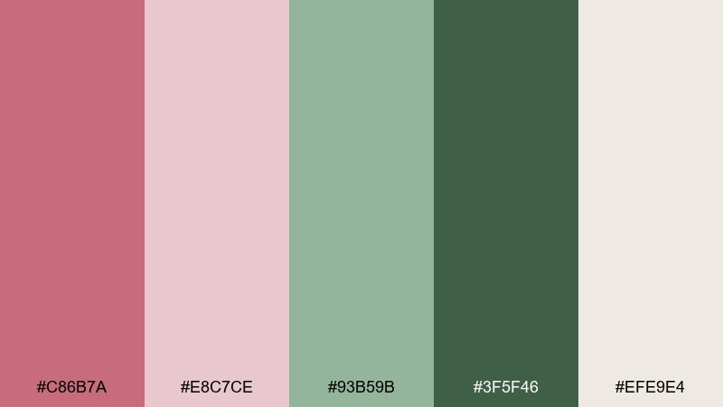
HEX: #C86B7A #E8C7CE #93B59B #3F5F46 #EFE9E4
Mood: moody, natural, timeless
Best for: interior mood boards and home decor brands
Moody and natural like dried roses and forest moss, this set feels timeless. Use the deep green for furniture silhouettes, headlines, or premium tags, and keep the dusty blush for soft accents. The warm greige base ties everything together and pairs well with wood textures. Usage tip: in catalogs, set body copy in the darkest green to avoid low-contrast gray text.
Image example of dusty rose moss generated using media.io
11) Ballet Mint Cream
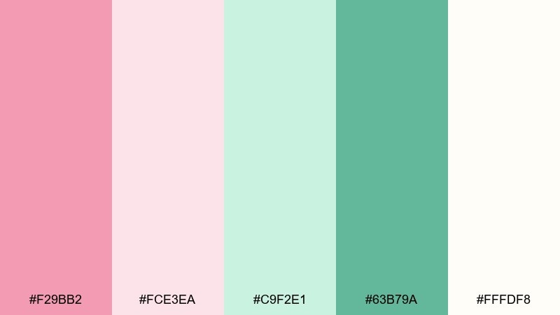
HEX: #F29BB2 #FCE3EA #C9F2E1 #63B79A #FFFDF8
Mood: delicate, light, romantic
Best for: beauty landing pages and email headers
Delicate and light like ballet ribbons and mint gelato, these tones feel soft on the eyes. Make the cream your main background, then layer mint for panels and form fields. The mid green gives you a dependable button color without turning the design harsh. Usage tip: use subtle shadows instead of hard borders to keep the airy vibe.
Image example of ballet mint cream generated using media.io
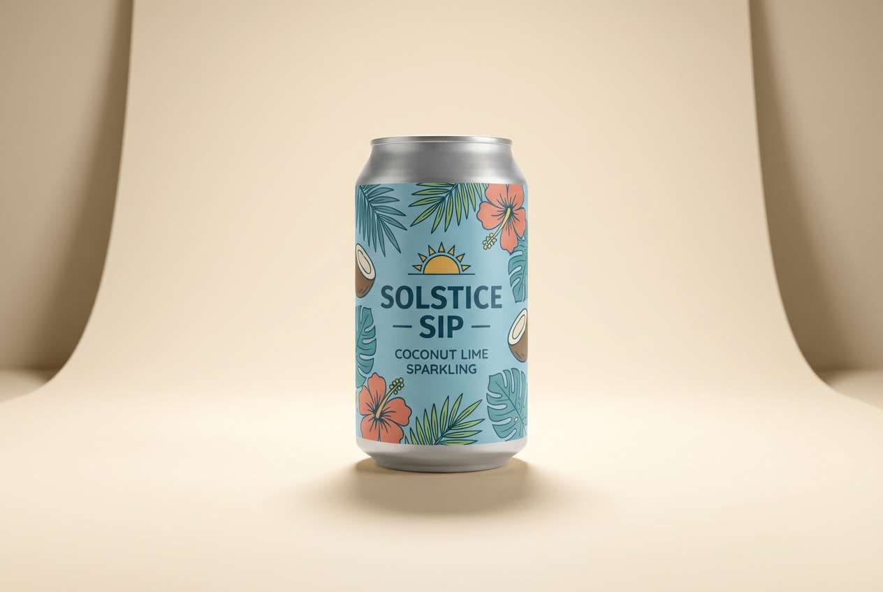
12) Tropical Hibiscus
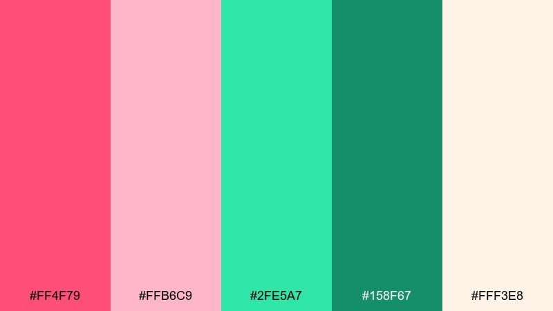
HEX: #FF4F79 #FFB6C9 #2FE5A7 #158F67 #FFF3E8
Mood: vibrant, sunny, vacation-ready
Best for: resort ads and summer product campaigns
Vibrant and sunny like hibiscus petals by a pool, this mix is built for bold seasonal creatives. Pink green color combinations like these work best with generous whitespace and a single strong headline. Use the darker teal-green for legible text and the bright pink for a punchy offer badge. Usage tip: keep gradients subtle so the palette stays crisp across devices.
Image example of tropical hibiscus generated using media.io
13) Antique Mauve Thyme
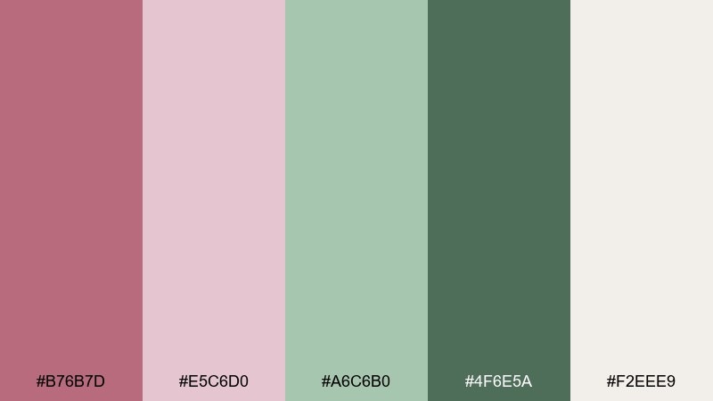
HEX: #B76B7D #E5C6D0 #A6C6B0 #4F6E5A #F2EEE9
Mood: vintage, calm, bookish
Best for: editorial layouts and book cover concepts
Vintage and calm like a worn poetry book with pressed herbs, this palette feels quietly confident. Let the thyme green carry titles and rules, while mauve supports subheads and pull quotes. The paper-like neutral keeps spreads readable and pairs nicely with classic serif fonts. Usage tip: add one small area of deep green per page to keep the layout from drifting too pale.
Image example of antique mauve thyme generated using media.io
14) Candy Stripe Kiosk
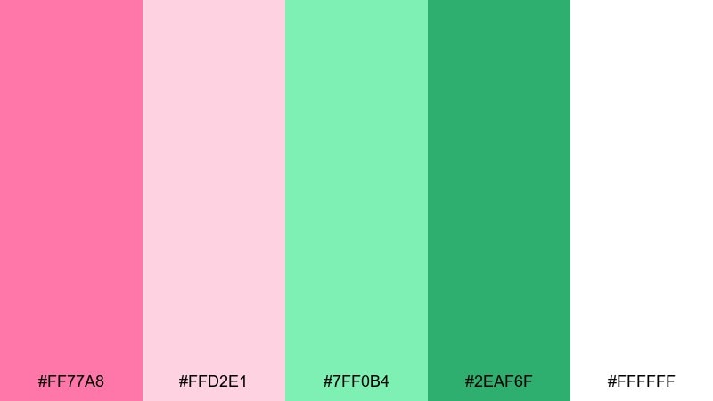
HEX: #FF77A8 #FFD2E1 #7FF0B4 #2EAF6F #FFFFFF
Mood: cute, clean, upbeat
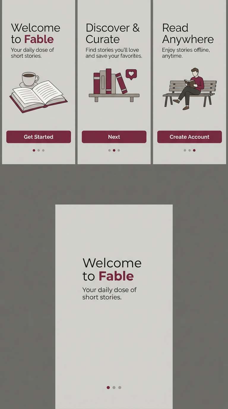
Best for: mobile app onboarding screens
Cute and clean like a candy-striped kiosk, these tones are friendly without feeling messy. Use white as the primary base, then bring in mint for cards and progress steps. The saturated green keeps CTAs visible, while the brighter pink stays for micro-highlights. Usage tip: limit pink to one component type (like badges) to keep hierarchy obvious.
Image example of candy stripe kiosk generated using media.io
15) Modern Blush Jade
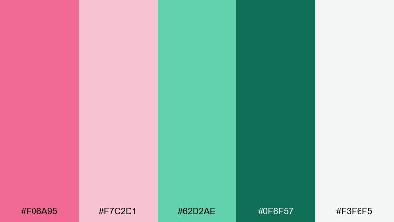
HEX: #F06A95 #F7C2D1 #62D2AE #0F6F57 #F3F6F5
Mood: confident, clean, contemporary
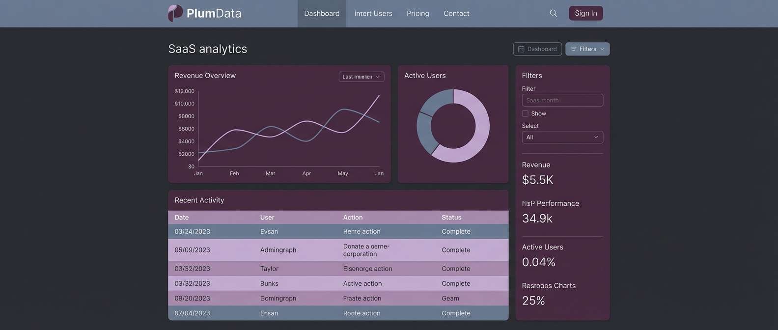
Best for: SaaS dashboards and fintech UI
Confident and clean like a modern studio space, these hues feel contemporary and sharp. For a reliable pink green color palette in UI, put the jade tones in navigation and status elements, and use blush for highlights or empty states. The cool near-white background keeps data tables and charts readable. Usage tip: reserve the deepest green for text and active states to meet contrast guidelines.
Image example of modern blush jade generated using media.io
16) Strawberry Pistachio
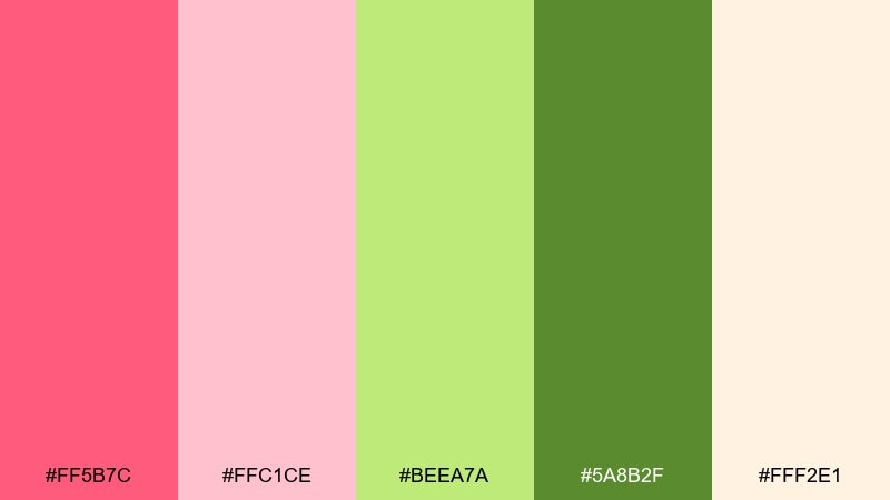
HEX: #FF5B7C #FFC1CE #BEEA7A #5A8B2F #FFF2E1
Mood: tasty, bright, nostalgic
Best for: bakery branding and dessert packaging
Tasty and bright like strawberry frosting with pistachio crumble, this palette feels nostalgic and fun. Use the warm cream as your packaging base so the pink and green pop without clashing. The darker green is great for ingredient lists and nutrition panels where legibility matters. Usage tip: add a thin outline to pink text when printing on light backgrounds to prevent fading.
Image example of strawberry pistachio generated using media.io
17) Sunset Cactus
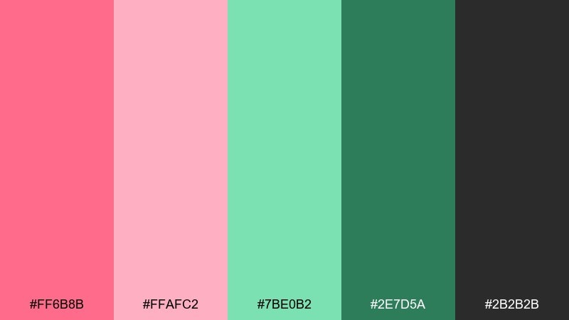
HEX: #FF6B8B #FFAFC2 #7BE0B2 #2E7D5A #2B2B2B
Mood: warm, adventurous, modern
Best for: outdoor lifestyle ads and lookbooks
Warm and adventurous like sunset light over desert cactus, this set has bite and balance. The charcoal gives you strong typography, while the greens bring a rugged edge to the soft pinks. It works well for lookbooks, especially with sandy photography and bold headlines. Usage tip: keep green as the primary accent and pink as the secondary to maintain a grounded feel.
Image example of sunset cactus generated using media.io

18) Rosewater Celery
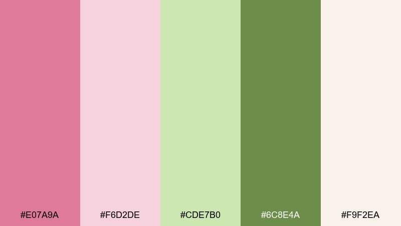
HEX: #E07A9A #F6D2DE #CDE7B0 #6C8E4A #F9F2EA
Mood: soft, organic, comforting
Best for: recipe blogs and healthy meal planners
Soft and organic like rosewater and crisp celery, these tones feel comforting and fresh. Use the celery green for categories, tags, and checkmarks, and keep rose pink for featured recipes or seasonal modules. The warm neutral helps food photography look natural rather than overly cool. Usage tip: add a darker green footer to anchor long pages and improve scanability.
Image example of rosewater celery generated using media.io
19) Blossom Pine
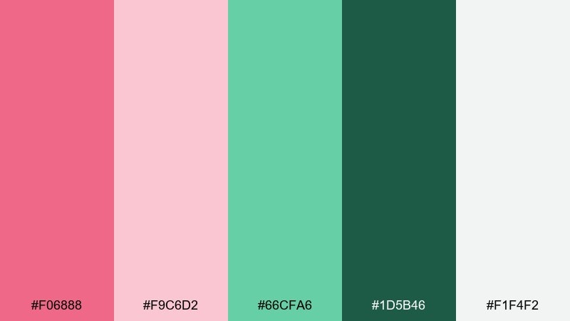
HEX: #F06888 #F9C6D2 #66CFA6 #1D5B46 #F1F4F2
Mood: fresh, premium, slightly dramatic
Best for: jewelry ads and premium product pages
Fresh and premium like blossoms against deep pine, this palette looks polished and intentional. Use the pine shade for luxury cues such as serif headlines and thin rules, then add blush for soft highlights. It pairs well with silver, off-white, and clean studio photography. Usage tip: keep saturation consistent by using the lighter pink for large areas and the brighter pink only for one focal point.
Image example of blossom pine generated using media.io

20) Minimal Petal Sprig
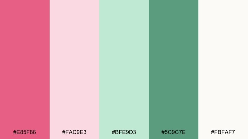
HEX: #E85F86 #FAD9E3 #BFE9D3 #5C9C7E #FBFAF7
Mood: minimal, bright, friendly
Best for: startup branding and simple logos
Minimal and bright like a single petal beside a green sprig, this set feels friendly and modern. It shines in clean identity systems where you want one bold accent and plenty of whitespace. The mid green supports icons and subheads, while blush creates warmth around otherwise neutral layouts. Usage tip: test your logo in one color first (deep green), then add pink as an optional highlight for flexibility.
Image example of minimal petal sprig generated using media.io
21) Eden Blush Botanical
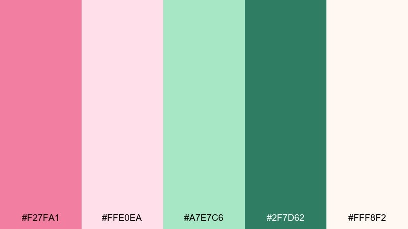
HEX: #F27FA1 #FFE0EA #A7E7C6 #2F7D62 #FFF8F2
Mood: dreamy, natural, springlike
Best for: spring botanical illustrations and stickers
Dreamy and natural like a spring sketchbook, these colors feel light and optimistic. Use the warm off-white as paper tone, then layer blush petals and minty greens for leaves. The deeper green adds definition for outlines and small labels. Usage tip: keep shadows minimal and use soft watercolor edges so the palette stays airy.
Image example of eden blush botanical generated using media.io
What Colors Go Well with Pink Green?
Neutrals are the easiest support for a pink green color scheme: warm off-white, cream, greige, and soft gray keep the palette wearable across web and print. They also give you space to let either pink or green become the hero.
For sharper hierarchy, add a dark anchor like charcoal, near-black, or deep forest green for text and icons. This prevents pastel pairings from becoming low-contrast, especially in UI components and long-form reading layouts.
If you want a third accent, choose one direction and stay consistent: gold or peach for warmth, or navy/teal for cooler modern contrast. Use it sparingly (badges, links, tiny highlights) so pink and green remain the main story.
How to Use a Pink Green Color Palette in Real Designs
Start by assigning roles: pick one neutral for backgrounds, one dark shade for typography, then decide which of pink or green is your primary accent. This “job assignment” keeps the design clean even when the colors are vibrant.
In branding and packaging, test your palette on different materials: matte labels soften blush tones, while glossy finishes can make pink feel louder. For print, consider how small text behaves—deep greens usually hold up better than mid-pinks in ingredient lists or fine rules.
For UI, keep contrast predictable: use dark green/charcoal for body text, reserve bright pink for alerts or promotional emphasis, and use mint/sage for panels and status fills. Always preview on mobile and in dark mode if your product supports it.
Create Pink Green Palette Visuals with AI
If you’re pitching a concept, visuals matter as much as HEX codes. Generate mockups like brand boards, onboarding screens, posters, and packaging so stakeholders can “feel” the palette before you commit to production.
With Media.io’s AI image tools, you can turn each palette into consistent design examples by reusing a prompt style and swapping only a few keywords (industry, product, layout). That makes it easier to compare options side-by-side.
When prompting, mention the vibe (e.g., “premium wellness,” “summer event,” “minimal UI”), the layout type (poster, dashboard, packaging), and request a clean background to keep colors accurate.
Pink Green Color Palette FAQs
-
What does a pink and green color palette communicate?
Most pink and green palettes feel fresh and optimistic: pink adds warmth and personality, while green adds balance and a natural, calming cue. The exact message changes by shade—neon versions feel energetic, muted sage versions feel premium and calm. -
How do I make pink and green look modern (not childish)?
Use a neutral base (off-white/greige), limit hot pink to small highlights, and choose a deeper green for typography. Clean spacing, simple shapes, and one strong dark text color will keep the palette contemporary. -
What’s the best text color for a pink green color scheme?
Charcoal, near-black, or a very deep green are the safest choices for body text. Light pink or mint backgrounds usually need a dark text color to stay readable and accessible. -
What neutrals pair best with blush and mint?
Warm neutrals like cream, ivory, and soft greige pair especially well because they keep the overall look cozy and natural. Cool light grays also work for a more modern, UI-friendly feel. -
Can I use pink and green for a brand logo?
Yes—try building the logo to work in a single color first (typically the darkest green), then add pink as an optional accent. This keeps the mark flexible for embroidery, stamps, and one-color printing. -
How do I keep a pink green palette accessible for UI?
Reserve high-saturation colors for buttons and small elements, and use dark text on light backgrounds. Avoid placing mid-pink text on light backgrounds; use the darker green or charcoal for labels, navigation, and data-heavy areas. -
What’s a good accent color to add to pink and green?
If you need a third accent, choose either a warm direction (gold/peach) or a cool direction (navy/teal) and apply it sparingly. Too many accents can make pink and green compete instead of complement.
Next: Tan Brown Color Palette


