

Pink and gray is one of those rare pairings that feels both soft and structured. You get warmth from pink and clarity from gray, which makes layouts look intentional instead of overly sweet.
Below are 20 modern pink gray color palette ideas with HEX codes, plus practical tips for using them in branding, UI, packaging, and decor.
In this article
- Why Pink Gray Palettes Work So Well
-
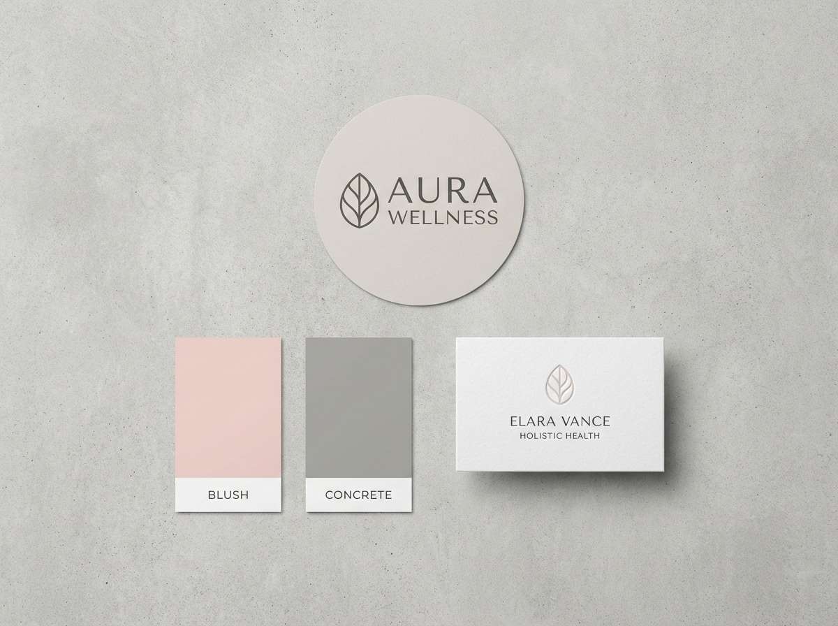
- blush concrete
- rose quartz mist
- peony slate
- ballet smoke
- raspberry graphite
- mauve minimal
- vintage pink cement
- sakura steel
- pink clay fog
- berry ash
- dusty rose pewter
- flamingo charcoal
- cotton candy stone
- orchid aluminum
- antique rose granite
- pink neon gunmetal
- soft petal silver
- warm blush cool gray
- rosewood shadow
- pink frost storm
- What Colors Go Well with Pink Gray?
- How to Use a Pink Gray Color Palette in Real Designs
- Create Pink Gray Palette Visuals with AI
Why Pink Gray Palettes Work So Well
Pink brings a human, emotional tone—friendly, calming, romantic, or bold—depending on saturation. Gray adds restraint and structure, so the overall look feels modern instead of childish.
This balance is especially useful in digital design: pink can highlight actions or states, while grays handle layout, typography, and UI chrome. You get clear hierarchy without relying on harsh black-and-white contrast.
In print and decor, pink softens hard surfaces (stone, metal, concrete), and gray keeps the palette grounded. The result is a calm, “designed” neutral that still has personality.
20+ Pink Gray Color Palette Ideas (with HEX Codes)
1) Blush Concrete
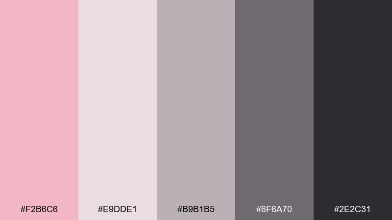
HEX: #F2B6C6 #E9DDE1 #B9B1B5 #6F6A70 #2E2C31
Mood: calm, urban, polished
Best for: branding for beauty or wellness, minimalist social posts
Calm and city-sleek, this mix feels like blush lipstick against smooth concrete. Use the pale pink and warm off-white for generous negative space, then lean on the mid grays for typography and structure. Charcoal works best as the anchor for logos or headings. Tip: keep the blush in small, intentional accents so the layout stays refined.
Image example of blush concrete generated using media.io
Media.io is an online AI studio for creating and editing video, image, and audio in your browser.

2) Rose Quartz Mist
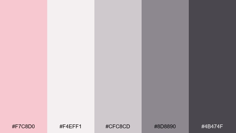
HEX: #F7C8D0 #F4EFF1 #CFC8CD #8D8890 #4B474F
Mood: airy, soft, romantic
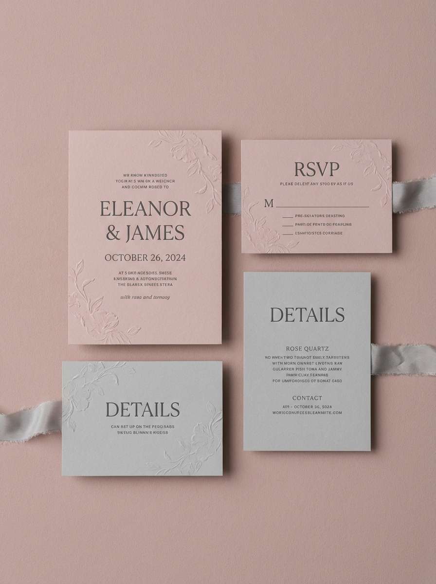
Best for: wedding invitations, skincare landing pages
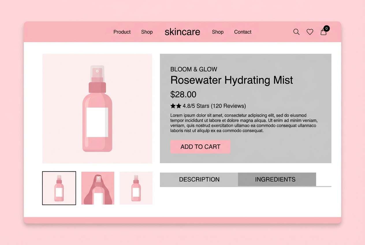
Airy and romantic, it reads like rose quartz glowing through morning fog. Let the near-white and blush handle backgrounds, then introduce the soft grays for dividers, icons, and secondary text. A deeper graphite keeps CTAs and headings legible without turning harsh. Tip: pair with a warm serif and a thin-line sans to keep the softness intentional.
Image example of rose quartz mist generated using media.io
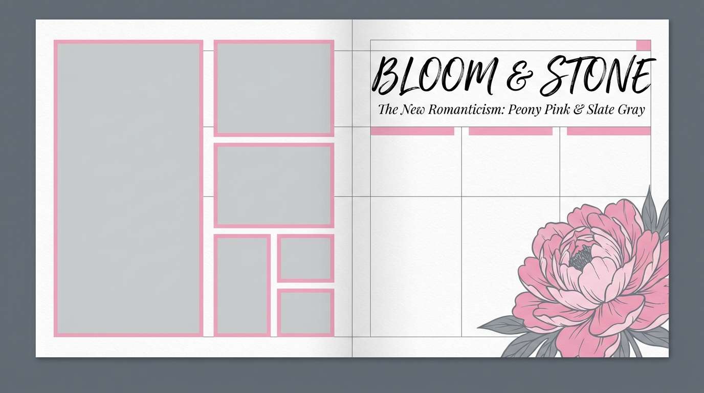
3) Peony Slate
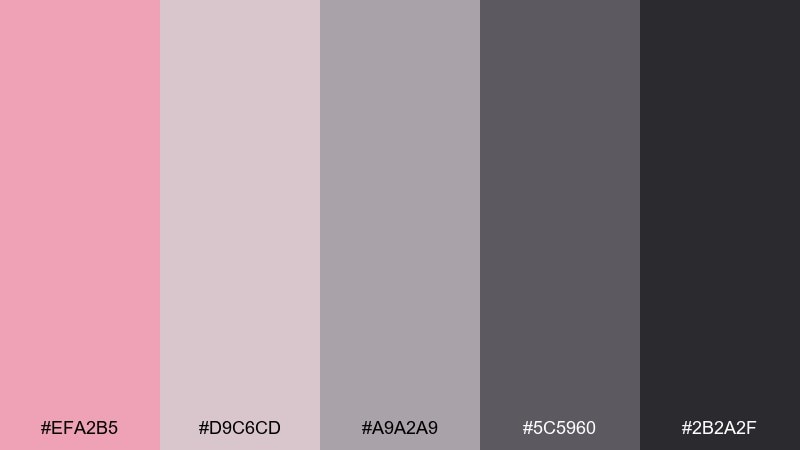
HEX: #EFA2B5 #D9C6CD #A9A2A9 #5C5960 #2B2A2F
Mood: modern, confident, editorial
Best for: magazine layouts, fashion lookbooks
Modern and editorial, it feels like peony petals set against cool slate. Use the mid gray as the layout backbone, then bring in the brighter pink for pull quotes, buttons, or highlights. The soft neutral supports photography without shifting skin tones. Tip: keep the darkest shade for text only, and let the pink do the storytelling.
Image example of peony slate generated using media.io
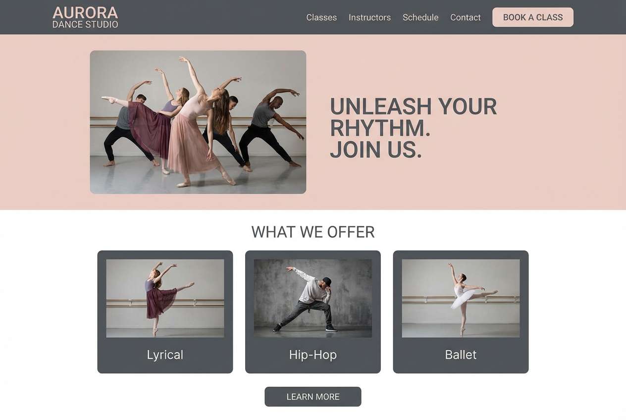
4) Ballet Smoke
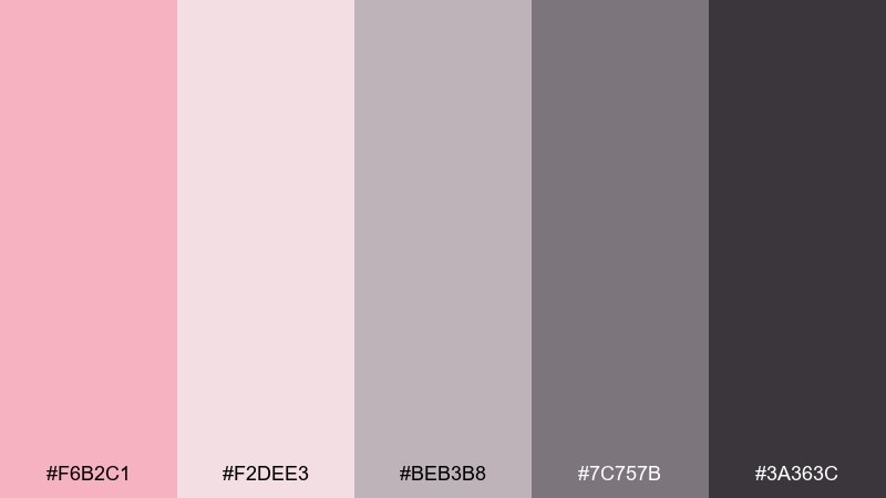
HEX: #F6B2C1 #F2DEE3 #BEB3B8 #7C757B #3A363C
Mood: graceful, muted, elegant
Best for: dance studio branding, feminine UI themes
Graceful and muted, it evokes satin ballet slippers disappearing into stage smoke. This pink gray color palette works best with blush as the hero color and smoky grays handling navigation, outlines, and microcopy. Add the near-white as a soft background so the interface never feels heavy. Tip: use the dark shade for primary text to keep accessibility strong.
Image example of ballet smoke generated using media.io
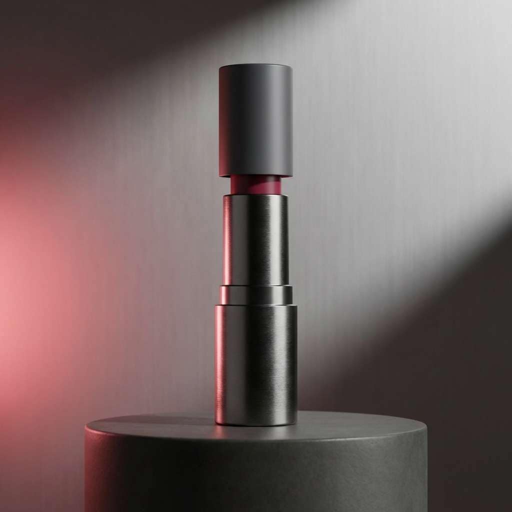
5) Raspberry Graphite
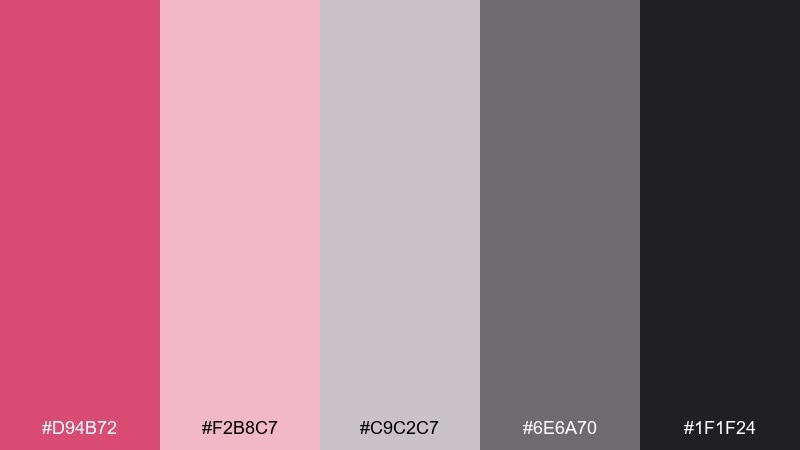
HEX: #D94B72 #F2B8C7 #C9C2C7 #6E6A70 #1F1F24
Mood: bold, chic, high-contrast
Best for: product ads, promotional banners
Bold and chic, it feels like raspberry lacquer on a graphite desk. Use the deep pink sparingly for high-impact CTAs, price tags, or key badges. The soft blush keeps gradients and backgrounds warm, while the grays bring sharp contrast and structure. Tip: reserve near-black for text and product silhouettes to avoid muddy mids.
Image example of raspberry graphite generated using media.io
6) Mauve Minimal
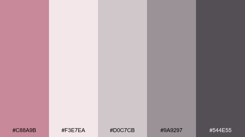
HEX: #C88A9B #F3E7EA #D0C7CB #9A9297 #544E55
Mood: minimal, cozy, understated
Best for: portfolio sites, stationery sets
Minimal and cozy, it suggests mauve knitwear beside smooth stone. Start with the creamy blush as a background, then layer the light and mid grays for cards and subtle borders. Mauve works nicely for icons, hover states, and small highlights without stealing focus. Tip: keep contrast strong by pairing the deepest gray with larger type sizes for headings.
Image example of mauve minimal generated using media.io
7) Vintage Pink Cement
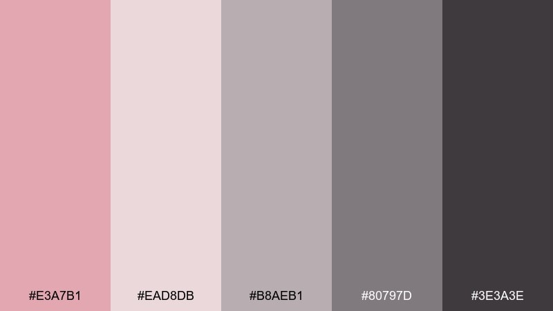
HEX: #E3A7B1 #EAD8DB #B8AEB1 #80797D #3E3A3E
Mood: vintage, warm, grounded
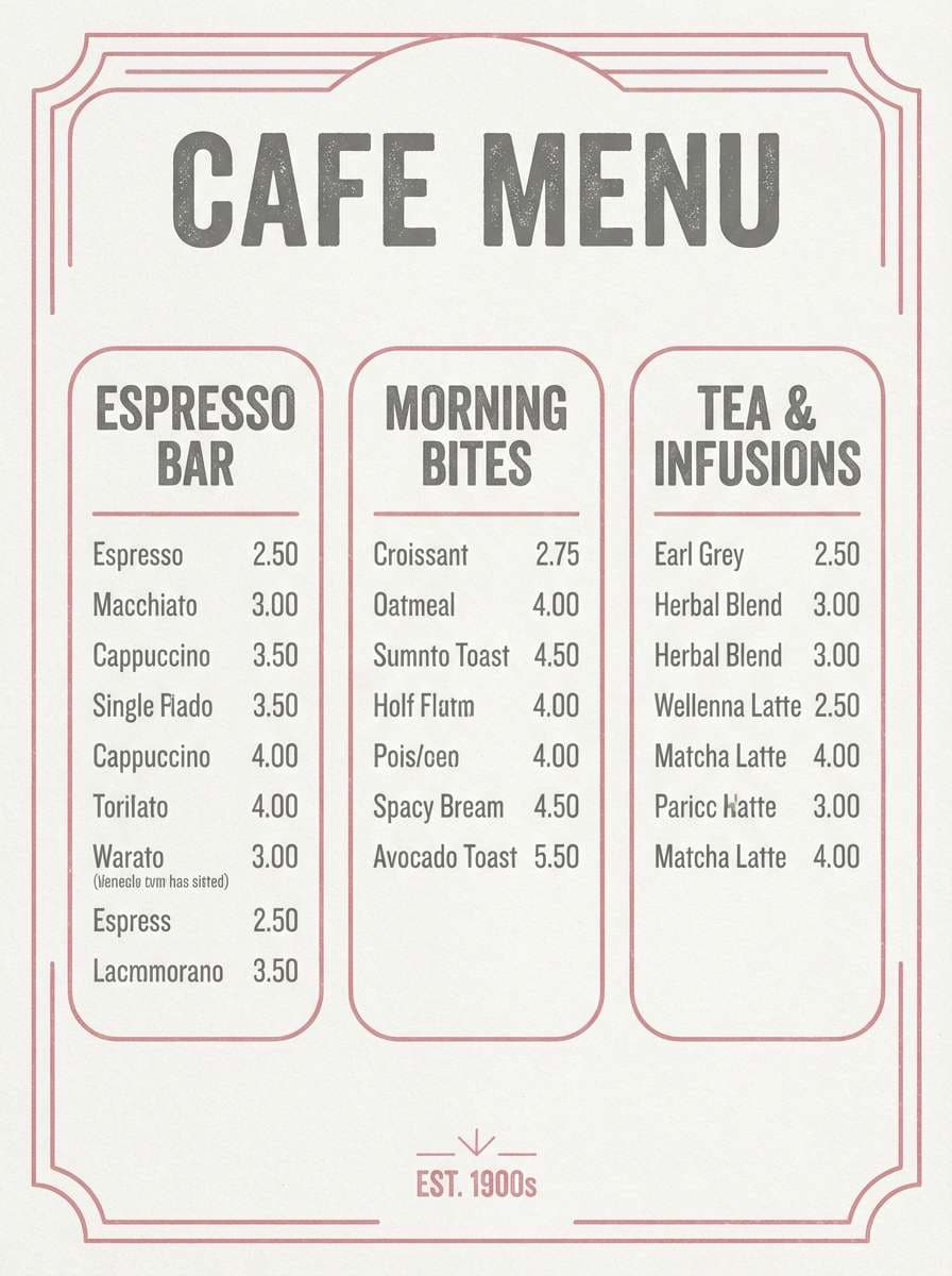
Best for: cafe menus, lifestyle branding
Vintage and grounded, it looks like faded lipstick on a cement wall. The warm blushes give menus and labels a welcoming tone, while the grays keep the overall look tidy and readable. Use the mid gray for body text and the deeper shade for headings or stamps. Tip: add plenty of spacing and let the palette do the nostalgia without extra textures.
Image example of vintage pink cement generated using media.io
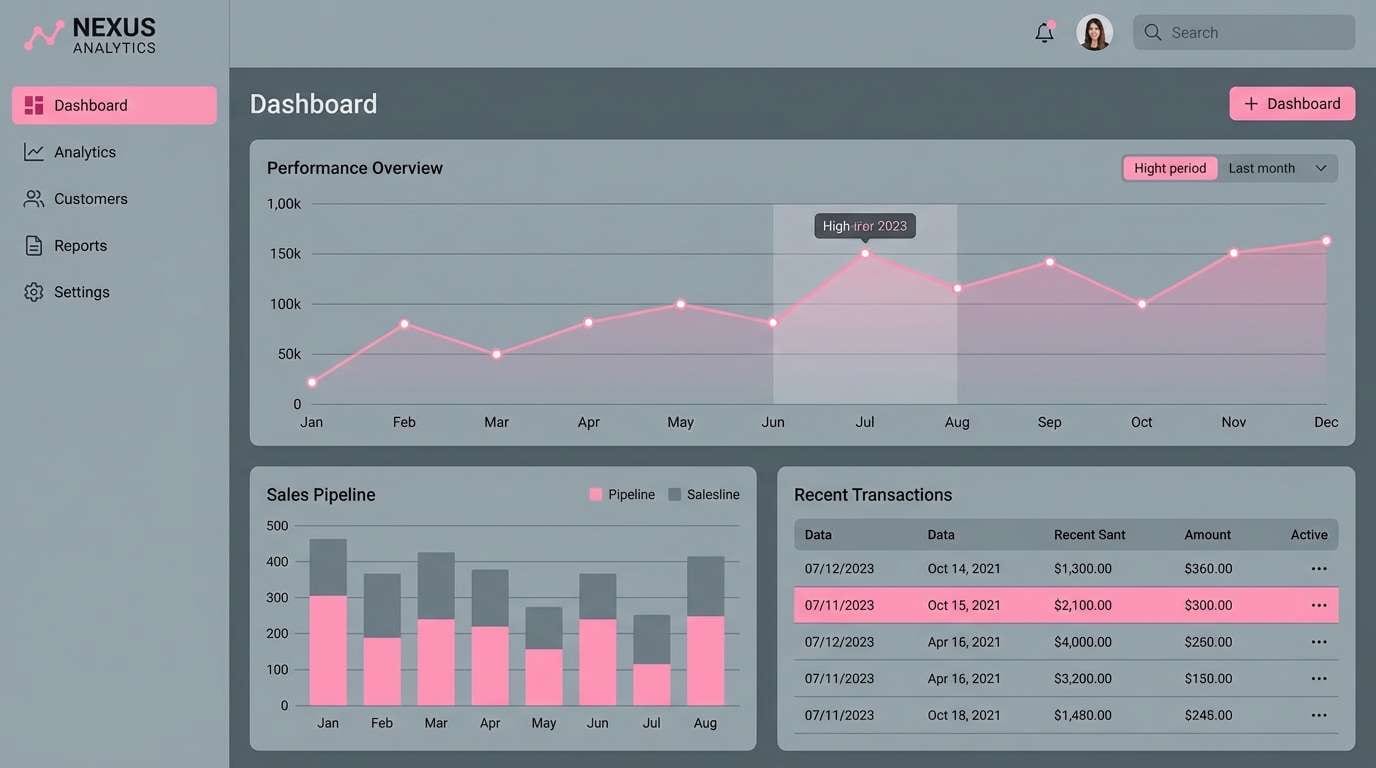
8) Sakura Steel
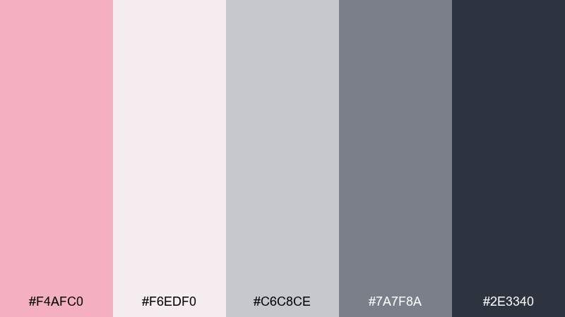
HEX: #F4AFC0 #F6EDF0 #C6C8CE #7A7F8A #2E3340
Mood: fresh, cool, contemporary
Best for: SaaS dashboards, tech branding
Fresh and cool, it brings to mind sakura blossoms against brushed steel. This pink gray color scheme shines in data-heavy UIs: use the pale tones for panels and the steel grays for charts, axes, and labels. The deeper blue-gray gives you a reliable text color that still feels modern. Tip: apply the pink only to alerts, tags, or selected states for instant clarity.
Image example of sakura steel generated using media.io
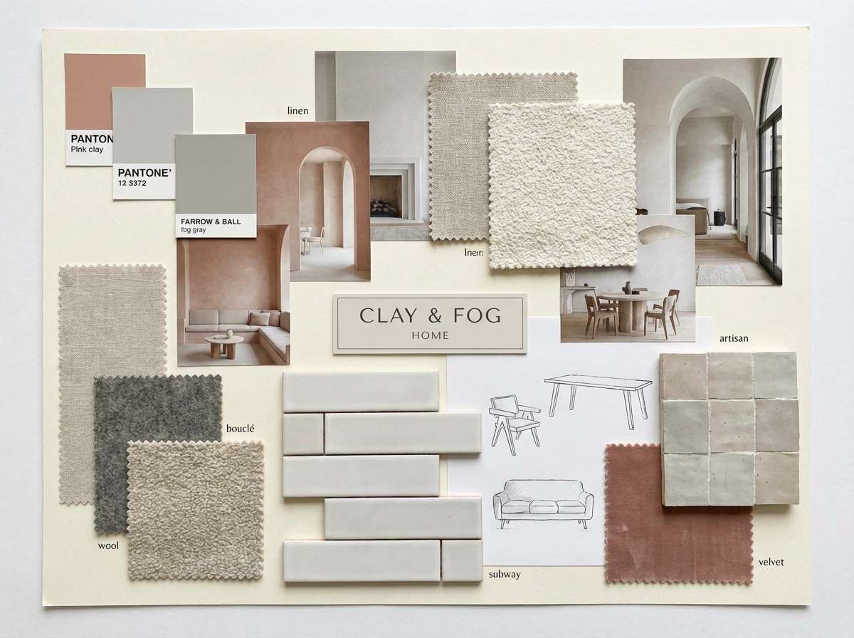
9) Pink Clay Fog
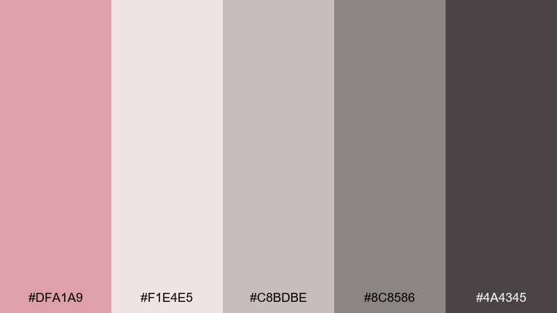
HEX: #DFA1A9 #F1E4E5 #C8BDBE #8C8586 #4A4345
Mood: earthy, calm, tactile
Best for: interior moodboards, ceramics shops
Earthy and calm, it feels like pink clay drying in a quiet studio. The dusty blush works beautifully on large surfaces, while foggy neutrals keep supporting elements subtle. Use the darker gray for frames, labels, and product names so everything stays crisp. Tip: pair with natural materials like linen, oak, and matte stone for an honest, tactile look.
Image example of pink clay fog generated using media.io
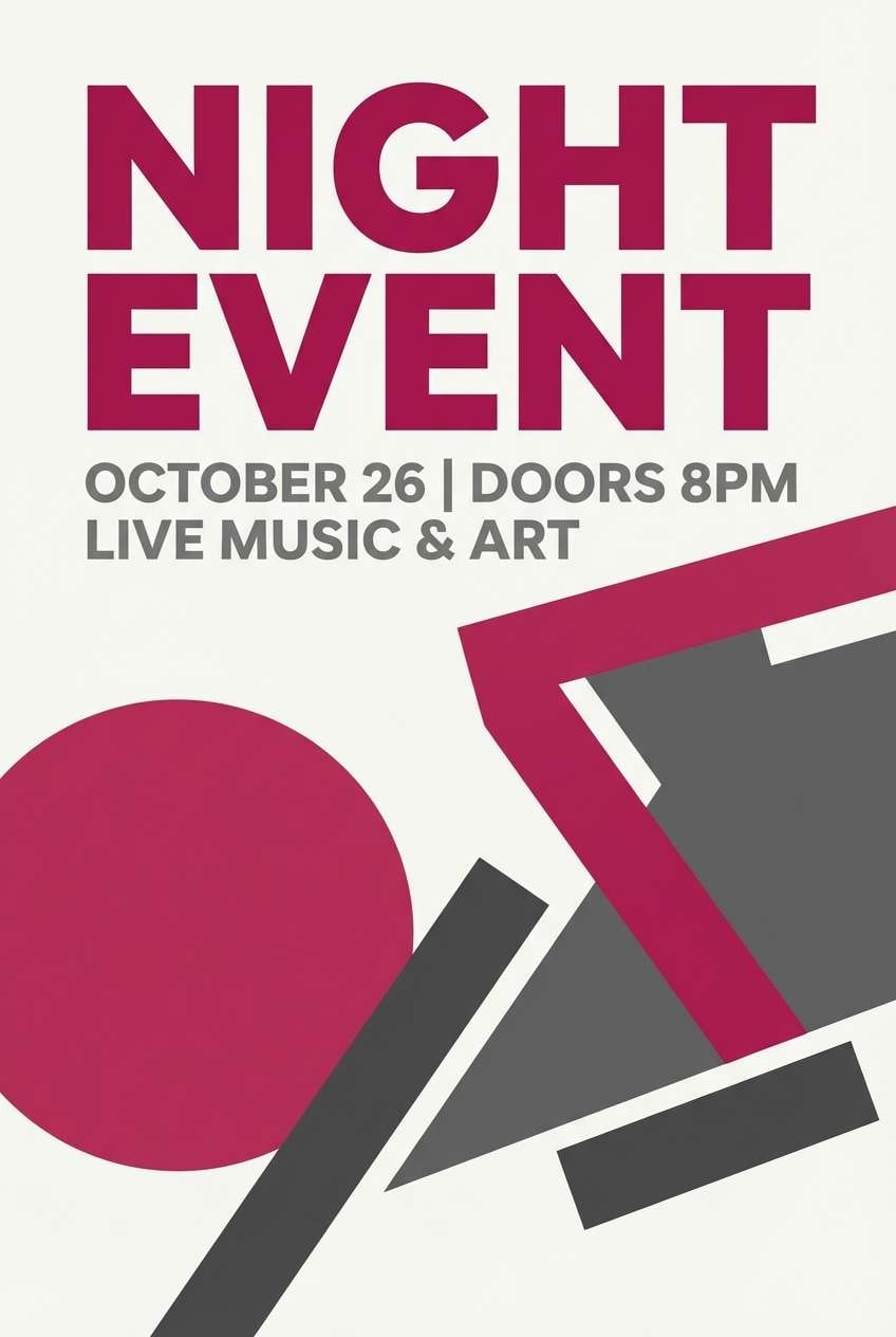
10) Berry Ash
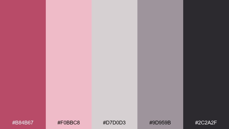
HEX: #B84B67 #F0BBC8 #D7D0D3 #9D959B #2C2A2F
Mood: moody, stylish, dramatic
Best for: night event posters, boutique campaigns
Moody and stylish, it resembles berry wine poured over cool ash. Use the deep berry as the attention grabber for headlines, icons, or key shapes. The softer pink makes a smooth gradient partner, while ash grays help keep busy designs organized. Tip: limit the near-black to type and thin rules to avoid overpowering the berry.
Image example of berry ash generated using media.io
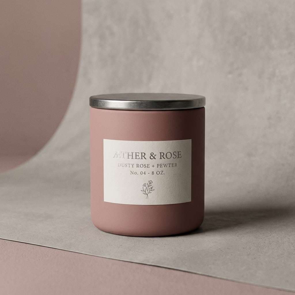
11) Dusty Rose Pewter
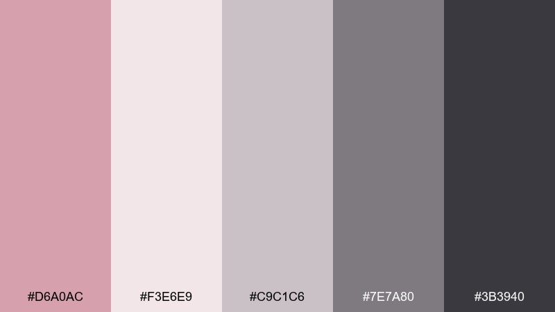
HEX: #D6A0AC #F3E6E9 #C9C1C6 #7E7A80 #3B3940
Mood: timeless, gentle, balanced
Best for: editorial blogs, packaging labels
Timeless and balanced, it recalls dried roses and softly tarnished pewter. The light blush is ideal for backgrounds that flatter product photography, while pewter grays keep type readable and calm. Use the mid gray for body copy and the deepest shade for brand marks. Tip: add a tiny hit of blush to separators and icons to tie pages together.
Image example of dusty rose pewter generated using media.io
12) Flamingo Charcoal
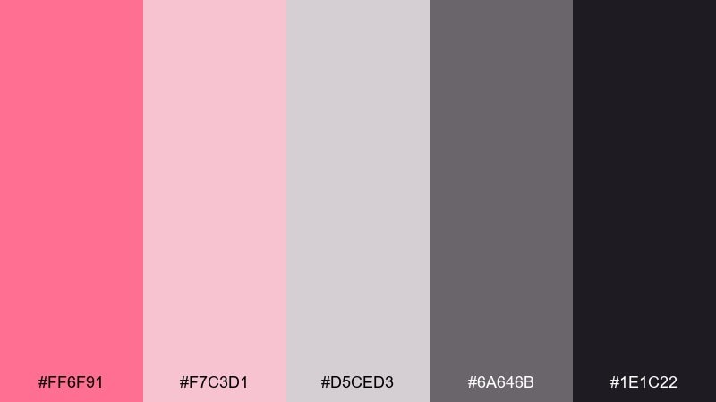
HEX: #FF6F91 #F7C3D1 #D5CED3 #6A646B #1E1C22
Mood: playful, punchy, modern
Best for: social ads, app onboarding screens
Playful and punchy, it feels like a flamingo feather against clean charcoal. This pink gray color palette is great when you need energy without neon overload: use hot pink for key moments and let the blush soften transitions. Gray tones keep the system consistent across screens and components. Tip: keep hot pink to one action per screen so the hierarchy stays obvious.
Image example of flamingo charcoal generated using media.io
13) Cotton Candy Stone
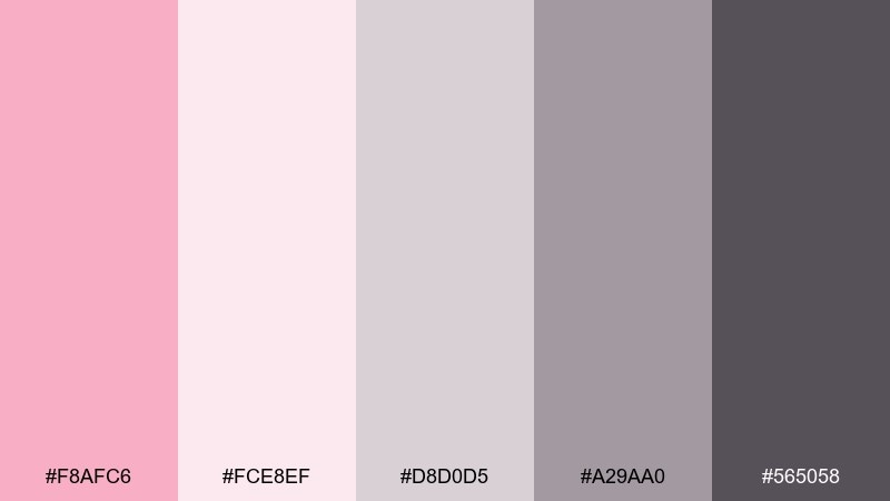
HEX: #F8AFC6 #FCE8EF #D8D0D5 #A29AA0 #565058
Mood: sweet, light, friendly
Best for: kids party invitations, playful brands
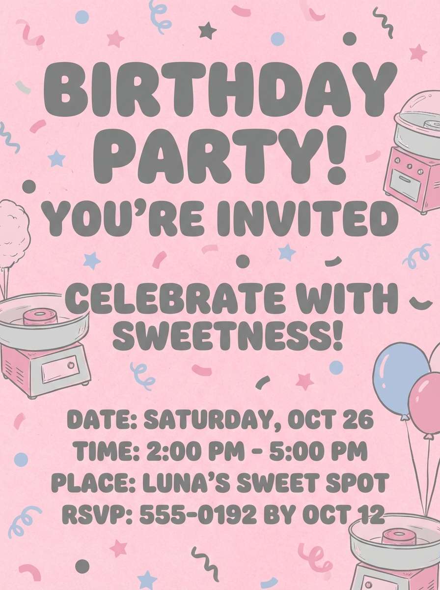
Sweet and light, it brings cotton candy softness with a stone-cool base. Use the pale pink for big background areas, and let the deeper pink handle icons or headings. The stony grays keep it from becoming overly cute, especially for type and grids. Tip: pair with rounded sans fonts and simple shapes to maintain a friendly tone.
Image example of cotton candy stone generated using media.io
14) Orchid Aluminum
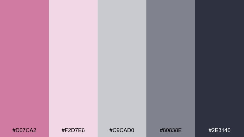
HEX: #D07CA2 #F2D7E6 #C9CAD0 #80838E #2E3140
Mood: sleek, creative, tech-forward
Best for: creative tool UI, startup pitch decks
Sleek and creative, it feels like orchid ink on brushed aluminum. The lavender-pink reads sophisticated when used for highlights, selection states, and key charts. Aluminum grays keep slides and interfaces clean, especially behind screenshots and diagrams. Tip: use the darkest shade for titles and reserve the orchid for emphasis, not body copy.
Image example of orchid aluminum generated using media.io

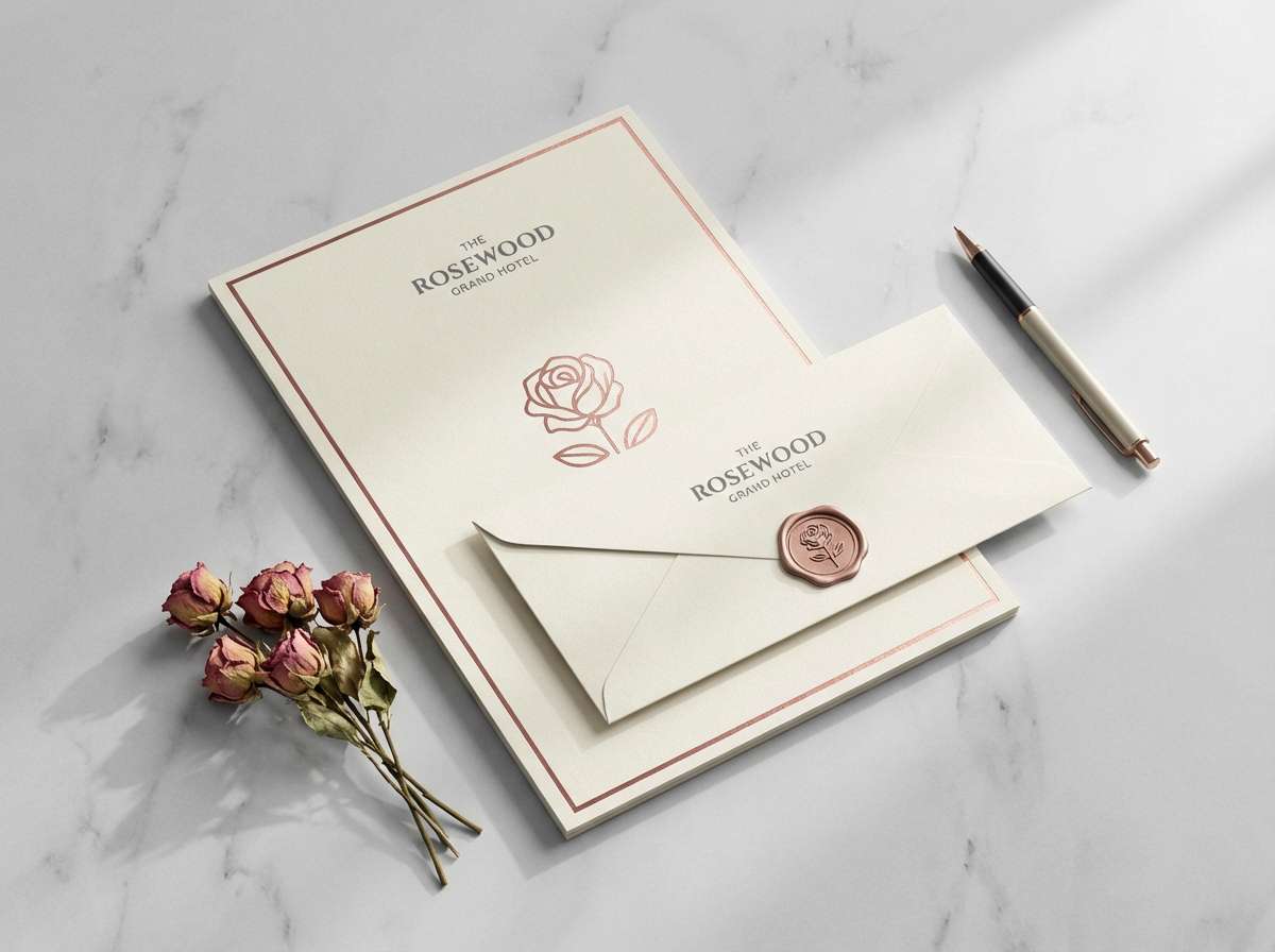
15) Antique Rose Granite
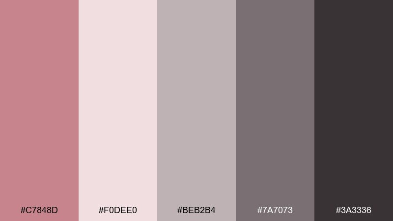
HEX: #C7848D #F0DEE0 #BEB2B4 #7A7073 #3A3336
Mood: heritage, refined, cozy
Best for: boutique hotel branding, printed stationery
Heritage and refined, it suggests antique roses pressed into granite. Use the pale blush as paper tone, then build hierarchy with the two middle grays for rules, captions, and secondary info. The deeper granite works well for monograms and elegant headings. Tip: print tests matter here, so keep the darkest shade slightly softened rather than pure black.
Image example of antique rose granite generated using media.io
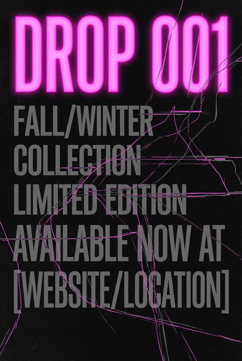
16) Pink Neon Gunmetal
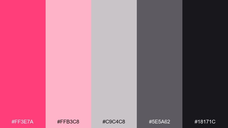
HEX: #FF3E7A #FFB3C8 #C9C4C8 #5E5A62 #18171C
Mood: edgy, energetic, nightlife
Best for: music promos, streetwear drops
Edgy and energetic, it looks like neon signage glowing over gunmetal. Keep the neon pink tight to key typography and small graphic elements so it stays premium, not loud. Pale pink can soften gradients and glows, while the grays ground the whole layout. Tip: use plenty of black space and let neon appear in short, sharp bursts.
Image example of pink neon gunmetal generated using media.io
17) Soft Petal Silver
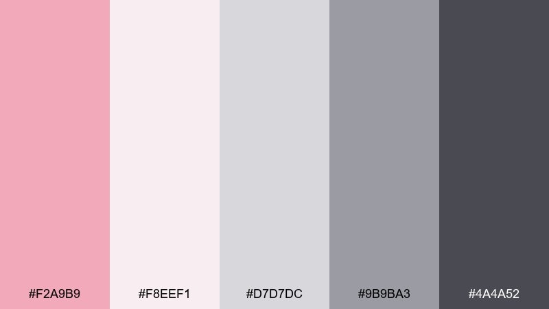
HEX: #F2A9B9 #F8EEF1 #D7D7DC #9B9BA3 #4A4A52
Mood: clean, soothing, bright
Best for: medical spa sites, clean product pages
Clean and soothing, it feels like soft petals scattered over cool silver. Use the pale blush as a gentle background tint and rely on the silver grays for form fields, borders, and UI chrome. The darker gray keeps labels and legal text readable without looking severe. Tip: a subtle gradient from blush to off-white adds depth without clutter.
Image example of soft petal silver generated using media.io
18) Warm Blush Cool Gray
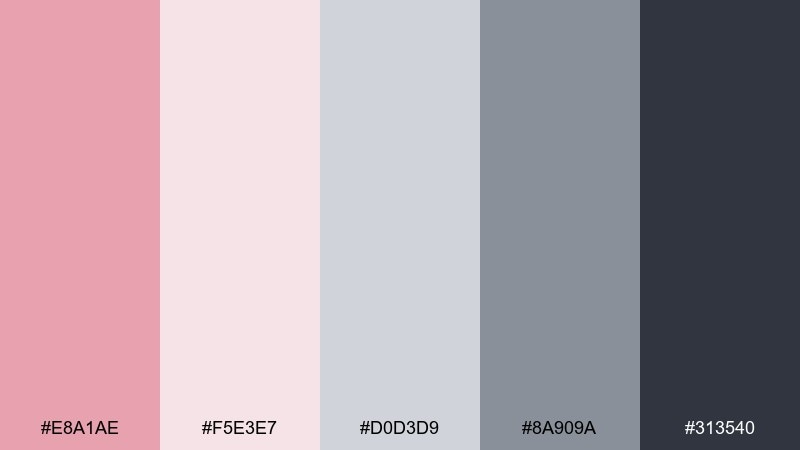
HEX: #E8A1AE #F5E3E7 #D0D3D9 #8A909A #313540
Mood: balanced, modern, versatile
Best for: corporate rebrands, presentations
Balanced and versatile, it mixes warm blush with cool office-ready grays. The contrast between soft pink and blue-gray makes charts, icons, and callouts feel modern without being trendy. Keep backgrounds light, and use the darkest gray for titles and key numbers. Tip: use blush for one consistent meaning, like highlights or positive states, across every slide.
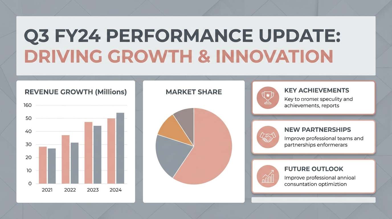
Image example of warm blush cool gray generated using media.io
19) Rosewood Shadow
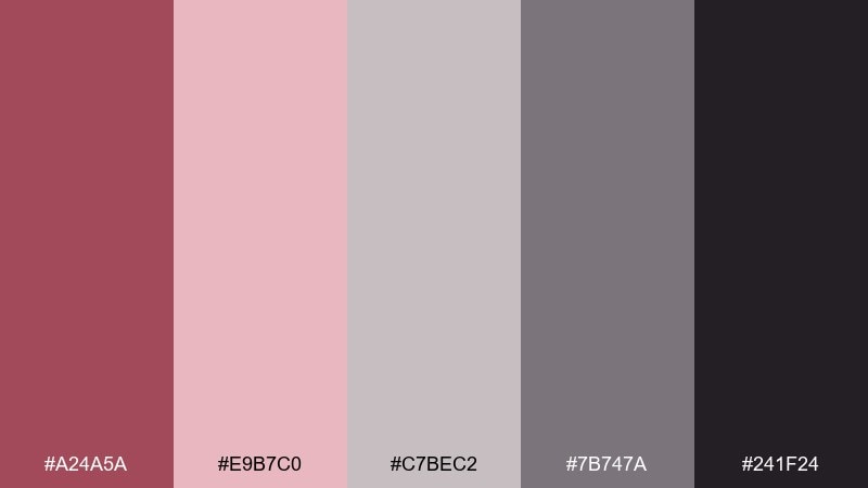
HEX: #A24A5A #E9B7C0 #C7BEC2 #7B747A #241F24
Mood: rich, intimate, luxe
Best for: premium packaging, boutique photography overlays
Rich and intimate, it brings rosewood warmth into a deep shadowy base. Use the darker red-rose as a signature accent on labels, seals, or small patterns. The pale pink supports gentle gradients, while grays help typography stay neutral and upscale. Tip: matte finishes and minimal foil details look especially good with these deeper tones.
Image example of rosewood shadow generated using media.io
20) Pink Frost Storm
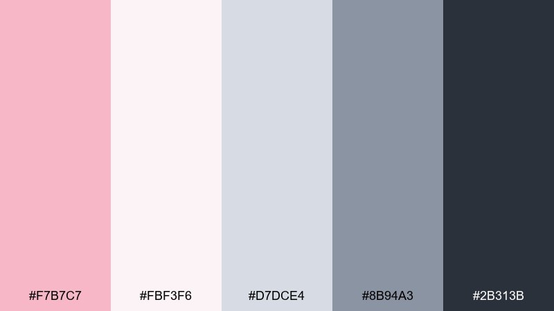
HEX: #F7B7C7 #FBF3F6 #D7DCE4 #8B94A3 #2B313B
Mood: crisp, wintry, modern
Best for: seasonal campaigns, newsletter templates
Crisp and wintry, it feels like pink frost settling over a stormy sky. The icy near-white keeps layouts bright, while the blue-leaning grays add a clean, contemporary edge. For pink gray color combinations in email, use blush for buttons and section headers, then keep body text in slate. Tip: add a thin border in the light gray to separate modules without heavy lines.
Image example of pink frost storm generated using media.io
What Colors Go Well with Pink Gray?
Dark blue is a natural partner for pink and gray because it adds authority and depth without turning the palette harsh. Navy accents also help pink feel more grown-up and brand-ready.
Warm neutrals like cream, sand, or soft taupe can make pink-gray schemes feel more inviting, especially for packaging and interior styling. If you want a cleaner, cooler look, try white plus steel blue-grays.
For extra contrast, small hits of metallics (silver, chrome, muted gold) or deep tones (black cherry, espresso) work well—just keep them as accents so the calm base stays intact.
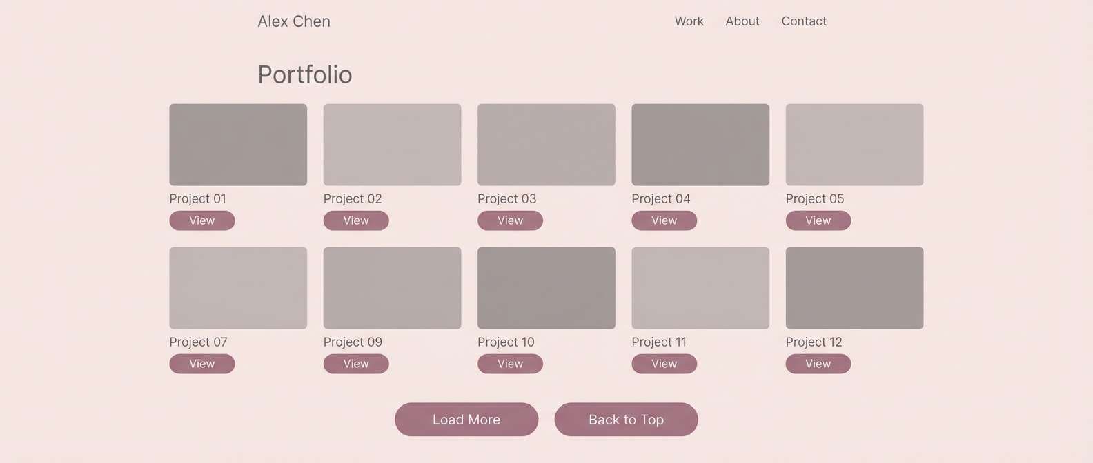
How to Use a Pink Gray Color Palette in Real Designs
In UI, treat gray as your system color: backgrounds, cards, borders, and typography. Then assign pink a single job—primary CTA, selected states, or highlights—so users learn what it means across the interface.
For branding and print, start with a light blush or off-white as the “paper” tone, and use mid-to-dark grays for readability. This keeps logos, labels, and layouts crisp while still feeling gentle.
In decor and moodboards, scale matters: use pink on larger soft surfaces (paint, textiles) and let gray define hard edges (metal, stone, frames). This prevents the space from feeling overly sweet.
Create Pink Gray Palette Visuals with AI
If you want to preview how a pink gray palette looks on a poster, UI mockup, invitation, or product shot, generate quick concept images before committing to final design files.
With Media.io’s text-to-image tool, you can paste a prompt, describe the layout style, and iterate until the mood and contrast feel right—then use the best result as a reference for your real build.
Pink Gray Color Palette FAQs
-
What vibe does a pink gray color palette create?
Most pink-gray palettes feel calm and modern: pink adds warmth or softness, while gray adds structure and professionalism. You can push it toward romantic (light blush + mist gray) or edgy (neon pink + gunmetal) by adjusting saturation and contrast. -
Is pink and gray a good combo for branding?
Yes—especially for beauty, wellness, lifestyle, and modern retail brands. Use gray for typography and layout consistency, then reserve pink for a signature accent (logo detail, buttons, badges) to keep the brand recognizable without feeling overly feminine. -
How do I keep pink-gray designs from looking washed out?
Add a reliable dark anchor (charcoal, near-black, or deep blue-gray) for headlines and key UI text. You can also introduce one higher-saturation pink as an accent so the palette has a clear focal point. -
What’s the best text color on blush backgrounds?
Deep charcoal or dark blue-gray usually reads best on blush because it maintains contrast without the harshness of pure black. For accessibility, test contrast ratios and avoid mid-gray text on light pink surfaces. -
What accent colors pair well with pink and gray?
Navy and dark blue are the easiest add-ons for depth and authority. Warm neutrals (cream, taupe) make it cozy, while metallics (silver or muted gold) add a premium finish in packaging and editorial design. -
How many pink shades should I use in one layout?
Typically one main pink plus one lighter tint is enough. Too many pinks can blur hierarchy—keep pink meaning consistent (e.g., CTA/selected state only) and let grays handle the rest of the system. -
Can I use pink-gray palettes in corporate or SaaS design?
Absolutely—choose cooler grays (steel/blue-gray) and a restrained blush accent. Used for highlights, tags, or positive states, pink can feel modern and distinct without compromising a professional tone.
Next: Dark Blue Color Palette


