

Pastel yellow is the sweet spot between sunny and subtle: it adds warmth, clarity, and a “new” feeling without the harshness of bright primary yellow.
Below are 20 curated pastel yellow color palette ideas (with HEX codes) you can use for branding, UI, invitations, packaging, and content design—plus AI prompts to generate matching visuals fast.
In this article
- Why Pastel Yellow Palettes Work So Well
-
- lemon chiffon morning
- buttercream neutrals
- sunny sage garden
- vanilla peach glow
- daffodil denim pop
- honey oat minimal
- soft sunlit coral
- pastel yellow and charcoal
- citrus mint splash
- creamy lavender dream
- apricot sandstone
- pale gold and teal
- sunbeam rosewater
- foggy yellow blues
- warm linen studio
- spring picnic pastels
- golden milk matcha
- light mustard and plum
- yellow mist monochrome
- sunwashed terracotta
- What Colors Go Well with Pastel Yellow?
- How to Use a Pastel Yellow Color Palette in Real Designs
- Create Pastel Yellow Palette Visuals with AI
Why Pastel Yellow Palettes Work So Well
Pastel yellow brings “light” into a design—emotionally and visually—so layouts feel more welcoming, optimistic, and human. It’s especially effective when you want warmth without the intensity of saturated yellows.
Because it sits close to neutral in many contexts, pastel yellow can behave like a soft background tone while still adding personality. That makes it great for modern branding and UI where whitespace and spacing are part of the aesthetic.
It also pairs easily: you can push it playful with coral and sky blue, or keep it premium with charcoal, warm grays, and creamy off-whites.
20+ Pastel Yellow Color Palette Ideas (with HEX Codes)
1) Lemon Chiffon Morning
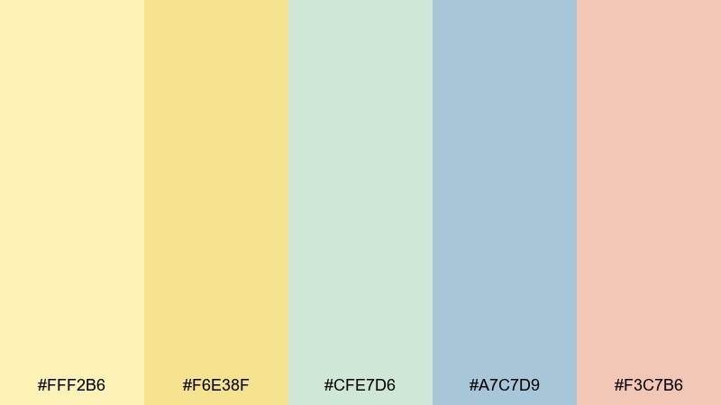
HEX: #FFF2B6 #F6E38F #CFE7D6 #A7C7D9 #F3C7B6
Mood: fresh, airy, optimistic
Best for: spring hero banners and lifestyle illustrations
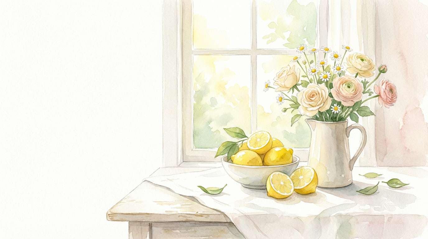
Fresh and airy like early sunlight on a kitchen counter, these tones feel clean and upbeat without getting loud. Use it for seasonal hero sections, blog headers, and light lifestyle visuals where you want warmth with plenty of whitespace. Pair the soft yellow with mint for calm balance, then let the dusty blue handle readability for text and icons. Tip: keep the coral as a tiny accent for calls to action so the layout stays breezy.
Image example of lemon chiffon morning generated using media.io
Media.io is an online AI studio for creating and editing video, image, and audio in your browser.

2) Buttercream Neutrals
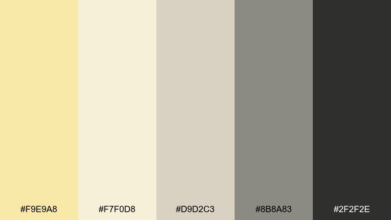
HEX: #F9E9A8 #F7F0D8 #D9D2C3 #8B8A83 #2F2F2E
Mood: soft, refined, minimalist
Best for: minimal website UI and modern landing pages
Soft and refined like buttercream against linen, this mix reads premium and calm. As a pastel yellow color palette, it shines in minimalist UI where contrast and spacing do the heavy lifting. Use the off-white for large surfaces, the warm gray for dividers and secondary text, and the near-black for headlines. Tip: reserve the yellow for highlights and states so it feels intentional, not washed out.
Image example of buttercream neutrals generated using media.io
3) Sunny Sage Garden
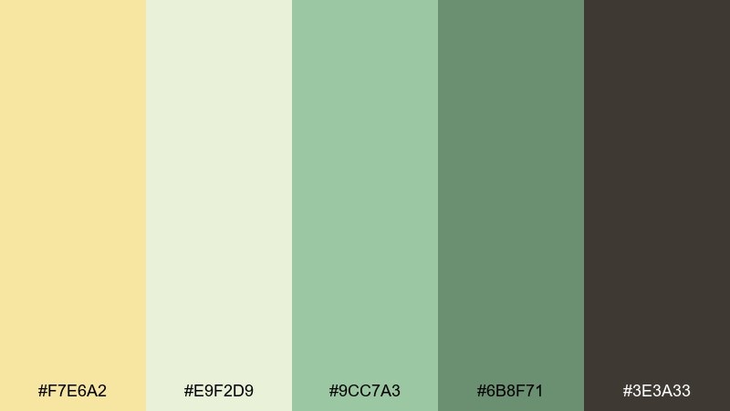
HEX: #F7E6A2 #E9F2D9 #9CC7A3 #6B8F71 #3E3A33
Mood: natural, grounded, soothing
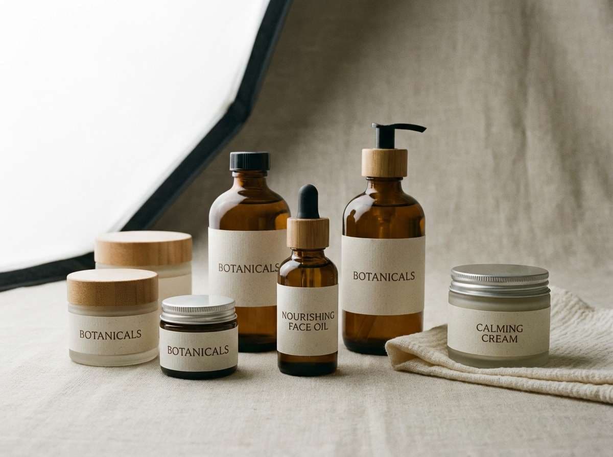
Best for: botanical skincare packaging and wellness branding
Natural and grounded like a herb garden in soft sun, these hues feel restorative and trustworthy. The sage range gives you structure for labels, while the yellow keeps the overall look friendly and bright. Pair with recycled-paper textures, simple line illustrations, and a dark neutral for ingredient text. Tip: use the deep green sparingly as a logo anchor so the palette stays light.
Image example of sunny sage garden generated using media.io
4) Vanilla Peach Glow
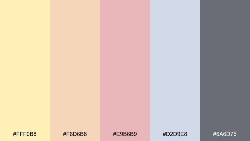
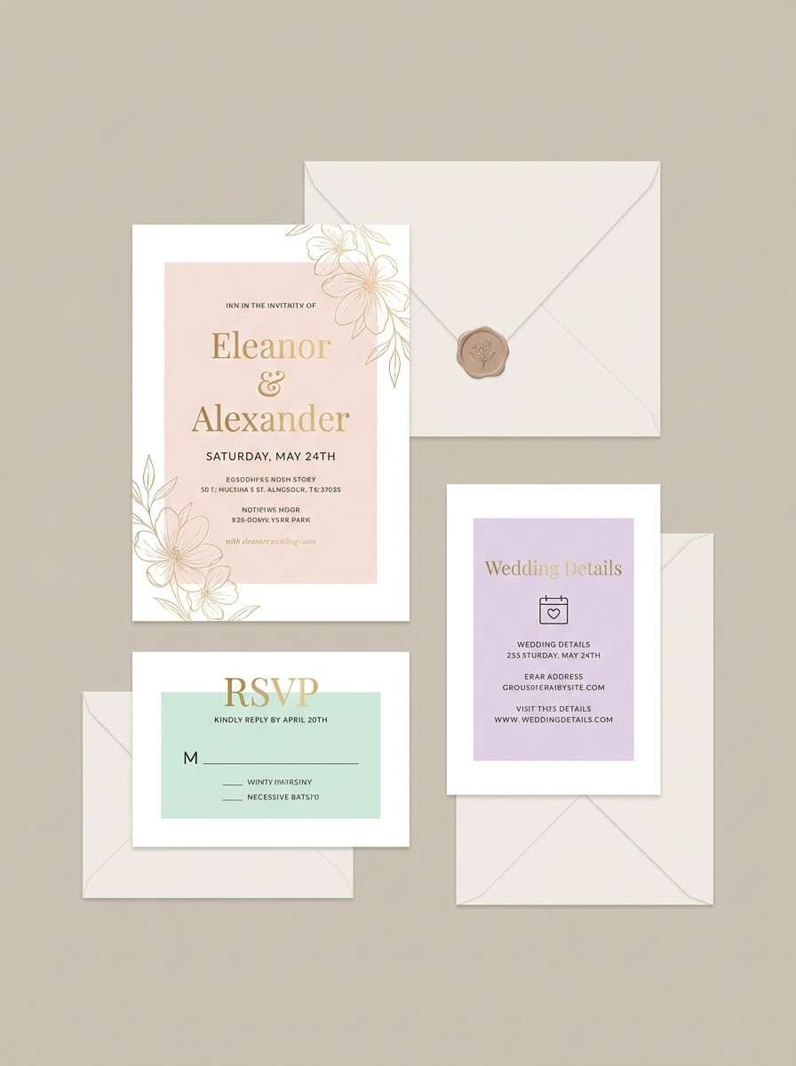
HEX: #FFF0B8 #F6D6B8 #E9B6B9 #D2D9E8 #6A6D75
Mood: romantic, warm, delicate
Best for: wedding invitations and bridal stationery
Romantic and warm like vanilla frosting with a peach blush, this set feels gentle and celebratory. It works beautifully for invitation suites, RSVP cards, and place settings where softness matters more than contrast. Let the gray-blue support typography and line art, while the peach and rose provide small decorative moments. Tip: print on textured stock to keep the light yellow from feeling too flat.
Image example of vanilla peach glow generated using media.io
5) Daffodil Denim Pop
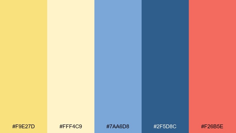
HEX: #F9E27D #FFF4C9 #7AA6D8 #2F5D8C #F26B5E
Mood: playful, punchy, youthful
Best for: social promos and bold campaign posters
Playful and punchy like daffodils against a favorite denim jacket, this set brings instant energy. Use the deep blue for type and shapes, then let the yellow carry the background and spotlight moments. Coral works best as a bright accent for prices, badges, or micro-illustrations. Tip: keep gradients out and use flat blocks so the colors stay crisp on small screens.
Image example of daffodil denim pop generated using media.io

6) Honey Oat Minimal
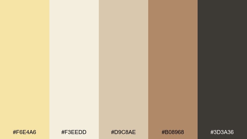
HEX: #F6E4A6 #F3EEDD #D9C8AE #B08968 #3D3A36
Mood: cozy, calm, artisanal
Best for: cafe menus and small food brands
Cozy and calm like honey stirred into warm oats, these tones feel handmade and welcoming. For pastel yellow color combinations that still read premium, lean on the oat cream as your base and use the warm brown for headings and section rules. It suits cafe menus, bakery labels, and packaging that needs an approachable craft vibe. Tip: add plenty of line spacing and use the mid beige for subtle table shading instead of heavy borders.
Image example of honey oat minimal generated using media.io
7) Soft Sunlit Coral
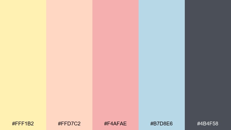
HEX: #FFF1B2 #FFD7C2 #F4AFAE #B7D8E6 #4B4F58
Mood: bright, friendly, flattering
Best for: beauty ads and skincare product visuals
Bright and flattering like sunlit cheeks, this mix feels friendly and editorial at the same time. The coral and rose deliver the glow, while the cool blue keeps the composition from turning too sugary. Use the charcoal for claims and ingredient callouts so it remains readable over light backgrounds. Tip: on product ads, keep the coral behind the hero item and use the yellow as a soft halo.
Image example of soft sunlit coral generated using media.io
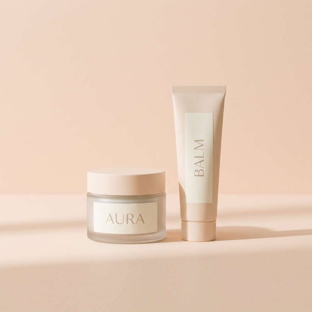
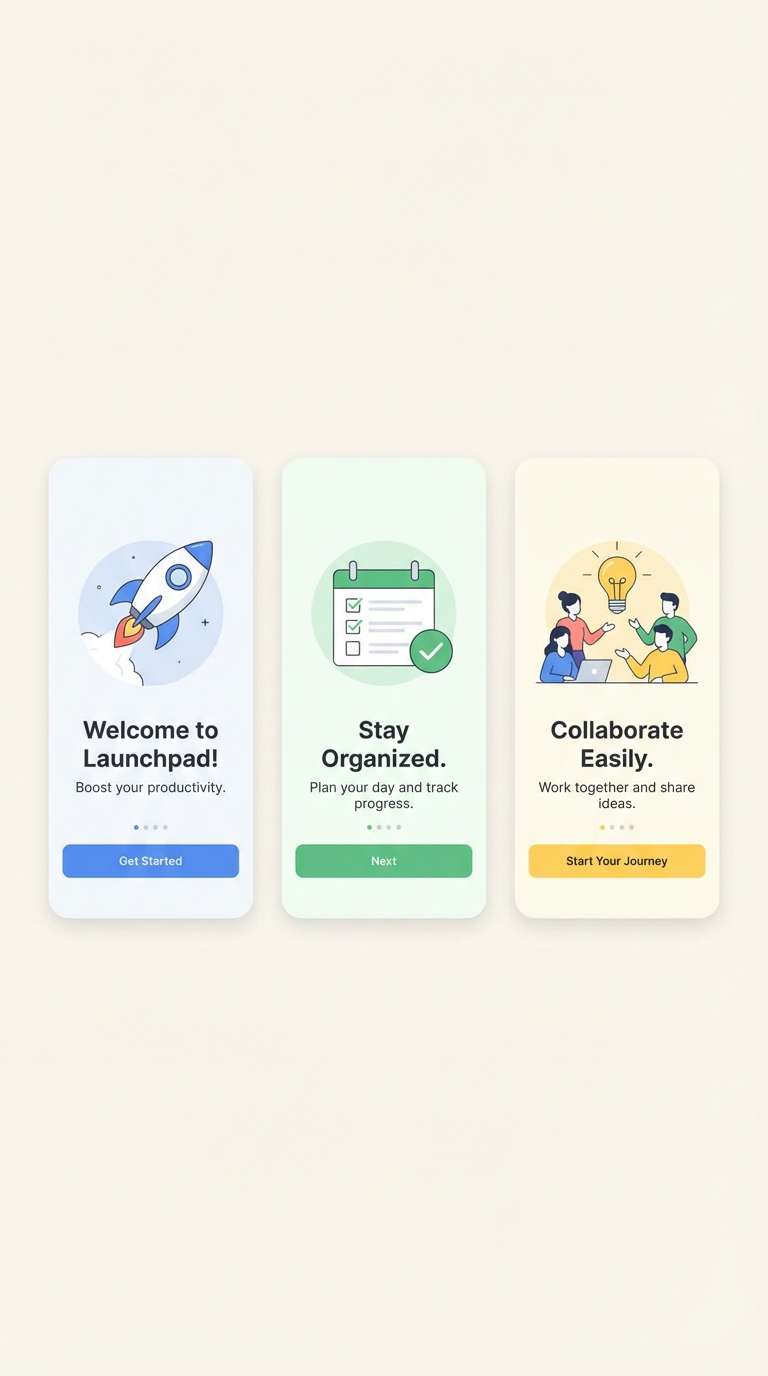
8) Pastel Yellow and Charcoal
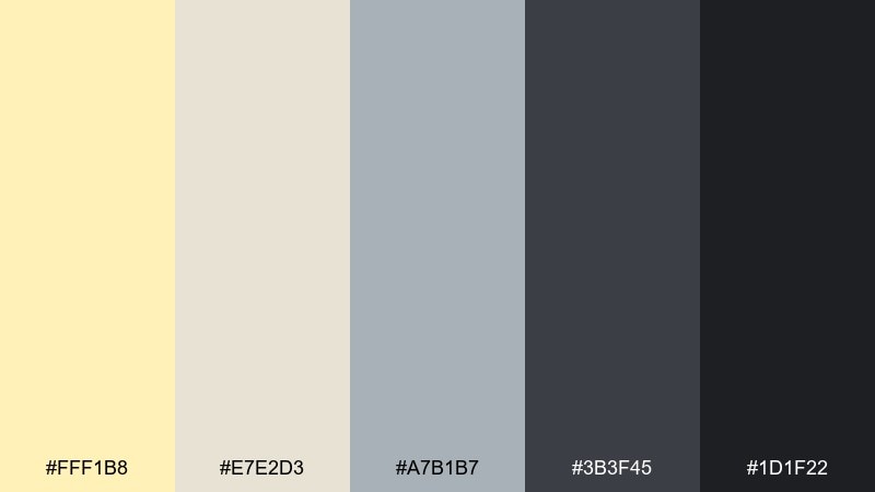
HEX: #FFF1B8 #E7E2D3 #A7B1B7 #3B3F45 #1D1F22
Mood: modern, confident, high-contrast
Best for: app onboarding and product UI
Modern and confident like warm light in a sleek studio, this palette leans crisp and professional. Use the charcoal range for navigation, icons, and body text, then bring in the yellow for progress, highlights, and success states. The soft stone neutral helps separate panels without harsh borders. Tip: test accessibility early and push the darkest shade for small text to keep the UI sharp.
Image example of pastel yellow and charcoal generated using media.io
9) Citrus Mint Splash
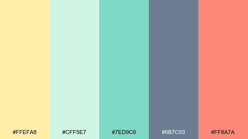
HEX: #FFEFA8 #CFF5E7 #7ED9C6 #6B7C93 #FF8A7A
Mood: fresh, lively, summery
Best for: summer event flyers and pop-up announcements
Fresh and lively like citrus soda with mint, these colors feel energetic without turning neon. The mint and teal are great for large shapes and backgrounds, while the slate keeps text stable and readable. Use the warm coral as a single attention-grabber for dates or ticket links. Tip: combine rounded shapes with lots of whitespace to maintain the light, fizzy vibe.
Image example of citrus mint splash generated using media.io
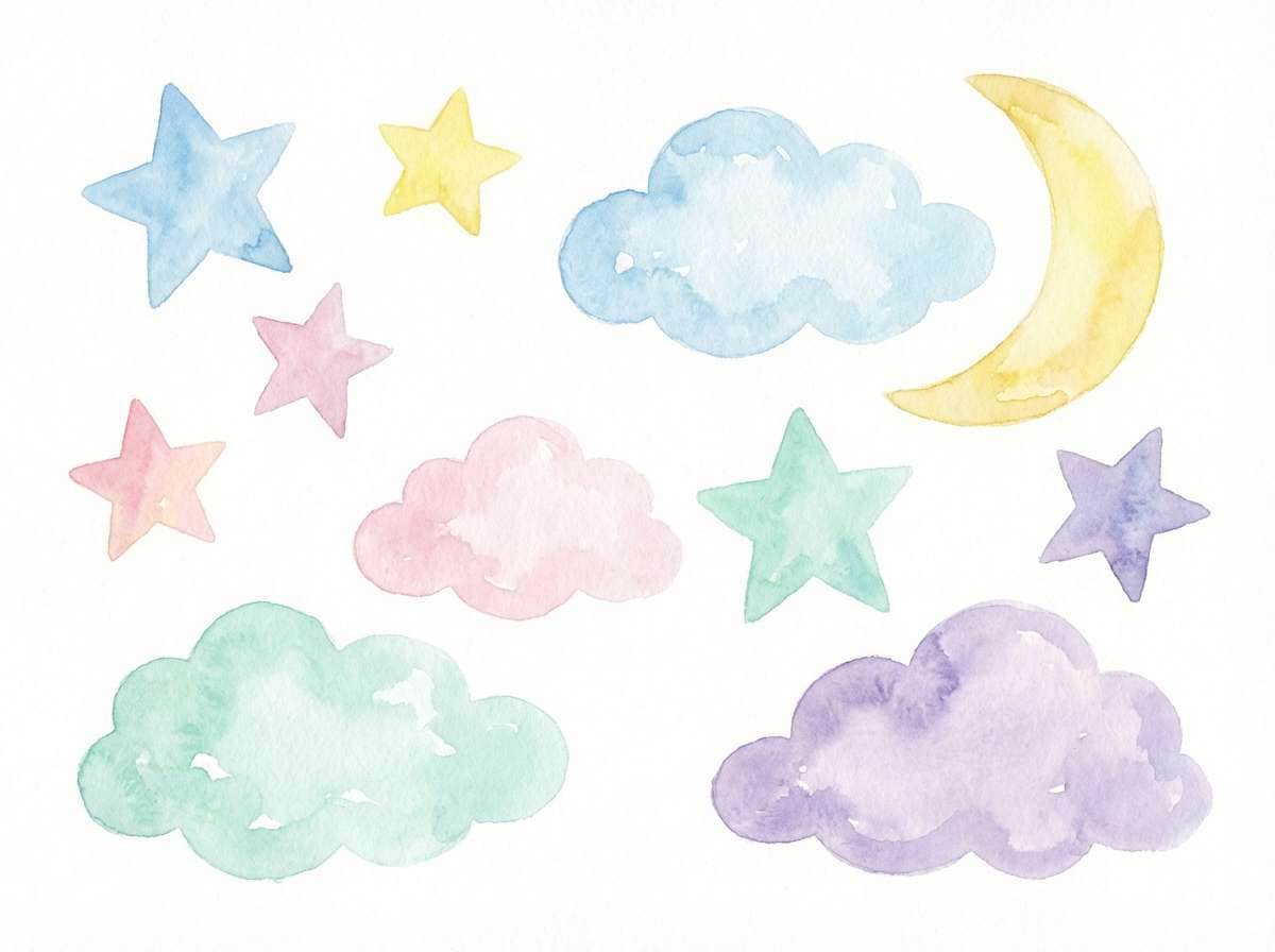
10) Creamy Lavender Dream
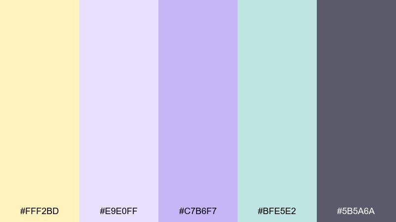
HEX: #FFF2BD #E9E0FF #C7B6F7 #BFE5E2 #5B5A6A
Mood: dreamy, gentle, soothing
Best for: nursery art and calming illustrations
Dreamy and gentle like a bedtime story under soft lamps, this mix feels calm and comforting. Lavender and mint create a quiet backdrop, while the pale yellow adds warmth so the design never feels cold. It works well for nursery prints, wellness content, and soft editorial graphics. Tip: keep contrast moderate and use the deep gray only for titles or small details.
Image example of creamy lavender dream generated using media.io
11) Apricot Sandstone
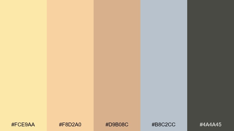
HEX: #FCE9AA #F8D2A0 #D9B08C #B8C2CC #4A4A45
Mood: warm, tasteful, editorial
Best for: interior mood boards and lifestyle editorials
Warm and tasteful like apricot light on sandstone, these tones feel curated and grown-up. Use it for interior mood boards, magazine-style graphics, and brand stories where a muted warmth reads premium. The blue-gray supports captions and grid lines, and the dark neutral is strong enough for small type. Tip: keep images slightly desaturated so the palette remains the hero.
Image example of apricot sandstone generated using media.io
12) Pale Gold and Teal
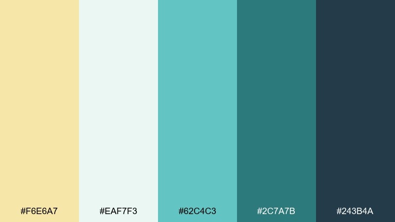
HEX: #F6E6A7 #EAF7F3 #62C4C3 #2C7A7B #243B4A
Mood: clean, smart, optimistic
Best for: slide decks and tech brand graphics
Clean and smart like a polished dashboard with a sunny edge, this set feels modern and optimistic. Teal delivers a confident accent for charts and highlights, while pale gold keeps the mood friendly. Use the deep blue for titles and the mid teal for buttons and links. Tip: in presentations, keep backgrounds near-white and use gold only for key takeaways.
Image example of pale gold and teal generated using media.io

13) Sunbeam Rosewater
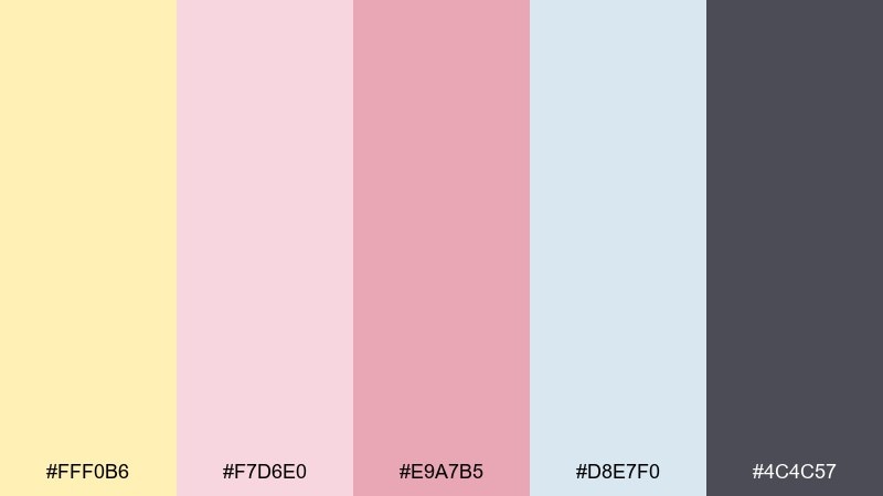
HEX: #FFF0B6 #F7D6E0 #E9A7B5 #D8E7F0 #4C4C57
Mood: soft, polished, romantic
Best for: bridal beauty branding and product labels
Soft and polished like rosewater in morning light, these colors lean elegant and flattering. The blush shades are perfect for beauty branding, while the pale blue keeps layouts feeling clean rather than overly sweet. Use the dark gray for ingredient lists and small-print compliance text. Tip: set blush as a secondary accent and let the yellow quietly brighten negative space.
Image example of sunbeam rosewater generated using media.io
14) Foggy Yellow Blues
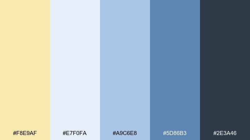
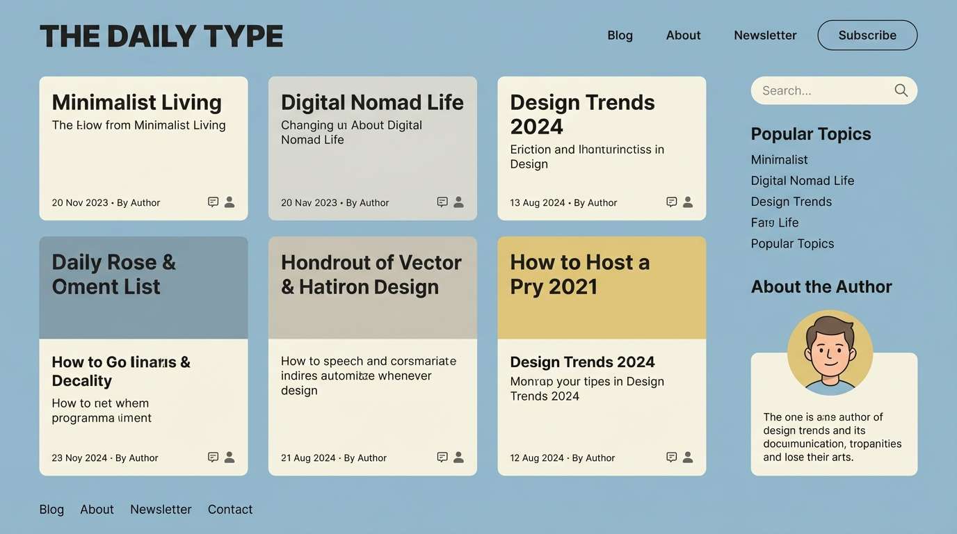
HEX: #F8E9AF #E7F0FA #A9C6E8 #5D86B3 #2E3A46
Mood: cool, calm, coastal
Best for: blog themes, newsletters, and calm UI
Cool and calm like a foggy seaside morning, this palette balances warmth with crisp blues. Use the light blue for page backgrounds and the deeper blue for links and hover states. The soft yellow works best as a highlight for tags, badges, and subtle emphasis. Tip: keep body text on the darkest shade to avoid a washed look on pale surfaces.
Image example of foggy yellow blues generated using media.io
15) Warm Linen Studio
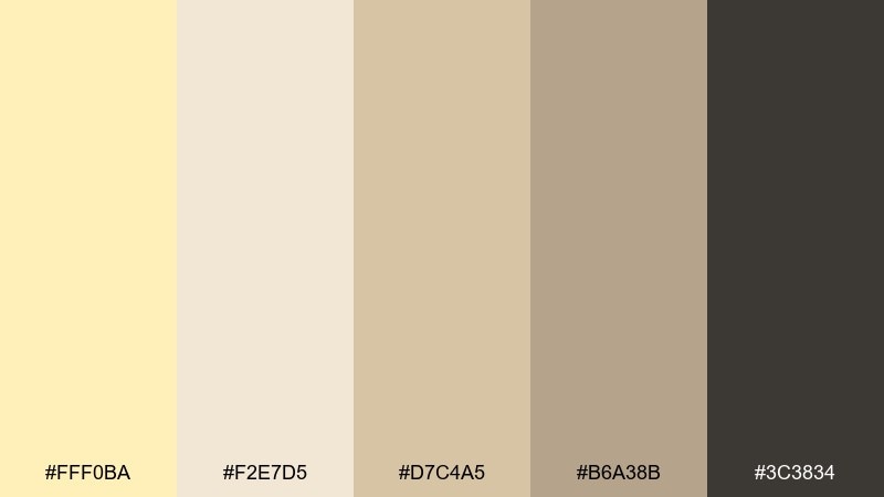
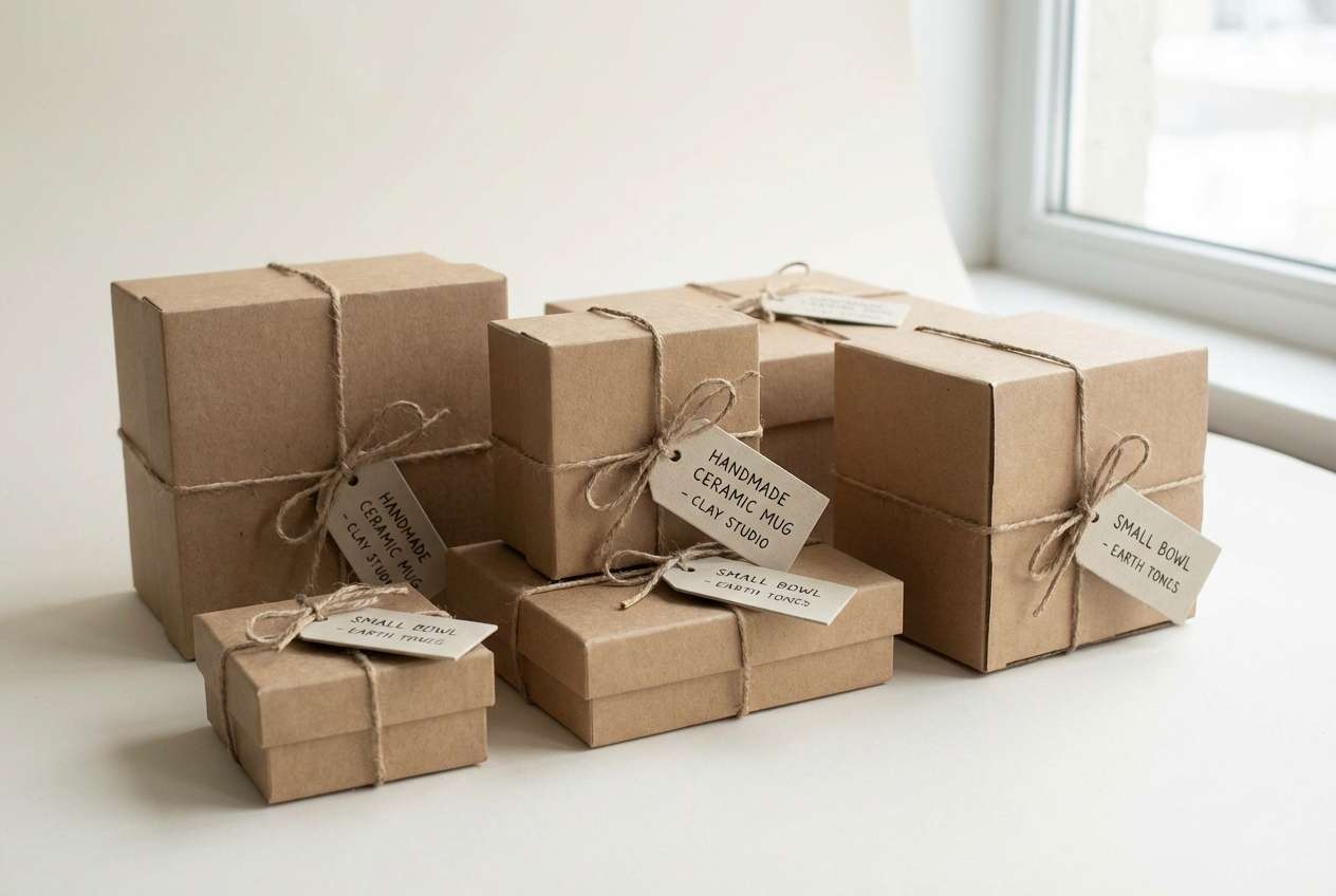
HEX: #FFF0BA #F2E7D5 #D7C4A5 #B6A38B #3C3834
Mood: earthy, calm, studio-clean
Best for: ceramics branding and handmade product packaging
Earthy and calm like linen backdrops in a pottery studio, these tones feel grounded and tactile. Use the creams and beiges for packaging bases and wrap paper, then set the dark neutral for logos and barcodes. It pairs well with embossing, kraft textures, and minimal line art. Tip: introduce the mid beige as a band or label strip to create structure without harsh contrast.
Image example of warm linen studio generated using media.io
16) Spring Picnic Pastels
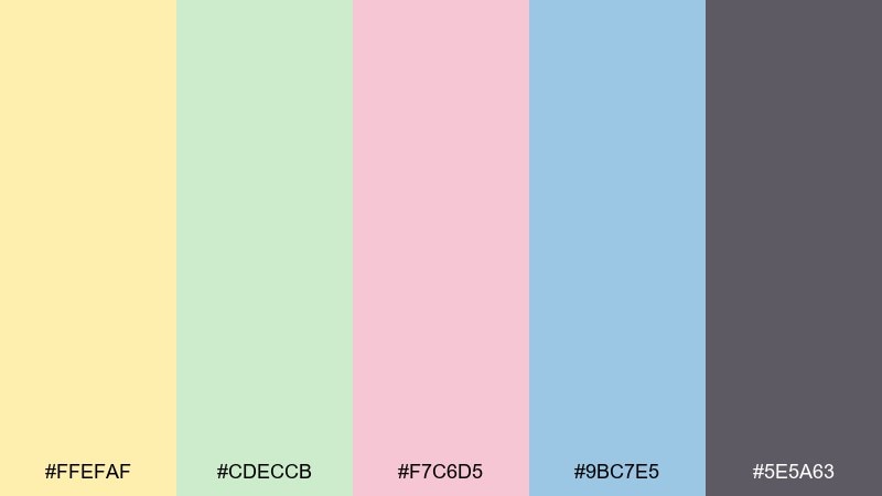
HEX: #FFEFAF #CDECCB #F7C6D5 #9BC7E5 #5E5A63
Mood: cheerful, light, nostalgic
Best for: spring festival posters and event branding
Cheerful and nostalgic like a picnic blanket in a flower field, this mix feels playful yet tidy. For pastel yellow color combinations that need to stay legible, use the deep gray for all type and keep the colorful pastels for shapes and illustrations. It works well for spring festivals, craft fairs, and community events that want a friendly tone. Tip: pick one accent per layout section so the design stays organized.
Image example of spring picnic pastels generated using media.io

17) Golden Milk Matcha
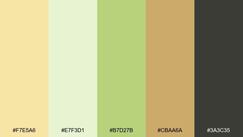
HEX: #F7E5A6 #E7F3D1 #B7D27B #CBAA6A #3A3C35
Mood: wholesome, modern, cafe-cool
Best for: beverage labels and cafe packaging
Wholesome and modern like golden milk beside an iced matcha, these colors feel trendy but relaxed. Use the pale yellow and milk-foam cream as background tones, then let the matcha green carry brand accents and patterning. The caramel note adds warmth for seals, caps, or secondary labels. Tip: keep the darkest neutral for nutrition text so the label stays readable at a glance.
Image example of golden milk matcha generated using media.io
18) Light Mustard and Plum
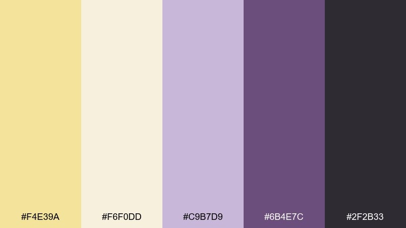
HEX: #F4E39A #F6F0DD #C9B7D9 #6B4E7C #2F2B33
Mood: artsy, moody, sophisticated
Best for: fashion editorials and lookbook layouts
Artsy and sophisticated like a gallery poster with a warm spotlight, this set brings quiet drama. Use plum for headlines, pull quotes, and section dividers, then let the light mustard brighten margins and negative space. It pairs well with serif typography, grainy photo treatments, and minimal line work. Tip: keep backgrounds creamy instead of pure white to make the plum feel richer.
Image example of light mustard and plum generated using media.io
19) Yellow Mist Monochrome
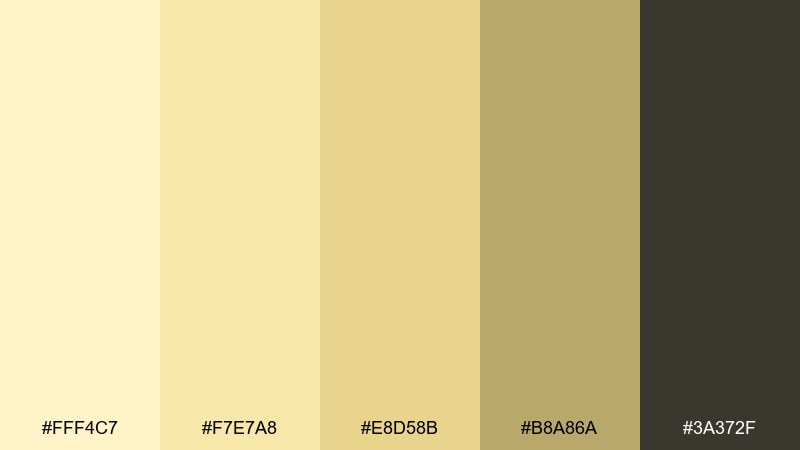
HEX: #FFF4C7 #F7E7A8 #E8D58B #B8A86A #3A372F
Mood: subtle, cohesive, quietly bold
Best for: monochrome dashboards and data-heavy UI
Subtle and cohesive like a soft fog of warm light, these near-monochrome tones feel surprisingly bold. Use the lightest shade for large panels, then step down through the golds for cards, tables, and chart fills. The deep brown-black is strong enough for dense data and small labels. Tip: add one thin outline color only, otherwise the layered yellows will do the work.
Image example of yellow mist monochrome generated using media.io
20) Sunwashed Terracotta
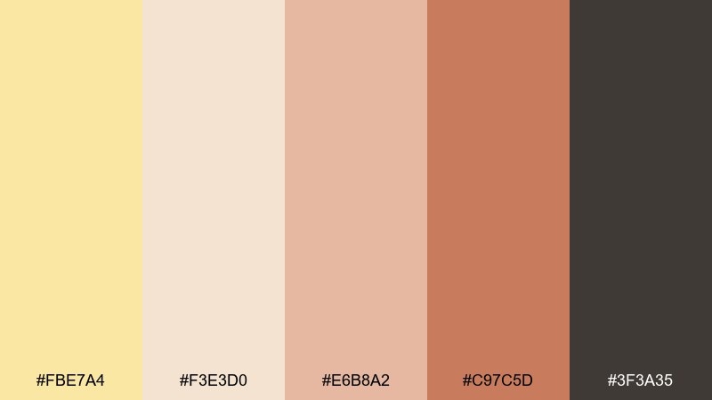
HEX: #FBE7A4 #F3E3D0 #E6B8A2 #C97C5D #3F3A35
Mood: sunbaked, cozy, Mediterranean
Best for: home decor ads and lifestyle product shots
Sunbaked and cozy like terracotta tiles warmed all afternoon, these colors feel inviting and grounded. Use the creamy neutrals for backgrounds and negative space, then let terracotta and clay tones carry the product story. The dark neutral is ideal for small type and brand marks without fighting the warm palette. Tip: in product ads, keep props minimal and use one terracotta accent to avoid a heavy look.
Image example of sunwashed terracotta generated using media.io
What Colors Go Well with Pastel Yellow?
Pastel yellow pairs beautifully with cool tones like dusty blue, denim, slate, and teal—these add structure and keep the overall look modern and readable. This is why pastel yellow is so common in UI palettes and editorial layouts.
For softer, romantic combinations, blend pastel yellow with blush, peach, rose, and lavender. These keep the vibe gentle and celebratory for invitations, beauty branding, and spring campaigns.
If you want a premium or tech-forward feel, anchor pastel yellow with charcoal, near-black, and warm grays. The contrast makes yellow feel intentional—great for highlights, states, and key messages.
How to Use a Pastel Yellow Color Palette in Real Designs
Start by choosing your “job” for pastel yellow: background glow, gentle highlight, or primary brand color. Most modern designs work best when yellow is used in larger soft surfaces or small accents—not both at the same intensity.
For readability, pair pastel yellow backgrounds with dark neutrals (charcoal, deep navy, deep brown-black) for body text. Use mid-tone blues/teals for links and UI actions, and keep saturation consistent across accents.
In print (menus, labels, invitations), consider texture: uncoated or lightly textured stock helps pale yellows feel richer. Keep thin lines and small text in the darkest palette color to avoid a washed-out finish.
Create Pastel Yellow Palette Visuals with AI
Want matching visuals that actually look like your palette? Use your chosen colors as style guidance, then generate branded mockups, posters, UI concepts, or product scenes with a consistent mood.
Pick one palette above, reuse its prompt, and swap the subject (e.g., “flyer” → “Instagram post” or “skincare jar” → “candle label”). Keeping composition cues (minimal background, soft diffused light, flat vector) helps the output stay on-style.
With Media.io’s text-to-image, you can iterate fast: generate a few options, choose the closest match, then fine-tune the prompt for lighting, whitespace, and typography placement.
Pastel Yellow Color Palette FAQs
-
What is a pastel yellow HEX code?
Common pastel yellow HEX values include #FFF1B8, #FFF2BD, and #FFEFAF. The best choice depends on whether you want a creamier yellow (more white) or a warmer buttery yellow (slightly deeper). -
Is pastel yellow good for website UI?
Yes—pastel yellow works well for backgrounds, highlights, badges, and friendly brand accents. For accessibility, pair it with dark text (charcoal/near-black) and test contrast before using it behind small UI labels. -
What colors pair best with pastel yellow?
Dusty blues, denim/navy, teals, sages, warm grays, blush/peach, and lavender are the most reliable pairings. Charcoal anchors the palette when you need a modern, high-contrast look. -
How do I keep pastel yellow from looking “babyish”?
Add a strong neutral (charcoal, deep blue, or dark brown) and keep layouts minimal with clean typography. Using yellow as a controlled accent (instead of everywhere) also makes the palette feel more grown-up. -
Can I use pastel yellow for branding and packaging?
Absolutely—pastel yellow is popular for wellness, cafe, skincare, and handmade product brands because it feels warm and approachable. Use darker inks for small-print text and consider textured materials to make pale yellow feel premium. -
What’s the difference between butter yellow and pastel yellow?
Butter yellow is typically warmer and slightly deeper, while pastel yellow is lighter and more muted (closer to white). Both are soft, but butter yellow reads richer and more “golden.” -
How can I generate images that match my pastel yellow palette?
Use a consistent prompt style (lighting, minimal background, vector vs. photo) and iterate. Start with the example prompts above in Media.io, then refine keywords like “soft diffused light,” “clean negative space,” or “flat color blocking” to keep results cohesive.


