

An orange gray color palette is a modern classic: orange brings energy and personality, while gray adds control, clarity, and a premium neutral base.
Below are 20 orange gray palettes with HEX codes, plus practical tips for using them in branding, UI, packaging, and interiors.
In this article
- Why Orange Gray Palettes Work So Well
-
- ember concrete
- sunrise slate
- citrus steel
- terracotta fog
- apricot graphite
- pumpkin ash
- copper pebble
- tangerine storm
- persimmon smoke
- marigold charcoal
- burnt sienna drift
- amber alloy
- orange peel minimal
- rust and raincloud
- coral cinder
- saffron urbanite
- papaya stone
- firelight cement
- autumn signal
- neon safety gray
- What Colors Go Well with Orange Gray?
- How to Use a Orange Gray Color Palette in Real Designs
- Create Orange Gray Palette Visuals with AI
Why Orange Gray Palettes Work So Well
Orange and gray work because they naturally balance temperature and emotion: orange feels warm, active, and human, while gray reads cool, stable, and professional.
That contrast creates instant hierarchy in designs. Grays can carry typography, grids, and surfaces, while orange becomes a controlled accent for CTAs, highlights, and key information.
It’s also a flexible pairing across industries—from fintech to fashion—because you can shift the vibe by changing saturation: bright orange feels energetic, burnt orange feels premium, and soft apricot feels calm.
20+ Orange Gray Color Palette Ideas (with HEX Codes)
1) Ember Concrete
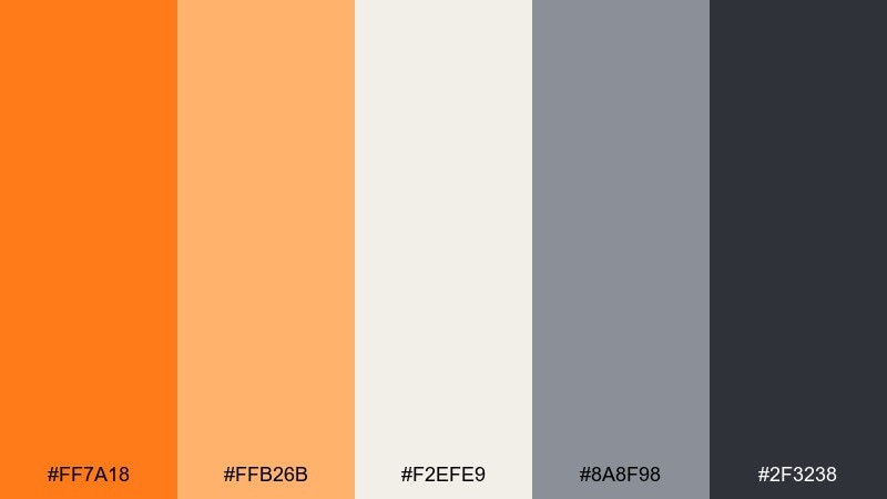
HEX: #ff7a18 #ffb26b #f2efe9 #8a8f98 #2f3238
Mood: bold, grounded, modern
Best for: brand identity systems and website hero banners
Bold ember warmth against concrete neutrals feels like city lights on wet pavement. Use the deep charcoal for headlines, the mid gray for UI structure, and the soft off-white to keep layouts breathable. The bright orange works best as a controlled accent for buttons, badges, or key data points. Tip: keep orange coverage under 15 percent to preserve a premium, modern look.
Image example of ember concrete generated using media.io
Media.io is an online AI studio for creating and editing video, image, and audio in your browser.

2) Sunrise Slate
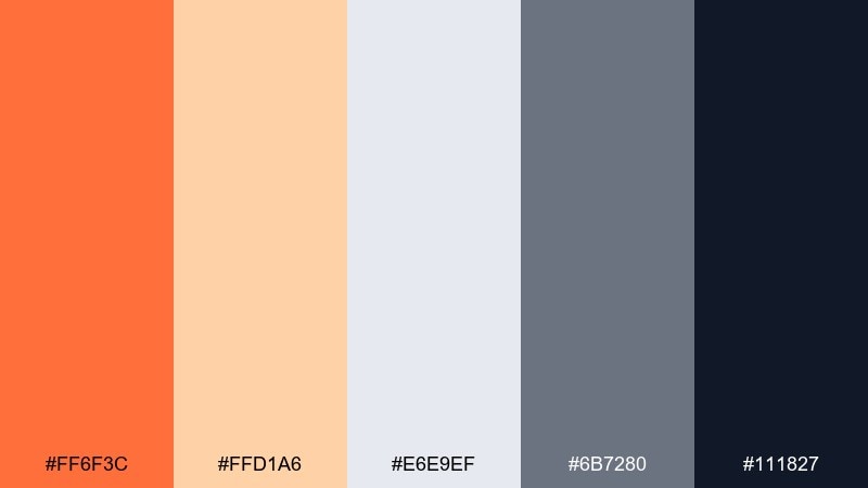
HEX: #ff6f3c #ffd1a6 #e6e9ef #6b7280 #111827
Mood: fresh, optimistic, crisp
Best for: dashboard UI and analytics visuals
Fresh sunrise tones over slate shadows give a clean, early-morning clarity. As an orange gray color palette, it excels when the light peach is used for panels and the dark navy-charcoal anchors navigation. Reserve the vivid orange for primary CTAs and chart highlights to guide attention fast. Tip: pair with thin-line icons and generous spacing to keep the interface feeling airy.
Image example of sunrise slate generated using media.io
3) Citrus Steel
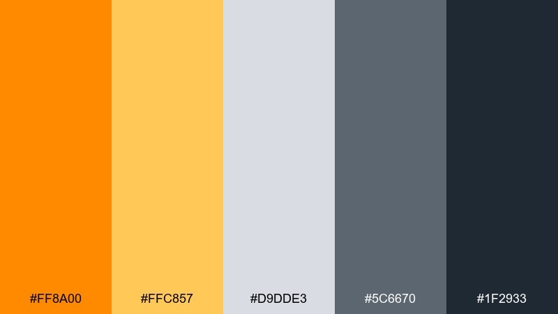
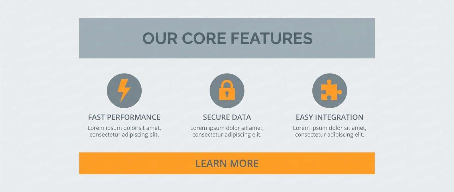
HEX: #ff8a00 #ffc857 #d9dde3 #5c6670 #1f2933
Mood: energetic, industrial, sharp
Best for: tech product landing pages and feature sections
Energetic citrus pops against steel grays like safety markings on brushed metal. Use the golden tone for secondary highlights and keep the brightest orange for one main action per screen. The cool light gray makes an excellent background for cards, while the dark slate supports readable headings. Tip: add subtle 1px dividers in mid gray to maintain an engineered, precise feel.
Image example of citrus steel generated using media.io
4) Terracotta Fog
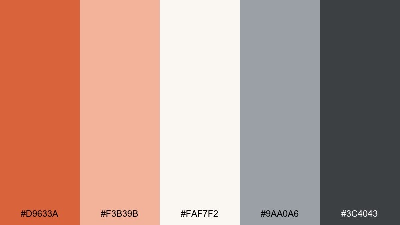
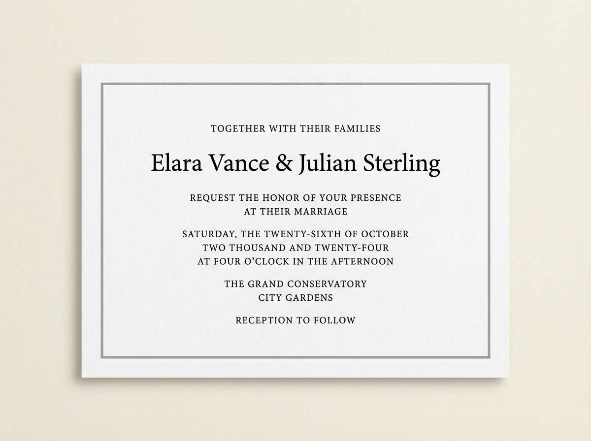
HEX: #d9633a #f3b39b #faf7f2 #9aa0a6 #3c4043
Mood: soft, cozy, elegant
Best for: wedding invitations and event stationery
Soft terracotta drifting through pale fog feels romantic and tactile, like clay and linen. Use the creamy white as the paper base, then set body text in the deeper gray to stay legible. The muted orange works beautifully for monograms, borders, and small floral motifs without looking loud. Tip: add a hint of texture in the background while keeping typography refined and minimal.
Image example of terracotta fog generated using media.io
5) Apricot Graphite
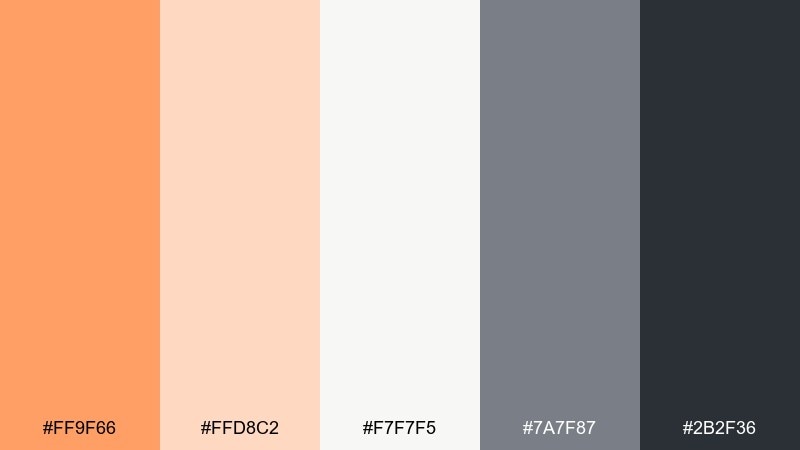
HEX: #ff9f66 #ffd8c2 #f7f7f5 #7a7f87 #2b2f36
Mood: warm, minimalist, polished
Best for: modern interiors and home decor moodboards
Warm apricot against graphite reads like a sunlit room with matte stone details. Use the soft peach as an accent for textiles, art, or small decor, while graphite grounds larger surfaces and furniture silhouettes. The near-white keeps the scene clean and contemporary, especially with natural wood or black metal. Tip: repeat the mid gray in two to three places to create visual rhythm without clutter.
Image example of apricot graphite generated using media.io
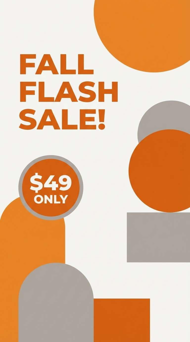
6) Pumpkin Ash
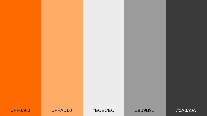
HEX: #ff6a00 #ffad66 #ececec #9b9b9b #3a3a3a
Mood: confident, punchy, street-smart
Best for: social media story ads and promo graphics
Punchy pumpkin tones over ash grays feel like street posters under neon lights. These orange gray color combinations work best when the darkest gray carries typography and the bright orange is reserved for price tags or limited-time labels. Use the pale gray as breathing space so the design stays readable on mobile. Tip: keep contrast high and use bold type weights to maintain impact at small sizes.
Image example of pumpkin ash generated using media.io
7) Copper Pebble
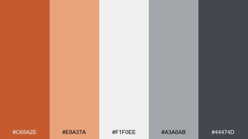
HEX: #c65a2e #e8a37a #f1f0ee #a3a6ab #44474d
Mood: artisan, earthy, refined
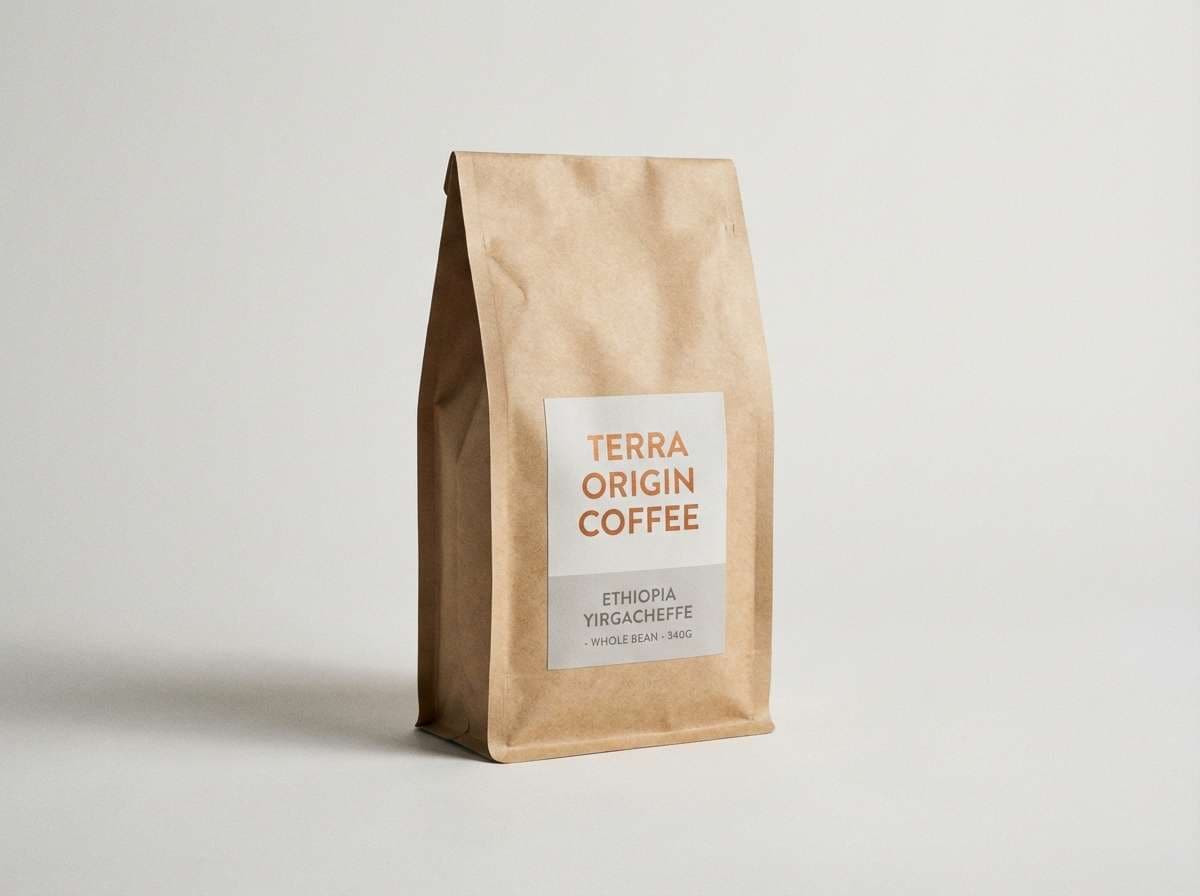
Best for: coffee packaging and craft product labels
Artisan copper with pebble grays evokes roasted beans, pottery, and hand-stamped paper. Let the creamy neutral act as the label base while the darker gray handles ingredients and legal copy. Copper is ideal for a logo mark or seal, especially when paired with a subtle grain texture. Tip: add small copper linework to frame the layout without overwhelming the product name.
Image example of copper pebble generated using media.io
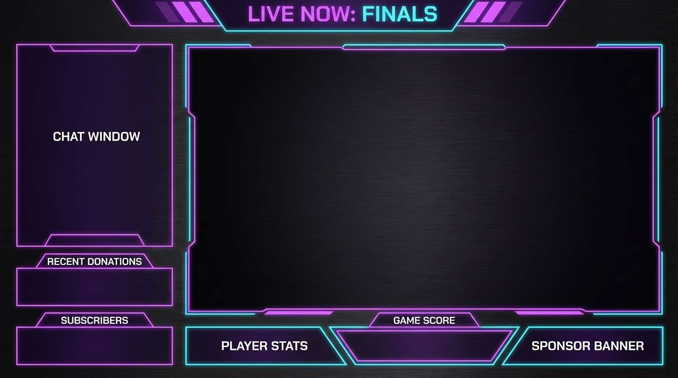
8) Tangerine Storm
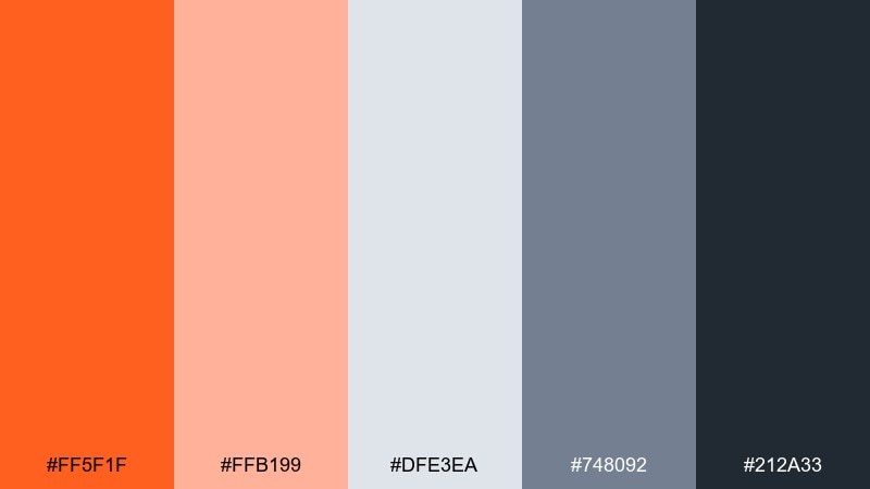
HEX: #ff5f1f #ffb199 #dfe3ea #748092 #212a33
Mood: dynamic, edgy, tech-forward
Best for: gaming banners and streaming overlays
Electric tangerine cutting through stormy grays feels fast, loud, and cinematic. Use the dark blue-gray as the primary background to make orange highlights glow without eye strain. The pale tint can soften panels for chat or stats while keeping everything cohesive. Tip: combine with subtle diagonal shapes to reinforce the sense of motion.
Image example of tangerine storm generated using media.io
9) Persimmon Smoke
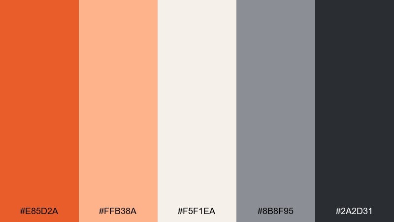
HEX: #e85d2a #ffb38a #f5f1ea #8b8f95 #2a2d31
Mood: calm, boutique, inviting
Best for: skincare branding and boutique e-commerce
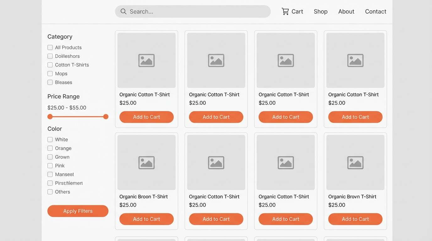
Smoky neutrals with persimmon warmth feel like a spa lounge with soft lighting. Use the creamy tone for backgrounds and product grids, then keep typography in the near-black for clarity. The persimmon accent shines on add-to-cart buttons, ratings, and small icons. Tip: limit gradients and rely on clean blocks of color for a high-end finish.
Image example of persimmon smoke generated using media.io
10) Marigold Charcoal
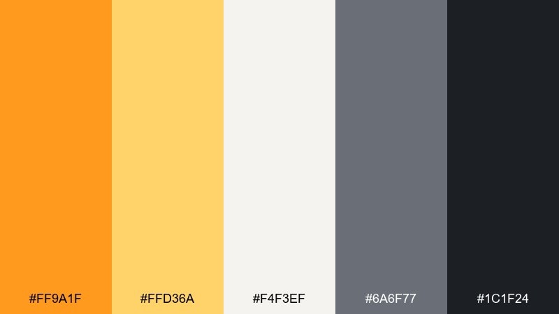
HEX: #ff9a1f #ffd36a #f4f3ef #6a6f77 #1c1f24
Mood: uplifting, editorial, confident
Best for: presentation decks and keynote templates
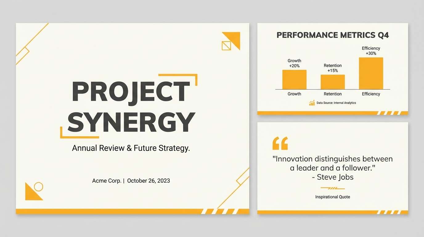
Marigold highlights over charcoal feel like spotlight moments on a dark stage. Use charcoal for title slides and section dividers, then bring in marigold for callouts, icons, and charts. The light neutral keeps content-heavy slides readable when you need a calmer page. Tip: keep one consistent marigold accent style, like underlines or small blocks, across the deck.
Image example of marigold charcoal generated using media.io
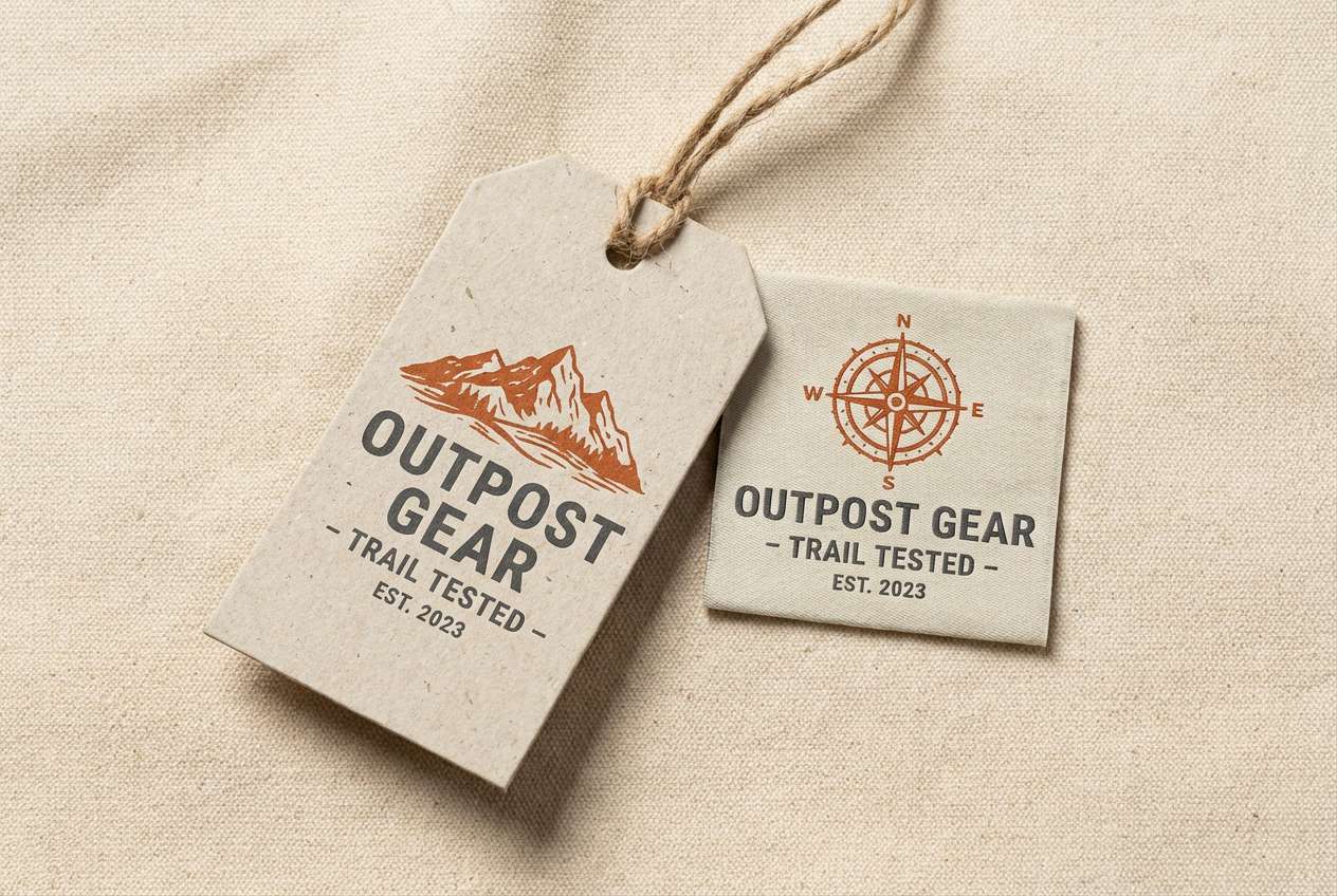
11) Burnt Sienna Drift
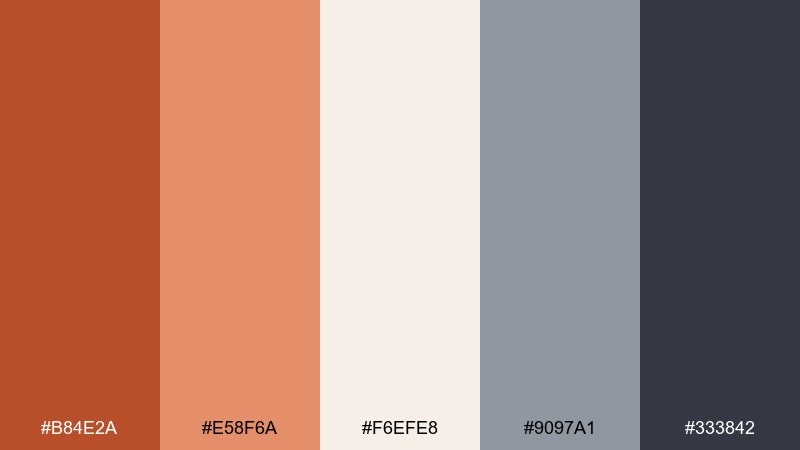
HEX: #b84e2a #e58f6a #f6efe8 #9097a1 #333842
Mood: heritage, outdoorsy, sturdy
Best for: outdoor gear labels and hang tags
Burnt sienna with drifting cool grays recalls canyon trails and weathered canvas. Use the deep gray for type and barcodes, while sienna becomes the brand stamp or stitched badge color. The warm mid-tone pairs nicely with kraft paper and matte finishes. Tip: choose a bold condensed font to match the rugged, utilitarian vibe.
Image example of burnt sienna drift generated using media.io
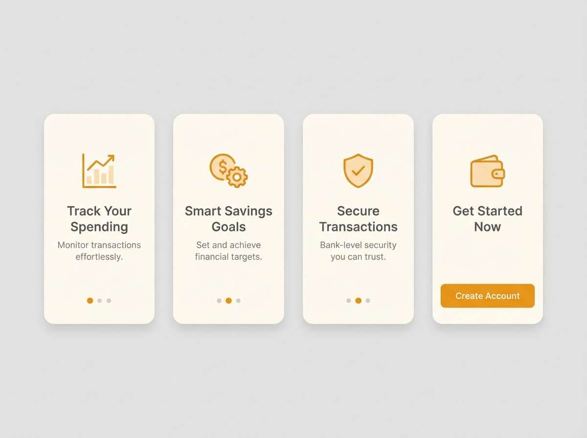
12) Amber Alloy
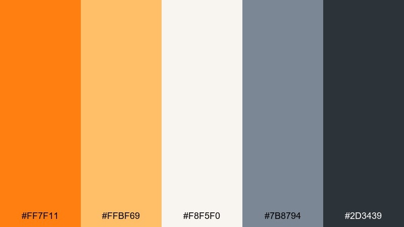
HEX: #ff7f11 #ffbf69 #f8f5f0 #7b8794 #2d3439
Mood: sleek, premium, balanced
Best for: fintech apps and onboarding screens
Sleek amber against alloy-like grays feels trustworthy with a hint of warmth. This orange gray color palette works especially well when the darker gray supports navigation and the amber is saved for progress states and primary actions. Use the light neutral for full-screen backgrounds to avoid visual fatigue. Tip: keep shadows subtle and rely on spacing and contrast for hierarchy.
Image example of amber alloy generated using media.io
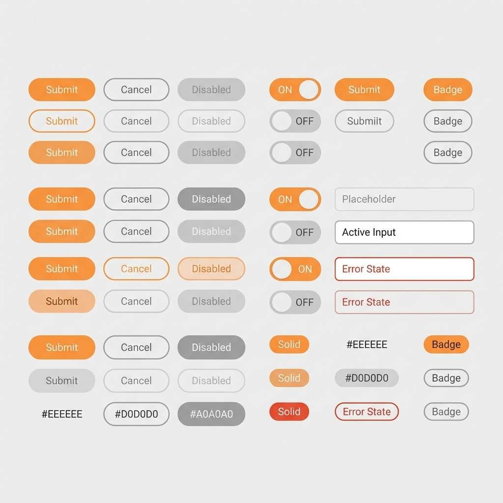
13) Orange Peel Minimal
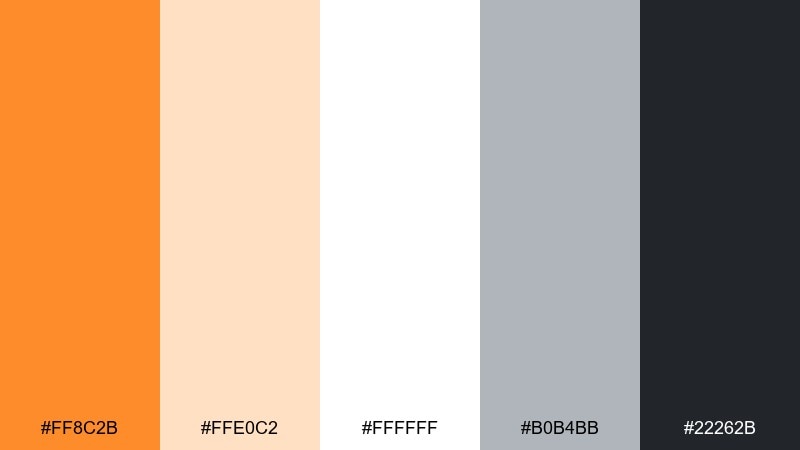
HEX: #ff8c2b #ffe0c2 #ffffff #b0b4bb #22262b
Mood: clean, friendly, modern
Best for: SaaS UI kits and component libraries
Bright peel accents on clean whites feel fresh, simple, and highly usable. Use the near-black for text, the light gray for borders, and the peach tint for subtle states like hover or selected tabs. The orange is strongest when applied to a single component type, such as primary buttons or toggles. Tip: test contrast on small labels so accessibility stays solid.
Image example of orange peel minimal generated using media.io
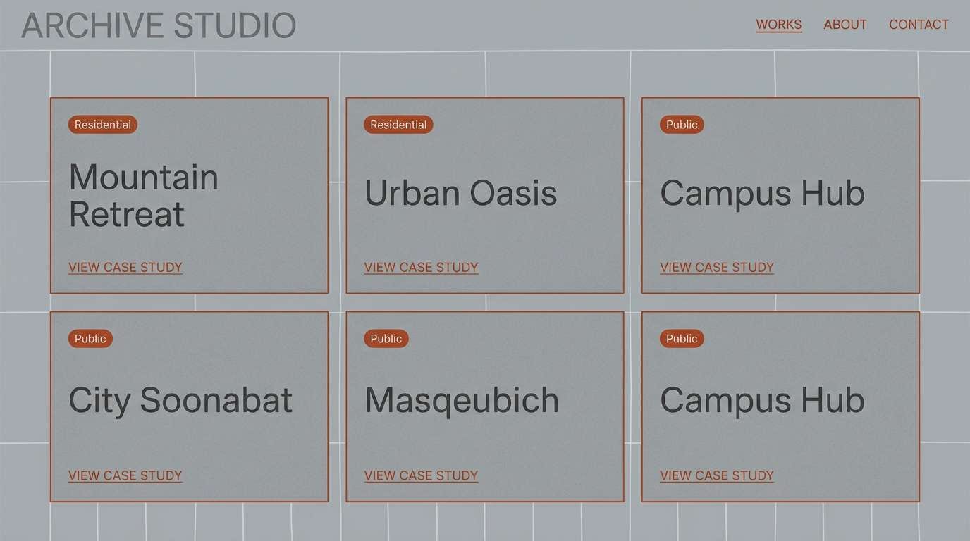
14) Rust and Raincloud
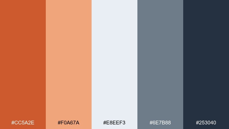
HEX: #cc5a2e #f0a67a #e8eef3 #6e7b88 #253040
Mood: moody, architectural, sophisticated
Best for: architecture portfolios and case study pages
Rusty warmth under raincloud blues and grays feels architectural and quietly dramatic. Use the pale blue-gray as the page background, then set body text in the deep slate for crisp readability. Rust makes a strong accent for section numbers, links, and project tags. Tip: pair with large photography and thin grid lines to emphasize structure.
Image example of rust and raincloud generated using media.io
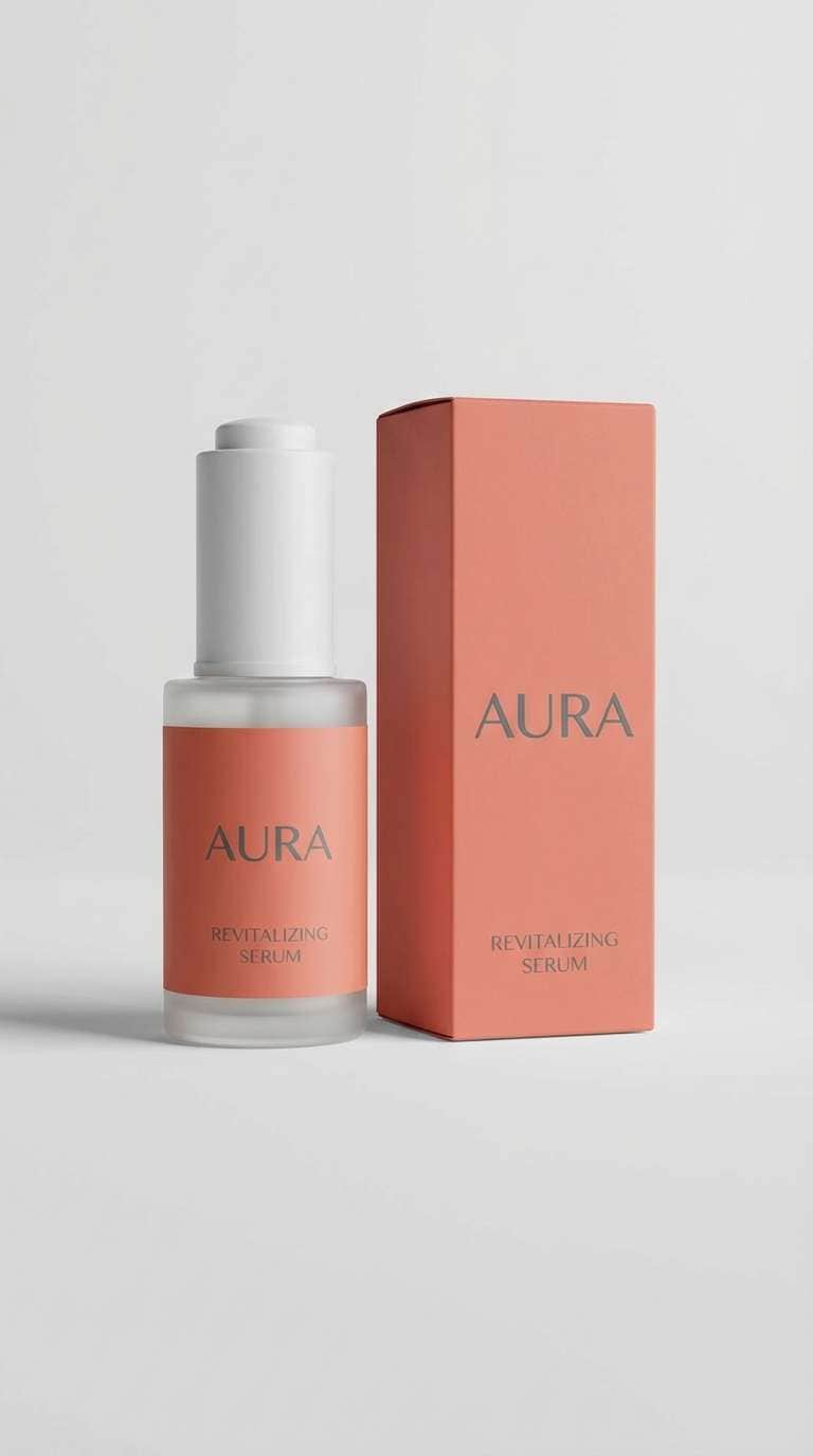
15) Coral Cinder
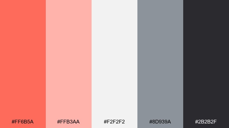
HEX: #ff6b5a #ffb3aa #f2f2f2 #8d939a #2b2b2f
Mood: playful, trendy, approachable
Best for: beauty product ads and social posts
Coral energy with cinder grays feels playful but still polished, like a modern beauty editorial. Use the soft coral for large color fields, then keep the darker gray for headlines to avoid a sugary look. The pale neutral makes product photography stand out without competing. Tip: add simple rounded shapes to echo the friendly vibe of the coral tones.
Image example of coral cinder generated using media.io
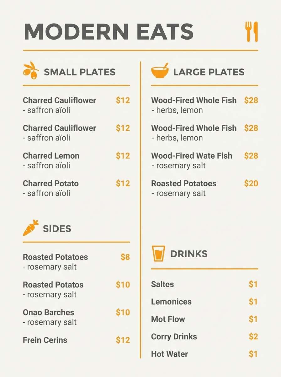
16) Saffron Urbanite
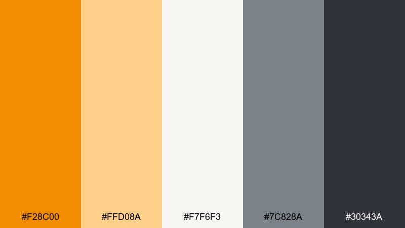
HEX: #f28c00 #ffd08a #f7f6f3 #7c828a #30343a
Mood: urban, warm, confident
Best for: restaurant menus and cafe branding
Saffron warmth with urban grays evokes a cozy cafe tucked into a busy street. Use the off-white as the menu base, then set sections in the deeper gray for clear scanning. Saffron works best for category headers, small icons, and emphasis lines. Tip: keep imagery warm-toned to match the saffron and avoid clashing cool photos.
Image example of saffron urbanite generated using media.io
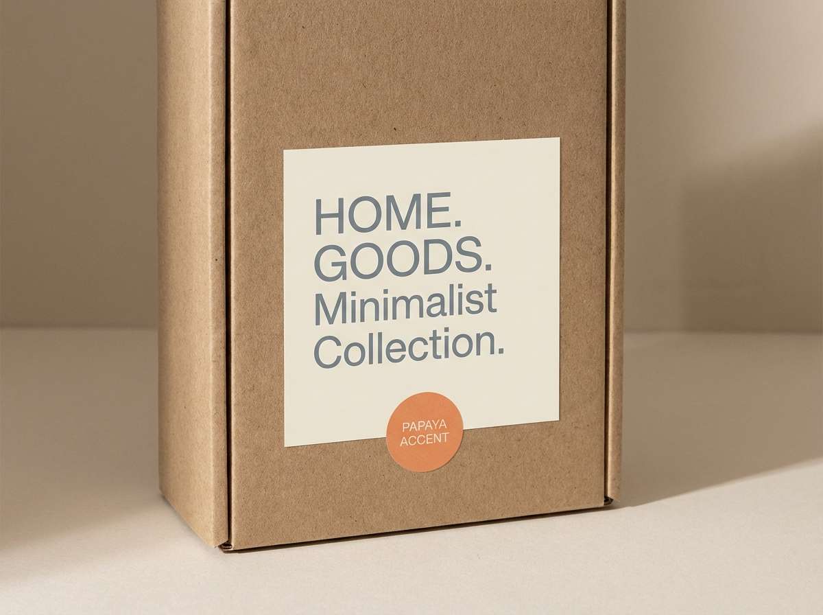
17) Papaya Stone
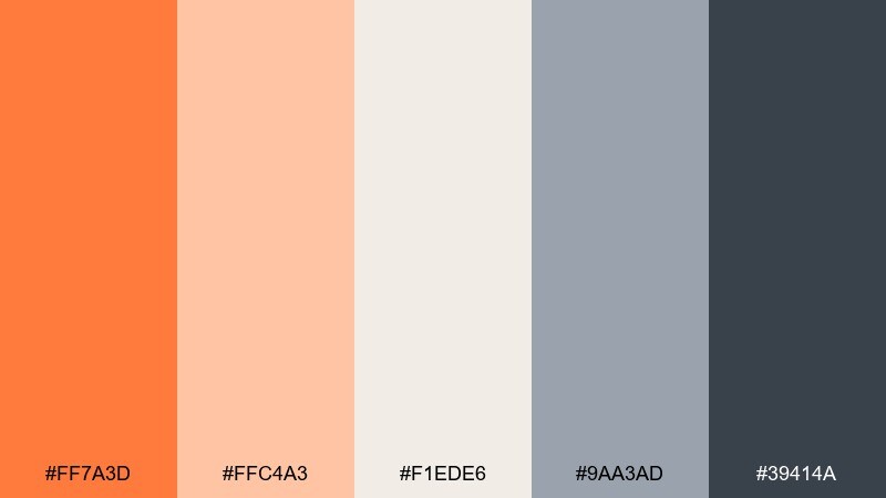
HEX: #ff7a3d #ffc4a3 #f1ede6 #9aa3ad #39414a
Mood: sunny, natural, relaxed
Best for: home goods packaging and lifestyle labels
Papaya brightness with stone neutrals feels relaxed, like linen aprons and sunlit kitchens. Orange gray color combinations here shine when papaya is used for a small badge or pattern and the deep slate handles product names. The warm beige keeps the palette feeling organic and less techy. Tip: use matte materials and minimal ink coverage for a calm, sustainable look.
Image example of papaya stone generated using media.io
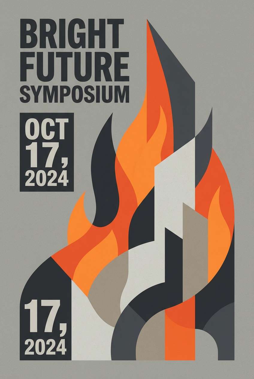
18) Firelight Cement
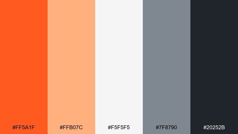
HEX: #ff5a1f #ffb07c #f5f5f5 #7f8790 #20252b
Mood: high-contrast, modern, dramatic
Best for: event posters and music night promos
Firelight orange against cement grays feels dramatic, like a spotlight cutting through haze. Use the near-black for bold type, the mid gray for secondary info, and the pale gray to create breathing space. Keep orange for the artist name, date, or one striking graphic element. Tip: use a strict grid so the drama stays controlled and legible.
Image example of firelight cement generated using media.io
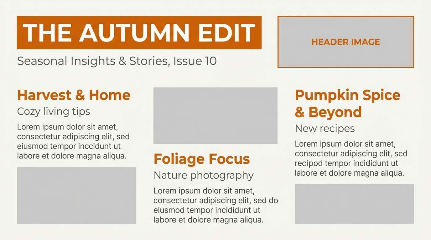
19) Autumn Signal
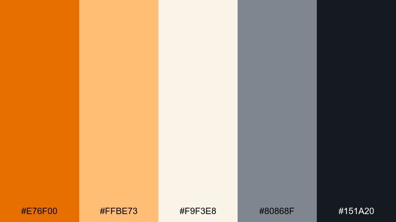
HEX: #e76f00 #ffbe73 #f9f3e8 #80868f #151a20
Mood: seasonal, confident, classic
Best for: newsletter headers and blog visuals
Autumn signal tones feel like crisp air, warm knitwear, and clean typography. Use the dark near-black for titles and long-form text, and let the pale cream carry the page background. The bright orange is perfect for small highlights like links, bullets, or section tags. Tip: pair with muted photography and avoid overly saturated images to keep the palette cohesive.
Image example of autumn signal generated using media.io
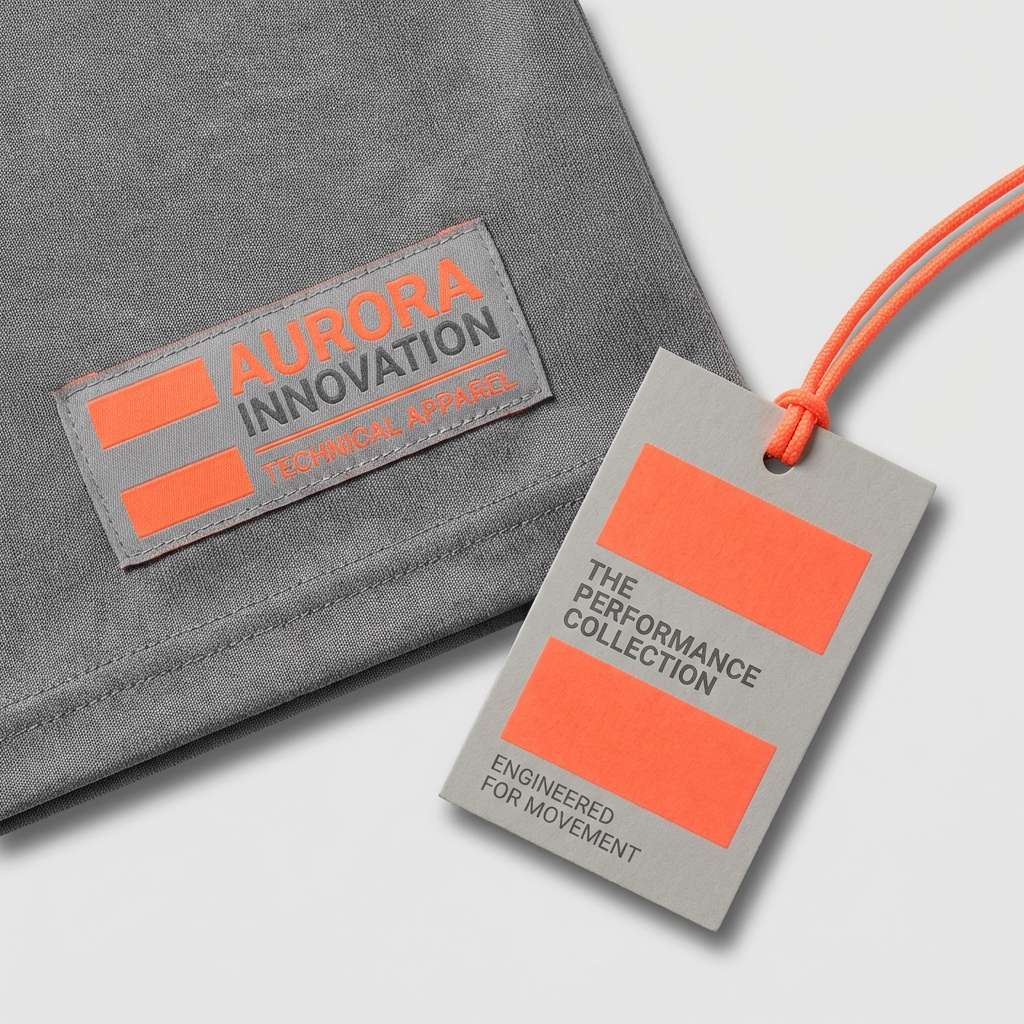
20) Neon Safety Gray
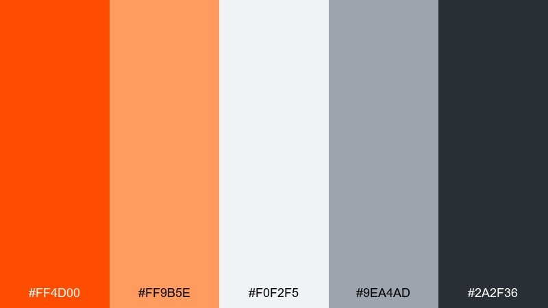
HEX: #ff4d00 #ff9b5e #f0f2f5 #9ea4ad #2a2f36
Mood: sporty, loud, contemporary
Best for: sportswear branding and label systems
Neon orange with clean grays feels sporty and high-energy, like a training set under bright stadium lights. Use the deepest gray for logos and text, and keep the neon strictly for standout elements such as size markers, zipper pulls, or tag corners. The cool light gray helps the system look modern rather than chaotic. Tip: use lots of negative space so the neon reads intentional, not accidental.
Image example of neon safety gray generated using media.io
What Colors Go Well with Orange Gray?
Orange and gray pair easily with crisp whites and soft off-whites for a clean, modern base. Add black or deep charcoal when you need stronger contrast for typography and accessibility.
For a more natural look, bring in warm neutrals like beige, sand, or kraft tones; they make orange feel less “tech” and more organic. For cooler compositions, blue-gray backgrounds and muted navy accents keep the palette calm and structured.
If you want extra pop, small doses of teal, mint, or icy blue can complement orange without fighting it—just keep them as secondary accents so orange stays the hero.
How to Use a Orange Gray Color Palette in Real Designs
Start with gray as the main system color: backgrounds, navigation, surfaces, and text hierarchy. Then use orange sparingly for actions (primary buttons), emphasis (tags), and key metrics (charts), so attention is directed on purpose.
Choose one orange saturation level and stick to it across components to avoid visual noise. If you need multiple oranges, reserve the brightest for the most important interaction and use softer tints for hover, selected, or background states.
In print and packaging, matte grays and off-whites make orange look more premium. Consider texture (paper grain, soft shadows) and keep contrast high for ingredient text and legal copy.
Create Orange Gray Palette Visuals with AI
If you have HEX codes but need real mockups—posters, UI screens, packaging, or interiors—AI image generation can turn your palette into consistent visuals quickly.
With Media.io, you can describe the layout you want (e.g., “dashboard cards,” “coffee bag label,” or “event poster”) and keep the orange gray balance consistent from concept to export.
Orange Gray Color Palette FAQs
-
What does an orange and gray color palette communicate?
It typically communicates energy plus professionalism: orange adds warmth and momentum, while gray brings stability, neutrality, and a modern, “designed” feel. -
How do I keep orange from overpowering gray?
Use gray for the main surfaces and typography, then treat orange as an accent. A common rule is to keep orange coverage under about 10–15% for premium UI and branding. -
Is burnt orange and gray better than bright orange and gray?
Burnt orange feels more refined and earthy (great for packaging and heritage branding), while bright orange feels more energetic and tech-forward (great for CTAs, promos, and sports). -
Which gray should I use with orange: warm gray or cool gray?
Cool grays create a sharper, more modern contrast with orange; warm grays feel softer and more natural. Pick based on your product tone and the photography you plan to use. -
Are orange gray palettes good for UI accessibility?
Yes, if you ensure enough contrast for text and interactive elements. Use near-black/charcoal for body text, and test orange buttons against their backgrounds to meet WCAG contrast targets. -
What are good background colors for orange and gray designs?
Off-white, light gray, and very pale blue-gray backgrounds keep layouts breathable and make orange accents feel intentional. Dark charcoal backgrounds can also work for dramatic, high-contrast designs. -
How can I generate orange gray mockups quickly?
Use Media.io’s text-to-image generator: describe the design (UI, packaging, poster, interior) and include your palette direction, then iterate with small prompt tweaks to match your brand style.


