

Pastel pink is soft, flattering, and versatile—easy to style for modern brands, cozy interiors, and warm, welcoming UI.
Below are 20+ curated pastel pink color palette ideas with HEX codes, plus practical pairing tips and AI prompts you can reuse.
In this article
- Why Pastel Pink Palettes Work So Well
-
- rose sorbet
- blush linen
- cotton candy sky
- peony and sage
- strawberry milkshake
- ballet slipper neutrals
- pink porcelain
- dawn rose gradient
- powder pink and denim
- vintage rosewood
- cherry blossom tea
- pink clay minimal
- petal and lavender mist
- seashell and sand
- flamingo studio
- soft berry and cocoa
- rose quartz and graphite
- spring bouquet watercolor
- rose garden wedding suite
- kawaii ui pastels
- petal punch citrus
- What Colors Go Well with Pastel Pink?
- How to Use a Pastel Pink Color Palette in Real Designs
- Create Pastel Pink Palette Visuals with AI
Why Pastel Pink Palettes Work So Well
Pastel pink sits in a “friendly” range: it feels warm, approachable, and emotionally calming, which makes it ideal for branding that aims to be human and inviting.
It’s also flexible across styles—romantic, minimal, playful, or modern—depending on what you pair it with (cool blues for freshness, greens for botanical balance, or charcoals for contrast).
In digital design, pastel pink can soften layouts without sacrificing hierarchy—especially when you reserve deeper shades for text and keep pinks for surfaces, highlights, and states.
20+ Pastel Pink Color Palette Ideas (with HEX Codes)
1) Rose Sorbet
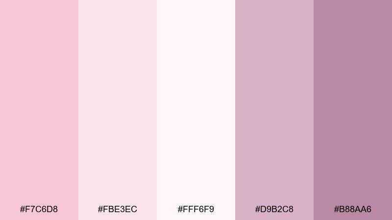
HEX: #f7c6d8 #fbe3ec #fff6f9 #d9b2c8 #b88aa6
Mood: airy, sweet, romantic
Best for: soft lifestyle branding and hero banners
Airy and dessert-sweet, these tones feel like whipped cream, rose petals, and soft morning light. Use it for lifestyle branding, skincare headers, and gentle promo graphics where warmth matters. Pair with warm whites, light taupe, or a muted plum for contrast without harsh edges. Tip: keep text in the deepest mauve to maintain readability while staying soft.
Image example of rose sorbet generated using media.io
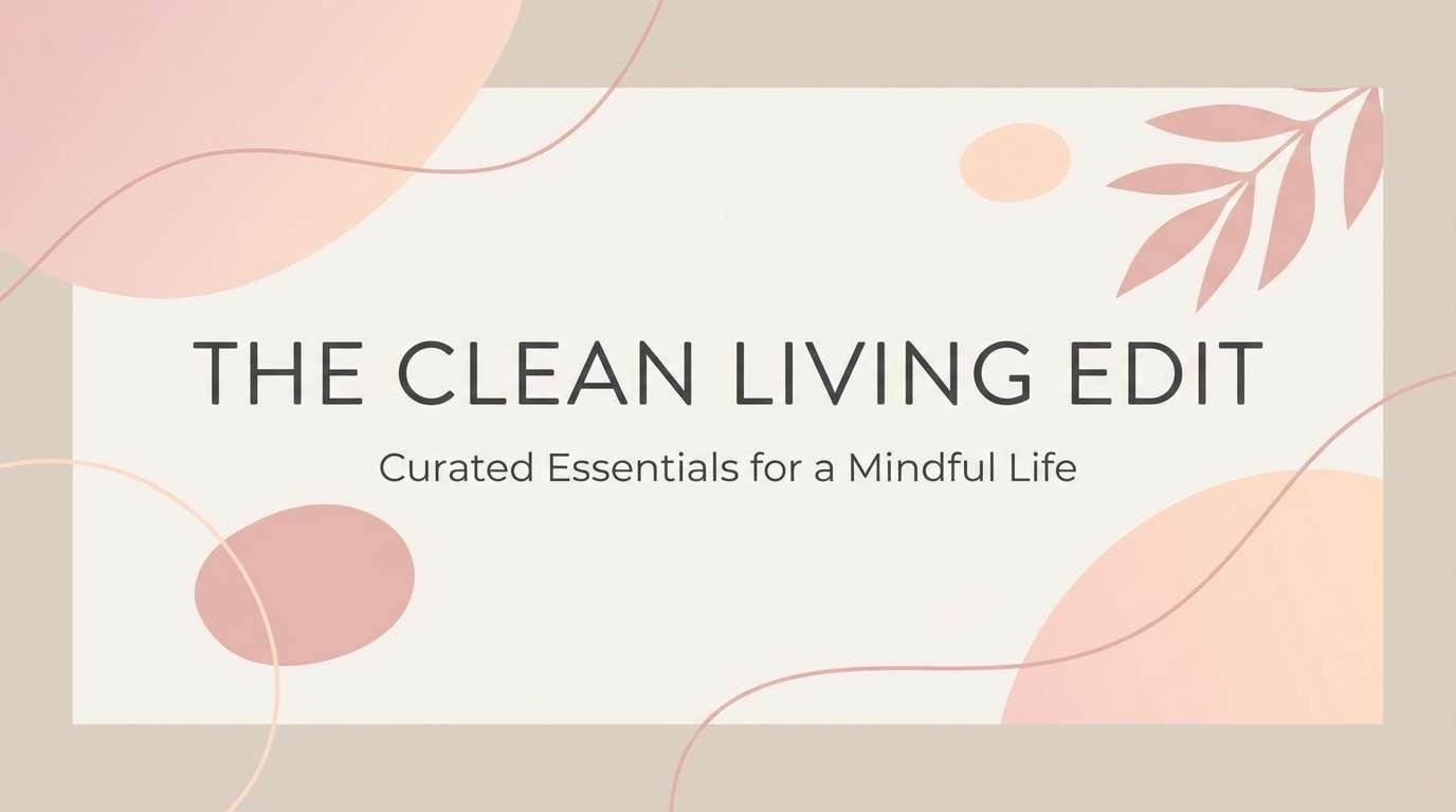
Media.io is an online AI studio for creating and editing video, image, and audio in your browser.

2) Blush Linen
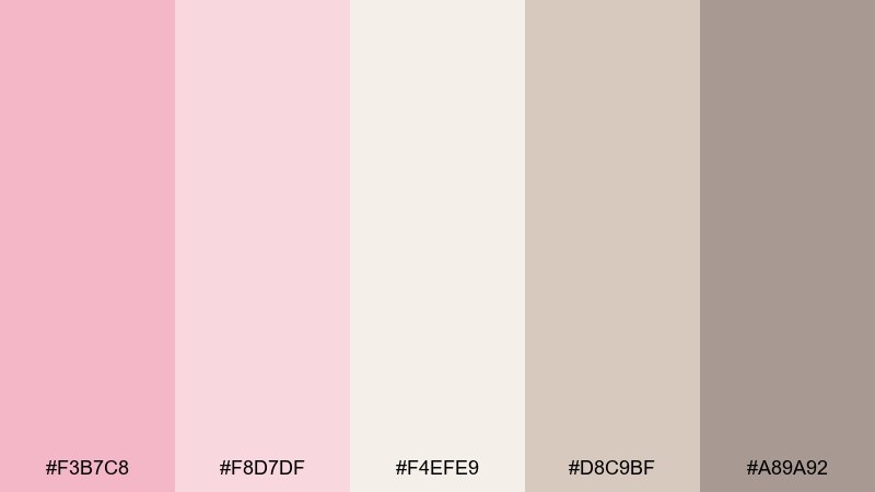
HEX: #f3b7c8 #f8d7df #f4efe9 #d8c9bf #a89a92
Mood: cozy, natural, understated
Best for: minimal packaging and boutique product labels
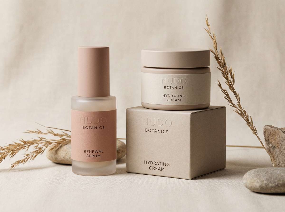
Cozy and textile-like, the mix evokes linen, blush makeup, and warm stone. It works beautifully on packaging for candles, soap, and handmade goods where a calm, premium feel is key. Pair with uncoated paper textures and matte finishes, then add a small metallic foil accent if you need lift. Tip: reserve the greige for body copy so the pinks can stay airy.
Image example of blush linen generated using media.io
3) Cotton Candy Sky
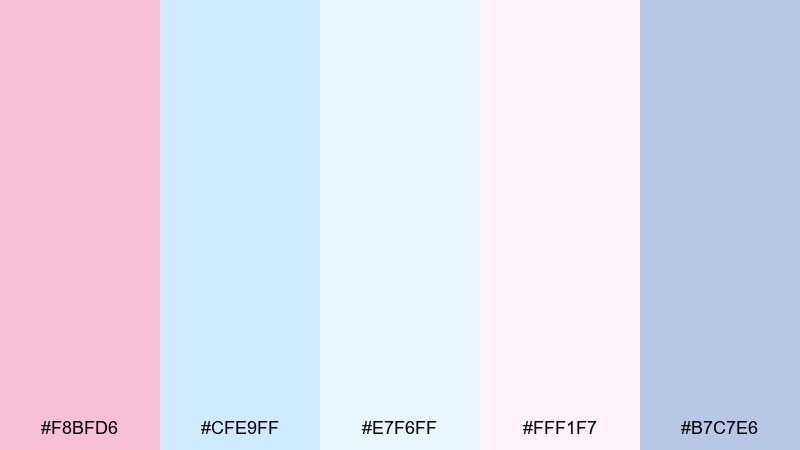
HEX: #f8bfd6 #cfe9ff #e7f6ff #fff1f7 #b7c7e6
Mood: playful, breezy, dreamy
Best for: kids brands, party invites, and social posts
Playful and cloudlike, these colors feel like a bright sky with candy-soft highlights. Use them for party invites, kids brands, or upbeat social templates that need a cheerful lift. Pair with rounded sans typography and a clean white base so the blues stay crisp. Tip: keep accents to small pops of periwinkle to avoid a washed-out layout.
Image example of cotton candy sky generated using media.io

4) Peony and Sage
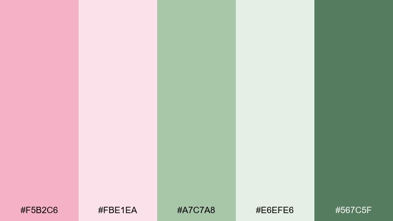
HEX: #f5b2c6 #fbe1ea #a7c7a8 #e6efe6 #567c5f
Mood: fresh, botanical, balanced
Best for: wellness branding and garden-themed visuals
Fresh and garden-inspired, the peony pinks and sage greens feel like new leaves and blooming petals. This pastel pink color combination is ideal for wellness brands, herbal products, and spring campaigns that want calm energy with a natural edge. Pair with off-white backgrounds and a deep forest green for headlines. Tip: use sage as the primary UI background and let pink act as the friendly accent.
Image example of peony and sage generated using media.io
5) Strawberry Milkshake
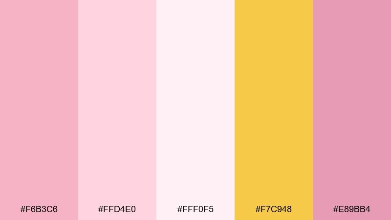
HEX: #f6b3c6 #ffd4e0 #fff0f5 #f7c948 #e89bb4
Mood: fun, sweet, sunny
Best for: cafe promos and dessert packaging
Fun and sugary, these tones bring to mind strawberry foam, glossy glaze, and a little burst of sunshine. Use them for cafe promos, dessert packaging, or playful seasonal launches where you want instant appetite appeal. Pair with creamy whites and a tiny hit of yellow to guide the eye to CTAs. Tip: keep the yellow as an accent only, so the pinks stay the main flavor.
Image example of strawberry milkshake generated using media.io
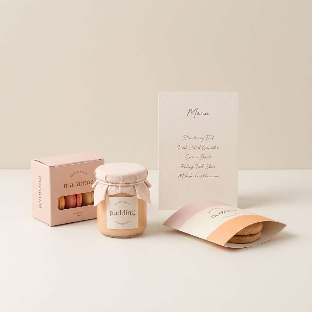
6) Ballet Slipper Neutrals
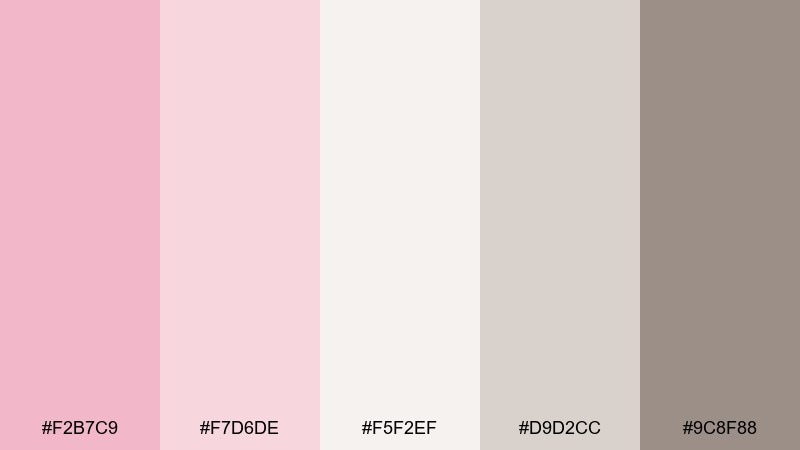
HEX: #f2b7c9 #f7d6de #f5f2ef #d9d2cc #9c8f88
Mood: elegant, minimal, timeless
Best for: editorial layouts and premium lookbooks
Elegant and quiet, the tones feel like satin ballet slippers, powder, and soft studio light. This pastel pink color palette suits editorial spreads, lookbooks, and premium campaigns that need a refined whisper rather than a shout. Pair with warm gray typography and plenty of whitespace for a modern, gallery-like finish. Tip: keep borders and rules in the light greige so the page stays delicate.
Image example of ballet slipper neutrals generated using media.io
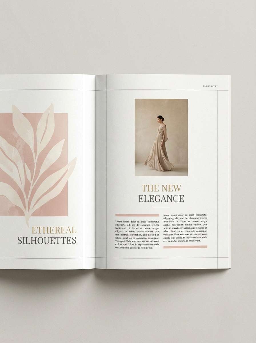
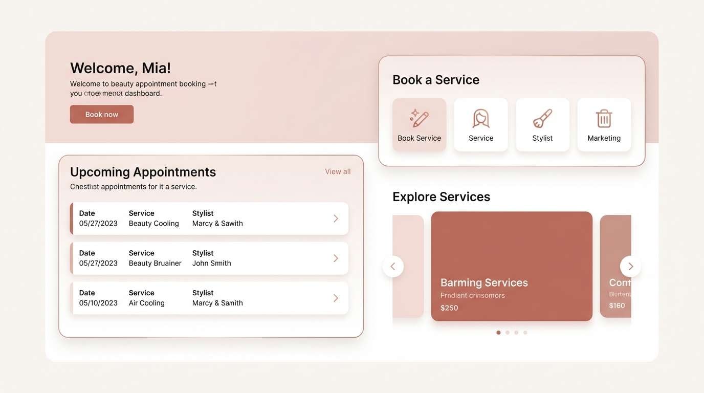
7) Pink Porcelain
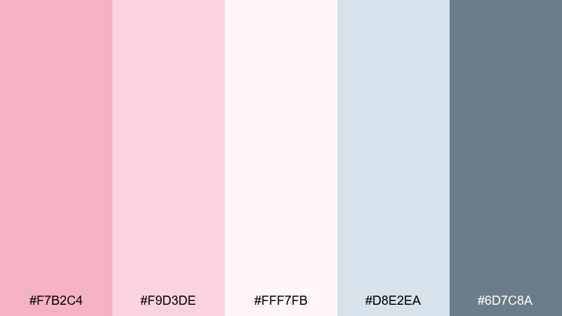
HEX: #f7b2c4 #f9d3de #fff7fb #d8e2ea #6d7c8a
Mood: delicate, clean, polished
Best for: beauty UI and appointment booking screens
Delicate and polished, these shades evoke glazed porcelain, clean counters, and soft blush makeup. They work well for beauty UI, booking flows, and membership pages where clarity must stay front and center. Pair with cool gray-blue for icons and subtle dividers, keeping buttons in a slightly deeper pink for hierarchy. Tip: use the near-white as the main canvas and save color for states and highlights.
Image example of pink porcelain generated using media.io
8) Dawn Rose Gradient
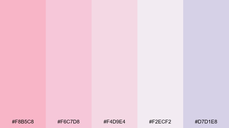
HEX: #f8b5c8 #f6c7d8 #f4d9e4 #f2ecf2 #d7d1e8
Mood: dreamy, calm, luminous
Best for: landing pages and soft-gradient backgrounds
Dreamy and luminous, the shift from rose to lilac feels like sunrise haze. These pastel pink color combinations are perfect for landing pages, hero gradients, and calming onboarding screens. Pair with charcoal text and a single saturated accent for buttons to avoid a too-soft CTA. Tip: add a faint noise texture to gradients to prevent banding on large displays.
Image example of dawn rose gradient generated using media.io

9) Powder Pink and Denim
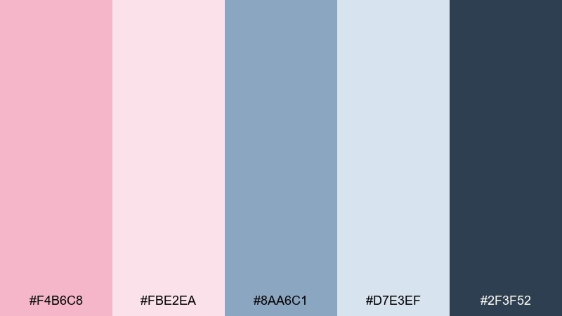
HEX: #f4b6c8 #fbe2ea #8aa6c1 #d7e3ef #2f3f52
Mood: modern, casual, confident
Best for: streetwear lookbooks and social ads
Modern and casual, this mix feels like powder blush paired with crisp denim and navy stitching. It shines in streetwear lookbooks, social ads, and creator brands that want softness without losing edge. Pair with bold sans headlines in the deep navy and keep backgrounds light for contrast. Tip: use denim blue for navigation and pink for highlights to guide attention cleanly.
Image example of powder pink and denim generated using media.io

10) Vintage Rosewood
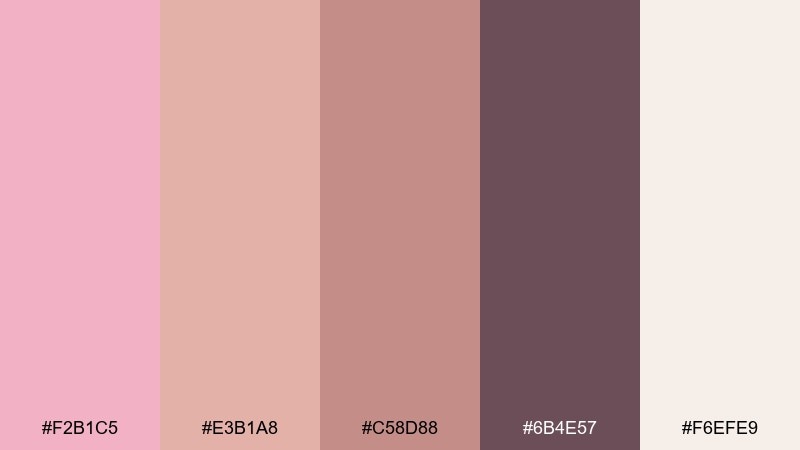
HEX: #f2b1c5 #e3b1a8 #c58d88 #6b4e57 #f6efe9
Mood: nostalgic, warm, grounded
Best for: boutique interiors and classic branding
Nostalgic and grounded, these tones recall rosewood furniture, faded lipstick, and sun-warmed plaster. Use them for boutique interiors, classic logos, or packaging that needs a heritage feel. Pair with cream and a deep wine shade for type, then add brass or copper details for richness. Tip: keep the darkest shade for small anchors like headers and icons, not large backgrounds.
Image example of vintage rosewood generated using media.io
11) Cherry Blossom Tea
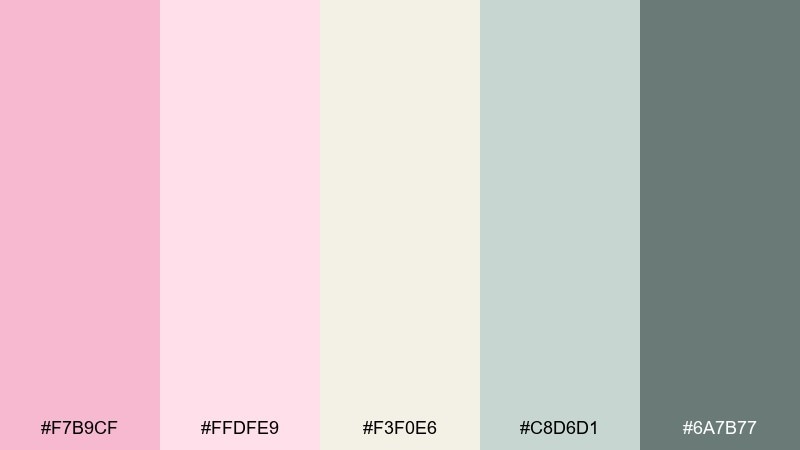
HEX: #f7b9cf #ffdfe9 #f3f0e6 #c8d6d1 #6a7b77
Mood: serene, soothing, spa-like
Best for: tea packaging and calm ecommerce pages
Serene and spa-like, the palette feels like cherry blossom steam over a quiet tea set. It works well for tea packaging, calm ecommerce, and wellness content that should feel restorative. Pair with soft sage-gray for secondary UI elements and keep product photography on warm ivory. Tip: add generous line spacing and light-weight type to keep the mood unhurried.
Image example of cherry blossom tea generated using media.io
12) Pink Clay Minimal
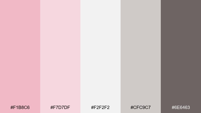
HEX: #f1b8c6 #f7d7df #f2f2f2 #cfc9c7 #6e6463
Mood: modern, calm, architectural
Best for: portfolio sites and minimalist brand systems
Modern and architectural, the tones echo pink clay, concrete, and soft daylight. Use them for portfolio sites, minimalist brand systems, and typography-led layouts where structure matters. Pair with crisp neutrals and a strong charcoal for body text, keeping pink for highlights and section headers. Tip: choose one pink as the primary accent and treat the rest as supportive tints to avoid visual clutter.
Image example of pink clay minimal generated using media.io
13) Petal and Lavender Mist
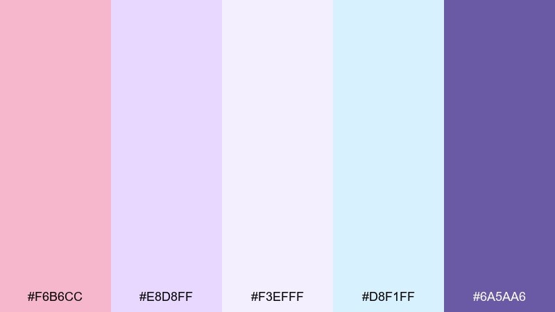
HEX: #f6b6cc #e8d8ff #f3efff #d8f1ff #6a5aa6
Mood: whimsical, gentle, creative
Best for: creator brands and pastel illustration covers
Whimsical and gentle, the petal pink and lavender mist feel like soft stationery and daydreams. Use it for creator brands, journal covers, and lighthearted campaign art that needs a friendly, creative edge. Pair with deep violet for headings and keep the baby blue for subtle shadows and depth. Tip: limit gradients to one area per layout so the palette stays clean.
Image example of petal and lavender mist generated using media.io
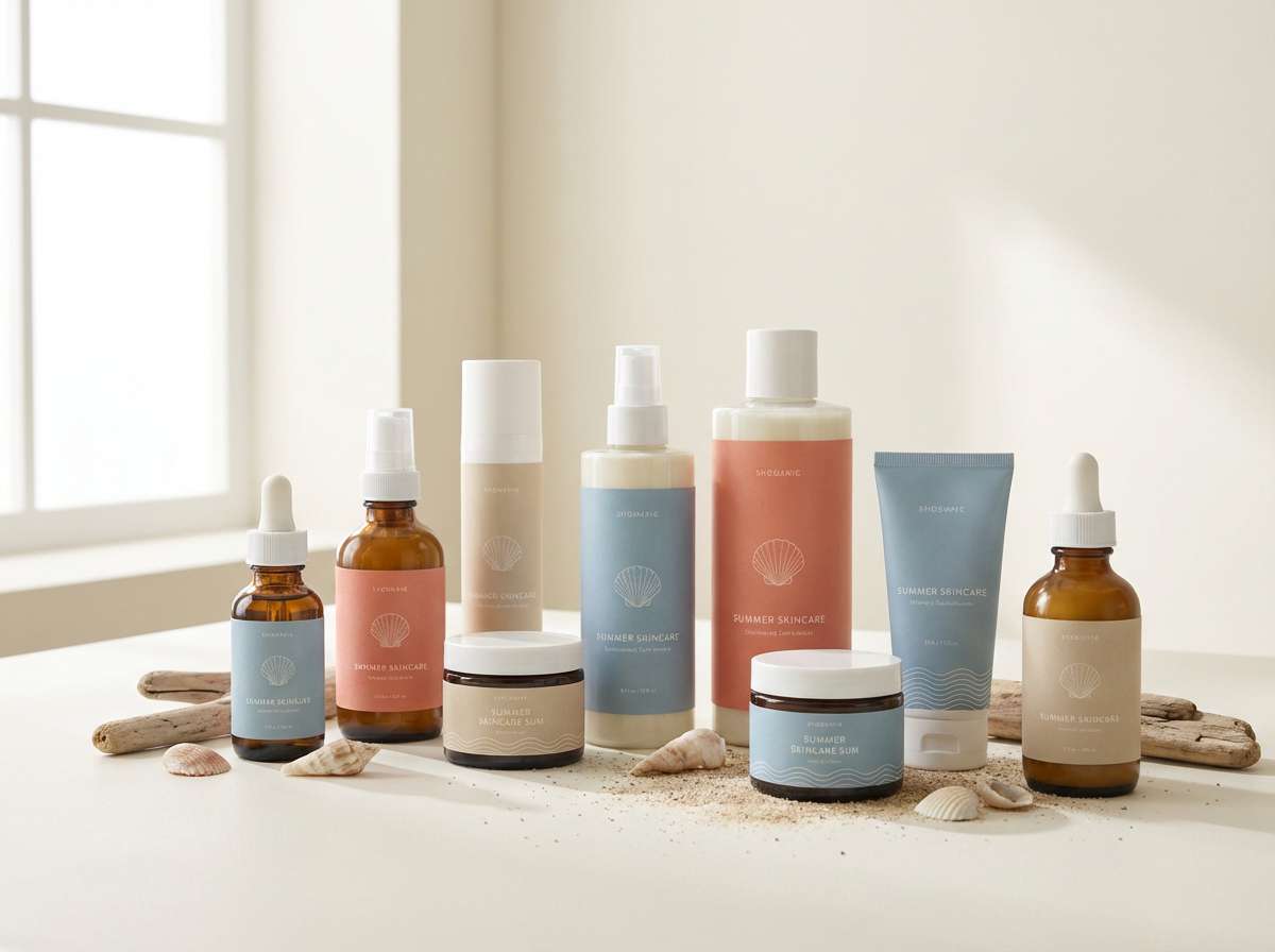
14) Seashell and Sand
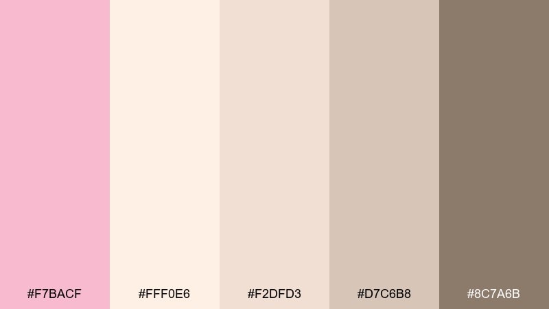
HEX: #f7bacf #fff0e6 #f2dfd3 #d7c6b8 #8c7a6b
Mood: beachy, warm, relaxed
Best for: summer campaigns and lifestyle blogs
Beachy and relaxed, these shades suggest seashells, warm sand, and sun-bleached driftwood. They fit summer campaigns, lifestyle blogs, and travel promos where you want softness without feeling sugary. Pair with plenty of white and a medium brown for grounded typography and icons. Tip: use the sandy tones for large blocks and the pink as a light highlight to keep balance.
Image example of seashell and sand generated using media.io
15) Flamingo Studio
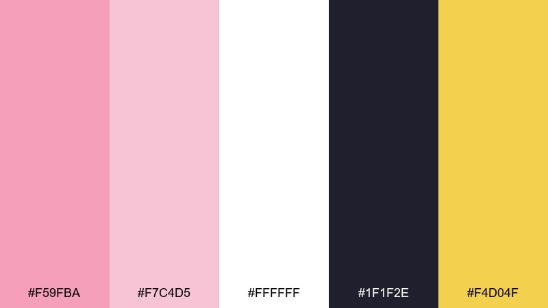
HEX: #f59fba #f7c4d5 #ffffff #1f1f2e #f4d04f
Mood: bold, upbeat, graphic
Best for: event posters and punchy announcements
Bold and upbeat, the flamingo pink pops against inky navy like neon on a night sky. It works for event posters, punchy announcements, and playful brands that still need strong legibility. Pair with white space and use the yellow as a small spark for dates or buttons. Tip: keep the navy for type and outlines so the design stays crisp at a distance.
Image example of flamingo studio generated using media.io

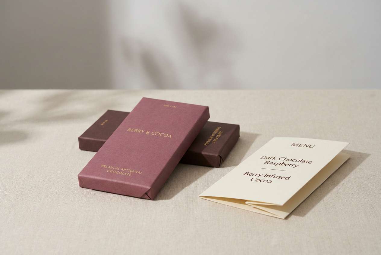
16) Soft Berry and Cocoa
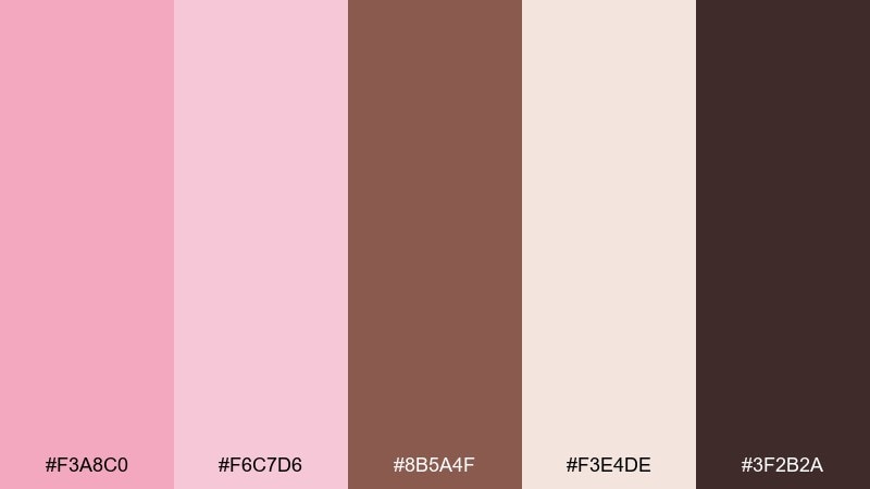
HEX: #f3a8c0 #f6c7d6 #8b5a4f #f3e4de #3f2b2a
Mood: rich, cozy, romantic
Best for: chocolate packaging and cafe menus
Rich and cozy, the berry pinks with cocoa browns feel like truffles, suede, and candlelight. Use it for chocolate packaging, cafe menus, and boutique food brands that want warmth with a touch of romance. Pair with creamy beige for negative space and keep the darkest brown for headings. Tip: add small pink highlights around product names to create a premium, handcrafted vibe.
Image example of soft berry and cocoa generated using media.io
17) Rose Quartz and Graphite
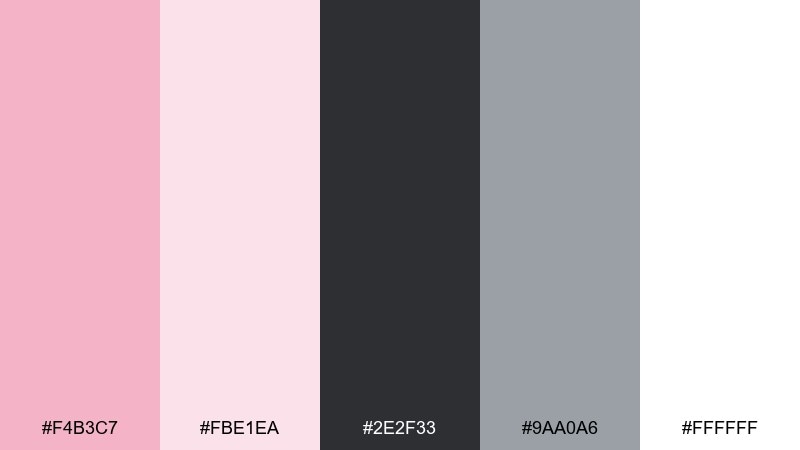
HEX: #f4b3c7 #fbe1ea #2e2f33 #9aa0a6 #ffffff
Mood: sleek, modern, high-contrast
Best for: tech branding and clean dashboards
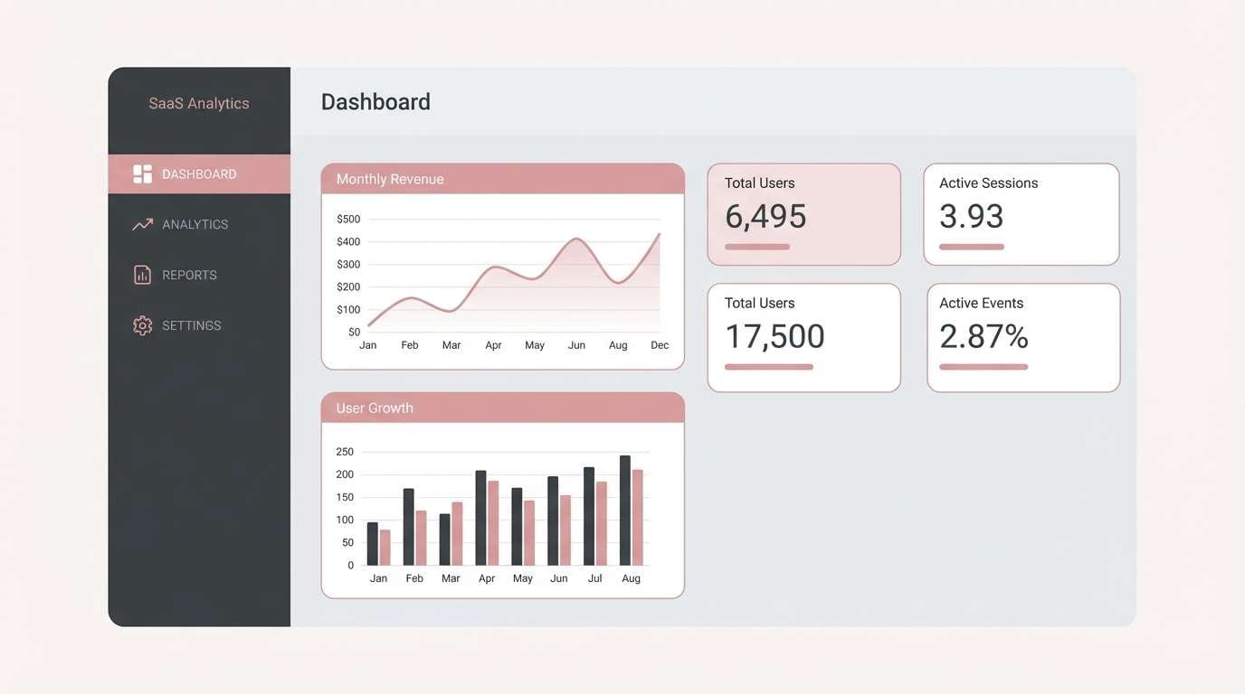
Sleek and modern, rose quartz softens the sharpness of graphite for a confident, contemporary feel. This pastel pink color scheme is great for tech branding, dashboards, and SaaS landing pages that want warmth without losing clarity. Pair with crisp white space and keep the dark graphite for navigation and data-heavy areas. Tip: use pink sparingly for status highlights and primary actions to avoid visual fatigue.
Image example of rose quartz and graphite generated using media.io
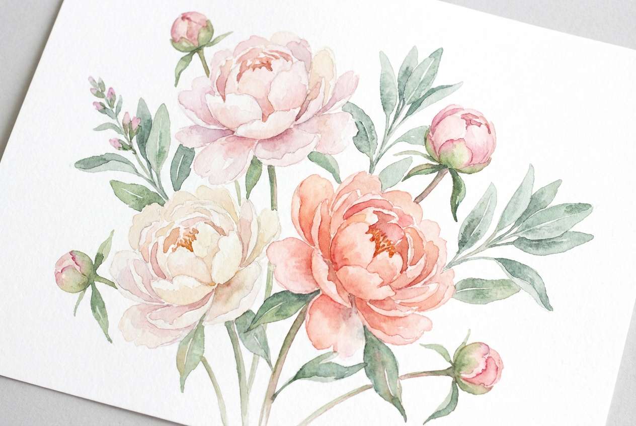
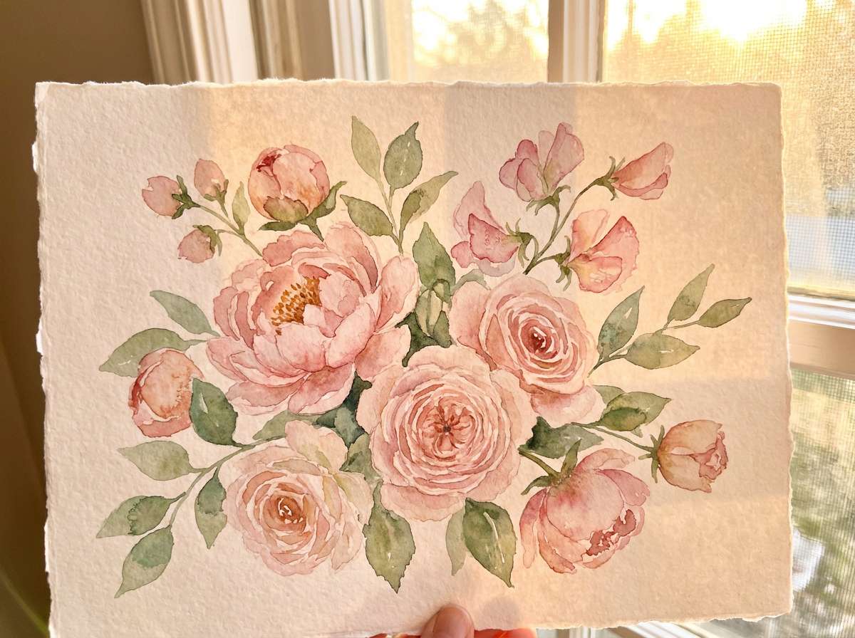
18) Spring Bouquet Watercolor
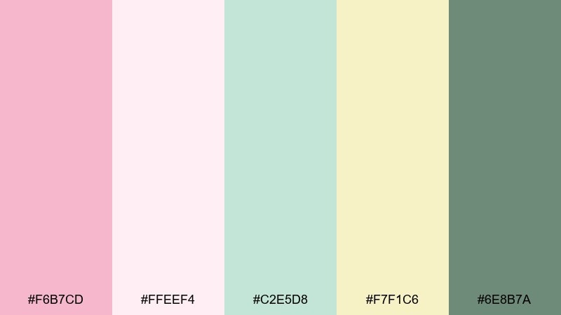
HEX: #f6b7cd #ffeef4 #c2e5d8 #f7f1c6 #6e8b7a
Mood: light, floral, handmade
Best for: greeting cards and seasonal illustrations
Light and handmade, the colors feel like a watercolor bouquet laid onto textured paper. They are ideal for greeting cards, seasonal illustrations, and gentle social graphics with a crafted touch. Pair with soft green linework and keep text in the muted leaf tone for harmony. Tip: add subtle paper grain and uneven edges to make the palette feel authentically painted.
Image example of spring bouquet watercolor generated using media.io
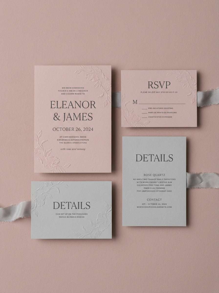
19) Rose Garden Wedding Suite
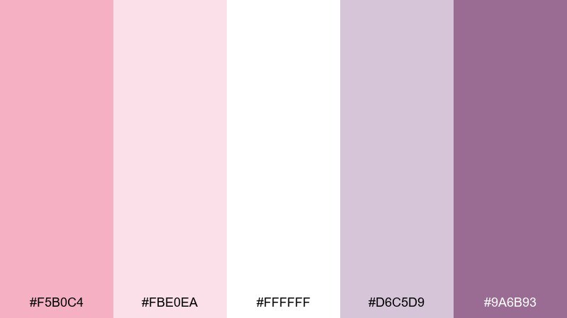
HEX: #f5b0c4 #fbe0ea #ffffff #d6c5d9 #9a6b93
Mood: romantic, elegant, celebratory
Best for: wedding invitations and day-of stationery
Romantic and celebratory, the rose tones with soft lilac feel like bouquets, silk ribbons, and candlelit reception tables. This pastel pink color palette is made for wedding invitations, menus, and save-the-dates with a refined finish. Pair with crisp white paper and use the deeper purple for monograms or venue details. Tip: print the light pinks as tints and keep the darkest shade for sharp, readable type.
Image example of rose garden wedding suite generated using media.io
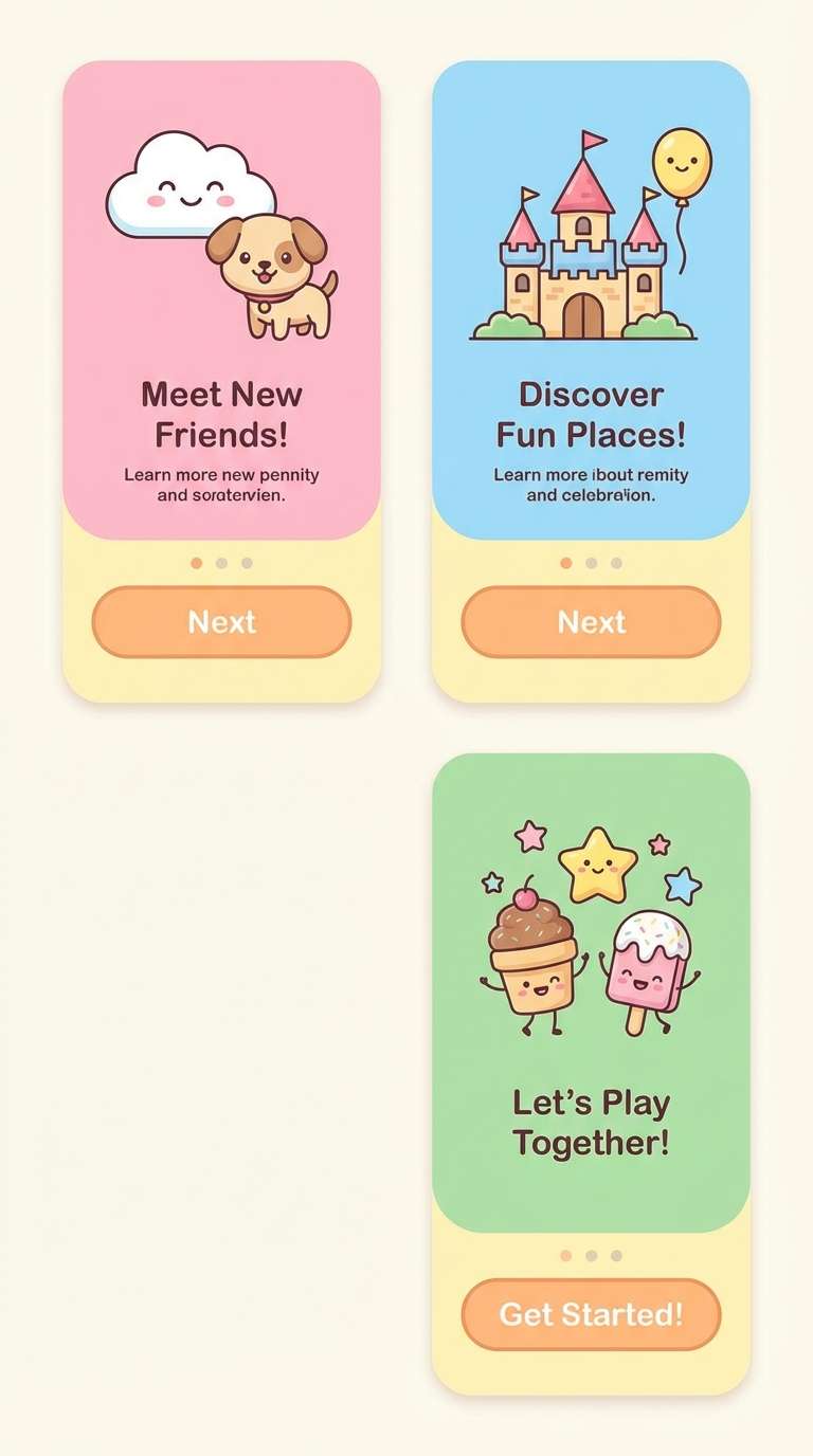
20) Kawaii UI Pastels
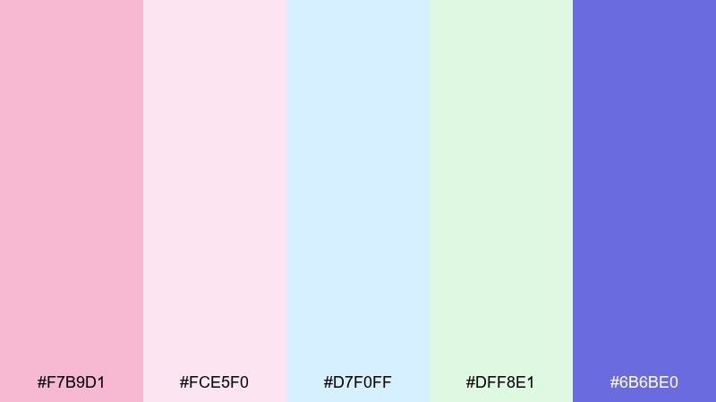
HEX: #f7b9d1 #fce5f0 #d7f0ff #dff8e1 #6b6be0
Mood: cute, friendly, energetic
Best for: app onboarding and playful UI components
Cute and friendly, these pastels feel like stickers, bubbly icons, and cheerful micro-interactions. Use them for app onboarding, playful UI components, and community platforms that want a welcoming vibe. Pair with the bold indigo for key actions and keep surfaces in the lightest pink for calm. Tip: keep icon strokes consistent and use indigo for accessibility-safe contrast on buttons.
Image example of kawaii ui pastels generated using media.io
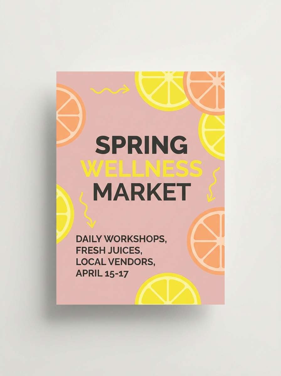
21) Petal Punch Citrus
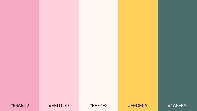
HEX: #f6a9c2 #ffd1dd #fff7f2 #ffcf5a #4a6f6a
Mood: bright, optimistic, fresh
Best for: seasonal promos and energetic brand campaigns
Bright and optimistic, the citrus accent makes the pinks feel zesty rather than sleepy. These pastel pink color combinations fit seasonal promos, energetic brand campaigns, and email headers that need a clean pop. Pair with deep teal for headlines and use the yellow to spotlight discounts or new arrivals. Tip: keep the yellow to under 10 percent of the layout for a polished, premium punch.
Image example of petal punch citrus generated using media.io
What Colors Go Well with Pastel Pink?
Neutrals are the easiest match: warm white, ivory, greige, and soft taupe keep pastel pink looking premium and airy (great for packaging, editorial, and interiors).
For fresh contrast, try cool companions like powder blue, denim, periwinkle, and blue-gray; they sharpen the palette without making it feel harsh or overly saturated.
If you want a more grounded or modern feel, add deep anchors like graphite, navy, forest green, or cocoa brown—use them mostly for type, icons, and key UI components.
How to Use a Pastel Pink Color Palette in Real Designs
Pick a “role” for pink first: background wash, brand accent, or hero highlight. Pastel pink works best when it’s not competing with too many other light tints in the same layout.
Maintain readability by assigning your darkest shade to text (or use charcoal/graphite), and keep light pinks for surfaces, cards, and gentle gradients—especially in UI and landing pages.
For print (weddings, menus, labels), combine matte textures with one small premium accent (foil, emboss, or spot UV) so the palette feels intentional instead of simply “cute.”
Create Pastel Pink Palette Visuals with AI
When you already have HEX codes, the fastest way to explore real compositions is generating mock visuals—posters, packaging, UI screens, or hero banners—before you commit to production.
Use consistent prompts (scene + style + layout + aspect ratio), then iterate by swapping one anchor color (navy, graphite, forest green) to quickly test contrast and mood.
Create polished examples in minutes, then reuse the best outputs across brand guides, pitch decks, and social templates.
Pastel Pink Color Palette FAQs
-
What is the best contrasting color for pastel pink?
Charcoal/graphite and deep navy are top choices because they create strong readability while keeping the overall look soft and modern. -
Is pastel pink a good UI color?
Yes—use it for backgrounds, cards, and highlights, and keep text/icons in dark neutrals (graphite, navy) to meet accessibility contrast needs. -
What neutral colors pair well with pastel pink?
Warm white, ivory, greige, taupe, and light stone gray pair well because they preserve the gentle tone without making layouts look washed out. -
How do I keep a pastel pink palette from looking too “sweet”?
Add a grounded anchor (denim, forest green, cocoa brown, or graphite) and limit bright accents (like yellow) to small UI states or callouts. -
Which pastel pink palette works best for weddings?
Rose Garden Wedding Suite is designed for invitations and day-of stationery: crisp white paper plus a deeper purple for monograms and readable details. -
Which pastel pink palette works best for branding?
Rose Sorbet and Blush Linen are strong starting points—one is airy and romantic for lifestyle, and the other is understated for premium, minimal packaging. -
Can I generate pastel pink design examples with AI?
Yes—use Media.io Text-to-Image to generate consistent mockups (UI, posters, packaging) by reusing prompts and iterating on one accent color at a time.
Next: Purple Red Color Palette


