

Pastel orange is a soft, approachable warm tone that brings “sunlit” energy without feeling loud. It’s a favorite for modern branding, airy UI, and event stationery because it reads friendly, optimistic, and premium at the same time.
Below are 20+ pastel orange color palette ideas with HEX codes, plus real-use tips and AI prompts you can copy to generate matching visuals fast.
In this article
- Why Pastel Orange Palettes Work So Well
-
- apricot cloud
- peach sorbet
- sunset gelato
- creamsicle minimal
- coral blush and mint
- terracotta latte
- citrus linen
- vintage postcard
- soft pumpkin and sage
- ballet studio
- desert daybreak
- cozy nursery
- modern bridal peach
- retro diner pop
- spa candlelight
- autumn pastel market
- scandinavian peach
- tropical sherbet
- editorial peach noir
- clay rosewood
- honey peach picnic
- peach blossom botanicals
- What Colors Go Well with Pastel Orange?
- How to Use a Pastel Orange Color Palette in Real Designs
- Create Pastel Orange Palette Visuals with AI
Why Pastel Orange Palettes Work So Well
Pastel orange sits in a sweet spot: it feels warm, human, and inviting, but it’s muted enough to stay modern. That makes it ideal for designs that need friendliness without the intensity of saturated orange.
It also plays nicely with both cool and warm companions. Pair it with teals, blue-grays, or mint for clean contrast, or keep it cozy with creams, taupes, and cocoa browns.
In digital products, pastel orange is especially useful for highlights and micro-interactions because it draws attention gently. With the right dark text color, you can keep accessibility and readability on track.
20+ Pastel Orange Color Palette Ideas (with HEX Codes)
1) Apricot Cloud
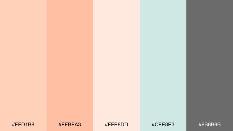
HEX: #ffd1b8 #ffbfa3 #ffe8dd #cfe8e3 #6b6b6b
Mood: airy, gentle, modern
Best for: landing page UI and SaaS onboarding
Airy and optimistic like sunlight through sheer curtains, this mix keeps orange soft and breathable. Use the apricot tones for primary buttons and highlights, then lean on the cool mint as a calm counterweight. Off-white creates clean spacing while charcoal keeps text crisp and accessible. Tip: reserve the darkest gray for headings to maintain contrast without feeling harsh.
Image example of apricot cloud generated using media.io

Media.io is an online AI studio for creating and editing video, image, and audio in your browser.

2) Peach Sorbet
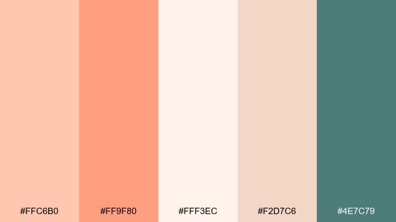
HEX: #ffc6b0 #ff9f80 #fff3ec #f2d7c6 #4e7c79
Mood: sweet, friendly, inviting
Best for: bakery branding and menu design
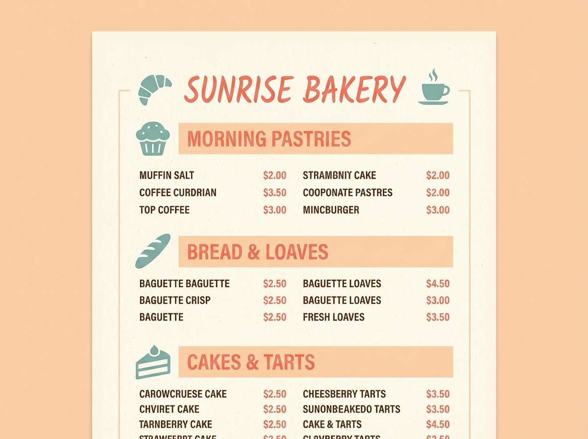
Sweet and playful like a scoop of fruit sorbet, these tones feel instantly welcoming. Pair the peach and warm coral for headings and badges, then use the creamy white for breathing room. The teal-green adds a refreshing twist that prevents the palette from going too sugary. Tip: print menus on uncoated stock so the soft tones stay true and not overly glossy.
Image example of peach sorbet generated using media.io
3) Sunset Gelato
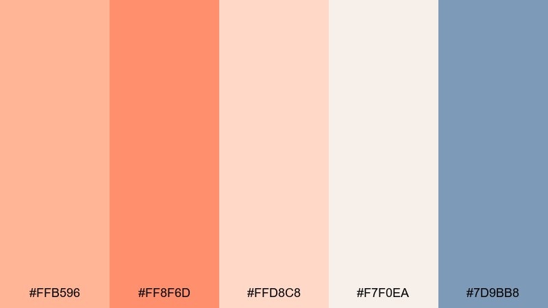
HEX: #ffb596 #ff8f6d #ffd8c8 #f7f0ea #7d9bb8
Mood: romantic, breezy, coastal
Best for: travel posters and social ads
Romantic and breezy like a seaside sunset, this set blends soft orange with a cool ocean blue. Use the coral for punchy callouts, then let the pale peach and warm cream handle background blocks. The blue is ideal for links or secondary headlines to create an easy visual hierarchy. Tip: keep plenty of negative space so the warm tones feel like glow, not clutter.
Image example of sunset gelato generated using media.io
4) Creamsicle Minimal
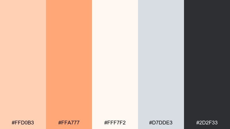
HEX: #ffd0b3 #ffa777 #fff7f2 #d7dde3 #2d2f33
Mood: clean, balanced, understated
Best for: app UI kits and design systems
Clean and minimal like a well-lit studio, this set keeps warmth on a tight leash. It works as a dependable pastel orange color palette for interfaces where clarity matters more than decoration. Let the orange sit in small doses for states, chips, and micro-interactions, while cool gray-blue supports cards and dividers. Tip: define a single accent scale so your oranges stay consistent across components.
Image example of creamsicle minimal generated using media.io
5) Coral Blush and Mint
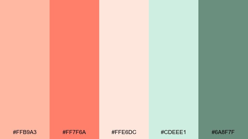
HEX: #ffb9a3 #ff7f6a #ffe6dc #cdeee1 #6a8f7f
Mood: fresh, upbeat, youthful
Best for: skincare product ads and thumbnails
Fresh and upbeat like a morning spritz, coral and mint create instant energy. Use the blushy peach as your base, then bring in the brighter coral for price tags or key benefits. Mint keeps the look light and modern, especially when paired with the creamy neutral. Tip: add subtle gradients only within the orange family to keep the ad looking premium.
Image example of coral blush and mint generated using media.io
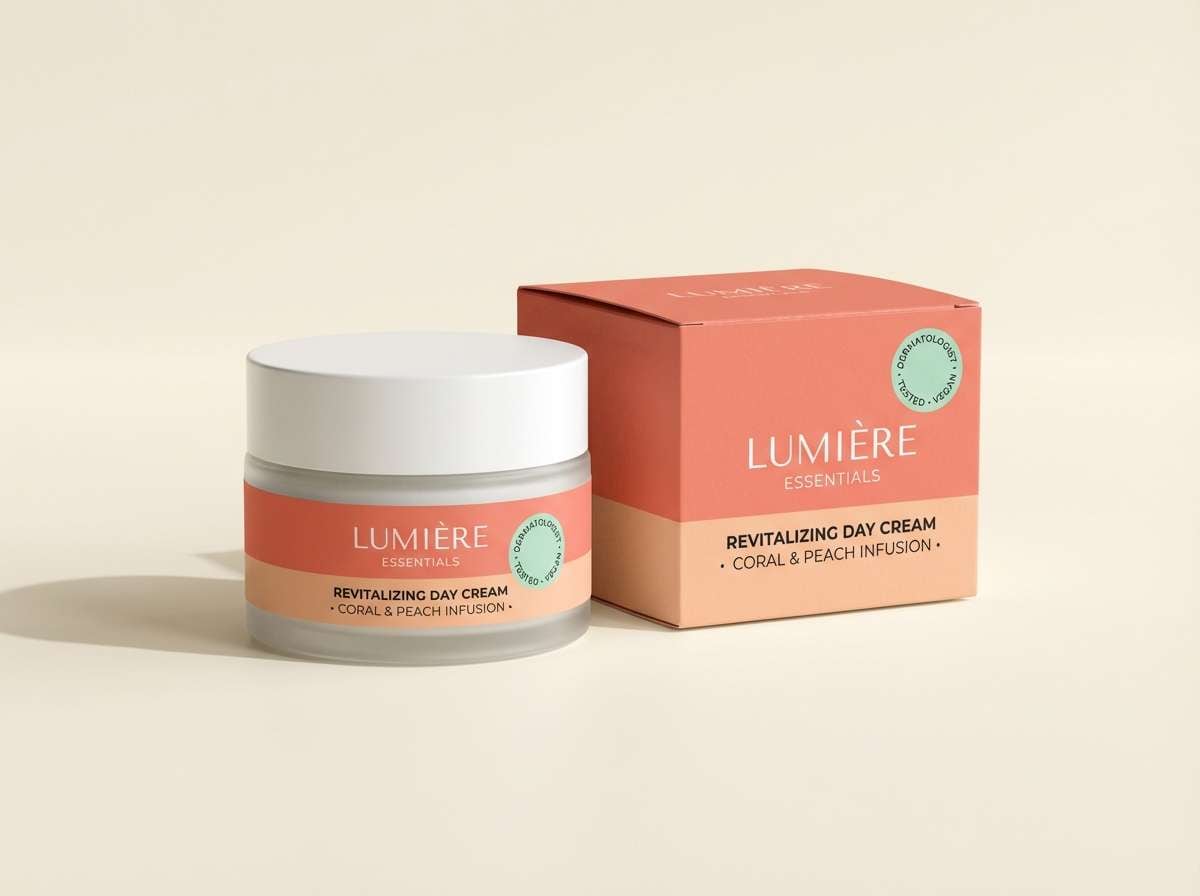
6) Terracotta Latte
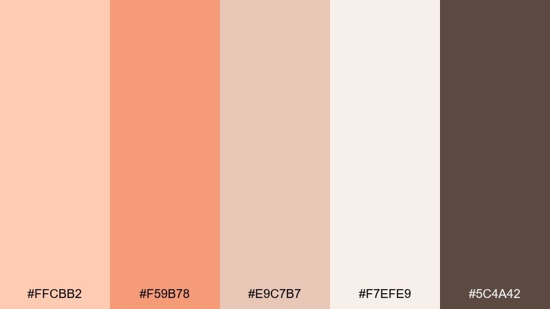
HEX: #ffcbb2 #f59b78 #e9c7b7 #f7efe9 #5c4a42
Mood: cozy, earthy, artisanal
Best for: coffee packaging and cafe signage
Cozy and earthy like steamed milk with cinnamon, these tones feel handmade and grounded. This pastel orange color combination shines on kraft labels, where the soft terracotta reads warm without turning loud. Pair it with creamy off-white for roomy layouts and use the deep cocoa brown for logos and nutrition text. Tip: foil-stamp only small elements so the artisanal vibe stays intact.
Image example of terracotta latte generated using media.io
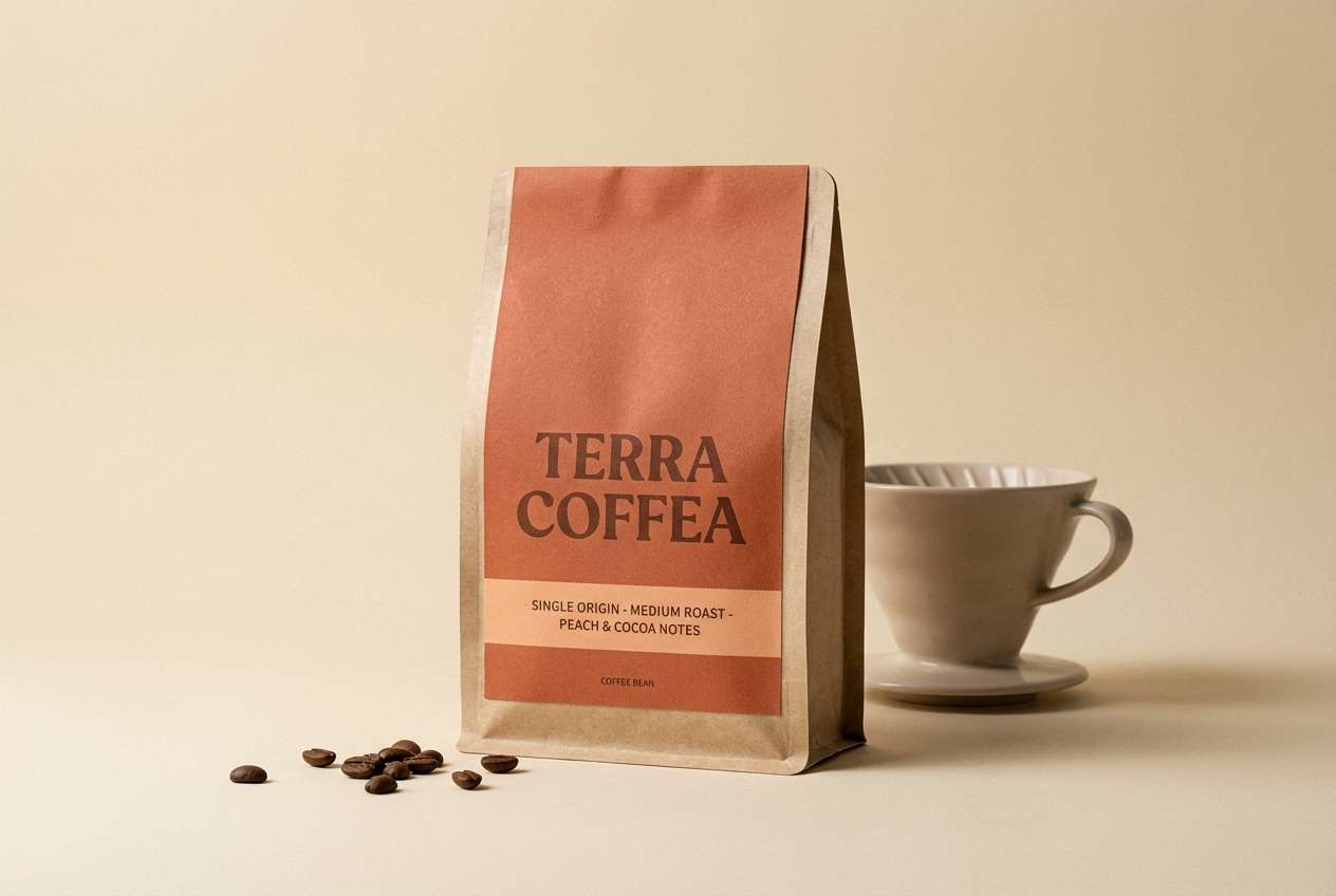
7) Citrus Linen
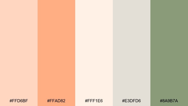
HEX: #ffd6bf #ffad82 #fff1e6 #e3dfd6 #8a9b7a
Mood: soft, natural, sunlit
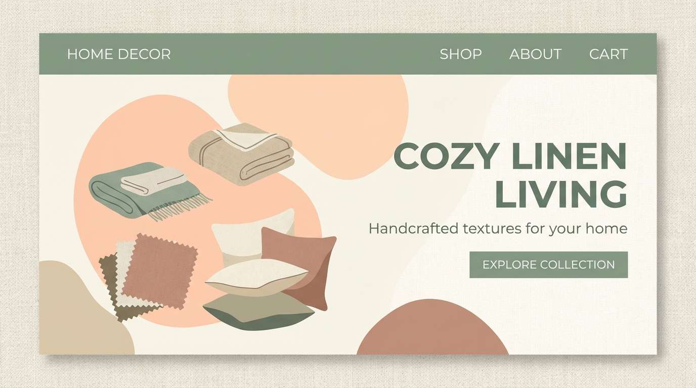
Best for: home decor ecommerce banners
Soft and sunlit like linen drying outdoors, this palette feels calm and natural. Use peachy accents to spotlight discounts or new arrivals, while the linen neutral keeps the composition relaxed. The muted sage works well for navigation and small icons, adding an organic touch. Tip: keep product photos warm-balanced so the oranges do not clash with cooler lighting.
Image example of citrus linen generated using media.io
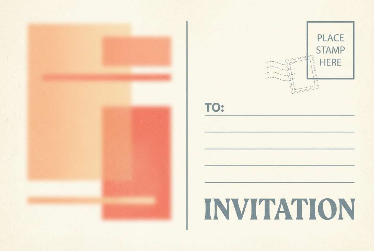
8) Vintage Postcard

HEX: #ffcfb0 #ff986f #f2e2d6 #c7d0d9 #3f4a56
Mood: nostalgic, travel-worn, charming
Best for: postcard-style invitations and announcements
Nostalgic and a little sun-faded, these colors feel like a postcard found in an old suitcase. The soft orange brings warmth, while dusty blue-gray adds that vintage ink note. Use the cream and paper beige for borders, stamps, and plenty of texture space. Tip: add subtle grain and a slightly imperfect edge to sell the retro print feel.
Image example of vintage postcard generated using media.io
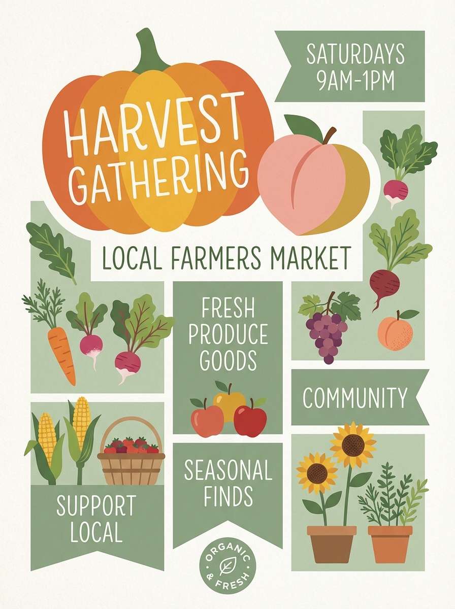
9) Soft Pumpkin and Sage
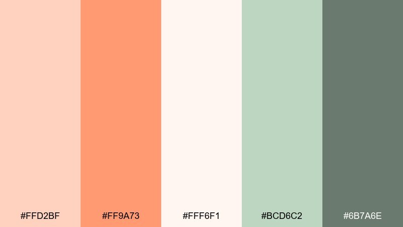
HEX: #ffd2bf #ff9a73 #fff6f1 #bcd6c2 #6b7a6e
Mood: calm, wholesome, garden-fresh
Best for: farmers market posters and labels
Calm and garden-fresh, this mix feels like pumpkins next to herb bundles. Use the soft pumpkin for headline shapes and the sage for supporting blocks and pricing. The near-white is perfect for keeping text readable in busy poster layouts. Tip: keep the orange in broad shapes and use sage for small detail text to avoid visual noise.
Image example of soft pumpkin and sage generated using media.io
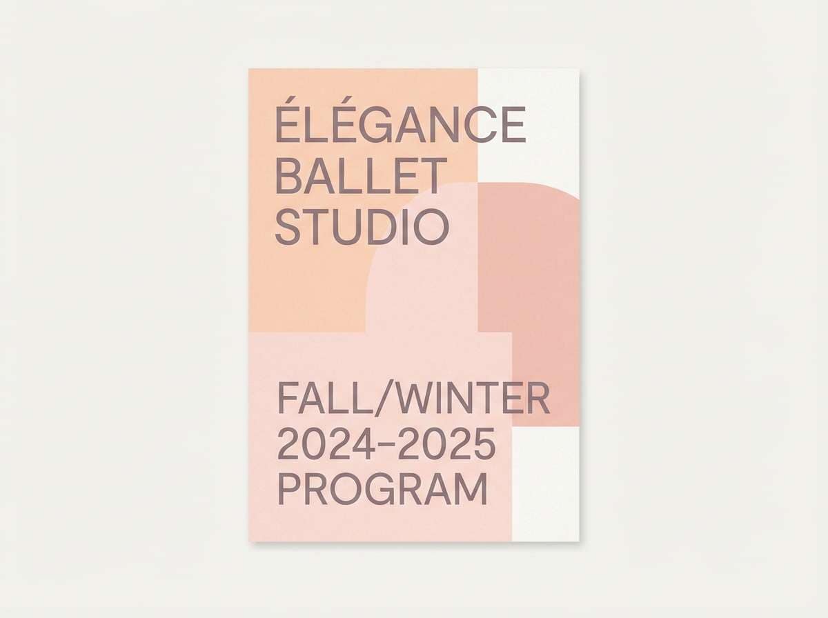
10) Ballet Studio
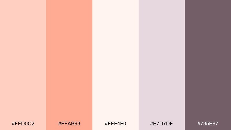
HEX: #ffd0c2 #ffab93 #fff4f0 #e7d7df #735e67
Mood: delicate, graceful, soft-focus
Best for: dance school branding and brochures
Delicate and graceful like satin ribbons, these peachy tones read calm and elegant. The mauve-gray supports typography and keeps the palette from feeling overly sweet. Use the lightest blush for backgrounds and the deeper peach for accents such as section headers or icons. Tip: choose a refined serif for headlines to match the gentle, classic vibe.
Image example of ballet studio generated using media.io
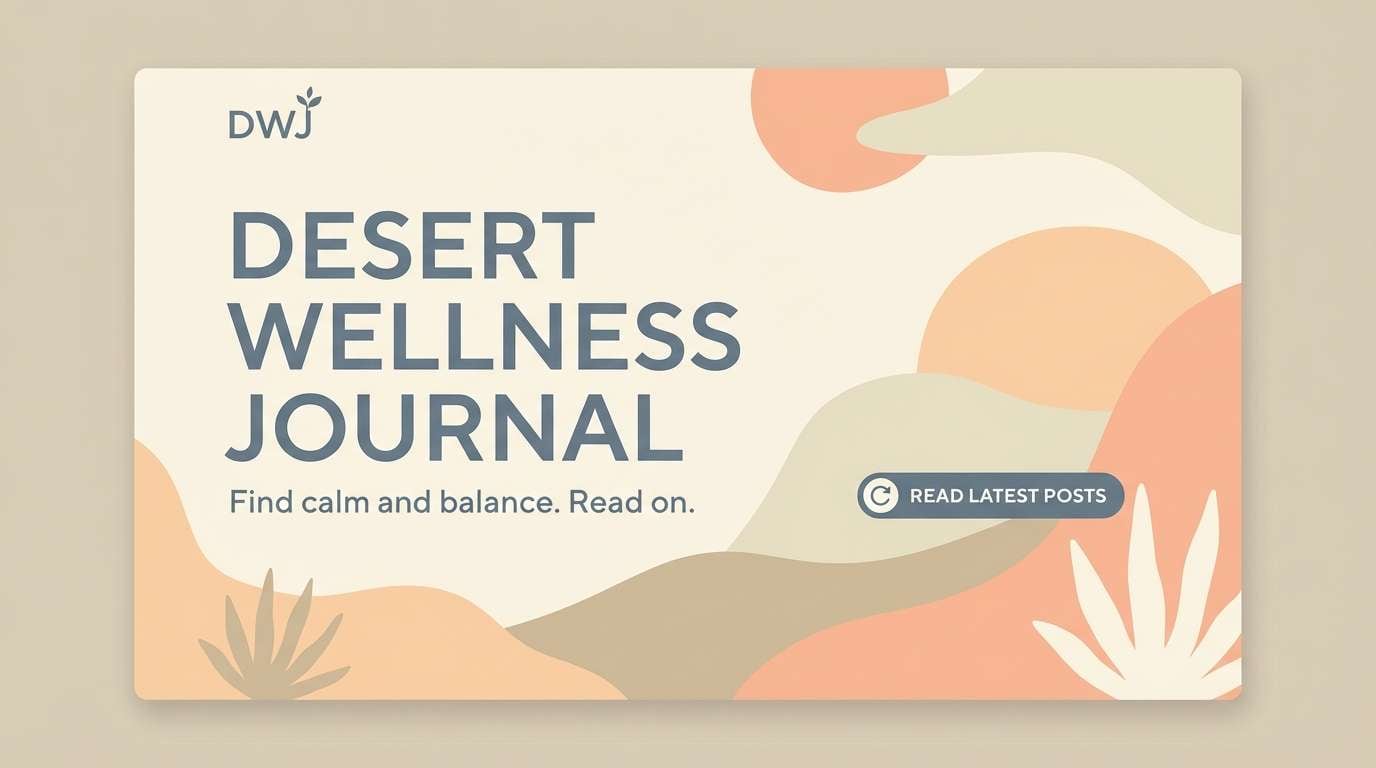
11) Desert Daybreak
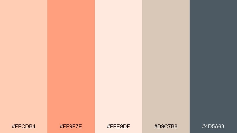
HEX: #ffcdb4 #ff9f7e #ffe9df #d9c7b8 #4d5a63
Mood: quiet, spacious, sun-warmed
Best for: wellness blog headers and hero sections
Quiet and spacious like dawn over desert sand, this palette feels warm without being loud. Use the orange tones as gentle highlights on CTAs, then let sandy beige carry the background. The slate blue-gray is a great pick for body text and subtle dividers. Tip: add soft, oversized shapes to create depth while keeping the overall look serene.
Image example of desert daybreak generated using media.io
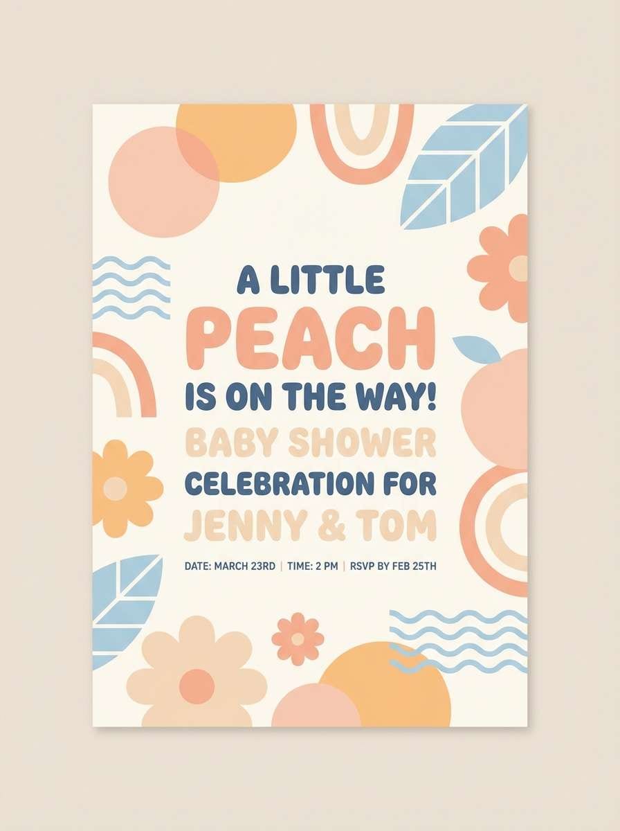
12) Cozy Nursery
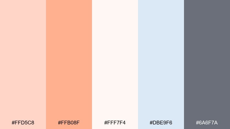
HEX: #ffd5c8 #ffb08f #fff7f4 #dbe9f6 #6a6f7a
Mood: comforting, tender, playful
Best for: baby shower invites and nursery prints
Comforting and tender, these hues feel like soft blankets and warm milk. Peach and apricot add a cheerful glow, while baby blue brings balance and a gentle lullaby calm. Use the off-white as the main canvas so illustrations and type stay airy. Tip: keep line art in the soft gray to avoid harsh contrast on printed keepsakes.
Image example of cozy nursery generated using media.io
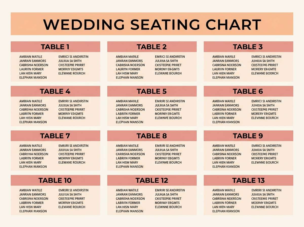
13) Modern Bridal Peach
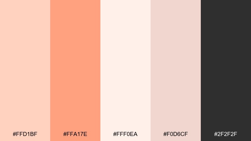
HEX: #ffd1bf #ffa17e #fff0ea #f0d6cf #2f2f2f
Mood: romantic, polished, contemporary
Best for: wedding stationery and seating charts
Romantic but polished, these tones feel like a modern ceremony with a soft glow. A pastel orange color palette like this works beautifully with crisp black typography for a contemporary contrast. Use the peach for monograms and section headers, then rely on the warm blush neutrals for large paper areas. Tip: keep embellishments minimal and let spacing do the luxury work.
Image example of modern bridal peach generated using media.io
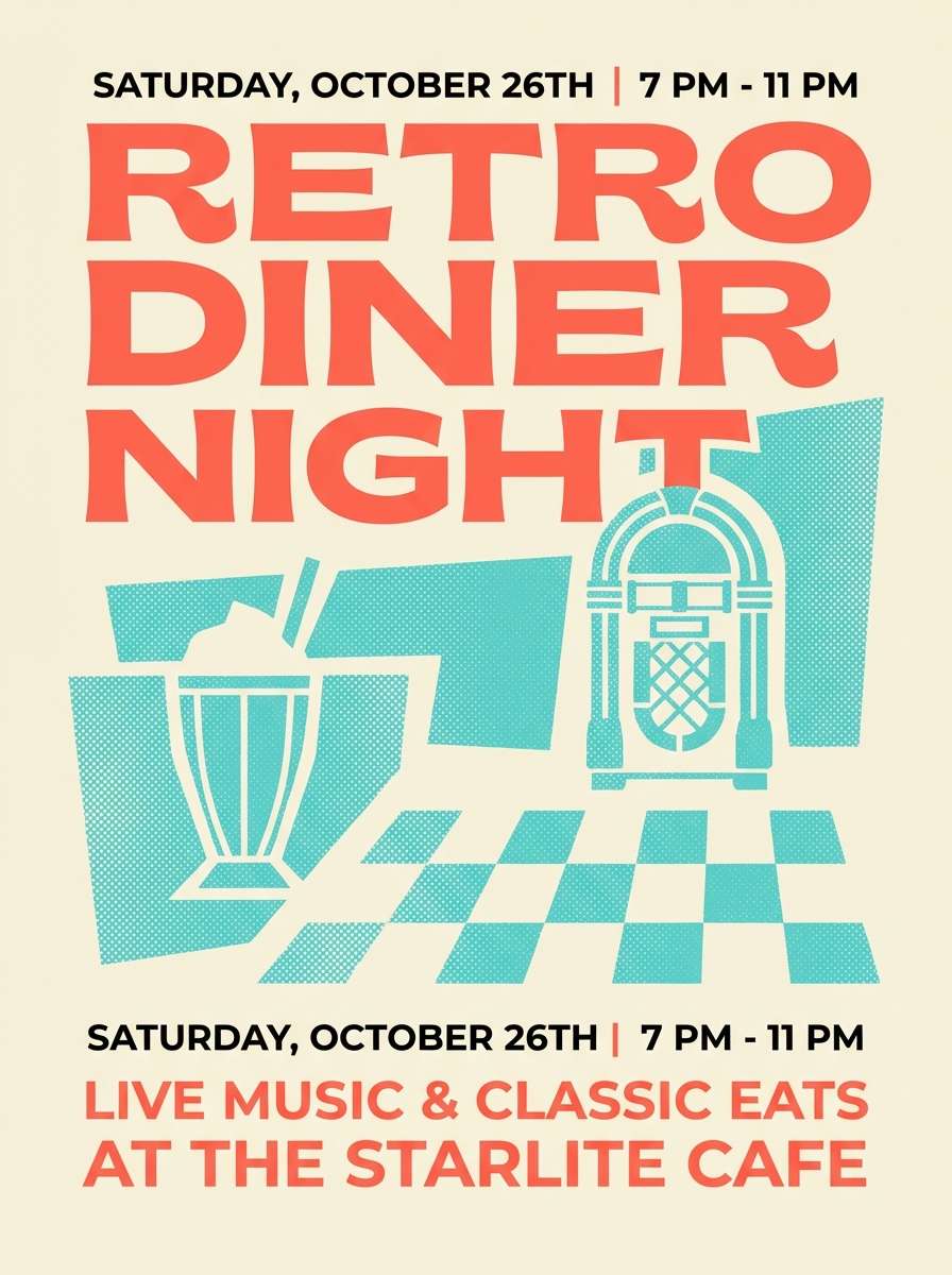
14) Retro Diner Pop
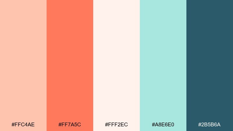
HEX: #ffc4ae #ff7a5c #fff2ec #a8e6e0 #2b5b6a
Mood: fun, bold, nostalgic
Best for: event flyers and promo posters
Fun and punchy like neon reflected on chrome, this set brings retro energy without going full primary. Use the brighter coral for the main headline and the aqua for secondary bursts and icons. The creamy background keeps the poster readable and prevents colors from vibrating. Tip: limit yourself to two font families to keep the nostalgia feeling intentional, not chaotic.
Image example of retro diner pop generated using media.io
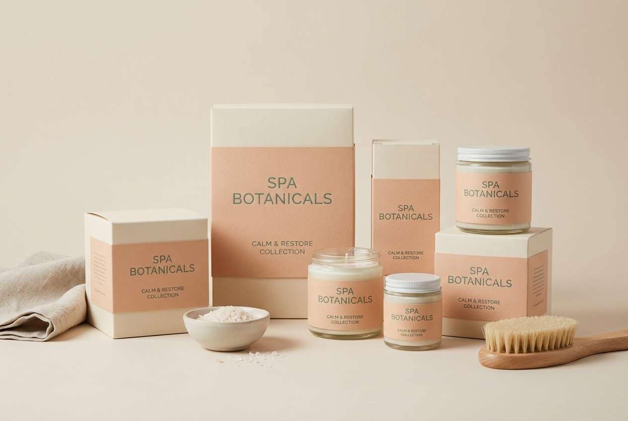
15) Spa Candlelight
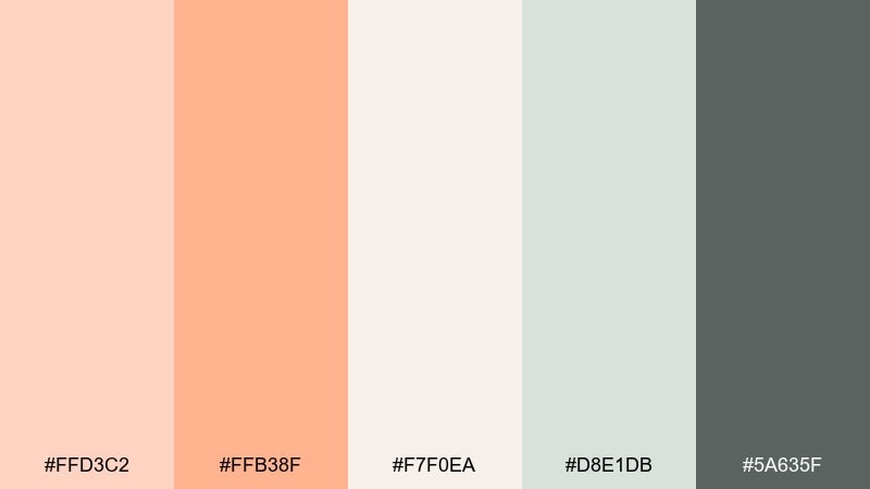
HEX: #ffd3c2 #ffb38f #f7f0ea #d8e1db #5a635f
Mood: soothing, warm, restorative
Best for: spa packaging and gift set design
Soothing and warm like candlelight in a quiet spa, these tones feel restorative. Use peach accents for seals, scent names, or small icons, then keep most surfaces in soft cream. The muted eucalyptus gray-green makes a calming secondary color for ingredients and badges. Tip: pair with matte finishes and minimal line illustrations for a premium, serene look.
Image example of spa candlelight generated using media.io
16) Autumn Pastel Market
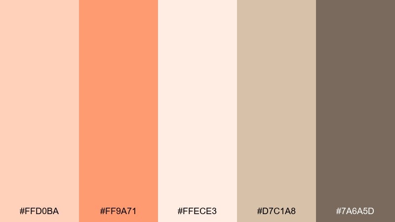
HEX: #ffd0ba #ff9a71 #ffece3 #d7c1a8 #7a6a5d
Mood: seasonal, friendly, rustic
Best for: seasonal storefront banners and email headers
Seasonal and friendly, this mix feels like a weekend market with warm pastries and dried florals. Use the brighter orange for limited-time tags, while the soft beige keeps the layout grounded. The deeper taupe-brown is ideal for type and small dividers in emails. Tip: add subtle paper texture so the colors feel cozy instead of flat.
Image example of autumn pastel market generated using media.io

17) Scandinavian Peach
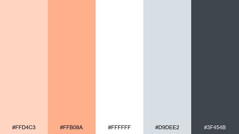
HEX: #ffd4c3 #ffb08a #ffffff #d9dee2 #3f454b
Mood: simple, bright, functional
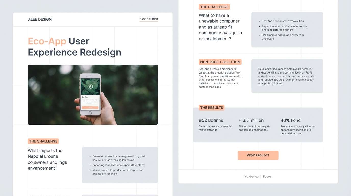
Best for: portfolio websites and case studies
Simple and bright, this set feels like a tidy Scandinavian interior with morning light. Use peach sparingly for emphasis in charts, links, or section markers, while white and cool gray handle structure. The dark slate keeps long-form reading comfortable and professional. Tip: stick to one accent per screen so the warm tone feels intentional and modern.
Image example of scandinavian peach generated using media.io
18) Tropical Sherbet
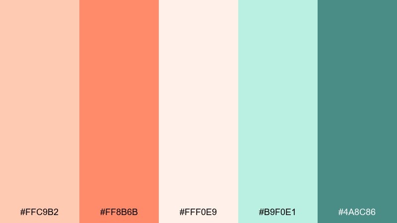
HEX: #ffc9b2 #ff8b6b #fff0e9 #b9f0e1 #4a8c86
Mood: bright, breezy, vacation-ready
Best for: summer campaign graphics and social templates
Bright and breezy like a beach drink with fruit slices, this palette feels instantly summery. Pastel orange color combinations like this look best when coral is used for one hero element and the minty aqua supports it. Keep the cream as the primary background to avoid overwhelming small screens. Tip: choose high-contrast text colors for mobile, especially over the mid coral.
Image example of tropical sherbet generated using media.io
19) Editorial Peach Noir
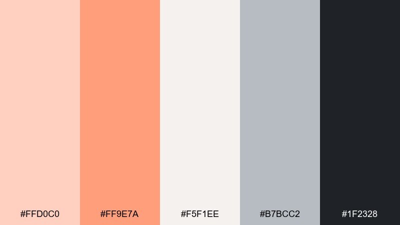
HEX: #ffd0c0 #ff9e7a #f5f1ee #b7bcc2 #1f2328
Mood: fashion-forward, sharp, sophisticated
Best for: magazine layouts and lookbooks
Fashion-forward and sharp, this mix feels like peach blush against inky editorial type. Use the deep near-black for headlines and captions, then add orange as highlight bars and pull-quote marks. The cool gray keeps columns and rules tidy without stealing attention. Tip: keep imagery consistent with warm skin tones so the peach accents feel integrated.
Image example of editorial peach noir generated using media.io
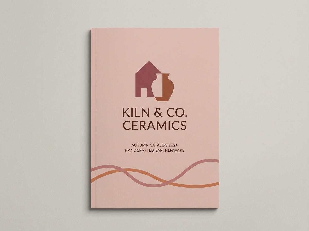
20) Clay Rosewood
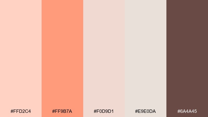
HEX: #ffd2c4 #ff9b7a #f0d9d1 #e9e0da #6a4a45
Mood: warm, refined, heritage
Best for: ceramics branding and artisan catalogs
Warm and refined like handcrafted clay with a rosewood stamp, these tones feel timeless. Use the cocoa-rosewood for logos and headers, and let the blush neutrals create a soft, tactile page base. The brighter peach can mark product categories or small seals without dominating. Tip: pair with textured photography and simple line icons to keep the heritage feel modern.
Image example of clay rosewood generated using media.io
21) Honey Peach Picnic
HEX: #ffd7bf #ffb07d #fff6ef #c9d8a7 #6f7b4f
Mood: cheerful, outdoorsy, wholesome
Best for: spring picnic invites and outdoor event flyers
Cheerful and outdoorsy, this mix feels like picnic blankets and fresh fruit. The peach and honey-orange work beautifully with leafy greens for a natural, seasonal look. Use the creamy white for open space and the darker olive for key details like date and location. Tip: keep illustrations simple and flat so the palette stays light and readable.
Image example of honey peach picnic generated using media.io
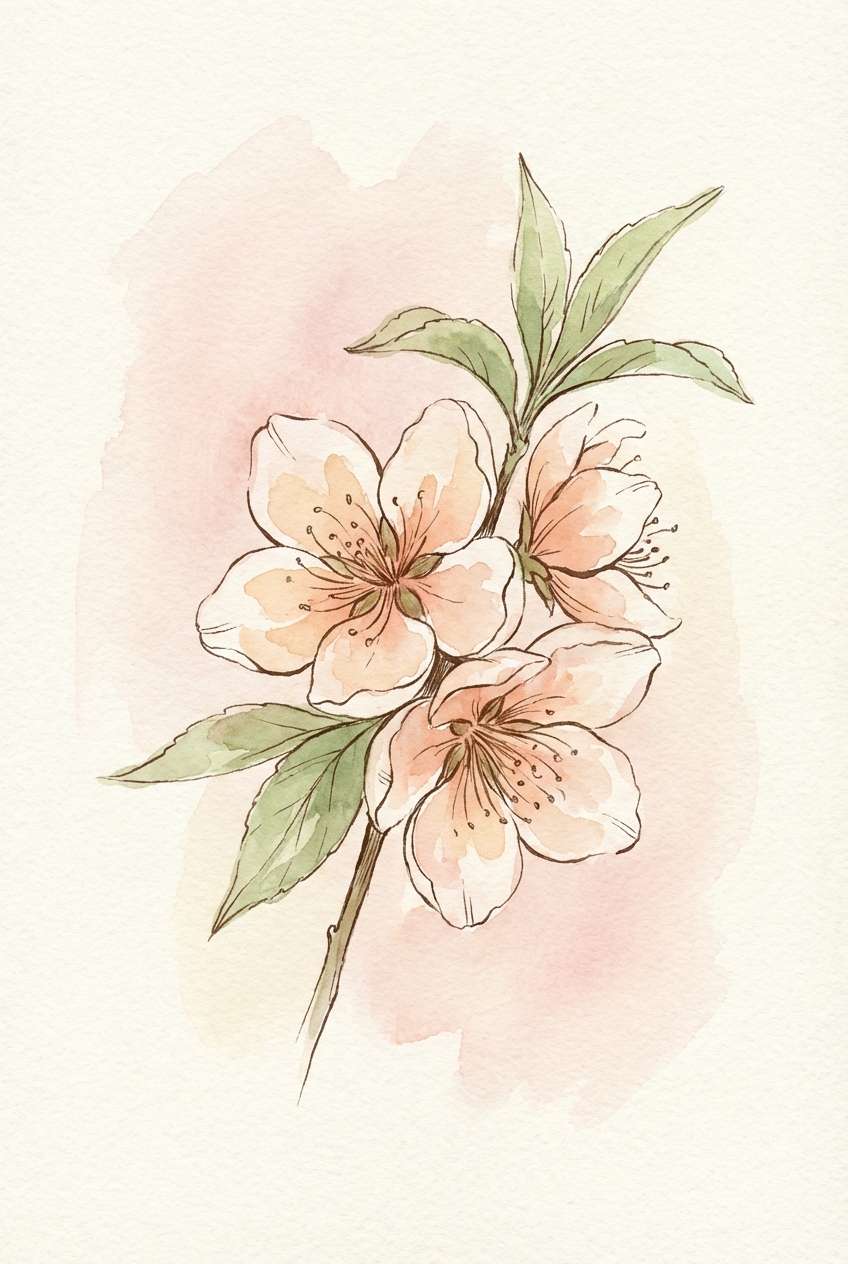
22) Peach Blossom Botanicals
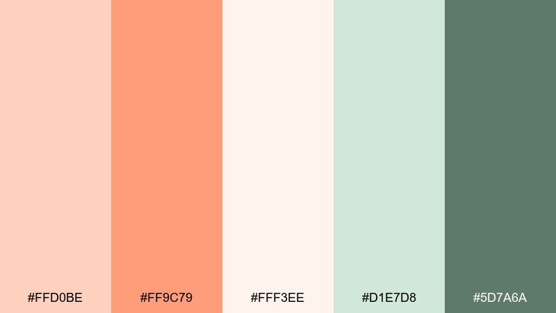
HEX: #ffd0be #ff9c79 #fff3ee #d1e7d8 #5d7a6a
Mood: fresh, floral, springlike
Best for: botanical illustrations and scrapbook stickers
Fresh and floral, these hues evoke peach blossoms and new leaves after rain. Use the peach tones for petals and warm highlights, then layer the greens for stems and soft shadows. The pale blush background keeps the illustration airy and giftable. Tip: vary watercolor transparency so the palette feels hand-painted rather than flat.
Image example of peach blossom botanicals generated using media.io
What Colors Go Well with Pastel Orange?
Creams and off-whites are the easiest match for pastel orange because they keep the palette light and breathable. They’re perfect for backgrounds, negative space, and print paper tones.
For contrast, lean into cool companions like mint, teal, aqua, or slate blue-gray. These hues balance orange’s warmth, making layouts feel clean and contemporary rather than overly sweet.
If you want a grounded, earthy direction, add warm neutrals like taupe, sand, cocoa brown, or olive. This shifts pastel orange toward “artisan” and “heritage” without losing softness.
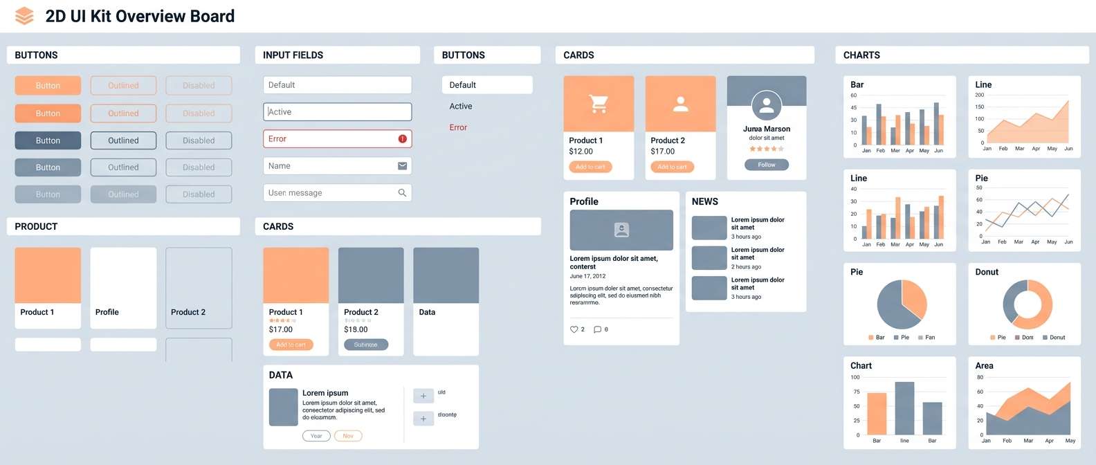
How to Use a Pastel Orange Color Palette in Real Designs
In UI, treat pastel orange as an accent—not a wall-to-wall fill. Use it for primary actions, small badges, progress states, or highlight bars, and keep most surfaces in white/cream for clarity.
In branding and packaging, pastel orange works well with tactile materials (uncoated paper, kraft labels, matte laminates). Pair it with dark, warm typography for legibility and a premium finish.
For weddings and events, pastel orange (peach/apricot) shines in headers, monograms, and florals, while black or deep taupe type keeps everything crisp. Let spacing and simple layouts do the “luxury” work.
Create Pastel Orange Palette Visuals with AI
If you already have HEX codes, you can turn them into consistent mockups by reusing the same prompt structure and swapping only the palette descriptors. This is especially handy for ad sets, UI variations, and seasonal campaigns.
Start with one hero composition (poster, banner, packaging, or UI screen), then iterate: keep layout and typography consistent, but rotate accent colors and background neutrals to explore options fast.
With Media.io’s text-to-image tool, you can generate pastel orange visuals in minutes for mood boards, client presentations, and quick A/B concepts.
Pastel Orange Color Palette FAQs
-
What is a pastel orange color palette?
A pastel orange color palette is a set of soft, low-saturation orange and peach/apricot tones paired with neutrals and complementary accents (like mint, teal, or blue-gray) to create a light, friendly look. -
What colors complement pastel orange best?
Mint, teal, aqua, and slate blue-gray complement pastel orange by adding cool contrast. For warm pairings, cream, sand, taupe, and cocoa brown create a cozy, grounded feel. -
Is pastel orange good for UI design?
Yes—pastel orange is great for UI when used as an accent for CTAs, tags, and micro-interactions. Pair it with off-white surfaces and dark charcoal text to maintain clarity and accessible contrast. -
How do I keep pastel orange from looking “too sweet”?
Add a deep neutral (charcoal, near-black, slate) and one cool counter-color (mint/blue-gray). Limit orange to one or two intensity levels so it stays intentional rather than sugary. -
What finish works best for printing pastel orange palettes?
Uncoated or matte stocks usually preserve the softness of pastel oranges better than glossy finishes. If you use embellishments (foil/spot UV), keep them small so the palette remains airy. -
Can I generate pastel orange themed mockups with AI prompts?
Yes. Use a clear design type (e.g., “2D UI mockup” or “packaging layout”), specify pastel peach/apricot accents, add a neutral background, set a typography color, and keep the prompt consistent across variations. -
What’s the difference between pastel orange and peach?
Pastel orange is the broader family of soft orange tones; peach typically leans slightly pinker and creamier. In practice, they’re often used together as adjacent shades in the same palette.


