

Pastel blue is one of the easiest colors to build around: it feels airy, modern, and calming without turning cold. In digital design, it softens interfaces; in rooms and print, it brings lightness and space.
Below are pastel blue color palette ideas with ready-to-use HEX codes, plus practical notes on mood, best use cases, and AI-generated example prompts you can remix for your own visuals.
In this article
- Why Pastel Blue Palettes Work So Well
-
- cloud harbor
- icy peony
- seaside linen
- blueberry milk
- frosted sage
- soft orbit
- morning pool
- powder denim
- arctic clay
- skywrite
- nordic nursery
- calm circuit
- misty marble
- coastal poster
- winter gelato
- lightwave brand
- serene stationery
- spa bottle
- spring herbarium
- moonlit minimal
- ice chapel
- pebble shore
- driftglass blush
- What Colors Go Well with Pastel Blue?
- How to Use a Pastel Blue Color Palette in Real Designs
- Create Pastel Blue Palette Visuals with AI
Why Pastel Blue Palettes Work So Well
Pastel blue sits in a “low-stress” zone: it reads clean and fresh, but its reduced saturation makes it gentle on the eyes. That’s why it’s a common choice for calming color palettes in UI, wellness, and lifestyle brands.
It’s also extremely flexible. Pastel blue pairs naturally with whites and warm neutrals for minimal layouts, but it can take on personality with accents like blush, peach, butter yellow, or lilac.
Most importantly, pastel blue scales well across mediums. On screens it looks modern and airy; in print and interiors it brings brightness without the harshness of pure white or intense cyan.
20+ Pastel Blue Color Palette Ideas (with HEX Codes)
1) Cloud Harbor
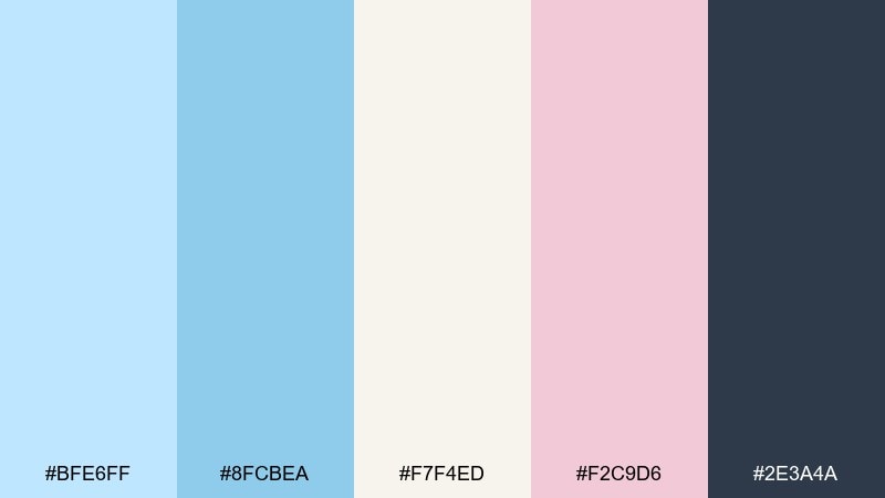
HEX: #BFE6FF #8FCBEA #F7F4ED #F2C9D6 #2E3A4A
Mood: airy, coastal, reassuring
Best for: landing page hero and lifestyle branding
Airy like sea mist rolling into a quiet harbor, these tones feel light but grounded. The mix reads clean for web hero sections, skincare brands, and editorial banners. Pair the soft blues with warm ivory for breathing room, then use charcoal for type and icons. Usage tip: keep the blush as a small accent for buttons or badges to avoid a candy look while still adding warmth to the pastel blue color palette.
Image example of cloud harbor generated using media.io
Media.io is an online AI studio for creating and editing video, image, and audio in your browser.

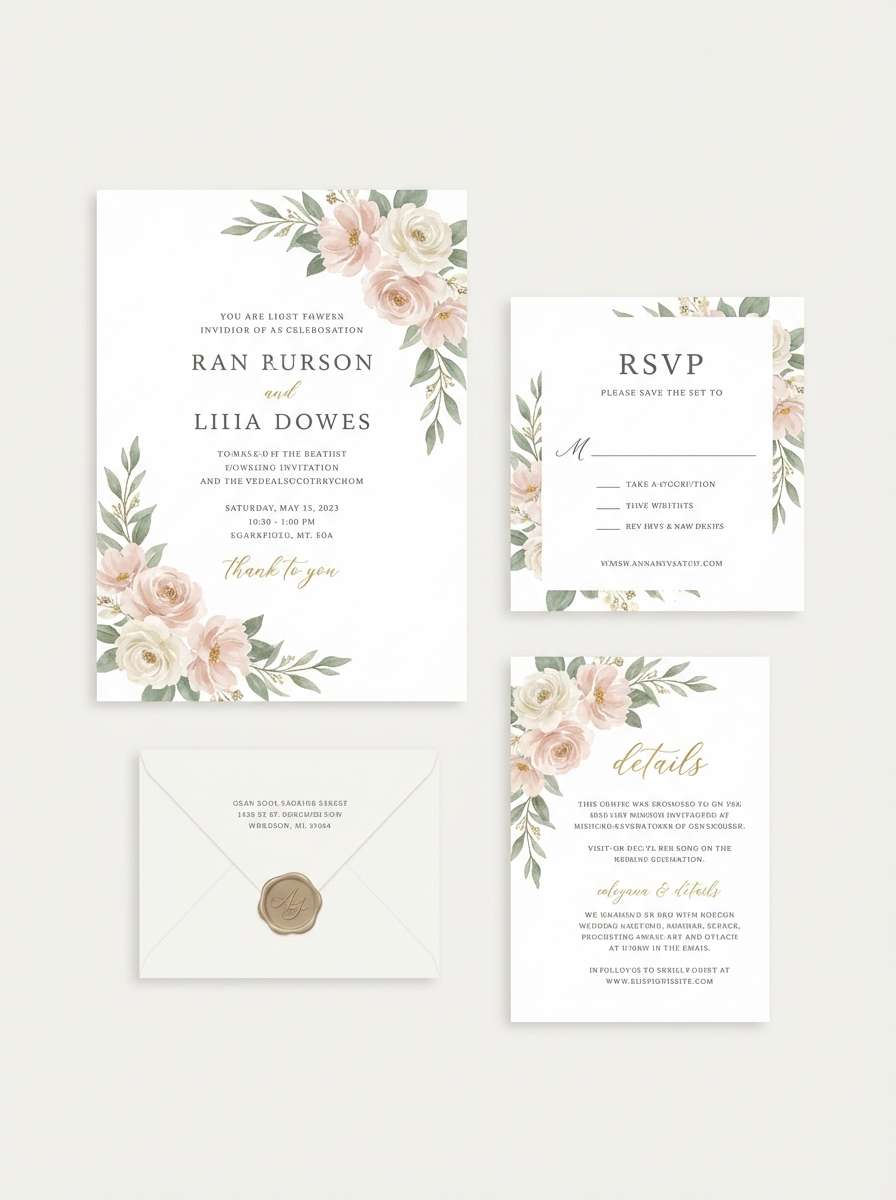
2) Icy Peony
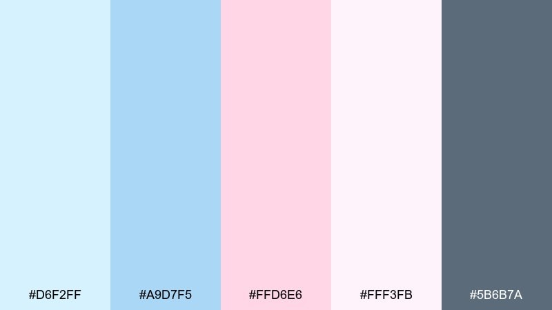
HEX: #D6F2FF #A9D7F5 #FFD6E6 #FFF3FB #5B6B7A
Mood: romantic, frosted, delicate
Best for: wedding invitation suite and RSVP cards
Romantic and frosted, this set feels like peonies on a cool morning. It shines on invitations, save the dates, and soft event signage where you want elegance without heavy contrast. Let the pale blue hold the background, then layer peony pink for names and highlights. Usage tip: print tests matter here, so slightly deepen the gray for text to keep readability on textured paper.
Image example of icy peony generated using media.io
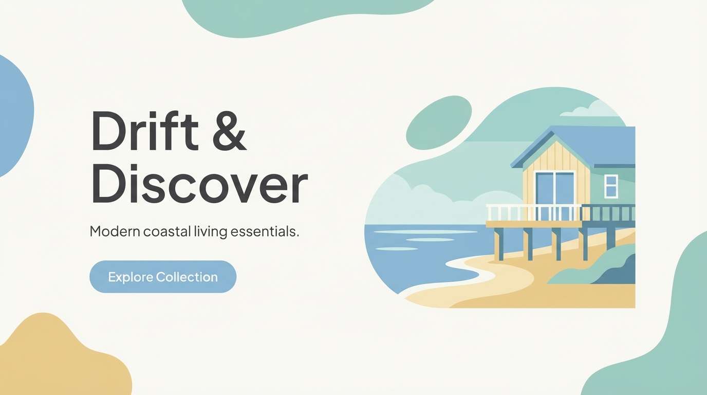
3) Seaside Linen
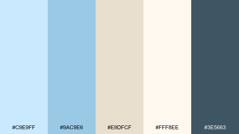
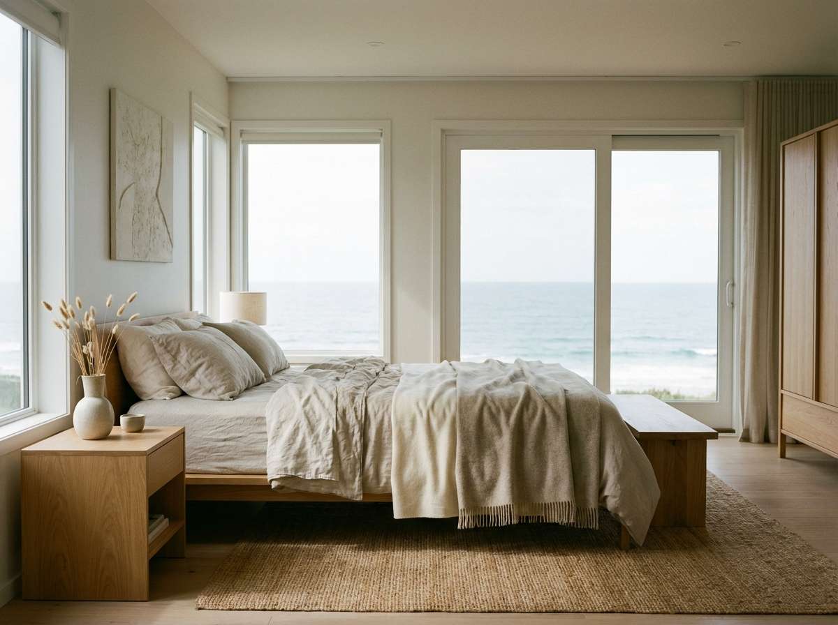
HEX: #C9E9FF #9AC9E6 #E9DFCF #FFF8EE #3E5663
Mood: sun-washed, relaxed, natural
Best for: coastal home decor and bedroom walls
Sun-washed and relaxed, it evokes linen curtains and beach air. These tones work beautifully for bedrooms, living rooms, and calm hospitality spaces where you want brightness without glare. Pair the blues with sand and warm cream to keep the room inviting, then add the deep teal for frames or hardware. Usage tip: repeat the sand tone in textiles so the blue feels intentional rather than chilly.
Image example of seaside linen generated using media.io
4) Blueberry Milk
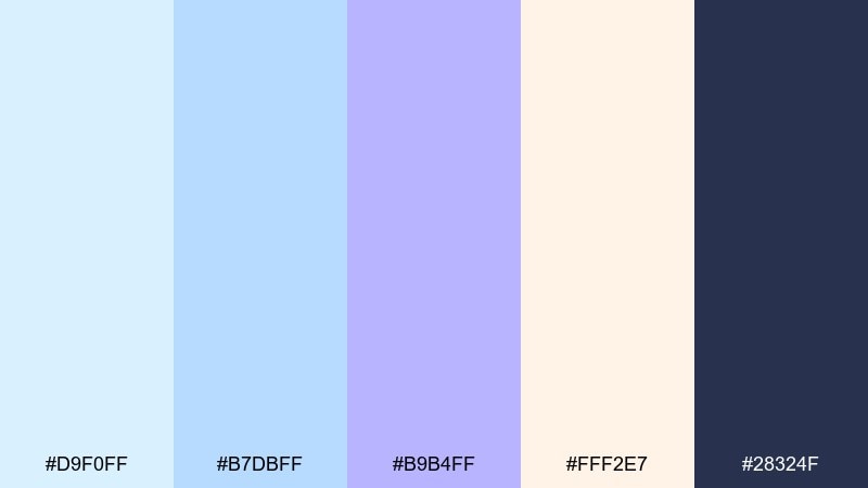
HEX: #D9F0FF #B7DBFF #B9B4FF #FFF2E7 #28324F
Mood: playful, creamy, modern
Best for: app onboarding screens and friendly SaaS UI
Playful and creamy, it feels like blueberry milk in a frosted glass. The gentle contrast makes it ideal for onboarding flows, empty states, and illustrations that need to stay light. These pastel blue color combinations also pair well with a deep inky navy for headers and navigation. Usage tip: reserve the purple periwinkle for progress indicators so the interface stays calm while still feeling guided.
Image example of blueberry milk generated using media.io
5) Frosted Sage
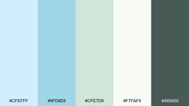
HEX: #CFEFFF #9FD6E8 #CFE7D9 #F7FAF5 #485A55
Mood: spa-like, balanced, fresh
Best for: wellness blog visuals and yoga studio branding
Spa-like and balanced, these colors suggest cool water and fresh herbs. Use them for wellness blogs, yoga studios, or packaging where calm is the main message. The sage keeps the blues from feeling too sweet, while off-white leaves plenty of negative space. Usage tip: set body text in the deep muted green instead of pure black for a softer, premium finish.
Image example of frosted sage generated using media.io
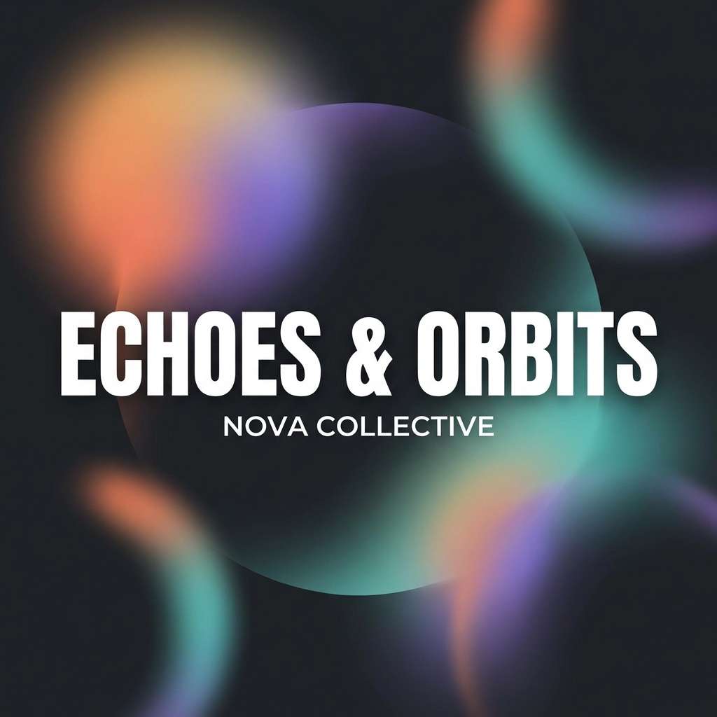
6) Soft Orbit
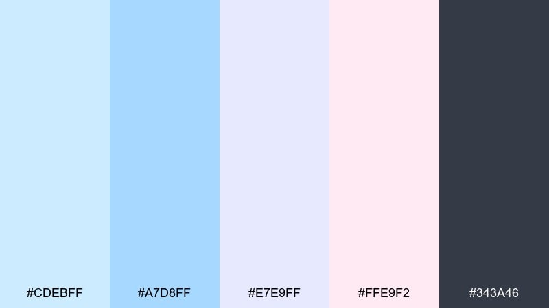
HEX: #CDEBFF #A7D8FF #E7E9FF #FFE9F2 #343A46
Mood: dreamy, futuristic, gentle
Best for: music cover art and streaming thumbnails
Dreamy and a little futuristic, it looks like light halos in a night sky. The cool blues and lilac make cover art feel modern without turning harsh. Add the blush as a tiny glow accent, and keep the dark gray for titles to stay readable at thumbnail size. Usage tip: use simple gradients between the two blues for depth, then keep typography crisp and minimal.
Image example of soft orbit generated using media.io
7) Morning Pool
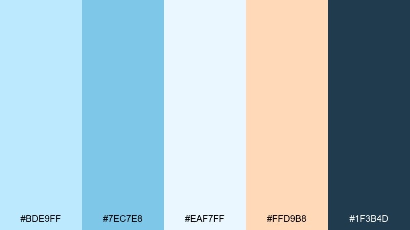
HEX: #BDE9FF #7EC7E8 #EAF7FF #FFD9B8 #1F3B4D
Mood: energizing, clean, sunny
Best for: summer campaign banners and travel ads
Energizing like a clear pool at sunrise, this mix feels fresh and optimistic. It works for travel campaigns, summer promos, and sports studios that want bright color without neon. The soft orange brings warmth, while the deep teal gives you strong CTAs and headings. Usage tip: keep imagery high key and airy so the palette stays light and welcoming.
Image example of morning pool generated using media.io

8) Powder Denim
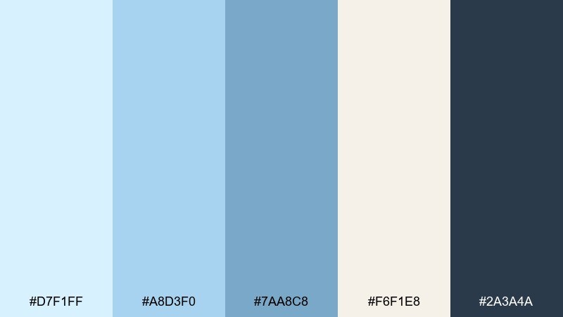
HEX: #D7F1FF #A8D3F0 #7AA8C8 #F6F1E8 #2A3A4A
Mood: casual, classic, dependable
Best for: ecommerce UI and product listing pages
Casual and classic, it channels well-worn denim with a clean, modern lift. These blues are ideal for ecommerce layouts, filters, and product detail pages that need trust and clarity. Pair with warm off-white backgrounds to keep it approachable, then use the dark slate for price and primary buttons. Usage tip: limit the mid-blue to hover states and tags so the interface does not feel heavy.
Image example of powder denim generated using media.io
9) Arctic Clay
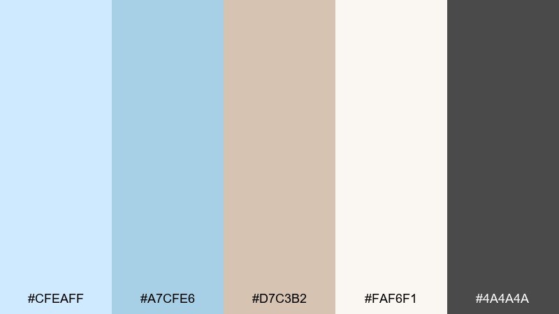
HEX: #CFEAFF #A7CFE6 #D7C3B2 #FAF6F1 #4A4A4A
Mood: quiet, earthy, contemporary
Best for: ceramic brand packaging and labels
Quiet and earthy, it feels like pale sky above handmade clay. The cool blues keep things modern, while the warm clay tone adds craft and tactility. Use it on labels, boxes, and shipping inserts, pairing the cream as your main substrate color. Usage tip: emboss or spot varnish the charcoal text for a premium look without adding more color.
Image example of arctic clay generated using media.io
10) Skywrite
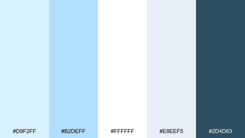
HEX: #D9F2FF #B2DEFF #FFFFFF #E8EEF5 #2D4D63
Mood: editorial, crisp, open
Best for: magazine layouts and blog editorial design
Crisp and open, it suggests white pages with sky-tinted highlights. This set is perfect for editorial layouts, blog templates, and long-form reading where clarity matters. Use white and pale gray for the page, then bring in the deeper blue for pull quotes and section dividers. Usage tip: keep line icons in the dark blue to maintain consistency across headers and footers.
Image example of skywrite generated using media.io
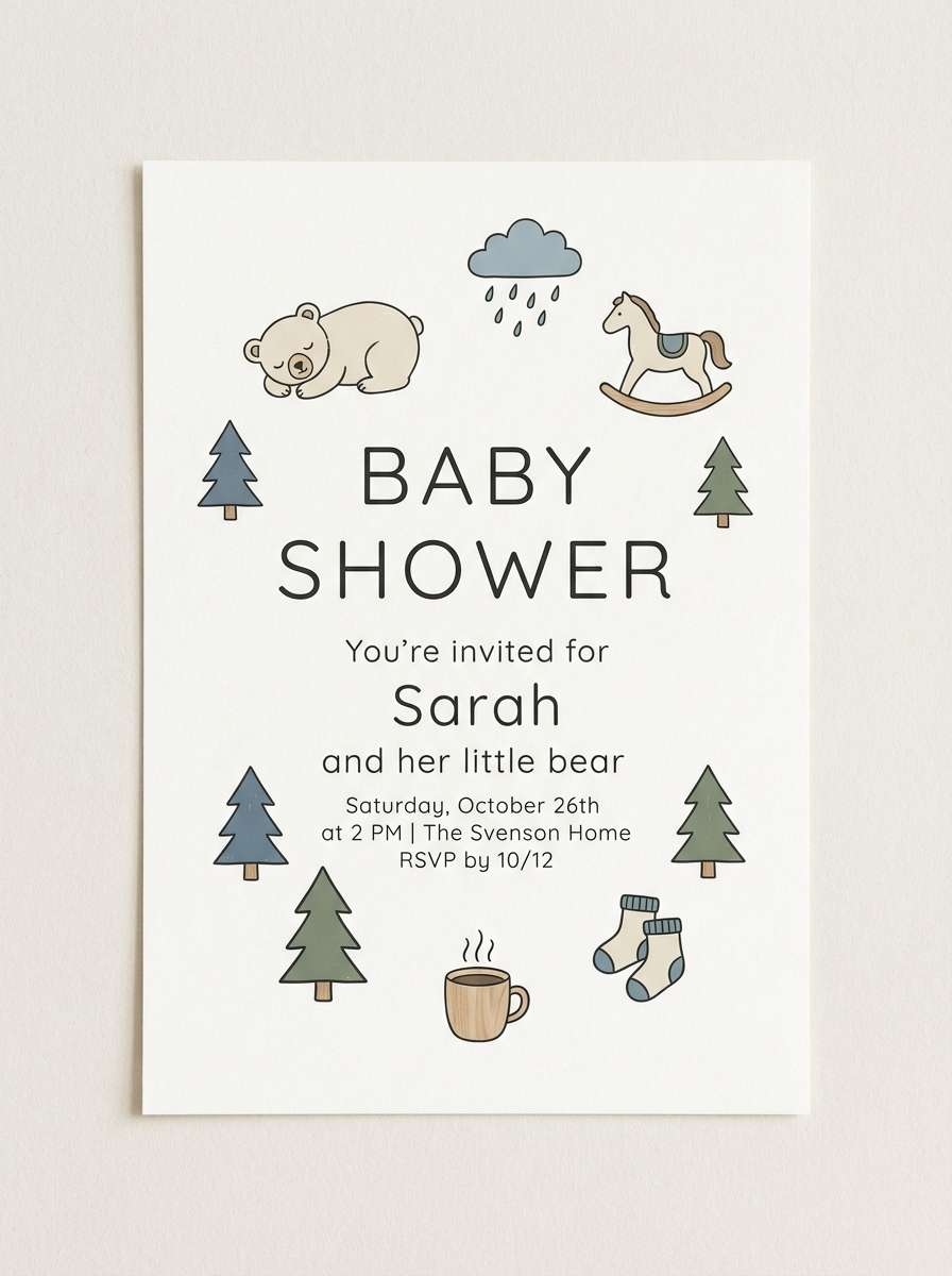
11) Nordic Nursery

HEX: #CFEFFF #B8D7FF #FFF1E6 #FBE8FF #4B5563
Mood: gentle, cozy, childlike
Best for: nursery decor and baby shower invites
Gentle and cozy, it feels like knitted blankets and soft daylight. These tones are great for nursery decor, baby shower graphics, and milestone cards that should feel warm, not sugary. Pair the peach with the light blue for a soothing balance, and keep the gray for text and outlines. Usage tip: use rounded shapes and plenty of whitespace so the palette stays airy.
Image example of nordic nursery generated using media.io
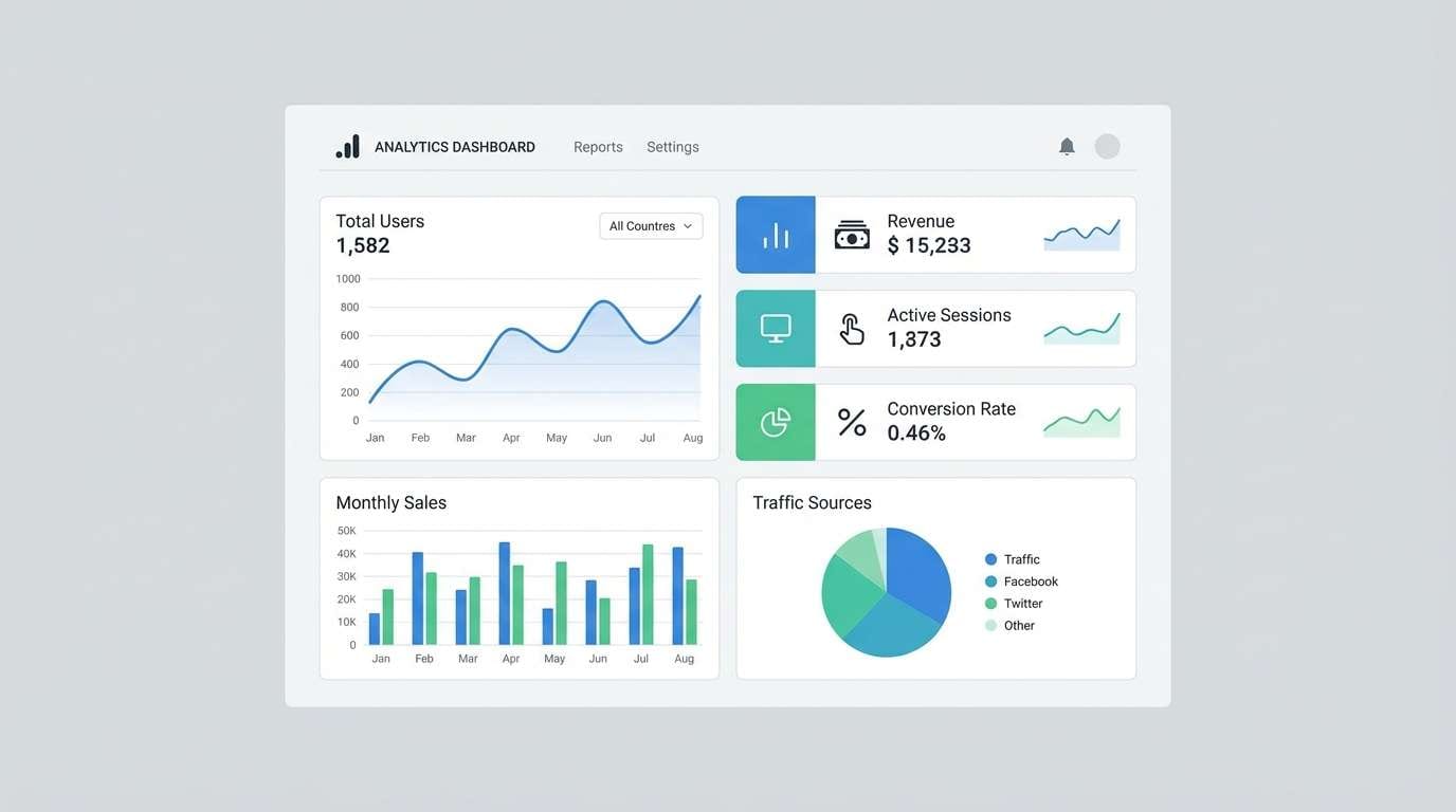
12) Calm Circuit
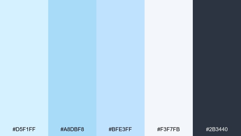
HEX: #D5F1FF #A8DBF8 #BFE3FF #F3F7FB #2B3440
Mood: focused, techy, calm
Best for: dashboard UI and analytics products
Focused and techy, it brings to mind clean data lines on a calm sky backdrop. The tones work as a pastel blue color scheme for dashboards where you want clarity and low eye fatigue. Use the near-white as your canvas, then apply the two blues for charts, selections, and active states. Usage tip: keep the darkest gray for key metrics only, so your hierarchy stays obvious.
Image example of calm circuit generated using media.io
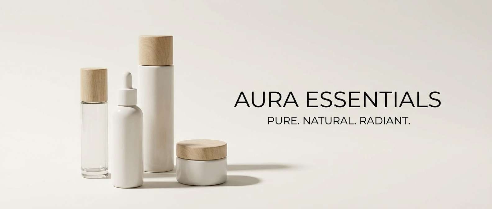
13) Misty Marble
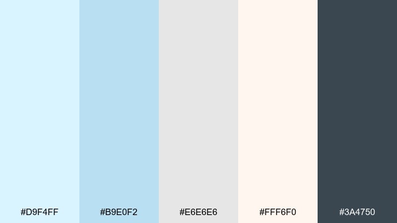
HEX: #D9F4FF #B9E0F2 #E6E6E6 #FFF6F0 #3A4750
Mood: minimal, polished, calm
Best for: beauty product ads and minimal banners
Minimal and polished, it feels like mist over pale marble. The light neutrals keep things premium, while the blue adds a clean, hydrated vibe for beauty visuals. Pair it with simple sans-serif type and subtle shadows so the design stays refined. Usage tip: use the dark slate for only one focal line, like the product name or a short claim.
Image example of misty marble generated using media.io
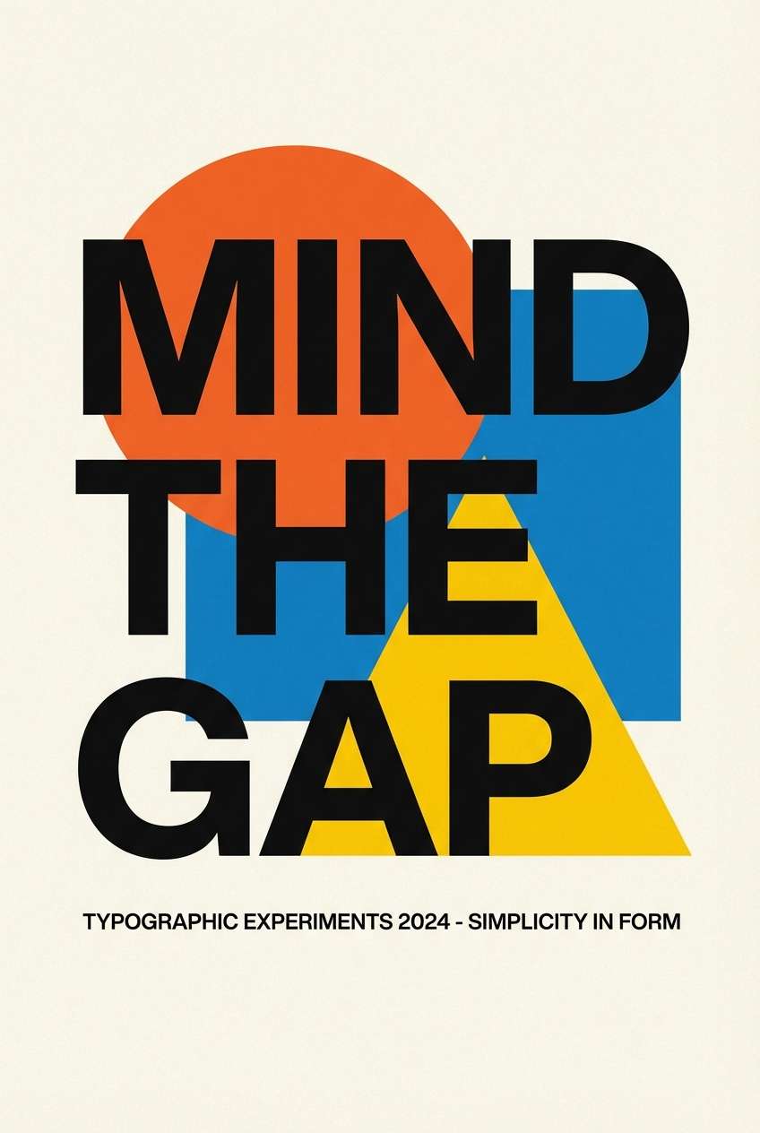
14) Coastal Poster
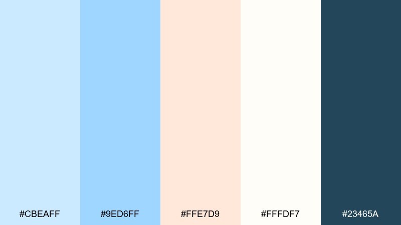
HEX: #CBEAFF #9ED6FF #FFE7D9 #FFFDF7 #23465A
Mood: bright, breezy, graphic
Best for: typographic posters and wall art prints
Bright and breezy, it reads like a clean coastal poster with sunlit accents. The peach warms the composition while the deep blue anchors bold lettering. Use the off-white as your base to keep prints feeling fresh and gallery-like. Usage tip: choose one strong typographic element in the dark blue and keep the rest of the shapes light for an effortless look.
Image example of coastal poster generated using media.io
15) Winter Gelato
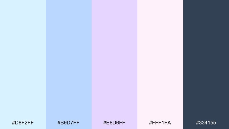
HEX: #D8F2FF #B9D7FF #E6D6FF #FFF1FA #334155
Mood: sweet, frosty, lighthearted
Best for: social media templates and story graphics
Sweet and frosty, it resembles gelato scoops in a winter display case. These colors pop on social templates, story frames, and carousel slides without overwhelming photos. Use the lavender as an accent block behind headlines, and keep the slate for small text and icons. Usage tip: set consistent margins and rounded cards so the visuals feel cohesive across posts.
Image example of winter gelato generated using media.io
16) Lightwave Brand
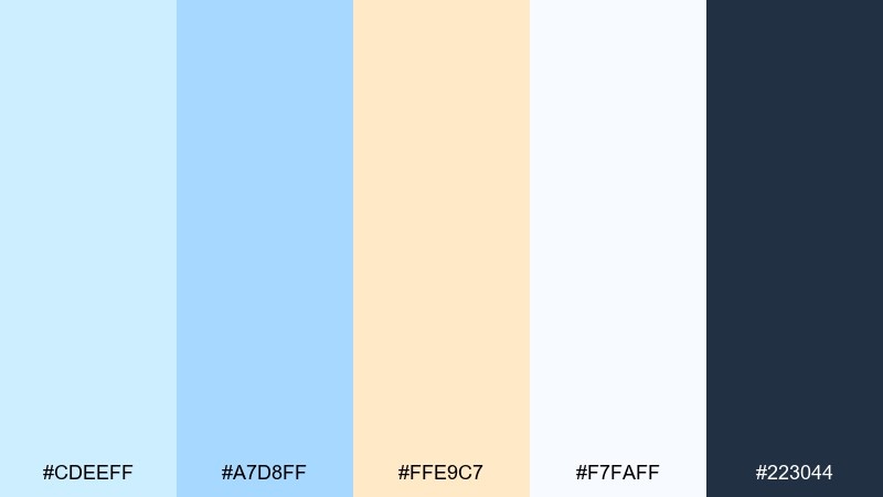
HEX: #CDEEFF #A7D8FF #FFE9C7 #F7FAFF #223044
Mood: optimistic, modern, confident
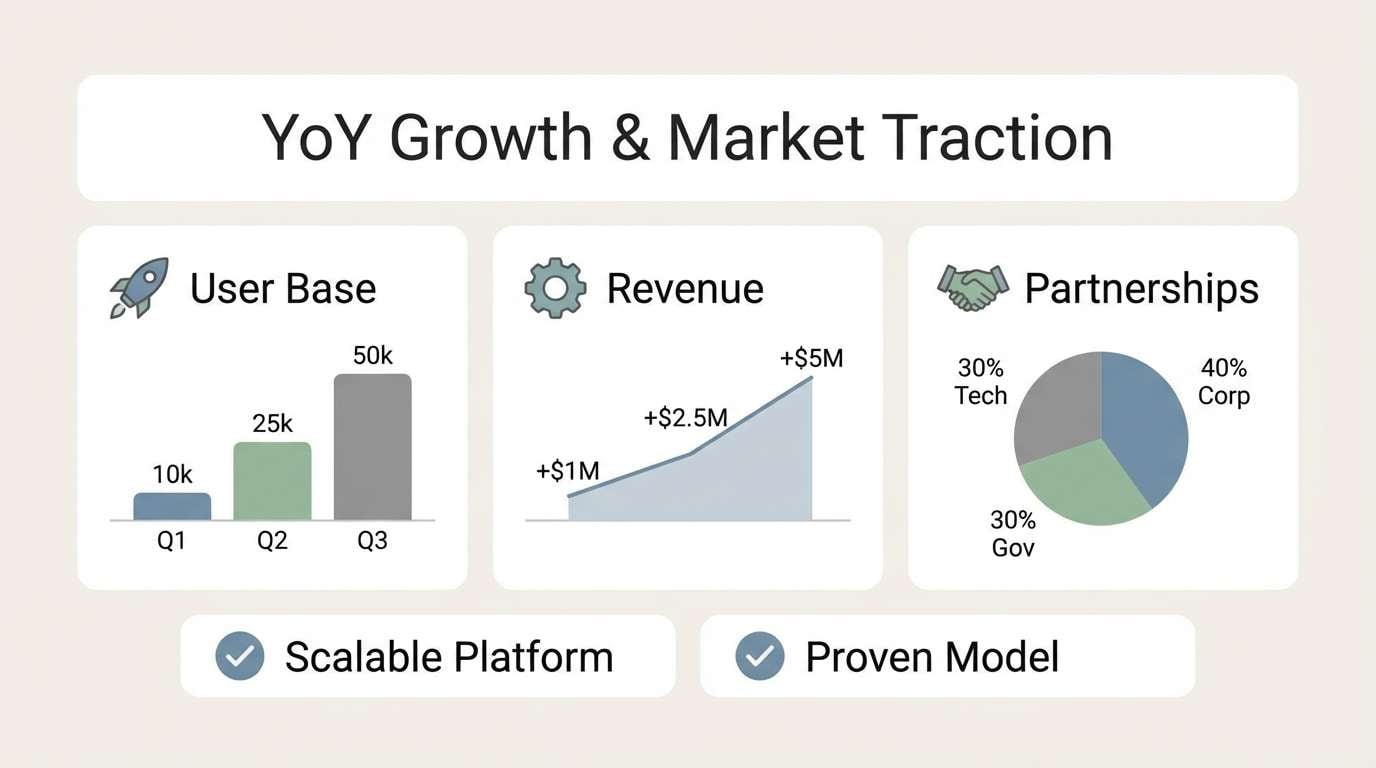
Best for: startup branding and pitch decks
Optimistic and modern, it feels like lightwaves moving across a clear horizon. The warm butter tone adds energy, making it a smart choice for pitch decks and product launches. These pastel blue color combinations look best with crisp typography and a strong navy for headlines. Usage tip: use the butter yellow sparingly for callouts and key numbers so it stays premium.
Image example of lightwave brand generated using media.io
17) Serene Stationery
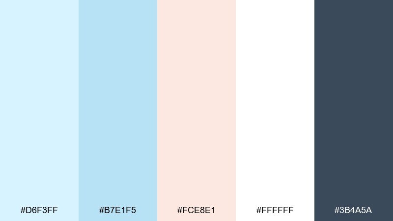
HEX: #D6F3FF #B7E1F5 #FCE8E1 #FFFFFF #3B4A5A
Mood: tidy, soft, uplifting
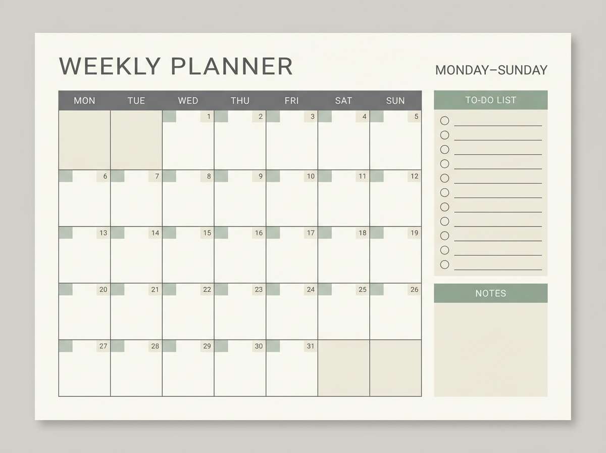
Best for: planner pages and printable stationery
Tidy and soft, it evokes a clean desk and morning notes. The pale blue and white keep pages readable, while the warm blush prevents the layout from feeling clinical. Use the darker gray-blue for headings, dates, and grid lines. Usage tip: keep accent blocks small, like section labels, to preserve plenty of whitespace.
Image example of serene stationery generated using media.io
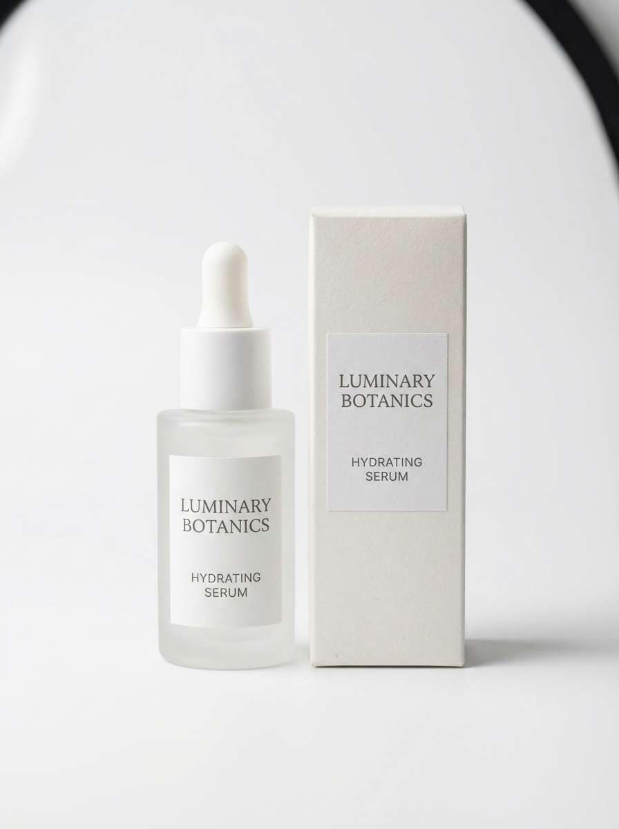
18) Spa Bottle
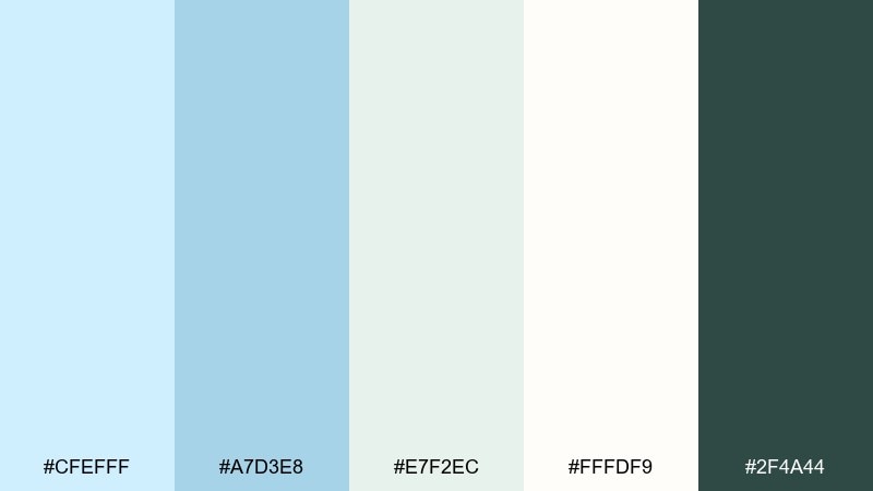
HEX: #CFEFFF #A7D3E8 #E7F2EC #FFFDF9 #2F4A44
Mood: clean, soothing, premium
Best for: skincare packaging and product ads
Clean and soothing, it brings to mind a quiet spa shelf with soft labels. The gentle blue reads instantly as fresh, while mint and cream make the look feel premium. Use the deep green for ingredient text and small seals to keep contrast elegant. Usage tip: choose matte materials and minimal typography so the colors do the work.
Image example of spa bottle generated using media.io
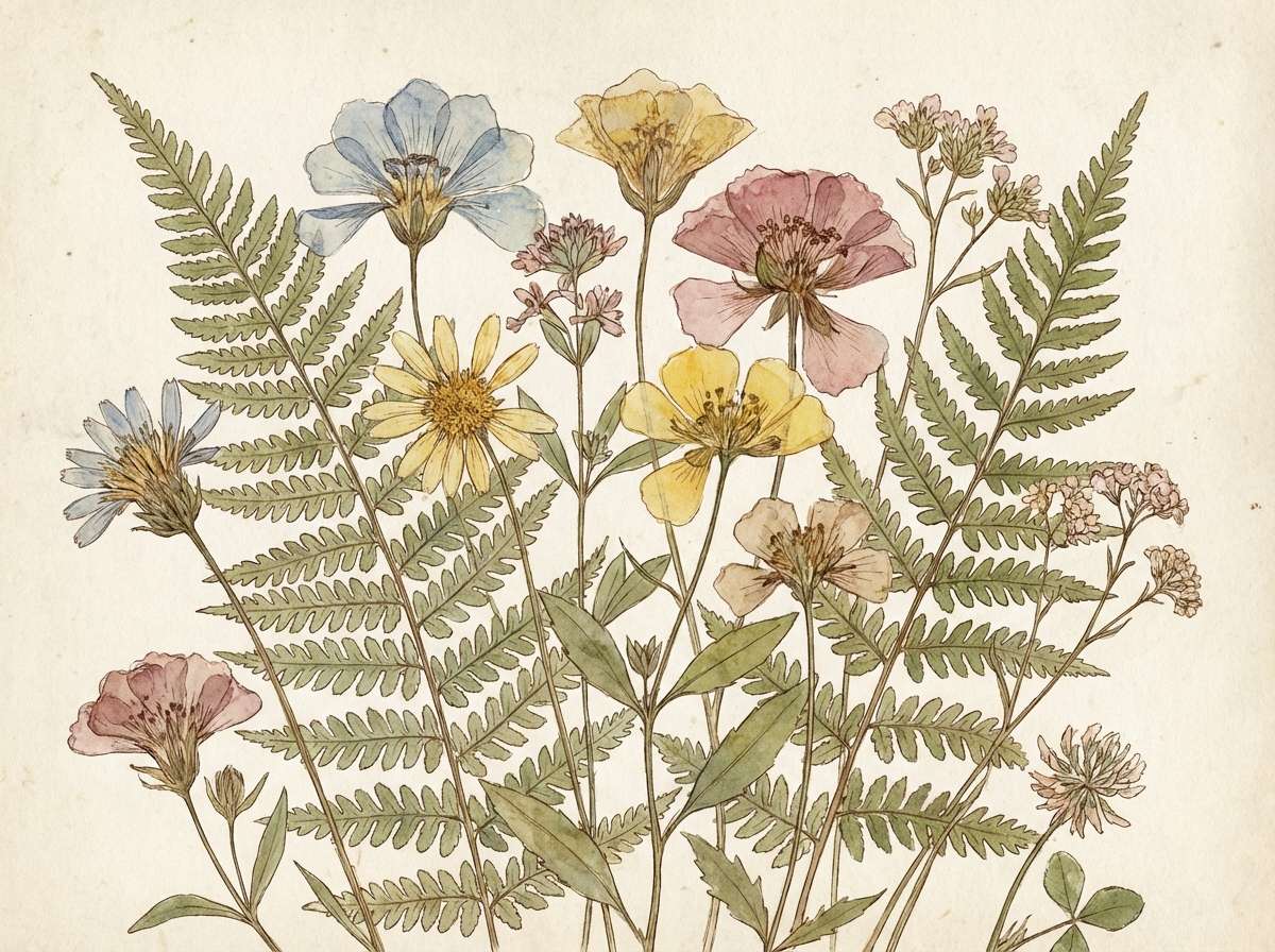
19) Spring Herbarium
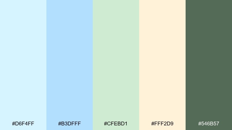
HEX: #D6F4FF #B3DFFF #CFEBD1 #FFF2D9 #546B57
Mood: botanical, light, airy
Best for: watercolor illustrations and spring packaging
Botanical and airy, it feels like pressed leaves under a pale sky. The greens and soft butter tone make it great for spring collections, tea labels, and gentle illustration work. Pair the blue as a wash background and let the green define stems and details. Usage tip: add fine paper texture and keep outlines minimal to maintain a watercolor feel.
Image example of spring herbarium generated using media.io
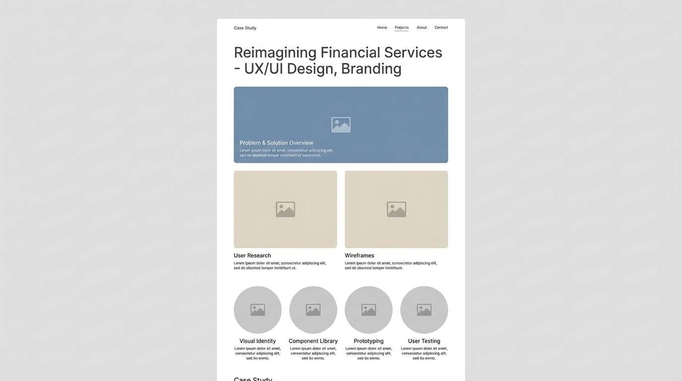
20) Moonlit Minimal
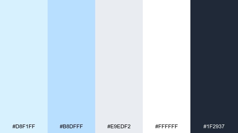
HEX: #D8F1FF #B8DFFF #E9EDF2 #FFFFFF #1F2937
Mood: quiet, minimal, sophisticated
Best for: portfolio websites and case study pages
Quiet and sophisticated, it looks like moonlight on smooth paper. The subtle blues add personality to minimalist layouts without sacrificing readability. Use the near-white and soft gray for sections, then pull in the deep charcoal for navigation and captions. Usage tip: keep imagery consistent in tone and avoid heavy saturation so the page feels curated.
Image example of moonlit minimal generated using media.io
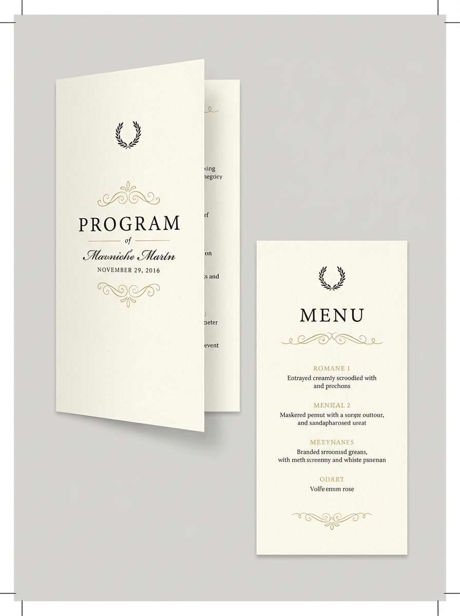
21) Ice Chapel

HEX: #DDF5FF #BDE6FF #F4E9FF #FFF7F0 #3C3F58
Mood: ethereal, serene, elegant
Best for: formal event programs and menus
Ethereal and serene, it recalls an ice chapel lit with soft candles. The lilac keeps the blues feeling special, not corporate, which suits formal programs, menus, and refined stationery. Pair the cream with the lightest blue for the base, then use the deep indigo-gray for text. Usage tip: add thin rules and generous leading to elevate the page.
Image example of ice chapel generated using media.io
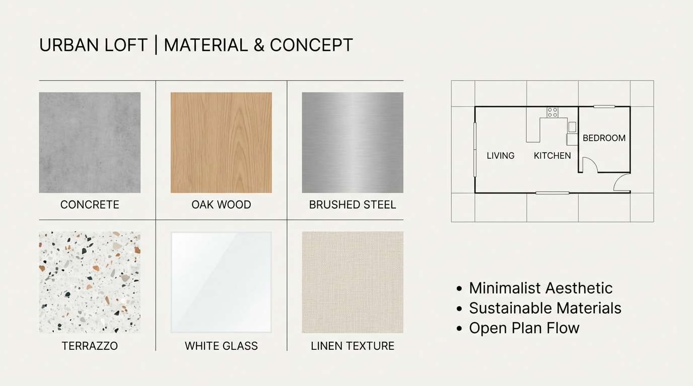
22) Pebble Shore
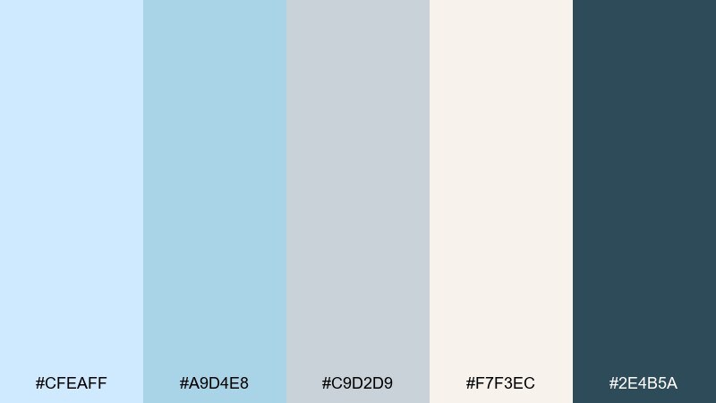
HEX: #CFEAFF #A9D4E8 #C9D2D9 #F7F3EC #2E4B5A
Mood: grounded, coastal, understated
Best for: architecture presentations and mood boards
Grounded and understated, it suggests smooth pebbles against pale surf. The cool gray-blue and stone neutrals suit architecture decks and interior mood boards where materials lead the story. Pair with natural textures like concrete, oak, or terrazzo, and keep the deep teal for section titles. Usage tip: use large blocks of off-white to let material photos breathe.
Image example of pebble shore generated using media.io
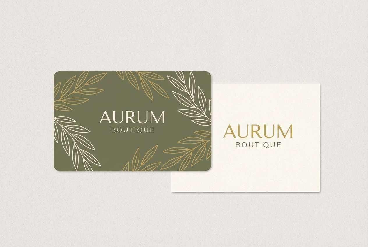
23) Driftglass Blush
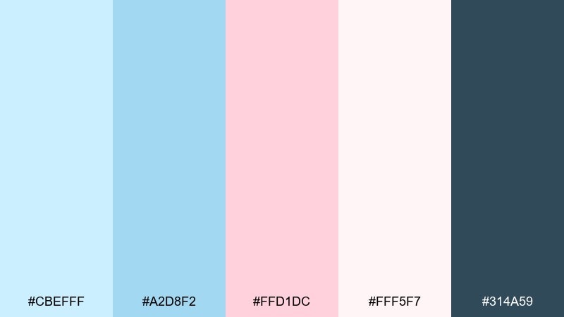
HEX: #CBEFFF #A2D8F2 #FFD1DC #FFF5F7 #314A59
Mood: soft, friendly, romantic
Best for: boutique shop branding and gift cards
Soft and friendly, it feels like driftglass with a blush tint. The pairing works well for boutiques, gift cards, and small-business branding that wants charm without looking childish. Use the pale pink for highlights like tags or stamps, and keep the deeper blue-gray for logos and text. Usage tip: combine with warm paper stock or subtle grain to add character to the pastel blue color palette.
Image example of driftglass blush generated using media.io
What Colors Go Well with Pastel Blue?
Neutrals are the easiest match. Pastel blue and white feels crisp and modern, while warm off-whites, sand, and light gray-blue add softness that works for both UI and interiors.
For accents, pastel blue pairs beautifully with blush pink, peach, and butter yellow when you want warmth and approachability. If you need more structure and contrast, anchor the palette with navy, charcoal, or deep teal for typography, icons, and CTAs.
To keep the scheme sophisticated, aim for one dark anchor, one warm neutral, and one accent color. That balance helps pastel blue shades look intentional instead of washed out.
How to Use a Pastel Blue Color Palette in Real Designs
Start with roles, not swatches: assign a background (near-white or the lightest blue), a surface color (slightly deeper blue), and a text/CTA color (navy or charcoal). This keeps hierarchy clear in interfaces and print layouts.
In rooms, pastel blue works best when it repeats in at least two places (e.g., wall + bedding, or tile + towels). Add warmth through wood, beige textiles, or cream paint so the space doesn’t feel chilly.
For branding, limit bright accents to 5–10% of the composition. Pastel blue combinations look most premium when the design has generous whitespace and consistent typography weights.
Create Pastel Blue Palette Visuals with AI
If you already have HEX codes, you can turn them into moodboards, UI mockups, posters, or packaging concepts in minutes by describing the layout and style you want. Prompts work best when you specify composition (banner, invitation, dashboard), typography style, and a plain background for clean results.
Try generating a few variations with the same palette: one minimal, one playful, and one premium. You’ll quickly see how the same pastel blue color scheme shifts mood depending on contrast, spacing, and accent usage.
When your image looks close, iterate by adjusting only one detail at a time—like “more whitespace,” “higher contrast title,” or “matte packaging material”—to keep results consistent.
Pastel Blue Color Palette FAQs
-
What is a pastel blue HEX code?
Common pastel blue hex codes include #BFE6FF, #D6F2FF, and #CDEBFF. “Pastel blue” isn’t one fixed value—it's a family of light blue tones with low saturation and high brightness. -
Does pastel blue go with white?
Yes. Pastel blue and white is a classic pairing for clean, airy designs. Add a dark anchor like navy or charcoal for readable text and stronger visual hierarchy. -
What accent colors work best with pastel blue?
Blush pink, peach, butter yellow, and lilac are reliable accents for warmth and personality. For a more professional look, use deep teal, slate, or navy as an accent/anchor instead. -
How do I keep pastel blue from looking washed out in UI design?
Use pastel blue primarily for backgrounds and surfaces, then pair it with a darker neutral (navy/charcoal) for text and buttons. Also ensure sufficient contrast (especially for small text) and avoid using multiple light colors for key UI states. -
Is pastel blue good for bedrooms and calming spaces?
Yes. Pastel blue is widely used for bedrooms, bathrooms, and wellness spaces because it feels cool, quiet, and spacious. Warm neutrals (cream, sand, light wood) help balance the coolness. -
What’s a good “dark” pairing for pastel blue?
Navy, deep teal, and charcoal are strong options. They create contrast for headlines and CTAs while keeping the overall palette sophisticated and calm. -
Can I generate pastel blue palette images for brand mockups?
Yes. With a tool like Media.io’s AI image generator, you can create consistent visuals (packaging, posters, UI screens, invitations) by reusing the same palette and describing the layout, typography, and materials in your prompt.


