Orange and purple is a modern, high-contrast pairing that can feel either playful or premium depending on the shades you choose.
Below are 20+ orange purple color palette ideas with HEX codes, plus practical guidance for matching neutrals, choosing accents, and applying the scheme in real designs.
In this article
- Why Orange Purple Palettes Work So Well
-
- citrus dusk
- amethyst sunrise
- neon carnival
- desert lavender
- spiced plum
- tangerine orchid
- autumn aubergine
- sorbet twilight
- cosmic clementine
- velvet mandarin
- grapefruit galaxy
- saffron iris
- pumpkin violet
- sunset cadence
- apricot mulberry
- papaya royale
- burnt sienna bloom
- orange peel lilac
- copper violet mist
- marmalade grape soda
- marigold mauve studio
- What Colors Go Well with Orange Purple?
- How to Use a Orange Purple Color Palette in Real Designs
- Create Orange Purple Palette Visuals with AI
Why Orange Purple Palettes Work So Well
Orange brings warmth, motion, and instant attention, while purple adds depth, imagination, and a modern “night mode” sophistication. Together, they create a bold complementary contrast that stays expressive without feeling chaotic.
This duo also gives you strong hierarchy options: orange naturally pulls focus for CTAs and highlights, and purple makes an excellent anchor for headers, nav, and background panels.
Because both colors have wide shade ranges—from peach to tangerine, lilac to aubergine—you can tune the same orange purple palette to feel playful, premium, retro, or futuristic.
20+ Orange Purple Color Palette Ideas (with HEX Codes)
1) Citrus Dusk
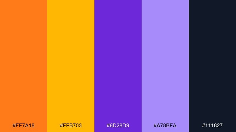
HEX: #ff7a18 #ffb703 #6d28d9 #a78bfa #111827
Mood: bold, energetic, modern
Best for: startup branding and hero sections
Bold sunset energy meets city-night glow, with bright citrus popping against deep violet. It works beautifully for modern brand identities, landing pages, and punchy headlines. Pair it with clean black or near-black typography and keep the lavender as a soft supporting tone. Usage tip: reserve the brightest orange for one primary CTA to avoid visual noise.
Image example of citrus dusk generated using media.io

Media.io is an online AI studio for creating and editing video, image, and audio in your browser.

2) Amethyst Sunrise
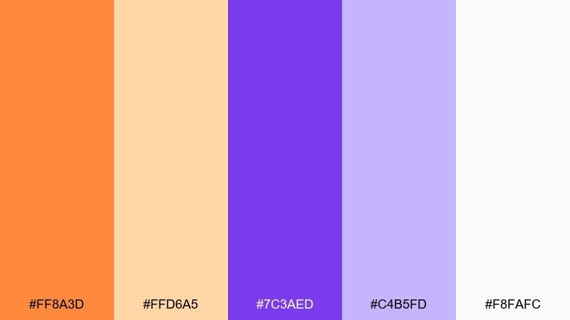
HEX: #ff8a3d #ffd6a5 #7c3aed #c4b5fd #f8fafc
Mood: optimistic, airy, friendly
Best for: wellness websites and email headers
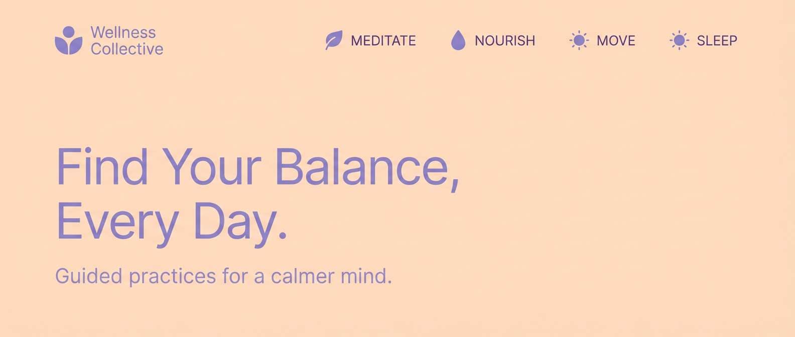
Soft morning light and gentle gemstones create a fresh, approachable feel. The pale peach and off-white keep layouts breathable, while amethyst adds focus and hierarchy. Use the deeper purple for headings and the warm orange for icons or small highlights. Usage tip: add plenty of white space so the pastels stay clean rather than sugary.
Image example of amethyst sunrise generated using media.io
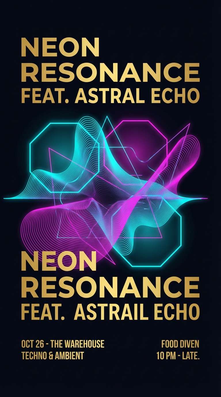
3) Neon Carnival
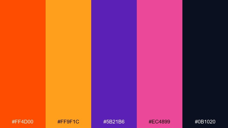
HEX: #ff4d00 #ff9f1c #5b21b6 #ec4899 #0b1020
Mood: electric, playful, high-contrast
Best for: music posters and event promos
Electric lights, late-night energy, and a touch of candy-bright fun make this feel like a festival after dark. For an orange purple color palette that stays readable, lean on the deep navy as your base and keep neon shades for headlines and badges. Add a hint of hot pink to break up large blocks of purple and keep the vibe lively. Usage tip: use bold sans fonts and limit gradients so the poster prints cleanly.
Image example of neon carnival generated using media.io
4) Desert Lavender
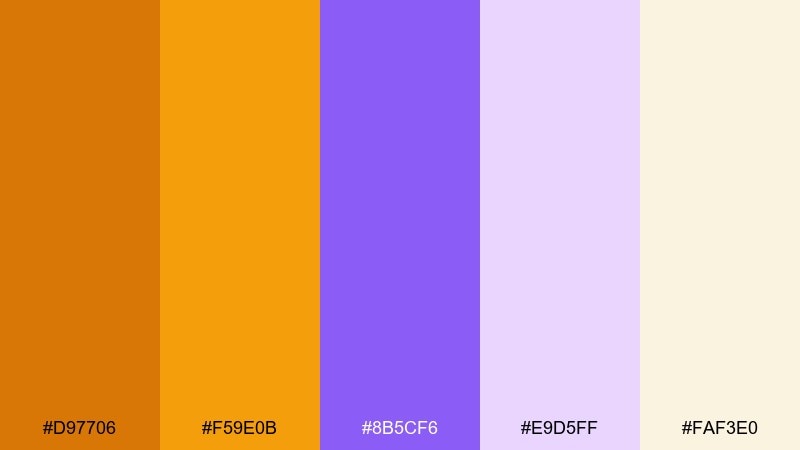
HEX: #d97706 #f59e0b #8b5cf6 #e9d5ff #faf3e0
Mood: sun-baked, calm, natural
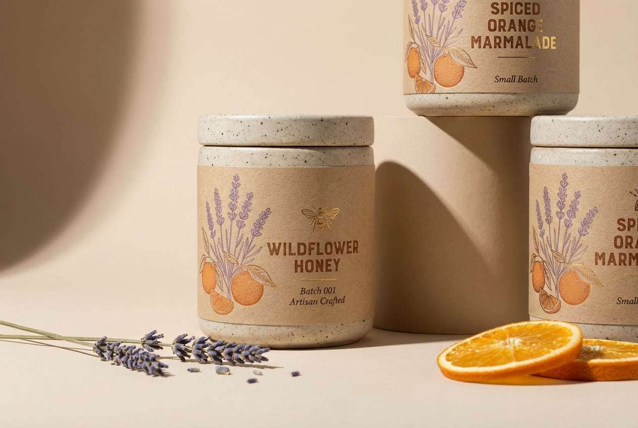
Best for: boutique packaging and artisan labels
Sun-baked sand and wild lavender feel grounded, warm, and quietly premium. The earthy oranges make a strong base for labels, while pale lilac adds a handmade softness. Pair it with textured paper stock or subtle grain to enhance the desert vibe. Usage tip: print the darkest purple for small text to keep readability on warm backgrounds.
Image example of desert lavender generated using media.io
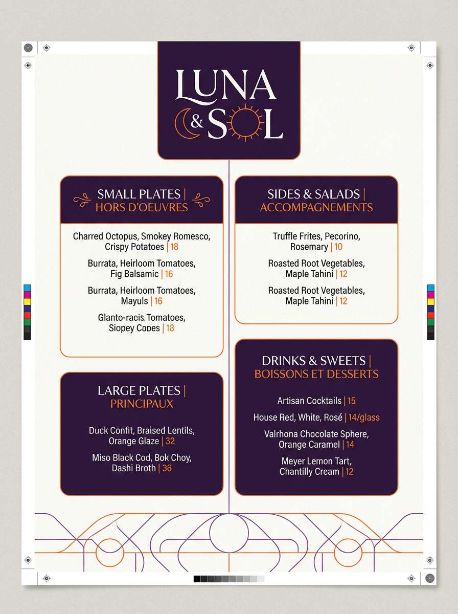
5) Spiced Plum
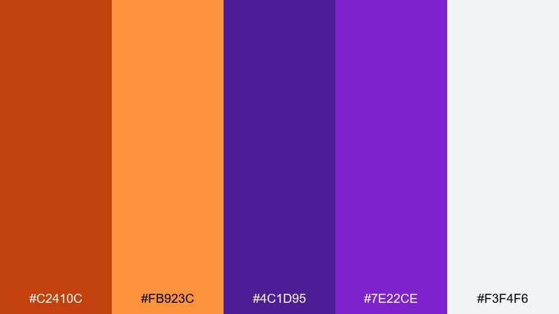
HEX: #c2410c #fb923c #4c1d95 #7e22ce #f3f4f6
Mood: rich, cozy, upscale
Best for: restaurant menus and seasonal campaigns
Rich spice and ripe plum tones bring a cozy, upscale atmosphere that feels perfect for evenings. Use the deep purple as a background panel and set warm orange as the highlight color for prices or callouts. Light gray keeps the palette from turning too heavy in long-form layouts. Usage tip: keep body text dark and reserve the bright orange for short, scannable accents.
Image example of spiced plum generated using media.io
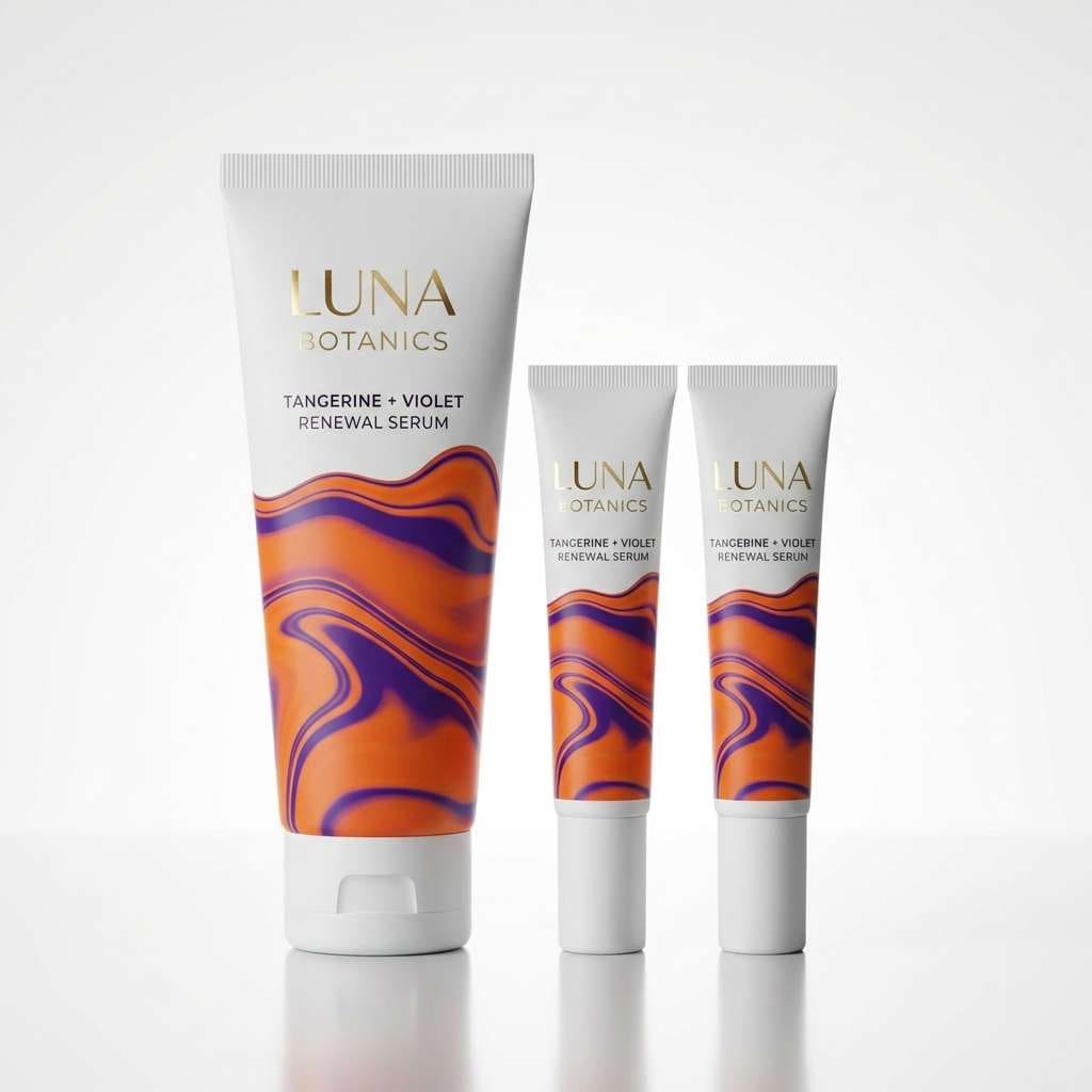
6) Tangerine Orchid
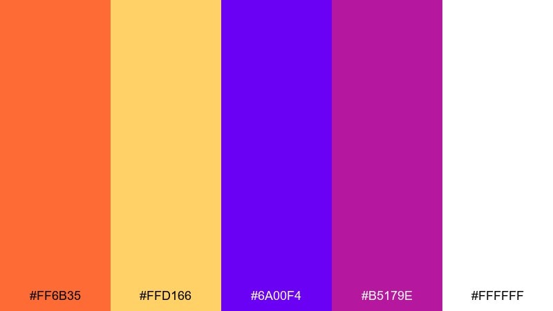
HEX: #ff6b35 #ffd166 #6a00f4 #b5179e #ffffff
Mood: vibrant, trendy, expressive
Best for: beauty branding and social ads
Vibrant tangerine and orchid feel fashion-forward, glossy, and a little dramatic. These orange purple color combinations shine in cosmetics branding, bold social creatives, and influencer-style promos. Keep white dominant for a clean look, then layer purple shadows and orange highlights for depth. Usage tip: use the magenta sparingly as a micro-accent for sparkle and contrast.
Image example of tangerine orchid generated using media.io
7) Autumn Aubergine
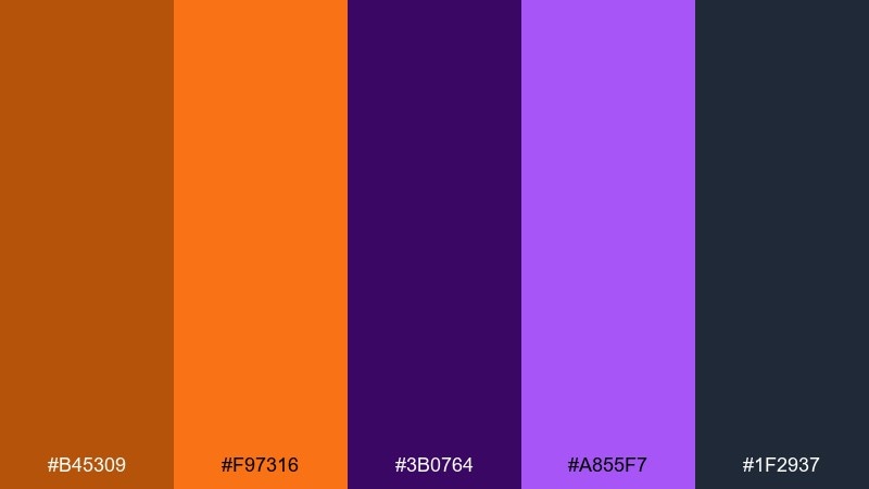
HEX: #b45309 #f97316 #3b0764 #a855f7 #1f2937
Mood: moody, autumnal, dramatic
Best for: book covers and cinematic thumbnails
Moody harvest warmth paired with aubergine shadows feels cinematic and story-driven. The dark purple and charcoal are ideal for atmospheric backgrounds, while orange gives instant focal points. Add subtle texture or grain to make the palette feel more editorial and less flat. Usage tip: keep highlights consistent, using one orange shade for titles and the other for small details.
Image example of autumn aubergine generated using media.io
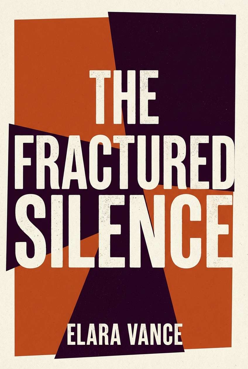
8) Sorbet Twilight
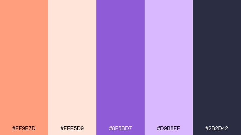
HEX: #ff9e7d #ffe5d9 #8f5bd7 #d9b8ff #2b2d42
Mood: soft, dreamy, romantic
Best for: wedding invitations and spring stationery
Dreamy sorbet tones and twilight lavender create a gentle, romantic mood. The pale peach works as an elegant backdrop, while the deeper purple gives structure for names and dates. Pair it with delicate serif typography and thin line icons for a refined finish. Usage tip: print a small swatch test first, since light pastels can shift on textured paper.
Image example of sorbet twilight generated using media.io
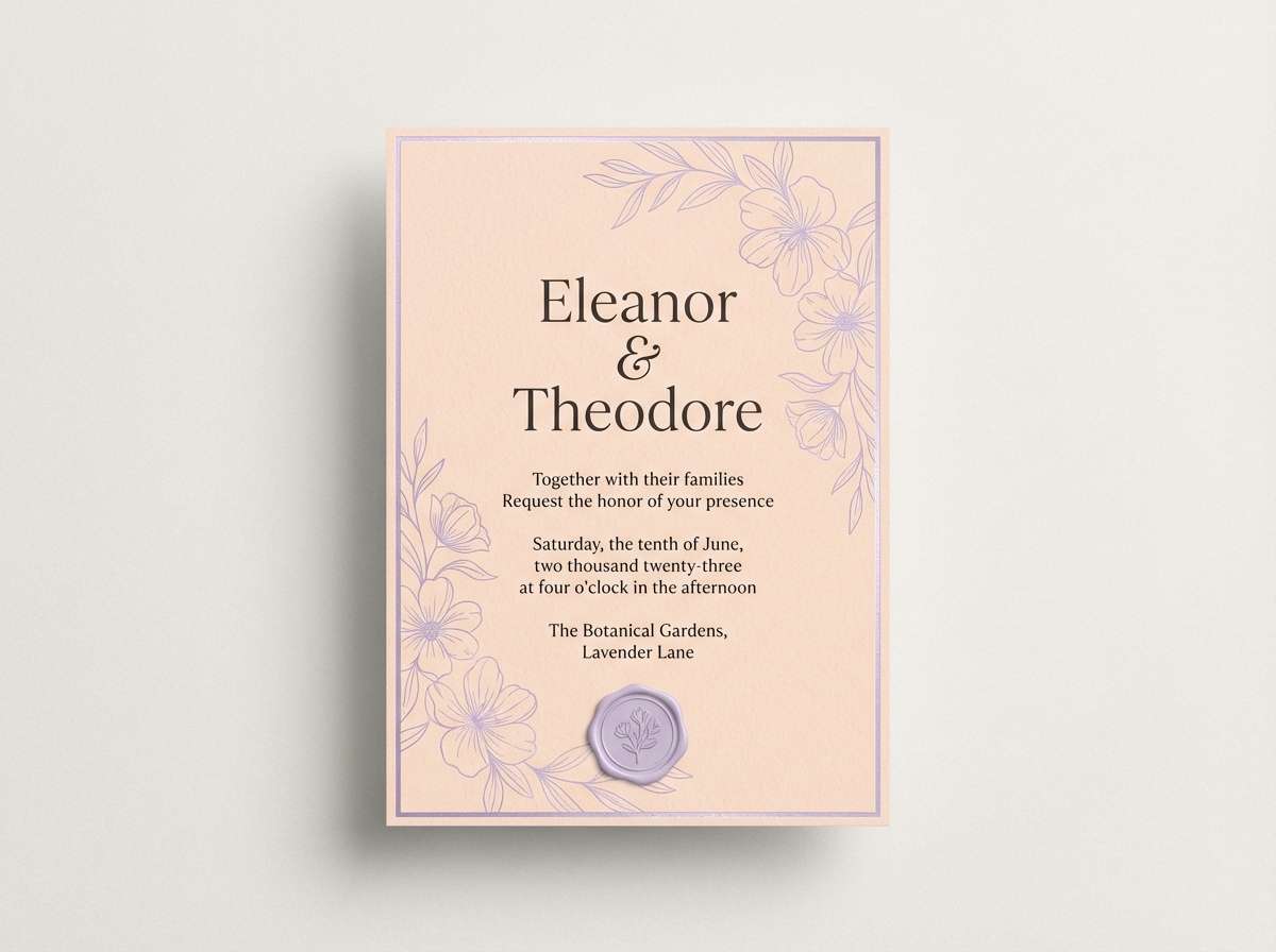
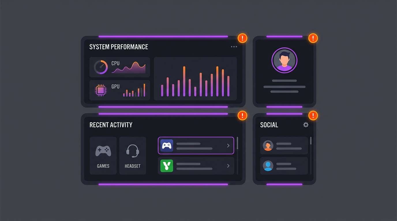
9) Cosmic Clementine
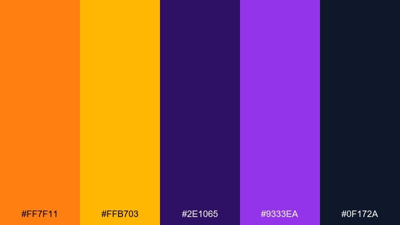
HEX: #ff7f11 #ffb703 #2e1065 #9333ea #0f172a
Mood: mysterious, futuristic, punchy
Best for: gaming UI and streamer overlays
Cosmic darkness with clementine sparks feels futuristic and a bit mysterious. Use the near-black and deep indigo for panels, then bring in orange for status states and alerts. Purple works well for secondary navigation and glow effects without feeling childish. Usage tip: keep contrast high for accessibility, especially on small UI labels.
Image example of cosmic clementine generated using media.io
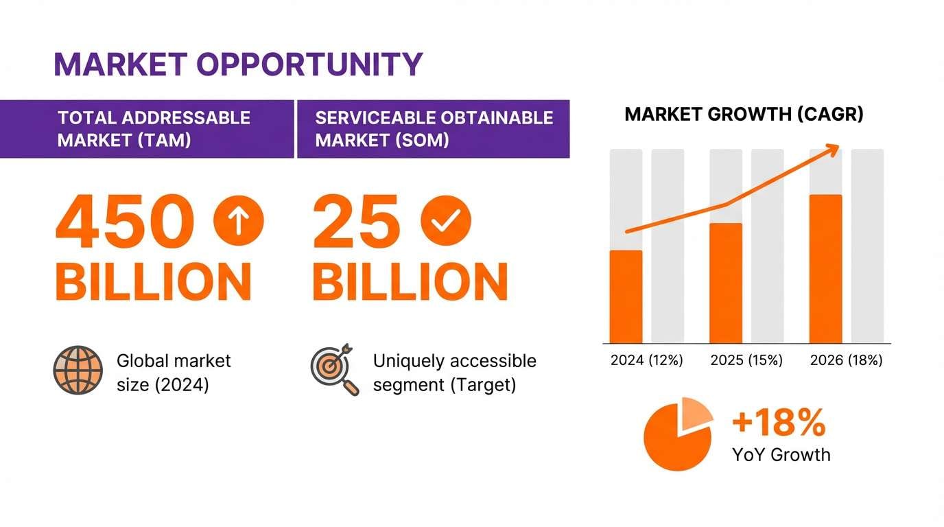
10) Velvet Mandarin
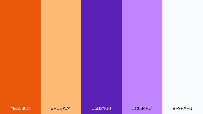
HEX: #ea580c #fdba74 #5b21b6 #c084fc #f9fafb
Mood: luxurious, warm, polished
Best for: premium service branding and pitch decks
Velvet purples and mandarin warmth feel polished, confident, and slightly luxurious. An orange purple color combination like this works nicely for decks where you want energy without losing credibility. Keep slides mostly white or very light gray, then use purple for section headers and orange for key metrics. Usage tip: limit to two accent colors per slide to maintain a premium rhythm.
Image example of velvet mandarin generated using media.io
11) Grapefruit Galaxy
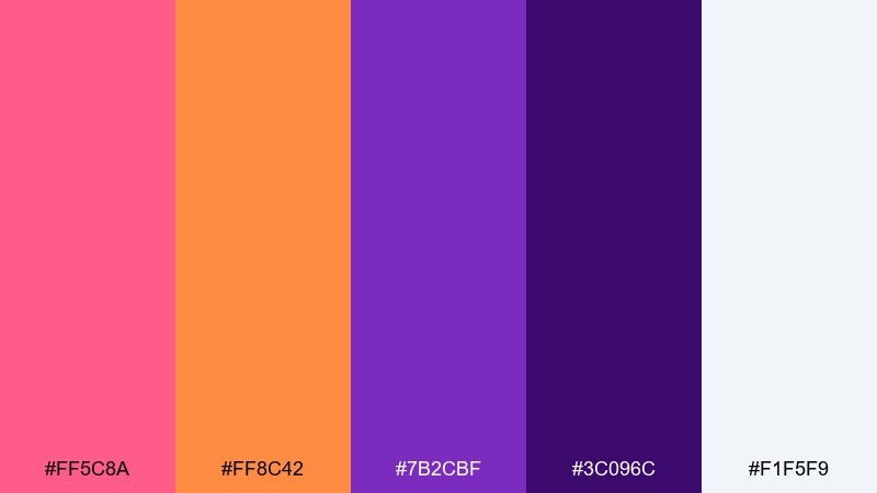
HEX: #ff5c8a #ff8c42 #7b2cbf #3c096c #f1f5f9
Mood: creative, youthful, expressive
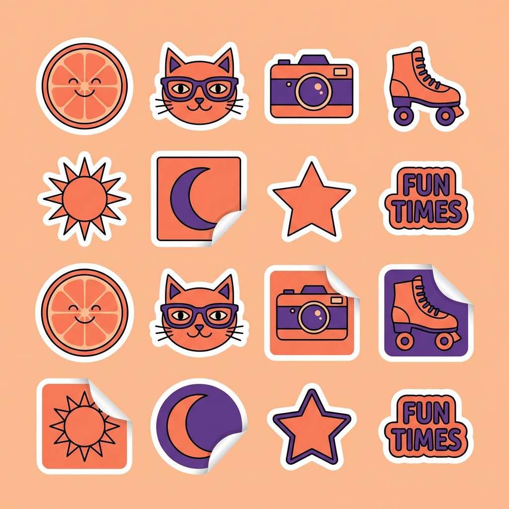
Best for: creator merch and sticker packs
Grapefruit punch and galaxy purples feel fun, expressive, and made for creators. The darker purple grounds the bright accents so designs stay readable on small formats like stickers. Pair it with chunky icon shapes and playful outlines for maximum pop. Usage tip: keep one light neutral in the mix so you can create negative space around bold shapes.
Image example of grapefruit galaxy generated using media.io
12) Saffron Iris
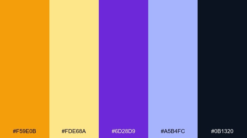
HEX: #f59e0b #fde68a #6d28d9 #a5b4fc #0b1320
Mood: bright, clean, confident
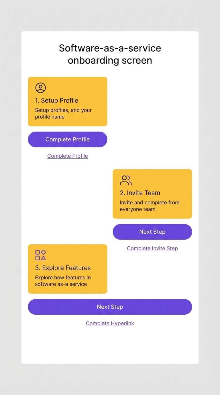
Best for: SaaS onboarding screens
Bright saffron with iris coolness creates a crisp, confident contrast that feels modern and clear. Use the dark navy for text and icons to keep accessibility strong on light screens. The pale yellow is great for subtle highlights behind tooltips or success messages. Usage tip: apply purple to interactive states like hover and focus for consistent UI behavior.
Image example of saffron iris generated using media.io
13) Pumpkin Violet
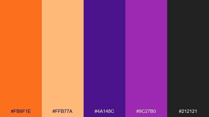
HEX: #fb6f1e #ffb77a #4a148c #9c27b0 #212121
Mood: bold, festive, high-impact
Best for: seasonal promos and retail signage
Pumpkin brightness and violet depth feel festive and attention-grabbing without relying on gimmicks. Use the charcoal for type and frames to keep signage sharp from a distance. The softer peachy orange helps you build hierarchy without going full neon. Usage tip: set your main headline in violet on a warm background for instant shelf impact.
Image example of pumpkin violet generated using media.io

14) Sunset Cadence
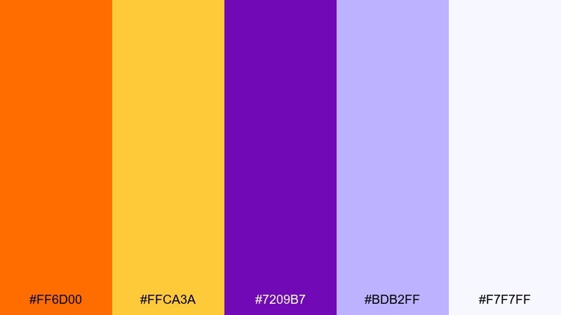
HEX: #ff6d00 #ffca3a #7209b7 #bdb2ff #f7f7ff
Mood: uplifting, rhythmic, optimistic
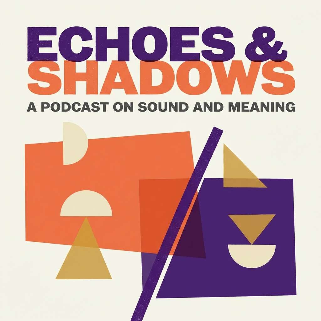
Best for: podcast cover art and thumbnails
Uplifting sunset rhythm and bright highlights give this mix an energetic, upbeat cadence. The yellow-orange works as a spotlight for episode numbers, while purple anchors the title area. Pair it with strong contrast and simple shapes to keep the cover readable at small sizes. Usage tip: avoid thin fonts and keep your background mostly one solid color.
Image example of sunset cadence generated using media.io
15) Apricot Mulberry
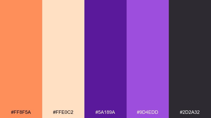
HEX: #ff8f5a #ffe0c2 #5a189a #9d4edd #2d2a32
Mood: warm, sophisticated, intimate
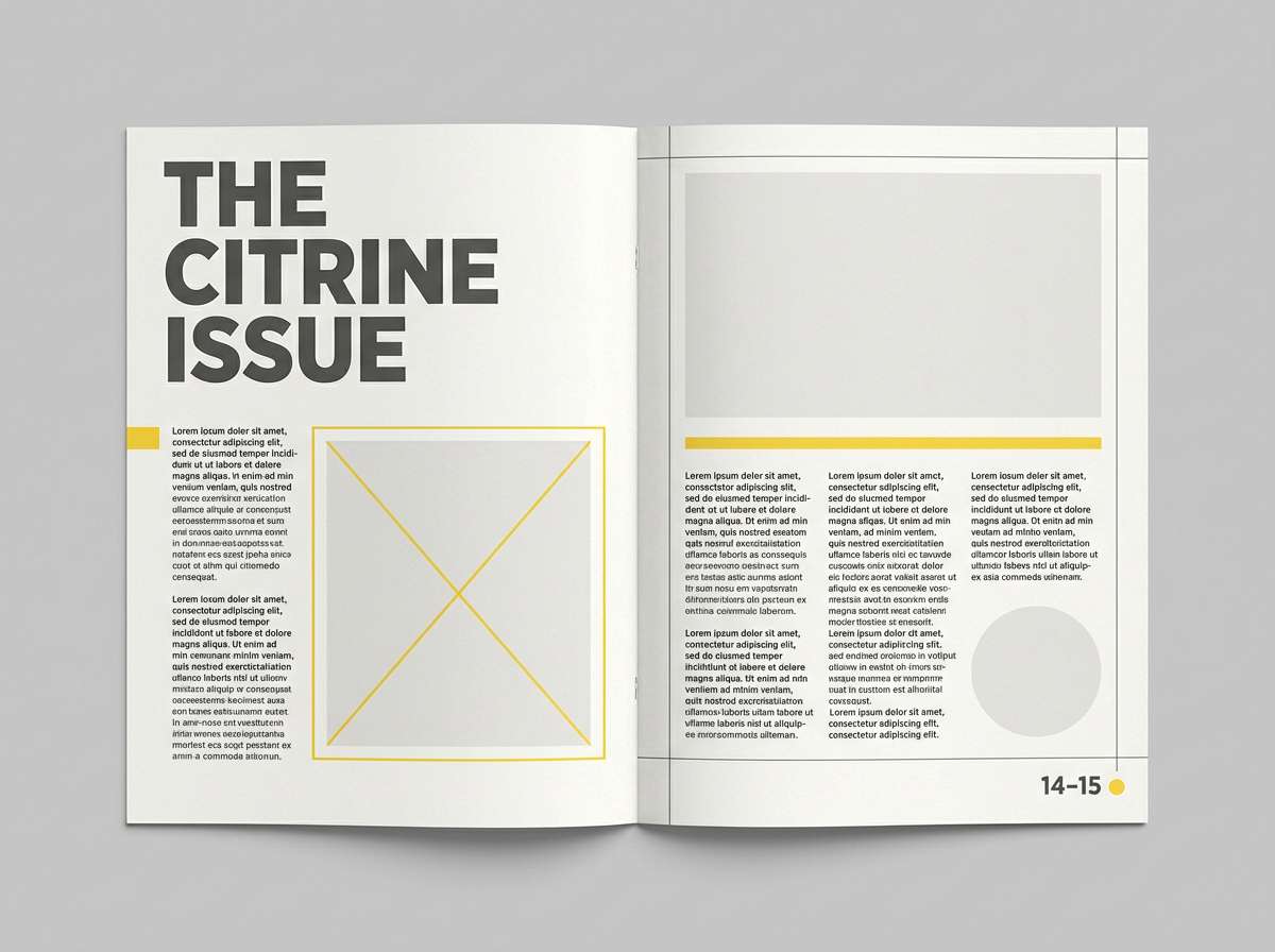
Best for: editorial spreads and lifestyle blogs
Apricot warmth and mulberry depth feel intimate, sophisticated, and a little nostalgic. Use the soft cream as the page base, then set headers in mulberry for an editorial look. Orange works best as a small accent for pull quotes, icons, or section dividers. Usage tip: keep imagery warm-toned so the palette feels cohesive rather than split.
Image example of apricot mulberry generated using media.io
16) Papaya Royale
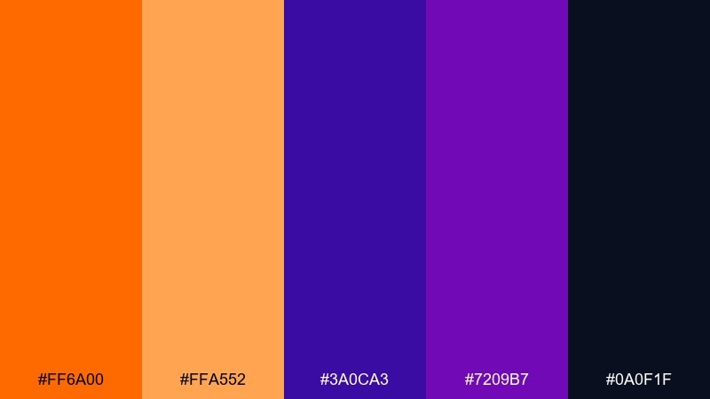
HEX: #ff6a00 #ffa552 #3a0ca3 #7209b7 #0a0f1f
Mood: royal, striking, confident
Best for: app splash screens and brand marks
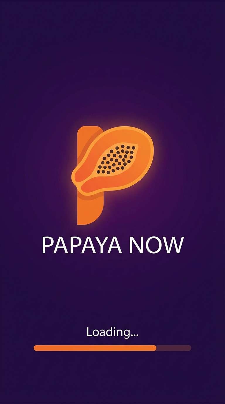
Royal purples with papaya heat create a confident, striking contrast that reads instantly on mobile. For an orange purple color palette in app branding, keep the dark shade as the background and let orange signal action or progress. Add subtle gradients only in large areas so icons stay crisp. Usage tip: test in light and dark modes to ensure the orange does not overpower small text.
Image example of papaya royale generated using media.io
17) Burnt Sienna Bloom
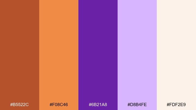
HEX: #b5522c #f08c46 #6b21a8 #d8b4fe #fdf2e9
Mood: earthy, floral, comforting
Best for: botanical illustrations and stationery
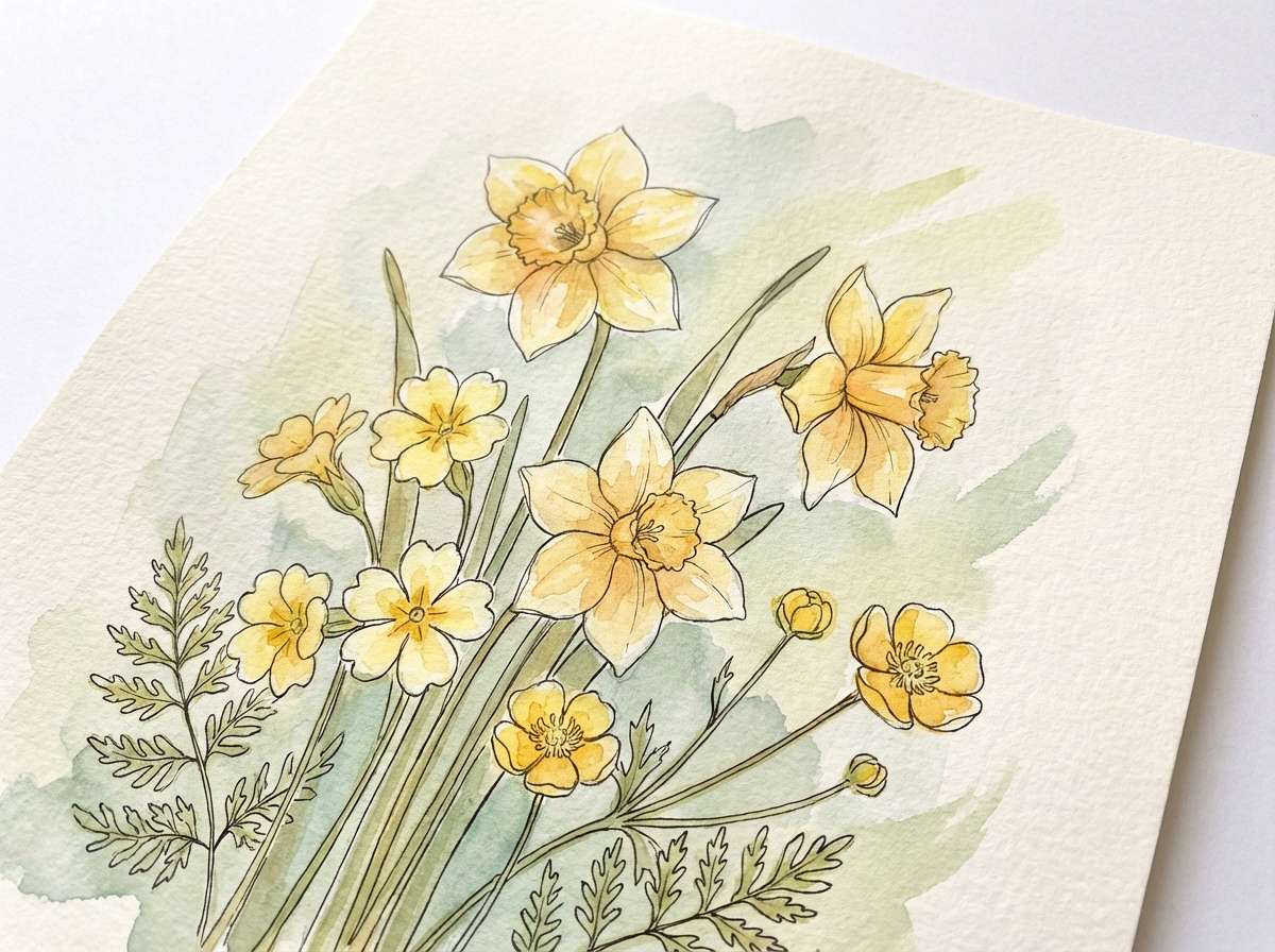
Earthy sienna with soft lilac feels like dried flowers pressed into a journal. It is ideal for botanical prints, gentle stationery, and cozy craft brands. Pair it with paper textures and hand-drawn linework to bring out the organic character. Usage tip: keep the darkest purple for stems and text so details stay sharp.
Image example of burnt sienna bloom generated using media.io
18) Orange Peel Lilac
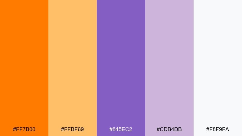
HEX: #ff7b00 #ffbf69 #845ec2 #cdb4db #f8f9fa
Mood: cheerful, light, approachable
Best for: kids products and playful web banners
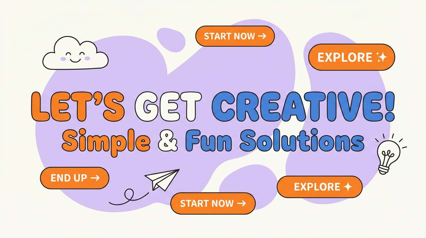
Cheerful citrus peel and soft lilac feel friendly, light, and inviting. This mix works well for playful banners, family-focused products, and approachable service pages. Pair it with rounded typography and simple illustrations to keep things upbeat. Usage tip: use lilac for backgrounds and let the orange do the attention work in buttons and badges.
Image example of orange peel lilac generated using media.io
19) Copper Violet Mist
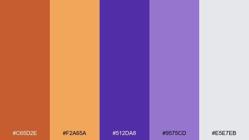
HEX: #c65d2e #f2a65a #512da8 #9575cd #e5e7eb
Mood: industrial, refined, balanced
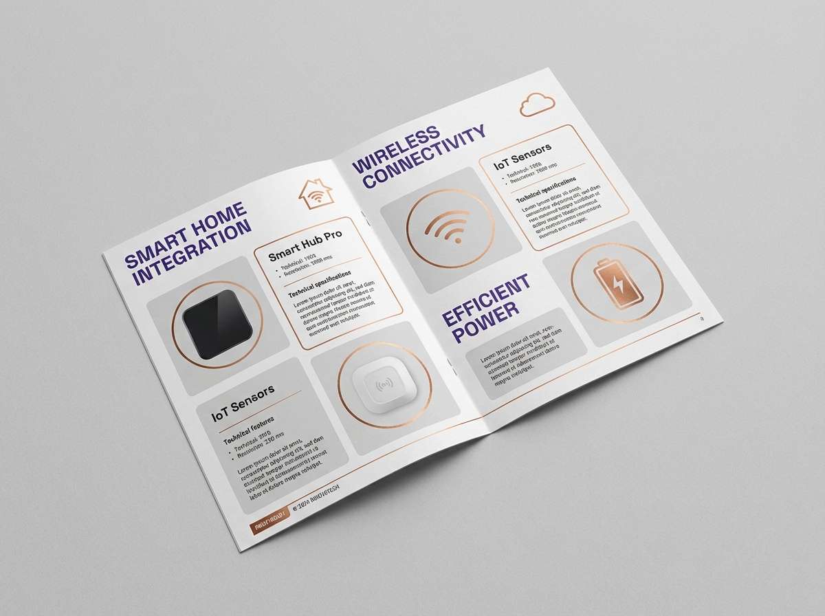
Best for: product one-pagers and tech brochures
Copper warmth with a violet haze feels refined and slightly industrial, like brushed metal under colored light. It fits product one-pagers, B2B brochures, and feature comparison tables. Keep the light gray as the main canvas, then use copper for highlights and violet for structured sections. Usage tip: use consistent icon strokes so the palette reads cohesive across diagrams.
Image example of copper violet mist generated using media.io
20) Marmalade Grape Soda
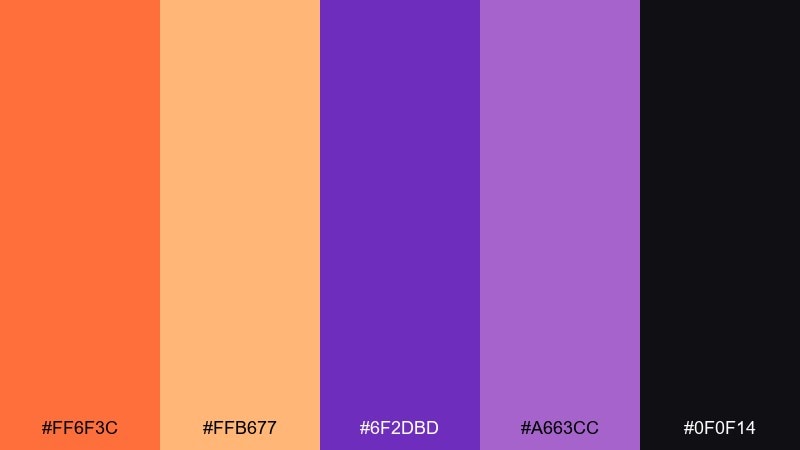
HEX: #ff6f3c #ffb677 #6f2dbd #a663cc #0f0f14
Mood: fun, retro, punchy
Best for: snack packaging and limited drops
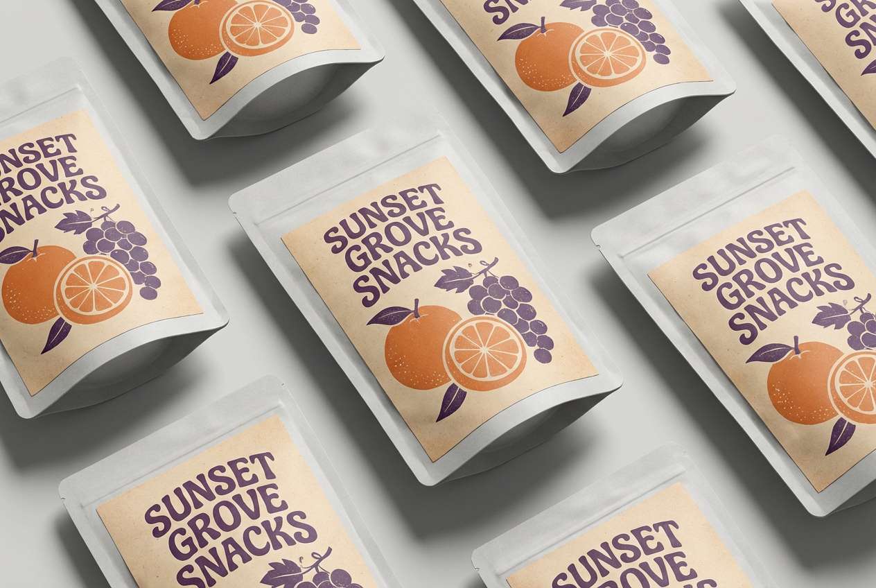
Retro marmalade and grape soda vibes feel fun, punchy, and slightly nostalgic. These orange purple color combinations are perfect for snack packaging, limited-edition drops, and bold shelf appeal. Use the near-black for barcodes and small legal text, then let the bright tones carry the brand blocks. Usage tip: add simple halftone textures to lean into the retro mood without cluttering the label.
Image example of marmalade grape soda generated using media.io
21) Marigold Mauve Studio
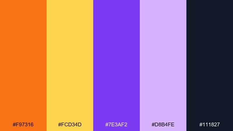
HEX: #f97316 #fcd34d #7e3af2 #d8b4fe #111827
Mood: creative, optimistic, studio-clean
Best for: portfolio sites and case study pages
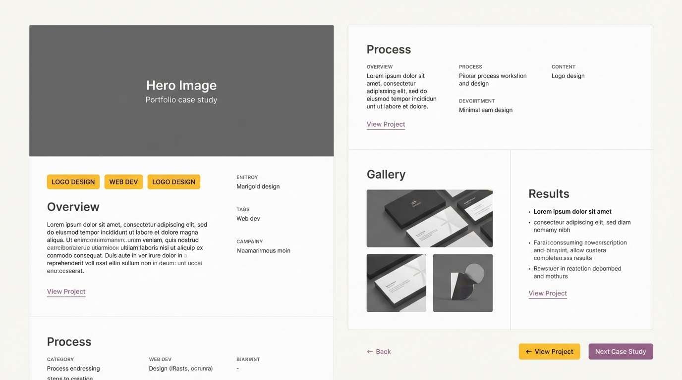
Studio-clean marigold and mauve feel creative yet organized, like a bright workspace with curated art prints. Use marigold for callouts and progress indicators, while purple can define section anchors and links. A dark neutral keeps typography crisp and professional. Usage tip: apply color in consistent components, like tags and buttons, so the interface feels intentional.
Image example of marigold mauve studio generated using media.io
What Colors Go Well with Orange Purple?
Neutrals are the easiest win: charcoal, near-black, and deep navy keep orange and purple looking modern and readable, while warm whites and soft grays make the palette feel more airy and editorial.
For supportive accents, consider pink/magenta for extra pop, or pale peach/lavender tints for gentle backgrounds. If you need a “reset” color, cream or off-white helps separate loud elements without losing warmth.
When you want a more grounded feel, add earthy tones like sand, tan, or muted brown—these reduce saturation fatigue and work especially well in packaging and print.
How to Use a Orange Purple Color Palette in Real Designs
Assign roles first: use purple (especially deeper shades) for structure—headers, panels, and navigation—then use orange for action—CTAs, highlights, badges, and key numbers. This keeps hierarchy consistent across screens.
Manage saturation to avoid visual noise. If your orange is very bright, balance it with a darker purple and a calm neutral background; if your purple is neon, keep orange as small accents.
Check accessibility early, especially for UI. Orange-on-purple (or vice versa) can fail contrast at small sizes, so reserve those pairings for large text, icons, or decorative blocks and use dark neutrals for body text.
Create Orange Purple Palette Visuals with AI
If you have HEX codes but need real visuals—hero sections, posters, packaging mockups, or UI screens—AI image generation is a fast way to prototype the look before you design the final assets.
Start with one palette, describe the layout style (minimal, bold, retro, premium), and specify where orange and purple should appear (CTA, background panels, accents). Iterate by adjusting contrast and adding a neutral base.
Orange Purple Color Palette FAQs
-
Are orange and purple complementary colors?
Orange and purple are not exact complementary colors on the traditional color wheel (orange’s complement is blue, and purple’s complement is yellow). However, they create a strong high-contrast pairing because they sit far apart and balance warm (orange) with cool (purple). -
What neutral colors work best with an orange purple color scheme?
Charcoal, near-black, deep navy, warm white, and light gray work especially well. Dark neutrals improve readability and make the accents feel intentional, while warm whites keep the palette bright and modern. -
How do I keep orange and purple from looking too loud?
Use one color as the main anchor (often purple) and keep the other as a restrained accent (often orange). Add a large neutral canvas and avoid using both colors at full saturation in equal amounts. -
Is orange and purple good for branding?
Yes—orange communicates energy and approachability, while purple suggests creativity and premium depth. It works well for startups, entertainment, beauty, and modern digital products when paired with clean typography and a stable neutral. -
What’s the best way to use orange purple in UI design?
Use purple for navigation, headers, and dark-mode panels, then reserve orange for CTAs, alerts, and progress states. Keep body text in a dark neutral and validate contrast ratios for small labels. -
Which accent colors pair nicely with orange and purple?
Pink/magenta adds extra punch for playful designs, while pale peach and lavender work for softer looks. For a more grounded vibe, add sand/tan or muted earthy browns. -
Can I generate palette-based designs with AI using HEX codes?
Yes. You can generate concept visuals by describing the scene and design style, then referencing your orange and purple tones. Iterate prompts to control where each color appears (background, CTA, accents) and to keep contrast readable.
Next: Turquoise Color Palette


