

Orange peach sits in that sweet spot between energetic orange and soft peach—warm, friendly, and easy to style across digital and print.
Below are 20+ orange peach color palette ideas with HEX codes, plus practical tips for contrast, typography, and brand consistency.
In this article
- Why Orange Peach Palettes Work So Well
-
- sunlit apricot
- citrus sorbet
- desert peach dusk
- coral linen
- peachy terrazzo
- tangerine tea time
- sunset gelato
- rust rosewater
- mango mist ui
- peach blossom stationery
- apricot latte packaging
- seaside peach
- peach sage garden
- modern clay interior
- peach neon pop
- soft harvest editorial
- candied citrus poster
- peach champagne wedding
- warm minimal brand kit
- apricot nightfall
- cottage peach cream
- What Colors Go Well with Orange Peach?
- How to Use a Orange Peach Color Palette in Real Designs
- Create Orange Peach Palette Visuals with AI
Why Orange Peach Palettes Work So Well
Orange peach palettes feel instantly welcoming because they borrow energy from orange and softness from peach. That mix reads human, upbeat, and approachable—great for brands that want warmth without looking loud.
They also scale well across mediums. In UI, orange-peach accents can guide attention to buttons and highlights; in print, the same hues look tactile and premium when paired with creamy whites or earthy browns.
Most importantly, orange peach plays nicely with contrast partners like deep navy, espresso, or dark teal—making it easier to keep typography readable while still maintaining a sunny, modern mood.
20+ Orange Peach Color Palette Ideas (with HEX Codes)
1) Sunlit Apricot
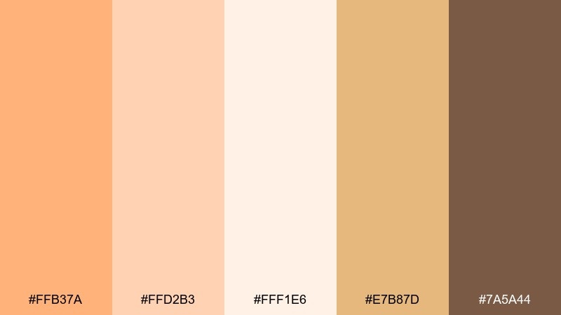
HEX: #FFB37A #FFD2B3 #FFF1E6 #E7B87D #7A5A44
Mood: bright, airy, optimistic
Best for: lifestyle branding and lookbooks
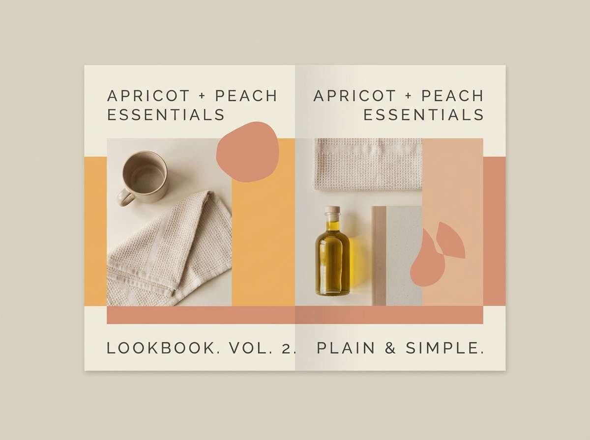
Bright and airy like morning light on stone fruit, these tones feel cheerful without turning neon. Use it for lifestyle branding, seasonal lookbooks, and warm hero sections. Pair with soft off-white space and a grounded cocoa accent for readable type. Tip: keep the dark brown for headings only, and let the apricot lead in buttons and highlights.
Image example of sunlit apricot generated using media.io
Media.io is an online AI studio for creating and editing video, image, and audio in your browser.

2) Citrus Sorbet
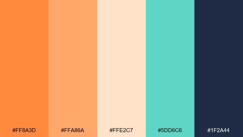
HEX: #FF8A3D #FFA86A #FFE2C7 #5DD6C6 #1F2A44
Mood: playful, zesty, high-contrast
Best for: app onboarding screens and call-to-action UI
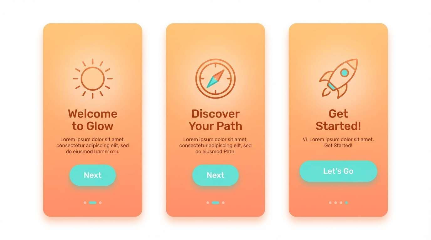
Playful and zesty like a scoop of sorbet, this mix balances sweet warmth with a cool aqua lift. It works well for onboarding screens, promo banners, and CTA-driven UI where contrast matters. Pair the navy for text and icons while reserving the bright orange for key actions. Tip: limit aqua to small chips or illustrations so the warm tones stay in control.
Image example of citrus sorbet generated using media.io
3) Desert Peach Dusk
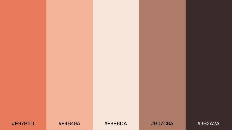
HEX: #E97B5D #F4B49A #F8E6DA #B07C6A #3B2A2A
Mood: earthy, muted, cinematic
Best for: interior mood boards and cozy blog headers
Earthy and cinematic like dusk settling over desert clay, these muted peaches feel calm and grounded. Use them for interior mood boards, cozy blog headers, and artisan storytelling pages. Pair with textured neutrals and matte black-brown for elegant readability. Tip: apply the deep espresso as a thin divider and body text to keep the softness intact.
Image example of desert peach dusk generated using media.io
4) Coral Linen
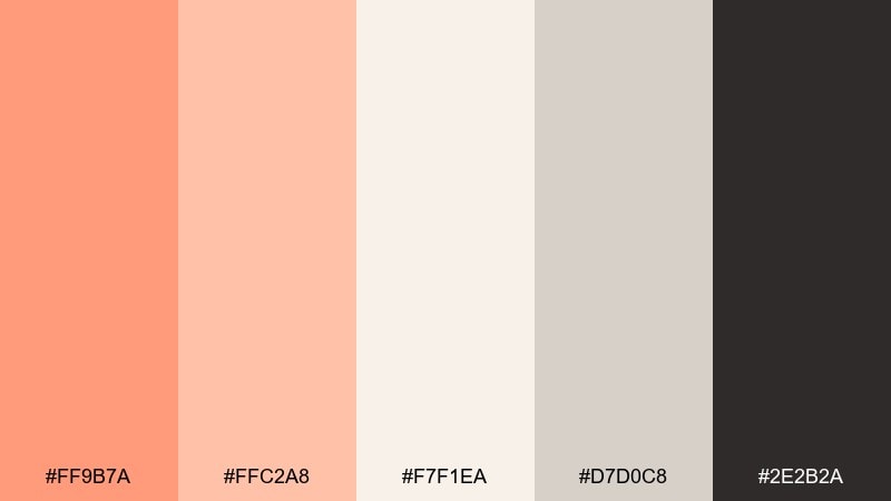
HEX: #FF9B7A #FFC2A8 #F7F1EA #D7D0C8 #2E2B2A
Mood: soft, clean, modern
Best for: minimal web design and editorial headers
Soft and clean like coral dye on washed linen, this set reads modern and effortless. It is an orange peach color palette that shines on minimalist websites, editorial headers, and calm landing pages. Pair the warm coral with light neutrals and a near-black for typography that feels premium. Tip: use the mid-gray as a subtle UI border color to avoid harsh lines.
Image example of coral linen generated using media.io
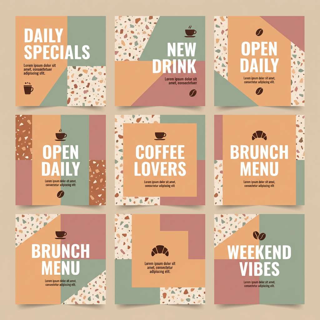
5) Peachy Terrazzo
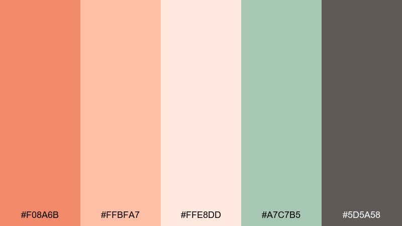
HEX: #F08A6B #FFBFA7 #FFE8DD #A7C7B5 #5D5A58
Mood: trendy, textured, friendly
Best for: social posts and café branding
Trendy and friendly like terrazzo chips in polished stone, these colors bring texture even in flat design. They fit café branding, social templates, and menu highlights where warmth should feel casual. Pair sage accents with charcoal text to keep everything crisp. Tip: add tiny terrazzo-style speckles in the pale peach for a modern pattern system.
Image example of peachy terrazzo generated using media.io
6) Tangerine Tea Time
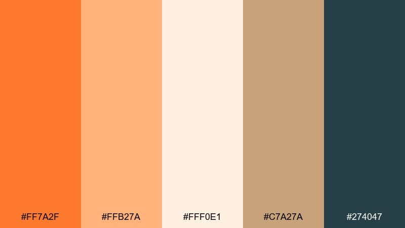
HEX: #FF7A2F #FFB27A #FFF0E1 #C7A27A #274047
Mood: cozy, inviting, balanced
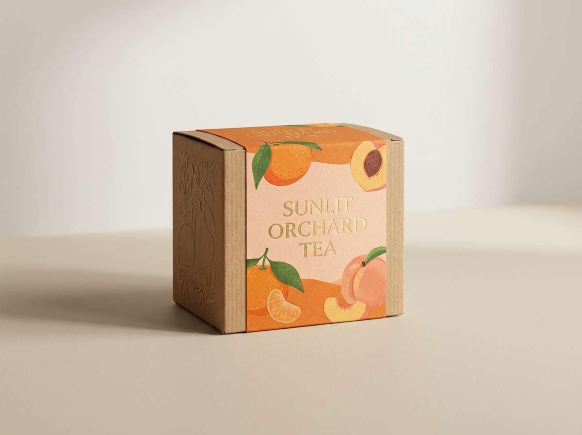
Best for: packaging for tea, candles, and small-batch goods
Cozy and inviting like citrus steam rising from a mug, this blend feels handcrafted and warm. It works beautifully for tea labels, candle boxes, and small-batch packaging where you want comfort with contrast. Pair the deep teal for ingredient text and the tan for secondary panels. Tip: keep the brightest tangerine to stamps, seals, and small brand marks to avoid overpowering the pack.
Image example of tangerine tea time generated using media.io
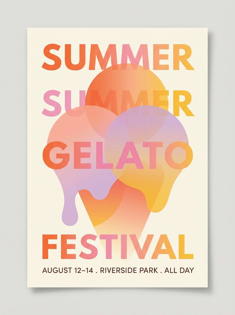
7) Sunset Gelato
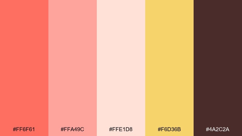
HEX: #FF6F61 #FFA49C #FFE1D8 #F6D36B #4A2C2A
Mood: romantic, sweet, energetic
Best for: event posters and summer campaign graphics
Romantic and sweet like a sunset gelato cone, these shades feel lively and a little nostalgic. Use them for summer campaign graphics, event posters, and playful announcements. Pair the warm yellow as a highlight color while keeping the deep brown for legibility. Tip: set large headlines in the darker tone and let the pink-peach gradients handle the mood.
Image example of sunset gelato generated using media.io
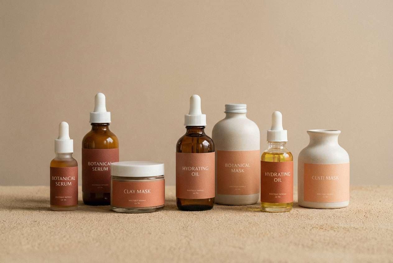
8) Rust Rosewater
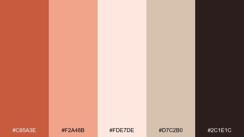
HEX: #C85A3E #F2A48B #FDE7DE #D7C2B0 #2C1E1C
Mood: vintage, intimate, refined
Best for: boutique skincare branding and labels
Vintage and intimate like rosewater in an amber bottle, this palette leans refined rather than sugary. It suits boutique skincare branding, apothecary labels, and premium product stories. Pair with warm beige space and deep cacao for elegant type. Tip: use the rust as a thin border or wax-seal accent to add heritage without heaviness.
Image example of rust rosewater generated using media.io
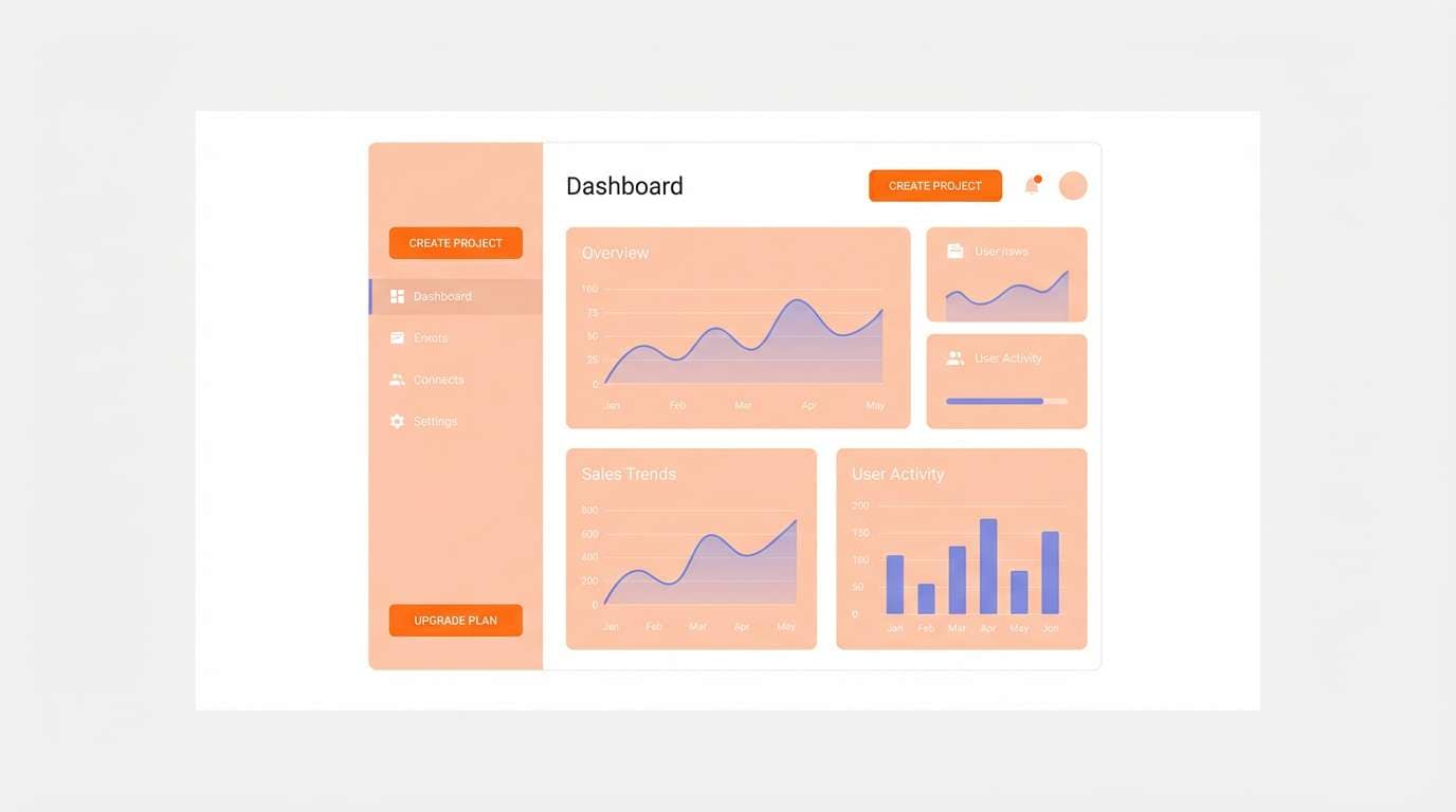
9) Mango Mist UI
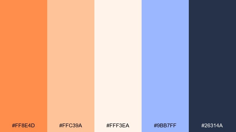
HEX: #FF8E4D #FFC39A #FFF3EA #9BB7FF #26314A
Mood: fresh, optimistic, tech-forward
Best for: dashboard UI and SaaS marketing pages
Fresh and optimistic like mango slices in cool morning mist, these tones stay light while still feeling modern. For dashboards and SaaS pages, the orange peach color combinations here create friendly emphasis without sacrificing clarity. Pair the indigo for navigation and charts, and use the pale peach as the primary surface color. Tip: keep the periwinkle to data highlights so it reads intentional, not decorative.
Image example of mango mist ui generated using media.io
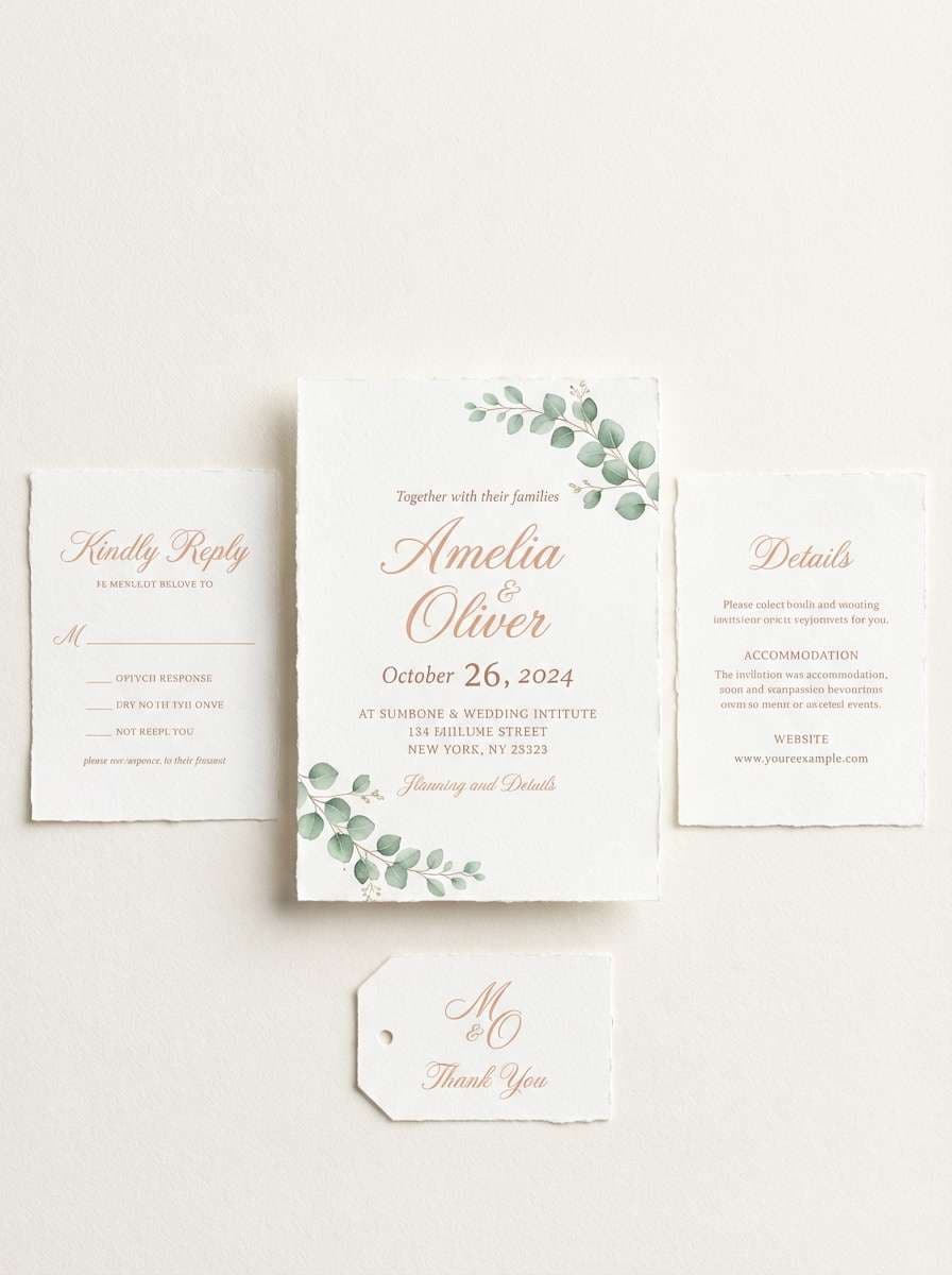
10) Peach Blossom Stationery
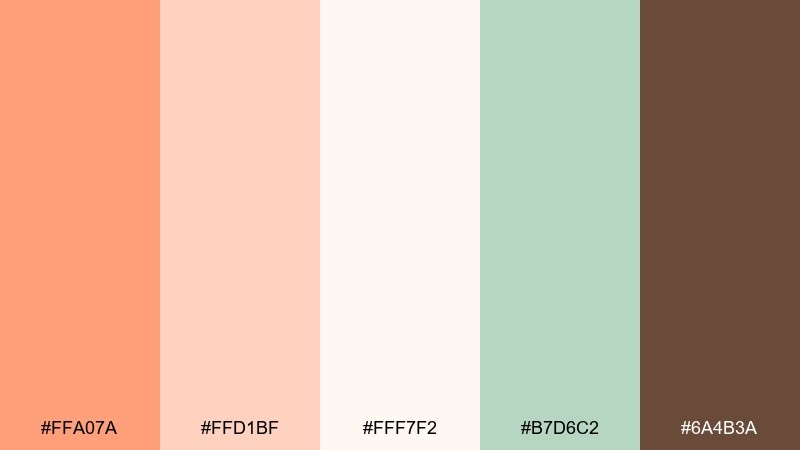
HEX: #FFA07A #FFD1BF #FFF7F2 #B7D6C2 #6A4B3A
Mood: gentle, romantic, springlike
Best for: invitations and personal stationery
Gentle and springlike like blossoms drifting onto paper, this set feels tender and personal. It is ideal for invitations, thank-you cards, and stationery systems with soft contrast. Pair the minty green as a botanical accent and keep the cocoa for names and key details. Tip: print the lightest shade as the paper base, then add coral as a single standout element like a monogram.
Image example of peach blossom stationery generated using media.io
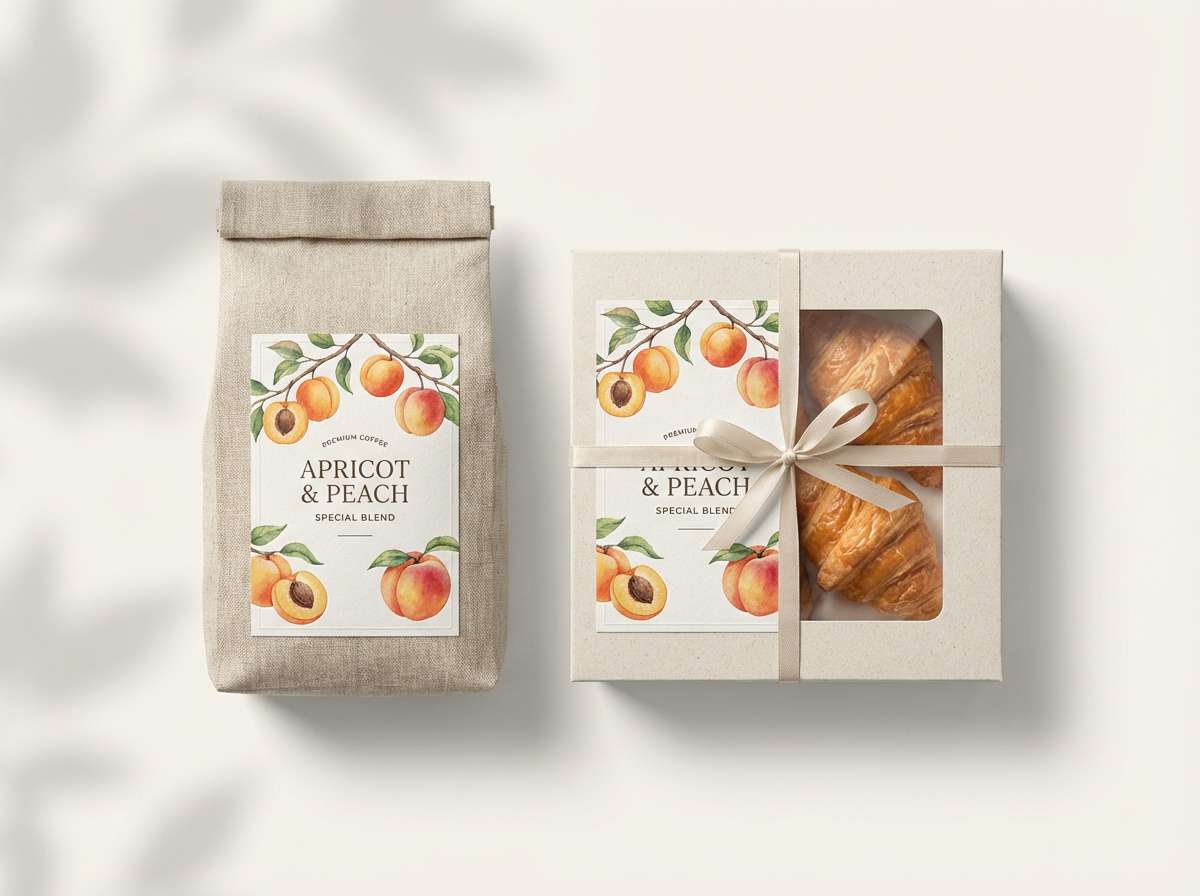
11) Apricot Latte Packaging
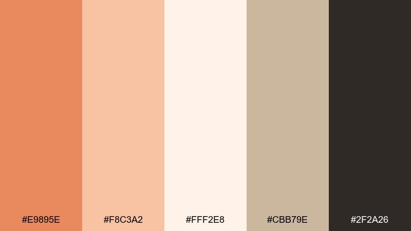
HEX: #E9895E #F8C3A2 #FFF2E8 #CBB79E #2F2A26
Mood: warm, creamy, artisanal
Best for: coffee bags and bakery packaging
Warm and creamy like apricot syrup stirred into latte foam, this mix feels artisanal and comforting. Use it for coffee bags, bakery boxes, and café loyalty cards that need a cozy premium tone. Pair the deep charcoal for ingredient lists and barcodes, and let the apricot do the storytelling on front panels. Tip: add a small block of the tan shade behind text for instant readability on curved packaging.
Image example of apricot latte packaging generated using media.io
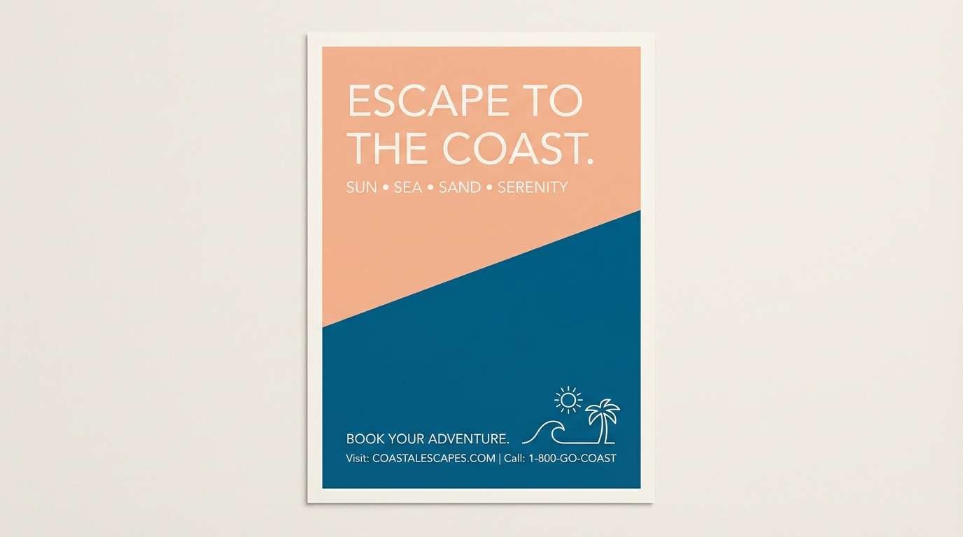
12) Seaside Peach
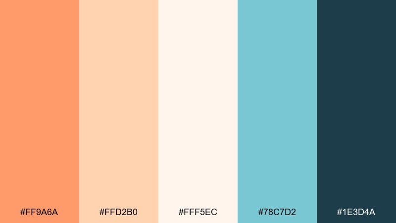
HEX: #FF9A6A #FFD2B0 #FFF5EC #78C7D2 #1E3D4A
Mood: breezy, relaxed, summery
Best for: travel ads and resort social media
Breezy and relaxed like sun-warmed sand by the water, these hues feel like an easy vacation. They work for travel ads, resort social media, and airy landing pages. Pair sea-blue accents with dark teal type for a crisp, coastal contrast. Tip: use the pale peach as the dominant background and reserve the bright coral for price tags and booking buttons.
Image example of seaside peach generated using media.io
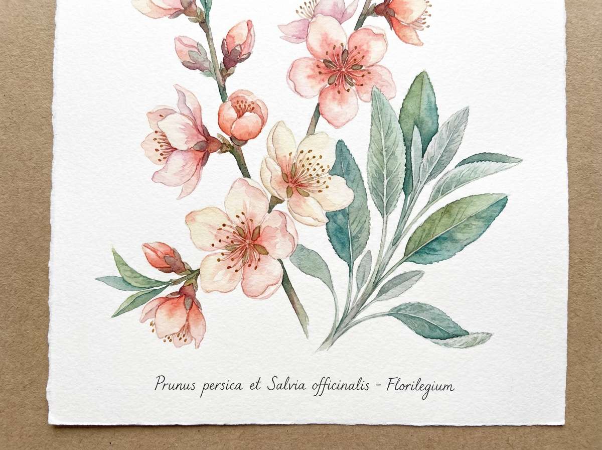
13) Peach Sage Garden
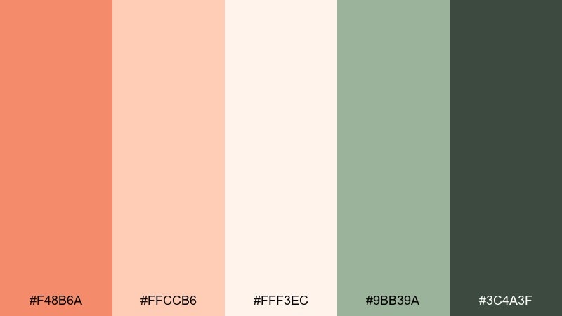
HEX: #F48B6A #FFCCB6 #FFF3EC #9BB39A #3C4A3F
Mood: natural, calm, botanical
Best for: watercolor florals and spring illustrations
Natural and calm like a kitchen garden in late spring, this pairing feels fresh and restorative. It suits watercolor florals, packaging with botanical cues, and mindful lifestyle content. Pair the sage and deep green for stems, leaves, and typography that reads earthy. Tip: keep the coral-peach to petals and highlights so the illustration stays balanced.
Image example of peach sage garden generated using media.io
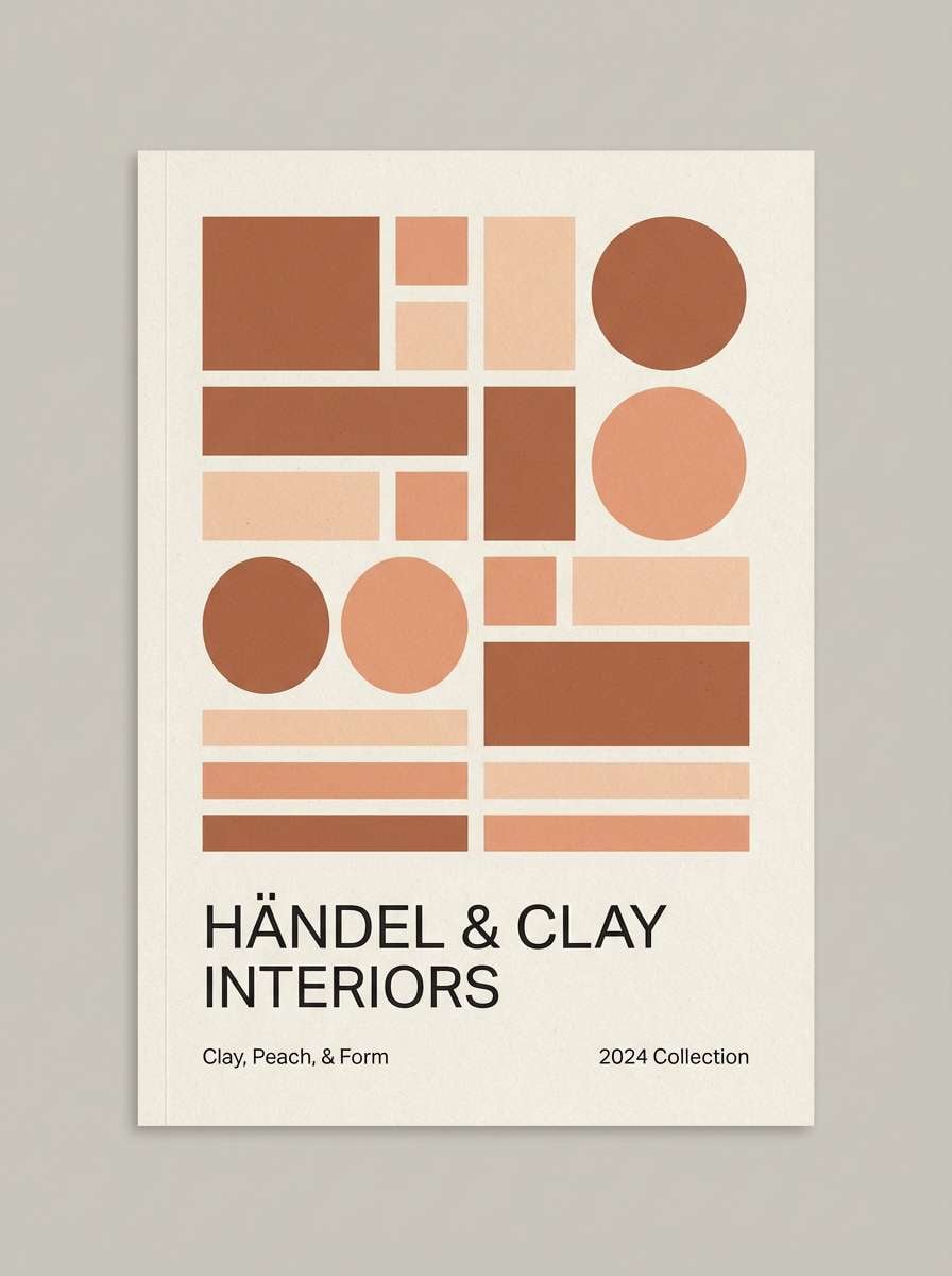
14) Modern Clay Interior
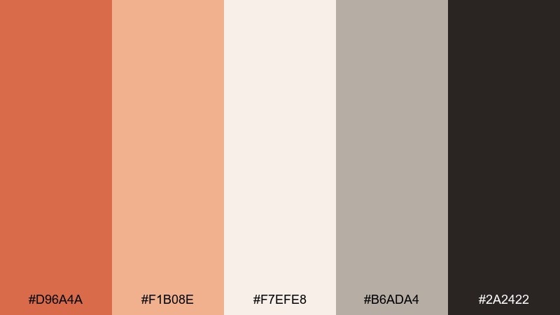
HEX: #D96A4A #F1B08E #F7EFE8 #B6ADA4 #2A2422
Mood: minimal, grounded, architectural
Best for: interior palettes and real estate brochures
Minimal and grounded like terracotta walls against brushed plaster, this set feels architectural and calm. Use it for interior styling decks, real estate brochures, and showroom signage. Pair the warm clay with soft greige and a near-black for clean, modern hierarchy. Tip: if you want a quieter orange peach color palette, push the light neutral to 70 percent of the layout and use clay only for focal blocks.
Image example of modern clay interior generated using media.io
15) Peach Neon Pop
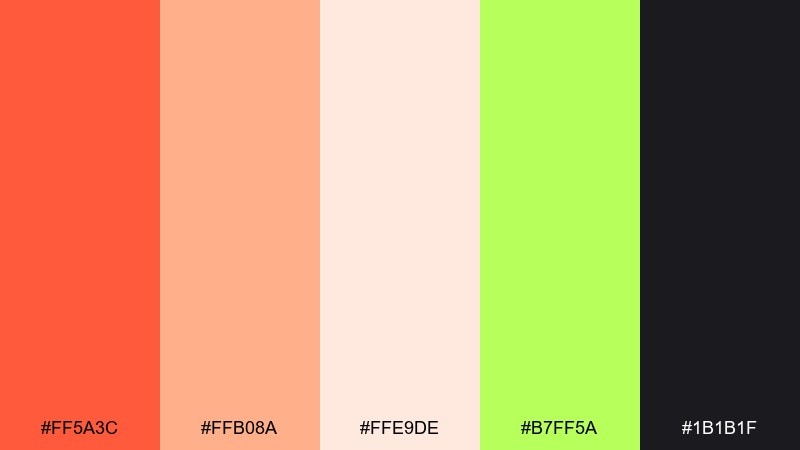
HEX: #FF5A3C #FFB08A #FFE9DE #B7FF5A #1B1B1F
Mood: bold, youthful, energetic
Best for: music flyers and promo graphics
Bold and youthful like neon signs glowing at golden hour, this mix delivers instant energy. It works for music flyers, promo graphics, and short-form social where you need punchy contrast. Pair the black for big type and keep the lime as a sharp, minimal accent. Tip: limit lime to underlines or stickers so the warm reds and peaches remain the hero.
Image example of peach neon pop generated using media.io

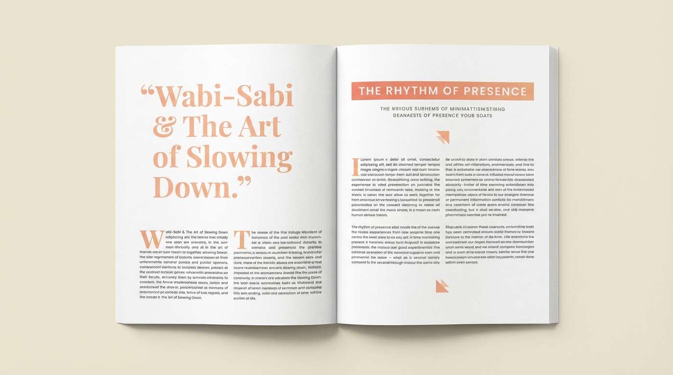
16) Soft Harvest Editorial
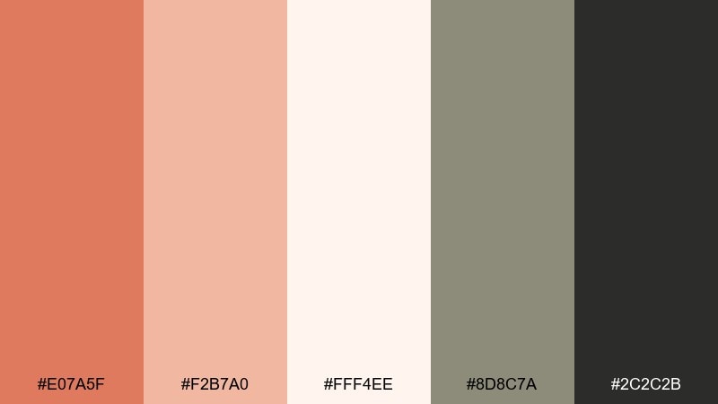
HEX: #E07A5F #F2B7A0 #FFF4EE #8D8C7A #2C2C2B
Mood: cozy, editorial, mature
Best for: magazine spreads and food stories
Cozy and mature like a late-harvest kitchen scene, these tones feel editorial and grounded. They fit magazine spreads, food stories, and long-read layouts where warmth should not distract. Pair the olive-gray for captions and the deep charcoal for body text. Tip: keep the peachy tint in pull quotes and section dividers for a subtle, consistent rhythm.
Image example of soft harvest editorial generated using media.io
17) Candied Citrus Poster
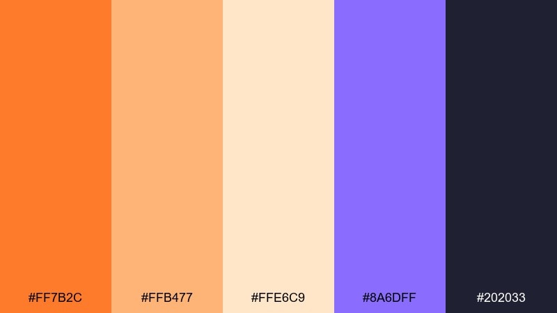
HEX: #FF7B2C #FFB477 #FFE6C9 #8A6DFF #202033
Mood: fun, modern, attention-grabbing
Best for: retail posters and storefront promos
Fun and modern like candied citrus slices, this palette is made to grab attention fast. Use it for retail posters, storefront promos, and limited-time sale graphics. Pair the purple as a surprising accent with deep navy for readable pricing. Tip: keep the poster background light and reserve the saturated orange for the biggest shapes and discount numbers.
Image example of candied citrus poster generated using media.io

18) Peach Champagne Wedding
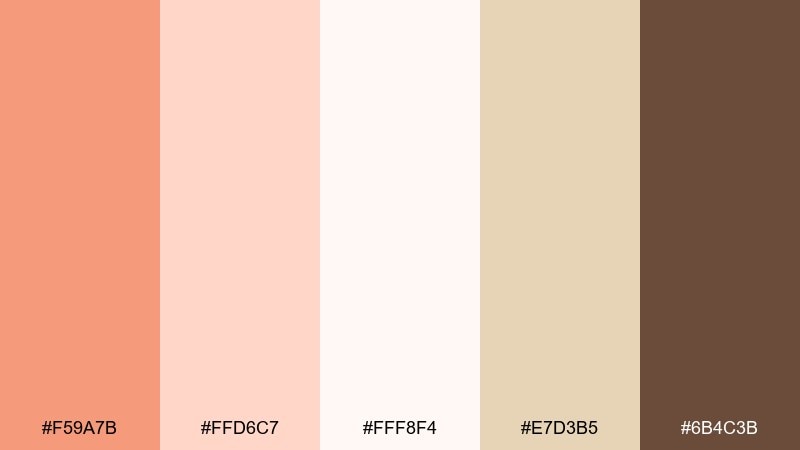
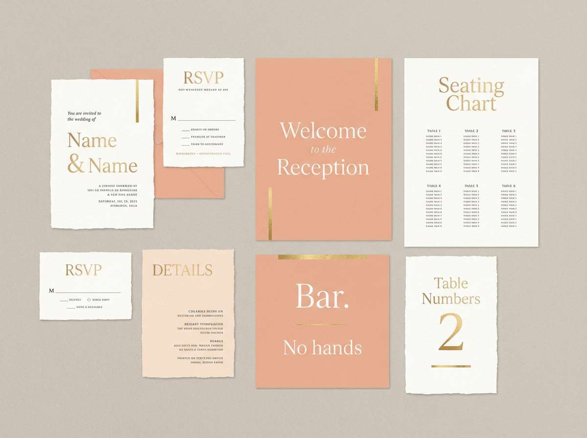
HEX: #F59A7B #FFD6C7 #FFF8F4 #E7D3B5 #6B4C3B
Mood: elegant, celebratory, soft
Best for: wedding suites and reception signage
Elegant and celebratory like champagne bubbles catching warm light, these shades feel timeless and soft. They are perfect for wedding suites, seating charts, and reception signage where romance should read upscale. Pair the champagne beige for borders and the cocoa for names and key details. Tip: add foil or metallic ink on the beige tone to elevate the whole suite without increasing contrast too much.
Image example of peach champagne wedding generated using media.io
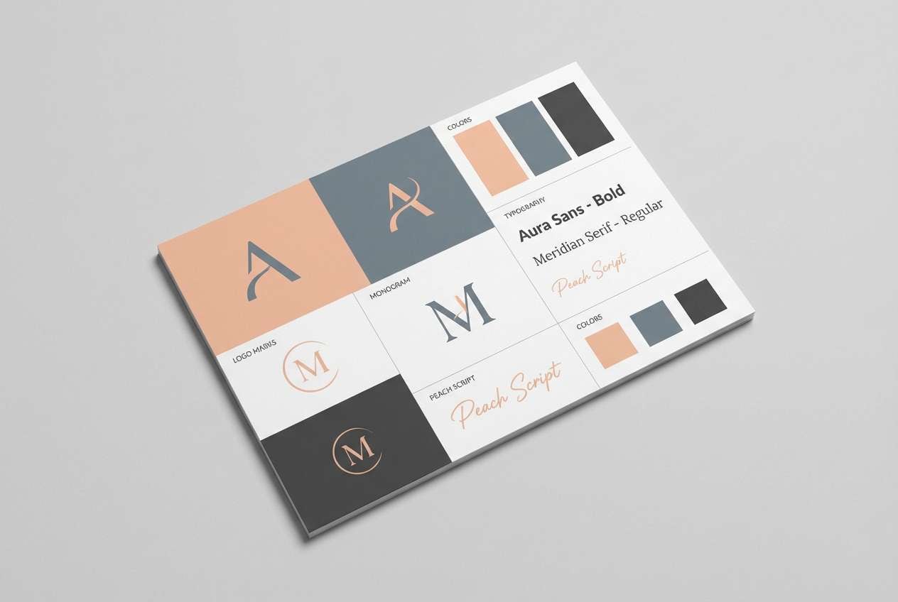
19) Warm Minimal Brand Kit
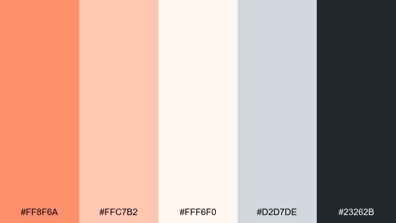
HEX: #FF8F6A #FFC7B2 #FFF6F0 #D2D7DE #23262B
Mood: clean, friendly, professional
Best for: startup branding and website kits
Clean and friendly like a well-lit studio workspace, this set feels professional without going cold. It works for startup brand kits, one-page websites, and pitch decks that need warmth and clarity. Pair the cool gray for UI surfaces and the near-black for type. Tip: set a single coral tone as your primary accent and keep the rest as supporting neutrals for consistency.
Image example of warm minimal brand kit generated using media.io
20) Apricot Nightfall
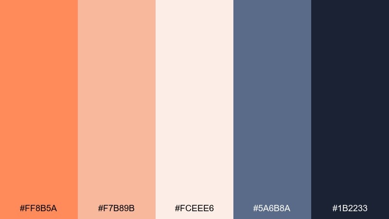
HEX: #FF8B5A #F7B89B #FCEEE6 #5A6B8A #1B2233
Mood: moody, modern, sophisticated
Best for: hero banners and premium app themes
Moody and sophisticated like apricot light fading into evening blue, this mix feels modern and confident. For premium UI themes and hero banners, the orange peach color combinations here look best when the blues take the lead. Pair the navy for large surfaces and let the warm accents highlight key stats or primary buttons. Tip: test contrast at small sizes and keep the mid-peach for secondary states, not core text.
Image example of apricot nightfall generated using media.io

21) Cottage Peach Cream
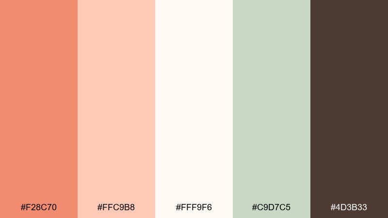
HEX: #F28C70 #FFC9B8 #FFF9F6 #C9D7C5 #4D3B33
Mood: wholesome, nostalgic, cozy
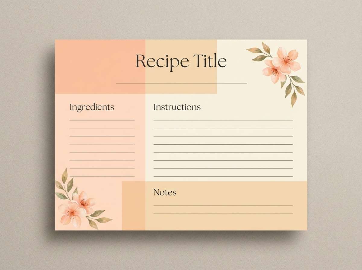
Best for: recipe cards and handmade craft labels
Wholesome and nostalgic like a cottage kitchen with fresh preserves, these colors feel cozy and approachable. They are great for recipe cards, handmade craft labels, and small-shop social posts. Pair the soft green for leaf motifs and keep the deep brown for titles and measurements. Tip: add a cream paper texture behind the lightest shade to enhance the handmade vibe.
Image example of cottage peach cream generated using media.io
What Colors Go Well with Orange Peach?
Orange peach pairs naturally with creamy whites, warm beiges, and soft grays—these neutrals keep the palette airy and let your peach tones feel intentional rather than overwhelming.
For stronger contrast, deep navy, charcoal, espresso brown, and dark teal are dependable choices for text, navigation, and key UI elements. They also make orange peach accents pop without needing extra saturation.
If you want a fresher twist, try cool complements in small doses: sea-aqua, periwinkle, or lavender. Use them as highlights (icons, chips, illustrations) so the warm base remains the hero.
How to Use a Orange Peach Color Palette in Real Designs
Start by deciding roles: pick one orange-peach as your primary accent (buttons, price tags, badges), one light peach as your surface/background, and one dark anchor for typography. This keeps the system consistent across pages and assets.
In UI, reserve the most saturated orange for actions and states (primary CTA, active toggles). Keep forms and cards on pale peach or off-white so shadows, borders, and content don’t feel heavy.
In print, orange peach looks premium when you add restraint: lots of negative space, one strong headline color, and a warm neutral panel behind text. If you’re using metallic ink or foil, apply it to beige/champagne areas for elegance without sacrificing readability.
Create Orange Peach Palette Visuals with AI
If you already have HEX codes, you can turn them into quick mockups by prompting AI with a layout type (poster, landing page, brand board) and describing where each color should appear (background, CTA, type, accents).
For best results, specify style keywords (minimal, editorial, vintage, bold), include a clear subject (UI cards, packaging, invitation suite), and keep prompts focused so the palette stays consistent.
Use Media.io to generate orange peach palette visuals, iterate quickly, and export assets for web, social, or print.
Orange Peach Color Palette FAQs
-
What is an orange peach color palette?
An orange peach palette is a warm scheme built around peach, apricot, coral, or soft orange hues, usually balanced with light neutrals and a dark anchor color for contrast. -
Is orange peach good for UI design?
Yes. Orange peach works well as an accent for CTAs and highlights, especially when paired with navy, charcoal, or deep teal for readable text and icons. -
What’s the best dark text color to pair with peach tones?
Deep navy, espresso brown, and near-black charcoal are the most reliable options. They preserve warmth while meeting contrast needs better than mid-grays. -
What colors complement orange peach without clashing?
Soft aqua, sea-blue, periwinkle, and muted sage complement orange peach nicely. Keep these cooler hues as secondary accents to avoid competing with the warm base. -
How do I keep an orange peach palette from looking too “sweet”?
Reduce saturation, increase neutral space (off-white/cream), and introduce grounded tones like cocoa, clay, or charcoal. Use the brightest peach only for small highlights. -
Are orange peach palettes good for weddings and invitations?
They’re a popular choice because they feel romantic and celebratory. Pair peach with champagne beige and a cocoa text color, then add metallic/foil accents for a premium finish. -
How can I generate palette mockups quickly?
Use Media.io Text-to-Image: choose a format (brand board, UI, packaging, poster), describe the style, and specify where peach/orange accents should appear to keep outputs consistent.
Next: Metallic Color Palette


