

Metallic colors instantly add polish—think chrome edges, brushed nickel neutrals, and warm gold accents that feel premium without being loud.
Below are metallic color palette ideas with HEX codes, plus practical tips for UI, branding, and print so you can keep the shine while staying readable.
In this article
- Why Metallic Palettes Work So Well
-
- chrome dusk
- brushed nickel neutrals
- champagne glow
- rose gold affair
- antique brass study
- copper ember
- steel and slate
- platinum frost
- gunmetal orchid
- pewter and pearl
- titanium teal
- bronze olive trail
- mercury mint
- silver lilac haze
- gilded sandstone
- midnight bronze
- urban copper pop
- graphite blush
- opal chrome wash
- lacquered gold noir
- cobalt steel shine
- smoked silver citrus
- What Colors Go Well with Metallic?
- How to Use a Metallic Color Palette in Real Designs
- Create Metallic Palette Visuals with AI
Why Metallic Palettes Work So Well
Metallic palettes feel “designed” because they balance contrast and restraint: deep charcoals and navies create structure, while silvers and warm golds signal quality.
They also translate across mediums. In UI, metallic-inspired neutrals keep layouts clean and readable; in print and packaging, warm brass or copper cues can imply texture and craft.
Most importantly, metallic schemes make accents matter. A single gold, bronze, or cobalt highlight can guide attention to CTAs, pricing, or hero details without adding clutter.
20+ Metallic Color Palette Ideas (with HEX Codes)
1) Chrome Dusk
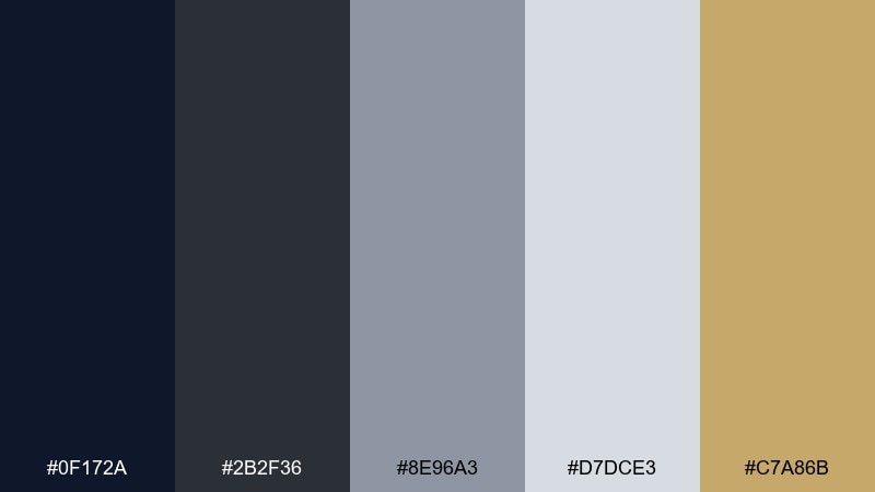
HEX: #0F172A #2B2F36 #8E96A3 #D7DCE3 #C7A86B
Mood: sleek, nocturnal, premium
Best for: SaaS landing page UI
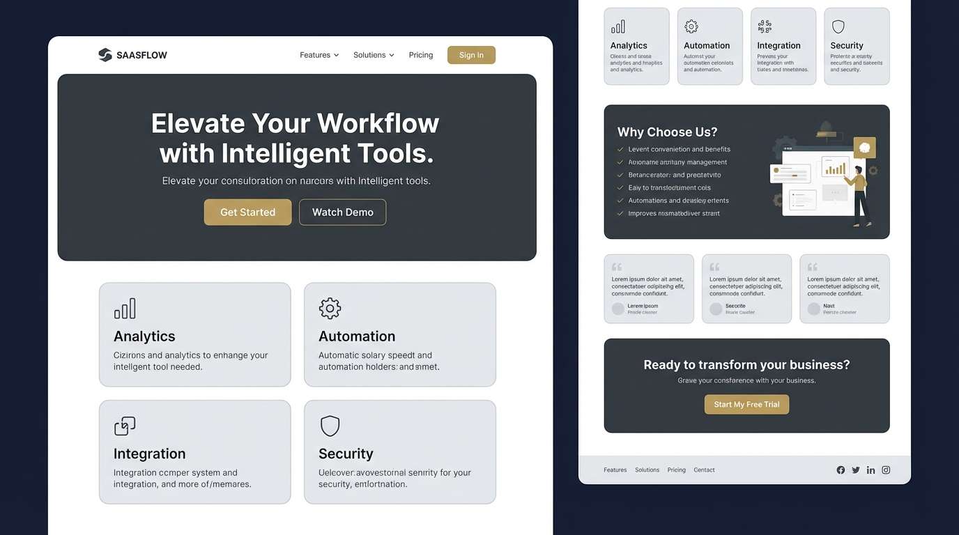
Sleek dusk tones with a chrome sheen feel like city lights bouncing off glass. Use the deep navy and graphite as your UI base, then let soft silver handle surfaces and dividers. The warm gold accent is best saved for primary CTAs or key metrics. Tip: keep gradients subtle so text contrast stays crisp.
Image example of chrome dusk generated using media.io
Media.io is an online AI studio for creating and editing video, image, and audio in your browser.

2) Brushed Nickel Neutrals
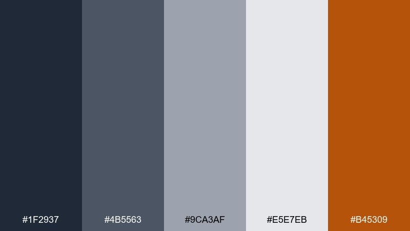
HEX: #1F2937 #4B5563 #9CA3AF #E5E7EB #B45309
Mood: minimal, industrial, calm
Best for: dashboard UI and data cards
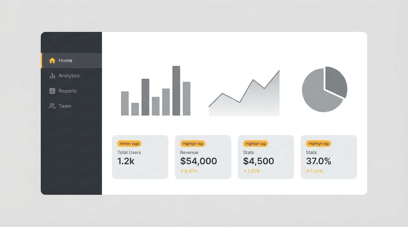
Brushed nickel neutrals read clean and technical, like machined metal under soft studio light. Build dashboards with charcoal headers, mid-gray charts, and pale gray card backgrounds. The amber note works as a warning or highlight color without feeling loud. Tip: reserve the darkest shade for typography to keep tables readable.
Image example of brushed nickel neutrals generated using media.io
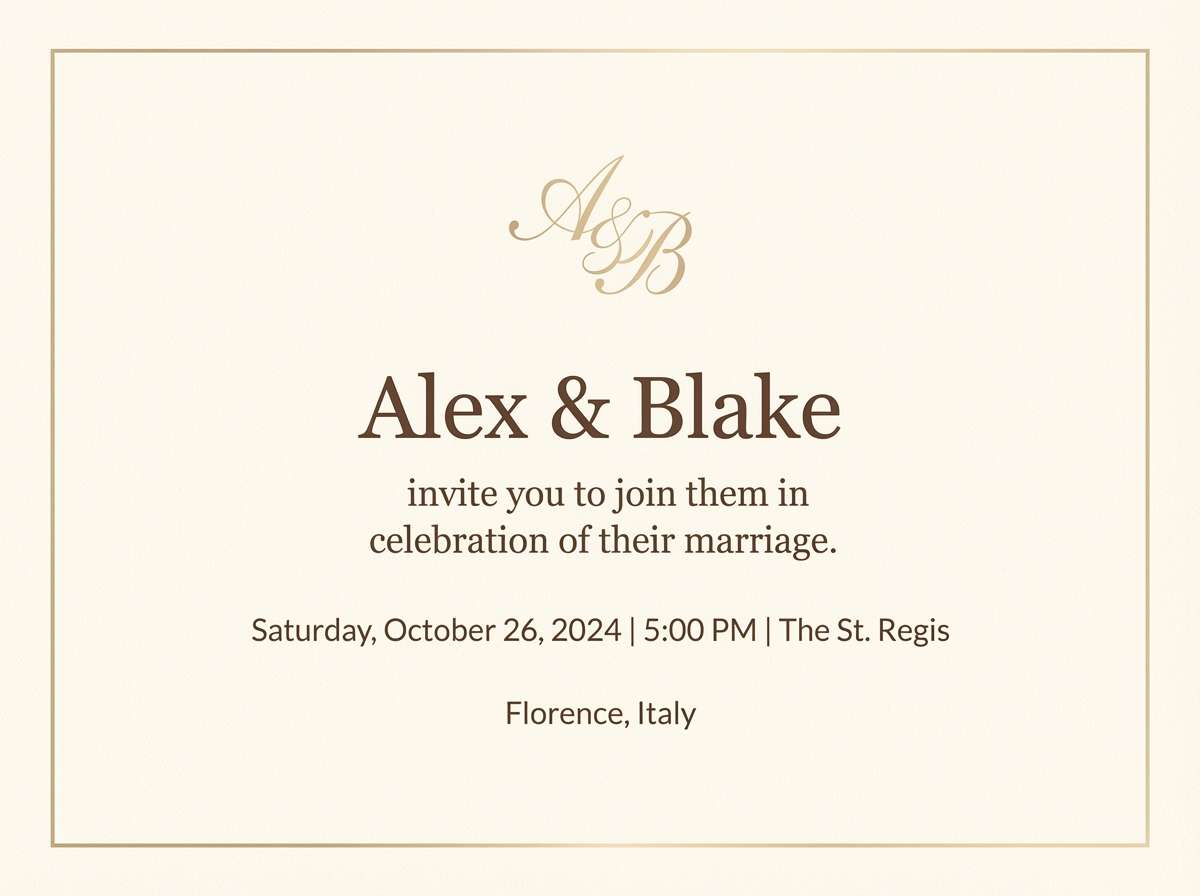
3) Champagne Glow
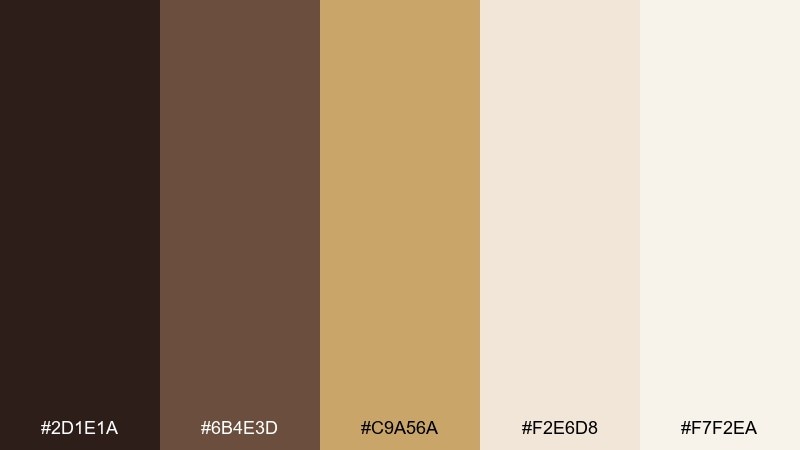
HEX: #2D1E1A #6B4E3D #C9A56A #F2E6D8 #F7F2EA
Mood: soft, celebratory, elegant
Best for: wedding invitation suite
Warm champagne tones evoke candlelight, satin, and clinking glasses. Pair the deep cocoa with creamy neutrals for type, then let the gold sit in borders, monograms, or foil-like accents. It shines on textured paper, vellum overlays, and minimal layouts. Tip: keep gold elements thin for a refined finish.
Image example of champagne glow generated using media.io
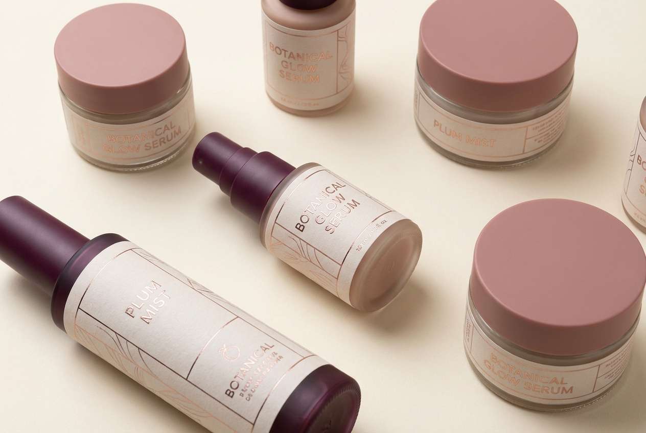
4) Rose Gold Affair
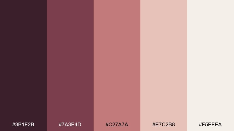
HEX: #3B1F2B #7A3E4D #C27A7A #E7C2B8 #F5EFEA
Mood: romantic, glossy, modern
Best for: beauty brand packaging and labels
Romantic rose tones feel like polished metal warmed by skin and blush. For metallic color combinations that stay upscale, ground the palette with the deep plum and use the pale cream as breathing room. Rose and blush shades work best on matte packaging with spot-gloss details. Tip: use the mid-rose for small typography so it stays legible on light backgrounds.
Image example of rose gold affair generated using media.io
5) Antique Brass Study
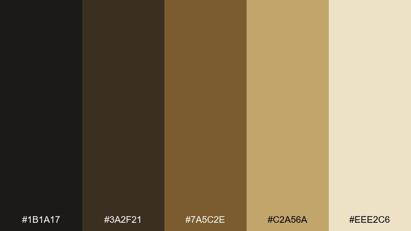
HEX: #1B1A17 #3A2F21 #7A5C2E #C2A56A #EEE2C6
Mood: heritage, scholarly, warm
Best for: book cover design and stationery
Antique brass and inky shadows feel like old libraries, leather spines, and lamp-lit desks. Use the near-black for titles, then layer warm browns for depth and ornament. Brass works beautifully in small line art, borders, and stamped details. Tip: try a slightly textured background to make the lightest cream feel archival.
Image example of antique brass study generated using media.io
6) Copper Ember
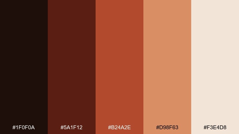
HEX: #1F0F0A #5A1F12 #B24A2E #D98F63 #F3E4D8
Mood: fiery, artisan, bold
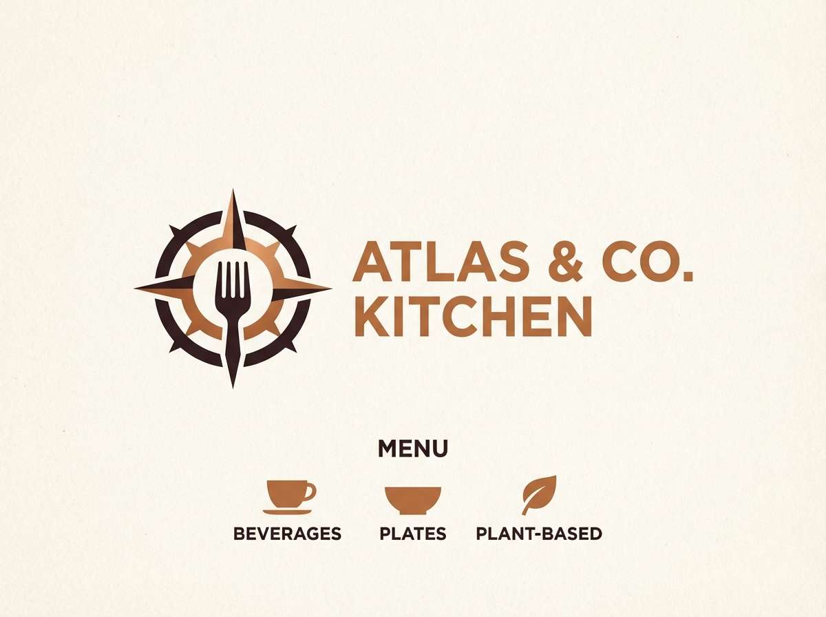
Best for: restaurant logo and menu accents
Smoky ember reds and copper highlights evoke open flames and hammered cookware. As a metallic color palette, it works best when the dark espresso anchors the layout and the copper tones stay in headlines or icons. Pair it with uncoated paper, wood textures, or black-and-white food photography. Tip: keep the brightest copper for callouts like chef specials or section dividers.
Image example of copper ember generated using media.io
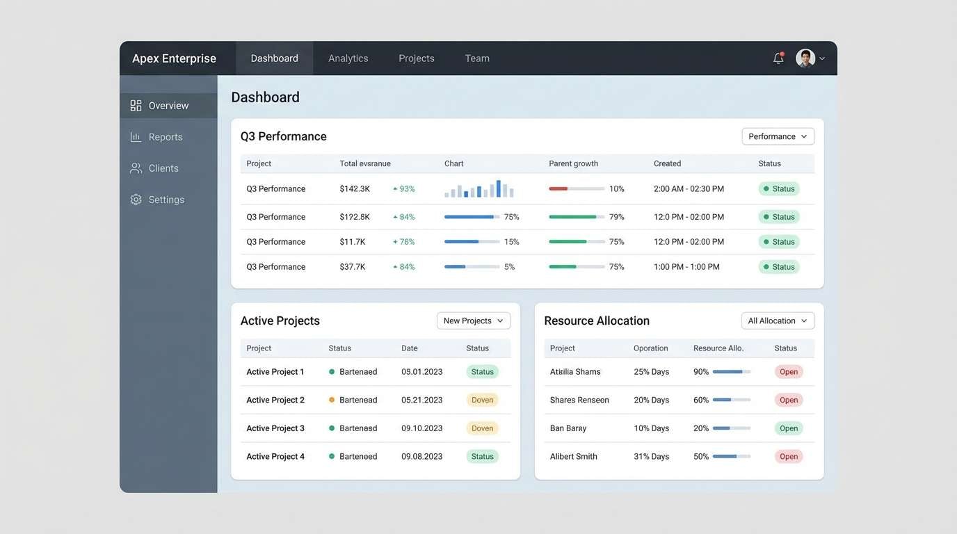
7) Steel and Slate
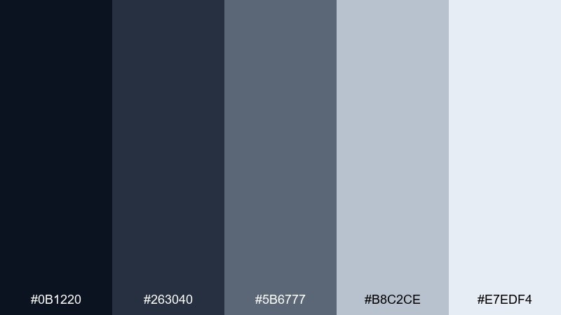
HEX: #0B1220 #263040 #5B6777 #B8C2CE #E7EDF4
Mood: cool, structured, confident
Best for: enterprise software UI
Cool steel and slate tones feel like precision, control, and polished hardware. Use the darkest shade for navigation, slate for panels, and pale blue-grays for content surfaces. It pairs well with sharp line icons and condensed type. Tip: add one bright accent color outside the set only for critical actions.
Image example of steel and slate generated using media.io
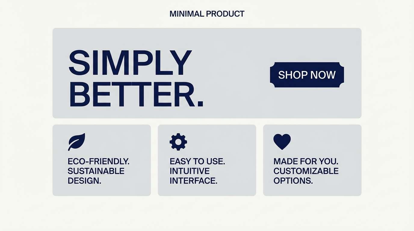
8) Platinum Frost
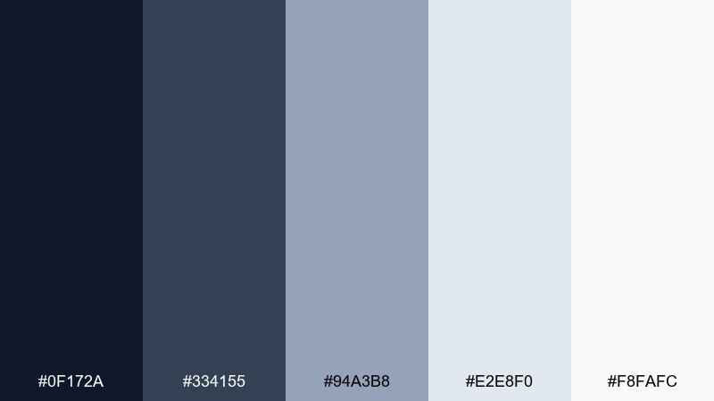
HEX: #0F172A #334155 #94A3B8 #E2E8F0 #F8FAFC
Mood: crisp, airy, modern
Best for: minimal product landing page
Platinum frost feels like winter light on smooth metal, clean and airy without looking sterile. Let the near-white and pale silver dominate backgrounds, then use navy for type and structure. This mix suits tech, skincare, and modern home goods. Tip: reduce shadow intensity and rely on spacing for hierarchy.
Image example of platinum frost generated using media.io
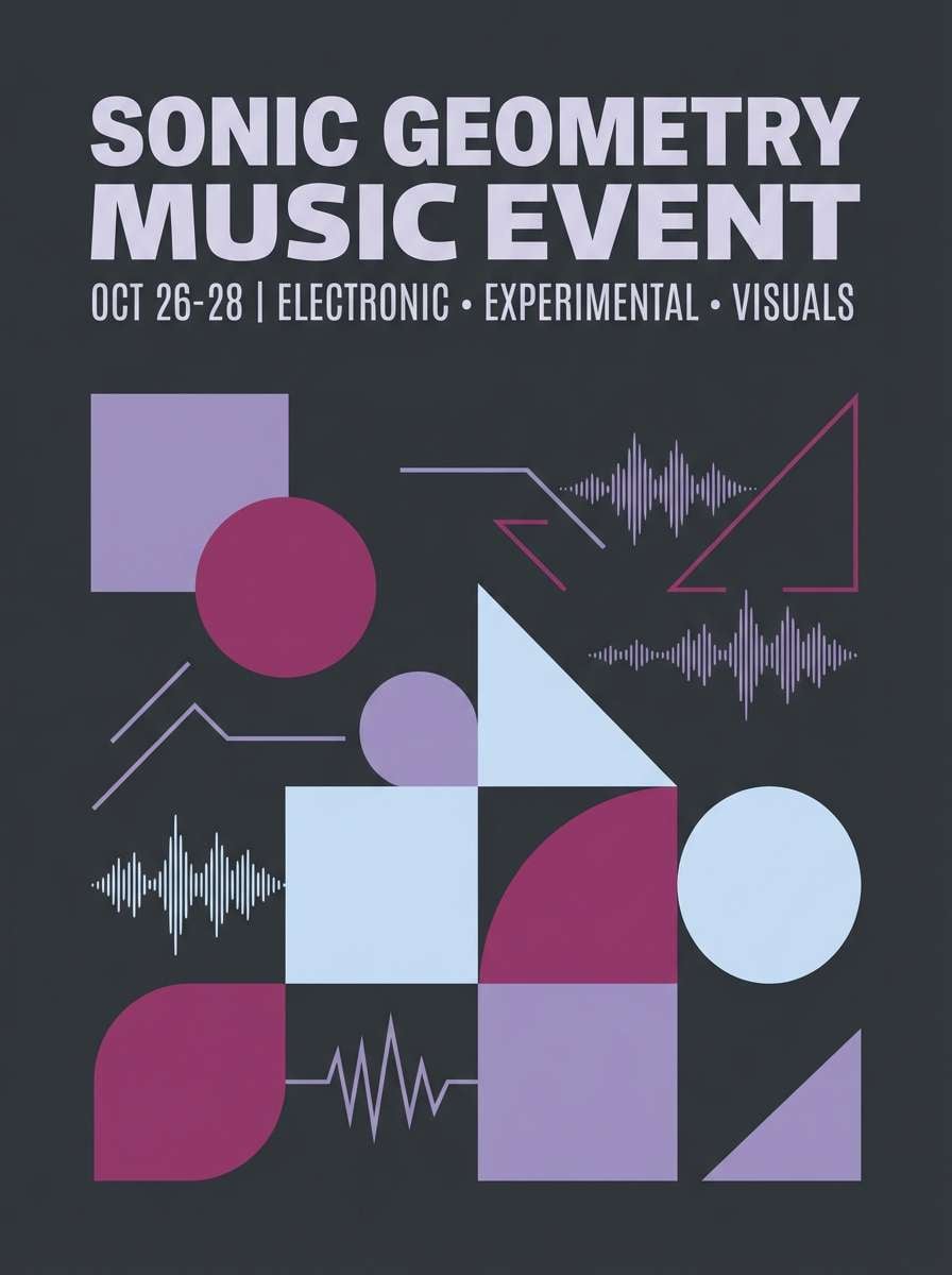
9) Gunmetal Orchid
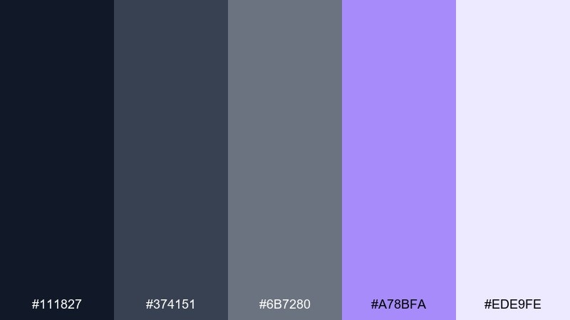
HEX: #111827 #374151 #6B7280 #A78BFA #EDE9FE
Mood: moody, futuristic, playful
Best for: music event poster
Gunmetal and orchid reads like neon reflected on wet pavement, moody with a pulse. Use the dark grays for background blocks and let lavender act as your headline and highlight color. It pairs well with geometric patterns and high-contrast type. Tip: keep lavender limited to one or two elements per section so it stays electric.
Image example of gunmetal orchid generated using media.io
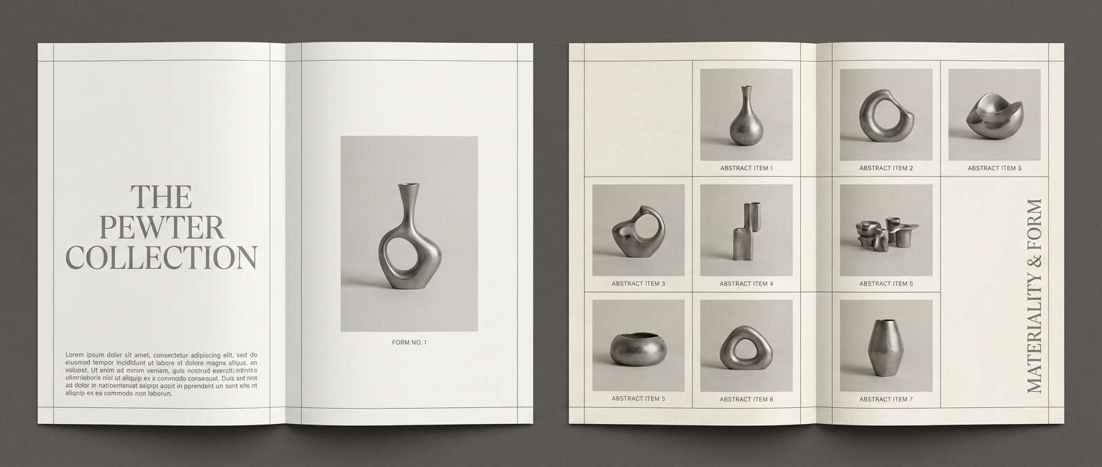
10) Pewter and Pearl
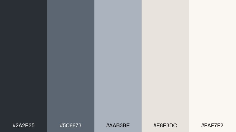
HEX: #2A2E35 #5C6673 #AAB3BE #E8E3DC #FAF7F2
Mood: soft, refined, editorial
Best for: magazine layout and lookbook
Pewter and pearl feel like tailored fabrics, soft daylight, and understated luxury. The grays are perfect for grids, captions, and rules, while the pearly neutrals keep pages light. Pair it with black-and-white portraits or minimal product photography. Tip: use pewter for small typography and reserve near-black only for section headers.
Image example of pewter and pearl generated using media.io
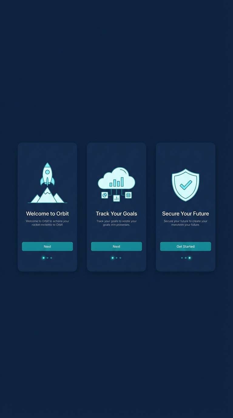
11) Titanium Teal
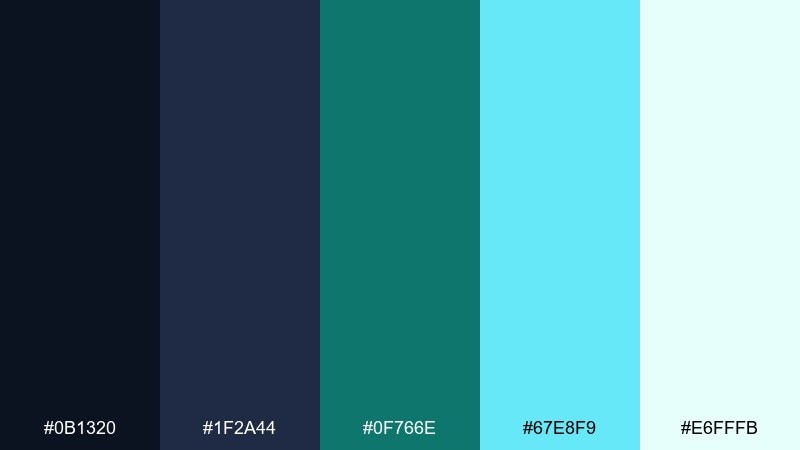
HEX: #0B1320 #1F2A44 #0F766E #67E8F9 #E6FFFB
Mood: fresh, high-tech, energetic
Best for: app onboarding screens
Titanium blues with teal sparks feel like clean circuitry and coastal light. Use the deep tones for structure and the teal for interactive elements like toggles, progress, and links. The icy cyan works as an accent for illustrations or badges. Tip: keep gradients within the teal family to avoid visual noise.
Image example of titanium teal generated using media.io
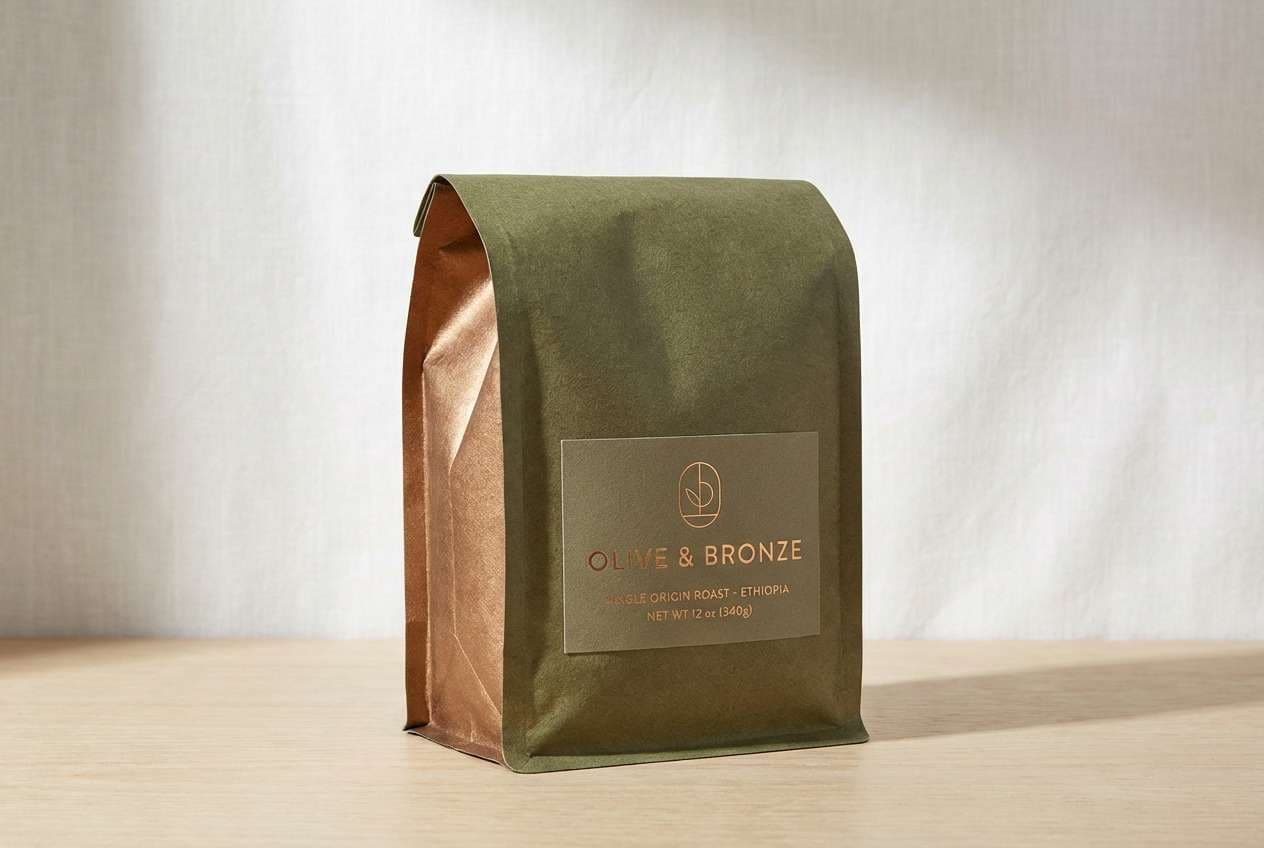
12) Bronze Olive Trail
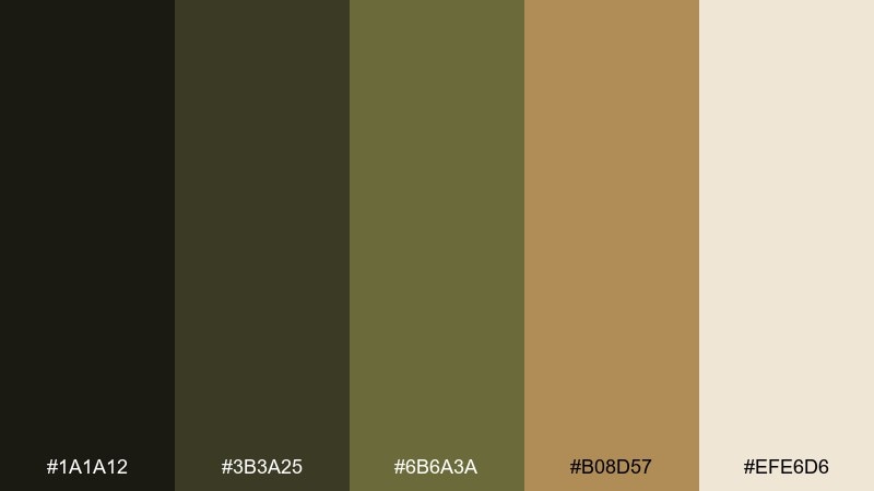
HEX: #1A1A12 #3B3A25 #6B6A3A #B08D57 #EFE6D6
Mood: earthy, outdoorsy, grounded
Best for: craft coffee bag packaging
Bronze and olive feel like trail dust, dried leaves, and sun on metal hardware. Use olive as the main field color and bronze for badges, seals, and small type details. It pairs naturally with kraft paper textures and simple line illustrations. Tip: keep the light cream for nutrition panels and small-print areas to maintain readability.
Image example of bronze olive trail generated using media.io
13) Mercury Mint
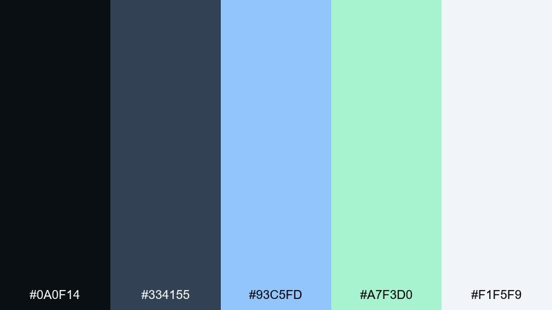
HEX: #0A0F14 #334155 #93C5FD #A7F3D0 #F1F5F9
Mood: clean, airy, experimental
Best for: startup brand kit
Mercury-like darks with mint and ice accents feel crisp, modern, and slightly futuristic. Use the near-black for logos and wordmarks, then let mint and pale blue define secondary graphics. It works well with lots of white space and rounded shapes. Tip: keep the mint as the signature color and use the blue only for supporting UI states.
Image example of mercury mint generated using media.io
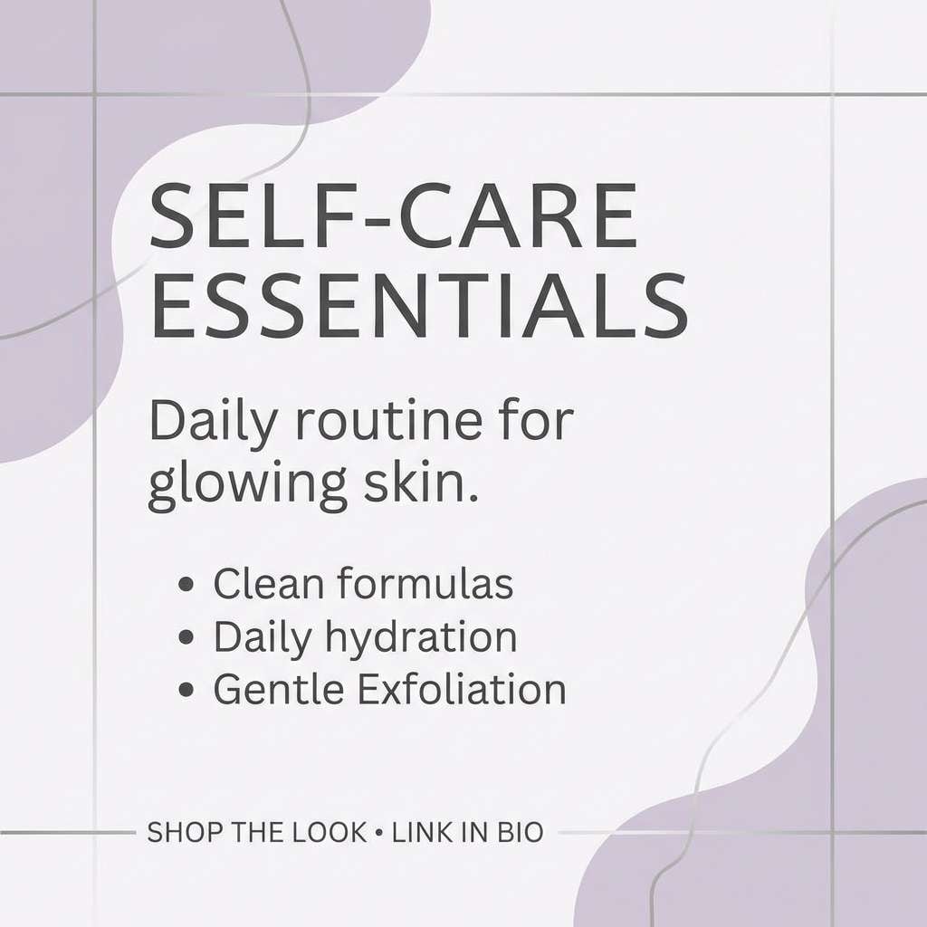
14) Silver Lilac Haze
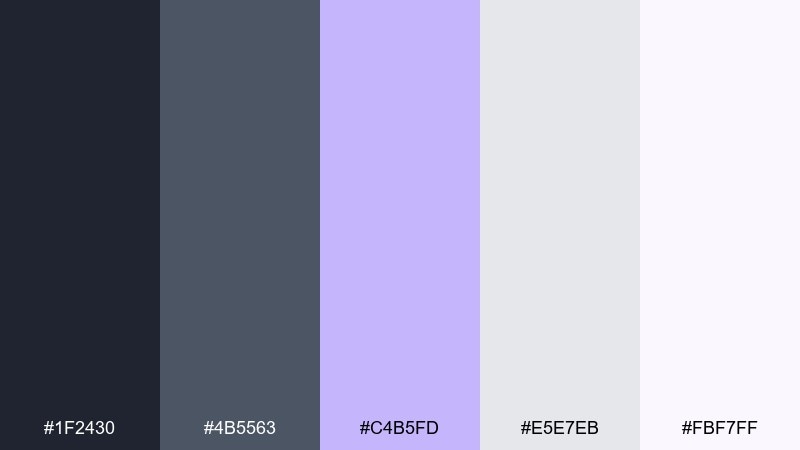
HEX: #1F2430 #4B5563 #C4B5FD #E5E7EB #FBF7FF
Mood: dreamy, soft, contemporary
Best for: skincare social media templates
Silvery neutrals with lilac haze feel like satin, mist, and gentle glow. Use light backgrounds for product shots and let lilac carry stickers, headers, and decorative shapes. The dark gray keeps copy readable without harsh contrast. Tip: add thin silver-gray outlines to separate pastel elements on white.
Image example of silver lilac haze generated using media.io
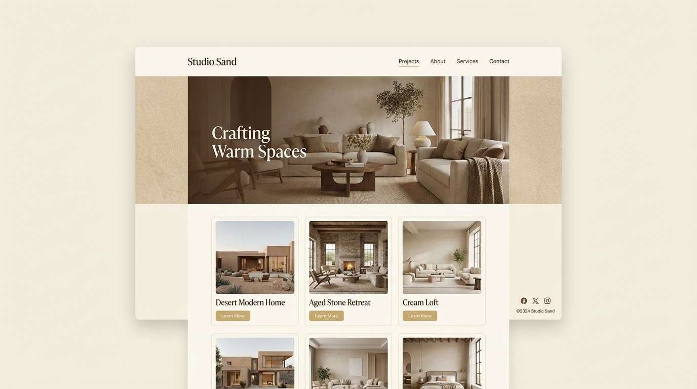
15) Gilded Sandstone
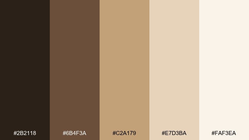
HEX: #2B2118 #6B4F3A #C2A179 #E7D3BA #FAF3EA
Mood: sunlit, calm, upscale
Best for: interior design portfolio
Gilded sandstone feels like warm sun on stone, linen curtains, and brushed brass fixtures. Use the creamy tones for page backgrounds and the rich brown for headings and navigation. Gold-beige works well for dividers, buttons, and subtle frames around photos. Tip: keep saturation low and let texture in imagery do the heavy lifting.
Image example of gilded sandstone generated using media.io
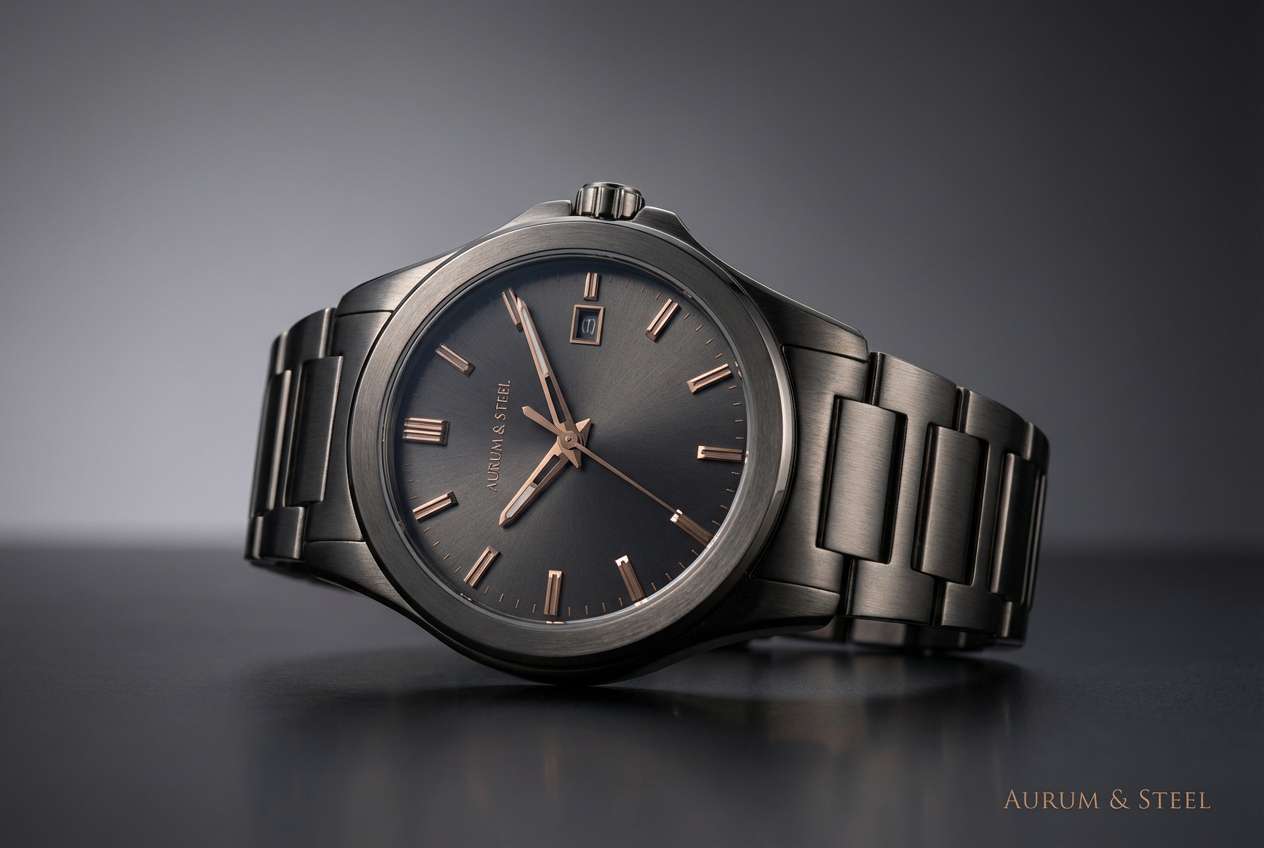
16) Midnight Bronze
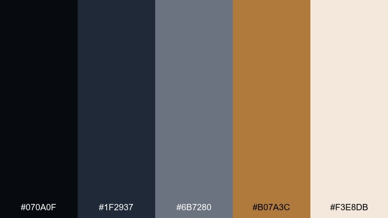
HEX: #070A0F #1F2937 #6B7280 #B07A3C #F3E8DB
Mood: dramatic, luxe, confident
Best for: premium watch product ad
Midnight shadows with bronze highlights feel like a spotlight on polished hardware. As a metallic color palette, it looks best with a near-black base and a single warm bronze accent for premium cues. Pair it with minimalist typography and plenty of negative space to keep it modern. Tip: use bronze sparingly on edges and micro-details to avoid a heavy look.
Image example of midnight bronze generated using media.io
17) Urban Copper Pop
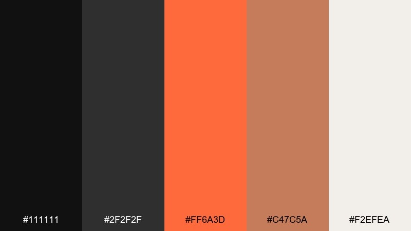
HEX: #111111 #2F2F2F #FF6A3D #C47C5A #F2EFEA
Mood: street, bold, modern
Best for: tech conference flyer
Urban darks with copper pop feel like concrete, signage, and glowing heat. Keep the blacks and grays dominant for structure, then use the vivid orange-copper as the attention grabber for dates and CTAs. It pairs well with bold sans fonts and sharp geometric blocks. Tip: apply the bright accent in one consistent shape system for visual rhythm.
Image example of urban copper pop generated using media.io

18) Graphite Blush
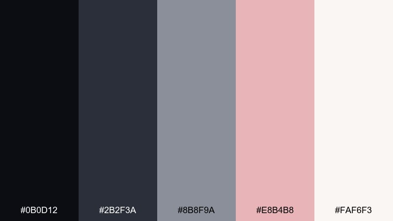
HEX: #0B0D12 #2B2F3A #8B8F9A #E8B4B8 #FAF6F3
Mood: soft, chic, contemporary
Best for: fashion ecommerce UI
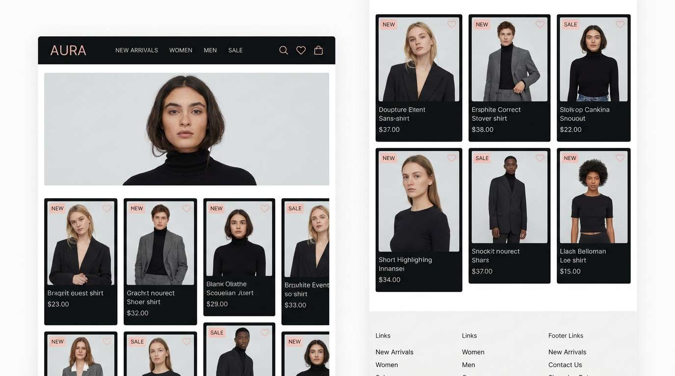
Graphite with blush feels like silk against leather, modern but approachable. Use the near-black for navigation, graphite for frames, and blush as the micro-accent on wishlist hearts or sale tags. It pairs nicely with editorial photography and generous margins. Tip: keep blush on light backgrounds to preserve a clean, premium feel.
Image example of graphite blush generated using media.io
19) Opal Chrome Wash
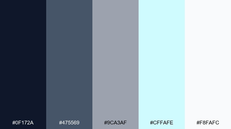
HEX: #0F172A #475569 #9CA3AF #CFFAFE #F8FAFC
Mood: glassy, luminous, light
Best for: presentation deck theme
Opal and chrome washes feel like light passing through glass, clean and slightly iridescent. Use navy for titles, slate for body copy, and save the opal cyan for section breaks and key numbers. It works best with simple charts and thin dividers. Tip: keep backgrounds mostly white to avoid dulling the airy effect.
Image example of opal chrome wash generated using media.io
20) Lacquered Gold Noir
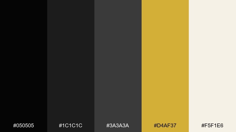
HEX: #050505 #1C1C1C #3A3A3A #D4AF37 #F5F1E6
Mood: dramatic, glamorous, high-contrast
Best for: luxury brand logo and monogram
Lacquered noir and bright gold feels like gala lighting and polished jewelry. The near-black and charcoal make a strong base for logos, while gold is best as a single premium mark or thin outline. Pair it with high-contrast serif typography and plenty of empty space. Tip: test the gold on both matte and glossy finishes to pick the right print treatment.
Image example of lacquered gold noir generated using media.io
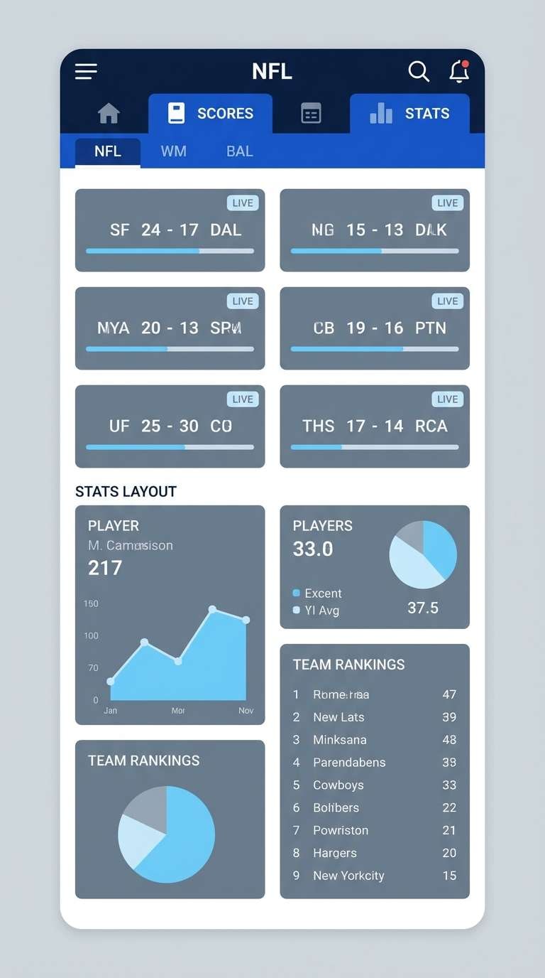
21) Cobalt Steel Shine
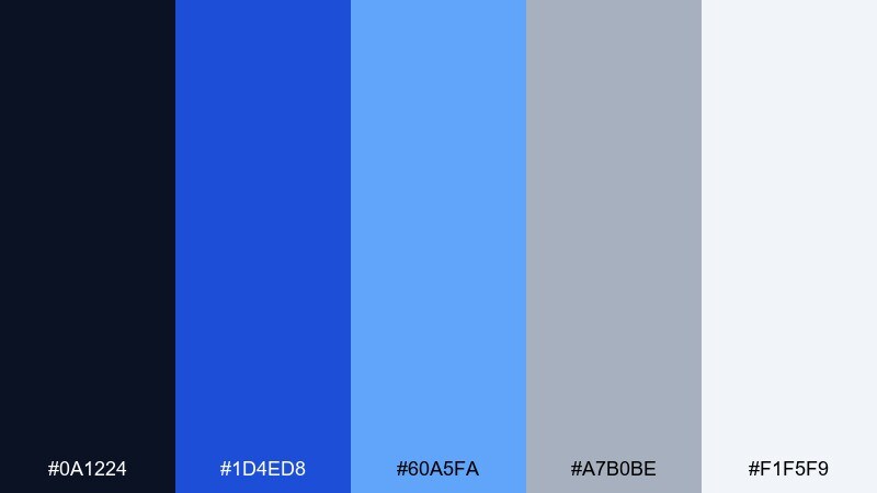
HEX: #0A1224 #1D4ED8 #60A5FA #A7B0BE #F1F5F9
Mood: bold, confident, sporty
Best for: sports app UI highlights
Cobalt with steel neutrals feels fast, polished, and competitive. Use the cobalt for key actions and active states, while the steel grays keep the rest of the interface calm. It pairs well with strong icons and condensed numerals for scores. Tip: limit full-saturation blue to one level of hierarchy to avoid overwhelming users.
Image example of cobalt steel shine generated using media.io
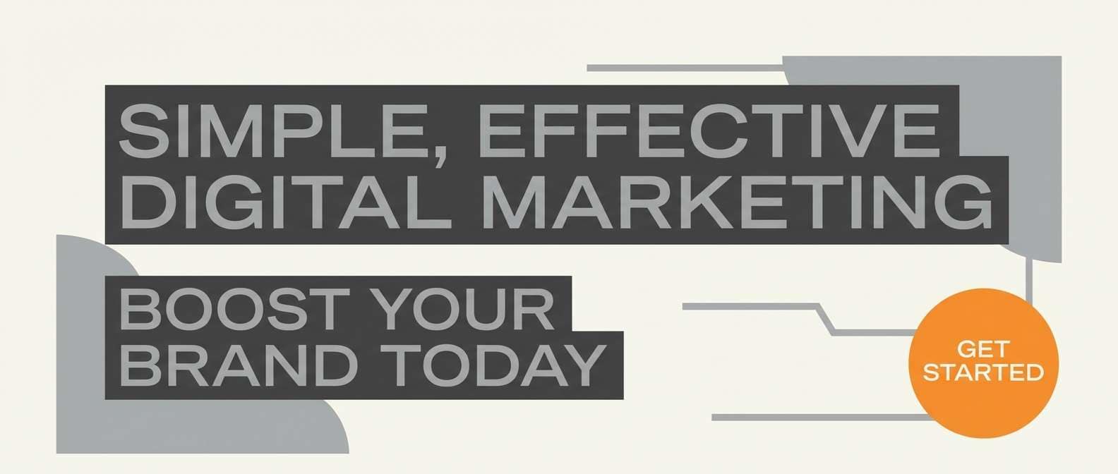
22) Smoked Silver Citrus
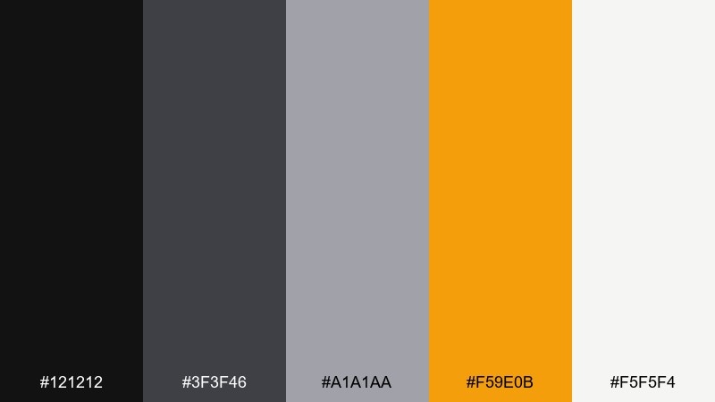
HEX: #121212 #3F3F46 #A1A1AA #F59E0B #F5F5F4
Mood: modern, punchy, balanced
Best for: brand social ads and banners
Smoked silver tones with a citrus punch feel like modern streetwear and glossy signage. For metallic color combinations that convert, keep the grays as the foundation and let the orange act as the single attention anchor. This pairing works well for sale banners, feature callouts, and bold typography. Tip: use the light off-white for breathing room so the accent stays sharp.
Image example of smoked silver citrus generated using media.io
What Colors Go Well with Metallic?
Metallic-inspired neutrals pair naturally with deep bases (near-black, navy, charcoal) and light surfaces (soft silver, pearl, warm off-white). This contrast keeps designs crisp and “hardware clean.”
For accents, choose one warm highlight (gold, bronze, copper) or one cool highlight (cobalt, teal, lilac) and repeat it consistently for buttons, badges, and key numbers.
If you need a broader system, add one non-metallic “signal color” (like coral or emerald) for alerts and success states—then keep everything else restrained.
How to Use a Metallic Color Palette in Real Designs
In UI, treat metallic palettes as a hierarchy tool: darkest for navigation and text, mid-grays for panels and borders, and the lightest tones for backgrounds and cards. This prevents the interface from feeling flat.
In branding and packaging, metallic cues work best as micro-details—thin borders, monograms, icons, or foil-like highlights—rather than large blocks of shiny color.
For print, always test. Warm golds and bronzes can shift on uncoated stock, while cool silvers can look dull if the background is too gray.
Create Metallic Palette Visuals with AI
If you want to preview how a metallic color scheme feels in a real layout, generate quick mockups first—landing pages, posters, packaging, or brand boards—before committing to production files.
With Media.io, you can turn a short prompt into on-brand visuals and iterate fast by changing just one accent (gold to copper, slate to pewter, teal to cobalt) while keeping the same structure.
Use the palette HEX codes above as your guide, then describe materials (brushed metal, lacquer, satin paper) to push the “metallic” vibe without sacrificing legibility.
Metallic Color Palette FAQs
-
What are metallic colors in design?
Metallic colors are hues that mimic metals like silver, gold, chrome, bronze, and copper. In digital design they’re usually represented with neutral grays plus carefully chosen warm or cool accents, while “shine” is suggested through contrast, gradients, and highlights. -
How do I make metallic colors look good on screens (without real shine)?
Use a strong value range: dark base + light surface + one accent. Add subtle gradients or highlights sparingly, and prioritize text contrast (WCAG-friendly) over glossy effects. -
Which metallic palette is best for modern UI?
Cool, neutral sets like Steel and Slate or Platinum Frost are safest for UI because they keep components readable. Add one controlled accent (gold, teal, cobalt) for interactive states and primary CTAs. -
Do metallic palettes work for luxury branding?
Yes—high-contrast noir + gold (like Lacquered Gold Noir) signals luxury fast. The key is restraint: keep gold as a single mark, thin outline, or micro-detail rather than covering large areas. -
What’s the best background color for metallic accents?
Near-black, charcoal, navy, and warm off-white are the most reliable. Dark backgrounds make gold/copper feel richer; light backgrounds make silver/pearl feel cleaner and more editorial. -
How many metallic accent colors should I use?
Typically one. Pick either a warm accent (gold/bronze/copper) or a cool accent (cobalt/teal/lilac) and repeat it consistently for CTA buttons, icons, dividers, and key highlights. -
Can I use these HEX codes for print projects?
You can start with HEX for planning, but convert to CMYK/Pantone and test proofs—metal-like hues can shift depending on paper stock and finishing (matte vs gloss vs foil).


