

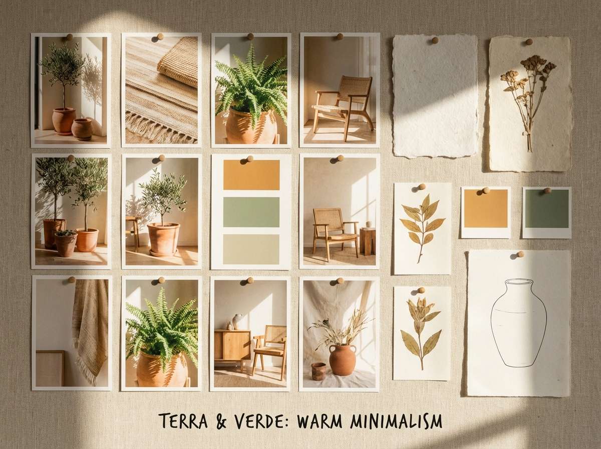
An orange green color palette blends warmth and freshness in a way that feels instantly energetic but still grounded. It’s a reliable pairing for brands that want to look friendly, natural, or modern without leaning too sterile.
Below are 20+ orange and green palette ideas with HEX codes, plus quick usage notes and AI image prompts you can remix for packaging, posters, UI, and more.
In this article
- Why Orange Green Palettes Work So Well
-
- citrus grove
- retro orchard
- sage tangerine
- neon market
- terracotta jungle
- pumpkin matcha
- sunset leaf
- harvest meadow
- festival citrus
- soft sprout
- copper fern
- apricot olive
- citrus ui pop
- garden party invite
- eco label
- tropic poster
- autumn cabin
- playful classroom
- canyon cactus
- minimal citrus ink
- botanical watercolor
- What Colors Go Well with Orange Green?
- How to Use a Orange Green Color Palette in Real Designs
- Create Orange Green Palette Visuals with AI
Why Orange Green Palettes Work So Well
Orange brings warmth, appetite, and momentum, while green signals nature, balance, and “go” energy. Together, they create a high-interest palette that still feels approachable and organic.
This pairing is also flexible: push orange brighter for playful campaigns, or lean into deeper greens for premium, outdoorsy, or eco-forward branding. With the right neutral, an orange green color scheme can shift from cozy to ultra-modern.
From a UI perspective, orange and green naturally map to attention and status (alerts vs. success). The key is controlling saturation and using dark neutrals for text to keep contrast clean.
20+ Orange Green Color Palette Ideas (with HEX Codes)
1) Citrus Grove
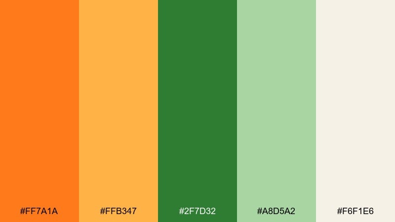
HEX: #ff7a1a #ffb347 #2f7d32 #a8d5a2 #f6f1e6
Mood: fresh, sunny, welcoming
Best for: cafe branding and packaging
Fresh and sunny, it feels like walking through a citrus orchard with new leaves overhead. The vivid orange and warm apricot make the green tones look even cleaner and more appetizing. Use it on food labels, coffee bags, or a storefront sign, then let the off-white act as breathing room for copy. Tip: keep body text dark and reserve the brightest orange for price tags or calls-to-action.
Image example of citrus grove generated using media.io

Media.io is an online AI studio for creating and editing video, image, and audio in your browser.

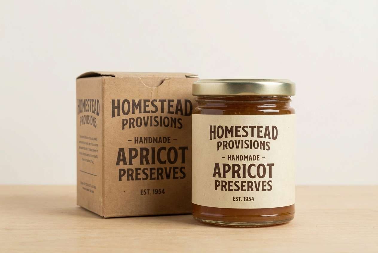
2) Retro Orchard
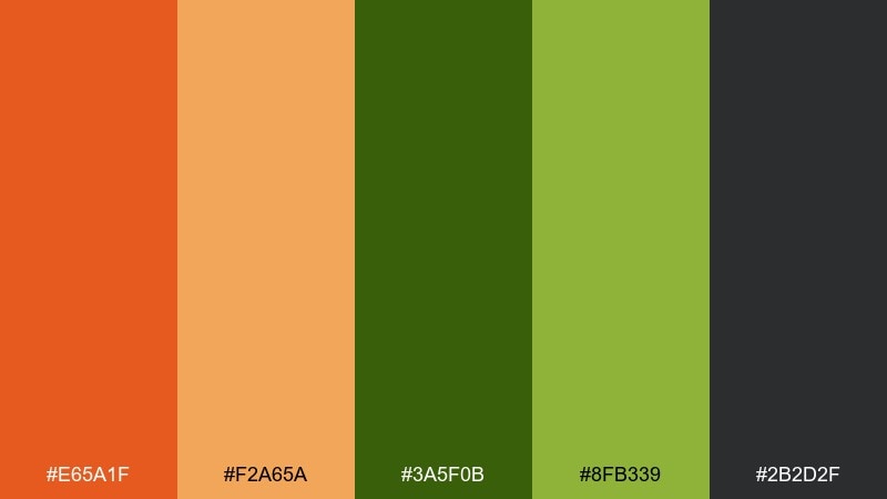
HEX: #e65a1f #f2a65a #3a5f0b #8fb339 #2b2d2f
Mood: retro, earthy, grounded
Best for: craft label design and vintage branding
Earthy and nostalgic, it recalls roadside fruit stands and screen-printed labels from the 70s. The dark charcoal adds weight, while the olive greens keep the orange from feeling too sweet. Use it for craft beer, jam jars, or any brand that wants “handmade” credibility. Tip: print the orange as a spot color and use charcoal for type to avoid muddy results.
Image example of retro orchard generated using media.io
3) Sage Tangerine
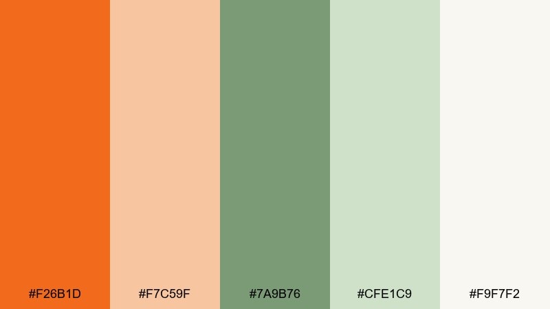
HEX: #f26b1d #f7c59f #7a9b76 #cfe1c9 #f9f7f2
Mood: soft, calm, airy
Best for: wellness websites and lifestyle blogs
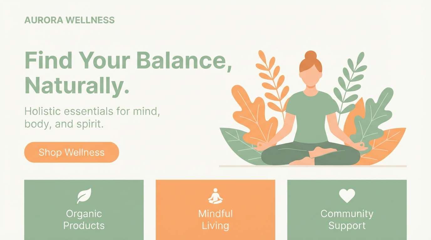
Calm and airy, it evokes linen fabrics, herbal tea, and a warm morning glow. The sage and pale greens soften the tangerine, creating an orange green color palette that feels gentle rather than loud. Use it for wellness landing pages, blog headers, and product highlight sections, pairing it with warm neutrals and plenty of whitespace. Tip: let tangerine be the accent only (buttons, icons) to keep the page serene.
Image example of sage tangerine generated using media.io
4) Neon Market
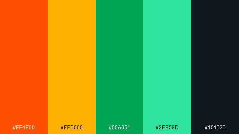
HEX: #ff4f00 #ffb000 #00a651 #2ee59d #101820
Mood: bold, energetic, nightlife
Best for: event posters and nightlife promos
Bold and electric, it feels like street lights, neon signage, and late-night pop-up markets. High-saturation orange and green punch hard against the near-black, making headlines impossible to miss. Use it for gig posters, festival schedules, or social promo graphics where speed and impact matter. Tip: keep gradients subtle and use the near-black as the main field color for readability.
Image example of neon market generated using media.io
5) Terracotta Jungle
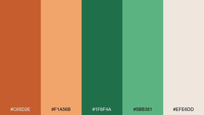
HEX: #c65d2e #f1a56b #1f6f4a #5bb381 #efe6dd
Mood: warm, natural, artisanal
Best for: interior mood boards and home decor
Warm and natural, it brings to mind clay pots, broad leaves, and sunlit terracotta tiles. The deeper green adds a lush anchor, while the sandy neutral keeps the mix sophisticated. It works beautifully for interior palettes, home decor catalogs, and boutique hotel branding. Tip: use the darkest green for headings and outlines so the terracotta can stay as the inviting feature color.
Image example of terracotta jungle generated using media.io
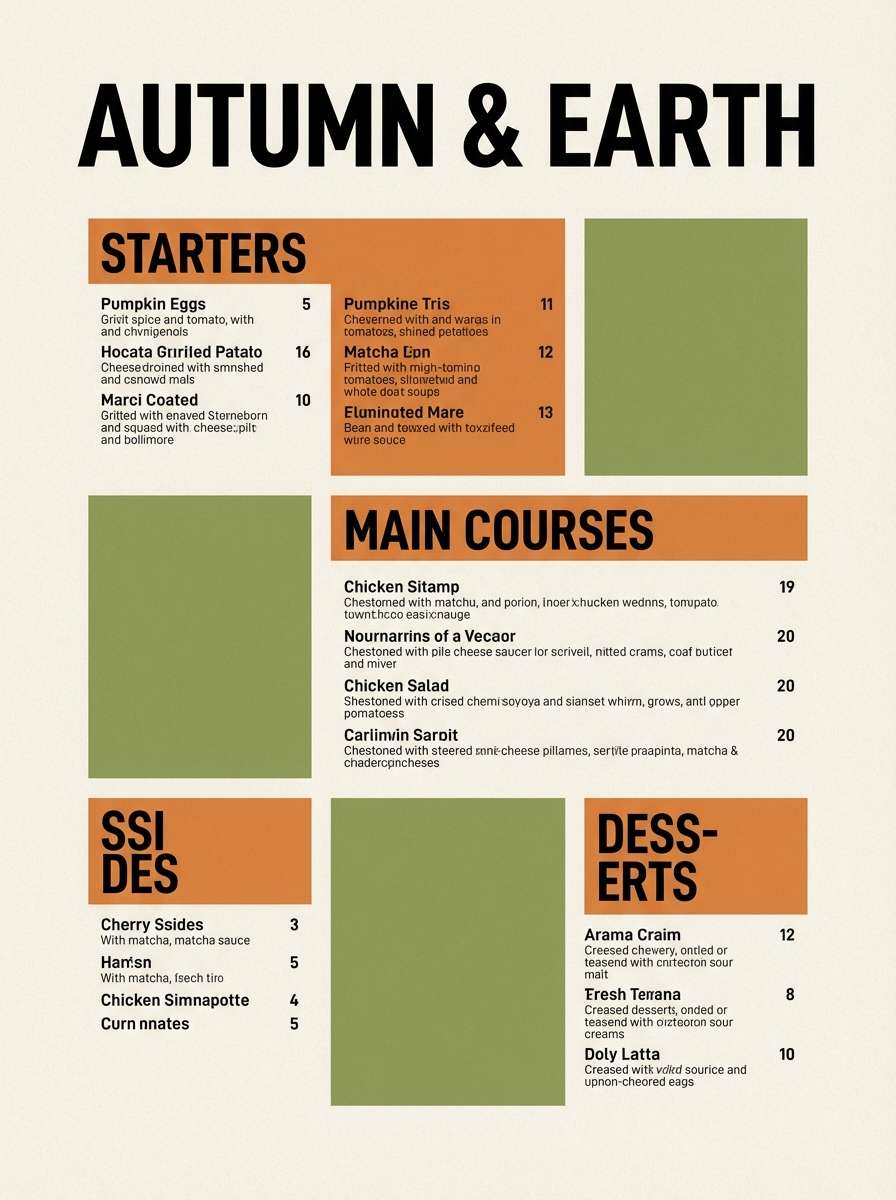
6) Pumpkin Matcha
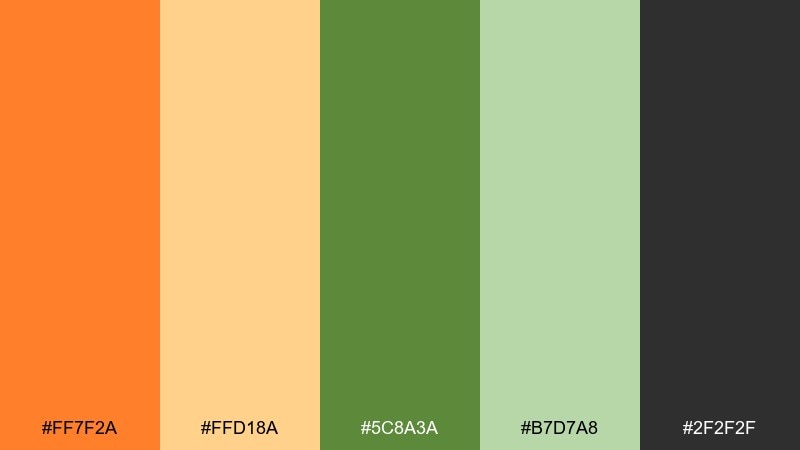
HEX: #ff7f2a #ffd18a #5c8a3a #b7d7a8 #2f2f2f
Mood: cozy, friendly, approachable
Best for: seasonal menus and food photography overlays
Cozy and friendly, it suggests pumpkin desserts, matcha foam, and warm café lighting. The creamy yellow-orange plays nicely with the grounded green, while charcoal gives you dependable contrast for text. Use it for seasonal menus, recipe cards, and food promo overlays. Tip: set body copy in charcoal and use the light green as a background tint for callout boxes.
Image example of pumpkin matcha generated using media.io
7) Sunset Leaf
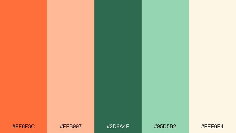
HEX: #ff6f3c #ffb997 #2d6a4f #95d5b2 #fef6e4
Mood: romantic, soft, optimistic
Best for: wedding stationery and invitations
Romantic and soft, it feels like sunset light filtering through garden leaves. The blushy orange adds warmth without overpowering, and the greens keep everything grounded and fresh. Use it for invitations, RSVP cards, and day-of signage, pairing it with elegant serif type and a warm cream background. Tip: foil or emboss the darker green for a subtle premium finish.
Image example of sunset leaf generated using media.io
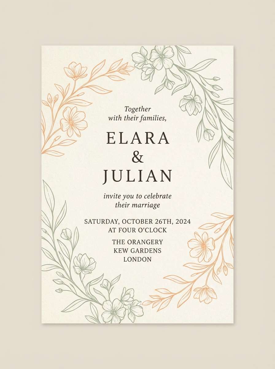
8) Harvest Meadow
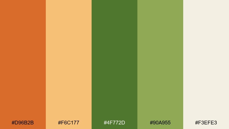
HEX: #d96b2b #f6c177 #4f772d #90a955 #f3efe3
Mood: rustic, wholesome, outdoorsy
Best for: farmers market flyers and community events
Rustic and wholesome, it evokes hay bales, fresh produce, and late-afternoon fields. The golden orange reads friendly and local, while the layered greens feel like real foliage rather than neon. Use it for community posters, farmers market flyers, and event wayfinding, especially when you need quick readability from a distance. Tip: set the background in the warm off-white and use the darker green for the main headline.
Image example of harvest meadow generated using media.io
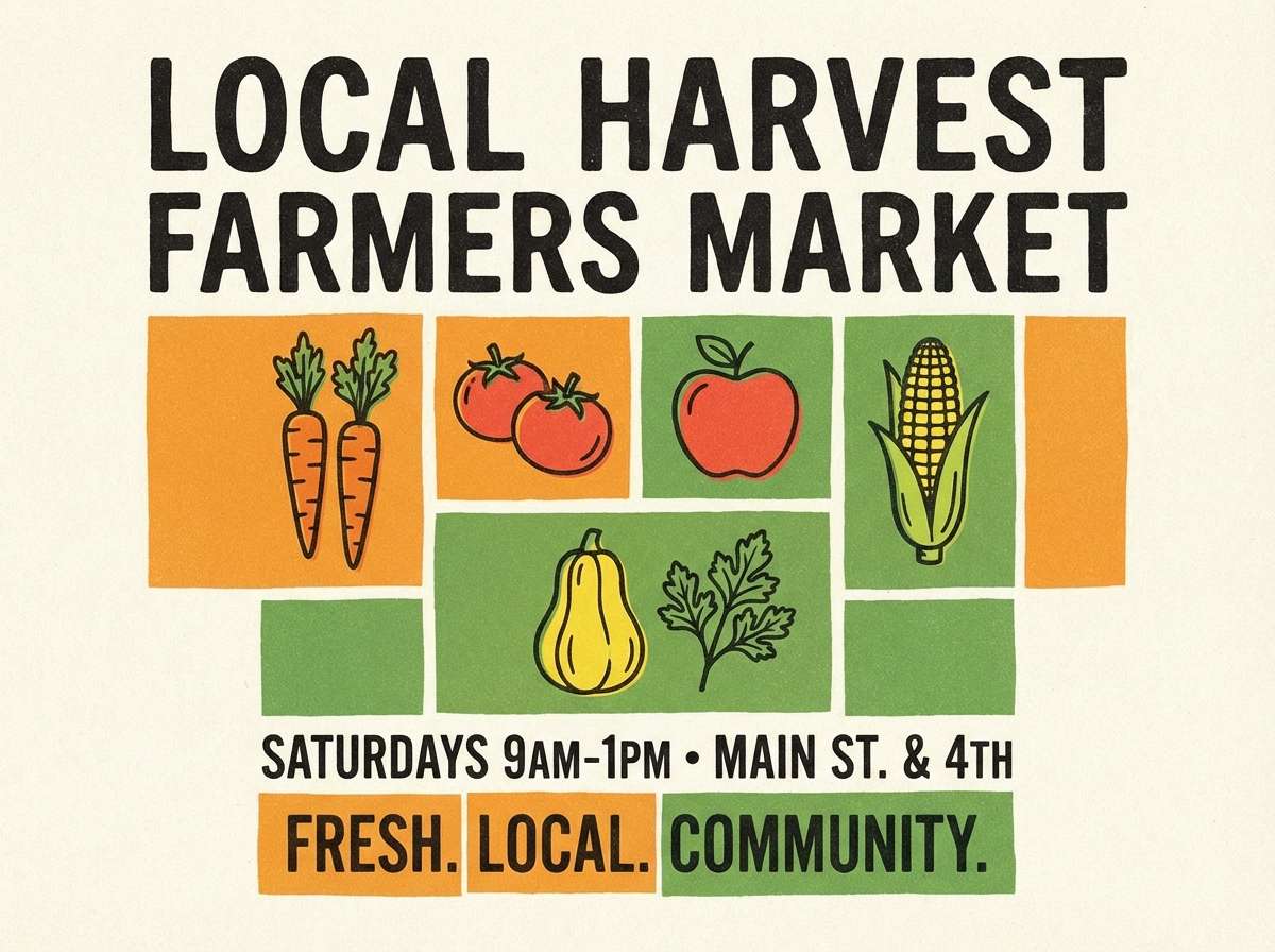
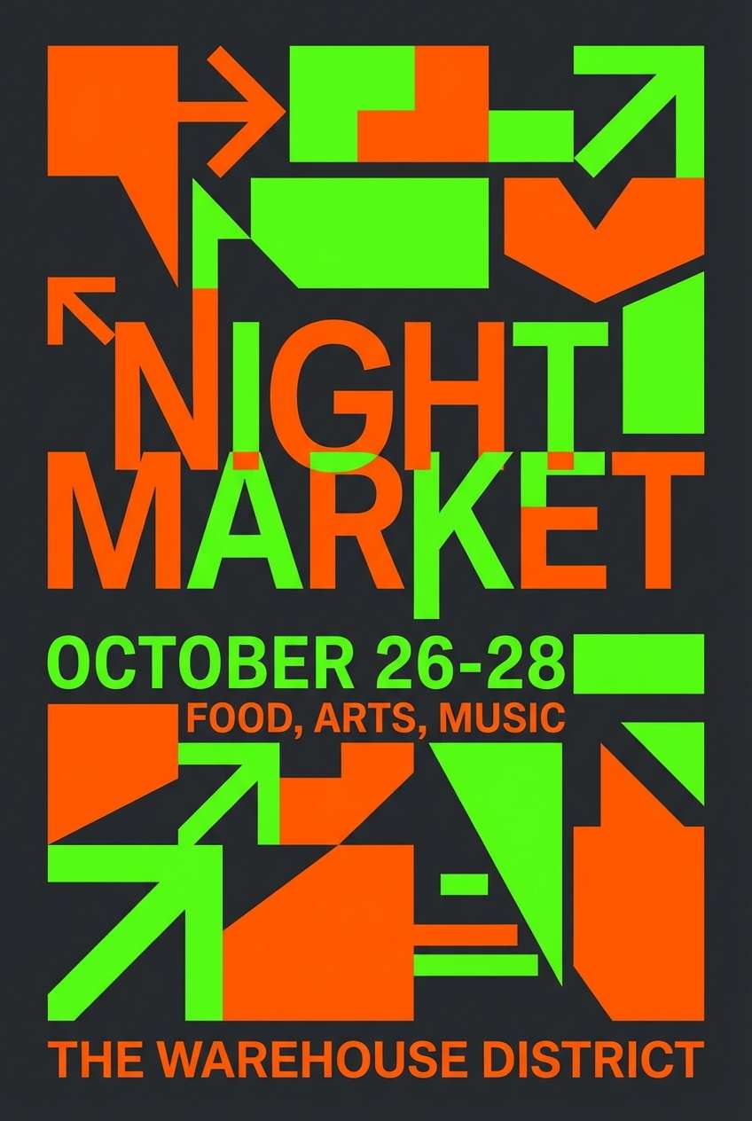
9) Festival Citrus
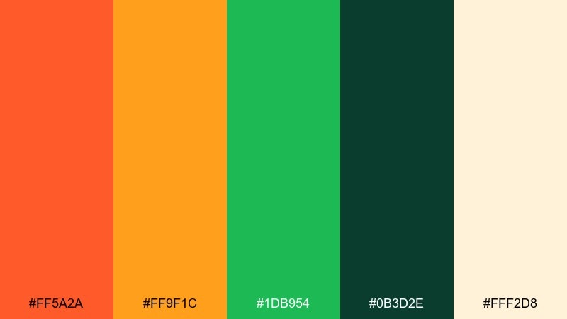
HEX: #ff5a2a #ff9f1c #1db954 #0b3d2e #fff2d8
Mood: playful, modern, upbeat
Best for: social media ads and campaign graphics
Playful and modern, it feels like summer playlists, bright wristbands, and confetti. The lively orange pairs with punchy green for quick-scrolling attention, while deep teal-green keeps layouts from looking childish. Use it for paid social ads, carousel slides, and promo banners, pairing it with bold sans-serif type. Tip: limit the brightest green to badges and stickers so the orange remains the hero.
Image example of festival citrus generated using media.io

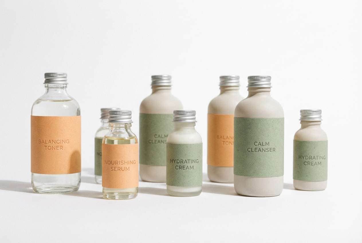
10) Soft Sprout
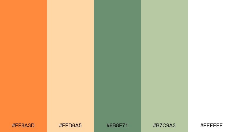
HEX: #ff8a3d #ffd6a5 #6b8f71 #b7c9a3 #ffffff
Mood: gentle, clean, minimal
Best for: skincare branding and minimalist web design
Gentle and clean, it suggests fresh soap, soft towels, and a hint of citrus. The muted greens keep the warm orange from feeling too loud, creating a calm, airy balance. Use it for skincare labels, product pages, and minimalist brand systems where trust and clarity matter. Tip: use white as the primary background and bring in orange only for key highlights like “new” or “limited.”
Image example of soft sprout generated using media.io
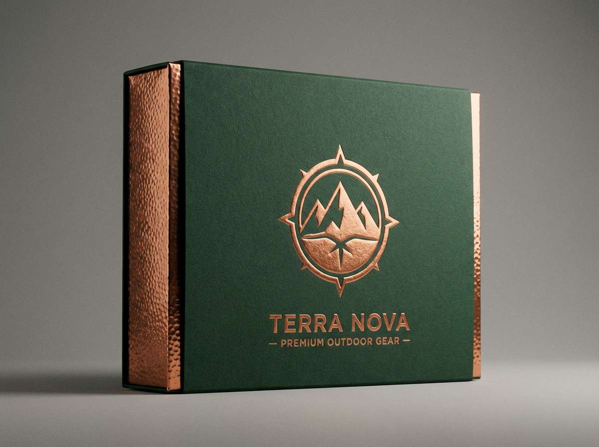
11) Copper Fern
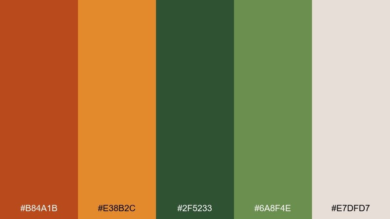
HEX: #b84a1b #e38b2c #2f5233 #6a8f4e #e7dfd7
Mood: heritage, moody, sophisticated
Best for: outdoor brands and premium packaging
Heritage and slightly moody, it feels like copper tools, worn leather, and shaded forest trails. The darker green adds a premium outdoor vibe, while the dusty neutral keeps everything refined. Use it on rugged lifestyle packaging, adventure club merch, or premium coffee and tea. Tip: pair it with textured paper stocks and keep the copper tone as the accent for seals and emblems.
Image example of copper fern generated using media.io
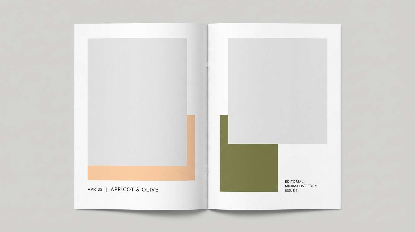
12) Apricot Olive
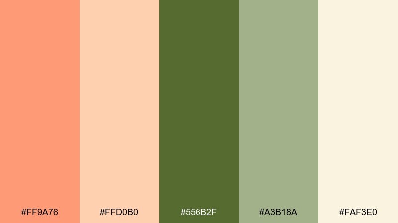
HEX: #ff9a76 #ffd0b0 #556b2f #a3b18a #faf3e0
Mood: warm, relaxed, organic
Best for: editorial layouts and lifestyle magazines
Warm and relaxed, it evokes apricot skin tones, olive branches, and sun-faded textiles. The olive core color makes the apricot feel grown-up and editorial rather than playful. Use it for magazine spreads, lookbooks, and blog templates that need a soft but distinctive identity. Tip: keep photo color grading slightly warm so the palette feels cohesive across pages.
Image example of apricot olive generated using media.io
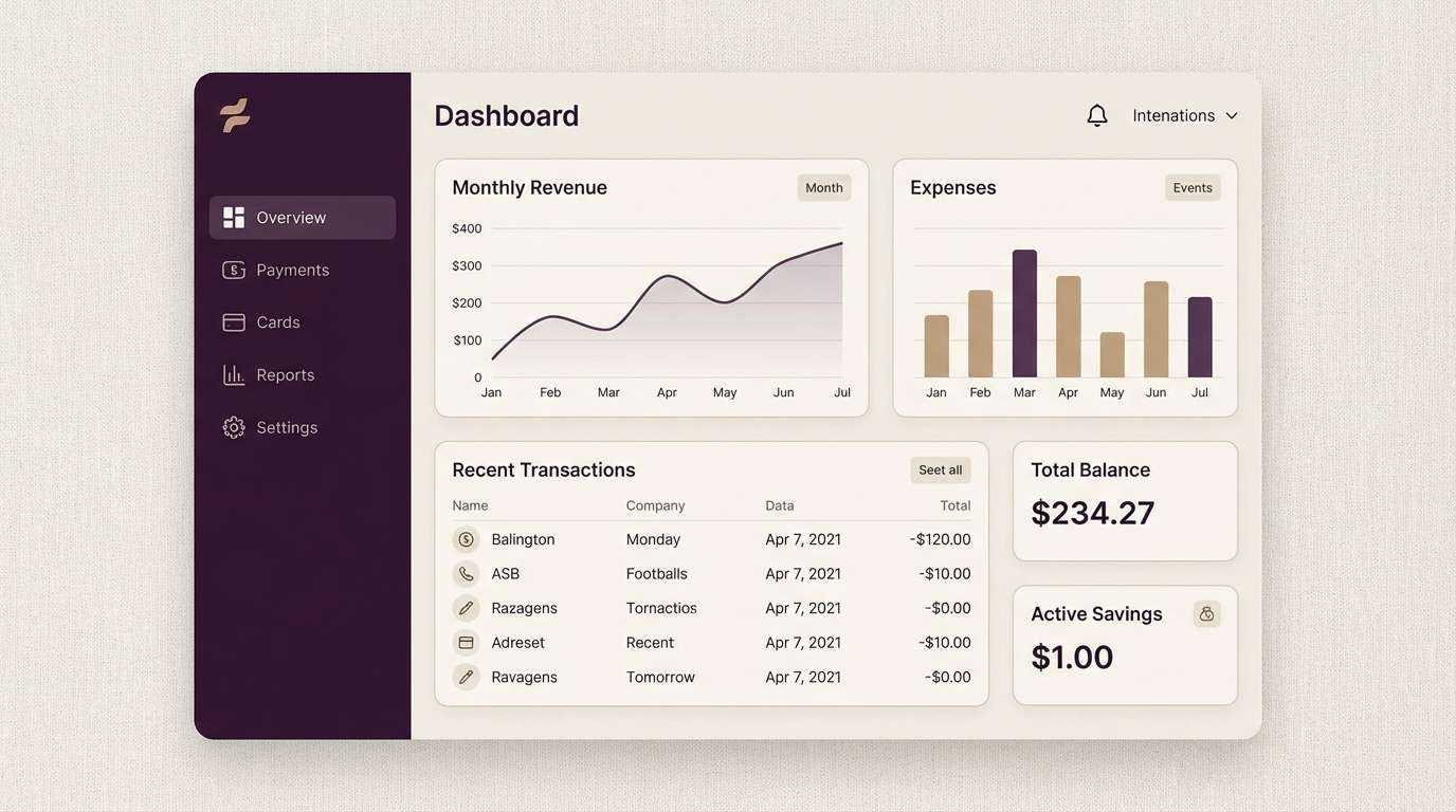
13) Citrus UI Pop
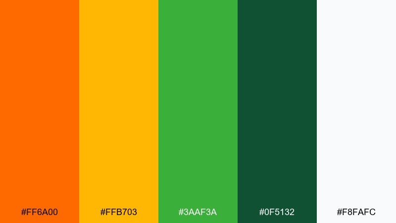
HEX: #ff6a00 #ffb703 #3aaf3a #0f5132 #f8fafc
Mood: modern, crisp, high-contrast
Best for: dashboard UI and fintech apps
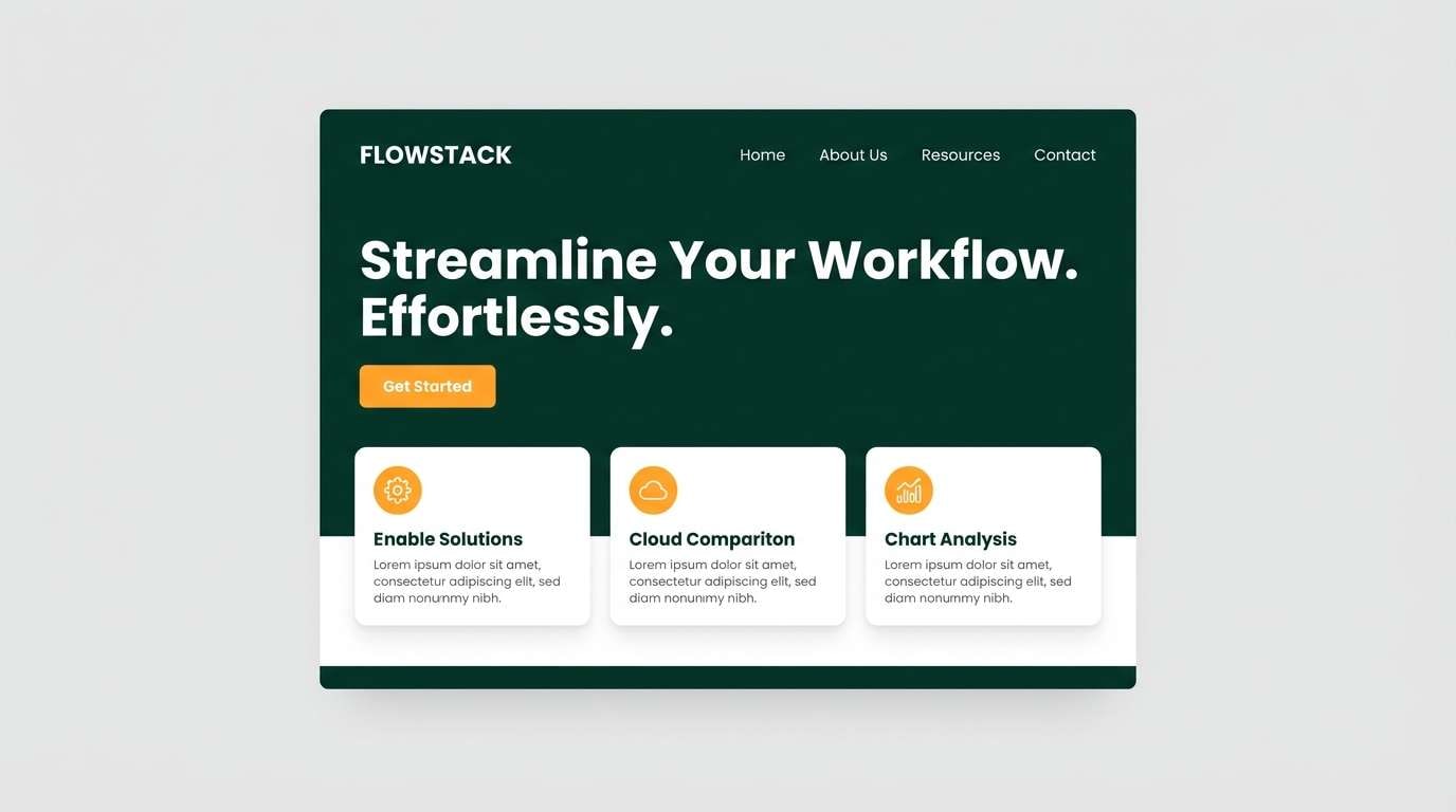
Modern and crisp, it feels like quick insights, clean charts, and confident navigation. The bright orange and gold provide strong hierarchy, while the greens read as “success” states without looking generic. For an orange green color scheme in dashboards, use the deep green for primary buttons and the gold as a highlight for key metrics. Tip: reserve the brightest orange for alerts so it keeps its urgency.
Image example of citrus ui pop generated using media.io
14) Garden Party Invite
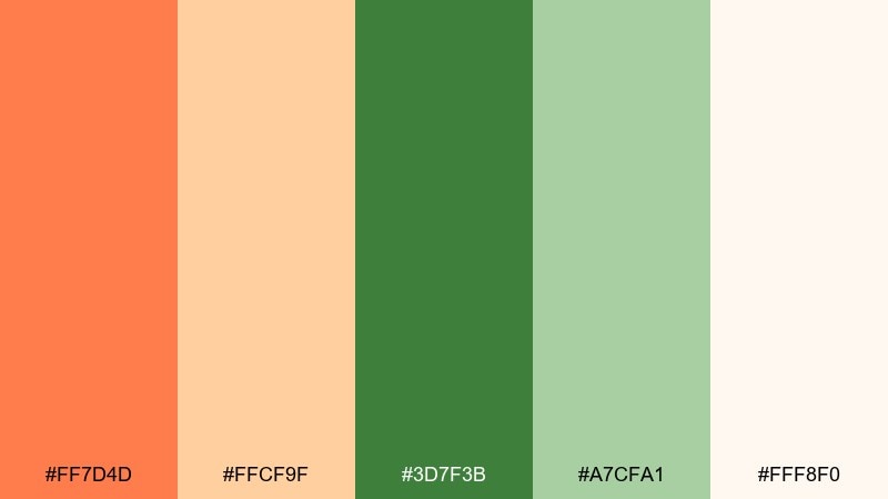
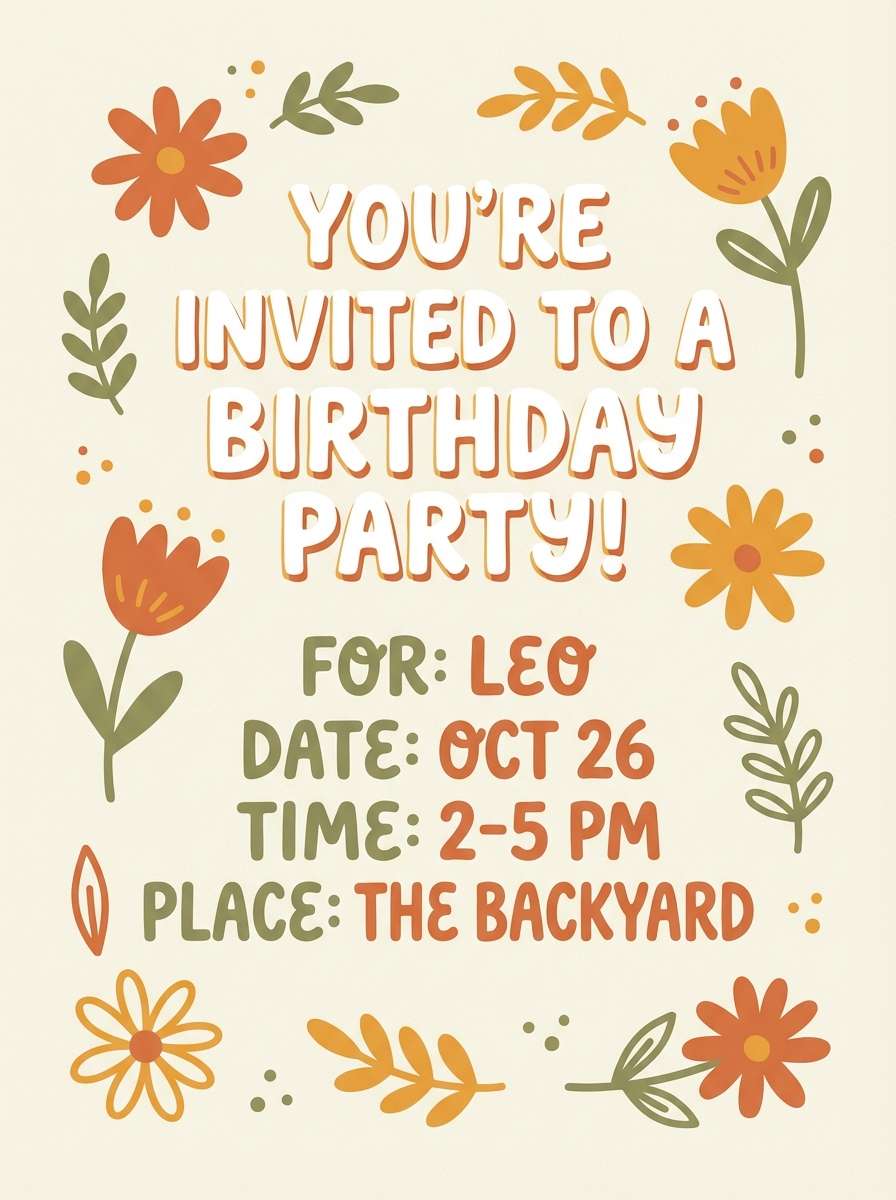
HEX: #ff7d4d #ffcf9f #3d7f3b #a7cfa1 #fff8f0
Mood: cheerful, light, celebratory
Best for: birthday invitations and party signage
Cheerful and light, it brings up backyard brunches, fresh florals, and fizzy drinks. The peachy orange adds friendliness while the leafy greens keep the design feeling outdoorsy and clean. Use it for birthday invites, party signs, and table cards, pairing it with playful scripts or rounded sans serifs. Tip: use the cream tone as your main canvas and add green borders to frame key details.
Image example of garden party invite generated using media.io
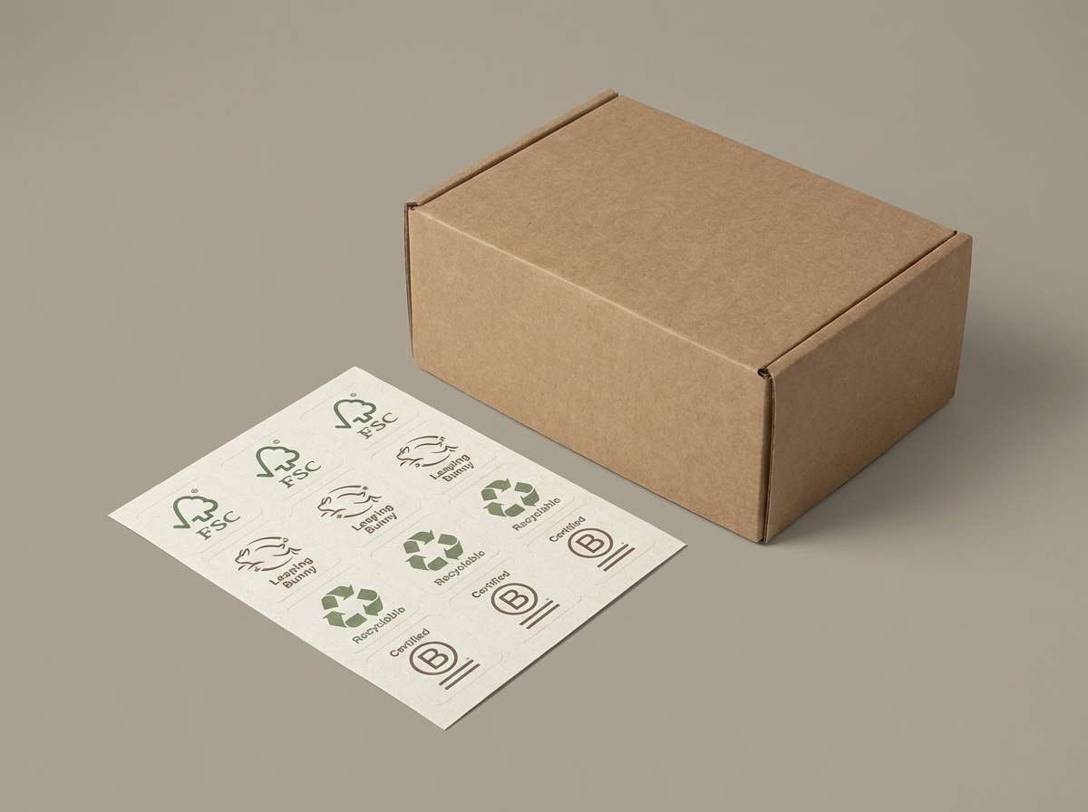
15) Eco Label
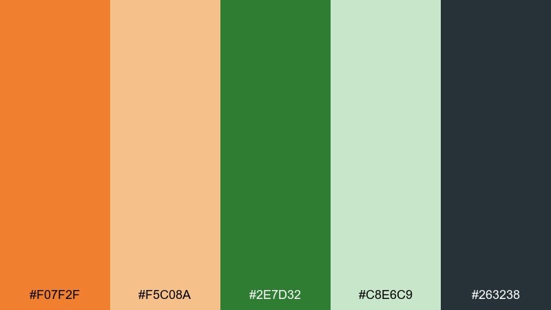
HEX: #f07f2f #f5c08a #2e7d32 #c8e6c9 #263238
Mood: responsible, clean, trustworthy
Best for: sustainable product labels and certifications
Responsible and clean, it feels like recycled paper, fresh produce, and clear labeling. The orange adds a human warmth to the greens, while the deep slate keeps claims readable and serious. Use it on eco badges, ingredient panels, and sustainable packaging systems where clarity matters. Tip: for best print consistency, keep the light green as a tint behind text rather than a full-bleed color.
Image example of eco label generated using media.io
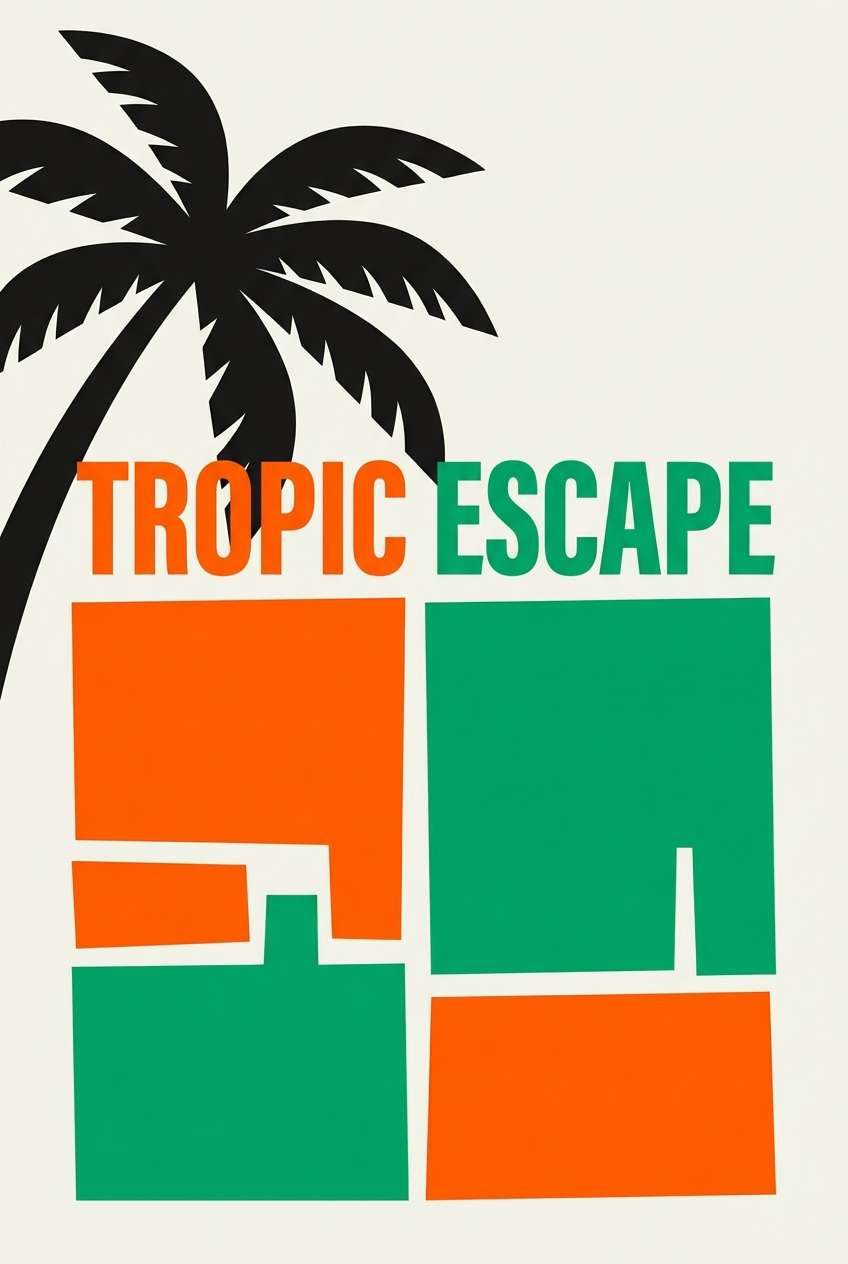
16) Tropic Poster
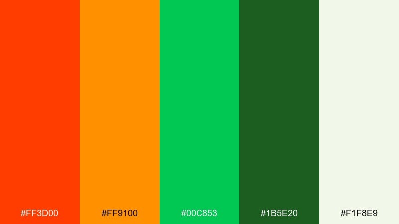
HEX: #ff3d00 #ff9100 #00c853 #1b5e20 #f1f8e9
Mood: tropical, loud, adventurous
Best for: travel posters and summer promotions
Tropical and loud, it evokes heat, palm shadows, and bright fruit stands near the beach. These orange green color combinations are made for big headlines and bold shapes that read instantly. Use it for travel posters, summer campaigns, and limited-time offers, pairing it with a clean off-white background to reduce visual noise. Tip: keep the darkest green for outlines and icons so the bright tones stay crisp.
Image example of tropic poster generated using media.io
17) Autumn Cabin
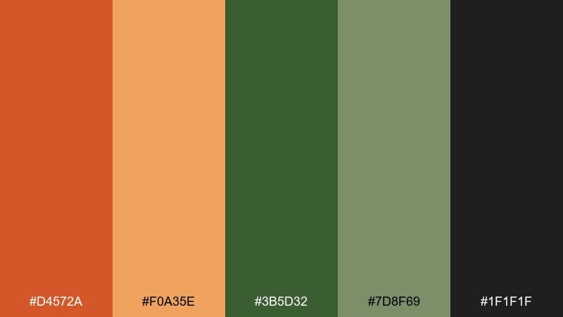
HEX: #d4572a #f0a35e #3b5d32 #7d8f69 #1f1f1f
Mood: cozy, rugged, fall
Best for: outdoor gear ads and seasonal campaigns
Cozy and rugged, it feels like campfires, pine needles, and a cabin porch at dusk. The darker base tones make the orange glow more believable and less “cartoon” in ads. Use it for autumn campaigns, outdoor gear promos, and newsletter headers, pairing it with warm photography and bold typography. Tip: add grain or subtle texture to backgrounds to enhance the seasonal mood.
Image example of autumn cabin generated using media.io

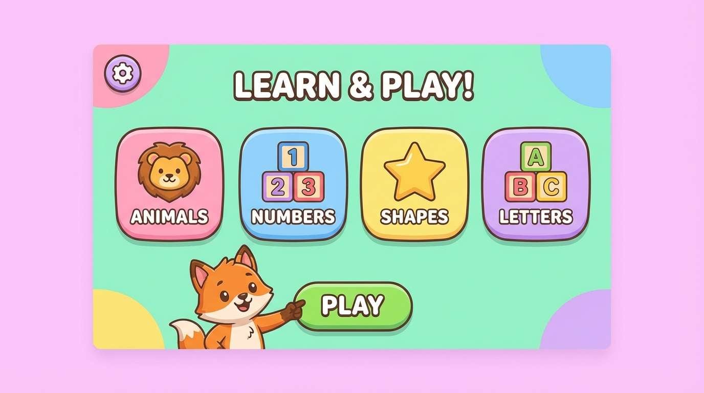
18) Playful Classroom
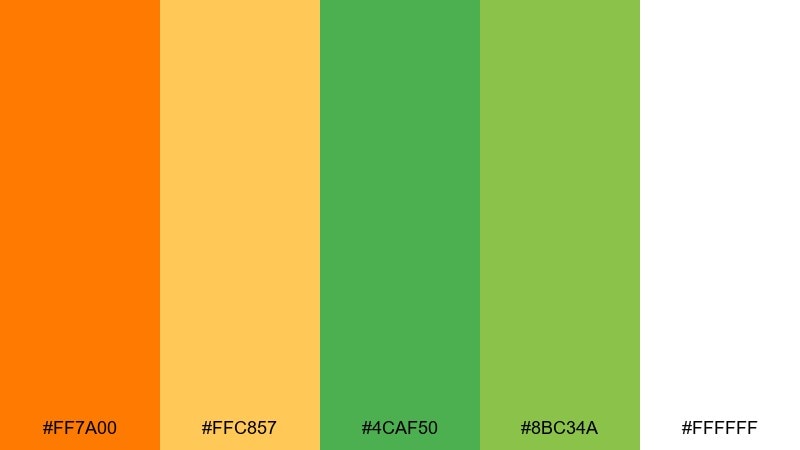
HEX: #ff7a00 #ffc857 #4caf50 #8bc34a #ffffff
Mood: fun, bright, kid-friendly
Best for: kids learning apps and classroom printables
Fun and bright, it brings to mind stickers, learning games, and sunny classroom posters. The upbeat orange and friendly greens create an inviting visual rhythm that’s easy for kids to follow. Use it for educational app screens, flashcards, and printable worksheets, pairing it with rounded icons and clear spacing. Tip: use the light green as a safe background for large text blocks to reduce glare.
Image example of playful classroom generated using media.io
19) Canyon Cactus
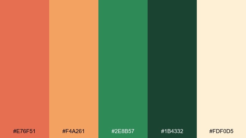
HEX: #e76f51 #f4a261 #2e8b57 #1b4332 #fdf0d5
Mood: adventurous, natural, desert
Best for: hiking brands and travel brochures
Adventurous and natural, it feels like desert rock, cactus shade, and dusty trails. The warm canyon oranges sit comfortably beside the greens, giving you a grounded palette that still feels lively. Use it for travel brochures, hiking tour branding, and map graphics, pairing it with off-white paper textures. Tip: use the deepest green for navigation elements so important details stand out.
Image example of canyon cactus generated using media.io
20) Minimal Citrus Ink
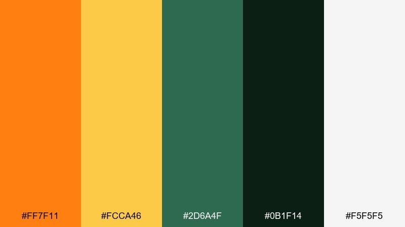
HEX: #ff7f11 #fcca46 #2d6a4f #0b1f14 #f5f5f5
Mood: minimal, sharp, modern
Best for: tech branding and sleek landing pages
Minimal and sharp, it evokes crisp headlines, clean grids, and a citrus accent against deep ink. The near-black green feels more distinctive than pure black, while the golden tone warms the overall look. Use it for modern landing pages, SaaS branding, and pitch decks, pairing it with geometric sans fonts and plenty of negative space. Tip: apply the golden color sparingly for interactive states like hover and focus rings.
Image example of minimal citrus ink generated using media.io
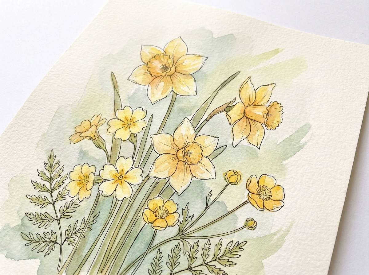
21) Botanical Watercolor
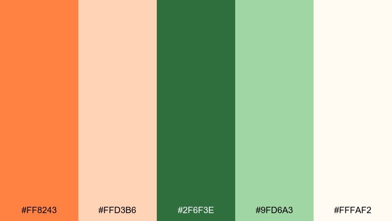
HEX: #ff8243 #ffd3b6 #2f6f3e #9fd6a3 #fffaf2
Mood: artsy, delicate, botanical
Best for: spring illustrations and botanical prints
Artsy and delicate, it feels like watercolor washes over petals and leafy stems. The soft orange reads like a bloom, while the greens layer depth without turning muddy. Use it for botanical prints, springtime stationery, and gentle pattern design, pairing it with fine linework and textured paper effects. Tip: keep edges slightly transparent to maintain the watercolor realism.
Image example of botanical watercolor generated using media.io
What Colors Go Well with Orange Green?
Neutrals are the easiest win: warm creams, off-whites, and soft beiges keep orange and green feeling natural, while charcoal or ink-black gives you reliable readability for type and icons.
For a modern edge, add deep teals or navy-like greens (instead of pure blue) to keep harmony with the green side of the palette. If you want a softer lifestyle vibe, blush, apricot, and dusty rose can blend smoothly with orange without clashing.
When you need more contrast, use a very dark base (near-black or deep forest) and let orange act as the attention color. This keeps designs bold without becoming visually noisy.
How to Use a Orange Green Color Palette in Real Designs
Start with roles: pick one dominant background (usually cream/white or deep dark), one primary brand color (often green), and one accent (often orange). This prevents the palette from turning into a “split attention” layout.
In UI, reserve the most saturated orange for alerts, highlights, and key CTAs, and use greens for positive states, navigation, or secondary actions. For print, test on the actual paper stock—orange can shift warm, while greens can go dull if over-inked.
For accessibility, keep body text on light backgrounds in dark charcoal/near-black, and check contrast for buttons (especially light green on cream). A strong neutral is what makes orange green color combinations look intentional.
Create Orange Green Palette Visuals with AI
If you want to see these palettes in action, generate quick mockups (labels, posters, UI screens, and mood boards) using a text prompt and your chosen HEX colors as guidance. This makes it easier to validate mood and contrast before you commit.
Try swapping the subject (packaging vs. landing page) while keeping the same palette to explore how the color hierarchy changes. You can also iterate saturation: slightly desaturating green often makes orange feel more premium.
Use Media.io to create consistent image examples for your orange green color scheme in minutes, then refine prompts until the style matches your brand.
Orange Green Color Palette FAQs
-
What does an orange green color palette communicate?
It typically signals energy (orange) plus freshness or nature (green). Together, the combination feels optimistic, appetizing, and outdoorsy—great for food, wellness, sustainability, and modern lifestyle brands. -
Are orange and green complementary colors?
Not exactly. Orange’s direct complementary color is blue, while green’s complement is magenta/red-purple. Orange and green are more of an energetic near-analogous pairing (warm + natural) that can still create strong contrast depending on brightness. -
How do I keep orange and green from clashing?
Control saturation and add a neutral buffer. Use one color as the hero and the other as an accent, then anchor everything with cream/white backgrounds or deep charcoal text for clarity. -
What’s the best text color for orange green backgrounds?
For readability, use a very dark neutral like charcoal, near-black, or deep forest green on light backgrounds. On dark green backgrounds, use off-white/cream text and reserve orange for buttons or small highlights. -
Which industries work best with an orange and green palette?
Food and beverage, cafes, agriculture, eco products, outdoor and travel brands, kids education, and fintech dashboards (using green for success states and orange for attention/alerts). -
Can I use orange and green in minimalist branding?
Yes—choose muted or earthy versions (sage, olive, terracotta) and rely on lots of whitespace. Keep orange as a limited accent so the system stays clean and premium. -
How can I quickly generate palette-based mockups?
Use a text-to-image tool and specify the subject (e.g., “product label,” “UI dashboard,” “poster”) plus the palette mood. Iterate prompts while keeping your HEX set consistent to compare options fast.


