

A black yellow color palette is one of the fastest ways to make a design feel bold, readable, and instantly recognizable. It’s a classic high-contrast pairing that can look premium, playful, or industrial depending on the exact yellow you choose.
Below are 20+ black and yellow palette ideas with HEX codes, plus practical tips for posters, branding, and UI—so you can get the impact without sacrificing balance.
In this article
- Why Black Yellow Palettes Work So Well
-
- midnight mustard
- taxi stripe
- vintage newspaper
- neon hazard
- desert bee
- art deco gild
- solar eclipse
- industrial caution
- honeyed charcoal
- minimal contrast
- retro arcade
- sporty chevron
- warm granite
- golden ink
- cosmic gold
- sunlit asphalt
- dandelion noir
- muted saffron
- lemon graphite
- golden hour studio
- bumble botanical
- monochrome gold
- What Colors Go Well with Black Yellow?
- How to Use a Black Yellow Color Palette in Real Designs
- Create Black Yellow Palette Visuals with AI
Why Black Yellow Palettes Work So Well
Black and yellow sit far apart in perceived brightness, so the pairing naturally creates strong visual hierarchy. That’s why it’s common in signage, sports, packaging, and UI—your eye knows exactly where to look first.
Yellow brings energy, warmth, and attention, while black adds structure and authority. Together, they can feel premium (gold-on-black), modern (clean yellow accents on dark UI), or practical (caution-inspired systems) depending on saturation and how much negative space you keep.
The key is restraint: use black or near-black as the foundation, then treat yellow like a spotlight. When yellow becomes the “highlight” instead of the “background,” the design stays readable and intentional.
20+ Black Yellow Color Palette Ideas (with HEX Codes)
1) Midnight Mustard
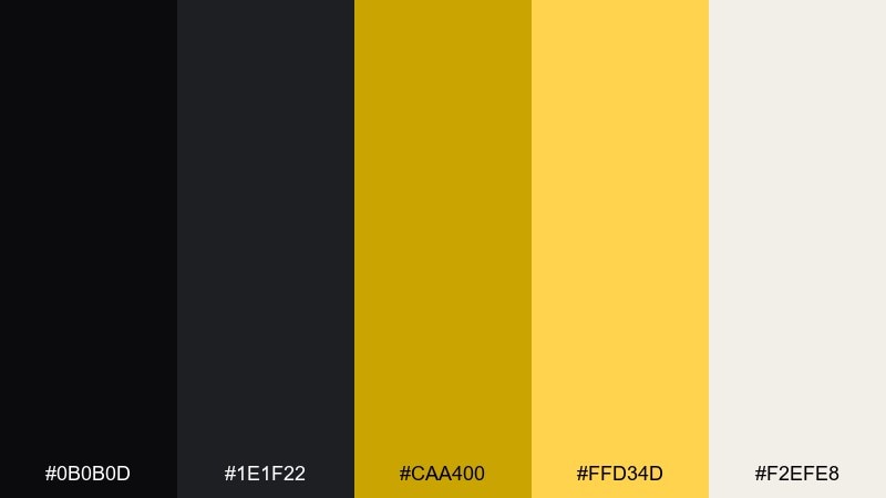
HEX: #0b0b0d #1e1f22 #caa400 #ffd34d #f2efe8
Mood: bold, luxe, and modern
Best for: premium branding and logo systems
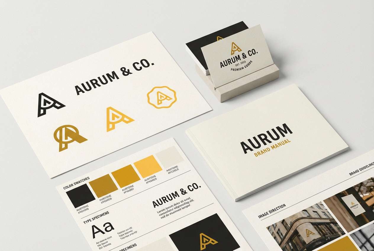
Bold and luxe like gold foil on matte black, these tones feel confident without being flashy. Use the mustard and warm yellow as the hero accent, and keep most layouts grounded in black and soft off-white. Pair well with simple geometric typography and plenty of negative space. Tip: reserve the brightest yellow for call-to-action moments so it reads like a highlight, not a fill.
Image example of midnight mustard generated using media.io
Media.io is an online AI studio for creating and editing video, image, and audio in your browser.

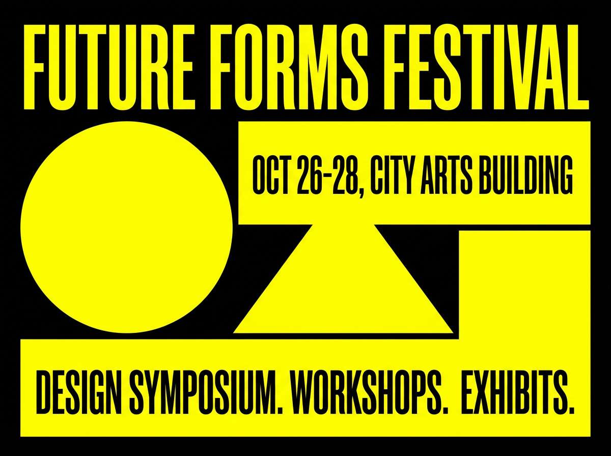
2) Taxi Stripe
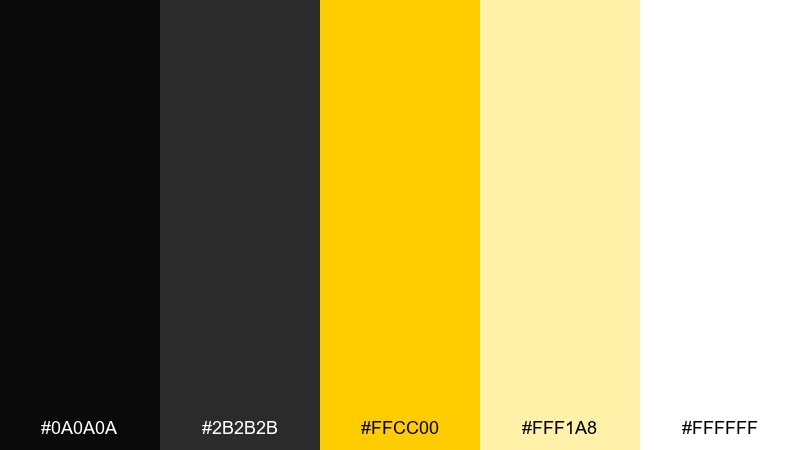
HEX: #0a0a0a #2b2b2b #ffcc00 #fff1a8 #ffffff
Mood: energetic, urban, and punchy
Best for: event posters and streetwear graphics
Energetic and urban, it evokes fast city nights and bold signage. Keep the yellow highly saturated for instant attention, then use black and charcoal for structure and legibility. White works best as breathing room around headlines and icons. Tip: lean on thick strokes and high-contrast type to keep the design readable from a distance.
Image example of taxi stripe generated using media.io
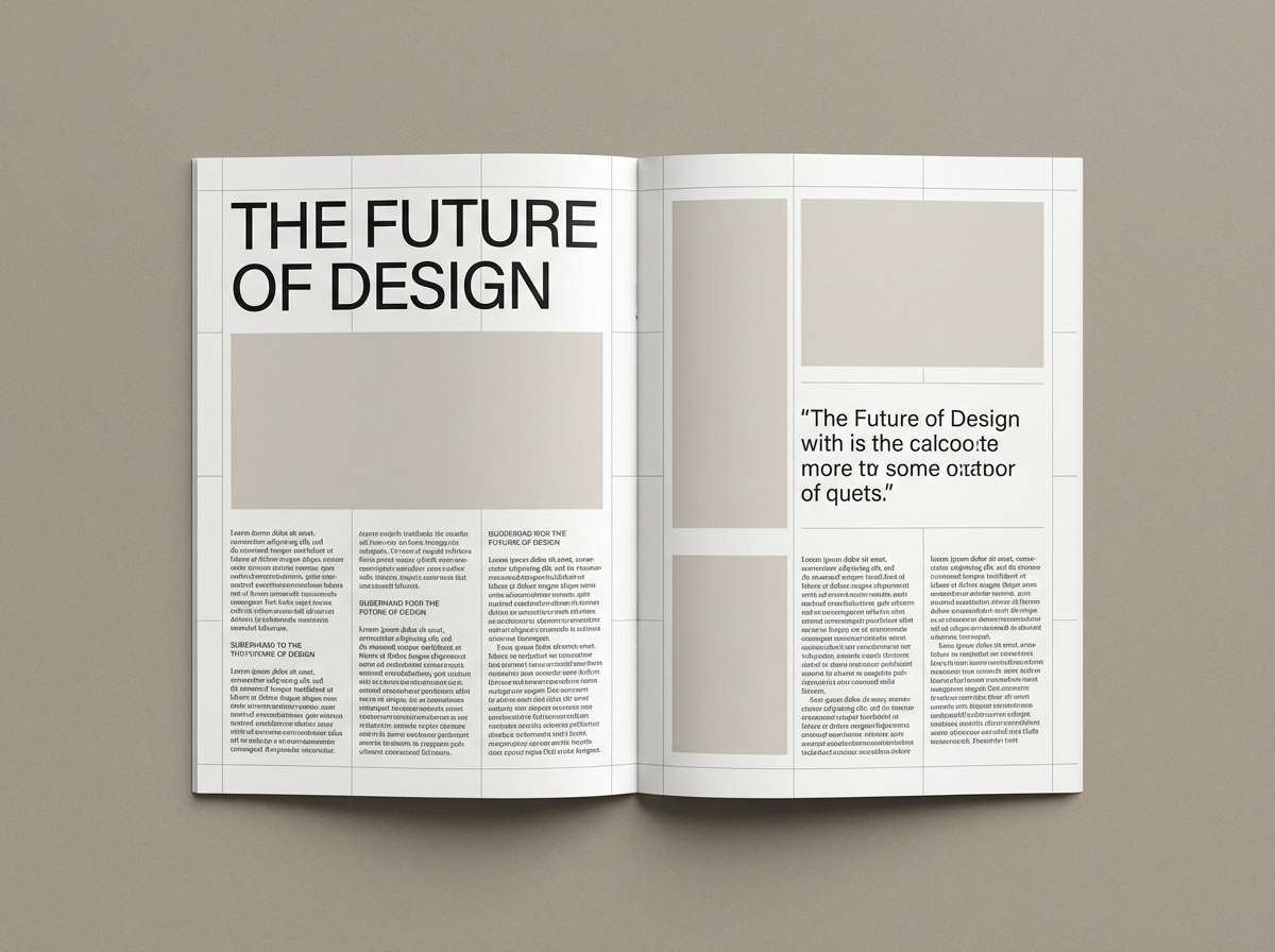
3) Vintage Newspaper
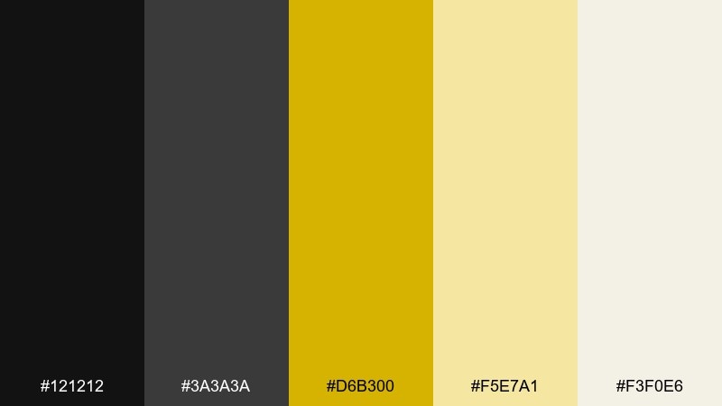
HEX: #121212 #3a3a3a #d6b300 #f5e7a1 #f3f0e6
Mood: editorial, classic, and warm
Best for: magazine layouts and long-form articles
Editorial and nostalgic, it feels like aged paper, ink, and a warm spotlight on a headline. Among black yellow color combinations, this one is especially friendly for reading because the yellows stay soft and paper-like. Use off-white for body text backgrounds and keep yellow to pull quotes, section labels, or dividers. Tip: avoid full-yellow pages—use it as a tint so typography stays crisp.
Image example of vintage newspaper generated using media.io
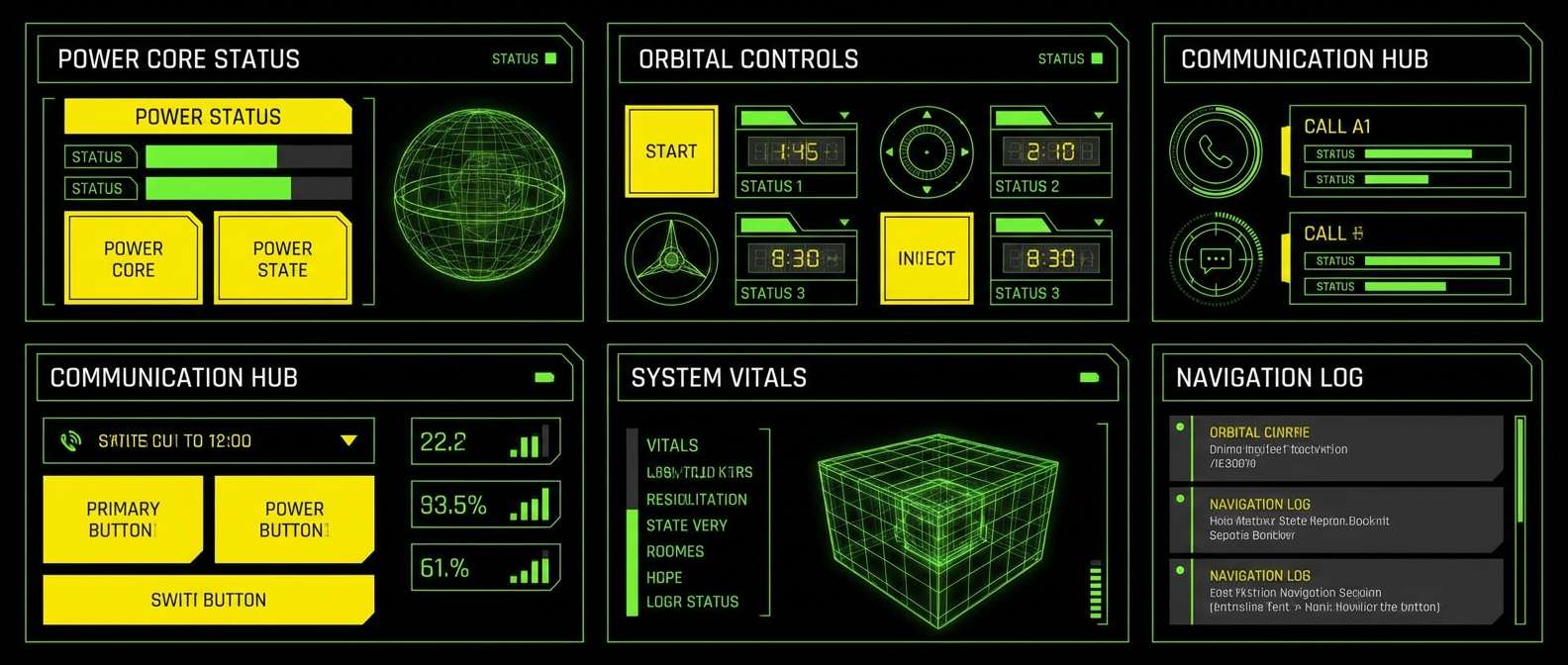
4) Neon Hazard
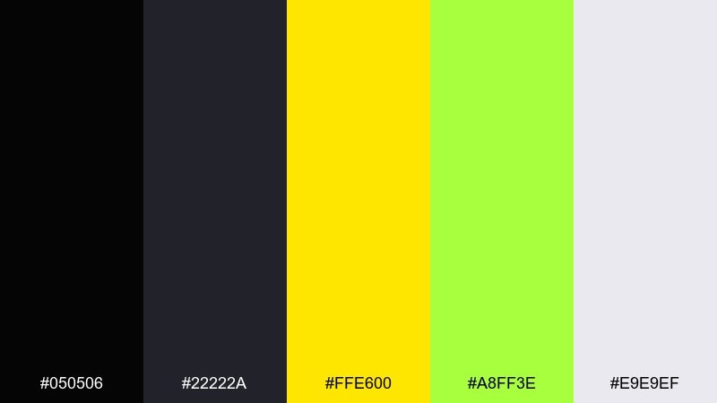
HEX: #050506 #22222a #ffe600 #a8ff3e #e9e9ef
Mood: electric, edgy, and futuristic
Best for: gaming UI and tech promos
Electric and edgy, it looks like neon tape under blacklight and UI glows in a dark room. Keep the lime edge color minimal so it doesn’t fight the core yellow, and let near-black do most of the heavy lifting. It pairs well with sharp icons, thin outlines, and subtle gradients. Tip: use the neon tones only for interactive states (hover, active) to avoid visual fatigue.
Image example of neon hazard generated using media.io
5) Desert Bee
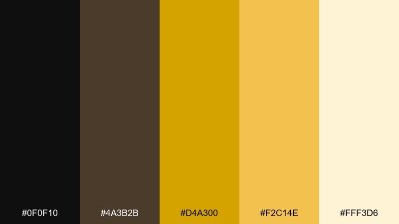
HEX: #0f0f10 #4a3b2b #d4a300 #f2c14e #fff3d6
Mood: sunbaked, earthy, and friendly
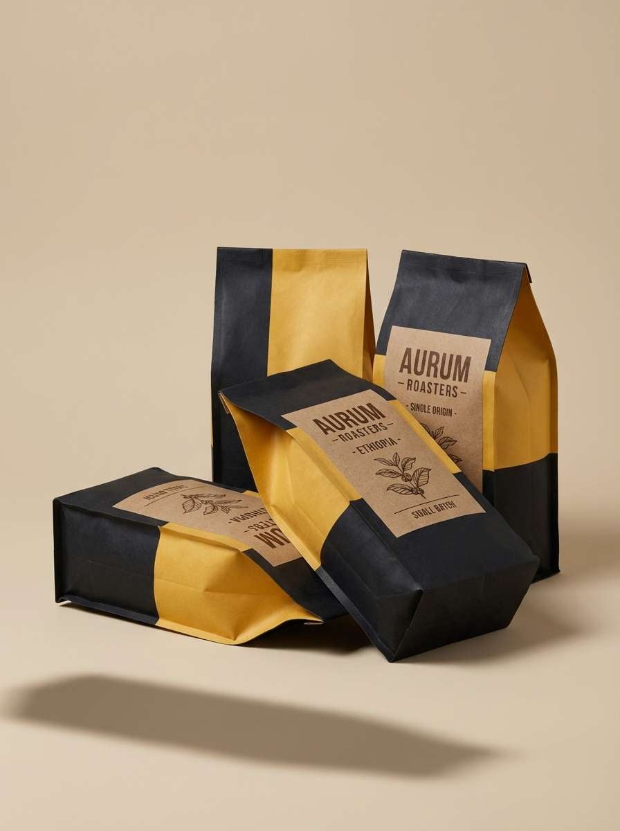
Best for: coffee packaging and artisan labels
Sunbaked and earthy, it suggests warm sand, roasted notes, and a friendly handmade feel. Use the brown as a bridge color to soften the jump between black and yellow. Works beautifully with kraft textures, stamp-style marks, and simple illustrations. Tip: print the darkest black as a slightly warm charcoal to keep the palette organic.
Image example of desert bee generated using media.io
6) Art Deco Gild
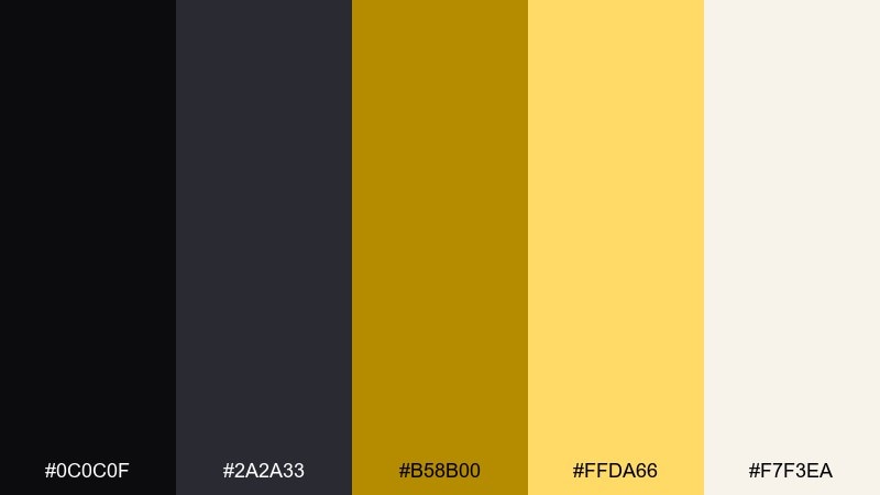
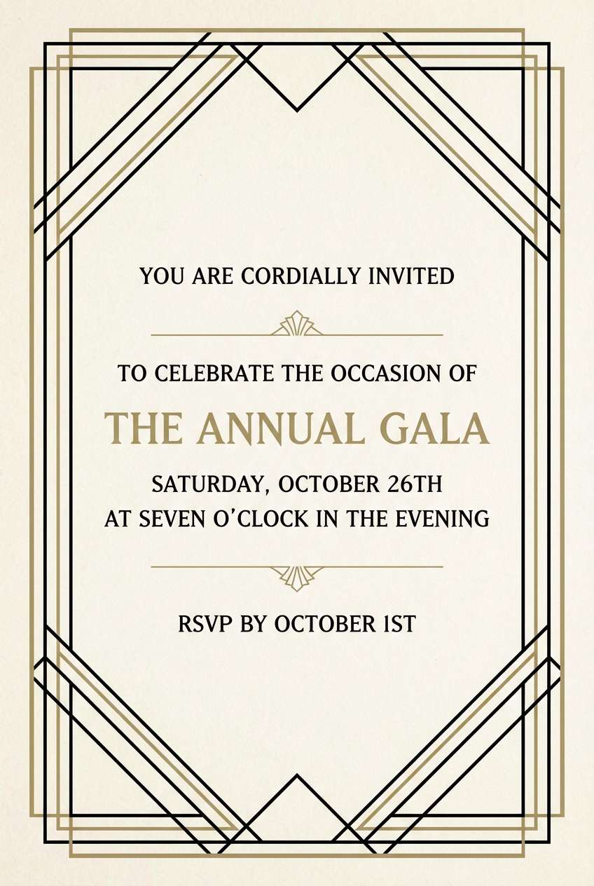
HEX: #0c0c0f #2a2a33 #b58b00 #ffda66 #f7f3ea
Mood: glamorous, structured, and timeless
Best for: wedding invitations and formal stationery
Glamorous and structured, it evokes art deco trims, gilded borders, and a candlelit ballroom. Keep lines thin and symmetrical, and use the muted gold as the main metallic impression. Off-white adds elegance and prevents the black from feeling too heavy. Tip: use gold only for frames and monograms, not for long text blocks.
Image example of art deco gild generated using media.io
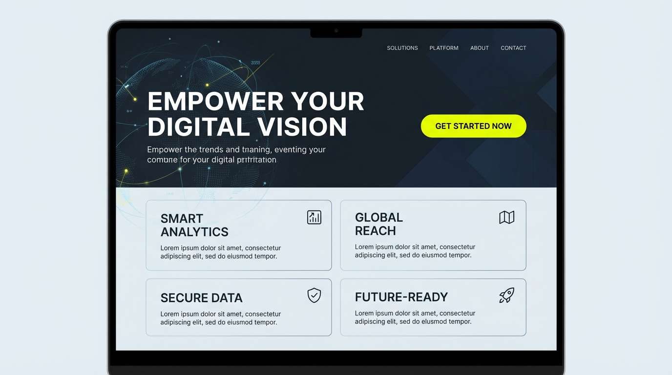
7) Solar Eclipse
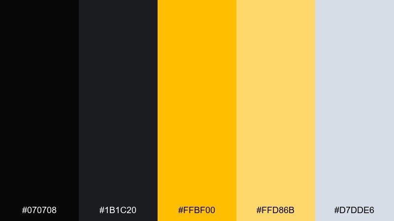
HEX: #070708 #1b1c20 #ffbf00 #ffd86b #d7dde6
Mood: dramatic, cinematic, and clean
Best for: landing pages and hero sections
Dramatic and cinematic, it feels like a bright corona cutting through deep shadow. This black yellow color palette shines in hero sections where you want an immediate focal point without clutter. Use the light gray-blue for soft UI surfaces, then reserve bright yellow for key buttons and badges. Tip: keep text either pure white or very light gray to avoid muddy contrast on dark panels.
Image example of solar eclipse generated using media.io
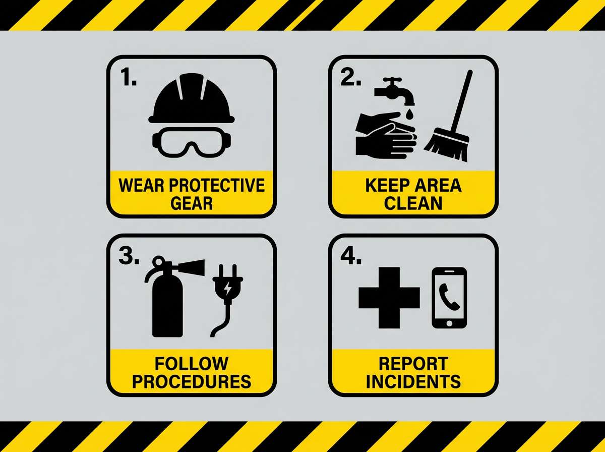
8) Industrial Caution

HEX: #0f1012 #2f3136 #f6c500 #ffe07a #c9ced6
Mood: practical, sturdy, and high-visibility
Best for: safety signage and instructional graphics
Practical and sturdy, it recalls warehouse labels, hazard tape, and clear instructions. Let the dark grays handle background blocks while yellow highlights warnings and key steps. The cool gray keeps layouts technical rather than playful. Tip: use consistent icon strokes so the visuals feel like a system, not a collage.
Image example of industrial caution generated using media.io
9) Honeyed Charcoal
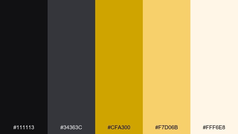
HEX: #111113 #34363c #cfa300 #f7d06b #fff6e8
Mood: cozy, refined, and inviting
Best for: restaurant menus and hospitality brands
Cozy and refined, it brings to mind honey drizzle, charcoal grills, and warm ambient lighting. Use charcoal for menu body text and layout frames, then add honey yellow for headings and section markers. It pairs nicely with textured paper stocks and simple line illustrations. Tip: keep the lightest cream as the main background so food photography feels natural.
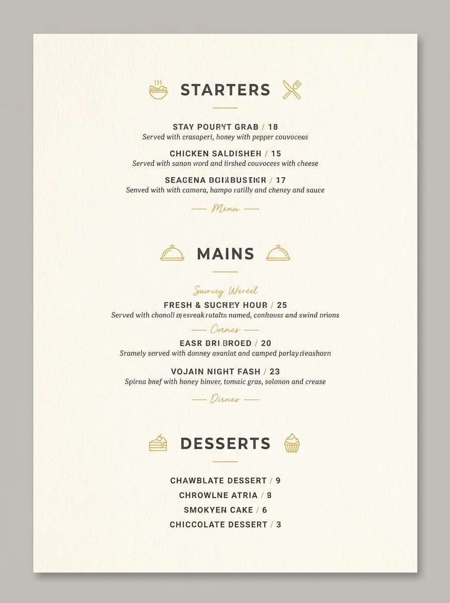
Image example of honeyed charcoal generated using media.io
10) Minimal Contrast
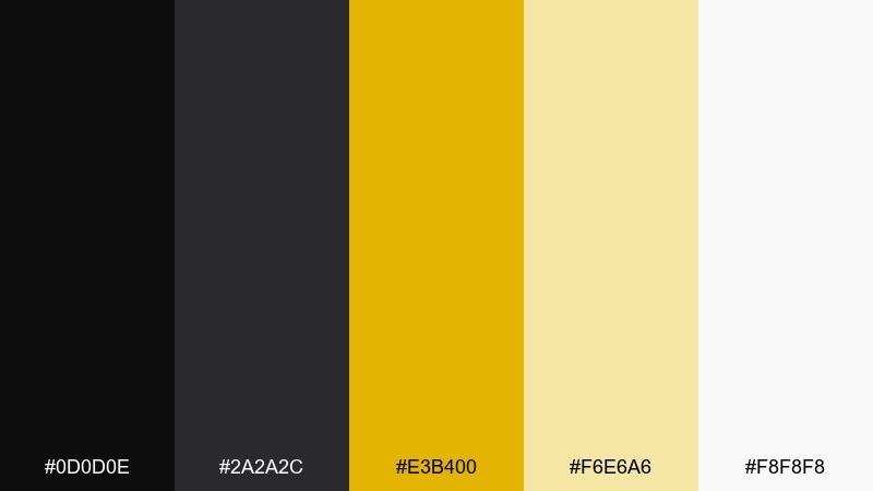
HEX: #0d0d0e #2a2a2c #e3b400 #f6e6a6 #f8f8f8
Mood: clean, minimal, and balanced
Best for: SaaS dashboards and data visuals
Clean and balanced, it feels like a minimalist workspace with one bright sticky note. Use yellow sparingly for KPI highlights, tags, and charts, while neutrals carry the grid and panels. The softer yellow tint is ideal for selected states without shouting. Tip: keep your primary CTA a deeper yellow and your secondary CTA a neutral outline for hierarchy.
Image example of minimal contrast generated using media.io
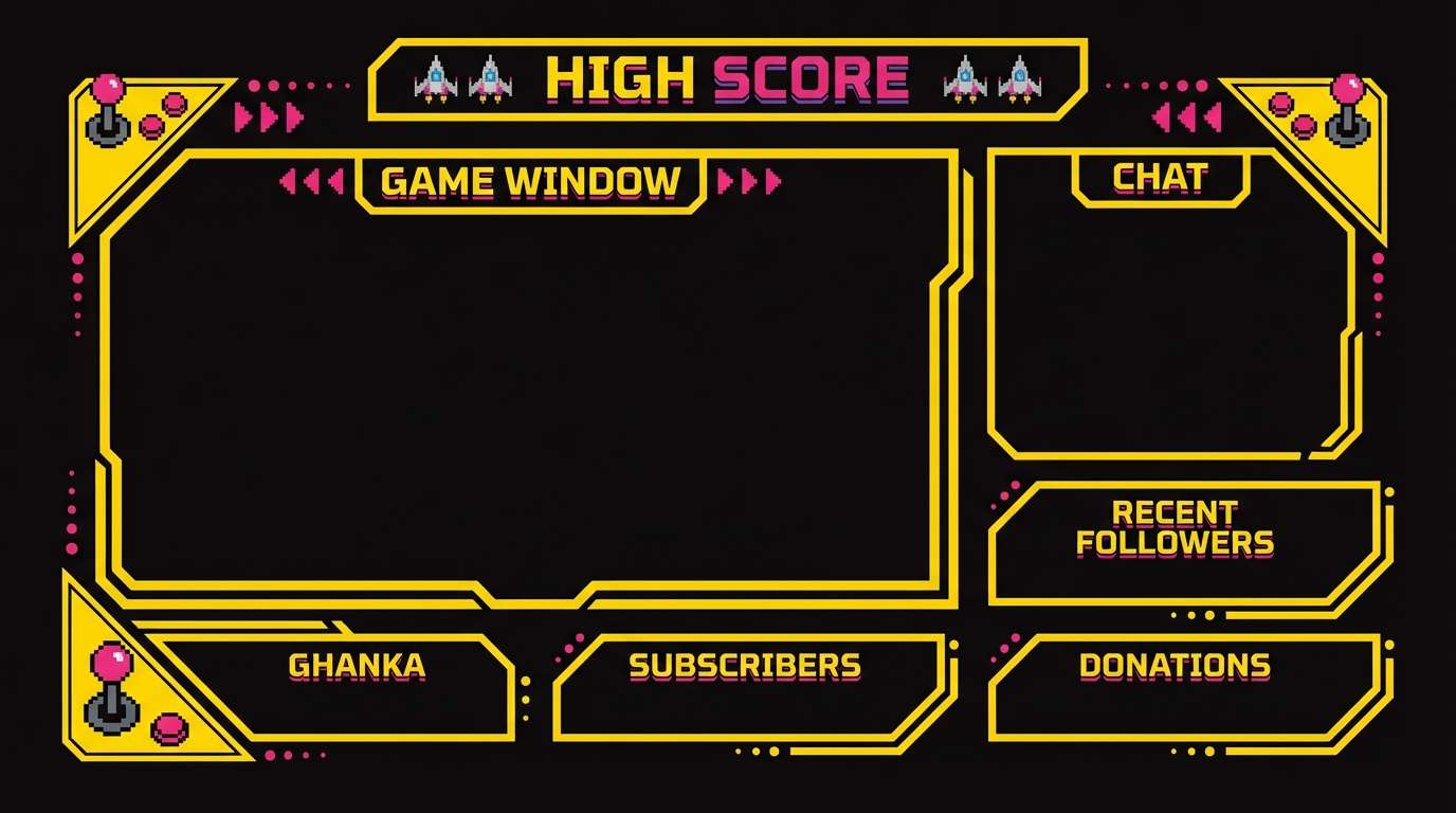
11) Retro Arcade
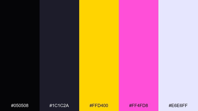
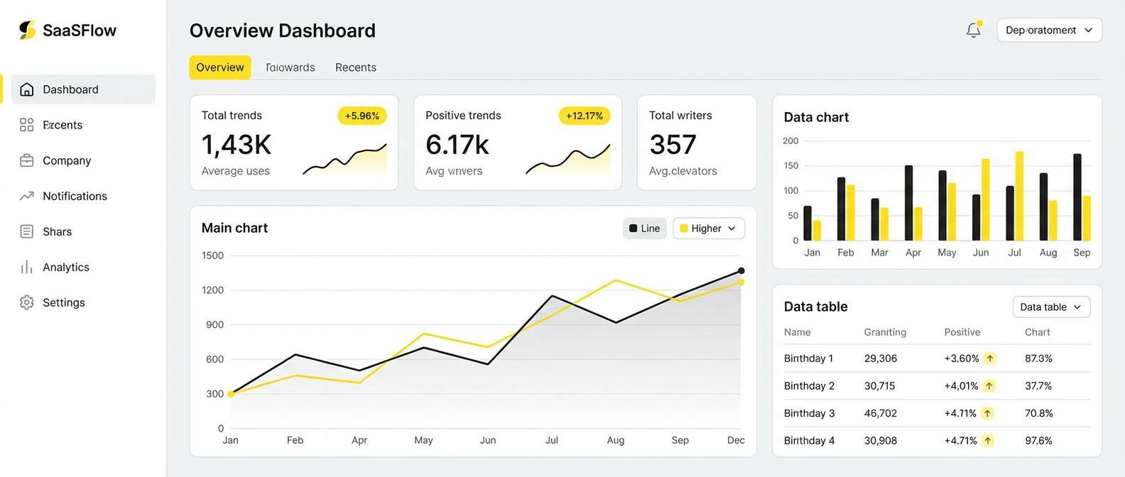
HEX: #050508 #1c1c2a #ffd400 #ff4fd8 #e6e6ff
Mood: playful, nostalgic, and punchy
Best for: stream overlays and promo banners
Playful and nostalgic, it channels arcade cabinets and neon tokens against a dark backdrop. Let yellow lead for buttons and badges, then use the pink as a secondary pop for limited highlights. The pale lavender keeps the palette from feeling too harsh in large areas. Tip: use pixel-inspired icons or chunky rounded type to match the vibe.
Image example of retro arcade generated using media.io
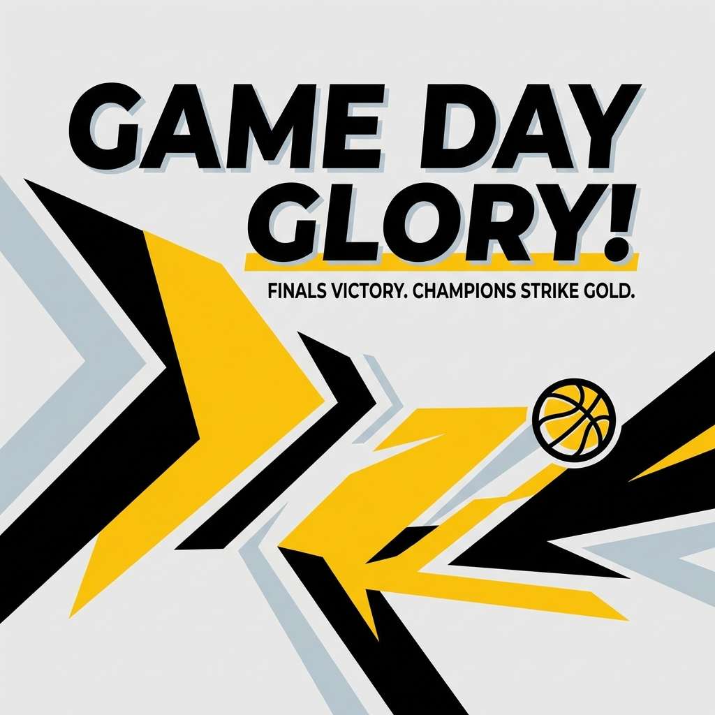
12) Sporty Chevron
HEX: #0a0a0b #2d2e32 #ffcc33 #fff2c2 #e7eef6
Mood: active, confident, and competitive
Best for: team merch and sports social posts
Active and confident, it feels like jersey stripes, stadium lights, and fast motion graphics. Use black for bold type and outlines, then bring in yellow for directional shapes like chevrons and arrows. The cool pale blue-gray helps backgrounds feel fresh instead of heavy. Tip: keep contrast high on small text by placing it on black or off-white, not on bright yellow.
Image example of sporty chevron generated using media.io
13) Warm Granite
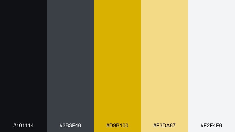
HEX: #101114 #3b3f46 #d9b100 #f3da87 #f2f4f6
Mood: steady, professional, and grounded
Best for: corporate reports and pitch decks
Steady and grounded, it suggests granite surfaces warmed by a soft lamp. For black yellow color combination work in presentations, keep yellow to chart highlights and section headers so the story stays professional. Light gray makes an excellent slide background, while black anchors titles and data labels. Tip: limit yellow to one highlight per chart to avoid confusing the message.
Image example of warm granite generated using media.io
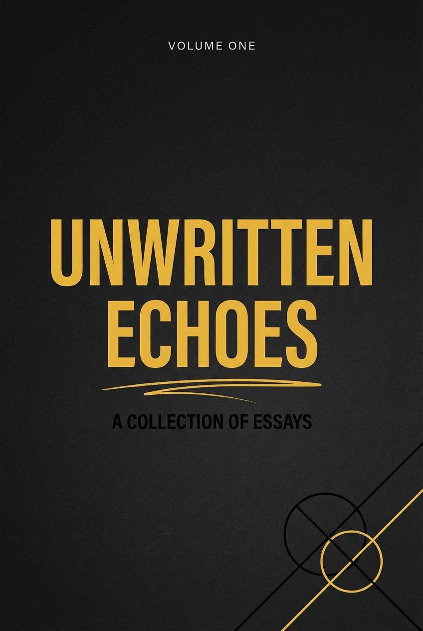
14) Golden Ink
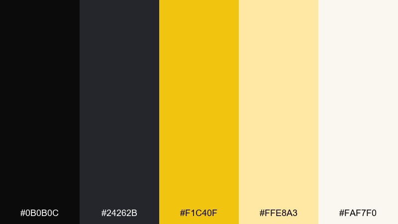
HEX: #0b0b0c #24262b #f1c40f #ffe8a3 #faf7f0
Mood: sharp, modern, and editorial
Best for: book covers and publication branding
Sharp and editorial, it feels like fresh ink with a warm gilded accent. Use black for strong typography and linework, while yellow works best as a title highlight or small motif. The creamy white keeps layouts airy and print-friendly. Tip: choose one bold typeface and one quiet supporting font to keep the cover clean.
Image example of golden ink generated using media.io
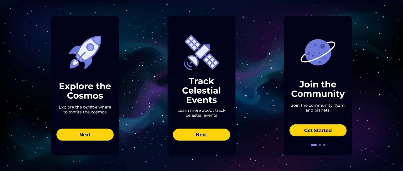
15) Cosmic Gold
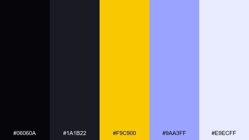
HEX: #06060a #1a1b22 #f9c900 #9aa3ff #e9ecff
Mood: mysterious, luminous, and futuristic
Best for: app onboarding screens
Mysterious and luminous, it reads like starlight cutting through deep space. Yellow acts like the main glow, while the periwinkle gives a cool, futuristic edge for secondary actions. Use light lavender for cards and hints to keep onboarding friendly. Tip: apply yellow only to one primary button per screen so attention stays guided.
Image example of cosmic gold generated using media.io
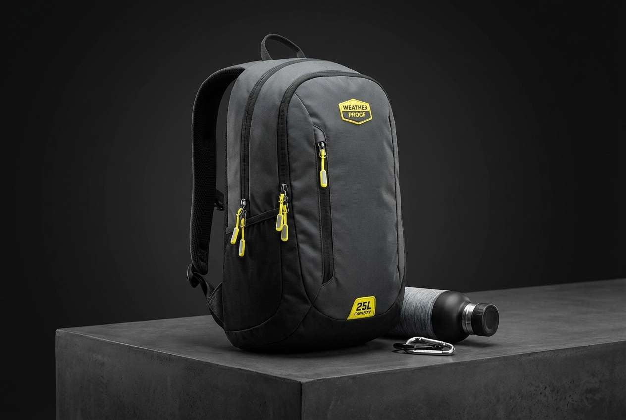
16) Sunlit Asphalt
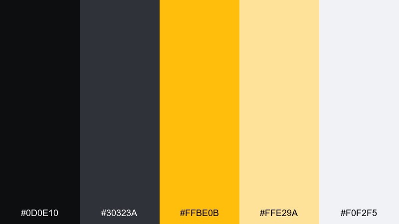
HEX: #0d0e10 #30323a #ffbe0b #ffe29a #f0f2f5
Mood: modern, street-smart, and clean
Best for: product ads for outdoor gear
Modern and street-smart, it brings to mind sunlight hitting asphalt and reflective details. Use black and graphite for the product silhouette and type, then add yellow for feature callouts and badges. The soft gray keeps ad layouts polished and contemporary. Tip: put yellow behind short phrases only—small blocks look premium and readable.
Image example of sunlit asphalt generated using media.io
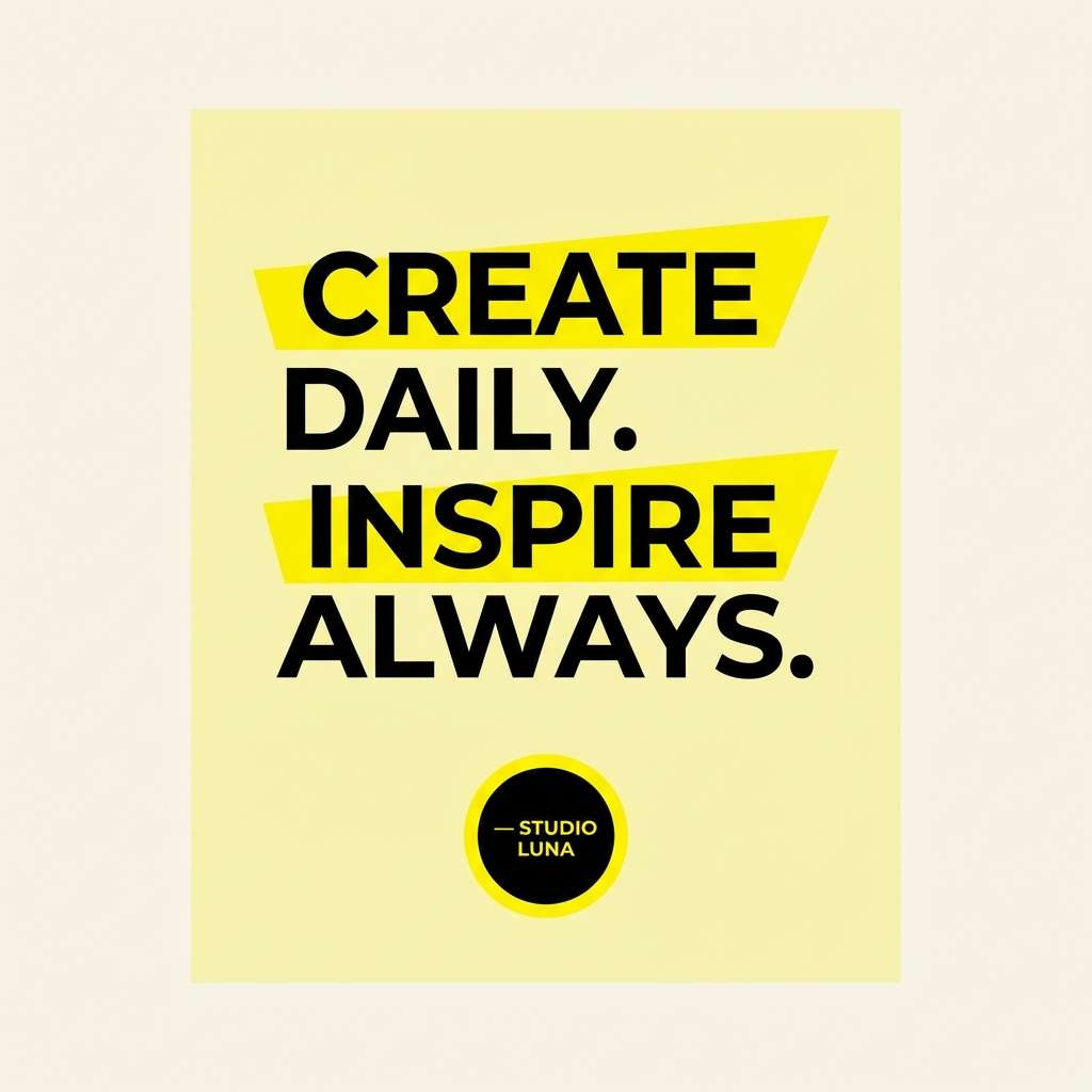
17) Dandelion Noir
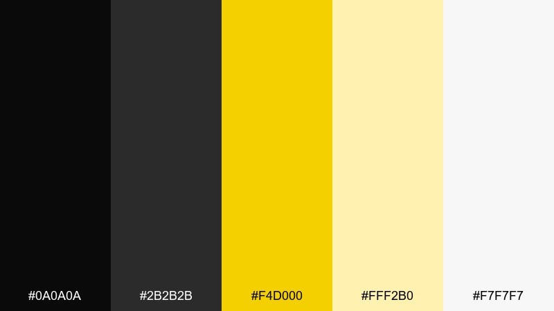
HEX: #0a0a0a #2b2b2b #f4d000 #fff2b0 #f7f7f7
Mood: cheerful, crisp, and modern
Best for: social graphics and quote cards
Cheerful and crisp, it feels like bright dandelions against a clean monochrome backdrop. Use the soft yellow as a background tint and keep the saturated yellow for emphasis on key words. Black type will stay sharp even in small sizes, especially on the pale yellow. Tip: add a thin black border around yellow shapes to improve clarity on feeds.
Image example of dandelion noir generated using media.io
18) Muted Saffron
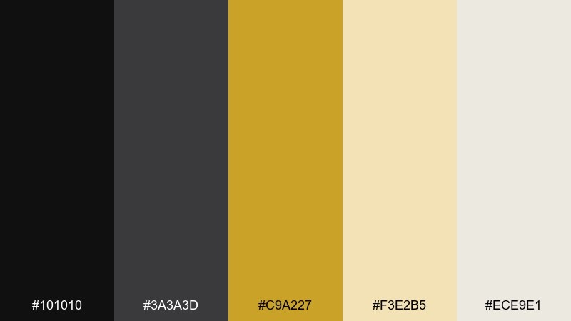
HEX: #101010 #3a3a3d #c9a227 #f3e2b5 #ece9e1
Mood: soft, vintage, and calm
Best for: lifestyle blogs and calm UI themes
Soft and vintage, it suggests saffron tea, linen textures, and quiet mornings. Keep the saffron as a gentle accent for links, toggles, and small UI indicators. The warm grays help everything feel approachable rather than stark. Tip: use the light beige as your main canvas so the palette stays soothing even with black text.
Image example of muted saffron generated using media.io
19) Lemon Graphite
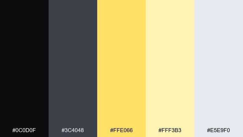
HEX: #0c0d0f #3c4048 #ffe066 #fff3b3 #e5e9f0
Mood: fresh, airy, and tech-friendly
Best for: dashboard charts and analytics UI
Fresh and airy, it feels like lemon zest brightening up a cool graphite workspace. Use lemon for data highlights and selection states, and keep graphite for axes, labels, and structure. Pale yellow works as an accessible highlight background for tooltips. Tip: maintain consistent contrast by placing small yellow elements on darker grays, not on light gray surfaces.
Image example of lemon graphite generated using media.io
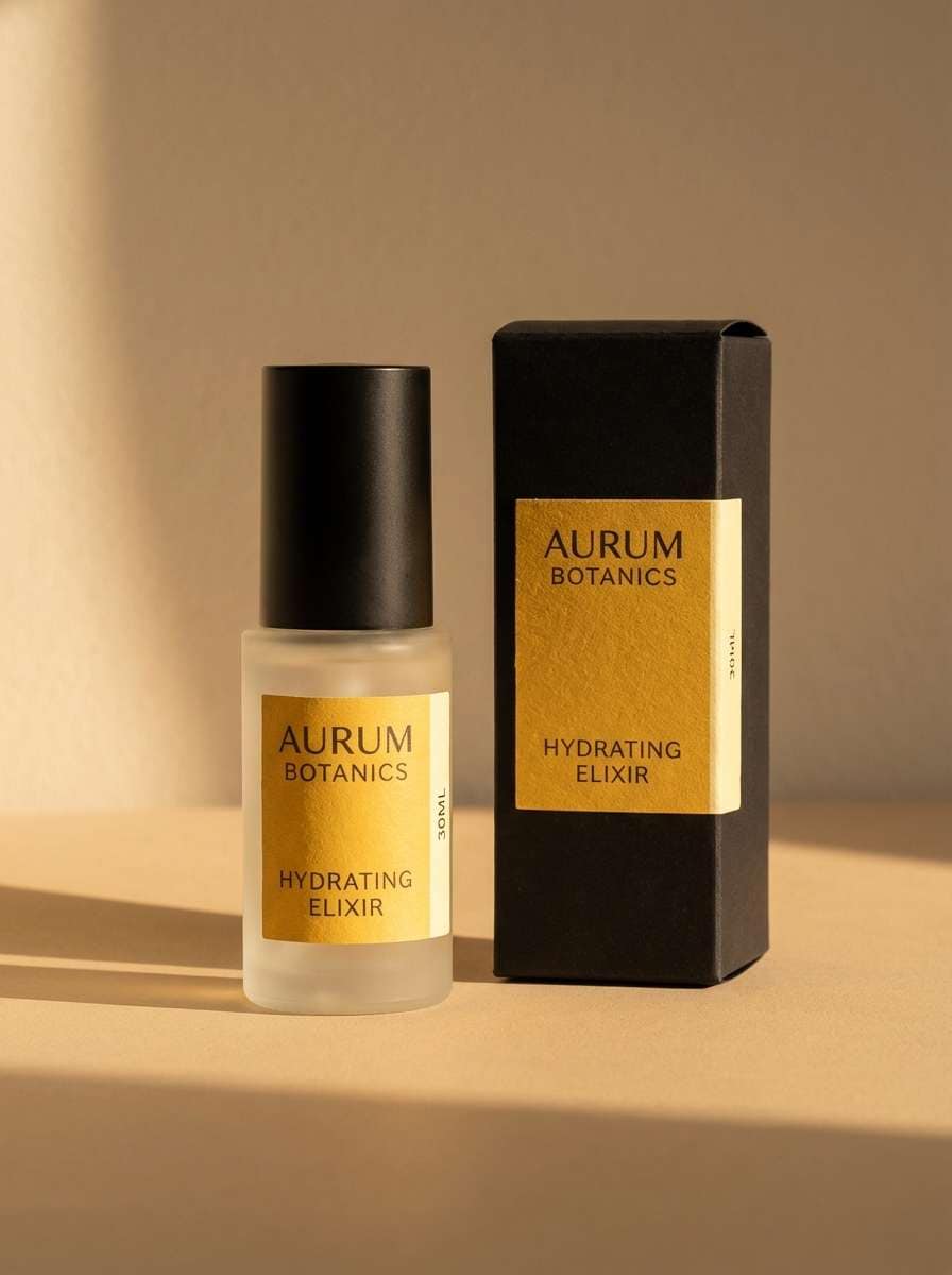
20) Golden Hour Studio
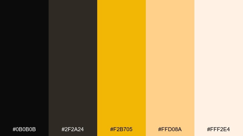
HEX: #0b0b0b #2f2a24 #f2b705 #ffd08a #fff2e4
Mood: warm, cinematic, and inviting
Best for: skincare packaging and product photography
Warm and cinematic, it evokes golden-hour light on matte black surfaces in a quiet studio. A black yellow color palette like this works best when you let creamy highlights and soft shadows do the styling. Use the deeper gold for logos and cap details, and the peachy cream for labels so text stays gentle. Tip: keep backgrounds neutral and let the product carry the contrast—too many props can steal the glow.
Image example of golden hour studio generated using media.io
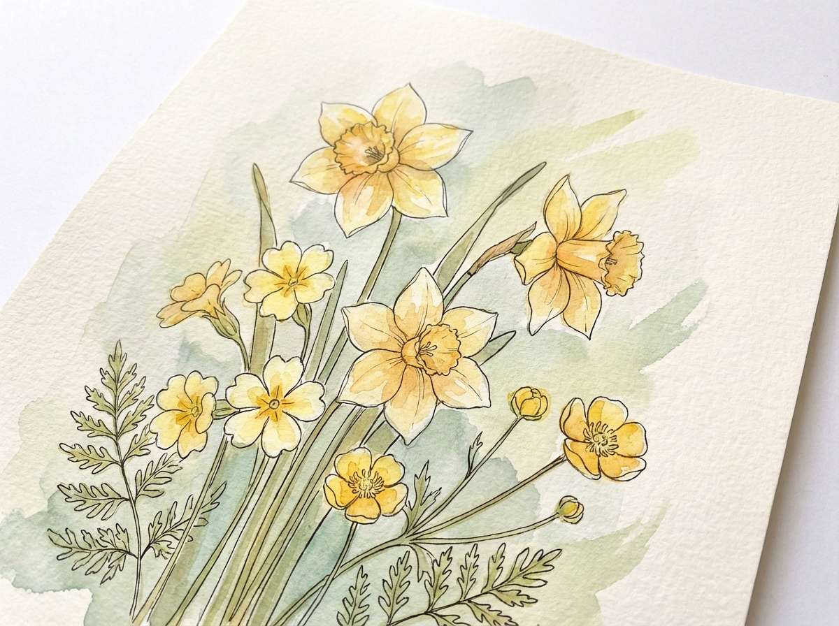
21) Bumble Botanical
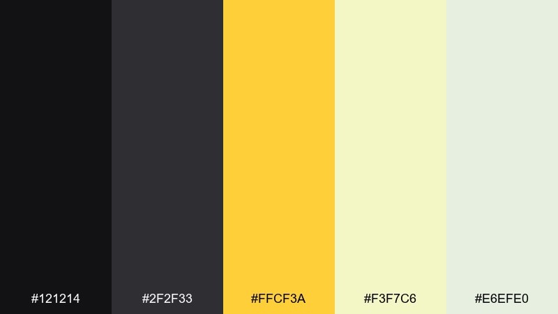
HEX: #121214 #2f2f33 #ffcf3a #f3f7c6 #e6efe0
Mood: light, natural, and cheerful
Best for: spring illustrations and botanical prints
Light and natural, it feels like bees moving through fresh spring leaves. Use the pale green tones as a calm base and bring in yellow for petals, pollen, and tiny highlights. Black works best as ink outlines and small label text rather than heavy fills. Tip: keep your yellows slightly muted in watercolor so the painting stays soft and airy.
Image example of bumble botanical generated using media.io
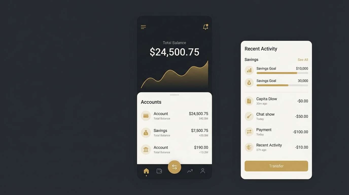
22) Monochrome Gold
HEX: #0a0a0c #1f2024 #d4af37 #f2e3b1 #f6f6f8
Mood: elegant, restrained, and premium
Best for: luxury UI and fintech branding
Elegant and restrained, it reads like brushed gold details on a sleek monochrome interface. Use the gold as a micro-accent for icons, progress states, and separators rather than large fills. The off-white keeps content readable and gives the dark tones room to breathe. Tip: limit gold to one or two UI tokens so it stays special and consistent across screens.
Image example of monochrome gold generated using media.io
What Colors Go Well with Black Yellow?
Neutrals are the easiest match: white, off-white, and light grays give yellow room to glow, while charcoal and graphite soften pure black for longer reading experiences. These supporting tones also help you control contrast in UI components and typography.
For a richer look, pair black and yellow with warm browns (kraft, cocoa) or metallic golds to push the palette toward premium packaging and editorial design. If you want a more futuristic direction, cool accents like periwinkle, pale blue-gray, or lavender can modernize the scheme without stealing focus from yellow.
When adding a third accent, keep it limited and purposeful (states, badges, small icons). Black-yellow already delivers high attention, so extra saturated colors can quickly turn the composition into visual noise.
How to Use a Black Yellow Color Palette in Real Designs
Start by choosing your “base” (black/near-black) and your “spotlight” (yellow), then decide where the spotlight must land: CTA buttons, key numbers, warnings, or headlines. If everything is yellow, nothing is highlighted—so treat yellow as a controlled accent.
For readability, avoid setting long paragraphs directly on bright yellow. Use off-white or light gray backgrounds for text-heavy areas, and reserve yellow for short labels, dividers, chips, and small blocks behind a few words.
In branding and posters, you’ll get a cleaner result by relying on one strong typeface, thick strokes, and generous spacing. High contrast does the heavy lifting; your layout should stay simple enough to feel intentional.
Create Black Yellow Palette Visuals with AI
If you have HEX codes but need real visuals (mockups, posters, UI screens, product scenes), AI generation helps you explore variations quickly without rebuilding every concept in a design tool. You can iterate on lighting, materials (matte black vs. glossy), and typography style to match your brand.
Try prompting for a specific use case—like a fintech UI, a streetwear poster, or premium packaging—then apply your black and yellow palette as the dominant color direction. Small prompt changes (e.g., “clean vector,” “studio photo,” “art deco lines”) can shift the mood fast.
Use Media.io to generate multiple options, pick the strongest composition, then refine details like contrast, spacing, and where the brightest yellow appears.
Black Yellow Color Palette FAQs
-
Why is black and yellow considered a high-contrast color combo?
Yellow has high perceived brightness while black has very low brightness, so the difference creates strong visual separation. That separation improves attention and hierarchy, which is why the pairing is common in signage, sports, and CTA-driven layouts. -
Is black text on a yellow background readable?
It can be very readable for short text (labels, badges, headlines), but bright yellow can cause eye fatigue on long paragraphs. For body text, consider off-white or light gray backgrounds and keep yellow as an accent or a light tint. -
What shade of yellow works best with black for a premium look?
Mustard, muted gold, and warm amber yellows tend to feel more luxurious than neon yellow. Pair them with near-black (charcoal) and creamy off-whites for a refined “gold-on-black” effect. -
How do I keep a black yellow UI from feeling too harsh?
Use dark grays instead of pure black for large surfaces, add off-white cards or light gray-blue panels, and limit saturated yellow to primary actions. Also keep plenty of spacing so the interface can breathe. -
What colors can I add as a third accent with black and yellow?
Cool accents like periwinkle, lavender, or pale blue-gray add a modern edge, while warm browns add an earthy, handcrafted feel. Choose one accent and use it consistently (e.g., secondary buttons or status tags) to avoid clutter. -
Does black and yellow work for print designs like posters and packaging?
Yes—black provides strong structure, and yellow pulls focus in crowded environments. For print, it helps to test proofs because yellows can shift; using a slightly muted yellow often prints more consistently than ultra-bright neon tones. -
How can I generate black and yellow palette mockups quickly?
You can use Media.io’s AI text-to-image generator to create posters, UI mockups, packaging scenes, and brand boards by describing the design style and specifying black/yellow as the dominant colors. Generate multiple variations, then keep the best layout and refine the prompt for details.


