

Hunter green is a deep, outdoorsy shade that instantly adds calm and credibility to a design. It can feel heritage and premium, or fresh and modern depending on the accents you pair it with.
Below are 20+ ready-to-use hunter green color palette ideas with HEX codes, plus practical tips for using them in branding, UI, and print.
In this article
- Why Hunter Green Palettes Work So Well
-
- deep forest linen
- moss and sandstone
- evergreen brass
- woodland blush
- alpine nightfall
- sage studio ui
- vintage library
- pine and terracotta
- rainy meadow
- dark emerald neon
- botanical watercolor
- craft beer label
- wedding eucalyptus
- minimal editorial spread
- cozy cabin interior
- ocean spruce
- autumn orchard
- luxury spa packaging
- tech dashboard dark
- garden party poster
- stone and fern
- citrus grove accent
- clay pot studio
- What Colors Go Well with Hunter Green?
- How to Use a Hunter Green Color Palette in Real Designs
- Create Hunter Green Palette Visuals with AI
Why Hunter Green Palettes Work So Well
Hunter green sits in that sweet spot between bold and neutral. It’s dark enough to ground layouts like a near-black, but it still reads as a color—so it adds personality without visual noise.
Because it’s rooted in nature, hunter green feels calming and trustworthy across many industries: wellness, outdoors, food, finance, education, and premium retail. It also pairs beautifully with both warm tones (beige, gold, terracotta) and cool tones (navy, teal, icy gray).
In UI, hunter green is especially useful for navigation, primary actions, and status colors. With the right neutrals, it creates comfortable contrast that doesn’t feel harsh on long-reading screens.
20+ Hunter Green Color Palette Ideas (with HEX Codes)
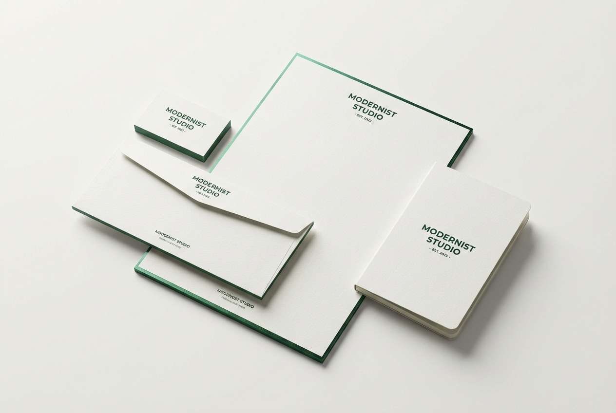
1) Deep Forest Linen
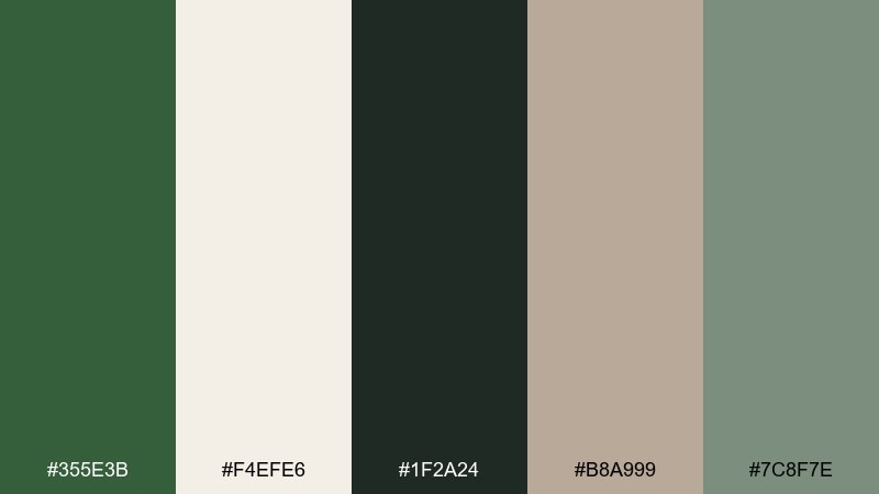
HEX: #355E3B #F4EFE6 #1F2A24 #B8A999 #7C8F7E
Mood: calm, grounded, understated
Best for: brand identity and stationery
Calm forest shade meets crisp linen, like letterpress paper on a cabin desk. Use it for premium branding, menus, and packaging where you want quiet confidence. Pair the dark green with linen for spacious layouts, then add taupe for warm hierarchy. Tip: keep type mostly charcoal and reserve the green for seals, rules, and small blocks.
Image example of deep forest linen generated using media.io
Media.io is an online AI studio for creating and editing video, image, and audio in your browser.

2) Moss and Sandstone
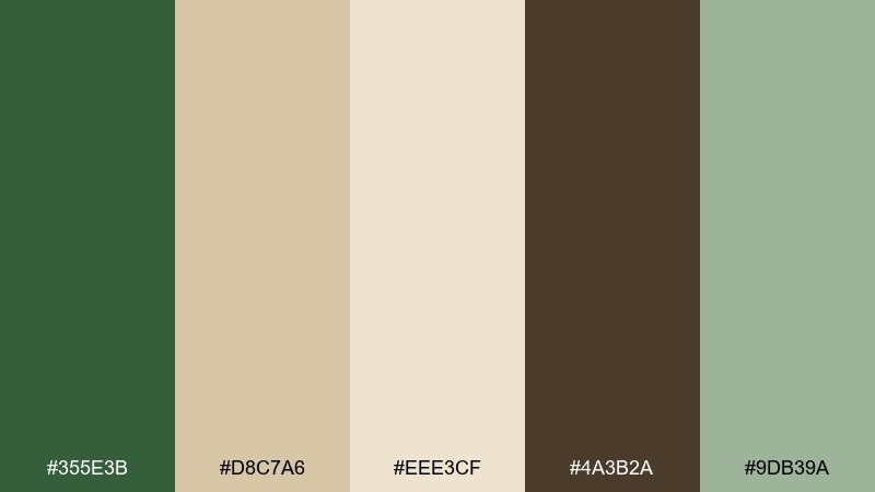
HEX: #355E3B #D8C7A6 #EEE3CF #4A3B2A #9DB39A
Mood: earthy, warm, approachable
Best for: rustic wedding invites and menus
Earthy moss and sandstone feel like sun on trail rock after rain. It works beautifully for weddings, farm-to-table events, and cozy hospitality pieces. Balance the deep green with creamy neutrals, then ground the layout with coffee-brown text. Tip: use the sandstone tone for borders and icons so the design stays soft, not heavy.
Image example of moss and sandstone generated using media.io
3) Evergreen Brass
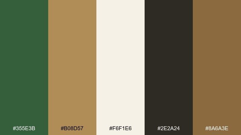
HEX: #355E3B #B08D57 #F6F1E6 #2E2A24 #8A6A3E
Mood: luxury, classic, confident
Best for: premium product packaging
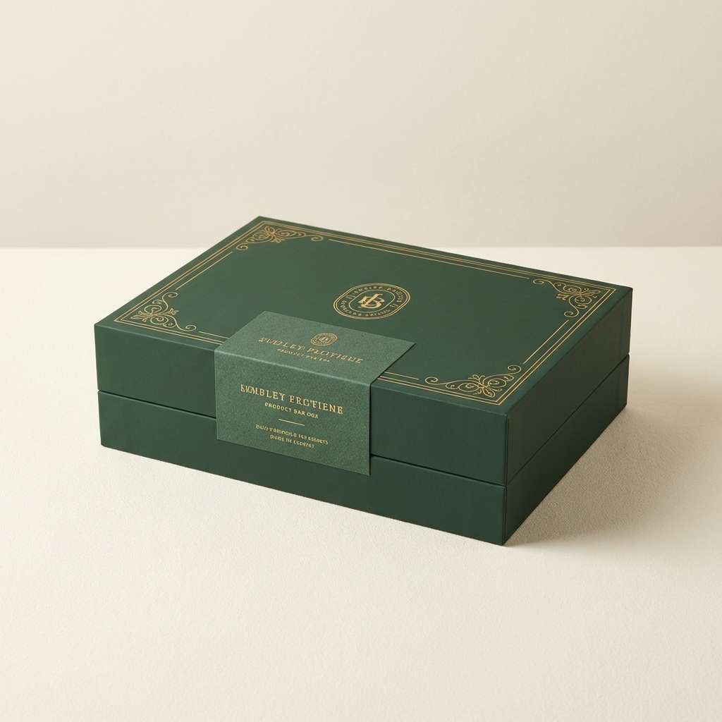
Evergreen with brass hints brings to mind old money interiors and polished hardware. It is ideal for premium skincare, candles, spirits, or boutique food packaging. Keep the green as the hero, and let brass and cream handle trim, foil, and label space. Tip: limit metallic accents to one or two elements so the pack still feels modern.
Image example of evergreen brass generated using media.io
4) Woodland Blush
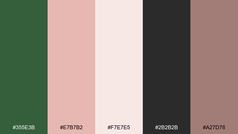
HEX: #355E3B #E7B7B2 #F7E7E5 #2B2B2B #A27D78
Mood: romantic, modern, soft
Best for: beauty branding and social posts
Woodland green paired with blush feels like wild roses against shaded leaves. Use it for beauty, lifestyle, and small-batch brands that want softness without losing depth. Let blush own backgrounds and highlights, then use the green for logos and key buttons. Tip: choose charcoal for body text to keep contrast clean on pale pink.
Image example of woodland blush generated using media.io
5) Alpine Nightfall
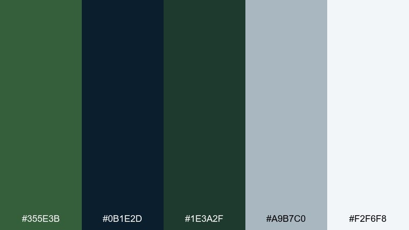
HEX: #355E3B #0B1E2D #1E3A2F #A9B7C0 #F2F6F8
Mood: moody, crisp, outdoorsy
Best for: landing pages for travel and gear
Alpine nightfall tones feel like a late hike under a clear, cold sky. They suit travel brands, outdoor gear, and cinematic hero sections with strong photography. Pair the green with deep navy for headers and overlays, then use icy gray for UI lines and captions. Tip: keep buttons in the lightest tint so calls to action pop on dark sections.
Image example of alpine nightfall generated using media.io
6) Sage Studio UI
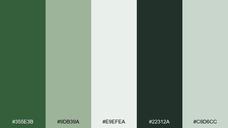
HEX: #355E3B #9DB39A #E9EFEA #22312A #C9D6CC
Mood: fresh, minimal, balanced
Best for: app UI for wellness and productivity
Fresh sage and deep green feel like a sunlit studio with plants and clean lines. This hunter green color palette works well for wellness apps, habit trackers, and calm dashboards. Use the pale minty neutrals for surfaces, and reserve the dark green for navigation and primary actions. Tip: keep borders subtle and rely on spacing plus soft shadows for separation.
Image example of sage studio ui generated using media.io
7) Vintage Library
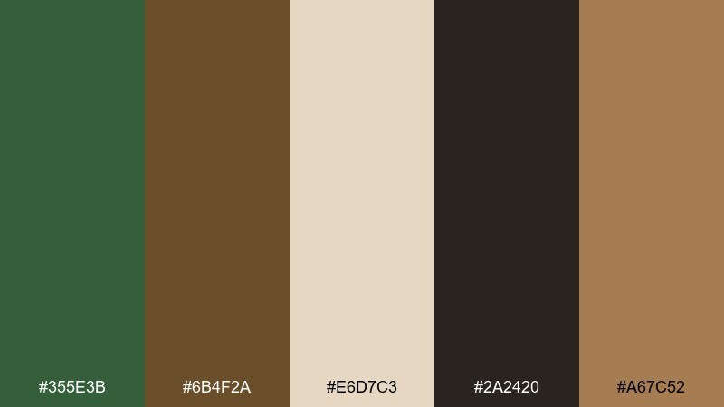
HEX: #355E3B #6B4F2A #E6D7C3 #2A2420 #A67C52
Mood: heritage, cozy, intellectual
Best for: editorial covers and book layouts
Vintage library tones evoke worn leather, wood shelves, and quiet reading lamps. They are perfect for book covers, long-form editorial, and cultural event programs. Pair the green with parchment cream for generous margins, then lean on browns for headings and ornaments. Tip: add subtle texture to backgrounds to sell the archival feel without sacrificing legibility.
Image example of vintage library generated using media.io
8) Pine and Terracotta
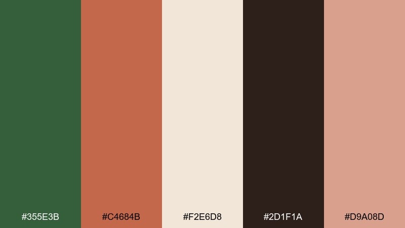
HEX: #355E3B #C4684B #F2E6D8 #2D1F1A #D9A08D
Mood: bold, artisanal, warm
Best for: restaurant branding and packaging
Pine and terracotta look like clay pots tucked into deep greenery. For punchy hunter green color combinations, let terracotta handle highlights while the green anchors the brand. It shines on restaurant menus, coffee bags, and craft food labels where warmth matters. Tip: keep terracotta to 10 to 20 percent of the layout so it reads as an accent, not a takeover.
Image example of pine and terracotta generated using media.io
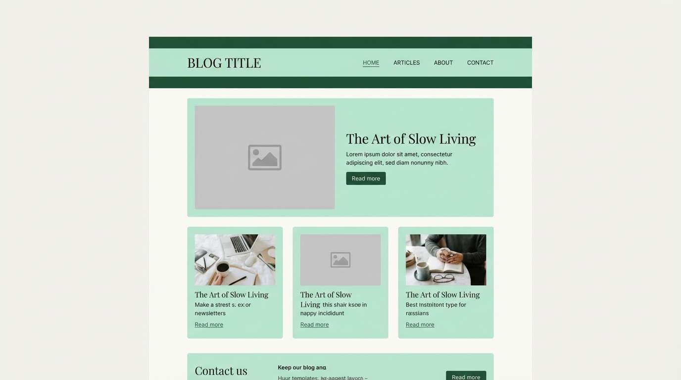
9) Rainy Meadow
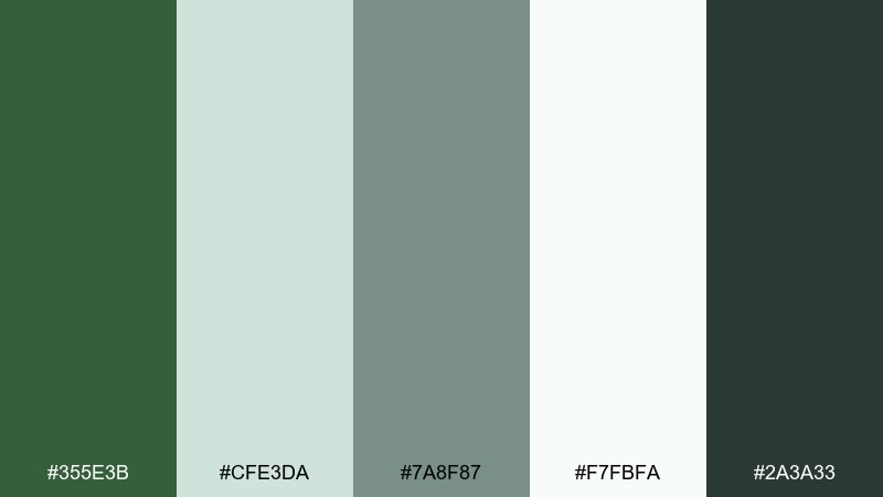
HEX: #355E3B #CFE3DA #7A8F87 #F7FBFA #2A3A33
Mood: quiet, airy, soothing
Best for: blog themes and reading apps
Rainy meadow tones feel like mist settling over tall grass. Use this mix for reading-heavy pages where comfort and clarity are the goal. Pair the darkest green with near-white backgrounds and soft gray-green dividers to reduce eye strain. Tip: make links a mid-tone green so they stand out without shouting.
Image example of rainy meadow generated using media.io
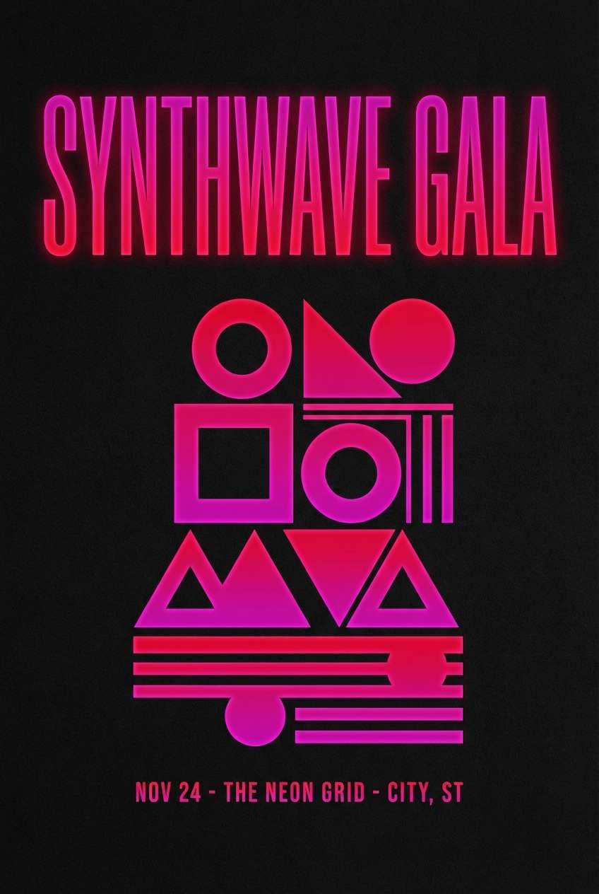
10) Dark Emerald Neon
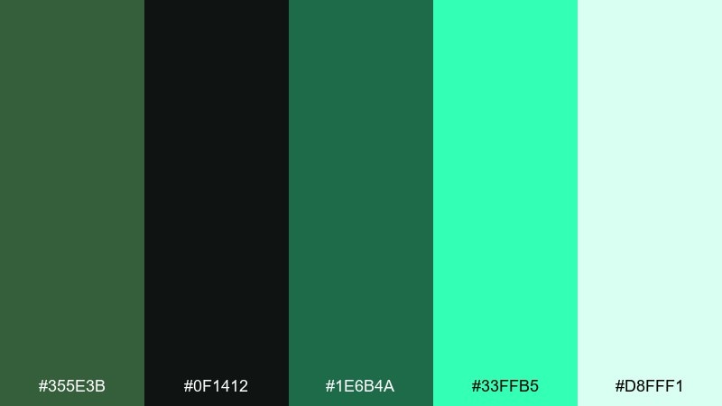
HEX: #355E3B #0F1412 #1E6B4A #33FFB5 #D8FFF1
Mood: electric, edgy, modern
Best for: music event graphics and merch
Dark emerald with neon mint feels like club lights cutting through fog. It is great for music posters, streetwear drops, and modern tech promotions that need high energy. Keep the background nearly black, then use neon sparingly for dates, prices, or key icons. Tip: increase tracking on neon text to improve readability against dark fields.
Image example of dark emerald neon generated using media.io
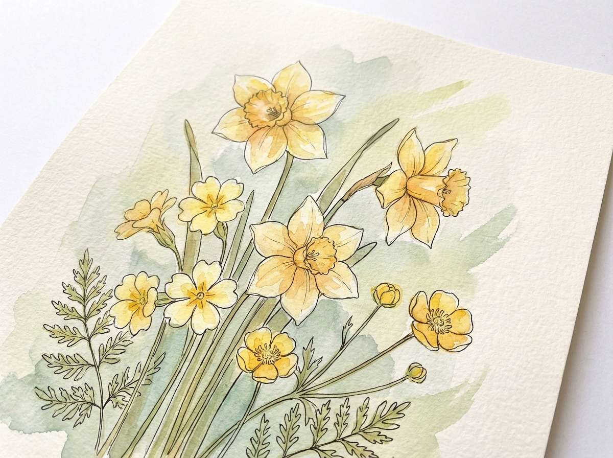
11) Botanical Watercolor
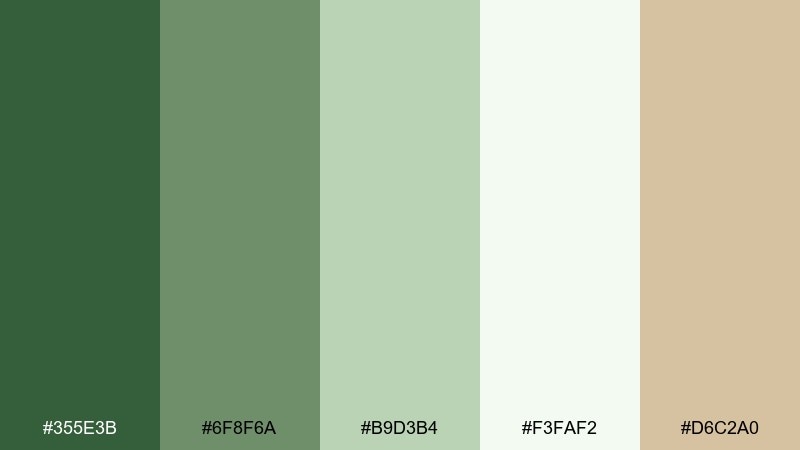
HEX: #355E3B #6F8F6A #B9D3B4 #F3FAF2 #D6C2A0
Mood: natural, gentle, artistic
Best for: botanical prints and nursery art
Soft botanicals and leafy greens evoke watercolor washes on textured paper. This palette suits nursery prints, garden journals, and gentle seasonal illustrations. Pair the darkest green with light mint for stems and outlines, then add a muted sand tone for warmth. Tip: use the off-white as paper space so the painting effect stays airy.
Image example of botanical watercolor generated using media.io
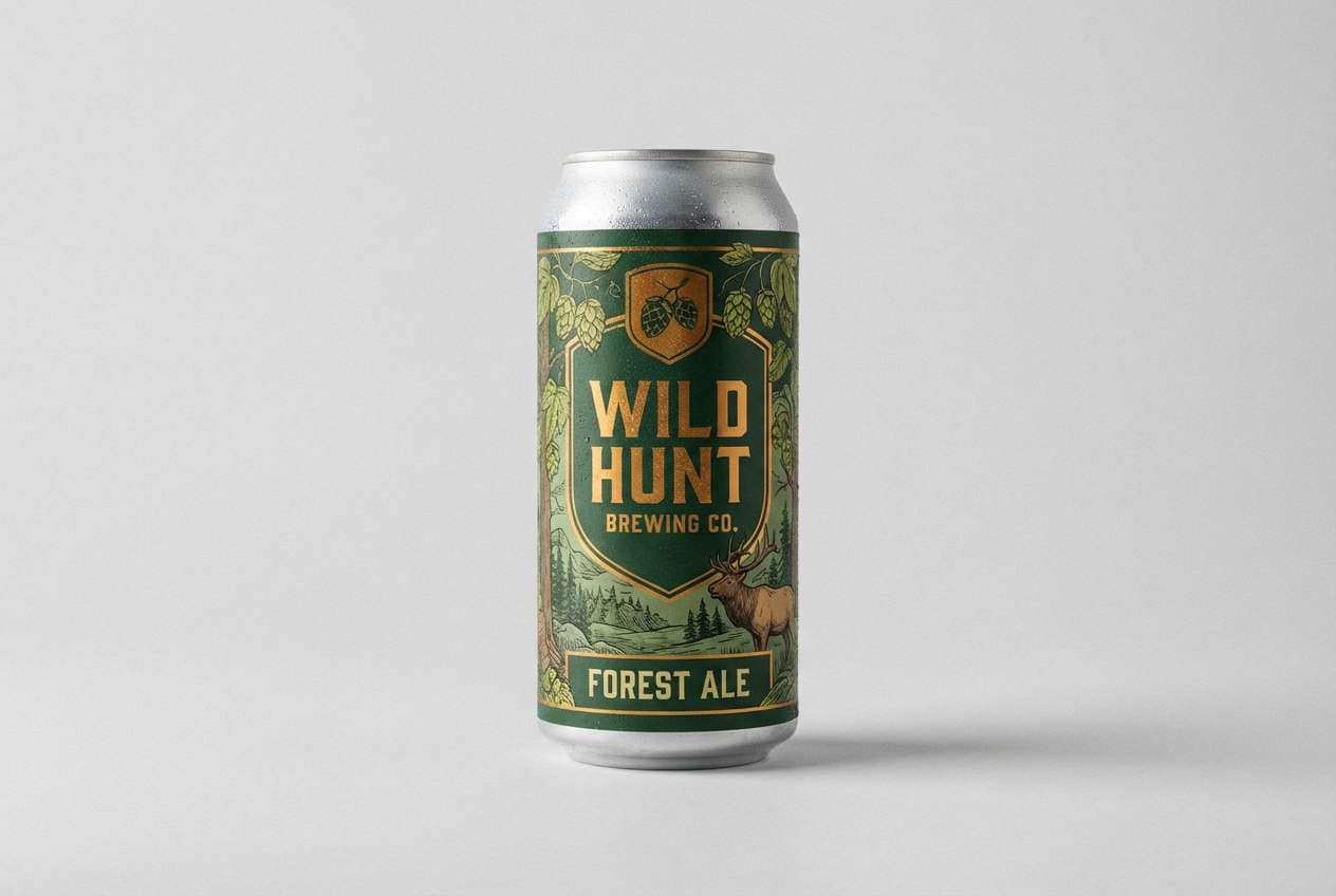
12) Craft Beer Label
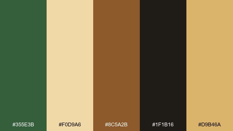
HEX: #355E3B #F0D9A6 #8C5A2B #1F1B16 #D9B46A
Mood: bold, vintage, tactile
Best for: beer can labels and taproom signage
Tactile greens and toasted golds feel like hops, grain, and old pub signage. Use this set for can labels, tap badges, and chalkboard-style promotions. Pair the dark green with warm gold for badges and borders, and keep black-brown for dense text. Tip: add a single cream highlight behind key copy to boost contrast on busy label art.
Image example of craft beer label generated using media.io
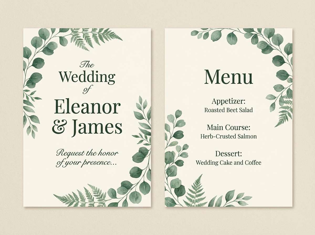
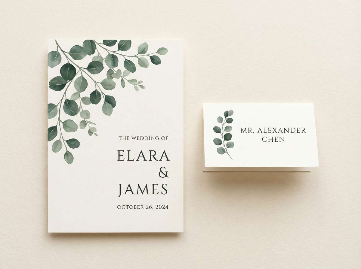
13) Wedding Eucalyptus
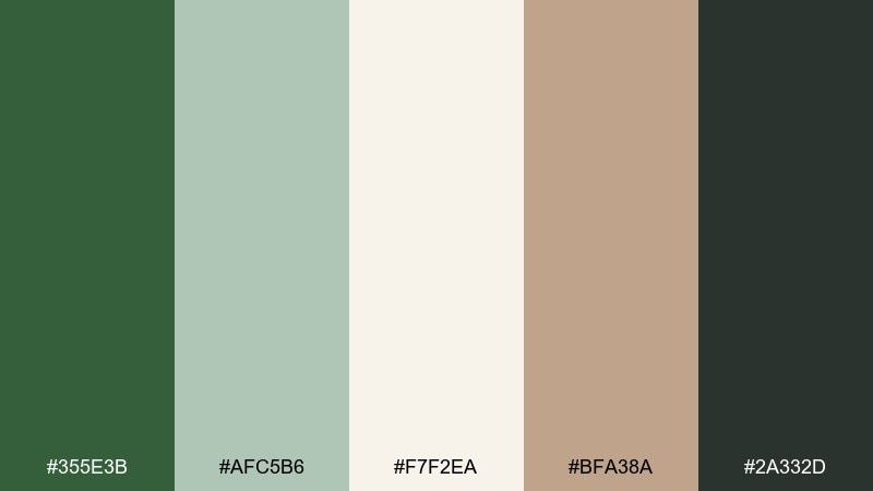
HEX: #355E3B #AFC5B6 #F7F2EA #BFA38A #2A332D
Mood: elegant, airy, romantic
Best for: wedding suites and event signage
Eucalyptus tones with creamy paper whites feel like fresh greenery on linen. They are ideal for modern weddings, vow books, and day-of signage that needs to photograph well. Pair the deep green with warm beige for secondary headers, and keep backgrounds soft for a refined look. Tip: use the darkest shade only for names and dates so the suite stays light.
Image example of wedding eucalyptus generated using media.io
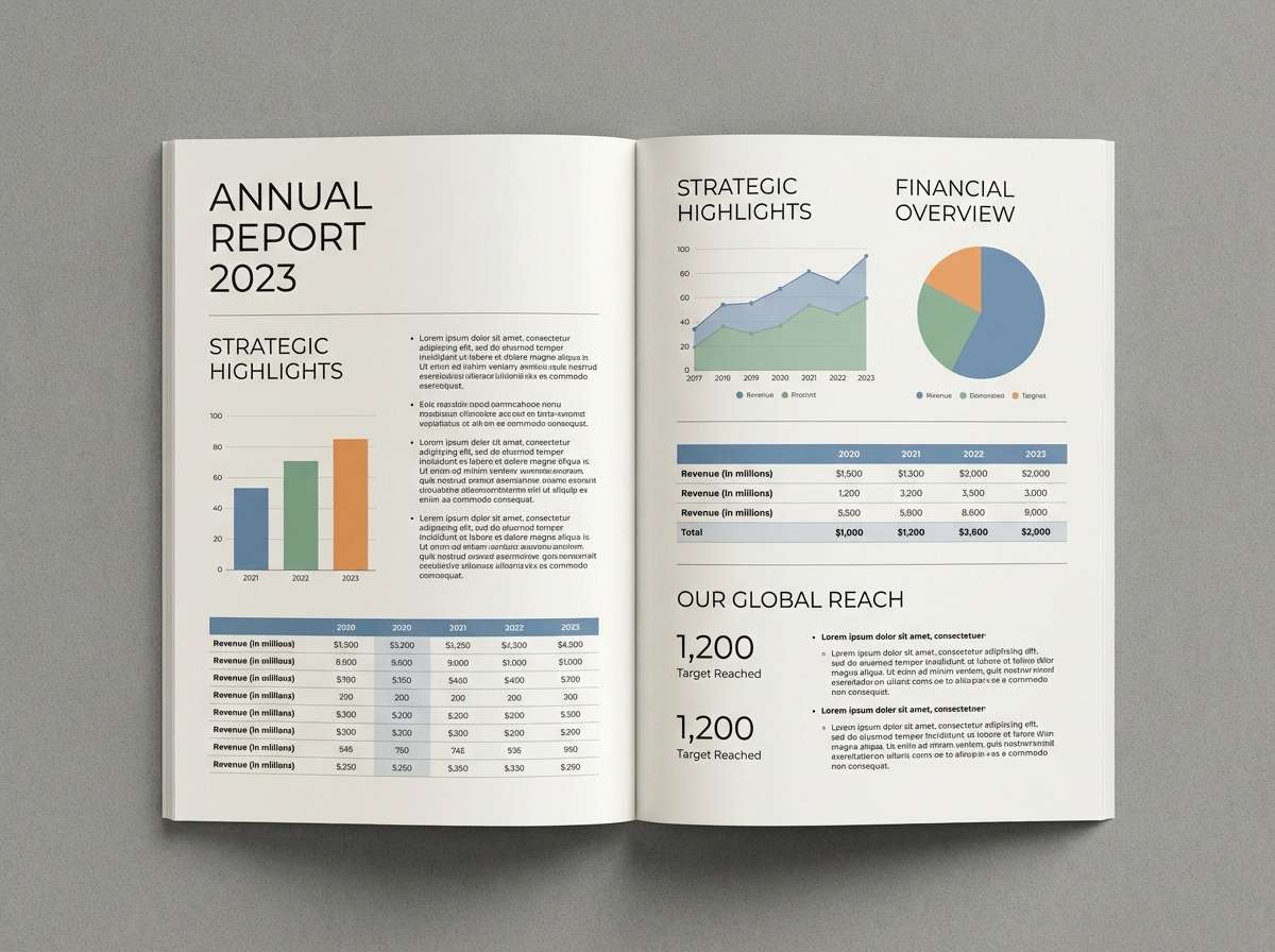
14) Minimal Editorial Spread
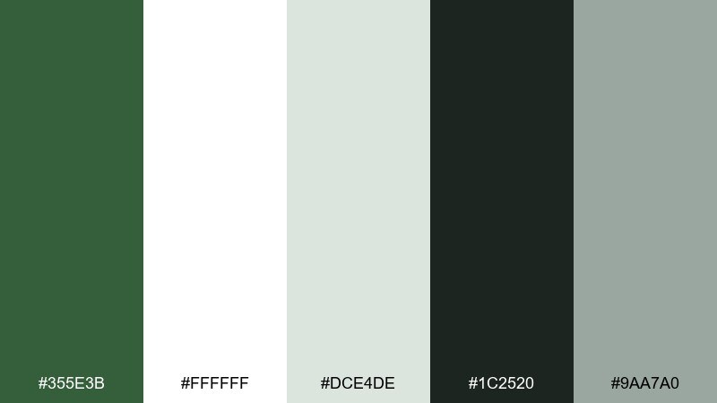
HEX: #355E3B #FFFFFF #DCE4DE #1C2520 #9AA7A0
Mood: clean, modern, editorial
Best for: magazine layouts and reports
Crisp whites and structured greens evoke a modern magazine with generous whitespace. Use it for annual reports, lookbooks, and long reads where hierarchy matters. Pair hunter green with near-black for headlines, then use the cool grays for rules, captions, and charts. Tip: keep the green to section openers and pull quotes to maintain a premium editorial rhythm.
Image example of minimal editorial spread generated using media.io
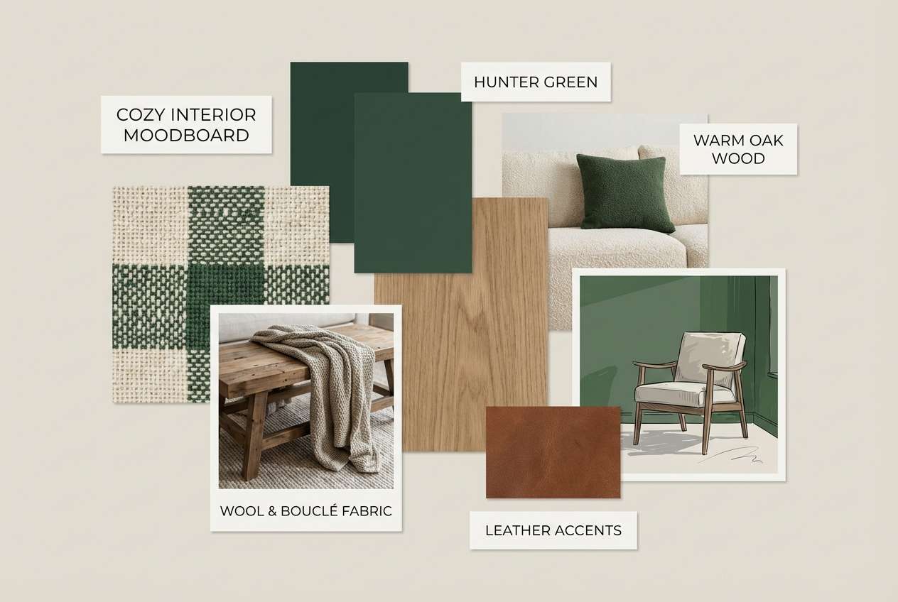
15) Cozy Cabin Interior
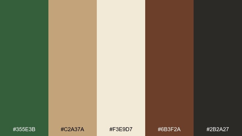
HEX: #355E3B #C2A37A #F3E9D7 #6B3F2A #2B2A27
Mood: cozy, rustic, welcoming
Best for: interior design moodboards
Cozy cabin colors bring to mind wool blankets, woodgrain, and a firelit evening. Use this hunter green color palette for interior moodboards, home brands, and seasonal campaigns. Pair the green with creamy neutrals, then add caramel and espresso tones for depth and texture. Tip: introduce the darkest shade through small details like hardware, frames, or thin lines.
Image example of cozy cabin interior generated using media.io
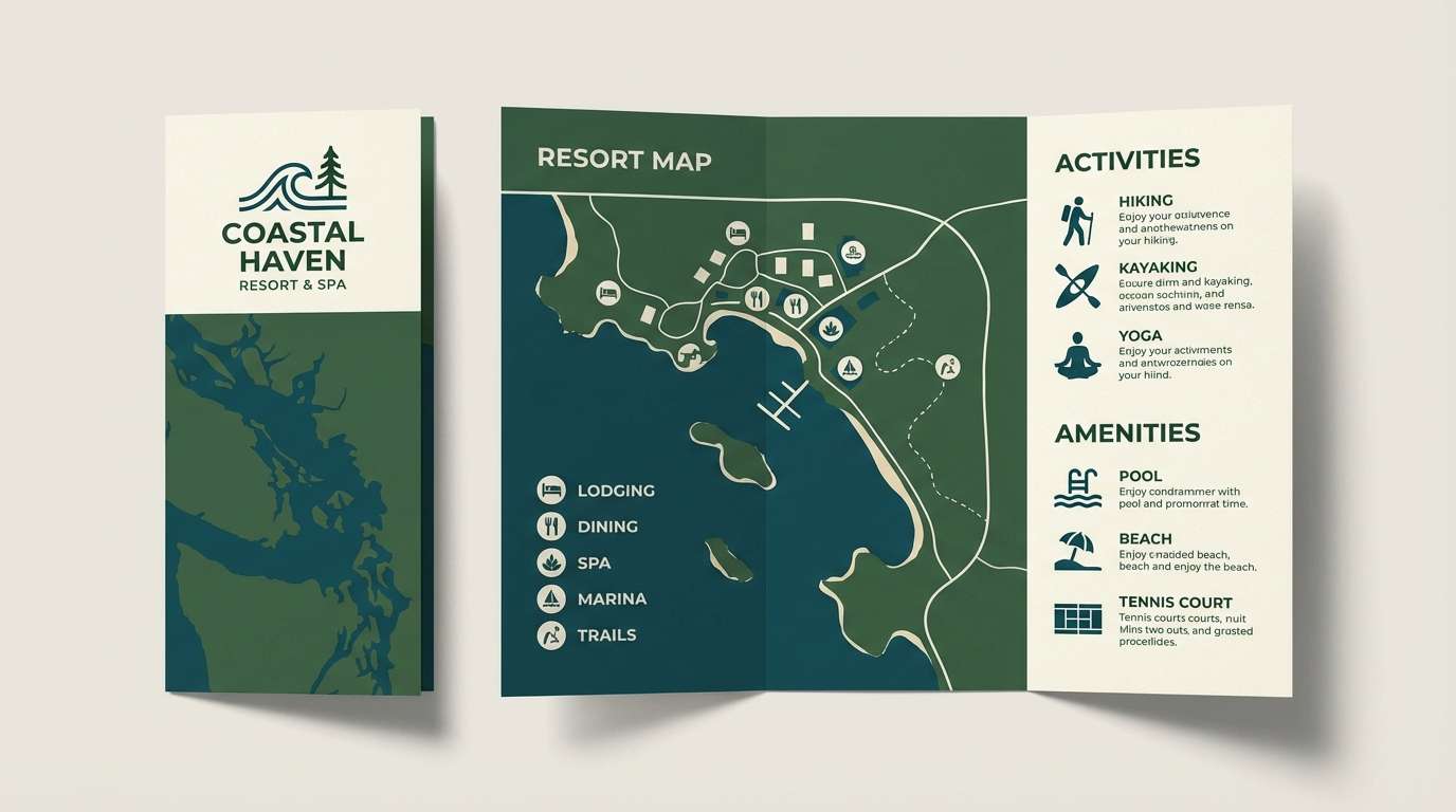
16) Ocean Spruce
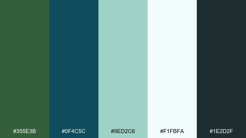
HEX: #355E3B #0F4C5C #9ED2C6 #F1FBFA #1E2D2F
Mood: refreshing, coastal, refined
Best for: resort branding and brochures
Ocean spruce feels like evergreen trees near a cold shoreline. It fits resort brochures, eco-travel brands, and calm service websites. Pair teal as a secondary accent for icons and infographics, while the deep green anchors navigation and logos. Tip: use the pale aqua for spacious backgrounds so content feels breezy.
Image example of ocean spruce generated using media.io
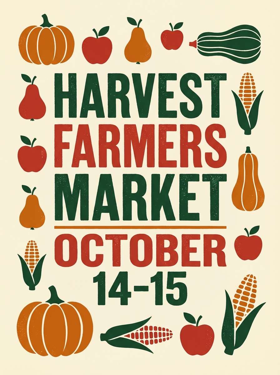
17) Autumn Orchard
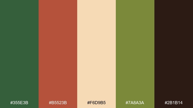
HEX: #355E3B #B5523B #F6D9B5 #7A8A3A #2B1B14
Mood: seasonal, hearty, inviting
Best for: fall marketing and farmers market signs
Autumn orchard tones feel like apples, leaves, and late-afternoon sun. Use them for seasonal promos, artisanal food brands, and fall event signage. Pair the green with warm orange-red for calls to action, then rely on creamy peach for breathing room. Tip: keep body text in the darkest brown to avoid harsh contrast on warm backgrounds.
Image example of autumn orchard generated using media.io
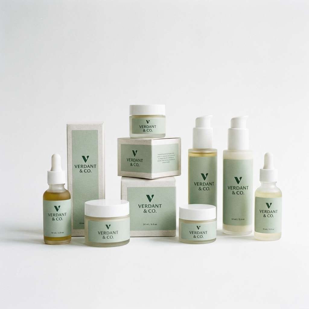
18) Luxury Spa Packaging
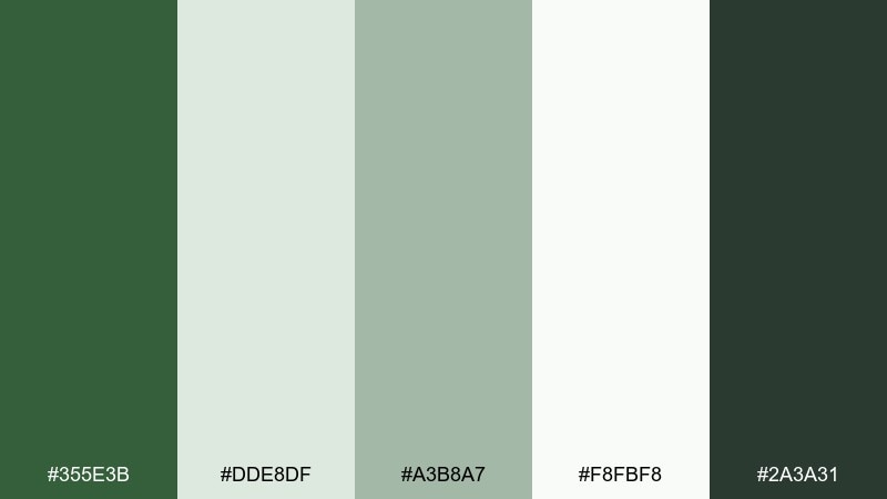
HEX: #355E3B #DDE8DF #A3B8A7 #F8FBF8 #2A3A31
Mood: serene, clean, premium
Best for: skincare packaging and e-commerce
Serene green neutrals suggest eucalyptus steam and a quiet spa room. This set works for skincare packaging, wellness subscription boxes, and clean product pages. Pair soft gray-green with lots of white space, and use the deep shade for brand marks and key labels. Tip: keep gradients subtle and matte to maintain a calm, clinical-luxe feel.
Image example of luxury spa packaging generated using media.io
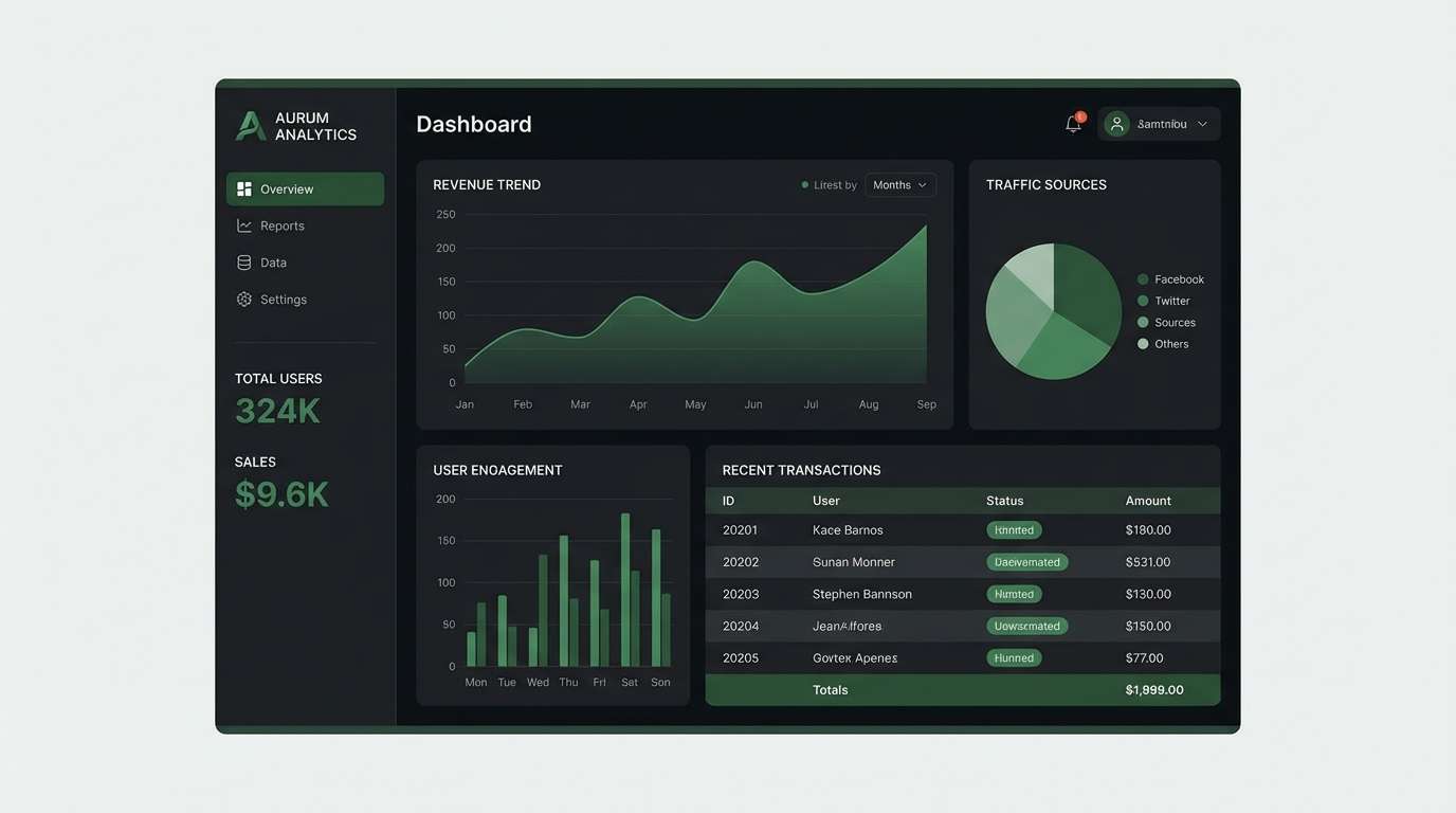
19) Tech Dashboard Dark
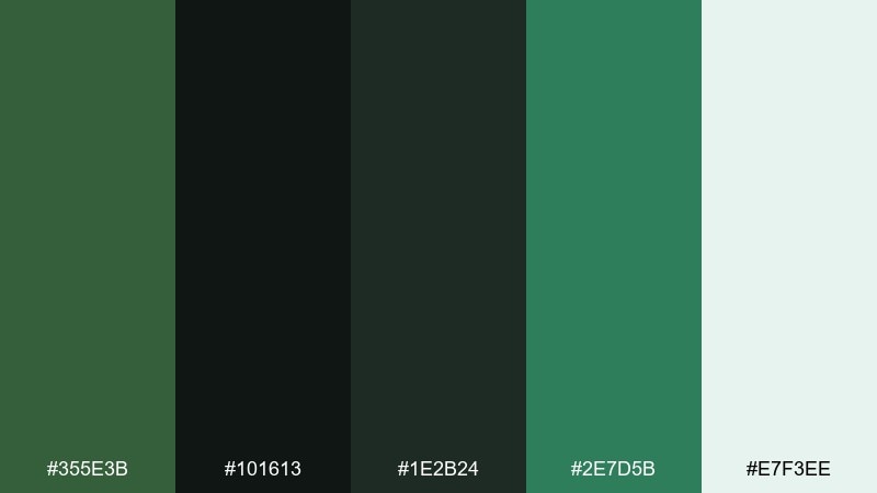
HEX: #355E3B #101613 #1E2B24 #2E7D5B #E7F3EE
Mood: focused, sleek, high-contrast
Best for: analytics dashboards and SaaS UI
Sleek dark tones with a green lift feel like a late-night control room. Use it for analytics products, admin panels, and monitoring dashboards where focus is critical. The mid green works well for success states and trend lines, while near-black keeps the interface quiet. Tip: reserve the light mint for text and key numbers so the hierarchy stays crisp.
Image example of tech dashboard dark generated using media.io
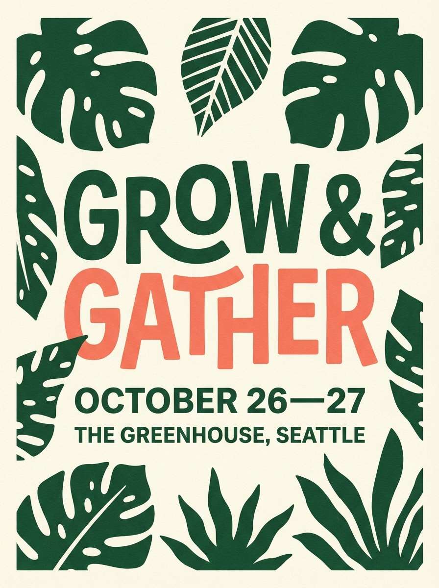
20) Garden Party Poster
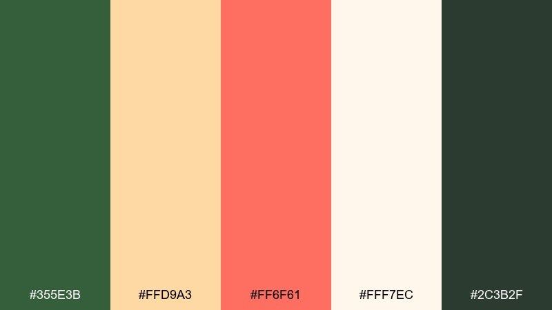
HEX: #355E3B #FFD9A3 #FF6F61 #FFF7EC #2C3B2F
Mood: cheerful, fresh, social
Best for: event posters and party invites
Cheerful garden colors feel like citrus drinks, sun umbrellas, and leafy shade. Use it for spring events, pop-up markets, and community flyers that need friendly energy. Pair the green with coral for headlines and dates, then keep plenty of creamy space around blocks. Tip: set the coral on light backgrounds and use the deep green for supporting text and icons.
Image example of garden party poster generated using media.io
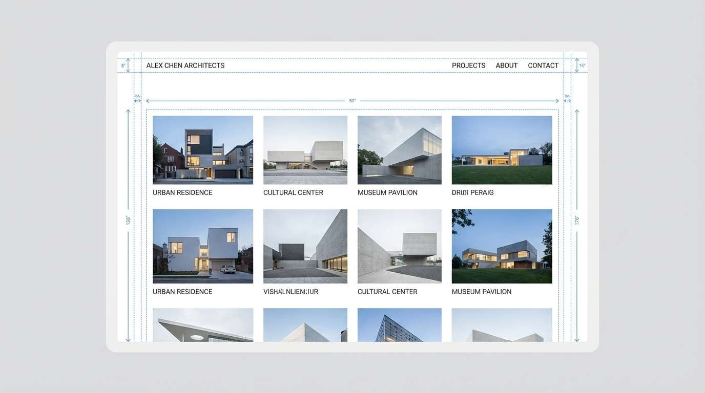
21) Stone and Fern
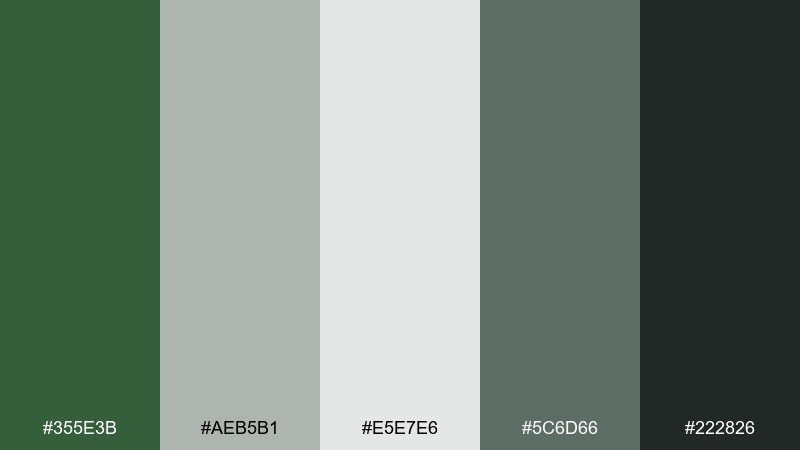
HEX: #355E3B #AEB5B1 #E5E7E6 #5C6D66 #222826
Mood: neutral, architectural, calm
Best for: portfolio sites and case studies
Stone gray and fern green evoke concrete walls softened by plants. This mix is great for portfolios, architecture studios, and case study pages where imagery should lead. Pair the grays for backgrounds and captions, then use the green sparingly for navigation and links. Tip: keep photographs slightly warm so the palette does not feel cold or clinical.
Image example of stone and fern generated using media.io
22) Citrus Grove Accent
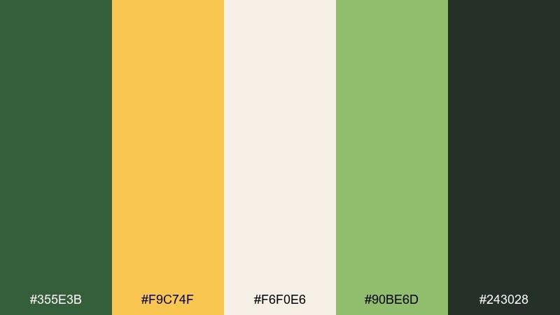
HEX: #355E3B #F9C74F #F6F0E6 #90BE6D #243028
Mood: bright, optimistic, modern
Best for: brand campaigns and ad banners
Bright citrus against deep green feels like sunlit fruit tucked under leaves. For lively hunter green color combinations, use yellow as the attention grabber while green keeps things grounded. This pairing works for campaign banners, seasonal promos, and retail ads that need instant clarity. Tip: place yellow behind short, bold copy and keep longer text on cream for readability.
Image example of citrus grove accent generated using media.io

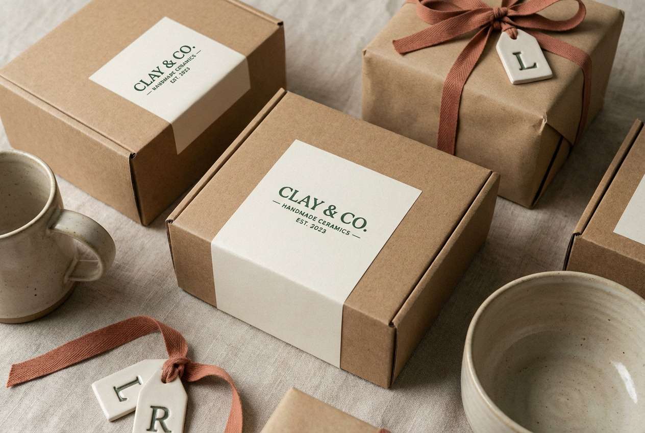
23) Clay Pot Studio
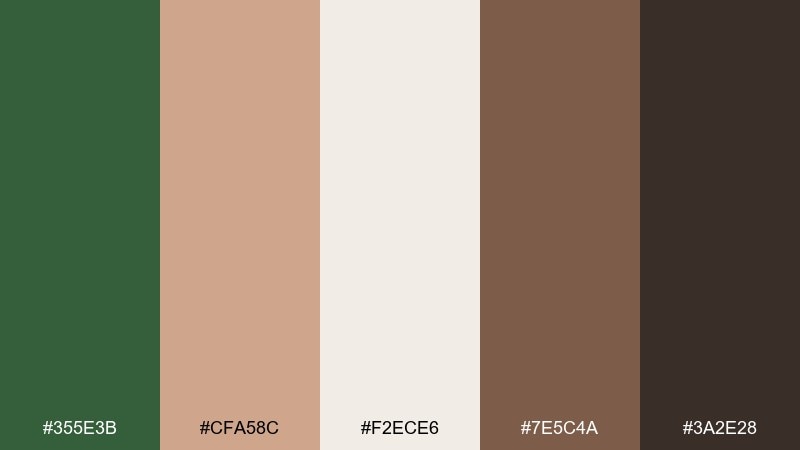
HEX: #355E3B #CFA58C #F2ECE6 #7E5C4A #3A2E28
Mood: crafty, warm, handcrafted
Best for: ceramics shops and maker branding
Clay and green tones evoke a pottery studio with dusty hands and warm kilns. They fit maker brands, ceramics shops, and small business packaging where texture is part of the story. Pair the deep green with blushy clay for backgrounds, then use cocoa browns for type and stamps. Tip: add grain or paper texture to match the handmade vibe, but keep the logo crisp.
Image example of clay pot studio generated using media.io
What Colors Go Well with Hunter Green?
Warm neutrals like linen, cream, sand, and beige make hunter green feel softer and more premium. They’re a go-to for packaging, editorial layouts, and wedding stationery because they keep contrast elegant rather than stark.
For richer, classic pairings, try metallic gold/brass, caramel brown, or espresso. These combinations lean heritage and tactile—great for labels, menus, and identity systems.
If you want a fresher or more modern look, pair hunter green with teal, icy gray, or crisp white. For high-energy accents, use coral or citrus yellow sparingly to create clear focal points.
How to Use a Hunter Green Color Palette in Real Designs
Start by choosing a role for hunter green: anchor (navigation, header, packaging base), accent (buttons, badges), or support (charts, icons). In most layouts, it works best as an anchor paired with generous light neutrals.
Maintain readable contrast by using near-black or charcoal for body text on light backgrounds, and reserve hunter green for headings, dividers, and key UI states. On dark themes, place text in light mint/gray rather than pure white to reduce glare.
Keep accents disciplined: one warm accent (gold, terracotta, blush) or one cool accent (teal, ice gray) usually looks more intentional than multiple competing highlight colors.
Create Hunter Green Palette Visuals with AI
If you’re building a brand board, UI mockup, or social graphic, it helps to see your hunter green palette in context. With AI-generated visuals, you can test mood, lighting, textures, and typography direction before committing to a full design system.
Use your HEX palette as a guide, then describe the scene (packaging, poster, landing page, stationery) and specify a clean background to keep the colors accurate. Iterate with one variable at a time—like swapping brass for terracotta—to quickly explore options.
Hunter Green Color Palette FAQs
-
What is the HEX code for hunter green?
A common digital HEX for hunter green is #355E3B. In practice, “hunter green” can vary slightly by brand, so confirm with your specific palette and display profile. -
Is hunter green the same as forest green?
They’re close, but not always identical. Hunter green is typically darker and more muted, while forest green often reads brighter or more saturated depending on the reference. -
What colors pair best with hunter green for branding?
For premium branding, pair hunter green with cream/linen, warm taupe, and brass or gold accents. For a modern look, use white, cool grays, and a restrained teal accent. -
Can I use hunter green in UI design without making it look too heavy?
Yes—use hunter green for navigation and primary actions, then rely on light neutrals (off-white, pale sage, light gray) for surfaces. Keep spacing generous and avoid filling large content areas with dark green. -
What’s a good accent color for hunter green?
Gold/brass adds a classic premium feel, terracotta adds warmth, coral adds energy, and citrus yellow creates high-visibility callouts. Use accents sparingly (often 10–20%) to keep the palette balanced. -
Does hunter green work for weddings?
It’s one of the most versatile wedding greens. Pair it with ivory, eucalyptus sage, and warm beige for a light, photogenic suite—or add blush for a romantic modern feel. -
How do I test a hunter green palette quickly?
Apply the palette to a simple mockup (poster, packaging label, or UI screen) and check contrast for text and buttons. Generating a few variations with AI can help you validate mood and hierarchy fast.
Next: Green Blue Color Palette


