

Orange brown color palettes blend spicy warmth with grounded, earthy stability—making them a go-to for branding, interiors, and cozy seasonal visuals. They can feel rustic and nostalgic or modern and polished depending on how you balance orange intensity with deeper browns and soft creams.
Below are 20 ready-to-use orange brown palette ideas with HEX codes, plus practical guidance on pairing, contrast, and real-world usage across web, print, and social graphics.
In this article
- Why Orange Brown Palettes Work So Well
-
- burnt citrus cabin
- desert clay latte
- amber toffee glow
- pumpkin leather study
- copper canyon sunset
- spiced apricot linen
- terracotta trail mix
- maple cocoa workshop
- autumn brick market
- saffron walnut kitchen
- gingerbread hearth
- caramel copper ui
- rust and sand editorial
- pecan orchard wedding
- smoked paprika packaging
- honeyed clay nursery
- bronze moss garden
- tangerine umber sports
- cinnamon stone interior
- ochre espresso night
- What Colors Go Well with Orange Brown?
- How to Use a Orange Brown Color Palette in Real Designs
- Create Orange Brown Palette Visuals with AI
Why Orange Brown Palettes Work So Well
Orange brown sits in a “comfort zone” of color psychology: orange adds energy and friendliness, while brown signals reliability, craft, and warmth. Together, they create a welcoming tone that works across lifestyle, food, hospitality, and earthy product categories.
These palettes are naturally flattering with photography—especially wood, leather, ceramics, spices, and outdoor scenes—so they feel cohesive without heavy color grading. That makes them ideal for websites, social templates, and packaging systems.
They also give you flexible contrast options: creamy beiges for airy layouts, rich cocoa browns for readable type, and brighter oranges for calls-to-action. The result is a palette that can be both expressive and highly usable.
20+ Orange Brown Color Palette Ideas (with HEX Codes)
1) Burnt Citrus Cabin
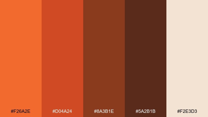
HEX: #F26A2E #D04A24 #8A3B1E #5A2B1B #F2E3D3
Mood: cozy, rustic, welcoming
Best for: cabin rental branding and website hero
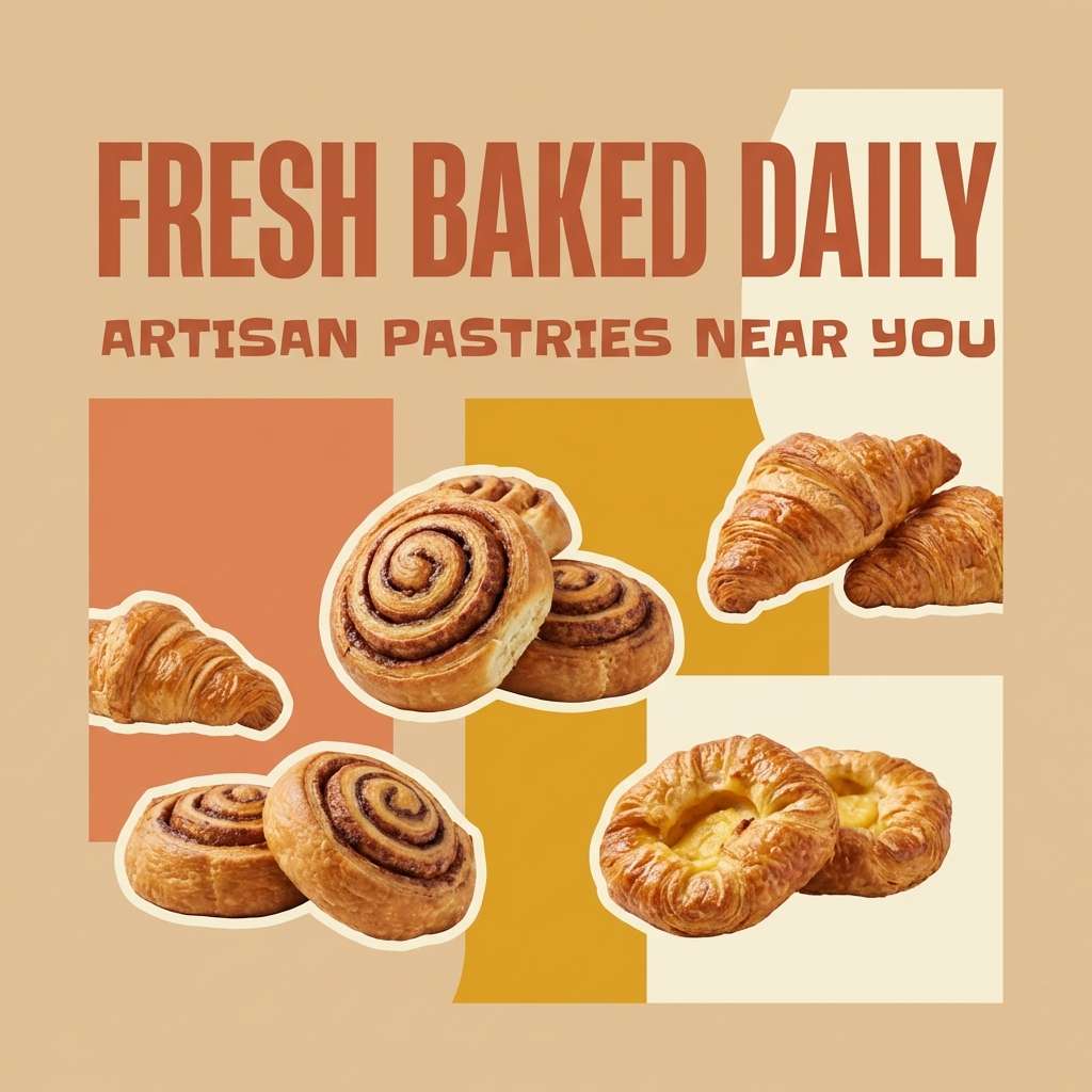
Cozy and rustic, like a crackling fire beside citrus peel and cedarwood. These warm oranges and deep browns feel inviting on hospitality pages, coffee labels, and woodsy lifestyle content. Pair with matte cream backgrounds and a single dark-brown type color for clarity. Usage tip: keep the brightest orange for buttons or badges so it reads as a friendly accent, not a wall of heat.
Image example of burnt citrus cabin generated using media.io

Media.io is an online AI studio for creating and editing video, image, and audio in your browser.

2) Desert Clay Latte
HEX: #E07A3E #C65D2E #9C4A2C #6E3A2A #EAD9C8
Mood: sunbaked, minimal, grounded
Best for: interior mood board for living rooms
Sunbaked and minimal, like clay walls warmed by late afternoon light. The mid-tone browns balance the orange so spaces feel grounded instead of loud. Pair with natural materials like linen, oak, and brushed brass for an elevated desert look. Usage tip: use the light beige as the largest surface color, then layer the deeper browns through furniture and trim.
Image example of desert clay latte generated using media.io
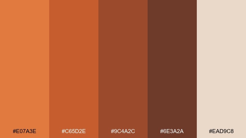
3) Amber Toffee Glow
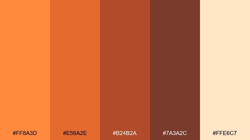
HEX: #FF8A3D #E56A2E #B24B2A #7A3A2C #FFE6C7
Mood: uplifting, sweet, radiant
Best for: bakery social posts and ad creatives
Uplifting and sweet, like amber candy catching light in a shop window. The bright orange adds energy while the toasted browns keep it grown-up. Pair with creamy whites and hand-drawn line art for a friendly, artisanal vibe. Usage tip: reserve the light cream for text panels so product shots stay the star.
Image example of amber toffee glow generated using media.io
4) Pumpkin Leather Study
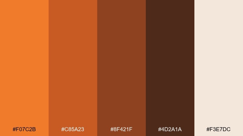
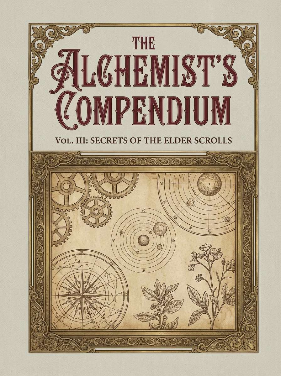
HEX: #F07C2B #C85A23 #8F421F #4D2A1A #F3E7DC
Mood: academic, vintage, confident
Best for: book cover and stationery set
Academic and vintage, like pumpkin spice drifting through a leather-bound library. This orange brown color palette suits titles, notebooks, and editorial graphics that need warmth without feeling playful. Pair with serif typography, subtle paper grain, and a thin gold line for polish. Usage tip: set body text in the deepest brown to avoid harsh black on warm backgrounds.
Image example of pumpkin leather study generated using media.io
5) Copper Canyon Sunset
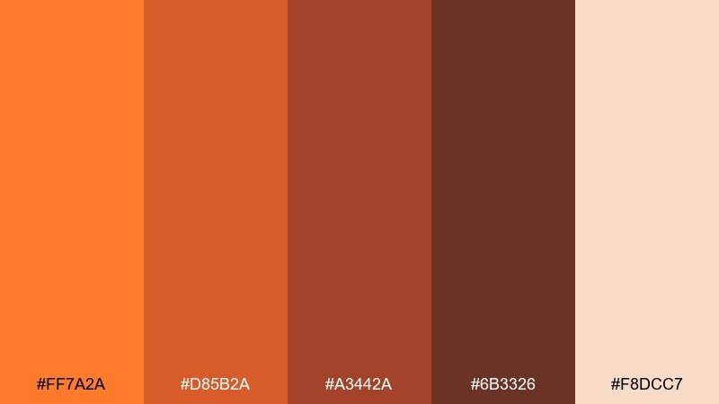
HEX: #FF7A2A #D85B2A #A3442A #6B3326 #F8DCC7
Mood: adventurous, cinematic, warm
Best for: travel blog header and feature imagery
Adventurous and cinematic, like a canyon ridge glowing right before dusk. The gradient-like oranges layer beautifully with the earthy browns for a natural sense of depth. Pair with dusty neutrals and wide landscape photography for a modern outdoor feel. Usage tip: let the richest brown anchor navigation bars so the brighter tones can breathe.
Image example of copper canyon sunset generated using media.io

6) Spiced Apricot Linen
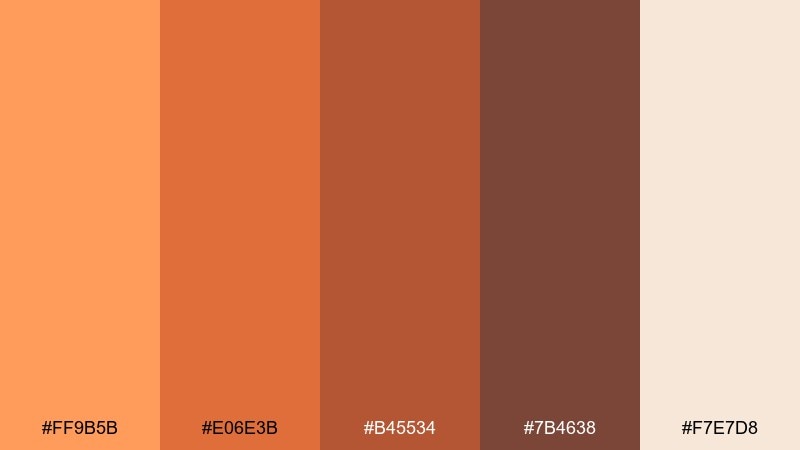
HEX: #FF9B5B #E06E3B #B45534 #7B4638 #F7E7D8
Mood: soft, airy, handcrafted
Best for: handmade goods landing page
Soft and airy, like apricot jam on warm linen. The lighter peach-orange keeps the palette gentle, while the browns add a handmade, grounded finish. Pair with neutral photography and plenty of whitespace for a calm, boutique look. Usage tip: use the peach tone for section headers and keep CTAs in the deeper orange for contrast.
Image example of spiced apricot linen generated using media.io
7) Terracotta Trail Mix
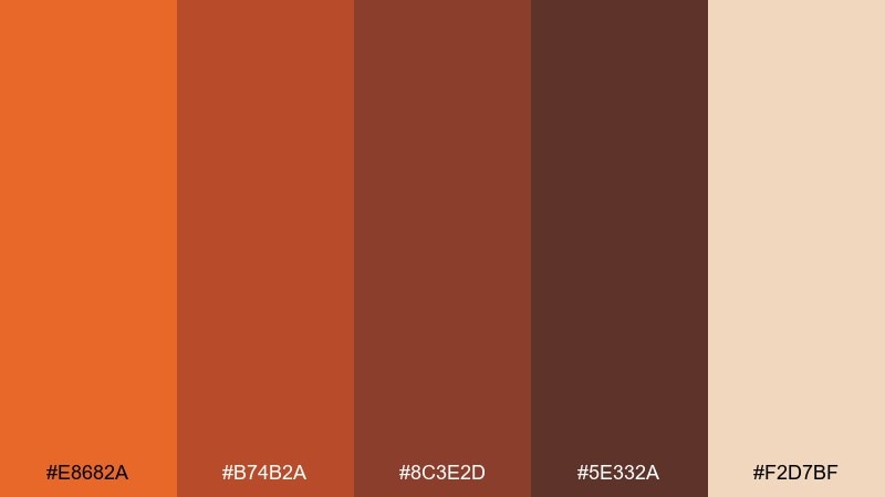
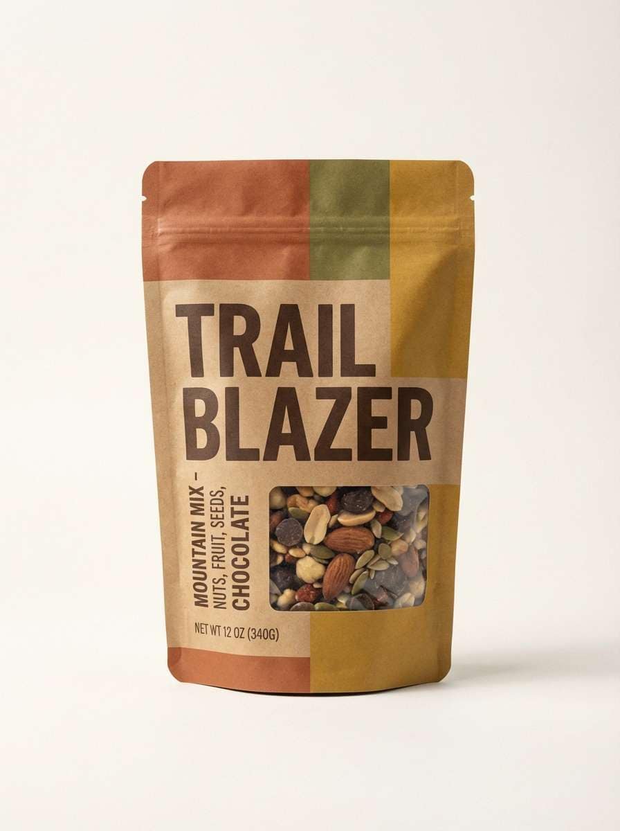
HEX: #E8682A #B74B2A #8C3E2D #5E332A #F2D7BF
Mood: active, outdoorsy, earthy
Best for: snack brand label and pouch design
Active and outdoorsy, like trail mix poured out on a terracotta plate. The oranges feel energetic while the browns add a hearty, whole-food signal. Pair with bold sans typography and simple iconography for quick shelf scanning. Usage tip: keep ingredient callouts on the light tan to maintain legibility over busy patterns.
Image example of terracotta trail mix generated using media.io
8) Maple Cocoa Workshop

HEX: #FF7F3A #C85A35 #9B4A35 #5B332C #E9D2C2
Mood: crafty, dependable, warm
Best for: DIY workshop poster and signup
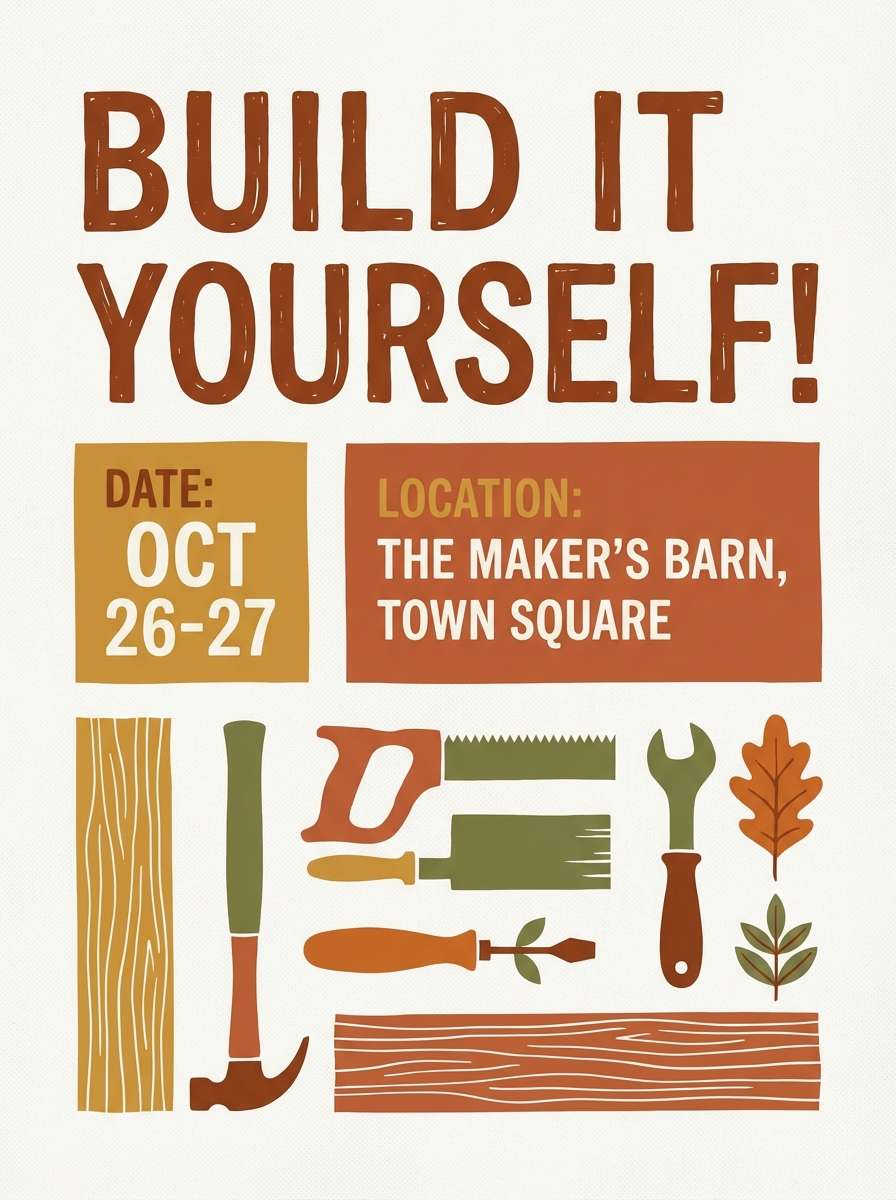
Crafty and dependable, like maple syrup simmering beside a mug of cocoa in a busy studio. These orange brown color combinations work well for class promos, maker markets, and community events because they feel friendly and capable. Pair with cream paper texture and a simple two-weight type system to keep it tidy. Usage tip: highlight the date and CTA in the brightest orange so it pops from a distance.
Image example of maple cocoa workshop generated using media.io
9) Autumn Brick Market
HEX: #F46A2D #D14F2A #A13E2A #6A2F25 #F3D8C8
Mood: bustling, vintage, local
Best for: farmers market flyer series
Bustling and local, like brick storefronts and fresh produce crates on an autumn weekend. The orange reads as upbeat and social, while the darker brown makes headlines feel sturdy. Pair with retro illustrations and stamp-style badges for that market-day charm. Usage tip: repeat the cream tone as a consistent background so each weekly flyer feels connected.
Image example of autumn brick market generated using media.io
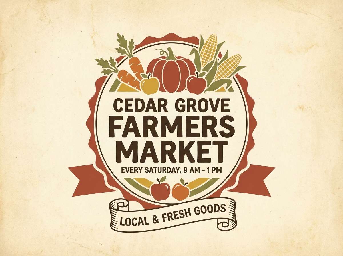
10) Saffron Walnut Kitchen
HEX: #FF8B2C #CC5A2A #8F4B34 #5A3B2E #F6E2CF
Mood: appetizing, homey, warm
Best for: recipe blog category pages
Appetizing and homey, like saffron steam drifting through a walnut-toned kitchen. The brighter orange brings appetite appeal, while the browns keep the layout grounded and cozy. Pair with food photography, rounded buttons, and soft dividers for a welcoming read. Usage tip: use the deep walnut for link text so it stays readable on warm backgrounds.
Image example of saffron walnut kitchen generated using media.io
11) Gingerbread Hearth
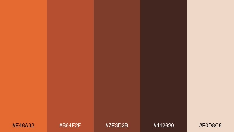
HEX: #E46A32 #B64F2F #7E3D2B #442620 #F0D8C8
Mood: nostalgic, wintery, comforting
Best for: holiday email header and promo tiles
Nostalgic and comforting, like gingerbread cooling near a warm hearth. The deep brown gives a festive richness that feels more classic than bright-red holiday palettes. Pair with off-white, subtle snowflake patterns, and a touch of metallic gold for sparkle. Usage tip: keep promo tiles on the light tan so product images remain crisp.
Image example of gingerbread hearth generated using media.io
12) Caramel Copper UI

HEX: #FF7D3B #D65E3A #A74B39 #6B3A31 #F6E0D2
Mood: modern, polished, friendly
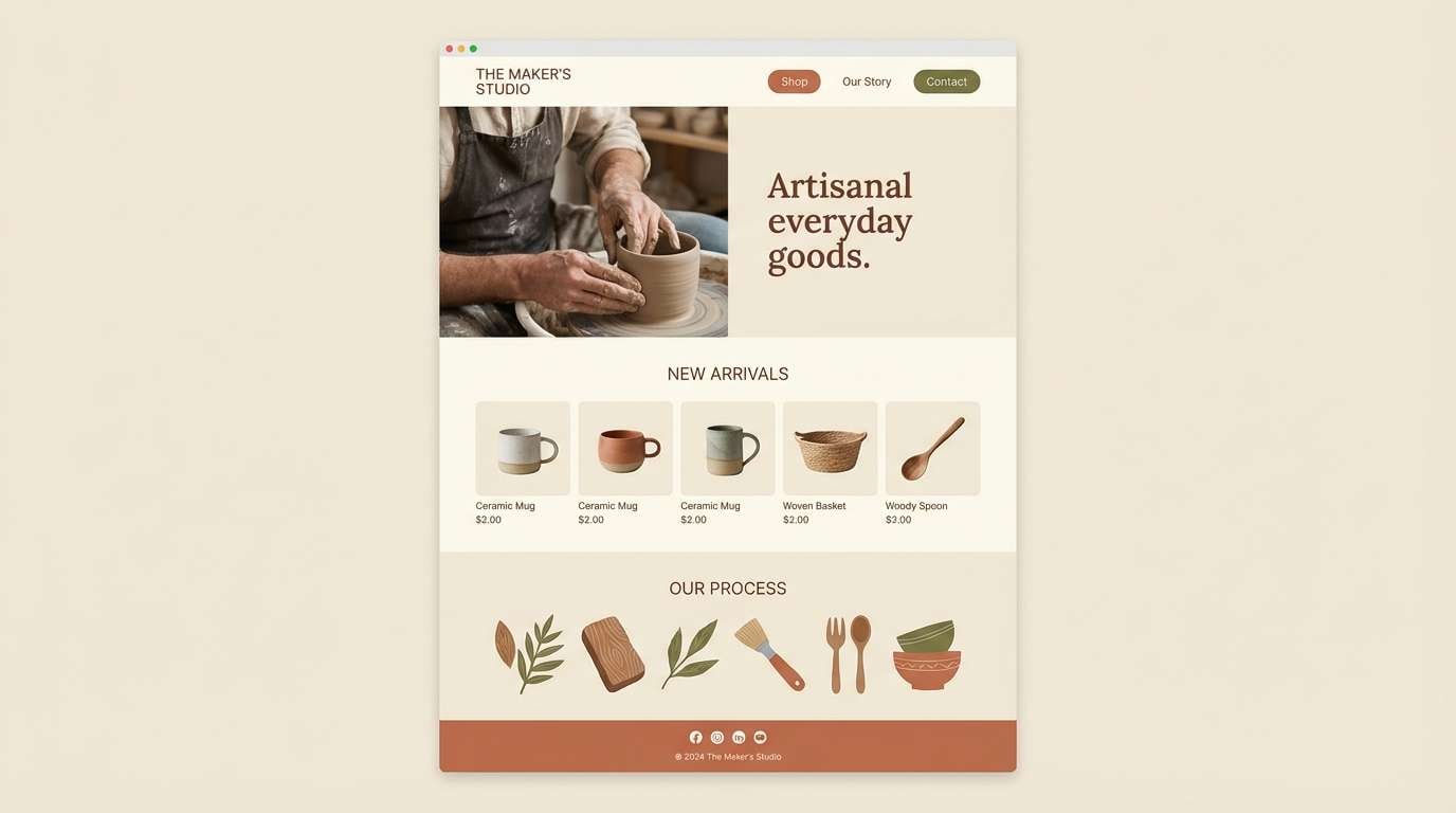
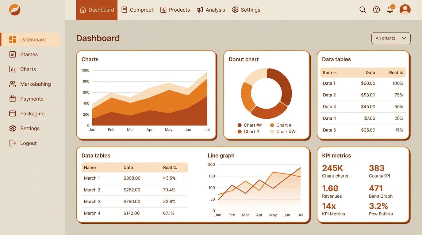
Best for: SaaS dashboard UI theme
Modern and polished, like caramel crema with a copper sheen. As an orange brown color scheme, it delivers warmth without sacrificing structure in dashboards and analytics views. Pair with cool gray linework and plenty of spacing so the warm accents feel intentional. Usage tip: assign orange to primary actions and keep charts mostly neutral, using brown only for emphasis.
Image example of caramel copper ui generated using media.io
13) Rust and Sand Editorial

HEX: #E06A2F #B75434 #8B4A3A #4E352E #EBD7C7
Mood: editorial, refined, earthy
Best for: magazine spread layout
Editorial and refined, like rust ink on sand-colored paper. The palette supports long-form reading with warm contrast that feels softer than stark black and white. Pair with elegant serif headlines, thin rules, and muted photography for a premium look. Usage tip: keep the darkest brown for pull quotes and section labels to guide scanning.
Image example of rust and sand editorial generated using media.io
14) Pecan Orchard Wedding
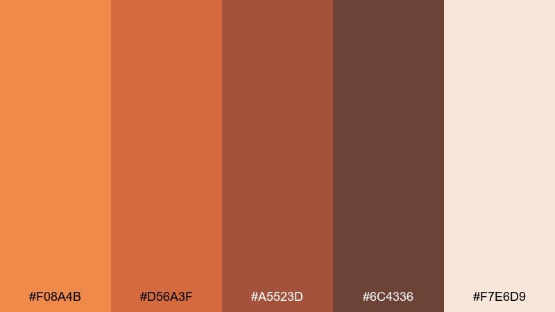
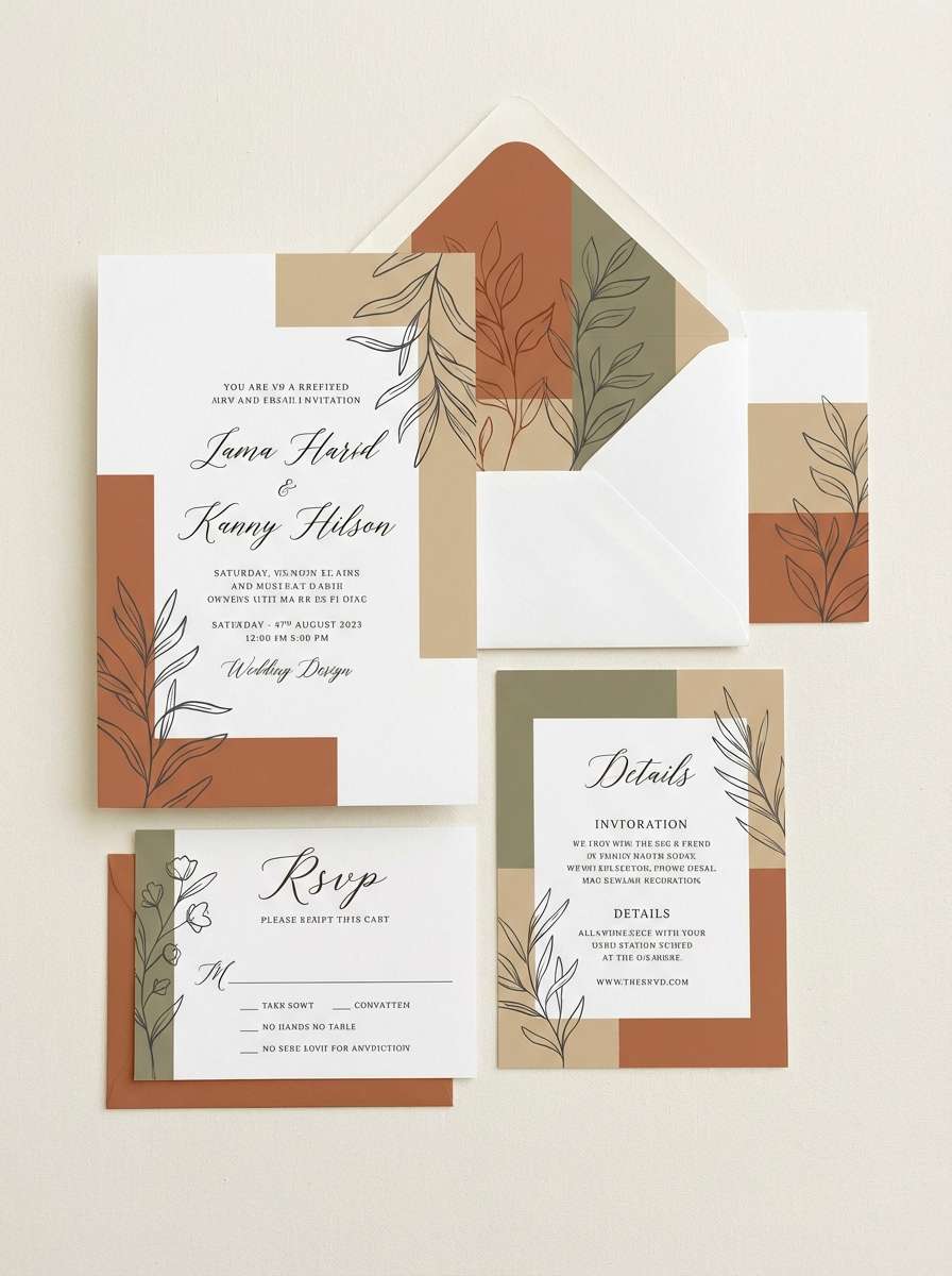
HEX: #F08A4B #D56A3F #A5523D #6C4336 #F7E6D9
Mood: romantic, rustic-elegant, soft
Best for: wedding invitation suite
Romantic and rustic-elegant, like pecan trees and sunset linens at an outdoor ceremony. The softened orange keeps things warm, while the browns add a timeless, natural anchor. Pair with creamy paper, delicate script, and minimalist florals for an elevated feel. Usage tip: print the darkest brown for body text so names and details stay crisp.
Image example of pecan orchard wedding generated using media.io
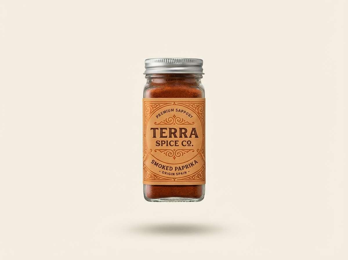
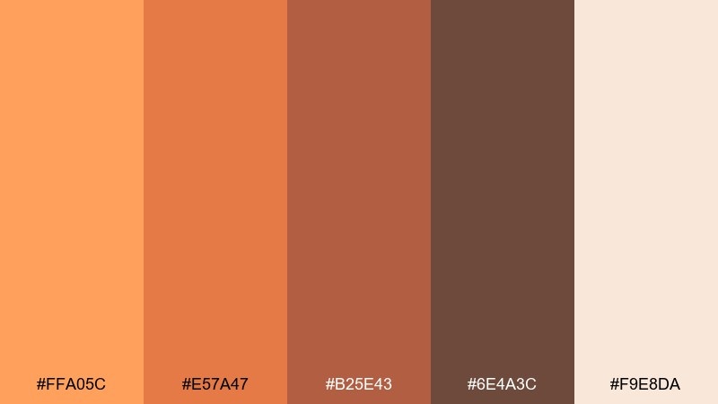
15) Smoked Paprika Packaging
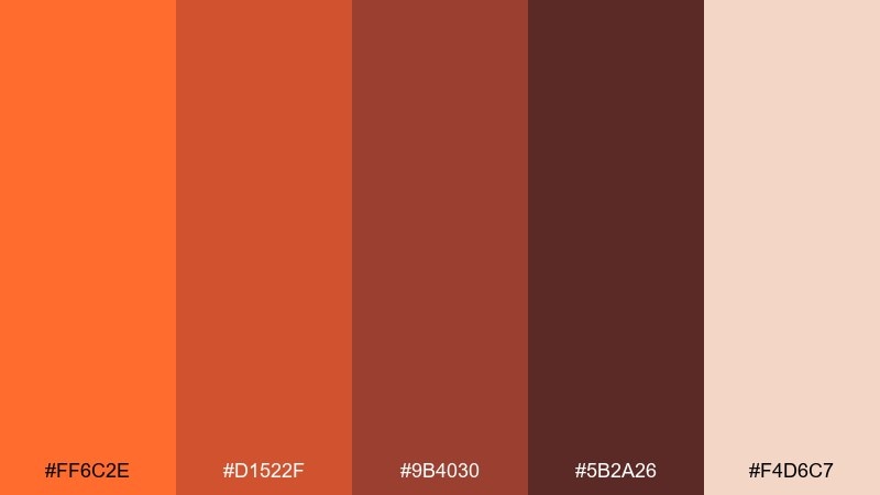
HEX: #FF6C2E #D1522F #9B4030 #5B2A26 #F4D6C7
Mood: bold, smoky, premium
Best for: spice jar label and product ad
Bold and smoky, like paprika dust on roasted vegetables. This orange brown color palette is ideal for premium food packaging because it signals heat, depth, and richness at a glance. Pair with black linework sparingly and let the cream tone carry ingredients and nutrition text. Usage tip: use the brightest orange only on the flavor name to create instant shelf impact.
Image example of smoked paprika packaging generated using media.io
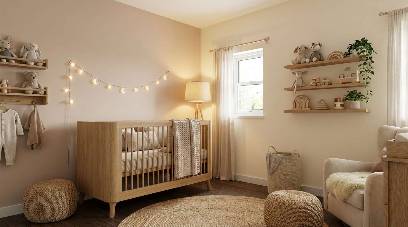
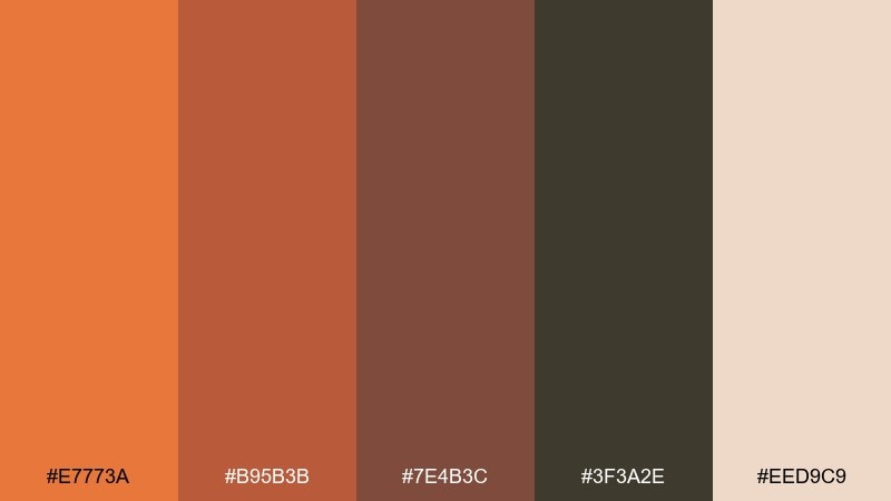
16) Honeyed Clay Nursery
HEX: #FFA05C #E57A47 #B25E43 #6E4A3C #F9E8DA
Mood: gentle, nurturing, calm
Best for: nursery decor and baby brand
Gentle and nurturing, like honeyed light over soft clay walls. The palette stays warm and cozy without drifting into overly saturated orange. Pair with muted greens, rounded shapes, and playful illustrations for a balanced baby-friendly look. Usage tip: keep the darkest brown for tiny icons and outlines so everything remains soft but readable.
Image example of honeyed clay nursery generated using media.io
17) Bronze Moss Garden
HEX: #E7773A #B95B3B #7E4B3C #3F3A2E #EED9C9
Mood: earthy, botanical, balanced
Best for: botanical illustration and label set
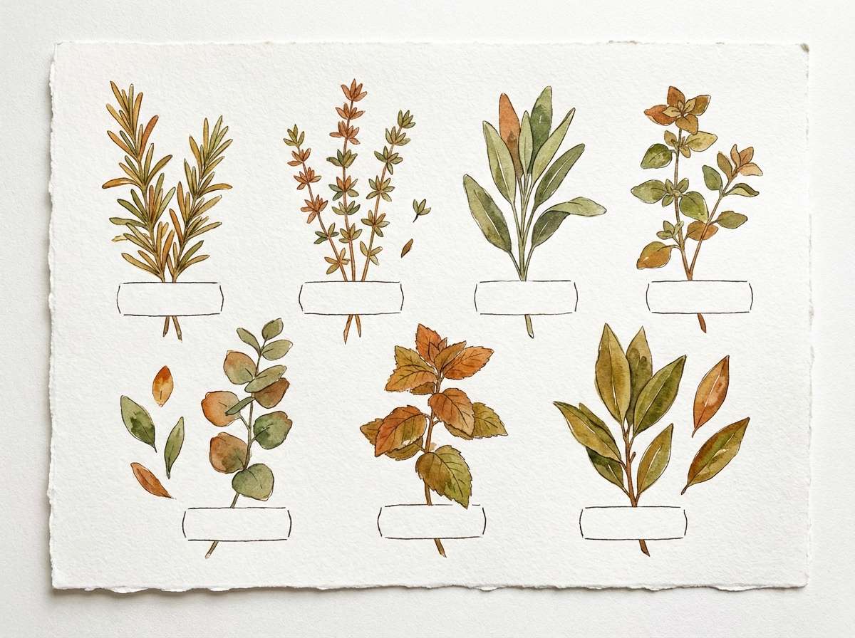
Earthy and botanical, like bronze planters tucked into mossy shade. The darker neutral leans slightly green, which helps the warm oranges feel more natural and grounded. Pair with watercolor textures and fine line drawings for herb labels or garden journals. Usage tip: let the cream background carry most of the space, then use orange for key plant names.
Image example of bronze moss garden generated using media.io
18) Tangerine Umber Sports
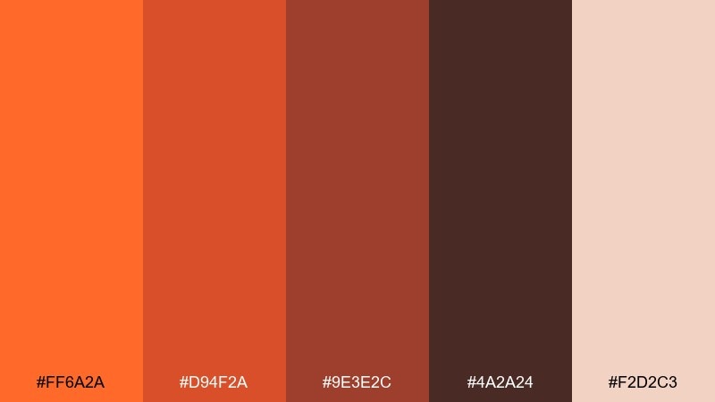
HEX: #FF6A2A #D94F2A #9E3E2C #4A2A24 #F2D2C3
Mood: energetic, gritty, high-contrast
Best for: team poster and event promo
Energetic and gritty, like stadium lights against worn umber textures. The sharp orange delivers speed and intensity, while the dark brown gives strong contrast for names and stats. Pair with bold condensed type and subtle grunge overlays to boost attitude. Usage tip: keep the light tone for secondary info blocks so the layout stays readable from afar.
Image example of tangerine umber sports generated using media.io

19) Cinnamon Stone Interior
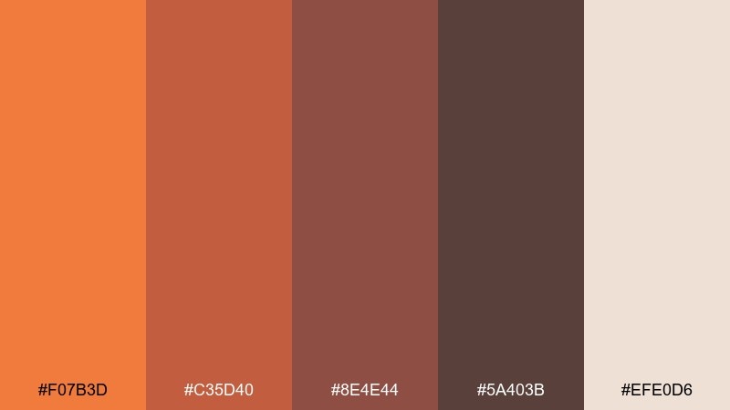
HEX: #F07B3D #C35D40 #8E4E44 #5A403B #EFE0D6
Mood: calm, modern-rustic, tactile
Best for: home decor catalog spread
Calm and tactile, like cinnamon dust on warm stone. These orange brown color combinations suit modern-rustic interiors where you want warmth without going fully autumnal. Pair with soft gray concrete, black metal fixtures, and natural wood for a balanced look. Usage tip: keep the mid-brown on larger surfaces and use the orange as a smaller accent in textiles or ceramics.
Image example of cinnamon stone interior generated using media.io
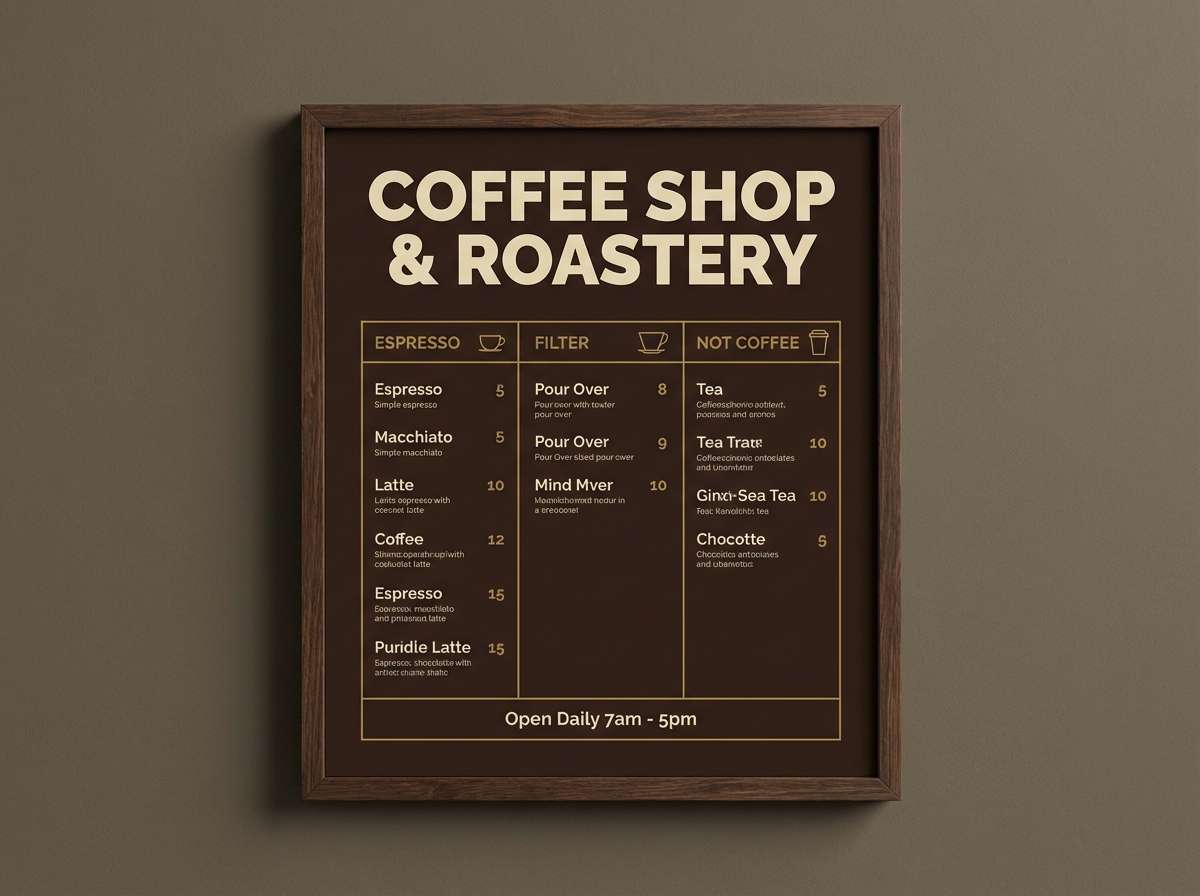
20) Ochre Espresso Night
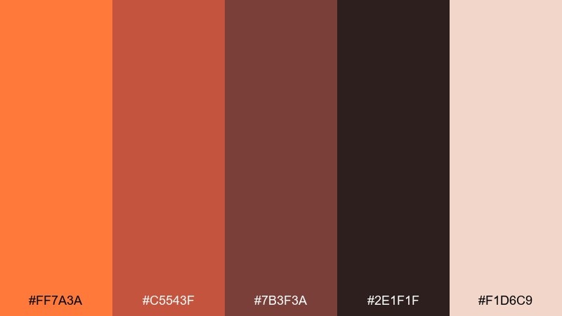
HEX: #FF7A3A #C5543F #7B3F3A #2E1F1F #F1D6C9
Mood: moody, chic, late-night
Best for: coffee shop menu and signage
Moody and chic, like espresso crema under warm ochre lighting at midnight. The near-black brown creates dramatic contrast while the orange keeps it inviting rather than harsh. Pair with minimalist icons and a simple grid so the darkness feels intentional and premium. Usage tip: use the light cream for menu sections to prevent the layout from feeling heavy.
Image example of ochre espresso night generated using media.io
What Colors Go Well with Orange Brown?
Orange brown pairs beautifully with warm neutrals like cream, ivory, sand, and oat—these keep layouts light while letting terracotta and rust accents feel intentional. For text and structure, deep espresso or walnut browns usually read softer than pure black.
For contrast, try cool counterpoints: slate gray, soft navy, or dusty teal can modernize orange brown and make it feel less seasonal. If you want a more natural vibe, muted greens (sage, olive, moss) create an earthy, botanical balance.
Metallics also work well: brushed brass and copper echo the warmth, while matte black can add a contemporary edge if used sparingly.
How to Use a Orange Brown Color Palette in Real Designs
Start by assigning roles: use a light cream as the primary background, a mid-brown for surfaces/cards, a deep brown for typography, and keep the brightest orange for CTAs or highlights. This keeps the palette warm without becoming visually heavy.
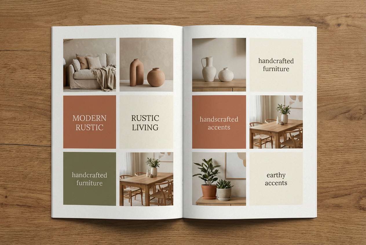
In branding, orange brown is strongest when you limit saturation: choose one “hero” orange and let the rest be toasted, earthy support tones. In interiors, repeat the mid-brown in wood/leather elements and use orange mainly in textiles or small decor.
Always check contrast for accessibility—deep walnut on cream is typically excellent, while orange-on-tan may fail. When in doubt, put text on the lightest swatch and reserve orange for icons, buttons, and small labels.
Create Orange Brown Palette Visuals with AI
If you want to preview these orange brown color combinations in posters, packaging, UI screens, or interior scenes, generating quick mock visuals can help you choose the right direction faster than tweaking swatches in isolation.
With Media.io’s text-to-image tools, you can paste a prompt, describe your layout, and iterate styles (rustic, modern, editorial, minimalist) while keeping your palette consistent across variations.
Orange Brown Color Palette FAQs
-
What does an orange brown color palette communicate in branding?
It typically signals warmth, approachability, craft, and reliability. Orange adds energy and friendliness, while brown adds grounded, natural “made-by-hand” credibility—popular for food, coffee, wellness, and outdoor brands. -
Is orange brown a good choice for modern UI design?
Yes—when used as an accent system. Keep backgrounds neutral (cream/soft gray), use orange for primary actions, and reserve deep browns for type and emphasis so the interface stays clean and readable. -
How do I keep an orange brown palette from looking too “fall” or seasonal?
Use lighter creams and muted browns, reduce saturation, and introduce a cool balancing color like slate, dusty blue, or muted teal. Avoid using the brightest orange across large surfaces. -
What’s the best text color on orange brown backgrounds?
Usually a deep espresso or near-black brown works best, because it feels softer than pure black while keeping contrast strong. For darker brown backgrounds, use cream/ivory text and increase font weight slightly. -
What colors pair well with burnt orange and terracotta?
Great pairings include cream, sand, cocoa brown, sage/olive greens, slate gray, navy, and brass/copper metallics. Choose warm neutrals for a cozy look or cool tones for a more modern feel. -
Can orange brown palettes work for weddings and invitations?
Yes—softened oranges (apricot, amber) with walnut browns and creamy paper tones create rustic-elegant suites. Add delicate line florals and plenty of negative space for a refined finish. -
How can I generate palette-based mockups quickly?
Use Media.io’s AI image generator to create sample visuals (packaging, posters, interiors, UI screens) from a prompt, then iterate by adjusting lighting, materials, and layout while keeping your chosen HEX tones consistent.
Next: Brown Pink Color Palette


