

A brown pink color palette pairs grounded, earthy neutrals with soft rosy accents, making designs feel warm, modern, and human.
Whether you’re building a brand, styling an interior, or designing wedding stationery, these brown and pink palettes offer flattering contrast that stays timeless and easy to read.
In this article
- Why Brown Pink Palettes Work So Well
-
- rosewood blush
- cocoa peony
- dusty mauve mocha
- terracotta petal
- caramel rose latte
- walnut sakura
- clay ballet
- espresso cotton candy
- chestnut bloom
- bronze rose quartz
- vintage sepia pink
- umber camellia
- cinnamon berry cream
- mocha orchid mist
- copper blush minimal
- sienna rose garden
- toffee pink picnic
- cocoa blush ui
- blush brown editorial
- rustic rosewood night
- What Colors Go Well with Brown Pink?
- How to Use a Brown Pink Color Palette in Real Designs
- Create Brown Pink Palette Visuals with AI
Why Brown Pink Palettes Work So Well
Brown brings stability, warmth, and trust—while pink adds softness and approachability. Together, they create a balanced look that feels inviting without being overly sweet.
This pairing is also naturally flattering in print and digital: cocoa-to-umber tones provide strong anchors for typography, and blush-to-rose tints add gentle highlights for hierarchy.
Because both hues sit comfortably in “warm” territory, brown pink color combinations adapt easily to materials like kraft paper, linen textures, ceramics, wood, and soft-touch packaging.
20+ Brown Pink Color Palette Ideas (with HEX Codes)
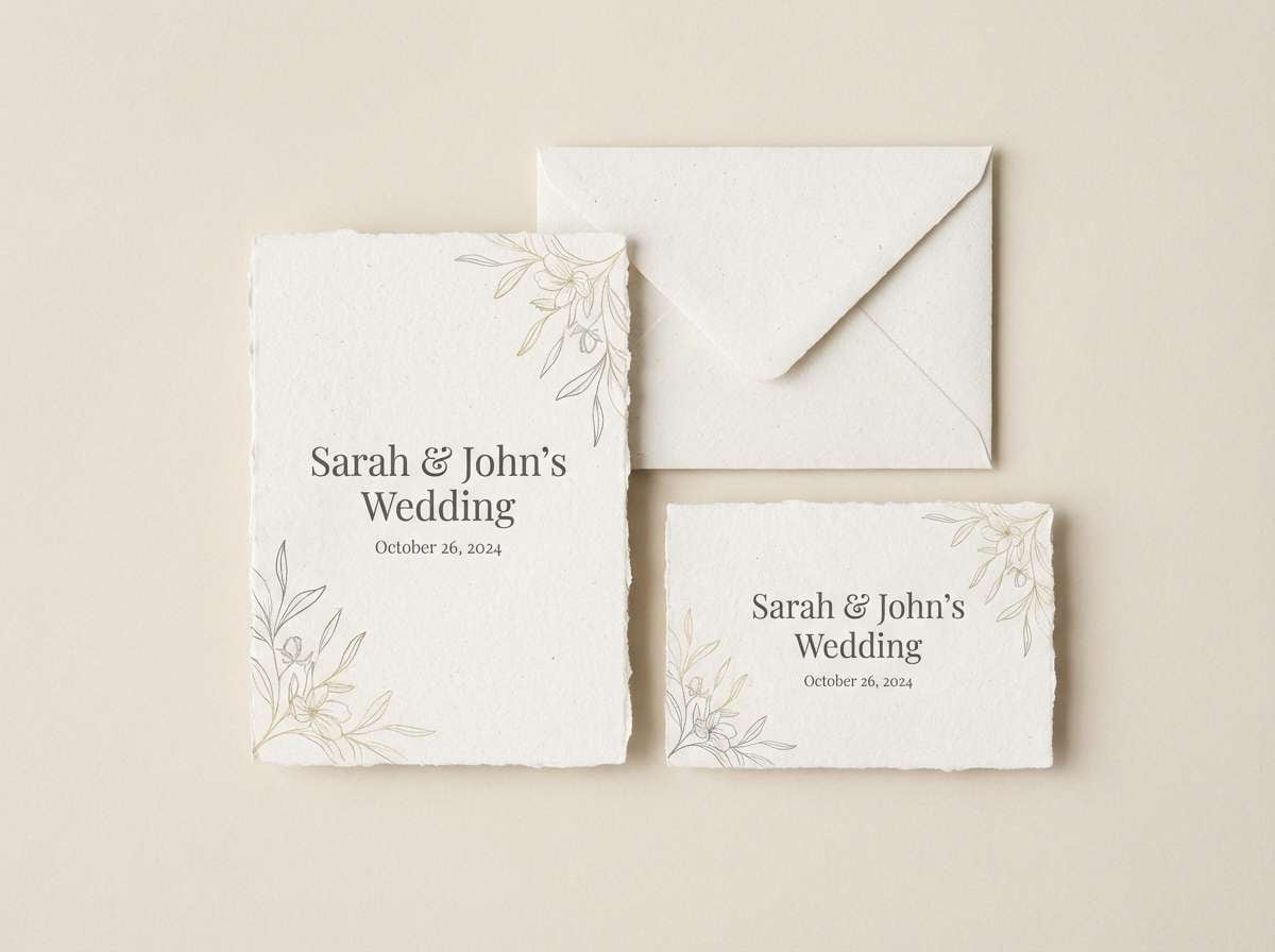
1) Rosewood Blush
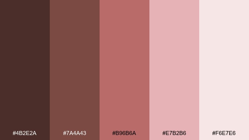
HEX: #4b2e2a #7a4a43 #b96b6a #e7b2b6 #f6e7e6
Mood: romantic, refined, warm
Best for: wedding invitations
Romantic rosewood and airy blush feel like velvet ribbons and dried roses. Use it for invitations, place cards, and monograms where you want warmth without going too bright. Pair with creamy paper textures, matte gold foil, or a deep charcoal for type. Tip: keep the darkest tone for names and dates so small text stays crisp.
Image example of rosewood blush generated using media.io
Media.io is an online AI studio for creating and editing video, image, and audio in your browser.

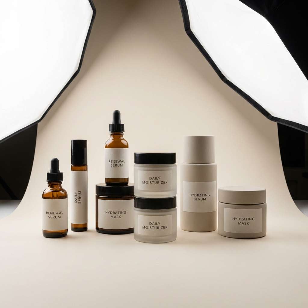
2) Cocoa Peony
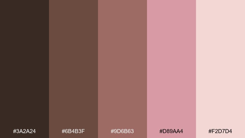
HEX: #3a2a24 #6b4b3f #9d6b63 #d89aa4 #f2d7d4
Mood: cozy, elegant, inviting
Best for: skincare packaging
Cozy cocoa browns with peony pink read like a warm latte beside a bouquet. The contrast is gentle, making it great for beauty labels, jar lids, and soft-touch boxes. Pair with off-white space and a single metallic accent like copper or champagne. Tip: use the mid brown for product names and the light pink for background panels to avoid visual heaviness.
Image example of cocoa peony generated using media.io
3) Dusty Mauve Mocha
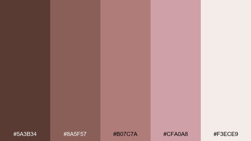
HEX: #5a3b34 #8a5f57 #b07c7a #cfa0a8 #f3ece9
Mood: calm, modern, muted
Best for: boutique branding
Muted mocha and dusty mauve evoke soft suede, rose tea, and quiet storefront charm. This brown pink color palette works beautifully for boutique logos, hang tags, and brand patterns that need a grown-up feel. Pair it with warm white margins and a small hit of black for hierarchy. Tip: reserve the pale neutral for negative space so the mauve stays sophisticated instead of sugary.
Image example of dusty mauve mocha generated using media.io
4) Terracotta Petal
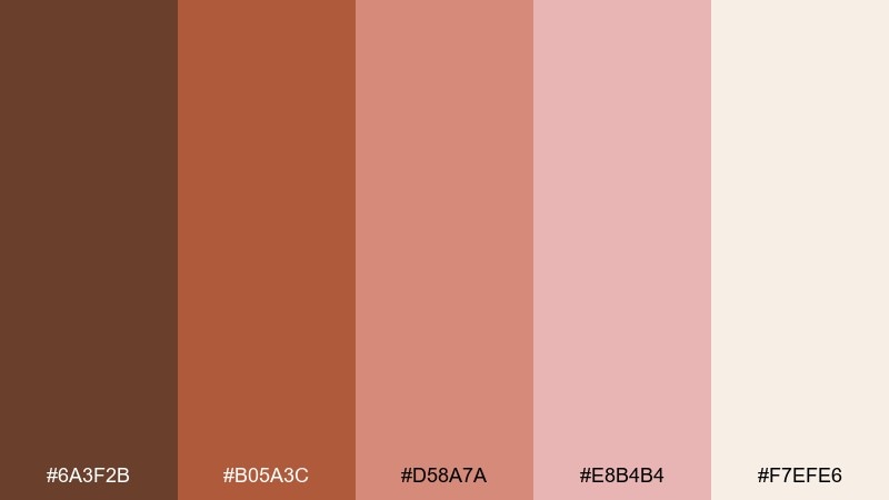
HEX: #6a3f2b #b05a3c #d58a7a #e8b4b4 #f7efe6
Mood: sunbaked, cheerful, artisanal
Best for: event posters
Sunbaked terracotta with petal pink brings to mind clay studios and late-afternoon light. It suits community events, workshops, and pop-up announcements where you want friendly energy. Pair with textured paper grains and a simple sans serif for modern clarity. Tip: keep the bright terracotta for headers only, and let the pale cream carry the background.
Image example of terracotta petal generated using media.io

5) Caramel Rose Latte
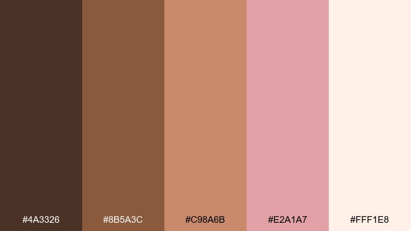
HEX: #4a3326 #8b5a3c #c98a6b #e2a1a7 #fff1e8
Mood: sweet, approachable, comforting
Best for: coffee packaging
Caramel browns and rosy foam tones feel like a fresh pour with latte art. These brown pink color combinations are perfect for coffee bags, café loyalty cards, and seasonal flavor labels. Pair with kraft textures or a clean ivory field and keep typography bold to compete with the warmth. Tip: use the rosy tone as a flavor stripe so it reads instantly on a shelf.
Image example of caramel rose latte generated using media.io
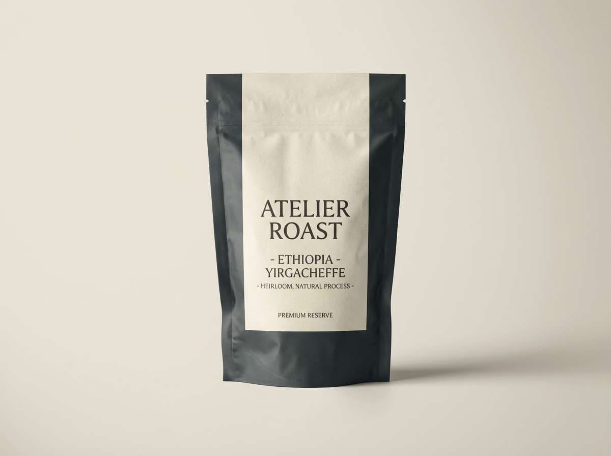
6) Walnut Sakura
HEX: #2f201b #5c3f36 #8f6a60 #f0b7c3 #fbe9ee
Mood: gentle, airy, springlike
Best for: botanical illustrations
Deep walnut anchored by sakura pink feels like branches against a pastel sky. It shines in floral prints, stationery borders, and soft watercolor scenes. Pair with plenty of pale blush wash and let the darker browns define stems and shadows. Tip: keep linework in the medium brown so it looks natural, not harsh.
Image example of walnut sakura generated using media.io
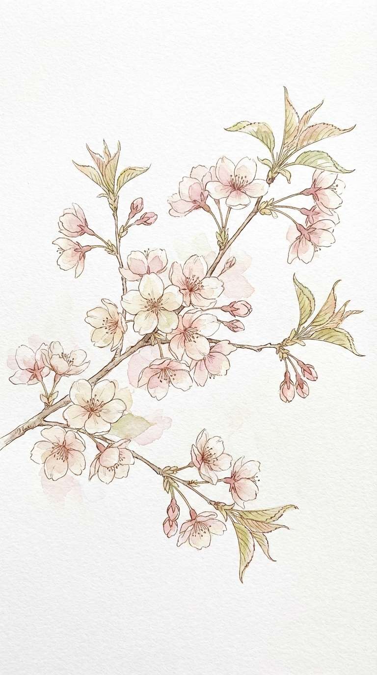
7) Clay Ballet
HEX: #5b463d #8a6a5d #c6a093 #e9c0c8 #f4f1ee
Mood: soft, minimal, poised
Best for: ceramic product ads
Soft clay neutrals with ballet pink suggest handmade pottery and quiet mornings. Use it for product ads, lookbooks, and lifestyle brand visuals that lean calm and tactile. Pair with simple shapes, lots of breathing room, and a warm gray for supporting text. Tip: make the pale neutral your background so the pink reads like a gentle highlight, not a block of color.
Image example of clay ballet generated using media.io
8) Espresso Cotton Candy
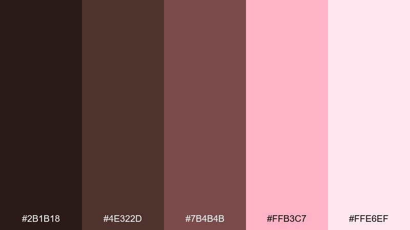
HEX: #2b1b18 #4e322d #7b4b4b #ffb3c7 #ffe6ef
Mood: playful, bold, high-contrast
Best for: album cover graphics
Inky espresso with cotton-candy pink feels like neon lights in a moody café. It works for album covers, podcast art, and bold promo graphics where contrast matters. Pair with crisp white type or a pale blush outline to keep text legible. Tip: use the bright pink sparingly as a focal pop, not as the main background.
Image example of espresso cotton candy generated using media.io

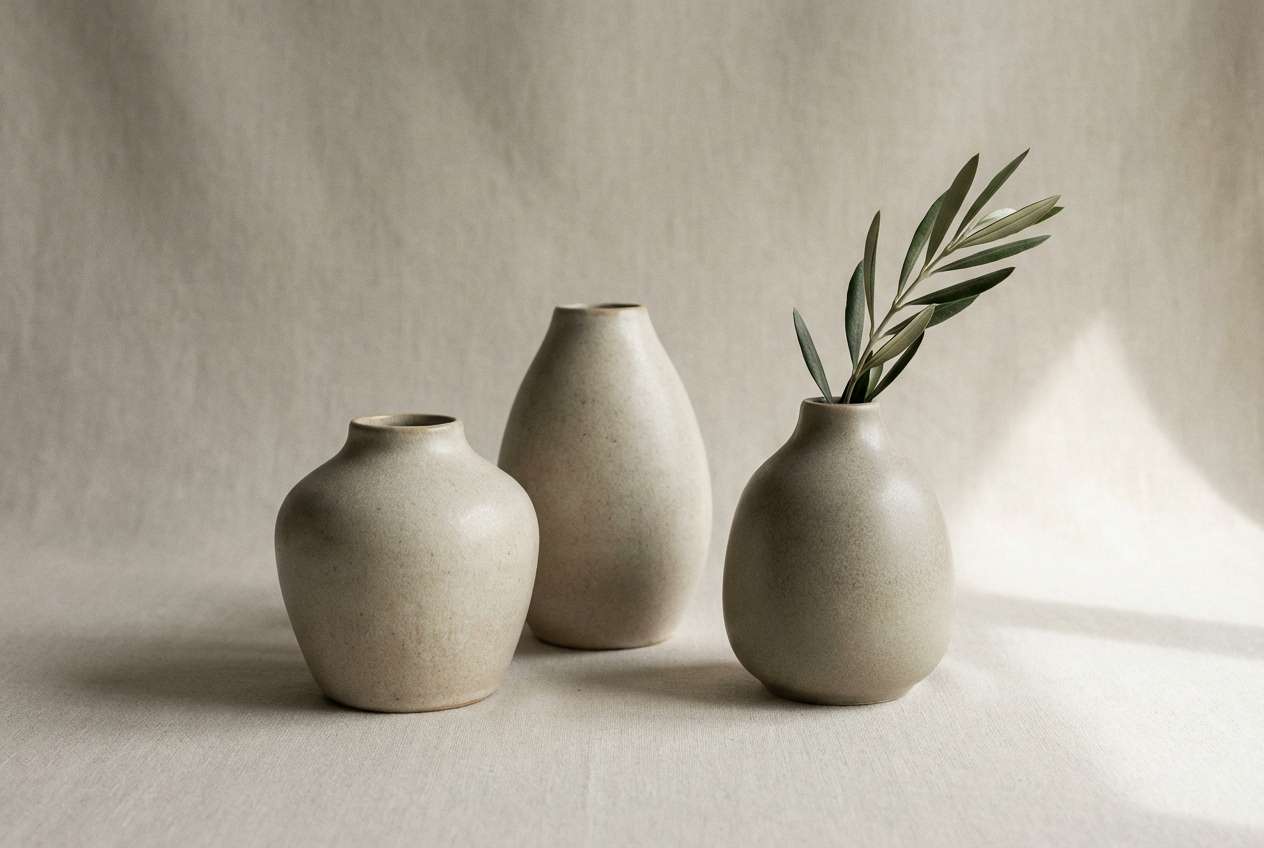
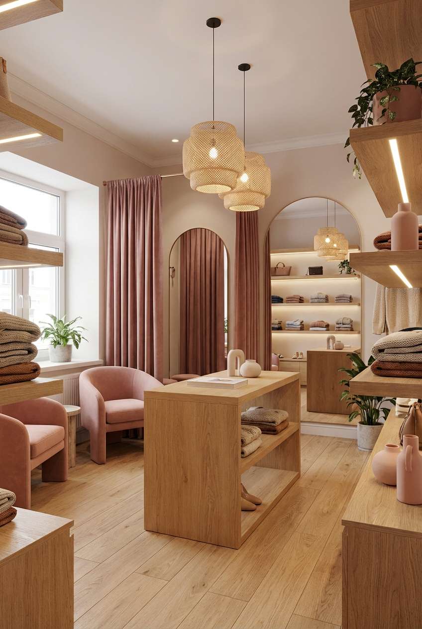
9) Chestnut Bloom
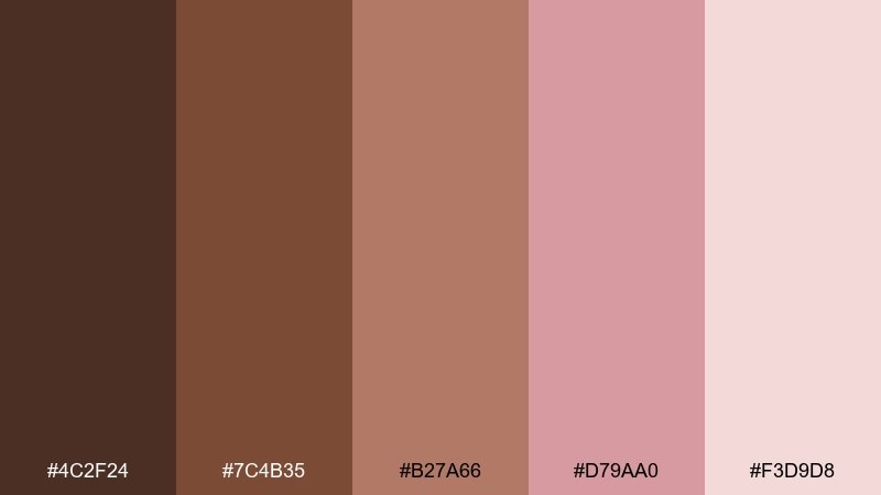
HEX: #4c2f24 #7c4b35 #b27a66 #d79aa0 #f3d9d8
Mood: warm, friendly, classic
Best for: boutique interiors
Chestnut warmth with blooming pink feels like fresh paint on a vintage dresser. Use it for interior mood boards, small retail spaces, and cozy waiting rooms. Pair with natural wood, linen textures, and brass hardware for a timeless finish. Tip: keep the mid tan for large surfaces and let the pink appear in accents like cushions or signage.
Image example of chestnut bloom generated using media.io
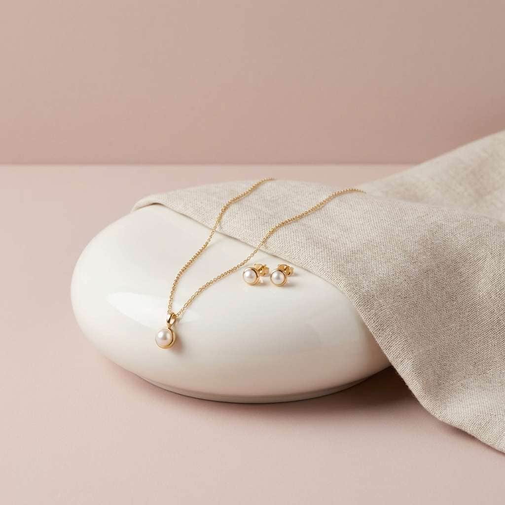
10) Bronze Rose Quartz
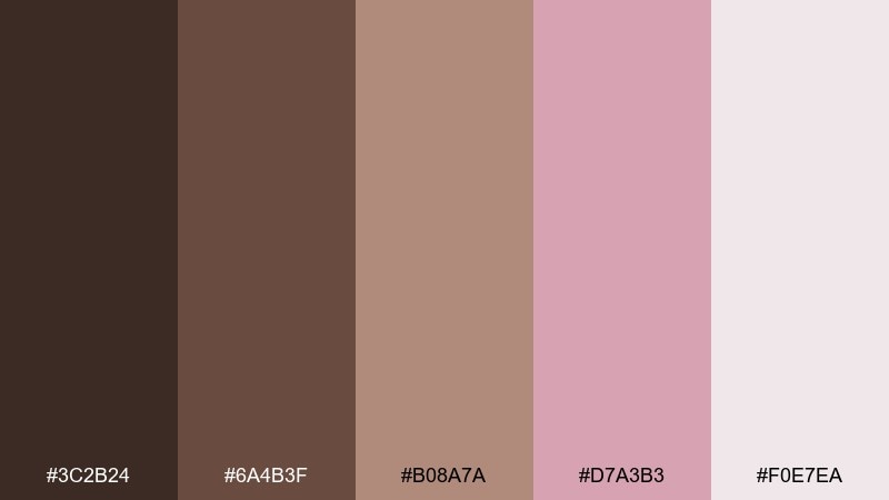
HEX: #3c2b24 #6a4b3f #b08a7a #d7a3b3 #f0e7ea
Mood: luxurious, polished, modern
Best for: jewelry product ads
Bronze browns and rose quartz pinks feel like polished metal against soft stone. This mix is ideal for jewelry ads, premium service brands, and gift collections. Pair with clean ivory space and thin line icons for a high-end vibe. Tip: keep shadows subtle and let the bronze tone carry the headline for instant luxury.
Image example of bronze rose quartz generated using media.io
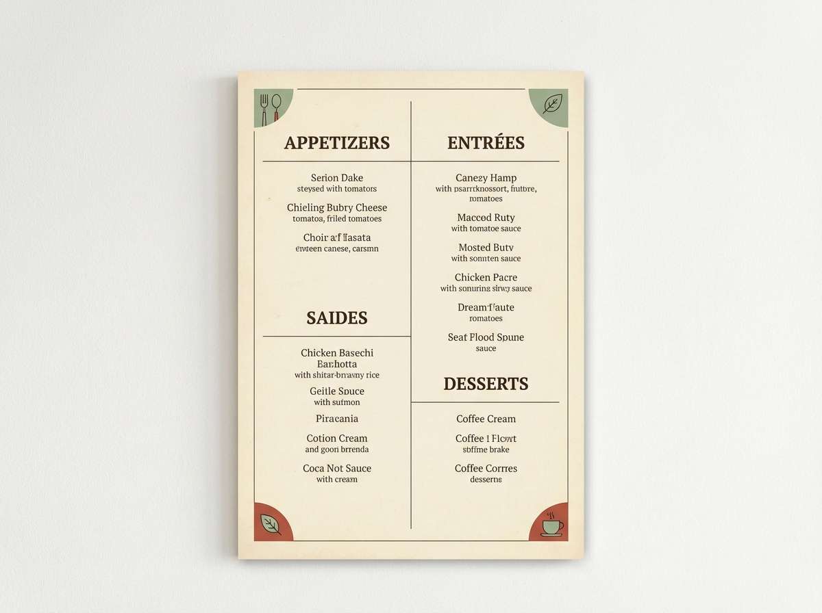
11) Vintage Sepia Pink
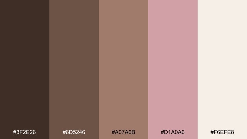
HEX: #3f2e26 #6d5246 #a07a6b #d1a0a6 #f6efe8
Mood: nostalgic, cozy, editorial
Best for: restaurant menus
Sepia browns with faded pink feel like an old photo tucked inside a cookbook. This brown pink color palette is a strong fit for café menus, table tents, and rustic food branding. Pair with cream paper tones and a serif font to lean into the vintage mood. Tip: print the background in the lightest shade and use the darkest brown only for headings and prices.
Image example of vintage sepia pink generated using media.io
12) Umber Camellia
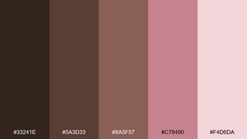
HEX: #33241e #5a3d33 #8a5f57 #c78490 #f4d6da
Mood: grounded, intimate, soft
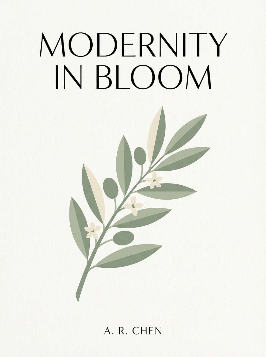
Best for: book covers
Grounded umber with camellia pink feels like a quiet romance novel on a wooden nightstand. Use it for book covers, poetry chapbooks, or journal designs where subtle emotion matters. Pair with light blush margins and a single dark spine color for readability on shelves. Tip: keep the title in the deepest shade and let the pink handle illustration elements.
Image example of umber camellia generated using media.io
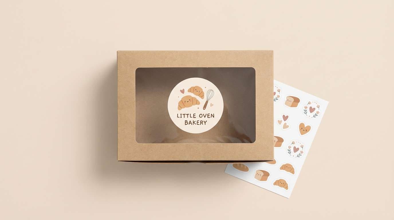
13) Cinnamon Berry Cream
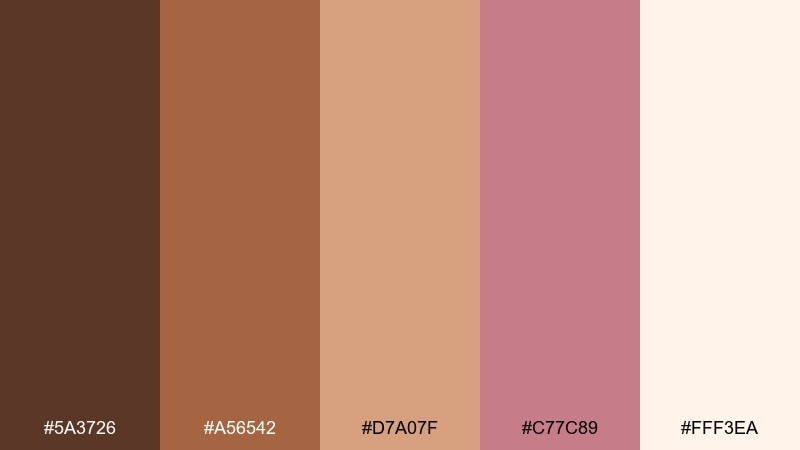
HEX: #5a3726 #a56542 #d7a07f #c77c89 #fff3ea
Mood: warm, tasty, upbeat
Best for: bakery branding
Cinnamon browns and berry pinks feel like frosted pastries and spiced jam. It suits bakery branding, pastry boxes, and seasonal promo cards with a handmade touch. Pair with cream backgrounds and playful illustrations to keep it light. Tip: use the tan shade for large panels and the berry tone for stamps, seals, or small highlights.
Image example of cinnamon berry cream generated using media.io
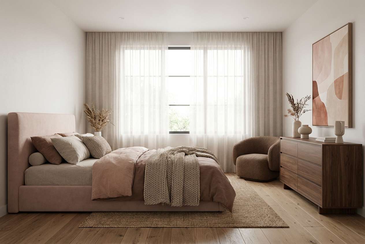
14) Mocha Orchid Mist
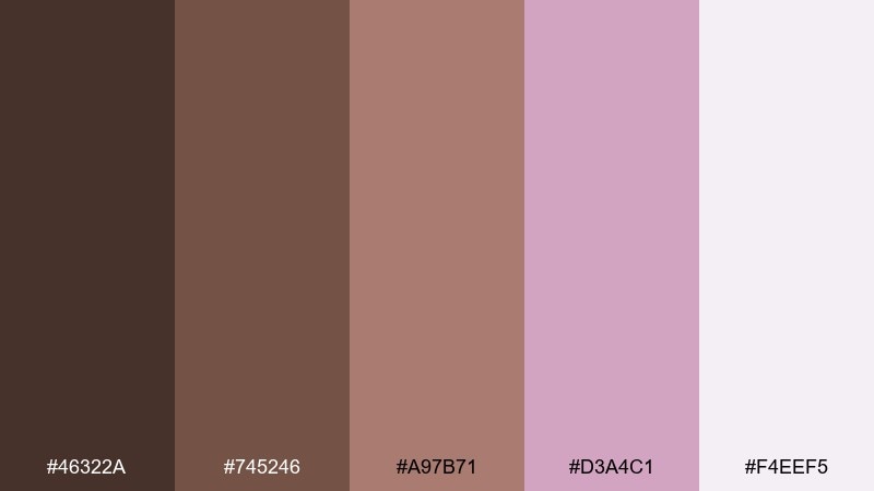
HEX: #46322a #745246 #a97b71 #d3a4c1 #f4eef5
Mood: dreamy, soft, contemporary
Best for: bedroom styling
Mocha grounding with orchid mist feels like linen sheets and a dusk-tinted sky. Use it for bedroom palettes, calming wellness visuals, and gentle lifestyle photography overlays. Pair with pale lilac-gray neutrals and warm wood to keep it serene. Tip: make the mist tone your wall or background color, then layer darker mocha in furniture for depth.
Image example of mocha orchid mist generated using media.io
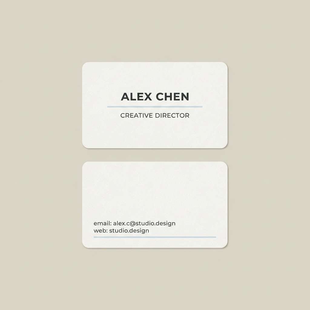
15) Copper Blush Minimal
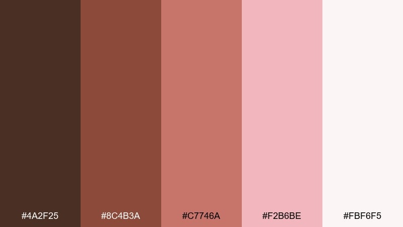
HEX: #4a2f25 #8c4b3a #c7746a #f2b6be #fbf6f5
Mood: clean, modern, confident
Best for: business cards
Copper warmth with a blush lift feels sleek, modern, and quietly confident. It is great for business cards, personal branding, and portfolio stationery where you want approachable professionalism. Pair with lots of white space and a geometric sans serif to keep it sharp. Tip: print the copper as the main text color and use blush only for small separators or icons.
Image example of copper blush minimal generated using media.io
16) Sienna Rose Garden
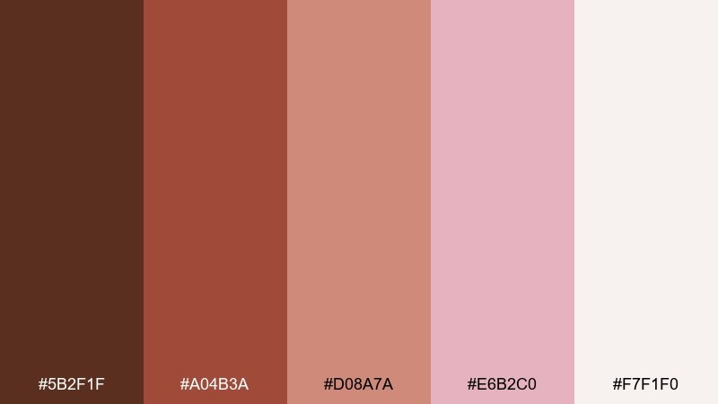
HEX: #5b2f1f #a04b3a #d08a7a #e6b2c0 #f7f1f0
Mood: earthy, romantic, lively
Best for: floral shop signage
Sienna and garden-rose pink feel like terracotta pots overflowing with blooms. Use it for floral shop signage, price tags, and seasonal campaign graphics. Pair with warm neutrals and a touch of leafy green if you want a natural counterpoint. Tip: keep the signage background light and use the deep sienna for the shop name so it reads from a distance.
Image example of sienna rose garden generated using media.io

17) Toffee Pink Picnic
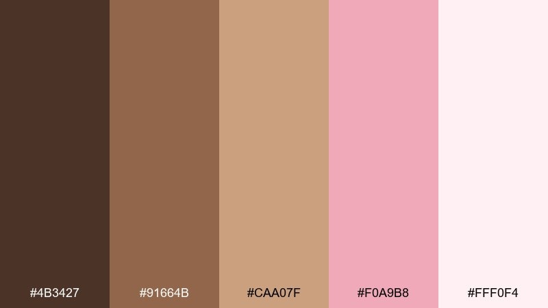
HEX: #4b3427 #91664b #caa07f #f0a9b8 #fff0f4
Mood: cheerful, casual, nostalgic
Best for: party invitations
Toffee browns with picnic pink feel like gingham blankets and strawberry lemonade. These brown pink color combinations fit birthday invites, brunch cards, and friendly community gatherings. Pair with simple illustrated motifs and rounded type to keep it lighthearted. Tip: use the creamy pink as the base and add toffee as borders so the layout stays airy.
Image example of toffee pink picnic generated using media.io

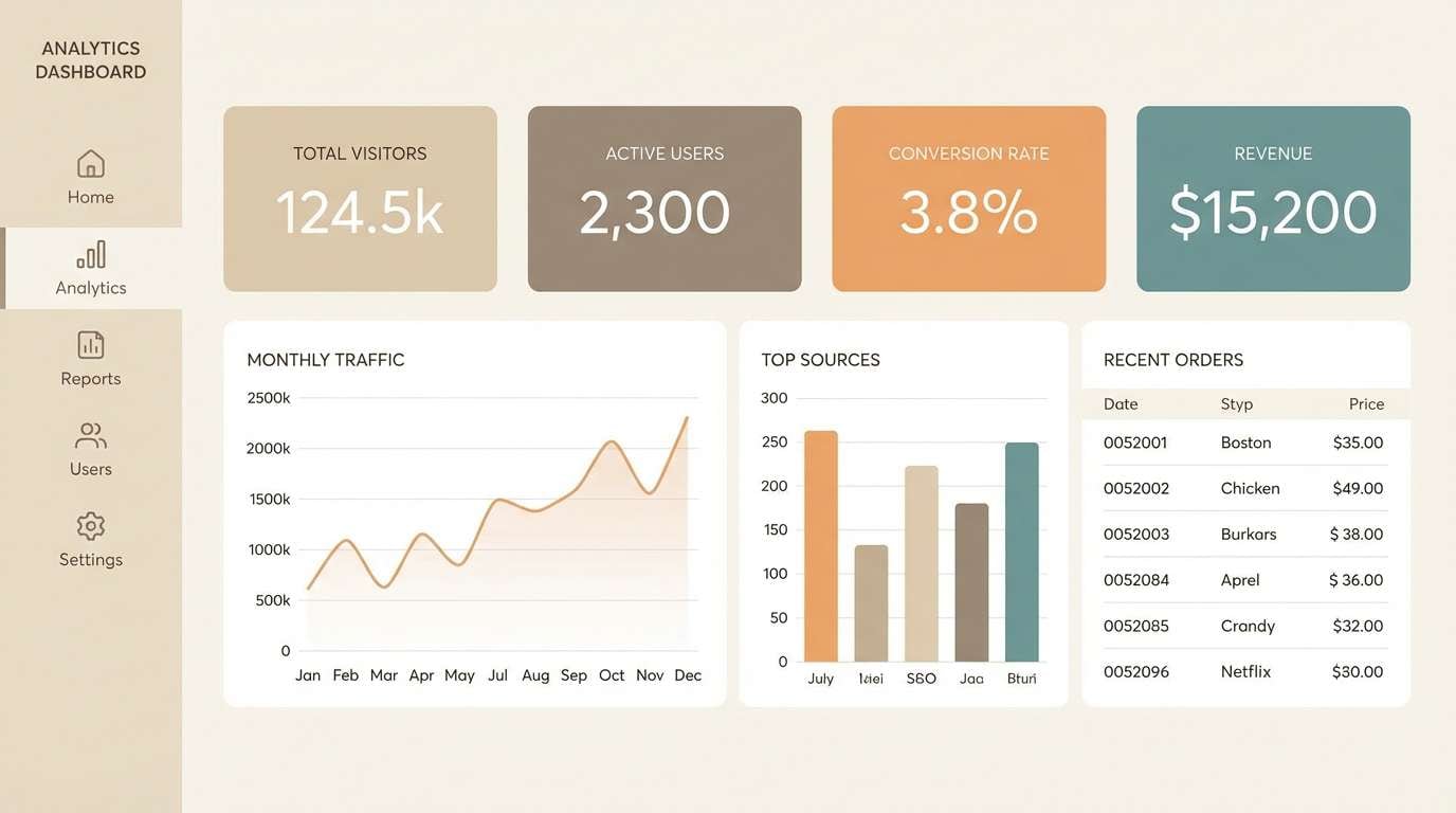
18) Cocoa Blush UI
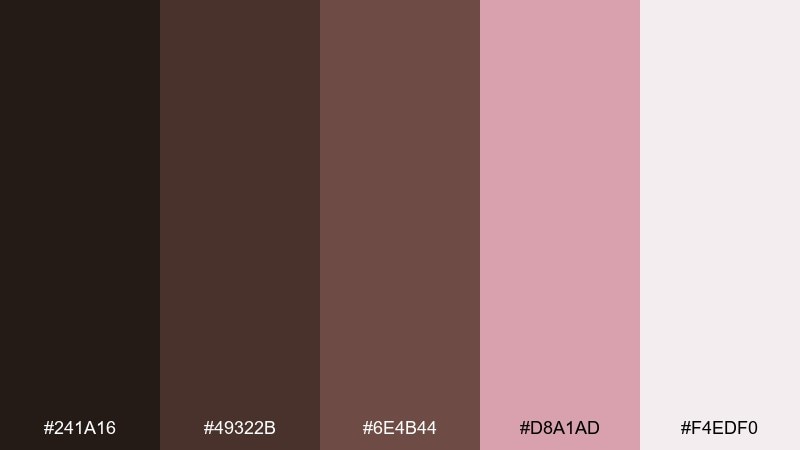
HEX: #241a16 #49322b #6e4b44 #d8a1ad #f4edf0
Mood: modern, grounded, accessible
Best for: dashboard UI
Grounded cocoa tones with blush accents feel modern and calm, without the coldness of pure gray. Use it for dashboards, fintech widgets, or wellness apps that need warmth and trust. Pair with clear iconography and generous spacing so the darker browns do not crowd the interface. Tip: keep blush for active states and highlights, while the mid brown handles secondary text.
Image example of cocoa blush ui generated using media.io
19) Blush Brown Editorial
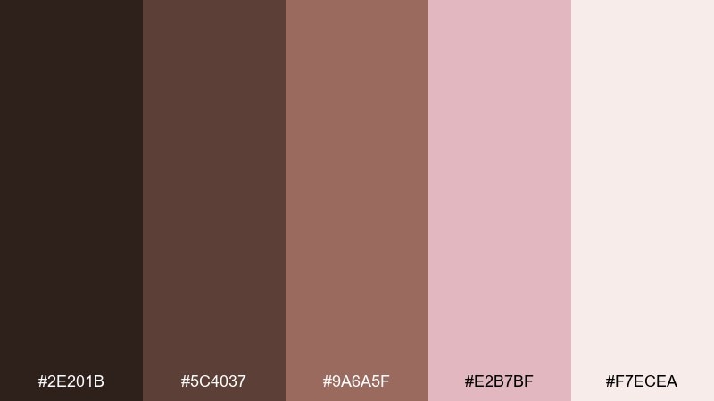
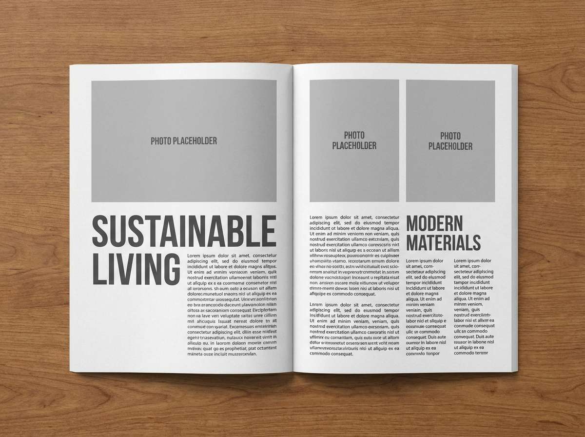
HEX: #2e201b #5c4037 #9a6a5f #e2b7bf #f7ecea
Mood: stylish, mature, magazine-like
Best for: magazine layouts
Dark brown and blush tones feel like a fashion editorial printed on warm paper stock. Use it for magazine spreads, brand books, or lookbooks where photography needs a soft frame. Pair with strong black type for headlines and keep blush as background blocks behind pull quotes. Tip: limit heavy browns to small bars and footers so the page stays light.
Image example of blush brown editorial generated using media.io
20) Rustic Rosewood Night
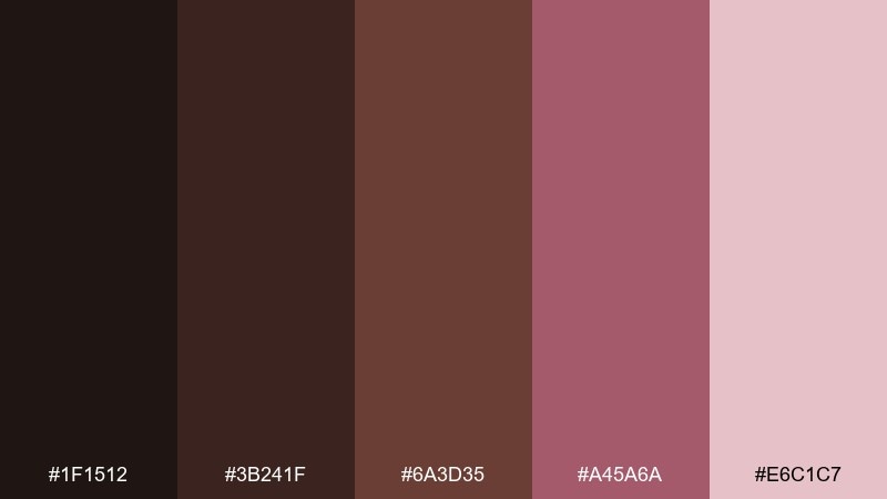
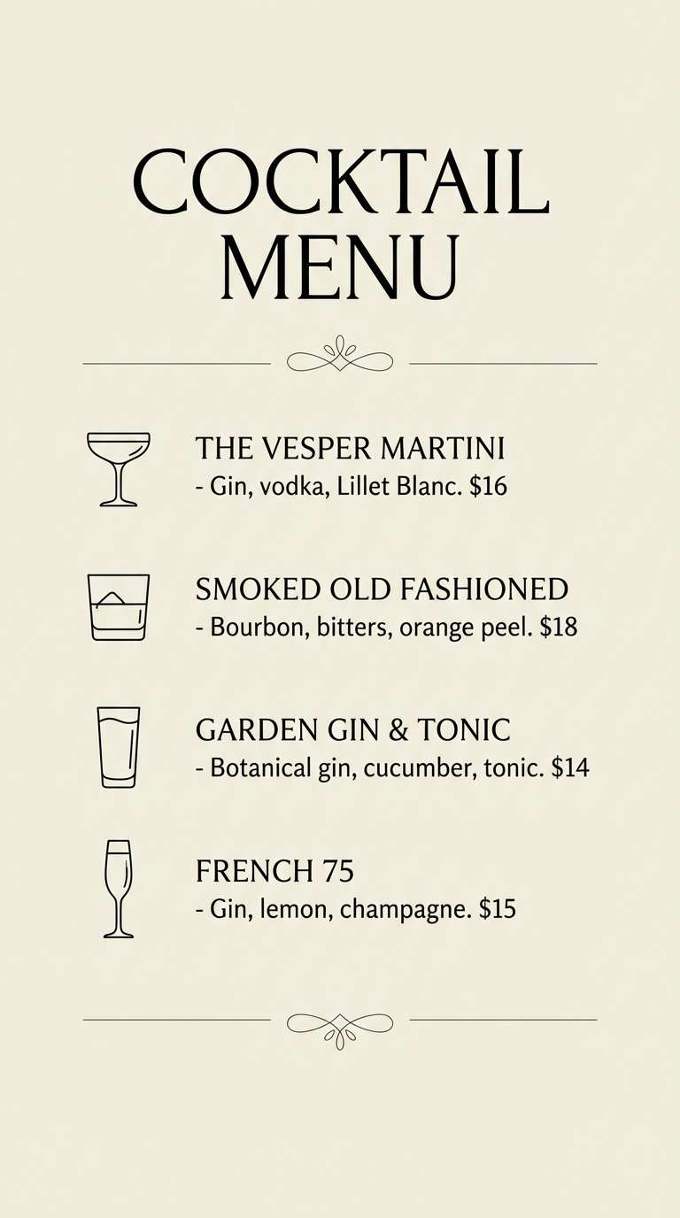
HEX: #1f1512 #3b241f #6a3d35 #a45a6a #e6c1c7
Mood: moody, intimate, dramatic
Best for: cocktail menu stories
Rosewood night shades with muted pink feel like candlelight, velvet booths, and late-hour jazz. It is perfect for cocktail menus, nighttime event promos, and story-style social posts. Pair with thin line dividers and a warm off-white for text to keep it readable. Tip: use the deepest tone as a full background and reserve pink for icons or drink highlights.
Image example of rustic rosewood night generated using media.io
What Colors Go Well with Brown Pink?
For clean contrast, pair brown pink with warm whites (ivory, cream) and near-blacks (charcoal, espresso). These support readability and keep the palette feeling premium instead of overly pastel.
If you want more depth, add metallics like champagne, copper, or brushed gold; they echo brown’s warmth and elevate pink accents for packaging, invites, and hero banners.
For a natural counterpoint, a restrained green (sage, olive, eucalyptus) works beautifully with rosy browns, especially in floral, wellness, and interior styling.
How to Use a Brown Pink Color Palette in Real Designs
Start with role assignment: use the lightest blush/cream as background, mid browns for surfaces and UI containers, and the deepest brown for headlines or key labels. This keeps layouts breathable.
Use pink as an accent color for states and highlights—buttons, badges, price tags, or callouts—so it stays intentional and doesn’t wash out important content.
In print, choose paper textures that match the warmth (cream stock, kraft, linen) and test small text in the darkest shade to ensure crisp readability.
Create Brown Pink Palette Visuals with AI
Want to see these brown pink color schemes on real mockups like packaging, posters, or UI screens? Generate consistent visuals by describing the subject, lighting, and style, then applying your chosen HEX colors.
With Media.io’s text-to-image, you can quickly iterate on prompts (minimal, editorial, realistic studio, flat graphic) until the palette feels exactly right for your project.
Brown Pink Color Palette FAQs
-
What does a brown pink color palette communicate?
It usually signals warmth, comfort, and approachability with a refined, romantic edge. Brown adds stability and trust, while pink softens the overall tone. -
Is brown and pink a good combination for branding?
Yes—especially for beauty, lifestyle, food, and boutique brands. Use deep browns for typography and structure, and keep pink for accents to maintain a premium look. -
How do I keep brown pink designs from looking too “sweet”?
Increase contrast and neutrals: add warm white space, use a near-black for key text, and choose dusty or muted pinks instead of saturated bubblegum tones. -
What neutral colors pair best with rose brown HEX tones?
Ivory, cream, warm gray, and soft greige work best because they preserve warmth. Charcoal can be added for stronger hierarchy and legibility. -
Can I use a brown pink palette in UI design?
Absolutely. Keep the lightest shade for backgrounds, mid browns for components, and reserve blush/pink for active states, highlights, or success/notification accents. -
What accent colors work with blush and cocoa colors?
Metallics like copper or champagne, and muted greens like sage or olive, complement the warmth. Use them sparingly as icons, lines, or small decorative elements. -
How can I preview a brown pink color scheme before designing?
Generate mockups with AI using prompts for the exact format you need (packaging, poster, room, UI). This helps validate contrast, mood, and readability fast.
Next: Black Gold Color Palette


