Mustard yellow is warm, earthy, and instantly characterful—bright enough to draw attention, but muted enough to feel grown-up. It’s a go-to for brands and spaces that want comfort, heritage, or a modern retro edge.
Below are 20+ mustard yellow color palette ideas with HEX codes, plus quick pairing tips and AI prompt examples you can reuse for mockups, posters, packaging, and UI.
In this article
- Why Mustard Yellow Palettes Work So Well
-
- golden harvest
- retro diner pop
- olive and mustard minimal
- sunbaked adobe
- midnight mustard
- coastal mustard mist
- botanical brass
- academic library
- artisan bakery
- desert roadtrip
- scandinavian cozy
- urban streetwear
- wedding ochre romance
- kids storybook
- modern ui amber
- premium packaging gold
- autumn orchard
- industrial workshop
- soft neutral loft
- night market neon
- ceramic studio
- citrus and cocoa
- What Colors Go Well with Mustard Yellow?
- How to Use a Mustard Yellow Color Palette in Real Designs
- Create Mustard Yellow Palette Visuals with AI
Why Mustard Yellow Palettes Work So Well
Mustard yellow sits in a “golden” zone: it feels sunny, but the earthy undertone keeps it from looking neon or childish. That balance makes it flexible across styles—from rustic packaging to sleek digital interfaces.
It also plays well with both warm and cool partners. Pair it with deep browns and creams for comfort and heritage, or contrast it with navy, teal, or electric blue for modern punch and readability.
Most importantly, mustard is an excellent accent color. Used for highlights, badges, buttons, and headings, it guides attention without overwhelming the layout.
20+ Mustard Yellow Color Palette Ideas (with HEX Codes)
1) Golden Harvest
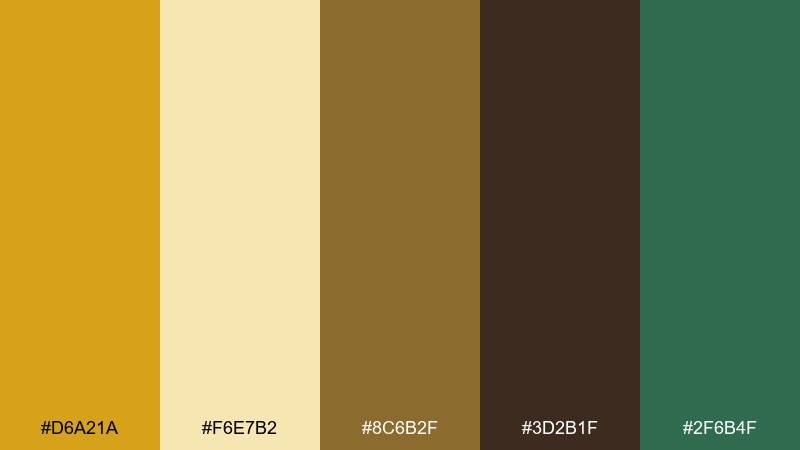
HEX: #D6A21A #F6E7B2 #8C6B2F #3D2B1F #2F6B4F
Mood: warm, rustic, grounded
Best for: kitchen decor and farmhouse branding
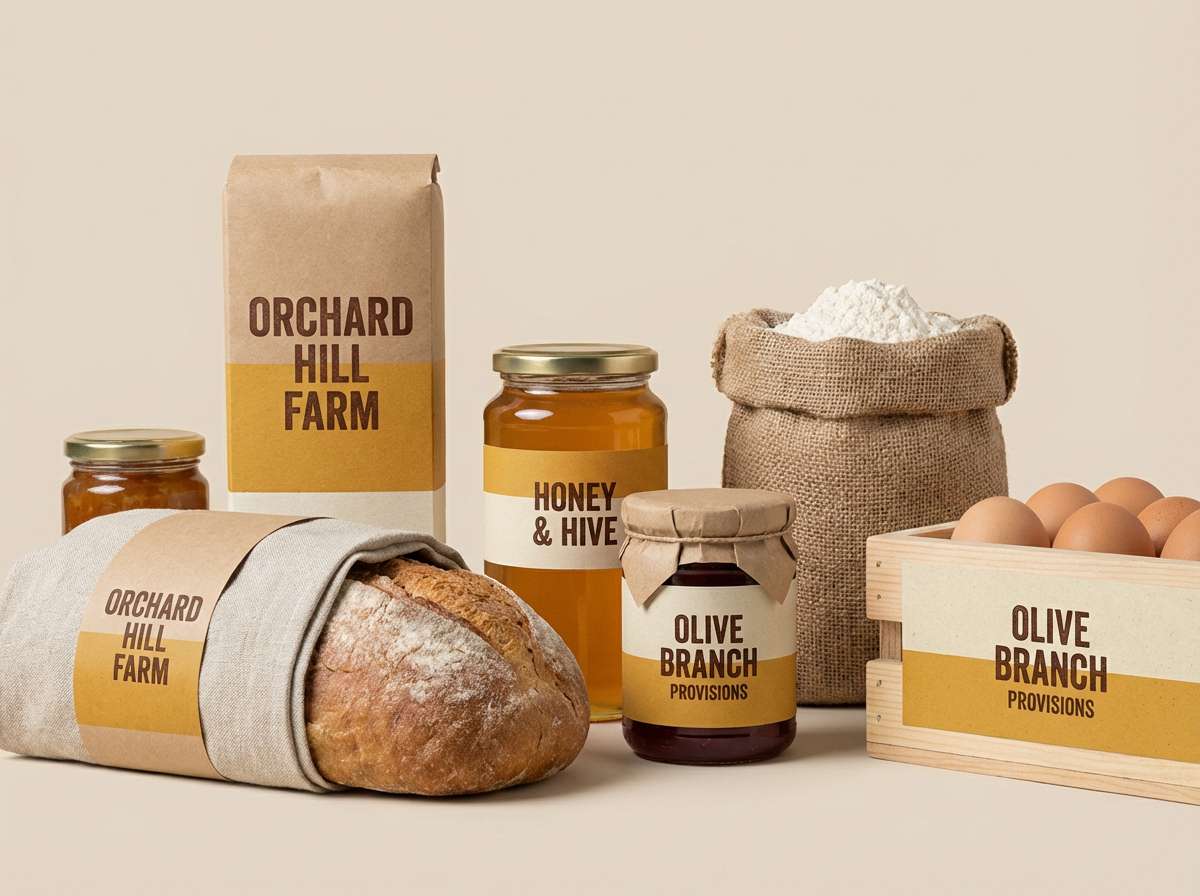
Warm and rustic like late-afternoon fields and wooden cutting boards, this mix feels comforting and honest. It works beautifully on food packaging, cafe menus, and cozy kitchen accents. Pair the mustard with deep brown for type and structure, then use the soft cream to keep layouts airy. Usage tip: reserve the green as a small accent for freshness, like labels or icons.
Image example of golden harvest generated using media.io
Media.io is an online AI studio for creating and editing video, image, and audio in your browser.

2) Retro Diner Pop
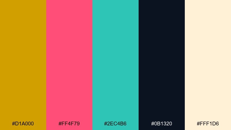
HEX: #D1A000 #FF4F79 #2EC4B6 #0B1320 #FFF1D6
Mood: playful, punchy, nostalgic
Best for: posters and social ads for events
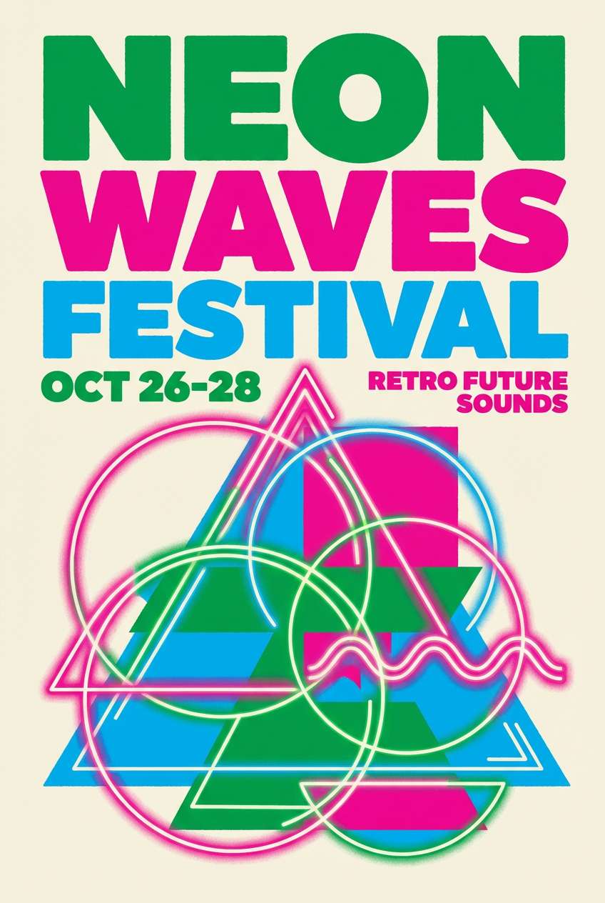
Playful and punchy like neon signs and vinyl booths, the tones feel energetic without getting chaotic. Use it for bold posters, event promos, and playful brand moments where contrast matters. The near-black anchors headlines while the cream keeps spacing clean and readable. Usage tip: limit the pink to one call-to-action element so the mustard stays the hero.
Image example of retro diner pop generated using media.io
3) Olive and Mustard Minimal
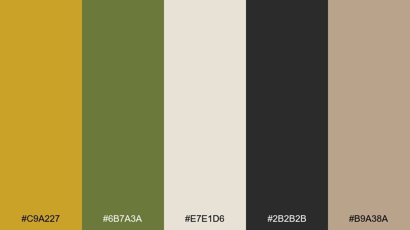
HEX: #C9A227 #6B7A3A #E7E1D6 #2B2B2B #B9A38A
Mood: calm, modern, earthy
Best for: branding systems and stationery
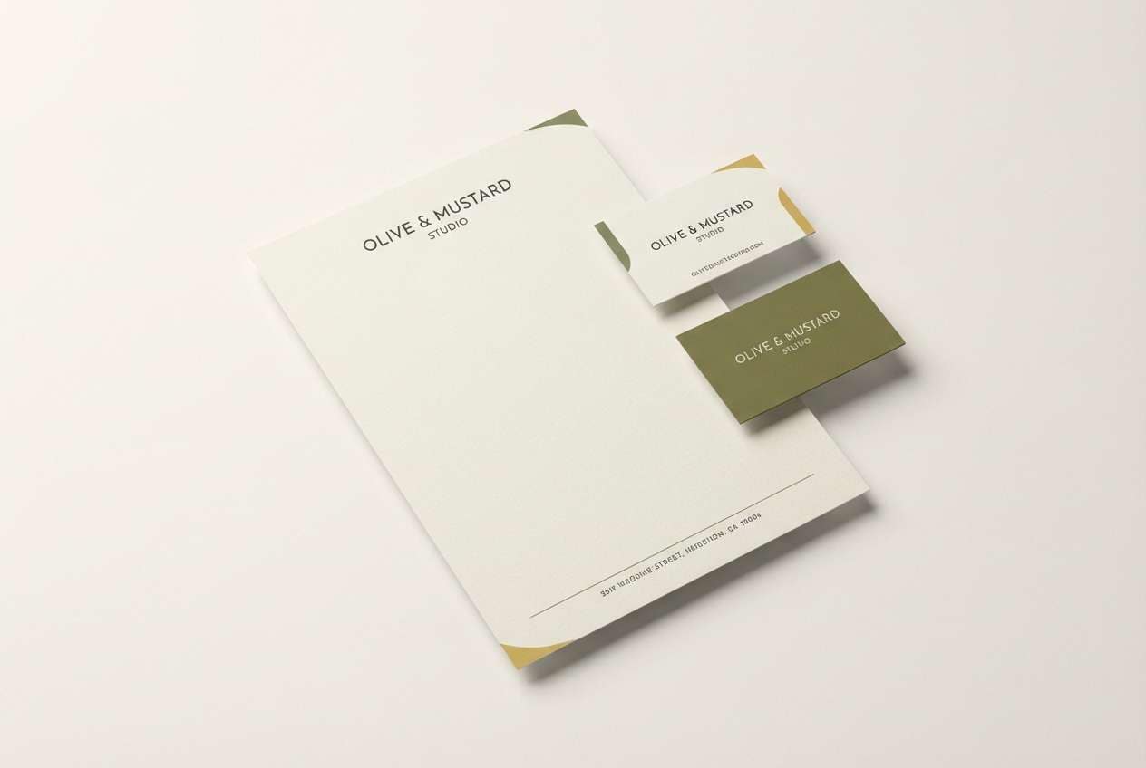
Calm and modern like a linen notebook beside olive branches, this palette feels composed and premium. It suits minimalist branding, stationery, and packaging where texture and whitespace do the heavy lifting. The charcoal is ideal for body text, while the beige helps soften large color blocks. Usage tip: print the mustard as a spot color for a richer, ink-like finish.
Image example of olive and mustard minimal generated using media.io
4) Sunbaked Adobe
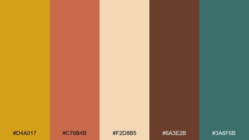
HEX: #D4A017 #C76B4B #F2D8B5 #6A3E2B #3A6F6B
Mood: sunlit, desert, artisanal
Best for: interior paint pairings and lifestyle brands
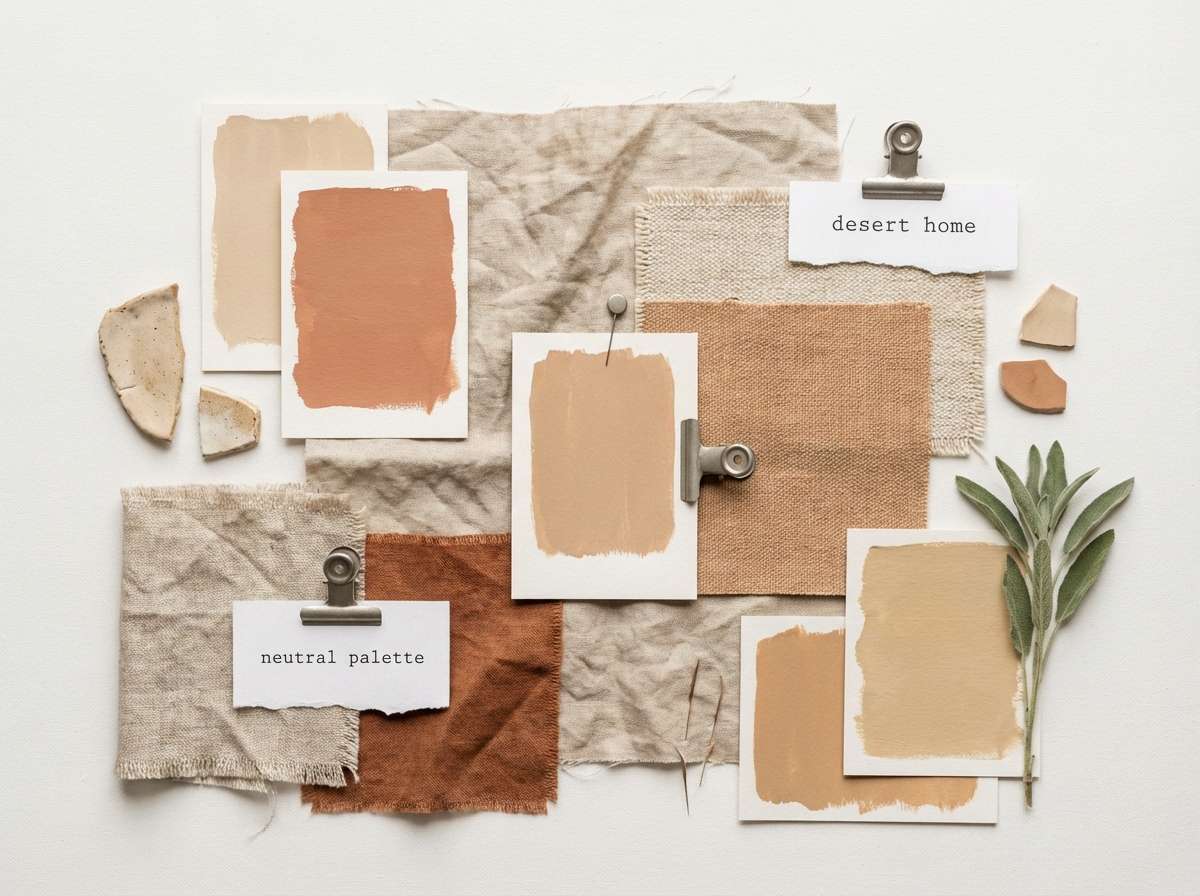
Sunlit and artisanal like adobe walls and woven textiles, the colors feel hand-made and inviting. Use it for warm interiors, wellness brands, and editorial spreads that need a grounded vibe. The terracotta and deep brown create natural contrast for headings and frames. Usage tip: keep teal as a small counterpoint in patterns or ceramics to prevent the warm tones from blending together.
Image example of sunbaked adobe generated using media.io
5) Midnight Mustard
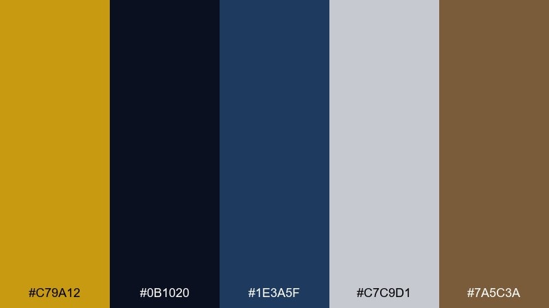
HEX: #C79A12 #0B1020 #1E3A5F #C7C9D1 #7A5C3A
Mood: moody, cinematic, confident
Best for: tech branding and landing pages
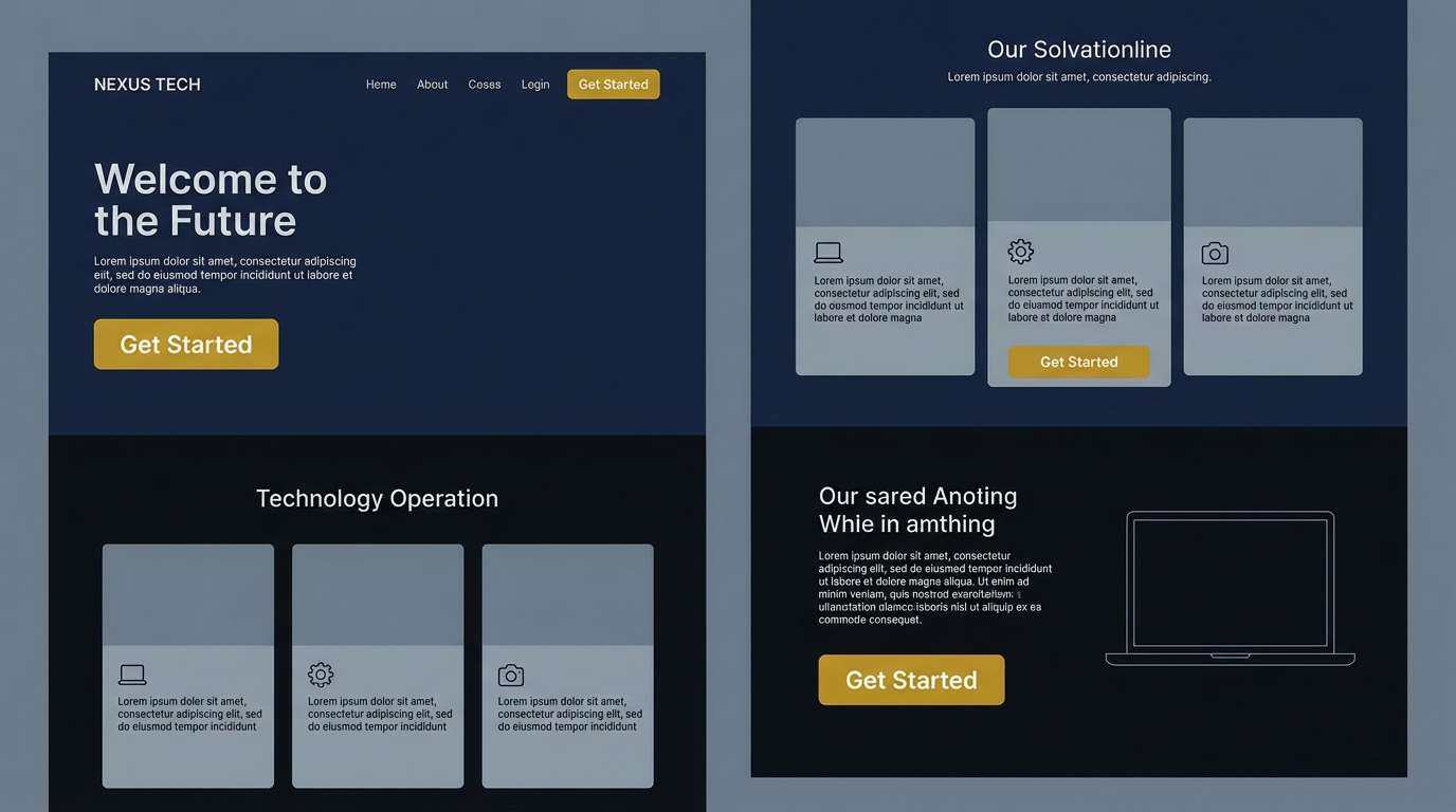
Moody and cinematic like streetlights against a night sky, this set feels confident and sharp. It is a strong mustard yellow color combination for tech, fintech, and product launches where you want warmth without losing authority. Use the navy and near-black for backgrounds, then let mustard highlight key stats and buttons. Usage tip: soften dense sections with the cool gray to keep contrast accessible.
Image example of midnight mustard generated using media.io
6) Coastal Mustard Mist
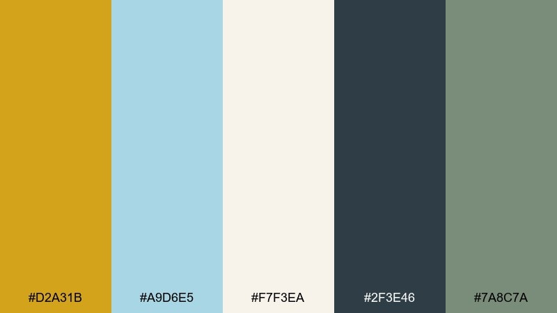
HEX: #D2A31B #A9D6E5 #F7F3EA #2F3E46 #7A8C7A
Mood: fresh, breezy, relaxed
Best for: travel content and lifestyle blogs
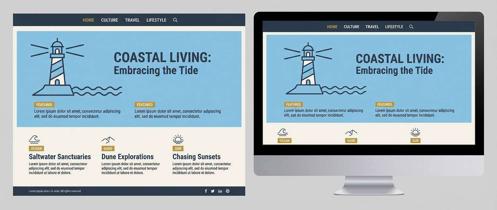
Fresh and breezy like a seaside morning with sun through haze, the colors feel easy and modern. Use it for travel content, blog themes, and airy lifestyle branding where calm readability matters. The dark slate supports navigation and captions, while the off-white keeps pages bright. Usage tip: apply the blue in large soft areas and save the mustard for highlights and badges.
Image example of coastal mustard mist generated using media.io
7) Botanical Brass
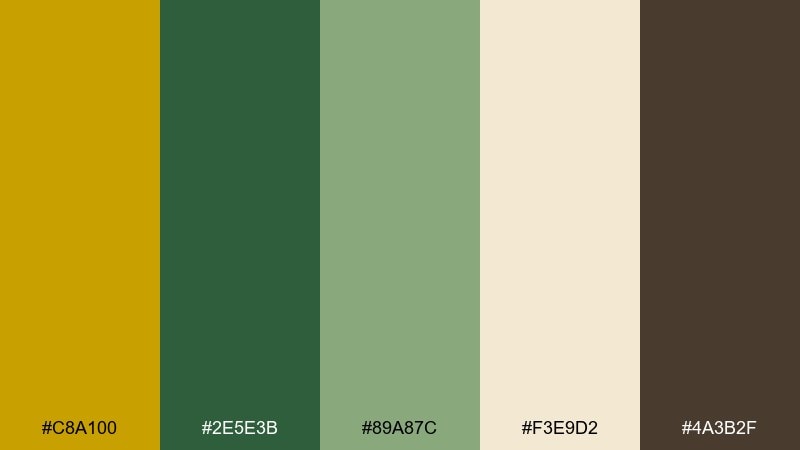
HEX: #C8A100 #2E5E3B #89A87C #F3E9D2 #4A3B2F
Mood: organic, calm, heritage
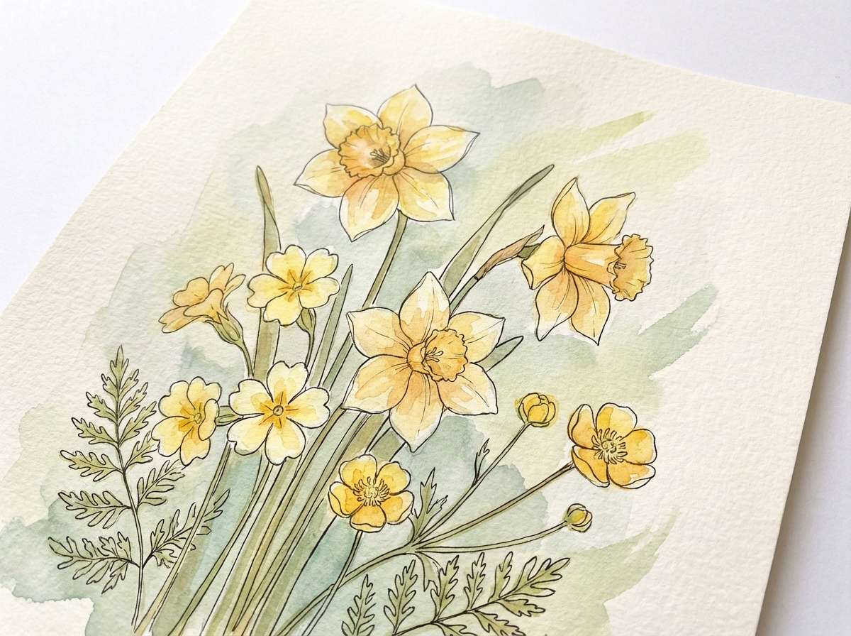
Best for: botanical illustrations and natural products
Organic and calm like pressed leaves and antique brass tools, this palette leans natural and timeless. It works well for botanical prints, skincare packaging, and eco-focused branding. Let the cream and soft green carry backgrounds, then use the deep brown for labels and borders. Usage tip: add mustard as a small metallic-like highlight on stamps, seals, or icon details.
Image example of botanical brass generated using media.io
8) Academic Library
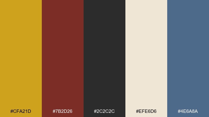
HEX: #CFA21D #7B2D26 #2C2C2C #EFE6D6 #4E6A8A
Mood: studious, classic, refined
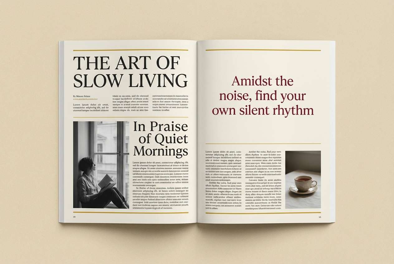
Best for: editorial layouts and book covers
Studious and classic like leather spines and quiet reading rooms, these tones feel refined. Use them for editorial design, book covers, and heritage-inspired branding where clarity and gravitas matter. The wine red adds depth without overpowering the mustard. Usage tip: set long text in charcoal on the warm cream to keep pages inviting and legible.
Image example of academic library generated using media.io
9) Artisan Bakery
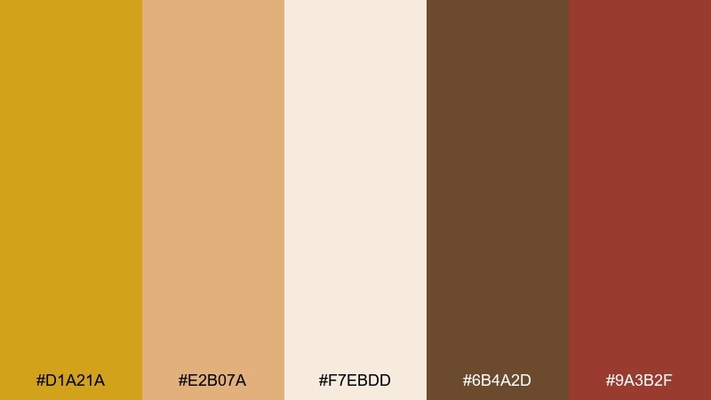
HEX: #D1A21A #E2B07A #F7EBDD #6B4A2D #9A3B2F
Mood: cozy, handmade, inviting
Best for: bakery packaging and menu design
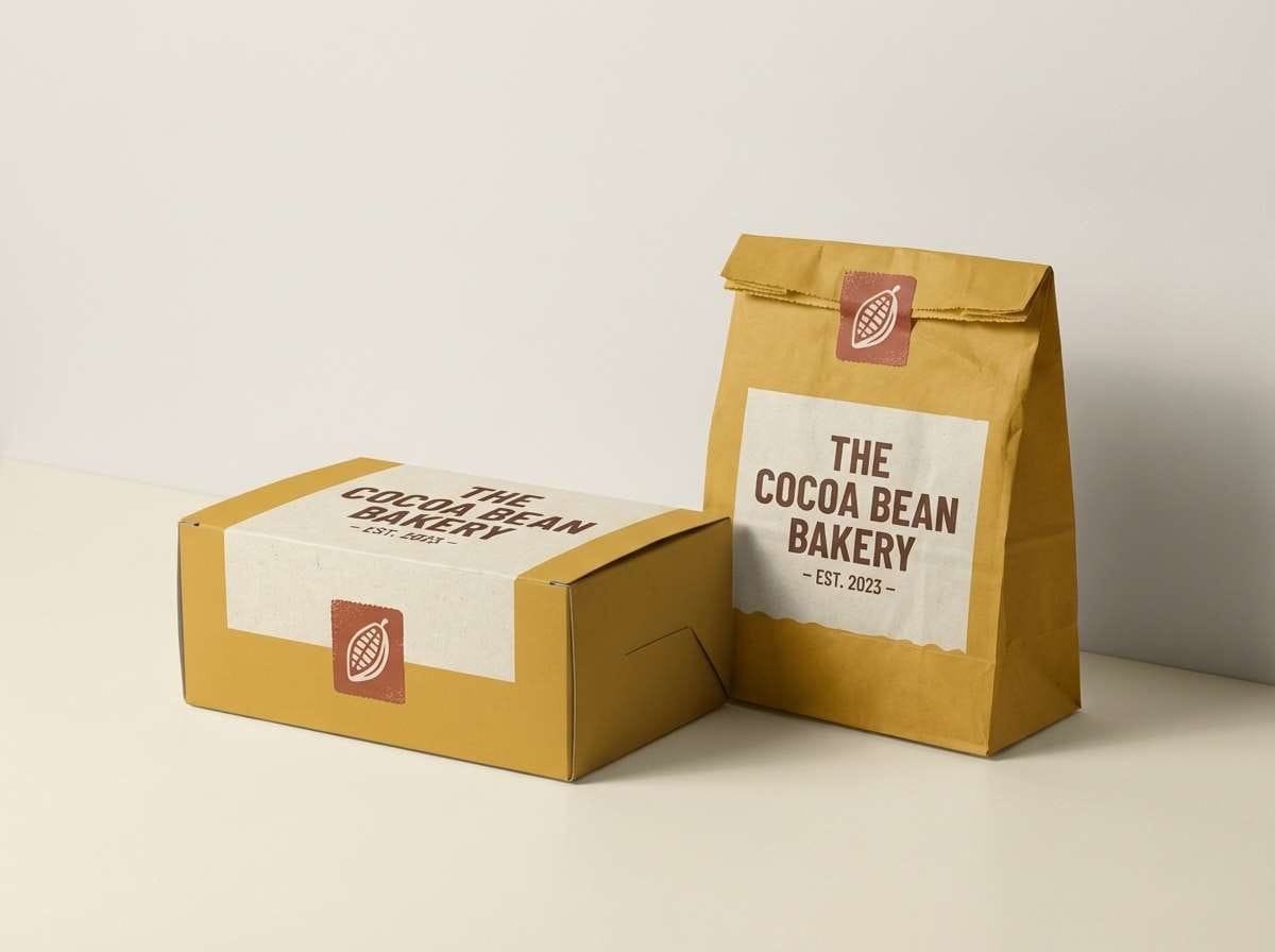
Cozy and handmade like warm crusts and paper bags, the palette feels welcoming and tactile. It is a friendly mustard yellow color palette for bakery boxes, menus, and loyalty cards. Use the cocoa brown for type and outlines, then bring in the clay red for stamps or specials. Usage tip: keep backgrounds mostly cream so food photography stays the focus.
Image example of artisan bakery generated using media.io
10) Desert Roadtrip
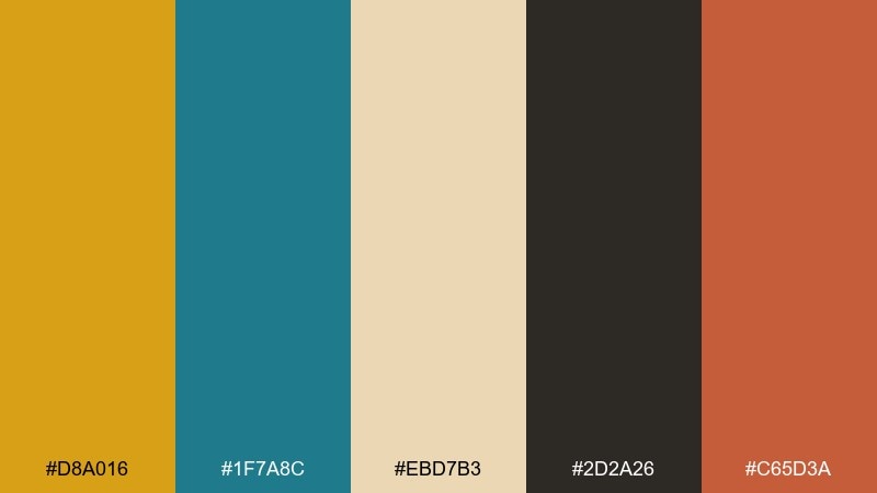
HEX: #D8A016 #1F7A8C #EBD7B3 #2D2A26 #C65D3A
Mood: adventurous, sun-warmed, bold
Best for: travel posters and outdoor brands
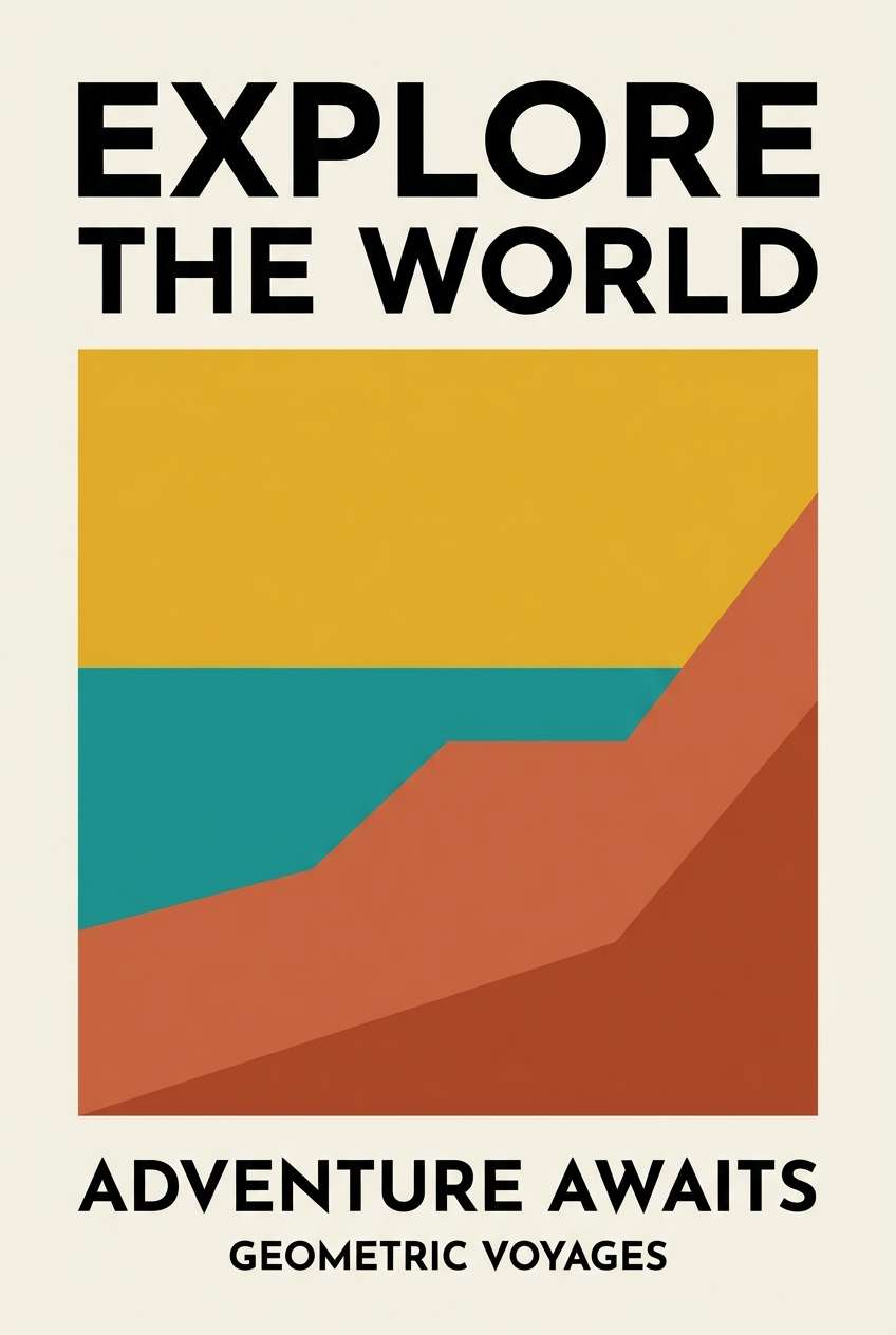
Adventurous and sun-warmed like long highways and roadside signs, the contrast feels bold and clear. Use it for travel posters, outdoor brands, and campaign graphics that need instant readability. The teal brings cool relief against the mustard and terracotta. Usage tip: build big color shapes first, then add black for crisp outlines and small text.
Image example of desert roadtrip generated using media.io
11) Scandinavian Cozy
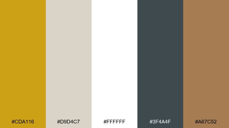
HEX: #CDA116 #D9D4C7 #FFFFFF #3F4A4F #A67C52
Mood: soft, cozy, minimalist
Best for: home goods and interior styling
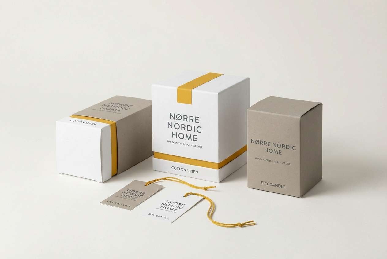
Soft and cozy like knit throws and winter light, the tones feel minimal but not cold. They suit home goods branding, interior styling, and calm ecommerce templates. Use white and light greige for clean space, then bring mustard in as a warm focal point. Usage tip: keep contrast high for text by relying on the slate gray instead of brown for small copy.
Image example of scandinavian cozy generated using media.io
12) Urban Streetwear
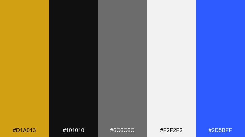
HEX: #D1A013 #101010 #6C6C6C #F2F2F2 #2D5BFF
Mood: edgy, high-contrast, modern
Best for: streetwear lookbooks and merch
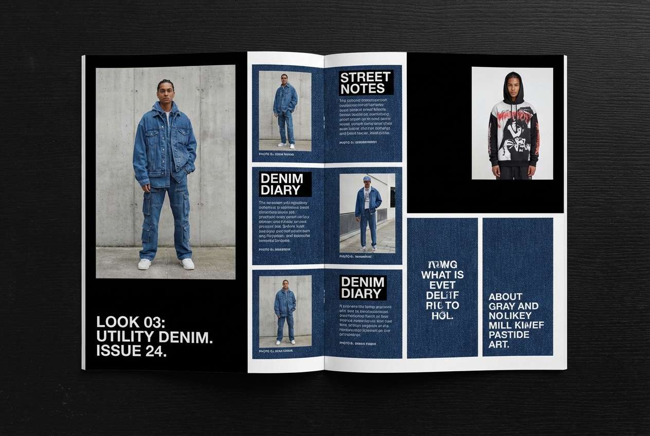
Edgy and high-contrast like fresh ink on concrete, this mix feels modern and fast. It works for streetwear lookbooks, merch graphics, and bold social tiles. The electric blue is best used sparingly as a signal color alongside mustard. Usage tip: set large type in black on light gray, then add mustard as underlines, tags, or small blocks.
Image example of urban streetwear generated using media.io
13) Wedding Ochre Romance
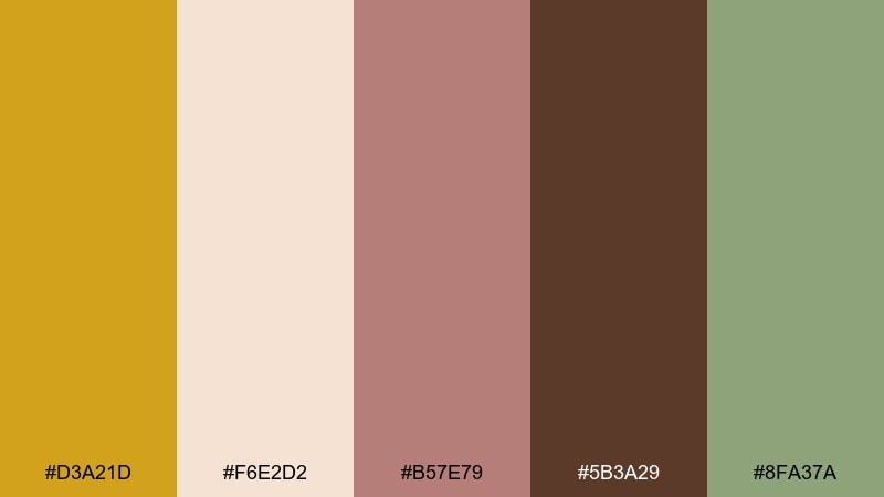
HEX: #D3A21D #F6E2D2 #B57E79 #5B3A29 #8FA37A
Mood: romantic, soft, elegant
Best for: wedding invitations and floral themes
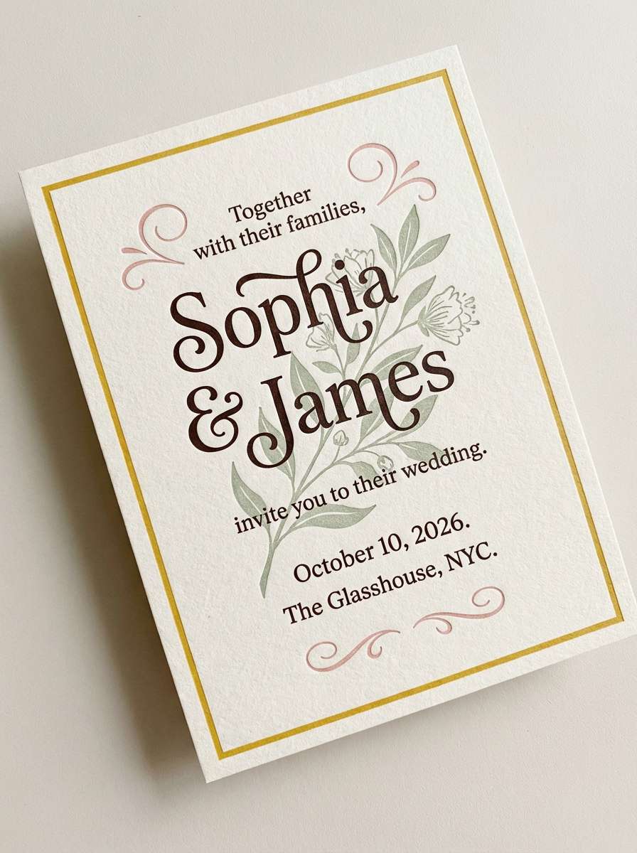
Romantic and soft like dried florals and candlelight, these hues feel elegant and intimate. They are lovely for invitations, seating charts, and wedding websites that need warmth without glare. Pair the blush and cream as the base, then bring in the rich brown for names and dates. Usage tip: use mustard as a thin border or monogram detail so it reads refined rather than loud.
Image example of wedding ochre romance generated using media.io
14) Kids Storybook
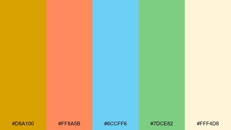
HEX: #D8A100 #FF8A5B #6CCFF6 #7DCE82 #FFF4D8
Mood: bright, friendly, imaginative
Best for: children book covers and learning apps
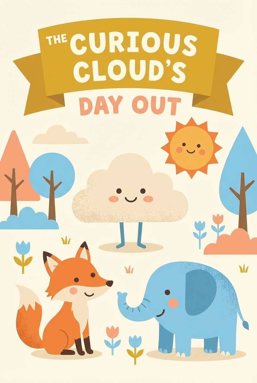
Bright and friendly like crayons on warm paper, the palette feels imaginative and safe. Use it for kids book covers, learning app illustrations, and cheerful classroom materials. The cream base helps the colorful accents stay readable and not over-stimulating. Usage tip: keep mustard for titles and key icons, then rotate the other colors for character highlights.
Image example of kids storybook generated using media.io
15) Modern UI Amber
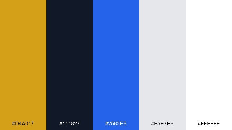
HEX: #D4A017 #111827 #2563EB #E5E7EB #FFFFFF
Mood: clean, modern, product-focused
Best for: dashboard UI and SaaS design
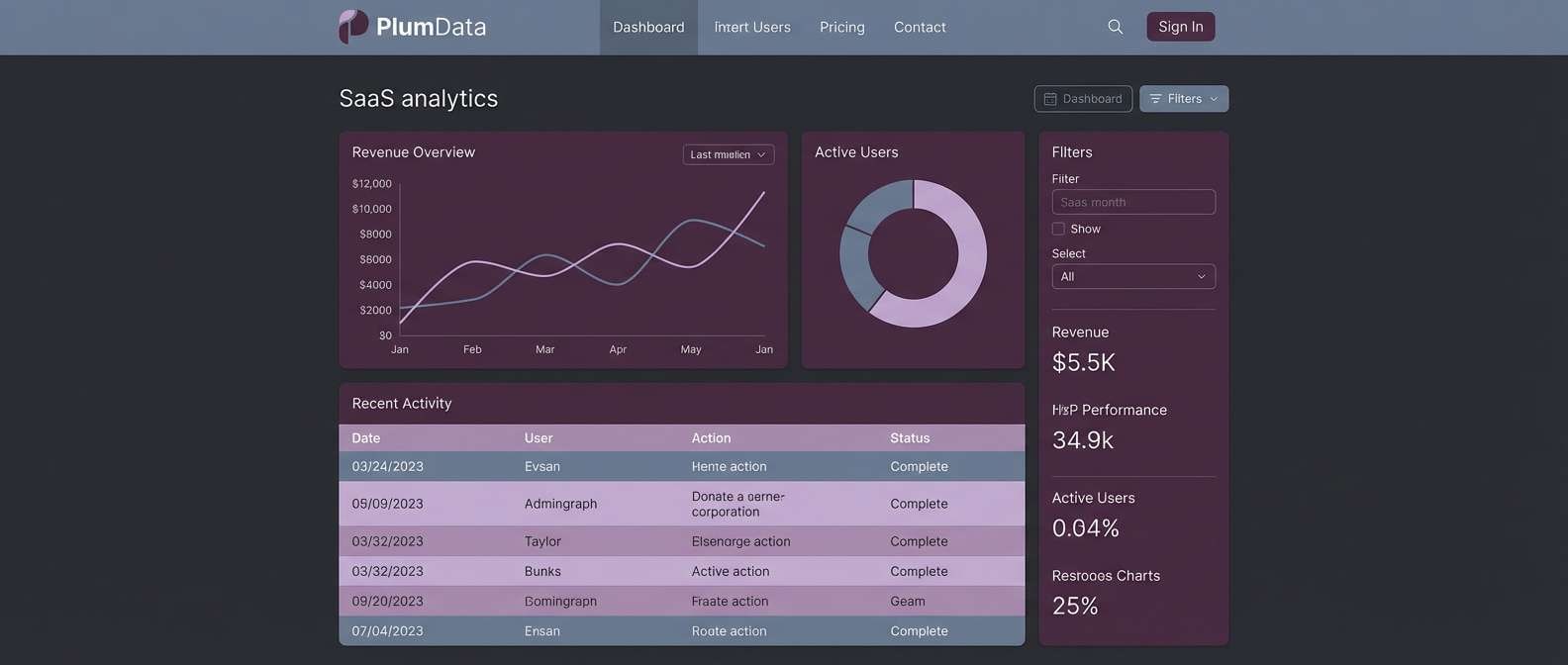
Clean and product-focused like a polished dashboard, these tones feel modern and trustworthy. The mustard provides a warm highlight that stands out against cool grays and blue. Use it for alerts, progress states, or a secondary button that should not compete with primary actions. Usage tip: test contrast on gray surfaces and keep mustard blocks slightly smaller than blue CTAs.
Image example of modern ui amber generated using media.io
16) Premium Packaging Gold
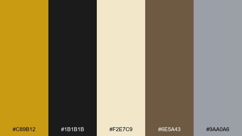
HEX: #C89B12 #1B1B1B #F2E7C9 #6E5A43 #9AA0A6
Mood: luxury, sleek, understated
Best for: premium product packaging and ads
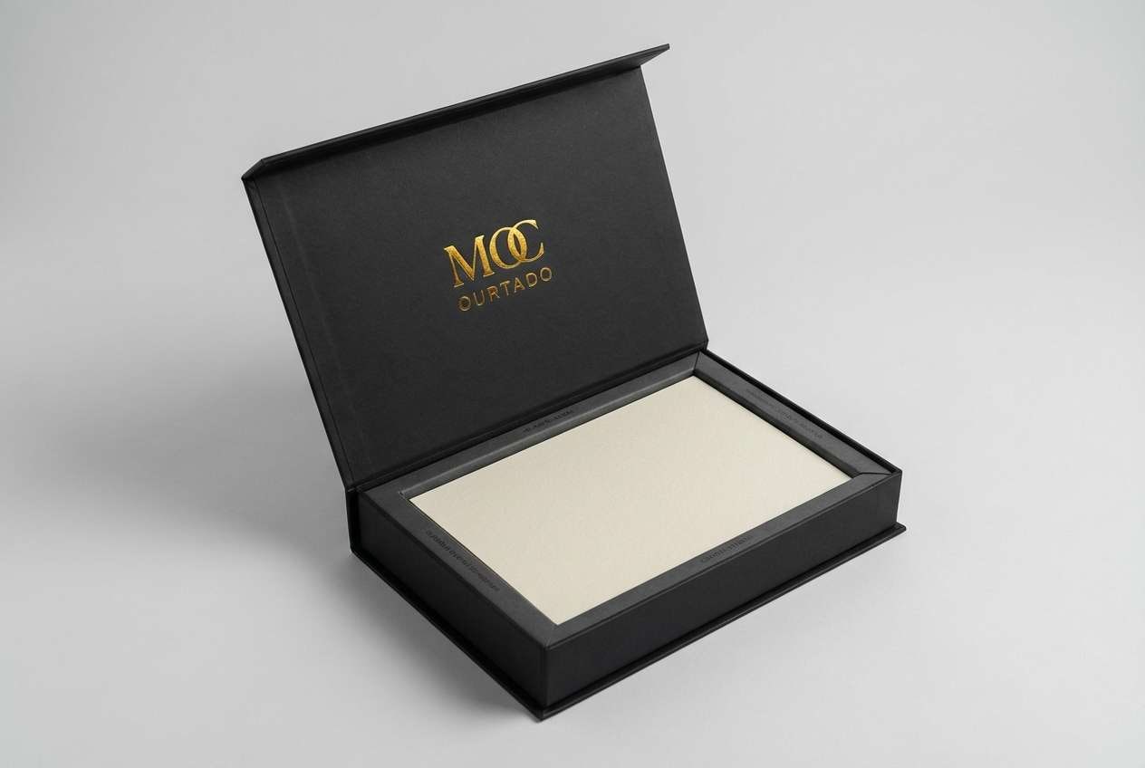
Luxury and sleek like matte boxes with subtle foil, this palette feels understated but rich. It is ideal for premium packaging, fragrance ads, and boutique ecommerce hero images. Let black carry most of the surface area and use the warm cream to create breathing room. Usage tip: treat the mustard as a metallic cue by using it on logos, thin lines, or seal marks rather than big fills.
Image example of premium packaging gold generated using media.io
17) Autumn Orchard
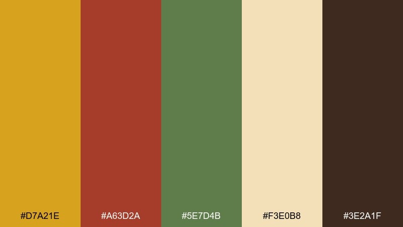
HEX: #D7A21E #A63D2A #5E7D4B #F3E0B8 #3E2A1F
Mood: seasonal, hearty, cozy
Best for: fall campaigns and food photography accents
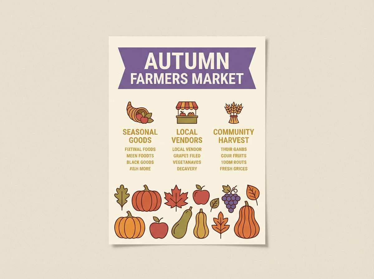
Seasonal and hearty like apples, leaves, and warm spice, this mix feels cozy and full. These mustard yellow color combinations work especially well for fall campaigns, recipe cards, and harvest market promos. Use the deep brown for typography and frames, while cream keeps the palette from feeling too heavy. Usage tip: add the green in small doses to suggest freshness and balance the reds.
Image example of autumn orchard generated using media.io
18) Industrial Workshop
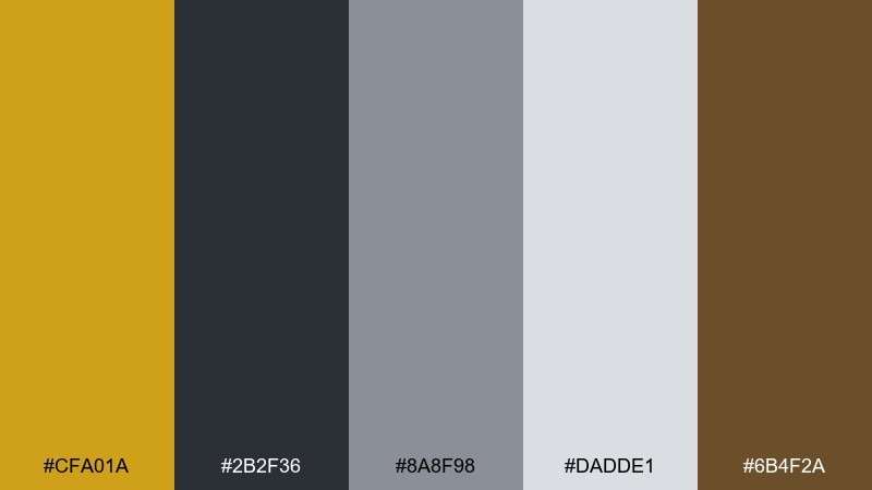
HEX: #CFA01A #2B2F36 #8A8F98 #DADDE1 #6B4F2A
Mood: rugged, practical, modern
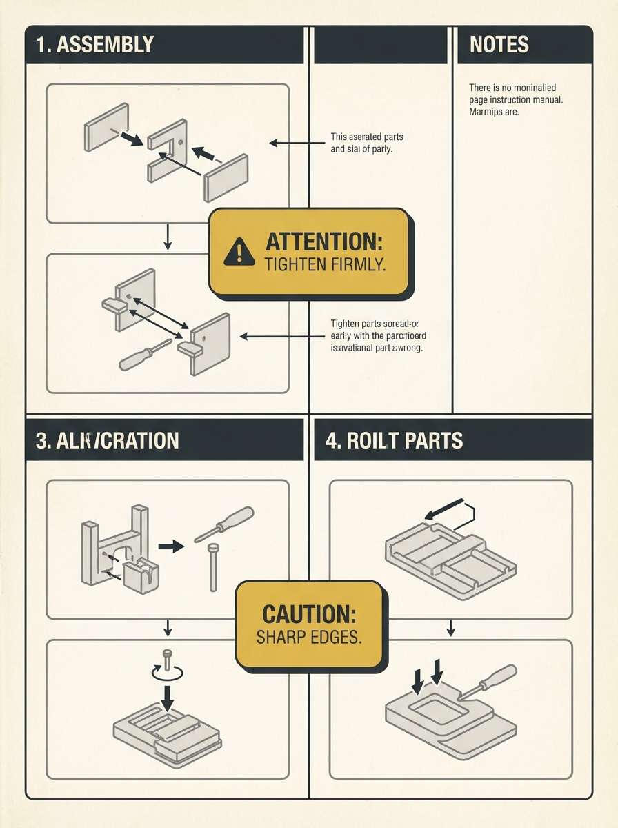
Best for: tool brands and instruction manuals
Rugged and practical like steel surfaces and worn leather gloves, the tones feel built-to-last. Use them for tool brands, instruction manuals, and utilitarian UI where clarity is critical. The cool grays create a dependable base, while mustard flags warnings or key steps. Usage tip: keep mustard limited to badges and callouts so the industrial feel stays crisp, not flashy.
Image example of industrial workshop generated using media.io
19) Soft Neutral Loft
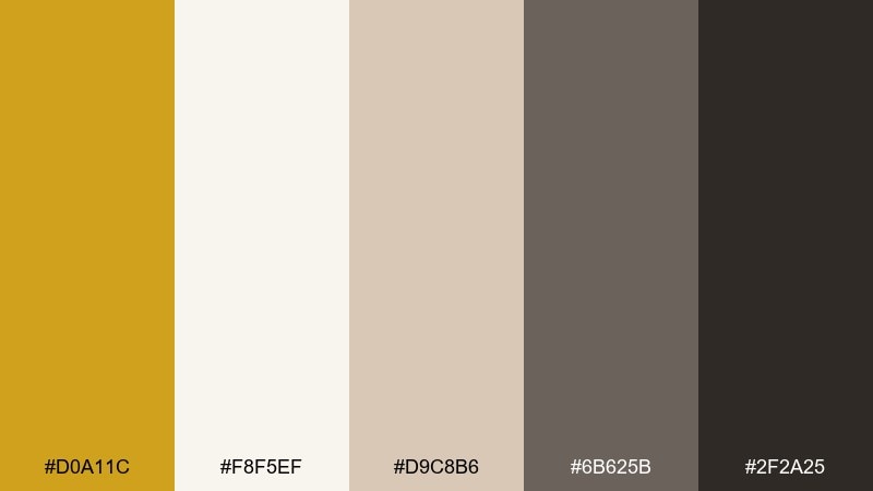
HEX: #D0A11C #F8F5EF #D9C8B6 #6B625B #2F2A25
Mood: airy, warm, sophisticated
Best for: interior websites and portfolio templates
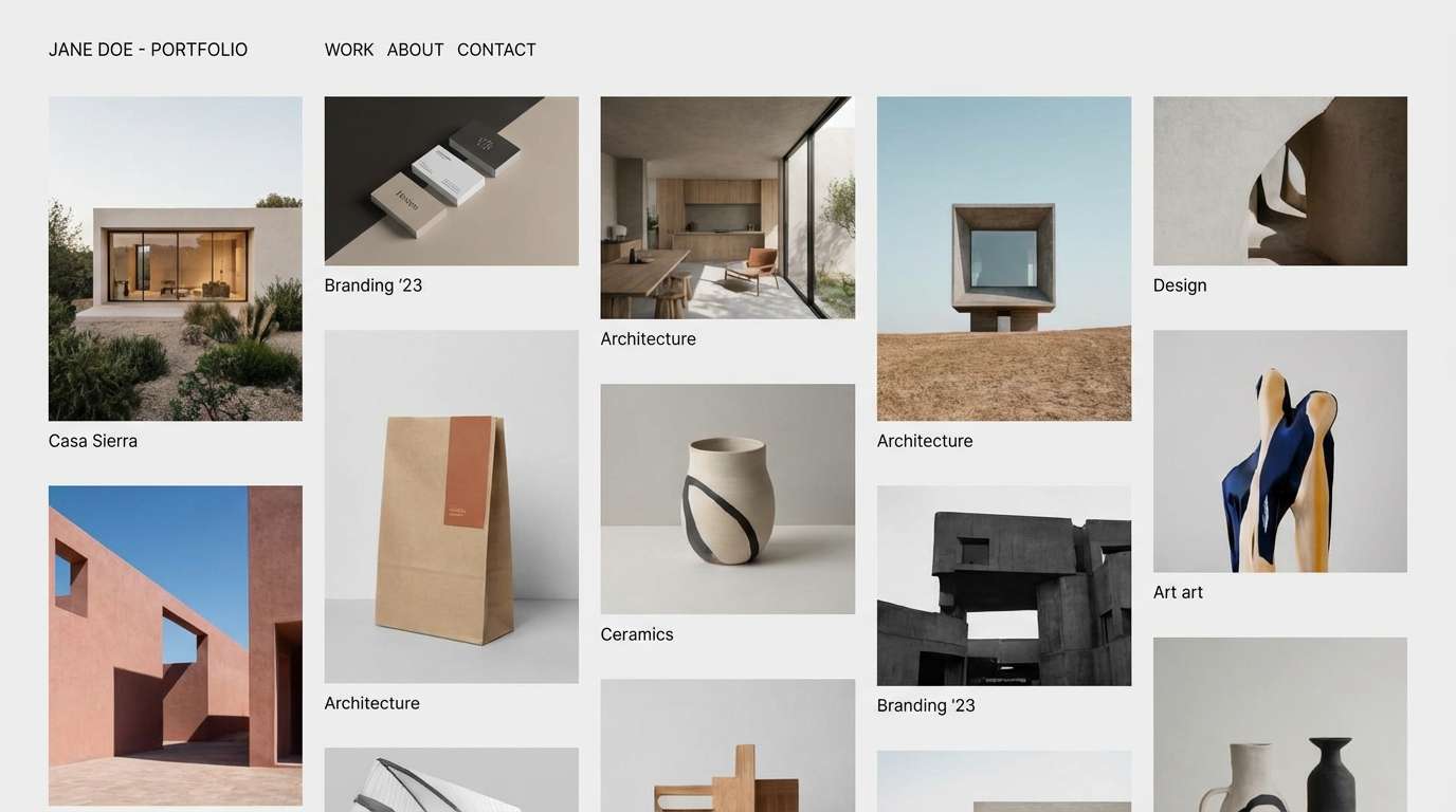
Airy and warm like sun on plaster walls, this set feels sophisticated and calm. It suits portfolio templates, interior websites, and brands that prefer subtle luxury over loud contrast. Use the soft off-white for backgrounds, then layer taupe and warm gray for sections and cards. Usage tip: use mustard sparingly as a focal accent on links, icons, or a single feature banner.
Image example of soft neutral loft generated using media.io
20) Night Market Neon
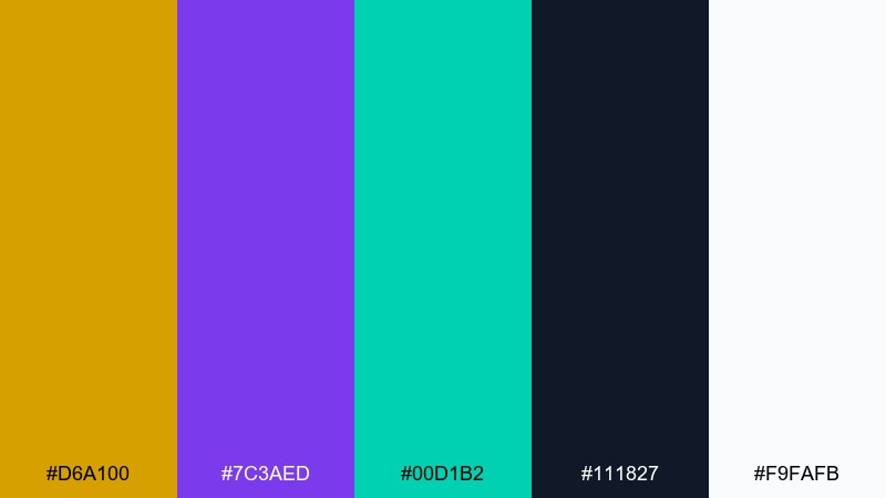
HEX: #D6A100 #7C3AED #00D1B2 #111827 #F9FAFB
Mood: vibrant, modern, nightlife
Best for: music flyers and nightlife promos
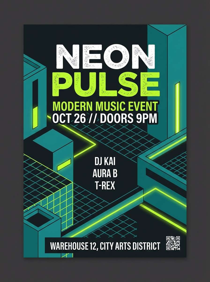
Vibrant and modern like neon lights in a crowded night market, the palette feels electric and youthful. It is a bold mustard yellow color combination for music flyers, nightlife promos, and digital banners that need instant pop. Use the deep navy as a stage-like background, then layer purple and teal for glow-style accents. Usage tip: keep text in near-white and use mustard for dates or ticket buttons to guide the eye.
Image example of night market neon generated using media.io
21) Ceramic Studio
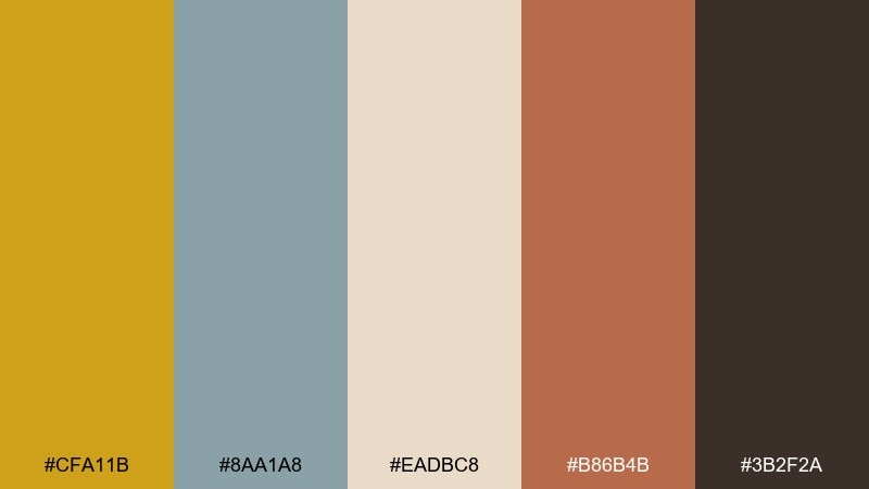
HEX: #CFA11B #8AA1A8 #EADBC8 #B86B4B #3B2F2A
Mood: artsy, earthy, tactile
Best for: craft brands and workshop posters
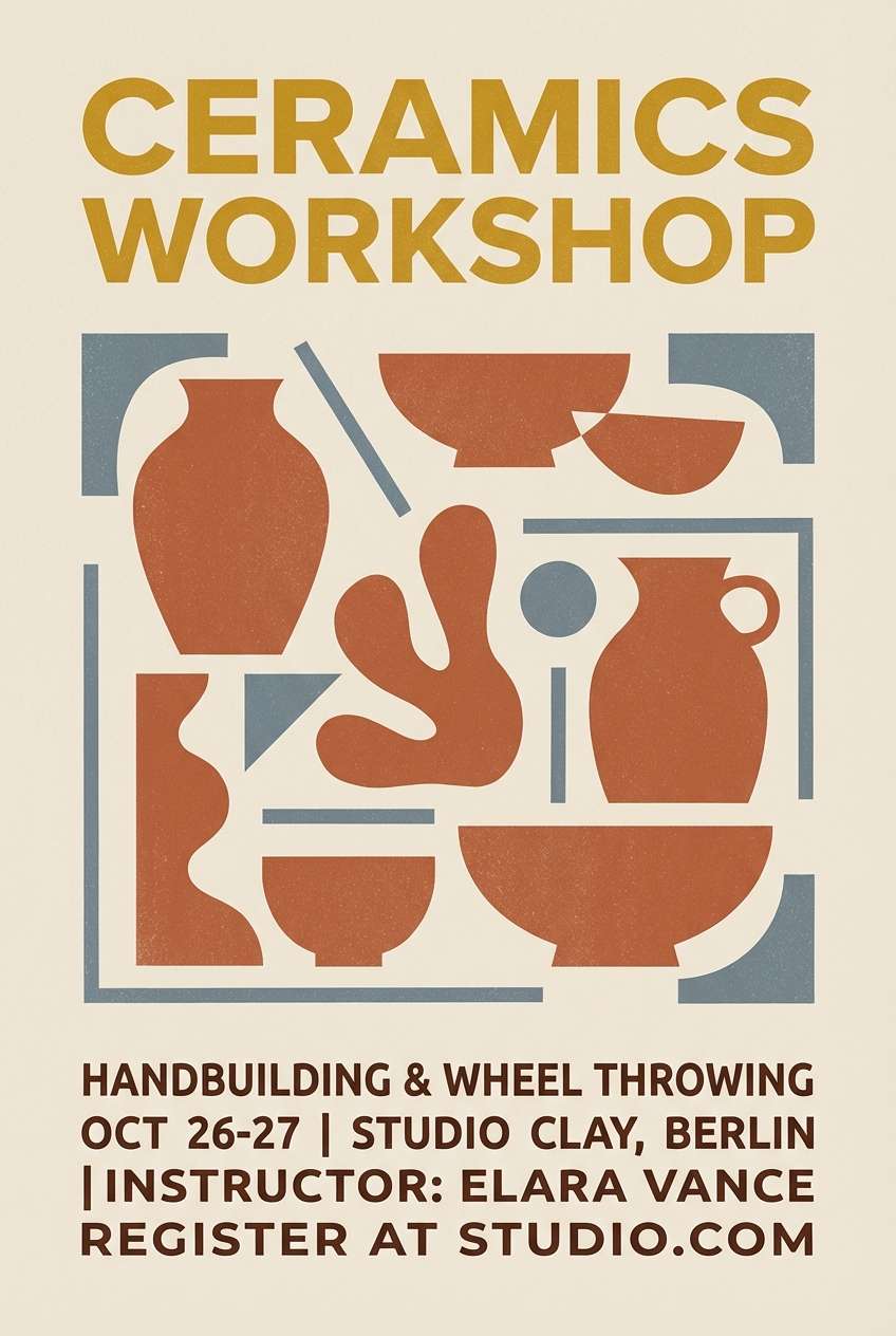
Artsy and tactile like glaze tests and clay dust, these tones feel earthy and creative. Use them for craft brands, ceramics studios, and workshop posters where warmth sells the experience. The muted blue-gray calms the warm spectrum and gives designs a modern edge. Usage tip: balance large mustard areas with generous beige space so everything feels hand-crafted, not heavy.
Image example of ceramic studio generated using media.io
22) Citrus and Cocoa
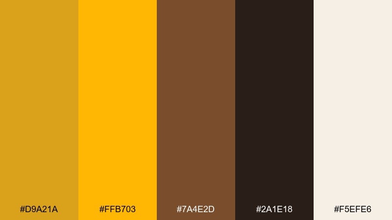
HEX: #D9A21A #FFB703 #7A4E2D #2A1E18 #F5EFE6
Mood: rich, appetizing, bold
Best for: coffee shops and chocolate brands
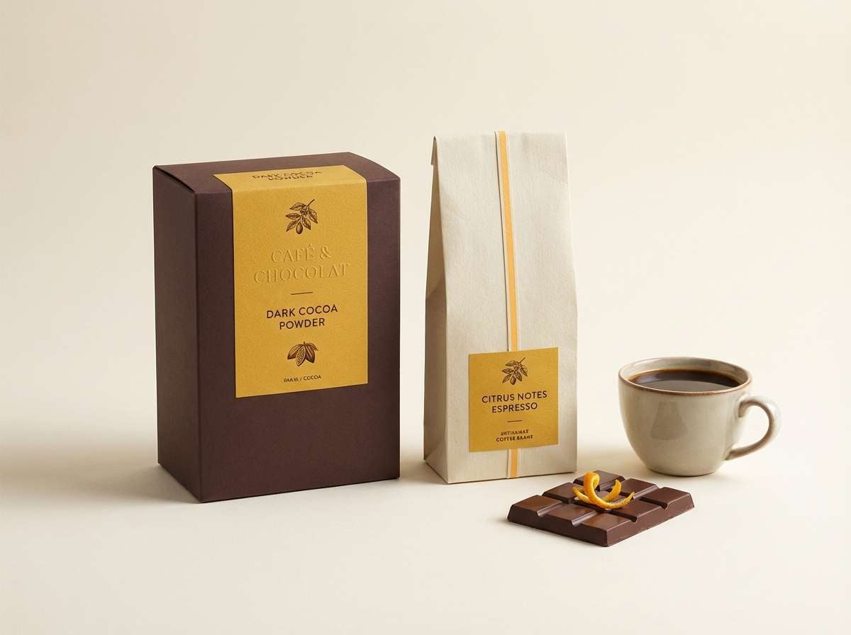
Rich and appetizing like orange peel over dark chocolate, this pairing feels bold and indulgent. The deep browns make the yellows look brighter without turning neon. Use it for coffee shop menus, chocolate packaging, and seasonal promotions. Usage tip: keep the brightest citrus tone as a secondary accent so the mustard stays distinct and mature.
Image example of citrus and cocoa generated using media.io
What Colors Go Well with Mustard Yellow?
Mustard yellow pairs naturally with warm neutrals like cream, beige, camel, and cocoa brown—these combinations feel cozy and “heritage,” perfect for packaging, interiors, and editorial layouts.
For sharper, more modern contrast, combine mustard with deep navy, charcoal, or near-black. Cool accents like teal, slate blue, or dusty blue keep mustard looking fresh and contemporary.
If you want playful energy, use mustard with pink, purple, or bright blue—but keep those brights limited to small accents so mustard remains the main character.
How to Use a Mustard Yellow Color Palette in Real Designs
Use mustard as an accent first: buttons, badges, icons, dividers, price tags, and key highlights. This keeps the design readable while still getting that warm, confident “golden” effect.
For large surfaces (backgrounds, big blocks, walls), balance mustard with off-white or light greige, then bring in a dark anchor (charcoal, espresso brown, or navy) for typography and structure.
When working with photos, mustard often matches wood, skin tones, baked goods, and natural textures. Add a cool counter-color (teal/blue-gray) if the layout starts to feel too warm overall.
Create Mustard Yellow Palette Visuals with AI
Need fast mockups for a landing page, packaging set, invitation, or poster? Turn any palette above into visuals in minutes by reusing the prompts and swapping subjects (e.g., “coffee packaging” to “skincare packaging”).
To stay on-brand, keep the prompt focused on the mood, materials, and layout, then specify mustard as the primary accent. Generate a few variations and pick the one with the cleanest contrast for text.
Mustard Yellow Color Palette FAQs
-
What HEX code is “mustard yellow”?
There isn’t one single standard, but common mustard yellow HEX values sit around #D4A017 to #D8A016. In this article, several palettes use mustard tones like #D6A21A and #CFA01A. -
What colors complement mustard yellow best?
Deep navy, charcoal/near-black, and dark brown create the strongest contrast. For softer pairings, use cream, warm beige, and greige; for a modern twist, add teal or slate blue. -
Is mustard yellow warm or cool?
Mustard yellow is generally warm because it leans toward golden/ochre undertones. Even when paired with cool colors, it typically reads as the “warm accent” in the palette. -
Can I use mustard yellow in modern UI design?
Yes—use it as a highlight color (badges, progress states, secondary buttons) against cool grays and navy for clarity. Check contrast carefully and avoid using mustard for small body text. -
Does mustard yellow work for luxury branding?
It can, especially when treated like a metallic accent rather than a large flat fill. Pair mustard with black, warm cream, and subtle grays to mimic gold-foil cues. -
How do I keep mustard yellow from feeling “dirty” or dull?
Balance it with clean off-whites and a darker anchor color for typography. Add one cool accent (teal, blue-gray, or navy) to keep the palette crisp and prevent everything from blending into warm browns. -
What are good mustard yellow palettes for weddings?
Soft combinations like cream + blush + rich brown + sage feel romantic and elegant. Use mustard in thin borders, monograms, or small details so it stays refined.
Next: Dark Brown Color Palette


