

Dark brown is one of the most versatile “deep neutral” bases: it can feel earthy and approachable, or sleek and premium depending on the supporting colors.
Below are 20 curated dark brown color palette ideas with HEX codes, plus practical guidance for UI, branding, packaging, and interiors.
In this article
- Why Dark Brown Palettes Work So Well
-
- espresso studio
- cocoa and cream
- walnut minimal
- desert bark
- smoky mahogany
- forest cabin
- bronze and leather
- mocha sage
- chocolate cherry
- amber woods
- rustic clay
- night chocolate and teal
- sepia journal
- caramel latte
- copper pine
- stone and truffle
- vintage suit
- sienna dust
- orchid brown
- black coffee and linen
- What Colors Go Well with Dark Brown?
- How to Use a Dark Brown Color Palette in Real Designs
- Create Dark Brown Palette Visuals with AI
Why Dark Brown Palettes Work So Well
Dark brown brings “warm depth” without the severity of pure black, which makes it ideal for brands and interfaces that want contrast but still feel human and inviting.
Because it sits close to natural materials (wood, leather, coffee, cocoa), it instantly signals authenticity and craft. That’s why it’s a frequent choice for packaging, hospitality, and lifestyle branding.
Dark brown also pairs smoothly with both warm and cool accents—from gold and terracotta to teal and steel blue—so you can steer the mood from rustic to modern with small tweaks.
20+ Dark Brown Color Palette Ideas (with HEX Codes)
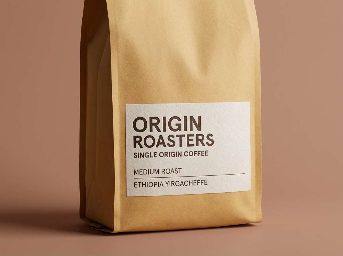
1) Espresso Studio
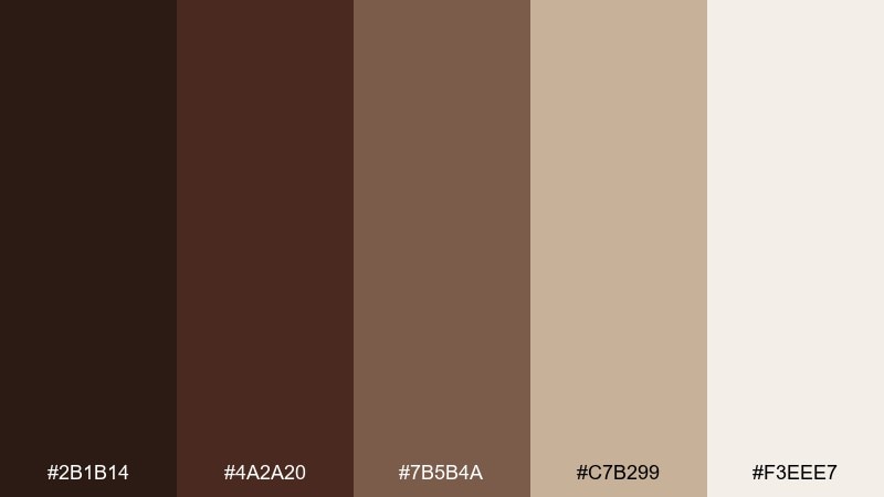
HEX: #2B1B14 #4A2A20 #7B5B4A #C7B299 #F3EEE7
Mood: refined, cozy, premium
Best for: coffee packaging, cafe branding, premium labels
Velvety espresso tones and creamy linen neutrals feel like a quiet cafe at golden hour. Use this dark brown color palette for packaging, logos, and menus where you want warmth without looking rustic. Pair it with matte paper textures, subtle embossing, or minimal line icons to keep it modern. Tip: reserve the light cream for whitespace and legibility, and let the mid walnut shade carry most typography.
Image example of espresso studio generated using media.io
Media.io is an online AI studio for creating and editing video, image, and audio in your browser.

2) Cocoa and Cream
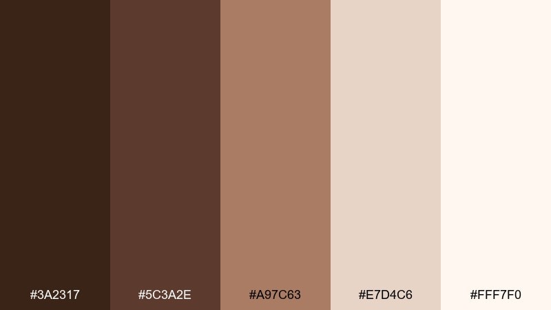
HEX: #3A2317 #5C3A2E #A97C63 #E7D4C6 #FFF7F0
Mood: sweet, welcoming, soft
Best for: bakery menus, dessert branding, social graphics
Milk-chocolate browns with whipped-cream highlights evoke fresh pastries and cozy treats. This mix works beautifully for menus, small-batch food branding, and promo posts where you want a friendly tone. Add a pop of cherry red or caramel gold as a limited accent for callouts. Tip: keep backgrounds in the light cream and use the cocoa midtone for headings so the design stays airy.
Image example of cocoa and cream generated using media.io
3) Walnut Minimal
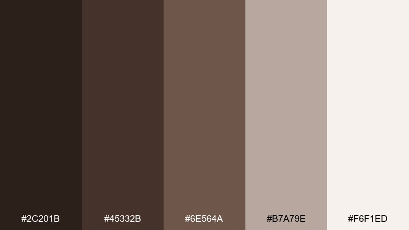
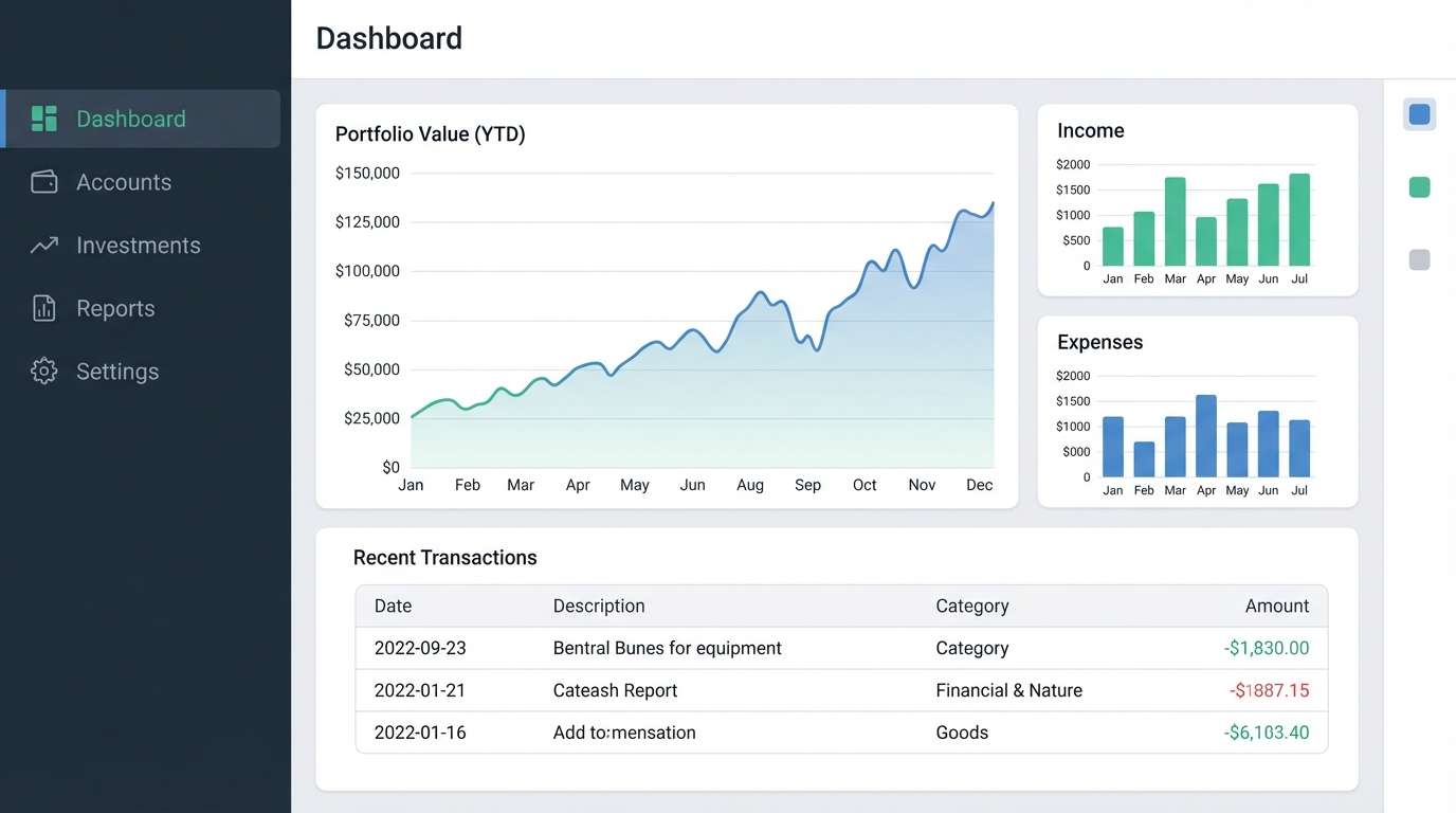
HEX: #2C201B #45332B #6E564A #B7A79E #F6F1ED
Mood: minimal, calm, modern
Best for: finance apps, dashboards, minimalist UI
Clean walnut browns and soft stone neutrals feel confident and quietly modern. As a dark brown color scheme, it suits dashboards and SaaS interfaces that need a premium edge without harsh contrast. Pair it with subtle dividers, rounded cards, and a single bright accent like mint or amber for key states. Tip: set body text on the lightest neutral and use the deepest brown sparingly for navigation and focus rings.
Image example of walnut minimal generated using media.io
4) Desert Bark
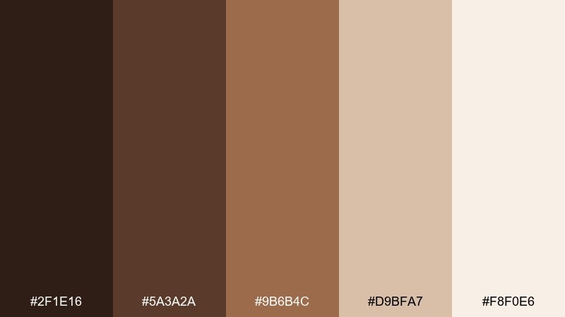
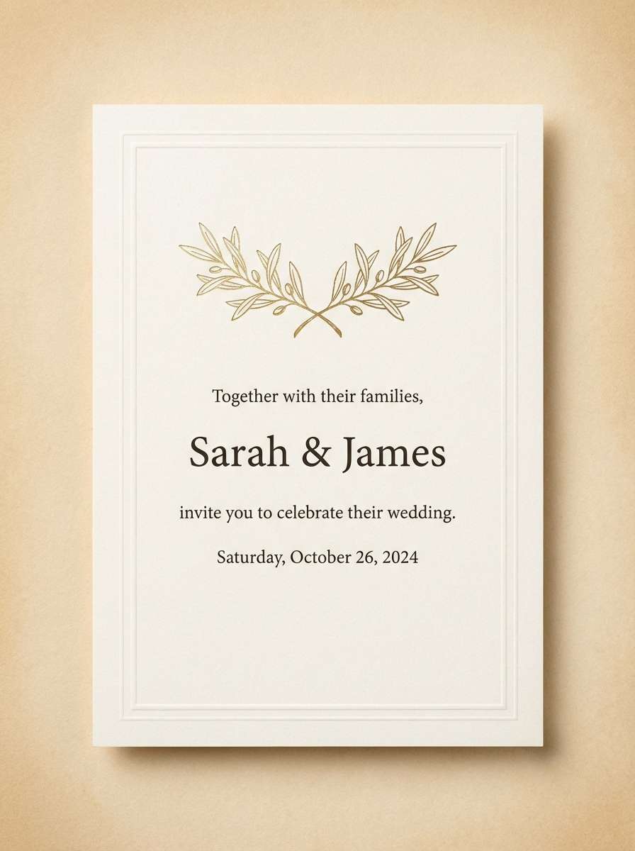
HEX: #2F1E16 #5A3A2A #9B6B4C #D9BFA7 #F8F0E6
Mood: sunbaked, rustic, romantic
Best for: wedding invitations, stationery, event signage
Sunbaked bark browns and sandy beiges evoke desert trails and dried grasses. The tones feel romantic for invites, place cards, and signage that leans natural rather than boho busy. Pair with serif typography, deckled edges, and a muted blush accent for softness. Tip: use the light sand as the base and keep the deepest brown for names and key details.
Image example of desert bark generated using media.io
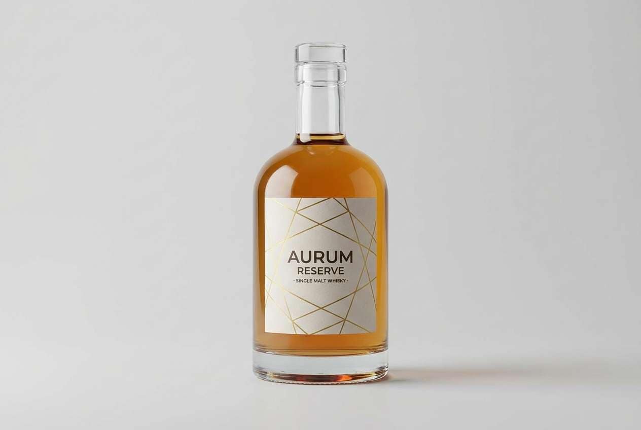
5) Smoky Mahogany
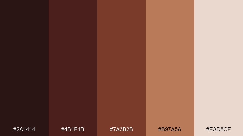
HEX: #2A1414 #4B1F1B #7A3B2B #B97A5A #EAD8CF
Mood: moody, bold, luxurious
Best for: whiskey labels, premium product ads, bar branding
Smoky mahogany reds and deep brown shadows bring to mind barrel rooms and velvet lounges. This dark brown color combination shines on labels, ad creatives, and hero banners where you want richness and depth. Pair it with foil stamping, black typography, or a restrained gold accent to elevate the look. Tip: keep gradients subtle and let the mid mahogany carry imagery so it does not feel too heavy.
Image example of smoky mahogany generated using media.io
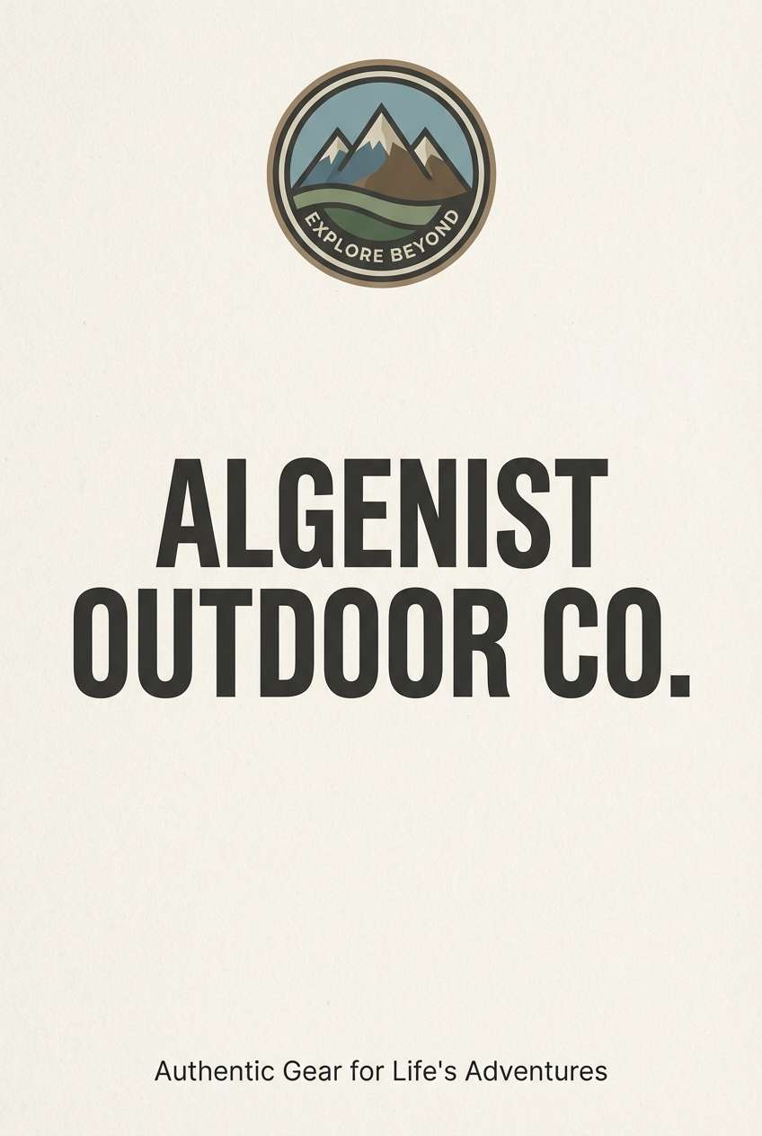
6) Forest Cabin
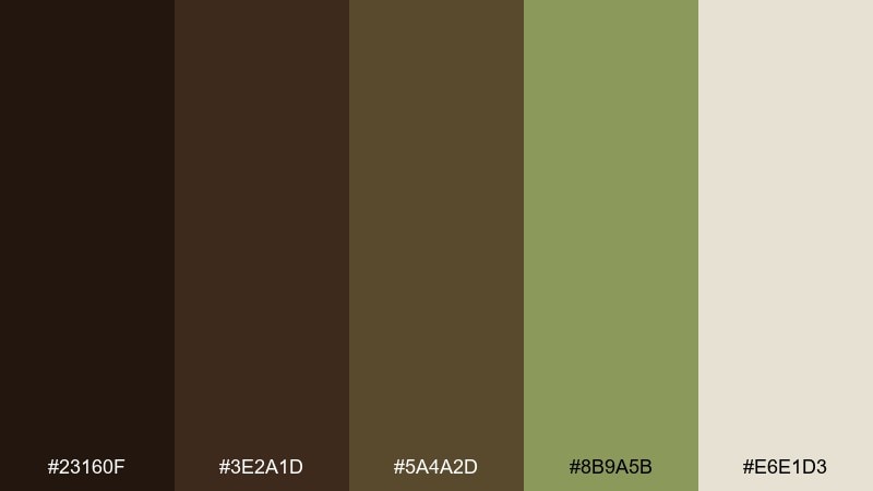
HEX: #23160F #3E2A1D #5A4A2D #8B9A5B #E6E1D3
Mood: earthy, outdoorsy, grounded
Best for: outdoor brands, lodge signage, rustic websites
Cabin-dark wood and mossy greens feel like pine needles underfoot and a fire crackling nearby. Use these tones for outdoor brands, trail maps, or lodge signage that needs a natural, trustworthy vibe. Pair with kraft textures, simple badges, and an off-white background to keep it readable. Tip: keep the green as an accent for buttons or wayfinding, not the main text color.
Image example of forest cabin generated using media.io
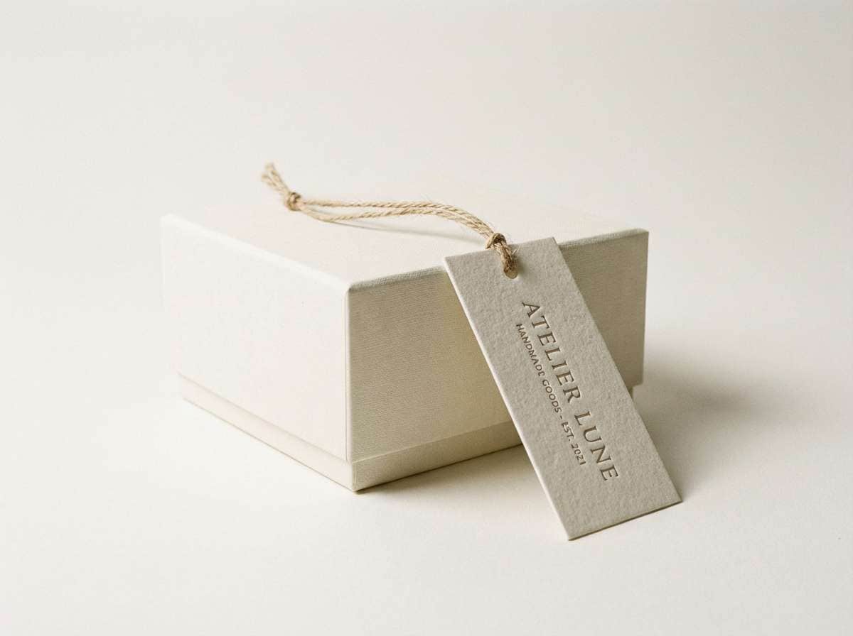
7) Bronze and Leather
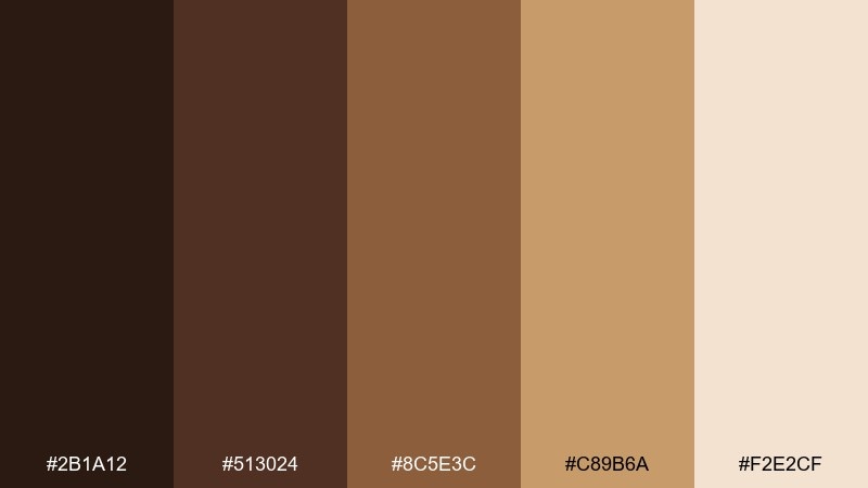
HEX: #2B1A12 #513024 #8C5E3C #C89B6A #F2E2CF
Mood: heritage, warm, tactile
Best for: leather goods packaging, hang tags, boutique branding
Burnished bronze and saddle leather tones evoke craftsmanship and well-worn patina. The set works for hang tags, packaging, and brand marks that want a heritage feel without looking dated. Pair with a condensed sans or a classic serif, and add subtle grain or stitching motifs. Tip: use the bronze-gold shade for small highlights like rules, icons, or seal marks.
Image example of bronze and leather generated using media.io
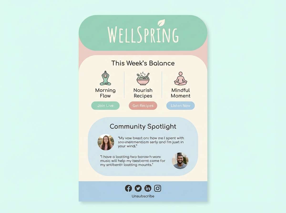
8) Mocha Sage
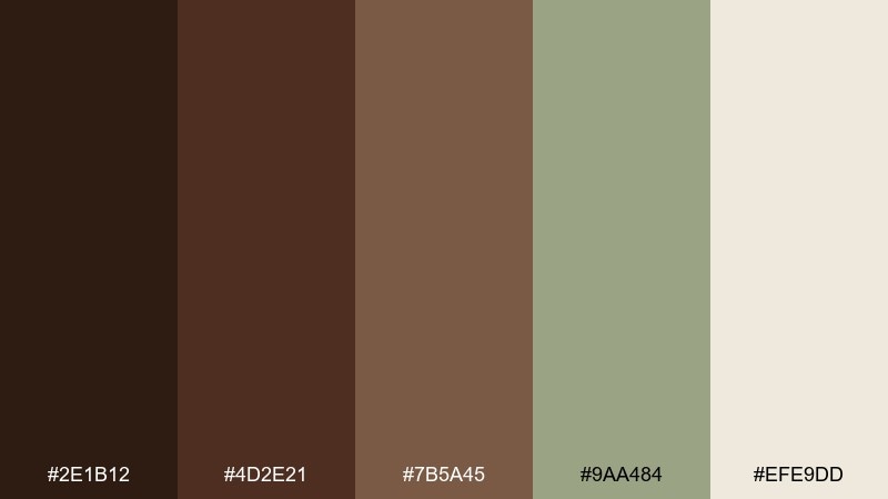
HEX: #2E1B12 #4D2E21 #7B5A45 #9AA484 #EFE9DD
Mood: calm, organic, contemporary
Best for: wellness brand UI, email templates, landing pages
Mocha browns softened by sage feel like ceramic cups and fresh herbs on a countertop. It is a great fit for wellness UI, newsletters, and landing pages where you want calm trust. Pair with plenty of whitespace, rounded corners, and gentle shadows for a modern, breathable layout. Tip: make the sage your primary action color and keep mocha for headings and navigation.
Image example of mocha sage generated using media.io
9) Chocolate Cherry
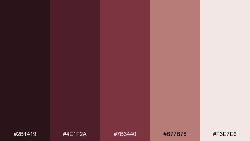
HEX: #2B1419 #4E1F2A #7B3440 #B77B78 #F3E7E6
Mood: romantic, dramatic, boutique
Best for: chocolate box design, candle labels, gift sets
Dark chocolate and cherry wine tones create a romantic, boutique mood that feels giftable. Use it for confectionery boxes, candle labels, or seasonal launches where you want a hint of drama. Pair with cream paper, fine line art, and minimal patterns so the burgundy stays elegant. Tip: keep the pinky neutral for backgrounds and reserve the wine shades for accents and borders.
Image example of chocolate cherry generated using media.io
10) Amber Woods
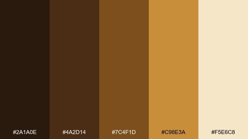
HEX: #2A1A0E #4A2D14 #7C4F1D #C98E3A #F5E6C8
Mood: energizing, warm, autumnal
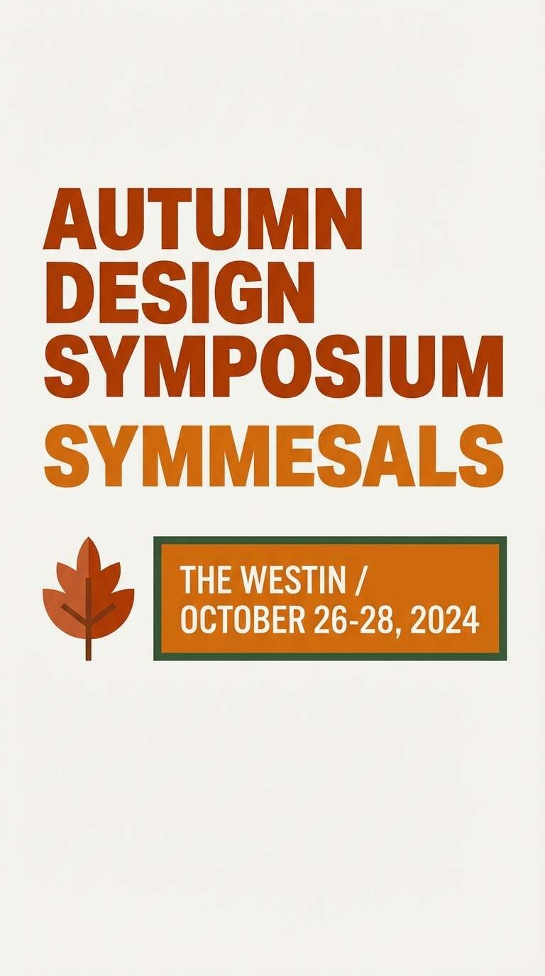
Best for: autumn event posters, festival branding, promo banners
Glowing amber and toasted wood tones feel like lantern light and fall markets. It works well for posters and banners that need warmth and visibility from a distance. Pair with bold type, simple iconography, and a single dark outline to keep contrast strong. Tip: use the amber as a spotlight color for dates, tickets, or key calls to action.
Image example of amber woods generated using media.io
11) Rustic Clay
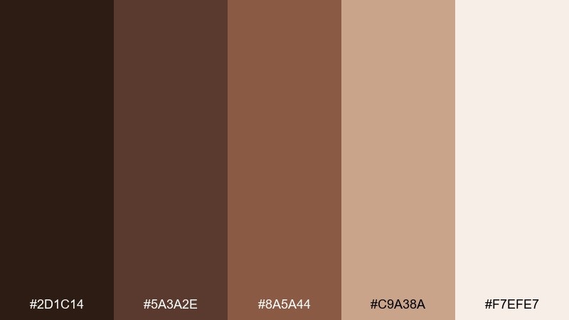
HEX: #2D1C14 #5A3A2E #8A5A44 #C9A38A #F7EFE7
Mood: handmade, earthy, approachable
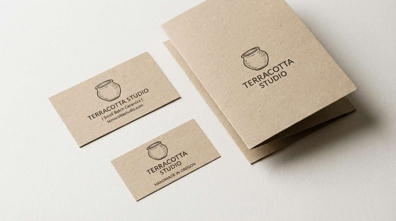
Best for: pottery branding, craft packaging, small business logos
Clay browns and warm buff neutrals evoke handmade pottery and kiln-fired glaze. The palette suits craft brands, packaging, and logo systems that want to feel authentic and friendly. Pair with textured backgrounds, stamp-style marks, and a simple two-weight type system. Tip: keep the mid clay as the brand anchor color and use the light buff for product info panels.
Image example of rustic clay generated using media.io
12) Night Chocolate and Teal
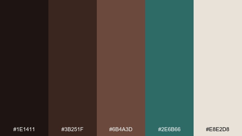
HEX: #1E1411 #3B251F #6B4A3D #2E6B66 #E8E2D8
Mood: sleek, techy, nocturnal
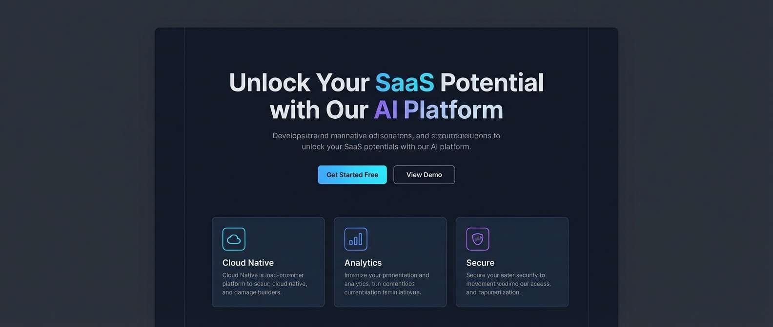
Best for: startup landing pages, SaaS UI, dark mode themes
Midnight chocolate browns with a deep teal accent feel sleek and quietly futuristic. Use it for dark mode interfaces, hero sections, or product pages that need contrast without pure black. Pair with thin lines, subtle gradients, and generous spacing to avoid visual noise. Tip: set teal for interactive states and keep text on the soft off-white for comfortable reading.
Image example of night chocolate and teal generated using media.io
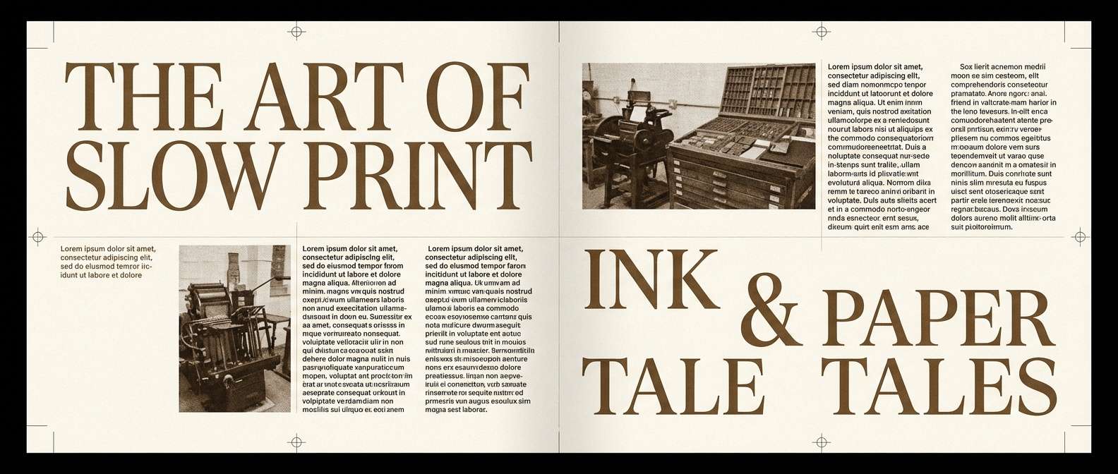
13) Sepia Journal
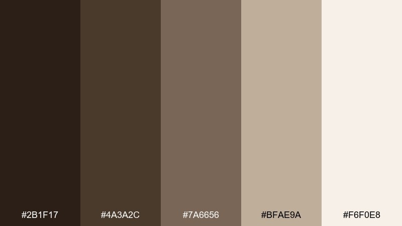
HEX: #2B1F17 #4A3A2C #7A6656 #BFAE9A #F6F0E8
Mood: nostalgic, literary, soft
Best for: book covers, editorial layouts, blog headers
Sepia inks and paper-toned neutrals evoke old journals, libraries, and slow mornings. The tones are ideal for book covers, editorial spreads, and blog design that leans thoughtful. Pair with serif typography, subtle rules, and muted illustrations to keep it timeless. Tip: use the light paper shade for margins and let the mid sepia support captions and pull quotes.
Image example of sepia journal generated using media.io
14) Caramel Latte
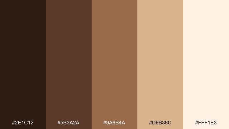
HEX: #2E1C12 #5B3A2A #9A6B4A #D9B38C #FFF1E3
Mood: warm, friendly, comforting
Best for: cafe interiors, mood boards, lifestyle branding
Caramel and latte creams feel comforting, like soft lighting over wood tables. These dark brown color combinations work well in interior mood boards, lifestyle branding, and packaging that needs warmth without heaviness. Pair with brushed gold hardware, creamy ceramics, and a touch of muted olive for balance. Tip: keep the palest cream dominant for walls or backgrounds and use the deepest brown for contrast lines and small details.
Image example of caramel latte generated using media.io
15) Copper Pine
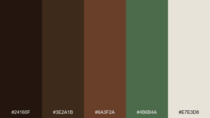
HEX: #24160F #3E2A1B #6A3F2A #4B6B4A #E7E3D8
Mood: outdoorsy, modern, balanced
Best for: eco labels, camping gear branding, artisan products
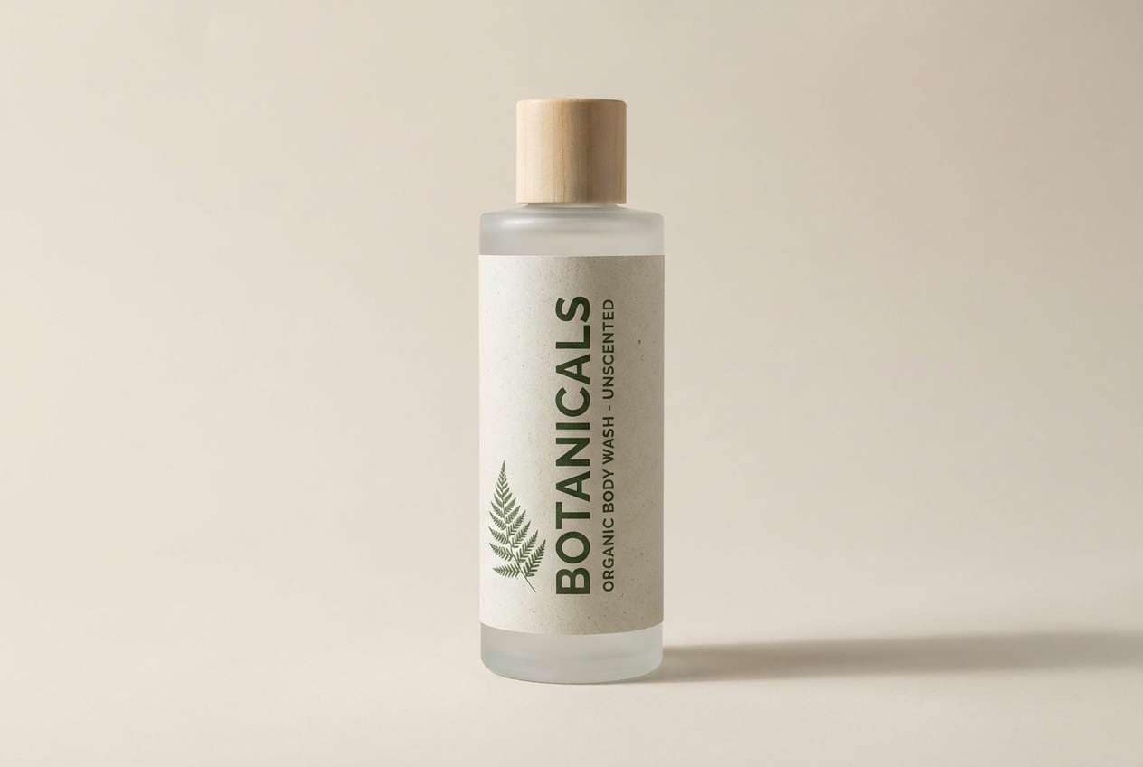
Coppery browns with pine green accents feel like campfires against evergreen silhouettes. The palette suits eco-forward labels, outdoor gear branding, and artisan products that want a natural but contemporary look. Pair with simple badge marks, recycled paper textures, and a clean sans-serif. Tip: use the pine green as a secondary accent so the browns remain the main storytelling tone.
Image example of copper pine generated using media.io
16) Stone and Truffle
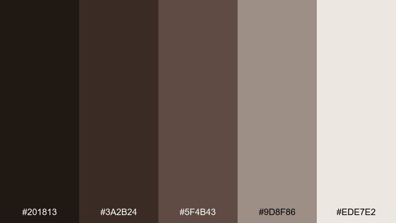
HEX: #201813 #3A2B24 #5F4B43 #9D8F86 #EDE7E2
Mood: quiet, architectural, elevated
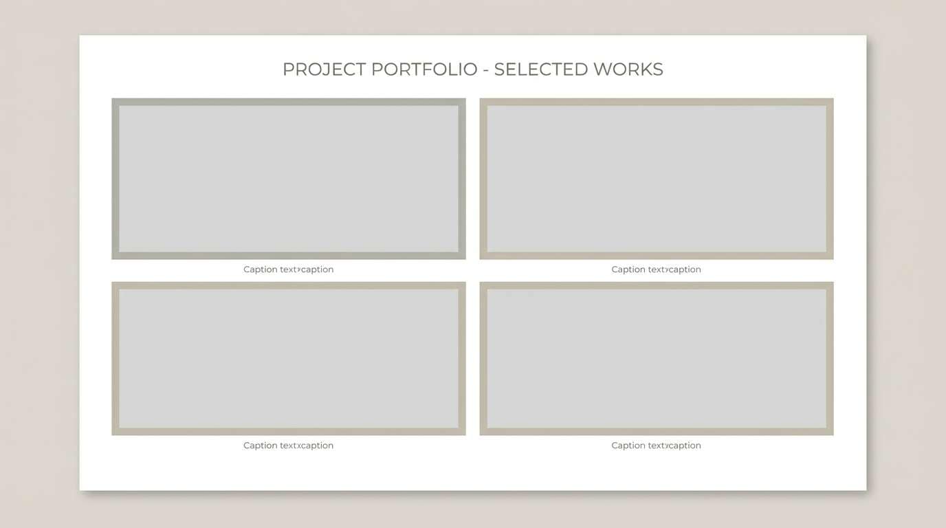
Best for: architecture portfolios, presentation decks, brand guidelines
Truffle browns and stone greys create an architectural calm that feels premium and understated. It is a strong choice for portfolios, pitch decks, and guideline documents where typography and hierarchy matter most. Pair with lots of white space and grid-based layouts for a crisp, editorial finish. Tip: keep the darkest truffle for titles and use the stone midtone for dividers and secondary UI elements.
Image example of stone and truffle generated using media.io
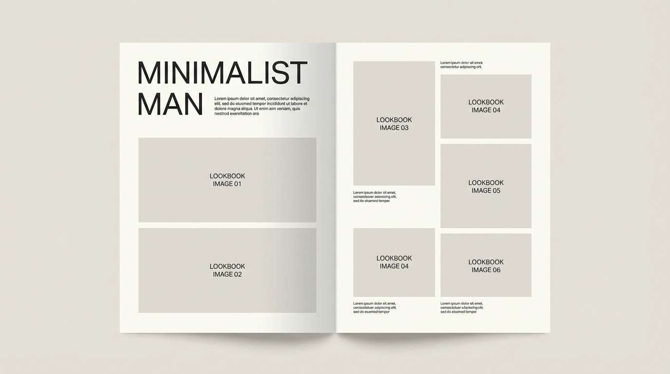
17) Vintage Suit
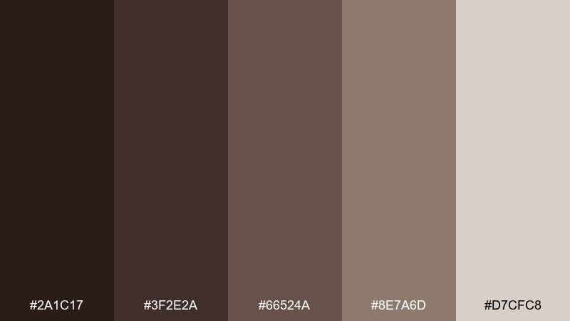
HEX: #2A1C17 #3F2E2A #66524A #8E7A6D #D7CFC8
Mood: classic, tailored, sophisticated
Best for: menswear lookbooks, tailoring brands, editorial ads
Tailored browns and muted greige feel like vintage wool, polished shoes, and old-world craft. Use it for lookbooks, boutique ads, and brand systems that lean classic and refined. Pair with high-contrast photography, thin rules, and generous margins to keep everything sharp. Tip: make the light greige your primary background so product shots and text stay crisp.
Image example of vintage suit generated using media.io
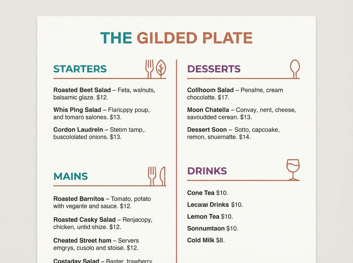
18) Sienna Dust
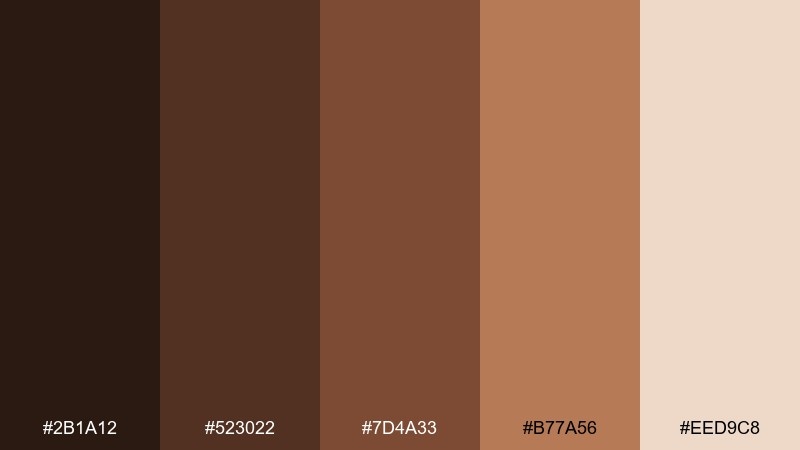
HEX: #2B1A12 #523022 #7D4A33 #B77A56 #EED9C8
Mood: warm, artisanal, sunlit
Best for: restaurant menus, artisan signage, food photography overlays
Sienna browns and dusty peach highlights feel sunlit and handmade, like terracotta bowls on a wooden table. It is great for restaurant menus, signage, and overlay graphics that need warmth and appetite appeal. Pair with charcoal typography and simple line icons for a clean, modern finish. Tip: use the peachy neutral behind text blocks to improve contrast over photos.
Image example of sienna dust generated using media.io
19) Orchid Brown
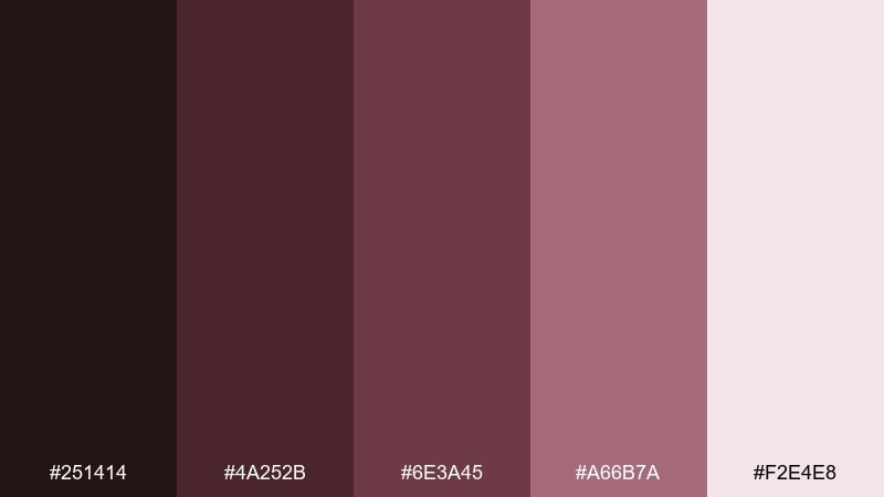
HEX: #251414 #4A252B #6E3A45 #A66B7A #F2E4E8
Mood: soft, elegant, modern romantic
Best for: beauty branding, boutique socials, feminine packaging
Chocolate-plum browns with orchid pinks feel polished, soft, and a little mysterious. Use it for beauty brand visuals, boutique socials, or packaging that wants romance without leaning pastel. Pair with clean sans-serif type and lots of negative space to keep it contemporary. Tip: keep the pale blush as the main background and use the plum shade for small, high-impact accents like badges or price tags.
Image example of orchid brown generated using media.io
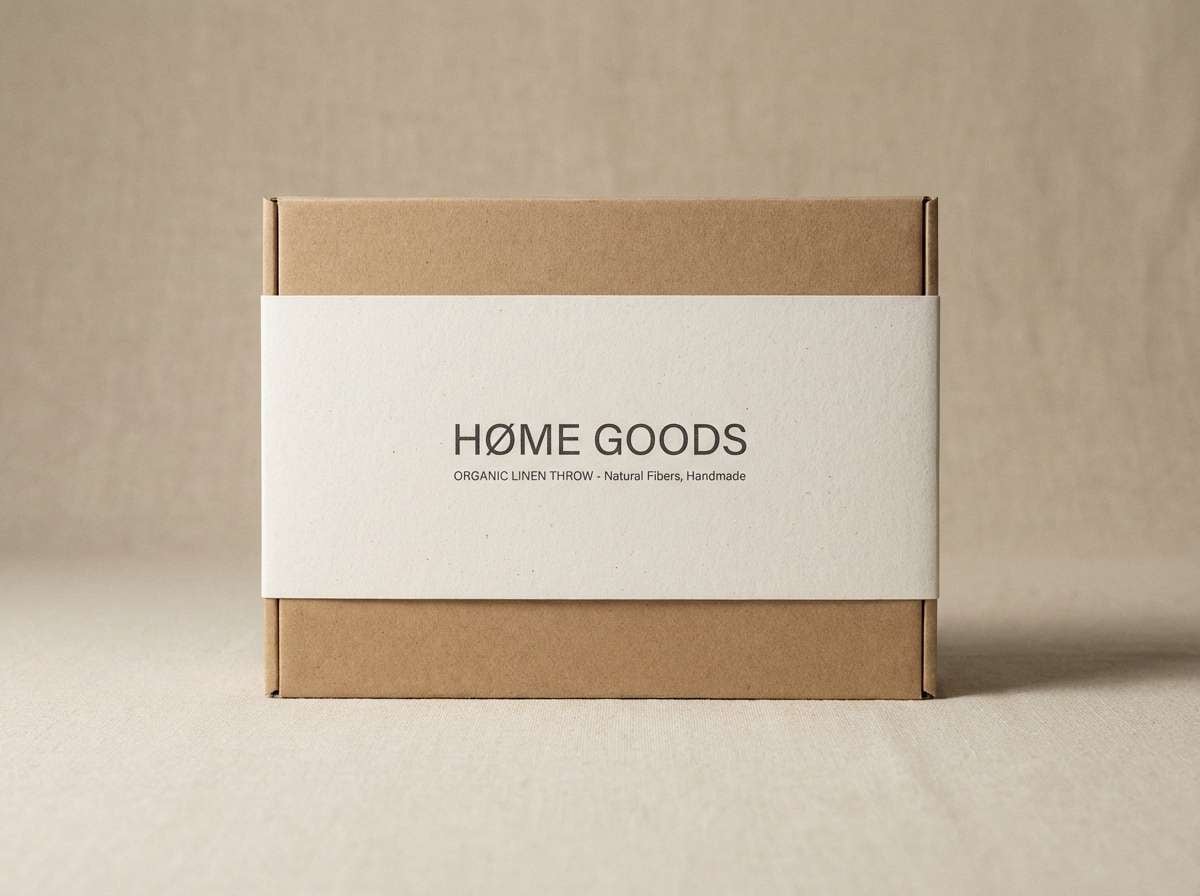
20) Black Coffee and Linen
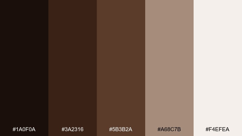
HEX: #1A0F0A #3A2316 #5B3B2A #A68C7B #F4EFEA
Mood: bold, clean, timeless
Best for: minimalist home goods packaging, luxury branding, web headers
Inky coffee browns against soft linen neutrals feel timeless and confident, like a well-designed kitchen staple. Use this dark brown color palette for home goods packaging, premium branding, and clean web headers where contrast matters. Pair with sharp typography, simple pictograms, and a single metallic accent if you need extra polish. Tip: keep the near-black only for the strongest hierarchy moments so the design stays warm, not harsh.
Image example of black coffee and linen generated using media.io
What Colors Go Well with Dark Brown?
Dark brown pairs effortlessly with warm neutrals like cream, beige, and linen for a calm, premium baseline. Add amber, caramel, or bronze when you want a crafted, heritage feel.
For fresher contrast, try earthy greens (sage, moss, pine) that echo nature and keep the palette grounded. For a modern twist, cool accents like teal or steel blue add clarity and a tech-forward edge.
If you need a romantic or boutique direction, introduce berry tones (cherry, plum, dusty rose) in small doses. Keep backgrounds light so dark brown remains rich rather than heavy.
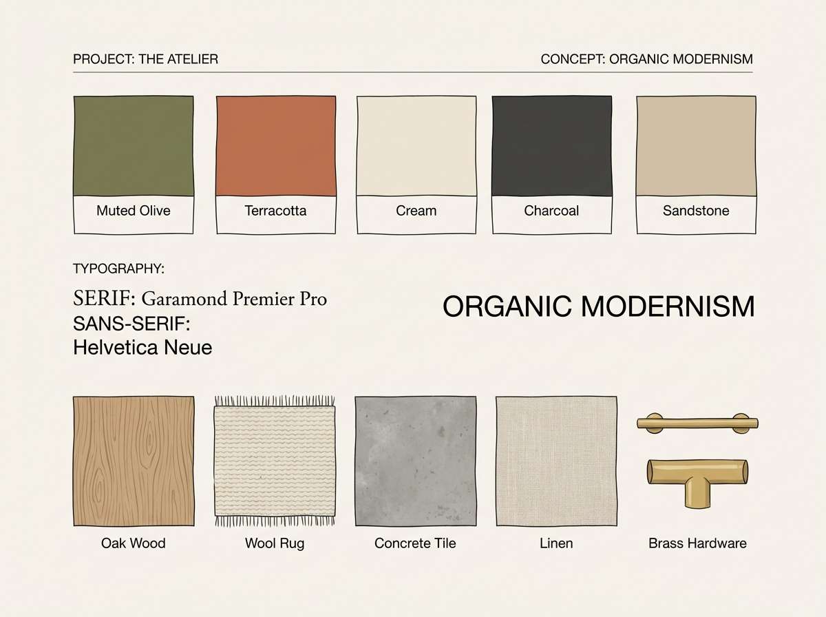
How to Use a Dark Brown Color Palette in Real Designs
In UI and dashboards, treat dark brown like a softer “black”: use it for navigation, headings, and key borders, then place body text on a light neutral for readability. Reserve one accent color (teal, sage, amber) for interactive states like buttons and links.
In branding and packaging, dark brown excels as the anchor color for logotypes, frames, and label structure. Pair it with tactile finishes (matte, emboss, kraft texture) to reinforce the natural, premium story.
For interiors and mood boards, keep the lightest cream dominant (walls/backgrounds) and use dark brown as contrast for trim, furniture, or small details. This keeps the space warm and bright instead of visually dense.
Create Dark Brown Palette Visuals with AI
If you want to see how a dark brown color scheme looks on real assets—like coffee bags, menus, UI screens, or invitation designs—generate quick mockups with text prompts and iterate in minutes.
Describe the format (poster, packaging, UI), the vibe (cozy, premium, minimal), and your exact HEX colors to keep outputs consistent. Then refine lighting, typography style, and materials to match your brand.
Dark Brown Color Palette FAQs
-
What is a good accent color for dark brown?
Teal, sage green, amber/gold, and steel blue are reliable accents for dark brown. Choose teal/steel blue for a modern feel, or amber/gold for a warmer, heritage look. -
Does dark brown work for modern UI design?
Yes. Dark brown can replace pure black in navigation and headings to reduce harsh contrast, especially when paired with off-white backgrounds and a single cool accent for interactive states. -
How do I keep a dark brown palette from looking too rustic?
Use cleaner neutrals (stone, greige, linen), minimal typography, and lots of whitespace. Add a cool accent (teal or steel blue) and avoid overly textured backgrounds. -
What text color is most readable on dark brown?
For dark brown backgrounds, use warm off-white or cream text rather than stark white to keep the look soft. For light beige/cream backgrounds, use deep brown for headings and a mid-brown for secondary text. -
Is dark brown a good branding color?
Dark brown is excellent for branding that wants warmth, trust, and craftsmanship—common in coffee, food, wellness, leather goods, and premium home products. -
What colors pair well with dark brown for interiors?
Cream and beige create a bright, cozy base; muted greens add a natural balance; and brushed gold or bronze details bring a refined finish without overpowering the room. -
How can I preview dark brown palette ideas quickly?
Generate sample visuals (packaging, posters, UI mockups) with an AI text-to-image tool and specify your HEX codes in the prompt. This helps you validate contrast and mood before final design work.
Next: Steel Blue Color Palette


