

Moss green is an earthy, muted green that instantly makes designs feel grounded, calm, and natural. It’s a go-to for modern organic branding, cozy interiors, and UI themes that need softness without looking washed out.
Below you’ll find moss green color palette ideas with HEX codes, plus practical tips and AI prompts you can reuse to generate matching visuals.
In this article
- Why Moss Green Palettes Work So Well
-
- forest floor calm
- herb garden neutrals
- vintage moss and brass
- nordic moss minimal
- rainy trail hues
- botanical study
- cozy cabin knit
- modern sage office
- moss and clay ceramics
- alpine mist
- mossy stone spa
- art deco green gold
- autumn field notes
- coastal dune green
- dark academia greens
- fresh sprout pastels
- urban park signage
- earthy food packaging
- minimal ui dashboard
- eucalyptus wedding
- moss midnight contrast
- What Colors Go Well with Moss Green?
- How to Use a Moss Green Color Palette in Real Designs
- Create Moss Green Palette Visuals with AI
Why Moss Green Palettes Work So Well
Moss green sits in the sweet spot between “natural” and “designed.” It reads as earthy and familiar, but it’s muted enough to feel modern and intentional in branding, interiors, and interface work.
Because it’s not overly saturated, moss green pairs easily with warm neutrals (cream, greige, sand) and grounded accents (clay, brass, cocoa). That makes it ideal for calm palettes that still have depth and hierarchy.
In digital design, moss green also plays nicely with accessibility. Dark moss tones can deliver strong contrast for text and UI controls, while lighter sage/moss tints create low-glare backgrounds.
20+ Moss Green Color Palette Ideas (with HEX Codes)
1) Forest Floor Calm
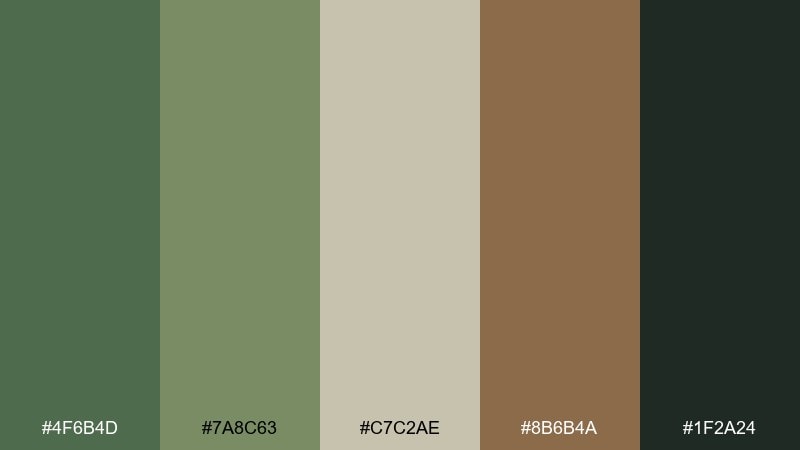
HEX: #4F6B4D #7A8C63 #C7C2AE #8B6B4A #1F2A24
Mood: grounded, quiet, organic
Best for: nature brands, outdoor posters, rustic interiors
Grounded and quiet like a shaded trail after rain, these tones feel steady and restorative. The deep moss anchor looks best when you give it breathing room with warm stone neutrals. Pair the clay brown for warmth and the near-black green for contrast in headings or trims. Usage tip: keep text on the darkest swatch and reserve the mid greens for large surfaces.
Image example of forest floor calm generated using media.io
Media.io is an online AI studio for creating and editing video, image, and audio in your browser.

2) Herb Garden Neutrals
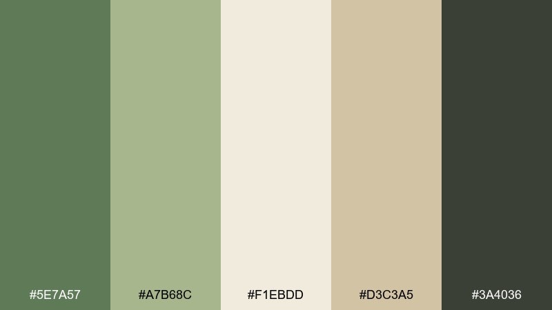
HEX: #5E7A57 #A7B68C #F1EBDD #D3C3A5 #3A4036
Mood: fresh, homey, clean
Best for: kitchen decor, lifestyle blogs, product labels
Fresh and homey like clipped herbs on a cutting board, this mix reads clean without feeling sterile. The creamy off-white keeps the greens bright and approachable, while the darker gray-green adds structure. Use the tan as a friendly bridge for backgrounds or label stock. Usage tip: for labels, print the darkest tone for text and keep the mid green for icons or seals.
Image example of herb garden neutrals generated using media.io
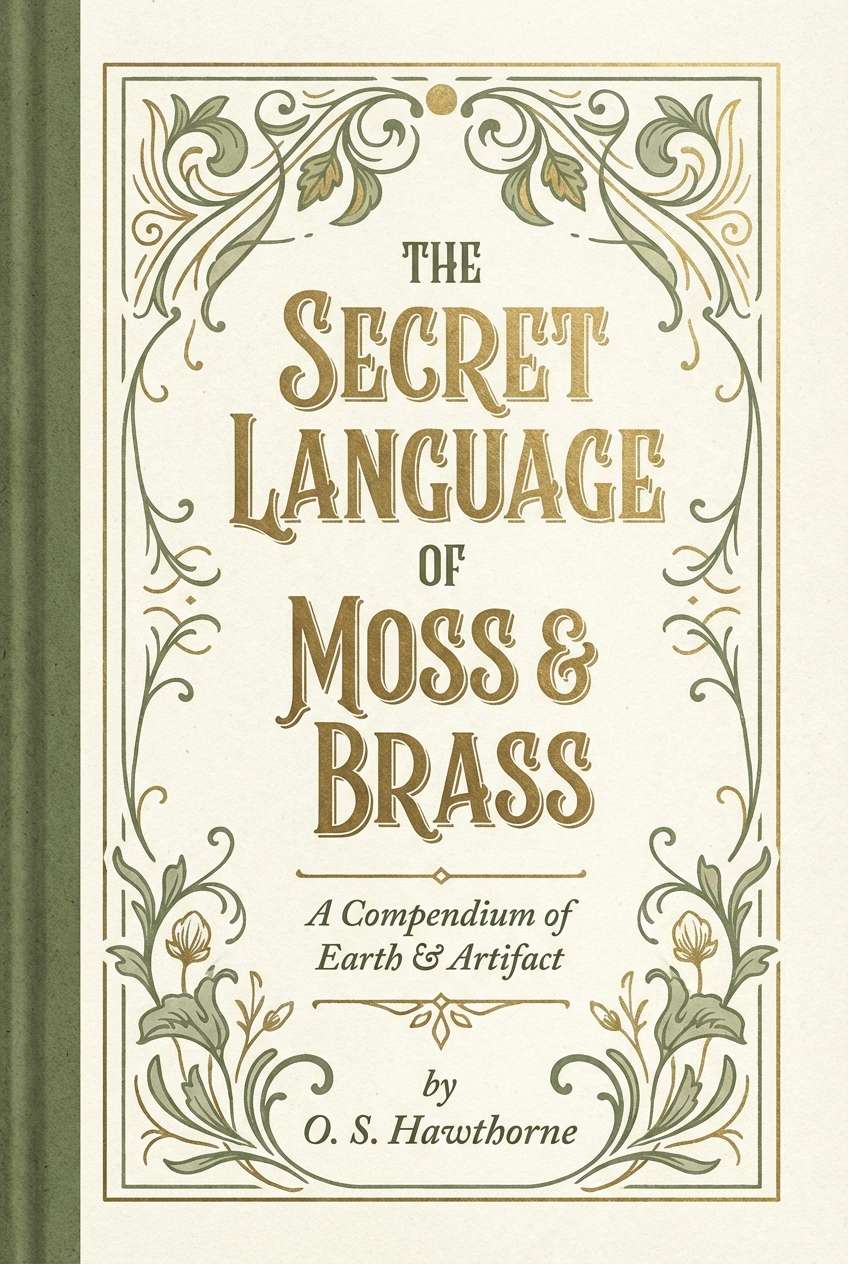
3) Vintage Moss and Brass
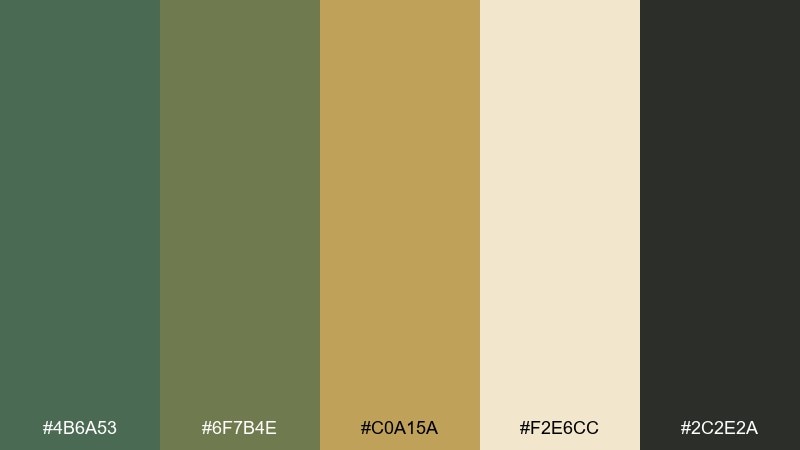
HEX: #4B6A53 #6F7B4E #C0A15A #F2E6CC #2C2E2A
Mood: vintage, elegant, moody
Best for: boutique branding, menus, book covers
Vintage and elegant like tarnished brass in a dim library, these hues balance warmth and shadow. The muted gold works as a refined accent against both the deep green and the soft cream. Keep the near-black for typography to maintain a premium feel. Usage tip: limit gold to 5 to 10 percent of the layout for a tasteful, not flashy, finish.
Image example of vintage moss and brass generated using media.io
4) Nordic Moss Minimal
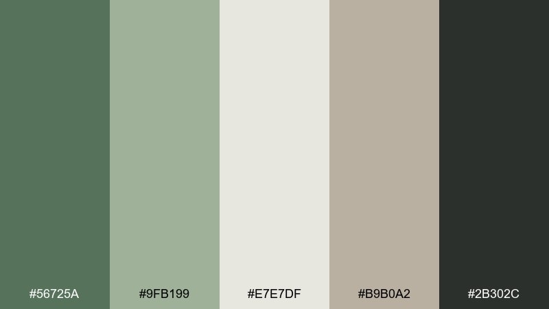
HEX: #56725A #9FB199 #E7E7DF #B9B0A2 #2B302C
Mood: minimal, airy, modern
Best for: scandi interiors, calming web design, SaaS landing pages
Minimal and airy like a bright apartment with leafy shadows, these tones feel modern and uncluttered. The pale gray-white makes the greens look crisp, while the warm greige prevents the layout from turning cold. As a moss green color scheme, it shines in simple grids and generous spacing. Usage tip: use the darkest swatch for primary buttons and keep the lightest for large background sections.
Image example of nordic moss minimal generated using media.io
5) Rainy Trail Hues
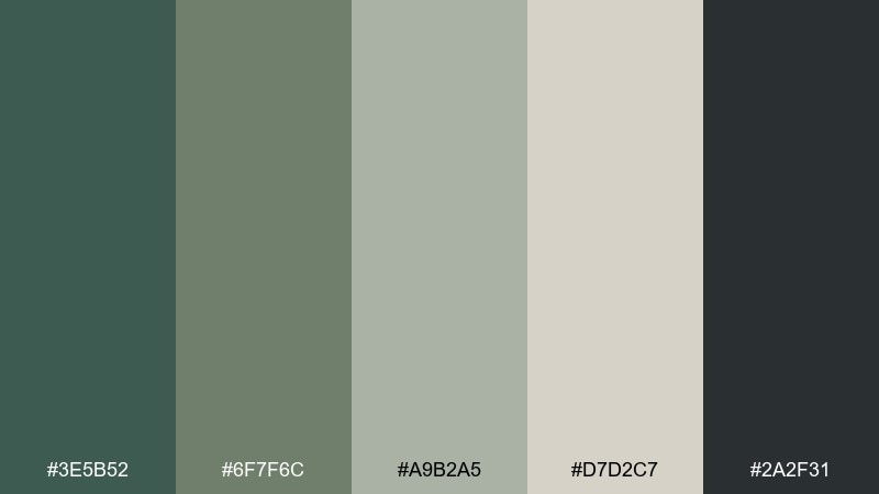
HEX: #3E5B52 #6F7F6C #A9B2A5 #D7D2C7 #2A2F31
Mood: misty, subdued, contemplative
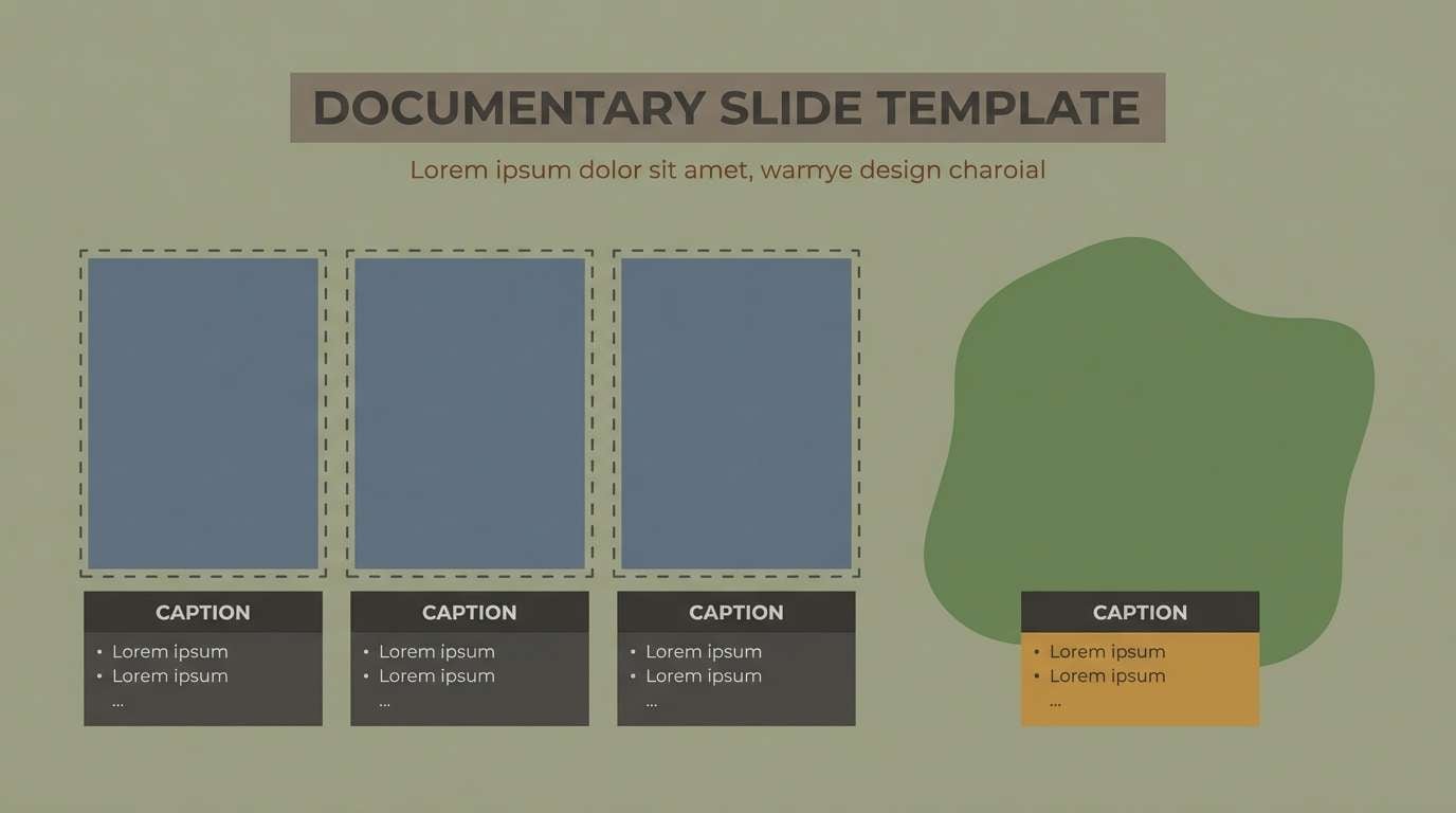
Best for: photo edits, documentary slides, quiet branding
Misty and subdued like fog lifting off a hillside path, these greens lean contemplative. The layered midtones make gradients feel natural, especially behind photography. Pair the soft stone neutral with the darkest slate to keep captions legible. Usage tip: add a subtle vignette using the two darkest swatches to frame key subjects.
Image example of rainy trail hues generated using media.io
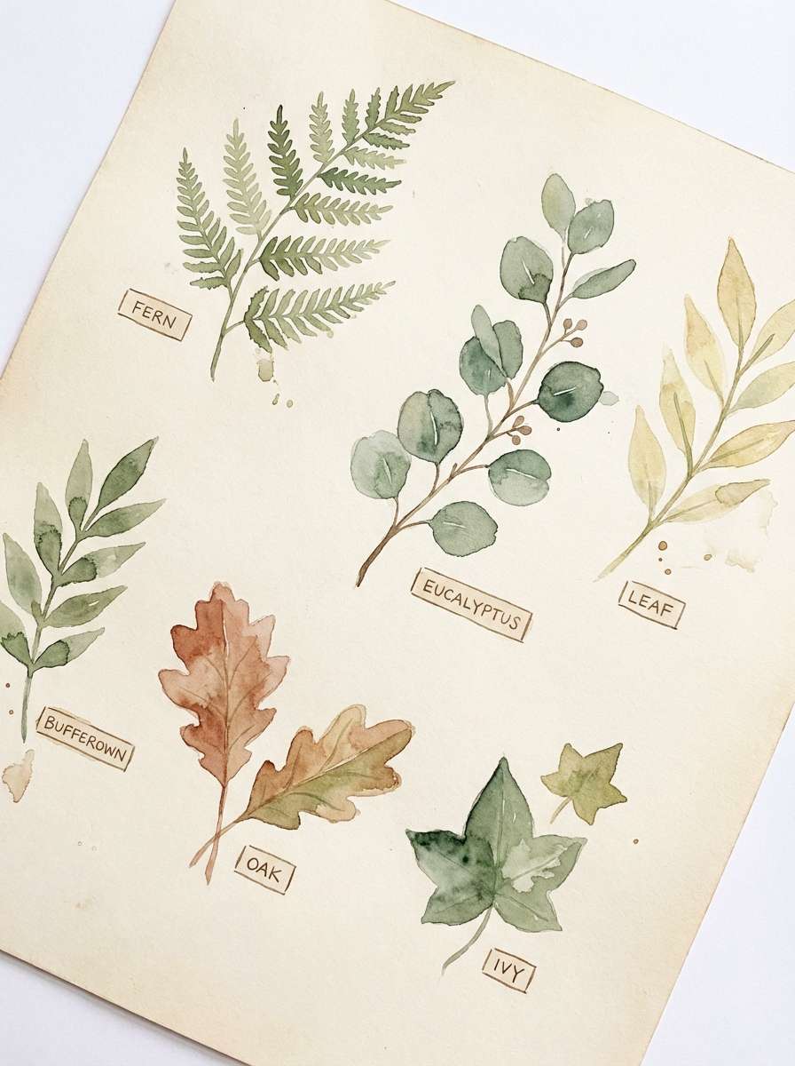
6) Botanical Study
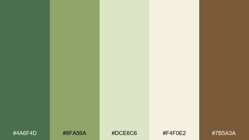
HEX: #4A6F4D #8FA56A #DCE6C6 #F4F0E2 #7B5A3A
Mood: botanical, bright, artisanal
Best for: plant illustrations, natural skincare, spring campaigns
Botanical and bright like pressed leaves on cream paper, the tones feel artisanal and optimistic. The light celery and warm ivory keep everything fresh, while the earthy brown adds a believable stem-and-soil note. This moss green color palette is especially strong for illustrated packaging or botanical pattern work. Usage tip: outline delicate line art with the mid green and reserve the darkest green for titles and borders.
Image example of botanical study generated using media.io
7) Cozy Cabin Knit
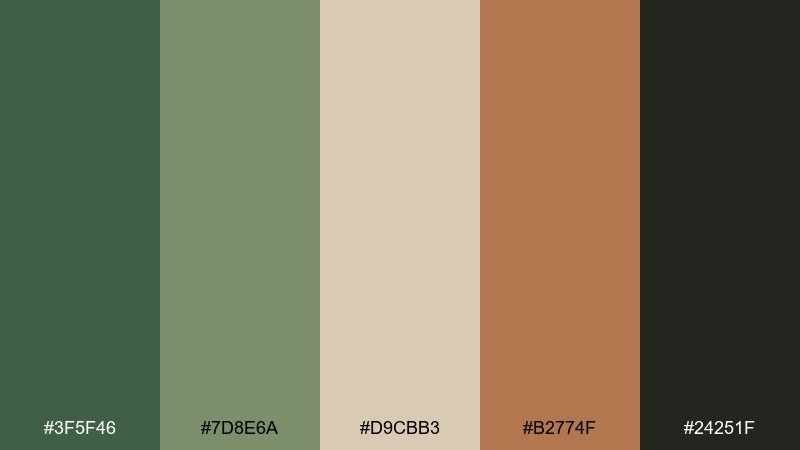
HEX: #3F5F46 #7D8E6A #D9CBB3 #B2774F #24251F
Mood: cozy, warm, rustic
Best for: cabin rentals, autumn promos, cozy lifestyle posts
Cozy and warm like a wool blanket by a wood stove, these greens feel comforting rather than cool. The caramel accent brings a lived-in warmth that works well for callouts and badges. Use the sandy beige for backgrounds to keep the overall look inviting. Usage tip: on social posts, frame photos with the darkest tone and add small caramel highlights to guide the eye.
Image example of cozy cabin knit generated using media.io

8) Modern Sage Office
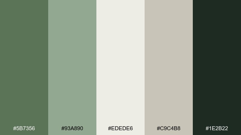
HEX: #5B7356 #93A890 #EDEDE6 #C9C4B8 #1E2B22
Mood: professional, calm, contemporary
Best for: presentations, dashboards, corporate branding
Professional and calm like a quiet meeting room with plants in the corner, these tones stay contemporary and clear. The pale neutral keeps charts readable while the deeper green adds authority to headings and key metrics. Pair the greige for secondary surfaces such as cards and sidebars. Usage tip: choose one green for interactive states and keep the rest for hierarchy to avoid a muddy interface.
Image example of modern sage office generated using media.io
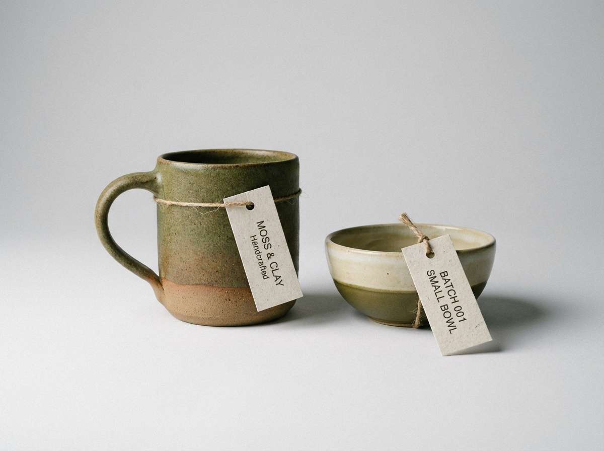
9) Moss and Clay Ceramics
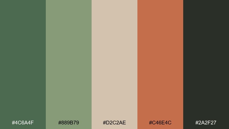
HEX: #4C6A4F #889B79 #D2C2AE #C46E4C #2A2F27
Mood: earthy, handmade, tactile
Best for: artisan shops, pottery ads, craft fairs
Earthy and handmade like glazed clay beside leafy cuttings, this mix feels tactile and grounded. The terracotta-like accent adds a friendly pop without overpowering the greens. Use the warm beige to mimic natural materials for backgrounds and product cards. Usage tip: keep the orange-clay tone for small CTAs or price tags so the greens stay the main story.
Image example of moss and clay ceramics generated using media.io
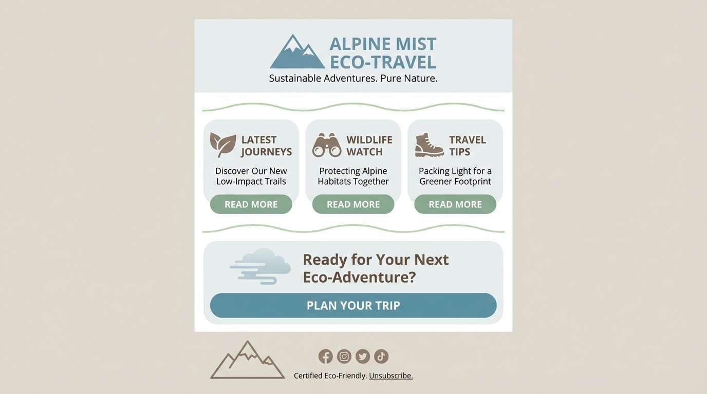
10) Alpine Mist
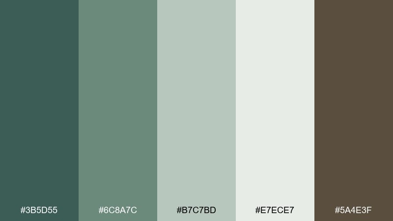
HEX: #3B5D55 #6C8A7C #B7C7BD #E7ECE7 #5A4E3F
Mood: cool, refreshing, outdoorsy
Best for: travel sites, wellness apps, eco newsletters
Cool and refreshing like mountain air at daybreak, these greens lean toward blue-gray for a crisp feel. The pale minty neutral is ideal for spacious backgrounds and content-heavy pages. Add the warm taupe as a grounding accent so the palette does not feel too chilly. Usage tip: use the mid teal-green for links and toggles to keep interaction visible without shouting.
Image example of alpine mist generated using media.io
11) Mossy Stone Spa
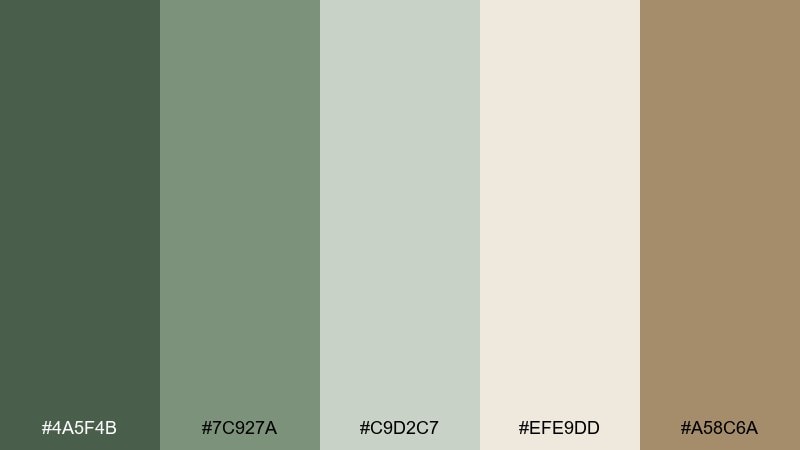
HEX: #4A5F4B #7C927A #C9D2C7 #EFE9DD #A58C6A
Mood: soothing, clean, restorative
Best for: spa branding, skincare sites, meditation rooms
Soothing and clean like warm stones by a quiet pool, this set reads restorative and soft. The creamy neutral keeps it luminous, while the taupe adds a gentle, skin-friendly warmth. Use the mid green for section headers and the pale green-gray for subtle panels. Usage tip: in print, choose uncoated paper so the muted greens stay natural and not glossy.
Image example of mossy stone spa generated using media.io
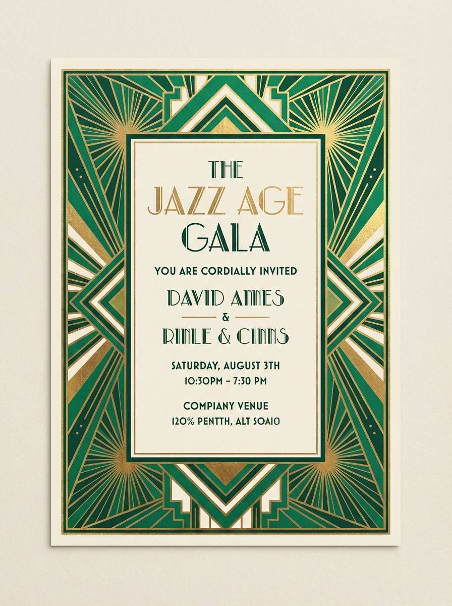
12) Art Deco Green Gold
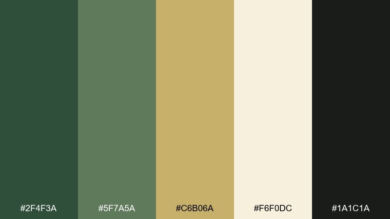
HEX: #2F4F3A #5F7A5A #C6B06A #F6F0DC #1A1C1A
Mood: glamorous, structured, dramatic
Best for: event invitations, premium branding, nightlife posters
Glamorous and structured like a vintage lobby with geometric trim, these tones feel dramatic yet refined. The gold accent adds sparkle, especially when paired with the deep green and near-black. These moss green color combinations work beautifully with sharp lines, borders, and symmetrical layouts. Usage tip: for invitations, foil only the gold elements and keep the rest flat to maintain contrast.
Image example of art deco green gold generated using media.io
13) Autumn Field Notes
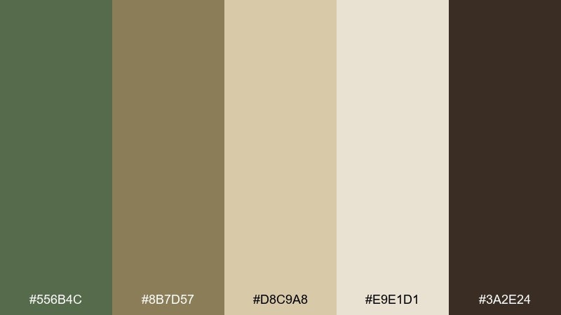
HEX: #556B4C #8B7D57 #D8C9A8 #E9E1D1 #3A2E24
Mood: nostalgic, warm, story-driven
Best for: journals, editorial layouts, cafe menus
Nostalgic and warm like a notebook filled on a late-season walk, these hues tell a story. The olive-leaning green pairs naturally with parchment and cocoa tones for a lived-in look. Use the deep brown for body text to keep the page soft, not harsh. Usage tip: add small, thin rules in the tan shade to create structure without heavy borders.
Image example of autumn field notes generated using media.io
14) Coastal Dune Green
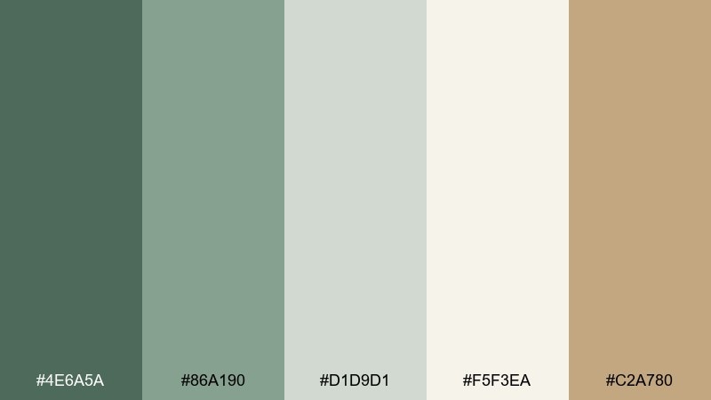
HEX: #4E6A5A #86A190 #D1D9D1 #F5F3EA #C2A780
Mood: breezy, soft, natural
Best for: beach rentals, eco resorts, airy interiors
Breezy and soft like dune grass against pale sand, this palette stays light while still earthy. The warm sand accent makes the green feel sunlit rather than forest-heavy. Use the off-white for spacious backgrounds and the mid green for navigation and accents. Usage tip: in interiors, repeat the sand tone in textiles so the greens do not dominate the room.
Image example of coastal dune green generated using media.io
15) Dark Academia Greens
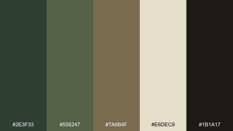
HEX: #2E3F33 #556247 #7A6B4F #E6DEC9 #1B1A17
Mood: scholarly, moody, classic
Best for: book clubs, museum branding, moody posters
Scholarly and moody like old stacks and worn leather, these tones feel classic and intentional. The cream brightens the palette just enough for readable typography and highlights. Pair the olive and bronze-brown for subtle gradients on covers or headers. Usage tip: keep backgrounds dark and use the cream for text blocks to create a high-contrast reading experience.
Image example of dark academia greens generated using media.io

16) Fresh Sprout Pastels
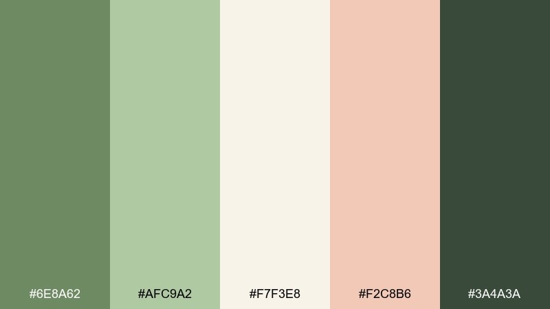
HEX: #6E8A62 #AFC9A2 #F7F3E8 #F2C8B6 #3A4A3A
Mood: playful, gentle, springlike
Best for: baby brands, spring promos, friendly apps
Playful and gentle like new sprouts beside blush petals, these pastels feel optimistic. The soft pink warms the greens and prevents the look from becoming too earthy. Use the creamy neutral as your main canvas and keep the deepest green for text and icons. Usage tip: when designing CTAs, pair the blush background with dark green text for accessibility.
Image example of fresh sprout pastels generated using media.io
17) Urban Park Signage
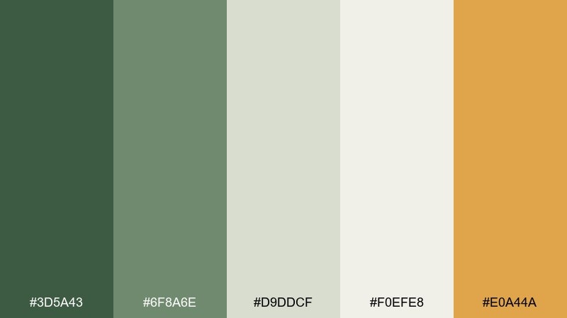
HEX: #3D5A43 #6F8A6E #D9DDCF #F0EFE8 #E0A44A
Mood: friendly, clear, modern
Best for: wayfinding, community flyers, city park branding
Friendly and clear like well-designed park signs, this set balances calm greens with a sunny accent. The amber pop helps calls to action stand out without clashing. Keep backgrounds light for readability, then use the darkest green for type and pictograms. Usage tip: if you are building a signage system, assign the amber to warnings and the greens to directions for consistency.
Image example of urban park signage generated using media.io

18) Earthy Food Packaging
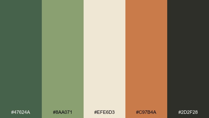
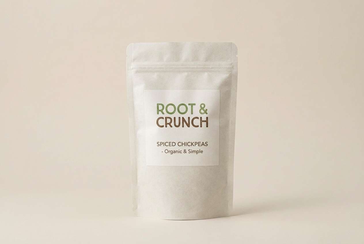
HEX: #47624A #8AA071 #EFE6D3 #C97B4A #2D2F28
Mood: wholesome, appetizing, natural
Best for: organic snacks, cafe branding, farmers markets
Wholesome and appetizing like produce crates and paper bags, these colors feel natural and honest. The toasted orange-brown adds flavor and pairs well with simple illustration styles. Use the cream as label stock and keep the deepest tone for ingredients and nutrition text. Usage tip: add a single-color stamp mark in the mid green to signal organic credibility without clutter.
Image example of earthy food packaging generated using media.io
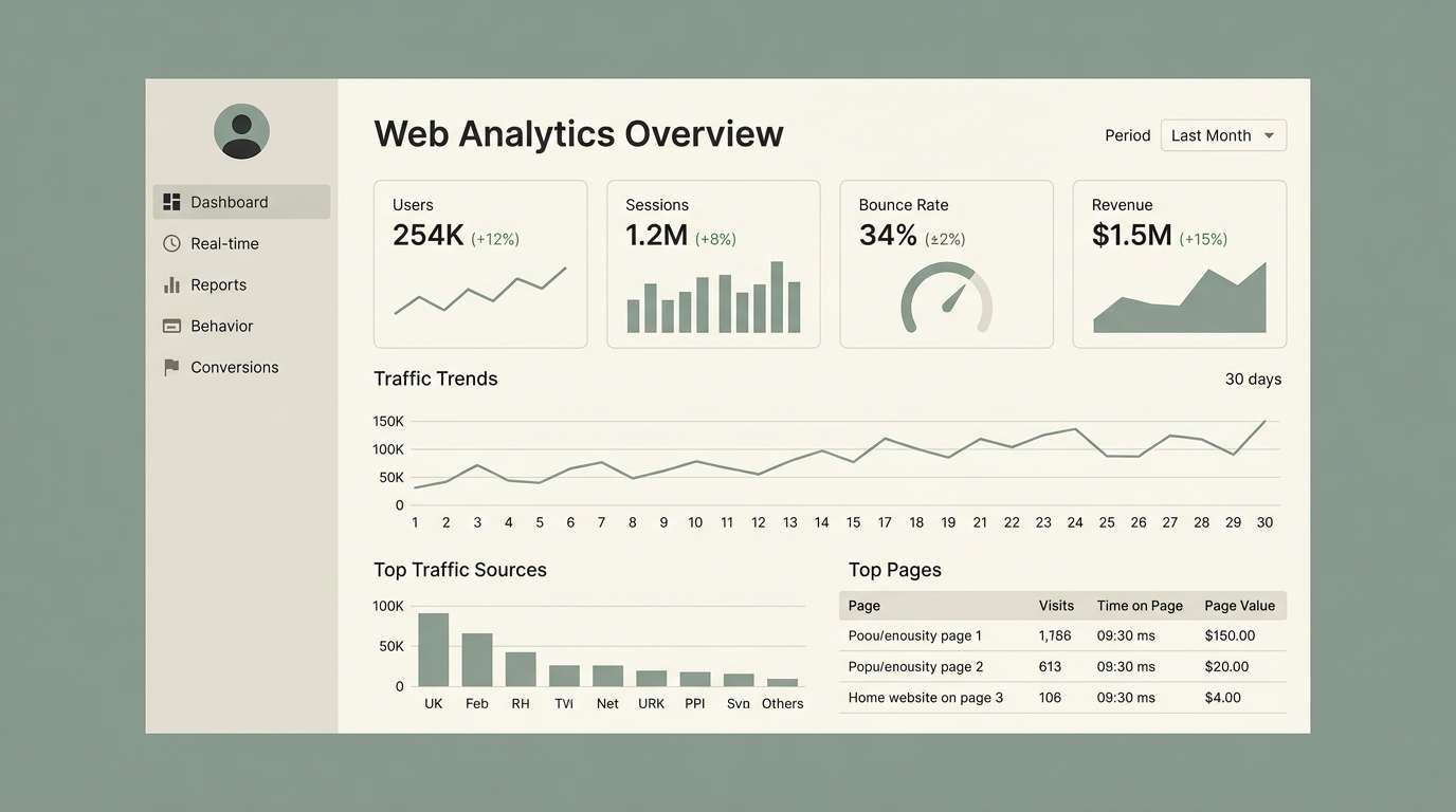
19) Minimal UI Dashboard
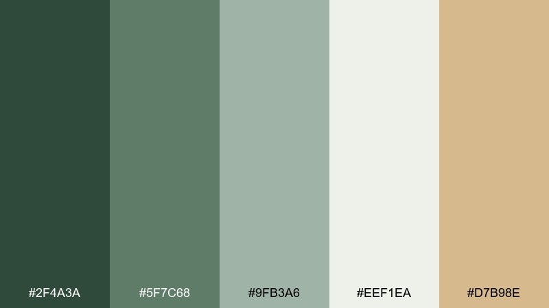
HEX: #2F4A3A #5F7C68 #9FB3A6 #EEF1EA #D7B98E
Mood: focused, tidy, confident
Best for: admin panels, fintech apps, data-heavy UI
Focused and tidy like a well-organized workspace, this mix keeps dashboards confident and calm. The soft gray-green background reduces glare while the dark green delivers strong contrast for navigation. Add the muted sand as a warm highlight for alerts or selected states. Usage tip: reserve the darkest swatch for primary actions and use the mid green for secondary buttons to maintain hierarchy.
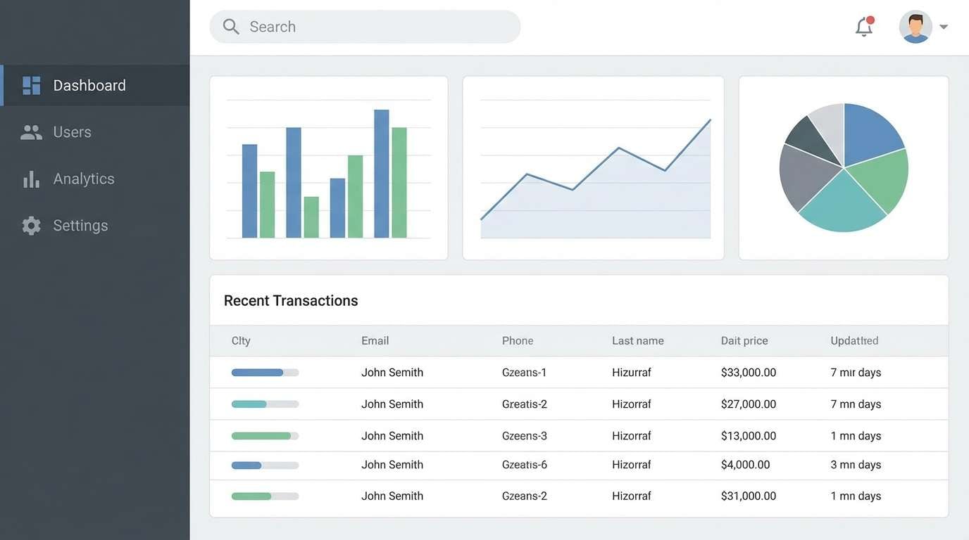
Image example of minimal ui dashboard generated using media.io
20) Eucalyptus Wedding
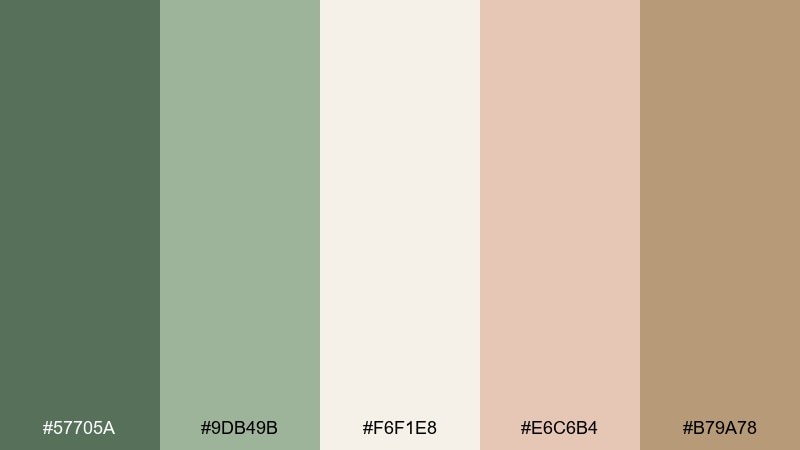
HEX: #57705A #9DB49B #F6F1E8 #E6C6B4 #B79A78
Mood: romantic, soft, airy
Best for: wedding invites, stationery, floral brands
Romantic and airy like eucalyptus sprigs on linen, these tones feel soft and elevated. The blush and warm tan add a gentle celebration note while the greens keep everything grounded. Use the ivory as the main paper tone and keep the deeper green for names and key details. Usage tip: for stationery, print green text slightly lighter than pure black to keep the look delicate.
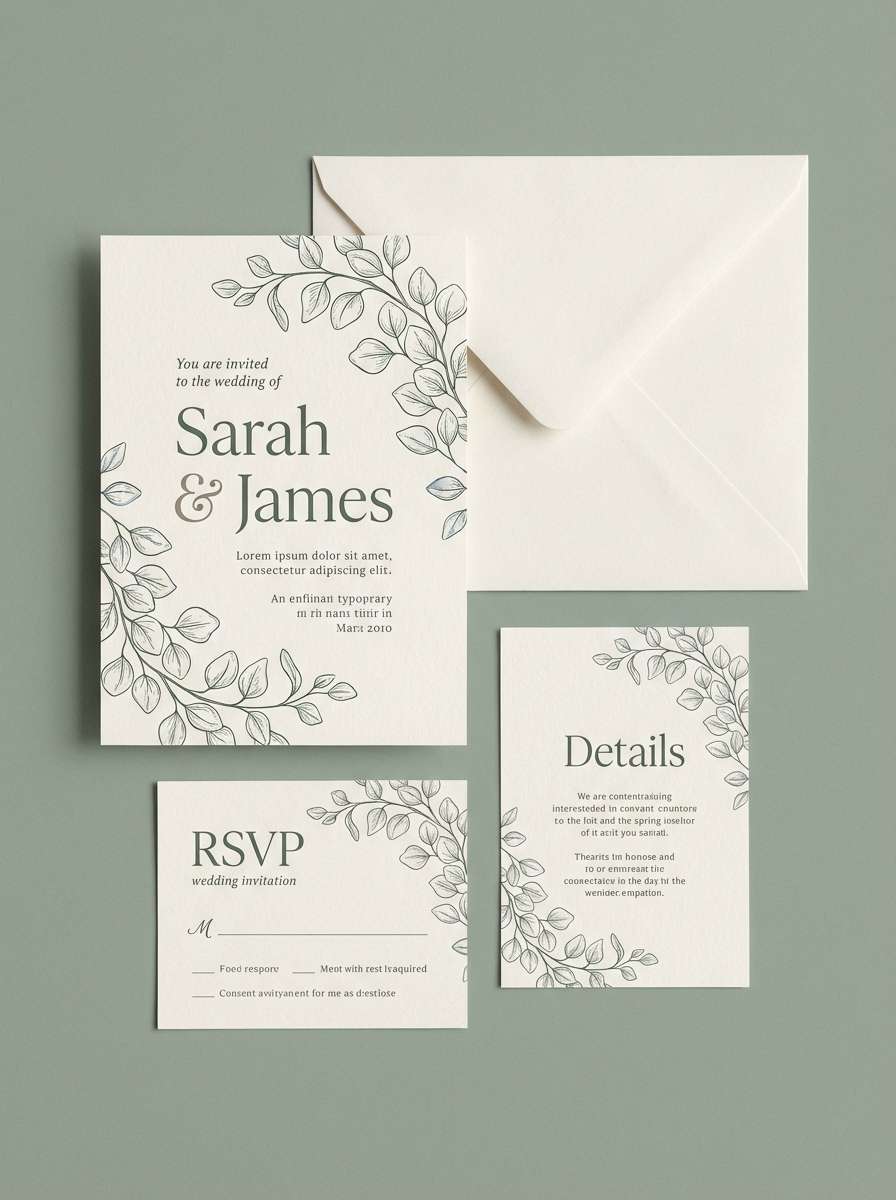
Image example of eucalyptus wedding generated using media.io
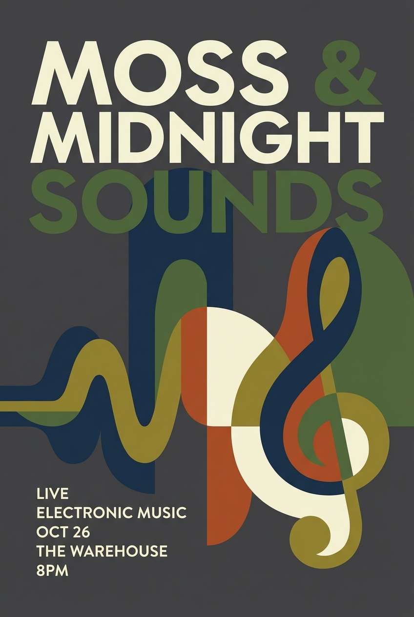
21) Moss Midnight Contrast
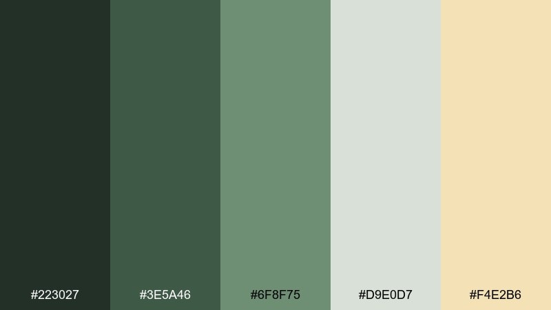
HEX: #223027 #3E5A46 #6F8F75 #D9E0D7 #F4E2B6
Mood: bold, modern, cinematic
Best for: music posters, hero banners, high-contrast branding
Bold and cinematic like a spotlight cutting through dark foliage, this set thrives on contrast. The pale green-gray keeps layouts readable, while the butter accent adds a surprising warmth. Use the near-black green for large headers and the mid green for supporting shapes. Usage tip: keep the yellow accent for one element per section so it reads as intentional emphasis.
Image example of moss midnight contrast generated using media.io
What Colors Go Well with Moss Green?
Warm neutrals are the easiest match: cream, ivory, beige, greige, and soft stone tones make moss green feel airy and “designed,” not heavy. These pairings are especially reliable for interior green paint pairings and calm, modern websites.
For accents, lean into earthy warmth like terracotta, clay, caramel, and brass/gold. They add contrast without clashing, which is perfect for organic packaging, editorial layouts, and boutique branding.
If you want a sharper, more modern look, add near-black green or charcoal for typography and UI structure. This keeps the palette crisp while preserving moss green’s organic character.
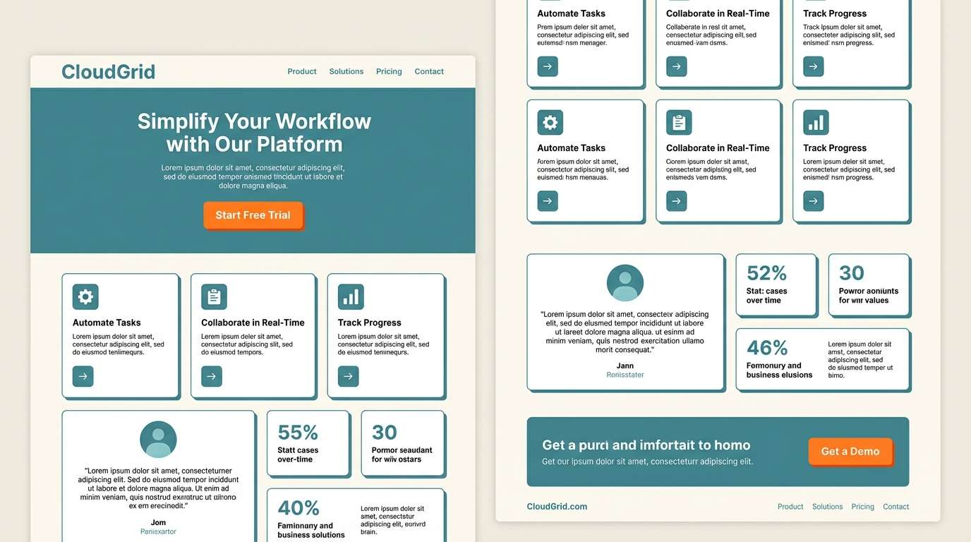
How to Use a Moss Green Color Palette in Real Designs
Start by choosing one “anchor” moss green (usually the darkest swatch) and one light neutral for backgrounds. This gives you instant hierarchy: dark for navigation/text and light for space and readability.
Use mid-tone greens for large surfaces (sections, cards, walls) and reserve warm accents (clay, brass, blush) for small moments like badges, price tags, links, or highlights. Too much warm accent can overpower the calm vibe.
For UI, keep states consistent: pick one green for primary actions, then use neutrals for secondary elements. This prevents the interface from looking muddy and helps users scan quickly.
Create Moss Green Palette Visuals with AI
If you already have HEX codes, you can generate on-brand images fast by describing the layout (poster, UI, packaging) and specifying a “colors inspired by” line. This keeps outputs consistent across campaigns and channels.
For best results, be specific about style (flat vector, editorial layout, realistic studio mockup) and include constraints like “no photos” or “clean seamless background.” Then iterate by swapping only one accent color at a time.
Use Media.io to turn any moss green color palette into posters, UI mockups, packaging previews, and more—directly in your browser.
Moss Green Color Palette FAQs
-
What is moss green (and how is it different from olive or sage)?
Moss green is a muted, earthy green that often sits between olive and sage. Compared to olive, moss green is usually less yellow-brown; compared to sage, it’s typically deeper and more grounded. -
What HEX code is moss green?
There isn’t one single official HEX for moss green, but common mossy anchors look like #4F6B4D, #4A6F4D, or #2F4A3A depending on how dark and how warm you want it. -
What colors go well with moss green for a modern look?
Try moss green with soft off-whites, greige, and charcoal for structure, plus one warm accent like sand or muted brass. This keeps the palette modern and minimal while still organic. -
Does moss green work for UI and apps?
Yes—moss green is great for low-glare backgrounds and calm interfaces. Use a dark moss tone for primary actions and typography, then keep the rest of the UI neutral so interactive elements stay clear. -
Is moss green good for interior design?
Moss green works well on walls, cabinets, and accent pieces because it feels natural in many lighting conditions. Pair it with warm whites, beige textiles, and wood tones to avoid a cold or overly dark room. -
What’s a strong accent color with moss green?
Terracotta/clay, caramel, muted gold, and blush are reliable accents. Use them sparingly (often 5–10% of the design) so moss green remains the dominant mood. -
How can I generate images that match my moss green palette?
Use a text-to-image tool and describe the format (poster, packaging, UI) and style (flat, minimal, studio mockup), then include a line like “colors inspired by [palette name].” Reuse the same prompt structure to keep outputs consistent.


