Coral orange sits in the sweet spot between energetic orange and friendly pink, which makes it feel modern without being too loud. It’s warm enough for bold branding, but soft enough for lifestyle, wellness, and editorial design.
Below are 20 coral orange color palette ideas with HEX codes, plus practical tips and AI prompts you can use to generate matching visuals.
In this article
- Why Coral Orange Palettes Work So Well
-
- sunset sorbet
- seaside coral teal
- terracotta linen
- citrus aperitif
- coral clay and sage
- retro diner pop
- desert bloom
- soft nursery peach
- sunset ui dark mode
- coastal wedding suite
- artisan coffee shop
- tropical fruit punch
- minimal gallery walls
- autumn market
- coral and cobalt energy
- spa calm neutrals
- boutique cosmetics ad
- mediterranean patio
- coral nightlife poster
- kids playroom brights
- What Colors Go Well with Coral Orange?
- How to Use a Coral Orange Color Palette in Real Designs
- Create Coral Orange Palette Visuals with AI
Why Coral Orange Palettes Work So Well
Coral orange is naturally attention-grabbing, but it’s less aggressive than pure orange and less sugary than hot pink. That balance makes it easy to use as a hero color for CTAs, highlights, and brand accents.
It pairs beautifully with both cool and warm tones. Add teal, navy, or slate for contrast and structure, or blend it with cream, blush, and sand for a softer, more editorial look.
Because coral orange sits close to skin tones, it often feels human and approachable. That’s why it works especially well in lifestyle branding, product marketing, hospitality, and modern UI themes.
20+ Coral Orange Color Palette Ideas (with HEX Codes)
1) Sunset Sorbet
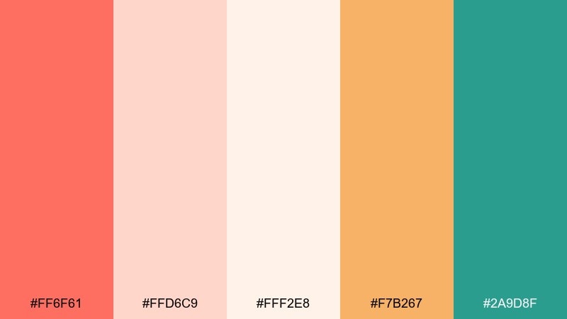
HEX: #ff6f61 #ffd6c9 #fff2e8 #f7b267 #2a9d8f
Mood: playful, sunny, breezy
Best for: summer lifestyle branding and social templates
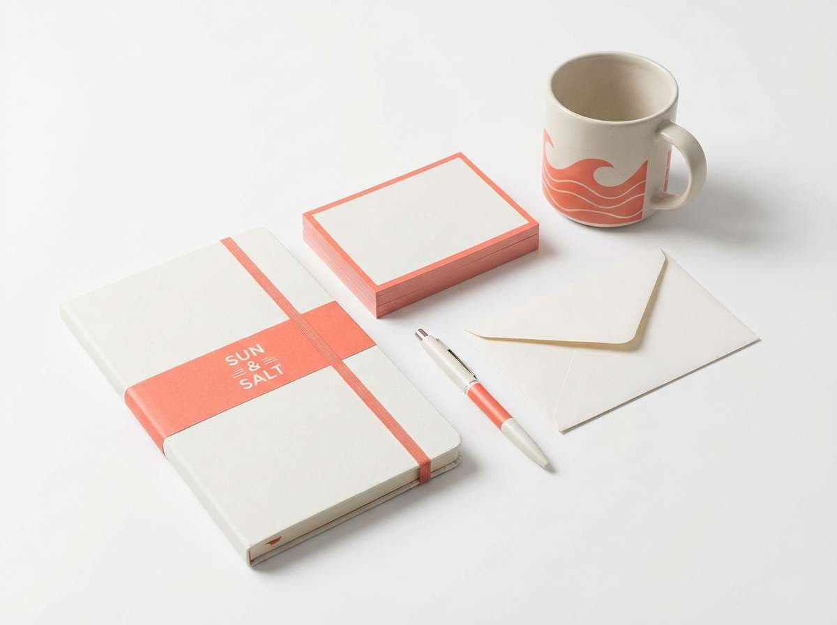
Playful and sun-warmed, this mix feels like sorbet at golden hour by the water. Use the coral as your headline or hero color, then let the blush and cream open up breathing room. Teal brings crisp contrast for buttons, links, and small icons. Tip: keep teal to 10 to 15 percent so the palette stays airy, not split.
Image example of sunset sorbet generated using media.io
Media.io is an online AI studio for creating and editing video, image, and audio in your browser.

2) Seaside Coral Teal
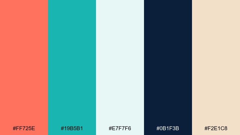
HEX: #ff725e #19b5b1 #e7f7f6 #0b1f3b #f2e1c8
Mood: coastal, clean, confident
Best for: travel websites and resort brochures
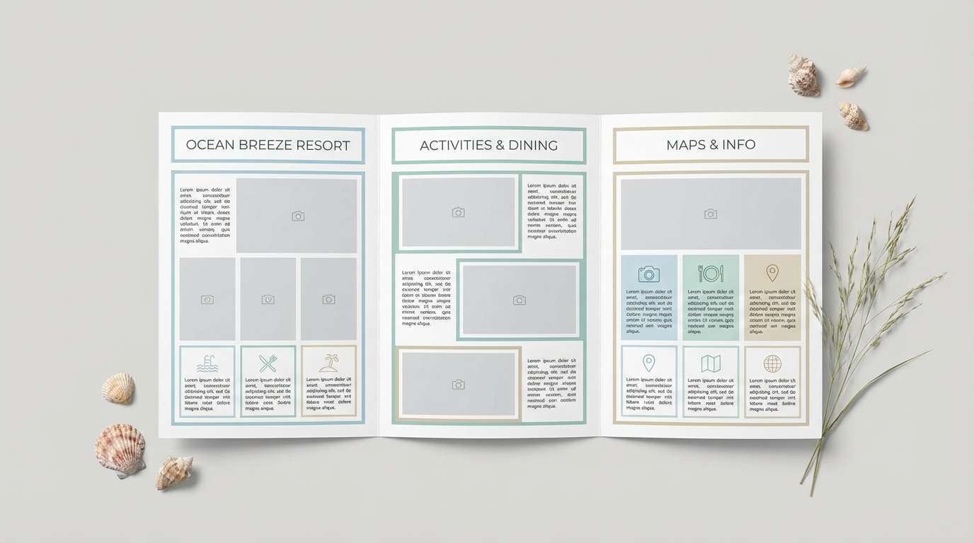
Coastal and crisp, it reads like sea glass against a warm shoreline. Pair coral with navy for strong hierarchy, then soften transitions with sand and pale aqua. This works especially well for navigation bars, booking CTAs, and feature callouts. Tip: use the light aqua as your main background to keep content calm and readable.
Image example of seaside coral teal generated using media.io
3) Terracotta Linen
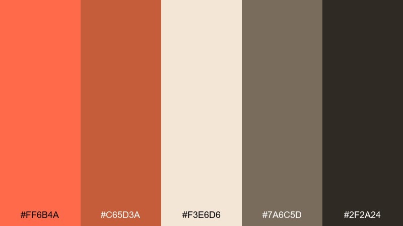
HEX: #ff6b4a #c65d3a #f3e6d6 #7a6c5d #2f2a24
Mood: earthy, grounded, artisanal
Best for: ceramics shops and rustic ecommerce
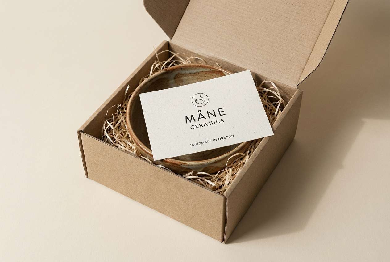
Earthy and tactile, it evokes clay, linen, and sunbaked studios. The deeper terracotta supports the brighter coral for a layered look that feels crafted, not loud. In a coral orange color palette like this, keep the charcoal for typography and the linen for product pages to reduce visual noise. Tip: use the warm gray-brown for borders and dividers instead of pure gray.
Image example of terracotta linen generated using media.io
4) Citrus Aperitif
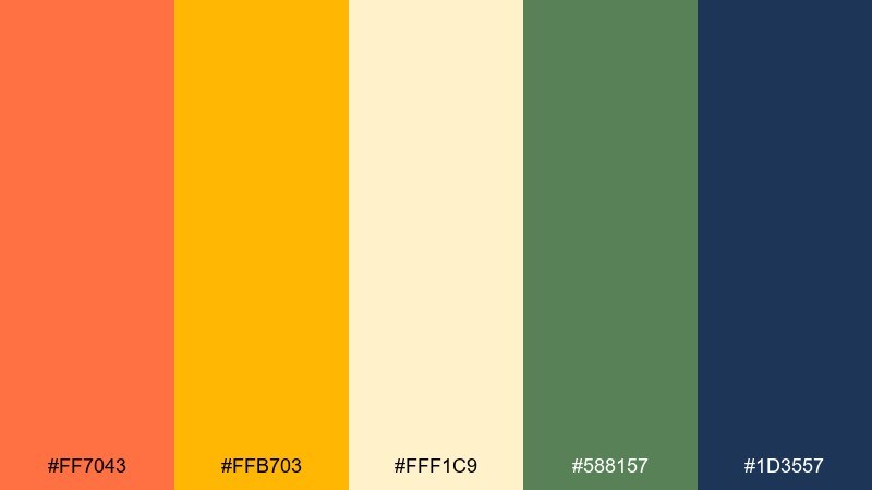
HEX: #ff7043 #ffb703 #fff1c9 #588157 #1d3557
Mood: zesty, social, high-energy
Best for: cocktail bars and menu design
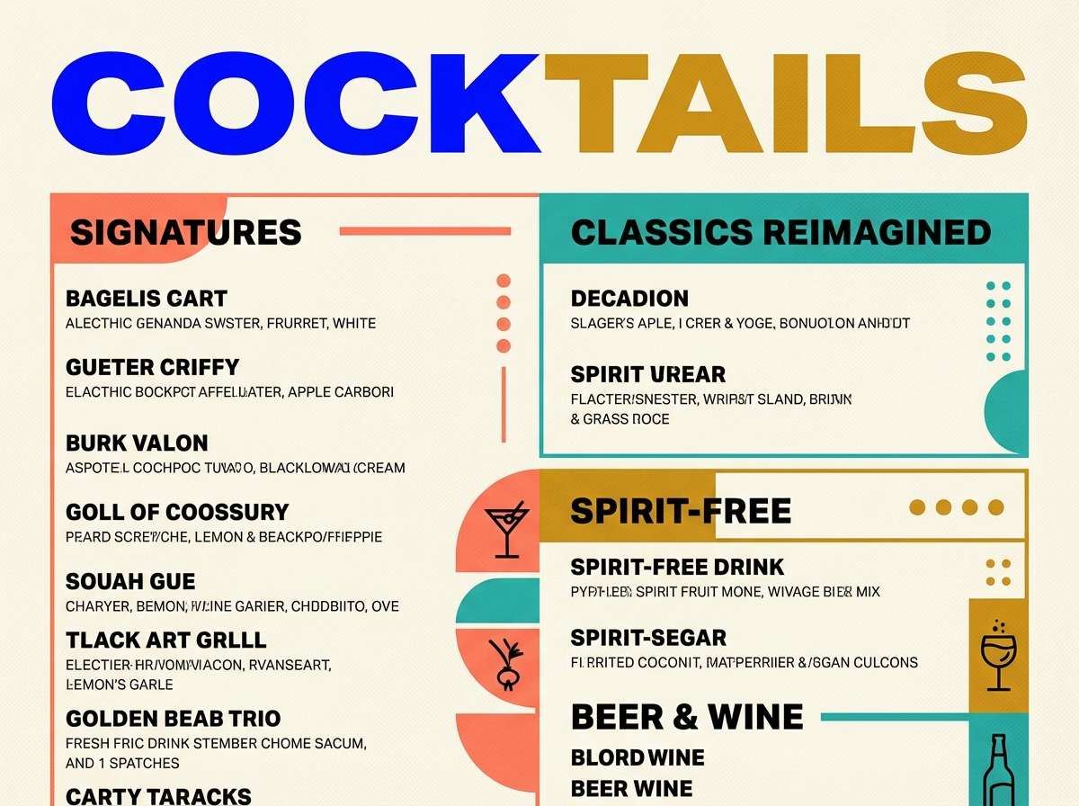
Zesty and social, it feels like clinking glasses and citrus peel. The coral and golden yellow make a punchy duo, while the deep navy anchors prices and headings. Use green sparingly for garnish-like highlights or dietary icons. Tip: print menus on warm cream stock so the bright accents stay saturated without glare.
Image example of citrus aperitif generated using media.io
5) Coral Clay and Sage
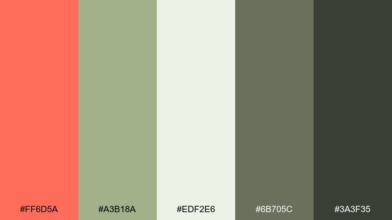
HEX: #ff6d5a #a3b18a #edf2e6 #6b705c #3a3f35
Mood: calm, organic, modern
Best for: wellness packaging and sustainable brands
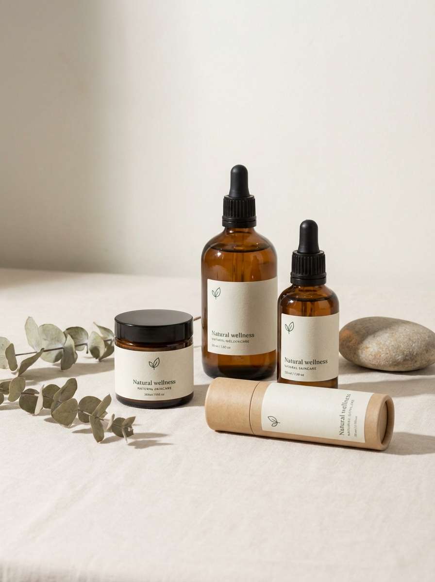
Calm and organic, it brings to mind clay pots, herbal steam, and quiet mornings. Sage and soft off-white keep the coral feeling grown-up rather than sugary. This pairing is ideal for ingredient callouts, eco badges, and subtle patterns. Tip: set body text in the deep olive charcoal for a softer contrast than pure black.
Image example of coral clay and sage generated using media.io
6) Retro Diner Pop
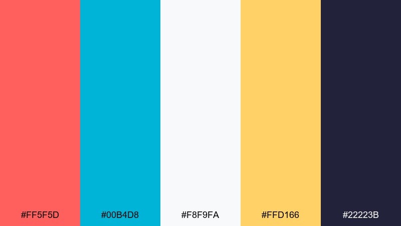
HEX: #ff5f5d #00b4d8 #f8f9fa #ffd166 #22223b
Mood: retro, bold, upbeat
Best for: event flyers and pop-up promos
Retro and punchy, it channels neon signs, jukebox energy, and glossy tiles. Coral and cyan create instant contrast for headlines and badges, while off-white keeps layouts from feeling crowded. Add yellow for limited-time tags or starburst shapes. Tip: reserve the dark ink tone for outlines and small text so the bright colors stay dominant.
Image example of retro diner pop generated using media.io

7) Desert Bloom
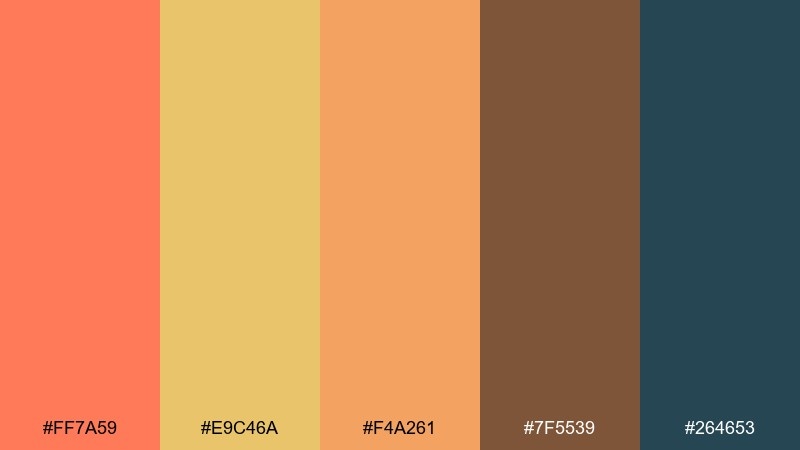
HEX: #ff7a59 #e9c46a #f4a261 #7f5539 #264653
Mood: warm, scenic, adventurous
Best for: outdoor brands and travel editorial
Warm and scenic, it looks like desert blooms against dusk-blue horizons. Use the blue-green as a grounding base, then layer coral and apricot for highlights and imagery overlays. The brown adds a natural, rugged note for secondary text or frames. Tip: apply coral as a gradient accent with apricot for hero banners and section headers.
Image example of desert bloom generated using media.io
8) Soft Nursery Peach
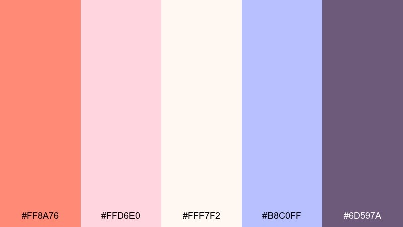
HEX: #ff8a76 #ffd6e0 #fff7f2 #b8c0ff #6d597a
Mood: gentle, cozy, dreamy
Best for: baby shower invitations and nursery decor
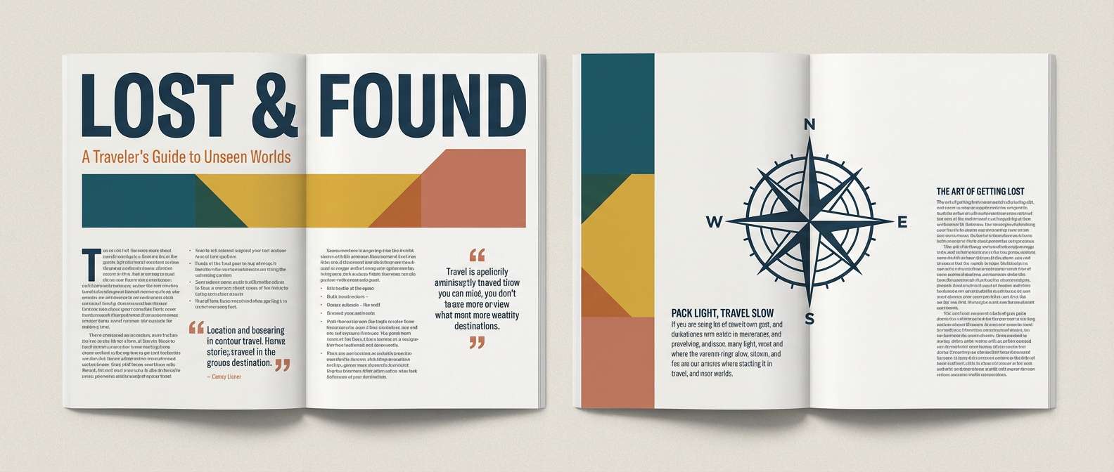
Gentle and cozy, it feels like cotton blankets and warm light through curtains. The coral-peach stays sweet without turning too neon, thanks to creamy white and dusty violet. Periwinkle gives a fresh counterbalance for names, dates, or small icons. Tip: for print, keep the darkest purple only for typography to maintain the soft mood.
Image example of soft nursery peach generated using media.io
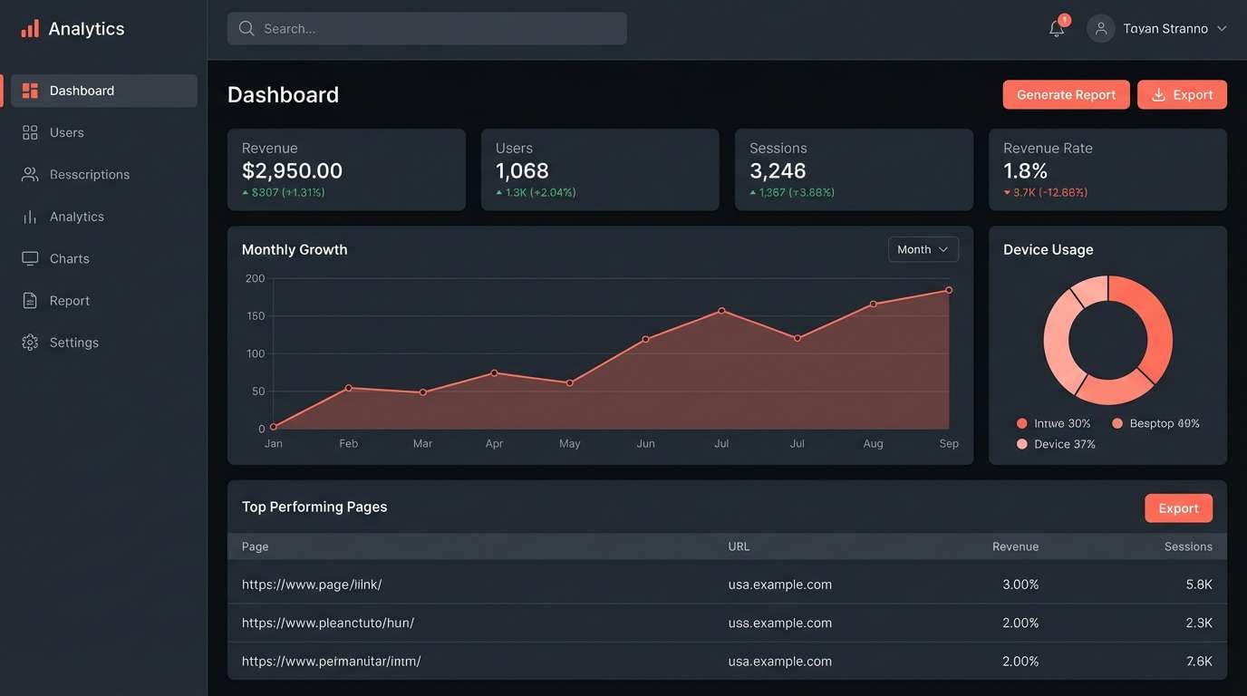
9) Sunset UI Dark Mode
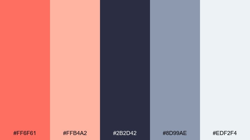
HEX: #ff6f61 #ffb4a2 #2b2d42 #8d99ae #edf2f4
Mood: sleek, modern, cinematic
Best for: app UI dashboards in dark mode
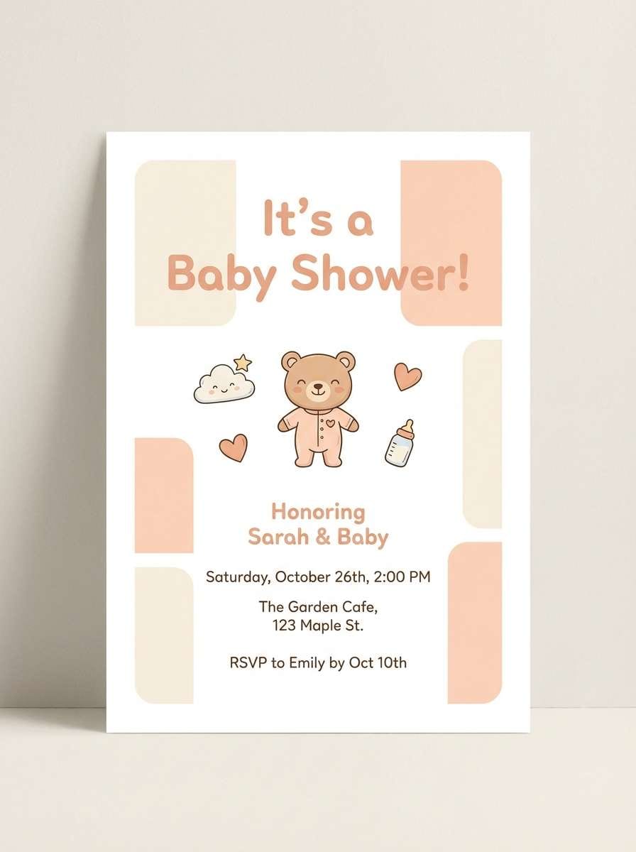
Sleek and cinematic, it reads like city lights at dusk. This coral orange color scheme works best when coral is reserved for primary actions and key charts, not large fills. Use the deep slate as your canvas, then lift cards and surfaces with cool gray and near-white. Tip: test contrast for accessibility by keeping coral on the darkest background, not mid-gray.
Image example of sunset ui dark mode generated using media.io
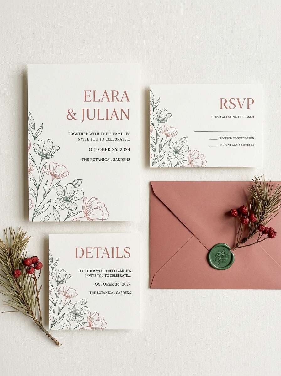
10) Coastal Wedding Suite
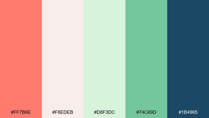
HEX: #ff7b6e #f8edeb #d8f3dc #74c69d #1b4965
Mood: romantic, fresh, airy
Best for: wedding invitations and save-the-dates
Romantic and airy, it evokes ocean breezes with a warm coral glow. Creamy blush keeps the page soft, while mint and sea-green add a refreshing lift for monograms and florals. Use the deep blue for names and venue details so everything stays legible. Tip: add coral only to key accents like RSVP buttons or envelope liners for a refined look.
Image example of coastal wedding suite generated using media.io
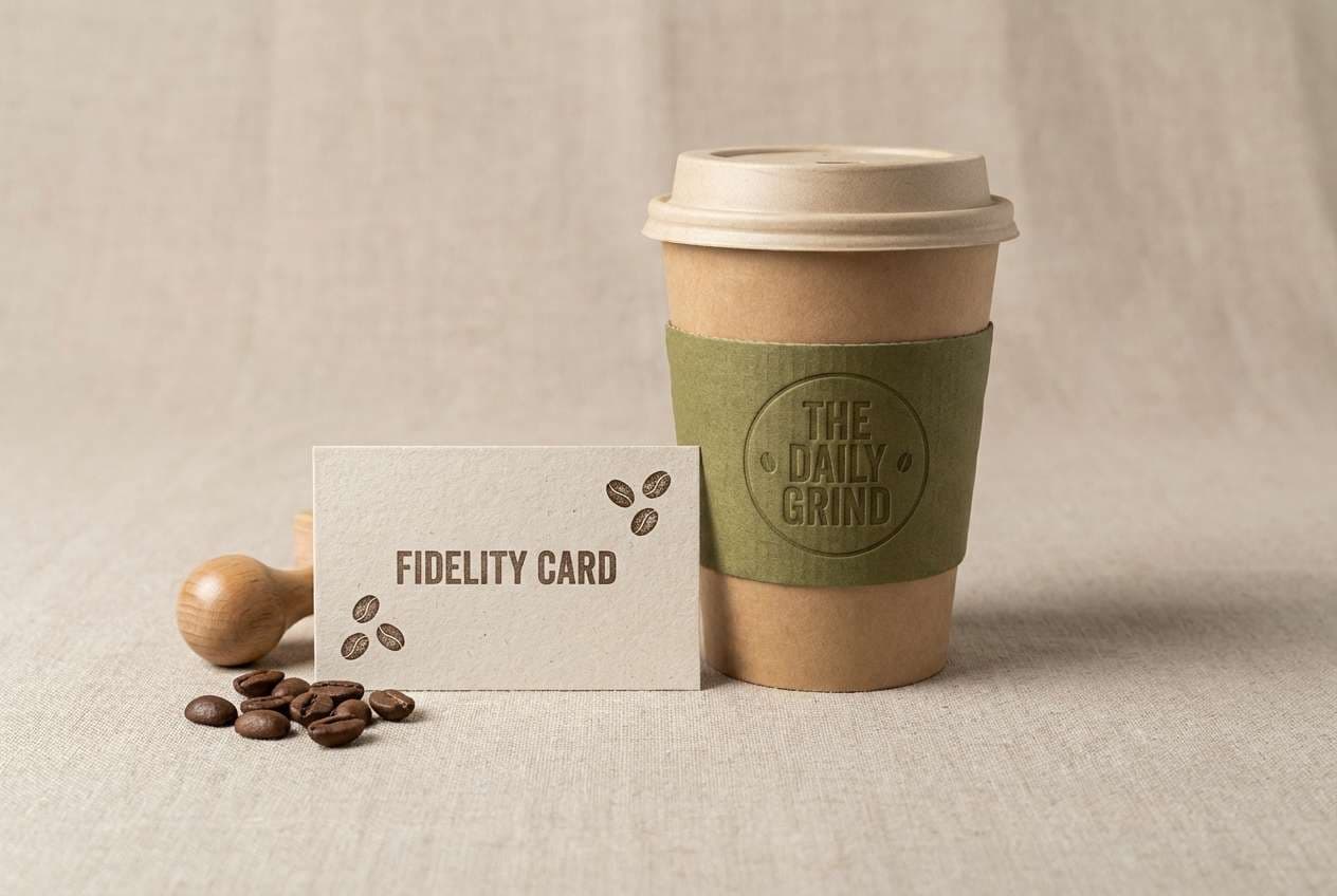
11) Artisan Coffee Shop
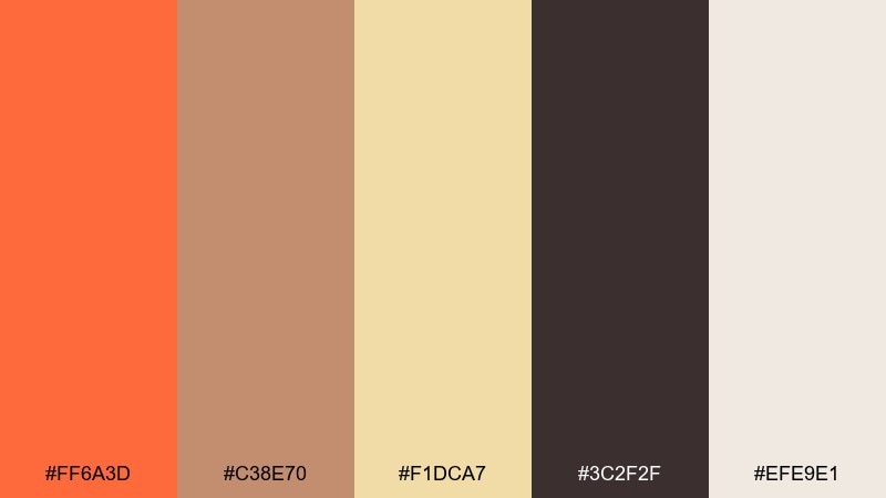
HEX: #ff6a3d #c38e70 #f1dca7 #3c2f2f #efe9e1
Mood: warm, inviting, handcrafted
Best for: cafe branding and loyalty cards
Warm and inviting, it feels like crema, cinnamon, and hand-stamped paper. Coral adds a friendly pop for stamps or social icons, while mocha and oat tones do the heavy lifting across menus and signage. Use the dark roast brown for typography and small illustrations. Tip: print loyalty cards on textured off-white to emphasize the handcrafted vibe.
Image example of artisan coffee shop generated using media.io
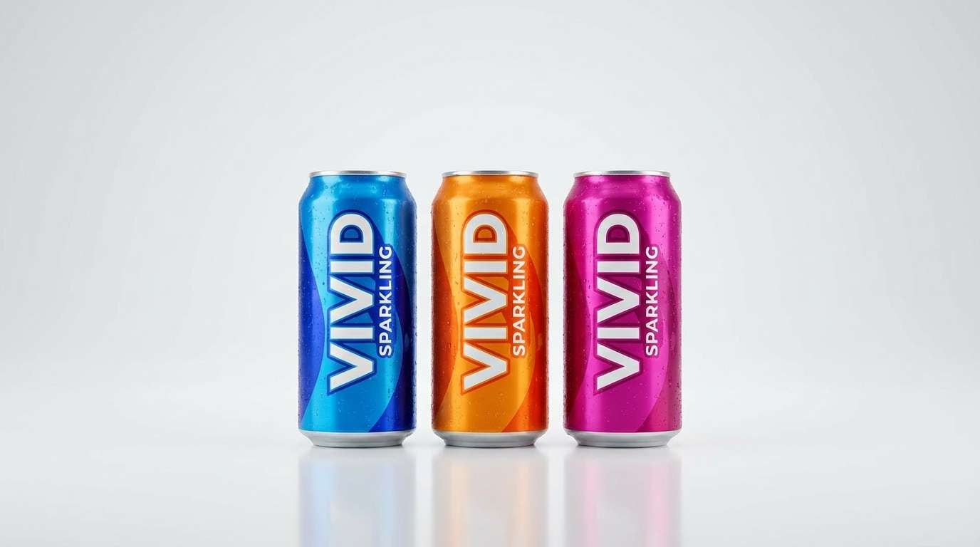
12) Tropical Fruit Punch
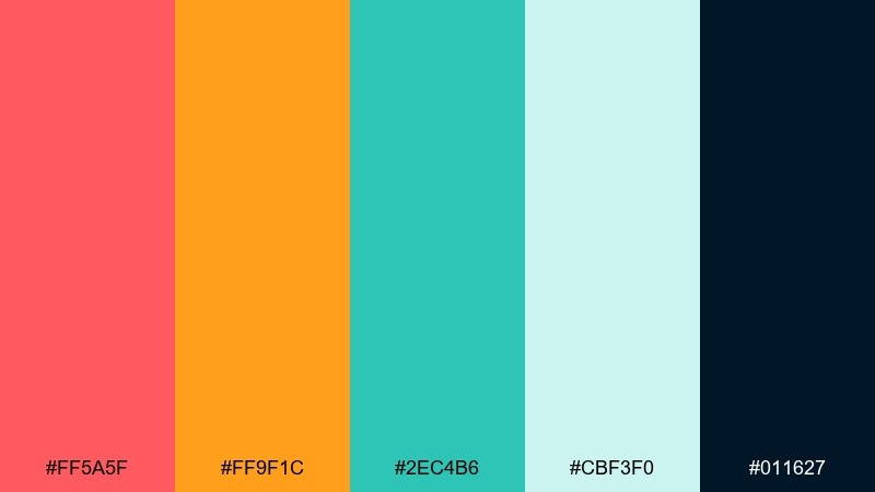
HEX: #ff5a5f #ff9f1c #2ec4b6 #cbf3f0 #011627
Mood: tropical, lively, energetic
Best for: summer product launches and ads
Tropical and lively, it brings pineapple, coral reefs, and sparkling water to mind. The coral and orange duo grabs attention fast, while teal keeps the whole mix feeling fresh. Use the near-black for bold headlines and to frame bright product shots. Tip: keep backgrounds light and let the saturated colors live in badges, buttons, and short bursts of copy.
Image example of tropical fruit punch generated using media.io
13) Minimal Gallery Walls
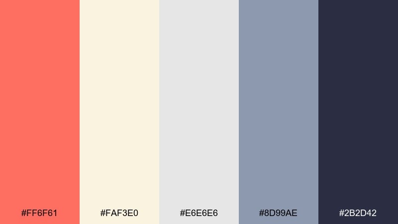
HEX: #ff6f61 #faf3e0 #e6e6e6 #8d99ae #2b2d42
Mood: minimal, curated, modern
Best for: interior mood boards and portfolios
Minimal and curated, it feels like a sunlit gallery with one statement artwork. Coral plays best as a single focal accent against warm cream and soft grays. The slate tones help structure captions, grids, and navigation without stealing attention. Tip: use coral on one element per section, like a single icon set or highlighted link, for a calm premium finish.
Image example of minimal gallery walls generated using media.io
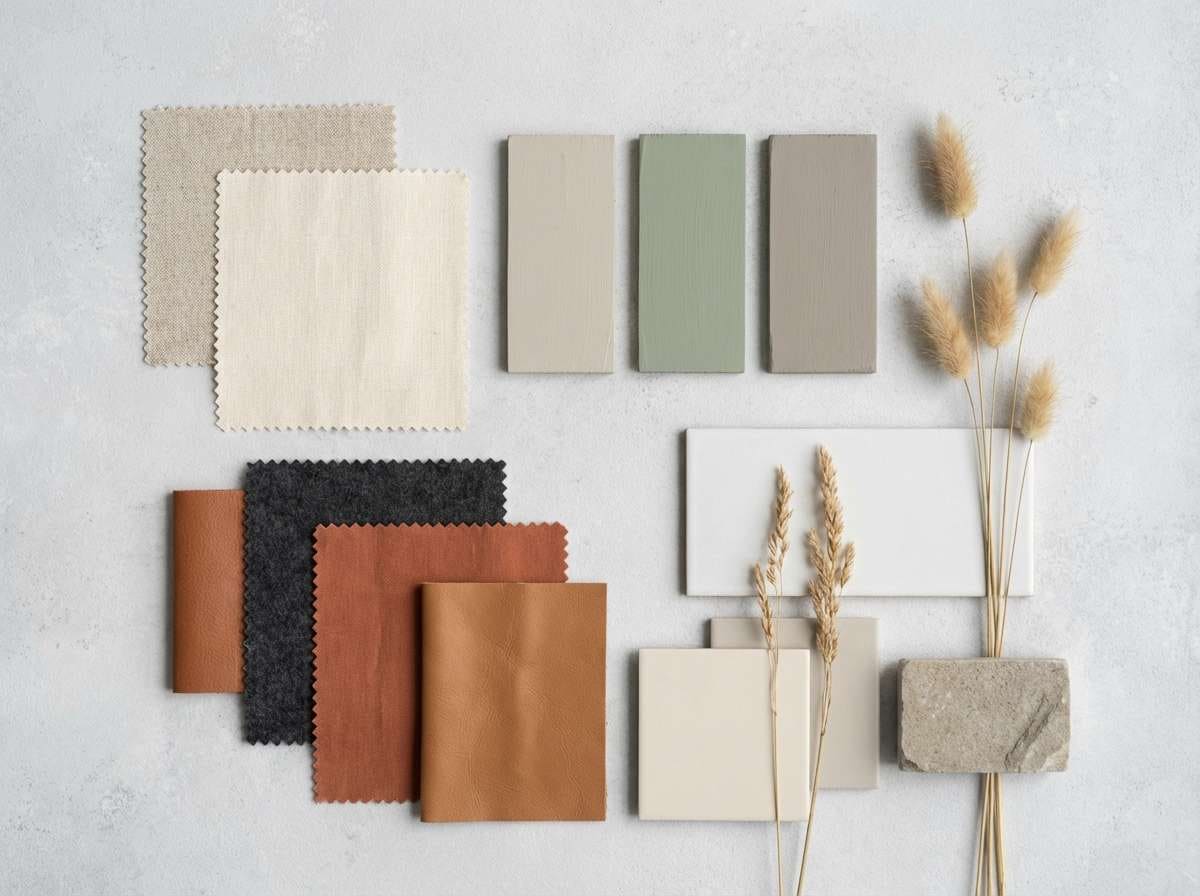
14) Autumn Market
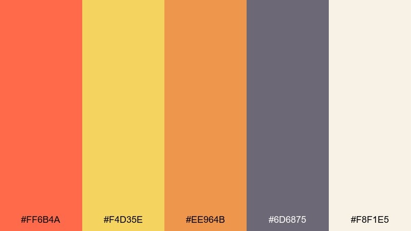
HEX: #ff6b4a #f4d35e #ee964b #6d6875 #f8f1e5
Mood: cozy, seasonal, welcoming
Best for: fall promotions and local market posters
Cozy and seasonal, it suggests knit scarves, cider, and stalls piled with fruit. In a coral orange color palette like this, blend coral with honey yellow for friendly warmth, then lean on mauve-gray for balance. The creamy base keeps text blocks readable and helps photos look more natural. Tip: use the mauve-gray for large type and let coral be the accent on dates and callouts.
Image example of autumn market generated using media.io
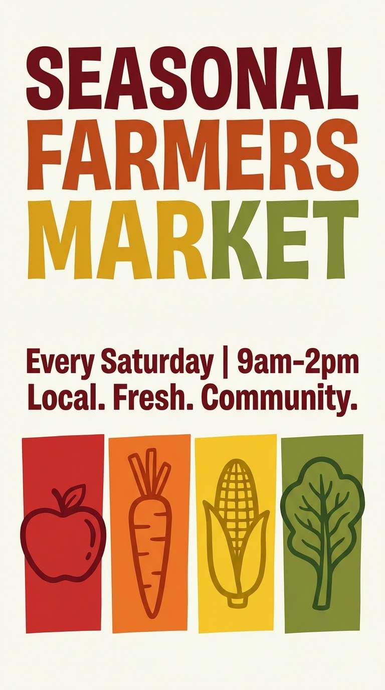
15) Coral and Cobalt Energy
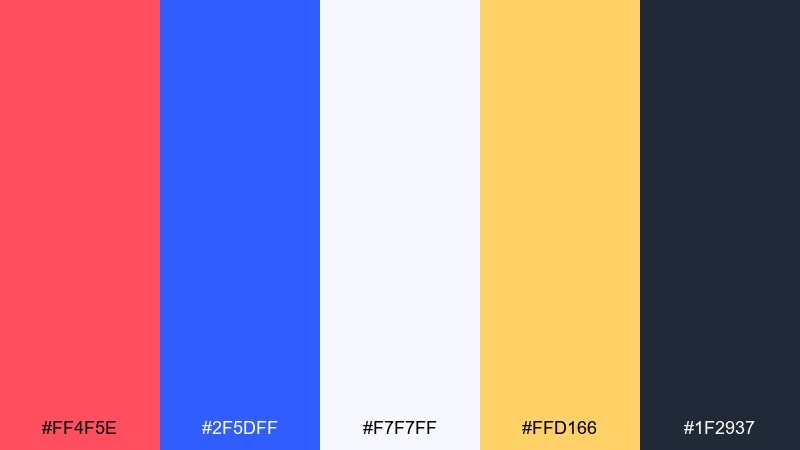
HEX: #ff4f5e #2f5dff #f7f7ff #ffd166 #1f2937
Mood: bold, sporty, high-contrast
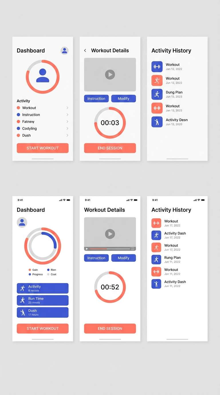
Best for: fitness apps and promo banners
Bold and high-contrast, it feels like stadium lights and fast motion. Coral and cobalt create instant tension for CTAs, scores, and progress states. Use off-white to keep screens clean and the deep gray for text-heavy sections. Tip: keep the yellow as a micro-accent for achievements or notification dots to avoid visual overload.
Image example of coral and cobalt energy generated using media.io
16) Spa Calm Neutrals
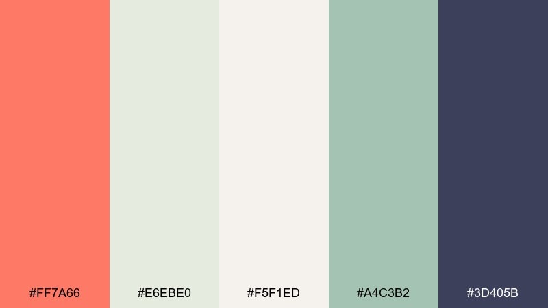
HEX: #ff7a66 #e6ebe0 #f5f1ed #a4c3b2 #3d405b
Mood: soothing, clean, restorative
Best for: spa websites and skincare labels
Soothing and restorative, it evokes steam, eucalyptus, and soft towels. Coral becomes a gentle warmth when paired with foggy neutrals and muted mint. Use the deep indigo as a refined text color and for small icons. Tip: set backgrounds in the pale cream and keep coral for just one primary action per page.
Image example of spa calm neutrals generated using media.io
17) Boutique Cosmetics Ad
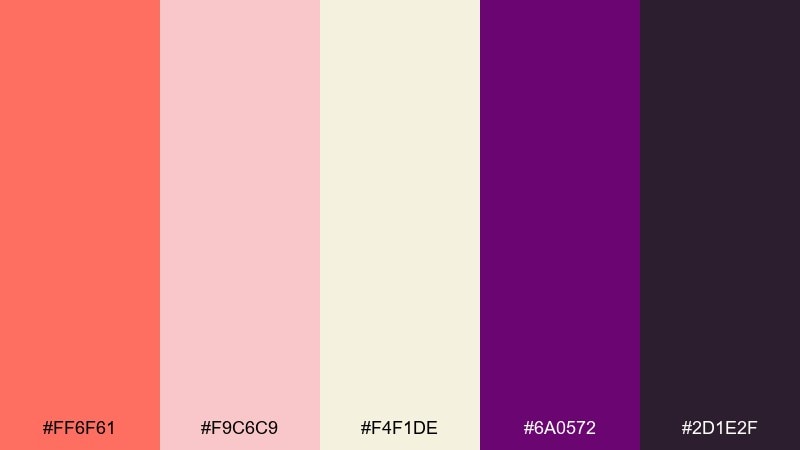
HEX: #ff6f61 #f9c6c9 #f4f1de #6a0572 #2d1e2f
Mood: glam, romantic, editorial
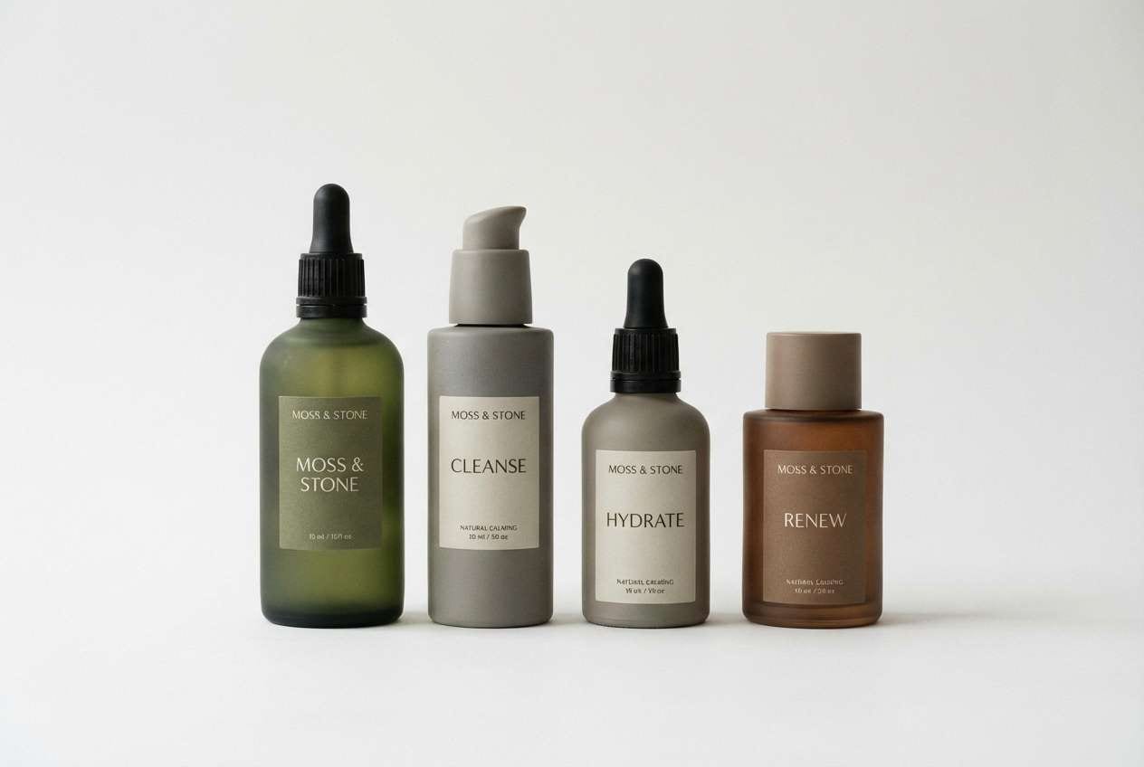
Best for: cosmetics product ads and landing pages
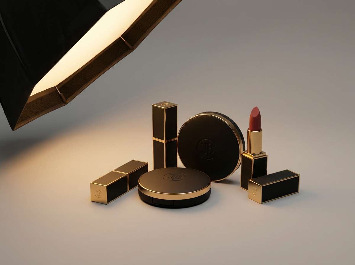
Glam and editorial, it reads like velvet shadows with a warm coral spotlight. These coral orange color combinations shine when you set coral against deep plum for premium contrast. Use the blush and cream to create soft gradients behind product renders and pricing blocks. Tip: keep the darkest shade for small text and outlines so the ad stays luminous, not heavy.
Image example of boutique cosmetics ad generated using media.io
18) Mediterranean Patio
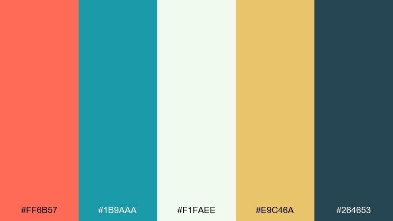
HEX: #ff6b57 #1b9aaa #f1faee #e9c46a #264653
Mood: sunny, breezy, vacation-ready
Best for: restaurant branding and hospitality signage
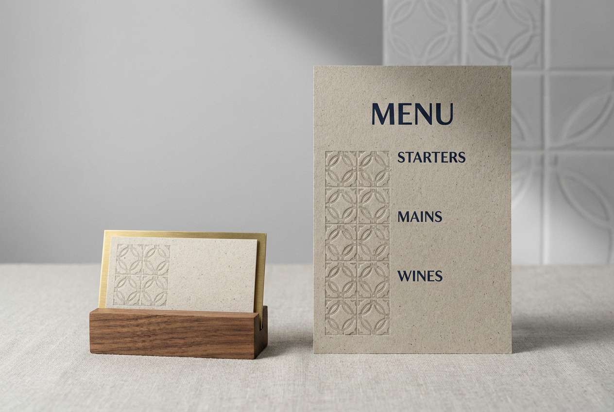
Sunny and vacation-ready, it feels like painted tiles, lemons, and sea air. Teal and deep blue-green give structure, while coral and saffron create appetizing warmth. Use the near-white for menus and wayfinding so text stays crisp. Tip: repeat teal in small patterns and borders, then reserve coral for featured dishes and key signage.
Image example of mediterranean patio generated using media.io
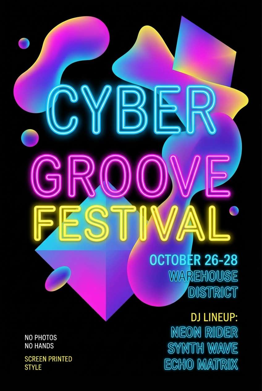
19) Coral Nightlife Poster
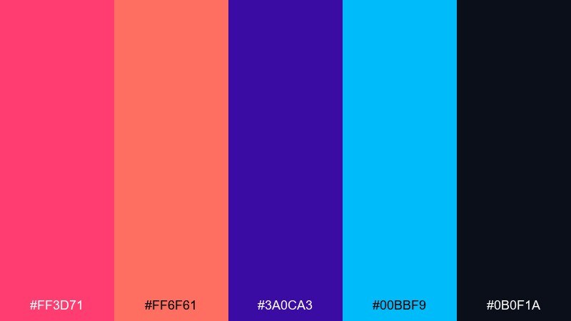
HEX: #ff3d71 #ff6f61 #3a0ca3 #00bbf9 #0b0f1a
Mood: neon, dramatic, electric
Best for: music posters and club event promos
Neon and dramatic, it looks like glowing signage in a midnight alley. Hot pink and coral create a fiery center, while violet and cyan push the palette into an electric club mood. Use near-black as the base so typography and gradients pop. Tip: apply coral as a soft glow behind the main headline to guide focus from a distance.
Image example of coral nightlife poster generated using media.io
20) Kids Playroom Brights
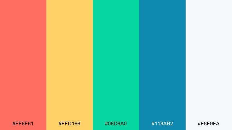
HEX: #ff6f61 #ffd166 #06d6a0 #118ab2 #f8f9fa
Mood: cheerful, playful, energetic
Best for: kids brands and educational graphics
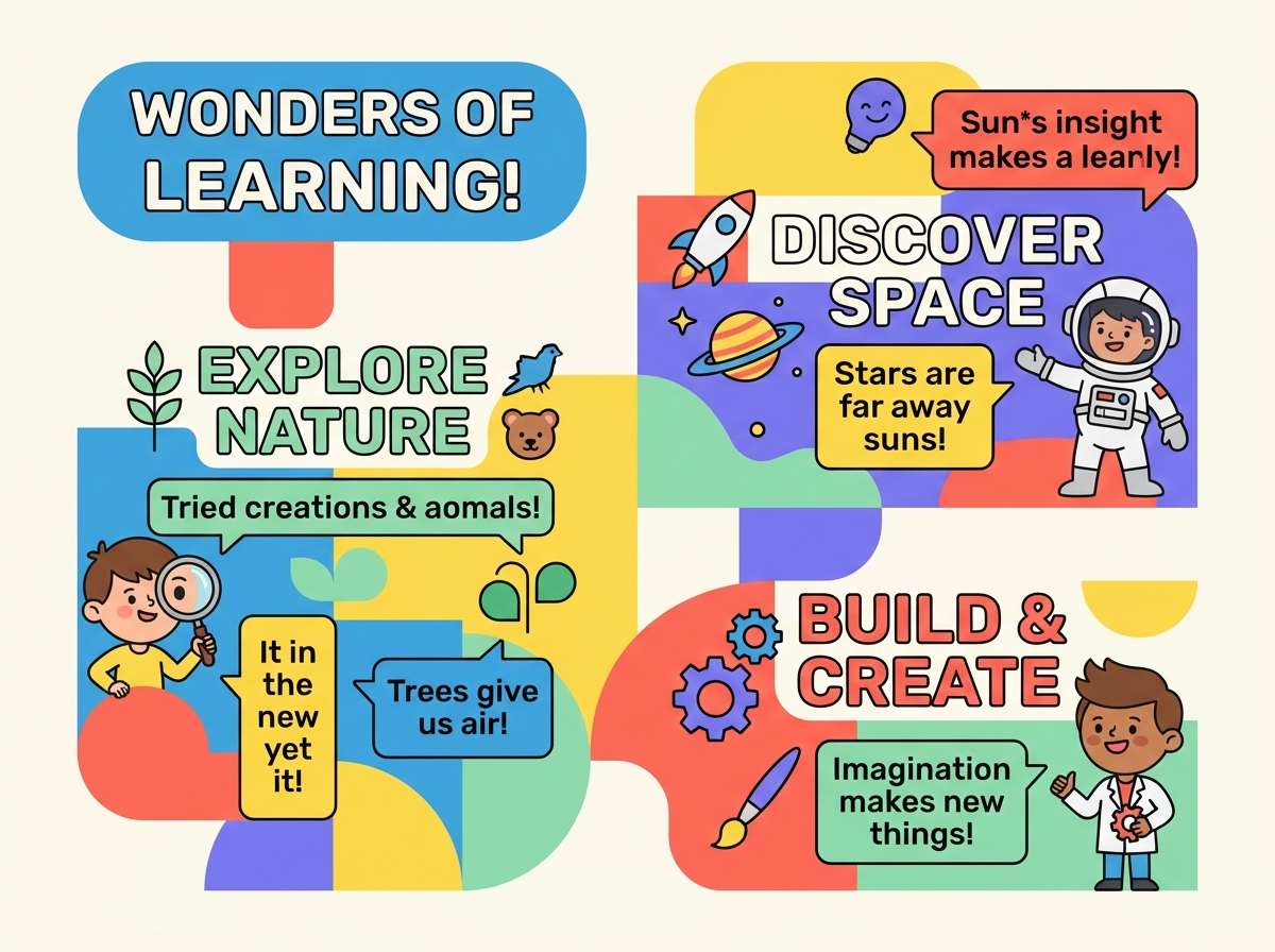
Cheerful and bouncy, it brings to mind building blocks, stickers, and sunny classrooms. Coral and yellow keep things friendly, while green and blue help separate categories in charts or lessons. Use the off-white as a calming base so the brights do not overwhelm. Tip: assign one color per content type, then keep coral for the most important prompts and rewards.
Image example of kids playroom brights generated using media.io
What Colors Go Well with Coral Orange?
Cool contrasts are the fastest way to make coral orange look sharp and modern. Teal, aqua, navy, cobalt, and slate help coral read cleaner and more “designed,” especially in UI, posters, and ads.
For softer, lifestyle-friendly combinations, pair coral with warm neutrals like cream, linen, sand, oat, and blush. These tones keep coral flattering and calm, making them ideal for wedding suites, packaging, and interior mood boards.
If you want extra energy, add one bright accent (like sunshine yellow or cyan) but keep it small. Coral already carries visual weight, so a restrained accent strategy prevents the palette from turning chaotic.
How to Use a Coral Orange Color Palette in Real Designs
Use coral orange as an accent first: primary buttons, key tags, sale badges, or hero headlines. Then build structure with a deep anchor (navy, charcoal, deep olive) and give your layout room with a light background.
When coral is the main brand color, keep large fills slightly softened (more peach/coral than pure orange), and rely on darker text colors for readability. In print, warm whites and creams often look better than bright white because they reduce glare and keep coral saturated.
For photos and product shots, coral overlays work best as gradients or semi-transparent blocks. This keeps imagery visible while still tying the visuals back to the palette.
Create Coral Orange Palette Visuals with AI
If you have HEX codes but need matching mockups, ads, or UI screens, you can generate consistent coral-orange visuals with AI prompts. Start with a clear subject (packaging, poster, dashboard), then add style cues (minimal, editorial, retro) and finish with your aspect ratio.
To keep results on-brand, repeat your palette’s keywords (like “coastal,” “earthy,” or “neon”) and specify “clean background” when you need swatch-friendly compositions. You can also iterate quickly by swapping only one descriptor at a time.
Use Media.io Text-to-Image to turn any of the prompts above into on-brand examples you can test in real layouts.
Coral Orange Color Palette FAQs
-
What is a coral orange color?
Coral orange is a warm hue between orange and pink. It typically looks softer than pure orange and more energetic than peach, making it popular for modern branding and lifestyle design. -
Is coral orange good for UI and app design?
Yes—coral orange works well as an accent for CTAs, highlights, and active states. For accessibility, place coral on very light backgrounds (cream/off-white) or very dark backgrounds (navy/charcoal) to maintain strong contrast. -
What colors pair best with coral orange?
Top pairings include teal/aqua, navy, slate gray, cream, blush, sand, sage, and deep olive. Choose cool tones for contrast, or warm neutrals for a softer, editorial feel. -
How do I keep a coral orange palette from looking too “summer”?
Balance coral with grounded tones like terracotta, mocha, charcoal, deep olive, or muted mauve-gray. Limiting bright accents and using textured neutrals (linen/cream) also makes coral feel more mature. -
Can coral orange work for luxury branding?
It can, especially when paired with deep plum, near-black, or navy and supported by soft cream backgrounds. Use coral sparingly as a spotlight color and keep typography and spacing refined. -
What’s a good background color for coral orange text or buttons?
For buttons, coral often pops best on off-white/cream or deep navy/charcoal. For coral text, avoid mid-tone backgrounds; pick very light neutrals or very dark anchors to keep it readable. -
How can I generate coral orange palette visuals quickly?
Use an AI text-to-image tool with a subject-focused prompt (e.g., “menu design,” “packaging,” “dashboard”), add a style descriptor (minimal, retro, editorial), and keep a clean background for consistent, usable outputs.
Next: Pink Teal Color Palette


