

Gold and purple is a timeless duo: purple brings depth and imagination, while gold adds warmth and prestige. Together, they create palettes that feel instantly “designed,” whether you’re building a brand, a UI, or print materials.
Below are 20+ gold purple color palette ideas with HEX codes, plus practical tips and AI prompts you can reuse to generate matching visuals.
In this article
- Why Gold Purple Palettes Work So Well
-
- royal gala
- amethyst gild
- velvet crown
- orchid lanterns
- antique brocade
- cosmic luxe
- plum sorbet
- dusk brass
- lavender bullion
- baroque night
- sunlit iris
- grapevine gold
- mocha majestic
- lilac treasury
- midnight saffron
- heirloom orchid
- purple haze gold
- iris sandstone
- gilded minimal
- harvest violet
- opulent bouquet
- What Colors Go Well with Gold Purple?
- How to Use a Gold Purple Color Palette in Real Designs
- Create Gold Purple Palette Visuals with AI
Why Gold Purple Palettes Work So Well
Gold and purple naturally communicate “premium” because they combine warm metallic energy with cool, royal depth. Purple creates a strong anchor for layouts, while gold highlights what matters—headlines, badges, borders, and key UI actions.
This pairing also gives you built-in contrast options: deep plum or near-black for structure, pale lilac or cream for breathing room, and gold for focal points. That makes it easy to control hierarchy without needing dozens of colors.
Most importantly, gold purple color combinations scale across mediums. They look elegant in print (especially with foil) and feel modern on screens when gold is used as a restrained accent instead of a full background.
20+ Gold Purple Color Palette Ideas (with HEX Codes)
1) Royal Gala
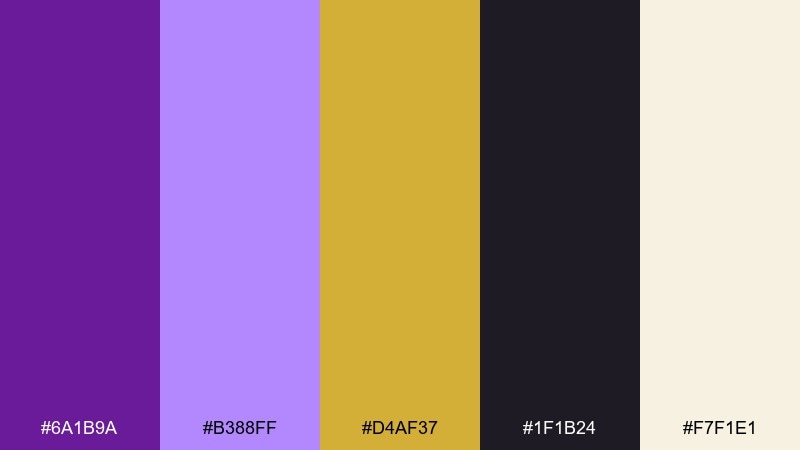
HEX: #6A1B9A #B388FF #D4AF37 #1F1B24 #F7F1E1
Mood: regal, celebratory, high-contrast
Best for: luxury branding and hero banners
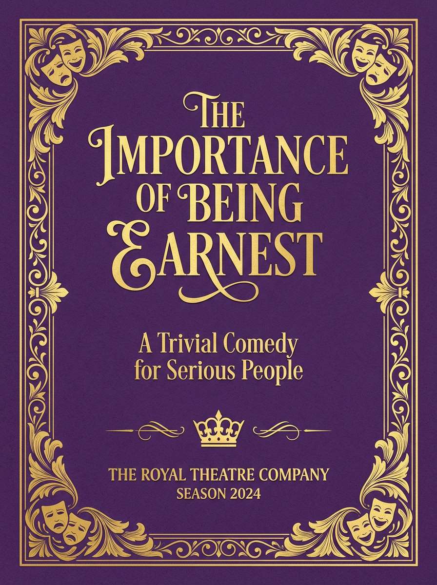
Regal and celebratory, this mix feels like velvet drapes lit by warm chandeliers. Deep purple anchors layouts while antique gold delivers instant premium cues. Use the near-black for type and UI outlines, then reserve the pale cream for breathing room. Tip: keep gold to small, consistent accents so it reads as metal, not yellow.
Image example of royal gala generated using media.io
Media.io is an online AI studio for creating and editing video, image, and audio in your browser.

2) Amethyst Gild
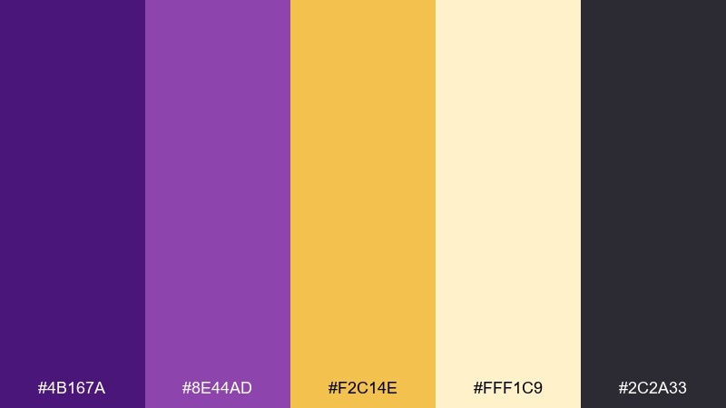
HEX: #4B167A #8E44AD #F2C14E #FFF1C9 #2C2A33
Mood: polished, modern, luminous
Best for: cosmetics packaging and product ads
Polished and luminous, these tones evoke amethyst stones beside brushed brass. The mid purple and warm gold work best when separated by the creamy highlight to avoid color vibration. Pair with matte black typography for a crisp, upscale finish. Tip: print gold as a spot foil or metallic ink for the most realistic effect.
Image example of amethyst gild generated using media.io
3) Velvet Crown
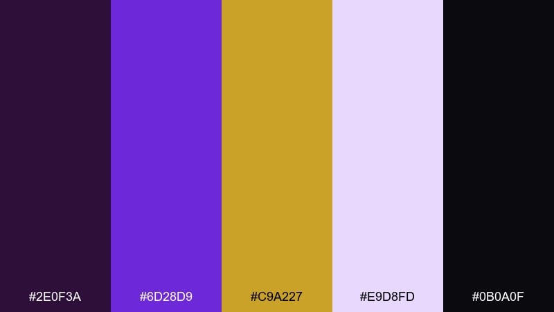
HEX: #2E0F3A #6D28D9 #C9A227 #E9D8FD #0B0A0F
Mood: dramatic, cinematic, luxe
Best for: event posters and nightlife promos
Dramatic and cinematic, it feels like stage lights cutting through midnight velvet. The electric violet brings energy while the muted gold adds a crown-like highlight without overpowering. For a gold purple color palette like this, keep text mostly in pale lavender and use gold for dates or badges. Tip: add subtle grain to the dark base to reduce banding in large prints.
Image example of velvet crown generated using media.io

4) Orchid Lanterns
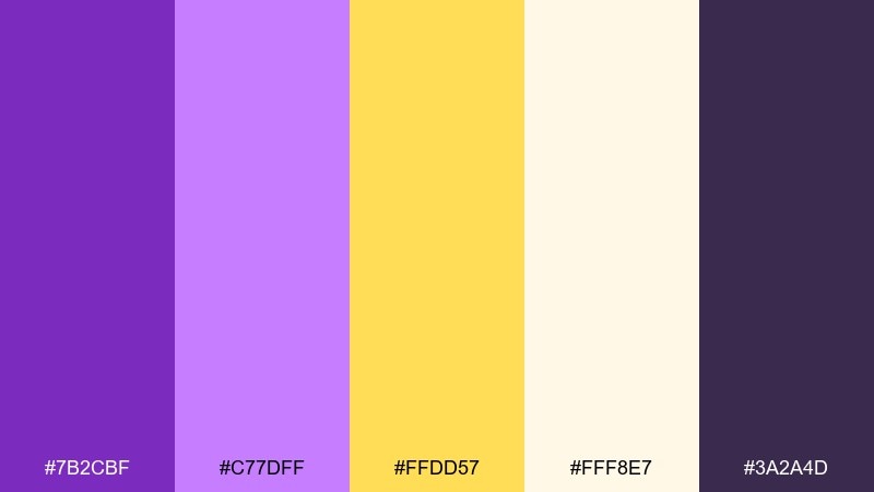
HEX: #7B2CBF #C77DFF #FFDD57 #FFF8E7 #3A2A4D
Mood: romantic, glowing, soft
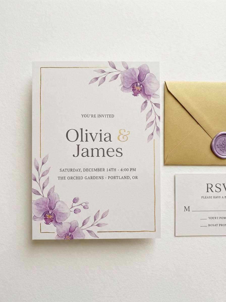
Best for: wedding invitations and RSVP cards
Romantic and glowing, these shades feel like paper lanterns at twilight with orchid petals nearby. The creamy white keeps the palette airy, while gold adds warmth around headings and borders. Pair with serif type for a classic look, or a modern script for a lighter touch. Tip: use the dark plum sparingly for readability on small details like RSVP lines.
Image example of orchid lanterns generated using media.io
5) Antique Brocade
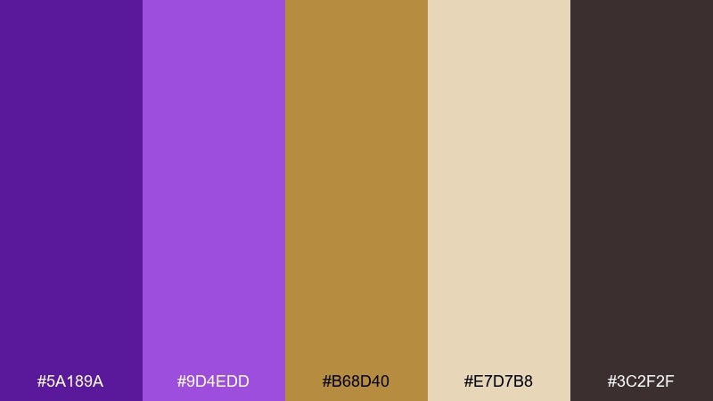
HEX: #5A189A #9D4EDD #B68D40 #E7D7B8 #3C2F2F
Mood: heritage, warm, textured
Best for: boutique hotel branding and menus
Heritage and warm, it brings to mind brocade fabrics and softly aged brass. The tan and parchment tones keep purple from feeling too loud, making it ideal for print-heavy pieces. Combine with embossed patterns, linen textures, or classic iconography. Tip: set body text in the deep brown for better legibility than pure purple.
Image example of antique brocade generated using media.io
6) Cosmic Luxe
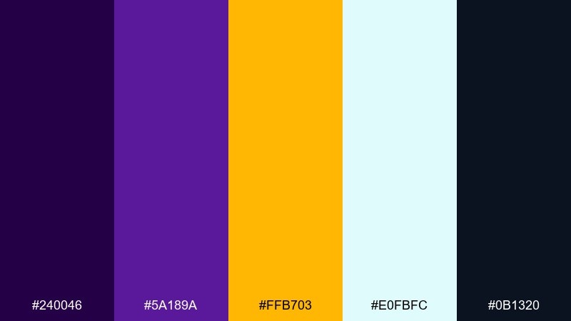
HEX: #240046 #5A189A #FFB703 #E0FBFC #0B1320
Mood: futuristic, bold, glossy
Best for: tech landing pages and gradients
Futuristic and bold, this set feels like a nebula lit with molten gold. The icy aqua highlight adds a modern counterpoint that keeps the purples from turning too heavy. Use gold as a call-to-action color and lean on dark space tones for depth. Tip: test contrast on buttons, since bright gold can wash out on very light backgrounds.
Image example of cosmic luxe generated using media.io

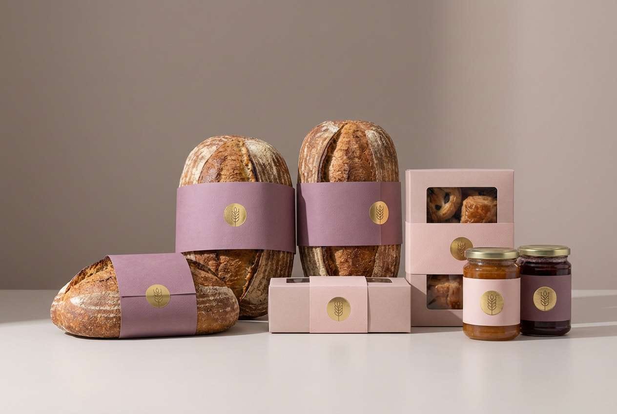
7) Plum Sorbet
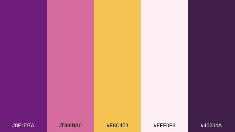
HEX: #6F1D7A #D66BA0 #F6C453 #FFF0F6 #40204A
Mood: playful, sweet, boutique
Best for: bakery packaging and social posts
Playful and sweet, it suggests plum sorbet with a drizzle of honey. The blush pink softens the purple and makes gold feel friendlier for lifestyle brands. Pair with rounded typography and simple illustrations for a modern, approachable look. Tip: keep backgrounds mostly off-white so the warm accents stay fresh instead of muddy.
Image example of plum sorbet generated using media.io
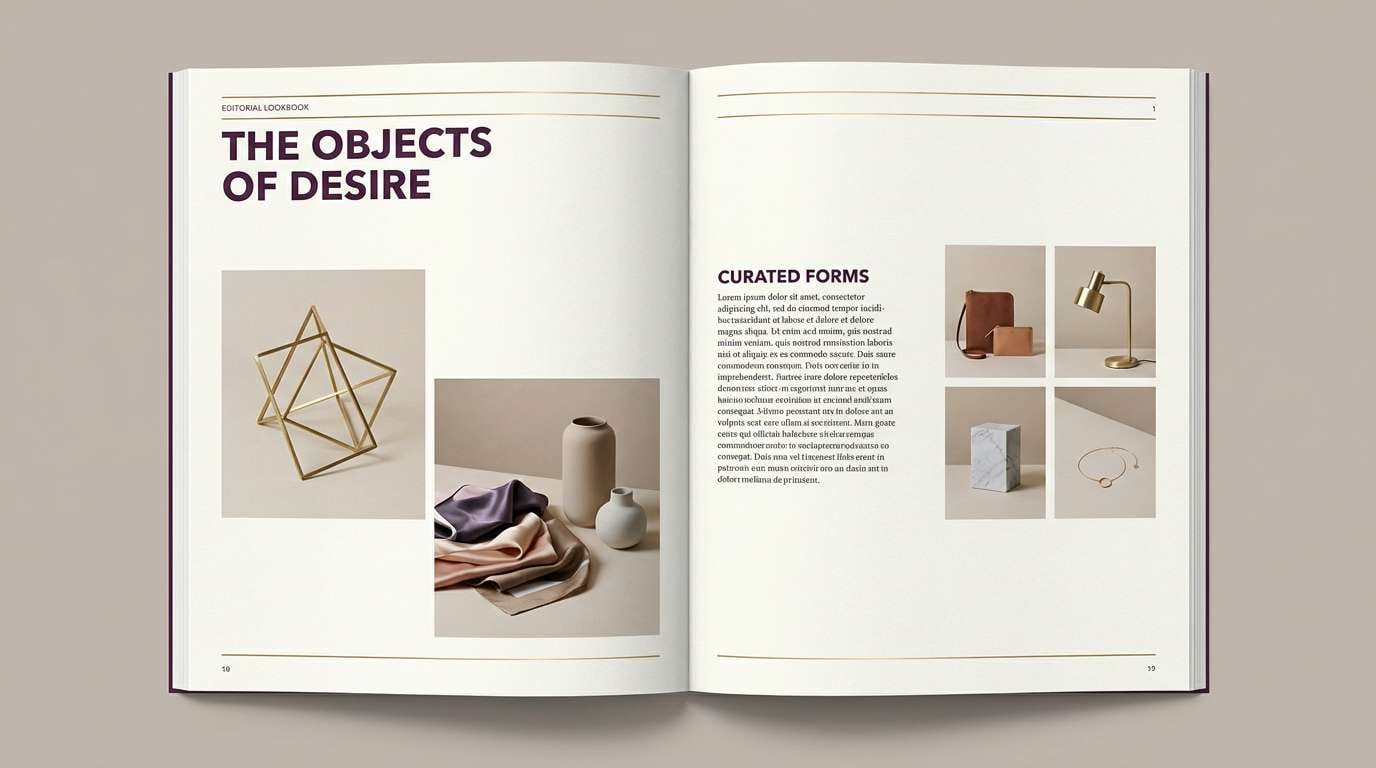
8) Dusk Brass
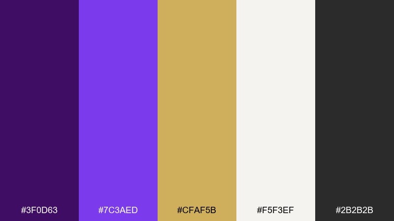
HEX: #3F0D63 #7C3AED #CFAF5B #F5F3EF #2B2B2B
Mood: moody, refined, architectural
Best for: interior design lookbooks and portfolios
Moody and refined, it reads like dusk settling over brass fixtures and stone. The soft off-white gives layouts an architectural clarity, while the violet brings a curated edge. Pair with grayscale photography and thin linework to keep the page feeling spacious. Tip: use the brass tone for section markers and captions rather than large fills.
Image example of dusk brass generated using media.io
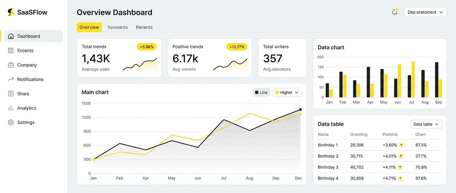
9) Lavender Bullion
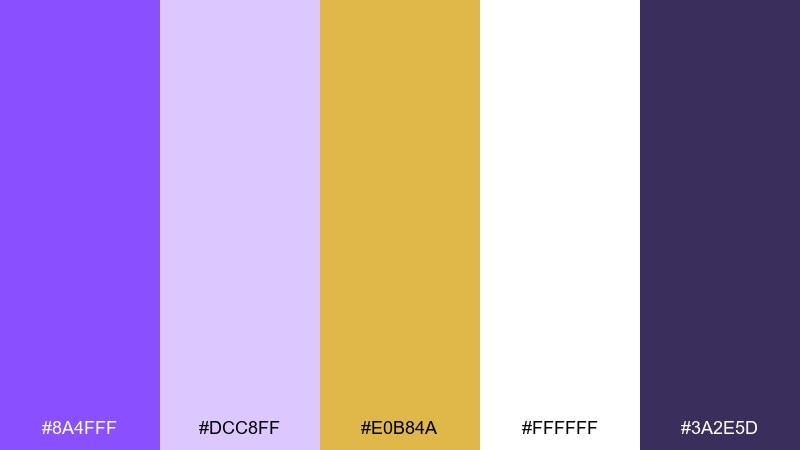
HEX: #8A4FFF #DCC8FF #E0B84A #FFFFFF #3A2E5D
Mood: airy, clean, contemporary
Best for: SaaS UI and dashboard accents
Airy and contemporary, these tones feel like lavender light with a polished bullion shine. The pale lilac makes a calm canvas for dashboards, while gold works best as a notification or highlight color. Pair with plenty of white space and structured spacing to keep it professional. Tip: use the dark indigo for text to maintain accessible contrast.
Image example of lavender bullion generated using media.io
10) Baroque Night
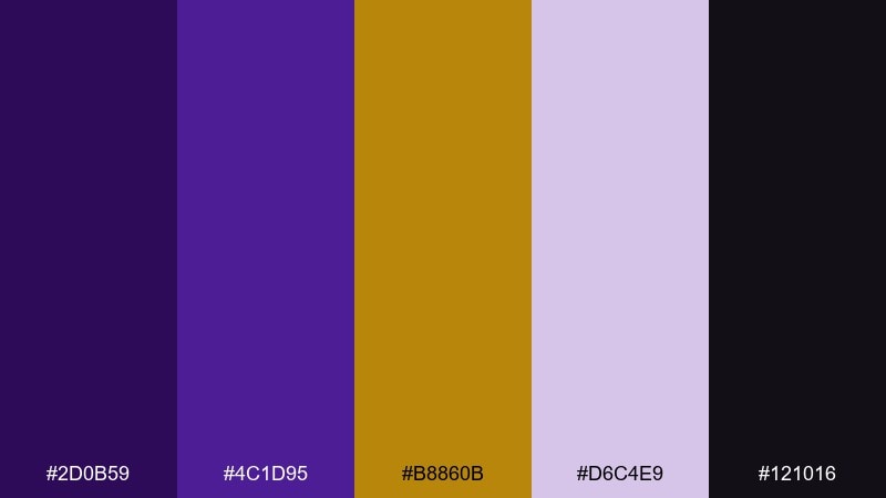
HEX: #2D0B59 #4C1D95 #B8860B #D6C4E9 #121016
Mood: ornate, nocturnal, dramatic
Best for: theater programs and premium tickets
Ornate and nocturnal, it recalls gilded frames against a dark stage curtain. The muted lavender adds readability for subheads without breaking the mood. Pair with decorative borders, monograms, or subtle flourishes for a classic baroque feel. Tip: limit ornate elements to corners so the layout stays readable from a distance.
Image example of baroque night generated using media.io
11) Sunlit Iris
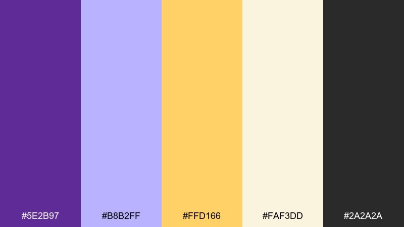
HEX: #5E2B97 #B8B2FF #FFD166 #FAF3DD #2A2A2A
Mood: optimistic, bright, friendly
Best for: education brands and presentation decks
Optimistic and bright, it feels like iris petals catching morning sun. The buttery gold lifts the cooler purples, making slides and learning materials feel welcoming. Pair with simple icons and generous spacing for clarity. Tip: use the charcoal for body text and keep purple for section headers to guide scanning.
Image example of sunlit iris generated using media.io

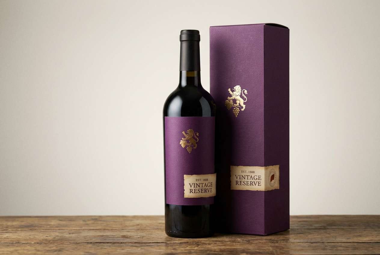
12) Grapevine Gold
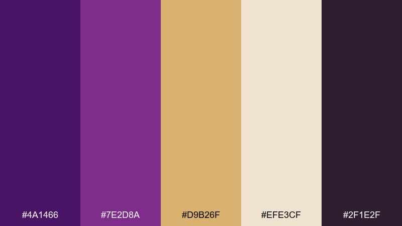
HEX: #4A1466 #7E2D8A #D9B26F #EFE3CF #2F1E2F
Mood: rustic luxe, cozy, grounded
Best for: wine labels and tasting room signage
Rustic-luxe and cozy, it suggests grape skins, wooden barrels, and warm cellar light. The tan and parchment tones keep the purple feeling grounded rather than neon. These gold purple color combinations shine on labels, where gold can be a foil stamp and purple can carry the brand mark. Tip: use the darkest plum for small legal text to keep it crisp on textured stock.
Image example of grapevine gold generated using media.io
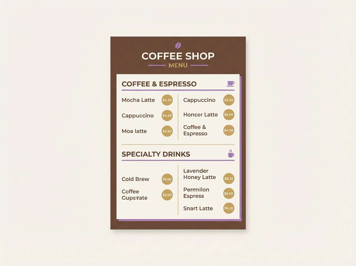
13) Mocha Majestic
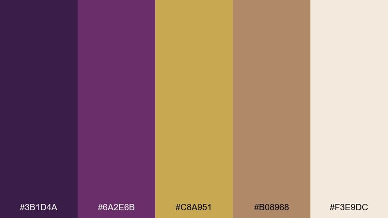
HEX: #3B1D4A #6A2E6B #C8A951 #B08968 #F3E9DC
Mood: warm, sophisticated, earthy
Best for: coffee shop branding and menus
Warm and sophisticated, it blends cocoa depth with a refined violet undertone. The light cream keeps everything approachable, while the brown adds a grounded, café-like comfort. Pair with kraft textures, minimal line icons, and rounded serif type. Tip: use gold for small highlights like prices or stamps so the palette stays earthy, not flashy.
Image example of mocha majestic generated using media.io
14) Lilac Treasury
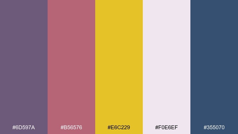
HEX: #6D597A #B56576 #E6C229 #F0E6EF #355070
Mood: artful, romantic, vintage-leaning
Best for: stationery sets and gift wrap
Artful and romantic, it evokes pressed flowers tucked into a keepsake box. The dusty lilac and rose bring a vintage softness, and the golden yellow adds a cheerful pop. Great for wrapping paper patterns, stickers, and seasonal stationery collections. Tip: build repeat patterns with the pale base so the darker tones feel like highlights, not clutter.
Image example of lilac treasury generated using media.io
15) Midnight Saffron
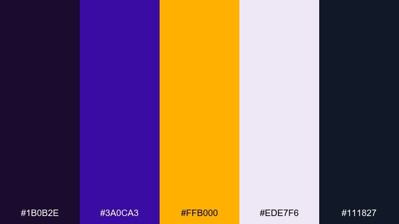
HEX: #1B0B2E #3A0CA3 #FFB000 #EDE7F6 #111827
Mood: high-energy, sharp, modern
Best for: app onboarding screens
High-energy and sharp, it feels like neon saffron against a midnight sky. The pale lavender keeps screens readable, while the saturated gold is perfect for progress and primary actions. Pair with geometric illustrations and crisp sans-serif type for a modern edge. Tip: use the darkest tones for backgrounds only, and keep content areas light for accessibility.
Image example of midnight saffron generated using media.io

16) Heirloom Orchid
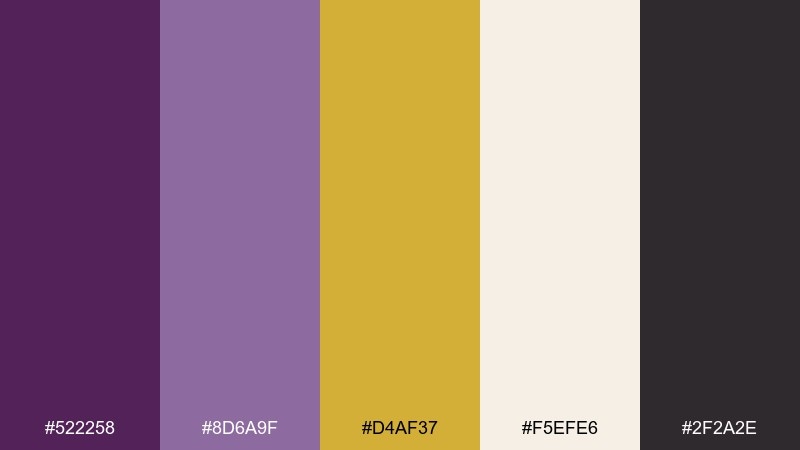
HEX: #522258 #8D6A9F #D4AF37 #F5EFE6 #2F2A2E
Mood: timeless, gentle, upscale
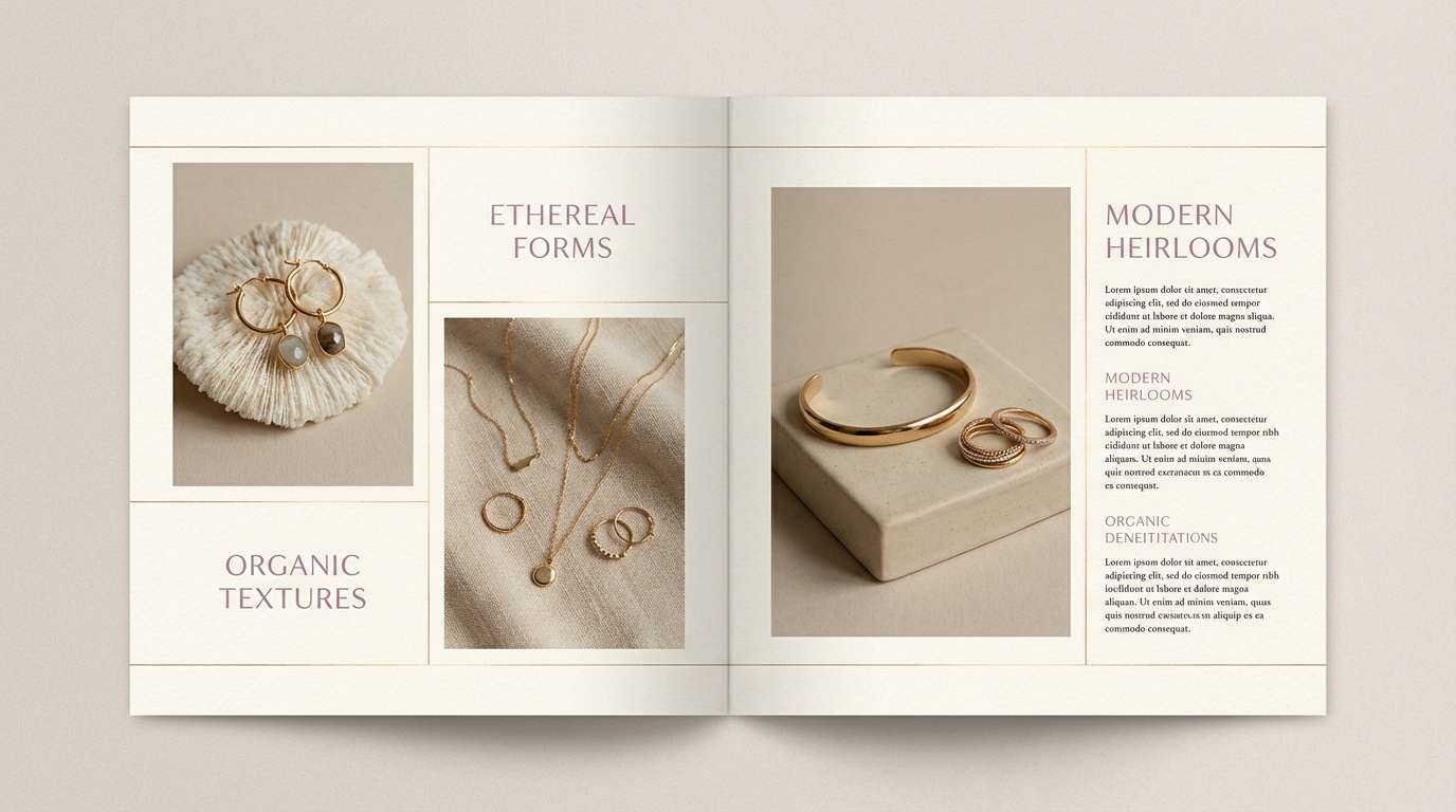
Best for: fine jewelry lookbooks
Timeless and gentle, it looks like heirloom orchids beside softly polished gold. The muted violet reads elegant in print, especially when paired with creamy backgrounds and minimalist grids. Use the darker neutral for captions and product specs to keep pages clean. Tip: let gold appear as a thin rule line or small icon so it stays understated.
Image example of heirloom orchid generated using media.io
17) Purple Haze Gold
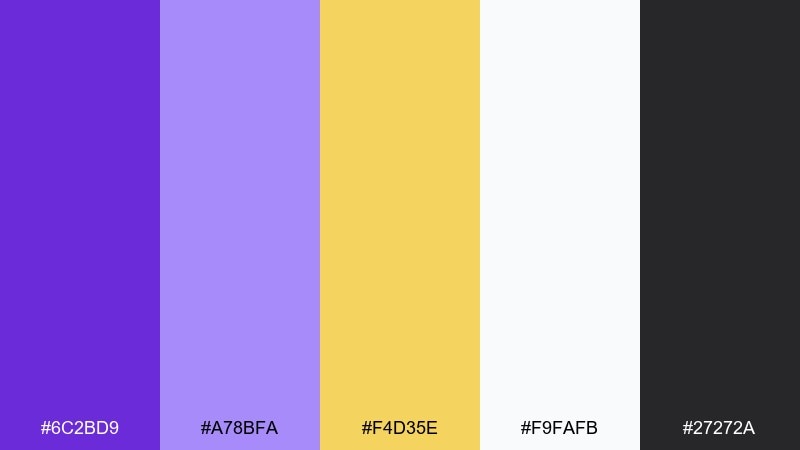
HEX: #6C2BD9 #A78BFA #F4D35E #F9FAFB #27272A
Mood: fresh, digital, upbeat
Best for: creator brand kits and thumbnails
Fresh and upbeat, it feels like a purple haze with a punch of warm sunlight. The pale lavender supports large text and icons, while the gold pops for badges and key words. This set works well when you want quick contrast without a heavy, luxury mood. Tip: keep the gold to one focal element per thumbnail to avoid visual noise.
Image example of purple haze gold generated using media.io
18) Iris Sandstone
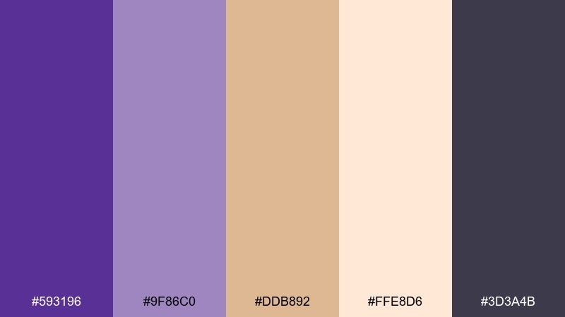
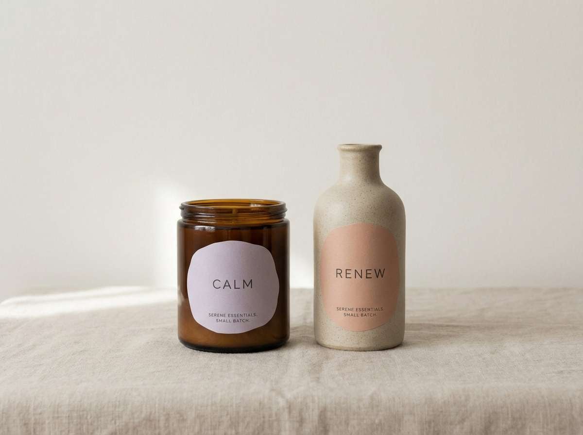
HEX: #593196 #9F86C0 #DDB892 #FFE8D6 #3D3A4B
Mood: soft, calm, natural
Best for: wellness packaging and labels
Soft and calm, it reads like iris blooms against warm sandstone. The peachy neutrals make the purples feel gentle, perfect for skincare, candles, or supplements. Pair with minimal line illustrations and plenty of negative space for a soothing shelf presence. Tip: use the darker slate as your barcode and ingredient text color for clarity.
Image example of iris sandstone generated using media.io
19) Gilded Minimal
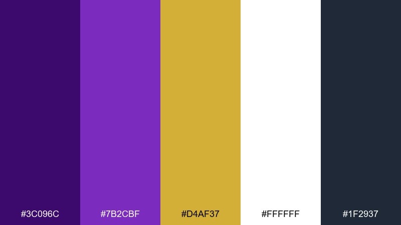
HEX: #3C096C #7B2CBF #D4AF37 #FFFFFF #1F2937
Mood: minimal, premium, confident
Best for: startup branding and UI design systems
Minimal and premium, it feels like crisp white paper stamped with a single gilded seal. The two purples give you a clear hierarchy for headings and active states, while gold becomes a controlled accent. For a gold purple color combination that stays modern, keep gold to icons, toggles, or small highlights. Tip: document one gold usage rule in your design system to prevent overuse.
Image example of gilded minimal generated using media.io
20) Harvest Violet
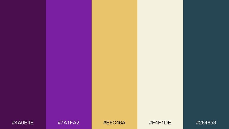
HEX: #4A0E4E #7A1FA2 #E9C46A #F4F1DE #264653
Mood: seasonal, cozy, artisanal
Best for: fall market flyers and labels
Seasonal and cozy, it suggests late-harvest fruit with warm grain and candlelight. The cream base keeps the palette friendly for community events and artisan packaging. Pair with hand-drawn stamps, woodcut textures, or simple botanical motifs. Tip: use the teal as a small secondary accent to add depth without competing with purple.
Image example of harvest violet generated using media.io
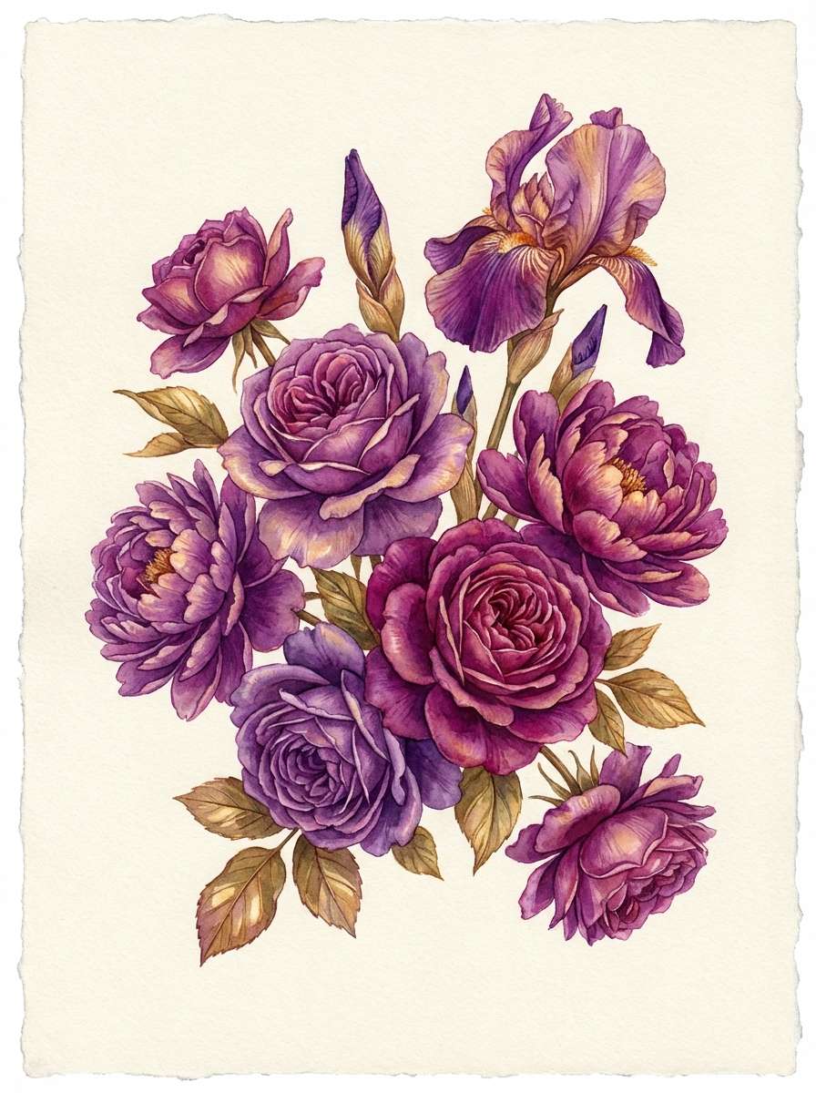
21) Opulent Bouquet
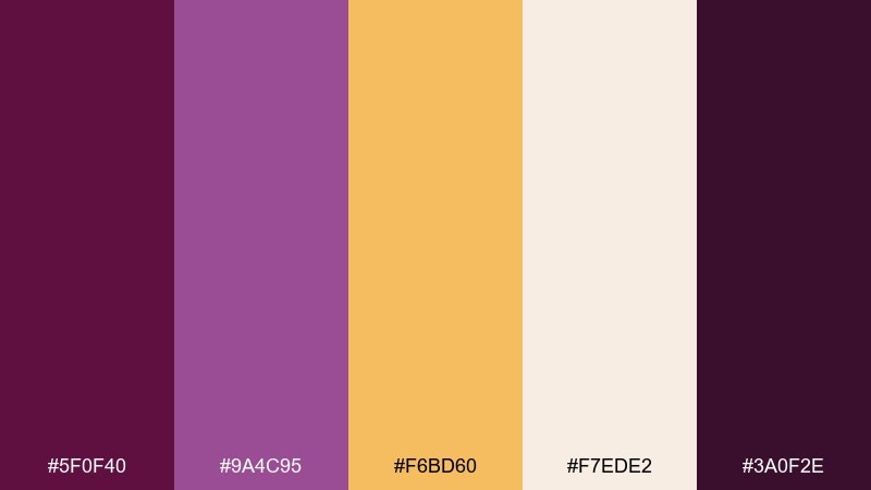
HEX: #5F0F40 #9A4C95 #F6BD60 #F7EDE2 #3A0F2E
Mood: floral, romantic, opulent
Best for: botanical illustrations and spring invites
Floral and opulent, it feels like a bouquet of peonies wrapped in golden ribbon. The warm gold reads like sunlight on petals, while the deep magenta-purple adds richness for outlines and type. Use the pale cream as your paper tone to keep everything delicate. Tip: for watercolor work, let gold appear as soft washes, not hard blocks, to maintain a natural look.
Image example of opulent bouquet generated using media.io
What Colors Go Well with Gold Purple?
Neutrals are the easiest match: cream, parchment, off-white, and soft gray keep gold from turning too loud and help purple feel more refined. For typography, near-black, charcoal, or deep brown often reads cleaner than saturated purple.
If you want extra depth, try dark plum, midnight navy, or slate as the supporting base—these tones make gold accents feel more metallic. For a fresher look, pale lilac, icy aqua, or blush can brighten the scheme without losing the gold-purple identity.
When in doubt, choose one role per color: purple for brand/structure, gold for highlights, and a neutral for background. That simple hierarchy prevents a regal palette from becoming visually busy.
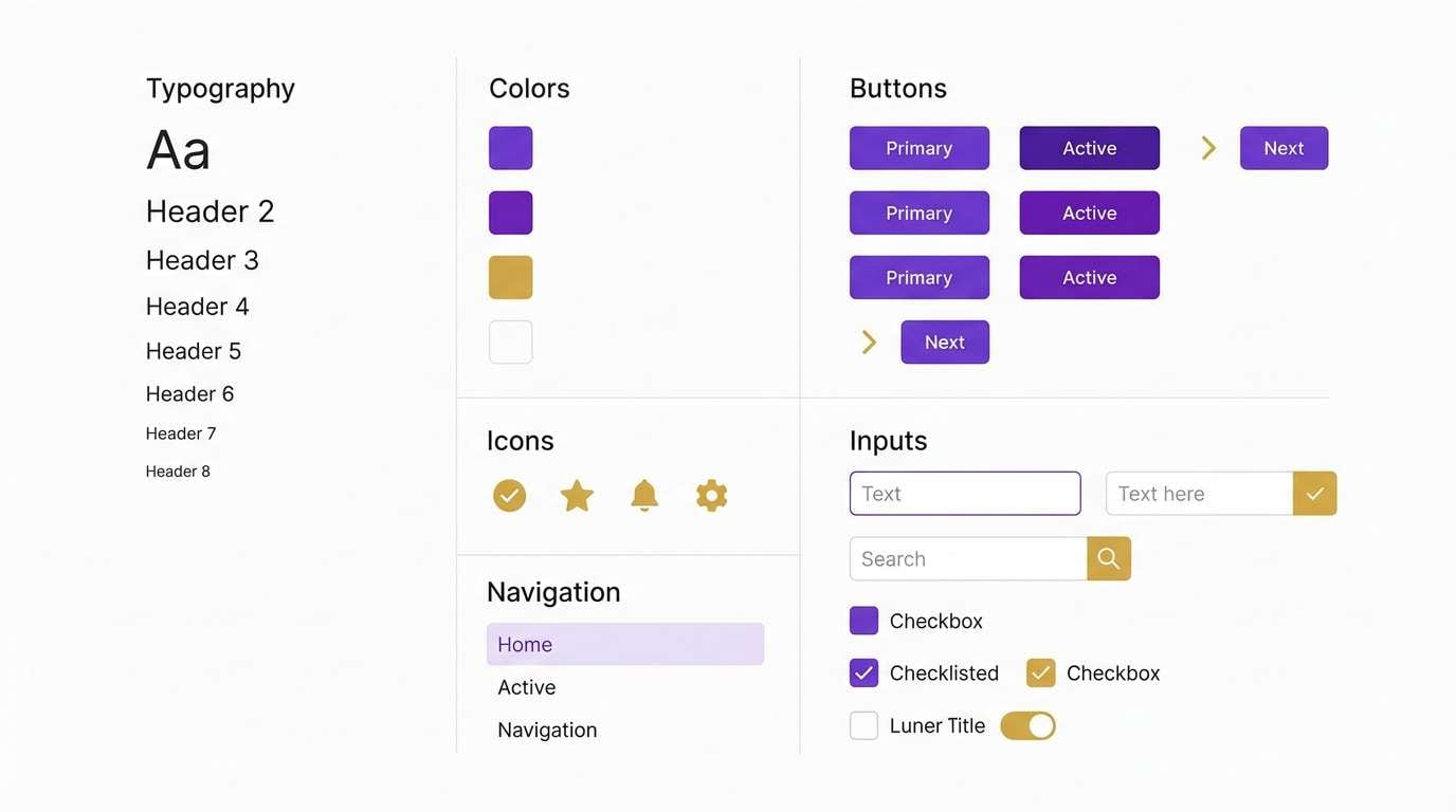
How to Use a Gold Purple Color Palette in Real Designs
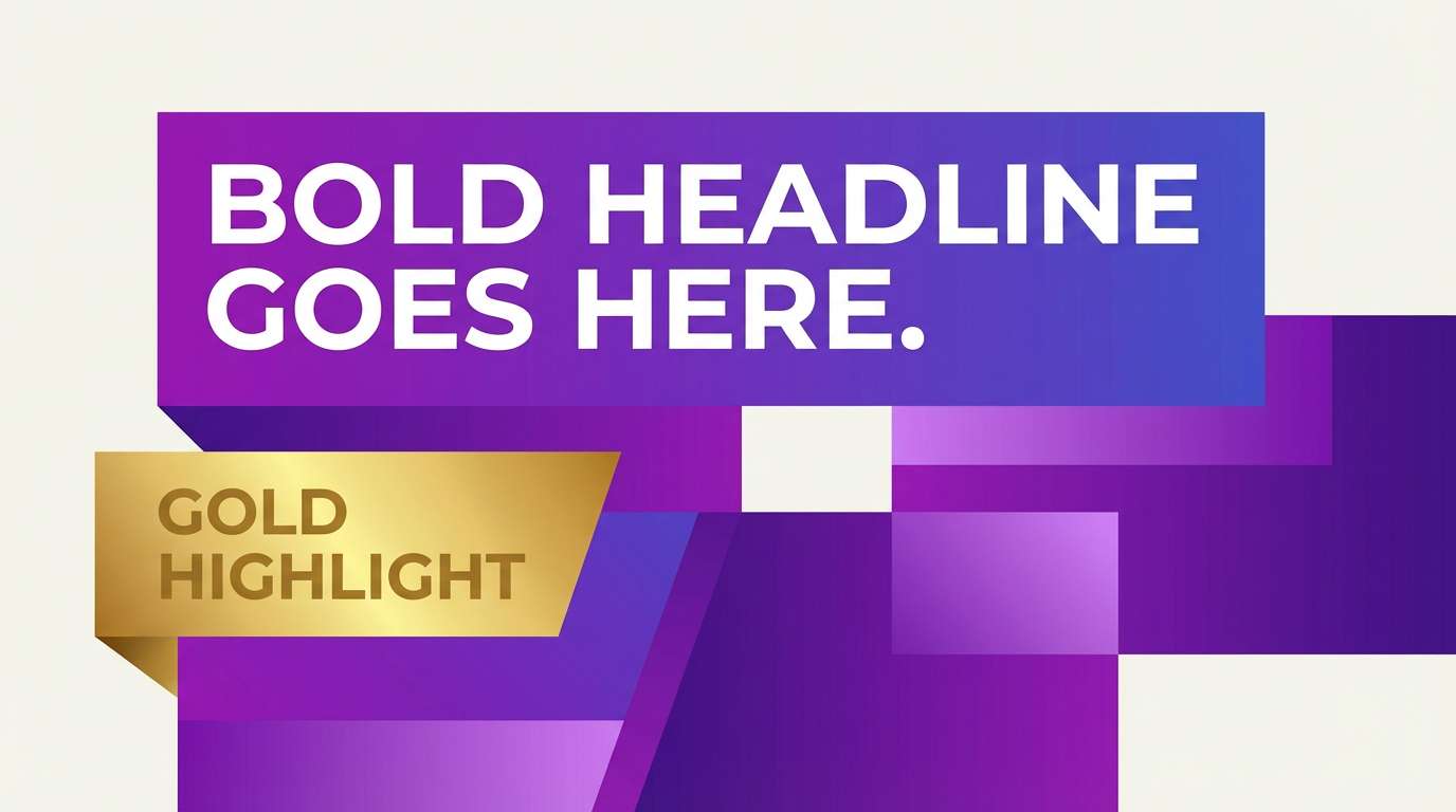
For branding and packaging, treat gold like a “special effect.” Use it for logos, seals, borders, or small icons, while letting purple carry the main surfaces. In print, gold looks most believable as foil/metallic ink rather than flat yellow.
For UI design, keep backgrounds light (white, cream, very pale lilac) and reserve dark purple for headers or navigation. Then use gold sparingly for badges, progress states, or a single primary CTA so it stays attention-grabbing.
For posters and editorials, lean into contrast: dark purple base, pale lavender/cream for type, and gold for dates, tickets, or key callouts. A little grain or texture on dark backgrounds can improve large-format results.
Create Gold Purple Palette Visuals with AI
If you already have HEX codes, you can generate consistent mockups, hero banners, packaging concepts, and UI scenes by describing the layout and explicitly calling out “deep purple + subtle gold accents.” This helps the AI preserve the gold-purple relationship across variations.
Reuse the prompts above as templates: swap the subject (invitation, dashboard, label) while keeping the composition notes (minimal, no photography, flat graphic, clean grid). You’ll get on-brand outputs faster with fewer rerolls.
When you need multiple sizes for campaigns, generate a few base visuals first, then iterate by changing only the aspect ratio or the key element (CTA button, badge, border) to keep the style consistent.
Gold Purple Color Palette FAQs
-
What does a gold and purple color scheme represent?
Gold and purple typically signal luxury, celebration, and authority. Purple adds depth and creativity, while gold reads as premium and attention-focused—great for brands that want a regal or high-end impression. -
How do I keep gold from looking yellow in digital designs?
Use gold as a small accent on darker purples, avoid large gold backgrounds, and pair it with a neutral (white/cream) to prevent color shift. Slightly muted gold tones (more brass/bullion) often look more “metallic” on screens. -
What are the best neutral colors to pair with gold and purple?
Cream, off-white, parchment, and light warm gray are the easiest neutrals. For text and UI outlines, charcoal or near-black usually provides better readability than saturated purple. -
Is a purple and gold palette good for UI/UX?
Yes—when used with restraint. Keep backgrounds light, use purple for navigation/structure, and reserve gold for highlights (badges, status, or one primary CTA). Always test contrast for accessibility. -
Which purple works best with gold: violet, plum, or lavender?
Plum and deep violet make gold feel richer and more formal, while lavender creates a softer, modern vibe. The “best” option depends on whether you want dramatic luxury (deep purple) or airy contemporary (lavender + white). -
How can I use gold in print for a premium look?
Foil stamping, metallic ink, or spot UV on gold areas creates a realistic metallic finish. Keep gold elements small (logos, borders, seals) so they feel intentional rather than overpowering. -
What’s a common mistake with gold purple color combinations?
Overusing gold as a large fill or combining highly saturated purple and bright gold without a buffer neutral, which can cause visual vibration. Add cream/off-white between them and define a clear hierarchy for each color’s role.


