

Maroon red is a confident, grown-up red with depth—richer than cherry, softer than pure black, and naturally “premium” in almost any layout.
Below are maroon red color palette ideas you can use for branding, interiors, UI, and print, plus quick pairing advice and ready-to-copy HEX codes.
In this article
- Why Maroon Red Palettes Work So Well
-
- velvet merlot
- antique rosewood
- garnet nightfall
- cocoa cabernet
- blush and brick
- modern wine neutrals
- gold foil burgundy
- denim and maroon
- sage vineyard
- midnight plum ink
- terracotta cellar
- minimal maroon ui
- winter cranberry
- coffeehouse berry
- coastal wine mist
- orchid cabernet
- emerald and maroon accent
- museum velvet
- peachy sangria
- graphite and garnet
- What Colors Go Well with Maroon Red?
- How to Use a Maroon Red Color Palette in Real Designs
- Create Maroon Red Palette Visuals with AI
Why Maroon Red Palettes Work So Well
Maroon red sits in that sweet spot between classic red and near-black, which makes it feel dramatic without looking loud. That built-in sophistication is why it shows up so often in luxury packaging, hospitality, and editorial design.
Because maroon has darker value, it creates strong hierarchy: it’s excellent for headers, logos, buttons, and “hero” accents. Add blush, cream, or warm gray around it and the palette instantly gets more breathable and modern.
It’s also a versatile bridge color—maroon can lean warm with terracotta and gold, or cool with denim blue, sage, and graphite. That flexibility makes maroon red color combinations easy to adapt across seasons and channels.
20+ Maroon Red Color Palette Ideas (with HEX Codes)
1) Velvet Merlot
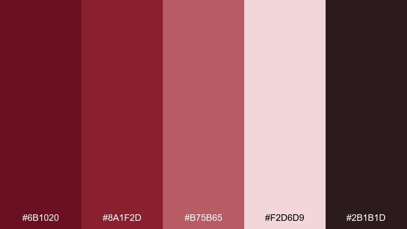
HEX: #6b1020 #8a1f2d #b75b65 #f2d6d9 #2b1b1d
Mood: luxurious, intimate, dramatic
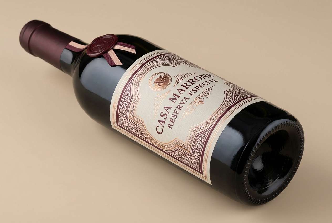
Best for: wine branding and premium packaging
Luxurious and candlelit, these tones feel like velvet drapes and a deep pour of merlot. Use the dark base for logos and headers, then let the dusty rose and soft blush handle highlights and whitespace. It works beautifully with warm metallics, cream paper textures, and minimal typography. Tip: keep black to a minimum and use the near-black plum for a softer, more expensive contrast.
Image example of velvet merlot generated using media.io
Media.io is an online AI studio for creating and editing video, image, and audio in your browser.

2) Antique Rosewood
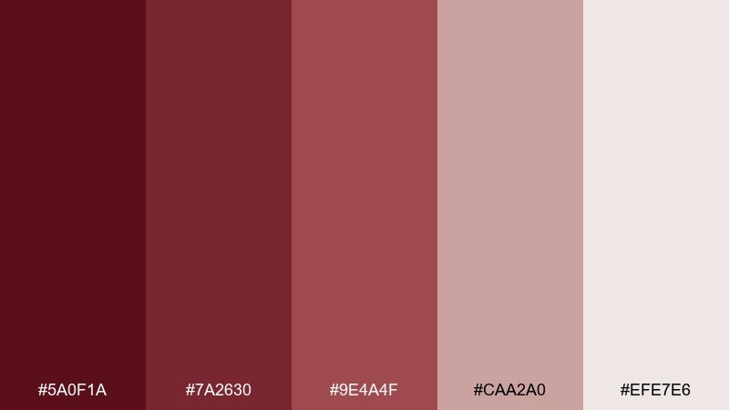
HEX: #5a0f1a #7a2630 #9e4a4f #caa2a0 #efe7e6
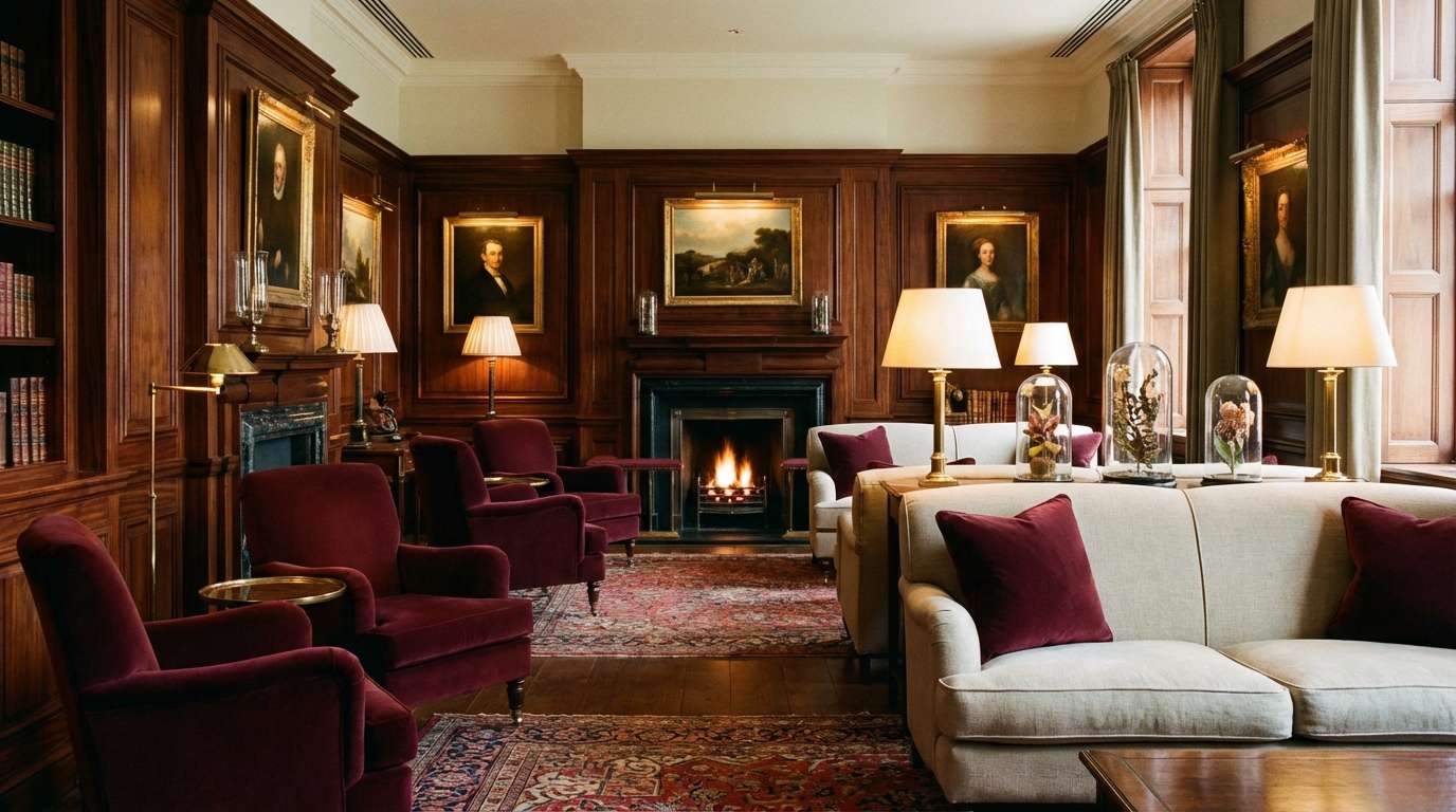
Mood: heritage, warm, understated
Best for: classic interiors and boutique hotel styling
Heritage and comforting, this mix recalls rosewood furniture, worn leather, and soft linen. Layer the deeper reds on trim or feature walls, then balance with the pale stone and muted mauve for a lived-in feel. It pairs well with brass fixtures, walnut wood, and warm white lighting. Tip: repeat the mid-tone (#9e4a4f) across textiles to unify the room without making it too heavy.
Image example of antique rosewood generated using media.io
3) Garnet Nightfall
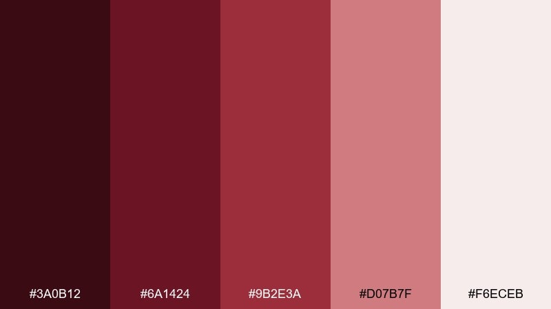
HEX: #3a0b12 #6a1424 #9b2e3a #d07b7f #f6eceb
Mood: cinematic, bold, nocturnal
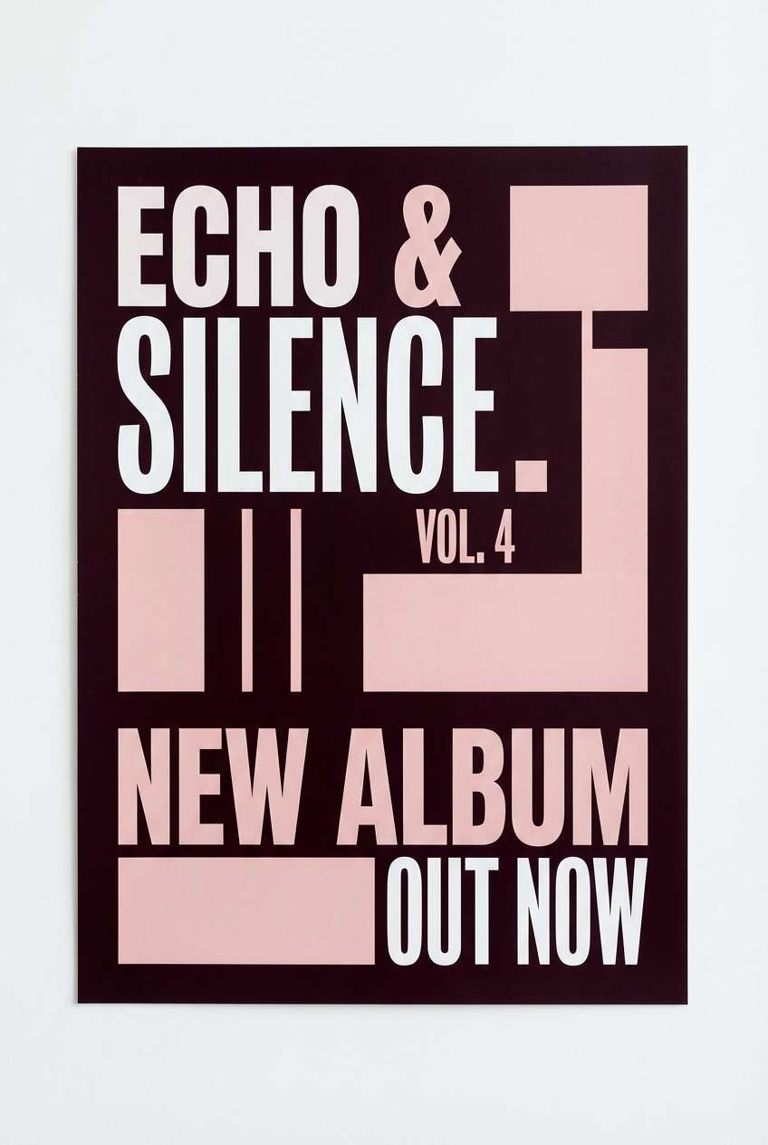
Best for: album covers and moody poster design
Cinematic and nocturnal, this set feels like neon reflected on wet streets with a garnet glow. Push the near-black and deep wine as your background, then let the brighter red act like a spotlight for titles and focal elements. The pale blush is perfect for small credits and spacing so the design still breathes. Tip: if you want a cohesive maroon red color palette for print, keep gradients subtle to avoid banding on dark areas.
Image example of garnet nightfall generated using media.io
4) Cocoa Cabernet
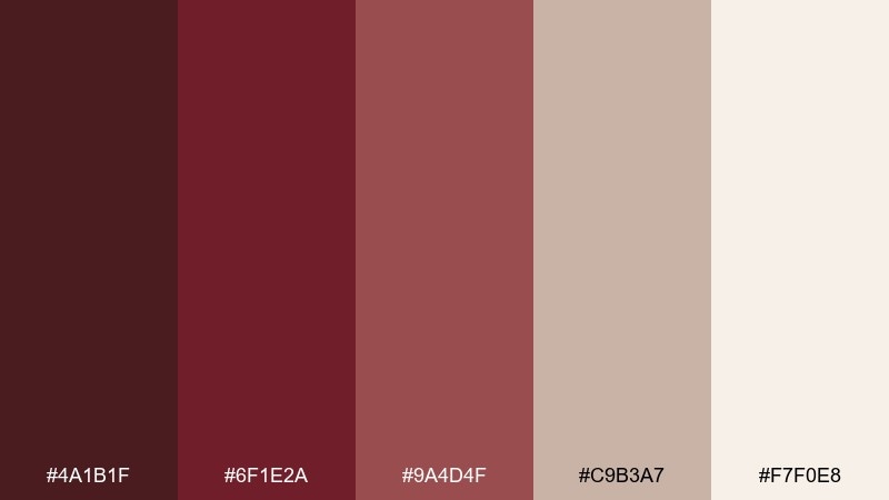
HEX: #4a1b1f #6f1e2a #9a4d4f #c9b3a7 #f7f0e8
Mood: cozy, grounded, refined
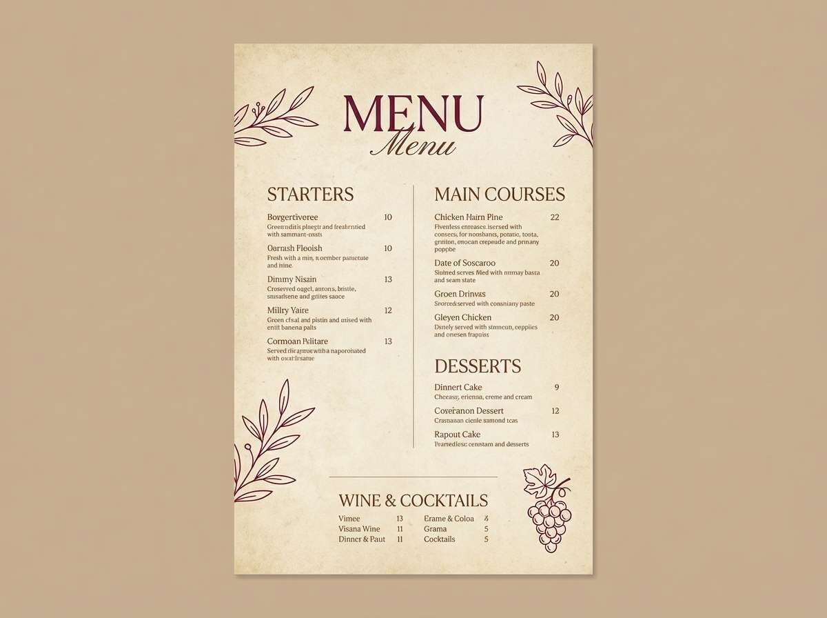
Best for: restaurant menus and artisan food brands
Cozy and grounded, these shades evoke cocoa powder, cabernet notes, and handmade paper. Use the darkest tones for headings and dividers, then lean on the warm beige and cream for the menu background. It pairs well with serif typography, subtle grain textures, and copper accents. Tip: reserve the mid red-brown (#9a4d4f) for callouts like chef specials so it feels intentional, not busy.
Image example of cocoa cabernet generated using media.io
5) Blush and Brick
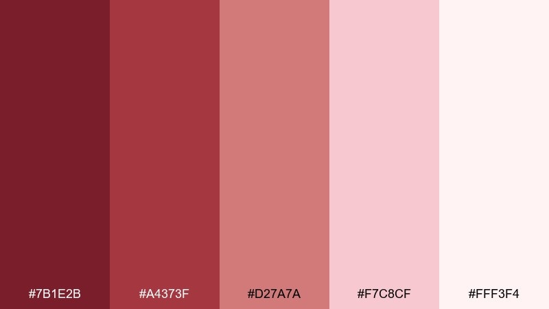
HEX: #7b1e2b #a4373f #d27a7a #f7c8cf #fff3f4
Mood: romantic, friendly, upbeat
Best for: beauty promos and social graphics
Romantic and upbeat, this mix looks like brick lipstick softened with cotton-candy blush. The deeper reds make strong buttons and headlines, while the pale pinks create a clean, flattering canvas. Pair it with thin sans fonts and a touch of warm gray to keep it modern. Tip: for social posts, keep the background at #fff3f4 and use #a4373f for the main call to action to boost readability.
Image example of blush and brick generated using media.io
6) Modern Wine Neutrals
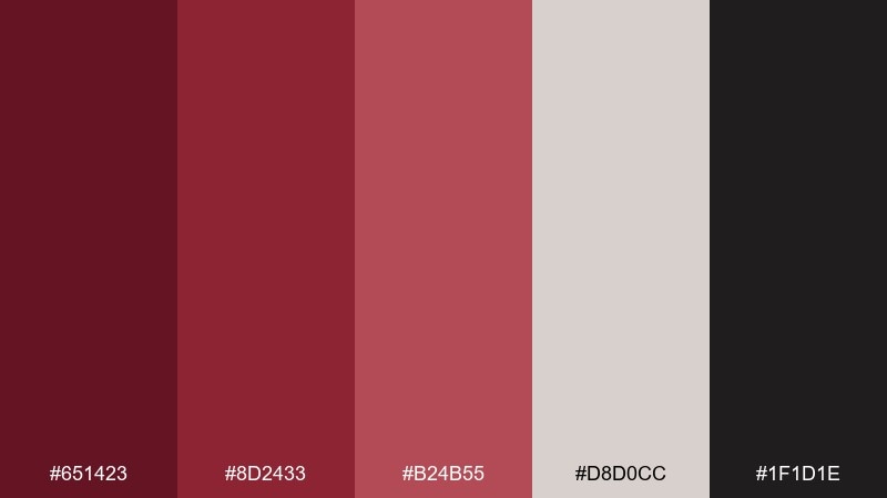
HEX: #651423 #8d2433 #b24b55 #d8d0cc #1f1d1e
Mood: modern, confident, minimal
Best for: startup branding and landing pages
Modern and confident, these hues feel like a tailored blazer with a wine-stain edge. The warm neutrals keep the page airy, while the reds add authority without shouting. For maroon red color combinations that read premium, pair them with off-white sections, charcoal text, and plenty of spacing. Tip: use #8d2433 for primary buttons and reserve #b24b55 for hover and secondary states.
Image example of modern wine neutrals generated using media.io
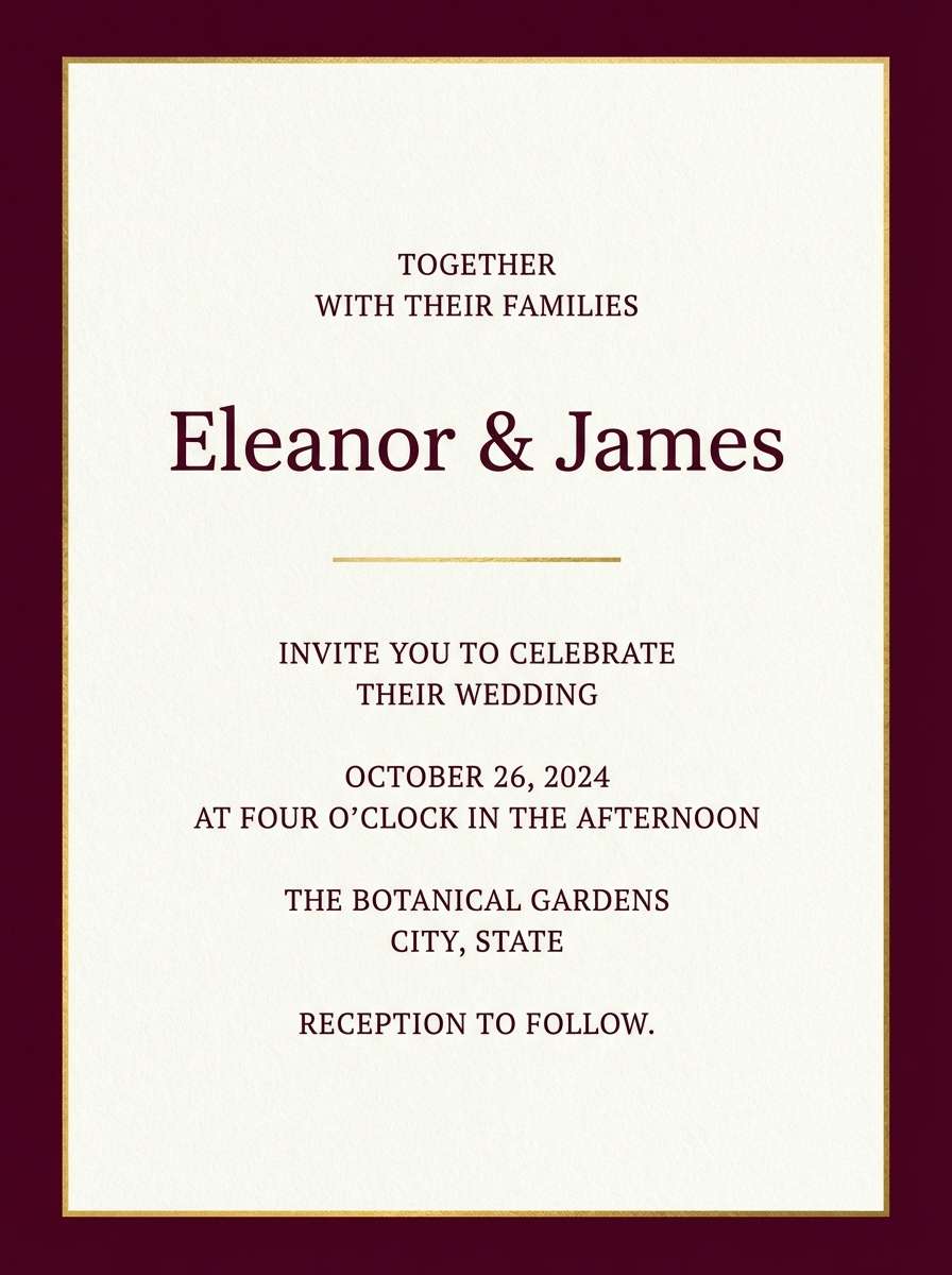
7) Gold Foil Burgundy
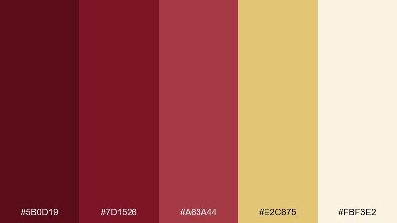
HEX: #5b0d19 #7d1526 #a63a44 #e2c675 #fbf3e2
Mood: celebratory, elegant, formal
Best for: wedding invitations and gala collateral
Elegant and celebratory, this set brings to mind burgundy velvet with gold foil lettering. Let the cream act as the main paper tone, then use the deep reds for borders, monograms, and key lines of type. The gold works best as a restrained accent rather than a full block of color. Tip: keep decorative elements thin so the palette feels refined instead of heavy.
Image example of gold foil burgundy generated using media.io
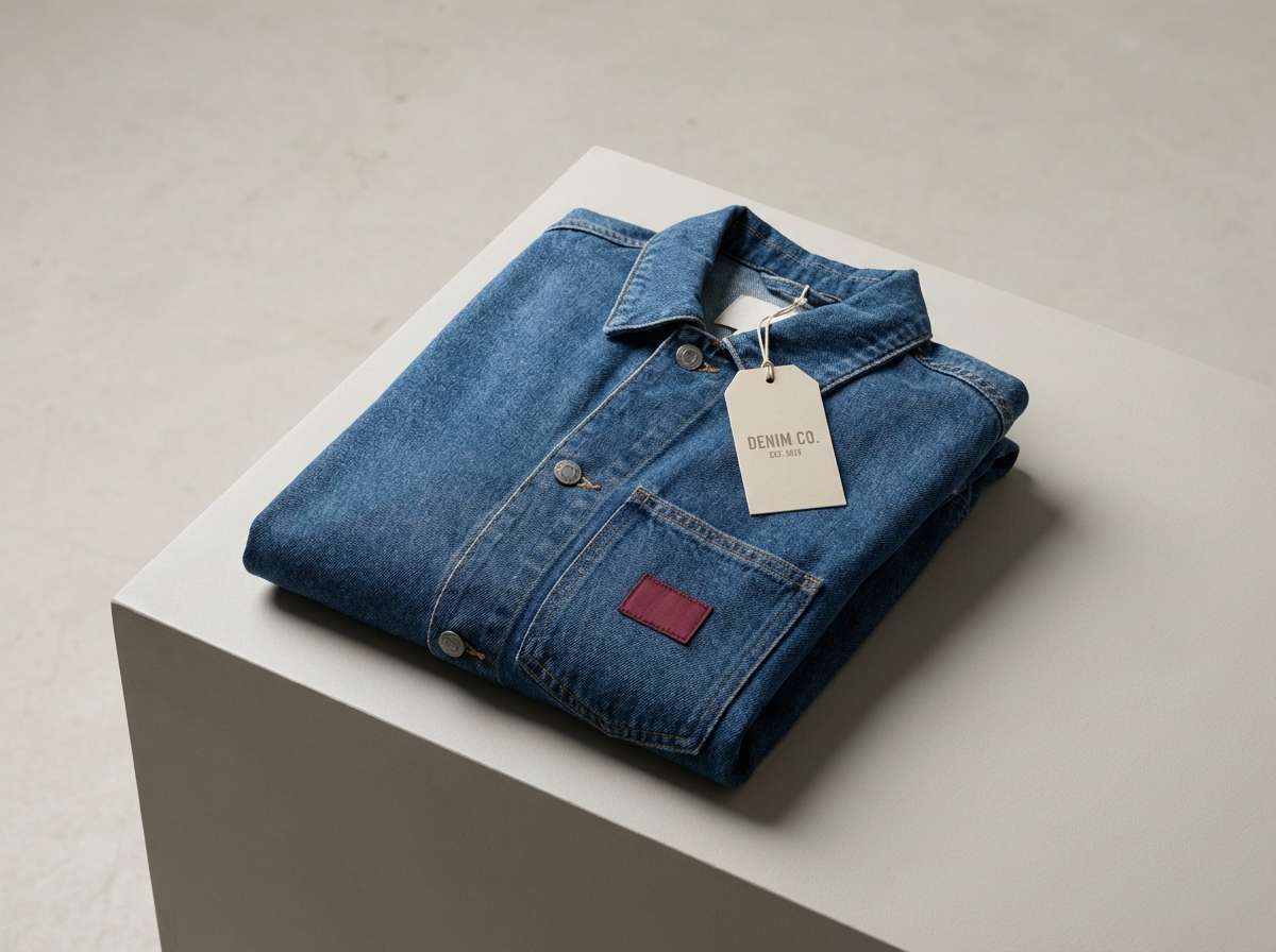
8) Denim and Maroon
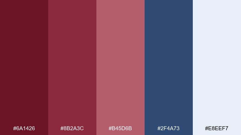
HEX: #6a1426 #8b2a3c #b45d6b #2f4a73 #e8eef7
Mood: casual, youthful, sporty
Best for: apparel campaigns and lookbooks
Casual and sporty, this pairing feels like dark denim with a maroon beanie. Use the blue as a steady backdrop for layouts, then bring in the reds for badges, pricing, or limited-drop labels. The pale blue-white keeps everything crisp and clean, especially in grid-heavy designs. Tip: keep the maroon to small, repeated accents so the denim stays the hero.
Image example of denim and maroon generated using media.io
9) Sage Vineyard
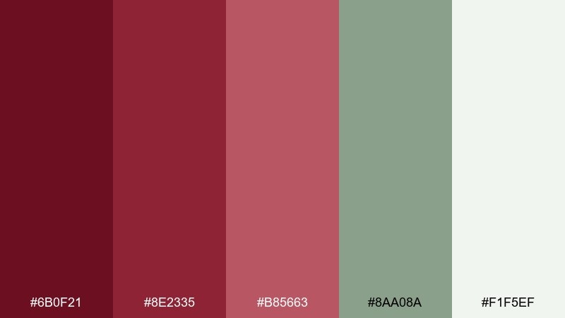
HEX: #6b0f21 #8e2335 #b85663 #8aa08a #f1f5ef
Mood: natural, balanced, inviting
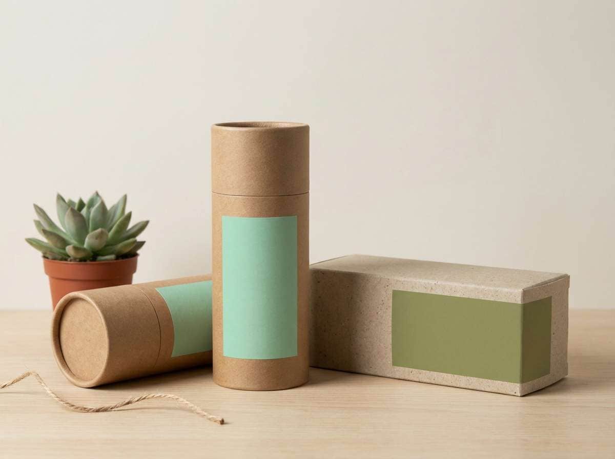
Best for: eco packaging and organic product labels
Natural and balanced, these colors evoke vineyard leaves against ripening fruit. The sage green cools the reds and makes the whole set feel more organic and contemporary. Use the off-white for label backgrounds, then let the maroon tones carry the brand mark and key info. Tip: add subtle paper texture so the palette reads handcrafted rather than glossy.
Image example of sage vineyard generated using media.io
10) Midnight Plum Ink
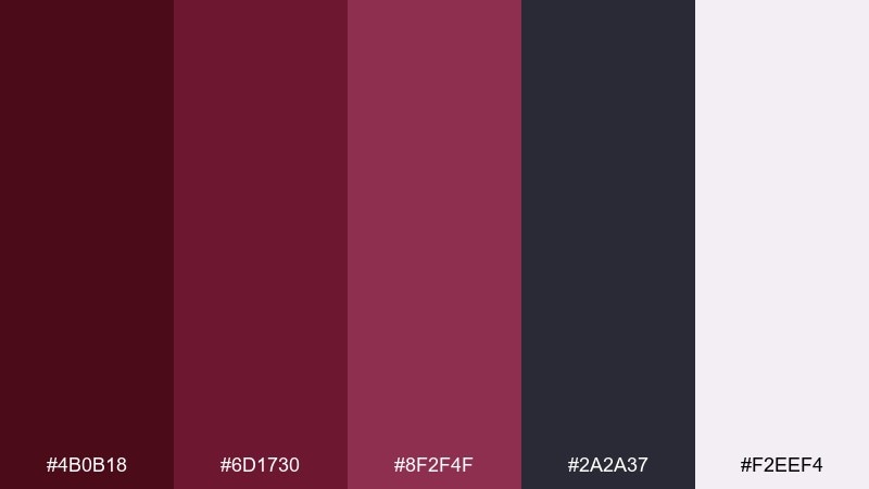
HEX: #4b0b18 #6d1730 #8f2f4f #2a2a37 #f2eef4
Mood: sleek, techy, mysterious
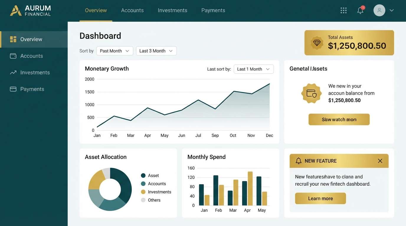
Best for: fintech dashboards and data UI
Sleek and mysterious, these shades feel like plum ink on a midnight interface. The deep maroon and graphite make a strong dark-mode base, while the soft lavender-white keeps text blocks legible. Use the brighter plum for charts, alerts, and selected states to guide the eye. Tip: keep body text closer to #f2eef4 than pure white to reduce glare in dark UIs.
Image example of midnight plum ink generated using media.io
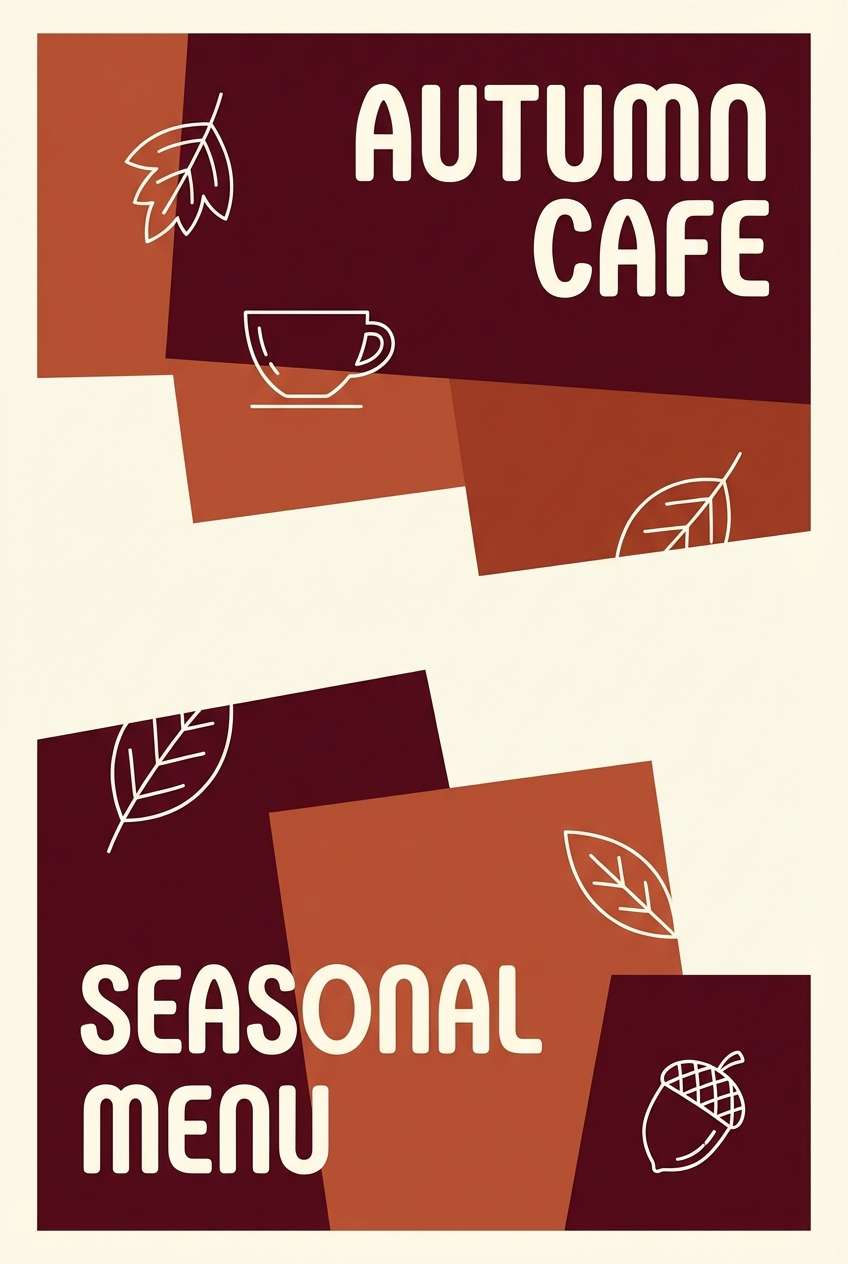
11) Terracotta Cellar
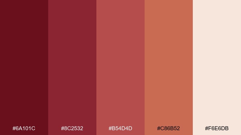
HEX: #6a101c #8c2532 #b54d4d #c86b52 #f6e6db
Mood: rustic, warm, artisanal
Best for: autumn promos and cafe posters
Rustic and warm, this set looks like terracotta pottery in a cozy cellar. The clay orange adds a sunbaked note that keeps the reds from feeling too formal. Use the cream as your main background, then stack the deeper shades for headings and illustrated details. Tip: pair with hand-drawn icons or stamp textures for an artisanal, local-market vibe.
Image example of terracotta cellar generated using media.io
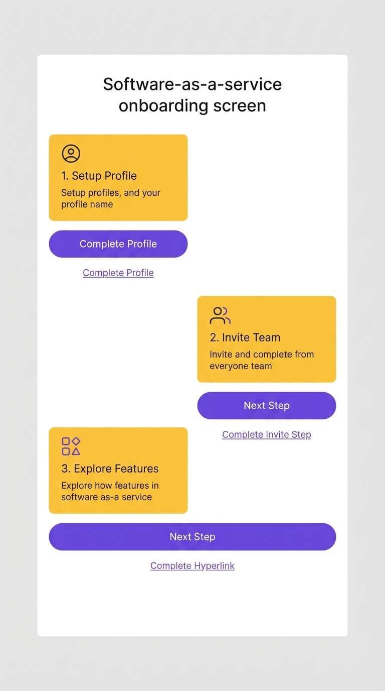
12) Minimal Maroon UI
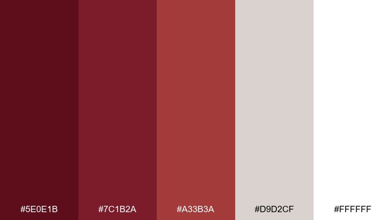
HEX: #5e0e1b #7c1b2a #a33b3a #d9d2cf #ffffff
Mood: clean, focused, professional
Best for: SaaS UI kits and product onboarding
Clean and focused, these tones feel like crisp cards with a confident red accent. Use white and warm gray for surfaces, then bring in the reds for progress, highlights, and key actions. It supports high readability and works nicely with simple icon sets and tight spacing. Tip: if you need a maroon red color palette that stays accessible, reserve #a33b3a for larger elements and keep text on light backgrounds.
Image example of minimal maroon ui generated using media.io
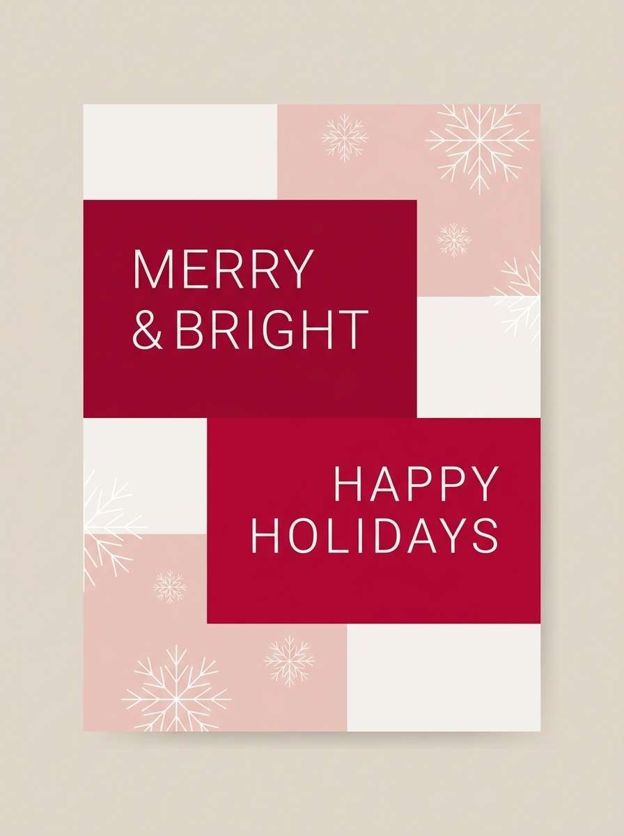
13) Winter Cranberry
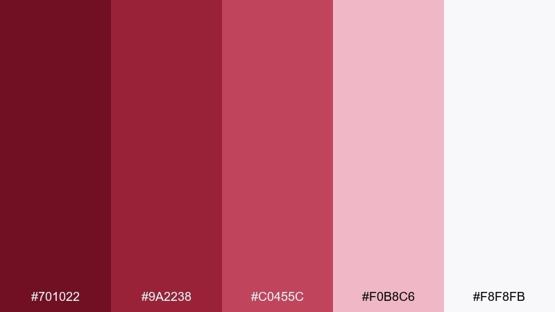
HEX: #701022 #9a2238 #c0455c #f0b8c6 #f8f8fb
Mood: festive, bright, cozy
Best for: holiday cards and seasonal email headers
Festive and cozy, these colors look like cranberries dusted with snow. The bright red adds cheer, while the pale pink and near-white keep the design light and airy. Use the darkest shade for type and outlines so the softer tones can stay background-friendly. Tip: add tiny pops of evergreen or silver elsewhere in the design for a classic winter contrast.
Image example of winter cranberry generated using media.io
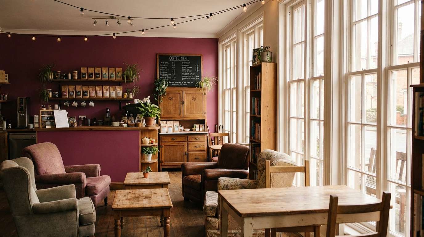
14) Coffeehouse Berry
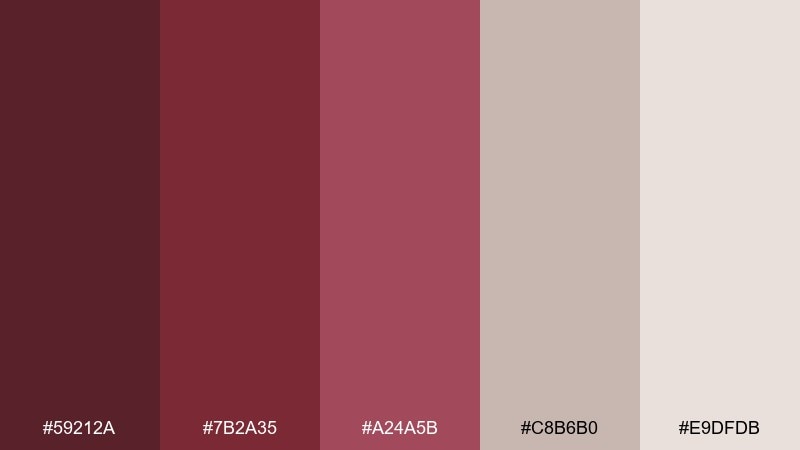
HEX: #59212a #7b2a35 #a24a5b #c8b6b0 #e9dfdb
Mood: soft, relaxed, vintage
Best for: coffee shop interiors and menu boards
Soft and relaxed, this palette feels like a berry pastry beside a latte. The dusty neutrals tame the darker reds, making it ideal for spaces that should feel welcoming rather than dramatic. Use the mid berry for signage accents and the pale taupes for walls, menus, and packaging. Tip: pair with warm woods and matte black hardware to keep the look grounded.
Image example of coffeehouse berry generated using media.io
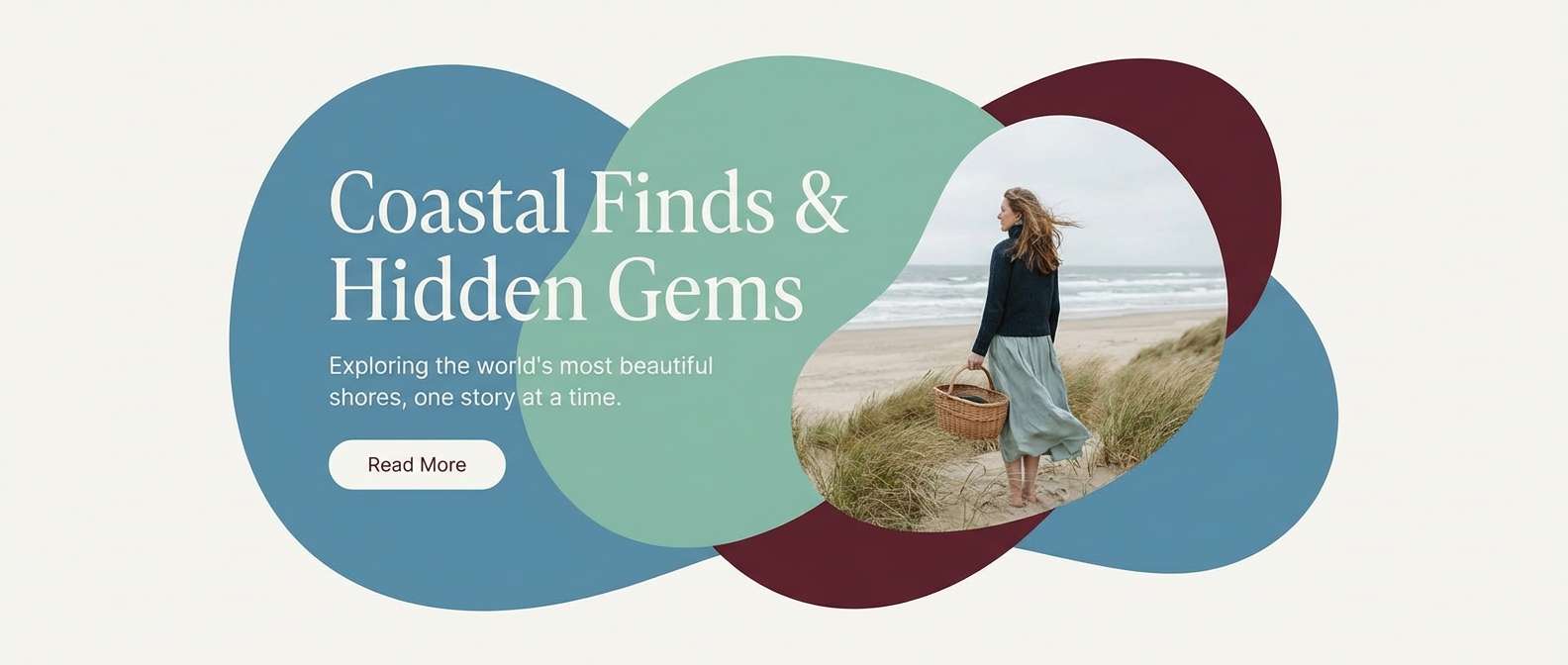
15) Coastal Wine Mist
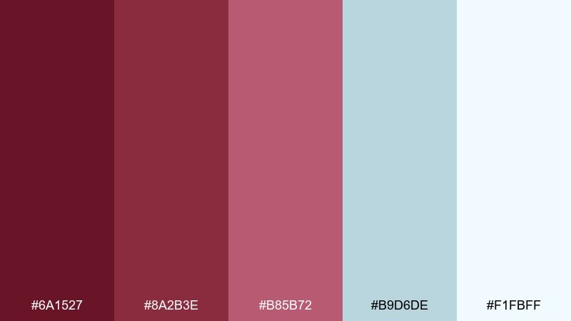
HEX: #6a1527 #8a2b3e #b85b72 #b9d6de #f1fbff
Mood: fresh, airy, modern
Best for: travel branding and lifestyle blogs
Fresh and airy, these hues feel like sea mist drifting past a glass of rosé. The cool coastal blue lightens the maroon tones and makes layouts feel more open. Use the pale blue-white for backgrounds, then add maroon for section headers and key highlights. Tip: keep photography slightly cool-toned so the palette looks cohesive across pages.
Image example of coastal wine mist generated using media.io
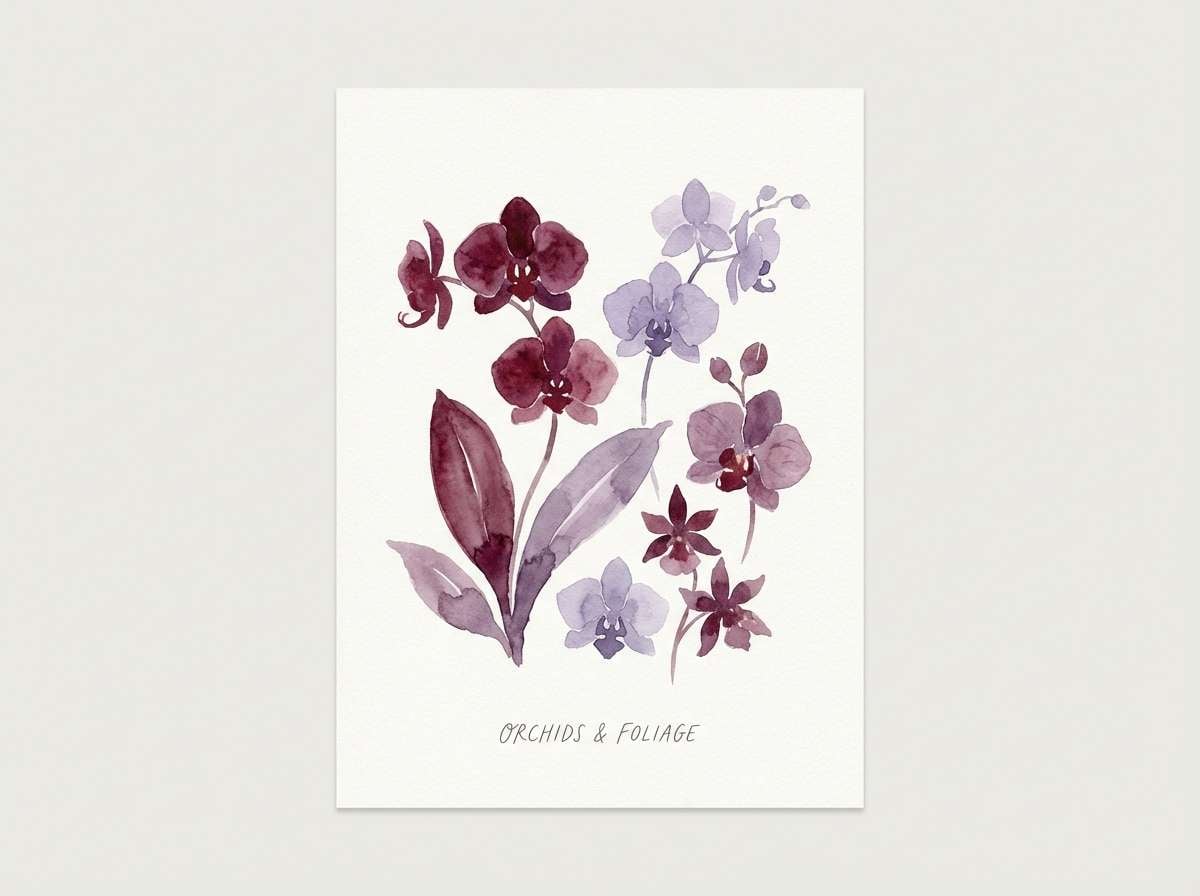
16) Orchid Cabernet
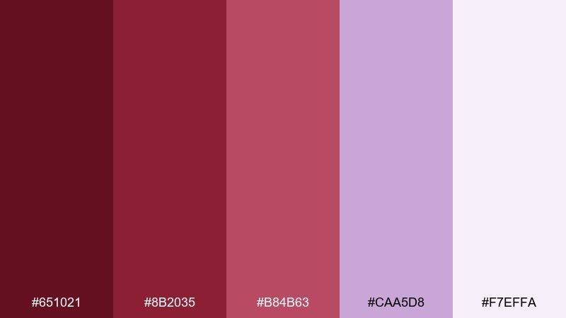
HEX: #651021 #8b2035 #b84b63 #caa5d8 #f7effa
Mood: creative, dreamy, feminine
Best for: floral art prints and boutique stationery
Dreamy and creative, this pairing brings orchid petals into a cabernet base. The lavender tint gives the reds a softer, more playful edge for prints and small products. Use the deepest tone for outlines and titles, then let the pastel shades fill backgrounds and illustrated blooms. Tip: add negative space around floral clusters so the darker reds do not overwhelm the composition.
Image example of orchid cabernet generated using media.io
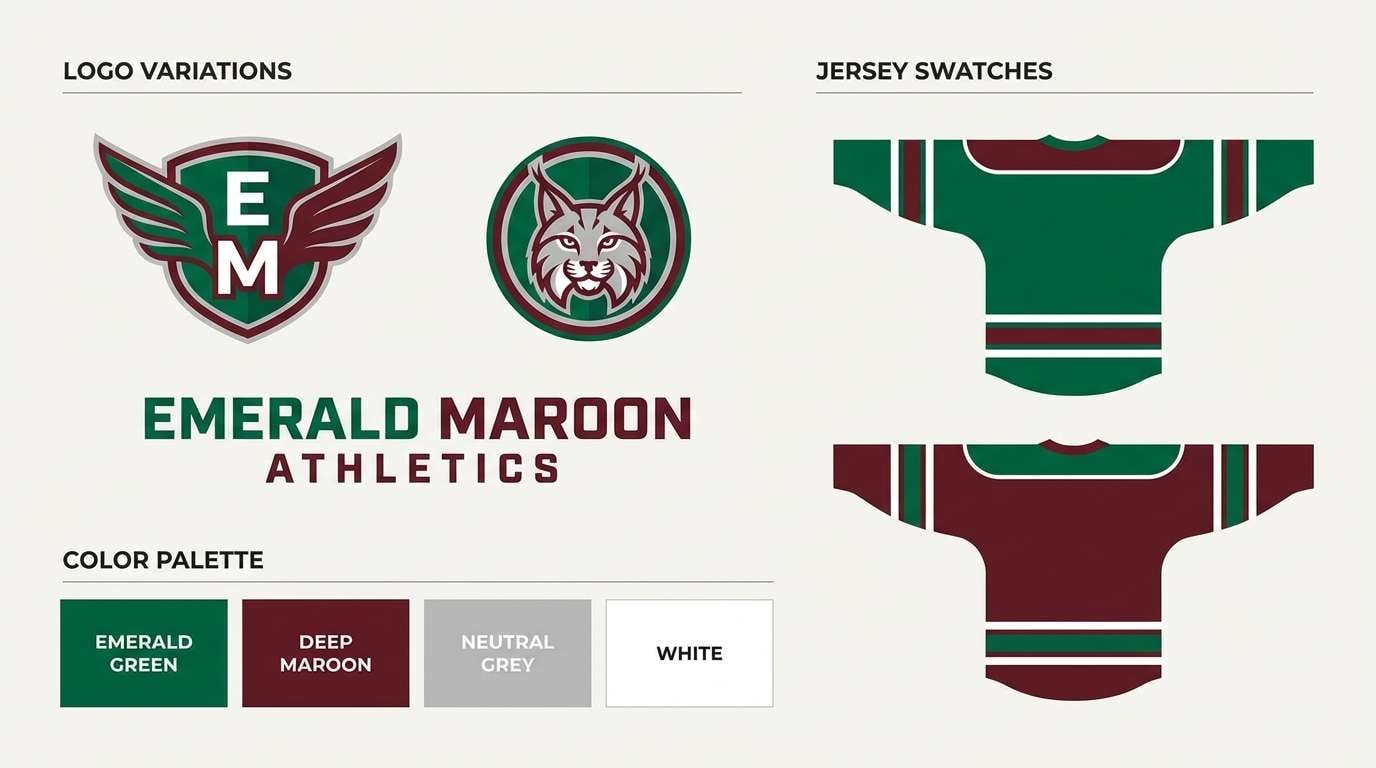
17) Emerald and Maroon Accent
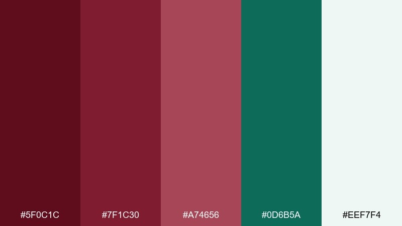
HEX: #5f0c1c #7f1c30 #a74656 #0d6b5a #eef7f4
Mood: bold, sporty, high-contrast
Best for: team branding and energetic campaigns
Bold and competitive, this mix looks like a jewel-toned uniform under stadium lights. The emerald adds snap and makes the reds feel even richer without relying on pure black. For a memorable maroon red color combination, keep the background light and let emerald handle small highlights like trims and icons. Tip: use the deepest maroon for typography and reserve the brighter red for emphasis so the hierarchy stays clear.
Image example of emerald and maroon accent generated using media.io
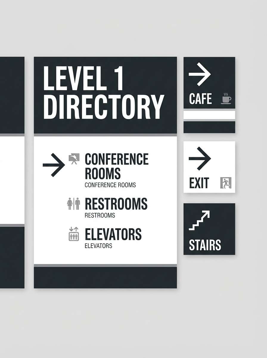
18) Museum Velvet
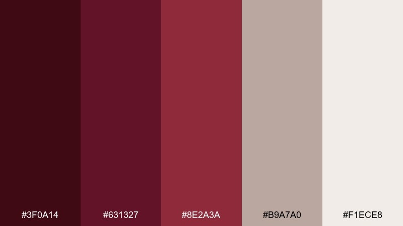
HEX: #3f0a14 #631327 #8e2a3a #b9a7a0 #f1ece8
Mood: curated, quiet, sophisticated
Best for: exhibit signage and cultural branding
Curated and quiet, these tones feel like velvet ropes, framed art, and soft gallery lighting. Use the deep shades for titles and directional markers, then lean on the pale stone for signage backgrounds. It pairs nicely with muted photography, thin rules, and understated iconography. Tip: keep contrast strong on wayfinding text by placing #f1ece8 behind dark type.
Image example of museum velvet generated using media.io
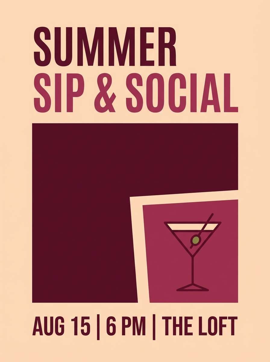
19) Peachy Sangria
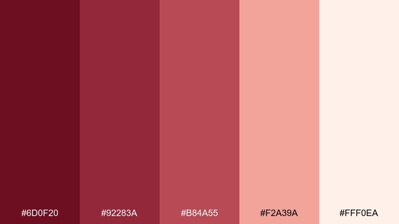
HEX: #6d0f20 #92283a #b84a55 #f2a39a #fff0ea
Mood: playful, social, summery
Best for: cocktail promos and event flyers
Playful and summery, these colors suggest sangria with peach slices at golden hour. The peach tones soften the deeper reds, making it great for cheerful promotions and nightlife branding. Use the light peach as the base, then set headings in the darker reds for instant readability. Tip: add a small lime or teal accent elsewhere in the design to make the warm palette pop even more.
Image example of peachy sangria generated using media.io
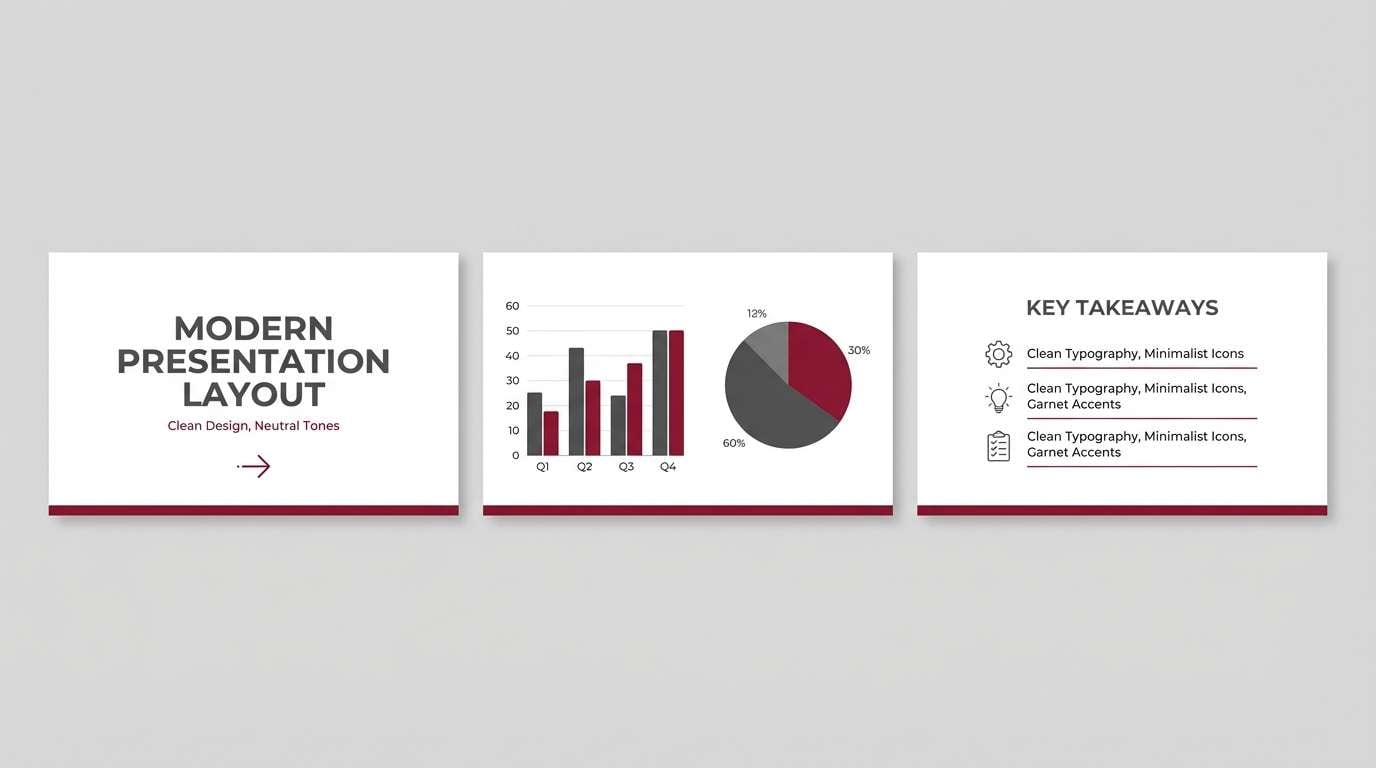
20) Graphite and Garnet
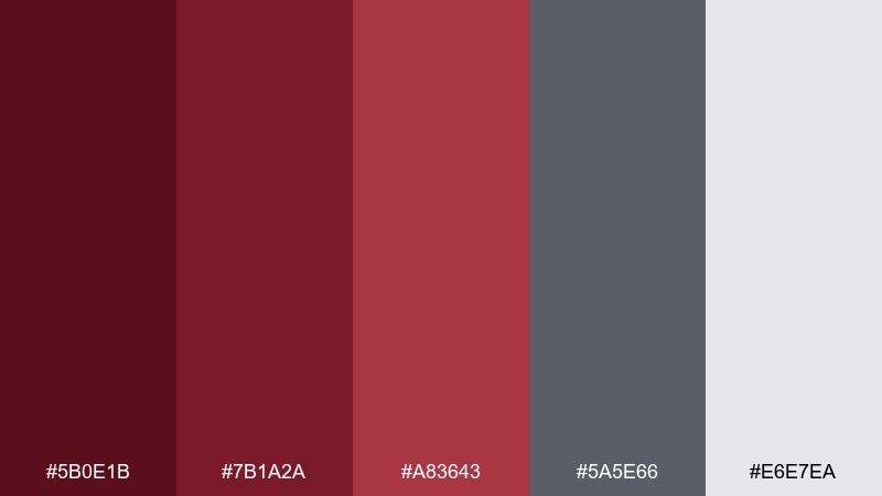
HEX: #5b0e1b #7b1a2a #a83643 #5a5e66 #e6e7ea
Mood: sharp, corporate, contemporary
Best for: pitch decks and tech presentations
Sharp and contemporary, this set feels like garnet accents against modern graphite architecture. The grays give you structure for charts and tables, while the reds provide confident emphasis for key numbers. Use the light gray as the slide background to reduce glare and keep the deck looking polished. Tip: stick to one red for highlights across the entire deck so your message stays consistent.
Image example of graphite and garnet generated using media.io
What Colors Go Well with Maroon Red?
Maroon red pairs effortlessly with warm neutrals like cream, ivory, beige, and greige because they soften its intensity while keeping the overall look upscale. For typography and UI, charcoal is often a better partner than pure black, since it feels less harsh.
For contrast, try cool companions like denim blue, coastal misty blues, sage/olive greens, or graphite grays. These hues pull maroon away from “holiday red” and toward a more contemporary, balanced palette.
If you want a luxe finish, add metallic accents: gold for warmth and celebration, copper for artisan vibes, or brushed silver for modern tech branding. Keep metallics as highlights (lines, icons, foil details) rather than large blocks.
How to Use a Maroon Red Color Palette in Real Designs
Start with role assignment: choose one maroon as your primary brand color (logo, buttons, key headers), one lighter tint for backgrounds or cards, and one neutral for spacing and readability. This prevents maroon-heavy designs from feeling too dark.
In print, maroon red looks best with texture—uncoated paper, subtle grain, or soft gradients—because it enhances depth. In digital UI, reserve saturated maroons for states that matter (primary CTA, selected tabs, key chart series) and keep body surfaces light or charcoal-based.
For consistency, reuse the same mid-tone maroon across repeated elements (badges, dividers, icons). That repetition creates a cohesive system and makes your maroon red color scheme feel intentional rather than random.
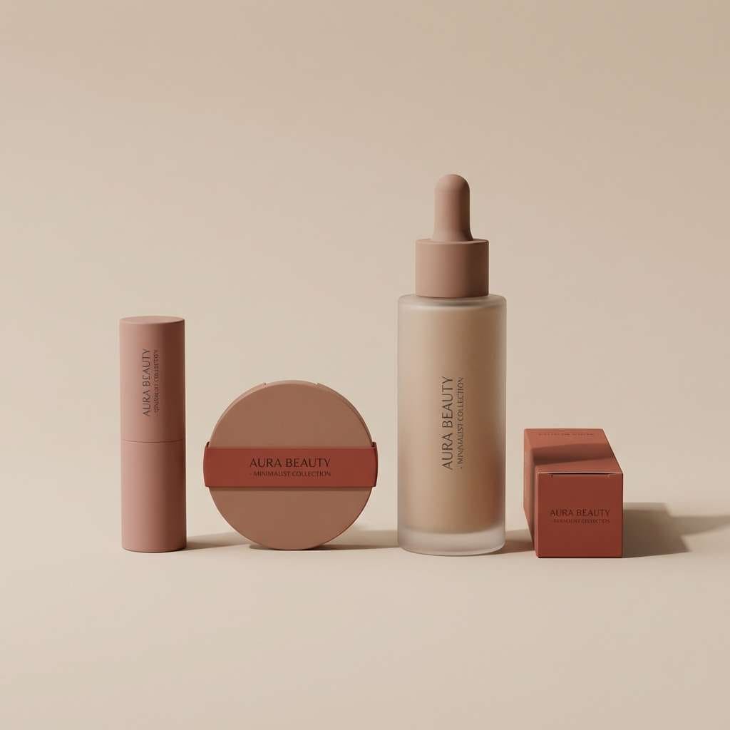
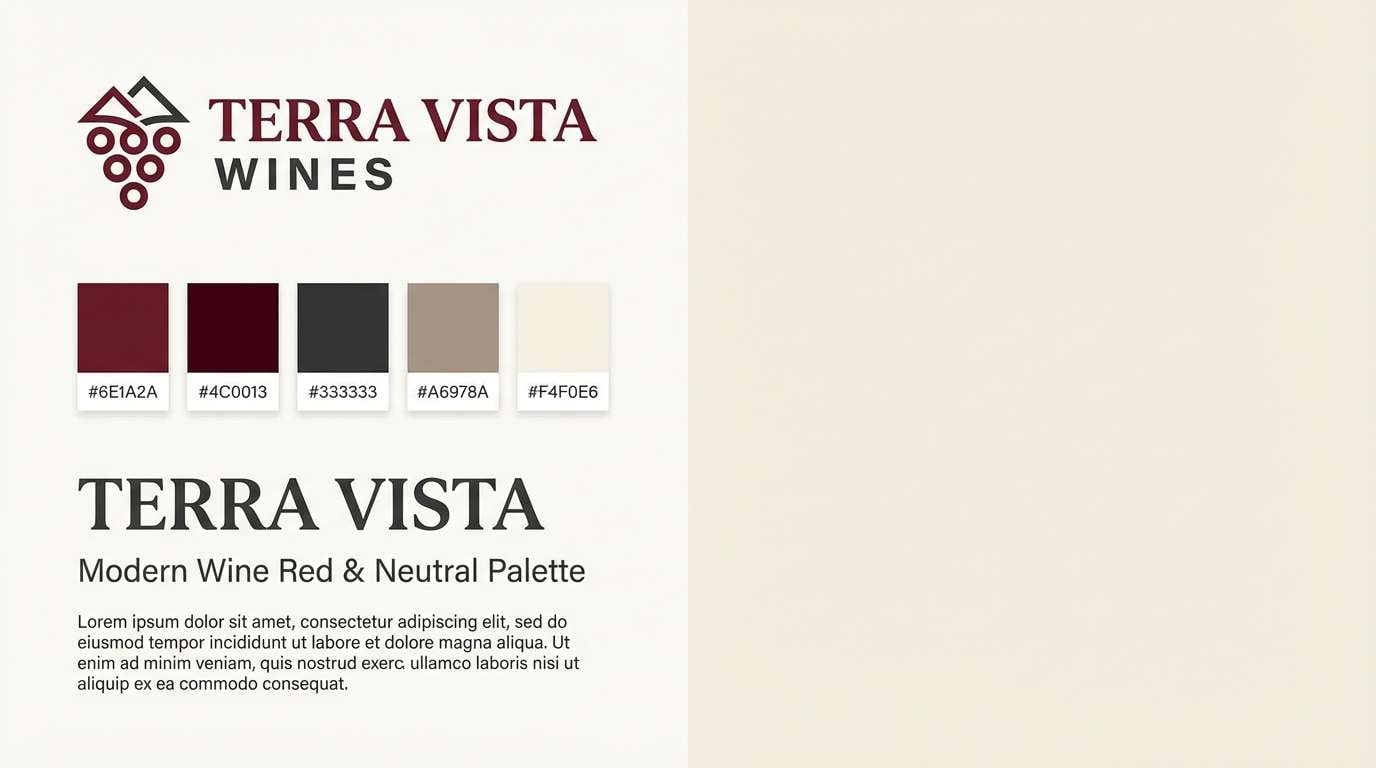
Create Maroon Red Palette Visuals with AI
If you already have HEX codes, you can turn them into on-brand visuals fast by generating mockups (posters, packaging, UI screens, invitations) that match your palette’s mood. This is especially useful when you need multiple design directions for A/B testing.
With Media.io’s text-to-image, you can paste a prompt like “minimal brand board with maroon red and blush color chips, modern typography” and iterate quickly—adjusting lighting, style, and layout without starting from scratch.
Generate a few options, then keep the winners and standardize them into a reusable palette system for web, print, and social templates.
Maroon Red Color Palette FAQs
-
What is the difference between maroon, burgundy, and wine red?
They’re closely related deep reds, but maroon usually leans more brown, burgundy leans more purple, and wine red often sits in between with a rich, cool “red grape” tone. In practice, lighting and surrounding colors can shift how each one reads. -
Is maroon red a good color for branding?
Yes—maroon red signals heritage, confidence, and premium quality. It works especially well for food & beverage, beauty, hospitality, finance, and culture brands when balanced with warm neutrals or modern grays. -
What neutral colors look best with maroon red?
Cream, ivory, warm white, beige, taupe, and light warm grays are the easiest neutrals with maroon. For dark themes, pair maroon with charcoal or deep graphite instead of pure black for a softer, more elevated contrast. -
What accent colors make maroon red pop?
Emerald/teal, denim blue, sage green, and coastal light blues create clean contrast. For a luxe accent, gold or copper works well—use it sparingly as lines, icons, or foil-style details. -
How do I keep a maroon red palette from feeling too dark?
Use maroon as an accent rather than a full background, and add plenty of light space with off-white or blush. If you need a dark base, include a pale “text white” (slightly tinted) and keep saturated reds for highlights only. -
Are maroon red palettes accessible for web design?
They can be, but you must check contrast. Avoid placing mid maroons on dark backgrounds for small text; instead, use light backgrounds for maroon text or use near-white text on deep maroon surfaces, then verify with WCAG contrast testing. -
How can I quickly generate mockups using a maroon red color scheme?
Use an AI image generator and describe the scene plus the palette (e.g., “minimal packaging mockup in maroon red and blush with cream background”). Generate multiple variations, then refine prompts until the visuals match your brand tone.
Next: Light Pink Color Palette


