

Light pink is one of the most versatile “soft statement” colors: it can feel romantic, modern, playful, or premium depending on what you pair it with. The right light pink color palette also helps you keep layouts readable while still adding warmth and personality.
Below are 20 curated light pink palettes (with HEX codes) for branding, UI, weddings, packaging, and more—plus practical tips and AI prompts you can reuse to generate matching visuals.
In this article
- Why Light Pink Palettes Work So Well
-
- blush porcelain
- rosewater latte
- cotton candy dusk
- peony sage
- ballet slate
- strawberry milk
- pink sand neutral
- cherry blossom sky
- dusty rose clay
- soft coral sunrise
- lilac blush
- modern mauve concrete
- champagne blush
- berry sorbet pop
- pale pink navy
- flamingo mint
- vintage pink sepia
- rose gold studio
- petal teal contrast
- misty blush grayscale
- What Colors Go Well with Light Pink?
- How to Use a Light Pink Color Palette in Real Designs
- Create Light Pink Palette Visuals with AI
Why Light Pink Palettes Work So Well
Light pink sits in a sweet spot: it’s emotionally warm without being as visually loud as saturated reds. That makes it ideal for brands and interfaces that want to feel friendly, calm, or caring while still looking polished.
It also plays well with both cool and warm companions. Pair it with slate, navy, and blue-gray for a modern, professional finish—or with beige, taupe, and cocoa for a cozy, lifestyle feel.
Most importantly, light pink gives you an easy “accent lever.” When your base is mostly neutrals, a small amount of blush can highlight key UI states, labels, or packaging seals without overwhelming the design.
20+ Light Pink Color Palette Ideas (with HEX Codes)
1) Blush Porcelain
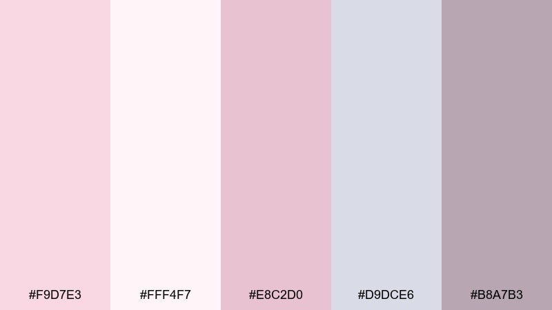
HEX: #F9D7E3 #FFF4F7 #E8C2D0 #D9DCE6 #B8A7B3
Mood: airy, clean, romantic
Best for: skincare packaging and minimal brand identity
Airy and porcelain-smooth, these tones feel like soft daylight on satin. The near-white pink and gentle mauves keep labels readable while still feeling sweet. Pair it with matte whites, silver foil, or light gray typography for a premium look. Tip: use the deepest mauve for ingredient text and reserve the brightest pink for small seals or icons.
Image example of blush porcelain generated using media.io
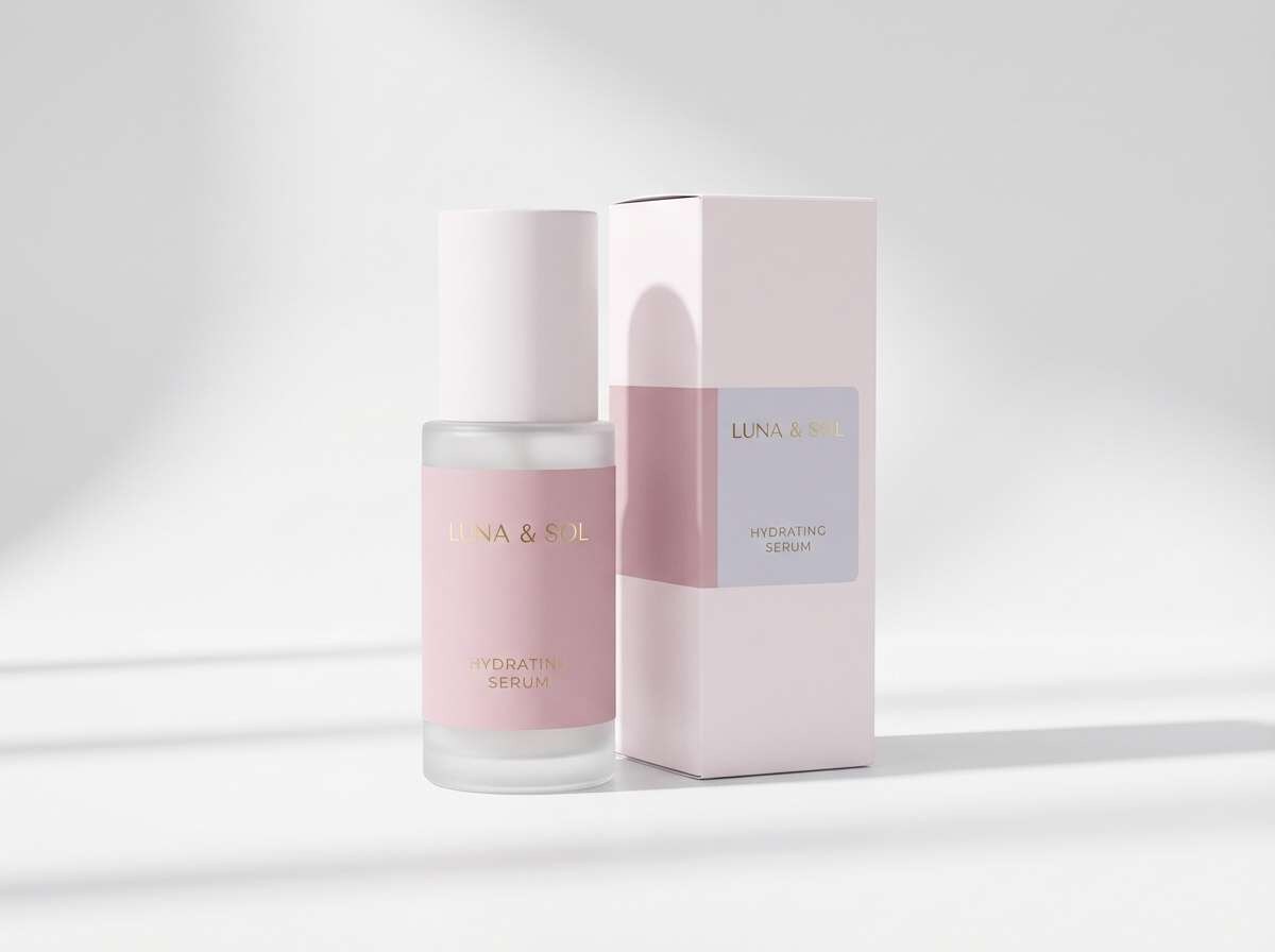
Media.io is an online AI studio for creating and editing video, image, and audio in your browser.

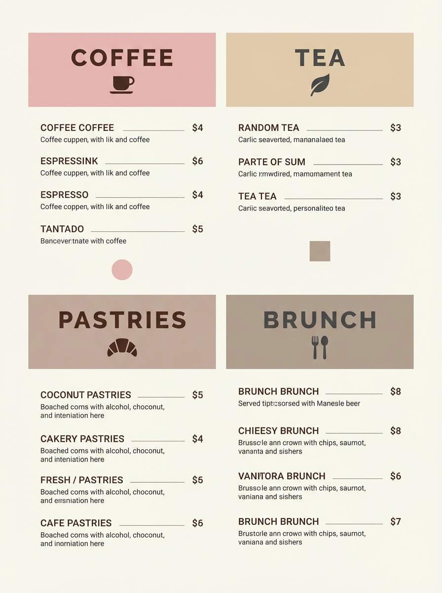
2) Rosewater Latte
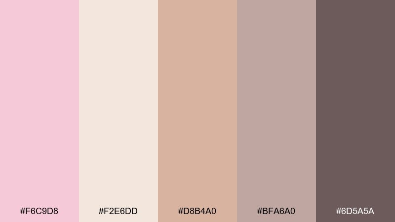
HEX: #F6C9D8 #F2E6DD #D8B4A0 #BFA6A0 #6D5A5A
Mood: cozy, warm, welcoming
Best for: cafe menus, bakery branding, and loyalty cards
Cozy and comforting, it reads like steamed milk with a blush swirl. Warm beiges keep the pink grounded, while the cocoa brown adds instant legibility for headings. It works beautifully for menus, stamp cards, and social posts that need a handmade feel. Tip: keep backgrounds latte-beige and use the brown for prices to improve scanability.
Image example of rosewater latte generated using media.io
3) Cotton Candy Dusk
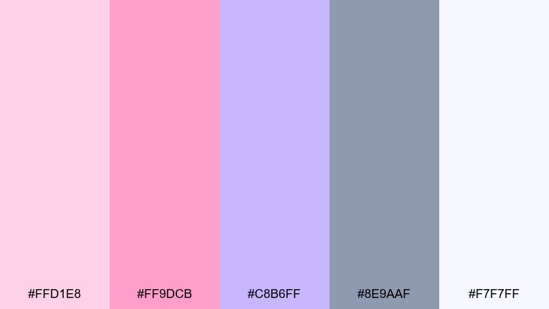
HEX: #FFD1E8 #FF9DCB #C8B6FF #8E9AAF #F7F7FF
Mood: playful, dreamy, youthful
Best for: social media stories and creator templates
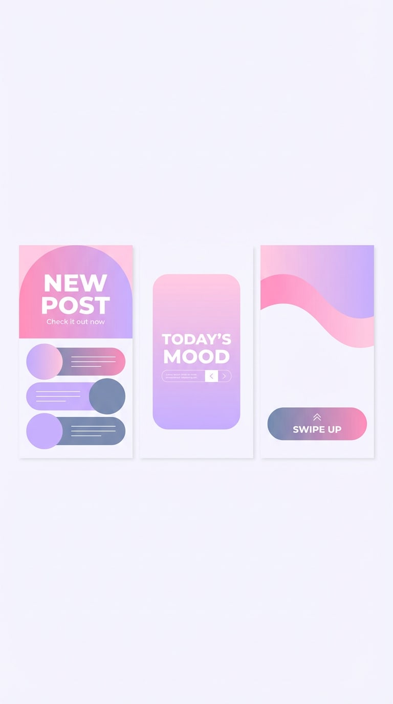
Playful and dreamy, this mix feels like cotton candy fading into twilight. The bright pink pop is balanced by lavender and a cool slate that keeps it from looking childish. Use it for story templates, sticker packs, or highlight covers where contrast matters. Tip: put white type over the slate, and save the hot pink for call-to-action buttons.
Image example of cotton candy dusk generated using media.io
4) Peony Sage
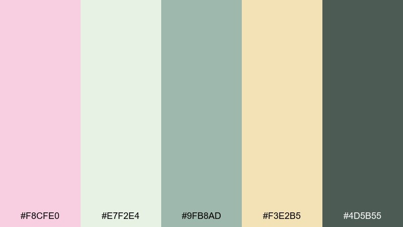
HEX: #F8CFE0 #E7F2E4 #9FB8AD #F3E2B5 #4D5B55
Mood: fresh, botanical, softly elegant
Best for: wedding invitations and garden events
Fresh and botanical, it evokes peony petals against sage leaves in morning light. The green tones add calm structure, while the buttery accent brings a candlelit warmth to details. For a light pink color scheme, use the pale green as the paper-like base and keep pink for monograms or borders. Tip: choose the deep green for names and dates to maintain crisp readability.
Image example of peony sage generated using media.io
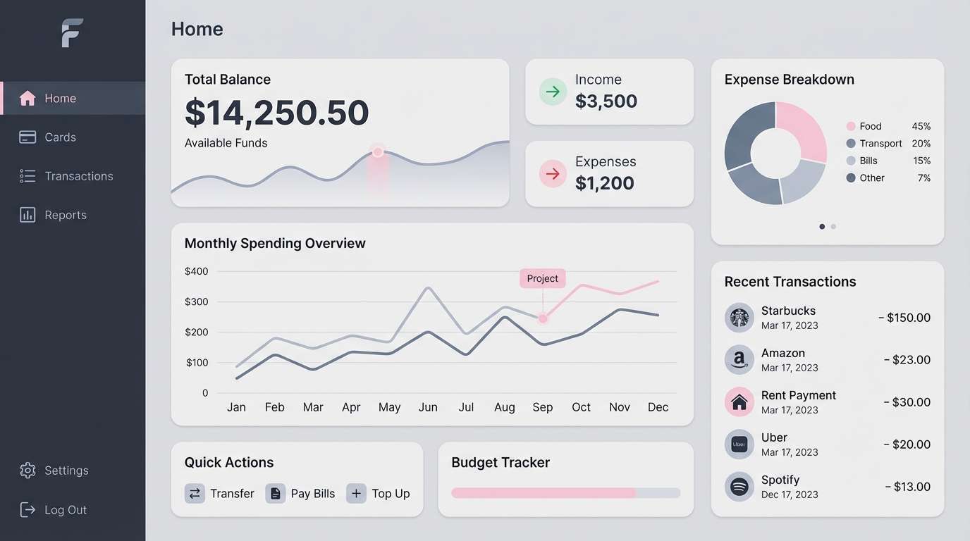
5) Ballet Slate
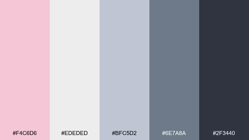
HEX: #F4C6D6 #EDEDED #BFC5D2 #6E7A8A #2F3440
Mood: modern, calm, professional
Best for: fintech dashboards and data-heavy UI
Modern and composed, it feels like a ballet studio with cool mirrors and a blush accent ribbon. The grays and slate create a serious foundation that supports charts, tables, and long-form content. Use the blush for highlights and selected states, and keep the darkest tone for primary text. Tip: limit pink to one key interaction color so the interface stays focused.
Image example of ballet slate generated using media.io
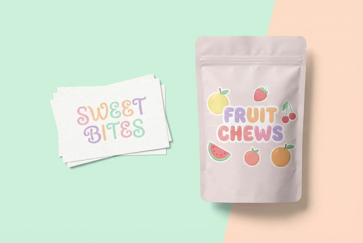
6) Strawberry Milk
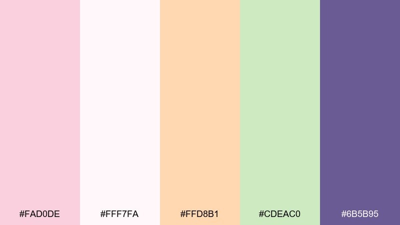
HEX: #FAD0DE #FFF7FA #FFD8B1 #CDEAC0 #6B5B95
Mood: sweet, cheerful, friendly
Best for: dessert labels and kids snack packaging
Sweet and sunny, it brings to mind strawberry milk with a sprinkle of fun toppings. Creamy whites and apricot soften the pink, while the violet adds a playful brand anchor. It works well on cartons, stickers, and small-format labels where you want instant charm. Tip: use the violet for brand name type so it stays bold even on pale backgrounds.
Image example of strawberry milk generated using media.io
7) Pink Sand Neutral
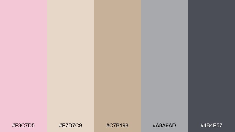
HEX: #F3C7D5 #E7D7C9 #C7B198 #A8A9AD #4B4E57
Mood: grounded, understated, lifestyle
Best for: lookbooks, interior mood boards, and lifestyle blogs
Grounded and sun-warmed, it feels like pink sand against driftwood and stone. The beige-to-taupe steps make it easy to layer backgrounds, dividers, and captions without visual noise. Use it for lookbooks and blog graphics where images need room to breathe. Tip: keep the darkest gray for small UI labels and let the sand tones do most of the heavy lifting.
Image example of pink sand neutral generated using media.io
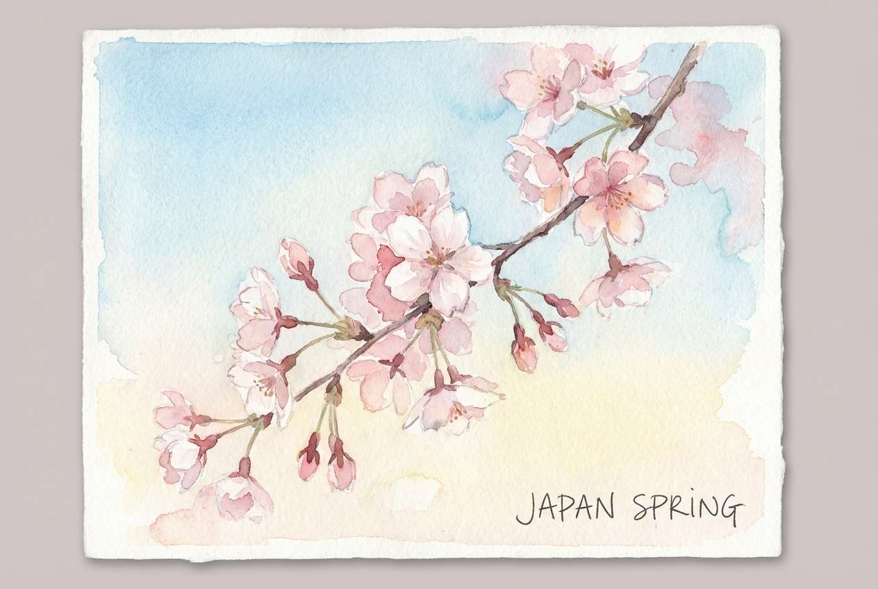
8) Cherry Blossom Sky
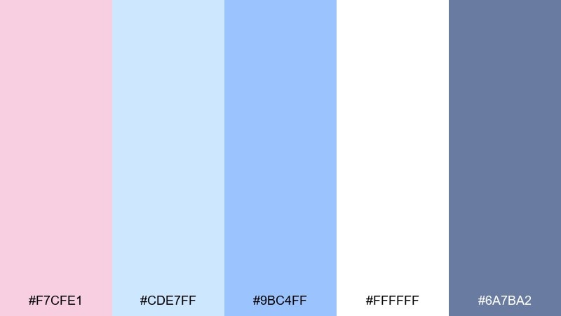
HEX: #F7CFE1 #CDE7FF #9BC4FF #FFFFFF #6A7BA2
Mood: fresh, airy, springtime
Best for: seasonal illustrations and wellness content
Fresh and weightless, it suggests blossoms floating under a bright spring sky. The blue range adds clarity and makes the pink feel more open and modern. Use it for wellness graphics, journaling pages, or seasonal campaigns that need a calm uplift. Tip: keep large areas white and use the deeper blue for headers to avoid a washed-out look.
Image example of cherry blossom sky generated using media.io
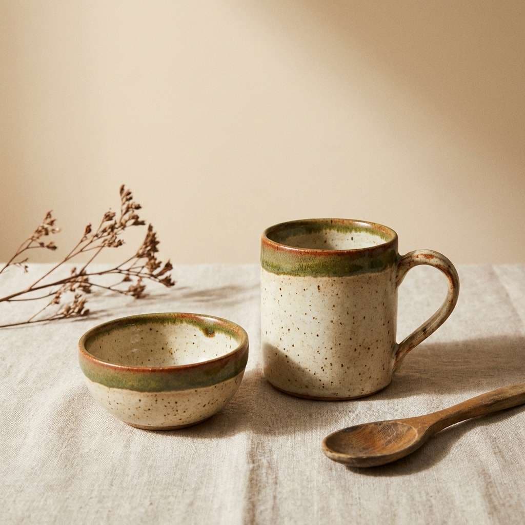
9) Dusty Rose Clay
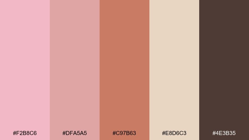
HEX: #F2B8C6 #DFA5A5 #C97B63 #E8D6C3 #4E3B35
Mood: earthy, artisanal, warm
Best for: ceramics ads and handmade product branding
Earthy and artisanal, it feels like dusty petals mixed into clay. The terracotta and cocoa browns make the pink read more mature, perfect for craft-forward brands. Use it on product tags, pottery shop banners, or packaging stamps. Tip: lean on the pale clay tone for backgrounds and keep the terracotta for borders and emphasis lines.
Image example of dusty rose clay generated using media.io
10) Soft Coral Sunrise
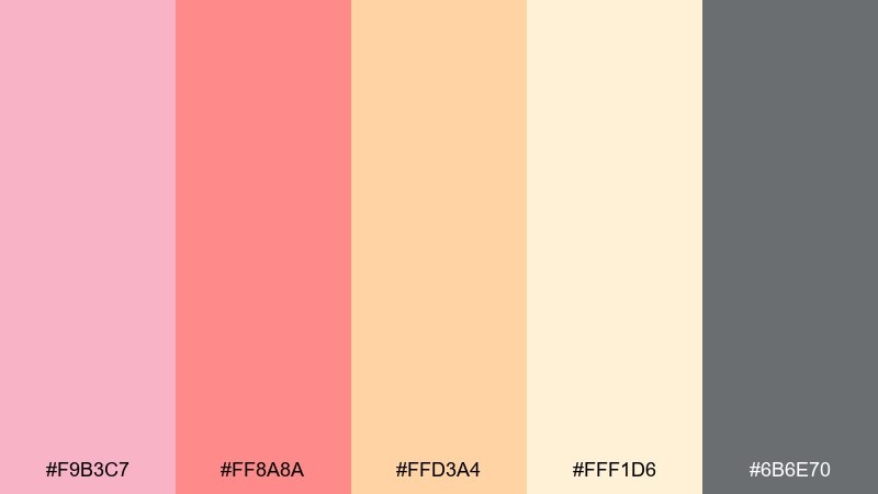
HEX: #F9B3C7 #FF8A8A #FFD3A4 #FFF1D6 #6B6E70
Mood: optimistic, energetic, inviting
Best for: event posters and community announcements
Optimistic and bright, it reads like sunrise light hitting coral clouds. The warm reds and apricot tones make the pink feel lively, while the gray keeps type crisp. These light pink color combinations are great for posters, workshops, and announcements that need quick impact. Tip: set the headline in the gray and reserve the strongest coral for date and location callouts.
Image example of soft coral sunrise generated using media.io

11) Lilac Blush
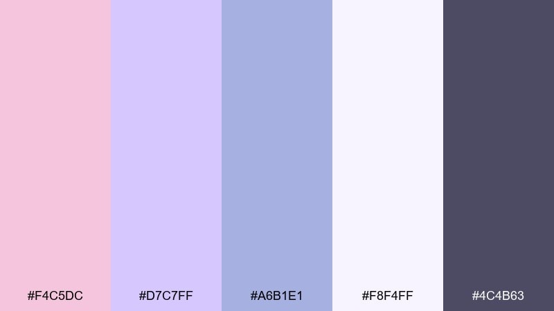
HEX: #F4C5DC #D7C7FF #A6B1E1 #F8F4FF #4C4B63
Mood: gentle, dreamy, polished
Best for: beauty app onboarding and membership UI
Gentle and dreamy, it feels like lilac perfume lingering over soft blush fabric. The lavender notes add visual depth, which helps onboarding screens look elevated instead of overly cute. Use the pale violet for panels and the charcoal-violet for text and icons. Tip: keep buttons in the mid lavender so they stand out without shouting.
Image example of lilac blush generated using media.io
12) Modern Mauve Concrete
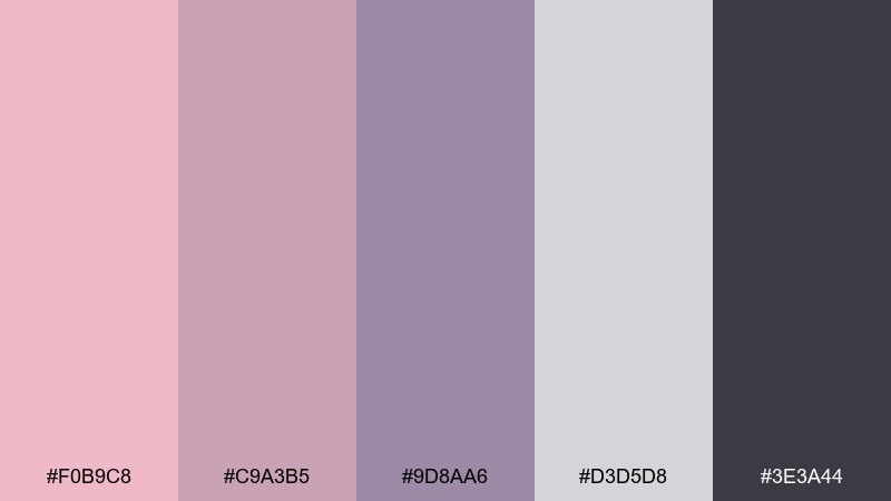
HEX: #F0B9C8 #C9A3B5 #9D8AA6 #D3D5D8 #3E3A44
Mood: urban, editorial, refined
Best for: architecture portfolios and brand guidelines
Urban and refined, it suggests mauve light reflecting off concrete and steel. The gray core keeps things professional, while the pink-mauves soften sharp layouts. It suits portfolio spreads, typography-heavy pages, and brand guideline PDFs. Tip: use the darkest charcoal for body text and keep the mid mauve for section tabs or page numbers.
Image example of modern mauve concrete generated using media.io
13) Champagne Blush
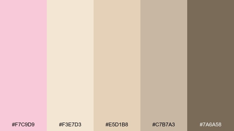
HEX: #F7C9D9 #F3E7D3 #E5D1B8 #C7B7A3 #7A6A58
Mood: luxurious, soft, celebratory
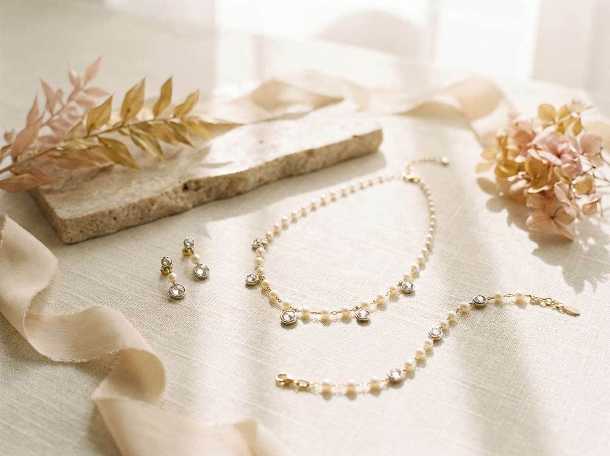
Best for: bridal jewelry ads and premium gifting
Luxurious and celebratory, it feels like champagne bubbles and blush tulle. The warm neutrals make the pink look expensive, especially paired with soft shadows and plenty of negative space. Use it for jewelry ads, gift cards, or boutique packaging that needs quiet elegance. Tip: keep the deepest taupe for logos and fine lines to avoid muddy mid-tones.
Image example of champagne blush generated using media.io
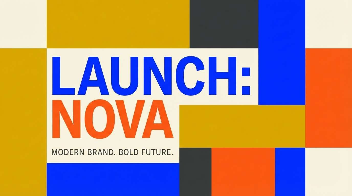
14) Berry Sorbet Pop
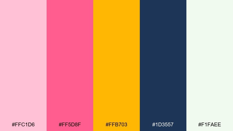
HEX: #FFC1D6 #FF5D8F #FFB703 #1D3557 #F1FAEE
Mood: bold, fun, high-contrast
Best for: campaign banners and modern brand launches
Bold and juicy, it looks like berry sorbet with a neon edge. The navy adds instant contrast, and the golden accent keeps the palette feeling upbeat rather than overly sweet. Use this light pink color palette for banners, hero sections, and launch graphics that need confident energy. Tip: limit the hot pink to one dominant block and use navy for the rest of the layout to keep hierarchy clear.
Image example of berry sorbet pop generated using media.io
15) Pale Pink Navy
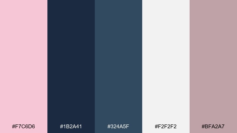
HEX: #F7C6D6 #1B2A41 #324A5F #F2F2F2 #BFA2A7
Mood: smart, crisp, contemporary
Best for: SaaS landing pages and professional UI
Smart and crisp, it pairs pale pink with deep navy like tailored clothes with a soft lining. The cool blues sharpen the overall feel, making it perfect for product pages and feature sections. Use off-white for background, navy for body copy, and pink for highlights and micro-interactions. Tip: keep the mauve-gray as your border and divider color for a tidy grid.
Image example of pale pink navy generated using media.io
16) Flamingo Mint
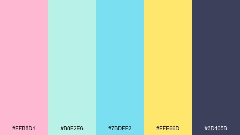
HEX: #FFB8D1 #B8F2E6 #7BDFF2 #FFE66D #3D405B
Mood: fresh, tropical, upbeat
Best for: summer beverage packaging and promos
Fresh and tropical, it feels like flamingo pink splashed into minty pool water. The aqua tones cool the palette down, while the lemon accent makes it look instantly summery. It works well for drink cans, limited-edition flavors, and promotional stickers. Tip: use the deep indigo for regulatory text so it stays readable against bright colors.
Image example of flamingo mint generated using media.io
17) Vintage Pink Sepia
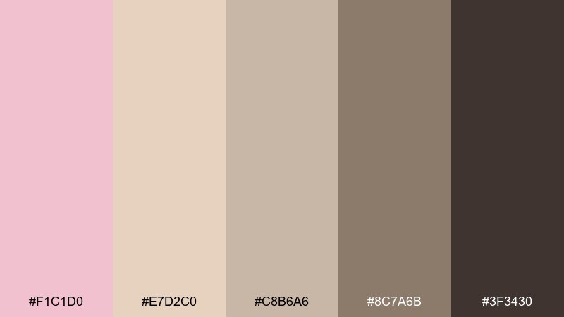
HEX: #F1C1D0 #E7D2C0 #C8B6A6 #8C7A6B #3F3430
Mood: nostalgic, muted, handcrafted
Best for: stationery sets and boutique packaging
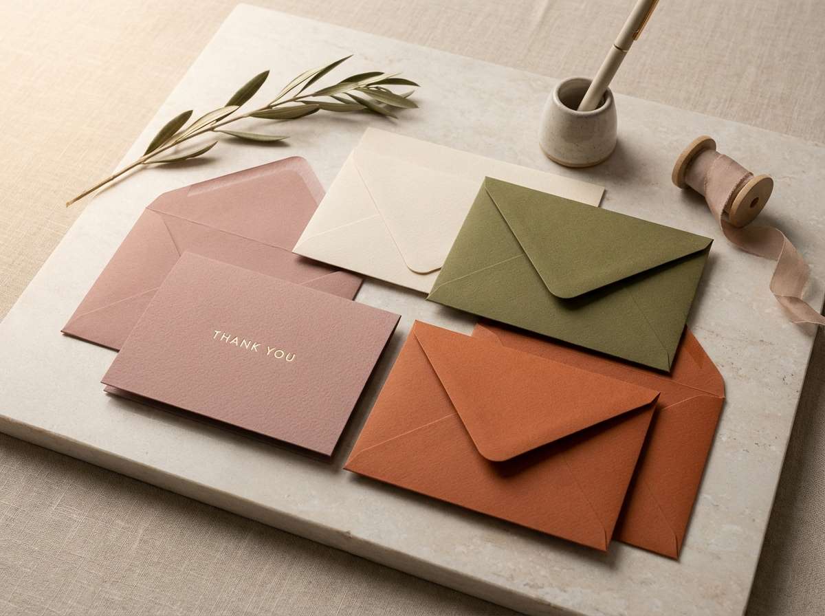
Nostalgic and muted, it brings up sepia postcards and faded ribbon. The beige and brown notes keep the pink restrained, ideal for vintage-inspired brands. Use it for stationery, hang tags, and thank-you cards with classic serif typography. Tip: choose the darkest brown for stamps and small print to avoid a washed vintage look.
Image example of vintage pink sepia generated using media.io
18) Rose Gold Studio
HEX: #F6C4D0 #E9D6C9 #D4AFB9 #A67C7C #2E2A2A
Mood: glam, warm, studio-polished
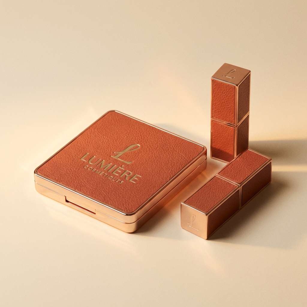
Best for: cosmetics packaging and product ads
Glam and studio-polished, it feels like rose gold metal under warm spotlights. The blush-to-taupe range supports premium finishes like foil, embossing, and glossy varnish. Use the near-black for logo contrast and the mid rose for secondary accents. Tip: keep the light beige as a clean backdrop so metallic details feel intentional, not busy.
Image example of rose gold studio generated using media.io
19) Petal Teal Contrast
HEX: #F7C7D7 #2EC4B6 #CBF3F0 #FFBF69 #1F2937
Mood: fresh, modern, energetic
Best for: fitness app UI and bold CTA systems
Fresh and modern, it pairs petal pink with teal like a clean pop against a neutral wardrobe. The dark slate anchors the bright accents, making it ideal for goal tracking and action-heavy screens. These light pink color combinations shine when teal is reserved for primary actions and pink supports badges or progress states. Tip: use the pale aqua for cards so the interface stays light while still feeling colorful.
Image example of petal teal contrast generated using media.io
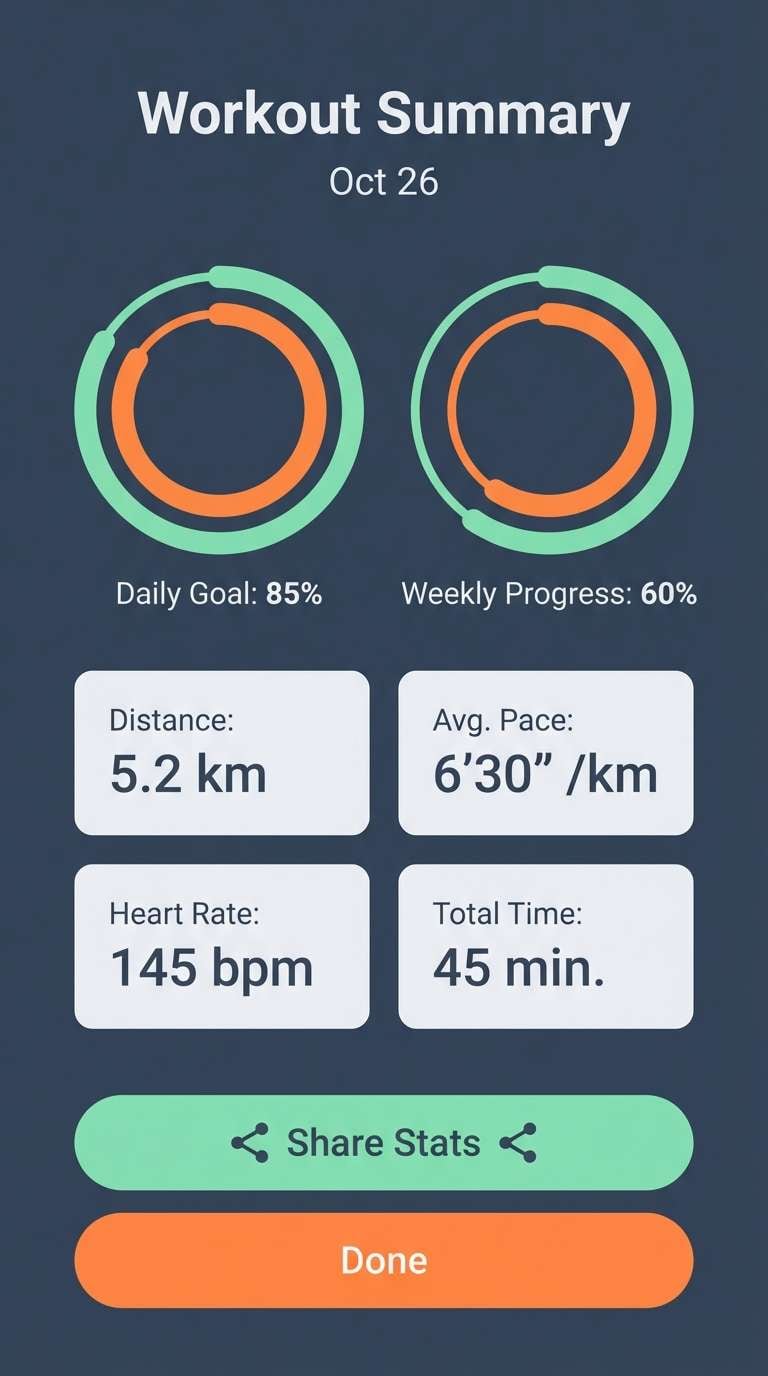
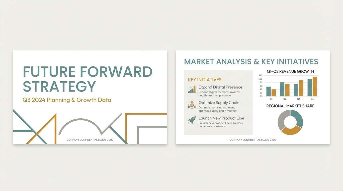
20) Misty Blush Grayscale
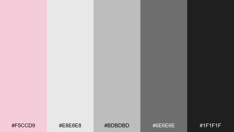
HEX: #F5CCD9 #E8E8E8 #BDBDBD #6E6E6E #1F1F1F
Mood: minimal, balanced, quietly romantic
Best for: pitch decks, slide templates, and reports
Minimal and balanced, it looks like misty blush drifting over clean grayscale. The neutrals make charts and data feel serious, while the pink adds a human touch to headers and key points. Use it for slide decks, reports, and professional templates where consistency matters. Tip: keep pink to one highlight role, such as section headers or callouts, to avoid visual fatigue.
Image example of misty blush grayscale generated using media.io
What Colors Go Well with Light Pink?
Light pink pairs beautifully with clean neutrals like white, ivory, dove gray, and charcoal—these keep the palette sophisticated and help typography stay crisp. If you want a “premium” look, try warm taupe and champagne-beige alongside blush.
For modern contrast, add deep tones such as navy, slate, or near-black. This approach is especially effective in UI, where light pink can be reserved for selected states, badges, or subtle highlights.
If you’re aiming for something fresh or playful, light pink also works with cool accents like teal, mint, and sky blue, or with sunny pops like apricot and soft yellow—just keep one accent dominant for a clear hierarchy.
How to Use a Light Pink Color Palette in Real Designs
Start with role assignment: choose one light background (often off-white), one primary text color (charcoal/navy), one mid-tone for borders and UI chrome, and one pink accent for emphasis. This prevents “too much blush” and keeps layouts readable.
In branding and packaging, use light pink as a surface color and reserve the darkest hue for logos and small print. Metallic finishes (silver, rose gold, or warm foil) often pair well with blush because they add contrast without introducing harsh colors.
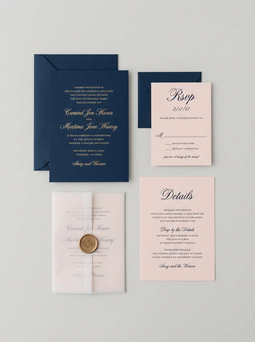
For weddings and editorial layouts, let negative space do the work. A light pink border, monogram, or ribbon element can carry the theme while keeping the overall design airy and elegant.
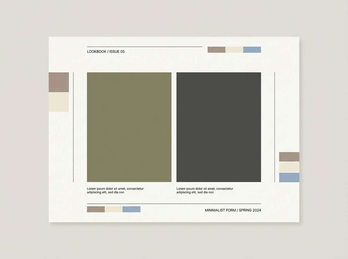
Create Light Pink Palette Visuals with AI
If you already have HEX codes, you can generate consistent visuals by repeating the same palette across prompts: specify “colors matching the palette,” describe the design style (studio, watercolor, UI mockup), and keep lighting/background simple for clarity.
Media.io’s text-to-image tool makes it easy to produce matching mockups for packaging, posters, or UI screens—so you can test your light pink color combinations before committing to a full design system.
Reuse any prompt above, swap the subject (menu, invitation, app screen), and keep the aspect ratio tag unchanged to get reliable layout outputs.
Light Pink Color Palette FAQs
-
What does a light pink color palette communicate in branding?
Light pink typically signals softness, care, approachability, and calm. With neutrals it can feel premium and minimal, while with brighter accents (coral, teal, yellow) it becomes playful and energetic. -
How do I keep light pink from looking “too sweet” or childish?
Anchor it with a strong dark (navy, charcoal, espresso) and use pink as an accent rather than the main background. Cool grays and slate tones also help make blush feel modern and professional. -
What’s the best text color on a light pink background?
For readability, use charcoal, deep navy, or dark slate instead of pure black. If you need a softer look, try deep taupe—but test contrast for body text and small labels. -
Can I use light pink in UI design without hurting accessibility?
Yes—treat pink as a highlight color and rely on dark neutrals for text. Ensure contrast ratios meet WCAG for text and key UI components, and don’t use color alone to communicate states (add icons, labels, or shapes). -
What colors go well with blush pink for weddings?
Sage green, champagne beige, warm taupe, and soft ivory are classic choices. For a fresher spring look, pair blush with sky blue and plenty of white space. -
How many colors should be in a light pink palette?
Five is a practical sweet spot: one light base, one light pink, one supporting mid-tone, one accent, and one dark anchor for type/contrast. This keeps your system flexible across print and digital. -
How can I generate palette-matching images quickly?
Use a consistent prompt template and specify “colors matching the palette,” then generate variations (packaging, UI mockups, posters) while keeping lighting and background simple. Media.io text-to-image is a fast way to create these visuals for testing and presentation.


