

A black orange color palette is one of the fastest ways to make a design feel modern, bold, and high-contrast. It pairs the authority of black with the energy of orange—perfect for interfaces, posters, and packaging that need instant focus.
Below are 20 black and orange palette ideas with HEX codes, plus practical tips and AI prompts you can reuse to generate matching visuals.
In this article
- Why Black Orange Palettes Work So Well
-
- ember noir
- citrus charcoal
- autumn nightfall
- safety stripe
- burnt sienna studio
- neon pumpkin punch
- copper asphalt
- tangerine latte
- volcano sunset
- industrial ember
- midnight marigold
- spiced cinder
- retro arcade
- cozy cabin glow
- urban tiger
- minimal contrast
- festival flame
- espresso orange
- cosmic campfire
- matte tactical
- What Colors Go Well with Black Orange?
- How to Use a Black Orange Color Palette in Real Designs
- Create Black Orange Palette Visuals with AI
Why Black Orange Palettes Work So Well
Black and orange is a naturally high-contrast pairing: black provides structure, weight, and legibility, while orange delivers speed, heat, and attention. Together, they create a clear visual hierarchy that works especially well for CTAs, badges, and hero headlines.
Unlike many “loud” color combos, black grounds orange so it feels intentional rather than chaotic. With the right neutrals (off-white, stone, warm grays), you can keep the palette readable for long-form UI screens and packaging information.
It also adapts across moods—industrial, premium, cozy, or playful—simply by shifting the orange temperature (amber vs. neon) and choosing a softer black (charcoal, espresso, navy-black) to control intensity.
20+ Black Orange Color Palette Ideas (with HEX Codes)
1) Ember Noir
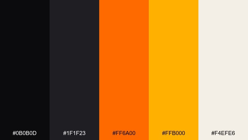
HEX: #0b0b0d #1f1f23 #ff6a00 #ffb000 #f4efe6
Mood: cinematic, bold, energized
Best for: landing pages, tech branding, call-to-action buttons
Cinematic and punchy, it feels like glowing embers against a midnight skyline. The black base keeps layouts crisp while the oranges deliver instant focus and urgency. For a balanced black orange color palette, let the warm hues live in buttons, badges, and key numbers, and use the soft off-white to open up space. Usage tip: keep orange to one primary shade per screen to avoid visual noise.
Image example of ember noir generated using media.io
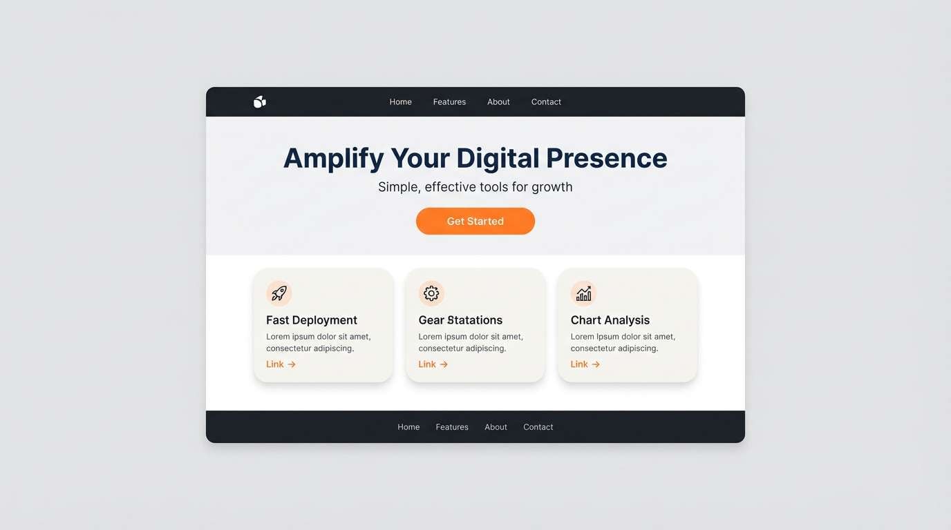
Media.io is an online AI studio for creating and editing video, image, and audio in your browser.

2) Citrus Charcoal
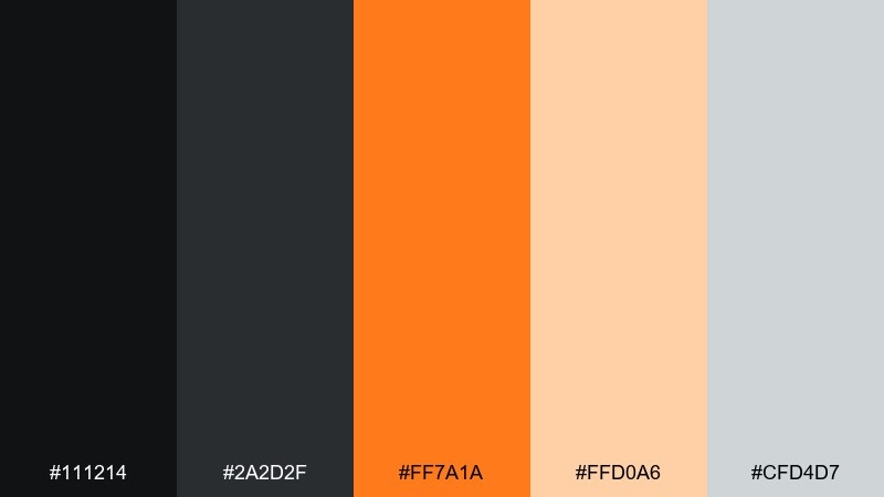
HEX: #111214 #2a2d2f #ff7a1a #ffd0a6 #cfd4d7
Mood: clean, modern, warm-neutral
Best for: dashboards, fintech apps, data visualization
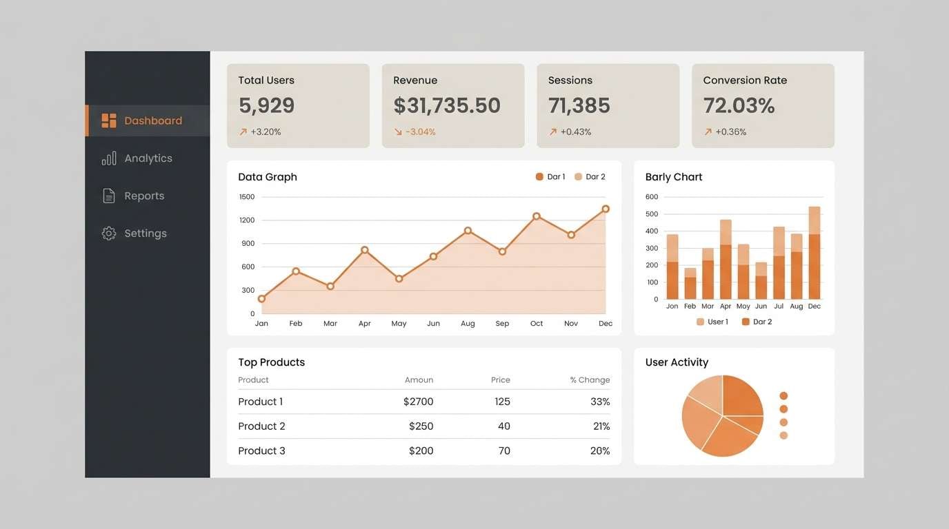
Clean charcoal tones with a citrus kick make the interface feel modern and trustworthy. The warm highlight reads clearly on dark surfaces without looking neon. Use this black orange color scheme for active states, charts, and alert badges, and keep the pale peach for secondary panels or empty states. Usage tip: reserve the orange for interactive elements so the hierarchy stays obvious.
Image example of citrus charcoal generated using media.io
3) Autumn Nightfall
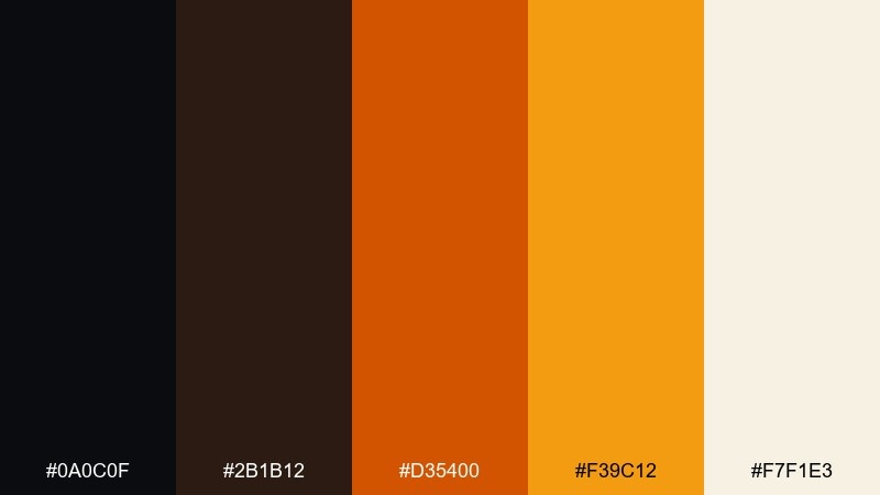
HEX: #0a0c0f #2b1b12 #d35400 #f39c12 #f7f1e3
Mood: cozy, autumnal, nostalgic
Best for: fall event posters, cafe menus, seasonal social posts
Cozy and nostalgic, it evokes bonfires, roasted spices, and early sunsets. The deep brown-black reads softer than pure black, making the oranges feel more natural and seasonal. Pair it with textured paper backgrounds or warm photography to amplify the fall vibe. Usage tip: use the lighter orange for headings and the darker orange for subheads to build depth.
Image example of autumn nightfall generated using media.io
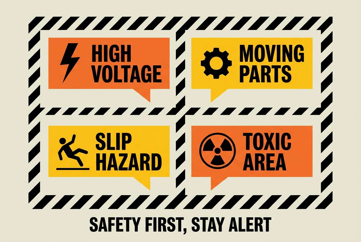
4) Safety Stripe

HEX: #000000 #2d2d2d #ff8c00 #ffcc00 #f2f2f2
Mood: high-visibility, industrial, direct
Best for: warning labels, sports graphics, signage
High-visibility and industrial, it brings to mind hazard tape, stadium lights, and bold direction. The yellow-orange range stays readable at a distance, even against heavy black. Use it for signage, bold headers, and iconography where clarity matters most, then soften edges with the light gray. Usage tip: add thick black outlines to orange icons to keep them sharp on busy layouts.
Image example of safety stripe generated using media.io
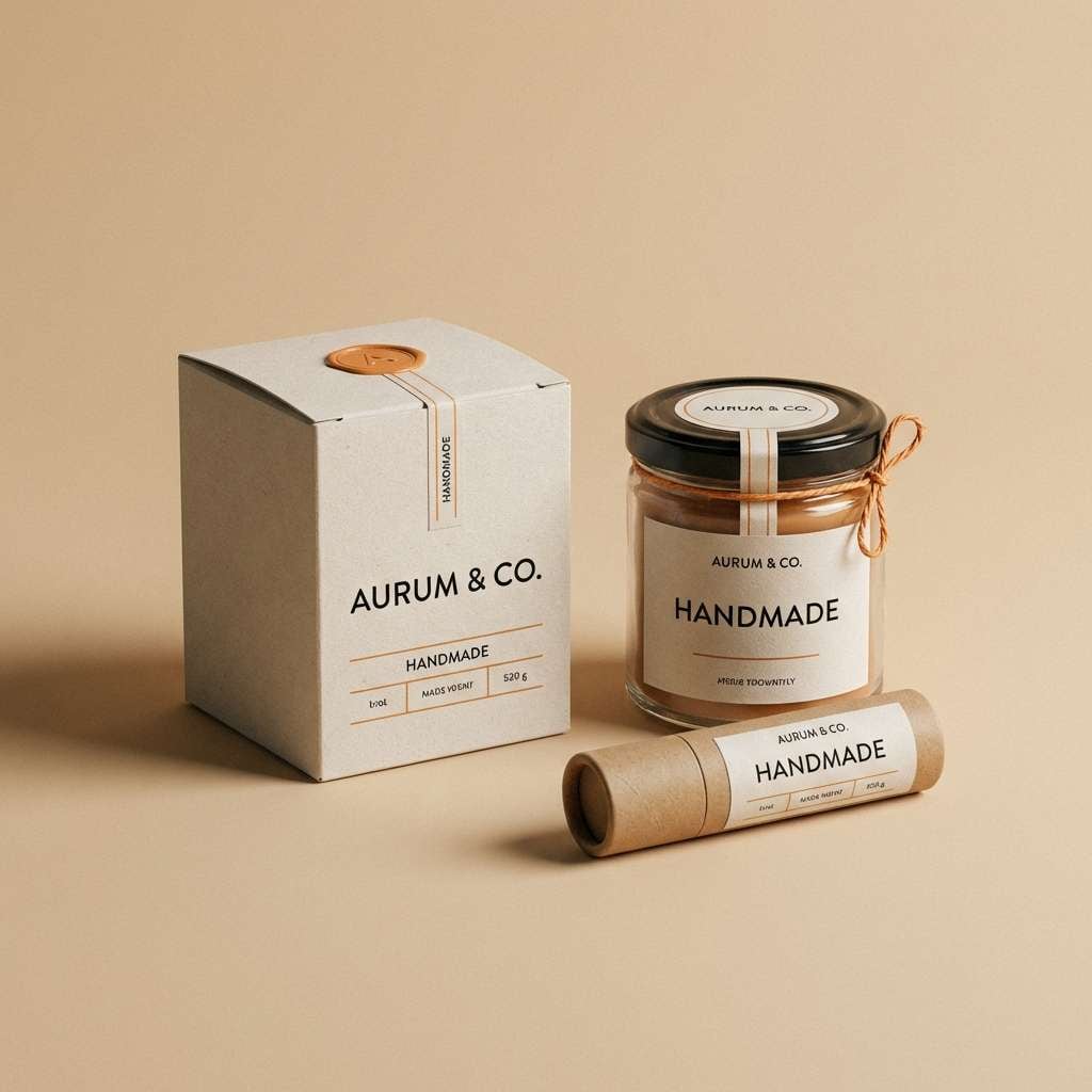
5) Burnt Sienna Studio
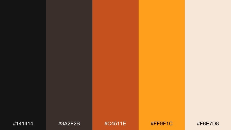
HEX: #141414 #3a2f2b #c4511e #ff9f1c #f6e7d8
Mood: artisanal, earthy, handcrafted
Best for: product packaging, craft brands, boutique labels
Artisanal and earthy, it feels like clay, leather, and studio light on a workbench. The sienna tones make the orange feel grown-up and tactile, not loud. For black orange color combinations in packaging, use the deep neutral for typography and the warm cream for breathing room around ingredients and claims. Usage tip: print the oranges in matte finishes to keep the palette looking premium.
Image example of burnt sienna studio generated using media.io
6) Neon Pumpkin Punch
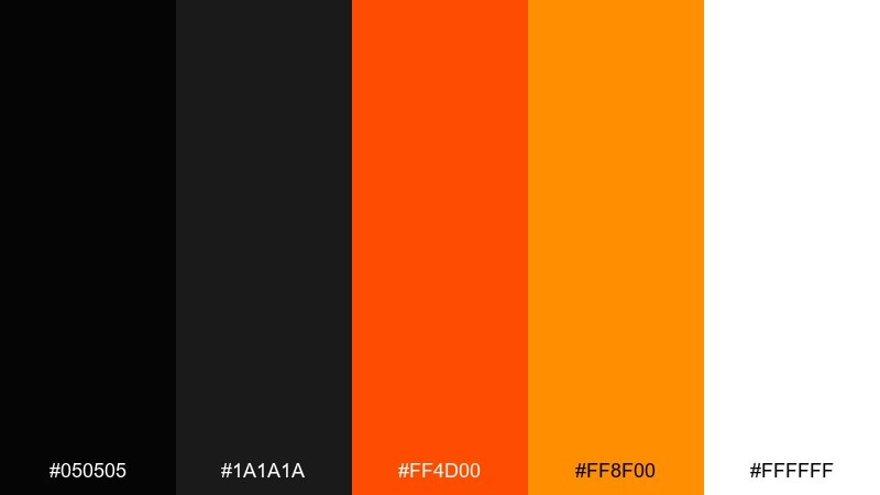
HEX: #050505 #1a1a1a #ff4d00 #ff8f00 #ffffff
Mood: electric, nightlife, hype
Best for: music flyers, gaming promos, social ads
Electric and loud, it channels club lighting and high-energy promos. The near-black background makes the hot oranges vibrate, while white keeps text crisp and legible. Use it for limited-time announcements, countdown graphics, and stream overlays where you want instant attention. Usage tip: apply the brightest orange to only one focal element per layout for maximum punch.
Image example of neon pumpkin punch generated using media.io
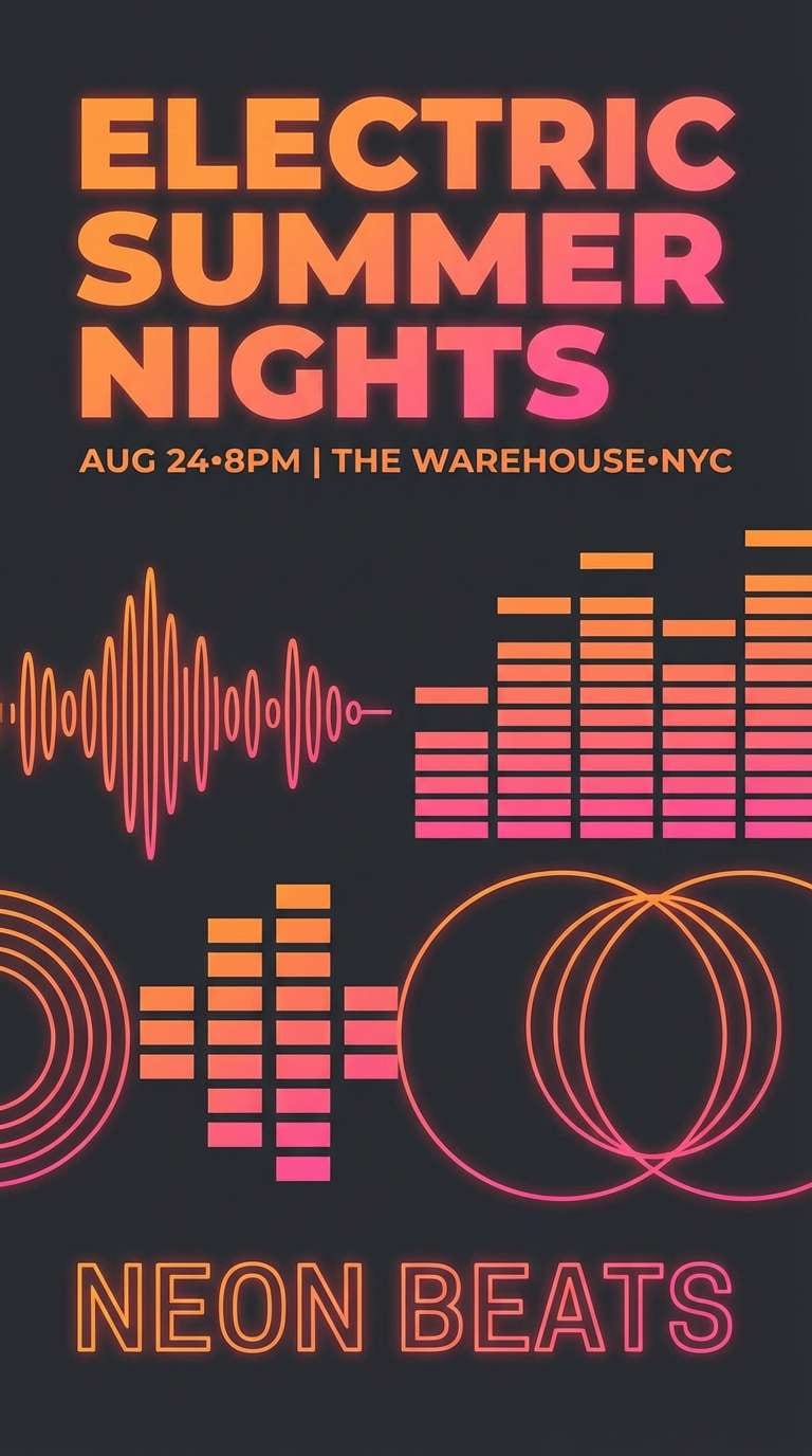
7) Copper Asphalt
HEX: #0f1012 #2c2f33 #b85c38 #ff7f11 #eae3da
Mood: urban, rugged, refined
Best for: outdoor gear branding, apparel tags, editorials
Urban and rugged, it feels like copper reflections on wet pavement. The muted copper bridges the jump between dark grays and bright orange, so designs look layered instead of flat. Pair it with grain textures, condensed type, and monochrome photography for an editorial feel. Usage tip: set body text in the light stone tone to reduce glare on dark backgrounds.
Image example of copper asphalt generated using media.io
8) Tangerine Latte
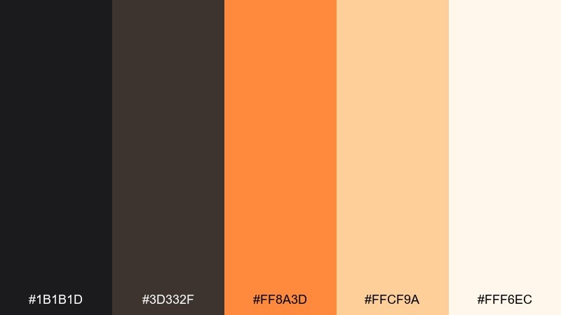
HEX: #1b1b1d #3d332f #ff8a3d #ffcf9a #fff6ec
Mood: friendly, creamy, welcoming
Best for: coffee shop menus, recipe cards, lifestyle blogs
Friendly and creamy, it evokes steamed milk, cinnamon, and a warm cafe counter. The soft peach and cream tones keep the contrast gentle, so it suits content-heavy designs. Use the darker neutrals for headings and the tangerine for highlights like prices, buttons, or callouts. Usage tip: add subtle separators in the peach tone instead of harsh lines for a softer layout.
Image example of tangerine latte generated using media.io
9) Volcano Sunset
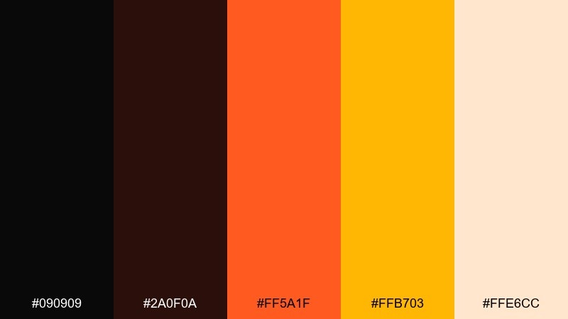
HEX: #090909 #2a0f0a #ff5a1f #ffb703 #ffe6cc
Mood: dramatic, fiery, adventurous
Best for: movie posters, sports reveals, video intros
Dramatic and fiery, it looks like molten lava fading into a golden horizon. The deep red-black adds intensity, while the bright amber lifts the palette so it does not feel heavy. If you want a black orange color combination with extra heat, use the red-black for shadows and the amber for glow effects around titles. Usage tip: add soft gradients between the two oranges to create a cinematic transition.
Image example of volcano sunset generated using media.io

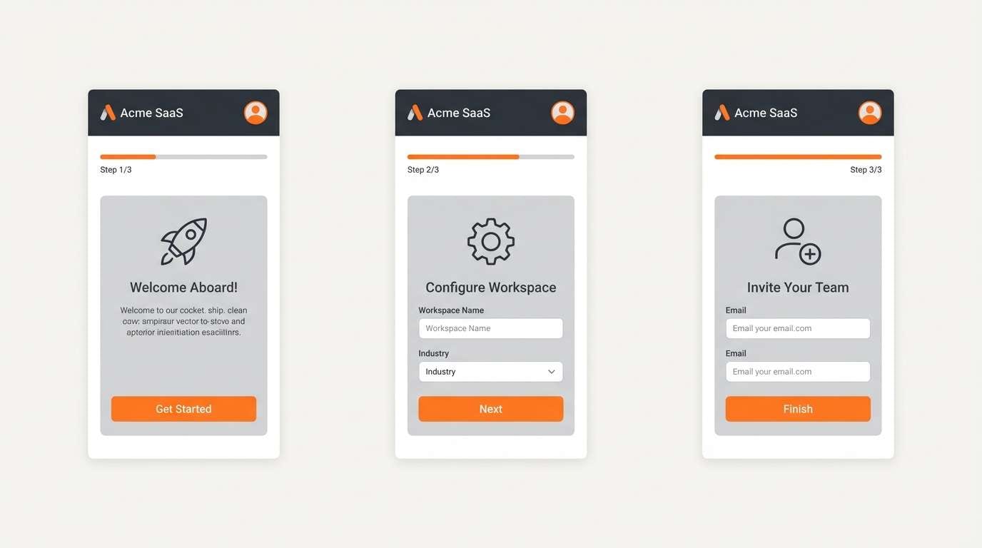
10) Industrial Ember
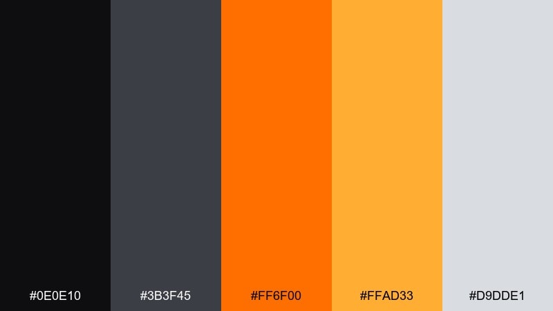
HEX: #0e0e10 #3b3f45 #ff6f00 #ffad33 #d9dde1
Mood: technical, sharp, dependable
Best for: SaaS onboarding, icon systems, slide decks
Technical and sharp, it suggests machinery heat and brushed metal. The grays keep everything disciplined, while the orange provides a clear path for attention. Use the bright orange for progress, toggles, and primary actions, and lean on the pale gray for card backgrounds. Usage tip: keep icons in gray and reserve orange for states like active, warning, or success highlights.
Image example of industrial ember generated using media.io
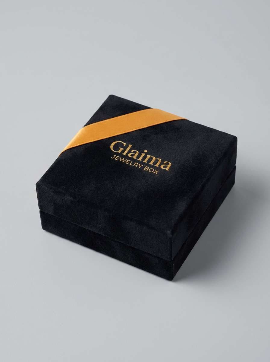
11) Midnight Marigold
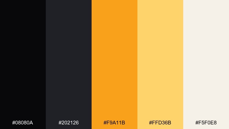
HEX: #08080a #202126 #f9a11b #ffd36b #f5f0e8
Mood: elegant, premium, celebratory
Best for: luxury invites, boutique packaging, jewelry ads
Elegant and celebratory, it feels like marigold petals under evening light. The golden oranges read upscale against the inky blacks, especially when paired with minimal typography. Use the cream tone for negative space and the lighter gold for subtle patterns or foil-like highlights. Usage tip: try spot gloss on the marigold accents to add a premium finish.
Image example of midnight marigold generated using media.io
12) Spiced Cinder
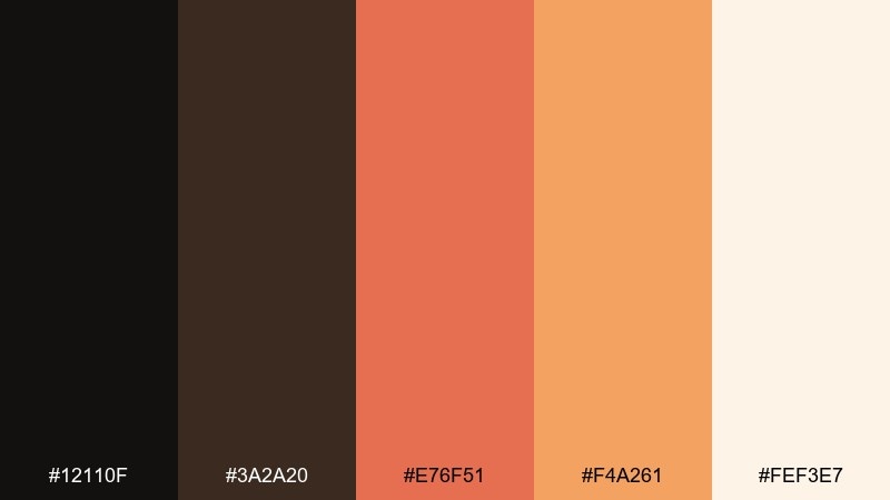
HEX: #12110f #3a2a20 #e76f51 #f4a261 #fef3e7
Mood: rustic, spicy, inviting
Best for: restaurant branding, food labels, rustic web themes
Rustic and inviting, it brings to mind smoked paprika, clay ovens, and warm hearthlight. The softer oranges are friendly and food-forward, while the dark neutrals ground menus and packaging. For a black orange color palette that feels handcrafted, combine the cream background with bold dark type and use orange for category markers and seals. Usage tip: keep the lighter orange as the dominant accent so the darker coral reads as a supporting spice.
Image example of spiced cinder generated using media.io
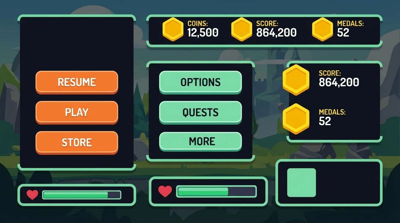
13) Retro Arcade
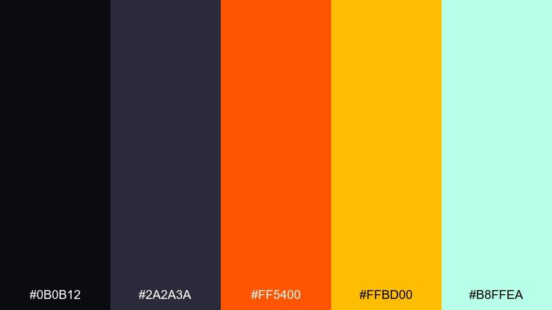
HEX: #0b0b12 #2a2a3a #ff5400 #ffbd00 #b8ffea
Mood: retro, playful, high-energy
Best for: game UI, stream overlays, sticker packs
Retro and playful, it feels like arcade cabinets and glowing scoreboards. The teal-tinted mint adds a fun twist that keeps the oranges from feeling too seasonal. Use the bright orange for primary buttons, the yellow for points or rewards, and the mint for secondary highlights. Usage tip: set small text in the lighter neutrals to maintain readability over dark panels.
Image example of retro arcade generated using media.io
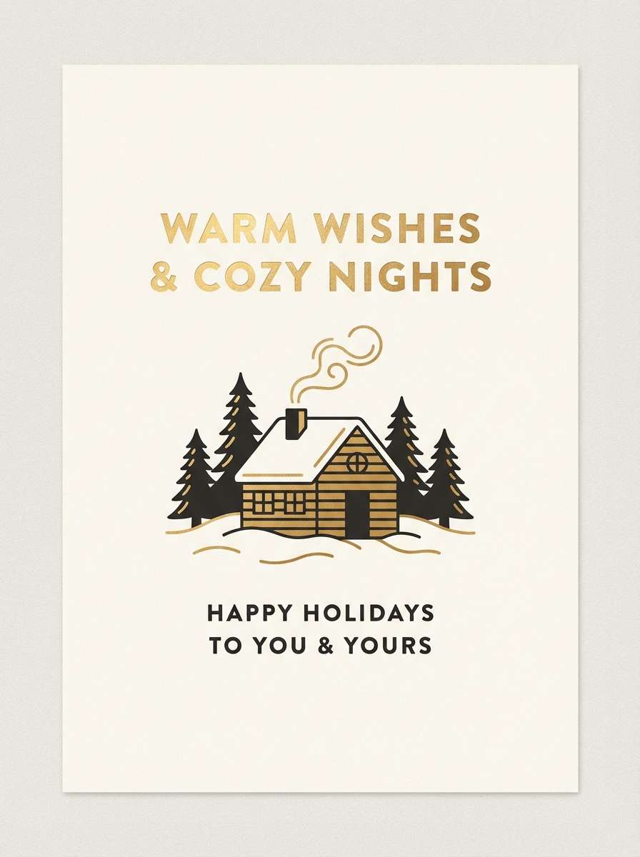
14) Cozy Cabin Glow
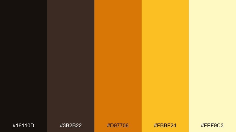
HEX: #16110d #3b2b22 #d97706 #fbbf24 #fef9c3
Mood: cozy, wholesome, golden
Best for: holiday cards, market posters, email newsletters
Cozy and wholesome, it evokes wood cabins, lantern light, and golden hour comfort. The honeyed yellows make the palette feel optimistic, not harsh. Use the darkest brown-black for headlines and illustration outlines, then let the warm gold carry icons and decorative borders. Usage tip: add subtle grain to the lightest tone for a handmade look without sacrificing clarity.
Image example of cozy cabin glow generated using media.io
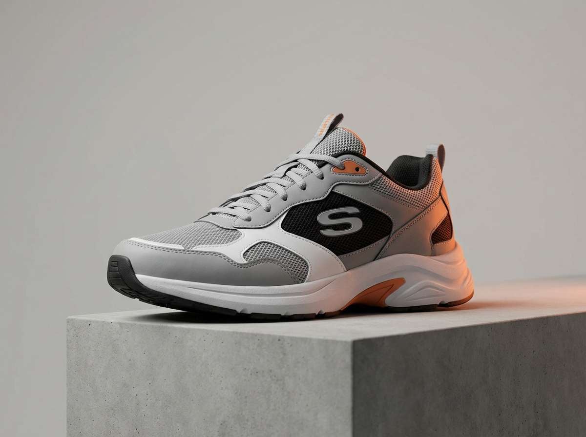
15) Urban Tiger
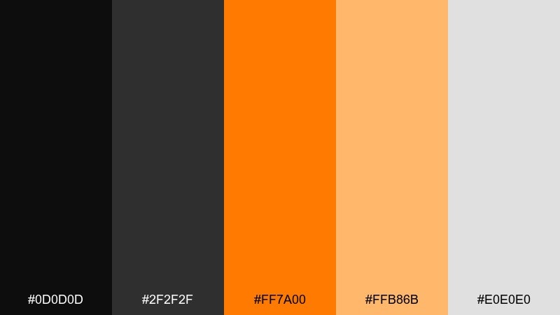
HEX: #0d0d0d #2f2f2f #ff7a00 #ffb86b #e0e0e0
Mood: confident, street, sporty
Best for: sneaker ads, streetwear lookbooks, social promos
Confident and street-ready, it feels like orange stitching on black denim. The mid-gray supports text and grids so the bright orange can stay aggressive without overwhelming the design. Use the softer peach for secondary callouts like sizes, drops, or feature bullets. Usage tip: keep backgrounds mostly dark and let the orange appear in tight, graphic hits for a premium streetwear vibe.
Image example of urban tiger generated using media.io
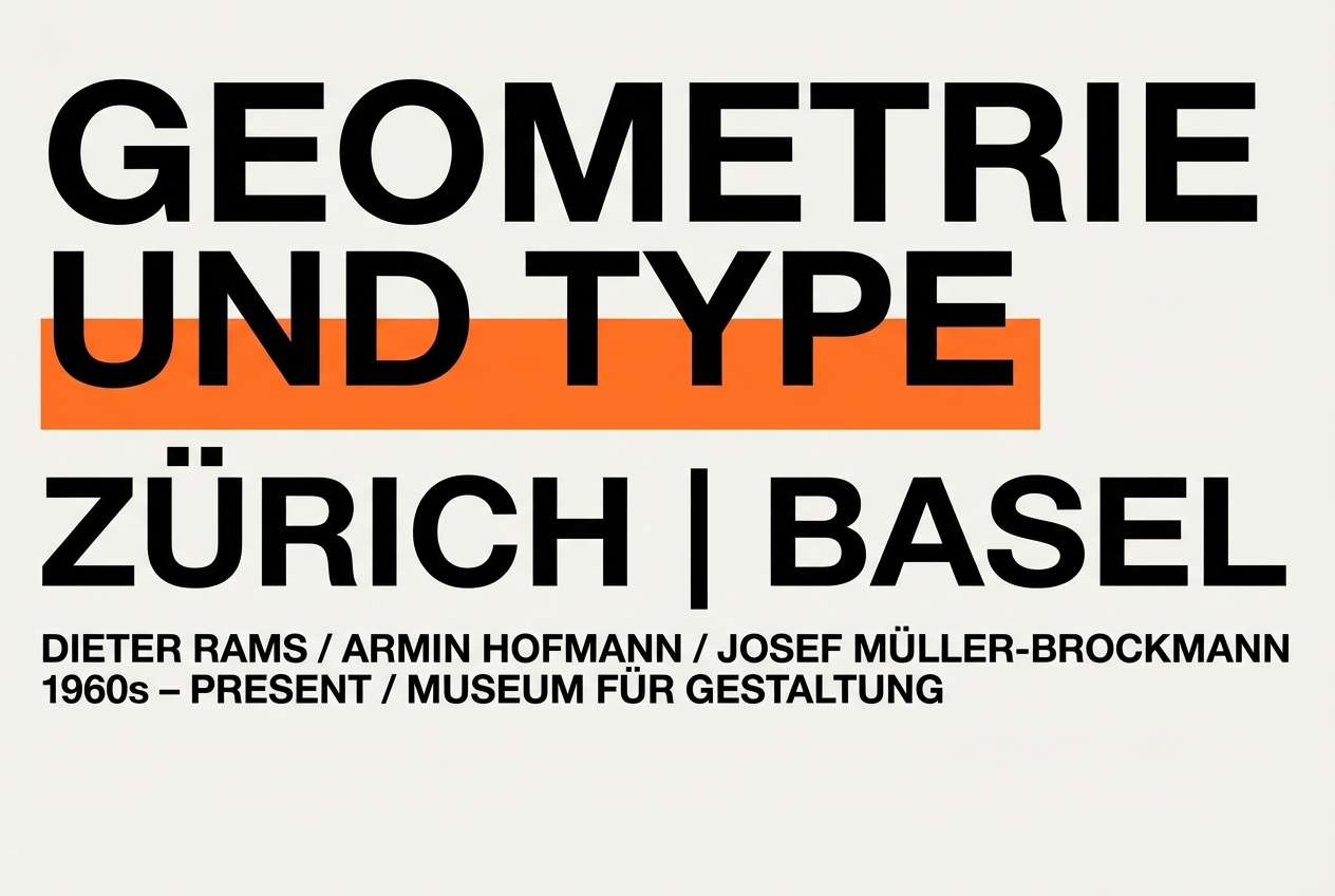
16) Minimal Contrast
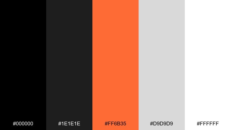
HEX: #000000 #1e1e1e #ff6b35 #d9d9d9 #ffffff
Mood: minimal, modern, graphic
Best for: portfolio sites, UI components, typography posters
Minimal and graphic, it resembles ink on paper with a single bright marker stroke. The grayscale range gives you flexible hierarchy, from heavy headers to quiet dividers. Use the orange sparingly for links, active states, or a single key message, and let white space do the heavy lifting. Usage tip: test contrast on small text and keep orange for larger UI elements to maintain accessibility.
Image example of minimal contrast generated using media.io
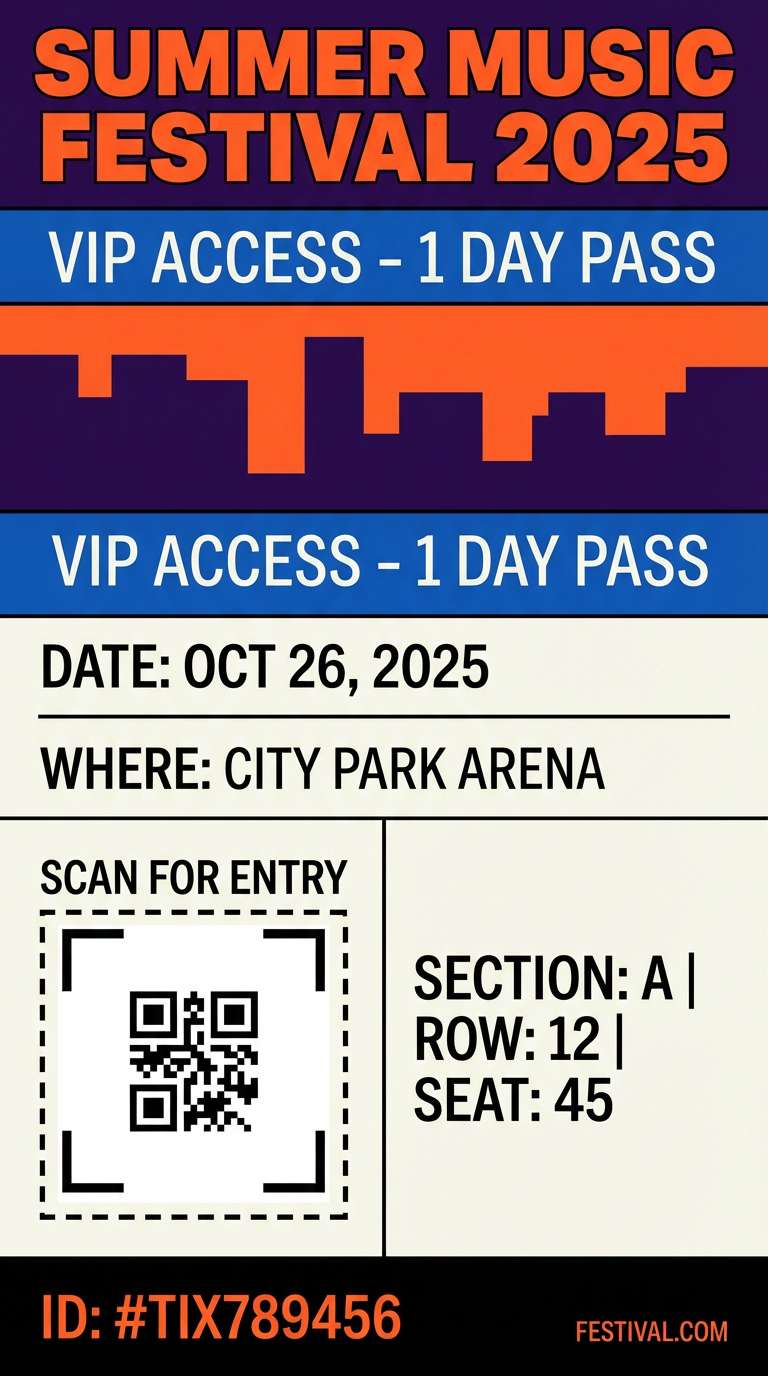
17) Festival Flame
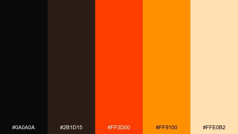
HEX: #0a0a0a #2b1d15 #ff3d00 #ff9100 #ffe0b2
Mood: festive, energetic, bright
Best for: event tickets, party invites, story templates
Festive and energetic, it reads like stage lights and confetti sparks. The red-orange brings urgency, while the softer peach keeps layouts friendly for details like dates and venues. Black orange color combinations like this shine on tickets and social stories where you need both punch and legibility. Usage tip: put fine print on the peach tone and keep the brightest orange for the headline and QR area.
Image example of festival flame generated using media.io
18) Espresso Orange
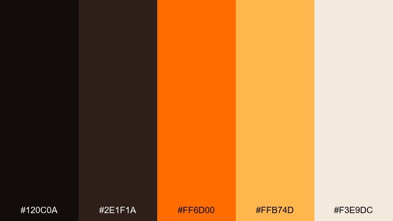
HEX: #120c0a #2e1f1a #ff6d00 #ffb74d #f3e9dc
Mood: rich, cozy, grounded
Best for: cafe packaging, loyalty cards, small business branding
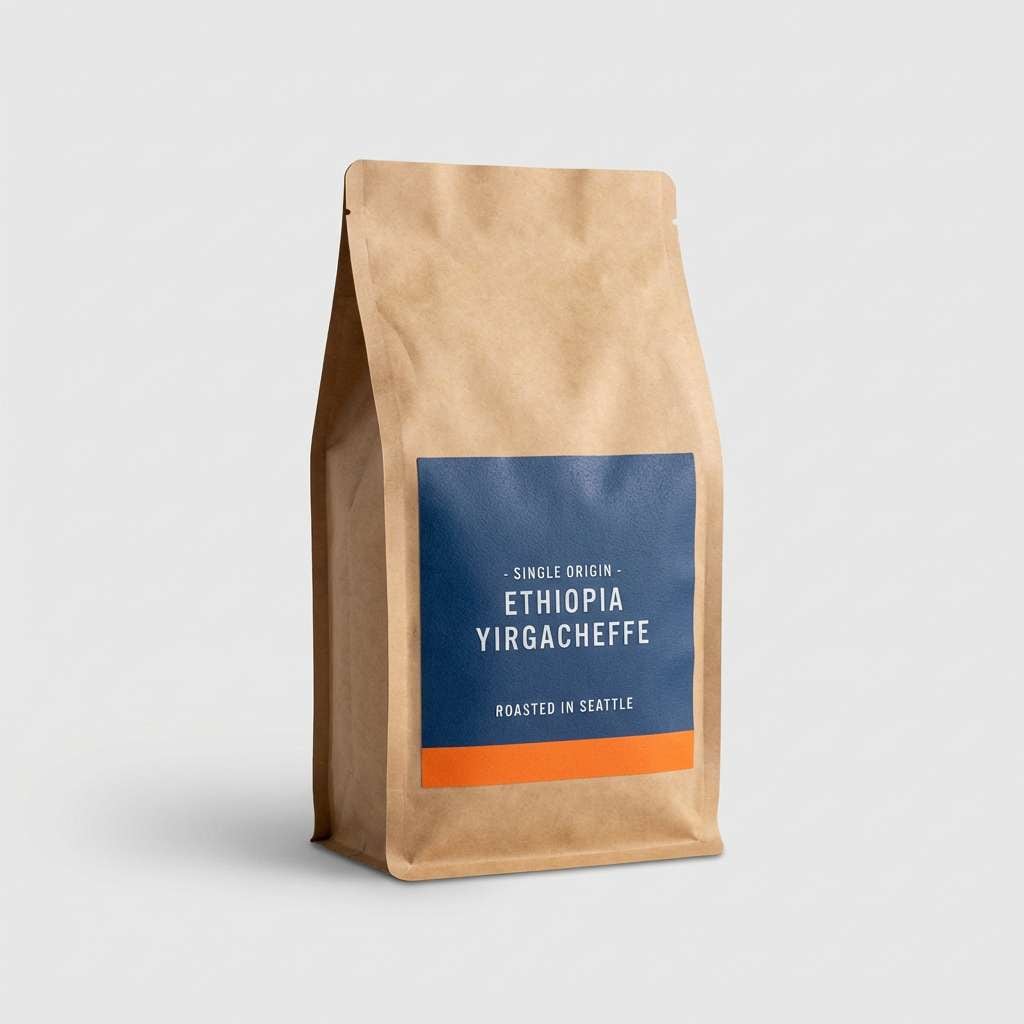
Rich and grounded, it feels like espresso crema against a dark roast. The warm browns make the orange feel appetizing and comfortable, perfect for food-forward brands. Use the darker tones for logos and stamp marks, then lift key details with the lighter orange and cream. Usage tip: try uncoated stock so the browns stay deep and the oranges look natural.
Image example of espresso orange generated using media.io
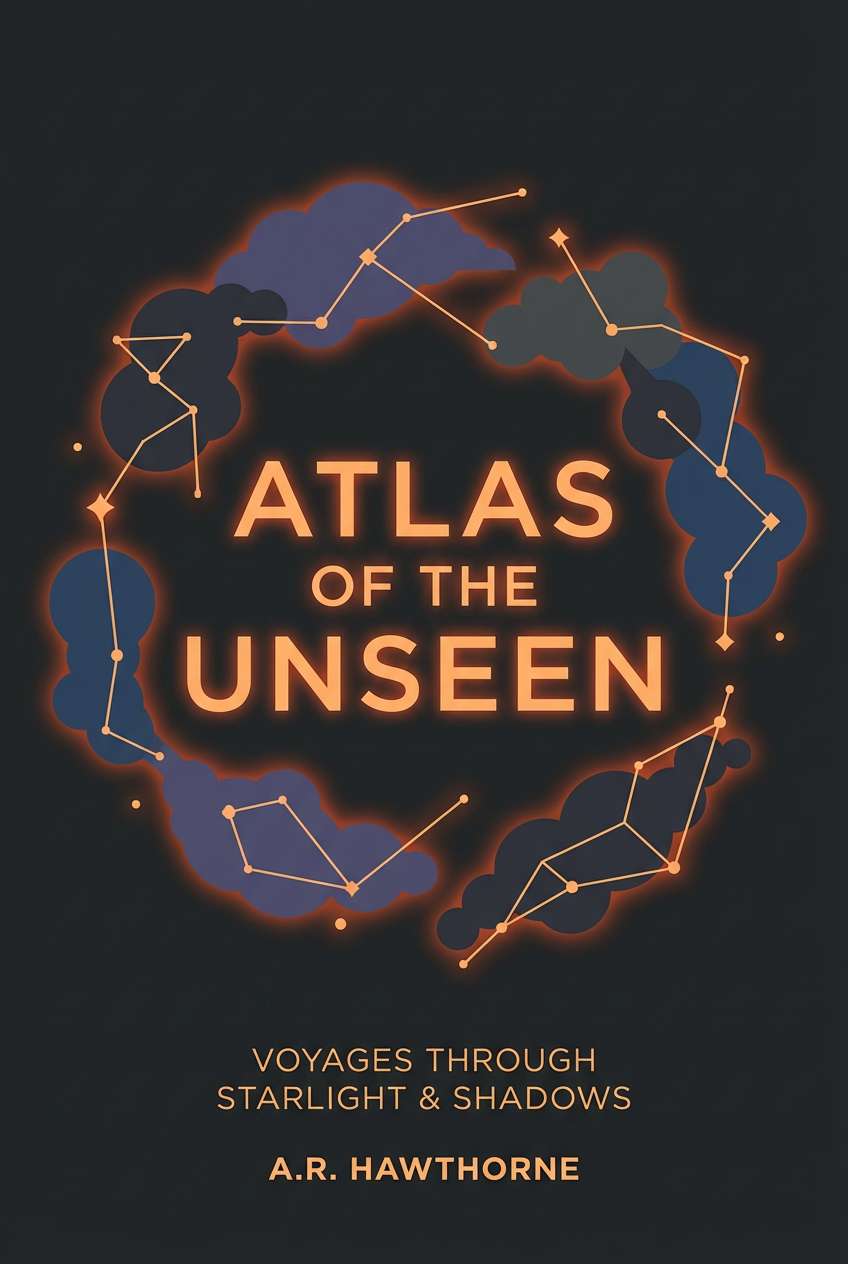
19) Cosmic Campfire
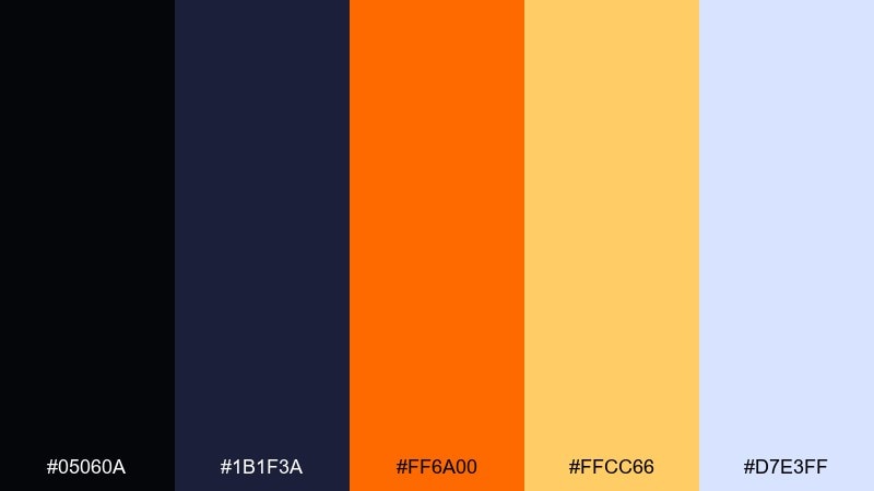
HEX: #05060a #1b1f3a #ff6a00 #ffcc66 #d7e3ff
Mood: cosmic, adventurous, luminous
Best for: sci-fi book covers, adventure posters, splash screens
Cosmic and adventurous, it looks like a campfire glow under a starry sky. The deep navy-black adds depth, while the icy light tone gives space for titles and UI labels. Use orange for focal elements like titles and icons, and let the pale blue act as a calm counterbalance. Usage tip: add subtle star-like speckles in the light tone to reinforce the night-sky mood without clutter.
Image example of cosmic campfire generated using media.io
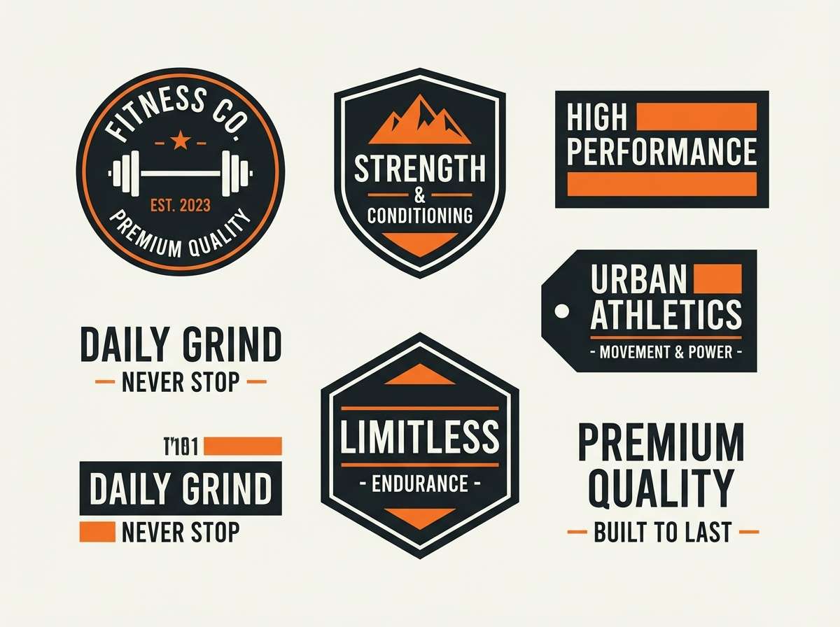
20) Matte Tactical
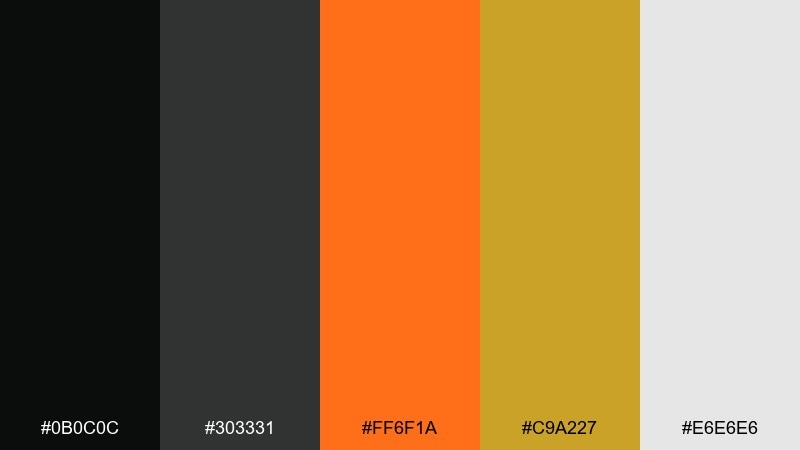
HEX: #0b0c0c #303331 #ff6f1a #c9a227 #e6e6e6
Mood: tactical, sturdy, focused
Best for: fitness branding, gear catalogs, badge designs
Tactical and sturdy, it brings to mind matte gear, utilitarian labels, and disciplined training. The muted gold adds authority without turning the palette flashy, while the orange keeps it active and competitive. Use the light gray for spec tables and the darker greens for structure, then highlight key metrics in orange. Usage tip: keep accent shapes squared and minimal to match the rugged tone.
Image example of matte tactical generated using media.io
What Colors Go Well with Black Orange?
Neutrals are the easiest wins: warm off-white, stone, and light gray reduce glare and give your orange room to pop. Charcoal and espresso tones also soften pure black for a more premium, less harsh look.
For modern contrast, cool accents like teal, mint, or icy blue can keep orange from feeling too seasonal (or too Halloween). Use these cool tones sparingly—think secondary buttons, small tags, or chart series.
If you want a richer, more cinematic direction, add deep reds or copper-browns. They bridge black and orange smoothly, creating more depth for posters, product pages, and editorial layouts.
How to Use a Black Orange Color Palette in Real Designs
Start by deciding where orange is allowed to live: primary actions, key numbers, and one “hero” highlight per screen. Keeping orange constrained makes the hierarchy obvious and prevents visual fatigue on dark UIs.
Use black/charcoal for structure (navigation, backgrounds, typography) and introduce a light neutral for breathing room. This is especially important in packaging and dashboards where you have dense information to present.
Finally, tune the orange temperature to your brand: amber reads friendly and premium, while neon orange reads hype and urgent. Small shifts in orange saturation can completely change the tone of your black and orange palette.
Create Black Orange Palette Visuals with AI
If you already have HEX codes, you can generate matching UI mockups, posters, and packaging concepts in minutes by describing your layout and lighting, then letting AI produce variations. This makes it easy to test multiple “black orange” directions before committing to production design.
Reuse the prompts above as templates: swap “dashboard” for “app onboarding,” “ticket” for “story template,” or “jewelry box” for “cosmetics packaging,” while keeping the same contrast and accent logic.
When you find a result you like, keep the orange usage consistent (one primary orange per composition) and standardize neutrals for text readability across your system.
Black Orange Color Palette FAQs
-
Why does black and orange look so strong together?
Because it’s a high-contrast pairing: black provides weight and clarity, while orange adds warmth and urgency. The combo creates instant hierarchy, making CTAs, headlines, and icons stand out quickly. -
What are good black orange HEX codes to start with?
A solid baseline is a near-black (#0b0b0d to #111214), a charcoal (#1f1f23 to #2a2d2f), one primary orange (#ff6a00 to #ff7a1a), a lighter accent orange/amber (#ffb000 to #ffd36b), and an off-white (#f4efe6 to #ffffff). -
Is black and orange only for Halloween designs?
No. If you choose amber or copper oranges and pair them with warm neutrals, the palette reads modern, premium, or industrial—not seasonal. Halloween vibes usually come from neon oranges plus pure black with minimal neutrals. -
How do I keep a black orange UI accessible?
Use off-white or light gray for body text on dark backgrounds, and keep orange for larger elements like buttons and badges. Always check contrast ratios, especially for small orange text on black. -
What accent colors go well with black and orange?
Teal/mint and icy blues add modern balance; copper and deep browns add richness; warm grays and creams keep layouts readable. Choose one accent family so the palette doesn’t become noisy. -
How much orange should I use in a black orange color scheme?
As a rule of thumb, keep orange as a controlled accent (often 5–15% of the layout). Limit to one main orange per screen or composition, then use a lighter orange only for supporting highlights. -
Can I generate black orange marketing visuals quickly?
Yes—use Media.io’s text-to-image tool with a prompt that specifies a dark base, orange accents, clean layout, and your target format (poster, UI, packaging). Generate multiple options and pick the one that best matches your brand tone.
Next: Teal Color Palette


