

Lime green is bold by nature, but it’s also more flexible than it looks. With the right supporting colors, it can read sporty, botanical, futuristic, or even premium.
Below are lime green color palette ideas with HEX codes you can use for branding, UI, posters, packaging, and illustrations—plus prompts you can recreate with Media.io.
In this article
- Why Lime Green Palettes Work So Well
-
- citrus pop
- aloe and sand
- electric lime night
- matcha milk
- spring orchard
- urban tennis court
- minted copper
- lime and lavender
- green flash ui
- wasabi and denim
- tropical leafprint
- lime sherbet retro
- eco chalkboard
- rainy lime stone
- lime punch poster
- lime and charcoal minimal
- lime blossom watercolor
- cyber lime gradient
- lime and coral party
- soft lime workspace
- What Colors Go Well with Lime Green?
- How to Use a Lime Green Color Palette in Real Designs
- Create Lime Green Palette Visuals with AI
Why Lime Green Palettes Work So Well
Lime green sits close to neon, so it naturally grabs attention. That makes it perfect for CTAs, labels, highlights, and anything that needs quick visual hierarchy.
It also shifts personality depending on what you pair it with: charcoal and slate make it feel modern and “tech,” tans and browns make it feel botanical, and pinks/purples push it into nightlife or pop culture.
Because it’s intense, lime green works best when you treat it like an accent color. A little goes a long way, especially on interfaces and print layouts where readability matters.
20+ Lime Green Color Palette Ideas (with HEX Codes)
1) Citrus Pop
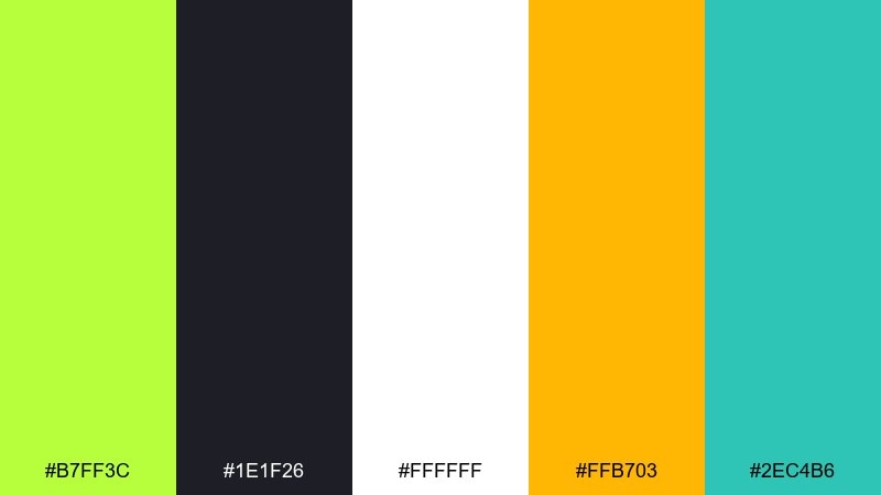
HEX: #B7FF3C #1E1F26 #FFFFFF #FFB703 #2EC4B6
Mood: energetic, punchy, modern
Best for: product ads and bold social graphics
Electric and sunny, it feels like fresh citrus zest against a dark countertop. Use it for high-contrast banners, sale promos, and hero headlines where legibility matters. Pair the lime with near-black for structure, then add warm amber for a friendly glow. Tip: keep white space generous so the accents stay crisp instead of chaotic.
Image example of citrus pop generated using media.io
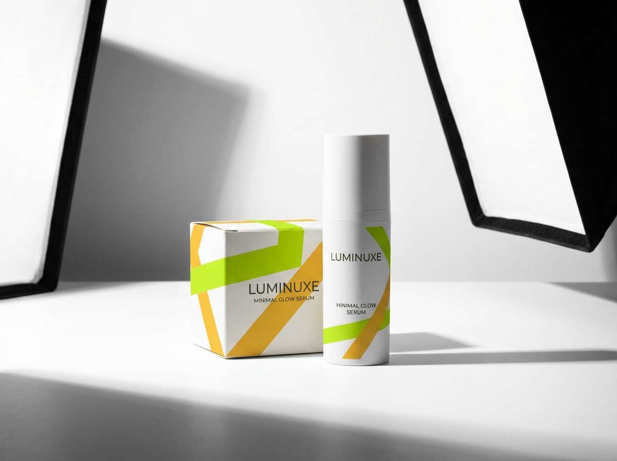
Media.io is an online AI studio for creating and editing video, image, and audio in your browser.

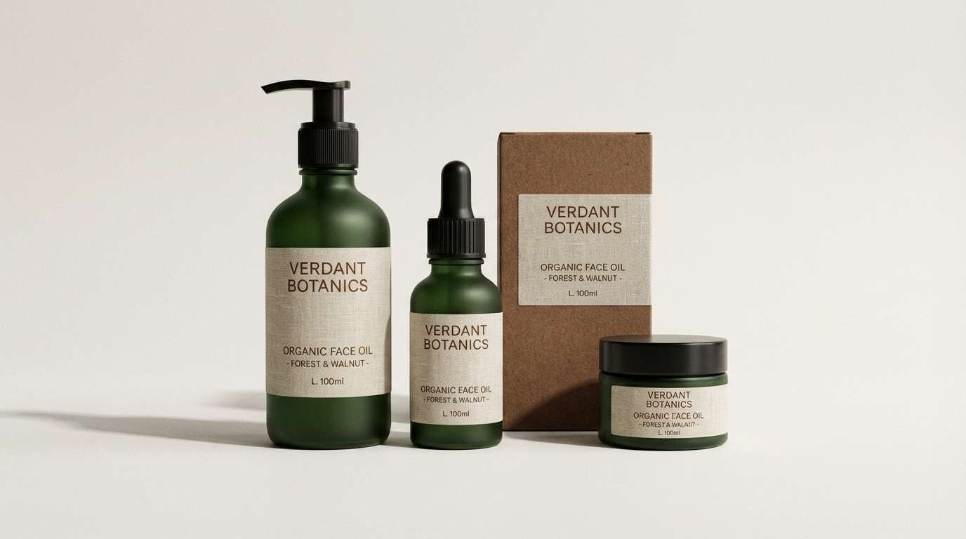
2) Aloe and Sand
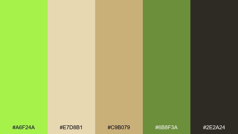
HEX: #A6F24A #E7D8B1 #C9B079 #6B8F3A #2E2A24
Mood: earthy, calming, organic
Best for: eco packaging and natural wellness branding
Soothing like aloe gel and warm sand, these tones feel grounded and trustworthy. The tan and brown anchors make the green read more botanical than neon. Use it on kraft-style labels, ingredient panels, and minimalist logos, then add deep cocoa for text. Tip: print tests matter here, since muted greens can shift under warm lighting.
Image example of aloe and sand generated using media.io
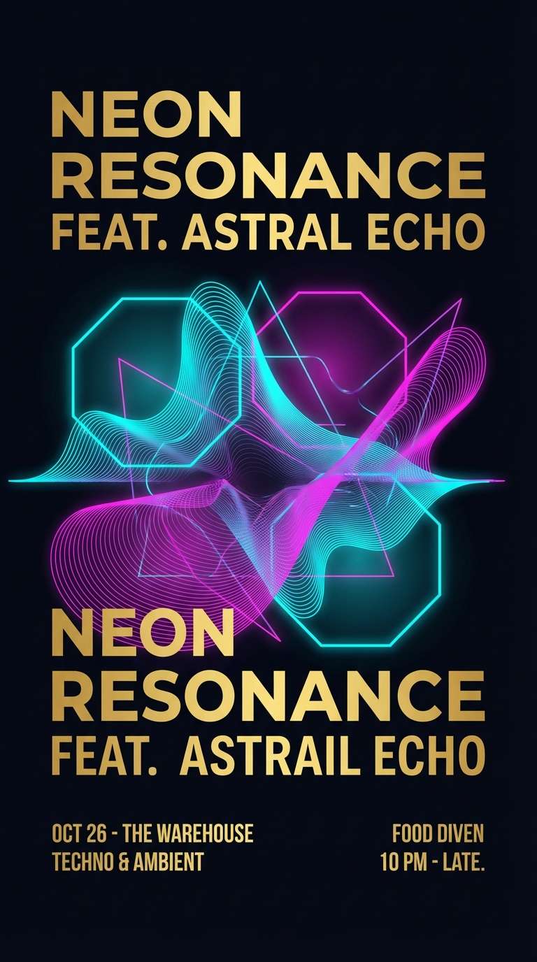
3) Electric Lime Night
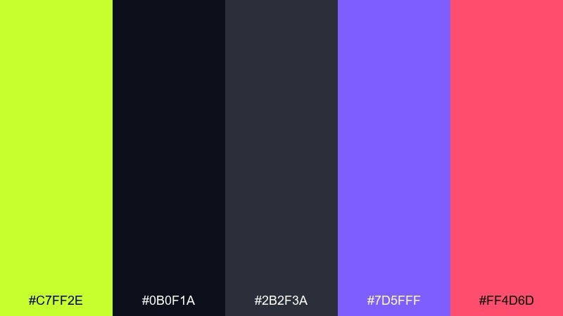
HEX: #C7FF2E #0B0F1A #2B2F3A #7D5FFF #FF4D6D
Mood: nightlife, futuristic, loud
Best for: music posters and event flyers
High-voltage and club-ready, it looks like neon signage cutting through midnight air. This lime green color palette works best with big typography and a few sharp shapes, not lots of tiny details. Pair violet for a sci-fi edge and hot pink for rhythm, then keep the dark tones as your stage. Tip: reserve the lime for titles and key info so it punches from across the room.
Image example of electric lime night generated using media.io
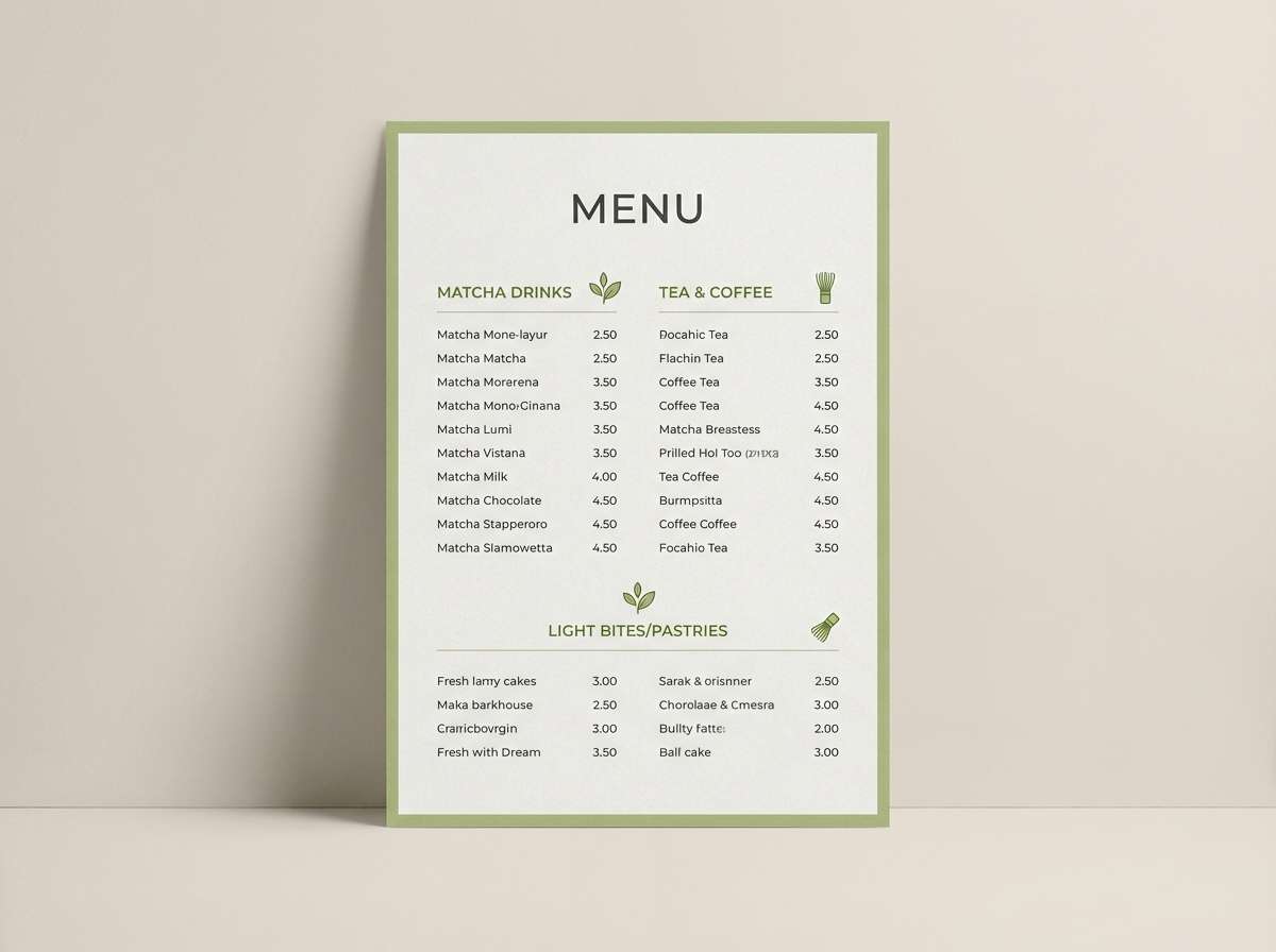
4) Matcha Milk
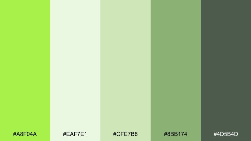
HEX: #A8F04A #EAF7E1 #CFE7B8 #8BB174 #4D5B4D
Mood: soft, cozy, fresh
Best for: cafe menus and lifestyle branding
Creamy and gentle, it brings to mind matcha latte foam and quiet mornings. The pale greens create a friendly canvas for photography, while the deeper sage keeps layouts from feeling washed out. Use it for menus, loyalty cards, and packaging stickers, pairing charcoal text for clarity. Tip: add subtle paper texture so the light tones feel warm instead of clinical.
Image example of matcha milk generated using media.io
5) Spring Orchard
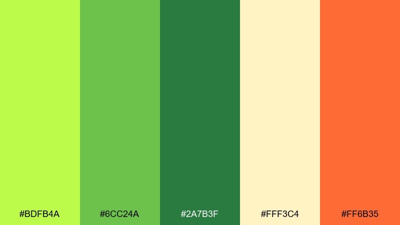
HEX: #BDFB4A #6CC24A #2A7B3F #FFF3C4 #FF6B35
Mood: cheerful, outdoorsy, sunny
Best for: seasonal campaigns and farmers market signage
Bright and juicy, it feels like new leaves and fruit stands in warm sun. The yellow-cream softens the punchy greens, while orange adds a ripe accent for calls to action. Use it on spring promos, wayfinding signs, and outdoor banners where color needs to read fast. Tip: keep orange to small badges so the palette stays fresh, not fiery.
Image example of spring orchard generated using media.io
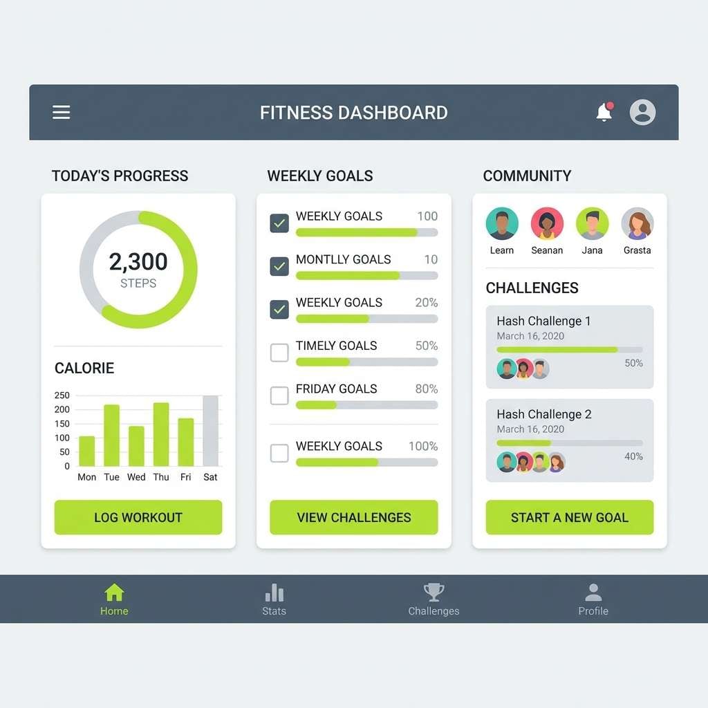
6) Urban Tennis Court
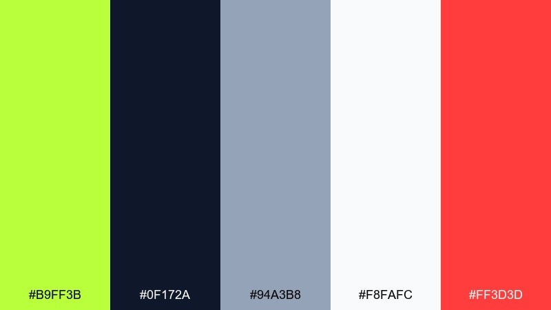
HEX: #B9FF3B #0F172A #94A3B8 #F8FAFC #FF3D3D
Mood: sporty, crisp, high-contrast
Best for: fitness app UI and sports branding
Clean and athletic, it evokes painted court lines and fast-paced drills. The cool slate neutrals keep screens readable, while red provides a strong alert accent. Use it for dashboards, scorecards, and CTA buttons where hierarchy matters. Tip: apply lime to primary actions only, and let the gray scale carry the rest of the interface.
Image example of urban tennis court generated using media.io
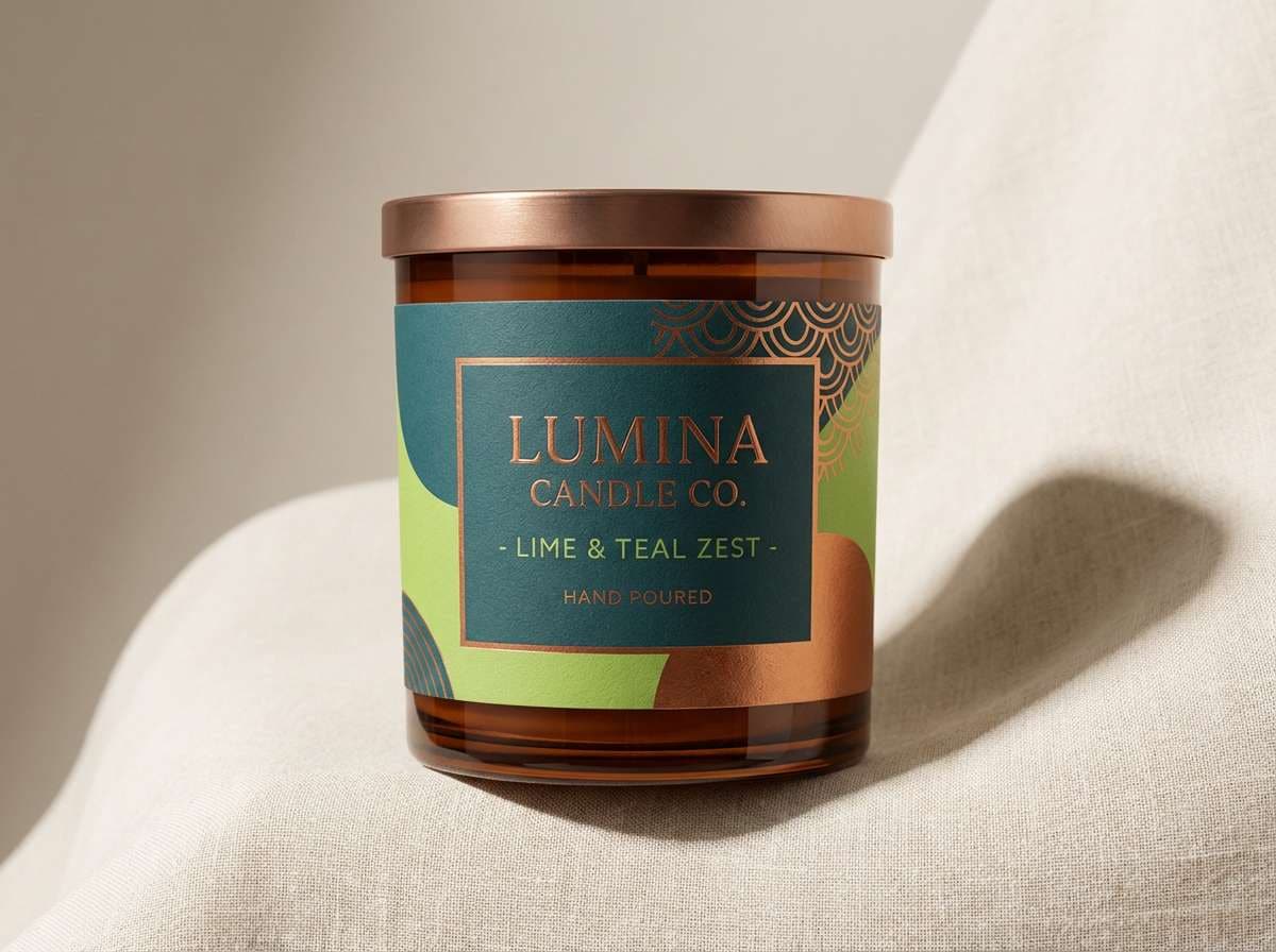
7) Minted Copper
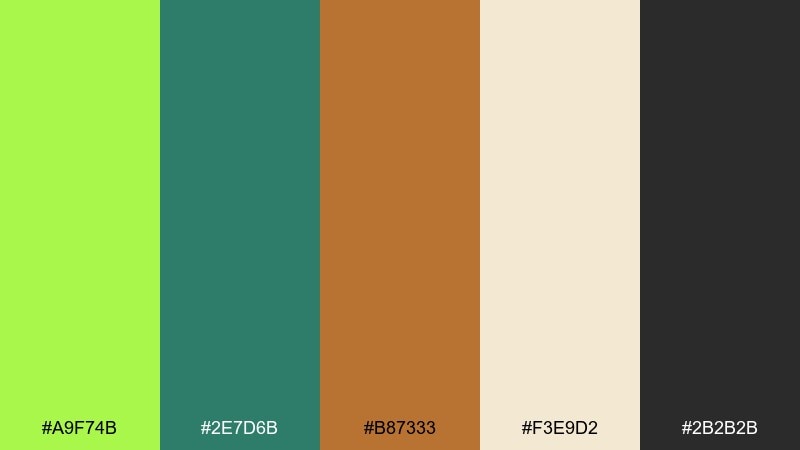
HEX: #A9F74B #2E7D6B #B87333 #F3E9D2 #2B2B2B
Mood: artisan, premium, warm-modern
Best for: boutique packaging and product labels
Crafty and refined, it feels like polished copper next to fresh herbs. The warm metallic note makes the green look intentional and upscale rather than playful. Use it for candle labels, coffee bags, and stationery, pairing cream for breathing room and charcoal for typography. Tip: if you add foil, keep it to small linework so the layout stays elegant.
Image example of minted copper generated using media.io
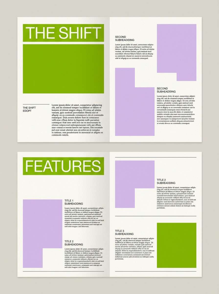
8) Lime and Lavender
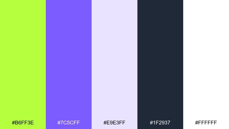
HEX: #B6FF3E #7C5CFF #E9E3FF #1F2937 #FFFFFF
Mood: playful, dreamy, modern
Best for: beauty branding and editorial graphics
Whimsical and bright, it reads like spring florals with a neon twist. As a lime green color scheme, the lavender keeps the energy upbeat while the dark gray prevents it from feeling sugary. Use it for headlines, pull quotes, and accent icons, then let white handle the negative space. Tip: avoid equal amounts of lime and purple; choose one hero and one supporting accent.
Image example of lime and lavender generated using media.io
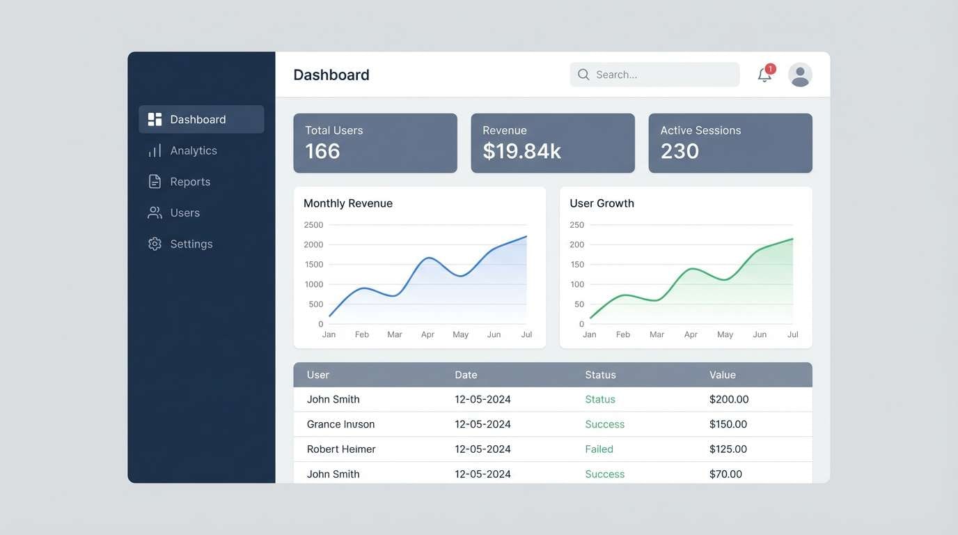
9) Green Flash UI
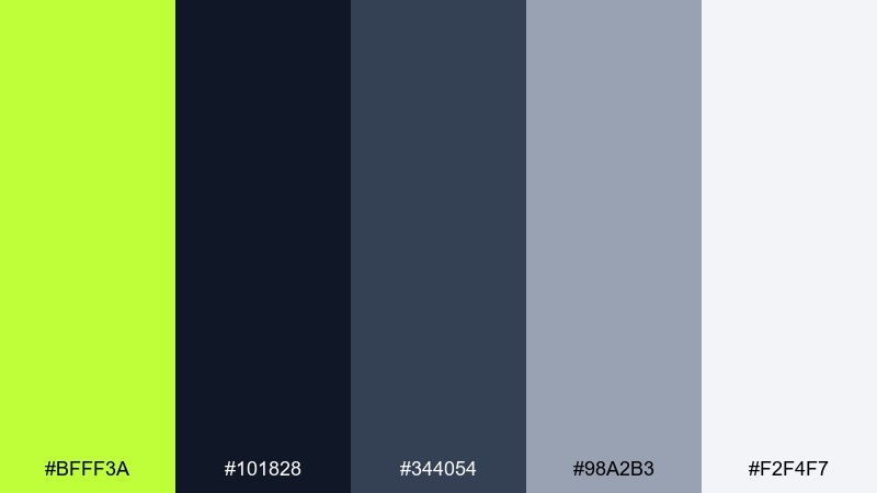
HEX: #BFFF3A #101828 #344054 #98A2B3 #F2F4F7
Mood: focused, techy, confident
Best for: SaaS dashboards and admin panels
Sharp and professional, it feels like a quick status light in a clean control room. The dark base and layered grays create depth, while the green acts as a clear success cue. Use it for charts, toggles, and confirmation states, keeping your primary text on the neutral scale. Tip: set strict usage rules so the accent always communicates meaning, not decoration.
Image example of green flash ui generated using media.io
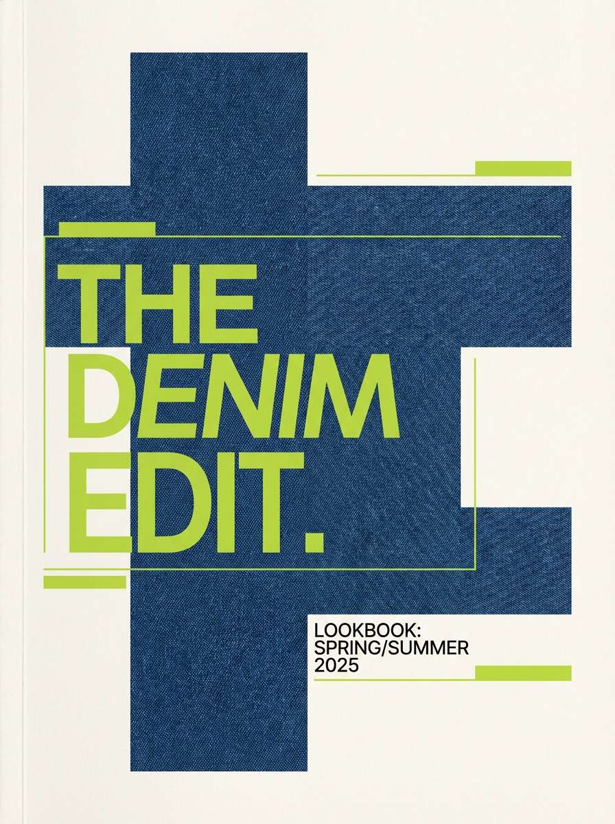
10) Wasabi and Denim
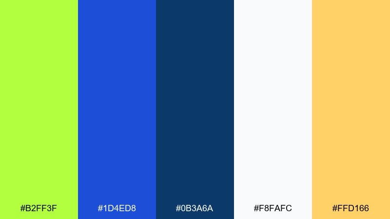
HEX: #B2FF3F #1D4ED8 #0B3A6A #F8FAFC #FFD166
Mood: bold, sporty, youthful
Best for: streetwear lookbooks and web banners
Lively and punchy, it brings wasabi heat balanced by cool denim blues. The white and deep navy keep contrast strong for typography and product shots. Use it on web headers, promo tiles, and lookbook covers, letting yellow add a friendly highlight. Tip: keep blue as the dominant field color so the green stays exciting, not overpowering.
Image example of wasabi and denim generated using media.io
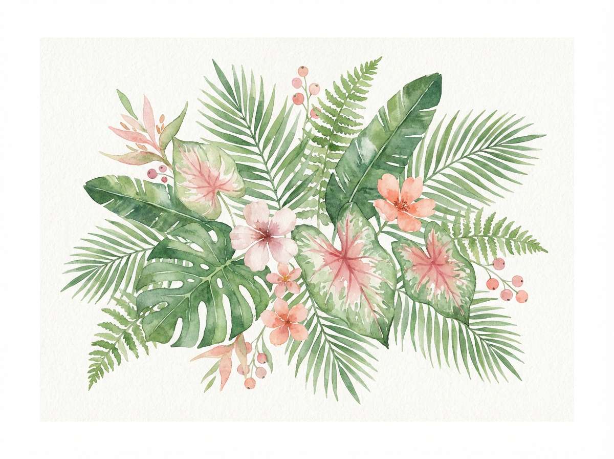
11) Tropical Leafprint
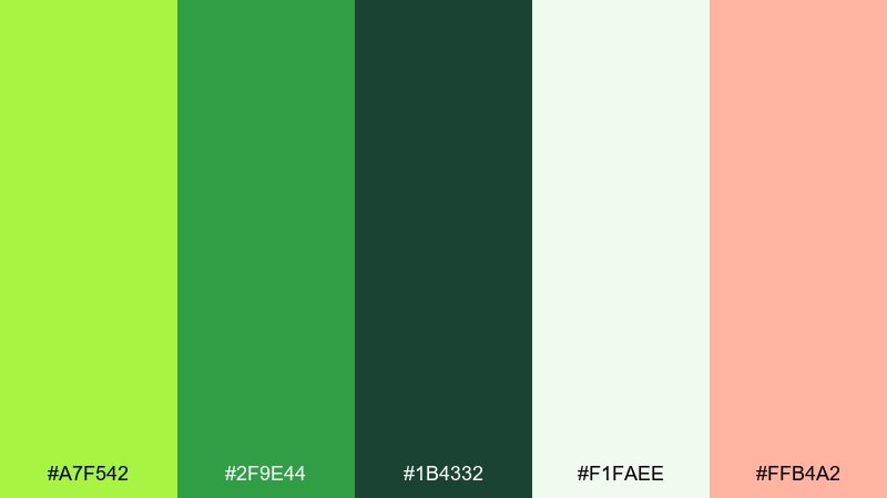
HEX: #A7F542 #2F9E44 #1B4332 #F1FAEE #FFB4A2
Mood: lush, vacation, fresh
Best for: botanical illustrations and summer invites
Lush and breezy, it feels like palm shade with a soft sunset blush. The deeper jungle green makes the brighter tones look natural and layered. Use it for tropical patterns, wedding brunch invites, or spa promos, pairing the blush as a gentle highlight. Tip: add leaf shapes in two green values to create depth without clutter.
Image example of tropical leafprint generated using media.io
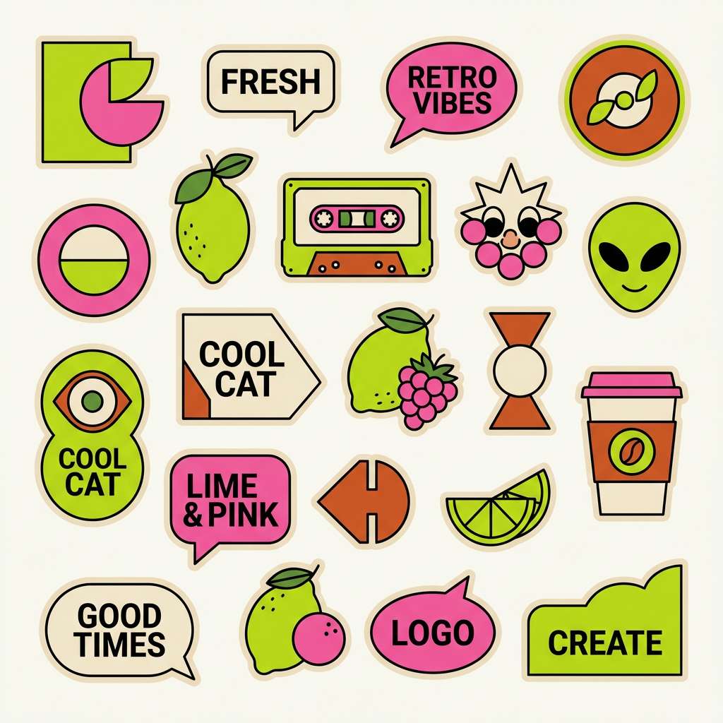
12) Lime Sherbet Retro
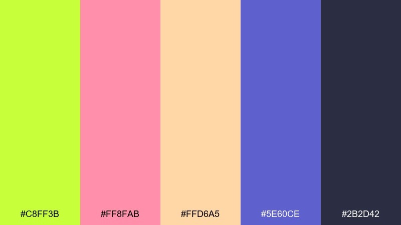
HEX: #C8FF3B #FF8FAB #FFD6A5 #5E60CE #2B2D42
Mood: retro, playful, candy-bright
Best for: stickers, merch, and fun brand identity
Sweet and nostalgic, it evokes sherbet scoops and vintage arcade buttons. A lime green color palette like this loves simple shapes, bold outlines, and big headlines. Pair the soft peach for backgrounds and use navy for structure so the pink stays readable. Tip: limit gradients; flat fills keep the retro vibe authentic.
Image example of lime sherbet retro generated using media.io
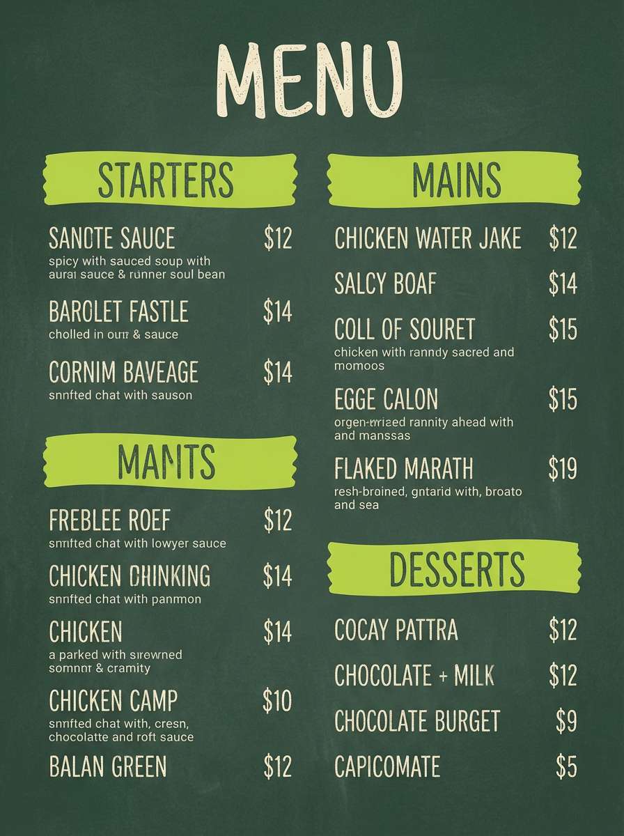
13) Eco Chalkboard
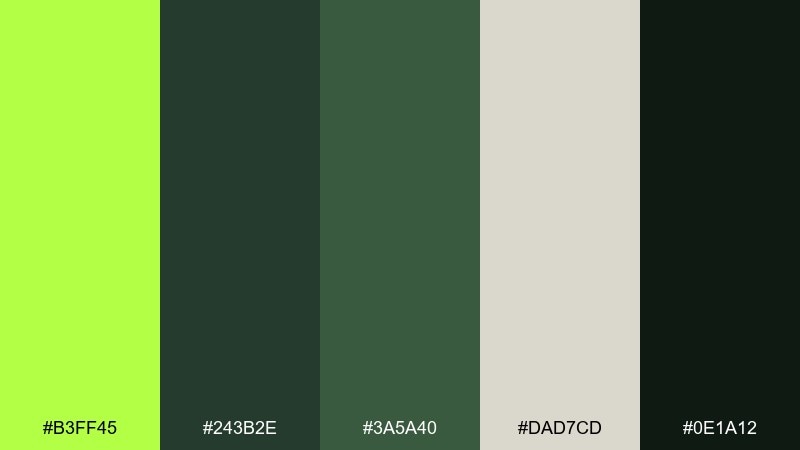
HEX: #B3FF45 #243B2E #3A5A40 #DAD7CD #0E1A12
Mood: rustic, sustainable, grounded
Best for: farm-to-table menus and eco signage
Earthy and textured, it feels like chalk on a café board with herbs nearby. The off-white and foresty tones make the lime accent read like fresh garnish. Use it for menu highlights, icons, and section dividers, pairing the darkest green for body text. Tip: try hand-drawn linework, but keep spacing consistent so it still looks professional.
Image example of eco chalkboard generated using media.io
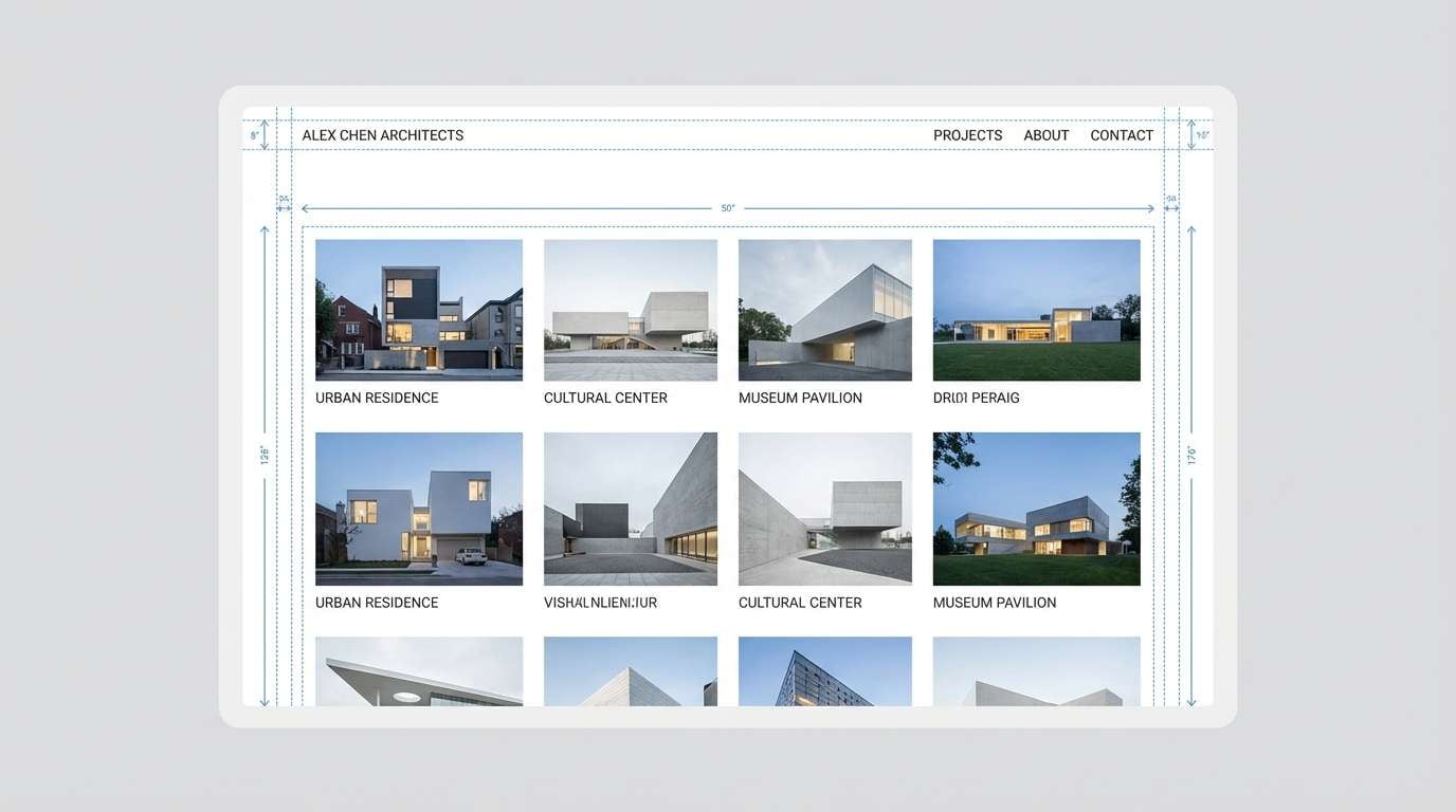
14) Rainy Lime Stone
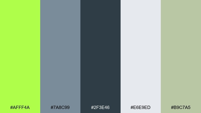
HEX: #AFFF4A #7A8C99 #2F3E46 #E6E9ED #B9C7A5
Mood: moody, contemporary, calm
Best for: architecture portfolios and minimalist websites
Cool and atmospheric, it looks like wet concrete with a surprise pop of fresh green. The blue-grays keep the palette mature, while the muted olive ties everything together. Use it for portfolio grids, case study pages, and clean navigation, pairing light gray as your base. Tip: keep the lime for hover states and micro-interactions to make the UI feel polished.
Image example of rainy lime stone generated using media.io
15) Lime Punch Poster
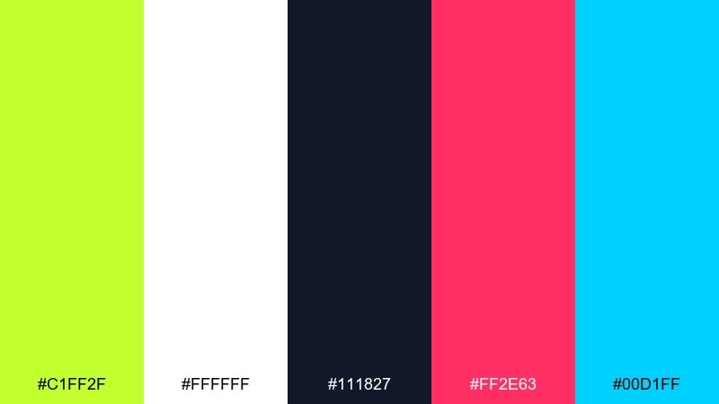
HEX: #C1FF2F #FFFFFF #111827 #FF2E63 #00D1FF
Mood: high-impact, trendy, loud
Best for: gig posters and announcement graphics
Punchy and headline-first, it feels like a spotlight flash on opening night. These lime green color combinations shine when you keep the background simple and the type huge. Pair cyan for a digital edge and magenta for emphasis, while black handles readability. Tip: use one accent for icons and one for highlights so the layout stays controlled.
Image example of lime punch poster generated using media.io

16) Lime and Charcoal Minimal
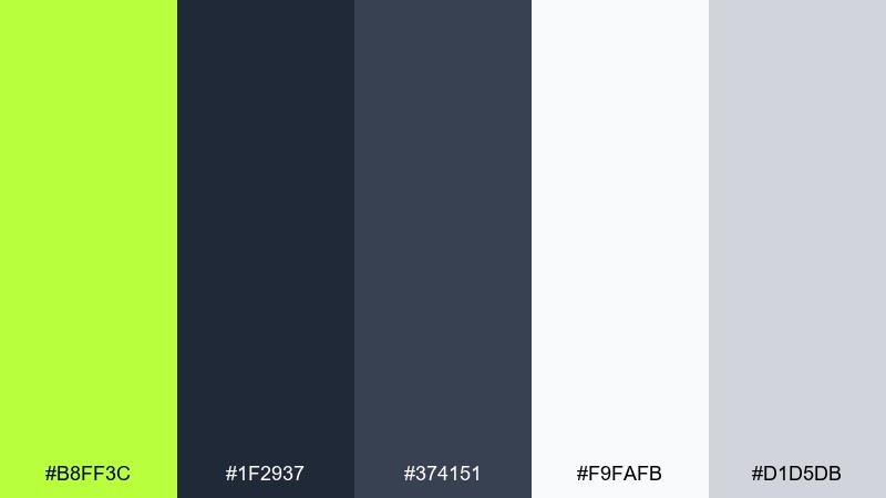
HEX: #B8FF3C #1F2937 #374151 #F9FAFB #D1D5DB
Mood: minimal, modern, confident
Best for: brand systems and landing pages
Crisp and understated, it reads like a clean studio space with one neon marker. Charcoal and soft grays keep the overall look premium, while the lime supplies instant focus. Use it for landing page CTAs, feature highlights, and icon sets, keeping backgrounds mostly off-white. Tip: apply the accent consistently to one interaction type, like primary buttons, for a cohesive system.
Image example of lime and charcoal minimal generated using media.io
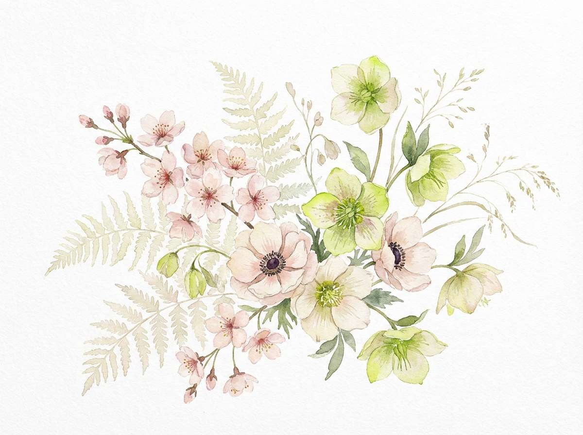
17) Lime Blossom Watercolor
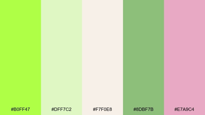
HEX: #B0FF47 #DFF7C2 #F7F0E8 #8DBF7B #E7A9C4
Mood: delicate, airy, springtime
Best for: botanical prints and wedding stationery
Light and romantic, it evokes blossoms drifting over fresh leaves. The creamy neutrals soften the green, while dusty pink adds a gentle floral note. Use it for invites, thank-you cards, and art prints, pairing the deeper green for stems and details. Tip: keep edges slightly imperfect to preserve the watercolor charm.
Image example of lime blossom watercolor generated using media.io
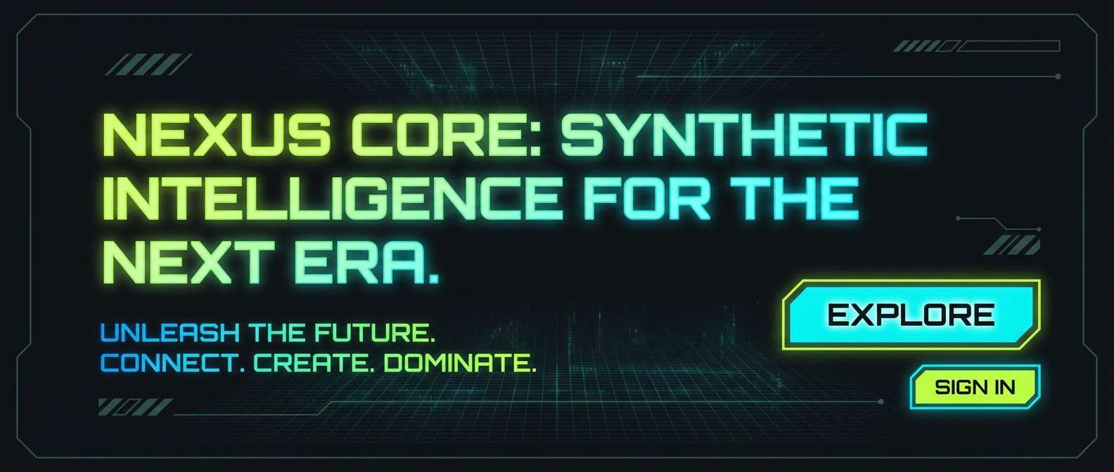
18) Cyber Lime Gradient
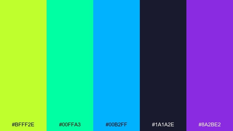
HEX: #BFFF2E #00FFA3 #00B2FF #1A1A2E #8A2BE2
Mood: digital, futuristic, electric
Best for: tech hero sections and streaming overlays
Glowy and synthetic, it feels like LED strips and animated gradients in a dark room. The cool blue and violet help the green read more cyber than natural. Use it for hero banners, gradient buttons, and highlight strokes, keeping the background near-black for contrast. Tip: apply subtle noise to gradients to avoid banding on large screens.
Image example of cyber lime gradient generated using media.io
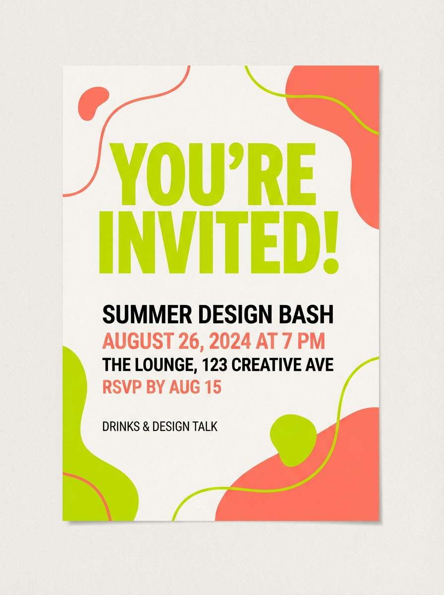
19) Lime and Coral Party
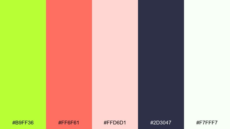
HEX: #B9FF36 #FF6F61 #FFD6D1 #2D3047 #F7FFF7
Mood: festive, friendly, vibrant
Best for: party invitations and playful campaigns
Bright and welcoming, it feels like confetti, summer drinks, and upbeat playlists. A lime green color combination with coral keeps things lively without going full neon. Use it for invitations, RSVP pages, and promo graphics, letting navy ground the layout and blush soften transitions. Tip: set coral as the supporting accent so lime remains the main signal color.
Image example of lime and coral party generated using media.io
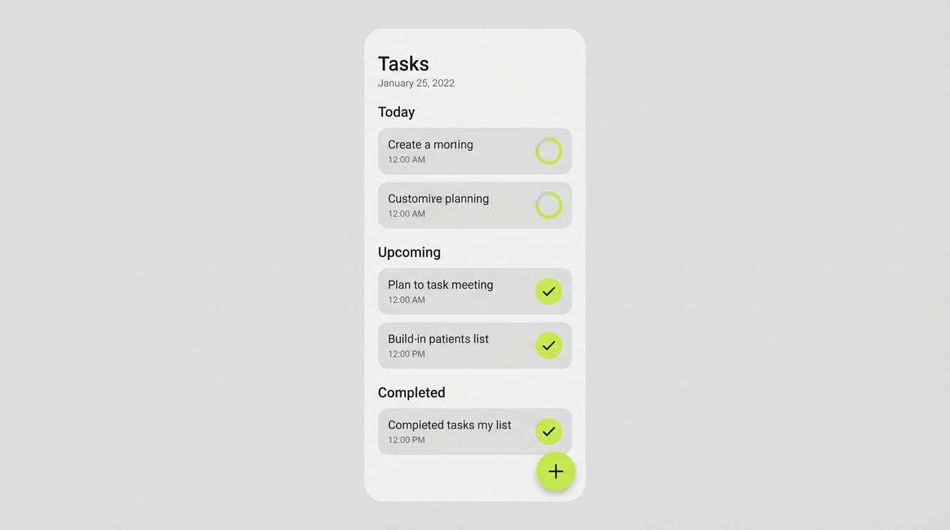
20) Soft Lime Workspace
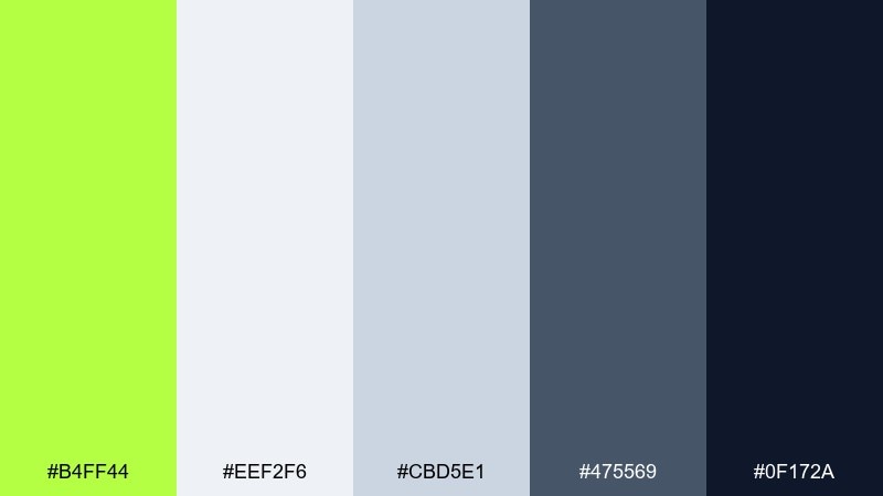
HEX: #B4FF44 #EEF2F6 #CBD5E1 #475569 #0F172A
Mood: calm, productive, modern
Best for: workspace apps and productivity tools
Quiet and efficient, it looks like a clean desk with one bright sticky note. This lime green color scheme is ideal for productivity UI because the neutrals do the heavy lifting while the accent guides attention. Use it for task states, progress bars, and primary actions, keeping most surfaces light gray. Tip: lower the lime saturation slightly for large fills, and save the brightest tone for small cues.
Image example of soft lime workspace generated using media.io
What Colors Go Well with Lime Green?
Neutrals are the easiest win: charcoal, near-black, cool grays, and off-white make lime green feel clean and intentional. This is why lime works so well for modern branding and UI states like “success” or “active.”
For more personality, try complementary or near-complementary accents: violet/lavender adds a futuristic pop, coral and pink add a playful party vibe, and cyan pushes a digital look. If you want a natural direction, pair lime with tan, sand, olive, and deep forest green.
Because lime is bright, keep it as the “signal” color and let supporting hues do the heavy lifting in backgrounds and long text areas.
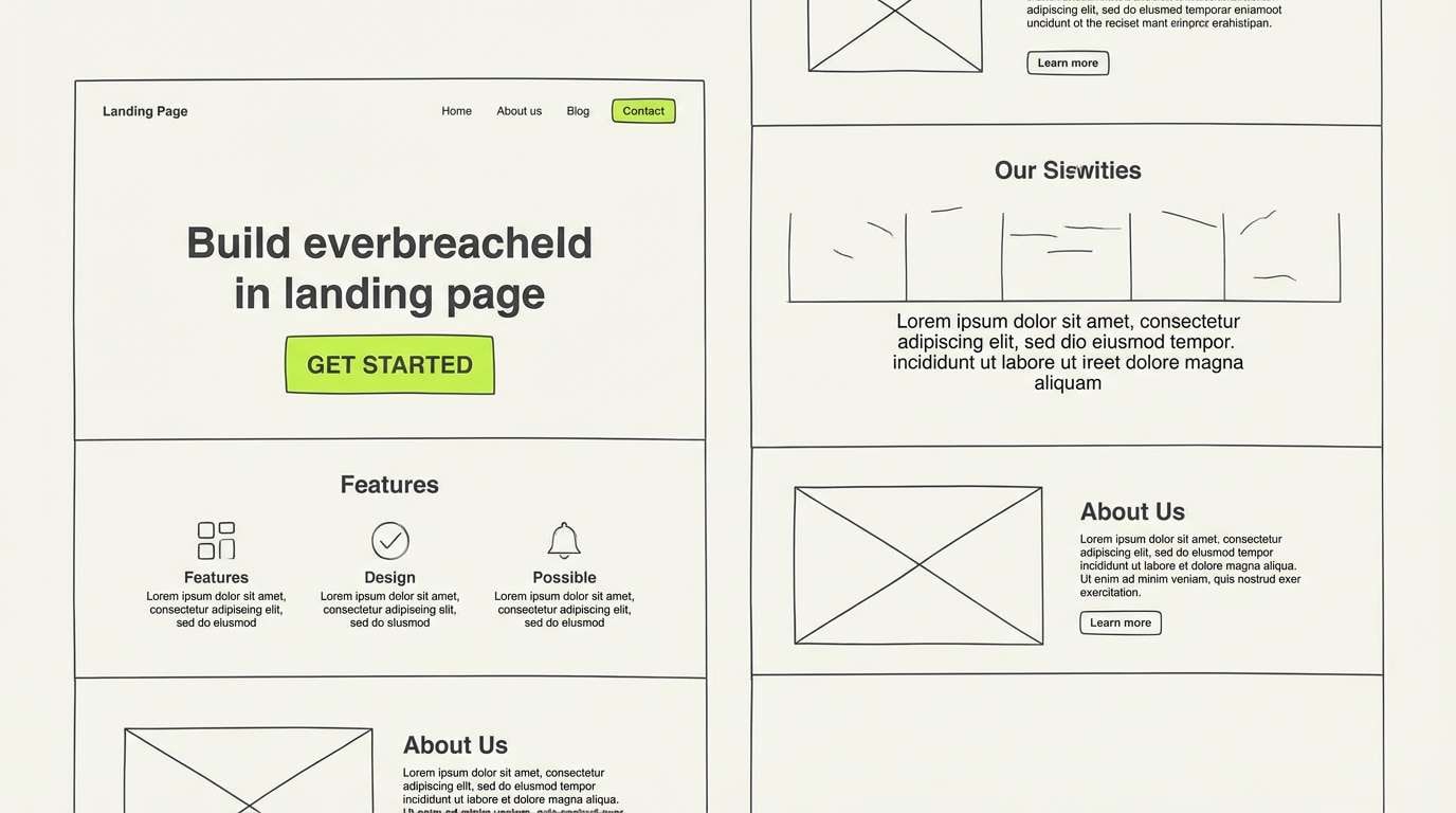
How to Use a Lime Green Color Palette in Real Designs
Start by defining where lime green is allowed to appear (buttons, badges, key headings, icons). When the accent always means something, the design feels more premium and easier to scan.
Balance saturation with surface area. Large lime backgrounds can cause eye fatigue, so reserve full fills for small blocks or use a softer tint for big sections, especially in dashboards and landing pages.
Finally, test contrast early. Lime can look different across screens and print conditions, so check accessibility (text over lime) and run quick print proofs if you’re designing packaging or posters.
Create Lime Green Palette Visuals with AI
If you want to see how a lime green color scheme looks in a real composition, generate mockups with AI first. It’s a fast way to validate contrast, mood, and layout before you commit to final assets.
Use the prompts under each palette as a starting point, then swap subjects (poster, packaging, UI) while keeping the same HEX-driven vibe. You’ll quickly find which combinations feel right for your brand.
Lime Green Color Palette FAQs
-
What is the HEX code for lime green?
Lime green doesn’t have one single HEX value—designers use multiple “lime” shades depending on brightness. In this article, lime greens range from #A6F24A to #C8FF3B, with common picks like #B7FF3C and #BFFF3A. -
Is lime green the same as neon green?
Not always. Neon green is typically brighter and more fluorescent, while lime green can be slightly softer or more yellow-green. Pairing with charcoal or slate can also make lime read less “neon.” -
What colors pair best with lime green for a modern look?
Charcoal/near-black, cool grays, and off-white create a clean modern system. For a tech edge, add cyan or violet as a secondary accent while keeping lime as the primary highlight. -
What colors go well with lime green for a natural/eco vibe?
Tan, sand, kraft brown, olive, sage, and deep forest green make lime feel botanical and grounded. Palettes like “Aloe and Sand” and “Eco Chalkboard” are built for this. -
How do I use lime green in UI without it feeling overwhelming?
Use lime sparingly for primary actions, success states, progress, and hover/focus indicators. Let neutral grays handle most backgrounds and text so the accent remains meaningful. -
Can lime green work for luxury branding?
Yes—when it’s controlled and paired with premium anchors like charcoal, cream, deep teal, or metallic copper tones. Keep lime for small highlights (rules, seals, linework) rather than full backgrounds. -
How can I quickly preview lime green palettes in real designs?
Generate mockups with an AI image tool using a clear prompt (subject + style + lighting + “no people”) and iterate. Media.io Text to Image makes it easy to test posters, packaging, and UI concepts in minutes.
Next: Tan Color Palette


