

Light brown sits in the sweet spot between cozy and clean. It brings warmth, softness, and a natural, premium feel to branding, interiors, and modern UI.
Below are 20 light brown color palettes (with HEX codes), plus quick pairing and usage tips so you can apply them confidently in real projects.
In this article
Why Light Brown Palettes Work So Well
Light brown feels human and grounded. It naturally suggests craft, comfort, and authenticity, which is why it shows up so often in coffee, wellness, interiors, and lifestyle brands.
It also behaves like a “warm neutral,” so it plays nicely with both cool accents (blues, teals, mints) and warm accents (terracotta, copper, citrus). That flexibility makes it easy to build a full system: backgrounds, surfaces, borders, and typography.
In UI, light brown tones reduce the starkness of pure gray while keeping interfaces readable. When you pair them with a deep charcoal or espresso shade, you get contrast that still feels soft and premium.
20+ Light Brown Color Palette Ideas (with HEX Codes)
1) Latte Linen
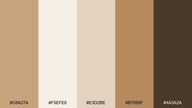
HEX: #C8A27A #F5EFE6 #E3D2BE #B7895F #4A3A2A
Mood: warm, airy, and welcoming
Best for: minimal brand identity and cafe packaging
Warm latte tones and soft linen neutrals evoke a calm morning ritual and a clean countertop glow. Use it for logos, labels, and menu layouts where readability matters. Pair the tan base with deep espresso brown for type, and keep the cream as generous negative space. Tip: reserve the darkest shade for small accents so the palette stays light and premium.
Image example of latte linen generated using media.io
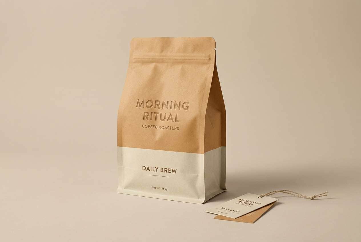
Media.io is an online AI studio for creating and editing video, image, and audio in your browser.

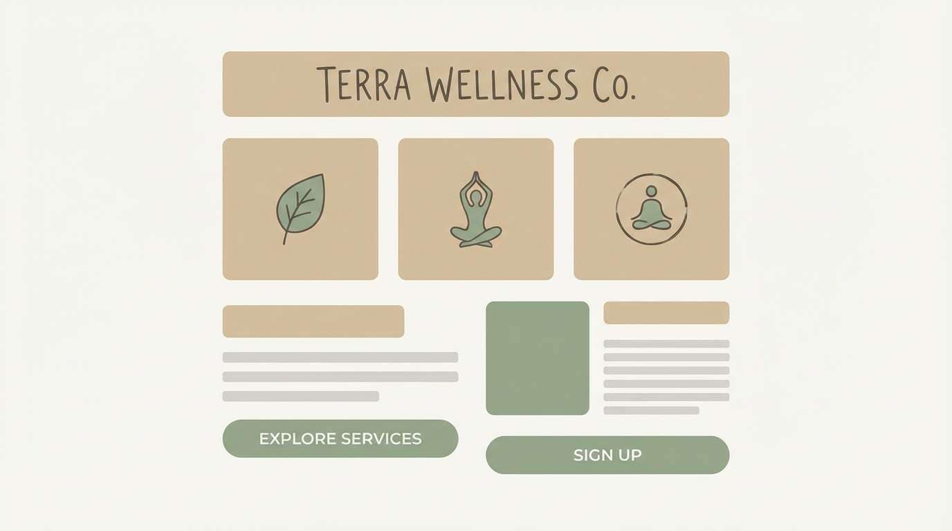
2) Sandstone Sage
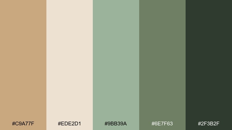
HEX: #C9A77F #EDE2D1 #9BB39A #6E7F63 #2F3B2F
Mood: grounded, fresh, and natural
Best for: wellness websites and eco product branding
Grounded sandstone and quiet sage feel like a sunny trail and fresh-cut herbs. These light brown color combinations work beautifully for sustainable brands that want warmth without looking heavy. Pair the pale beige with sage for backgrounds, then lean on the deep forest tone for buttons and headings. Tip: keep green accents to 10 to 15 percent so the tan remains the hero.
Image example of sandstone sage generated using media.io
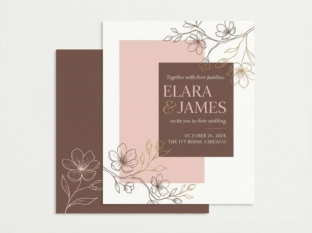
3) Cocoa Blush
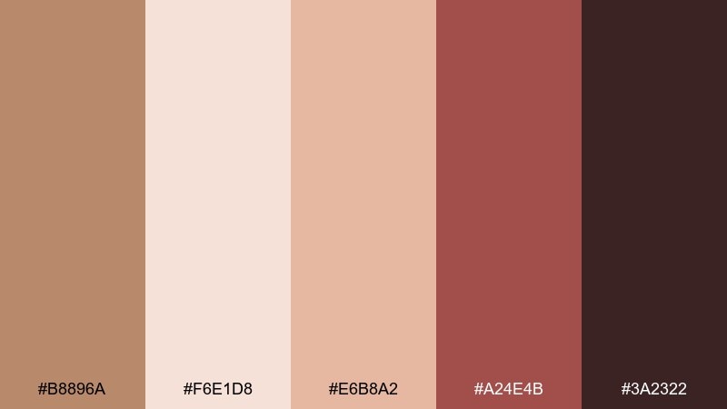
HEX: #B8896A #F6E1D8 #E6B8A2 #A24E4B #3A2322
Mood: romantic, cozy, and soft
Best for: beauty branding and wedding stationery
Cocoa and blush tones evoke rose-tinted evenings and velvety desserts. The gentle pinks soften the brown base, making it feel intimate rather than rustic. Pair the deep cocoa with blush for elegant contrast, and use the clay red as a statement seal or ribbon color. Tip: choose one pink for backgrounds and keep the others for highlights to avoid a busy look.
Image example of cocoa blush generated using media.io
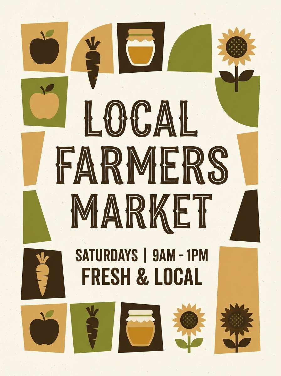
4) Honeyed Olive
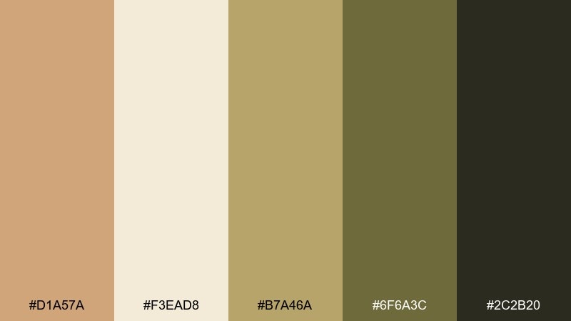
HEX: #D1A57A #F3EAD8 #B7A46A #6F6A3C #2C2B20
Mood: sunny, earthy, and vintage
Best for: artisan food labels and farmers market posters
Honey warmth and olive depth feel like late-afternoon sun over fields. The golden tan keeps things friendly, while the darker olive adds a heritage, hand-crafted vibe. Pair it with off-white paper textures and simple serif type for a timeless look. Tip: print the mid olive on matte stock to avoid muddy results and keep edges crisp.
Image example of honeyed olive generated using media.io
5) Wheat and Ink
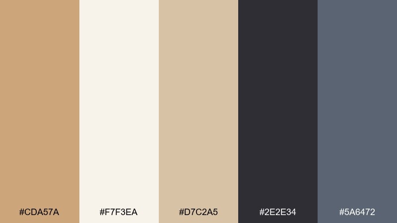
HEX: #CDA57A #F7F3EA #D7C2A5 #2E2E34 #5A6472
Mood: clean, modern, and editorial
Best for: portfolio sites and minimalist presentations
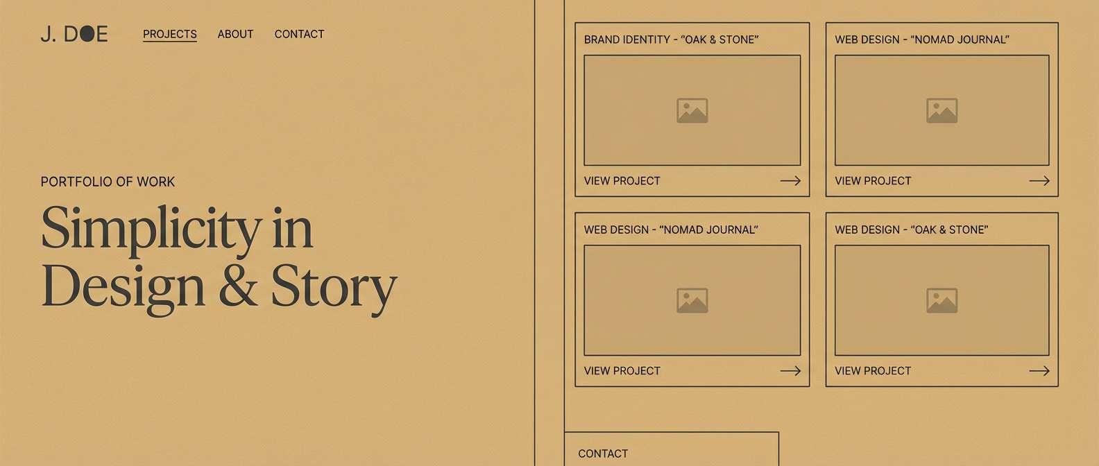
Wheat neutrals with inky charcoal create a crisp, gallery-like calm. This light brown color palette is ideal when you want warmth without losing a sharp, professional edge. Pair the off-white with charcoal for layouts, and use slate blue as a subtle link or icon accent. Tip: set body text in charcoal and reserve slate for hover states to keep hierarchy clear.
Image example of wheat and ink generated using media.io
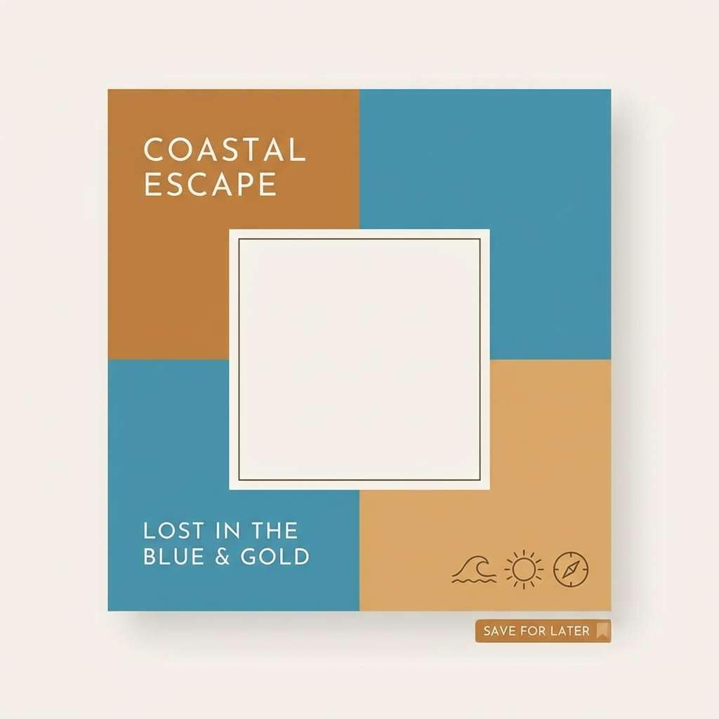
6) Caramel Coastal
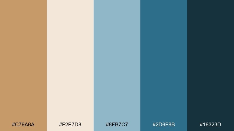
HEX: #C79A6A #F2E7D8 #8FB7C7 #2D6F8B #16323D
Mood: breezy, relaxed, and fresh
Best for: travel blog headers and lifestyle social posts
Caramel sand and sea-glass blues bring a laid-back shoreline vibe. The warm tan keeps it inviting, while the cool blues add clarity and modern contrast. Pair the navy-teal with caramel for strong headings and use the pale cream as a clean background. Tip: keep photos slightly warm-toned so the palette feels cohesive across a feed.
Image example of caramel coastal generated using media.io
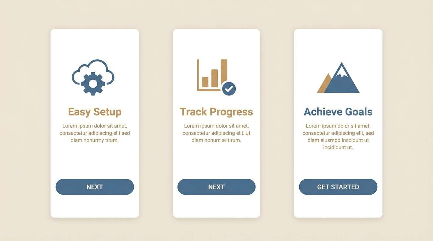
7) Toasted Denim
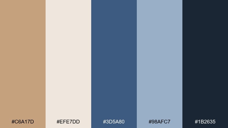
HEX: #C6A17D #EFE7DD #3D5A80 #98AFC7 #1B2635
Mood: confident, casual, and modern
Best for: app onboarding screens and SaaS branding
Toasted tan with denim blues feels like a favorite jacket and well-worn leather. These light brown color combinations make interfaces feel friendly while still trustworthy. Pair the deep navy for primary CTAs and use the pale blue to soften secondary panels. Tip: add generous line spacing with the off-white so the dark blues never overpower the warm base.
Image example of toasted denim generated using media.io
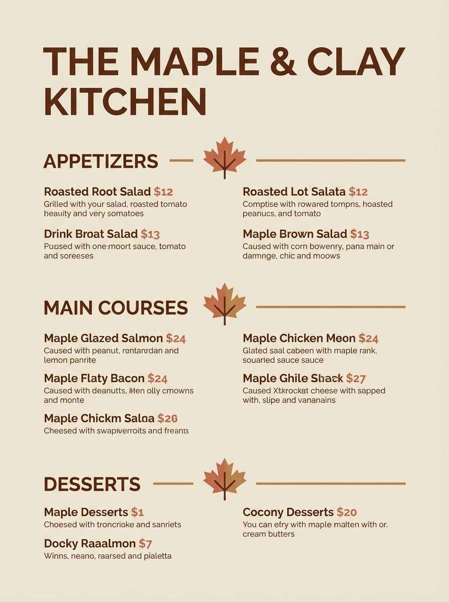
8) Maple Clay
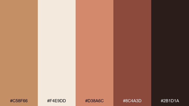
HEX: #C58F66 #F4E9DD #D38A6C #8C4A3D #2B1D1A
Mood: rustic, spicy, and inviting
Best for: restaurant menus and autumn event flyers
Maple and clay tones evoke warm ovens, cinnamon, and handmade pottery. The mix balances soft cream with rich brown-red depth for appetite appeal. Pair the dark espresso shade with cream for legible menu text, and use clay as a highlight for prices or section headers. Tip: keep backgrounds light and let the deeper hues show up in borders and icons.
Image example of maple clay generated using media.io
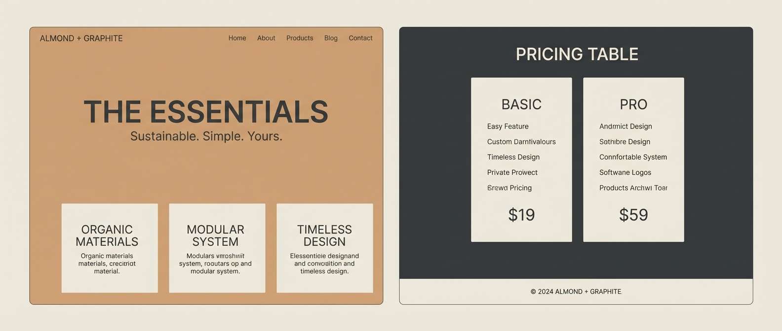
9) Almond Graphite
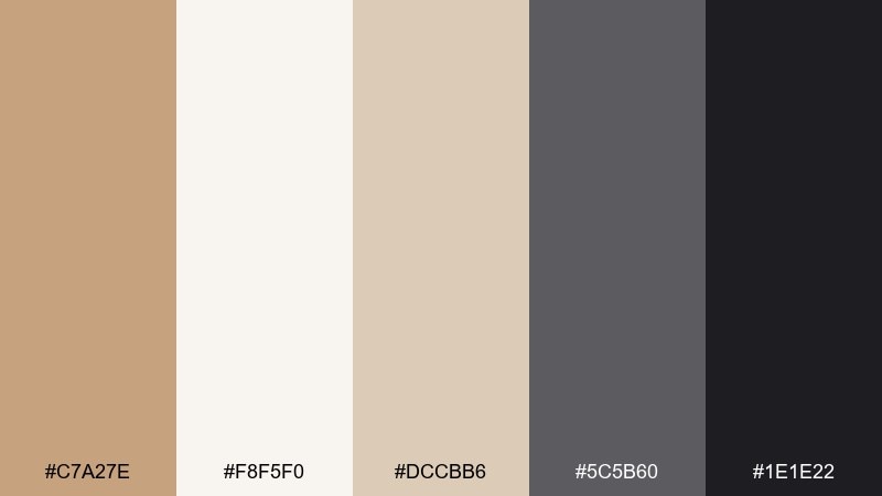
HEX: #C7A27E #F8F5F0 #DCCBB6 #5C5B60 #1E1E22
Mood: sleek, calm, and refined
Best for: product landing pages and tech decks
Almond neutrals with graphite shadows feel polished and quietly luxurious. The soft tan makes layouts approachable, while charcoal brings structure and seriousness. Pair graphite for headings and icons, and keep almond for large surfaces to reduce visual fatigue. Tip: use the mid taupe as a divider color to create depth without heavy lines.
Image example of almond graphite generated using media.io
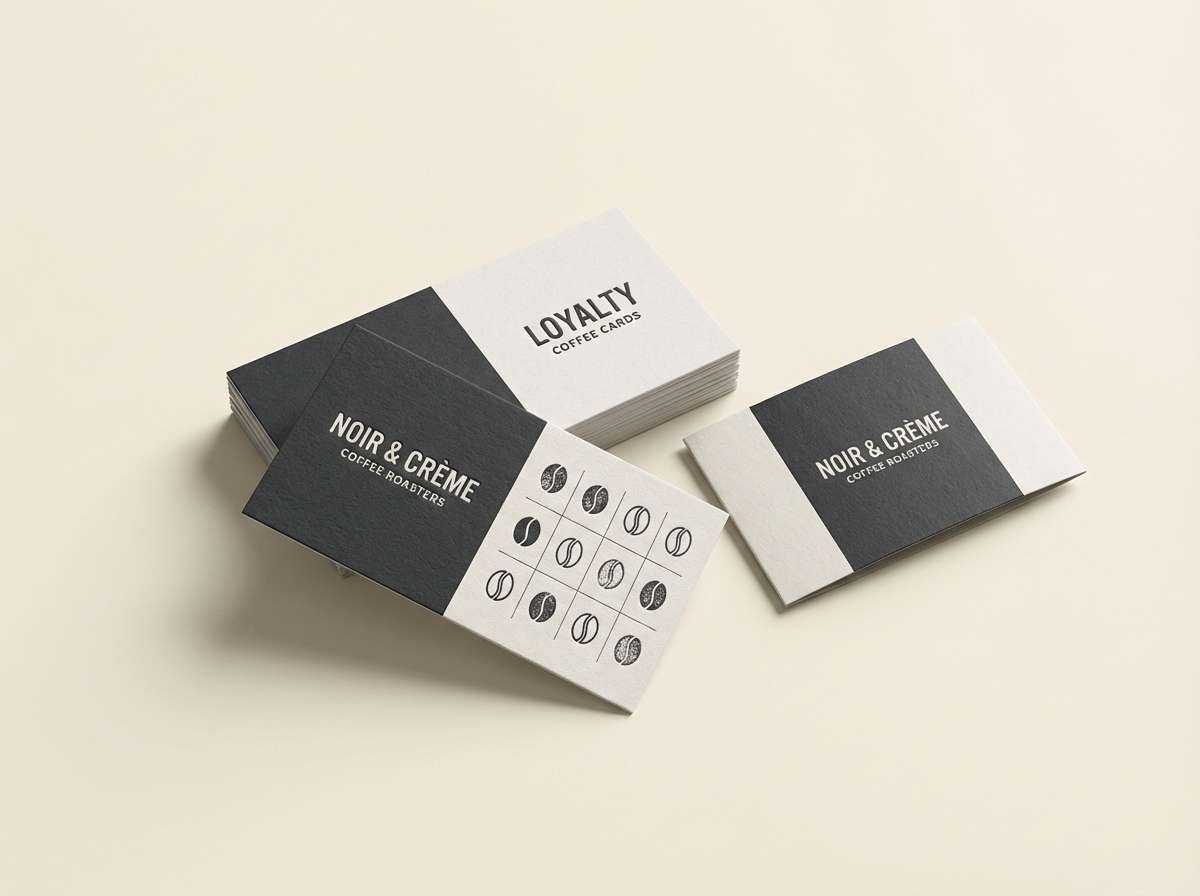
10) Cafe Noir and Cream
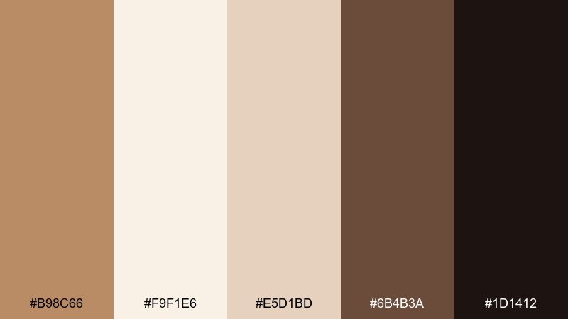
HEX: #B98C66 #F9F1E6 #E5D1BD #6B4B3A #1D1412
Mood: classic, rich, and cozy
Best for: coffeehouse branding and loyalty cards
Creamy highlights and cafe noir depth bring a timeless espresso bar mood. This light brown color palette works especially well for logos that need instant warmth and tradition. Pair the near-black for stamps and type, then use the tan and cream for backgrounds and packaging panels. Tip: add a touch of texture in print, but keep digital backgrounds flat for clarity.
Image example of cafe noir and cream generated using media.io
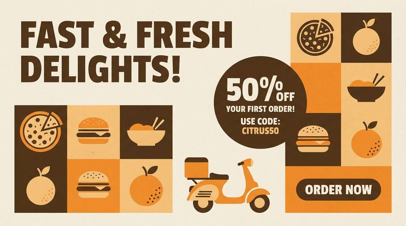
11) Sepia Citrus
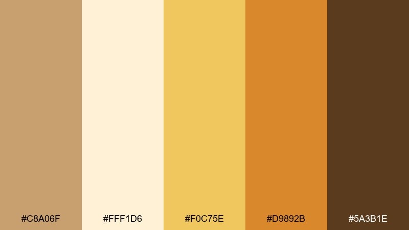
HEX: #C8A06F #FFF1D6 #F0C75E #D9892B #5A3B1E
Mood: bright, upbeat, and nostalgic
Best for: summer promos and food delivery ads
Sepia warmth with citrus pops feels like sunlit postcards and fresh peel zest. The yellow and orange accents add energy without fighting the brown base. Pair the cream for clean space, then use orange for buttons or discount badges. Tip: keep the citrus shades in small bursts so the overall look stays sophisticated, not loud.
Image example of sepia citrus generated using media.io
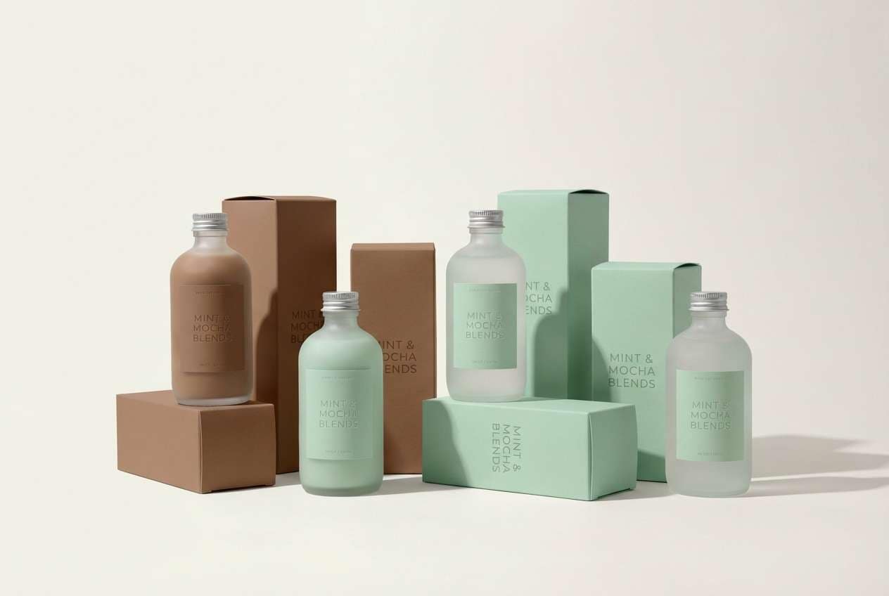
12) Mocha Mint
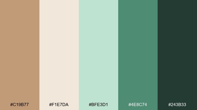
HEX: #C19B77 #F1E7DA #BFE3D1 #4E8C74 #243B33
Mood: clean, spa-like, and soothing
Best for: skincare packaging and appointment booking UI
Mocha neutrals with minty greens evoke a calm spa room and fresh towels. The cool green notes keep the browns from feeling too heavy or traditional. Pair the deeper green for CTAs and use cream as the main background for a breathable layout. Tip: match icon strokes to the darkest green for a cohesive, professional finish.
Image example of mocha mint generated using media.io
13) Birch Rose
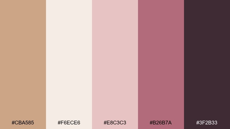
HEX: #CBA585 #F6ECE6 #E8C3C3 #B26B7A #3F2B33
Mood: gentle, elegant, and intimate
Best for: boutique branding and editorial lookbooks
Birch tan and dusty rose feel like soft fabrics and warm blush lighting. The palette stays delicate while still offering enough contrast for typography and accents. Pair the plum shade for headlines and use dusty rose for callouts, ribbons, or small shapes. Tip: in print, choose uncoated paper to make the rosy tones feel more natural.
Image example of birch rose generated using media.io
14) Desert Night
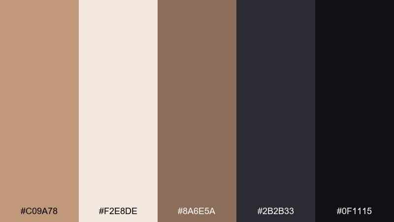
HEX: #C09A78 #F2E8DE #8A6E5A #2B2B33 #0F1115
Mood: moody, cinematic, and luxe
Best for: premium branding and landing page heroes
Desert sand fading into night tones creates a dramatic, cinematic mood. The warm tan keeps the mix approachable, while near-black adds luxury and authority. Pair the darkest shade for hero headlines and use sand as the soft glow behind key messages. Tip: add subtle gradients between taupe and charcoal to avoid flat, harsh transitions.
Image example of desert night generated using media.io
15) Vintage Bookshop
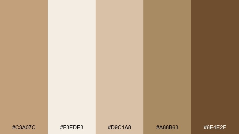
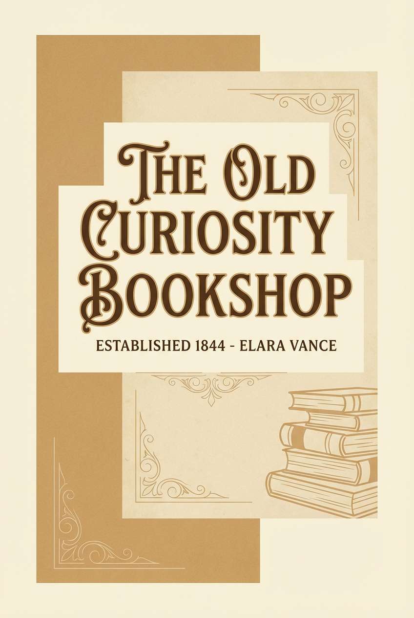
HEX: #C3A07C #F3EDE3 #D9C1A8 #A88B63 #6E4E2F
Mood: nostalgic, calm, and scholarly
Best for: book covers and stationery sets
Soft browns and paper-like creams evoke worn spines, quiet shelves, and penciled margins. This light brown color palette suits literary brands, journals, and classic packaging that should feel familiar. Pair the deeper umber for titles and the pale cream for backgrounds, then use the mid tan for borders and frames. Tip: combine it with a single accent foil, like muted gold, to elevate the vintage feel.
Image example of vintage bookshop generated using media.io
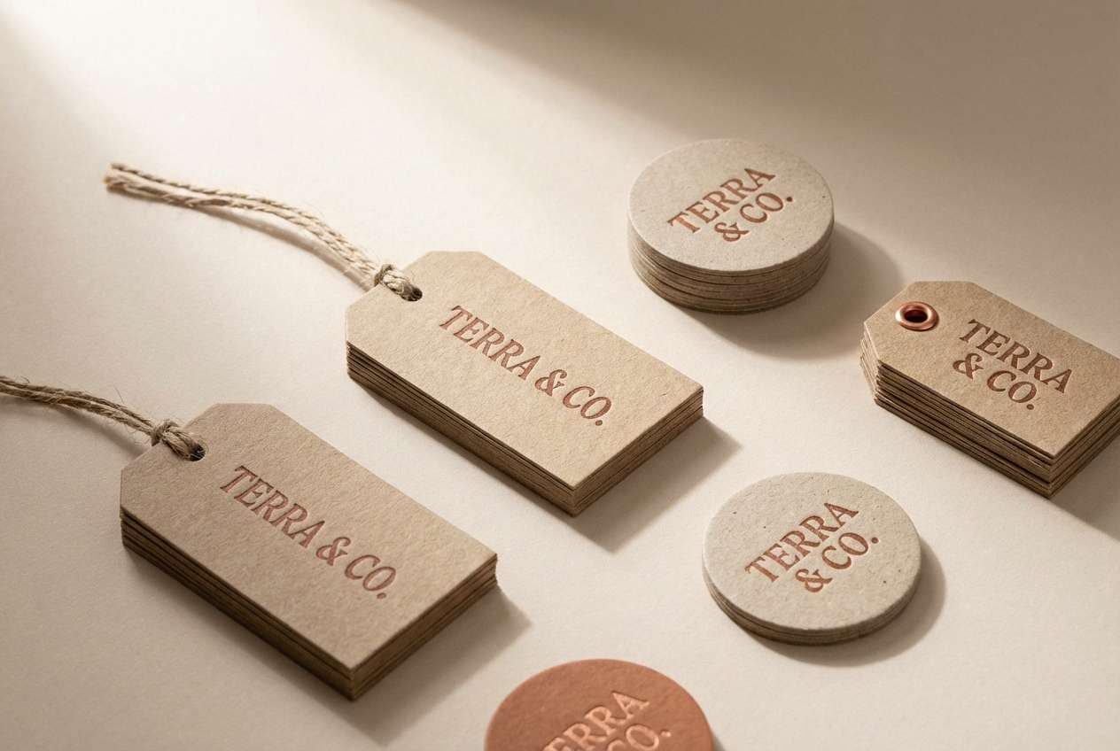
16) Clay and Copper
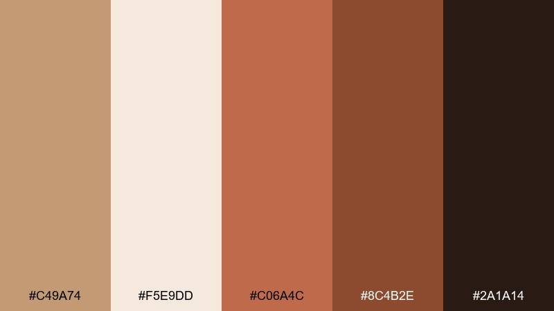
HEX: #C49A74 #F5E9DD #C06A4C #8C4B2E #2A1A14
Mood: bold, handcrafted, and warm
Best for: ceramics shops and handmade product tags
Clay and copper tones feel like kiln heat, terracotta dust, and hand-thrown edges. The brighter copper shade adds punch while still staying earthy and grounded. Pair the cream for tag backgrounds and use the deep brown for logos and QR codes. Tip: keep copper as a spot color so it reads intentional, not overwhelming.
Image example of clay and copper generated using media.io
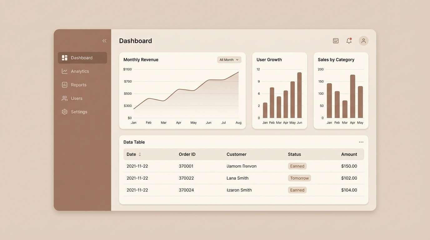
17) Soft Umber UI
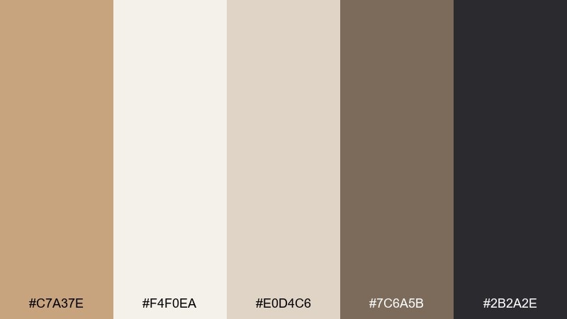
HEX: #C7A37E #F4F0EA #E0D4C6 #7C6A5B #2B2A2E
Mood: calm, balanced, and readable
Best for: dashboard UI and data-heavy admin panels
Soft umber neutrals create a calm workspace that feels less stark than pure gray. The range from cream to charcoal supports clear hierarchy for tables, charts, and forms. Pair the darkest shade for navigation and use taupe for dividers to keep screens tidy. Tip: set chart highlights in a single contrasting accent outside the palette to avoid muddy data visuals.
Image example of soft umber ui generated using media.io
18) Sunlit Terracotta
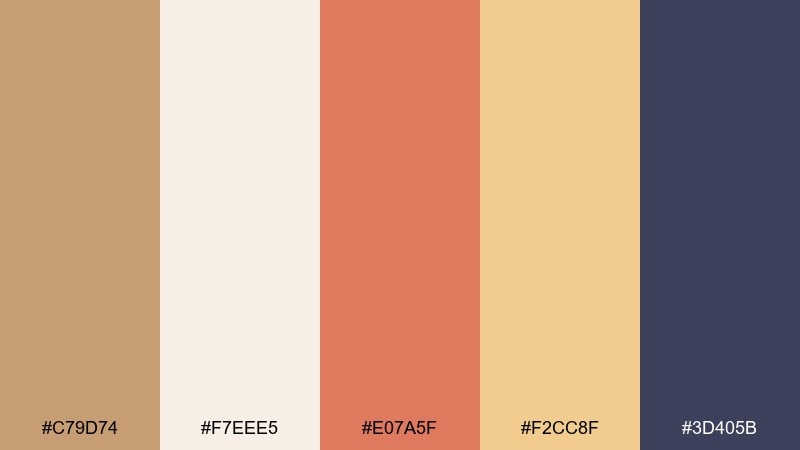
HEX: #C79D74 #F7EEE5 #E07A5F #F2CC8F #3D405B
Mood: optimistic, artistic, and warm
Best for: creative studio sites and event posters
Sunlit tan with terracotta and golden sand feels like a bright studio wall at golden hour. The unexpected navy adds a modern edge that keeps the warmth from turning too rustic. Pair terracotta for headline shapes and use navy for body text or logos. Tip: keep the cream as your base layer so the warm accents stay punchy and clean.
Image example of sunlit terracotta generated using media.io

19) Prairie Morning
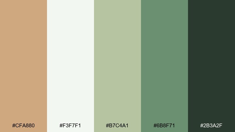
HEX: #CFA880 #F3F7F1 #B7C4A1 #6B8F71 #2B3A2F
Mood: fresh, outdoorsy, and calm
Best for: botanical illustrations and nature blog headers
Prairie tan and soft greens evoke dew on grass and a quiet morning breeze. The palette is gentle enough for backgrounds yet strong enough for clear titles and badges. Pair the darkest green for key text and use the pale minty white to keep everything airy. Tip: add watercolor textures in the lightest tones to enhance the natural feel without clutter.
Image example of prairie morning generated using media.io
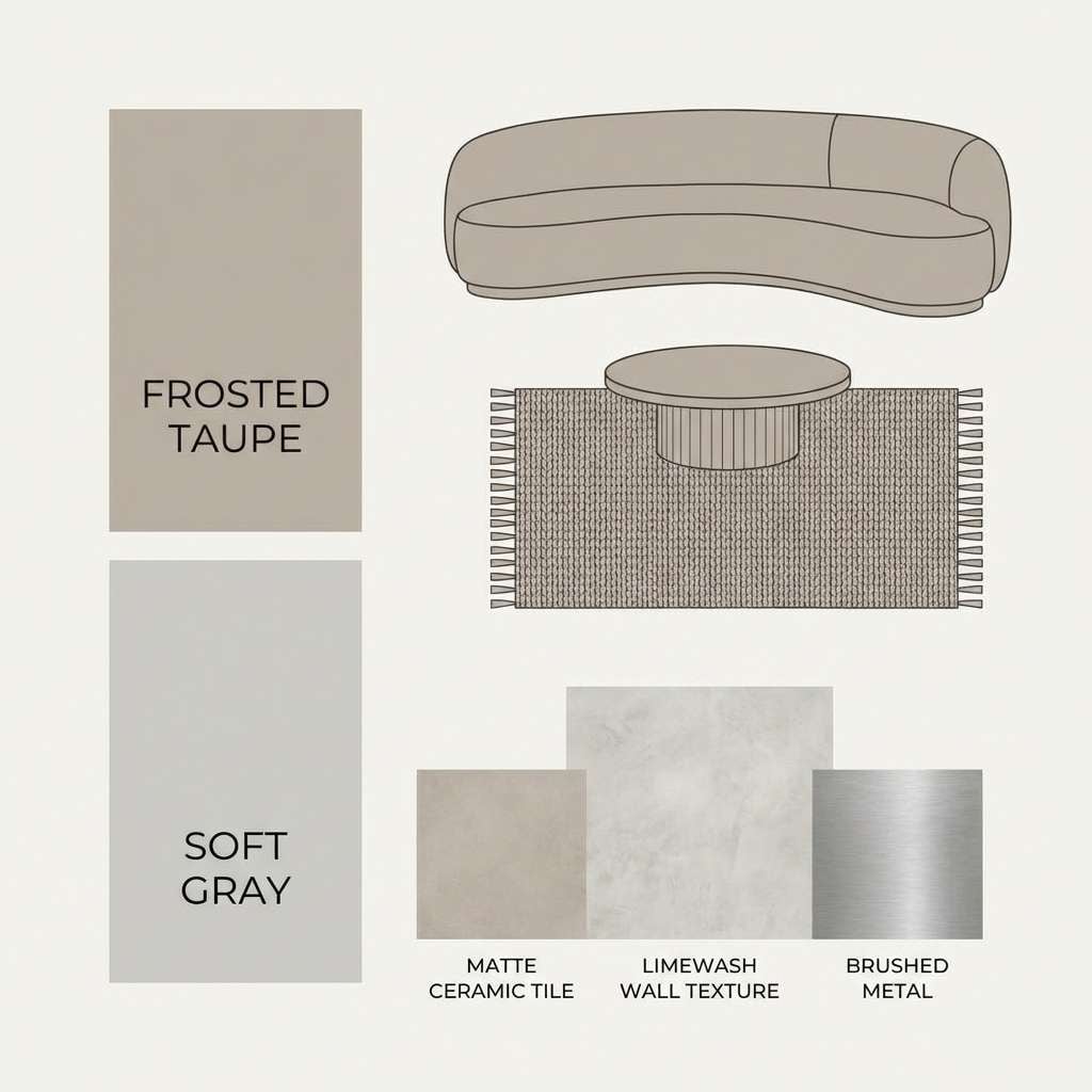
20) Frosted Taupe
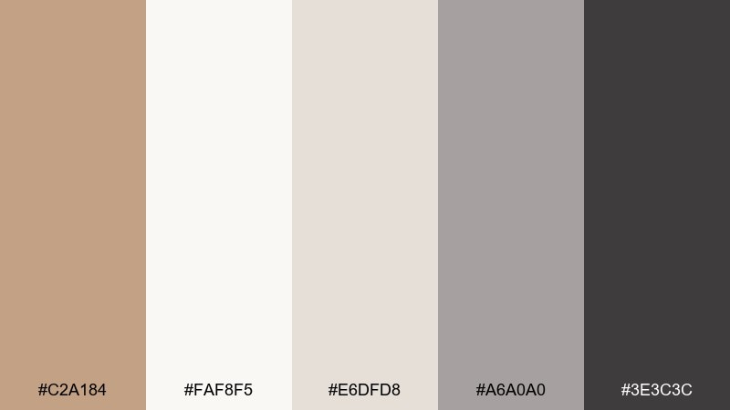
HEX: #C2A184 #FAF8F5 #E6DFD8 #A6A0A0 #3E3C3C
Mood: soft, minimal, and contemporary
Best for: modern interiors moodboards and typography posts
Frosted taupe and whispery grays feel like quiet light through sheer curtains. The contrast stays subtle, making it ideal for minimalist layouts and calming moodboards. Pair the deep graphite for typography and keep the near-white for spacious backgrounds. Tip: use the mid gray for subtle shadows and separators instead of hard lines.
Image example of frosted taupe generated using media.io
What Colors Go Well with Light Brown?
Light brown pairs effortlessly with creamy whites and soft beiges for a calm, tonal look. Add charcoal, espresso, or near-black when you need strong, professional contrast for headings and UI elements.
For a fresh twist, combine light brown with greens (sage, olive, forest) or coastal blues (teal, denim, slate). These cooler accents keep the palette modern while preserving the warmth.
If you want more energy, use warm accents sparingly—terracotta, copper, mustard, or citrus orange. Small bursts (badges, buttons, icons) make the whole system feel intentional instead of noisy.
How to Use a Light Brown Color Palette in Real Designs
Start with a “surface plan”: use the lightest cream/off-white for backgrounds, then use the tan as a primary surface (cards, packaging panels, sections). Reserve the darkest shade for text, logos, or navigation so readability stays high.
Keep accents limited. Choose one standout accent (a blue, green, or terracotta) and apply it consistently to CTAs, links, or key highlights. This avoids muddy-looking combinations that can happen when multiple mid-tones compete.
For print, test on the right paper. Warm browns can shift depending on stock and finish; uncoated papers usually enhance the cozy feel, while matte coatings help mid-tones stay crisp.
Create Light Brown Palette Visuals with AI
If you already have HEX codes, you can turn them into realistic brand mockups, posters, or UI concepts in minutes. The fastest workflow is to generate a reference image for your palette, then iterate with small prompt changes.
Use your palette words (latte, linen, sage, denim, terracotta) plus the design format (packaging, landing page, invitation, dashboard) to keep results on-style. Add lighting and material cues like “matte paper,” “soft shadow,” or “clean seamless background.”
When you find a look you like, keep the prompt structure and only swap the subject (menu → label → hero banner) so your visuals stay cohesive across a campaign.
Light Brown Color Palette FAQs
-
What HEX code is considered light brown?
Many “light brown” tones fall in the tan range, such as #C8A27A (a warm latte tan). Similar light browns often sit around #C2A184–#CFA880 depending on how golden or muted you want it. -
Is light brown a warm or cool color?
Light brown is typically warm because it leans toward yellow/orange undertones. You can cool it down by pairing it with blues, mints, or cool grays, or warm it up further with terracotta and copper accents. -
What color text works best on light brown backgrounds?
Deep espresso, charcoal, or near-black usually provides the clearest contrast on light brown. For accessibility, test contrast ratios and consider using #2B2A2E, #1E1E22, or similar dark tones from your palette. -
What are the best accent colors for a light brown palette?
Sage/olive greens, denim/coastal blues, dusty rose, and terracotta are reliable accents. For a brighter pop, use mustard or citrus orange in small amounts (buttons, badges, icons). -
Can light brown work for modern UI design?
Yes—light brown works well as a warm neutral for surfaces and backgrounds. Combine it with off-white for breathing room and a dark charcoal for navigation and typography to keep the UI clean and readable. -
How do I keep a light brown palette from looking “muddy”?
Use one light background, one main tan, and one dark anchor color for text. Limit mid-tones, add clear spacing, and keep your accent color to a small percentage so the overall design stays crisp. -
What industries benefit most from light brown color schemes?
Cafes and food brands, wellness and skincare, interiors, handmade goods, editorial portfolios, and eco-friendly products often benefit because light brown communicates warmth, quality, and natural materials.
Next: Lime Green Color Palette


