

A hippie color palette is all about freedom: warm earth tones, sun-faded pastels, and bold tie-dye brights that feel relaxed but expressive. It’s a fast way to make designs look handcrafted, nostalgic, and human.
Below are 20 curated hippie color palette ideas with HEX codes, plus practical tips for pairing colors in branding, posters, and UI.
In this article
- Why Hippie Palettes Work So Well
-
- sunset tie dye
- earthy patchwork
- desert roadtrip
- sunflower groove
- wildflower bandana
- cosmic lava lamp
- sage and sandalwood
- peace sign pastels
- terracotta sunrise
- denim and daisies
- vintage record store
- turquoise caravan
- canyon clay
- citrus beads
- midnight bonfire
- mushroom forest
- golden wheatfield
- rose quartz haze
- indigo tapestry
- neon daydream
- What Colors Go Well with Hippie?
- How to Use a Hippie Color Palette in Real Designs
- Create Hippie Palette Visuals with AI
Why Hippie Palettes Work So Well
Hippie color schemes balance comfort and character: grounded browns, greens, and creams make designs feel natural, while punchy brights (coral, sunflower, neon) bring instant optimism and movement.
They’re also flexible across mediums. You can go full tie-dye with high saturation for posters and merch, or keep it softer with muted pastels for UI, invites, and wellness branding.
Most importantly, hippie color combinations communicate “real life” warmth. They pair beautifully with organic shapes, retro typography, and textured elements like paper grain or hand-drawn icons.
20+ Hippie Color Palette Ideas (with HEX Codes)
1) Sunset Tie Dye
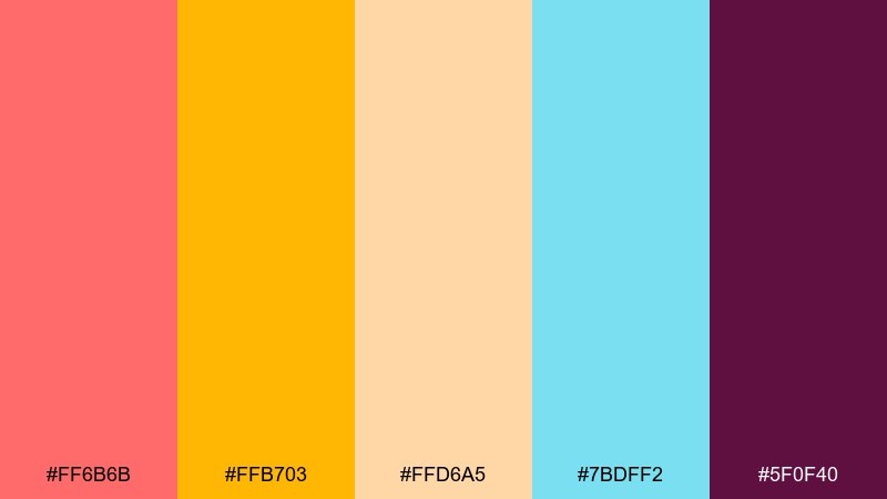
HEX: #ff6b6b #ffb703 #ffd6a5 #7bdff2 #5f0f40
Mood: energetic, nostalgic, playful
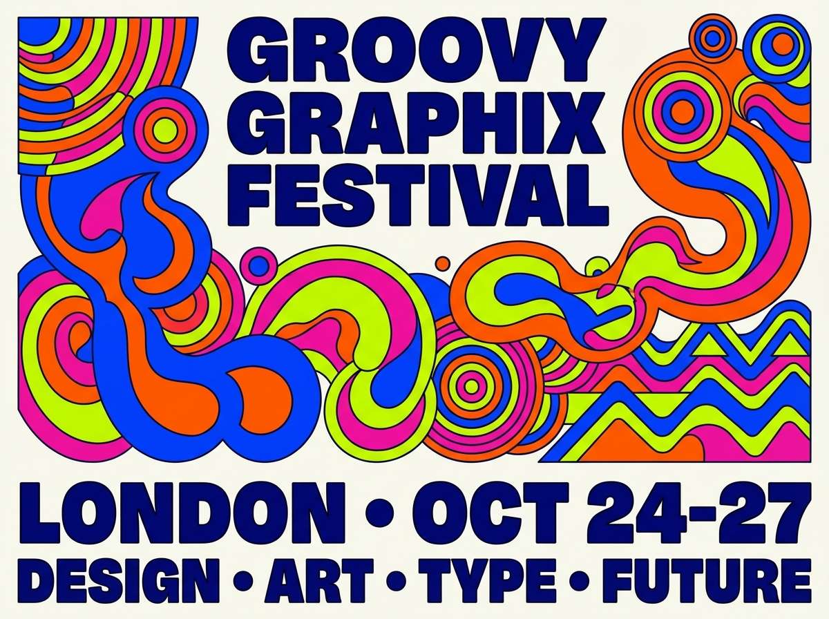
Best for: festival poster design
Electric and sunny, it feels like tie-dye tees drying in late-day heat with a hint of velvet-dark contrast. These hippie color combinations shine on bold headlines and simple shapes where saturation can do the talking. Use the deep berry as your anchor, then let the warm brights carry calls to action. Tip: keep backgrounds light and reserve the darkest tone for type to maintain legibility.
Image example of sunset tie dye generated using media.io
Media.io is an online AI studio for creating and editing video, image, and audio in your browser.

2) Earthy Patchwork
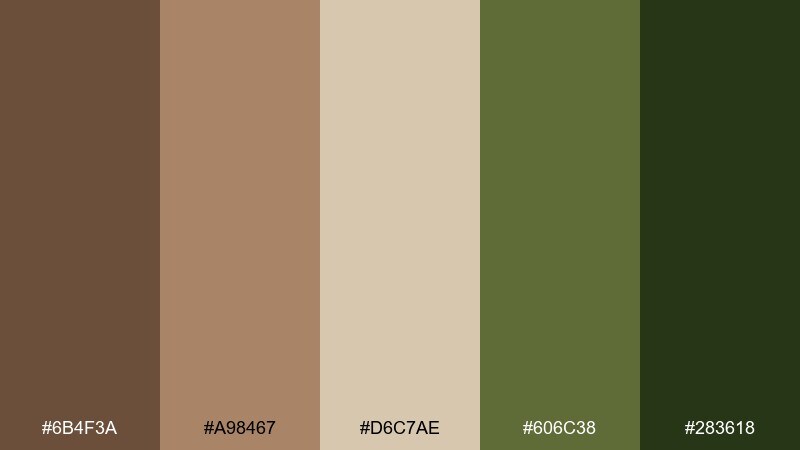
HEX: #6b4f3a #a98467 #d6c7ae #606c38 #283618
Mood: grounded, handcrafted, cozy
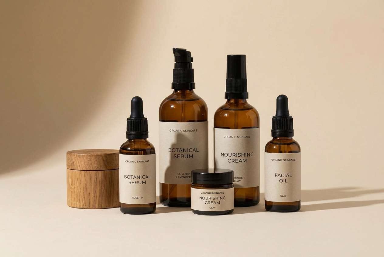
Best for: organic skincare packaging
Warm and tactile, it evokes woven baskets, clay jars, and sun-baked herbs. The browns and sands build trust on labels, while the olive greens keep it fresh and botanical. Pair with off-white paper textures and minimal icons for a premium, earthy feel. Tip: use the darkest green for ingredient lists so small text stays crisp.
Image example of earthy patchwork generated using media.io
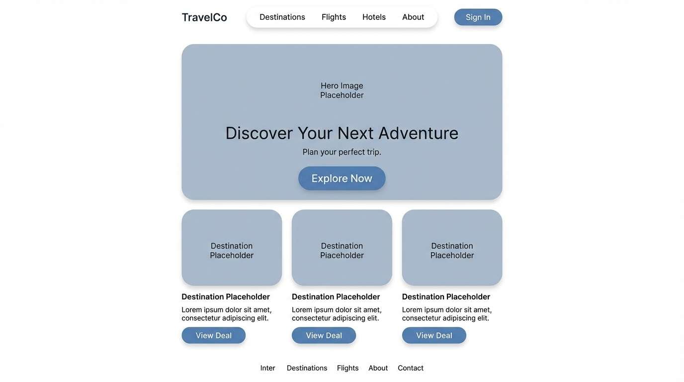
3) Desert Roadtrip
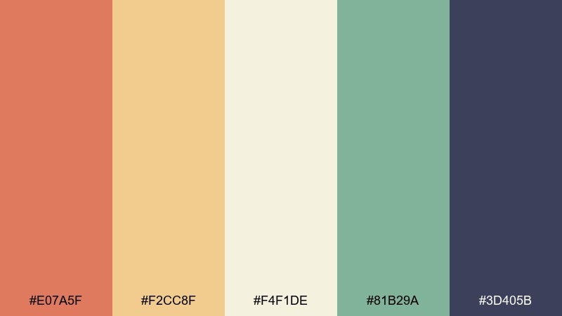
HEX: #e07a5f #f2cc8f #f4f1de #81b29a #3d405b
Mood: sun-warmed, open-road, relaxed
Best for: travel website landing page UI
Soft heat and wide horizons come through in the coral and sand tones, balanced by a calm teal. It works especially well for travel, outdoor, or lifestyle layouts that need warmth without looking loud. Use the navy as a steady base for navigation and body text, then highlight buttons with coral. Tip: keep plenty of whitespace so the palette feels airy and modern.
Image example of desert roadtrip generated using media.io
4) Sunflower Groove
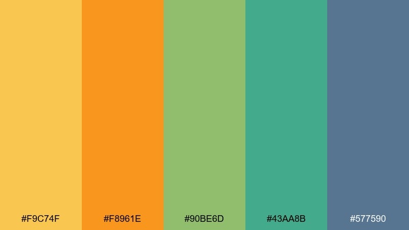
HEX: #f9c74f #f8961e #90be6d #43aa8b #577590
Mood: optimistic, sunny, friendly
Best for: sticker illustration set
Bright and bouncy, it feels like sunflowers, painted vans, and cheerful roadside stops. The yellows lead with joy, while the greens add a clean, natural balance. Use the blue as an outline or shadow color to keep illustrations readable on light backgrounds. Tip: limit the two warm yellows to key elements so the set does not look overly busy.
Image example of sunflower groove generated using media.io
5) Wildflower Bandana
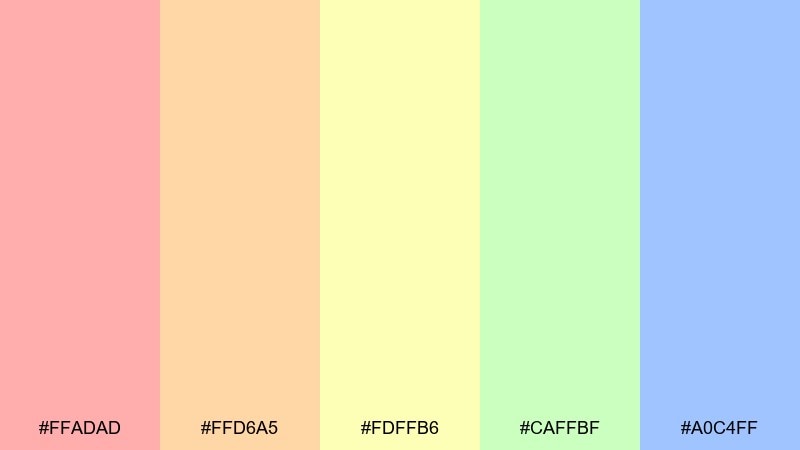
HEX: #ffadad #ffd6a5 #fdffb6 #caffbf #a0c4ff
Mood: soft, breezy, carefree
Best for: bandana pattern design
Light and breezy, it evokes faded bandanas, pressed flowers, and thrifted cottons. The pastels play nicely in repeating motifs where contrast comes from shape more than darkness. Pair with a warm off-white base and a single ink-like outline for clarity. Tip: use the blue as the dominant pattern color and keep the pink as a small accent to avoid a candy look.
Image example of wildflower bandana generated using media.io
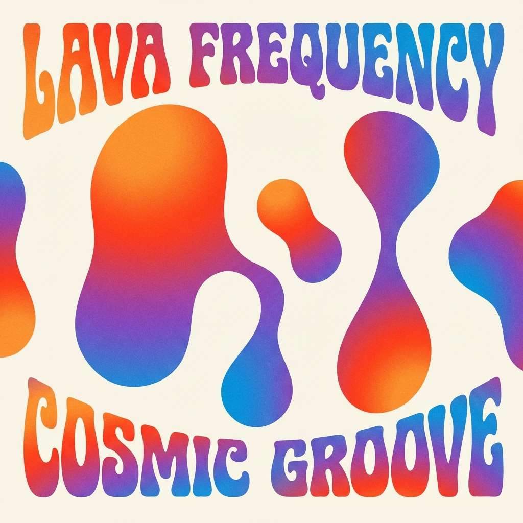
6) Cosmic Lava Lamp
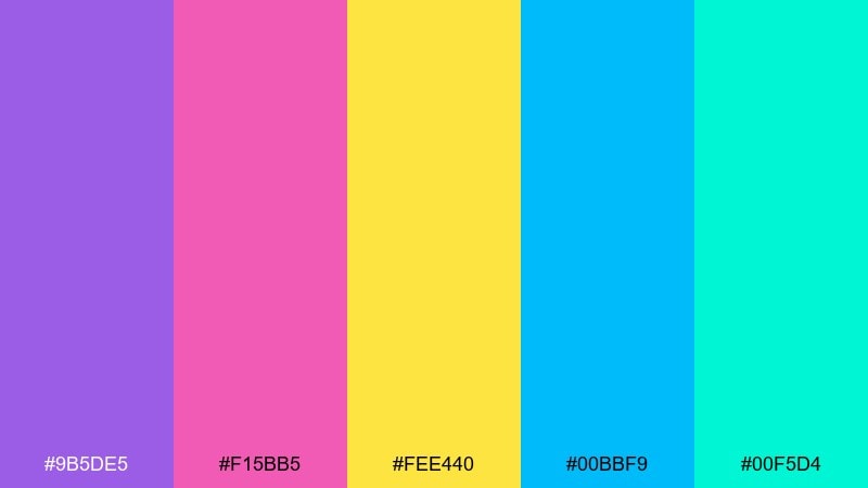
HEX: #9b5de5 #f15bb5 #fee440 #00bbf9 #00f5d4
Mood: psychedelic, electric, dreamy
Best for: album cover graphic
Psychedelic and glossy, it calls up lava-lamp swirls and neon club posters. The high-saturation mix is perfect for large gradients, blobs, and abstract shapes. Pair with black or deep navy type to keep the energy controlled. Tip: use one neon as a spotlight accent and let the others appear in secondary patterns or glows.
Image example of cosmic lava lamp generated using media.io
7) Sage and Sandalwood
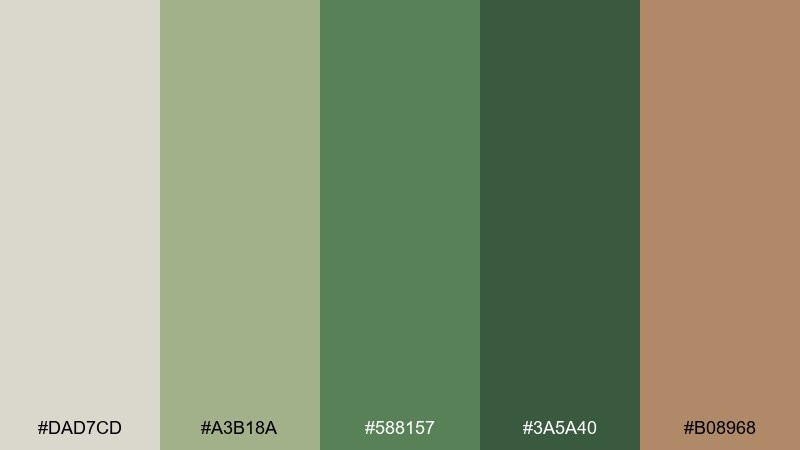
HEX: #dad7cd #a3b18a #588157 #3a5a40 #b08968
Mood: calm, mindful, earthy
Best for: wellness brand identity
Quiet and restorative, it feels like a slow morning with sage leaves and warm wood. This hippie color scheme works beautifully for wellness brands that want nature-first credibility without going overly rustic. Keep the light stone as your primary background, then build hierarchy with the deeper greens. Tip: bring in the sandalwood brown only for highlights like badges and key icons.
Image example of sage and sandalwood generated using media.io
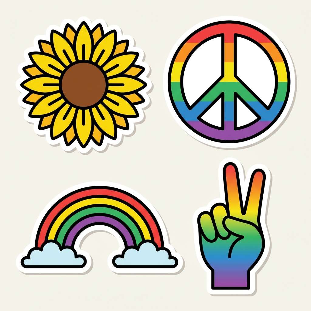
8) Peace Sign Pastels
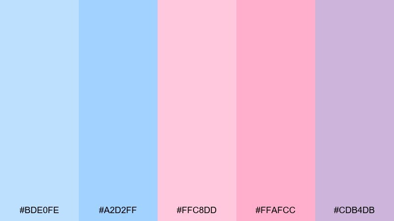
HEX: #bde0fe #a2d2ff #ffc8dd #ffafcc #cdb4db
Mood: sweet, gentle, optimistic
Best for: summer brunch invitation
Gentle and bubbly, it brings to mind chalky peace signs, macarons, and sunlit patios. The close pastel values feel cohesive on invitations and social posts with playful icons. Pair with a dark charcoal type to avoid low-contrast readability issues. Tip: use the lavender as a unifying background and alternate the pinks for decorative elements.
Image example of peace sign pastels generated using media.io
9) Terracotta Sunrise
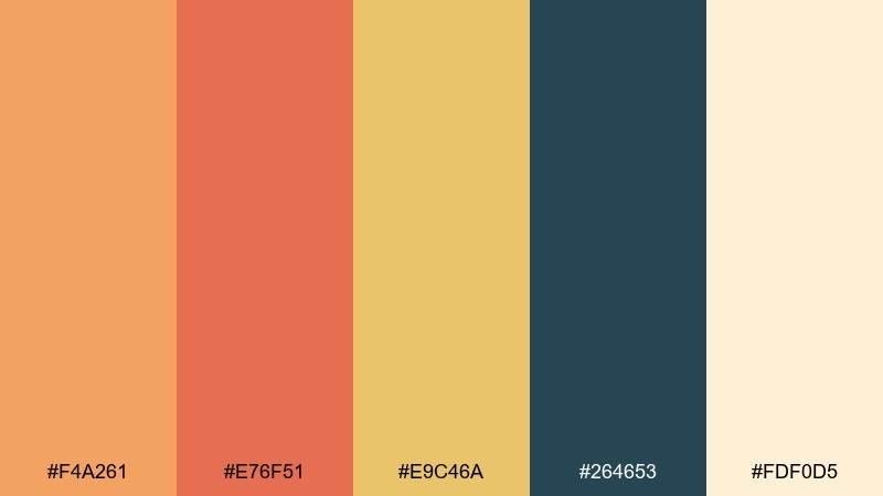
HEX: #f4a261 #e76f51 #e9c46a #264653 #fdf0d5
Mood: warm, artisanal, confident
Best for: interior design mood board
Warm and artisanal, it evokes terracotta pots catching the first sun. The orange-reds feel inviting, while the deep teal adds a sophisticated counterweight. Use it for interiors, cafés, or lifestyle brands that want warmth with structure. Tip: keep the cream tone dominant and use the terracotta as an accent on key focal points.
Image example of terracotta sunrise generated using media.io
10) Denim and Daisies
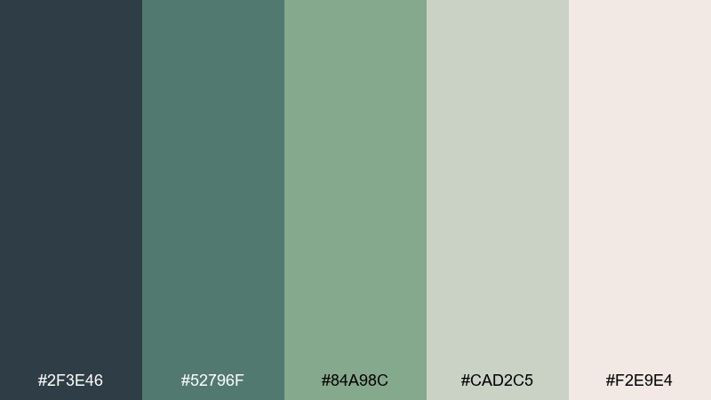
HEX: #2f3e46 #52796f #84a98c #cad2c5 #f2e9e4
Mood: easygoing, vintage, natural
Best for: apparel lookbook layout
Cool denim tones and soft neutrals create an effortless, thrift-store-chic vibe. The muted greens keep it earthy without leaning too brown, making it great for fashion, sustainable goods, and lifestyle editorial. Pair with minimalist photography and thin serif headings for a modern-retro balance. Tip: reserve the darkest blue-green for section titles and page numbers.
Image example of denim and daisies generated using media.io
11) Vintage Record Store

HEX: #f6bd60 #f7ede2 #f5cac3 #84a59d #f28482
Mood: retro, warm, friendly
Best for: magazine feature spread
Warm and nostalgic, it feels like dusty vinyl sleeves and afternoon sun through shop windows. In a hippie color palette like this, the creamy neutrals keep pages readable while the peach and coral add personality. Use teal as a calm framing color for pull quotes and small UI-like elements in layouts. Tip: keep accent blocks small so the spread stays editorial, not scrapbooky.
Image example of vintage record store generated using media.io
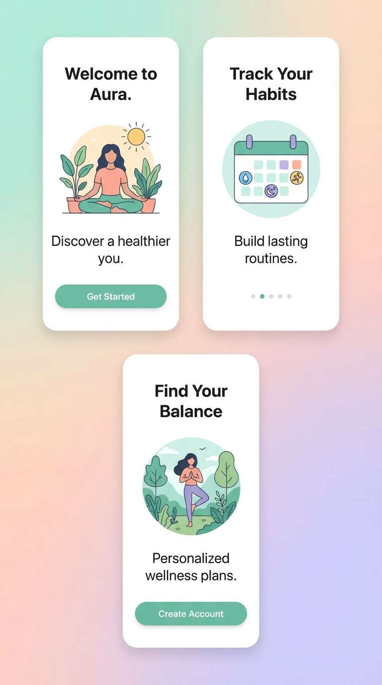
12) Turquoise Caravan
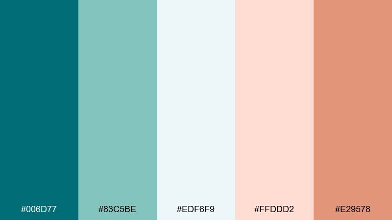
HEX: #006d77 #83c5be #edf6f9 #ffddd2 #e29578
Mood: fresh, coastal, adventurous
Best for: wellness app onboarding UI
Fresh turquoise and soft blush feel like a coastal caravan stop with salty air and warm light. It is ideal for onboarding screens where calm comes first, and color simply guides attention. Pair the pale background with turquoise navigation elements and use the clay accent for primary buttons. Tip: add subtle gradients only in illustrations, not behind text.
Image example of turquoise caravan generated using media.io
13) Canyon Clay
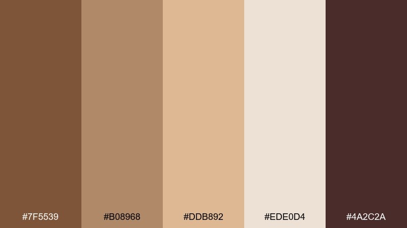
HEX: #7f5539 #b08968 #ddb892 #ede0d4 #4a2c2a
Mood: rustic, warm, grounded
Best for: handmade pottery product ad
Rich clay browns and creamy stone bring a kiln-fired, handmade warmth. The tones are perfect for showcasing ceramics, candles, or artisanal goods where texture is the hero. Keep the light beige as the main field and use the deepest brown for logos and price labels. Tip: add a small pop of metallic foil in print to elevate the earthy base.
Image example of canyon clay generated using media.io
14) Citrus Beads
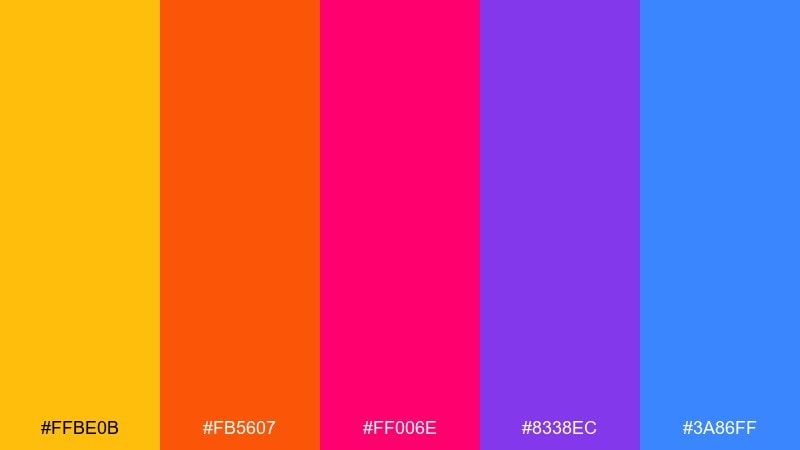
HEX: #ffbe0b #fb5607 #ff006e #8338ec #3a86ff
Mood: bold, youthful, expressive
Best for: jewelry e-commerce banner
Juicy and punchy, it looks like candy-colored beads laid out for a craft night. The hot brights work best in short bursts on banners, badges, and promotional strips. Pair with a clean white base and simple sans-serif type so the colors do not compete. Tip: choose one dominant hue per banner and keep the other brights as small supporting accents.
Image example of citrus beads generated using media.io

15) Midnight Bonfire
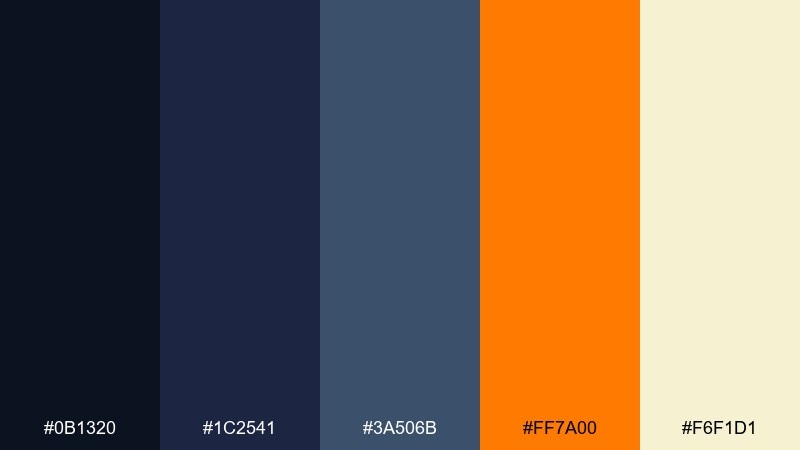
HEX: #0b1320 #1c2541 #3a506b #ff7a00 #f6f1d1
Mood: moody, cozy, dramatic
Best for: social media post template
Dark blues with a bonfire orange spark feel like stories told under a night sky. The contrast is great for social templates where you want a punchy hook and clear text. Use the cream for body copy blocks and the orange only for emphasis like dates or discount numbers. Tip: add grain or subtle noise to the deep background for a cinematic finish.
Image example of midnight bonfire generated using media.io
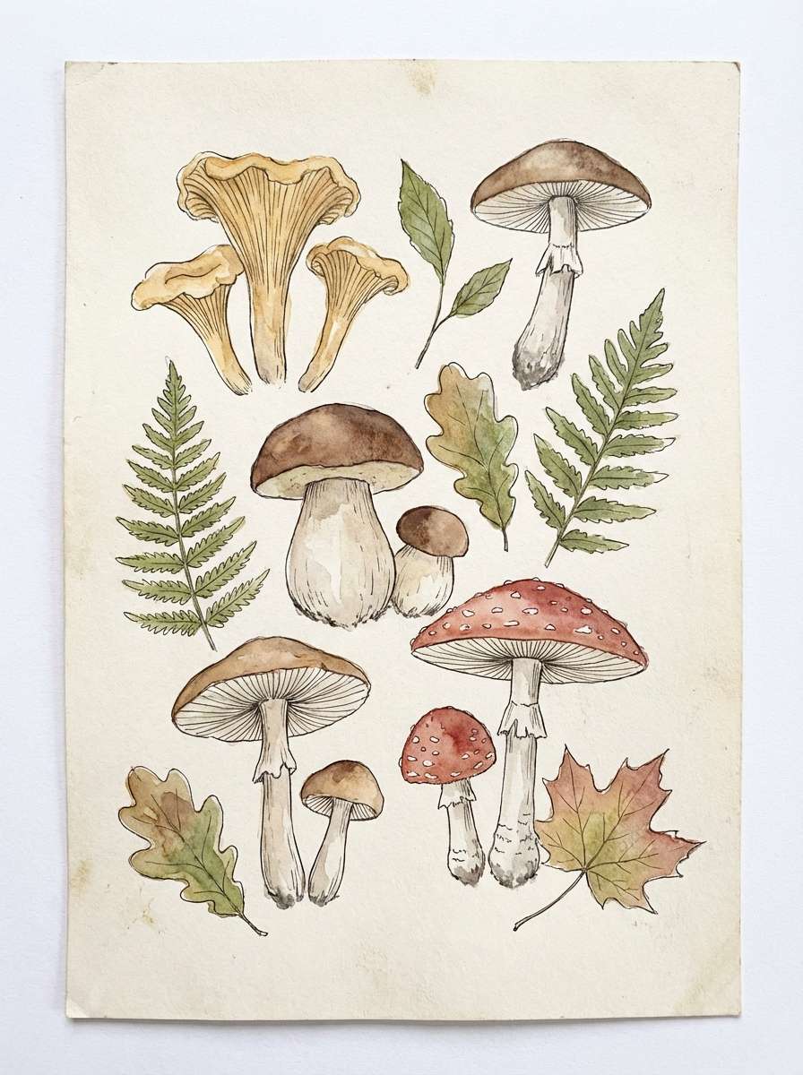
16) Mushroom Forest
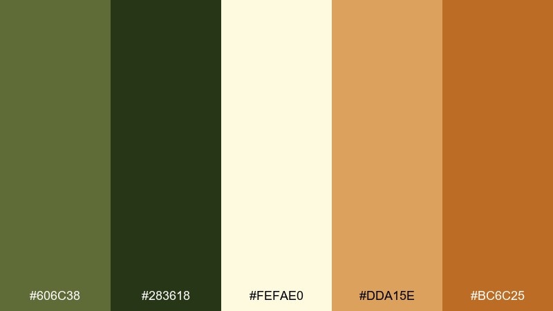
HEX: #606c38 #283618 #fefae0 #dda15e #bc6c25
Mood: woodsy, whimsical, grounded
Best for: watercolor botanical print
Woodsy greens and mushroom browns create a quiet, foraged feeling. The creamy background keeps watercolor textures looking natural and not muddy. Use the dark green for stems and line accents, then build warmth with the amber tones. Tip: leave generous negative space so the illustration breathes like a gallery print.
Image example of mushroom forest generated using media.io
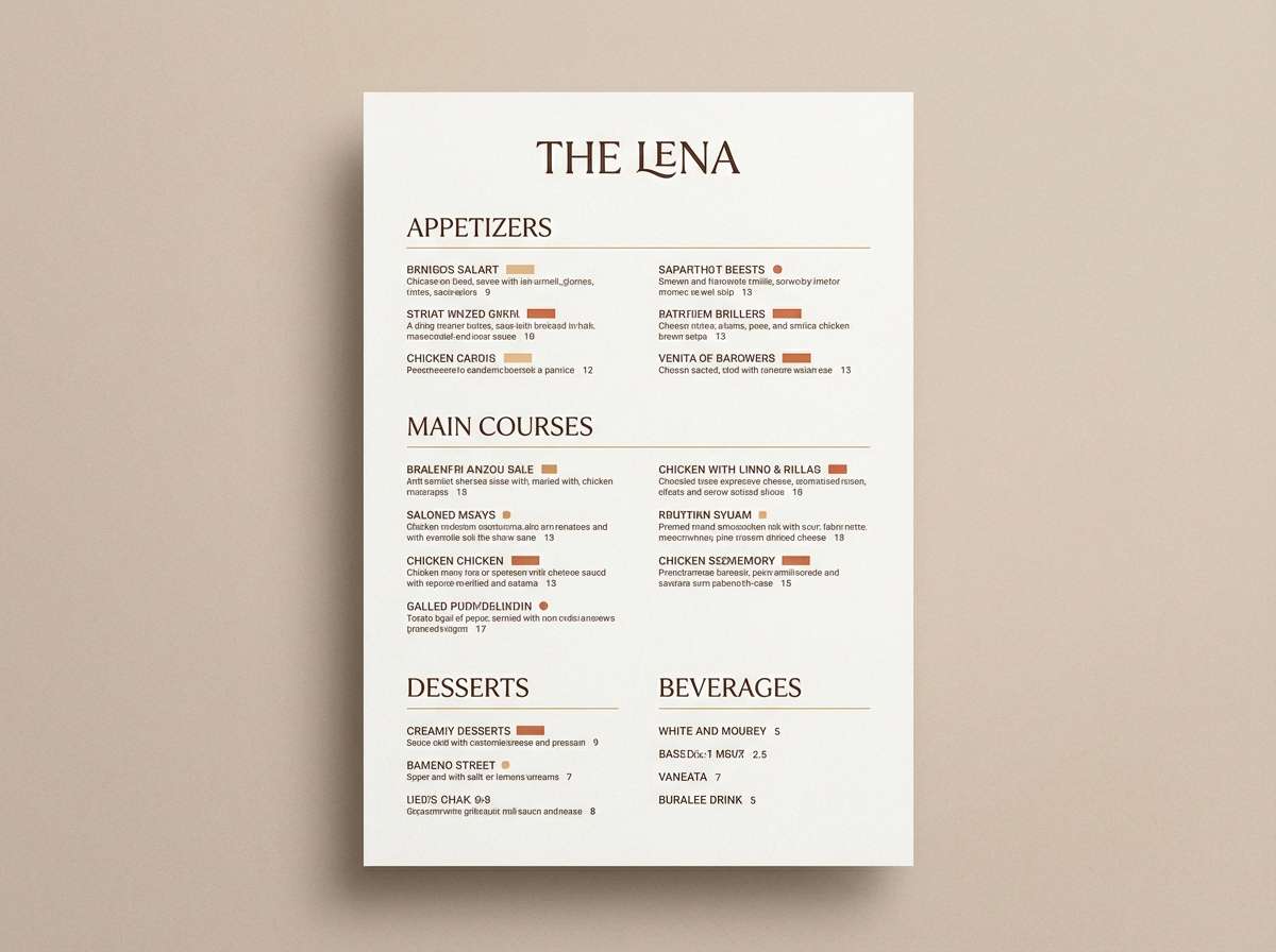
17) Golden Wheatfield
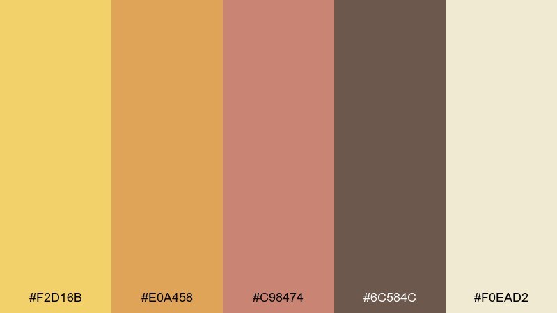
HEX: #f2d16b #e0a458 #c98474 #6c584c #f0ead2
Mood: sunlit, rustic, welcoming
Best for: farm-to-table menu design
Sunlit golds and muted clay tones feel like a wheatfield breeze and handwritten recipes. It is a strong fit for menus, packaging inserts, and signage that should read warm and local. Pair with a textured off-white background and a classic serif for dish names. Tip: use the deep brown sparingly for dividers and prices to keep the page light.
Image example of golden wheatfield generated using media.io
18) Rose Quartz Haze
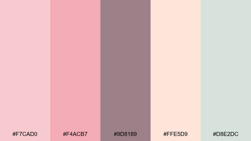
HEX: #f7cad0 #f4acb7 #9d8189 #ffe5d9 #d8e2dc
Mood: romantic, hazy, soothing
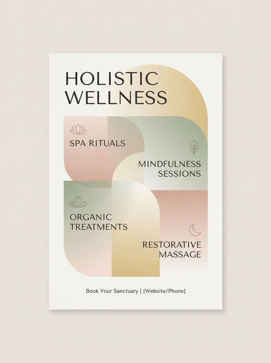
Best for: spa flyer design
Soft and hazy, it evokes rose quartz, steamed towels, and quiet self-care rituals. A hippie color palette with these blush tones works best when typography is minimal and spacing is generous. Pair the warm pinks with the cool minty neutral to keep the design from skewing too sweet. Tip: use the mauve for small headings and keep body text in a dark gray for readability.
Image example of rose quartz haze generated using media.io
19) Indigo Tapestry
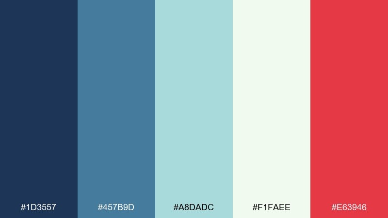
HEX: #1d3557 #457b9d #a8dadc #f1faee #e63946
Mood: artful, bold, balanced
Best for: home decor pattern collection
Deep indigo and airy aqua feel like woven tapestries with a modern edge. The crisp red accent adds a confident pop that helps patterns look intentional, not washed out. Use it for pillows, posters, or pattern packs where you want a strong focal color. Tip: keep the red under 10 percent of the design so it stays special.
Image example of indigo tapestry generated using media.io
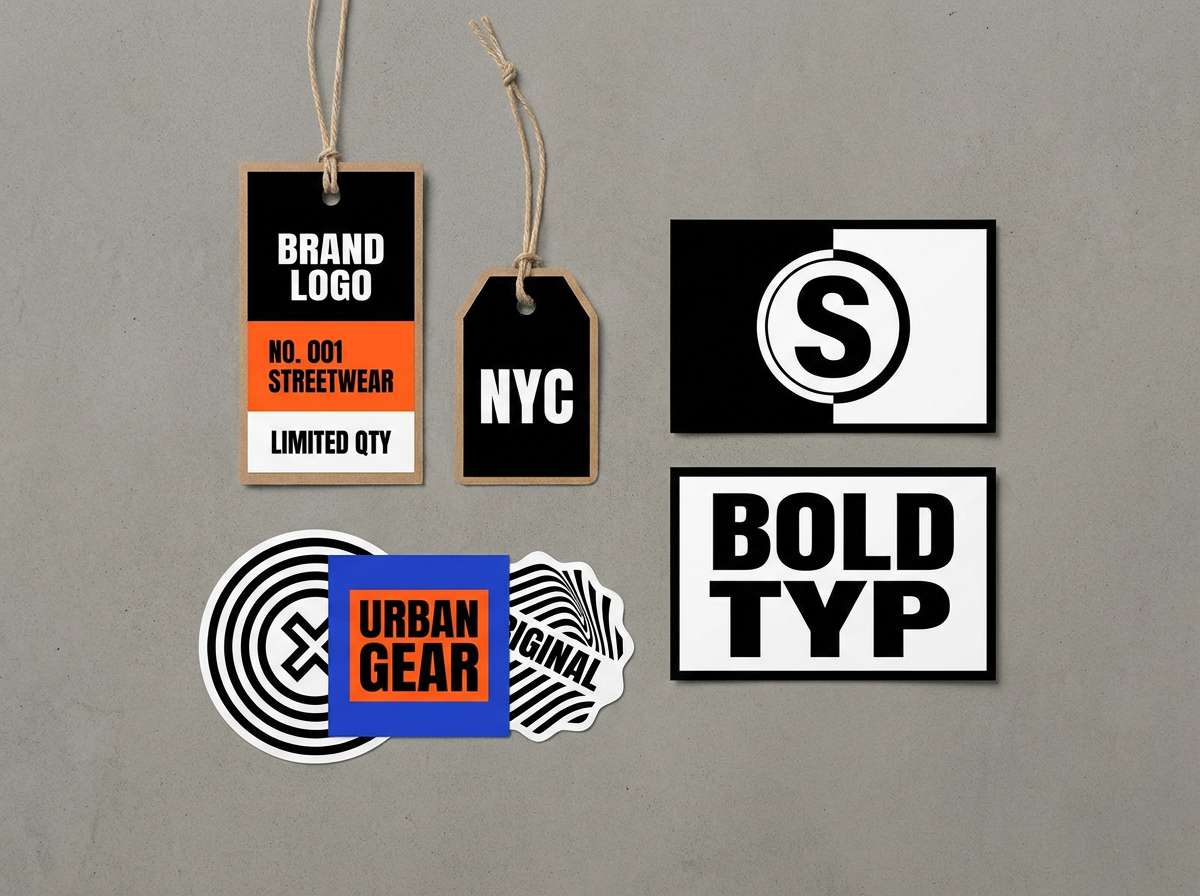
20) Neon Daydream
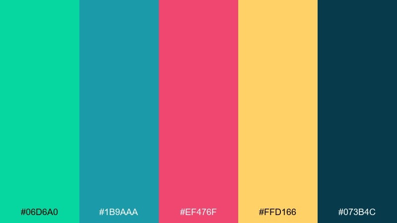
HEX: #06d6a0 #1b9aaa #ef476f #ffd166 #073b4c
Mood: fresh, daring, playful
Best for: streetwear brand logo and tags
Fresh neon with a deep blue base feels like late-night skate spots and glow-in-the-dark ink. These hippie color combinations work well for streetwear when you keep shapes bold and type heavy. Use the dark teal as the primary field, then rotate neon accents across tags and stickers for variety. Tip: print-test the green and pink together to ensure they do not vibrate at small sizes.
Image example of neon daydream generated using media.io
What Colors Go Well with Hippie?
Hippie palettes pair best with warm, nature-based neutrals (cream, sand, tan, clay, cocoa) because they make bright accents look intentional instead of chaotic. If you want a more boho color palette vibe, lean into muted greens, dusty rose, and sun-baked terracotta.
For retro 70s colors, combine golden yellow with avocado/olive greens and a deep ink tone (navy or espresso) for structure. For tie dye colors, keep one “anchor” dark and let the rest be high-saturation accents or gradients.
If you’re designing for screens, add a clean off-white background and choose one primary accent color for CTAs so readability stays strong.
How to Use a Hippie Color Palette in Real Designs
Start with a base (background + text) before adding the fun colors. A simple combo like cream + deep teal or stone + forest green gives you a stable foundation, then you can layer coral, sunflower, or neon as highlights.
Use hippie color combinations to guide hierarchy: one color for navigation, one for buttons, and one for badges. In posters and merch, let brights dominate big shapes while reserving the darkest hue for typography and contrast.
To keep things from looking overly busy, repeat the same two accent colors across components (icons, dividers, labels), and treat the rest as occasional “surprise” pops.
Create Hippie Palette Visuals with AI
If you want to see a hippie color scheme in action, generate quick mockups (posters, album covers, packaging, or UI screens) before committing to final design files. This helps you test contrast, mood, and how your accent colors behave at different sizes.
With Media.io’s Text to Image, you can paste a prompt, specify a layout style (vector, editorial, UI), and iterate until the palette feels right—especially useful for retro 70s colors, tie-dye looks, and boho branding.
Hippie Color Palette FAQs
-
What is a hippie color palette?
A hippie color palette is a mix of warm earth tones (brown, tan, olive, cream) plus optimistic accents (sunset orange, sunflower yellow, turquoise, or psychedelic neons) inspired by boho and retro 60s–70s aesthetics. -
What are the best “anchor” colors for hippie color schemes?
Deep teal, navy, espresso brown, or forest green work well as anchors because they add contrast and keep bright tie-dye accents readable in headlines, buttons, and icons. -
How do I keep hippie color combinations from looking messy?
Limit your design to one background neutral, one dark anchor for type, and 1–2 strong accents. Use the remaining palette colors only in small repeats (badges, patterns, highlights) to avoid visual noise. -
Are hippie palettes good for UI design?
Yes—choose softer, muted pastels or desert tones for backgrounds and cards, then reserve one brighter accent for CTAs. Always check contrast (especially on pastel-on-pastel) to maintain accessibility. -
What fonts work best with a hippie color palette?
Try retro display fonts for headlines (groovy, rounded, 70s-inspired) paired with a clean sans-serif for body text. The typography mix helps your palette feel playful without sacrificing readability. -
What’s the difference between a boho color palette and a hippie palette?
Boho palettes usually lean more muted and earthy (sand, terracotta, sage), while hippie palettes often include brighter, more psychedelic accents (turquoise, hot pink, neon yellow) inspired by tie-dye and retro posters. -
How can I preview hippie palette ideas before designing?
Generate sample visuals (posters, packaging, UI screens) with an AI image tool using your palette as guidance, then iterate until the contrast and mood feel right for your brand.
Next: Beige Pink Color Palette


